i
ANALYSIS AND VISUALIZATION OF ATRIAL FIBRILLATION
ELECTROGRAMS USING CROSS-CORRELATION
Conrad John Geibel III
A thesis submitted to the faculty of the University of North Carolina at Chapel Hill in partial fulfillment of the requirements for the degree of Masters of Science in the Department of Biomedical Engineering.
Chapel Hill 2012
Approved by: - David S. Lalush, Ph.D.
Anil K. Gehi, M.D.
i ABSTRACT
CONRAD GEIBEL: Analysis and Visualization of Atrial Fibrillation Electrograms using Cross- correlation. (Under the direction of David Lalush, Ph.D.)
ii
iii
TABLE OF CONTENTS
TABLE OF CONTENTS ... iii
Chapter 1. INTRODUCTION ... 1
2. BACKGROUND ... 5
2.1 Atrial Fibrillation ... 5
2.2 Theories of Atrial Fibrillation Maintenance ... 8
2.2.1 Circus Movement ... 8
2.2.2 Ectopic Foci ... 9
2.2.3 Multiple Wavelet Hypothesis ... 10
2.2.4 Leading Circle Theory ... 11
2.2.5 Mother Rotor Theory ... 12
2.3 Current Ablation Strategies and their Issues ... 14
2.3.1 Pulmonary Vein Isolation ... 14
2.3.2 Linear Ablation... 16
2.3.3 Complex-Fractionated Atrial Electrograms ... 17
2.3.4 Stepwise Catheter Ablation Approach ... 18
2.4 Ablation Procedure Used by Cardiologists at UNC Chapel Hill ... 19
2.5 Significance of this Project ... 20
2.6 Previous Procedures for Analyzing CFAEs ... 22
2.6.1 Sanders et al.. – Dominant Frequency Analysis ... 22
2.6.2 Nash et al. – Phase Analysis of Wavefronts ... 23
2.6.3 Narayan et al. – Cycle-to-Cycle Analysis using Basket Catheter Electrodes ... 25
3. METHODS ... 29
3.1 Data Collection ... 29
iv
3.1.2 Transfer Data from EP WorkMate System to Matlab ... 32
3.2 Matlab Data Processing and Analysis ... 33
3.2.1 Filtering and Pre-Analysis Calculations ... 33
3.2.2 Sect0 Electrogram Lag/Lead Analysis... 35
3.2.3 Multi-Section Analyses ... 37
3.3 Matlab Mapping and Visualization of Results ... 39
4. RESULTS ... 43
4.1 Initial Data Set ... 43
4.1.1 Filtering Results and Signal Quality ... 43
4.1.2 Single-section (Sect0) Analysis ... 46
4.2 Flutter Data Set ... 48
4.2.1 Filtering and Signal Quality ... 48
4.2.2 Single-section (Sect0) Analysis ... 52
4.3 Unipolar Data Set ... 57
4.3.1 Filtering and Signal Quality ... 57
4.3.2 Single-section (Sect0) Analysis ... 60
4.3.3 Selected-section (SectS) Analysis... 63
4.4 Effects of Varying Section Sizes on Analysis Results ... 67
4.4.1 Initial Data Set ... 68
4.4.2 Flutter Data Set ... 72
4.4.3 Unipolar Data ... 78
5. CONCLUSION ... 86
1
1. INTRODUCTION
Atrial Fibrillation (AF) is an arrhythmia, or abnormal heartbeat, involving the disorganization of electrical impulses within the atria of the heart. This disorganization prevents the atria from contracting normally and results in a decrease in heart efficiency as well as increased risk of blood clot formation. Atrial fibrillation can be paroxysmal or persistent. Paroxysmal AF occurs randomly and for a limited amount of time before the heart returns to normal sinus rhythm. It is typically easier to treat than persistent AF. Atrial fibrillation is identified as persistent when the condition maintains itself constantly without intervention, and is the focus condition of this study. There has been extensive discussion over the last century as to the mechanism that initiates and maintains atrial fibrillation. A current theory among scholars is that atrial fibrillation is regularly driven by electric “rotors” within the cardiac tissue. These sources are characterized by a large wavefront that revolves around a single point in the center of the rotor, called a “phase singularity”. Smaller wavefronts called wavelets split off from the rotating wavefront as refractory tissue or other wavelets are encountered, causing the chaotic fibrillation that prevents contraction. These rotor sources are highly organized, but the disordered daughter wavelets overcome this regularity in far-field tissue that is not near the source.
2
AF45. When the standardized ablation methods are unsuccessful, additional ablation involving the analysis of the complex fractionated atrial electrograms (CFAEs) is pursued. Success rates of these procedures vary substantially between reports, and there is not yet a standardized and reliable method of analyzing the atrial electrograms to locate the rotor sources. Currently many cardiologists resort to a “trial-and-error” method where they ablate in places of intense chaos and observe for any change in the CFAEs. The cardiologists ablate as much as necessary to bring the CFAEs into organization and terminate the fibrillation, which is inefficient and increases the risk of harm to the patient.
To change the current practices and increase both the efficiency and safety of ablation procedures, a reliable and standardized method of evaluating atrial electrograms to locate rotor sources must be developed. This thesis project is aimed at creating and evaluating a novel method for analyzing CFAEs and determining wavefront activity with an active mapping
technique. Analysis and display programs were built in Matlab using electrogram data collected from persistent AF patients using small multi-electrode catheters. An analysis methodology was developed that compared the electrogram collected at an electrode with that of a local
“reference” electrode and used cross-covariance calculations to determine the time difference, or lag, between the impulses of each electrogram. After finding the time lag for each individual electrode, a 3D color map could be created using collected coordinate data. These color maps would show the different time lag at each electrode and allow visualization of the wavefront activity over the time period of the collected electrograms.
Although it is not implemented in this study, the eventual objective would be to use these analysis and visualization methods in a real-time active mapping approach, where the
3
each time the program would process the electrical activity into a visualized color map showing the wavefront. The wavefront activity would be used to follow the wavefronts and determine their origins at the rotor sources. The mapping catheter would be used alongside the ablation catheter, so that rotors could be eliminated as soon as they are located, as opposed to current CFAE studies. The current procedures often perform a data collection procedure, and then they process the data and determine rotor locations afterwards. On a later date they would try to use the mapping results in an ablation procedure. Performing the planning and ablation procedures separately is not always successful, however, since rotors can migrate over time. Unless the ablation is performed very soon after the data collection, there is a chance of the rotor being missed due to migration. If the rotors could be located without unnecessary ablation, the surgery would cost less in time and energy, as well as reducing risk for the patient.
4
The second section of this thesis discusses the background of atrial fibrillation, the prevailing theories of its maintenance, current methods used to treat it, and examples of methods for analyzing CFAEs. Section three describes the novel method for analyzing electrograms collected during AF, with the goal of developing a real-time localized measurement of conduction
5
2. BACKGROUND
2.1 Atrial Fibrillation
Fibrillation is a in which the electrical signals become chaotic within the cardiac muscle. When it occurs, the muscle tissue becomes uncoordinated, with small areas contracting at random intervals. The affected chambers cannot contract normally in this state; they can only shake, or fibrillate. Very little, if any, blood can be pumped through a fibrillating heart chamber. Fibrillation can occur in either the atria of the heart or in the ventricles. Ventricular fibrillation (VF) is a very serious condition. Without the pumping of the ventricles, blood cannot be circulated throughout the body, and the patient can die within a few minutes without
treatment. Atrial fibrillation (AF) is not as serious of a condition as VF. Because of the continued pumping of the ventricles, blood is still pushed passively through the atria. Without the aid of the atria, though, the heart pumps at 20-30% lower efficiency1. In a normal heartbeat, the ventricles contract in response to electrical impulses that travel through the atria from the sino-atrial (SA) node. In the case of AF, however, the electrical impulses in the atria are disorganized. The impulses reach the ventricles more often and more chaotically, resulting in a faster,
6
Figure 2.1 – Electrical Pathways in the Healthy Heart versus the AF Heart38
In the figure, the fibrillating heart beats faster and more irregularly because of all the individual impulses reaching the atrioventricular node from the individual chaotic circuits. In a normal heart only one primary impulse wave reaches the atrioventricular node, allowing the ventricles to beat in time with the atria.
It is uncommon for both AF and VF to occur within the same patient at the same time, though it is not impossible. The muscle tissue in the atria and ventricles are similar, and it is widely held that the same mechanisms cause fibrillation in both AF and VF1.
Although there are several prevailing theories as to the cause and mechanism of atrial fibrillation, they all agree that re-entry plays a critical part in fibrillation. Whenever an electrical impulse passes through an area of muscle tissue, that area enters a refractory state that cannot conduct electricity for a certain amount of time. In a normal heart, the electrical impulse travelling through the chamber will dissipate when it reaches the other side of the chamber because all of the tissue around it is refractory and conduction is blocked. Some portions of the heart tissue come out of refractoriness earlier than other portions, creating a mosaic of
7
be travelling in new directions. These irregular impulses can travel throughout the heart chamber, blindly following the tissue wherever it is not in a refractory state. If they encounter another area of refractory tissue, then they will split around that and create even more impulses or they will dissipate1. Some electrical waves will find pathways of non-refractory tissue
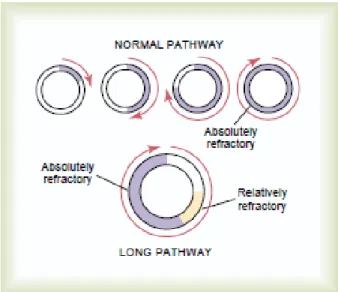
between refractory areas. The impulses will travel in a chain reaction of smaller waves called wavelets as they encounter different areas of refractory tissues within the chamber, and these chain reactions can create long pathways. In some cases, the pathways can even travel back to an earlier point in the pathway and create a circuit.
This circuit will end immediately if the tissue is still in a refractory state, but if the tissue has reverted back to an excitable state, then the pathway can restart all over again, following the same or a similar pathway. This event is referred to as a “re-entrant circuit”. If the pathway is sufficiently long, then the circuit will have a gap of non-refractory tissue between the
8
Fig 2.2 Comparison of Normal Impulse Pathway (Top) with Long Impulse Pathway (Bottom) 1
On the other hand, shorter pathways can have the problem of the impulse reaching itself, with little or no non-refractory gap. When the impulse reaches the refractory tissue from earlier in the circuit, it will usually split around it, creating a new wavelet that travels off in a different direction. The resulting re-entrant circuit is unstable and creates many disorganized wavelets that interfere with other waves and wavelets throughout the heart chamber. This situation leads to fibrillation2.
2.2 Theories of Atrial Fibrillation Maintenance
2.2.1 Circus Movement
Starting in the early 20th century there were two prevailing theories for the maintenance of atrial fibrillation, Lewis’s circus movement theory and the ectopic foci theory. Circus
9
Figure 2.3 – Lewis’ Illustration of “Circus Movement” in a Ring of Muscle3
This figure shows a step by step process of the start and maintenance of “circus movement” in muscle rings. The wavefront starts at (1), continuing until it reaches a “circus” state at (5).
2.2.2 Ectopic Foci
Ectopic Foci are excitable areas of cardiac tissue that can fire of their own volition and interfere with the sinus rhythm. In normal sinus rhythm, the SA node usually suppresses the ectopic foci due to the higher impulse rate of the SA node. However, in the instance of an ectopic focus with a superior fire rate to that of the SA node, the focus can overcome the SA node signal and interfere with normal heart function4. If an ectopic focus starts firing at a fast, regular rate, then it can create a regular electrical “wave” from this point. The wave it creates will not follow normal cardiac circuits, and can result in a reentrant circuit that triggers AF5.
The theories of ectopic foci versus circus movement were disputed throughout the 20th century. Studies by Prinzmetal6 and Scherf 7 in the 1950’s found evidence of focal beats in AF. They believed that AF was driven by one or more focal beat sources rather than circus movement. Both studies concluded that their results refuted Lewis’s theory. The debates surrounding the ectopic focus theory were not resolved until 1998, when a study by
Haissaguerre et al. provided definite evidence of focal beats originating around the pulmonary veins during atrial fibrillation5. Haissaguerre’s discovery led to the development of the
10
2.2.3 Multiple Wavelet Hypothesis
Atrial fibrillation is inherently unstable due to the frequent splitting of waves and creation of wavelets. In 1950s, Gordon Moe proposed a third theory for the mechanism of atrial
fibrillation, the multiple wavelet hypothesis9. According to his hypothesis, once AF is established it is “self-sustained and independent of its initiating agency” (Moe, 1959)9. Moe believed that atrial fibrillation is too chaotic of a condition for it to last for years at a time under the circus movement or ectopic focus mechanisms8. He envisioned fibrillation as the result of “randomly wandering wavefronts, ever changing in number and direction.” (Moe, 1956). 8
11 Figure 2.4 – Schematic of the Cox-Maze IV Procedure49
2.2.4 Leading Circle Theory
In 1973, Allessie et al. made the discovery of reentrant circuits that would develop in the heart without obstacles13. In these cases, as the circuit continued around in a “circle” the center would be barraged by centripetal wavelets, causing it to be in a state of constant refractoriness. As the center remained refractory, it would act as a functional obstacle and the reentrant circuit could continue to maintain the arrhythmia. This suggested mechanism was dubbed the “leading circle” theory of AF. While similar to Lewis’s earlier circus movement theory, it was different in that it did not require an anatomical obstacle, the circulating wave intrudes upon itself, and it has a shorter cycle length than circus movement13. Figure 2.546 below shows the leading circle
12
Figure 2.5 - Diagram of the Leading Circle Mechanism of AF46
The arrows in the figure show the wavefront paths and directions in the leading circle mechanism. The rotor itself is shown as the large arrow, while the smaller arrows are the daughter wavelets that keep the center in a non-refractory state. The gray area is the gap of refractory tissue that allows the circle to continue indefinitely.
The leading circle theory prevailed for about 20 years before researchers found
problems with it. Due to the refractoriness of the leading circle’s center, it would be impossible for the circulating wavefront to intrude upon it, and the circuit would be fixed in a single location. However, several high-resolution studies found evidence of reentrant circuits drifting during AF14-16. If the reentrant circuits followed the leading circle mechanism as described by Allessie, then this drifting would not have occurred.
2.2.5 Mother Rotor Theory
To address the issues with the leading circle theory, researchers suggested that
13
Fig 2.6 – Diagram of the Spiral Wave or Rotor Mechanism of AF46
Figure 2.646 shows the basic mechanism of an atrial rotor. The initial step of the rotor mechanism is a wave break after the interaction of a wavefront with a functional or anatomical obstacle, such as another wavefront15. The process occurs following the S1-S2 protocol2, which proceeds as follows:
(i) The S1 wave is followed by a perpendicular S2 wave.
(ii) If S2 is initiated before the tail of S1 exits the refractory state, then S1 acts as an obstacle to S2 at the intersection point.
(iii)S2 turns into a rotating spiral wave, with the center at the point of intersection.
After the rotor initiates, it maintains itself in a process similar to the S1-S2 protocol. As the spiral wave travels around, any obstacles encountered (tissues in a refractory state) cause it to split and create wavelets. These wavelets then travel throughout the atria, interfering with normal electrophysiological pathways and starting fibrillation of the chamber.
14
theory with modifications. Several mapping studies of AF have found a single or a small number of rapidly spinning sources maintaining the fibrillation17-19. However, these sources are not Lewis’s waves that travel in a ring; they are rotors that spin around a phase singularity. Although the wavelets cause electrical chaos in the heart, the rotor that maintains fibrillation will often be highly periodic and organized20.
2.3 Current Ablation Strategies and their Issues
2.3.1 Pulmonary Vein Isolation
Ablation strategies targeting the pulmonary veins are the foundation of AF ablation procedures45. Initial treatments attempted to ablate focally within the PVs, but this method was abandoned in favor of complete electrical isolation of the PVs by creating a full circle of ablation around each, which resulted in much lower recurrence of fibrillation. The isolation of each individual PV is typically called pulmonary vein isolation (PVI). A study by Pappone et al. proposed a method of circumferential PV ablation called PV antral ablation21. Using
radiofrequency energy close to the cardiac surface, they were able to reduce local electrogram amplitude by over 80%, creating a reduction but not complete block of electrical signals. Reducing the signal strength by this amount would interfere with chaotic wavelets from AF sources while allowing the normal heart beat wavefronts from the SA node to pass through.
15
than PVI, it cuts off the AF sources that can form in the area around the PVs, rather than only the sources that form in the PVs.
Figure 2.7 (Left) – Ablation spots of Pappone et al.’s PV Antral Ablation (PVI) 21
Figure 2.8 (Right) – Ablation spots of Arentz et al.’s PV Antral Isolation (PVAI) 22
Although PVI/PVAI is a very effective treatment for paroxysmal AF, it is not as effective for patients with persistent or long-standing AF45. Studies have shown that after a single
16
persistent AF, PVAI has become the preferred initial ablation strategy for all AF patients, both paroxysmal and persistent45.
2.3.2 Linear Ablation
Linear ablation involves creating linear lesions in the atrial tissue in order to modify the macro-reentrant circuits involved in maintaining AF23. The procedure usually include a roof line connecting the left and right superior pulmonary veins and a mitral line connecting the mitral annulus to the left inferior pulmonary vein23. Linear ablation is an evolution of the MAZE procedure, an early surgical treatment for AF where the cardiac muscle is cut in a “maze” pattern to control the flow of electrical waves within the atria and prevent reentrant circuits from developing12. Studies have shown that re-entrant atrial tachycardia is likely to occur in patients again after PVI treatment without the addition of linear ablation23.
Figure 2.9 – Example of Roof and Mitral Isthmus Lines in Linear Ablation50
This figure shows a 3D map of roof and mitral isthmus line ablations performed in a study by Scharf et al. Each red dot marks the location of an ablation lesion that was placed there.
Linear ablation can be challenging to perform, since bidirectional block must be achieved across all lines to have effective lesions23. If complete linear block is not achieved in surgery, then there is an increased chance of reentrant atrial tachycardia developing after the procedure23. Linear ablation is often used in addition to PVI, PVAI, or electrogram-based
17
linear ablation in addition to PVI have a much lower recurrence of AF than patients who only undertake PVI28.
2.3.3 Complex-Fractionated Atrial Electrograms
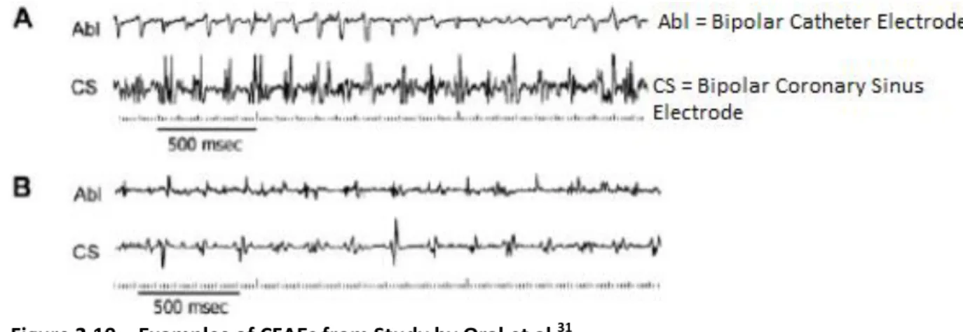
AF ablation research has become increasingly focused on the analysis of complex-fractionated atrial electrograms (CFAEs). CFAEs are collected from the atrial tissue during fibrillation and represent areas of “slow conduction, wavefront collision, conduction block, or anchor points for reentrant circuits.” (Letsas, 2011)45. Cardiologists want to analyze these signals to determine the source(s) maintaining the fibrillation and disrupt them to terminate AF. End points for CFAE ablation include complete elimination of the CFAE or slowing and organization of the local electrograms30. Figure 2.1031 below, taken from a paper by Oral et al.31, shows different CFAEs obtained from a patient with AF. CFAEs will sometimes exhibit periods of relatively stable, rapid activity as seen in electrogram A. The wavelets can also collide and travel so chaotically that the electrograms show little meaningful activity without filtering, such as in electrogram B.
Figure 2.10 – Examples of CFAEs from Study by Oral et al.31
18
There has also been research into the use of CFAE ablation in addition to PVI or PVAI. In these investigations, CFAE ablation was performed immediately following treatment with PVI/PVAI. Studies by Elayi et al.32, Brooks et al.24, and Kong et al.27 experienced improved success rates when using this method. On the other hand, outcomes by Oral et al.25 and Bencsik et al.33 reported little or no improvement after using CFAE ablation in addition to PVI or PVAI. Another factor to be considered with these studies is that CFAE ablation significantly increased the procedural time and energy, which increased costs and danger for the patient27.
2.3.4 Stepwise Catheter Ablation Approach
According to the Bordeaux group37, the optimal stepwise catheter ablation approach for persistent AF includes:
(i) PVI as the initial step, along with isolation of the superior vena cava and coronary sinus.37
(ii) Electrogram-based ablation aiming at CFAEs and electrograms with large activation gradients.37
(iii)Final target site should be linear ablation of the mitral isthmus line and left atrial roof line.37
(iv)If AF still persists, the right atrium is targeted for ablation if there is evidence that a source for AF exists in those areas.37
Using this method, the Bordeaux group reported termination of AF in 87% of patients, and lack of AF in 95% of patients after an 11-month follow up37. Another stepwise procedure study by Rostock et al. found a single procedure success rate of 38% at 20 months, but it was
19
2.4 Ablation Procedure Used by Cardiologists at UNC Chapel Hill
Atrial ablation procedures are performed regularly at UNC Chapel Hill. Dr. Mounsey and Dr. Gehi of UNC Cardiology have extensive experience with the treatment of atrial fibrillation and were collaborated with over the course of this project. They use a modified stepwise procedure for AF ablation that was explained in their published study from 201255, and is summarized below:
1) As with most other ablation procedures, the first ablation performed is pulmonary vein antral isolation (PVAI). PVAI lesions are placed until complete block can be confirmed.
2) A linear ablation of the roof line is performed.
3) After the first two ablations, a decapolar mapping catheter is used to collect electrograms from the atrial wall. The cardiologist places lesions in the area of any electrograms that are identified as CFAEs.
4) Coronary sinus isolation is performed, where linear lesions are placed adjacent to and within the coronary sinus until the atrial activity within it disappears. 5) A mitral isthmus linear ablation line is created.
6) The final ablation is the isolation of the superior vena cava.
7) The procedure is considered complete at any point if sinus rhythm has returned and AF cannot be induced again. If the treatment reaches this stage and the cycle length of the fibrillation is significantly slower, then the procedure is complete.
20
9) Patients still exhibiting fibrillation after the procedure are treated with anti-arrhythmic medicines to control the fibrillation.
Using these methods, the cardiologists reported an AF recurrence rate of 27.3% for paroxysmal AF patients and 18.8% for persistent AF patients with repeat procedures after 56 weeks55.
2.5 Significance of this Project
The objective of this study is to develop and examine a novel method of actively analyzing CFAEs and determining wavefront direction in real time using small multi-electrode catheters. Data would be collected from an area in the atrial wall during fibrillation using a small multi-electrode catheter, such as a spiral catheter or loop catheter. The data would be analyzed using an electrogram comparison method, and wavefront shape and direction in the data collection area would be displayed on the computer for the cardiologist’s perusal. Using this knowledge about wavefront behavior, it is hoped that the method could be used multiple times in order to “triangulate” the center of the rotor source in the atrial wall. If the cardiologist is able to locate the rotor center, then the rotor area could be ablated to potentially terminate the fibrillation.
AF is usually not immediately dangerous to the patient, but patients with AF have a five-fold increase in the risk of stroke compared to people without AF40. This risk increases drastically with age, reaching up to 23.5% in AF patients aged 80-8941. Even with the relatively high success rates of ablation procedures, many of the patients with “successful” treatments must remain on at least one antiarrhythmic drug55. Using antiarrhythmic drugs is not necessarily an ideal
21
effects can occur while taking the drugs including proarrhythmic events, negative inotropy, and torsades de pointes42-43.
Relatively little progress has been made in improving ablation treatments since the adoption of pulmonary vein isolation. The reason for this lack of progress is that no consistently accurate methods have been developed for analyzing CFAEs. According to the prevailing mother rotor theory, the rotors will be an organized source within the disorder of fibrillation. If one is able to analyze the CFAEs during atrial fibrillation correctly then one can pinpoint the rotors, or rotor migration pathways, and ablate them.
However, without a definitive method of locating rotors in the atria, cardiologists must resort to trial and error in order to terminate AF. Currently, cardiologists use trial and error to try and guide the fibrillatory pathways into a controllable loop by ablating spots that exhibit CFAEs. Once the fibrillation is constricted to a single pathway, the tissue along the entire
pathway area is ablated in order to eliminate the fibrillation. The trial and error methods are not always successful, and patients’ hearts are often ablated more than would be necessary if the rotors could be located. Catheter ablation carries certain risks at any point, such as bleeding at the ablation site or perforation of the heart muscle, and ablating more than necessary increases these risks51.
22 2.6 Previous Procedures for Analyzing CFAEs
2.6.1 Sanders et al. – Dominant Frequency Analysis
Rotors are attractive as focal points for ablation, since they are a strong periodic point source among all of the chaotic CFAEs. Early studies into locating these rotors, such as an experiment by Sanders et al. in 200444, used dominant frequency (DF) analysis to translate the CFAE signals in AF patients. They believed that the areas with the highest DF would be closest to the rotors driving AF, and should be the key targets for ablation.
Sanders’ group performed electroanatomic mapping on 32 AF patients (19 paroxysmal, 13 persistent), and they were put through ablation surgery. The dominant frequency was then calculated for each electrode point by an investigator who was blinded to the results of the surgery. The calculated results were used to create a DF map of the atria and CS. In order to assess the hypothesis, DF maps for each patient were compared with the results for that patient’s ablation surgery.
In their results, the changes in AF cycle length (AFCL) during ablation were observed as effects of ablation. The AFCL would increase significantly when ablation occurred at high DF sites, but AFCL remained unchanged when ablation occurred in other areas. During the surgery, AF was terminated in 17 of the 19 paroxysmal AF patients, but there was not termination in any of the persistent AF patients. It was observed that more of the high DF areas in paroxysmal patients occurred in or around the PVs than in persistent patients. Most of the successfully treated patients had high DF sites only in or around the pulmonary veins. To account for the lack of success in persistent AF patients, Sanders pointed out that there were more high DF sites in the atria of the patients than were ablated in the surgery.
23
as termination of AF in a number of paroxysmal AF patients. Although this method of CFAE analysis looked promising, it has not proven to be very reliable in practice. Later studies have also found significant variability in DF patterns of fibrillation, such as the study by Nash in 200617.
2.6.2 Nash et al. – Phase Analysis of Wavefronts
It is widely thought that the mechanisms for atrial and ventricular fibrillation are very similar, if not the same. Both VF and AF studies were researched for this project. Nash et al. performed a study 2006 where phase analysis and DF analysis were used to study the
wavefronts and rotors in VF17. They decided to use phase analysis “because it provides a way of identifying reentrant sources that is robust in the presence of noise and changing signal
morphology.” (Nash, 2006) 17.
In the study, electrograms of the ventricles of the heart during 20-40 sec episodes of VF in 10 patients were recorded. An electrode sock was used to record 256 electrograms spread across both ventricles. The electrogram data was filtered and processed to determine the dominant frequency for each electrode and obtain a DF map of the ventricles. In order to visualize the wavefronts, several steps were taken. In general, a phase plot is created by graphing two state variables against one another in a system. For this study, the electrogram voltage was plotted against the Hilbert transform of itself. There was a phase plot for each electrode, and they calculated the phase at each time point using the plots. A topological charge technique47 was used to identify the phase singularities, which correspond to rotor centers, and an active-edge technique48 was used to visualize the wavefronts.
24
in the pattern over time. The heterogeneous/mobile structure (2 patients) had significantly more DF variability across the electrode field. This pattern would also change with time. The heterogeneous/static structure (6 patients) exhibited a spatially varied DF map that remained relatively unchanged over time. The variability observed in the different DF maps did not support the conclusion made by Sanders et al. a year before44. The DF maps did not consistently relate to the phase analysis results and the three structures shows that person to person variability will exist when mapping DF.
Figure 2.11 – Nash’s Findings of Reentrant Activity in a Patient’s VF17
25
Epicardial reentry was observed in all patients using the phase analysis method, an example of which is shown in Figure 2.1117. The number of phase singularities found in the study remained low, lending credence to the mother rotor theory. However, the VF would sometimes devolve into large, chaotic, reentrant waves, similar to what one would find in Moe’s multiple wavelet mechanism of fibrillation. This behavior would usually prevail for several cycles, and then return to a more organized rotor mechanism. Nash concluded that both mother rotor and multiple wavelet mechanisms can maintain VF, and they are not mutually exclusive.
2.6.3 Narayan et al. – Cycle-to-Cycle Analysis using Basket Catheter Electrodes
The concept of an electrogram comparison method of determining wavefront activity between electrodes is not entirely new. A very recent study into analyzing CFAEs was published by Narayan et al. in 201252. According to Narayan, “there has been no direct evidence for localized sources in human AF using traditional methods” (Narayan, 2012)52, even though several successes have occurred using animal models. A novel time-based approach utilizing repolarization and conduction dynamics was suggested as a method to characterize and locate rotor and focal sources of AF.
26
Simultaneous to the MAP collection, 64 pole basket catheters were used to collect unipolar electrograms from multiple sites throughout the left atrium. The electrograms were recorded as unipoles and filtered at 0.05 to 500 Hz. The electrograms were also recorded as overlapping bipoles to reduce far-field artifact. Data was collected from 49 AF patients total, 20 of which had electrograms recorded from both the left and right atria rather than only the left atrium. These patients had a mix of paroxysmal and persistent AF, and any patients without active AF at the start of the data collection had it induced through external pacing.
27
Figure 2.12 – Left Atrial Rotor Source (Left) and Focal Beat Source (Right)52
This figure shows examples of rotor sources and focal beat sources found using the mapping methods. The colors represent the time lag after a reference, represented by the red color in both plots. The white arrows show the predicted direction of the AF impulses based upon the
isochrones results. The rotor source in the left map was located in a persistent AF patient, while the focal beat source in the right map was located in the left atrium of a patient with paroxysmal AF.
28
Despite the apparent success of Narayan et al.’s study, it is believed that the use of basket catheters has several disadvantages. In addition to the low spatial resolution of the basket catheters, no ablation can be completed while collecting data using them. It is believed that a smaller, more mobile catheter may be better to map the activity and find likely AF
29 3. METHODS
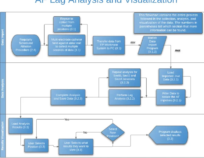
Figure 3.1. Flowchart of Entire Procedure for Collection, Analysis, and Visualization of Data 3.1 Data Collection
30
held against the left atrial wall for several seconds while recording the electrogram at each electrode. The process was repeated at least 10 times in order to collect data from all around the left atrium. A parallel 3D positioning system was able to record the positions of the catheter electrodes at each of the data collection positions and store them, along with the collected electrograms, in an EP WorkMate System from St. Jude Medical. The system allowed the cardiologists to collect the data from patients and store it electronically on the system’s hard drive.
31
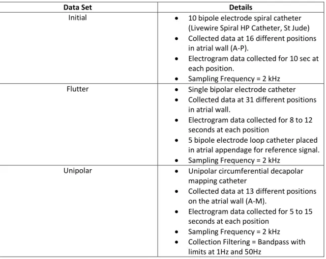
3.1.1 Data Sets
There were three data sets used in this project to develop and test the analysis algorithms. These data sets are referred to as the Initial, Flutter, and Unipolar data sets.
Data Set Details
Initial 10 bipole electrode spiral catheter
(Livewire Spiral HP Catheter, St Jude)
Collected data at 16 different positions in atrial wall (A-P).
Electrogram data collected for 10 sec at each position.
Sampling Frequency = 2 kHz
Flutter Single bipolar electrode catheter
Collected data at 31 different positions in atrial wall.
Electrogram data collected for 8 to 12 seconds at each position
5 bipole electrode loop catheter placed in atrial appendage for reference signal.
Sampling Frequency = 2 kHz
Unipolar Unipolar circumferential decapolar
mapping catheter
Collected data at 13 different positions on the atrial wall (A-M).
Electrogram data collected for 5 to 15 seconds at each position
Sampling Frequency = 2 kHz
Collection Filtering = Bandpass with limits at 1Hz and 50Hz
32
3.1.2 Transfer Data from EP WorkMate System to Matlab
The first step that was taken for each data set was to transform the data from the EP WorkMate System at the hospital into a manipulable form in Matlab. The data was imported to the PC as a large collection of text files, with each text file containing the data for a single electrogram. Each electrogram that the system recorded has its own unique name. The 3D coordinate data was exported in a single large .csv document, with x, y, and z coordinates for each electrode, and a different set of coordinates for each position.
When the data was obtained in its text file form from the cardiologists, a program was used to import the electrogram data from the text files into Matlab matrices that could be manipulated. In the program, native Matlab functions are used to first open the text file in Matlab, then to scan through it, taking data and re-saving the data as a Matlab variable. This process is repeated for all electrodes at all positions. The program puts all the data together into a matrix for each catheter, with a row for each electrode/electrode pair in the catheter. There is a different matrix created for each catheter position. For example, in ObtainInitialData.m, 16 different matrices are created, labeled A-P for the 16 different positions, and each of these matrices has 10 rows, for each of the 10 electrode bipoles in the catheter.
After importing the electrogram data, the program imports the 3D positioning data using the same reading procedure as was used for the electrode data. After importing both the electrogram and coordinate data, the matrices for each position are combined into a structure for that position.
33 3.2 Matlab Data Processing and Analysis
3.2.1 Filtering and Pre-Analysis Calculations
The analysis program starts by filtering the data to remove unwanted artifact and noise. Most of the filters used in these programs are Gaussian low-pass filters. They are created using the steps outlined in the table below:
Data Set Filtering Procedure
Initial
1) Electrogram data and coronary sinus reference data are filtered using the same filters.
2) Data is normalized by subtracting the mean value of electrogram. It is then half-wave rectified to keep only positive values.
3) Gaussian (80 points, α = 4) low-pass FIR filter is used.
4) Gaussian (60 points, α = 4) low-pass FIR filter is used.
Flutter
1) Electrode data and coronary sinus reference data are filtered the same amount.
2) Gaussian (80 points, α = 4) low-pass FIR filter is used.
3) Gaussian (60 points, α = 4) low-pass FIR filter is used.
Unipolar
1) Butterworth high-pass IIR filter (30 order, ) is used.
2) Gaussian (130 points, α = 4) low-pass FIR filter is used.
3) Gaussian (80 points, α = 4) low-pass FIR filter is used.
34
Figures 3.2-3.3. Unfiltered versus Filtered Electrograms for Position A of Unipolar Data Set
After the filtering is complete, the program does several calculations using the 3D mapping coordinates. First the midpoint is determined between the two electrodes that composed each bipole electrode. This calculation was only necessary for the electrogram data in the Initial data set and the atrial appendage reference data, since all the other data was collected with unipolar electrodes. After midpoint calculation the program establishes the distance between each electrode or each bipole midpoint, which will be used later in the analysis.
The primary lag analysis is performed using the entire data set, called the Sect0 analysis. Details for the Sect0 electrograms of each data set are shown in Table 3.2 on the next page:
0 2000 4000 6000 8000 10000 12000 14000
-2 0 2 4 6 8 10 12
x 104
Time (ms) Unfiltered Data
0 2000 4000 6000 8000 10000 12000 14000
0 2 4 6 8 10
x 104
35
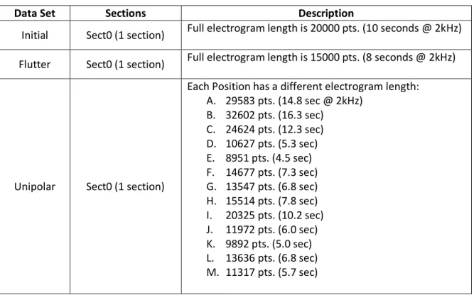
Data Set Sections Description
Initial Sect0 (1 section) Full electrogram length is 20000 pts. (10 seconds @ 2kHz) Flutter Sect0 (1 section) Full electrogram length is 15000 pts. (8 seconds @ 2kHz)
Unipolar Sect0 (1 section)
Each Position has a different electrogram length: A. 29583 pts. (14.8 sec @ 2kHz)
B. 32602 pts. (16.3 sec) C. 24624 pts. (12.3 sec) D. 10627 pts. (5.3 sec) E. 8951 pts. (4.5 sec) F. 14677 pts. (7.3 sec) G. 13547 pts. (6.8 sec) H. 15514 pts. (7.8 sec) I. 20325 pts. (10.2 sec) J. 11972 pts. (6.0 sec) K. 9892 pts. (5.0 sec) L. 13636 pts. (6.8 sec) M. 11317 pts. (5.7 sec)
Table 3.3. Electrogram Sections for Sect0 Analysis.
3.2.2 Sect0 Electrogram Lag/Lead Analysis
The first step in the lag analysis part of the program is to calculate the cross-covariance between the electrode electrogram and the reference electrogram for each electrode at each position using the xcov() function. The reference electrogram used was different for each data set. In the Initial and Unipolar data sets, the reference was a local electrogram. The first
electrode was used as the reference for almost all cross-covariance calculations. For positions C & O and position F of the Initial data set, the reference electrodes were electrode 2 and
36
offset length is set to 250, then the cross-covariance will be calculated 501 times, one for each point between +250 and -250 offset. For the Initial and Unipolar data sets, a ±250 point offset was used for all iterations. For the Flutter data set, ±600 point offset was used for all iterations. In the selected data sections of the Unipolar data set, a ±200 point offset was used.
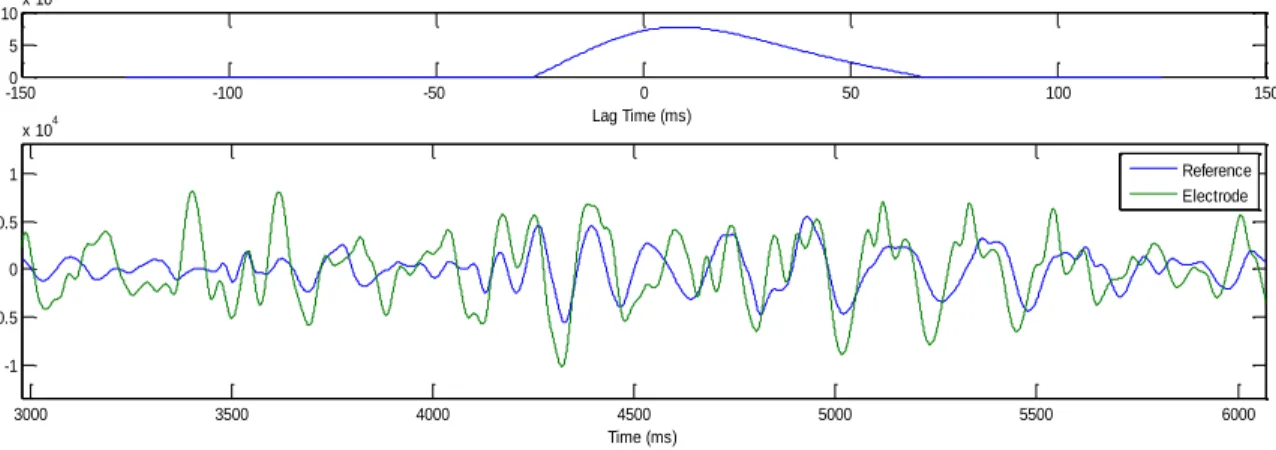
Figure 3.4. Comparison of Electrograms and their Associated Cross-Covariance Curve
This figure contains the 5th electrode electrogram overlaid on the reference electrogram for Position A of the Unipolar data set. The cross-covariance curve above the electrograms shows peaks at places where the electrograms would match up if electrode electrogram was shifted by that amount.
The next step of the analysis determines at which offset the cross-covariance is strongest for each electrode and defines the overall time lag between that electrode and the reference electrode. The program searches point by point through derivative of each cross-covariance curve to find any zero-crossing from positive value to negative values, which represent a peak in the original cross-covariance curve. The program then uses the metric mean value for each peak to determine which offset has the most agreement between the electrode and the reference.
Once the program determines the lag offset for every electrode, a smoothing step is performed on the data. In the Initial data sets, the program recalculates the lag value by taking into account the value of lead/lag at each other electrode. This calculation was initially used for the Unipolar data set as well, but later on in the project it was decided that the data set did not
-1500 -100 -50 0 50 100 150
5 10x 10
10
Lag Time (ms)
3000 3500 4000 4500 5000 5500 6000
-1 -0.5 0 0.5 1
x 104
Time (ms)
37
need a smoothing step. In the Flutter data set, the electrograms were so organized (See Figures 4.8-4.9) that the cross-covariance peaks representing the next and the previous period were close to the same strength. Some of the lag values would be recorded as the opposite lag compared to the other electrodes surrounding it, and a smoothing step was designed to fix these outliers. For each electrode, the program counts the numbers of lagging/leading
electrodes nearby, and if the majority of the nearby electrodes have an opposite time lag than the target electrode, then the lag for that electrode is changed to the next highest lag
determined using the metric mean. In almost all cases this next highest lag was the opposite lag peak.
3.2.3 Multi-Section Analyses
Separate analysis iterations were performed by splitting the electrograms up into multiple sections, then performing the lag analysis on each individual section. The Initial and Flutter data sets were split up into Sect0, Sect2, and Sect4 analyses, while the Unipolar data had an
38
Data Set Sections Description
Initial
Sect0 (1 section) Full electrogram length is 20000 pts. (10 seconds @ 2kHz)
Sect2 (2 sections) Each section is half the length of Sect0.
Sect4 (4 sections) Each section is one fourth the length of Sect0.
Flutter
Sect0 (1 section) Full electrogram length is 15000 pts. (8 seconds @ 2kHz)
Sect2 (2 sections) Each section is half the length of Sect0.
Sect4 (4 sections) Each section is one fourth the length of Sect0.
Unipolar
Sect0 (1 section)
Each Position has a different electrogram length:
N. 29583 pts. (14.8 sec @ 2kHz)
O. 32602 pts. (16.3 sec)
P. 24624 pts. (12.3 sec)
Q. 10627 pts. (5.3 sec)
R. 8951 pts. (4.5 sec)
S. 14677 pts. (7.3 sec)
T. 13547 pts. (6.8 sec)
U. 15514 pts. (7.8 sec)
V. 20325 pts. (10.2 sec)
W. 11972 pts. (6.0 sec)
X. 9892 pts. (5.0 sec)
Y. 13636 pts. (6.8 sec)
Z. 11317 pts. (5.7 sec)
Sect2 (2 sections) Each section is half the length of Sect0.
Sect4 (4 sections) Each section is one fourth the length of Sect0.
SectS (1 section)
Sections that look particularly good/regular are selected for each position:
A. pts. 8000:12000 (sec 4-6 @ 2kHz)
B. pts. 18000:22000 (sec 9-11)
C. pts. 2000:4600 (sec 1-2.3)
D. pts. 2000:6000 (sec 1-3)
E. pts. 1000:5000 (sec 0.5-2.5)
F. pts. 1000:2500 (sec 0.5-1.25)
G. pts. 3800:5800 (sec 1.9-2.9)
H. pts. 2200:4000 (sec 1.1-2)
I. pts. 9100:11400 (sec 4.55-5.7)
J. pts. 4800:6400 (sec 2.4-3.2)
K. pts. 3200:6600 (sec 1.6-3.3)
L. pts. 9300:11300 (sec 4.65-5.65)
M. pts. 1200:2880 (sec 0.6-1.44)
Table 3.4. Electrogram Sections for Each Analysis Iteration.
39
average standard deviation is also calculated for each position and the positions are sorted into a list of least average standard deviation to greatest. Average standard deviation was not calculated for the Flutter data sets, since there is only one position.
In the display program, color maps are used to show the different lag values for electrodes on a 3D map. To ensure accurate visualization and comparison of the data, the limits for these color maps are calculated in the analysis program. A first set of limits is calculated using the Sect0, Sect2, and Sect4 data results. A second set of color limits was created for the Unipolar data set using only the SectS data results.
3.3 Matlab Mapping and Visualization of Results
A display program was designed that would give the user several options of which analysis results to view, and to show those to the user in an understandable format. After choosing which of the positions they want to view by entering a position A-P (A-M in Unipolar data set; unused in Flutter data set), the electrode electrograms and reference electrograms for that position are formatted for easier viewing. By offsetting each electrogram vertically, the plots are made to look similar to an ECG chart. An ECG chart is a common tool used by cardiologists, and showing the data in this manner would help them to more easily understand the visualized electrograms.
40
Position Options
Initial Data Set
1. Electrode Data Chart 2. Lag Map for this Position 3. X-Cov Plots for this Position 4. X-Cov Plots vs. Shifted Chart 5. List of Least Noise Positions 6. All positions on one graph 9. Choose New Position 0. Terminate Program
Flutter Data Set
1. Electrode Data Chart 2. Lag Map
3. X-Cov Plots
4. X-Cov Plots vs. Shifted Chart 9. Choose New Position 0. Terminate Program
Unipolar Data Set
1. Electrode Data Chart 2. Lag Map for this Position
3. Display X-cov plot for each electrode 4. X-Cov Plots vs. Shifted Chart
5. List of Least Noise Positions 6. All positions on one graph
7. Dominant Frequency Analysis of Sect0 9. Choose New Position
0. Terminate Program
Table 3.5. User Options for the Different Display Programs
Each option is covered in more detail in the following list.
Option 1 – Electrogram Plots
The first option involves the display of the electrogram data in ECG chart form. In the Initial data set, the program only plots the rectified and filtered data. An example of an electrogram plot can be seen in Figure 4.1 of the Results section.
Option 2 – Lag Result Maps
Selection of the second option results in plots of the lead/lag times for the different electrodes in 3D space. These plots contain points in 3D space representing the different
41
Initial and Unipolar data set there are lines connecting the different electrodes, to show how the catheter was shaped during data collection. Examples for these plots can be found in Figures 4.4 and 4.35-37 of the Results section.
Option 3 – Individual Cross-covariance Plots
With the third option the program plots the cross-covariance (xcov) curves for each section in a data set. These plots also contain bar graphs of the metric mean for each peak in the xcov curves, which allows the user to check that the program is working correctly and determining the correct peak as strongest in the xcov plot.
Option 4 – Overlaid and Shifted Electrogram Figures
The fourth section causes the program to plot the electrogram for each electrode, overlaid onto an electrogram for the reference electrode. The cross-covariance curve is plotted in a separate graph on each figure, as well as another electrogram plot. The new electrogram plot contains the reference electrogram graphed on top of the electrode electrogram, but the electrode electrogram is shifted by the amount determined to be the lag offset in the analysis program. If the lag was chosen correctly, then the shifted electrode electrogram and the reference electrogram will match one another closely. These overlaid electrograms provide an easier visualization of whether the analysis program is working correctly.
Option 5 – List of Least Std Deviation Positions
When the user selects option 5, the ranked lists of lowest standard deviation positions from the analysis program are displayed. The list for the Sect2 and Sect4 are all displayed in sequence on the command window.
Option 6 – Plot All Positions on One Graph
42
containing checkboxes for each position is displayed to the user. Using this input, the user can select particular positions to show or hide, and press a button to redraw the map with only the selected positions. For Sect2 and Sect4 data, a multi-position lag map and checkbox control figure are created for each individual section. Both Options 5 and 6 are not available for the Flutter data set, since this data set only had one position.
Option 7 – Dominant Frequency Analysis
A dominant frequency analysis is performed on each position in the Sect0 analysis of the Unipolar data set. The analysis is performed using the fast Fourier transform (FFT) and power spectrum analysis. The dominant frequency for each electrode was calculated in the analysis program, and this list of dominant frequencies can be displayed in a list format similar to Option 5.
Option 9 & 0 – Restart or Terminate the Program
43 4. RESULTS
4.1 Initial Data Set
The Initial data set was the first one collected by the cardiologists and analyzed, so this data set was used to create the analysis method and Matlab programs. Although the atrial fibrillation impulses could be discerned after filtering, the data positions were characterized by either low amplitude or high noise.
4.1.1 Filtering Results and Signal Quality
The spiral catheter used in the Initial data collection is larger and more unwieldy than smaller conventional catheters. The cardiologist had difficulty holding the spiral catheter against the atrial wall during AF and obtaining a good signal on all of the catheter electrodes.
Figure 4.1. Bipolar Electrograms for Position B of Initial Data Set
One of the issues with the data was low signal amplitude. Refer to position B data in Figure 4.1. The electrograms for the 3rd, 4th, 5th, 9th and 10th electrodes all had very low
0 1000 2000 3000 4000 5000 6000 7000 8000 9000 10000
1 2 3 4 5 6 7
44
amplitude signals. Figure 4.2 below compares the electrograms from the 2nd and 3rd electrodes, in which one can see very small peaks in the 3rd electrogram that match with the larger peaks in the 2nd electrogram. These peaks are difficult for the program to tell from any noise peaks, such as those seen around 6500 ms in the 3rd electrogram. The program had difficulty in
differentiating the AF impulses from noise in these low amplitude signals, since the noise peaks were almost as large as the AF peaks in many cases.
Figure 4.2. Comparison of Electrograms 2 & 3 from Position B
Not only was low signal amplitude a problem in some positions, but high noise was an issue in the others. Figure 4.3 shows that there was significant noise on each electrogram for Position I and these peaks were often irregularly shaped.
4500 5000 5500 6000 6500 7000
1.4 1.6 1.8 2 2.2 2.4x 10
45
Figure 4.3. Electrograms for Position I of the Initial Data Set
For example, the 9th electrode electrogram contained periods of large, easily
distinguishable peaks, but also contained periods where the peaks are indistinguishable from noise. The extra peaks from noise made the analysis much more difficult, since many false cross-covariance peaks were obtained in the analysis that had to be evaluated to determine the correct time lag.
This high noise can be attributed in part to the low amplitude of the electrograms. Filtering the low amplitude electrograms enough to eliminate the noise would have removed much of the desired AF signal strength, so all of the noise could not be filtered out.
0 1000 2000 3000 4000 5000 6000 7000 8000 9000 10000
1 2 3 4 5 6 7
46
4.1.2 Single-section (Sect0) Analysis
Figure 4.4. Sect0 Lag Map for Position B
This figure shows the lag analysis results for position B. In the 3D lag analysis map, the time lag is shown as a function of color. There is a color map on the side of the figure that shows which amount of lag goes with which shade of color. In the map, the positive values mean that the electrode signal lags behind the reference, while the negative values mean that the electrode signal leads the reference.
Despite the low amplitude of many of the electrograms collected at position B, the lag analysis presented a promising map. One can see a shift from dark red at one side of the spiral catheter, representing where the signal is the most behind the distal reference electrode, to the dark blue section at the opposite side of the spiral, representing where the signal leads the reference electrode the most. There is a gradual shift from dark red to dark blue across the catheter, but there is an out of place dark red lag in the center electrode. If one imagines a line of the wavefront traveling across the spiral in Figure 4.4, then the center electrode should be light orange or yellow, representing a smaller amount of lag. Though the wavefront passing through this position could have been irregularly shaped, it is also possible that the low amplitude of the 10th electrode pair, seen in Figure 4.1, caused the program to calculate an
T im e L a g ( m s) -35 -30 -25 -20 -15 -10 -5 0 5
Mean/Stdev Lag for 1 Section
-165 -160 -155 -150 -145 -140 -300 -280 -260 236 238 240 242 244 246 248 250 252
47
inaccurate lag value for the center electrode. The ambiguity of this result illustrated the need for a method to assess signal quality in terms of how regular a signal is and how stable its frequency remains over time.
Figure 4.5. Cross-Covariance Analysis for Electrode Pair 8 in Position B
This figure is an example of the cross-covariance (xcov) curve obtained at the 8th electrode pair for Position I. It also shows the electrode electrogram (green) compared to the reference electrogram (blue) in two plots. The top plot shows the electrograms as they were recorded, while the bottom plot shifts the electrode electrogram by the amount determined by the program to be the time lag between the two. The time lag was determined as the highest peak in the cross-covariance curve on top. Since the highest peak was at -17.5ms, so the green electrogram was shifted to the left by 17.5ms in the bottom plot.
The xcov analysis results for position B, which had a promising wavefront result (Figure 4.4), did not show as much agreement as expected. Figure 4.5 shows the cross-covariance (xcov) curve and overlaid electrograms for the 8th electrode pair of Position B. The lag map had looked like a good wavefront example. Although the analysis seemed to match the peaks better for this electrode and position than it did in Figure 4.6, irregularity in the AF impulses could still be seen. The low amplitude and noise problems in this data set likely contributed to the poor lag analysis results. It also led to the conclusion that it was too difficult to get a good electrical contact with
-1500 -100 -50 0 50 100 150
2 4x 10
8
Lag Time (ms)
3000 3500 4000 4500 5000 5500 6000 6500 7000
0 500 1000 1500 2000 2500
Time (ms)
3000 3500 4000 4500 5000 5500 6000 6500 7000
0 500 1000 1500 2000 2500
48
the atrial wall using the LiveWire spiral catheter. It was decided that using different electrode catheters for subsequent data sets was necessary.
4.2 Flutter Data Set
With the imperfect lag analysis results and irregularities in signal frequency for the Initial Data set, it was decided that testing the analysis methods on a controlled set of data would be a logical next step for the investigation. Atrial flutter, as mentioned in the Background, is a more organized form of cardiac reentry, the driving force of atrial fibrillation. Flutter is driven by a reentrant circuit or rotor, but without the splitting off of wavelets that cause chaos in the cardiac tissue. The Flutter data set was collected from a patient with atrial flutter and analyzed using the same general methods as the Initial data set.
4.2.1 Filtering and Signal Quality
Figure 4.6. Electrograms for Electrodes 1-15
1000 2000 3000 4000 5000 6000 7000
0 1 2 3 4 5 6 7
x 104 Electrode Data
A
m
p
lit
u
d
e
49 Figure 4.7. Electrograms for Electrodes 16-31
The electrograms for the 31 electrodes in the Flutter data set are shown in Figures 4.6 and 4.7 on the previous page. Except for some artifact or noise in the electrogram for the 5th electrode, the signals generally had very low noise, if any. The signals also had varying
amplitudes between high-amplitude, easily recognizable signals and low-amplitude signals that could barely be seen in places. A good representation of the different amplitudes is shown in Figure 4.8 below, which shows a section of the electrograms for the 7th, 8th, 9th, and 10th electrodes. Although the 9th and 10th electrograms were much smaller than the larger
electrograms of the 7th and 8th electrodes, there was little enough noise that the program could still recognize the flutter impulses in the electrograms.
1000 2000 3000 4000 5000 6000 7000
0.8 0.9 1 1.1 1.2 1.3 1.4 1.5
x 105 Electrode Data
A
m
p
lit
u
d
e
50
Figure 4.8. Example of Amplitude Variation in Flutter Electrograms
Figure 4.9. LASSO Reference Electrograms, Electrodes 1-15
2600 2800 3000 3200 3400 3600 3800 4000 4200
2.8 3 3.2 3.4 3.6 3.8 4 4.2 4.4 4.6
x 104 Electrode Data
A
m
p
lit
u
d
e
Time (msec)
1000 2000 3000 4000 5000 6000 7000
0 0.5 1 1.5 2 2.5
x 105 LASSO Data
A
m
p
lit
u
d
e
51
Figure 4.10. LASSO Reference Electrograms, Electrodes 16-31
Figures 4.9 and 4.10 show the reference electrograms for each of the electrodes. They were collected from the atrial appendage with a LASSO catheter. The reference electrograms were generally higher amplitude than their associated electrode electrogram, as well as having very low noise after filtering.
1000 2000 3000 4000 5000 6000 7000
3 3.5 4 4.5 5
x 105 LASSO Data
A
m
p
lit
u
d
e
52
4.2.2 Single-section (Sect0) Analysis
Figure 4.11. Single-section Lag Results Map for Flutter Data Set; No Rotation
Figure 4.12-4.13. Lag Results Map; (Left) Rotated 90⁰ Right or (Right) Rotated 45⁰ Left and Up
These figures show the lag analysis results for the flutter data as a single section. The electrodes covered most of the inner wall of the atrium, with the yellow section being near the reference electrodes in the left atrial appendage. Figure 4.11 shows the atrium from the front, while 4.12 and 4.13 are the same plot rotated 90⁰ to the right or 45⁰ to the left and up, respectively. These other rotations show that the electrode positions covered the entire endocardial wall of the left atrium.
-150 -100 -50 0 50 100
Mean/Stdev Lag for 1 Section
-150 -145 -140 -135 -130 -125 -120 -115 -110 -105 130
135 140 145 150 155 160 165 170 175 180
-150 -100 -50 0 50 100
Mean/Stdev Lag for 1 Section
-160 -140
-120 -100
-80
-160 -140 -120 -100
53
The bulk of the electrodes in Figures 4.11-4.13 were either dark red or dark blue, with the electrogram either lagging behind or leading ahead of the reference signal, respectively. These lagging and leading electrodes were grouped together, with no outlier electrodes in the middle of a group. At the right side of the map is the area where the atrial appendage was located. The electrograms in this area had much more mild lag since they were spatially closer to the reference electrode.
Figure 4.14. Lag Results Map without Smoothing Step Enabled
This figure is showing the same results as those seen in Figure 4.11, except for the deactivation of the smoothing step in the analysis. The circled electrodes are those that do not match the results in 4.11.
54
not seen when the smoothing step is used in Figure 4.13, and provides evidence that the smoothing step is working as intended.
Figure 4.15A-B. Comparison of Flutter Lag Results with Activation Map Created by Cardiologists
Comparison between the Flutter lag results and an activation map created by the cardiologists using the EP Workmate System. The lag results map in 4.15A is a representation of the single-section lag results, except the color axis is reversed to match the color axis of the activation map in 4.15B. The matching electrode positions were labeled on both 4.15A and 4.15B.
When compared, the Flutter lag results and activation map match one another relatively well. There was a division separating the lagging and leading sections in a line going from
55 Figure 4.16. Cross-Covariance Results for Electrode 30
Figure 4.17. Cross-Covariance Results for Electrode 7
These figures show the same plots as those observed and explained in Figure 4.5. See Figure 4.5 for more information on what the plots represent. Figure 4.16 shows the results for Electrode 30 and Figure 4.17 shows the results for Electrode 7.
Figures 4.16 and 4.17 above show the xcov curves as well as the overlaid electrograms for the 30th and 7th electrodes versus their respective references. Other electrodes all had similar results to those shown above; electrodes 30 and 7 were chosen because their electrograms
-3000 -200 -100 0 100 200 300
1 2x 10
9
Lag Time (ms)
C ro s s -C o v a ri a n c e
1000 2000 3000 4000 5000 6000 7000
-5000 0 5000 10000 Time (ms) C a rd ia c I m p u ls e S tr e n g th
1000 2000 3000 4000 5000 6000 7000
-5000 0 5000 10000
Shifted Time (ms)
C a rd ia c I m p u ls e S tr e n g th
-3000 -200 -100 0 100 200 300
2 4x 10
9
Lag Time (ms)
C ro s s -C o v a ri a n c e
1000 2000 3000 4000 5000 6000 7000
-5000 0 5000 Time (ms) C a rd ia c I m p u ls e S tr e n g th
1000 2000 3000 4000 5000 6000 7000
-5000 0 5000
Shifted Time (ms)
56
show one of the smallest and one of the largest amplitude signals, respectively. The analysis found impulses both before and after each reference electrogram impulse for every catheter electrode, represented by peaks in the xcov curve. These peaks often had very similar amplitude, but the metric mean method of analyzing peak strength was able to determine which peak represented stronger agreement between the two electrograms. As seen in the overlaid electrograms plots, the time lead or lag determined by the analysis was very accurate. The shifted electrogram in the bottom plot matches up very closely with the reference
electrogram. Because of the accurate matching between the time-shifted electrode electrogram and the reference electrogram seen in Figures 4.16 and 4.17, it was decided that the lag analysis method created in this study was working as designed and should be a viable method for analyzing atrial fibrillation electrical signals.
It is interesting to note the double peaks in the cross-covariance curves of Figure 4.18-19. After studying the data, it was discovered that these are caused because the reference electrode actually has two peaks. It initially looked as if the reference waveform was composed of a periodic single peak and trough in the electrograms of Figures 4.11-12, but in Figures 4.18-19 showed that there is a second peak following the trough in the waveform. Although this second peak is not as large as the first peak, it is still large enough that it creates a positive cross-covariance value between the electrode and reference electrograms. Although this behavior was noted, it was not investigated further.
57
the Initial signal was believed to be caused by the wavelets that split off from the rotor source during AF. The wavelets would introduce signal interference and alter the AF impulses all throughout the chamber. It would be reasonable to assume that the irregularity in the local electrograms also existed in the rest of the atrium. Early in the investigation, a nonlocal reference in the coronary sinus (CS) was considered to be used as a reference for all of the positions in the Initial data set. However, the wavelet behavior in AF creates irregularity in the signals, and these irregularities would become increasingly difficult to predict as distance between the reference and data electrode increased. It was concluded that though a nonlocal reference may be suitable for atrial flutter analysis, it should not be used to analyze atrial fibrillation.
4.3 Unipolar Data Set
After the high noise and low amplitude of the electrograms in the Initial data set, it was predicted that using bipolar electrodes in such close proximity was removing not only the ventricular artifact, but also much of the amplitude from the AF impulses themselves. To test this hypothesis, the next set of data was collected using 10 unipolar electrodes in a
circumferential decapolar mapping catheter as opposed to using the 10 bipolar electrode pairs of the spiral catheter. These electrodes would pick up everything that they detected, including any artifact coming from the other chambers of the heart. This set of data was designated under the name Unipolar.
4.3.1 Filtering and Signal Quality