Visualizing data using Matplotlib and Seaborn libraries
in Python for data science
Arnav Oberoi, Rahul Chauhan
Department of Computer Science, The NorthCap University, Gurugram, Haryana Department of Computer Science, Maharaja Surajmal Institute of Technology, Janakpuri, N. Delhi
DOI: 10.29322/IJSRP.9.03.2019.p8733
http://dx.doi.org/10.29322/IJSRP.9.03.2019.p8733
Abstract- Visualization is the graphic representation of data through the use of pictorial design. The goal is to make a visual easy to comprehend and presentable. In general, visualization in data science can be divided into univariate and multivariate data visualizations. Univariate data visualization involves plotting a single variable to understand more about its distribution while multivariate plots express the relationship between two or more variables. The usual data visualization methods, such as scatter plots, bar charts, histograms, line charts, and pie charts, are widely used in management research. In a world of rapid evolution of data science, however, new techniques to visualize quantitative and qualitative data is what everyone is looking for.
Index Terms- Comparison between Matplotlib and Seaborn on the basis of univariate plots, comparison between Matplotlib and Seaborn on the basis of multivariate plots for data science.
I. INTRODUCTION
M
atplotlib as we know is one of the most commonly used data visualization libraries of Python. Matplotlib is the work of John Hunter, who, along with many other contributors, had put in great amount of time into producing this software used by every scientist worldwide. Matplotlib is a graphics package for data visualization in Python which has arisen as a key component in the Python Data Science Stack and is well integrated with NumPy and Pandas.Seaborn is a library built on prime of Matplotlib. It allows one to make their visualizations prettier, and provides us with some of the common data visualization needs (like mapping a color to a variable or using faceting). Seaborn is more integrated for working with Pandas DataFrames.
Both the libraries are easy to understand and implement in their own field of usage. Seaborn has a straightforward syntax where as for matplotlib there is more complexity with more variables to be defined depending on the user’s requirements.
The remainder of the paper is as follows
:
1) Section 2: Data Overview2) Section 3: Univariate Plots 3) Section 4: Multivariate Plots 4) Section 5: Conclusions
II. DATA OVERVIEW
The datasets used for this research purpose are made or self-generated. The same dataset has been used for fair comparison between the two libraries of python. For most of the visualizations, the NumPy library was used to generate the dataset. For bar plot and line plot the dataset was chosen randomly but was kept the same for both the visualizations.
III. UNIVARIATE PLOTS
This type of plots that come in this category are the much used bar plot, line plot, histograms, density plot, box plot and whisker plot. These are the kind of plots that have been practiced worldwide for a very long time and are very easily comprehended.
A. Bar Plot
Bar plot is a pictorial representation or graph that presents categorical data in form of bars with length and width directly proportional to the values that they are set to. These bars can be plotted vertically or horizontally.
Figure 1.2 – Bar Plot with Seaborn
With the same dataset provided to both the libraries, the contrast between the visualizations of the two is clearly visible. Matplotlib provides a basic bar plot with bars corresponding to their assigned values whereas seaborn enriches the same set of data by adding different colors to different bars making the visualization much more comprehendible unlike that of the matplotlib plot.
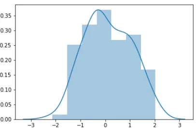
B. Histogram/Density Plot
A Histogram visualizes the dataset over an interval or certain time period. Every bar in it represents a tabulated frequency at each interval. These kind of plots give an estimate as to where the values are focused.
Figure 2.1 – Histogram with Matplotlib
Provided the same dataset to both the libraries, we see that Matplotlib’s visualization focuses more on how the data is scattered whereas in the visualization by Seaborn, the main focus is on where the data is concentrated and with the line also known as the KDE or Kernel Density Estimate along it, the visualization is able to show how the trend of the distribution is. For
Matplotlib histogram plot, KDE is by default set to false which the opposite to that of Seaborn.
C. Box Plot/Whisker Plot
Box and whisker plots have been used widely and are varied in the fields of statistics and data analysis. It consists of 5 parts:
• Minimum
• First Quartile
• Median (Second Quartile)
• Third Quartile
• Maximum
[image:2.612.327.530.72.211.2]Box plots use powerful summary statistics that are easily and quickly computable.
[image:2.612.321.538.517.683.2] [image:2.612.41.271.531.714.2]The box plot visualization of the two libraries shows not much difference except that the visualization with Seaborn library fills in colors itself and darkens the median line to make the plot appealing and with the axis aligned right, it makes the plot more easily comprehendible.
D. Line Plot
[image:3.612.331.552.75.225.2]Line Plot is a way to visualize data points along a line to help user understand the trend of the dataset provided. It is usually used in the fields of statistics and being quick and easy to comprehend, it is used quite often for visualizing small data sets.
Figure 4.1 – Line Plot with Matplotlib
Figure 4.2 – Line Plot with Seaborn
There is a minor variation in the visualizations by both the libraries and that is due the reason that the dataset provided was unsorted. Providing raw and same dataset to the libraries, Seaborn comes out with a much more comprehensive plot which clearly shows us the trend of the plot whereas for the Matplotlib plot, since the data is unsorted it gives us different kind of plot with points interconnected. For Matplotlib it is necessary for the x-axis data to be sorted whereas Seaborn being much more flexible, handles with this issue and makes the data presentable.
IV. MULTIVARIATE PLOTS
Multivariate visualizations include the much commonly used scatter plot and its extension the pairwise plot, heat maps, parallel coordinate plots, 3D plots and many more.
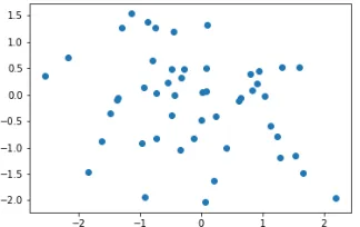
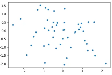
A. Scatter Plot/Regplot/Jointplot
[image:3.612.69.290.76.227.2]This is an example of a two dimensional visualization that shows data points in form of dots. It is an effective plotting method to find the concentration of data points.
Figure 5.1 – Scatter Plot with Matplotlib
[image:3.612.57.274.449.601.2] [image:3.612.323.485.526.628.2]Figure 5.3 – Regplot with Seaborn
Figure 5.4 – Jointplot with Seaborn
For the scatter plot of both the visualization, there is no difference
a clearer view of the data being referred to. In this case Seaborn seems to be more flexible than Matplotlib.
B. Pairplot/Subplot
This is an example of a two dimensional visualization that shows data points in form of dots. It is an effective plotting method to find the concentration of data points.
Figure 6.1 – Subplots with Matplotlib
[image:4.612.317.573.181.350.2]comparison grid which is very easy to study and use. Seaborn seems to be much more flexible in this case providing us with an inbuilt plot type for such requirements.
B. Heat map
It is a very effective plot type where in one can understand the concentration of the data points or the occurrence density around a field of observation. This plot type is used often in the fields of data analysis to understand the correlation of the data values.
Figure 7.1 – Heat map with Matplotlib
Figure 7.3 – Heat map with Seaborn
When the same dataset is filled into the plots, the heat map generated by Matplotlib is not very detailed, when set to default conditions whereas in Seaborn the data is more presentable and more detailed. Seaborn provides us with a color bar by default making the data easily understandable for the user.
V. CONCLUSION
Matplotlib and Seaborn are both very effective libraries for visualizing data with Python. These libraries provide a quick and simple visualization but when it comes to accurate, precise and comprehensive visualization, Seaborn takes the edge providing every minor detail to understand what the dataset represents. Seaborn built on top of Matplotlib but can do quite amazing things in the field of visualization – Matplotlib works more as “bare bones” visualization tools. Seaborn could be used to create more sophisticated visualizations such as heat maps.
Seaborn requires lesser effort and only a few specifics to be defined to build a pretty and comprehensive plot. With Matplotlib one has to put in the effort of describing all the details which Seaborn provides by default.
REFERENCES [1] Sandro Tosi,“Matplotlib for Python Developers”
[2] Jessica Hamrick,“Creating Reproducible, Publication – Quality Plots with Matplotlib and Seaborn”
[3] Chris Mofitt,“Choosing a Python Visualization Tool”
[4] Rahul Chauhan,“Performance Analysis of MySQL in PHP, Java and Python”
[5] Rahul Chauhan,“A comprehensive comparison of SQL and MongoDB databases.”
AUTHORS
First Author – Arnav Oberoi, B-Tech(CSE) The NorthCap University