Munich Personal RePEc Archive
Assessing the Targeting Performance of
Social Programs: Cape Verde
Angel-Urdinola, Diego and Wodon, Quentin
World Bank
January 2008
Online at
https://mpra.ub.uni-muenchen.de/11072/
Budget constraints faced by governments in developing countries imply that effectively targeting performance of public subsidies and social pro-grams (whether the subsidies are provided in cash or in kind) is impor-tant in reducing poverty. There are three main advantages to effective tar-geting. First, for programs not intended to offer universal coverage, better targeting helps reduce program outlay because there are fewer benefici-aries. Second, for any given level of outlay, better targeting suggests that the share of public expenditure that accrues to poor people typically will be higher and so will enable the programs to have a larger impact on poverty. Third, targeting may help reduce the potential negative incentive effects or distortions in economic behavior associated with transfers if fewer households are affected by the programs. For example, if fewer households benefit from subsidized water or electricity service, there will be less incentive to consume more than would be consumed normally if the full cost of the service were paid by the household. Too much target-ing, however, can produce negative incentive effects. In some industrial countries, transfers may lead to poverty traps whereby the incentives for some households to emerge from poverty are lessened by high implicit taxation rates associated with increased income and decreased transfers.
Assessing the Targeting Performance
of Social Programs
Cape Verde
In this chapter, our objective is not to discuss the incentive effects asso-ciated with social programs; rather, we intend to document the incidence or distributional properties of the programs under way in Cape Verde, a group of islands off the West African coast in the North Atlantic Ocean, and to analyze whether some systems of targeting could help improve targeting performance.1
According to the Cape Verde poverty report prepared by the World Bank (2005), public transfers in Cape Verde represent, on average, be-tween 5 percent and 13 percent of household income, depending on the consumption quintile to which a household belongs. Most social public spending is invested for education, health care, and pensions. As a result, school enrollment rates are high and the country has been successful in eradicating most communicable diseases and in achieving the best per-formance levels for basic indicators among sub-Saharan African countries.2 Cape Verde, however, needs to improve the efficiency of its spending because of budget constraints. The demands for education and health care have increased, with nearly universal access to primary education trans-lating into a higher demand for secondary and tertiary education. Unit costs per student in primary school increased from $60 in 1993 to $128 in 2000. The increase at the secondary level was even larger, from $125 in 1993 to $334 in 2000 (World Bank 2005). Estimates suggest that the an-nual unit cost for a student in tertiary education circa 2004–05 could be as high as $2,000 (because of investment in new university facilities and study-abroad programs promoted by the government).
Because overall life expectancy is high, the health care system faces the challenge of providing subsidized and affordable medical care to a grow-ing and aggrow-ing population in need of expensive and complicated treat-ments. Government expenditures on pensions also are substantial and the financial situation of the contributory pension system is not sustainable in the long run (see World Bank 2007).
Beyond an analysis of the incidence of public spending in Cape Verde, we also provide a framework for analyzing the factors that determine the targeting performance of social programs and transfers. Whereas most in-dicators of benefit incidence are silent as to why subsidies are targeted the way they are (that is, the indicators give only an idea of subsidies’ targeting performance),3we develop a simple decomposition that enables an analy-sis of both “access” and “subsidy design” factors that affect subsidies’ over-all targeting performance. Finover-ally, we explore the potential for more effec-418 Public Finance for Poverty Reduction
tive targeting of social programs in Cape Verde by comparing the target-ing performance that could be achieved either under a proxy means-test-ing system or under a geographic targetmeans-test-ing system based on a poverty map recently completed.
To sum up, to increase efficiency and limit costs, efforts must be made to allocate resources to those segments of the population that most need them. In this chapter, we analyze how public transfers are targeted using data from a 2001–02 national household survey, and study the incidence and coverage of public transfers. Because incidence analysis does not ex-plain the rationale behind resource allocation, we look at the determi-nants of the system’s targeting performance following a framework devel-oped by Angel-Urdinola and Wodon (2007). We also discuss alternative targeting mechanisms to improve performance.
Incidence of Public Transfers and Targeting Performance
This section provides an analysis of the incidence and coverage of public transfers in Cape Verde, using data from the Inequérito às Despensas e
Re-ceitas Familiareshousehold survey conducted by Cape Verde’s Ministry
of Finance and the National Institute for Statistics during the last trimester of 2001 and the first trimester of 2002. The survey collected general information on households and individuals (including data on de-mographics, education, assets, and health) and comprehensive informa-tion on income and expenditures. The stratified sample included 4,584 households (44 percent from rural areas) and was representative of the total population (approximately 95,257 households).
Our analysis covers all public transfers that could be identified in the household survey. Public spending for primary, secondary, and tertiary edu-cation is considered, as are outlays for public pensions (that is, reform pen-sions, which are traditional penpen-sions, and minimum penpen-sions, which target poor people).4The survey also included information on school stipends (bolsas de estudo), other public subsidies (abonoes e subsídios diversos), and social assistance (prestações de assistência social pelas administrações publicas em género).
in the case of Sierra Leone, when this assumption is not verified, it typi-cally is because poor people benefit more than nonpoor people from lower-cost (and lower-quality) services. This means that the estimates of in-kind benefits accruing to the poor from the use of publicly provided services, as presented here, are probably overstated.
To present and visualize our results on the incidence of public transfers, we first rely on a diagram that provides three sources of information at once (figure 13.1). The three indicators are the percentage of the poor pop-ulation that benefits from any given income source, the percentage of the total income from a source that is received by the poor, and the size of the income source (that is, the total income from the source obtained by the population as a whole). Here are the key results portrayed in the figure:
• Sizes of various transfers: Primary, secondary, and tertiary education; health care; and reform pensions all represent large public transfers to households (pensions are not purely public transfers, however; they are partly private contributions because workers have contributed to the pension scheme). Outlays for minimum pensions, school stipends, so-cial assistance, and other public subsidies are much smaller.
[image:5.432.62.371.108.295.2]420 Public Finance for Poverty Reduction
Figure 13.1. Incidence and Coverage of Remittances/Private Transfers, 2001–2002
Source:Authors’ estimates. 1.0
0.7
0.4
0.1
–0.2
re
ach among the poor (% of the poor who benefit fr
om the sour
ce
)
0 0.25 0.50 0.75 1.00
targeting to the poor (% of total transfer from the source received by the poor)
perfect transfer primary education
secondary education
health care reform
pensions
public study fund minimum pension
public subsidies tertiary education
social assistance
• Coverage:For primary and secondary education and for health servic-es, coverage levels are fairly high. For other transfers, coverage levels are in the 10–15 percent range or even lower. For example, coverage of tertiary education among the poor is virtually zero.
• Targeting:Given that poor people represent 36.7 percent of the coun-try’s population,5a lower share than 36.7 percent would mean that, relative to their population size, poor people benefit less from trans-fers than does the population as a whole. As expected, the targeting in-dicators are more favorable for primary education than for secondary education and health, with virtually none of the spending on tertiary education benefiting the poor. The share of reform pension outlays that reaches the poor also is minimal. About a third of the outlays for the minimum pension schemes do reach the poor, but poor people still receive a lower share of these outlays relative to their proportion of the total population. That suggests weaknesses in the targeting system for these pensions. About 40 percent of social assistance outlays reach the poor, but the targeting indicator is lower for other public subsidies and schooling stipends.
• Eradication of poverty:The large bubble on the upper right corner on Fig-ure 13.1 represents the size of a perfectly targeted transfer that would be sufficient to eradicate poverty (the coverage among the poor would be 100 percent, as would be the targeting among the poor, since the transfer would provide to each poor household exactly what is needed to lift the household to the poverty line). Pooling the resources from var-ious types of cash transfers could go a long way in reducing poverty if all these resources were better targeted to the poor. Aiming for perfectly targeted transfers is obviously difficult in most cases (such as reform pensions, which are meant to replace income lost by retirement), and we do not recommend it because many of the transfers are meant to cover a larger population than the poor. Still, overall, only a small portion of the transfers typically reach poor people so the effect of those transfers on the reduction of poverty is relatively limited.
Following Angel-Urdinola and Wodon (2007), another way to look at benefit incidence is to define a simple indicator of targeting performance,
Ω, which is the share of the subsidy benefits received by the poor (SP/
SH, where SPdenotes the value of all subsidies accruing to the poor and
whole) divided by the proportion of the population in poverty (P/H, where Pdenotes the number of poor households or individuals and H de-notes the number of households in the overall population. In mathemati-cal notation, we have
Ω=Sp Sh . (13.1)
P
兾
HA value of 1.00 for Ωimplies that the subsidy distribution is neutral, with the share of benefits going to the poor proportional to their popu-lation share. A value above (below) 1.00 for Ωimplies that the subsidy distribution is progressive (regressive): the poor receive a larger (small-er) share of the benefits than their population share. The smaller the number, the more regressive it is—and vice versa.
In our analysis, we also provide data on the public transfer allocations’ errors of exclusion. An error of exclusion occurs when a poor household does not benefit from a subsidy. Denoting by Bpthe proportion of house-holds who get the public transfer (that is, the beneficiary incidence or coverage level among the poor mentioned in the discussion of figure 13.1), the share of poor households excluded from the subsidy is
Error of exclusion = 1 – Bp. (13.2)
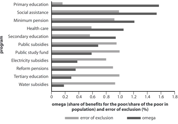
Figure 13.2 displays the value of the targeting performance indicator,Ω,
as well as the errors of exclusion for the public transfers described above and for subsidies for the consumption of water and electricity (these val-ues are obtained from Angel-Urdinola and Wodon 2007). As before, the results suggest that public transfers related to primary education, social assistance, minimum pensions, and health care are the most pro-poor (that is, the value of Ωis greater than 1). With the exception of primary education and, to some extent, health care, however, program coverage is very limited because the errors of exclusion are often high. Other public transfers (secondary education, the public study fund that provides grants for schooling, electricity and water subsidies, reform pensions, and terti-ary education) display values of Ωlower than 1, suggesting that resources are allocated more heavily to nonpoor households than to poor house-holds. Most of the programs with low values for Ωalso have very limited coverage, as suggested by their high errors of exclusion.
422 Public Finance for Poverty Reduction
Factors That Determine Targeting Performance
The data presented above suggest that many poor households in Cape Verde do not receive a range of public transfers and that the values of the targeting performance indicators Ωare often lower than 1. As Angel-Urdinola and Wodon (2007) described in detail for the case of water and electricity subsidies, there may be both “access” and “subsidy design” fac-tors that contribute to low targeting performance and poor coverage.
[image:8.432.61.373.101.318.2]Access factors can de divided into physical access (A) and usage or “take up” of subsidies or services (U). Let AHrepresent the share of all house-holds having physical access to (or being eligible for) a transfer or service. For example, access to primary education is available only in communities or geographic areas where there are schools. Given access, let UH|Abe the share of households who have physical access to a public transfer or service and choose to use it or are eligible for it (this could not occur, for instance, if parents do not send their children to school because they can’t afford the fees or if eligible households do not receive a cash transfer to which they are entitled because they lack information about the program).
Figure 13.2. Indicators of Targeting Performance
Source:Authors’ calculations.
omega (share of benefits for the poor/share of the poor in population) and error of exclusion (%)
0 0.2 0.4 0.6 0 .8 1.0 1.2 1.4 1.6 1.8
pr
ogr
a
m
Primary education
Social assistance
Minimum pension
Health care
Secondary education
Public subsidies
Public study fund
Electricity subsidies
Reform pensions
Tertiary education
Water subsidies
Subsidy design factors are those that determine the final distributional incidence of the transfer, once we know who could benefit from the sub-sidy or transfer because the household has access to it and is using the service. A first subsidy design factor is the targeting mechanism used.TH|U
is defined as the share of households among those using a service that ac-tually get the public transfer (that is, the beneficiary population among the population that potentially can benefit from the transfer because it has access and is using the service).
A second subsidy design factor is the rate of subsidization,R.Denote the average unit cost of the service by C(such as the average annual unit cost per student in primary school).Cis assumed to be constant across all households. The total cost of serving a customer is a function of Cand of the quantity consumed (or the number of beneficiaries using the serv-ice), denoted by Q.If the average quantity consumed by subsidy recipi-entsis QH|T,and the average private expenditure on the good (such as co-payments for health care or education) is denoted by EH|T,then the average rate of subsidization is RH|T= 1 – EH|T/ (QH|T* C). As shown in Angel-Urdinola and Wodon (2007), the parameter Ωcan be described as a product of five ratios, as follows (denoting by Pthe poor):
Ω= AP ✕ UP|A ✕ TP|U ✕ RP|T ✕QP|T. (13.3)
AH UH|A TH|U RH|T QH|T
The first two ratios represent the service access rate among the poor di-vided by the access rate among the population as a whole, followed by the usage rate for a service (given access) for the poor compared with the rate for the population as a whole. Typically, one would expect that the ratio of access rates (A) would be lower than 1 because the poor tend to live in areas with lower access to public transfers and services than the popula-tion as a whole. Similarly, one would expect that the ratio of the usage rates for transfers and services (U) would be lower than 1 because a lack of information and, perhaps, a lack of funds makes poor people less likely to use public services than is the population as a whole where there is ac-cess. This “access-factors handicap” can be expected to work against the targeting of public transfers to the poor. Subsidy design factors will need to overcome the access handicap if the distribution of transfers is to be progressive, so that the value of Ωis larger than 1. This result could be ob-served among others if targeting is good (among those using the service, the poor are more likely to receive the public transfer than is the popula-424 Public Finance for Poverty Reduction
tion as a whole), if the unit reduction in price versus full cost received by the poor is larger than for the nonpoor, or if the poor are likely to con-sume more of the good than is the population as a whole when they have been found eligible for the transfer (for example, the poor may have more children enrolled in public schools than does the total population).
Table 13.1 provides the results of the above Ωdecomposition to ex-plain in more detail the key determinants of targeting performance for the various public transfers observed in Cape Verde’s household survey. For primary education and health care, which present values of Ωgreater than 1, access generally is high among the poor (that is,APis close to 1 in both cases), and usage rates are larger among the poor (that is,UP|A>
UH|A). The latter finding probably arises because richer households can afford to choose to use private services for either education or health care. We find, for instance, that usage rates for primary education are 10 per-centage points higher than average among poor households, and rates for health care are 3 percentage points higher. As expected, overall usage rates for education are higher than for health care (78–87 percent versus 35–38 percent) because households are more likely to have children in the education system than to have a member (presumably sick) actively using health services. In terms of quantity consumed, we find that the Q
ratios for primary education and health care are close to 1. For education, the Qratio is slightly above 1 for education because, on average, poor households are larger and thus more likely to have more children using education services on a yearly basis (thus,QP|T= 2.03 > QH|T= 1.75). For health care, the ratio is slightly below 1, which is not surprising because richer households usually have a higher average of effective health con-sultations per household each year (QP|T= 33.6 < QH|T= 34.22; these val-ues are high because the number of recent visits is annualized). For sec-ondary education, the value of Ωis also slightly lower than 1, mainly stemming from a high Qratio (QH|T= 1.6 > QP|T = 1.5), which results from nonpoor households tending to have more children in secondary school. Users of minimum pensions and social assistance programs, which also display a value for Ωgreater than 1, generally are poor households, and thus AP* UP> AH* UH. Qratios for these two programs, on the con-trary, are usually lower than 1, which suggests that, on average, richer households receive larger nominal benefits than do poor households.
426
Table 13.1. Decomposition of Determinants of Public Transfers Performance
Ratio of share Ratio of share
of households with of households Ratio of share of Ratio of Ratio of Unit cost community access with access users who receive subsidization average quantity (CVEsc) Program to service (A) who use service (U|A) subsidy (T|U) (R|T) consumed (Q|T) (C)
Water subsidies
Poor households 0.52 0.20 1.00 0.40 3.36 350 All households 0.65 0.41 1.00 0.33 6.37 350
Ratio 0.79 0.49 1.00 1.19 0.53 350
Electricity subsidies
Poor households 0.72 0.34 1.00 0.11 56.83 20.5 All households 0.82 0.54 1.00 0.06 111.72 20.5
Ratio 0.88 0.63 1.00 1.70 0.51 20.5
Primary education
Poor households 1.000 0.877 1.000 1.000 2.032 31,370 All households 1.000 0.780 1.000 1.000 1.751 31,370 Ratio 1.000 1.124 1.000 1.000 1.160 31,370
Secondary education
Poor households 0.984 0.399 1.000 1.000 1.514 27,552 All households 0.993 0.408 1.000 1.000 1.581 27,552 Ratio 0.991 0.978 1.000 1.000 0.958 27,552
Tertiary education
Poor households 0.163 0.034 1.000 1.000 1.432 412,386 All households 0.272 0.091 1.000 1.000 1.106 412,386 Ratio 0.599 0.374 1.000 1.000 1.295 412,386
427
All households 0.994 0.358 1.000 1.000 34.215 1,743 Ratio 0.999 1.085 1.000 1.000 0.983 1,743
Program (A x U) (T|U) (R|T) (QC|T)
Reform pensions
Poor households 0.097 1.000 1.000 65,269.64 All households 0.102 1.000 1.000 175,155.30
Ratio 0.954 1.000 1.000 0.373
Subsidies
Poor households 0.049 1.000 1.000 28,892.04 All households 0.071 1.000 1.000 29,415.58
Ratio 0.690 1.000 1.000 0.982
Public study fund
Poor households 0.006 1.000 1.000 115,597.60 All households 0.010 1.000 1.000 126,327.50
Ratio 0.638 1.000 1.000 0.915
Social assistance
Poor households 0.013 1.000 1.000 24,545.98 All households 0.006 1.000 1.000 32,721.84
Ratio 2.039 1.000 1.000 0.750
Minimum pension
Poor households 0.070 1.000 1.000 31,734.90 All households 0.047 1.000 1.000 38,888.40
Ratio 1.486 1.000 1.000 0.816
Source:Authors’ calculations.
useful to learn why this is true by examining the various subprograms in this category.6In any case, contrary to what we observed for minimum pensions, users of these various programs and transfers are more likely to be nonpoor households and thereby AP *UP< AH *UH). Furthermore,
Qratios for these programs are lower than 1, which suggests that richer households receive greater benefits, on average. As for utility services, low
Ωvalues for electricity and water subsidies result from a combination of different subsidy rates and quantities consumed by poor and nonpoor households. Although the rate of subsidization is greater for poor house-holds than for all househouse-holds (RP|T= 0.11 versus RH|T= 0.06), the aver-age quantity (in kilowatt hours) consumed per month by poor house-holds connected to the network is less than half the quantity consumed in the population as a whole (QP|T= 49.31 versus QH|T= 111.72). Indeed, because the system provides greater subsidies to households that con-sume less (the country implemented an inverted block tariffs scheme), this difference in consumption levels explains why the energy bills of poor households are more discounted than bills of other households. However, nonpoor households still receive a larger subsidy each month than do the poor households because they consume more electricity and almost all of their consumption is subsidized to some degree: the product of RP|T/ RN|T* QP|T/ QN|Tis 0.81.7
Improving Targeting Performance
Targeting is a relevant subsidy factor for improving the allocation of re-sources so that they become more beneficial for poor people. There are several targeting mechanisms that policy makers can design to define cri-teria for public transfer eligibility. Some of the more widely used mecha-nisms are geographic targeting (whereby benefits are allocated in locali-ties with high concentrations of poverty), quantity targeting (through which benefits are allocated to users who consume smaller quantities of service), and proxy means testing (whereby benefit allocations are based on the prediction of a household’s poverty level, reflected by certain visi-ble characteristics). Targeting mechanisms are well designed to the extent they provide more accurate predictions of which households are poorer (and therefore in greater need of public transfers). In this section, we an-alyze the predictive power of means-testing and geographic mechanisms. 428 Public Finance for Poverty Reduction
Proxy Means Testing to Predict Household Poverty
Proxy means-testing mechanisms rely on a method of predicting house-hold welfare based on visible characteristics. Like the other targeting methods, proxy means testing may be used in combination with quantity targeting or may be the sole basis for identifying subsidy beneficiaries.
To design a proxy means-testing mechanism, we relied on linear regres-sions to predict household welfare. In particular, we used the natural log of per capita expenditure as the dependent variable, and we controlled for household characteristics that may predict per capita consumption and that are easily verifiable by a social worker. These household-level vari-ables include the log of the household size (to allow for nonlinearity), whether the household head is female, the age of the head and the age squared, the literacy and education levels of the head (the excluded cate-gory is a household head who has no education), and other infrastructure variables (for example, household access to electricity, piped water, and a toilet; and a household dwelling’s type of walls, floor, and ceiling). We also included a vector of geographic variables (a set of geographic dummies for every island) and dummies reflecting whether households possess a series of assets (television, radio, telephone, oven, refrigerator, washing machine, bicycle, motorcycle, and other motor vehicles). To maximize the predictive power of our regression, we relied on stepwise estimation. This method en-sures that the set of available variables included in our model provides the highest possible fit as measured by the R2. When the model was estimated, we generated a predictor of the dependent variable. Additionally, we creat-ed a dummy variable (poor) that takes the value of 1 if the “observed” value of household per capita consumption is below the official poverty line (equivalent to CVEsc 43,249.8 per capita annually), and a second dummy (predicted poor) that equals 1 if the “predicted” value of the household’s per capita consumption fulfills the same condition.
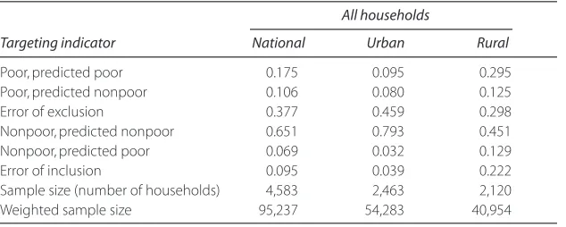
In Cape Verde, 28.1 percent of all households are poor. As shown in table 13.2, our model rightly predicted as “poor” 17.5 percent of the ac-tual 28.1 percent, and it wrongly predicted the remaining 10.6 percent (therefore, the Type I error is equivalent to approximately 38 percent, as a share of the predicted poor). Table 13.2 presents similar results for ur-ban and rural areas. The Type I error is 46 percent in urur-ban areas and 30 percent in rural areas. Although the share of incorrectly predicted poor households is somewhat high, more information should be collected be-fore making a judgment of the model. In particular, the model still could be considered a good one to the extent that most of the households mis-predicted as poor are borderline nonpoor households (that is, they are only marginally above the poverty line). Furthermore, by changing the poverty line, the magnitude of the errors also change. We will conduct more de-tailed analyses of this issue below. The Type II error of the model, meas-ured by the poor households predicted to be nonpoor, is approximately 10 percent nationwide (4 percent in urban and 22 percent in rural areas).
[image:15.432.60.377.95.222.2]We provide a more detailed analysis of the errors of inclusion and ex-clusion by using a prediction matrix based on population decile (rather than on household decile) of per capita consumption (table 13.3). Cape Verde’s 28.1 percent poor households are equivalent to 36.7 percent of the population (25 percent urban and 51 percent rural). For simplicity’s sake in identifying the poor population, we used the third, fourth, and fifth deciles of per capita consumption (weighted by the population weights) as our new poverty lines at the urban, national, and rural levels, respectively. According to the matrix, errors of exclusion are 10.0 per-430 Public Finance for Poverty Reduction
Table 13.2. Errors of Exclusion and Inclusion in a Proxy Means-Testing Model
All households
Targeting indicator National Urban Rural
Poor, predicted poor 0.175 0.095 0.295 Poor, predicted nonpoor 0.106 0.080 0.125 Error of exclusion 0.377 0.459 0.298 Nonpoor, predicted nonpoor 0.651 0.793 0.451 Nonpoor, predicted poor 0.069 0.032 0.129 Error of inclusion 0.095 0.039 0.222 Sample size (number of households) 4,583 2,463 2,120 Weighted sample size 95,237 54,283 40,954
Source:Authors’ calculations.
431
100
Per capita Error of
expenditure decile 1 2 3 4 5 6 7 8 9 10 inclusion National
1 4.48 2.54 1.73 0.70 0.35 0.14 0.05 0.02 0.01 0.00 0.57 2 2.52 2.43 1.99 1.36 1.04 0.46 0.15 0.04 0.00 0.00 1.69 3 1.46 1.67 1.90 2.22 1.18 0.84 0.42 0.28 0.01 0.00 2.73 4 0.38 1.07 1.52 1.99 1.63 1.57 1.27 0.45 0.13 0.00 5.05 5 0.57 0.89 1.26 1.53 1.78 1.69 0.93 1.03 0.25 0.03 0.00 6 0.42 0.70 0.67 0.92 1.67 1.76 2.15 0.99 0.71 0.03 0.00 7 0.13 0.20 0.37 0.67 0.98 1.77 1.63 2.21 1.68 0.35 0.00 8 0.03 0.37 0.31 0.38 0.94 0.95 1.96 2.18 2.14 0.73 0.00 9 0.00 0.10 0.16 0.15 0.31 0.39 1.15 2.11 3.41 2.24 0.00 10 0.00 0.02 0.10 0.08 0.14 0.41 0.29 0.68 1.66 6.60 0.00 Error of exclusion 1.15 2.28 2.87 3.73 0.00 0.00 0.00 0.00 0.00 0.00
Urban areas
1 5.93 2.55 0.96 0.48 0.26 0.00 0.01 0.01 0.00 0.00 0.76 2 2.38 2.84 2.29 1.13 0.74 0.31 0.17 0.00 0.00 0.00 2.35 3 0.50 2.11 1.97 2.36 1.59 0.92 0.31 0.10 0.06 0.00 5.34 4 0.77 0.98 2.04 1.74 1.35 1.79 0.96 0.34 0.08 0.00 0.00 5 0.16 0.91 1.13 1.29 2.03 1.53 1.69 0.92 0.31 0.00 0.00 6 0.20 0.10 0.85 1.24 1.21 1.70 1.91 1.92 0.78 0.15 0.00 7 0.10 0.38 0.44 1.01 1.36 1.61 2.01 1.67 1.17 0.15 0.00
continued on next page
[image:16.432.65.563.77.354.2]432
Table 13.3,continued
100
Per capita Error of
expenditure decile 1 2 3 4 5 6 7 8 9 10 inclusion Urban areas
8 0.00 0.12 0.16 0.40 0.77 1.65 1.43 2.86 1.98 0.64 0.00 9 0.00 0.00 0.14 0.24 0.43 0.43 1.09 1.78 3.52 2.38 0.00 10 0.00 0.00 0.00 0.11 0.27 0.04 0.45 0.39 2.14 6.61 0.00 Error of exclusion 1.23 2.49 4.76 0.00 0.00 0.00 0.00 0.00 0.00 0.00
Rural areas
1 4.20 1.86 1.35 0.87 0.94 0.37 0.23 0.17 0.02 0.04 0.83 2 2.11 1.54 1.88 1.41 1.32 0.71 0.58 0.40 0.00 0.02 1.71 3 1.79 1.51 1.88 1.24 0.94 1.29 0.67 0.51 0.14 0.06 2.67 4 0.87 1.34 1.70 1.15 1.38 1.29 0.85 0.63 0.55 0.22 3.54 5 0.38 1.11 0.94 1.29 1.56 1.40 1.31 1.39 0.46 0.22 4.78 6 0.48 0.95 0.91 0.97 1.28 1.46 1.48 1.05 1.20 0.21 0.00 7 0.24 0.95 0.53 0.89 0.82 1.24 1.32 1.66 1.70 0.59 0.00 8 0.00 0.56 0.63 1.08 0.62 0.75 1.44 1.48 2.08 1.37 0.00 9 0.00 0.12 0.11 0.55 0.83 0.90 1.58 1.88 2.14 1.90 0.00 10 0.00 0.00 0.14 0.49 0.28 0.59 0.56 0.82 1.76 5.32 0.00 Error of exclusion 0.72 2.58 2.32 3.98 3.83 0.00 0.00 0.00 0.00 0.00
Source:Authors’ estimates.
Note:Values in cells indicate share of the total population.The shaded areas in the matrix account for the errors of inclusion or exclusion.
cent, 8.5 percent, and 13.5 percent at the national, urban, and rural lev-els, respectively. Almost half of the individuals excluded (poor but pre-dicted nonpoor) are borderline poor. The magnitude of the errors of in-clusion is similar to that of the errors of exin-clusion. Most of the nonpoor households “wrongly” predicted are also borderline nonpoor (that is, they are only a little above the poverty line).
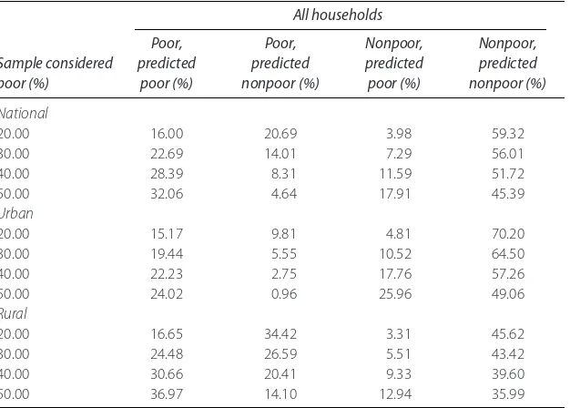
[image:18.432.62.375.343.567.2]Now we turn to exploring how sensitive the prediction model is to the choice of poverty line. To do so, we ranked our welfare predictor from the lowest to the highest. Using household weights and size (and conserving the ranking), we calculated the share of the total population represented by each household in the survey. We defined as “predicted poor” all households below our choice of poverty line (we used 20, 30, 40, and 50 percent of the cumulative population distribution of the predictor, respectively). The real “poor” (approximately 37 percent) are those households with observed per capita incomes below the official poverty line—that is, below CVEsc 43,249.8 per capita annually. Our results are summarized in table 13.4.
Table 13.4. Means-testing Performance under Different Poverty Lines
All households
Poor, Poor, Nonpoor, Nonpoor,
Sample considered predicted predicted predicted predicted
poor (%) poor (%) nonpoor (%) poor (%) nonpoor (%)
National
20.00 16.00 20.69 3.98 59.32 30.00 22.69 14.01 7.29 56.01 40.00 28.39 8.31 11.59 51.72 50.00 32.06 4.64 17.91 45.39
Urban
20.00 15.17 9.81 4.81 70.20 30.00 19.44 5.55 10.52 64.50 40.00 22.23 2.75 17.76 57.26 50.00 24.02 0.96 25.96 49.06
Rural
20.00 16.65 34.42 3.31 45.62 30.00 24.48 26.59 5.51 43.42 40.00 30.66 20.41 9.33 39.60 50.00 36.97 14.10 12.94 35.99
As suggested in table 13.4, using a cutoff point of 40 percent of the predicted poor (the benchmark case because the actual poverty rate is 37 percent), the model gives a good prediction of poor households, espe-cially in urban areas. Urban poverty predictions are more accurate mainly because urban households show a larger dispersion in terms of consump-tion as well as asset levels than do rural households, which increases the power of the proxy means-testing mechanism. Using higher (lower) cut-off points results in a higher (lower) share of the actual “poor” being pre-dicted poor, especially in urban areas. Of course, a higher (lower) cut-off point increases (decreases) the probability that the model fails to exclude nonpoor households from the targeted program. That may contribute to an overinvestment (underinvestment) of social funds because the percent-age of nonpoor households predicted to be poor becomes larger (smaller).
Geographic Targeting to Predict Household Poverty
Using census data and the Cape Verde poverty map (which predicts per capita expenditure for all households included in the census), we ranked all districts in the country, from the one with the highest average poverty rate to the one with the lowest rate. We then calculated the overall popu-lation share in every district. Keeping the rank constant, we calculated the cumulative population distribution. All households belonging to the provinces below 20, 30, 40, and 50 percent of the population distribution were predicted as “geographically poor.”
As suggested by table 13.5, geographic targeting, like proxy means test-ing, has a better predictive power in urban than in rural areas. By imple-menting this method and assuming poverty rates of 20, 30, 40, and 50 percent of the population, respectively, we could predict correctly only 28 percent of the poor households in rural areas (versus 47 percent in ur-ban areas), 40 percent (versus 61 percent), 51 percent (versus 72 per-cent), and 62 percent (versus 82 percent). This result is not surprising be-cause the urban poor population usually is concentrated in slum districts, whereas poor households are more widely dispersed in rural districts.
As table 13.6 suggests, proxy means testing offers a better targeting mechanism than does geographical targeting at the national, urban, and rural levels when all households in the survey and census are included in the analysis. This is true because both the errors of inclusion and the er-rors of exclusion are smaller using proxy means-testing mechanisms than using geographic targeting methods in all scenarios. This is to be expected 434 Public Finance for Poverty Reduction
because the proxy means-testing model controls not only for locality fac-tors but also for other variables that predict welfare, such as type of hous-ing characteristics and demographics.
Conclusion
[image:20.432.64.371.95.320.2]Cape Verde spends heavily on public transfers, especially for health care, education, and pensions. Although large government spending in the so-cial sectors has made the country one of the best performers in West Africa regarding the delivery of services in those sectors, the system needs to improve the efficiency of its spending to ensure its sustainability. The country’s expenditures on primary education and health care constitute a large share of overall public transfers in nominal terms, and they are quite pro-poor. However, other components of the social protection network (such as pensions, public subsidies, public study funding, utility subsidies, and higher education) are not reaching the poor adequately.
Table 13.5. Geographic Targeting Using Census Data
All households
Poor, Poor, Nonpoor, Nonpoor,
Sample considered predicted predicted predicted predicted
poor (%) poor (%) nonpoor (%) poor (%) nonpoor (%)
National
20.00 14.26 21.91 5.72 58.11 30.00 20.01 16.16 9.89 53.93 40.00 24.96 11.22 14.88 48.95 50.00 28.92 7.26 20.94 42.89
Urban areas
20.00 8.88 10.10 11.00 70.03 30.00 11.54 7.44 18.28 62.75 40.00 13.77 5.21 26.02 55.01 50.00 15.55 3.42 15.55 46.84
Rural areas
20.00 15.47 40.55 4.52 39.46 30.00 22.21 33.82 7.68 36.30 40.00 28.59 27.43 11.30 32.67 50.00 34.55 21.48 15.34 28.63
Source:Authors’ calculations.
The targeting performance of public transfers in Cape Verde has a natu-ral distributional handicap because poor households usually have an access disadvantage: they are limited in access to infrastructure and information, and they still cannot afford the services. To overcome this handicap, policy makers must pay attention to the performance of subsidy-design factors (such as targeting mechanisms and rates of subsidization). Results for Cape Verde indicate that, apart from primary education and health care (services with high rates of access and use among poor people), public transfers are not being allocated in a pro-poor manner because of a combi-nation of disadvantageous access factors among the poor and poorly per-forming design factors (especially involving targeting mechanisms).
[image:21.432.59.372.94.334.2]Finally, proxy means testing generally has better predictive power than does geographic targeting, especially in rural areas where poverty is wide-spread. In urban areas, the predictive advantage of means testing over ge-ographic targeting is lower, probably because urban poverty is concentrat-436 Public Finance for Poverty Reduction
Table 13.6. Geographical Targeting Versus Proxy Means Testing
Geographical targeting Proxy means testing
using census using survey
Share of the sample Error of Error of Error of Error of
considered poor (%) inclusion (%) exclusion (%) inclusion (%) exclusion (%)
Full sample Full sample
National
20 28.63 27.38 19.92 25.86 30 33.08 23.06 24.32 20.01 40 37.35 18.65 28.99 13.84 50 42.00 14.48 35.84 9.27
Urban areas
20 55.33 12.60 24.07 12.26 30 61.30 10.60 35.11 7.92
40 65.39 8.65 44.41 4.58
50 50.00 6.80 51.94 1.92
Rural areas
20 22.61 50.68 16.58 43.00 30 25.69 48.23 18.37 37.98 40 28.33 45.64 23.33 34.01 50 30.75 42.87 25.93 28.15
Source:Authors’ estimation.
Note:The actual “poor” under means testing are defined as those households having per capita consumption below CVEsc 43,249.8 annually (the official poverty line).
ed in slums. This poses a natural trade-off because policy makers con-strained by tight budgets may choose to implement geographic targeting, even when it sacrifices some predictive power.8
Notes
1. There is a large body of literature in this area. Several studies have been devot-ed to assessing the targeting performance of a wide range of programs in devel-oping and transition economies (for example, Grosh 1994; Subbarao et al. 1997; Braithwaite, Grootaert, and Milanovic 2000; and Coady, Grosh, and Hoddinott 2004). In the case of utilities such as water and electricity, although subsidies are very widespread, it is not clear that they are well targeted (Wodon, Ajwad, and Siaens 2003; Komives et al. 2005; Angel-Urdinola, Cos-grove-Davies, and Wodon 2006; and Angel-Urdinola and Wodon 2007). This finding is problematic given that utility subsidies in developing and transition economies often are more costly than other transfer programs (Alderman 2002).
pri-marily elderly people and families in economic distress who are not covered under other pension schemes.
5. Following the methodology used by the National Institute of Statistics in Cape Verde, a household is considered poor if its annual per capita consump-tion falls below the official poverty line (equivalent to CVEsc 43,249.8 per capita a year). With that poverty line, 36.7 percent of the population is poor (equivalent to 28.0 percent of households).
6. Unfortunately, the requisite information for such a study is not included in the survey data.
7. For a more detailed discussion on the targeting performance of utility tariffs in Cape Verde, see Wodon et al. (2007).
8. The cost of implementing proxy means testing is usually higher because it re-quires the involvement of social workers and the use of data processing.
References
Alderman, Harold. 2002. “Subsidies as a Social Safety Net: Effectiveness and Chal-lenges.” Social Safety Net Primer Series, Discussion Paper 0224 World Bank, Washington, DC.
Angel-Urdinola, Diego, M. Cosgrove-Davies, and Q. Wodon. 2006. “Rwanda: Elec-tricity Tariff Reform.” In Poverty and Social Impact Analysis of Reforms: Lessons and Examples from Implementation,ed. Aline Coudouel, A. Dani, and S. Pater-nostro, 235–56. Washington, DC: World Bank.
Angel-Urdinola, Diego, and Quentin Wodon. 2007. “Do Utility Subsidies Reach the Poor? Framework and Evidence for Cape Verde, Sao Tome, and Rwanda.”
Economics Bulletin94 (4): 1–7.
Braithwaite, Jeanine, C. Grootaert, and B. Milanovic. 2000.Poverty and Social Assis-tance in Transition Countries.New York: Palgrave Macmillan.
Coady, David, M. Grosh, and J. Hoddinott. 2004. “Targeting Outcomes Redux.”
World Bank Research Observer 19 (1): 61–85.
Demery, Lionel. 2003. “Analyzing the Incidence of Public Spending.” In The Impact of Economic Policies on Poverty and Income Distribution: Evaluation Techniques and Tools,ed. Françoise Bourguignon and Luis A. Pereira da Silva, 41–68. Wash-ington, DC: World Bank.
Grosh, Margaret. 1994.Administering Targeted Social Programs in Latin America: From Platitudes to Practice.Washington, DC: World Bank.
438 Public Finance for Poverty Reduction
Komives, Kristin, V. Foster, J. Halpern, Q. Wodon, and R. Abdullah. 2005.Water, Electricity, and the Poor: Who Benefits from Utility Subsidies?Washington, DC: World Bank.
Subbarao, Kalanidhi, A. Bonnerjee, J. Braithwaite, S. Carvalho, K. Ezemenari, C. Graham, and A. Thompson. 1997.Safety Net Programs and Poverty Reduction: Lessons from Cross-Country Experience.Washington, DC: World Bank.
Wodon, Quentin, M. I. Ajwad, and C. Siaens. 2003. “Lifeline or Means Testing? Electric Utility Subsidies in Honduras.” In Infrastructure for the Poor People: Pub-lic PoPub-licy for Private Provision,ed. P. Brook and T. Irwin, 277–96. Washington, DC: World Bank.
Wodon, Quentin, D. Angel-Urdinola, D. Echevlin, M. Francisco, and P. Meier. 2007. “Energy Subsidies, Electricity Tariffs, and the Poor in Cape Verde.” World Bank, Washington, DC.
Wodon, Quentin, and Xiao Ye. 2006. “Benefit Incidence Analysis Adjusted for Needs and Costs: Assessing the Equity of Public Education Spending in Sierra Leone.” World Bank, Washington, DC.
World Bank. 2005. “Cape Verde: Poverty Diagnostic.” Report 32826-CV, World Bank, Washington, DC.