I
nt
er
naonal
Conf
er
ence
f
or
Pr
oceedi
ngs
Sust
ai
nabl
e
Desi
gn
of
t
he
Bui
l
t
Envi
r
onment
SDBE
2017
Edi
t
or
s
Heba
El
shar
kawy
Sahar
Zahi
r
i
J
ack
Cl
ough
Visualization techniques for heterogeneous and multidimensional simulated
building performance data sets
Thomas Jusselme1,4, Raphaël Tuor2, Denis Lalanne2, Emmanuel Rey3 and Marilyne
Andersen1,4
1Building 2050 Research Group, Ecole Polytechnique Fédérale de Lausanne (EPFL), Fribourg,
Switzerland
2Human-IST Institute, University of Fribourg, Fribourg, Switzerland
3Laboratory of Architecture and Sustainable Technologies (LAST), School of Architecture, Civil
and Environmental Engineering (ENAC), Ecole Polytechnique Fédérale de Lausanne (EPFL), Lausanne, Switzerland
4Laboratory of Integrated Performance in Design (LIPID), School of Architecture, Civil and
Environmental Engineering (ENAC), Ecole Polytechnique Fédérale de Lausanne (EPFL), Lausanne, Switzerland
Abstract: The architecture, environment and construction industry is facing, on the one hand, ambitious environmental regulations for low carbon and net zero energy buildings, and on the other hand, the emergence of new techniques such as parametric assessment and cloud computing. As a result, there is a dramatic increase of performance analysis and collected data during the building design phase. However, previous research highlighted major weaknesses of current building performance simulation -BPS- software regarding its ability to represent and explore input and output data, to interact with it, and to extract valuable data patterns and analyses. Therefore, this research aims to identify suitable visualization techniques that might increase the usability and the knowledge extracted from building simulation dataset.
To that end, an interdisciplinary approach has been set up. First, a literature review allowed to characterize the specificities of BPS dataset, namely their heterogeneous nature -discrete, ordinal, categorical, and continuous-, their different correlation levels and their medium size. Second, key tasks that should be performed by BPS tools to support the design process are identified: exploration, solutions generation and evaluation. Then, two data visualization techniques that accept the BPS dataset specificities and that enable to perform these key tasks were selected within the information visualization research field: Decision Tree and Parallel Coordinates. Third, these techniques were applied to an extensive BPS dataset, generated from a series of parametric building simulations based on a high-performance building to be, called the smart living building. Finally, a qualitative comparison between the selected visualization techniques was conducted so as to reveal their strengths and weaknesses. This comparison highlights Parallel Coordinates as the most promising approach.
Keywords: building performance simulation tools, datasets, data visualization, data exploration.
Introduction
The built environment is a major greenhouse gas contributor with 33% of the world emissions (UNEP 2009a, 2009b). Recent international agreements such as the UN Conference on Climate Change in Paris in 2015 (UNFCCC 2015) leads each stakeholder to implement and strengthen their local environmental regulations all over the next century. Therefore, the complexity of these regulations is continually rising, as their targets are more and more ambitious. For instance, the future 2020 European Union directive (EU - EPBD 2010) will require every building to generate more energy than it will consume, that is to say to reach the Net Zero Energy Building -NZEB- level (Sartori et al. 2012). Some countries like France are already working to integrate energy and carbon lifecycle targets in their future regulations (Plan Bâtiment Durable 2014). By doing so, the Architecture, Engineering and Construction industry will have to assess every process and material involved into a building project, and
not only the ones that consume energy during the building operational phase, as was the case so far.
In order to support all these new regulations, the Building Performance Simulation
-BPS- research and development field is playing a key role, by developing new methods and software enabling energy and lifecycle performance to be taken into consideration as early as possible in the design process. During the last decade, many improvements in BPS tools followed a new trend: developing workflows by coupling energy simulation algorithms with other techniques (Østergård et al. 2016). The aim is to support the design process based on
BPS datasets, generated parametrically from a baseline architectural model. Researchers start to consider the dataset exploration itself as a powerful decision making process. A new proactive usage of BPS tools is possible, with the fast creation of design alternatives and their performance assessment and exploration with data visualization techniques -DVT-. The first promising results have been highlighted in previous research (Jusselme et al. 2016, Miyamoto et al. 2015, Naboni et al. 2013).
However, at the same time, the assessment of thousands of variants increases the complexity of data interpretation. A study based on 28 interviews of building performance optimization experts (Attia et al. 2013) highlights that 75% of them do not have a proper graphical user interface -GUI- to process the assessment results, visualize patterns and explore input and output data. Most of the experts develop their own custom script to interpret results, with basic visualization techniques such as Pareto front, scatter plot, line graph, bar chart and time series. From the interviewee point of view, optimization techniques are mostly used to explore the design space of alternative solutions, which is in fact more relevant than finding the best one. Despite this exploration emphasis, one can notice that in Attia’s paper, no cited DVT are dynamic as they do not allow the user to interact with the GUI
in a proactive way. The purpose of the present paper is specifically to bridge different research fields that have not really been connected so far: the BPS engineering and the data visualization domain. Which would be the suitable DVT that should be integrated by BPS tools in order to support a data driven design?
The first section will be dedicated to the characterisation of BPS datasets. What are their main characteristics? Thanks to this knowledge, requirements will be set up to qualify how DVT might be suitable to explore this data. In the second section, DVT are highlighted via a literature review. These techniques are ranked according to their ability to fulfil the requirements defined in the first section. In the third section, a case study allows the implementation of the two most promising techniques. Finally, the last section compares the strengths and weaknesses of the two implemented techniques.
Requirements for data visualization techniques
DVT address a large spectrum of data, but their usability is highly dependent on the characteristics of the data. Thus, the purpose of this section is first to define the BPS dataset specificities. Secondly, tasks that should be performed by decision making tool to support the design process are identified. Datasets specificities and tasks will be used as requirements (RX) for the data visualization techniques selection. They are identified from (R1) to (R8) within this section.
Dataset characteristics
BPS datasets are the result of simulations that estimate the output value for a given combination of dimensions. They usually include ten to twenty dimensions (Jusselme et al.
2016, Miyamoto et al. 2015) and several output values representing the performance of each design alternative.
A literature review of techniques that allowed to create BPS datasets has been done. Among these techniques, one can cite approaches involving parametric analyses (Hollberg and Ruth 2016, Jusselme et al. 2016, Lolli et al. 2017), those dealing with sensitivity and uncertainty analysis (Heeren et al. 2015, Hopfe and Hensen 2011, Tian 2013), methods that include a multivariate regression (Catalina et al. 2013, Hygh et al. 2012), and those that include meta-modelling (Eisenhower et al. 2012, Manfren et al. 2013).
Based on their method and findings, one can make the following points:
BPS datasets are characterized by input values defining building parameters that are chosen to feed the workflow, and output values, which are the BPS assessment results. Inputs are discrete values composed by ordinal -e.g. the Thermal transmittance: U=1 W/m2.K- and categorical data -e.g. the type of insulation: Rockwool-. Outputs are continuous -e.g. the CO2 emissions: 10 Kg CO2eq./m².y, discrete and categorical data
-e.g. Thermal comfort: Good-.
Inputs and outputs can be correlated -e.g. photovoltaic panel surface and energy performance- and non-correlated -e.g. photovoltaic panel surface and heating demand-. The datasets have a medium size: they are too big to be understandable with traditional
graphical tools, but not enough to be associated with the “big data”, which deals with terabytes of information. Datasets coming from BPS are generally sized from hundreds to hundreds of thousands -100k- of design alternatives. Indeed, in Naboni’s research (Naboni et al. 2013), a parametric analysis involving 8 parameters induced the calculation of 221’184 design alternatives.
As a conclusion, the main characteristics of BPS datasets are their heterogeneous nature (R1), their different correlation levels (R2) and their medium size (R3).
Tasks required by BPS tool users
In early design stages, designers do not require accurate simulation results, but rather “an understanding of the relative effect on performance due to changes in design alternatives” (Bambardekar and Poerschke 2009). The priority for the designer is to get “a qualitative and overall design direction”. Such a tool should allow the visual exploration and assessment of the potential solutions’ space, and should be able to generate new solutions if required. A key remaining challenge is to focus the attention of the designer on the important parameters and to integrate simulation feedback into his design process (Ibarra and Reinhart 2009, Reinhart et al. 2012). According to Huot, numerous studies about design process highlighted three main activities: exploration, solution generation and evaluation (Huot 2005). An appropriate decision-making tool should integrate these tasks, allowing for a smooth user-machine interaction.
Exploration
Exploration brings together the prior learning of the designer and the external data that he will have to gather and assess on the subject. Exploration allows the designer to better understand the constrained problems -correlations, patterns- by tuning parameters.
Here is a more detailed list of tasks that the designer should be able to execute:
Dataset overview (R4): being able to get an overview on the whole dataset, with all its dimensions at a glance.
Impact of parameters (R5): identifying the parameters with the highest impacts on the assessment results.
Similarity task (R6): identifying the strength of correlations between input and output, patterns and clusters.
Frequency task (R7): identifying the most represented parameter values.
Solutions generation
Generating a solution is defined as filtering the database in order to keep only one design alternative that complies with a set of constraints. As previously exposed, the designer should be able to take decisions based on feedback from BPS software, rather than his prior experience (Bambardekar and Poerschke 2009). These solutions can then be compared and the best one is selected, according to the designer’s own preferences and other criteria such as norms.
Filtering task (R8): being able to set constraints -e.g. norms, cost, preferences- based on parameter values, in order to filter out the undesired alternatives.
Evaluation
The third step consists in selecting the most convenient solution among the solutions space. It is up to the designer to assess the solutions, giving more importance to some criteria. The evaluation is permanent during the creative process, often raising the need to take the first two steps over again.
Filtering task (R8): determine a set of parameter values that define a building design, i.e. make a final decision.
Data visualization techniques specifications
Multidimensional DVT should allow the comparison of the quality of several solutions. They should also fit the designer’s creative process. Choosing a set of parameters defining a building can be seen as an under-constrained configuration task: no optimal solution exists, and the final choice depends on both qualitative -aesthetic preference, comfort- and quantitative criteria -performance threshold-. Such tasks involve both the human and the machine: the user is actively involved in the decision-making process and needs to choose among a set of acceptable solutions. A constraint is a condition that has to be met for the solution to be valid. It is usually a numerical value representing cost, or performance.
In summary, thanks to the dataset characteristics and to the user needs previously explored, we were able to set the following key requirements for visualization techniques applicable to BPS multidimensional dataset: R1 Dataset size <100k; R3 Data type; R4 Overview;
R5 Impact; R2, R6 Similarity/Correlations; R7 Frequency; R8 Filtering. These specifications will be used in the next chapter in order to qualify different DVT.
Overview and selection of data visualization techniques
This section explores mainly bibliographic references of datasets which are not in the field of architecture or building performance, but still relevant for this study. Data visualization is a powerful way to provide the user with insights and useful information about very complex problems (Agrawal et al. 2006). Adding interaction techniques to such displays allows the user to explore the dataset and solve problems in real time. Particular attention should be taken when establishing a compromise between the amount of information, simplicity and accuracy, especially in the case of multivariate DVT (Chan 2006). As opposed to fully automated systems, Mixed Initiative Systems -MIS- involve the user in the problem resolution process [Horvitz 1999]. MIS are useful in optimization problem solving, since "non-expert users [...] prefer an incremental and interactive procedure to build solutions rather than a completely automated
approach." (Cortellessa 2006). DVTsplay an important role in Mixed Initiative user interfaces, as they give the user visual cues and information, reducing his cognitive load (Pu and Lalanne 2002).
A first overview
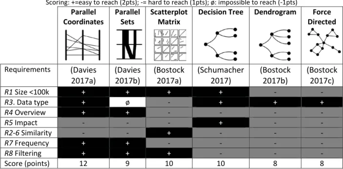
A selection of DVT applicable to multivariate and multidimensional data has been established by means of a literature review. Table 1 summarizes the potential of each technique to fulfil the requirements that have been listed in the previous section -R1-8-. A qualitative ranking is proposed by rating each DVT according to its potential to fulfil the requirements: “+” is associated with a high potential to meet the requirement and is credited with 2 points, “-” means that the requirement may be hard but is not impossible to meet, and credited with 1 point. “ø” means that the DVT cannot fulfil the requirement, and is credited with -1 point. At the end, each DVT is ranked according to the resulting sum of all individual scores.
Table 1. A comparison of data visualization techniques for Building Performance Simulation dataset. Scoring: +=easy to reach (2pts); -= hard to reach (1pts); ø: impossible to reach (-1pts)
Parallel Coordinates Parallel Sets Scatterplot Matrix
Decision Tree Dendrogram Force Directed Requirements (Davies 2017a) (Davies 2017b) (Bostock 2017a) (Schumacher 2017) (Bostock 2017b) (Bostock 2017c) R1 Size <100k + + + + - - R3. Data type + ø - + + + R4 Overview + + - - - - R5 Impact - - - + - - R2-6 Similarity - - + - - - R7 Frequency + + - - - - R8 Filtering + + + - - - Score (points) 12 9 10 10 8 8
With a few visual enhancements -alpha blending, jittering, frequency encoding-, the first four DVTs can handle 100’000 design alternatives. Parallel Coordinates and Parallel Sets allow the assessment of the correlation between adjacent dimensions, i.e. they require the user to reorder the dimensions if non-adjacent. While both of these visualization methods are the best at assessing the frequency of a given parameter value amongst the one selected in Table 1, there is a significant drawback with Parallel Sets related to their inability to handle continuous parameters, making them useless for a BPS dataset. In contrast, the Scatterplot Matrix is designed for continuous values, and representing categorical dimensions results in heavy over-plotting. In this case, jittering and alpha blending can improve the visualization to some extent. However, the number of dimensions should stay under 10 to remain readable.
The Decision Tree is, on the other hand, the most suitable to show the impact of parameters. Dendrogram and Force directed do not scale well with the dataset size, as they need to represent each design alternative as a node, and thus require a lot of space in order to display all the data. Decision Tree, Dendrogram and Force directed are not appropriate to compare the similarity between dimensions, but are a good way to find clusters of design
alternatives. However, they do not implement a filtering interaction, and thus require the use of link and brush interactions with an external filtering method.
Harrison et al. recently expanded on previous work by studying the perception of correlations in Parallel Coordinates compared with eight other visualization techniques: scatterplots, stacked areas, stacked lines, stacked bars, donuts, radar charts, line plots, and ordered line plots (Harrison et al. 2014). 1687 participants took part in the test, using a crowdsourcing platform. The task was to judge the strengths of different correlations. Their results are consistent with the work from Li et al. (Li et al. 2008), in which scatterplots depict correlations better than Parallel Coordinates.
In the end, considering the score, Parallel Coordinates seems to be the most suitable for the visualization of a BPS dataset. In second position, the choice is directed towards the Decision Tree, as it can handle well more than 10 mixed categorical and continuous dimensions. The next sections give a deeper description of the most promising techniques according to the scoring of Table 1, and a qualitative analysis regarding the tasks they should help complete.
Parallel Coordinates
Parallel Coordinates (Inselberg and Dimsdale 1990) are the most popular visualization method to represent multivariate multidimensional data. They are applied to a large set of multidimensional problems (Rodriguez and Nancy 2016) in many fields -e.g. life sciences, engineering and finance- (Heinrich and Weiskopf 2013). In practice, such datasets contain up to some 10-15 dimensions (Kosara et al. 2006). Moustafa (Moustafa 2011) states that Parallel Coordinates are becoming an "essential tool for visualizing hyper-dimensional numerical data from almost all real life applications [...]".
They use a parallel layout for axes: the horizontal spatial position is used to separate axes, and the vertical spatial position is used to express the value along each aligned axis. Each data item is depicted as a polyline intersecting all the axes. Parallel Coordinates allow the user to set constraints: filtering the dataset is done by selecting a range of values for each parameter -i.e. brushing-. Parallel Coordinates can be used to select a set of parameter values that define a building design and to assess whether the solution is valid, i.e. the output values from the output axis are below a given threshold -e.g. price, comfort, or energy consumption-.
Parallel Coordinates can be displayed in other layouts: vertical, and star layouts. The star layout is better when there are inliers in the data: "homogenous records [...] appear as distinct star shape" (Moustafa 2011). A connecting line between two entities shows the relationship between two axes in an explicit way: this is especially pertinent to spot trends (Munzner and Maguire 2015) and can be used to identify an individual data item.
Parallel Coordinates are well suited for the type of tasks that we mentioned in the previous section. Without the use of any enhancement method, the number of items is limited to a few hundreds. 100’000 items can be represented by adding clutter reduction methods such as jittering or alpha blending to the polylines. Parallel Coordinates can assist in the identification of highly discriminant dimensions (Moustafa 2011). Parallel Coordinates allow the easy assessment of the strength of correlations. The lines connecting the dimensions enable the identification of correlated dimensions: a high positive correlation is characterized by a set of parallel segments, while a negative correlation is characterized by a set of segments crossing over at a single point. However, this only allows pairwise comparison between neighbouring axes. Visible patterns depend on the ordering of axes; this requires
the user to test all possible configurations of axes, which becomes time consuming as the number of dimension increases.
Parallel Coordinates are helpful in data mining tasks such as the identification of clusters and the exploration of class properties. They allow the user to identify the most represented parameter values. For the larger datasets, jittering and alpha blending can be used to restore the frequency information.
Decision tree
Decision trees are a great decision support tool. Rather than being a true exploratory tool, they make it possible to "[...] break down a complex decision-making process into a collection of simpler decisions, thus providing a solution which is often easier to interpret." (Safavian and Landgrebe 1990). The first step in the construction of a decision tree is a learning phase. It is initiated taking a set of vectors as input, each belonging to a known class: several machine-learning algorithms will then help to determine which attributes best divide the data between the classes, based on impurity measures. As an example, the C4.5 algorithm is an Information Gain algorithm. It selects the parameters that best split the target class into the purest possible children nodes. In other words, the parameters with the highest scores are the ones that best divide the samples between two classes. It places the most important parameters closer to the root of the tree. By adding collapsible nodes to the decision tree, only the most important parameters are initially shown to the user. In order to get a full set of parameter values, he has to click on the children nodes until he reaches a leaf.
Tree nodes can be visually enhanced with two types of visual cues: a colour coding -green or red- can, for example, show the ratio of each class included in the leaves represented by the node. The size of a node can indicate the amount of design alternatives included in the subset.
The decision tree is not highly scalable in terms of dimensionality. As stated by (van den Elzen and van Wijk 2011), "For a decision tree to be understandable, its complexity should be low, which can be measured by the following metrics: (1) the total number of nodes; (2) total number of leaves; (3) tree depth; (4) number of attributes used”. Small trees containing fewer attributes are therefore preferred. This method imposes a ranking of parameters, and is thus optimal for assessing the impact of parameters on performance. Each node represents a parameter value, and the depth in the tree depends on the impact, allowing the user to quickly detect the most important parameters.The decision tree only shows the strength of the relationship between the class and the parameters. There is no relationship between the rate of correlation of two attributes and their position in the tree.
The smart living building as a case study
The previous chapter allowed us to select two DVT that look promising according to our understanding of the literature. Here, the purpose is to apply these DVT to the dataset of a case study in order to analyse their advantages and drawbacks in a real-like situation.
The dataset that has been chosen was generated in the frame of the smart living building, which is currently under design. This building will be built by 2021 in Fribourg, Switzerland. Its aim is to achieve the 2050 goals of the 2000-watt society vision (Jochem et al. 2004). In order to guide designers towards these performance targets, a new decision making method has been developed (Jusselme et al. 2016), coupling parametric energy analysis, lifecycle assessment and sensitivity analysis. In this paper, a dataset of 25’000 design alternatives has been created using the same workflow, and a lifecycle analysis has been
performed on each, in order to quantify their Global Warming Potential -GWP- impact. As a result, the dataset encompasses the description of the 25’000 design alternatives with 17 parameters, e.g. window to wall ratio, windows properties, insulation level, photovoltaic power, HVAC system, structure type and so on. According to the Swiss norm (SIA 2011), the objective that the building has to achieve is a footprint below 12,6 Kg CO2eq/m²year.
We implemented the two visualization prototypes presented below using the client-side web technology stack: HTML, CSS, SVG and Javascript. Since we planned to test the visualizations with several datasets, we needed a flexible approach.
Here is a summary of our requirements:
being able to switch between several datasets.
being able to add visual encodings to a visualization method.
being able to handle large datasets without compromising the user experience. implement several interaction methods such as clicks and brushing.
To represent the data we chose the D3 Javascript library (Bostock 2017d), since it is widely used, provides a good documentation, and meets all the above requirements.
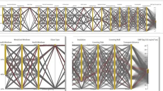
Implementation of the Parallel Coordinates
According to the literature review, a few visual enhancements were added: jittering reduces over-plotting, and allows the increase of the visual perception of distribution for each parameter. We added a colour coding: each polyline is coloured according to its compliance to the target. In the example, polylines are coloured in green if their GWP is below 12.6 Kg CO2eq/m²year, red if above the target. Brushing interaction makes it possible to filter the
dataset by selecting a range of values for a given parameter. The user is able to reorder the axes in order to assess the correlation between specific dimensions.
Figure 1. Visualization of the smart living building dataset with Parallel Coordinates (on the top), zoom on input parameters (bottom left) and zoom on output performance indicator: Global Warming Potential (GWP,
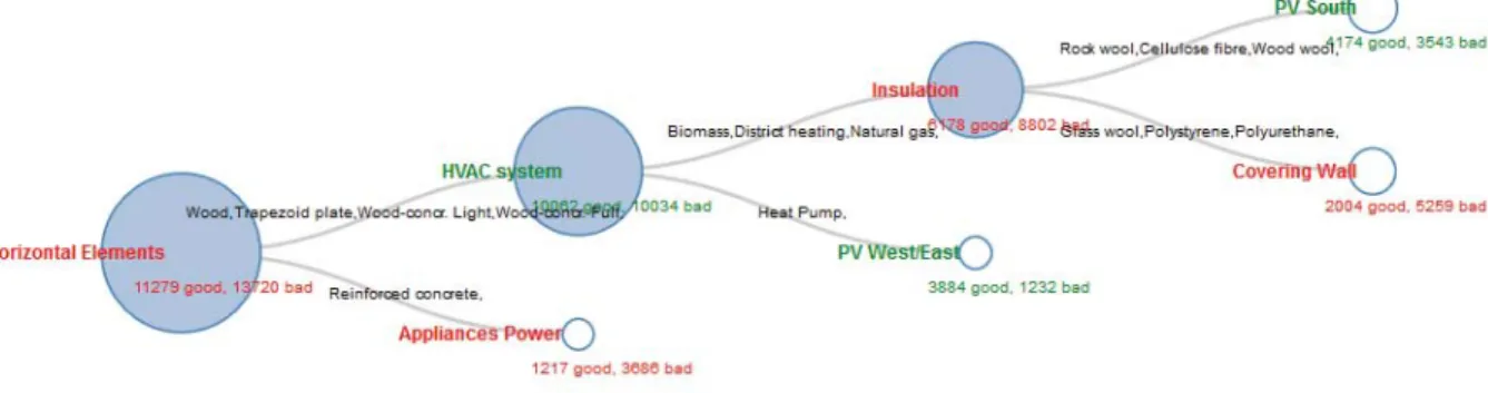
Implementation of the Decision Tree
In order to represent our dataset as a Decision Tree, we first had to compute it with the C4.5 algorithm, using a modified version of LearningJS (Yandong 2017). The Decision Tree data was stored as a JSON file. The user is able to click on a node in order to reveal its children nodes, until he reaches a leaf. A leaf represents a completely homogenous set of design alternatives: it contains only valid, or non-valid design alternatives. Nodes are scaled according to the number of design alternatives they represent. Each node is coloured according to the most represented class inside it: it is green if it contains mostly valid design alternatives, red if it contains mostly non-valid design alternatives.
Figure 2. Visualization of the smart living building data set with a Decision Tree.
Qualitative comparison
In this section, we perform a -non-quantitative- comparative analysis of the two most promising DVTs for our use case, namely the Parallel Coordinates plot and the Decision Tree. First, both methods can handle a medium-sized dataset. The Decision Tree is more scalable since it only represents aggregates of design alternatives. On its part, the Parallel Coordinates plot requires specific clutter reduction techniques -jittering, alpha blending- in order to increase its readability.
Both methods can represent mixed categorical and continuous dimensions. The number of dimensions is more limited with the Decision Tree, since a large number will inevitably increase the depth of the tree, and thus its complexity. Discrepancies in the user's mental model can appear when the dimensions include several types -categorical, ordinal or continuous- and the cognitive load increases when the amount of parameters gets too large. In Parallel Coordinates, these problems can be addressed by reducing the amount of axes displayed, or by allowing the user to distinguish between the continuous and categorical axes with a specific layout for each type. Unlike the Decision Tree, the Parallel Coordinates plot gives an overview on the whole dataset -i.e. on each design alternative- at a glance.
Regarding the ability to perform the tasks described in Table 1, the Decision Tree is better suited to show the impact of parameters. It first displays the parameters that best divide the data between the two output classes; an identification of clusters, based on one parameter, is a trivial task. Parallel Coordinates can show the same information, but in a less explicit way: parameters axes can be laid out horizontally according to an impact criterion such as the Information Gain (Safavian and Landgrebe 1990). The C4.5 algorithm (Quinlan 1992) would be suitable to do that.
Parallel Coordinates allow the identification of similarities between dimensions, while the Decision Tree does not. The effectiveness of Parallel Coordinates for this task is highly dependent on the order of axes. Interaction techniques should be implemented to allow the
user to reorder them. The Decision Tree is best to identify families of design alternatives sharing a similar output class.
In the Decision Tree, nodes can be scaled according to the amount of samples included inside them. With two output categories, each node gives two choices and groups parameter values according to this criterion. Thus, a node can represent one or many categories, and does not allow a clear identification of the frequency for each category. Parallel Coordinates show the frequency for each individual category, but the add of jittering and alpha-blending is needed to resolve the over-plotting problems.
A valid solution can be found at any level of the Decision Tree: filtering stops, when the output class of design alternatives under a given node, is homogenous -only valid, or only non-valid design alternatives-. However, this technique is too directive for the user: it forces him to follow a predefined sequence of decisions, returned by the algorithm used to generate the tree, and does not give him a good overview on the solution space. The user has to click on many nodes before being able to assess the validity of a given solution. Moreover, the output range cannot be visualized individually for each design alternative. For example, it is impossible to show only the references that are really close to the output threshold -Pareto front-, or those that are slightly above. The Parallel Coordinates plot offers a broad range of filtering possibilities with the brushing interaction implemented on each axis. However, selecting a range of values makes little sense for categorical parameters, as there is no ranking between them. For categorical parameters, the brushing method should be replaced with a set of checkboxes.
In synthesis, Parallel Coordinates enable a highest flexibility in the dataset exploration and then a better ability to perform tasks useful to support the design process. Decision tree is easier to use, but more limited in terms of data exploration. It is worth to notice that this comparison informs us about the technical possibilities of the different DVT, but a usability assessment with their impact evaluation on the design process would be useful to confirm their real added value.
Conclusions
Human-computer interactions and specifically the information visualization research field already developed data visualization techniques enabling the exploration of large and high-dimensional datasets. However, BPS datasets have particular characteristics. They embed multivariate and multidimensional data, which have different levels of correlations and a medium size, generally up to a hundred thousand design alternatives. In addition, the dataset analysis aims to support the design process through specific tasks that might allow to explore, generate or evaluate solutions based on designer’s requirements. By crossing DVT and BPS
user requirements, a first selection of techniques has been made in this paper. Parallel Coordinates, Parallel Sets, Scatterplot Matrix, Decision Tree, Dendrogram and Force Directed techniques have been compared, and a qualitative ranking according to our understanding of the literature review allowed the selection of the two most promising of them, namely the Parallel Coordinates and the Decision Tree.
These two DVT have been implemented via the smart living building dataset as a case study. Overall, the Parallel Coordinates plot seems best suited since it gives a better overview on the database, and it is more flexible in terms of number of dimensions. However, it requires adding specific visual encodings -jittering, alpha blending- and interaction methods -hiding and moving axes, filtering- in order to be able to perform the tasks described previously. The Decision Tree is less convenient as it cannot represent dimensions without
imposing a ranking to the user, does not give a clear overview on the database, is not appropriate to show the details of individual design alternatives, and does not fit the designer’s creative process well.
Parallel Coordinates might be implemented in future BPS tools in order to increase the usability of the dataset they generate. Further research would be required to perform a quantitative and qualitative user centred assessment of a broader user population exploring a BPS dataset with Parallel Coordinates. Also, the real impact of Parallel Coordinates to direct the design decisions still have to be done.
Acknowledgements
The work presented in this paper has been funded by the State of Fribourg (message du Conseil d’Etat au Grand Conseil 2014-DEE-22) and EPFL.
References
Agrawal, G., Lewis, K.E., and Bloebaum, C.L. (2006) ‘Intuitive Visualization of Hyperspace Pareto Frontier’.
Collection of Technical Papers - 44th AIAA Aerospace Sciences Meeting 12 (January), 8783–8796
Attia, S., Hamdy, M., O’Brien, W., and Carlucci, S. (2013) ‘Assessing Gaps and Needs for Integrating Building Performance Optimization Tools in Net Zero Energy Buildings Design’. Energy and Buildings 60
Bambardekar, S. and Poerschke, U. (2009) ‘The Architect As Performer of Energy Simulation in the Performance Based Design’. in Eleventh International IBPSA Conference [online] held 2009. 1306–1313. available from <http://www.ibpsa.org/proceedings/BS2009/BS09_1306_1313.pdf>
Bostock, M. (2017a) Scatterplot Matrix Brushing [online] available from <https://bl.ocks.org/mbostock/4063663>
Bostock, M. (2017b) Collapsible Tree [online] available from <https://bl.ocks.org/mbostock/4339083> Bostock, M. (2017c) Force-Directed Graph [online] available from <https://bl.ocks.org/mbostock/4062045>
Bostock, M. (2017d) D3.Js - Data-Driven Documents [online] available from <https://d3js.org/>
Catalina, T., Iordache, V., and Caracaleanu, B. (2013) ‘Multiple Regression Model for Fast Prediction of the Heating Energy Demand’. Energy and Buildings 57, 302–312
Chan, W.W. (2006) ‘A Survey on Multivariate Data Visualization’. Science And Technology (June), 1–29 Cortellessa, G. (2006) ‘Evaluating Mixed-Initiative Systems: An Experimental Approach’. ICAPS-06 [online] available from <http://www.aaai.org/Papers/ICAPS/2006/ICAPS06-018.pdf>
Davies, J. (2017a) Parallel Coordinates [online] available from <https://bl.ocks.org/jasondavies/1341281> Davies, J. (2017b) Parallel Sets [online] available from <https://www.jasondavies.com/parallel-sets/>
ŝƐĞŶŚŽǁĞƌ͕͕͘K͛EĞŝůů͕͕͘EĂƌĂLJĂŶĂŶ͕^͕͘&ŽŶŽďĞƌŽǀ͕s͕͘͘ĂŶĚDĞnjŝđ͕/͘;ϮϬϭϮͿ͚DĞƚŚŽĚŽůŽŐLJĨŽƌDĞƚĂ -Model Based Optimization in Building Energy -Models’. Energy and Buildings 47, 292–301
van den Elzen, S. and van Wijk, J.J. (2011) ‘BaobabView: Interactive Construction and Analysis of Decision Trees’. IEEE S. Vis. Anal. 151–160
EU - EPBD (2010) ‘Directive 2010/31/EU of the European Parliament and of the Council of 19 May 2010 on the Energy Performance of Buildings (Recast)’. Official Journal of the European Union 18 (06), 2010
Harrison, L., Yang, F., Franconeri, S., and Chang, R. (2014) ‘Ranking Visualizations of Correlation Using Weber’s Law’. IEEE Transactions on Visualization and Computer Graphics 20 (12), 1943–1952
Heeren, N., Mutel, C.L., Steubing, B., Ostermeyer, Y., Wallbaum, H., and Hellweg, S. (2015) ‘Environmental Impact of Buildings—What Matters?’ Environmental Science & Technology 49 (16), 9832–9841
Heinrich, J. and Weiskopf, D. (2013) ‘State of the Art of Parallel Coordinates’. Eurographics 95–116 Hollberg, A. and Ruth, J. (2016) ‘LCA in Architectural Design—a Parametric Approach’. The International Journal of Life Cycle Assessment 21 (7), 943–960
Hopfe, C.J. and Hensen, J.L.M. (2011) ‘Uncertainty Analysis in Building Performance Simulation for Design Support’. Energy and Buildings 43 (10), 2798–2805
Huot, S. (2005) Une Nouvelle Approche Pour La Conception Créative: De l’interprétation Du Dessin à Main Levée Au Prototypage d’interactions Non-Standard. Universit{é} de Nantes
Hygh, J.S., DeCarolis, J.F., Hill, D.B., and Ranji Ranjithan, S. (2012) ‘Multivariate Regression as an Energy Assessment Tool in Early Building Design’. Building and Environment 57, 165–175
Ibarra, D.I. and Reinhart, C.F. (2009) ‘Daylight Factor Simulations – How Close Do Simulation Beginners “Really’’ Get?”’ 11th International IBPSA Conference, Building Simulation 2009 196–203
Inselberg, A. and Dimsdale, B. (1990) ‘Parallel Coordinates: A Tool for Visualizing Multi-Dimensional Geometry’. Visualization, 1990. Visualization ’90., Proceedings of the First IEEE Conference On 361–378
Jochem, E., Andersson, G., Favrat, D., Gutscher, H., Hungerbühler, K., von Roh, P.R., Spreng, D., Wokaun, A., and Zimmermann, M. (2004) A White Book for R&D of Energy-Efficient Technologies [online] Switzerland: Novantlantis. available from <https://goo.gl/UGBiAM> [2 April 2015]
Jusselme, T., Cozza, S., Hoxha, E., Brambilla, A., Evequoz, F., Lalanne, D., Rey, E., and Andersen, M. (2016) ‘Towards a Pre-Design Method for Low Carbon Architectural Strategies’. in PLEA2016. held at Los Angeles, USA Kosara, R., Bendix, F., and Hauser, H. (2006) ‘Parallel Sets: Interactive Exploration and Visual Analysis of Categorical Data’. in IEEE Transactions on Visualization and Computer Graphics [online] held July 2006. IEEE, 558–568. available from <http://ieeexplore.ieee.org/lpdocs/epic03/wrapper.htm?arnumber=1634321>
Li, J., Martens, J.-B., and van Wijk, J.J. (2008) ‘Judging Correlation from Scatterplots and Parallel Coordinate Plots’. Information Visualization 9 (1), 13–30
Lolli, N., Fufa, S.M., and Inman, M. (2017) ‘A Parametric Tool for the Assessment of Operational Energy Use, Embodied Energy and Embodied Material Emissions in Building’. Energy Procedia 111, 21–30
Manfren, M., Aste, N., and Moshksar, R. (2013) ‘Calibration and Uncertainty Analysis for Computer Models – A Meta-Model Based Approach for Integrated Building Energy Simulation’. Applied Energy 103
Miyamoto, A., Tam Nguyen Van, Damien Trigaux, Karen Allacker, and Frank De Troyer (2015) Visualisation Tool to Estimate the Effect of Design Parameters on the Heating Energy Demand in the Early Design Phases. [online] available from <http://dx.doi.org/10.13140/RG.2.1.1515.2085> [11 March 2016]
Moustafa, R.E. (2011) ‘Parallel Coordinate and Parallel Coordinate Density Plots’. Wiley Interdisciplinary Reviews: Computational Statistics 3 (2), 134–148
Munzner, T. and Maguire, E. (2015) Visualization Analysis & Design [online] available from <http://public.eblib.com/choice/PublicFullRecord.aspx?p=1664615>
Naboni, E., Zhang, Y., Maccarini, A., Hirsch, E., and Lezzi, D. (2013) ‘Extending the Use of Parametric Simulation in Practice through a Cloud Based Online Service’. in IBPSA Italy-Conference of International Building Performance Simulation Association, Bozen, Italy [online] held 2013. available from <http://m.e3lab.org/upl/website/publication11111/IBPSAitaly13.pdf> [11 March 2016]
Østergård, T., Jensen, R.L., and Maagaard, S.E. (2016) ‘Building Simulations Supporting Decision Making in Early Design – A Review’. Renewable and Sustainable Energy Reviews 61, 187–201
Plan Bâtiment Durable (2014) Rapport# 3 Du Groupe de Travail RBR 2020. [online] available from <http://www.planbatimentdurable.fr/publication-du-rapport-3-du-groupe-a846.html>
Pu, P. and Lalanne, D. (2002) ‘Design Visual Thinking Tools for Mixed Initiative Systems’. Proceedings of the 7th International Conference on Intelligent User Interfaces - IUI ’02 119
Quinlan, J.R. (1992) C4.5: Programs for Machine Learning [online] 3. vol. 1. available from <http://portal.acm.org/citation.cfm?id=152181%5Cnhttp://www.amazon.com/C4-5-Programs-Machine-Learning-Kaufmann/dp/1558602380>
Reinhart, C.F., Dogan, T., Ibarra, D., and Samuelson, H.W. (2012) ‘Learning by Playing – Teaching Energy Simulation as a Game’. Journal of Building Performance Simulation 5 (6), 359–368
Rodriguez, N. and Nancy, R. (2016) A Survey of Muldimensional Data Visualization Techniques. (January) Safavian, S.R. and Landgrebe, D. (1990) A Survey of Decision Tree Classifier Methodology.
Sartori, I., Napolitano, A., and Voss, K. (2012) ‘Net Zero Energy Buildings: A Consistent Definition Framework’. Energy and Buildings 48, 220–232
Schumacher, A. (2017) Interactive D3 View of Sklearn Decision Tree [online] available from <https://bl.ocks.org/ajschumacher/65eda1df2b0dd2cf616f>
SIA (2011) SIA 2040 La Voie Vers l’efficacité Énergétique. Société suisse des ingénieurs et des architectes Tian, W. (2013) ‘A Review of Sensitivity Analysis Methods in Building Energy Analysis’. Renewable and Sustainable Energy Reviews 20, 411–419
UNEP (2009a) ‘Buildings and Climate Change: Summary for Decision-Makers’. United Nations Environmental Programme, Sustainable Buildings and Climate Initiative, Paris 1–62
UNEP (2009b) ‘Common Carbon Metric for Measuring Energy Use & Reporting Greenhouse Gas Emissions from Building Operations’. United Nations Environment Programme (UNEP)
UNFCCC (2015) Adoption of the Paris Agreement. Report No. FCCC/CP/2015/L.9/Rev.1. available from <http://unfccc.int/resource/docs/2015/cop21/eng/l09r01.pdf>
Yandong, L. (2017) Yandongliu/Learningjs [online] available from <https://github.com/yandongliu/learningjs>