Social Indicators
RESEARCH PAPER 14/47
3 September 2014
This Research Paper summarises a wide range of social statistics. Subjects covered
include agriculture, crime, defence, education, elections, environment and energy, health,
housing, local government, population and migration, social security and transport.
This information is provided to Members of Parliament in support of their parliamentary
duties and is not intended to address the specific circumstances of any particular individual.
It should not be relied upon as being up to date; the law or policies may have changed since
it was last updated; and it should not be relied upon as legal or professional advice or as a
substitute for it. A suitably qualified professional should be consulted if specific advice or
information is required.
This information is provided subject to our general terms and conditions which are available
online or may be provided on request in hard copy. Authors are available to discuss the
content of this briefing with Members and their staff, but not with the general public.
We welcome comments on our papers; these should be e-mailed to [email protected].
ISSN 1368-8456Recent Research Papers
14/33 Local elections 2014 11.06.14
14/34 Unemployment by Constituency, June 2014 11.06.14
14/35 Childcare Payments Bill [Bill 7 of 2014-15] 26.06.14
14/36 Economic Indicators, July 2014 01.07.14
14/37 Modern Slavery Bill [Bill 8 of 2014-15] 02.07.14
14/38 Social Action, Responsibility and Heroism Bill [Bill 9 of 2014-15] 08.07.14
14/39 Small Business, Enterprise and Employment Bill [Bill 11 of 2014-15] 10.07.14
14/40 Unemployment by Constituency, July 2014 16.07.14
14/41 Economic Indicators, August 2014 05.08.14
14/42 Unemployment by Constituency, August 2014 13.08.14
14/43 English local government finance: issues and options 26.08.14
14/44 Pension Schemes Bill [Bill 12 of 2014-15] 21.08.14
14/45 National Insurance Contributions Bill [Bill 80 of 2014-15] 21.08.14
14/46 Economic Indicators, September 2014 02.09.14
Research Paper 14/47
Contributing Authors:
Contents
I
Introduction to Social Indicators
i
II
Contacts for further information
ii
III Regular subject pages
Agriculture
Agricultural incomes and subsidies
1
Agriculture in the home countries
2
Crime
Police numbers
3
Police funding
4
Crime
5
Drug use, seizures and offending
6
Prison population
7
Defence
Defence employment
8
Defence expenditure
9
Education
Schools and class sizes
10
Teachers
11
Examination results
12
Participation in education and training: 16-18 year olds
13
Applicants and entrants to higher education
14
Participation in higher education
15
Education expenditure
16
Elections
General Election results
17
Local, Scottish Parliament, Welsh Assembly & European Parliament
18
Turnout
19
Opinion polls
20
Environment and energy
Road fuel prices
21
Energy use
22
Greenhouse gas emissions
23
Domestic gas and electricity prices
24
The weather
25
Research and development
26
Health
Waiting times
27
Health expenditure
28
Beds and activity
29
NHS staff
30
Housing
Housebuilding
32
House prices
33
Homelessness
34
Local government
Local government finance
35
Council tax
36
Population and migration
Population
37
International migration
38
Asylum seekers
39
Asylum decisions
40
Ethnicity and religion
41
Social security
Social security benefits and expenditure
42
Pensions and pensioners’ income
43
Transport
Reported road accident casualties
44
Road traffic
45
Passenger transport
46
i Introduction to Social Indicators
Social Indicators are a series of subject pages that cover a wide range of social statistics. The pages are individual Standard Notes available to MPs and staff on the parliamentary intranet, and internet, and are updated when new statistics are available. Subject pages are combined to produce an annual printed report.
Subjects have been chosen from those that receive the most public attention and those that we think are most useful to MPs. International comparisons are included alongside national statistics in some Standard Notes.
Social Indicators complements the Economic Indicators research paper, which is produced by the Economic Policy and Statistics section.
The range of topics included in Social Indicators and the content of the intranet pages is regularly reviewed. If you have views on either, please contact the Head of Section, Richard Cracknell (x4632) or the editor, Richard Keen (x3851).
Statistical Literacy Guides
Readers of Social Indicators may find the Library’s Statistical Literacy Guides useful when looking through this document or, more generally, any press stories, research, reports, books etc. with statistical content.
The guides are available on the statistics policy pages of: http://www.parliament.uk/topics/Statistics-policy.htm
ii Contacts for further information
Members and staff who require further information on a particular subject should contact the relevant statistician as detailed below. A comprehensive guide to the subject coverage of Research Service specialists is available on the Parliamentary intranet.
Subject Main statistician Xtn.
Agriculture Richard Keen 3851
Charities / voluntary Richard Keen 3851
Civil service Steven Ayres 5504
Defence Tom Rutherford 4313
Education Paul Bolton 6969
Elections Richard Cracknell 4632
Energy Tom Rutherford 4313
Environment Carl Baker 4310
Health Rachael Harker 5061
Housing Richard Cracknell 4632
Local government finance Neil Johnston 6789
Media / arts Richard Keen 3851
Parliament Steven Ayres 5504
Parliament (MP’s activity, divisions) Steven Ayres 5504
Pensions Roderick McInnes 3793
Population / immigration Oliver Hawkins 2324
Religion Oliver Hawkins 2324
Social security Roderick McInnes 3793
Social services Rachael Harker 5061
Sport / gambling / lottery Richard Keen 3851
Statistics (policy) Richard Cracknell 4632
Technology (inc. R&D) Richard Keen 3851
Transport Tom Rutherford 4313
General enquiries Benjamin Politowski 6177
Agricultural incomes and subsidies
● 2013 data shows that total income from farming (TIFF) increased by 13.1% in real terms year-on-year to £5.5 billion. This followed a fall of 12.1% in 2012.
● TIFF per full time person equivalent also increased 14.7%, to £28,426.
● In recent years TIFF was at its highest in the early 1990s. TIFF increased by 38.5% in 1995 alone; in 1995, it reached £7.4 billion at 2013 prices.
● Total public subsidies under the CAP and national schemes increased dramatically in the early 1990s with the introduction of arable area payments.
● The total value of direct payments to farmers was £3.3 billion in 2013.
● The introduction of the Single Payment Scheme in 2005 resulted in a major shift in subsidies away from those coupled to production.
Next Update: July 2015 Contact: Richard Keen x3851
0 1 2 3 4 5
1973 1978 1983 1988 1993 1998 2003 2008 2013
Subsidies and other payments made to farmers in the UK 1973-2013
£ billion 2013 prices
Decoupled and other payments
Payments linked to production
0 1 2 3 4 5 6 7 8 9 10
1973 1978 1983 1988 1993 1998 2003 2008 2013
Total income from farming 1973-2013
£ billion at 2013 prices
Real farm incomes in the UK: 1973 - 2013
At 2013 prices
Total income from farming (TIFF)
TIFF per whole-time person equivalent
£ million £ per head
1990 3,150 12,273
1995 7,429 30,434
2000 2,100 10,227
2005 2,984 14,900
2006 2,890 14,542
2007 3,076 15,602
2008 4,521 23,164
2009 4,589 23,849
2010 4,414 22,992
2011 5,501 28,247
2012 4,834 24,791
2013 5,464 28,426
Source: Defra, Agriculture in the UK 2011
Agriculture in the home countries
● In the 10 years up to 2012,agriculture’s contribution to the UK, measured as its share of UK Gross Value Added (GVA), has fallen from 0.7% to 0.6%.
● In 2012, agriculture's contribution to GVA was smallest in Scotland at 0.5%, and highest in Northern Ireland at 1.3%.
● In 2013, agricultural employment as a share of each country's employment was lowest in England at 1.1% and highest in Northern Ireland at 5.8%.
● At June 2013, agriculture in England tended to be characterised by a greater concentration on crops, especially cereals.
● Holdings in Scotland were, on average, much larger than elsewhere in the UK and had a disproportionately large area of rough grazing.
● Holdings in Wales had a small percentage area of crops along with Northern Ireland, and by far the largest number of sheep per hectare.
● The broad breakdown of land use in Northern Ireland was similar to that in Wales, but beef and dairy farming dominated and the number of cattle per hectare was above any of the other home countries.
Next update: July 2015 Contact: Richard Keen x3851
Summary measures of agriculture, 2013
England Scotland Wales
Northern
Ireland UK Gross value added at basic prices
£ million (2013) 7,338 1,096 344 445 9,222
£ million (2012) 7,000 985 243 389 8,656
% of country total (2012) 0.6% 0.5% 0.9% 1.3% 0.6% Total labour force in agriculture (a)
Thousands 296 67 53 48 464
% of country total 1.1% 3.9% 2.6% 5.8% 1.4% Area of agricultural holdings (b)
Thousand ha. 9,086 5,604 1,559 998 17,250
% of total area 69.7% 71.9% 75.2% 73.6% 71.1% Holdings
Number (thousands) 104 53 43 25 222
Average size (ha.) 88 106 36 41 78
Land use
% of area on holdings under:
Crops 374554% 132210% 11415% 7885% 715626%
Grassland 41% 24% 73% 79% 40%
Rough grazing (b) 5% 55% 17% 14% 16%
Livestock
Number per ha. of agricultural holdings14,922 6,570 9,461 1,904 32,215
Sheep 1.64 1.17 6.07 1.91 1.90
Cattle 3,6620.59 0.32319 0.7025 1.59480 4,4810.57
Pigs 0.40 0.06 0.02 0.48 0.28
Notes: Totals may not sum due to rounding
(a) Includes farmers, partners, spouses, salaried managers, regular workers and casual/gang labour. (b) Excludes common rough grazing
Sources: Defra, Agriculture in the UK 2013, Tables 2.1, 2.2, 2.4, 2.5 and 3.2. Defra, Survey of Agriculture and Horticulture: 1 June 2013 England Scottish Government, Results from the June 2013 Scottish Agricultural Census NAW, Survey of Agriculture and Horticultire, 1 June 2013: final results DARDNI, Northern Ireland Agriculture Census 2013: final results 0%
1% 2% 3% 4% 5% 6% 7%
England Scotland Wales Northern Ireland
Contribution of agriculture to the economies of the home countries
% of regional GVA (2012) % of regional employment (2013)
Police numbers
● There were 127,909 police officers in the 43 police forces of England and Wales on 31 March 2014 a decrease 1,674 or 1.3 per cent compared with a year earlier. An additional 437 were central service secondees and 2,912 officers represented the British Transport Police. Since March 2003 this headline measure of police strength has included staff on career break or maternity/paternity leave
● Excluding staff on career break or maternity/paternity leave, to enable longer term comparisons, the strength of the 43 police forces was 125,645 at March 2014, the lowest level since March 2002.
● HerMajesty’s Inspectorate of Constabulary (HMIC) estimates that police officer strength is planned to be 127,500 by March 2015, which is 16,300 fewer police officers than in 2010.
● Police forces recruited 5,589 officers in the 12 months to March 2014, with 6,904 officers leaving over that period.
● The proportion of female police officers in England and Wales has increased from 7% in 1977 to 28% by 2014.
● Ethnic minority strength as a proportion of total police service strength increased from 1.0% in 1989 to 5.2% in March 2014. In London, the proportion of ethnic minority officers in the Metropolitan Police force is 11%
Next update: March 2015 Contact: Neil Johnston x6789
-6,000 -4,000 -2,000 0 2,000 4,000 6,000 8,000
1980 1985 1990 1995 2000 2005 2010
Annual changes in police officer strength
(excluding secondments)
Consistent like for like basis - FTE, England and Wales March 1980- March 2013
0 20,000 40,000 60,000 80,000 100,000 120,000 140,000 160,000 180,000 200,000
2003 2004 2005 2006 2007 2008 2009 2010 2011 2012 2013 2014 Police officer strength, England and Wales 2003 - 2013
FTE excluding secondments at 31st March
Total officers Female officers
Total police officer strength1, England and Wales 2003-2013
Full Tim e Equivalent at 31 March Total
excluding Total
s econdm ents Num ber % Num ber % strength2
2003 132,509 25,139 19% 3,868 3% 134,450
2004 138,468 27,925 20% 4,594 3% 140,563
2005 141,059 29,940 21% 4,971 4% 142,794
2006 141,523 31,520 22% 5,236 4% 143,271
2007 141,892 33,117 23% 5,519 4% 142,374
2008 141,861 34,332 24% 5,793 4% 142,363
2009 143,770 36,121 25% 6,290 4% 144,274
2010 143,734 36,988 26% 6,642 5% 144,235
2011 139,109 36,532 26% 6,615 5% 139,585
2012 134,099 35,401 26% 6,664 5% 134,580
2013 129,584 35,401 27% 6,537 5% 129,956
2014 127,909 35,653 28% 6,715 5% 128,346
Source: Home Of f ice Statistical Bulletin, Police Service Strength, England & Wales
Of which:
Notes:
1 - Includes staf f on career breaks or maternity/paternity leave.
2 - Excluding British Transport Police. From March 2007 no longer includes staf f employed by NCS and NCIS f ollow ing the launch of SOCA.
Fem ale Minority ethnic
Police funding
● Central government provides resource funding for English and Welsh police forces in the form of Home Office core police grant and DCLG/Welsh Govt formula funding, plus some specific grants from the Home Office.
● The total government funding settlement for the 43 forces in England and Wales in 2014-15 was announced at £8.5bn, compared with £8.7bn in 2013-14 and £9.7bn in 2010-11. Total central funding is projected to fall by around 20% in real terms between 2010/11 and 2014/15, as originally planned in the 2010 Spending Review.
● Her Majesty’s Inspectorate of Constabulary (HMIC) reported that police forces need to find £2.42bn of savings by 2014-15 in order to manage the funding reduction and rising costs. HMIC suggests that forces have plans in place to save £2.31bn of this, a shortfall of £116m.
Next update: Spring 2015 Contact: Neil Johnston x6789
0% 10% 20% 30% 40% 50% 60% 70% 80% 90%
Proportion of budget financed through formula and police grant, England and Wales police forces, 2014/15 (est.)
The percentage of individual forces’ budget financed through formula and police grant varies from 46% in Surrey to 83% in Northumbria.
Council Tax 24%
DCLG/WG formula grant
27% HO police grant
37% Special and specific grants
6%
Other income 6%
Source: CIPFA Police Statistics estimates 2013-14 Sources of police funding - England and Wales 2013-14 (est.)
England and Wales £ million, nominal (cash)
Home Special & Gross
Office specific Council Other revenue
core grant grants Tax income expenditure
1996/97 3,338 2,511 n/a 819 239 6,907
1997/98 3,424 2,517 n/a 932 300 7,174
1998/99 3,656 2,526 n/a 1,027 241 7,450
1999/00 3,711 2,615 n/a 1,122 354 7,800
2000/01 4,303 2,369 91 1,099 448 8,310
2001/02 5,094 2,085 239 1,095 457 8,971
2002/03 5,197 2,126 361 1,269 446 9,398
2003/04 4,530 2,800 511 2,055 282 10,178
2004/05 4,649 2,936 561 2,330 1,037 11,514
2005/06 4,545 3,131 949 2,488 1,252 12,364
2006/07 4,162 3,268 1,352 2,656 1,834 13,272
2007/08 4,851 3,436 1,014 2,829 1,536 13,667
2008/09 4,995 3,533 1,137 2,999 1,052 13,715
2009/10 4,606 3,627 1,522 3,142 890 13,788
2010/11 4,625 3,724 1,461 3,191 872 13,875
2011/12 4,802 3,511 1,059 3,262 1,025 13,659
2012/13 4,500 3,358 1,259 3,326 1,015 13,459
2013/14 est 4,768 3,345 1,004 2,981 790 12,887
2014/15 est 4,667 3,139 1,028 3,098 843 12,774
Source: CIPFA, Police statistics actuals and estimates
Police funding and expenditure reported by forces, 1996/97 to 2014/15
DCLG/WG formula funding
Crime
● The Crime Survey for England and Wales (CSEW; formerly known as the British Crime Survey) measures crimes against adults living in private households in England and Wales. In the year to March 2014 the CSEW estimate was 7.3 million offences, an annual fall of 13.6% and the lowest estimate since the survey began in 1981.
● CSEW data shows violence to have fallen by 20%, criminal damage by 17% and theft offences by 10%.
● In January 2014 the UK Statistics Authority de-designated police recorded crime as National Statistics due to quality concerns. Refer to the ONS User Guide to CSEW (July 2014) for further information.
● In the year to March 2014 the police recorded 3.72 million offences, a slight fall from the previous year's figure of 3.73 million. There were falls among most of the broad offence groups, the exception being sexual offences which rose by 20%.
● In the year ending March 2014 theft from the person fell by 10% and possession of drugs fell by 5%. Rape rose by 27%.
Next update: November 2013 Contact: Richard Cracknell x4632
VATP
Burglary (dwelling) Total all offences
0 20 40 60 80 100 120 140
2002/03 2004/05 2006/07 2008/09 2010/11 2012/13
Trends in police recorded crime by offence Index 2002/03 = 100
-15% -10% -5% 0% 5% 10% 15% 19 81 -83 19 83 -87 19 87 -91 19 91 -93 19 93 -95 19 95 -97 19 97 -99 20 00 -01 /02 01 /0 2-02 /03 02 /0 3-03 /04 03 /0 4-04 /05 04 /0 5-05 /06 05 /0 6-06 /07 06 /0 7-07 /08 07 /0 8-08 /09 08 /0 9-09 /10 09 /1 0-10 /11 10 /1 1-11 /12 11 /1 2-12 /13 12 /1 3-13 /14
Annual % change in BCS/CSEW crime 1981 - 2013/14
-15% -10% -5% 0% 5% 10% 15% 20%
1982 1984 1986 1988 1990 1992 1994 1996 98/99 00/01 02/03 04/05 06/07 08/09 10/11 12/13
Annual % change in police recorded crime: 1982 - 2012/13
Arificial increase due to implementation of NCRS
Drug use, seizures and offending
● In 2012/13, 193,575 individuals aged 18+ were in contact with drug treatment services in England, a decrease of 2% compared with 2011/12. Of those leaving treatment during 2012/13 and not in treatment at year-end, 47% were discharged successfully, 13% were transferred for further treatment within the community and 11% into structured treatment in custody; 29% had dropped out.
● In 2012/13 police recorded 208,017 drug offences in England and Wales, a decrease of 9.2% on the previous year. Of those detected, 35% were dealt with by way of a cannabis warning. 44% of persons convicted of production, supply and possession with intent to supply in 2013 were given a custodial sentence. In the year ending March 2014, 92% of convicted drug offenders were male.
● There were 193,980 drug seizures by police forces and UK Border Force in England and Wales in 2012/13*. This represents a decrease of 8% from 2011/12. Cannabis was the most commonly seized controlled substance accounting for 76% of all seizures in 2012/13, compared with cocaine (8%), heroin (4%) and amphetamines (3%).
Next update: Winter 2014 Contact: Richard Cracknell x4632
Cannabis 76% Cocaine 8%
Heroin 4%
Amphetamines 3%
Crack 2% Ecstasy 1%
Other 3% Class C 2%
Drug seizures by type, 2012/13
England and Wales
50,000 100,000 150,000 200,000 250,000
2005/06 2006/07 2007/08 2008/09 2009/10 2010/11 2011/12 2012/13 Clients aged 18 and over in treatment contact, England
Entire treatment population New presentations to treatment
* Hampshire Constabulary and Surry Police were unable to produce returns for 2012/13 and have been excluded from the figures.
-30% -20% -10% 0% 10% 20% 30% 40% 50% 60%
1998 1999 2000 2001 2002 2003 2005 06/0707/0809/1010/1111/1212/13
% change in seizure of drugs, 1998-2012/13
England and Wales
Note: cannabis reclassified to Class C Jan 04-09
Class A
Class B
Class C
From 2006/07, drug seizure statistics published on a financial year basis
Prison population
● On 15 August 2014 the prison population of England and Wales stood at 85,834, approximately 1,528 places below the useable operational capacity of the prison estate. This includes those held in NOMS-operated Immigration Removal Centres. On 2 December 2011 the prison population was at a record high level of 88,179.
● On 30 June 2014 prisoners serving determinate sentences of four or more years accounted for 34% of the total prison population, while 6% were serving sentences equal to or less than six months. 11% of the prison population were on remand awaiting trial and 4% were awaiting sentence.
● The prison population in post-war England and Wales has risen steadily. Since the mid-90s however, this increase has become more marked: the average prison population has increased by nearly 90% since 1993.
● The latest Ministry of Justice projections suggest that the prison population will range between 77,300 and 86,600 by 2019.
● England and Wales had 148 prisoners per 100,000 population in 2013. This is down from 153 in 2011.
Next update: Autumn 2014 Contact: Richard Cracknell x4632
0 10,000 20,000 30,000 40,000 50,000 60,000 70,000 80,000 90,000
1901 1911 1921 1931 1941 1951 1961 1971 1981 1991 2001 2011
Prison population, England and Wales, 1901-2013
Source: Ministry of Justice
0 100 200 300 400 500 600 700 800
USA RUS UKR SA POL E&W ESP SCO PRT AUS LUX CAN BEL ITA NI FRA NET GER DEN NOR JAP ICE Prison population - Rate per 100,000 population, 2013
(unless otherwise stated)
Note: Years for Australia (2012); USA (2011); & Canada (2011-2012)
Prison estate population 1980-2012 by sex of prisoner
England and Wales, average of monthly totals
Total
1980 40,748 96.4% 1,516 3.6% 42,264
1990 43,378 96.4% 1,597 3.6% 44,975
2000 61,252 94.8% 3,350 5.2% 64,602
2001 62,560 94.4% 3,741 5.6% 66,301
2002 66,544 93.9% 4,299 6.1% 70,843
2003 68,613 93.9% 4,425 6.1% 73,038
2004 70,209 94.0% 4,449 6.0% 74,657
2005 71,513 94.1% 4,467 5.9% 75,980
2006 73,680 94.3% 4,447 5.7% 78,127
2007 75,842 94.5% 4,374 5.5% 80,216
2008 78,158 94.7% 4,414 5.3% 82,572
2009 79,277 94.9% 4,283 5.1% 83,559
2010 80,489 95.0% 4,236 5.0% 84,725
2011 81,763 95.1% 4,188 4.9% 85,951
2012 82,481 95.2% 4,154 4.8% 86,634
2013 80,158 95.4% 3,886 4.6% 84,044
June 2014 81,045 94.4% 3,991 4.6% 85,869 June 2013 79,989 95.4% 3,853 4.6% 83,842
Source: Ministry of Justice
Females Males
Defence employment
● The MoD (DASA) produces a monthly personnel report of the strength, intake and outflow of UK Regular and Non-Regular Forces. More detail is provided in the quarterly personnel report which is used to update the table below. ● As at 1 July 2014 the UK Armed Forces comprised 163,670 personnel, of
whom 157,490 were regular forces.
● Regular armed forces exclude Gurkhas and the Full Time Reserve Service (FTRS). In July 2014 these stood at 2,830 and 3,340 respectively.
● The requirement for UK Armed Forces was 156,000 at 1 July 2014 while the full-time trained strength was 148,710. The deficit in the UK Armed Forces was therefore 7,290, 4.7% of the requirement.
● The SDSR announced that by 2015 the full-time trained strength of the Navy will decrease by 5,000 to 30,000, the Army by 7,000 to 95,000 and the RAF by 5,000 to 33,000. The RAF figure is on top of the 2,000 reduction decided in Planning Round 10.
Next update: October 2014 Contact: Tom Rutherford x4313
0 50 100 150 200 250 300 350
1975 1978 1981 1984 1987 1990 1993 1996 1999 2002 2005 2008 2011 UK armed forces strength at April - 1975 - 2014
(thousands)
-70% -60% -50% -40% -30% -20% -10% 0% 10% 20% 30%
HUN CZE ITA POL PRT FRA GRC TUR DEU LUX NOR DNK BEL GBR ESP NLD USA CAN % change in armed forces personnel 2000-2014
Selected NATO countries
Navy Army RAF Officers
Other
Ranks Total
1980 71,900 159,100 89,700 42,100 278,600 320,700
1985 70,400 162,400 93,400 42,500 283,700 326,200
1990 63,200 152,800 89,700 42,870 262,840 305,710
1995 50,900 111,700 70,800 35,500 197,800 233,300
2000 42,850 110,050 54,720 32,520 175,100 207,620
2005 39,940 109,290 51,870 33,000 168,090 201,090
2006 39,390 107,730 48,730 32,700 163,150 195,850
2007 38,860 106,170 45,370 32,100 158,290 190,400
2008 38,560 104,980 43,370 31,730 155,190 186,910
2009 38 450 108 990 43 940 31 970 159 410 191 380
2010 38 560 106 580 43 480 32 150 156 480 188 630
2011 36 760 105 680 41 580 31 680 152 340 184 010
2012 34,680 102,760 38,500 30,960 150,750 175,940
2013 33,520 97,030 35,920 29,740 142,790 166,460 So urces: UK A rmed Fo rces - Quarterly P erso nnel repo rt, DA SA
UK regular armed forces strength at 1 October
Service All services
Defence expenditure
● The figures announced in the 2013 spending review showed that total MoD Deprtmental Expendtiure Limits (DEL) will fall by 11% in real terms between 2012/13 and 2015/16.
● In real terms, defence expenditure in 2012/13 was 13% below the record post-war levels of 2008/09 and 2009/10. This is based on net cash requirement. ● According to the MoD's analysis, spending on operations in Afghanistan was
£2.7 billion in 2012/13, 23% down from the previous year and 30% below peak operational spending in 2009/10.
● At 2.6% of GDP in 2011, the UK spent a greater proportion of its output on defence than all but the USA amongst current NATO members, according to NATO definitions. MoD figures suggest that defence expenditure is falling as a proportion of GDP (2.2% in 2012/13), although the UK continues to meet the informal defence expenditure target of 2% of GDP.
Next update: Spring 2015 Contact: Tom Rutherford x4313
0.0% 0.5% 1.0% 1.5% 2.0% 2.5% 3.0% 3.5% 4.0% 4.5% 5.0%
LUX ESP BEL CZE NLD DNK DEU ITA CAN NOR PRT ALB POL TUR FRA GRC GBR USA
Estimated defence spending of selected NATO countries NATO defined expenditure as a % of GDP, 2013 estimate
0 5 10 15 20 25 30 35 40 45
1962/63 1972/73 1982/83 1992/93 2002/03 2012/13
UK defence expenditure 1955/56 - 2012/13
£billion, constant 2011/12 prices
Near cash definition prior to 2002/03 Net cash requirement from 2002/03
0% 1% 2% 3% 4% 5% 6% 7%
1962/63 1972/73 1982/83 1992/93 2002/03 2012/13
% of GDP
Annual auditied costs of military operations
£ million
2006/07 2007/08 2008/09 2009/10 2010/11 2011/12 2012/13 Afghanistan 738 1,504 2,623 3,821 3,774 3,454 2 673
Iraq 956 1,457 1,381 342 92 .. ..
Libya .. .. .. .. 21 213 ..
Mali .. .. .. .. .. .. 17
So urce: M o D Defence statistics, vario us years
No te: Includes net additio nal co sts o f the main o peratio ns. These are the co sts o ver and abo ve what the M o D wo uld have incurred had the o peratio n no t taken place
Schools and class sizes
● The number of primary schools declined by 5,759 (21%) between 1970/71 and 2013/14.
● The number of secondary schools fell by 1,894 (32%) over the same period.
● Since 1950 the average size of a primary school has gone through a cyclical trend in a range of 180 to 220 pupils. In 2013/14 the average primary school size had risen slighty to around 260 pupils.
● Over the same period the average size of secondary schools has also gone through cycles based on changes in pupil numbers, but the dominant trend has been to increase. In 2013/14 average secondary school size was 956 pupils.
● The proportion of primary school pupils in England in large classes peaked at nearly 35% in 1998. It subsequently declined sharply to 18% in 2002 and continued to gradually decline until 2013, after which time a slight rise occurred.
● In the secondary sector the trend was upwards during most of the 1990s. The proportion of pupils in large class sizes rose from below 9% (1997) to nearly 12% in 2004 before falling to below 10% in 2013 and 2014.
Next update: Spring 2015 Contact: Paul Bolton x6969
Primary Secondary
0 100 200 300 400 500 600 700 800 900
1950 1955 1960 1965 1970 1975 1980 1985 1990 1995 2000 2005 2010
Average size of UK maintained schools
1950-2009, 2008-2015
Primary schools
Secondary schools
0% 5% 10% 15% 20% 25% 30% 35% 40% 45%
1978 1983 1988 1993 1998 2003 2008 2013
Proportion of pupils in large classes (>30), England
Public sector primary and secondary schools
UK, academic years
Primary Secondary Total
1970/71 26,799 6,010 32,809
1980/81 26,504 5,542 32,046
1990/91 24,135 4,790 28,925
2000/01 22,902 4,337 27,239
2008/09 21,568 4,183 25,751
2009/10 21,427 4,149 25,576
2010/11 21,281 4,121 25,402
2011/12 21,165 4,072 25,237
2012/13 21,069 4,077 25,146
2013/14 21,040 4,116 25,156
Source: ONS, Annual Abstract of Statistics, various
Education departments' reports of school/pupil censuses
Teachers
● There were 497,000 full-time equivalent qualified teachers in state funded nursery, primary and secondary schools in 2011/12.
● The ratio of pupils to teachers was at its lowest level in primary schools in 2011 and the 2010-12 ratios in secondary schools were the lowest since the late 1980s.
● The recent peak in teacher vacancy rates was 4,700 or 1.4% in 2001. Vacancies have fallen since then to 1,460, or 0.5% in 2010. A new series, not comparable to the earlier data, estimated a rate of 0.1% in November 2010, rising to 0.2% in 2013. ● Teacher vacancies peaked at almost 6,500 in 1990, well above the more recent high
in 2001. The latest vacancy rates are similar to those seen in the mid 1990s. ● Entrants to full-time teaching increased up to 2008-09 before falling back by 10% in
2009-10. The number of full-time leavers has remained broadly flat over the last six years and was higher than full-time entrants in 2010-11.
● Entrants to part-time teaching have increased by more than two-thirds since 1996-97, reaching almost 27,000 in 20010-11. The gap between part-time entrants and leavers has generally widened over the past decade.
Next update: Winter 2014/15 Contact: Paul Bolton x6969
0 10,000 20,000 30,000 40,000 50,000
1997-98 1999-00 2001-02 2003-04 2005-06 2007-08 2009-10 F/T entrants F/T Leavers
P/T Entrants P/T Leavers
0 1,000 2,000 3,000 4,000 5,000 6,000 7,000
1987 1990 1993 1995 1998 2001 2004 2006 2009 2012
Sources: DfE-School Workforce in England , November 2013 -and earlier Teachers' Review Body report, various years DES news release 13 August 1991 Marked improvement in teacher vacancy rates
Full-time teacher vacancies in maintained primary and secondary schools in England Teacher Flows in Maintained Schools in England
FTE teachers in UK primary and secondaryschools
Teachers ('000s) Pupils per teacher
Primary Secondary Primary Secondary
1979 241.2 281.8 22.9 16.5
1990 219.0 236.6 21.7 14.8
1997 227.0 228.9 22.8 16.2
2000 228.0 232.9 22.7 16.6
2009 228.3 246.5 20.7 15.4
2010 238.3 233.4 20.7 15.3
2011 238.7 247.2 20.4 15.3
2012 245.5 251.4 20.5 15.3
Notes: Excludes pupils and teachers in sixth form colleges in England and Wales from 1994 onwards.
Nursery teachers included with primary FTEs from 2010 From 2011 includes all academies and free schools.
Source: ONS, Annual Abstract 2010, and earlier
Education and training statistics for the UK 2013, DfE
Examination results
● The percentage of pupils achieving level 4 or above at Key Stage 2 (KS2) rose sharply between 1997 and 2000. In 2012, 86% of pupils attained this level in reading, 85% in maths and 75% in reading, writing and maths. ● The percentage of pupils achieving five or more GCSEs grades A*-C fell for
the first time in 2012/13.
● The percentage of pupils passing at least five GCSEs/equivalents at A*-C including English and Maths fell for the first time in a decade in 2012/13. ● The percentage of 16-18 year old candidates with three or more A-level
passes rose almost twenty points between 1997/98 and 2004/05.
● There have been recent declines in A-level performance after many years of continued improvement.
● Approaching third of independent school pupils and more than one-quarter of selective school pupils gained three or more As at A-Level in 2012/13. At comprehensive schools one in thirteen pupils achieved this– up from one in twenty in 1997/98.
Next update: Autumn 2014 Contact: Paul Bolton x6969
5+ grades A*-C
5+ grades A*-C inc. Eng & Maths
0 20 40 60 80
1988/89 1993/94 1998/99 2003/04 2008/09
Trends in GCSE and equivalent exams in England, % achieving:
A-level and equivalent achievements in schools and colleges England, academic years
2+ 3+ Comprehensive Grammar Independent
1997/98 81.4 57.1 4.7 12.7 16.9
2000/01 86.5 61.2 4.9 15.5 19.4
2004/05 93.2 76.8 6.0 21.5 27.1
2005/06 95.1 - 6.7 23.1 29.1
2006/07 95.2 - 7.5 24.7 31.1
2007/08 95.3 - 7.7 25.8 30.9
2008/09 95.1 - 8.1 26.2 32.6
2009/10 94.8 - 8.0 27.0 31.4
2010/11 94.1 - 8.4 27.7 32.7
2011/12 93.6 - 8.3 27.7 31.6
2012/13 92.3 - 8.4 28.0 30.5
Source: A level and other level 3 results in England: academic year 2012/13 (revised), DfE
% of examinees with A-level or equivalent passes
% achieving at least three A grades, by school type
Percentage achieving level 4+ at Key Stage 2
England, all schools
Reading Maths
Reading, writing
& mathsa Science
1997 67 62 .. 69
2000 83 72 .. 85
2005 84 75 .. 86
2006 83 76 .. 87
2007 84 77 60 88
2008 87 79 62 88
2009 86 79 62 88
2010 83 79 64 ..
2011 84 80 67 ..
2012 87 84 75 ..
2013 86 85 75 ..
(a) 2012 and later results are based on reading tests and writing teacher assesments, in earlier years both were test-based so the new data are not directly comparable. Source: National curriculum assessments at key stage 2: 2012 to 2013 (and earlier), DfE
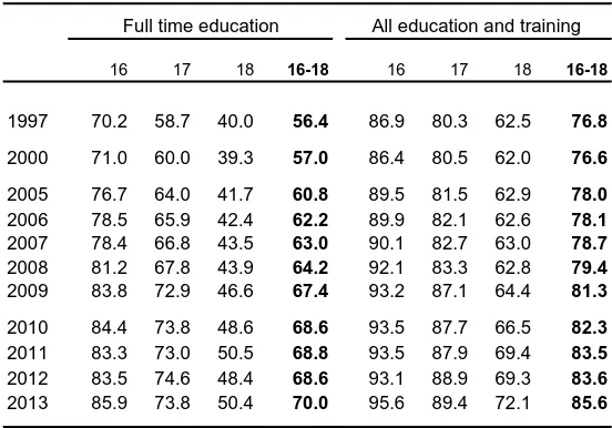
Participation in education and training: 16-18 year olds
● The proportion of the 16-18 age group continuing in full-time education rose by 12 points to 71% between 1997 and 2011 before falling in 2012
● Between 1997 and 2012 the full-time education rate increased for each single age group, the rise was smaller for 18 year olds (6 points) than those for 16 year olds (13 points) or 17 year olds (15 points).
[image:19.842.479.755.115.308.2]● Changes to the collection of data on further and higher education means there is a series break in 1994. Figures in the chart incorporate both points. Data in the table use the revised method.
● At the end of 2012 an estimated 17% of 16-18 year olds were not in any education or training– the second lowest level in this series. The proportion who were also not in employment fell from 10.4% in 2008 to 9.1% in 2010 and was 9.6% at the end of 2012.
● According to international data 60% of UK 18 year olds in some form of education in 2011- below all other EU states apart from Malta and Cyprus. The UK rate was lower due to a combination of lower school leaving age, lower post-compulsory participation and differences in how age is defined.
Next update: Summer 2015 Contact: Paul Bolton x6969
16 year olds
17 year olds
18 year olds
0 10 20 30 40 50 60 70 80 90 100
1985 1990 1995 2000 2005 2010
Proportion of 16-18 year olds in education or training in England (%) 0 10 20 30 40 50 60 70 80 90 100 IR L L TU S W E L V A
FIN PO
L E S T S V N N L D C ZE B E L
DNK DE
U
HUN SV
K
B
G
R
ITA ESP
RO U P R T FR A A U T L U X
HRV GRC GB
R M L T C Y P
Proportion of 18 year olds in education, EU 2012 (%)
Source: EUROSTAT
16 17 18 16-18 16 17 18 16-18
1997 70.2 58.7 40.0 56.4 86.9 80.3 62.5 76.8
2000 71.0 60.0 39.3 57.0 86.4 80.5 62.0 76.6
2005 76.7 64.0 41.7 60.8 89.5 81.5 62.9 78.0
2006 78.5 65.9 42.4 62.2 89.9 82.1 62.6 78.1
2007 78.4 66.8 43.5 63.0 90.1 82.7 63.0 78.7
2008 81.2 67.8 43.9 64.2 92.1 83.3 62.8 79.4
2009 83.8 72.9 46.6 67.4 93.2 87.1 64.4 81.3
2010 84.4 73.8 48.6 68.6 93.5 87.7 66.5 82.3
2011 83.3 73.0 50.5 68.8 93.5 87.9 69.4 83.5
2012 83.5 74.6 48.4 68.6 93.1 88.9 69.3 83.6
2013 85.9 73.8 50.4 70.0 95.6 89.4 72.1 85.6 Ages at 31 August
Source: Participation in education, training and employment by 16-18 year olds in England, DfE
All education and training Full time education
16, 17 and 18 year olds in education and training in England
Percentages at the end of the year
Applicants and entrants to higher education
● The total number of home applications via UCAS rose in each year between 1999 and 2005. There was a 4.1% drop in 2006, the first year of 'variable' fees.
● The drop in 2006 was greater than that seen in 1998 -the last major change to tuition fees. Both were preceded by relatively large increases in applications.
● 2007 data showed a return to the upward trend. Applicant and acceptance numbers reached new records which were exceeded in 2008, 2009 and 2011.
● Applicant numbers fell in 2012 with larger falls among those who face fees of up to £9,000. The total was 7.6% down; accepted applicants were down by 5.5%.
● The fall in applications in 2012 came from home/EU students with an 11% drop, however applications among this group in 2013 saw a resurge of 6.4%. This was concentrated in English institutions where the increase was 17,119 or 3.8%.
● Total applicants in the 2013 cycle were 3.6% up on 2012, but still below 2010 and 2011 levels. By the end of the year a record 495,000 applicants had been placed; 6.6% above the 2012 total. The majority of the increase in acceptances taking place in institutions in England.
● Applicant numbers by the main (pre-clearing) deadline for the 2014 cycle were 3.6% above 2013 levels, but still below their 2011 peak.
● These UCAS data cover full-time/sandwich undergraduate courses. As mature students are much more likely to study part-time, they are not as well covered by these data.
Next update: Autumn 2014 Contact: Paul Bolton x6969
25+ 21-24 Under 21
Age
Women Men
Sex
Overseas Home
Domicile
0% 10% 20% 30% 40% 50% 60% 70% 80% 90%
Accepted applicants in 2013
Accepted applicants by age, sex and domicile Thousands
% Change 1997 2005 2010 2011 2012 2013 on 1997 Age
Under 21 258 316 373 384 363 390 +51%
21-24 37 46 60 57 53 55 +48%
25+ 41 42 55 51 49 51 +24%
Sex
Female 172 217 267 270 257 274 +59%
Male 164 188 220 222 208 222 +35%
Domcile
Home 303 360 425 431 407 434 +43%
EU 17 17 26 27 23 25 +46%
Other overseas 16 28 37 34 34 37 +130%
Total 336 405 487 492 492 496 +47%
Sources: UCAS annual datasets; End of cycle report 2013, UCAS Home applicants through UCAS, UK
Applicants Accepted
number change number change
1995 369,701 +1.2% 265,536 +5.7% 72
2000 389,091 +0.1% 308,718 +1.9% 79
2005 444,630 +7.6% 360,244 +7.8% 81
2006 432,196 -2.8% 345,564 -4.1% 80
2007 454,148 +5.1% 364,544 +5.5% 80
2008 502,461 +10.6% 405,024 +11.1% 81
2009 544,285 +8.3% 425,063 +4.9% 78
2010 586,821 +7.8% 424,634 -0.1% 72
2011 589,350 +0.4% 431,235 +1.6% 73
2012 544,752 -7.6% 407,391 -5.5% 75
2013 561,983 +3.4% 433,612 +6.7% 77
% accepted
Source: UCAS annual datasets
Participation in higher education
● The current participation indicator is the Higher Education Participation Rate (HEIPR). It measures initial participation for 17 to 30-year-old English domiciled first-time entrants to Higher Education. ● The overall HEIPR in England increased gradually from 39% in 1999/00 to 42% in 2005/06 before
falling to 40% in 2006/07. The last Government's target was 50% by 2010.
● A new methodology was introduced in 2007/08 and the bnew series showed further increases to 2011/12 before a sharp drop in 2012/13. BIS says this was largely due to the fall in deferred entries in 2011/12 (the last year before higher fees).
● Under the old methodology participation among men was static or fell, while it increased among women. In recent years the gender gap has been 8-10 points.
● The HEIPR replaced the Age Participation Index which looked at entrants aged under 21 in Great Britain. This increased from 12% in 1979 to 30% in the early 1990s before increasing more gradually to 32% by the end of the 1990s.
● Since 2001/02 there have been only gradual increases in each under-represented group -those from state schools, socio-economic groups 4-7 and low participation neighbourhoods- as a proportion of all young entrants.
● Between 2005/06 and 2011/12 the proportion of English state school pupils eligible for free school meals going to higher education increased from 13% to 21%. In 2011/12 it was still only just over half the rate for pupils not eligible for free meals (39%)
Next update: April 2015 Contact: Paul Bolton x6969
Male Female
0 10% 20% 30% 40% 50%
1999/00 2001/02 2003/04 2005/06 2007/08 2009/10 2011/12
HEIPR by gender, England
HEIPR by gender: Academic years
1999/00-Entrants ('000s) HEIPR
Male Female All Male Female All
Old methodology
1999/00 113 125 238 37 41 39
2000/01 112 128 238 37 43 40
2001/02 112 131 244 36 44 40
2002/03 117 138 255 37 46 41
2003/04 116 141 257 35 45 40
2004/05 118 143 261 35 45 40
2005/06 127 155 281 37 48 42
2006/07 121 148 269 35 45 40
New methodology
2006/07 127 156 284 38 47 42
2007/08 132 162 294 39 48 44
2008/09 141 171 311 41 51 46
2009/10 146 176 322 41 51 46
2010/11 149 175 324 42 51 46
2011/12 158 183 341 45 54 49
2012/13 135 159 294 39 47 43
Source: Participation Rates in Higher Education: Academic Years 2006/07 to 2012/13 (Provisional), BIS
Trends in participation from under-represented groups, UK Percentage of young entrants to full-time first degree courses from:
2001/02 2005/06 2006/07 2007/08 2008/09 2009/10 2010/11 2011/12 2012/13
State schools 86.0 87.4 87.8 88.0 88.5 88.8 88.7 88.9 89.3
NS-SEC 4-7 .. 29.3 29.8 29.5 32.3 30.0 30.6 30.7 32.3
Low participation
neighbourhoods 13.1 14.0 9.0 9.7 10.1 10.3 10.5 10.2 10.9
Notes: The low participation neighbourhood classification changed in 2006/07 and 2011/12 and is not comparable to earlier data. The question used to determine NS-SEC changed in 2008/09 and this figure is also not comparable to other data Source: Performance indicators in higher education in the UK 2012/13, and earlier, HESA
Education expenditure
● UK education expenditure increased consistently from the late 1990s to reach 5.9% in 2009-10 and 2010-11; the highest totals since the mid 1970s.
● Substantial increases in education spending as a proportion of GDP occurred in the early 1990s and the decade from 1999-00. ● Spending has increased in real terms in most years since
1979-80. The only periods where it fell for two or more consecutive years were in the mid-1980s, mid-1990s and early 2010s.
● Education and training expenditure was 6.2% of GDP in 2009-10. Real terms cuts 2012-13 took it back to 5.5%.
● Spending on both measures increased in real terms in 2013-14, but fell, slightly, as a proporiton of GDP.
● The OECD ranked the UK 10th highest out of 27 states on total education expenditure as a percentage of GDP in 2010.
● At 6.5% of GDP (on the OECD measure), total publicand private UK expenditure on education the same as the OECD weighted average.
Next update: Autumn 2014 Contact: Paul Bolton x6969
0% 1% 2% 3% 4% 5% 6% 7% 8%
Education expenditure as a percentage of GDP, 2010
Private Public
Source: Education at a Glance 2013, OECD
0% 1% 2% 3% 4% 5% 6%
1979-80 1984-85 1989-90 1994-95 1999-00 2004-05 2009-10
UK public expenditure on education and training as a percentage of GDP
Education and training
Education only
UK Expenditure on education and training Financial years
£ billion at Annual %
2013-14 increase in Percent £ billion pricesa real terms of GDP
1997-98 38.6 55.0 +0.3% 4.5%
2001-02 51.2 67.9 +8.6% 4.9%
2007-08 78.7 90.6 +5.1% 5.4%
2008-09 83.0 92.9 +2.6% 5.8%
2009-10 88.5 96.4 +3.8% 6.2%
2010-11 91.5 97.2 +0.8% 6.1%
2011-12 86.9 90.2 -7.2% 5.6%
2012-13 87.0 88.7 -1.6% 5.5%
2013-14 90.2 90.2 +1.7% 5.5%
(a) Adjusted using December 2013 HM Treasury GDP deflators Source: PESA 2014 , and earlier, HM Treasury
General Election results
● Since 1945, Labour and the Conservatives have been the largest party in terms of seats won on nine occasions each.
● TheConservatives’ best result since 1945 in terms of seats was the 1983 General Election, when they had 397 MPs elected. Their highest share of the vote was in 1955 when they polled 49.6%.
● Labour’s 418 seats won in 1997 was their highest number ever. Their highest share of the vote since 1945 was 48.8% in 1951, an election that they lost.
● In the 2005 General Election the Liberal Democrats won 62 seats, the highest post war total by the party or its predecessors.
Contact:Richard Cracknell x4632
0% 10% 20% 30% 40% 50% 60%
1945 1950 1951 1955 1959 1964 1966 1970 F '74 O '74 1979 1983 1987 1992 1997 2001 2005 2010 Share of the vote: UK: 1945-2010
Labour Conservative
LibDem
Other
PC/SNP
General Election results: 1979-2010: UK
Con Lab Lib(a) PC/SNP Other Total Share of vote (%)
1979 43.9% 36.9% 13.8% 2.0% 3.4% 100%
1983 42.4% 27.6% 25.4% 1.5% 3.1% 100%
1987 42.2% 30.8% 22.6% 1.7% 2.7% 100%
1992 41.9% 34.4% 17.8% 2.3% 3.5% 100%
1997 30.7% 43.2% 16.8% 2.5% 6.8% 100%
2001 31.7% 40.7% 18.3% 2.5% 6.9% 100%
2005 32.4% 35.2% 22.0% 2.2% 8.2% 100%
2010 36.1% 29.0% 23.0% 2.2% 9.7% 100%
Seats won
1979 339 268 11 4 13 635
1983 397 209 23 4 17 650
1987 375 229 22 6 18 650
1992 336 271 20 7 17 651
1997 165 418 46 10 20 659
2001 166 412 52 9 20 659
2005 198 355 62 9 22 646
2010 306 258 57 9 20 650
Votes (millions)
1979 13.7 11.5 4.3 0.6 1.1 31.2
1983 13.0 8.5 7.8 0.5 1.0 30.7
1987 13.7 10.0 7.3 0.5 0.9 32.5
1992 14.1 11.6 6.0 0.8 1.2 33.6
1997 9.6 13.5 5.2 0.8 2.1 31.3
2001 8.4 10.7 4.8 0.7 1.8 26.4
2005 8.8 9.6 6.0 0.6 2.2 27.1
2010 10.7 8.6 6.8 0.7 2.9 29.7
(a) Liberal/SDP Alliance 1983-87; Liberal Democrats from 1992 Source: House of Commons Library Research Paper 12/43
Local, Scottish Parliament, Welsh Assembly and European Parliament elections
● Labour won or retained control of 82 councils in the local elections of May 2014, a net gain of 4; the Conservatives won or retained control of 41 councils, a net loss of 13, while the Liberal Democrats retained control of 6 councils. UKIP won or retained 161 seats, compared to 7 wins in 2010.
● The Scottish National Party won a majority of seats (69 out of 129) in the Scottish Parliament at the 2011 elections. Their total share of the vote was 44.7%, up 12.8% points on 2007. Labour are the second largest party with 37 seats.
● Labour won 30 out of 60 seats in the 2011 Welsh Assembly elections. Labour's vote share was 39.6%, up 8.7% points on 2007. The Conservatives are the second largest party with 14 seats and their vote share rose by 1.8% points.
● The first elections for Police and Crime Commissioners were held in England (excluding London) and Wales on 15 November 2012.
Next update: Sept 2014 Contact: Richard Cracknell x4632
CON
LAB
LD OTHERS
PC/SNP 0
2,000 4,000 6,000 8,000 10,000 12,000 14,000
1973 1977 1981 1985 1989 1993 1997 2001 2005 2009 2013 Councillors
Councillors in Great Britain: 1981-2014
After May local elections Forthcoming elections
18 September 2014 Scottish independence referendum
7 May 2015 United Kingdom General Election
Estimated post-election council composition 2014: Great Britain
CON LAB LD UKIP SNP/PC OTH CON LAB LD UKIPSNP/PC OTH
London Boroughs 612 1,054 116 12 47 33% 57% 6% 1% 3%
Metropolitan Boroughs 368 1,746 190 37 72 15% 72% 8% 2% 3%
Counties 933 380 251 138 88 52% 21% 14% 8% 5%
Unitary authorities 1,211 1,156 400 48 264 39% 38% 13% 2% 9%
Shire districts 5,083 1,788 1,182 96 727 57% 20% 13% 1% 8%
England 8,207 6,124 2,139 331 1,198 46% 34% 12% 2% 7%
Welsh unitary authorities 105 580 72 3 170 323 8% 46% 6% 0% 14% 26%
Scottish unitary authorities 115 394 71 424 216 9% 32% 6% - 34% 18% Great Britain 8,427 7,098 2,282 334 594 1,737 41% 35% 11% 2% 3% 8%
Source: Rallings and Thrasher, Local Government Chronicle 29 May 2014
European Parliament election results: 1979-2014: Great Britain
CON LAB LD UKIP PC/SNP Other Total
Share of vote (%)
1979 50.6% 33.0% 13.1% - 2.6% 0.7% 100%
1984 40.8% 36.5% 19.5% - 2.5% 0.7% 100%
1989 34.7% 40.1% 6.2% - 3.4% 15.6% 100%
1994 27.9% 44.2% 16.7% 1.0% 4.2% 6.0% 100%
1999 35.8% 28.0% 12.7% 7.0% 4.5% 12.0% 100%
2004 26.7% 22.6% 14.9% 16.2% 2.4% 17.2% 100%
2009 27.7% 15.7% 13.7% 16.5% 2.9% 23.3% 100%
2014 23.9% 25.4% 6.9% 27.5% 3.2% 13.1% 100%
Seats won
1979 60 17 0 - 1 0 78
1984 45 32 0 - 1 0 78
1989 32 45 0 - 1 0 78
1994 18 62 2 0 2 0 84
1999 36 29 10 3 4 2 84
2004 27 19 12 12 3 2 75
2009 25 13 11 13 3 4 69
2014 1919 20 1 24 3 3 1970
Source: House of Commons Library Research Paper 12/43
Turnout
● Turnout at the 2010 General Election was 65.1%, higher than the previous two General Elections but still the third lowest since the introduction of universal suffrage.
● Across EU-15 countries, average turnout at the last parliamentary election was 73.4%. UK turnout is low in comparison. Lowest of the G7 is USA at 52.2%
● UK turnout at the 2014 European Parliament election was 35.3%. This was up on the 34.5% in 2009 but below the 39.4% in 2004.
Next update: September 2014 Contact: Richard Cracknell x4632
0 20 40 60 80 100
1945 1950 1951 1955 1959 1964 1966 1970 F1974 O1974 1979 1983 1987 1992 1997 2001 2005 2010 % Turnout at General Elections 1945-2010
Percentage of registered electorate
0 20 40 60 80 100
DNK LUK BEL SWE AUT NLD ESP ITA IRL FIN DEU UK GRC CAN JAP FRA PRT USA % Turnout at last parliamentary election: EU-15 and G7
Percentage of registered electorate
Turnout at most recent elections Percentages of registered electorate
Election Year Turnout %
European Parliament 2014 35.3
English local 2014 35.3
County councils 2013 31.0
Unitary councils 2013 32.0
Mayoral elections
Doncaster 2013 27.2
North Tyneside 2013 32.0
Hackney 2014 38.8
Lewisham 2014 36.7
Newham 2014 39.4
Tower Hamlets 2014 45.9
Watford 2014 36.1
Welsh unitary councils 2013 51.0
Police and Crime Commissioners 2012 14.7
London Assembly 2012 37.5
Mayor of London 2012 37.4
Welsh unitary councils 2012 38.8
Scottish unitary councils 2012 37.9
Alternative Vote referendum 2011 42.0
Scottish Parliament 2011 50.4
Welsh Assembly 2011 41.4
Northern Ireland Assembly 2011 54.7
English local 2012 31.2
London boroughs 2010 63.1
Metropolitan boroughs 2012 31.2
County councils 2009 39.1
Unitary councils 2012 29.4
Shire district councils 2012 31.6
General 2010 65.1
Notes:
Sources: Rallings and Thrasher, British electoral facts 1832-2006
Rallings and Thrasher, Local elections handbook series Electoral Commission
Turnout at the 2010 local elections was boosted by the General Election being held on the same day. Turnout in council elections in 2012 is as reported by the Electoral Commission.
Opinion polls
● YouGov's monthly average for polls across July 2014 put Labour on 37%, the Conservatives on 34%, the Liberal Democrats 8% and UKIP on 12%.
● ICM's 11-13 July 2014 poll put Labour on 33%, the Conservatives on 34% and the Liberal Democrats 12%.
● An Ipsos MORI poll on 12-15 July 2014 put Labour on 35%, the Conservatives on 32% and Liberal Democrats on 8%.
● Populus' 01-03 August 2014 poll put Labour on 37%, the Conservatives 35% and the Liberal Democrats 9%.
● "Race relations/immigration/immigrants" registered as the top issue among voters in Ipsos MORI’s regular poll for the first time in June 2014, overtaking "Economy/economic situation" -which had held top position since September 2008. "Unemployment/factory closure/lack of industry" has fallen from joint 2nd place in October 2013 to 4th. "NHS/hospitals/health care" has risen to 3rd.
Next update:January 2015 Contact: Richard Cracknell x4632
31% LAB, 41%
LD, 13% Other, 16%
0% 5% 10% 15% 20% 25% 30% 35% 40% 45% 50%
Feb 11 Jun 11 Oct 11 Feb 12 Jun 12 Oct 12 Feb 13 Jun 13 Oct 13 Feb 14 Jun 14 Monthly voting intention: ICM
Published data, actual election results used
CON, 33% LAB, 37%
LD, 9% Other, 21%
0% 5% 10% 15% 20% 25% 30% 35% 40% 45% 50%
Feb 11 Jun 11 Oct 11 Feb 12 Jun 12 Oct 12 Feb 13 Jun 13 Oct 13 Feb 14 Jun 14 Monthly voting intention: Ipsos MORI
All 'absolutely certain' to vote, actual election results used
Ipsos MORI: Issues facing Britain: July 2014 Issues polling 8% or more
Most or other important issue %
Race releations/immigration/immigrants 36
Economy/economic situation 32
NHS/hospitals/health care 27
Unemployment/factory closure/lack of industry 25
Poverty/inequality 18
Crime/law & order/violence/vandelism 15
Housing 15
Education/schools 13
Defence/forieng affairs/international terrorism 12
Don't know 11
Inflation/prices 11
Pensions/social security 11
Low pay/minimum wage/fair wage 10
Ageing population/social care for elderly 9
Common market/EU/Europe/single currency 9
Morality/individual behavior 8
963 adults interviewed 6th-15th June 2014
Source: Ipsos MORI, Issues Index, www.ipsos-mori.com
Road fuel prices
● Petrol and diesel prices levelled off and started to fall slightly in 2012 and 2013, after sharp increases since 2009
● Unleaded petrol cost an average of 131.1p/litre in July 2014; 3% less than one year ago.
● The average diesel price was 136.2p/litre; 2.5% less than a year earlier. ● In June 2014 the UK had the seventh highest pump price for petrol in the
EU. The UK’s diesel pump price was the highest in the EU.
● 61% of the UK’s unleaded petrol pump price was accounted for by taxes and duties; the highest in the EU.
● 58% of theUK’s diesel pump price was accounted for by taxes and duties; the highest in the EU.
● Excluding tax and duties, the June 2014 prices for unleaded petrol and diesel were 51p/litre and 55p/litre respectively.
Next update: October 2014 Contact: Tom Rutherford x4313
0 20 40 60 80 100 120 140
0 20 40 60 80 100 120 140
1989 1991 1993 1995 1997 1999 2001 2003 2005 2007 2009 2011 2013
UK premium unleaded petrol retail prices
Monthly data, pence per litre
0 25 50 75 100 125 150
IT
A
NL
D
GR
C
DNK F
IN
SWE IRL DE
U
GB
R
BEL PRT FRA SVK SVN ML
T
ESP CZ
E
HUN LT
U
CRO CY
P
A
UT
B
GR LVA
L
U
X
P
OL
EST RO
U
Unleaded petrol pump prices in EU Member States
pre-tax price
taxes and duties
28 October 2013, pence per litre
UK retail prices for unleaded petrol and diesel Pence per litre
Petrol Diesel
Jan 1997 61.1 62.0
Jan 2001 76.9 81.6
Jan 2005 79.0 84.2
Jan 2009 86.3 98.7
Jan 2010 111.5 113.3 Jan 2011 127.5 132.1 Jan 2012 132.9 141.3 Jan 2013 131.7 139.5 Jan 2014 130.2 138.1 Jul 2014 131.1 136.2
Sources: Quarterly energy prices, DECC. Table 4.1.1
Energy use
● Final UK energy consumption rose by 12% in the two decades to 2000. It has fallen modestly since then apart from steeper cuts of 7% and 8% in 2009 and 2011 respectively.
● Transport became the largest energy consuming sector in 1988 and accounted for 38% of final consumption in 2012. Consumption by industry has more than halved since 1973.
● In 1956 coal supplied 85% of theUK’s energy needs. Growth in the use of petroleum for transport, gas and nuclear for electricity and gas for heating meant its share of energy supplied fell below 50% in 1970 and below 20% from 1996. A shift in generation from gas to coal in 2012 saw coal increase its share to the highest level since 1995.
● In 2012 gas supplied 35% of UK energy, petroleum 32% and coal 20%. ● Generation from gas started to increase in the early 1990s. In 1993 it stood
at 11%, by 1999 it was more than 40%. It fell from 2004 to 2006 (due to falling UK production and higher prices), increased to a record 48% in 2010 before falling back again in 2011 and 2012 in response to higher prices. ● Renewable generation made up 11% of UK electricity supply in 2012.
Next update: October 2014 Contact: Tom Rutherford x4313
0% 10% 20% 30% 40% 50% 60% 70% 80% 90% 100%
1956 1961 1966 1971 1976 1981 1986 1991 1996 2001 2006 2011 Consumption of primary fuels and equivalents
Energy supplied basis
Other Nuclear Natural gas Petroleum Coal
0 50,000 100,000 150,000 200,000 250,000 300,000 350,000 400,000
1993 1995 1997 1999 2001 2003 2005 2007 2009 2011 Electricity supplied by fuel/type (GWh)
Other Oil Renewables Nuclear Gas Coal
Final energy consumption by sector (energy supplied basis), UK Million tonnes of oil equivalent
Industry Transport Domestic Other(a) Total
1970 62.3 28.2 36.9 18.6 146.0
1980 48.3 35.5 39.8 18.7 142.4
1990 38.7 48.6 40.8 19.2 147.3
2000 35.4 55.5 46.9 21.5 159.4
2008 30.1 56.8 45.4 19.4 151.7
2009 26.2 54.8 43.0 18.4 142.4
2010 26.9 54.0 48.5 19.2 148.6
2011 25.9 54.0 38.9 18.5 137.3
2012 25.2 53.2 43.2 19.0 140.6
2013 24.2 53.4 43.8 28.7 150.1
(a) Mainly agriculture, public administration and commerce
Source: DECC, Digest of UK Energy Statistics, table 1.1.5
Greenhouse gas emissions
● Provisional results show that UK emissions of greenhouse gases stood at 464.3 tonnes of carbon dioxide equivalent in 2013. The recession caused a particularly large fall in emissions in 2009.
● UK carbon dioxide emissions fell by 32% between 1970 and 2013. There was little or no reduction in carbon emissions between 1997 and 2007.
● Much of the decline in carbon emissions has come from a fall in emissions from industry and power generation, while those caused by domestic users have also declined to a lesser degree. Emission from transport were 1.6 times greater in 2013 than in 1970.
● Emissions of carbon by end user in 2012 show that business was responsible for 34% of UK emissions, transport for 28% and residential sources for 29%.
● The UK is on course to meet its Kyoto and domestic Carbon Budget targets for 2008-2012. Actual compliance is net of emissions trading which is not included here.
Next update: January 2014 Contact: Richard Keen x3851
0% 10% 20% 30%
Buisness
Transport
Residential
Public Sector
Other
UK CO2emissions by end user: 2012
0 100 200 300 400 500 600 700
1970 1973 1976 1979 1982 1985 1988 1991 1994 1997 2000 2003 2006 2009 2012 UK CO2emissions since 1970
million tonnes of carbon equivalent
2013 provisional estimate
Estimated total UK emissions of Kyoto Protocol 'basket' of greenhouse gases Million tonnes of CO2 equivalent
2008-2012 targets (annual equivalents)
1990 2000 2005 2008 2009 2010 2011 2012p
Carbon budget
Kyoto target(a) ]
Carbon dioxide (net) CO2 591.10 552.19 552.83 527.29 477.94 495.23 454.03 474.05 Methane CH4 104.25 78.24 62.27 57.96 55.74 52.50 51.69 50.63 Nitrous oxide N2O 69.81 48.28 42.90 39.00 36.83 37.70 36.29 35.99
HFCs HFC 11.38 8.85 11.22 12.74 13.14 13.53 13.79 13.95
PFCs PFC 1.40 0.46 0.30 0.20 0.15 0.22 0.33 0.21
Sulphur hexafluoride SF6 0.99 1.79 0.99 0.58 0.56 0.65 0.56 0.54
Total 778.93 689.81 670.51 637.77 584.35 599.82 556.68 575.37 603.60
Kyoto basket total(b) 777.60 692.15 676.27 644.22 590.72 606.23 563.17 581.07
682.40
(a) The 1990 baseline, is the sum of 1990 totals for all gases other than HFCs, PFCs and sulphur hexafluoride where 1995 data are used.
Sources: 2011 greenhouse gas emissions, final figures, DECC 2012 UK greenhouse gas emissions, provisional figures, DECC
(b) The Kyoto basket totals differ slightly from the sum of the 6 individually reported gases shown above due to differences in the coverage of land use change and forestry, and the inclusion of the UK Overseas Territories
Domestic gas and electricity prices
● Both domestic gas and electricity prices, after falling in 2010, have seen annual increases over the last 3 years. The Committee on Climate Change estimates that with current policies average dual fuel bills will increase by around 18% in real terms between 2010 and 2020 and that 60% of the increase will be policy related.
● The average standard credit gas bill for a typical consumer was £896 in 2013. This was more than double the 2001 low in real terms and the highest real level in this series (from 1990).
● The average standard credit electricity bill for a typical consumer was £532 in 2012. This was 68% above the 2003 low in real terms.
● Average standard credit bills are higher for customers of former monopoly suppliers, but the gap has fallen over time.
● Monthly RPI data show the scale of price rises in late 2012 and late 2013. December 2013 electricity and gas prices were 69% and 140% above their respective April 2003 and November 2000 lows in real terms.
Next update: January 2015 Contact: Tom Rutherford x4313
50 60 70 80 90 100 110 120 130 140 150 160
1987 1989 1991 1993 1995 1997 1999 2001 2003 2005 2007 2009 2011 2013
Index prices for gas and electricity Indices relative to the all items RPI, January 1987=100
Gas Electricity
0 100 200 300 400 500 600 700 800 900
1990 1992 1994 1996 1998 2000 2002 2004 2006 2008 2010 2012
Gas Electricity
Average annual standard credit bills for typical consumers
£ 2013 prices
£ 2013 prices
Gas Electricity
Home suppliers
Non-home
suppliers All
Home suppliers
Non-home
suppliers All
1990 .. .. 493 .. .. 424
1996 479 444 479 .. .. 431
2000 420 353 401 353 328 349
2007 630 607 619 452 417 437
2008 700 699 700 506 464 487
2009 783 764 776 514 466 491
2010 732 713 724 484 441 462
2011 791 758 778 508 475 490
2012 883 821 857 527 497 511
2013 923 861 896 548 519 532
Notes: From 2007 data are for calendar years, earlier figures are for the year to September
Data adjusted to 2013 prices using December 2013 GDP deflators Source: Quarterly energy prices, DECC, Tables 2.2.1 and 2.3.1
Former public electricity suppliers/ British Gas are home supplier within their own areas, non home suppliers are all others
Average annual domestic gas and electricity bills for a typical standard credit consumer, UK
The weather
● Central England Temperature (CET) has been recorded since 1659. The CET temperature in 2013 was the 107th warmest on record; just over a full degree cooler than 2011.
● 2013 was slightly cooler, drier and sunnier than average. UK rainfall levels were 5% below average compared to 15% above average in 2012.
● The past winter and spring were both mild; spring 2014 was the fifth warmest on record.
● Winter 2013/14 was the wettest ever recorded on both the UK (1910-) and the England and Wales Precipitation (1766-) series. It was also 'exceptionally stormy' according to the Met Office. January 2014 was the wettest January ever on the longer series.
● Summer 2014 has so far been warmer (+1.2o
C), drier (-21%) and sunnier (+21%) than average.
Contact: Paul Bolton x6969 2013 -selected averages for the home countries
Mean temp
o
C
Sunshine hours
Rainfall (mm)
Actual
UK 8.8 1,421 1,091
England 9.5 1,539 814
Wales 9.0 1,471 1,343
Scotland 7.5 1,233 1,474
N Ireland 9.0 1,294 1,139
Differences from 1981-2010 averages, oC or %
UK -0.1 +4% -5%
England -0.2 +3% -5%
Wales -0.1 +5% -8%
Scotland +0.1 +4% -6%
N Ireland +0.1 +3% +0%
Source: Met Office UK climate and weather statistics
-5 0 5 10 15 20 25 30
-5 0 5 10 15 20 25 30
Aug Sep Oct Nov Dec Jan Feb Mar Apr May Jun Jul Temperature and rainfall variations, year to July 2014
Observations 1981-2010 average
0 20 40 60
0 20 40 60 80
Aug Sep Oct Nov Dec Jan Feb Mar Apr May Jun Jul Observations
1981-2010 average
Source: Adapted from Crown copyright data supplied by the Met Office
Daily max and min Central England Temperature oC
Weekly rainfall totals, England and Wales, mm
-2.4oC
29.7oC
Research and development
Next update: March 2015 Contact: Richard Keen x3851
UK GERD by sector, country and region, 2012
Government
Higher & Research Private Business Education Councils Non-Profit
£ million £ million £ million £ million £ million %
South East 4,086 1,033 793 111 6,023 22
East of England 3,449 650 207 225 4,531 17
London 1,477 1,767 323 121 3,688 14
North West 1,784 581 75 4 2,444 9
South West 1,364 363 345 11 2,083 8
Scotland 707 973 233 9 1,922 7
West Midlands 1,461 353 2 4 1,820 7
East Midlands 1,203 347 85 4 1,639 6
Yorkshire and the Humber 603 503 58 1 1,165 4
Northern Ireland 420 141 21 - 582 2
Wales 272 264 31 2 569 2
North East 282 237 - 23 542 2
United Kingdom 17,107 7,211 2,173 515 27,006
Source: Office for National Statistics
Total
0.00 0.50 1.00 1.50 2.00 2.50
1985 1988 1991 1994 1997 2000 2003 2006 2009 2012
UK GDRD spending as a percentage of GDP 1985 - 2012
In 2012 the UK’s gross domestic expenditure on research & development (GERD) was, in current (cash) terms, £27.0 billion.
In constant prices, adjusted for inflation, R&D expenditure has increased by 56% from the 1985 estimate of £17.3 billion. Expenditure peaked in 2011 at £27.9 billion.
GERD has fallen slightly as a percentage of GDP 1985-2012. Having peaked at 2.14% of GDP in 1986, it fell to a low of 1.65% of GDP in 2004. In 2012 GERD was 1.72% of GDP.
The business sector accounted for £17.1 billion of expenditure (current prices) in 2012, or 63% of total GERD. Higher education accounted for 27%, government & research councils for 8% and private non-profit for 2%.
Internationally, UK GERD as a percentage of GDP was below EU28 (1.98%), USA (2.79%), Germany (2.98%) and China (1.98%).
0.00 0.50 1.00 1.50 2.00 2.50 3.00 3.50 4.00 4.50 5.00