TSmap3D: Browser Visualization of High
Dimensional Time Series Data
Supun Kamburugamuve, Pulasthi Wickramasinghe, Saliya Ekanayake, Chathuri Wimalasena,
Milinda Pathirage, Geoffrey Fox
School of Informatics and Computing Indiana University
Bloomington, IN, United States
{skamburu, pswickra, sekanaya, cpelikan, mpathira, gcf}@indiana.edu
Abstract—Large volumes of high dimensional time series data are increasingly becoming commonplace, and the ability to project such data into three dimensional space to visually inspect them is an important capability for scientific exploration. Algorithms such as Multidimensional Scaling (MDS) and Prin-cipal Component Analysis (PCA) can be used to reduce high dimensional data into a lower dimensional space. The time sensitive nature of such data requires continuous processing in time windows and visualizations to be shown as moving plots. In this paper we present: 1. an MDS-based approach to project high dimensional time series data to 3D with automatic transformation to align successive data segments; 2. an open source commodity visualization of three-dimensional time series in web browser based on Three.js; and 3. An example based on stock market data. The paper discusses various options available when producing the visualizations and how one optimizes the heuristic methods based on experimental results.
I. INTRODUCTION
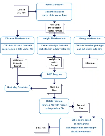
TSmap3D is a software toolkit for generating and visu-alizing high dimensional time series data in 3D space as a sequence of 3D point plots. It consists of a web portal, Web-PlotViz for viewing the points in 3D, a highly efficient parallel implementation of Multidimensional Scaling (MDS) [1] for mapping high dimensional data to 3D from large data sets, and a generic workflow with tools to prepare data for processing and visualization. The input to the system is a set of data points taking sequence of values at each time step. The output is a sequence of 3D point plots that can be portrayed by the visualization software as a continuous moving plot with user interactions enabled for the plots. The timestamp associated with a data point is used to segment the data into time windows, which can be calculated by a method such as sliding window approach. This sequence of data segments define the time steps of the time series. A distance metric between each pair of data points in a data segment is chosen, and the points are projected to 3D by the MDS algorithm such that the distances between the items in new 3D space matches the original distances as closely as possible.
The MDS projection of points to 3D is ambiguous up to an overall rotation, translation and reflection. When MDS is applied to each segment in a series of consecutive data segments for a time series data set, the resulting 3D points in adjacent plots are not aligned by default. We introduce an approach called MDS alignments to find the transformation
which best aligns mappings that are neighboring in time. The MDS and alignment techniques are well established, but they are non-trivial to apply in this particular instance with so many details regarding the implementation. Variants of least squares optimization are involved in both the MDS and alignment stages, and in each case, we weight the terms in objective functions by a user defined function. The result of MDS followed by MDS alignments is a time series consisting of a set of vectors, one for each data entity, in 3D (MDS can project to any dimension but 3D is natural for visualization). The visualization software is an HTML5 viewer (based on Three.js [2]) for general 3D time series, which greatly helps in understanding the behavior of time series data. The user is capable of viewing the time series as a moving plot, while interacting with the plots via 3D rotations, pan and zoom. This allows them to visually inspect changes in the high dimensional relationships between the items over time. The web-based viewer works on any platform with a web browser including handheld devices such as mobile phones.
This paper describes the initial results of a study concerning the structure of financial markets viewed as collections of securities generating a time series of 3D values and visualized using WebPlotViz. The study should be viewed as an exam-ination of technologies and approaches and not a definitive study of stock structures. For example, this study looks at only one set of U.S. securities over a 13-year time period with daily values defining the time series. A version of the WebPlotViz visualization software loaded with plots described in this paper, along with many other plots, is available publicly for reference1. WebPlotViz is available either as open source
software or as ”Software as a Service” supporting user upload and display of data.
The remainder of this paper is organized as follows: Sec-tion II discusses related work, then SecSec-tion III presents the workflow in detail. Section IV provides details about the implementation of visualization software. Section V informs on the stock data analysis using the system. Experiments and results are discussed in Section VI. Section VII presents future work and Section VIII concludes the paper.
II. RELATEDWORK
There are a large number of software tools for visualizing scientific data. Most of them are desktop models utilizing the power of low level programming to achieve highly efficient visualizations [3], [4], [5]. Many researchers [6], [7], [8], [9] have identified the importance of big data visualization as a tool for scientific exploration. Big data visualization can give valuable insight for scientists to further study prob-lems in different directions. With the recent advancements in Web browser technologies, visualization software is being developed for such platforms, which offers advantages such as platform independence and functionality in small devices. Some examples include Many Eyes [10], a tool developed by IBM for analyzing data visually in browsers, and iView [11], which is a browser-based visualization software for protein-ligand complexes developed using Three.js. Still desktop vi-sualization software seems to provide more advanced features than browser based software and Gephi [12] is a popular open source visualition system.
Some of the most popular dimension reduction algorithms include Principle Component Analysis (PCA), Generative Topographic Mapping (GTM) [13], Self-Organizing Map (SOM) [14], t-SNE [15] and Multidimensional Scaling. We use MDS (an improved SMACOF method) for this paper due to its popularity and strong theoretical backgrounds. The MDS algorithm [16] is well-known but has been efficiently optimized and parallelized [17]. This approach has recently been applied to visualize biological data sets including DNA sequences and proteins [18], [19].
There are many tools to develop large-scale workflows from both the HPC and Big Data communities. Some noteworthy examples of HPC workflows include Tavarna [20], Kepler [21] and Airavata [22]. These tools are geared towards linking high performance computations outside the data flow, which is the most important aspect of this application. The data used in our application is large in terms of data items and number of segments possible, hence it is more suitable for big data management platforms. Technologies such as Hadoop [23], Spark [24] and Flink [25] are also available. Developing workflows on top of such frameworks provides other capa-bilities including fault tolerance and automatic parallelization for analyzing large data sets. To develop big data workflows, tools such as Apache Beam [26] and Crunch, which work as a layer on top of big data frameworks described above, can be used. A generic dataflow language such as Apache Beam can avoid locking in to a single big data platform. The workflow described in this paper is implemented using Hadoop and Crunch and later will be implemented in Apache Beam (open source Google Cloud Dataflow).
The HTML5 visualization tool WebPlotViz described in this paper is the next generation of our desktop visualization tool PlotViz [27], [28]. PlotViz is a standalone Windows application with support for displaying individual plots and trees. With the desktop version, it was difficult to share plots among users and manage the data in a central repository. Also
the standalone nature of PlotViz made it impossible to develop large-scale processing algorithms for uploaded plots. Because the data is now stored at the back-end, the new architecture allows large-scale processing of plot data. Furthermore the new version supports time series data visualizations.
III. DATAPROCESSINGWORKFLOW
The TSmap3D framework executes all the steps, includ-ing pre-processinclud-ing, data analytics and post-processinclud-ing, in a scripted workflow as shown in Figure 1. The initial workflow was developed with MPI(Message Passing Interface) as the key technology to implement the data processing and used a HPC cluster to run the workflow. Later we implemented the same data processing steps in Apache Hadoop [23] for better scalability, data management and fault tolerance. All the programs in the workflow are written using Java, and the integration is achieved using bash scripts. The MDS and Levenberg-Marquardt MDS alignment algorithms are Java-based MPI applications running efficiently in parallel.
Pre-processing steps of TSmap3D mainly focus on data cleansing and preparing the data to suit the input for the MDS algorithm. These data are then run through the MDS algorithm to produce 3D point sets at each time value. There can be high numbers of data segments for a data set depending on the data segmentation approach. For each of these segments, we first put the data into a vector form where ith element represents
the value atithtime step in that window. For each vector file, a
distance matrix file and weight file are calculated according to user defined functions. The(i, j)thentry of these files contains
the pairwise distance or weight between i and j vectors. At the next step MDS is run on these data segments individually which produces the 3D point files.
Each MDS Projection is ambiguous to an overall rotation, reflection and translation, which was addressed by a least squares fit to find the best transformation between all con-secutive pairs of projections. This transformation minimizes the distances between the same data points in the two plots. Next the plots are prepared for visualization by TSmap3D. The points in the plots are assigned to clusters according to user defined classifications. Colors and symbols are assigned to clusters, and finally the files are converted to the input format of the visualiser.
A. Segmenting time series
TSmap3D mainly uses a sliding window approach to seg-ment the data. Users can choose a time window and sliding time period to generate data sets. The data segmenting starts with time t0, s and adds a fixed time window tw to get the
first data segment with end timet0, e. Adding a shifting time ts to the previous start time and end time produces a sliding
data segmentation. Adding a shifting time only to the end time produces an accumulating segmentation.
The sliding time approach with a 1 yeartwand 7 dayts
Fig. 1: Data processing workflow
can have different item sets and the data of an item in a given time segment can be incomplete.
B. Distance & Weight Calculation
The MDS algorithm expects a distance matrix D, which has the distance between each pair of items in a given data segment. It also expects a weight matrix W with the weights between each pair of items within that data segment. D = |di,j|;di,j =distance(i, j) W =|wi,j|;wi,j = weight(i, j)
Both distance matrix and weight matrix are stored as files with values converted to a short integer from its natural normalized double format (value between 0 and 1) for compact storage purposes.
To calculate both distance matrix and weight matrix, we put each data item into a vector format from the original input file. A row in this vector file contains values for each time step of the time window. When creating these vector files the data items are cleaned (i.e. remove items without sufficient values for the time period, and fill values that are missing). After this process, the data is now clean and in vector form.
C. MDS Program
The MDS algorithm we use [17], [29] is an efficient weighted implementation of SMACOF [30]. Its runtime com-plexity is effectively reduced from cubic to quadratic with the use of the iterative conjugate gradient method for dense matrix inversion. Also it implements robust Deterministic Annealing (DA) process to optimize the cost function without being trapped in local optima. Weighting allows us to give more importance to some data items in the final fit. Note our pipeline
is set up for general cases where points are not defined in a vector space and it only uses distances and not scalar products. In earlier work, we have learned to prefer MDS to PCA as MDS does optimal non-linear transformations and PCA is only superior over all linear point transformations to the 3D space. Despite this PCA remains a powerful approach and one could use this visualization package with it as well as MDS presented here.
The objective of the MDS algorithm is to minimize the stressσ(X)defined in Eq. 1 wheredi,jis the distance between
pointsiandjin the original space;δi,jis the distance between
the two points in mapped space andwi,jis the weight between
them.
σ(X) = X
i,i≤N
wi,j(di,j−δi,j)2 (1)
The mathematical foundation of the parallel algorithm along with deterministic annealing optimization approach is described in great detail in [17]. The parallel MDS implemen-tation uses Java and message passing. OpenMPI provides a Java binding over its native message passing implementation, which is further optimized in MDS to gain significant speedup and scalability on large HPC clusters [1]. The code for MDS is public and is also available at SPIDAL source repository2.
D. MDS alignments
Because MDS solutions are ambiguous to an overall rota-tion, reflection and translarota-tion, the algorithm produces visu-ally unaligned results for consequent windows in time. We experimented with two approaches to rotate and translate the MDS results among such different windows so that they can be viewed as a sequence of images with smooth transitions from one image to other.
In the first approach we generate a common dataset across all the data available and use this as a base to rotate and trans-late each of the datasets. In the second approach we rotate with respect to the result of the previous time window. This leads to a continuous alignment of the results but requires the data processing to run with overlapping times in a sliding window fashion. The first method is viable for time windows with less overlapping data, because the results of two consecutive time windows can be very different.
The algorithm reflects, rotates, translates and scales one data set to best match the second. It is implemented as a least squares fit to find the best transformation that mini-mizes sum of squares of difference in positions between the MDS transformed datasets at adjacent time values. We use the well-known reasonably robust LevenbergMarquardt [31] minimization technique using multiple starting choices; this increases robustness and allows us to see if a reflection (improper transformation) is needed. Currently the algorithm only uses the reflection, rotation and translation in the final transformation as it needs to preserve the original scale of
the generated points. In the future we intend to simplify the algorithm to remove the fitted scaling factor.
IV. WEBPLOTVIZVISUALIZATIONSOFTWARE
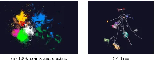
WebPlotViz is a HTML5-based viewer for large-scale 3D point plot visualizations. It uses Three.js 3 JavaScript library for rendering 3D plots in the browser. Three.js is built using WebGL technology, which allows GPU-accelerated graphics using JavaScript. It enables WebPlotViz to visualize 3D plots consisting of millions of data points seamlessly. WebPlotViz is designed to visualize sequences of time series 3D data frame by frame as a moving plot. The 3D point files are stored along with the metadata in a NoSQL database which allows scalable plot data processing on the server side. The user can use the mouse to interact with the plots displayed, i.e. zoom, rotate and pan. They can also edit and save the loaded plots by changing point sizes and assigning colors and special shapes to points for better visualization. WebplotViz provides features to create custom clusters and define trajectories, as well as supporting single 3D plots such as point plots and trees. A sample plot with 100k points and a tree are shown in Fig 3. The online version has many such example plots preloaded.
WebPlotViz also serves as a data repository for storing and sharing the plots along with their metadata, including functions to search and categorize plots stored. The source code of WebPlotViz, data analysis workflow and MDS algorithm are available in the DSC-SPIDAL github repository4.
A. Input
WebPlotViz has an XML-based input format, as well as text file-based and JSON-based versions. The XML and JSON file formats contain the points and other metadata such as cluster information of a plot. The text file input is a simple input format with only the point information for quick visualization of data sets. A time series input file is a collection of individual plots and an index file specifying the order of the plots to be displayed in the time series.
B. Grouping & Special Shapes
Points are grouped into user defined clusters and separate colors are used to distinguish them visually. WebPlotViz offers functions to manage these groups. For example, special shapes can be assigned to the items in a plot through the UI as well as in the plot input files, and the items can also be hidden. Additionally users are provided with the functionality to define custom clusters through the UI, which allows them to revise the clusters provided through the input file. This is an important functionality since when analyzing data through visualization, domain knowledge often allows users to deter-mine groupings and clusters that might not be obvious prior to visualization. Special shapes are assigned to points to clearly highlight them in the plot.
WebPlotViz also provides several color schemes that can be applied to plots in order to mark clusters with unique
3http://threejs.org
4https://github.com/DSC-SPIDAL
colors. This can be of help if the original plot data does not contain any color information for clusters or if the existing color scheme does not properly highlight the key features of the plot.
C. Trajectories
Trajectories allow the user to track the movement of a point through time when the time series is played. A trajectory is displayed as a set of line segments connecting the movement of an item in time where the points are marked with labels to identify their place.
D. Versioning
WebPlotViz provides version support for plots to allow users to manage multiple perspectives of the same data set. Users can edit the original plot by changing various features such as its rotation, zoom level, point size, cluster color, and custom clusters. They can then save the modified plot as a separate version. Each version is recorded as a change log in the back-end system; when a version is requested, the relevant changes are applied to the original data set and presented to the users. This allows the system to support large quantities of plot data versions without increasing the storage space requirements.
E. Data Management
The software system supports management of uploaded plots by grouping plots to collections and tagging them with user defined keywords. The ability to associate metadata with each plot, which may include experiment descriptions and various settings used during the experiment, enables them to associate important information for future reference and to share their work easily and effectively. The system offers the option to share plots publicly and add comments to existing plots, which permits discussion with others regarding plot details and findings related to the experiments. WebplotViz also provides tag-based and content-based search functionality to enhance usability of the system.
V. STOCKDATAANALYSIS
A. Source of Data
Stock market data are obtained from the Center for Research in Security Prices (CRSP)5 database through the Wharton Research Data Services (WRDS)6web interface, which makes daily security prices available to Indiana University students for research. The data can be downloaded as a ’csv’ file containing records of each day for each security over a given time period. We have chosen the CRSP data because it is being actively used by the research community, is readily available and free to use. The data includes roughly 6000 to 7000 securities for each annual period after cleaning. The number is not an exact one for all data segments because securities are added/removed from the stock exchange.
5Calculated (or Derived) based on data from Security Files@2016 Center for Research in Security Prices (CRSP), The University of Chicago Booth School of Business.
Fig. 2: WebPlotViz view area with various options
(a) 100k points and clusters (b) Tree
Fig. 3: Cluster of points and a tree visualized with WebPlotViz
This study considered daily stock prices from 2004 Jan-uary 1st to 2015 December 31st. The paper discusses the
examination of changes over one-year windows (the velocity of the stock) and the change over the full time period (the position of the stock). The data can be considered as high dimensional vectors, in a space – the Security Position Space – with roughly 250 times the number of years of components. We map this space to a new three dimensional space using dimensional reduction for visualization. With a one-year pe-riod and a 1-day shift sliding window approach, are 2770 data segments, each generating a separate 3D plot. The Pearson Correlation between the stock vectors is primarily used to calculate distances between securities in the Security Position Space. A single record of the data contains the following attributes and information about a security for a given time (in our case a day): ”ID, Date, Symbol, Factor to adjust volume, Factor to adjust price, End of day price, Outstanding stocks”.
Price is the closing price or the negative bid/ask average for a trading day. If closing price or the bid/ask average is not available, the price is set to zero. Outstanding stocks is the number of publicly held shares. This study uses the outstand-ing shares and the price to calculate the market capitalization of the stock. In addition we take two other attributes called factor to adjust price and factor to adjust volume. These are used for determining a stock split as described by the CRSP.
B. Data Cleansing
Here are the data anomalies we found in the data and the steps taken to correct them.
1) Negative Price Values: According to CRSP, if the clos-ing price is not available for any given period, the number in the price field is replaced with a bid/ask average. Bid/ask averages have dashes placed in front of them (which we read as negative values). These serve simply to distinguish bid/ask averages from actual closing prices. If neither price nor bid/ask average is available, Price or Bid/Ask Average is set to zero. For values with a dash in front of them, we read this as a negative value and multiply by -1.
2) Missing Values: Missing values are indicated by empty attribute values in the data file and are replaced with the previous day’s value. If there are more than 5% missing values for a given period we drop the stock from consideration. There are about 900 stocks with more than 5% of missing values per year from 2004 to the end of 2015.
3) Stock splits: In the 2004 to end of 2015 period there were 2456 stock splits. The CRSP data provides the split information in the form of two variables called Factor to Adjust Price and Factor to Adjust Volume. Factor to adjust price is defined as(s(t)−s(t0))/s(t0) = (s(t)/s(t0))−1where s(t)is the number of shares outstanding,tis a date after or on the exit for the split, andt’ is a date before the split. We use this variable to adjust the prices of a stock to a uniform scale during the time period we consider by multiplying the stock price after the split with (Factor to Adjust Price + 1). When a stock split happens both Factor to Adjust Volume and Factor to Adjust Price are the same and we can adjust the price with the above method. In very rare cases these two can be different and we ignore such instances. We had only 1 instance of a record where these two factors had different values over the whole period, which we feel justifies our decision to ignore that case.
[image:5.612.49.302.257.355.2]Fig. 4: Four Consecutive Plots of L given by Eq. 4
C. Data Segmentation
The results of this paper are primarily based on two data segmentation approaches: 1. Sliding window with time interval of 1 Year and 7 day or 1 day shifts (we call the sliding windows the ’velocity approach’); 2. Accumulating times with 1 Year starting window and 1 or 7 day additions. At initial stages we conducted experiments with time window of 1 year and sliding time of one month and 1 year; this gave bad transitions for consecutive plots. For the accumulating approach we start with 1 year period and add 7 days to the previous period to create new segments and gradually expand the time to the period end.
D. Distance Calculation
The stocks study uses the Pearson correlation to measure the distance between two stocks. Pearson correlation is a measure of how related two vectors are with values ranging between -1 and 1, -1 indicating a linear opposite relation, 1 indicating a linear positive relation and 0 indicating no linear relation. To incorporate the change of price of a stock over a given time period we include a concept called length. The general formula we use for calculating distance between stocksSiand
Sjis shown below. Each stock hasnprice points in its vector
and Si,k is thekthprice value of that stock. Sj is the mean
price of the stock during the period.
di,j=
q
(L(i)2+L(j)2−2L(i)L(j)c
i,j) (2)
ci,j =
Pn
k=1(si,k−¯si)(sj,k−s¯j)
pPn
k=1(si,k−¯si)2P n
k=1(sj,k−¯sj)2
(3)
In Eq. 2, L is a function indicating the percentage change of a stock during a given period and ci,j is the correlation
between two stocks for a given time window as shown in equation 3. For one set of experiments we have takenL(Si) =
1 for all stocks. For another set of experiments Eq. 4 is used for L.
L(Si) = 10|log(Si,n/Si,1)| (4) When calculating the ratio in Eq. 4, we impose a rather arbitrary cut that stock price ratios lie in the region 0.1 to 10. The two different distance calculations with L= 1andL as specified in Eq. 4 lead to different point maps in the final result.
E. Weight Calculation
We calculate weight using the market capitalization of stocks. Limiting the range of market capitalization is done to avoid large companies from dominating the weights and small companies from having negligible importance. We take the dynamic weight of a stocki as specified in Eq. 5 where M is a set with market capitalization of all stocks.
wi=max(4
p
max(M)×.05,p4
marketcapi) (5)
Weightwi,j between two stocksiandj is defined bywi,j=
wiwj, where marketcap of a stock is the average market
capitalization of that stock during the considered period.
F. Reference Stocks
The system adds five reference or fiducial stocks with known stock values to all the data segments to better visualize and interpret the results.
1) A constant stock.
2) Two increasing stocks with different increasing rates of α= 0.1,0.2 with Eq. 6 are used to calculate the price of ith day
3) Two decreasing stocks with different decreasing rates of α= 0.1,0.2 with Eq. 7 are used to calculate the price of ith day
For the uniform variation in price fiducial stocks, they are taken to have a constant fractional change each day so as to give annual value. For the choice L = 1 for all stocks, the two choices of annual change lead to identical structures, so in that case there are essentially just three ”fiducials: constant, uniform increase, and uniform decrease. To calculate these fiducial values we use the formula 6 for increasing case and 7 for decreasing case where αd = α/250 and x0 = 1 for α=.1or α=.2.
xi= (1 +αd)×xi−1 (6)
xi=xi−1/(1 +αd) (7)
G. Stock Classifications
(a) 2008-05-01 to 2009-05-01 Period with most stocks in the negative (b) 2013-09-19 to 2014-09-19 Period with most stocks in the positive
Fig. 5: Two sample plots from Stock velocities
[image:7.612.86.525.213.277.2]Fig. 6: Four Consecutive Plots of L given by Eq. 4
Fig. 7: Two views of leading finance stocks final position trajectories for L given by Eq. 4 with accumulating data segments
1) Relative Change in Value: To visualize the distribution of stocks, a histogram-based coloring approach is used. Stocks are put into bins according to the relative change of prices of the corresponding time window. Then for each bin we assign a color and use that to paint the stocks which fall into that bin.
2) Special Symbols for Chosen Stocks: On top of the above two classifications, we took the top 10 stocks in each major sector in etf.org7 and created special groups consisting
of 10 stocks each. These stocks consist of large companies dominating in each sector. ETF top stocks and our special fiducial stocks are marked using special symbols (glyphs) which allow the user to visualize the stocks clearly in the plot and track their movements through time.
H. Stock Experiments
Several experiments with stock data were conducted with different time shifts and distance functions. This was done
7http://www.etf.com/
on a dedicated cluster using 30 nodes, each having 4 Intel Xeon E7450 CPUs at 2.40GHz with 6 cores, totaling 24 cores per node and 48GB main memory running Red Hat Enterprise Linux Server release 5.11 (Tikanga) OS. For all the experiments the starting time windowtw is a 1-Year period.
1) 4 experiments with distance calculation from Eq. 4 with time shift of 1 Day and 7 Days for velocity and accumulating segmentation.
2) Distance calculation withL(Si) = 1and time shift of 7
Days with velocity segmentation.
The resulting plots of these experiments are publicly avail-able in WebPlotViz8.
VI. DISCUSSION
Running time of the MDS algorithm for different number of points utilizing 4, 8 and 16 nodes is shown in Fig 9. A node has 24 cores and hence we were running 24 MPI processes in each node. The total parallelism of each test is number of
[image:7.612.50.564.317.441.2](a) Distance with L = Log
[image:8.612.52.295.47.316.2](b) Distance with L = 1
[image:8.612.66.286.360.486.2]Fig. 8: Heatmap(right) of original distance to projected dis-tance and original disdis-tance distribution(left)
Fig. 9: MDS performance on 4, 8 and 16 nodes with points ranging from 1000 to 64000. Each node has 24 MPI processes. Different lines shows the different parallelisms used.
nodes times number of processes. It is evident from the graph that the running time decreases when the parallelism increases at larger point counts hence achieving strong scaling. For four nodes test, it was not possible to run the 64000 point test due to memory limitations. A detailed study of the performance of the algorithm can be found in [32], [1].
Four sample consecutive plots from the stock analysis are shown in Figure 6 with distance calculated from Eq. 2 with L from 4. Figure 5 shows two sample plots with velocity segmentation for different periods in time. The glyphs show those stocks the study has chosen to highlight. The different colors are decided by the histogram coloring approach. Fig-ure 7 shows trajectories of a few stocks over the whole time period considered. The trajectories are useful to inspect the
relative movement of stocks over time.
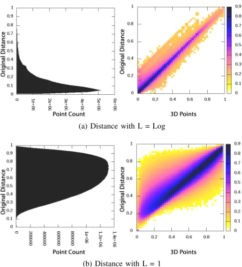
The accuracy of the MDS projection of original distances calculated using Eq. 2 to 3D is primarily visualized using the heat maps. Fig 8b is a sample heat map between 3D points and original distances forL(Si) = 1and Fig 8b is a heat map
forLcalculated using Eq. 4 case. When the distances between majority of the 3D points are closer to original distances they create a dense area along the diagonal of the heat map plot; this can be seen as the dark colors along the diagonal of Fig 8a and 8b. It is evident from sample heat maps 8a and 8b that the majority of 3D projections are accurate.
We first applied the MDS algorithm for each data segment independently. With this approach we have observed high alignment errors in some data segments. MDS final stress and alignment error are shown in the Fig 10. There were some data segments with high stress values compared to their neighbors. When MDS was run again on these segments the stress reduced to the range of the neighbors. By this experiment it was evident that even with the deterministic annealing and SMACOF approaches for MDS, it can produce local optimum solutions in rare cases. One way to reduce this effect is to initialize the MDS for a data segment with the solution of the previous data segment. This way the MDS algorithm starts with a solution closer to the global optimum and produced comparably good results as shown in Fig 11.
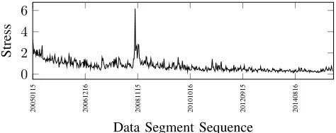
In Fig 10 and 11, high alignment errors seen in the 2008 stock crash period are primarily due to stock volatility. When two data segments are different from each other, it is expected to create an alignment error. Having a small time shift can definitely reduce these large changes from one plot to another. The alignment errors for a 1-Day shift are shown in Fig 12 which are shown to be much less than the 7-Day data. When the time shift is small, data segments increase dramatically and require more computing power. On the other hand, large time shifts produce larger volatility in the sequence of plots.
There were various experiments done with different choices for MDS alignment techniques and MDS algorithm before we came up with an approach that produces good visualizations. Table I summarizes the options for MDS algorithm and table II summarizes the options for alignments. We concluded that initializing MDS with the previous solution and using continuous alignments as the best approach among the choices we explored.
20050108 20061209 20081108 20101009 20120908 20140809
1 2 3
·10−4
Stress
(a) MDS Final Stress
20050115 20061216 20081115 20101016 20120915 20140816
0 10 20 30
alignment
Fit
[image:9.612.64.554.58.156.2](b) MDS alignment Fit
Fig. 10: MDS final Stress and alignment fit when applying independent MDS for consecutive plots, x axis shows the time series
20050108 20061209 20081108 20101009 20120908 20140809
1 2
·10−4
Stress
(a) MDS Final Stress
20050115 20061216 20081115 20101016 20120915 20140816
0 2 4 6
Alignment
Fit
[image:9.612.65.553.212.308.2](b) MDS alignment Fit
Fig. 11: MDS final Stress and alignment fit when initializing MDS with the previous data segment’s solution, x axis shows the time series
MDS Pros Cons
Run MDS independently for each segment
Can run in parallel for different data segments Produce local optimal solutions for some data segments randomly
Initialize MDS with previous so-lution
Produces optimal solutions and runs quickly be-cause the algorithm starts near solution
[image:9.612.65.541.349.472.2]Needs to run sequentially and best suitable for online processing
TABLE I: MDS Choices
Alignment Pros Cons
Respect to common data points for all segments
Can run easily in parallel for different data seg-ments
Doesn’t produce the best rotation
Respect to previous data points Produce the best rotations when there are over-lapping data and shift is small
Needs to run sequentially and best suitable for online processing
TABLE II: MDS Rotation Choices
VII. FUTUREWORK
The current TSmap3D system uses batch algorithms to process time series data offline. The system can be improved to handle real-time data using the faster interpolative MDS and
20050115 20061216 20081115 20101016 20120915 20140816
0 2 4 6
Data Segment Sequence
[image:9.612.58.295.588.682.2]Stress
Fig. 12: MDS alignment fit for 1 Day shift with Accumulating segmentation and Log distances
data sets can be inefficient for very large plots. Efficient data transfer mechanisms between back-end servers and JavaScript need to be explored.
VIII. CONCLUSIONS
With the user-centered rich set of functions for visualization software, as well as the scalable and efficient MDS algorithm and big data work flow, the TSmap3D system provides a comprehensive tool set for generating 3D projections of high dimensional data and analyzing them visually. We discussed how TSmap3D framework is being utilized to apply Multidi-mensional Scaling to financial data and visualized the changes in relationships among stocks over time. The stock data observed smooth transitions between consecutive plots when using the smallest time shift possible. So we can conclude that using finer-grained time shifts produces the best time series plots in general. The tools and workflow used are generic and can be applied to discover interesting relationships in other time series data sets.
IX. ACKNOWLEDGEMENTS
This work is partially supported by NSF grant 1443054 and used data analytics from the SPIDAL library. Additionally we would like to extend our gratitude to the FutureSystems team for their support with the infrastructure.
REFERENCES
[1] S. Ekanayake, S. Kamburugamuve, and G. Fox, “SPIDAL: High Perfor-mance Data Analytics with Java and MPI on Large Multicore HPC Clusters,” http://dsc.soic.indiana.edu/publications/hpc2016-spidal-high-performance-submit-18-public.pdf, Jan. 2016, Technical Report. [2] J. Dirksen,Learning Three. js: the JavaScript 3D library for WebGL.
Packt Publishing Ltd, 2013.
[3] W. J. Schroeder, K. M. Martin, and W. E. Lorensen, “The design and implementation of an object-oriented toolkit for 3D graphics and visualization,” inProceedings of the 7th conference on Visualization’96. IEEE Computer Society Press, 1996, pp. 93–ff.
[4] J. Ahrens, B. Geveci, C. Law, C. Hansen, and C. Johnson, “36-ParaView: An End-User Tool for Large-Data Visualization,” pp. 717–731, 2005. [5] H. Childs, “VisIt: An end-user tool for visualizing and analyzing very
large data,” 2013.
[6] S. LaValle, E. Lesser, R. Shockley, M. S. Hopkins, and N. Kruschwitz, “Big data, analytics and the path from insights to value,”MIT Sloan Management Review, vol. 52, no. 2, p. 21, 2011.
[7] H. Chen, R. H. Chiang, and V. C. Storey, “Business Intelligence and Analytics: From Big Data to Big Impact.”MIS quarterly, vol. 36, no. 4, pp. 1165–1188, 2012.
[8] A. J. Hey, S. Tansley, K. M. Tolleet al.,The fourth paradigm: data-intensive scientific discovery. Microsoft research Redmond, WA, 2009, vol. 1.
[9] P. Fox, J. Hendler et al., “Changing the equation on scientific data visualization,”Science, vol. 331, no. 6018, pp. 705–708, 2011. [10] F. B. Viegas, M. Wattenberg, F. Van Ham, J. Kriss, and M. McKeon,
“Manyeyes: a site for visualization at internet scale,”IEEE Transactions on Visualization and Computer Graphics, vol. 13, no. 6, pp. 1121–1128, 2007.
[11] H. Li, K.-S. Leung, T. Nakane, and M.-H. Wong, “iview: an interactive WebGL visualizer for protein-ligand complex,” BMC bioinformatics, vol. 15, no. 1, p. 1, 2014.
[12] M. Bastian, S. Heymann, M. Jacomy et al., “Gephi: an open source software for exploring and manipulating networks.”ICWSM, vol. 8, pp. 361–362, 2009.
[13] C. M. Bishop, M. Svens´en, and C. K. Williams, “GTM: A principled alternative to the self-organizing map,” inArtificial Neural NetworksI-CANN 96. Springer, 1996, pp. 165–170.
[14] T. Kohonen, “The self-organizing map,” Proceedings of the IEEE, vol. 78, no. 9, pp. 1464–1480, 1990.
[15] L. v. d. Maaten and G. Hinton, “Visualizing data using t-SNE,”Journal of Machine Learning Research, vol. 9, no. Nov, pp. 2579–2605, 2008. [16] J. B. Kruskal, “Multidimensional scaling by optimizing goodness of fit
to a nonmetric hypothesis,” Psychometrika, vol. 29, no. 1, pp. 1–27, 1964.
[17] Y. Ruan and G. Fox, “A robust and scalable solution for interpolative multidimensional scaling with weighting,” ineScience (eScience), 2013 IEEE 9th International Conference on. IEEE, 2013, pp. 61–69. [18] Y. Ruan, S. Ekanayake, M. Rho, H. Tang, S.-H. Bae, J. Qiu, and
G. Fox, “DACIDR: deterministic annealed clustering with interpolative dimension reduction using a large collection of 16S rRNA sequences,” in
Proceedings of the ACM Conference on Bioinformatics, Computational Biology and Biomedicine. ACM, 2012, pp. 329–336.
[19] L. Stanberry, R. Higdon, W. Haynes, N. Kolker, W. Broomall, S. Ekanayake, A. Hughes, Y. Ruan, J. Qiu, E. Kolkeret al., “Visualizing the protein sequence universe,”Concurrency and Computation: Practice and Experience, vol. 26, no. 6, pp. 1313–1325, 2014.
[20] K. Wolstencroft, R. Haines, D. Fellows, A. Williams, D. Withers, S. Owen, S. Soiland-Reyes, I. Dunlop, A. Nenadic, P. Fisheret al., “The Taverna workflow suite: designing and executing workflows of Web Services on the desktop, web or in the cloud,”Nucleic acids research, p. gkt328, 2013.
[21] B. Lud¨ascher, I. Altintas, C. Berkley, D. Higgins, E. Jaeger, M. Jones, E. A. Lee, J. Tao, and Y. Zhao, “Scientific workflow management and the Kepler system,”Concurrency and Computation: Practice and Experience, vol. 18, no. 10, pp. 1039–1065, 2006.
[22] S. Marru, L. Gunathilake, C. Herath, P. Tangchaisin, M. Pierce, C. Mattmann, R. Singh, T. Gunarathne, E. Chinthaka, R. Gardler
et al., “Apache airavata: a framework for distributed applications and computational workflows,” inProceedings of the 2011 ACM workshop on Gateway Computing Environments. ACM, 2011, pp. 21–28. [23] T. White,Hadoop: The definitive guide. ” O’Reilly Media, Inc.”, 2012. [24] M. Zaharia, M. Chowdhury, M. J. Franklin, S. Shenker, and I. Stoica, “Spark: Cluster Computing with Working Sets.”HotCloud, vol. 10, pp. 10–10, 2010.
[25] “Apache Flink,” https://flink.apache.org/, accessed: 2016.
[26] T. Akidau, R. Bradshaw, C. Chambers, S. Chernyak, R. J. Fern´andez-Moctezuma, R. Lax, S. McVeety, D. Mills, F. Perry, E. Schmidtet al., “The dataflow model: a practical approach to balancing correctness, latency, and cost in massive-scale, unbounded, out-of-order data process-ing,”Proceedings of the VLDB Endowment, vol. 8, no. 12, pp. 1792– 1803, 2015.
[27] S.-H. Bae, J. Y. Choi, J. Qiu, and G. C. Fox, “Dimension reduction and visualization of large high-dimensional data via interpolation,” in Proceedings of the 19th ACM international symposium on high performance distributed computing. ACM, 2010, pp. 203–214. [28] J. Y. Choi, S.-H. Bae, X. Qiu, and G. Fox, “High performance dimension
reduction and visualization for large high-dimensional data analysis,” in
Cluster, Cloud and Grid Computing (CCGrid), 2010 10th IEEE/ACM International Conference on. IEEE, 2010, pp. 331–340.
[29] Y. Ruan, G. L. House, S. Ekanayake, U. Schutte, J. D. Bever, H. Tang, and G. Fox, “Integration of clustering and multidimensional scaling to determine phylogenetic trees as spherical phylograms visualized in 3 dimensions,” in Cluster, Cloud and Grid Computing (CCGrid), 2014 14th IEEE/ACM International Symposium on. IEEE, 2014, pp. 720– 729.
[30] J. De Leeuw and P. Mair, “Multidimensional scaling using majorization: SMACOF in R,”Department of Statistics, UCLA, 2011.
[31] J. J. Mor´e, “The Levenberg-Marquardt algorithm: implementation and theory,” inNumerical analysis. Springer, 1978, pp. 105–116. [32] S. Ekanayake, S. Kamburugamuve, P. Wickramasinghe, and G. C. Fox,
“Java Thread and Process Performance for Parallel Machine Learning on Multicore HPC Clusters,” Sep. 2016, Technical Report.