W
INDOWS
F
ORMS
C
ONTROLS
Topics in This Chapter
• Introduction: A class hierarchy diagram offers a natural way to group Windows Forms controls by their functionality.
• Button Controls: The Button, CheckBox, and RadioButton
controls are designed to permit users to make one or more selections on a form.
• PictureBox and TextBoxt Controls: The PictureBox control is used to display and scale images; the TextBox control can be used to easily display and edit single or multiple lines of text. • List Controls: The ListBox, ComboBox, and CheckListBox
offer different interfaces for displaying and manipulating data in a list format.
• ListView and TreeView Controls: The ListView offers multiple views for displaying data items and their associated icons. The
TreeView presents hierarchical information in an easy-to-navigate tree structure.
• Timer and Progress Bar Controls: A timer can be used to control when an event is invoked, a ProgressBar to visually monitor the progress of an operation.
• Building a User Control: When no control meets an application’s needs, a custom one can be crafted by combining multiple controls or adding features to an existing one.
• Moving Data Between Controls: Drag and drop provides an easy way for users to copy or move an item from one control to another. .NET offers a variety of classes and events required to implement this feature.
• Using Resources: Resources required by a program, such as title, descriptive labels, and images, can be embedded within an application’s assembly or stored in a satellite assembly. This is particularly useful for developing international applications.
319
7
The previous chapter introduced the Control class and the methods, properties,
and events it defines for all controls. This chapter moves beyond that to examine the specific features of individual controls. It begins with a survey of the more important .NET controls, before taking an in-depth look at how to implement controls such as the TextBox, ListBox, TreeView, and ListView. Also included is a discussion of
the .NET drag-and-drop features that are used to move or copy data from one con-trol to another.
Windows Forms (WinForms) are not restricted to using the standard built-in con-trols. Custom GUI controls can be created by extending an existing control, building a totally new control, or fashioning a user control from a set of related widgets. Examples illustrate how to extend a control and construct a user control. The chapter concludes with a look at resource files and how they are used to create GUI applica-tions that support users from multiple countries and cultures.
7.1 A Survey of .NET Windows
Forms Controls
The System.Windows.Forms namespace contains a large family of controls that add
both form and function to a Windows-based user interface. Each control inherits a common set of members from the Control class. To these, it adds the methods,
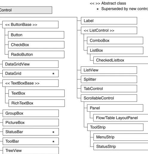
Figure 7-1 shows the inheritance hierarchy of the Windows Forms controls. The controls marked by an asterisk (*) exist primarily to provide backward compatibility between .NET 2.0 and .NET 1.x. Specifically, the DataGrid has been superseded by the DataGridView, the StatusBar by the StatusStrip, and the ToolBar by the ToolStrip. Table 7-1 provides a summary of the more frequently used controls in this hierarchy.
Figure 7-1 Windows Forms control hierarchy
Control << ButtonBase >> Button CheckBox RadioButton DataGridView DataGrid << TextBoxBase >> TextBox RichTextBox GroupBox PictureBox StatusBar ToolBar TreeView
*
*
*
Label << ListControl >> ComboBox ListBox CheckedListbox ListView Splitter TabControl ScrollableControl Panel Flow/Table LayoutPanel ToolStrip MenuStrip StatusStrip*
Superseded by new control << >> Abstract class7.1 A Survey of .NET Windows Forms Controls 321
Table 7-1 Selected Windows Forms Controls
Control Use Description
Button Fires an event when a
mouse click occurs or the Enter or Esc key is pressed.
Represents a button on a form. Its
text property determines the caption
displayed on the button’s surface.
CheckBox Permits a user to select
one or more options.
Consists of a check box with text or an image beside it. The check box can also be represented as a button by setting:
checkBox1.Appearance = Appearance.Button
CheckedListBox Displays list of items. ListBox with checkbox preceding
each item in list.
ComboBox Provides TextBox and ListBox functionality.
Hybrid control that consists of a text-box and a drop-down list. It combines properties from both the TextBox and
the ListBox. DataGridView
GridView
Manipulates data in a grid format.
The DataGridView is the foremost
control to represent relational data. It supports binding to a database. The DataGridView was introduced
in .NET 2.0 and supersedes the
DataGrid.
GroupBox Groups controls. Use primarily to group radio buttons; it
places a border around the controls it contains.
ImageList Manages a collection of
images.
Container control that holds a collec-tion of images used by other controls such as the ToolStrip, ListView,
and TreeView. Label Adds descriptive
informa-tion to a form.
Text that describes the contents of a control or instructions for using a con-trol or form.
ListBox Displays a list of items—
one or more of which may be selected.
May contain simple text or objects. Its methods, properties, and events allow items to be selected, modified, added, and sorted.
Control Use Description
ListView Displays items and
subitems.
May take a grid format where each row represents a different item and sub-items. It also permits items to be dis-played as icons.
MenuStrip Adds a menu to a form. Provides a menu and submenu system
for a form. It supersedes the Main-Menu control.
Panel
FlowPanelLayout TablePanelLayout
Groups controls. A visible or invisible container that groups controls. Can be made scrollable.
FlowPanelLayout automatically aligns
controls vertically or horizontally.
TablePanelLayout aligns controls in
a grid.
PictureBox Contains a graphic. Used to hold images in a variety of
standard formats. Properties enable images to be positioned and sized within control’s borders.
ProgressBar Depicts an application’s
progress.
Displays the familiar progress bar that gives a user feedback regarding the progress of some event such as file copying.
RadioButton Permits user to make one
choice among a group of options.
Represents a Windows radio button.
StatusStrip Provides a set of panels that
indicate program status.
Provides a status bar that is used to provide contextual status information about current form activities.
TextBox Accepts user input. Can be designed to accept single- or
multi-line input. Properties allow it to mask input for passwords, scroll, set letter casing automatically, and limit contents to read-only.
TreeView Displays data as nodes in a
tree.
Features include the ability to collapse or expand, add, remove, and copy nodes in a tree.
7.2 Button Classes, Group Box, Panel, and Label 323
This chapter lacks the space to provide a detailed look at each control. Instead, it takes a selective approach that attempts to provide a flavor of the controls and fea-tures that most benefit the GUI developer. Notable omissions are the DataGrid-View control, which is included in the discussion of data binding in Chapter 12,
“Data Binding with Windows Forms Controls,” and the menu controls that were dis-cussed in Chapter 6, “Building Windows Forms Applications.”
7.2 Button Classes, Group Box,
Panel, and Label
The Button Class
A button is the most popular way to enable a user to initiate some program action. Typically, the button responds to a mouse click or keystroke by firing a Click event
that is handled by an event handler method that implements the desired response. constructor: public Button()
The constructor creates a button instance with no label. The button’s Text
prop-ertysets its caption and can be used to define an access key (see Handling Button Events section); its Image property is used to place an image on the button’s
back-ground.
Setting a Button’s Appearance
Button styles in .NET are limited to placing text and an image on a button, making it flat or three-dimensional, and setting the background/foreground color to any avail-able color. The following properties are used to define the appearance of buttons, check boxes, and radio buttons:
FlatStyle This can take four values: FlatStyle.Flat, FlatStyle.Popup, FlatStyle.Standard, and FlatStyle.System. Standard is the
usual three-dimensional button. Flat creates a flat button. Popup
creates a flat button that becomes three-dimensional on a mouse-over. System results in a button drawn to suit the style of the
operat-ing system.
Image Specifies the image to be placed on the button. The Image.From-File method is used to create the image object from a specified file: button1.Image = Image.FromFile("c:\\book.gif");
ImageAlign Specifies the position of the image on the button. It is set to a value
of the ContentAlignmentenum:
button1.ImageAlign = ContentAlignment.MiddleRight; TextAlign Specifies the position of text on the image using the
Content-Alignment value.
Handling Button Events
A button’s Click event can be triggered in several ways: by a mouse click of the
but-ton, by pressing the Enter key or space bar, or by pressing the Alt key in combination with an access key. An access key is created by placing an & in front of one of the
characters in the control’s Text property value.
The following code segment declares a button, sets its access key to C, and regis-ters an event handler to be called when the Click event is triggered:
Button btnClose = new Button();
btnClose.Text= "&Close"; // Pushing ALT + C triggers event btnClose.Click += new EventHandler(btnClose_Clicked); // Handle Mouse Click, ENTER key, or Space Bar
private void btnClose_Clicked(object sender, System.EventArgs e) { this.Close(); }
Note that a button’s Click event can also occur in cases when the button does not
have focus. The AcceptButton and CancelButton form properties can specify a
but-ton whose Click event is triggered by pushing the Enter or Esc keys, respectively.
Core Suggestion
Set a form’s CancelButton property to a button whose Click event handler closes the form. This provides a convenient way for users to close a window by pushing the Esc key.
The CheckBox Class
The CheckBox control allows a user to select a combination of options on a form—in
contrast to the RadioButton, which allows only one selection from a group. constructor: public CheckBox()
The constructor creates an unchecked check box with no label. The Text and Image properties allow the placement of an optional text description or image beside
7.2 Button Classes, Group Box, Panel, and Label 325
Setting a CheckBox’s Appearance
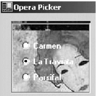
Check boxes can be displayed in two styles: as a traditional check box followed by text (or an image) or as a toggle button that is raised when unchecked and flat when checked. The appearance is selected by setting the Appearance property to Appearance.Normal or Appearance.Button. The following code creates the two
check boxes shown in Figure 7-2.
// Create traditional check box this.checkBox1 = new CheckBox(); this.checkBox1.Location =
new System.Drawing.Point(10,120); this.checkBox1.Text = "La Traviata"; this.checkBox1.Checked = true; // Create Button style check box this.checkBox2 = new CheckBox(); this.checkBox2.Location =
new System.Drawing.Point(10,150); this.checkBox2.Text = "Parsifal";
this.checkBox2.Appearance = Appearance.Button; this.checkBox2.Checked = true;
this.checkBox2.TextAlign = ContentAlignment.MiddleCenter;
The RadioButton Class
The RadioButton is a selection control that functions the same as a check box
except that only one radio button within a group can be selected. A group consists of multiple controls located within the same immediate container.
constructor: public RadioButton()
The constructor creates an unchecked RadioButton with no associated text. The Text and Image properties allow the placement of an optional text description or
image beside the box. A radio button’s appearance is defined by the same properties used with the check box and button: Appearance and FlatStyle.
Placing Radio Buttons in a Group
Radio buttons are placed in groups that allow only one item in the group to be selected. For example, a 10-question multiple choice form would require 10 groups of radio buttons. Aside from the functional need, groups also provide an opportunity to create an aesthetically appealing layout.
The frequently used GroupBox and Panel container controls support
back-ground images and styles that can enhance a form’s appearance. Figure 7-3 shows the striking effect (even more so in color) that can be achieved by placing radio buttons on top of a GroupBox that has a background image.
Listing 7-1 presents a sample of the code that is used to place the radio buttons on the GroupBox control and make them transparent so as to reveal the background
image.
Figure 7-3 Radio buttons in a GroupBox that has a background image
Listing 7-1
Placing Radio Buttons in a
GroupBox using System.Drawing;using System.Windows.Forms; public class OperaForm : Form {
private RadioButton radioButton1; private RadioButton radioButton2; private RadioButton radioButton3; private GroupBox groupBox1; public OperaForm()
{
this.groupBox1 = new GroupBox(); this.radioButton3 = new RadioButton(); this.radioButton2 = new RadioButton();
7.2 Button Classes, Group Box, Panel, and Label 327
Note that the BackColorproperty of the radio button is set to Color.Trans-parent. This allows the background image of groupBox1 to be displayed. By
default, BackColor is an ambient property, which means that it takes the color of its parent control. If no color is assigned to the radio button, it takes the BackColor of groupBox1 and hides the image.
The GroupBox Class
A GroupBox is a container control that places a border around its collection of
con-trols. As demonstrated in the preceding example, it is often used to group radio but-tons; but it is also a convenient way to organize and manage any related controls on a form. For example, setting the Enabled property of a group box to false disables
all controls in the group box.
constructor: public GroupBox()
The constructor creates an untitled GroupBox having a default width of 200 pixels
and a default height of 100 pixels.
this.radioButton1 = new RadioButton();
// All three radio buttons are created like this // For brevity only code for one button is included this.radioButton3.BackColor = Color.Transparent;
this.radioButton3.Font = new Font("Microsoft Sans Serif", 8.25F, FontStyle.Bold); this.radioButton3.ForeColor =
SystemColors.ActiveCaptionText;
this.radioButton3.Location = new Point(16, 80); this.radioButton3.Name = "radioButton3";
this.radioButton3.Text = "Parsifal"; // Group Box
this.groupBox1 = new GroupBox(); this.groupBox1.BackgroundImage = Image.FromFile("C:\\opera.jpg"); this.groupBox1.Size = new Size(120, 112); // Add radio buttons to groupbox
groupBox1.Add( new Control[]{radioButton1,radiobutton2, radioButton3});
} }
The Panel Class
The Panel control is a container used to group a collection of controls. It’s closely
related to the GroupBoxcontrol, but as a descendent of the ScrollableControl
class, it adds a scrolling capability. constructor: public Panel()
Its single constructor creates a borderless container area that has scrolling dis-abled. By default, a Panel takes the background color of its container, which makes
it invisible on a form.
Because the GroupBox and Panel serve the same purpose, the programmer is
often faced with the choice of which to use. Here are the factors to consider in select-ing one:
• A GroupBox may have a visible caption, whereas the Panel does not.
• A GroupBox always displays a border; a Panel’s border is determined
by its BorderStyle property. It may be set to BorderStyle.None, BorderStyle.Single, or BorderStyle.Fixed3D.
• A GroupBox does not support scrolling; a Panel enables automatic
scrolling when its AutoScroll property is set to true.
A Panel offers no features to assist in positioning or aligning the controls it
con-tains. For this reason, it is best used when the control layout is known at design time. But this is not always possible. Many applications populate a form with controls based on criteria known only at runtime. To support the dynamic creation of con-trols, .NET offers two layout containers that inherit from Panel and automatically
position controls within the container: the FlowLayoutPanel and the TableLay-outPanel.
The FlowLayoutPanel Control
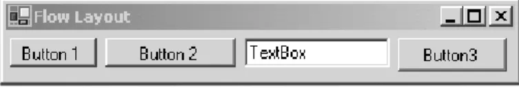
Figure 7-4 shows the layout of controls using a FlowLayoutPanel.
This “no-frills” control has a single parameterless constructor and two properties worth noting: a FlowDirection property that specifies the direction in which controls
7.2 Button Classes, Group Box, Panel, and Label 329
are to be added to the container, and a WrapControls property that indicates
whether child controls are rendered on another row or truncated.
The following code creates a FlowLayoutPanel and adds controls to its
collec-tion:
FlowLayoutPanel flp = new FlowLayoutPanel(); flp.FlowDirection = FlowDirection.LefttoRight;
// Controls are automatically positioned left to right flp.Controls.Add(Button1);
flp.Controls.Add(Button2); flp.Controls.Add(TextBox1); flp.Controls.Add(Button3);
this.Controls.Add(flp); // Add container to form
The FlowDirection enumerator members are BottomUp, LeftToRight, RighttoLeft, and TopDown. LefttoRight is the default.
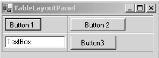
TableLayoutPanel Control
Figure 7-5 shows the grid layout that results from using a TableLayoutPanel
container.
This code segment creates a TableLayoutPanel and adds the same four controls
used in the previous example. Container properties are set to define a layout grid that has two rows, two columns, and uses an Inset border style around each cell.
Controls are always added to the container moving left-to-right, top-to-bottom.
TableLayoutPanel tlp = new TableLayoutPanel(); // Causes the inset around each cell
tlp.CellBorderStyle = TableLayoutPanelCellBorderStyle.Inset; tlp.ColumnCount = 2; // Grid has two columns
tlp.RowCount = 2; // Grid has two rows // If grid is full add extra cells by adding column tlp.GrowStyle = TableLayoutPanelGrowStyle.AddColumns;
// Padding (pixels)within each cell (left, top, right, bottom)
tlp.Padding = new Padding(1,1,4,5); tlp.Controls.Add(Button1);
tlp.Controls.Add(Button2); // Other controls added here
The GrowStyle property is worth noting. It specifies how controls are added to
the container when all of its rows and columns are filled. In this example, AddCol-umns specifies that a column be added to accommodate new controls. The other
options are AddRows and None; the latter causes an exception to be thrown if an
attempt is made to add a control when the panel is filled.
The Label Class
The Label class is used to add descriptive information to a form. constructor: public Label()
The constructor creates an instance of a label having no caption. Use the Text
property to assign a value to the label. The Image, BorderStyle, and TextAlign
properties can be used to define and embellish the label’s appearance.
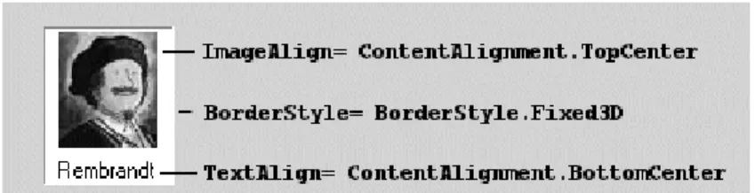
The following code creates the label shown in Figure 7-6:
Label imgLabel = new Label(); imgLabel.BackColor= Color.White;
Image img = Image.FromFile("c:\\rembrandt.jpg"); imgLabel.Image= img;
imgLabel.ImageAlign= ContentAlignment.TopCenter; imgLabel.Text="Rembrandt";
imgLabel.TextAlign= ContentAlignment.BottomCenter; imgLabel.BorderStyle= BorderStyle.Fixed3D;
imgLabel.Size = new Size(img.Width+10, img.Height+25);
7.3 PictureBox and TextBox Controls 331
One of its less familiar properties is UseMnemonic. By setting it to true and
plac-ing a mnemonic (& followed by a character) in the label’s text, you can create an access key. For example, if a label has a value of &Sum, pressing Alt-S shifts the focus
to the control (based on tab order) following the label.
7.3 PictureBox and TextBox Controls
The PictureBox Class
The PictureBox control is used to display images having a bitmap, icon, metafile,
JPEG, GIF, or PNG format. It is a dynamic control that allows images to be selected at design time or runtime, and permits them to be resized and repositioned within the control.
constructor: public PictureBox()
The constructor creates an empty (Image = null) picture box that has its Size-Mode property set so that any images are displayed in the upper-left corner of the
box.
The two properties to be familiar with are Image and SizeMode. Image, of
course, specifies the graphic to be displayed in the PictureBox. SizeMode specifies
how the image is rendered within the PictureBox. It can be assigned one of four
values from the PictureBoxSizeMode enumeration:
1. AutoSize. PictureBox is sized to equal the image.
2. CenterImage. Image is centered in box and clipped if necessary.
3. Normal. Image is place in upper-left corner and clipped if necessary.
4. StretchImage. Image is stretched or reduced to fit in box.
Figure 7-7 illustrates some of the features of the PictureBox control. It consists
of a form with three small picture boxes to hold thumbnail images and a larger pic-ture box to display a full-sized image. The large image is displayed when the user double-clicks on a thumbnail image.
The code, given in Listing 7-2, is straightforward. The event handler ShowPic
responds to each DoubleClick event by setting the Image property of the large PictureBox ( bigPicture ) to the image contained in the thumbnail. Note that the original images are the size of bigPicture and are automatically reduced (by setting SizeMode) to fit within the thumbnail picture boxes.
Figure 7-7 Thumbnail images in small picture boxes are displayed at full size in a larger viewing window
Listing 7-2
Working with Picture Boxes
using System;using System.Drawing; using System.Windows.Forms; public class ArtForm : Form {
private PictureBox bigPicture; private PictureBox tn1;
private PictureBox tn2; private PictureBox tn3; private Button btnClear; public ArtForm()
{
bigPicture = new PictureBox(); tn1 = new PictureBox();
tn2 = new PictureBox(); tn3 = new PictureBox(); btnClear = new Button();
bigPicture.Location = new Point(90, 30); bigPicture.Name = "bigPicture";
bigPicture.Size = new Size(160, 160); this.Controls.Add(bigPicture);
7.3 PictureBox and TextBox Controls 333
The TextBox Class
The familiar TextBox is an easy-to-use control that has several properties that affect
its appearance, but few that control its content. This leaves the developer with the task of setting up event handlers and data verification routines to control what is entered in the box.
// Define picturebox to hold first thumbnail image tn1.BorderStyle = BorderStyle.FixedSingle;
tn1.Cursor = Cursors.Hand;
tn1.Image = Image.FromFile("C:\\schiele1.jpg"); tn1.Location = new Point(8, 16);
tn1.Name = "tn1";
tn1.Size = new Size(56, 56);
tn1.SizeMode = PictureBoxSizeMode.StretchImage; this.Controls.Add(tn1);
// Code for other thumbnails would go here // Button to clear picture box
btnClear.Location = new Point(136, 192); btnClear.Name = "btnClear";
btnClear.Size = new Size(88, 24); btnClear.Text = "Clear Image"; this.Controls.Add(btnClear);
btnClear.Click += new EventHandler(this.btnClear_Click); // Set up event handlers for double click events
tn1.DoubleClick += new EventHandler(ShowPic); tn2.DoubleClick += new EventHandler(ShowPic); tn3.DoubleClick += new EventHandler(ShowPic); }
static void Main() {
Application.Run(new ArtForm()); }
private void btnClear_Click(object sender, EventArgs e) {
bigPicture.Image = null; // Clear image }
private void ShowPic (object sender, EventArgs e) {
// Sender is thumbnail image that is double clicked bigPicture.Image = ((PictureBox) sender).Image; }
}
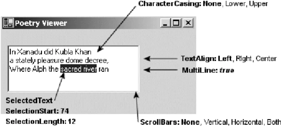
constructor: public TextBox()
The constructor creates a TextBox that accepts one line of text and uses the color
and font assigned to its container. From such humble origins, the control is easily transformed into a multi-line text handling box that accepts a specific number of characters and formats them to the left, right, or center. Figure 7-8 illustrates some of the properties used to do this.
The text is placed in the box using the Text property and AppendText method: txtPoetry.Text =
"In Xanadu did Kubla Khan\r\na stately pleasure dome decree,"; txtPoetry.AppendText("\r\nWhere Alph the sacred river ran");
A couple of other TextBox properties to note are ReadOnly, which prevents text
from being modified, and PasswordChar, which is set to a character used to mask
characters entered—usually a password.
TextBoxes and Carriage Returns
When storing data from a TextBox into a database, you want to make sure there are
no special characters embedded in the text, such as a carriage return. If you look at the TextBox properties, you’ll find AcceptsReturn, which looks like a simple
solu-tion. Setting it to false should cause a TextBox to ignore the user pressing an Enter
key. However, the name of this property is somewhat misleading. It only works when the form’s AcceptButton property is set to a button on the form. Recall that this
property causes the associated button’s Click handler to be executed when the
Enter key is pressed. If AcceptButton is not set (and the MultiLine property of
the text box is set to true), the TextBox receives a newline (\r\n) when the Enter
key is pushed.
7.4 ListBox, CheckedListBox, and ComboBox Classes 335
This leaves the developer with the task of handling unwanted carriage returns. Two approaches are available: capture the keystrokes as they are entered or extract the characters before storing the text. The first approach uses a keyboard event han-dler, which you should be familiar with from the previous chapter.
// Set up event handler in constructor for TextBox txtPoetry txtPoetry.KeyPress += new KeyPressEventHandler(onKeyPress);
private void onKeyPress( object sender, KeyPressEventArgs e) {
if(e.KeyChar == (char)13) e.Handled = true; }
Setting Handled to true prevents the carriage return/linefeed from being added
to the text box. This works fine for keyboard entry but has no effect on a cut-and-paste operation. To cover this occurrence, you can use the keyboard han-dling events described in Chapter 6 to prevent pasting, or you can perform a final verification step that replaces any returns with a blank or any character of your choice.
txtPoetry.Text = txtPoetry.Text.Replace(Environment.NewLine," ");
Core Note
Two common approaches for entering a carriage return/linefeed programmatically into a TextBox are
txtPoetry.Text = "Line 1\r\nLine 2";
txtPoetry.Text = "Line 1"+Environment.NewLine+"Line 2";
7.4 ListBox, CheckedListBox,
and ComboBox Classes
The ListBox Class
The ListBox control is used to provide a list of items from which the user may select
one or more items. This list is typically text but can also include images and objects. Other features of the ListBox include methods to perform text-based searches,
sorting, multi-column display, horizontal and vertical scroll bars, and an easy way to override the default appearance and create owner-drawn ListBox items.
constructor: public ListBox()
The constructor creates an empty ListBox. The code to populate a ListBox is
typically placed in the containing form’s constructor or Form.Load event handler. If
the ListBox.Sorted property is set to true, ListBox items are sorted
alphabeti-cally in ascending order. Also, vertical scroll bars are added automatialphabeti-cally if the con-trol is not long enough to display all items.
Adding Items to a ListBox
A ListBox has an Items collection that contains all elements of the list. Elements
can be added by binding the ListBox to a data source (described in Chapter 11,
“ADO.NET”) or manually by using the Add method. If the Sorted property is false, the items are listed in the order they are entered. There is also an Insert
method that places an item at a specified location.
lstArtists.Items.Add("Monet"); lstArtists.Items.Add("Rembrandt"); lstArtists.Items.Add("Manet");
lstArtists.Items.Insert(0, "Botticelli"); //Place at top
Core Note
To prevent a ListBox from repainting itself each time an item is added, execute the ListBox.BeginUpdate method prior to adding and ListBox.EndUpdate after the last item is added.
List boxes may also contain objects. Because an object may have many members, this raises the question of what is displayed in the TextBox list. Because by default a ListBox displays the results of an item’s ToString method, it is necessary to
over-ride this System.Object method to return the string you want displayed. The
fol-lowing class is used to create ListBox items:
// Instances of this class will be placed in a ListBox public class Artist
{
public string BDate, DDate, Country; private string firstname;
private string lastname;
public Artist(string birth, string death, string fname, string lname, string ctry)
{
7.4 ListBox, CheckedListBox, and ComboBox Classes 337 DDate = death; Country = ctry; firstname = fname; lastname = lname; }
public override string ToString() { return (lastname+" , "+firstname); }
public string GetLName { get{ return lastname;} }
public string GetFName { get{ return firstname;} }
}
ToString has been overridden to return the artist’s last and first names, which
are displayed in the ListBox. The ListBox (Figure 7-9) is populated using these
statements:
lstArtists.Items.Add
(new Artist("1832", "1883", "Edouard", "Manet","Fr" )); lstArtists.Items.Add
(new Artist("1840", "1926", "Claude", "Monet","Fr")); lstArtists.Items.Add
(new Artist("1606", "1669", "Von Rijn", "Rembrandt","Ne")); lstArtists.Items.Add
(new Artist("1445", "1510", "Sandre", "Botticelli","It"));
Selecting and Searching for Items in a ListBox
The SelectionMode property determines the number of items a ListBox allows to
be selected at one time. It takes four values from the SelectionMode enumeration: None, Single, MultiSingle, and MultiExtended. MultiSingle allows selection
by clicking an item or pressing the space bar; MultiExtended permits the use of the
Shift and Ctrl keys.
The SelectedIndexChanged event provides an easy way to detect when an item
in a ListBox is selected. It is fired when the user clicks on an item or uses the arrow
keys to traverse a list. A common use is to display further information about the selection in other controls on the form. Here is code that displays an artist’s dates of birth and death when the artist’s name is selected from the ListBox in Figure 7-9: // Set up event handler in constructor
lstArtists.SelectedIndexChanged += new EventHandler(ShowArtist); //
private void ShowArtist(object sender, EventArgs e) {
// Cast to artist object in order to access properties Artist myArtist = lstArtists.SelectedItem as Artist; if (myArtist != null) {
txtBirth.Text = myArtist.Dob; // Place dates in text boxes txtDeath.Text = myArtist.Dod;
} }
The SelectedItem property returns the item selected in the ListBox. This
object is assigned to myArtist using the as operator, which ensures the object is an Artist type. The SelectedIndex property can also be used to reference the
selected item:
myArtist = lstArtists.Items[lstArtists.SelectedIndex] as Artist;
Working with a multi-selection ListBox requires a different approach. You
typi-cally do not want to respond to a selection event until all items have been selected. One approach is to have the user click a button to signal that all choices have been made and the next action is required. All selections are exposed as part of the
SelectedItems collection, so it is an easy matter to enumerate the items: foreach (Artist a in lstArtists.SelectedItems)
MessageBox.Show(a.GetLName);
The SetSelected method provides a way to programatically select an item or items
in a ListBox. It highlights the item(s) and fires the SelectedIndexChanged event. In
7.4 ListBox, CheckedListBox, and ComboBox Classes 339
lstArtists.ClearSelected(); // Clear selected items for (int ndx =0; ndx < lstArtists.Items.Count-1; ndx ++) {
Artist a = lstArtists.Items[ndx] as Artist;
if (a.country == "Fr") lstArtists.SetSelected(ndx,true); }
Customizing the Appearance of a ListBox
The ListBox, along with the ComboBox, MenuItem, and TabControl controls, is an
owner-drawn control. This means that by setting a control property, you can have it fire an event when the control’s contents need to be drawn. A custom event handler takes care of the actual drawing.
To enable owner drawing of the ListBox, the DrawMode property must be set to
one of two DrawMode enumeration values: OwnerDrawFixed or OwnerDrawVari-able. The former draws each item a fixed size; the latter permits variable-sized
items. Both of these cause the DrawItem event to be fired and rely on its event
han-dler to perform the drawing.
Using the ListBox from the previous example, we can use the constructor to set DrawMode and register an event handler for the DrawItem event:
lstArtists.DrawMode = DrawMode.OwnerDrawFixed;
lstArtists.ItemHeight = 16; // Height (pixels) of item lstArtists.DrawItem += new DrawItemEventHandler(DrawList);
The DrawItemEventHandler delegate has two parameters: the familiar sender
object and the DrawItemEventArgs object. The latter is of more interest. It
con-tains properties related to the control’s appearance and state as well as a couple of useful drawing methods. Table 7-2 summarizes these.
Table 7-2 DrawItemEventArgs Properties
Member Description
BackColor Background color assigned to the control.
Bounds Defines the coordinates of the item to be drawn as a Rectangle object.
Font Returns the font assigned to the item being drawn.
ForeColor Foreground color of the control. This is the color of the text
displayed.
Graphics Represents the surface (as a Graphics object) on which the
Indexis used to locate the item. Font, BackColor, and ForeColor return the
current preferences for each. Bounds defines the rectangular area circumscribing
the item and is used to indicate where drawing should occur. State is useful for
making drawing decisions based on whether the item is selected. This is particularly useful when the ListBox supports multiple selections. We looked at the Graphics
object briefly in the last chapter when demonstrating how to draw on a form. Here, it is used to draw in the Bounds area. Finally, the two methods, DrawBackground and DrawFocusRectangle, are used as their name implies.
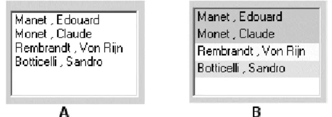
The event handler to draw items in the ListBox is shown in Listing 7-3. Its
behavior is determined by the operation being performed: If an item has been selected, a black border is drawn in the background to highlight the selection; if an item is added, the background is filled with a color corresponding to the artist’s coun-try, and the first and last names of the artist are displayed.
The routine does require knowledge of some GDI+ concepts (see Chapter 8, “.NET Graphics Using GDI+”). However, the purpose of the methods should be clear from their name and context: FillRectangle fills a rectangular area defined
by the Rectangle object, and DrawStringdraws text to the Graphics object using
a font color defined by the Brush object. Figure 7-9(B) shows the output.
Member Description
Index The index in the control where the item is being drawn. State The state of the item being drawn. This value is a
DrawItem-State enumeration. For a ListBox, its value is Selected (1) or None(0).
DrawBackground() Draws the default background.
DrawFocusRectangle() Draws the focus rectangle around the item if it has focus.
Listing 7-3
Event Handler to Draw Items in a
ListBoxprivate void DrawList(object sender, DrawItemEventArgs e) {
// Draw ListBox Items string ctry;
Rectangle rect = e.Bounds;
Artist a = lstArtists.Items[e.Index] as Artist; string artistName = a.ToString();
if ( (e.State & DrawItemState.Selected) == DrawItemState.Selected ) {
7.4 ListBox, CheckedListBox, and ComboBox Classes 341
Other List Controls: the ComboBox
and the CheckedListBox
The ComboBox control is a hybrid control combining a ListBox with a TextBox (see
Figure 7-10). Like the ListBox, it derives from the ListControl and thus
pos-sesses most of the same properties.
Visually, the ComboBox control consists of a text box whose contents are available
through its Text property and a drop-down list from which a selected item is
avail-able through the SelectedItemproperty. When an item is selected, its textual
rep-resentation is displayed in the text box window. A ComboBox can be useful in
constructing questionnaires where the user selects an item from the drop-down list or, optionally, types in his own answer. Its construction is similar to the ListBox:
// Draw Black border around the selected item e.Graphics.DrawRectangle(Pens.Black,rect); } else {
ctry = a.Country;
Brush b; // Object used to define backcolor // Each country will have a different backcolor b = Brushes.LightYellow; // Netherlands if (ctry == "Fr") b = Brushes.LightGreen; if (ctry == "It") b = Brushes.Yellow; e.Graphics.FillRectangle(b,rect);} e.Graphics.DrawString(artistName,e.Font, Brushes.Black,rect); }
}
Figure 7-10 ComboBox and CheckedListBox controls are variations on ListBox
ComboBox cbArtists = new ComboBox();
cbArtists.Size = new System.Drawing.Size(120, 21);
cbArtists.MaxDropDownItems= 4; // Max number of items to display cbArtists.DropDownWidth = 140; // Width of drop-down portion cbArtists.Items.Add(new Artist("1832", "1883",
"Edouard", "Manet","Fr" )); // Add other items here...
The CheckedListBox is a variation on the ListBox control that adds a check box
to each item in the list. The default behavior of the control is to select an item on the first click, and check or uncheck it on the second click. To toggle the check on and off with a single click, set the CheckOnClick property to true.
Although it does not support multiple selections, the CheckedListBox does
allow multiple items to be checked and includes them in a CheckedItems
collec-tion. The code here loops through a collection of Artist objects that have been
checked on the control:
// List all items with checked box. foreach (Artist a in clBox.CheckedItems)
MessageBox.Show(a.ToString()); // –> Monet, Claude
You can also iterate through the collection and explicitly determine the checked state:
For (int i=0; I< clBox.Items.Count; i++) {
if(clBox.GetItemCheckState(i) == CheckState.Checked) { Do something } else {do something if not checked } }
7.5 The ListView and TreeView Classes
The ListView Class
ListView is another control that displays lists of information. It represents data
rela-tionally as items and subitems. The data can be represented in a variety of formats that include a multi-column grid and large or small icons to represent item data. Also, images and check boxes can adorn the control.
Figure 7-11 illustrates the basic properties and methods used to lay out a Details view of the control—a format obviously tailored to displaying database tables. The first column contains text for an item—as well as a picture—the remaining columns contain subitems for the parent item.
7.5 The ListView and TreeView Classes 343
Let’s look at how this style of the ListView is constructed.
Creating a ListView Object
The ListView is created with a parameterless constructor: ListView listView1 = new ListView();
Define Appearance of ListView Object
// Set the view to show details listView1.View = View.Details;
The View property specifies one of five layouts for the control:
• Details. An icon and item’s text are displayed in column one.
Sub-items are displayed in the remaining columns.
• LargeIcon. A large icon is shown for each item with a label below the
icon.
• List. Each item is displayed as a small icon with a label to its right.
The icons are arranged in columns across the control.
• SmallIcon. Each item appears in a single column as a small icon with
a label to its right.
• *Tile. Each item appears as a full-size icon with the label and
sub-item details to the right of it. Only available for Windows XP and 2003.
Core Note
The ListView.View property can be changed at runtime to switch among the possible views. In fact, you may recognize that the view options correspond exactly to the View menu options available in Windows Explorer.
After the Details view is selected, other properties that define the control’s
appearance and behavior are set:
// Allow the user to rearrange columns listView1.AllowColumnReorder = true;
// Select the entire row when selection is made listView1.FullRowSelect = true;
// Display grid lines listView1.GridLines = true;
// Sort the items in the list in ascending order listView1.Sorting = SortOrder.Ascending;
These properties automatically sort the items, permit the user to drag columns around to rearrange their order, and cause a whole row to be highlighted when the user selects an item.
Set Column Headers
In a Details view, data is not displayed until at least one column is added to the
control. Add columns using the Columns.Add method. Its simplest form is ListView.Columns.Add(caption, width, textAlign)
Caption is the text to be displayed. Width specifies the column’s width in pixels.
It is set to –1 to size automatically to the largest item in the column, or –2 to size to the width of the header.
// Create column headers for the items and subitems
listView1.Columns.Add("Artist", -2, HorizontalAlignment.Left); listView1.Columns.Add("Born", -2, HorizontalAlignment.Left); listView1.Columns.Add("Died", -2, HorizontalAlignment.Left); listView1.Columns.Add("Country", -2, HorizontalAlignment.Left);
The Add method creates and adds a ColumnHeader type to the ListView’s Col-umns collection. The method also has an overload that adds a ColumnHeader object
7.5 The ListView and TreeView Classes 345 ColumnHeader cHeader: cHeader.Text = "Artist"; cHeader.Width = -2; cHeader.TextAlign = HorizontalAlignment.Left; ListView.Columns.Add(ColumnHeader cHeader);
Create ListView Items
Several overloaded forms of the ListView constructor are available. They can be
used to create a single item or a single item and its subitems. There are also options to specify the icon associated with the item and set the foreground and background colors.
Constructors:
public ListViewItem(string text); public ListViewItem(string[] items );
public ListViewItem(string text,int imageIndex ); public ListViewItem(string[] items,int imageIndex ); public ListViewItem(string[] items,int imageIndex, Color foreColor,Color backColor,Font font);
The following code demonstrates how different overloads can be used to create the items and subitems shown earlier in Figure 7-8:
// Create item and three subitems
ListViewItem item1 = new ListViewItem("Manet",2); item1.SubItems.Add("1832");
item1.SubItems.Add("1883"); item1.SubItems.Add("France");
// Create item and subitems using a constructor only ListViewItem item2 = new ListViewItem
(new string[] {"Monet","1840","1926","France"}, 3); // Create item and subitems with blue background color ListViewItem item3 = new ListViewItem
(new string[] {"Cezanne","1839","1906","France"}, 1, Color.Empty, Color.LightBlue, null);
To display the items, add them to the Items collection of the ListView control: // Add the items to the ListView
listView1.Items.AddRange(
new ListViewItem[]{item1,item2,item3,item4,item5});
Specifying Icons
Two collections of images can be associated with a ListView control as ImageList
and SmallImageList, which contains images used in all other views. Think of these
as zero-based arrays of images that are associated with a ListViewItem by the imageIndex parameter in the ListViewItem constructor. Even though they are
referred to as icons, the images may be of any standard graphics format.
The following code creates two ImageList objects, adds images to them, and
assigns them to the LargeImageList and SmallImageList properties: // Create two ImageList objects
ImageList imageListSmall = new ImageList(); ImageList imageListLarge = new ImageList();
imageListLarge.ImageSize = new Size(50,50); // Set image size // Initialize the ImageList objects
// Can use same images in both collections since they're resized imageListSmall.Images.Add(Bitmap.FromFile("C:\\botti.gif")); imageListSmall.Images.Add(Bitmap.FromFile("C:\\cezanne.gif")); imageListLarge.Images.Add(Bitmap.FromFile("C:\\botti.gif")); imageListLarge.Images.Add(Bitmap.FromFile("C:\\cezanne.gif")); // Add other images here
// Assign the ImageList objects to the ListView. listView1.LargeImageList = imageListLarge; listView1.SmallImageList = imageListSmall;
ListViewItem lvItem1 = new ListViewItem("Cezanne",1);
An index of 1 selects the cezanne.gif images as the large and small icons.
Spec-ifying an index not in the ImageList results in the icon at index 0 being displayed. If
neither ImageList is defined, no icon is displayed. Figure 7-12 shows the ListView
from Figure 7-11 with its view set to View.LargeIcon: listView1.View = View.LargeIcon;
7.5 The ListView and TreeView Classes 347
Working with the ListView Control
Common tasks associated with the ListView control include iterating over the
con-tents of the control, iterating over selected items only, detecting the item that has focus, and—when in Details view—sorting the items by any column. Following are
some code segments to perform these tasks.
Iterating over All Items or Selected Items
You can use foreach to create nested loops that select an item and then iterate
through the collection of subitems for the item in the outside loop:
foreach (ListViewItem lvi in listView1.Items) {
string row = "";
foreach(ListViewItem.ListViewSubItem sub in lvi.SubItems) {
row += " " + sub.Text; }
MessageBox.Show(row); // List concatenated subitems }
There are a couple of things to be aware of when working with these collections. First, the first subitem (index 0) element actually contains the text for the item—not a subitem. Second, the ordering of subitems is not affected by rearranging columns in the ListView control. This changes the appearance but does not affect the
under-lying ordering of subitems.
The same logic is used to list only selected items (MultiSelect = true permits
multiple items to be selected). The only difference is that the iteration occurs over the ListView.SelectedItems collection:
foreach (ListViewItem lvisel in listView1.SelectedItems)
Detecting the Currently Selected Item
In addition to the basic control events such as Click and DoubleClick, the List-View control adds a SelectedIndexChanged event to indicate when focus is
shifted from one item to another. The following code implements an event handler that uses the FocusedItem property to identify the current item:
// Set this in the constructor listView1.SelectedIndexChanged +=
new EventHandler(lv_IndexChanged); // Handle SelectedIndexChanged Event
{
string ItemText = listView1.FocusedItem.Text; }
Note that this code can also be used with the Click events because they also use
the EventHandler delegate. The MouseDown and MouseUp events can also be used
to detect the current item. Here is a sample MouseDown event handler:
private void listView1_MouseDown(object sender, MouseEventArgs e) {
ListViewItem selection = listView1.GetItemAt(e.X, e.Y); if (selection != null)
{
MessageBox.Show("Item Selected: "+selection.Text); }
}
The ListView.GetItemAt method returns an item at the coordinates where the
mouse button is pressed. If the mouse is not over an item, null is returned.
Sorting Items on a ListView Control
Sorting items in a ListView control by column values is a surprisingly simple feature
to implement. The secret to its simplicity is the ListViewItemSorter property that
specifies the object to sort the items anytime the ListView.Sort method is called.
Implementation requires three steps:
1. Set up a delegate to connect a ColumnClick event with an event
handler.
2. Create an event handler method that sets the ListViewItemSorter
property to an instance of the class that performs the sorting compari-son.
3. Create a class to compare column values. It must inherit the
IComparer interface and implement the IComparer.Compare
method.
The following code implements the logic: When a column is clicked, the event handler creates an instance of the ListViewItemComparer class by passing it the
column that was clicked. This object is assigned to the ListViewItemSorter
prop-erty, which causes sorting to occur. Sorting with the IComparer interface is
dis-cussed in Chapter 4, “Working with Objects in C#”).
// Connect the ColumnClick event to its event handler
listView1.ColumnClick +=new ColumnClickEventHandler(ColumnClick); // ColumnClick event handler
7.5 The ListView and TreeView Classes 349
{
// Setting this property immediately sorts the // ListView using the ListViewItemComparer object this.listView1.ListViewItemSorter =
new ListViewItemComparer(e.Column); }
// Class to implement the sorting of items by columns class ListViewItemComparer : IComparer
{
private int col;
public ListViewItemComparer() {
col = 0; // Use as default column }
public ListViewItemComparer(int column) {
col = column; }
// Implement IComparer.Compare method public int Compare(object x, object y) {
string xText = ((ListViewItem)x).SubItems[col].Text; string yText = ((ListViewItem)y).SubItems[col].Text; return String.Compare(xText, yText);
} }
The TreeView Class
As the name implies, the TreeView control provides a tree-like view of hierarchical
data as its user interface. Underneath, its programming model is based on the famil-iar tree structure consisting of parent nodes and child nodes. Each node is imple-mented as a TreeNode object that can in turn have its own Nodes collection. Figure
7-13 shows a TreeView control that is used in conjunction with a ListView to
dis-play enum members of a selected assembly. (We’ll look at the application that creates
it shortly.)
The TreeNode Class
Each item in a tree is represented by an instance of the TreeNode class. Data is
asso-ciated with each node using the TreeNode’s Text, Tag, or ImageIndex properties.
The Text property holds the node’s label that is displayed in the TreeView control. Tag is an object type, which means that any type of data can be associated with the
node by assigning a custom class object to it. ImageIndex is an index to an Image-List associated with the containing TreeView control. It specifies the image to be
In addition to these basic properties, the TreeNode class provides numerous
other members that are used to add and remove nodes, modify a node’s appearance, and navigate the collection of nodes in a node tree (see Table 7-3).
Figure 7-13 Using TreeView control (left) and ListView (right) to list enum values
Table 7-3 Selected Members of the TreeNode Class
Use Member Description
Appearance BackColor, ForeColor
Sets the background color and text color of the node.
Expand(), Collapse()
Expands the node to display child nodes or col-lapses the tree so no child nodes are shown. Navigation FirstNode,
LastNode, NextNode, PrevNode
Returns the first or last node in the collection. Returns the next or previous node (sibling) rel-ative to the current node.
Index The index of the current node in the collection. Parent Returns the current node’s parent.
Node Manipulation Nodes.Add(), Nodes.Remove(), Nodes.Insert(), Nodes.Clear()
Adds or removes a node to a Nodes collection. Insert adds a node at an indexed location, and Clear removes all tree nodes from the
collec-tion.
7.5 The ListView and TreeView Classes 351
Let’s look at how TreeView and TreeNode members are used to perform
funda-mental TreeView operations.
Adding and Removing Nodes
The following code creates the tree in Figure 7-14 using a combination of Add, Insert, and Clone methods. The methods are performed on a preexisting treeView1 control.
TreeNode tNode;
// Add parent node to treeView1 control tNode = treeView1.Nodes.Add("A");
// Add child node: two overloads available tNode.Nodes.Add(new TreeNode("C"));
tNode.Nodes.Add("D")); // Insert node after C
tNode.Nodes.Insert(1,new TreeNode("E")); // Add parent node to treeView1 control tNode = treeView1.Nodes.Add("B");
At this point, we still need to add a copy of node A and its subtree to the parent node B. This is done by cloning the A subtree and adding it to node B. Node A is ref-erenced as treeView1.Nodes[0] because it is the first node in the control’s
collec-tion. Note that the Add method appends nodes to a collection, and they can be
referenced by their zero-based position within the collection:
// Clone first parent node and add to node B
TreeNode clNode = (TreeNode) treeView1.Nodes[0].Clone(); tNode.Nodes.Add(clNode);
// Add and remove node for demonstration purposes tNode.Nodes.Add("G");
tNode.Nodes.Remove(tNode.LastNode);
Figure 7-14 TreeView node representation
A B
C E D A
Iterating Through the Nodes in a TreeView
As with any collection, the foreach statement provides the easiest way to loop
through the collection’s members. The following statements display all the top-level nodes in a control:
foreach (TreeNode tn in treeView1.Nodes) {
MessageBox.Show(tn.Text);
// If (tn.IsVisible) true if node is visible
// If (tn.IsSelected) true if node is currently selected }
An alternate approach is to move through the collection using the Tree-Node.NextNode property:
tNode = treeView1.Nodes[0]; while (tNode != null) {
MessageBox.Show(tNode.Text); tNode = tNode.NextNode; }
Detecting a Selected Node
When a node is selected, the TreeView control fires an AfterSelectevent that
passes a TreeViewEventArgs parameter to the event handling code. This
parame-ter identifies the action causing the selection and the node selected. The TreeView
example that follows illustrates how to handle this event.
You can also handle the MouseDown event and detect the node using the Get-NodeAt method that returns the node—if any—at the current mouse coordinates. private void treeView1_MouseDown(object sender, MouseEventArgs e) {
TreeNode tn = treeView1.GetNodeAt(e.X, e.Y); // You might want to remove the node: tn.Remove() }
A TreeView Example That Uses Reflection
This example demonstrates how to create a simple object browser (refer to Figure 7-13) that uses a TreeView to display enumeration types for a specified assembly.
When a node on the tree is clicked, the members for the selected enumeration are displayed in a ListView control.
Information about an assembly is stored in its metadata, and .NET provides classes in the System.Reflection namespace for exposing this metadata. The code
7.5 The ListView and TreeView Classes 353
parent nodes consist of unique namespace names, and the child nodes are the types contained in the namespaces. To include only enum types, a check is made to ensure
that the type inherits from System.Enum.
Listing 7-4
Using a
TreeViewand Reflection to List Enums in an
Assembly
using System.Reflection; //private void GetEnums() {
TreeNode tNode=null; Assembly refAssembly ;
Hashtable ht= new Hashtable(); // Keep track of namespaces string assem = AssemName.Text; // Textbox with assembly name tvEnum.Nodes.Clear(); // Remove all nodes from tree // Load assembly to be probed
refAssembly = Assembly.Load(assem);
foreach (Type t in refAssembly.GetTypes()) {
// Get only types that inherit from System.Enum
if(t.BaseType!=null && t.BaseType.FullName=="System.Enum") {
string myEnum = t.FullName; string nSpace =
myEnum.Substring(0,myEnum.LastIndexOf(".")); myEnum= myEnum.Substring(myEnum.LastIndexOf(".")+1) ; // Determine if namespace in hashtable
if( ht.Contains(nSpace)) {
// Find parent node representing this namespace foreach (TreeNode tp in tvEnum.Nodes)
{
if(tp.Text == myEnum) { tNode=tp; break;} }
} else {
// Add parent node to display namespace tNode = tvEnum.Nodes.Add(nSpace); ht.Add(nSpace,nSpace);
Notice how reflection is used. The static Assembly.Load method is used to
cre-ate an Assembly type. The Assembly.GetTypes is then used to return a Type
array containing all types in the designated assembly.
refAssembly = Assembly.Load(assem);
foreach (Type t in refAssembly.GetTypes())
The Type.FullName property returns the name of the type, which includes the
namespace. This is used to extract the enum name and the namespace name. The Type is stored in the Tag field of the child nodes and is used later to retrieve the
members of the enum.
After the TreeView is built, the final task is to display the field members of an
enumeration when its node is clicked. This requires registering an event handler to be notified when an AfterSelectevent occurs:
tvEnum.AfterSelect += new
TreeViewEventHandler(tvEnum_AfterSelect);
The event handler identifies the selected node from the TreeViewEvent-Args.Node property. It casts the node’s Tag field to a Type class (an enumerator in
this case) and uses the GetMembers method to retrieve the type’s members as Mem-berInfo types. The name of each field member—exposed by the Member-Info.Name property—is displayed in the ListView:
// ListView lView;
// lView.View = View.List;
private void tvEnum_AfterSelect(Object sender, TreeViewEventArgs e) {
TreeNode tn = e.Node; // Node selected ListViewItem lvItem;
// Add Child - name of enumeration TreeNode cNode = new TreeNode(); cNode.Text= myEnum;
cNode.Tag = t; // Contains specific enumeration tNode.Nodes.Add(cNode);
} } }
Listing 7-4
Using a
TreeViewand Reflection to List Enums in an
7.6 The ProgressBar, Timer, and StatusStrip Classes 355
if(tn.Parent !=null) // Exclude parent nodes {
lView.Items.Clear(); // Clear ListView before adding items Type cNode = (Type) tn.Tag;
// Use Reflection to iterate members in a Type foreach (MemberInfo mi in cNode.GetMembers()) {
if(mi.MemberType==MemberTypes.Field &&
mi.Name != "value__" ) // skip this { lView.Items.Add(mi.Name); } } } }
7.6 The ProgressBar, Timer,
and StatusStrip Classes
The ProgressBar and Timer are lightweight controls that have complementary
roles in an application: The Timer initiates action and the ProgressBar reflects the
status of an operation or action. In fact, the Timer is not a control, but a component
that inherits from the ComponentModel.Component class. It is used most often in
processes to regulate some background activity. This may be a periodic update to a log file or a scheduled backup of data. A ProgressBar, on the other hand, provides
visual feedback regarding the progress of an operation—such as file copying or steps in an installation.
The third class discussed in this section is the StatusStrip, which is often used
in conjunction with a timer and ProgressBar. It’s rendered on a form as a strip
divided into one or more sections or panes that provide status information. Each sec-tion is implemented as a control that is added to the StatusStrip container. For a
control to be included in the StatusStrip, it must inherit from the ToolStrip-Item class.
Building a StatusStrip
Let’s now build a form that includes a multi-pane StatusStrip. As shown in Figure
7-15, the strip consists of a label, progress bar, and panel controls. The label ( Tool-StripLabel) provides textual information describing the overall status of the
appli-cation. The progress bar is implemented as a ToolStripProgressBar object. It is
StatusStripPanel shows the elapsed time since the form was launched. An event
handler that is triggered by a timer updates both the progress bar and clock panel every five seconds.
Listing 7-5 contains the code to create the StatusStrip. The left and right ends
of the progress bar are set to represent the values 0 and 120, respectively. The bar is set to increase in a step size of 10 units each time the PerformStep method is
exe-cuted. It recycles every minute.
The Timer controls when the bar is incremented and when the elapsed time is
updated. Its Interval property is set to a value that controls how frequently its Tick event is fired. In this example, the event is fired every 5 seconds, which results
in the progress bar being incremented by 10 units and the elapsed time by 5 seconds.
Figure 7-15 StatusStrip with Label, ProgressBar, and Panel
Listing 7-5
StatusStripThat Uses a
ProgressBarand
Timer// These variables have class scope Timer currTimer;
StatusStrip statusStrip1; StatusStripPanel panel1; ToolStripProgressBar pb;
DateTime startDate = DateTime.Now;
private void BuildStrip() {
currTimer = new Timer(); currTimer.Enabled = true;
currTimer.Interval = 5000; // Fire tick event every 5 seconds currTimer.Tick += new EventHandler(timer_Tick);
7.6 The ProgressBar, Timer, and StatusStrip Classes 357
The StatusStripPanel that displays the elapsed time has several properties
that control its appearance and location. In addition to those shown here, it has an
Image property that allows it to display an image. The StatusStripPanel class panel1 = new StatusStripPanel();
panel1.BorderStyle = Border3DStyle.Sunken; panel1.Text = "00:00:00";
panel1.Padding = new Padding(2); panel1.Name = "clock";
panel1.Alignment = ToolStripItemAlignment.Tail; //Right align // Label to display application status
ToolStripLabel ts = new ToolStripLabel(); ts.Text = "Running...";
// ProgressBar to show time elapsing pb = new ToolStripProgressBar();
pb.Step = 10; // Size of each step or increment pb.Minimum = 0;
pb.Maximum = 120; // Allow 12 steps // Status strip to contain components statusStrip1 = new StatusStrip(); statusStrip1.Height = 20;
statusStrip1.AutoSize = true; // Add components to strip
statusStrip1.Items.AddRange(new ToolStripItem[] { ts, pb, panel1 } );
this.Controls.Add(statusStrip1); }
private void timer_Tick(object sender, EventArgs e) {
// Get difference between current datetime // and form startup time
TimeSpan ts = DateTime.Now.Subtract(startDate); string elapsed = ts.Hours.ToString("00") + ":" + ts.Minutes.ToString("00") +
":" + ts.Seconds.ToString("00"); ((StatusStripPanel)statusStrip1.Items[ "clock"]).Text= elapsed;
// Advance progress bar
if (pb.Value == pb.Maximum) pb.Value = 0; pb.PerformStep(); // Increment progress bar }