City, University of London Institutional Repository
Citation
:
Slingsby, A. (2011). Supporting the visual analysis of the behaviour of gulls (COST-STSM-IC0903-7590). European Cooperation in Science and Technology.This is the unspecified version of the paper.
This version of the publication may differ from the final published
version.
Permanent repository link:
http://openaccess.city.ac.uk/2528/Link to published version
:
COST-STSM-IC0903-7590Copyright and reuse:
City Research Online aims to make research
outputs of City, University of London available to a wider audience.
Copyright and Moral Rights remain with the author(s) and/or copyright
holders. URLs from City Research Online may be freely distributed and
linked to.
City Research Online: http://openaccess.city.ac.uk/ [email protected]
Short Term Scientific Mission COST-STSM-IC0903-7590
Supporting the Visual Analysis of the
Behaviour of Gulls
Aidan Slingsby
giCentre, Department of Information Science, City University London
http://gicentre.org/
I went on a Short-Term Scientific Mission (STSM) at the Institute of Biodiversity and Ecosystem Dynamics (IBED), University of Amsterdam, between 10th and 23rd May 2011 and
worked with Emiel van Loon, Judy Shamoun-Baranes, Adriaan Dokter and Willem Bouten. The aim of the visit was to apply well-designed interactive visualisation techniques to support the analysis of seagull movement data. The research trip was funded by COST (COST-STSM-IC0903-7590).
A user-centred approach that involved the use of software prototypes, was used to design and implement interactive visualisation techniques for the exploratory analysis of bird movement data. This process, based on prior giCentre experience of working with users, was guided by IBED’s analytical requirements, framed as ‘tasks’ established during a number of workshops. Between the workshops, I designed a number of interactive visualisation techniques to help address these analytical tasks and implemented them as prototypes. The techniques implemented in these prototypes were accepted, rejected or refined during subsequent workshops.
The result is a collaboratively-designed software application supports IBED's analytical tasks through well-design interactive graphics. Immediate feedback was positive. Subsequent feedback will be elicited in a few weeks’ time after IBED have been independently using the software to analysis a different (but similar) dataset, for a number of weeks.
Aim
The aim of the STSM was combine the expertise of IBED and the giCentre:
• apply well-designed interactive visualisation to support the analysis of movement tracks
of sea birds
• refine and validate a user-centred approach to achieving this
• explore opportunities for applying interactive visualisation to other aspects of ecology by
collaborating through research projects and bids.
These aims have either been fulfilled or are in the process of being fulfilled.
A collaboratively-designed software application was designed and implemented and is being used by IBED to analyse seagull data. Initial feedback has been obtained and further evaluation of the techniques will take place in a few weeks time, with a different dataset. A user-centred approach was used and adapted as and when needed to suit the context. Feedback on the effectiveness of this approach is being elicited. There are plans to collaborate on projects in future. There will be a face-to-face meeting on 4th July, chaired by Willem
Work carried out
A broad timetable of work based on that in the original application was agreed before the STSM based on previous experience of working with users and the availability of IBED staff.
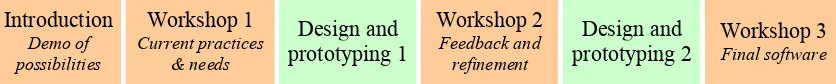
Introduction
Demo of possibilities
Workshop 1
Current practices & needs
Design and prototyping 1
Workshop 2
Feedback and refinement
Design and
[image:3.595.88.506.139.181.2]prototyping 2 Workshop 3 Final software
Figure 1: The user-centred process. Orange blocks involve both parties.
Our iterative user-centred approach uses rapidly developed/refined prototypes in response to user-requirements/feedback based on users’ own data. Requirements and feedback are elicited through workshops, between which design and prototyping takes place. The approach was influenced by Floyd et al’s (2007) and Roth et al’s (2010) work and one of our recent examples is written up by Dykes et al (2010).
The rapidity of this process maintains interest and relevance and the involvement of users throughout the whole process tries to ensure that design and development proceed in the right direction (Floyd et al, 2007). This STSM facilitated this close collaboration and allowed a fixed block of time to be allocated in which to complete this work. This helped ensure both parties were available for the whole process.
The workshops were structured around questions, most of which participants answered individually on paper before discussing as a group. The written answers were collection and notes were taken on the subsequent discussion. Here, we just present the main conclusions or the workshops which were between two and three hours long.
The design and prototyping periods between the workshops generally did not involve IBED members, but specific questions and opinions were frequently sought. This made our collocation very useful. The goal of the prototyping is to implement ideas quickly so that they can be evaluated by users – for this reason a variety of software, technologies and other means may be used to produce them. The idea is that examples can be mocked-up quickly without too much investment so that they can be discarded if necessary. For this STSM, I used Processing (http://www.processing.org/) for all the prototyping. It is a Java-based framework for experimenting with visual ideas of which I have considerable experience. It gives a high level of flexibility in terms of visual encoding and interaction, facilitates rapid development and resulting prototypes produced run on any computer with Java installed.
Introductory meeting 1 (9
thMay)
In this introductory meeting, the plans for the next two week were discussed.
This was followed by the presentation of various giCentre examples of interactive exploratory visual data analysis in a variety of contexts. These ranged from those closely related to IBED’s data and those that were quite unrelated. Presenting familiar examples followed by less familiar examples was intended to help spark creative thinking as to how interactive visualisation might help in ways not previously anticipated. There was some evidence that this was the case here.
Workshop 1 (10
thMay)
techniques that were available, how they helped, what was liked, what was disliked and what was potentially useful functionality was missing.
IBED’s current experience
The main conclusions from the workshop activities and discussion were:
• IDEB already make extensive use of interactive visualisation for exploratory data
analysis, and do it well.
• They use Matlab and R to produce both static and interactive graphics with multiple
coordinated linked views. Matlab and R gives a high degree of flexibility and control over visual encoding. It is supported by many useful libraries available, but interactive cartography is limited.
• They use a custom-built web-tool based on the Google Earth API for visual exploration
of bird movement. Google Earth provides detailed aerial imagery, high zoom levels, an intuitive interface, different datasets (weather) can be overlaid and results can be exported KML and distributed. The tools can be used on most computers and the output KML can be viewed by almost anyone. Disadvantages are that other data views (such as scatterplots) cannot be interactively linked and the number of data points displayed concurrently is limited.
• The ability to spatially aggregate data (e.g. to produce density estimation surfaces) was
considered important where GPS points are very dense.
• The ability to consider different types of time was considered important (temporal cycles
and relative to sunrise/sunset and tides)
• The sustainability of any solution resulting from this week was discussed. There is a
danger that building a highly customised tool that nobody else is capable of modifying will quickly become obsolete. The obvious way to deal with this is to see the value in the outcome of this week being the design rather than the implementation. But it is an issue to bear in mind.
• The ability to annotate interesting findings and be able to share these is considered
important.
• Correlating bird movement with weather data is a common activity of members of IBED. • Attention was drawn to the fact that libraries were available to link R to Java, and this
might be a way in which R libraries and IBED knowledge of R could be combined with the more flexible techniques offered by Processing/Java.
Tasks
To ensure that the designed techniques support IBED’s analytical requirements, users were asked for a list of analytical tasks that they wanted to be able to do, but that were not supported by existing tools. These were:
• Task: infer behaviour. Infer a birds behaviour along its track length.
• Task: revisited locations. Identify revisited locations: which birds and when.
• Task: temporal cycles. Compare a bird's behaviour with different temporal
cycles/windows (sunrise/sunset, tides, months).
• Task: extrapolate trajectories. Extrapolate trajectories back in time (based on current
heading and the windfield).
• Task: home ranges. Identify the temporal evolution of home ranges.
• Task: key places/times. Identify the key places and times in terms of birds' behaviours.
• Task: time stay. See how long birds stay somewhere.
• Task: resource use. Analyse resource use in relation to movement.
• Task: time expenditure. Identify time expenditure for different activities at different
Two datasets to work on were provided:
• an oystercatcher GPS data containing ~500,000 GPS points • a seagull dataset containing ~66,000 GPS points.
Design and prototyping 1 (10
th-16
thMay)
The most important issue reported in the workshop was inability to link different graphical views of data with zoomable map-based graphics. For this reason, the first few days were spent implementing this functionality in a way that other fast interactive graphics could be linked. Effectively, I was trying to implement aspects of Google Earth that were linked in such a way that the limitations could be overcome.
A zoomable/panning map viewer component for Processing was created using OpenStreetMap tiles. I was mindful of the discussion about the sustainability of the solution and wanted to have a self-contained component that could potentially be part of a library for Processing. Since Processing does not require strong grounding in programming, there is the potential for a zoomable/pannable component that works with Processing to enable IBED and others to create their own interactive visualisations with multiple coordinated views in future. This may help overcome the reported limitations with Google Earth.
The remaining days were spent designing interactions and graphics to try and address the analytical tasks provided and implementing these. These will be outlined in the subsequent section.
Workshop 2 (16
thMay)
In this workshop, the interaction, graphical design and functionality was presented in terms of the reported problems with the existing tools and analytical tasks identified, the degree of success with which these supported the tasks was discussed and rated. This was followed by a list of propositions as to how the remainder of the time should be used.
Functionality
Implemented functionality was demonstrated. The choice of functionality was down to my judgement of what was achievable in the time available, the comments made during the previous workshop and the data I had. Discussion during this session was ongoing and various observations about the data were made.
• Functionality: zoomable/pannable map. This enables a great deal of flexibility in
plotting data on the map and interactively linking it to other views. This directly addresses a number of issues raised in the previous workshop: the need to have detailed zoomable/pannable maps, a high level of visual encoding control, potential to link with other graphical views and the relative ease of reusing for other projects.
• Functionality: fast drawing for large datasets. The oystercatcher dataset (~500,000
points) took about a second to redraw. Once drawn, all other interactions were almost instant. Feedback suggested that this was very favourable compared to Google Earth (fast drawing was achieved by only plotting visible points and using off-screen graphical buffers). This directly addressed concerns that Google Earth cannot deal with large datasets.
• Functionality: query individual points. Being able to query individual points was
functionality that IDEB used extensively in Google Earth.
• Functionality: show/filter by bird. A graphic showing the proportion of GPS points in
• Functionality: linked timetime vs other attributes with highlight and animate. A
timeline that applies across multiple data views can support many of the requirements. The x-axis was used to depict time. Data shown on the y-axis could be alternated between bird height and bird ID (the individual). ‘Play’ could be started to animated movement over time.
• Functionality: coordinated highlighting. Highlighting data points with the mouse
works across data views, most importantly, the map and the timeline. This replicated some of the Matlab and R functionality, but integrated it with the map. Highlighting a location on the map highlights the parts of the timeline at which birds were present.
• Summarise data highlighting by location. A summary of a bird’s activity at a specific
location helps characterise how specific locations are used by birds, for example, how long birds stay somewhere (task: time stay).
• Bird ID on timeline. Using the bird ID on the y-axis of the timeline along with the
coordinated highlighting enables ‘revisited locations’ task to be answered.
• Filter by tidal level. Only showing the position of birds at particular tidal levels helps
comparison by tidal cycle (task: temporal cycles)
• Cyclic time highlighting. GPS points can be highlighted every month or year based a
time-range. This enabled comparison for different temporal cyclic rather than for one time-range (task: temporal cycles)
• Zoom dependent summary maps. Simple point density maps could be produced, with a
spatial scale that was dependent on the zoom level. The desire for this functionality came out of the previous workshop.
Functionality that was not implemented was also stated, due to time and lack of data constraints.
• Automatic identification of patterns • Sunrise/sunset
• Incorporate tidal patterns into the timeline (it used a separate selection mechanism) • Annotation
• Weather data (no weather data was provided)
These pieces of functionality was rank-ordered by perceived utility:
1. Fast drawing for large datasets. Impressed with the speed and responsiveness.
2. Show/filter by bird. Reveals difference between individual birds.
3. Coordinated highlighting. Matlab/R type functionality that also works with maps.
4. Query individual points. Liked the fact this was mouseover rather than click (as in
Google Earth).
5. Summarise data highlighting by location. See characteristics of a place.
6. Bird ID on timeline. See which bird visited a place and when.
7. Zoomable/pannable map. Aerial imagery would be more useful, but maps OK for
coastal birds.
8. Zoom dependent summary maps. Give a better representation of geographical
distribution.
9. Linked timetime vs height with highlight and animate. Let you see changes in height
over time.
10.Filter by tidal level. Patterns as expected – birds move up and down the mudflats in
response to tidal level
11.Cyclic time highlighting. Year/hour-based cyclic time not particularly useful.
Degree of support for the tasks
In the next part of the workshop, we ranked and assessed the apparent degree of support
for each analytical task. Note workshop participants were unable to try this out on their own (time constraints), so this assessment is not based on their experience (this will come in the longer-term evaluation at the end). Results are summarised below. Tasks are rank ordered
by how completely the functionality appears to support them.
1. Task: revisited locations. Success through the bird ID information on the timeline. It
was suggested that an overview map might help.
2. Task: time stay. Success, but difficult to isolate a particular track, often resulting in
summarised time ranges that included multiple tracks over multiple days.
3. Task: temporal cycles. Some success though the month/year cyclic selects, but it was
acknowledged that time that was relative to sunrise/sunset was more useful. Comparison between tidal height at the oystercatchers was successful, but the results were as expected and it was acknowledged that this was probably not useful functionality. Sunrise and sunsets were considered were important than absolute time. The direction of travel of a bird was considered difficult to see on the map and showing fading trails was suggested as a way to show this.
4. Task: home ranges. The correlation to bird movement by time of day could be made,
but for long timescales, the timescale was at too small a scale for precise selections. Zoomable time-ranges were suggested as a way of selecting time more precisely at a large-scale. The density maps helped show where birds spent most of their time. Home ranges were not defined.
5. Task: key places/times. Some success, but more bird attributes would be useful.
6. Task: infer behaviour. Some success, but difficult to isolate a track in an area that is
dense with tracks, difficult to see the differences in heights in the timeline over a short space of time and cannot get an overview of the speed distribution. It was suggested that selection of data by attribute (e.g. height and speed) would help.
• Task: extrapolate trajectories. This was not addressed as the details on how to do this
were not discussed
• Task: resource use. This was not addressed – did not have information on this.
• Task: time expenditure. This was not addressed – need already have segmented tracks
by behaviour type
There was discussion about how to keep track of observations and insights gathered during visual analysis and how this could be shared with colleagues. An example of an insight diary was provided to illustrate how this is done at the moment.
Propositions
I put forward a number of propositions as to how I should spend the remaining time:
• Wrap the zoomable/pannable map as a Processing library, and provide a guidances as
to how to use it in the remaining workshop
• Investigate links with R/Matlab
• Proceed as before, addressing the issues that were brought up in this workshop
• Concentrate on one particular task, provide detailed subtasks and use the best
techniques demonstrated in this workshop to try and address these completely.
IBED’s decision was to go for the third proposition – that we try and refine the prototype using the feedback obtained from this session. In addition, we decided to add support for:
• Display supplied satellite images – IBED have high resolution satellite imagery
• Read directly from the database – reduce the need for handling flat files of various
data queries
• Improve the timeline – make it zoomable in order to deal with short time periods
• Relative time – relative to sunset/sunrises
• Annotation – support for annotation and exporting annotations.
An agreed data file format was decided upon.
The tasks unsupported by the current prototype were also dropped.
Evaluation
Evaluation criteria were discussed. It was IBED suggested that a good criterion would be whether the group are still using the tool in six months time. This would suggest that it is both useful and provides functionality that is either missing from other available tool or easier to use.
The original plan was to present a tool at the final workshop and evaluate it in the session. Since only two of the participants would be able to attend, it was decided to delay the evaluation until after the scientific mission. It was agreed that this would likely be more objective as participants will have time to use the software on their own for a number of weeks.
Design and prototyping 2 (16
th-23
rdMay)
In this period, issues raised during the previous workshop were targeted and the current prototype was refined to a state in which it could be used by others. For the latter, ensuring interactions were intuitive was important.
Support for displaying supplied aerial imagery was not implemented, because suitable imagery was not available within this timeframe. Support for read and write access to the database was also not provided, because it was difficult to test as the database was only accessible from a few machines. However, retrieving data from a database using SQL is straightforward and this functionality can be easily added in future if required.
The resulting prototype was ‘wrapped up’ in a form that could be used on any computer on which Java is installed.
Workshop 3 (23
rdMay)
Only two of IBED’s users were present at this workshop. The prototype was supplied to each participant the day beforehand. Both had tried it, but not for more than a few minutes.
Functionalities
As before, the new functionalities of the prototype were presented. These were:
• Zoomable timeline – using the same interaction as for the map (left/right mouse drag),
the timeline can be zoomed and panned, enabling height data to be resolved for short units of time. This also affected the animation speed.
• Hour/day/year lines on the timeline – these guidelines are needed, now the timeline
can be zoomed and panned.
• GPS points coloured by individual – allowing difference between individuals to be
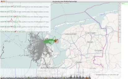
Figure 2: Screenshot, showing the movement of 8 sea gulls over a 4 week period (~66,000 GPS points), whose tracks are segmented into ‘journeys’ from the next. The spatial selection (on the map) is used by two birds (see red selection on right) and various points over the period (red dots in timeline at bottom). The timeline has bird height on y-axis. the Six of the selected journeys are shown at the top left as graphs with distance from nest on the x-axis, height on the y-axis and (faint) hourly isochrones along their lengths. An annotated view is saved (pale green rectangle at top right). Map data and information provided by Open Street Map and contributors, CC-BY-SA.
• Persistent highlighting – highlighting can be reset (press shift), done (hold down shift)
and kept persistent (releasing shift). This enables more flexible exporation as the map and timeline can be zoomed and panned without reseting the highlighted set. This was not picked up during the workshop, probably because users can not had the chance to try for themselves.
• Satellite imagery – (poor quality) satellite image can now be used instead of the
OpenStreetMap tiles from Map Quest (http://wiki.openstreetmap.org/wiki/MapQuest). This was helpful for the oystercatcher data as their spend their time on mudflats not marked in OpenStreetMap.
• Save view with comments, and save/load these to/from disk – the state of the
selection is recorded and free-text comments made. These are listed on the right-hand side of the application.
• Time relative to sunrise/sunsets – an alternative view adjacent to the timeline showed
time relative to sunset and sunrise
• Speed, temperature and distance from nest added to the timeline – in addition to
height and bird ID, speed, temperature and distance from the nest can now me used for the y-axis.
• Attribute seletion – as well temporal selection (vertical), attributes can be selected
(horizontal) and both simultaneously (window).
• Simple helpscreen – a succinct set of keystrokes and instructions are provided in the
[image:9.595.89.501.71.327.2]Figure 3: Zooming in on a track for a bird that visited Amsterdam. The selected area in the map is shown in the zoomed-in timeline (bottom) as red dots whose height relates to the bird’s height, showing its climbing and soaring behaviour. The track graph (top left) shows the height profile for the entire journey. Map data and information provided by Open Street Map and contributors, CC-BY-SA.
Degree of support for the tasks
The six tasks were then assessed for the degree of support given by these functionalities. Both participants considered that “good” support was provided for all these and that new functionalities helped. Specific comments were also provided.
• Task: revisited locations.
• Task: time stay.
• Task: temporal cycles. Found the sunrise/sunset view useful.
• Task: home ranges. The density maps were still considered useful, but changing the
colour scaling to show where birds spend 90% of the time might be a good indication of home ranges. The simplistic point-count density estimates could also be improved by regularly sampling along the tracks
• Task: key places/times. Found the display of the other attributes useful, but suggested
that a scale bar or the means to measure distance would be useful.
• Task: infer behaviour. Found the zoomable timeline and extra attributes helped with
this. Liked the annotation, but suggested that being able to annotate along a track’s length would be useful, perhaps as an ordered sequence of annotations. They also suggested that saving annotations as XML would make them more portable.
Plans for longer term evaluation
[image:10.595.89.501.71.329.2]After the STSM
There were a couple of developments after completion of the STSM:
• It became apparent that there was a bug in the software that only affected
Windows-based machines that it was used on. An unplanned half-day after the STSM was spent fixing this problem which made highlighted almost impossible to do.
• Criteria for identifying distinct journeys for the seagull data were supplied. These were
designed for a planned workshop and associated data challenge. I implemented this, additionally provided graphs that showed distance (x-axis), time (isochrones as vertical lines) and the other attributes (y-axis, as on the timeline) This provides a journey-view of the data. Initial feedback was positive.
• I received a comparable but different dataset to the one used during the STSM and
distributed updated software with this dataset, accompanied by an evaluation sheet. The evaluation sheet is designed to evaluate the process, the prototype and the prototypes ability to support the six tasks identified. Responses are expected in a few weeks time.
Further collaboration
During the STSM, a number of ideas for further collaboration were discussed. The introductory session at which visualisation examples were shown that did not directly relate to this work helped stimulate ideas about the wider application of this work in ecology.
Bird behaviour, weather, land use and resource use
During this scientific mission, we focused on bird behaviour alone. We are keen pursue work that uses interactive visualisation to study the relationship between behaviour and other aspects of the environment. IBED have particular interest in correlating weather data and bird behaviour. For example, recent work includes how bad weather might affect birds’ migratory flights (Shamoun-Baranes and van Gasteren, 2011) and how effectively birds correct the influence of wind on their bearing. Similarly, there is great interest in studying the routes birds take, which types of land they prefer to fly over and their energy expenditure. From our work during this STSM, it appears that interactive visualisation might be able to play an useful role in addressing these types of questions.
Species distribution modelling
We discussed scope for mapping and analysing species observation datasets whose data contain various different levels of spatial and temporal uncertainty. These data are collected by various Dutch organisations and are held centrally in a database that IBED helped design.
We also discussed scope for using interactive visualisation to explore the parameter spaces of species distribution models. These are important because they are widely used for extrapolating over regions to obtain likely distributions based on sparse input data.
Multidisciplinary research
Publications
Since the aim of the STSM was to develop visualisation techniques to support ecological research questions and that this appears to be successful, there is strong scope to jointly publish in our related disciplines.
In information visualisation research, there is a great deal of interest in user-centred approaches and recommendations for interactive visualisation design, case studies that demonstrate this and annotating and recording the data exploration process. We have had considerable success in publishing in these areas in the past, and intend to do so with this work. This work has good publishing potential.
Summary of results
The results are in accordance with the original aims.
Software application
A software application was been produced that was designed collaboratively with IBED, from scratch, during the STSM period. The software appears to be robust and intuitive enough for IBED members to use independently, so that they can objectively evaluation its utility. It supported an agreed data input format, allowing it to be use with other datasets.
There is good potential for this to be adapted and used in other contexts.
User-centred approach
The STSM was enabled us to test, adapt and gain more experience with our prototype-based user-centred approach to visualisation design. This fits in with our giCentre strategy and we believe it helps us built design visualisation to better suit analysts’ needs. Experience gained from this STSM will help us refine the way in which we work with users and will contribute to user-centred research.
Immediate feedback has been collected. More long-term feedback on the process, the software and its utility will be available in a few weeks time.
Further collaboration
This STSM has suggested that interactive visualisation might have an important role in wider ecological research. A number of research ideas were discussed and I will be attending a meeting about a new ‘e-science institute’ in July.
Acknowledgments
References
J. Dykes, J. Wood, and A. Slingsby, “Rethinking Map Legends with Visualization,” IEEE
Transactions on Visualization and Computer Graphics, 2010 Nov-Dec, vol. 16, no. 6, pp. 890-899, Dec. 2010.
I. R. Floyd, M. C. Jones, D. Rathi, M. B. Twidale, "Web Mash-ups and Patchwork
Prototyping: User-driven technological innovation with Web 2.0 and Open Source Software,"
HICSS, pp.86c, 40th Annual Hawaii International Conference on System Sciences (HICSS'07), 2007
R. E. Roth, K. S. Ross, B. G. Finch, W. Luo, and A. M. MacEachren, “A user-centered
approach for designing and developing spatiotemporal crime analysis tools,” in the Sixth International Conference on Geographic Information Science, 2010.
J. Shamoun-Baranes and H. van Gasteren, “Atmospheric conditions facilitate mass