Rochester Institute of Technology
RIT Scholar Works
Theses
Thesis/Dissertation Collections
8-1-1997
Type in motion: Motion of typography and its
effectiveness in communication
Anne Tolly-Wamsley
Follow this and additional works at:
http://scholarworks.rit.edu/theses
This Thesis is brought to you for free and open access by the Thesis/Dissertation Collections at RIT Scholar Works. It has been accepted for inclusion
in Theses by an authorized administrator of RIT Scholar Works. For more information, please contact
Recommended Citation
Rochester Institute
of
Technology
A Thesis
Submitted
to theFaculty
ofthe
College
ofImaging
Arts
andSciences
in candidacy tor
thedegree
ofMaster
ofFine
Arts
Type
in
Motion
Motion
ofTypography
andIts Effectiveness
in
Communication
Anne
Tolly Wamsley
Computer
Graphics
Design
CHIEF ADVISOR
APPROVAlS
ASSOCLATE ADVISOR
ASSOCLATE ADVISOR
CHAIRPERSON
James Ver Hague
Nancy Ciolek
Heinz Klinkon
Nancy Ciolek
/1
11
'":If>"
DATE
_--'7'---.'c/o(=_L-'{Iw-) _DATE
_1---=2==--"---=0=-"L-?--L7
_
DATE
/ /
!/2
let)
)
I
DATE
_ _ _
Iz- /
-"b~_-'---9'7
_
I, A'\JNE TOLLY W AJv1SLEY, hereby grant permission to the Wallace Memorial Library
of Rochester Institute of Technology
to
reproduce my thesis in whole or part.
Any reproduction will not be for commercial use or profit.
Anne Tolly Wamsley
Contexts
Acknowle dgments
1
Introduction
2
Interest
ofType
in
Morion
3
Development
ofIdeas
Initial Concepts
/Focus Defined
andNarrowed
4
Development
ofProject
Pressure
Morion
Gallery
The
Collections
Visiting
Artists
The Spider
andtheHy
18
Evaluation
ofProject
20
Consequences
ofCross
Platforming
Color
Speed
Quicktime
Movies
Hie Extensions
22
Research
User Responses
Direction
ofFuture
Work
24
Conclusion
25
Bibliography
Acknowledgments
The
successofathesislies
notonly
withthedesigner,
but
also withthosewho give
insight along
theway.The
following
people are theones who
helped
point theway
whenI
wasstumbling
about.Prof.
Jim
Ver
Hague
-forthecountlesshours
spentreviewing
my
work,
andcorrecting
my
programming
blunders.
Prof. Robert
Keough
-for
always
encouraging
that therereally
wasalight
at the endof
the tunnel.Prof.
Nancy Ciolek
-forgiving
criticaladvice andbending
over
backwards
tohelp
atany
time.Prof.
Heinz
Kllnkox
-for
teaching
that typebecomes
animage
when youallow
creativity
to takecontrol,
ratherthan the 'rules'of
type to which wehave
conformed.Mr.
Charles
Wamsley
-for
unconditional,
irrevocable
love
Introduction
Type
is
everywhere ...but how
candesigners
improve its ability
tocommunicatewhile
keeping
up
with thedemand
of ourvisually
dependent
society?Type
in
morion
is
thekey. Type becomes
a more effective communicationtoolwhenmorion
is
applied.Motion
adds adimension
ofmodernity
to theformerly
rigidwritten
word;
it
gives theword apersonality
andsets the tonefor
thedesign.
Our
society
has
grownto appreciatefast
moving,
sounddeafening
imagery.
The
basic
idea
is
togive thepublic whatit
wants.Type
affects thepersonality
andfeeling
ofthedesign,
whichsets the tone ofany
media. presentation.For
comparison,
anintroduction
to theMartha
Stewart
Living
televisionprogramis very
refined and traditionalin
stylewhereasthe
introduction
toBill Nye
theScience
Guy
is
loud,
obnoxious anddominating.
The
typehas been
selectedfor both
programsbased
on theiraudiences.
To
be
morespecific,
typehas
personality
and eachfont
its
owncharacter.
Goudy
evokes a traditionalfeeling
of stateliness andquietelegance;
Futura
is very sharp
and acerbicin its
demeanor;
Bodoni
andPoster Bodoni
are
domineering
anddemanding.
When
all the contents are strippedfrom
type, it
becomes
imagery.
Dealing
withtype
in
motion,
I
began
tolook
at thedifferent
factors
that affecttype;
whatInterest
ofType
inMotion
My
interest
in
type animationbegan
to growwhen theintroduction
to the newsprogram,
Dateline
-NBC,
developed
atitling
oftheirnamemoving
atdifferent
angles,
spinning
aroundaninvisible
spheredemonstrating
theirability
tocover news aroundthe world.In
short,
thebasic
newsprogram's title caught the attention of allpeople,
notjust
newshounds,
through the use oftypein
motion.That
smallintroduction
tomoving
typeintrigued
me withthe typical questionof
"how'd they do
that?"
Graduate
school and computer animation openedup
the answerto thatsimple question.
Computer
animationtypically
deals
withobjects, graphics,
orimages,
but
I
wanted to experiment with type andtypealone;
theimportance
oftypein
communication,
how
it
reachesits
audience and what typesof movement canbe
achievedtoenhance a piece oftype.Hardware/Software
A
variety
of software packageswere usedin
combination tocreate thedesign
ideas
thathad
only
existedin my
head
or scribbledin
thejournal
thatI
had
started
for
the sake of referencewhenwriting my
thesispaper.The
initial
design
work
for
the thesisprojectwasdone
on aPowerMac 7200
using
Director 5.0
for
animating
andinteractive
designs,
Strata Studio
Pro
for
threedimensional
animations and
stills,
Photoshop
4-0
for
image
enhancements,
Illustrator
for
twodimensional
drawings,
Adobe
Premiere
for
capturing
video andSoundEdit for
editing
thebackground
sounds.Partway
through theproject,
I
began
crossplatforming my
designs,
but
quickly
raninto
severaldesign dilemmas
whichforced
me tomy
486
PC
running
withWindows
95,
using
Director
5.0,
Photoshop
4.0
andCorelDraw 6.0. [Problems
of cross-platformingwillbe dis
Initial
Concepts/Focus
Defined
andNarrowed
The
goalwas todesign
type
in many
forms
and styles ofmotion,
existing in
both
two
dimensional
and threedimensional
environments.Questions
tobe
answeredwere whether all
fonts
wouldsurvive the samemorion,
andwould sound affectthe style ofthe
font
andits
motion.In
theinitial
stage ofdesign,
I
consideredexploring
thedifferent
environmentsthat typein
motion wouldbe
an effectivecommunication tool through theanimation of several poems of
varying
emotional
levels. Other
initial ideas
were thecontrasting
ofthecolorful andplayfultype of a
nursery
rhyme to the grand andflowing
verse of aPsalm;
andanimating
a recipe and whether
it
wouldbe
effective andfunctional
orjust
entertaining.I began
by
considering
different
situationsin
which type couldbe
in
motion andstill
be
effectivein its
communicating."Pressure"
wasthe
first
project andeventually
became
the pivotal pointofthe entire thesispresentation.Two
months oftedious work and
design
wentinto animating
type to thesong
"Pressure"
by Billy
Joel1using
Director
on aPowerMac.
One
sequenceofdesign
would
be
usedtodescribe
one sentence ofthe song.Each
sequence workedperfectly
alone,
but
once the sequences came together as awhole,
Director
could not
consistently
synch thesoundtrack to thedesign. I
felt
it
was time toturn
back
to the proverbialdrawing
board
and start over.After
encouragementfrom
professorsVer Hague
andCiolek,
I
chose totry
andfix
the problems.Unfortunately,
one problemled
to the nextcausing
morefrustration
andstealing
precious
hours. Around
thistime,
aPC
wasbrought
into
theMac
based
computer
lab
to encourage crossplatforming.Since I
am adiehard PC
user,
I
decided
to
try
crossplatforming
the"Pressure"
project.
Much
tomy
dismay,
crossplatforming
"Pressure"
in
its
half
completedstate,
created a situation thatcouldonly
be
solvedby
starting
the projectover.Several factors
convinced me toabandon
"Pressure"
andstartafresh
working
entirely
on thePC.
Still
with typein
motion asmy
focus,
I
started a newdesign direction. Rather
thandemonstrat
ing
different
forms
oftypein
motion through the animation of anursery
rhyme,
Psalm
orsong,
I decided
tohighlight
the motions themselves.What
developed
was the
'Motion
Gallery,'
an
interactive
programthatdealt
solely
with theidea
oftype
in
motion-how
Development
ofProject
PRESSURE
The
first
animationwas"Pressure"
a
song
thatcouldbe
described
aspulsing,
throbbing
and intense.The
environment of"Pressure"
was
dark;
theback
ground,
solidblack.
All
textswere either a metallicred,
metallic violetormetallic
yellow tocreate achilling
contrast to the starkness ofthedesign. Black
and whiteconcentric circlesspinning
ontop
ofone anotherwere added to theintroduction
and severalflashpoints
toimply
anindustrial
or mechanicalenvi ronment.As
thelyrics
ot thesong
wereheard
the wordsflashed
in
synchroniza tion.The
song'slyrics
aresung in
shortphrases andthen after each phrase thesong
is
halted
by
the word'pressure'
shouted.
The design
startedwith the con centric circlesspinning in
and outto the...
hrics
toPressure
by
Bilh
loel
beat. As
eachline
wassung,
words wereanimated
using
alldifferent
ranges ofmo-You
have
t0leam
t0Pace vurself
tions:
sliding
in
from
allsides,
fading
in,
PRESSURE
growing,
shrinking,
flipping,
andspacing
YouVe
Justlike
even'bodyelse techniqueswhichwouldallowoneletter
at aPRESET RE
rime
toslide intoplace as the othersfol-
YouVe
onl^'had
t0mn sofar
lowed.
Every
rime
the phrase'pressure'
was g
shouted,
thedesign
flashed
theword'pres-
But
>'ou Wl11 comet0 aPlace sure'in
apulsating
actioncreatedby
aWhere
theonlything
youfeel
positive and negative oftheword,
replacing
Are
loaded
8ms m >'our
face
the other
for
a time offour
seconds.PRESSURE
1981 Joel Songs
(BMI)
An
important
pointwasexploredin
"Pressure"
as towhetheror not typecould
effectively
communicate throughits
motionsin
an environmentbased
solely
on sound.In
"Pressure"
thewords
became
images
thatmimicked thesoundthrough movement.Though
theprojectwasabandoned,
thedesign did
successfully
com municatethethrobbing,
harshness
of anindustrial
environmentthrough typestyles andtheirmotions whichwere chosenfor
theirintense
attributes.In
Strata,
transparency
ofthe graphic wouldnotworkif
just
the transparentfactor
was applied.Several
conditionshad
to existbefore
thegraphicbecame
asolid with a transparent
background.
Adjustments
to thehighlight,
glossy,
reflective,
and glowfactors
had
tobe
toggledbefore
satisfactory
results weremade.
To apply
the twodimensional
graphic onto a threedimensional
object,
the object was
drawn
and thengiven awhite surface with zero reflective, zerogloss and several
light
sources thatwouldcancel out all shadowsin
the camera'sview.
To
best
achieve results oftransparency, only
black
textin
awhite environment could
be
used.The
textwas then texture-mappedonto the object.A
camera wasset
in
positionfor
animationsequencing
and adjusted to suit thedesired
rotation.The
objectwasrotatedin
15increments,
so that a camera shotwastaken at each rotation point.
These
animations were saved asindividual
PICTs
ratherthanQuicktime
moviesbecause
in
ordertohave
perfectinvisible
shapes with
rotating
text on animplied
surfaces,
Photoshop
was requiredtotouch
up
theimages.
After
creating
several shapes-ranging
from
spheres,
cubes,
cones and organic objects-and texture
mapping
severaldifferent
textpieces
from
thesong
'Pressure,'
the
PICTs
werebrought
into
Photoshop
andreversedto
fit
the theme ofblack
andindustrial
-like.Various filters
wereappliedto enhance the text's appearance.
Neon
glow,
colorchange,
lighting
effects,
motion
blur,
and gaussianblur
were several ofthefilters
commonly
used toaddcolor and
distort
the text quality.The
motionblur
filter
wasperfect toimply
anillusion
of speed on thealready
spinning
text.The
use oflighting
effectsfilters
were usedtomake a
dark,
unreadable phraselight
up
as amoving
spotlight scannedpassed.MOTION
GALLERY
During
thedesigning
of'Pressure'
and the three
dimensional
pieces ofrotating
type,
I
had been
considering
severaldesign
environmentsin
which theinterac
tiveportion ofthe project would exist.
Discussions
included creating
an educational
piece to teach otherdesigners
themethods ofcreating
typein
motionoran
interactive informative
project.Since
my
strengthis
design
and notprogramming,
I
decided
tokeep
the interaction simplebut
useful.Buttons
weredesigned
to move the viewerabout,
givedetails
about the typeanimations,
rewinding
movies,
jump
tohelp
pages,
and an option toquit the program.Keeping
themimicking
the conceptof a museumgallery
whichhas
different
exhibits ondisplay.
The
Motion
Gallery
wasdesigned
as aninteractive
informative
piecewhich containsthree categories: the
Collections,
theVisiting
Artists,
andthefeatured
exhibitionof'The
Spider
andthe Hy.'The Collections
are a rangeoftype
in
motionideas.
Visiting
Artists
is
the presentationofpiecesfrom
othersources,
such as televisionand student works.In
every
museum andgallery,
thereis
always afeatured
exhibit that stands above therest.My
animated version of'The
Spider
andthe Hy'is
a collection oftype motions thatweave a tale throughsight and sound.THE
COLLECTIONS
Morphing
the evolution of aletter
conforming
to the shape ofanother.The
ABC
Morph
animation(fig.
1)
wasthefirst
ofseven motionsin
theCollection
section;
the alphabetwastransformedby
oneletter
metamorphosing into
O-f>a l-i/is AKN \ the
preceding
letter. CorelDraw
wasusedentirely
tocreate themorph op
Q
FIGURE
fIGURk
\
sequencing.The
blend
function
is
aspecial effectusedto create aj
morphby
merging
oneletter
into
another througha progressionof\
intermediate
shapes.At
completion,
ablended
objecthas
allofthe entitiesconnected,
and a'separate'
command wasgivento
break
apart theentities.Each
entity
wasexportedinto
Photoshop
for
further
refinement.It
is important
toremember one's audience whendesigning
and tonot adddistracting
sidelinesormonotony
by
showing
things thatthey
already
know. Since
the alphabetis
such anelementary
subject,
I
had
to consider thelength
of animation to show withoutboring
the audience.Bearing
in
mind that there are26
characters,
the animation mustbe
quick paced.However,
I
needed to
keep
enough stepsof changebetween
oneletter
to thenext to^ makethe morph smooth andsuccessful.
With
afew
experiments of5
or10
steps ofchange,
I decided
the5
step
change was effective and still 'could run smoothly.
To
add abit
moreaction to the constantmorphing
motion,
I
addedseveral textelementssliding
andblinking
throughout the animation.This
animation provedtobe
the most successful andentertaining
piece of the project.Blur
creates theillusion
of movementin
static objects. 'Mg,' representfIGURk
blurred
images
wereimported
into
Director
andsequencedto animatefrom
afull
radialblur
to the actualimage
andthenreturnto the radialblur.
Another
approach to
creating
blur
was toapply
the windfilter.
Under
theStylize filter
flyout
is
Wind;
wind,
blast
and stagger are thecontrol options ofhow hard
themotion will
be
simulated.The
direction
controls arelimited
tomoving
left
orright,
soto make theimage
moveup
ordown,
first,
I
had
torotate thelogo
andthen add wind.
In
Director,
thefinal blur
animationhad
thelogo
spinning in
place,
sliding
from
thebottom
ofthe screen to thetop,
from
theleft
toright,
andblurring
radially
whilezooming in
from
theback
to thefront.
Slide
movements canbe
achievedby
sliding
horizontally
andvertically.A
single piece oftype
sliding
canbe
very
simplistic and alsovery
common,
but
by
layering
textsofdifferent
motion patterns-for
example,
aline
oftextmoving
to therightandthelayer
oftext abovemoving
to theleft
in
triple speed-makes
many
possibilitiesfor
designing
slidemotions.\
'Style
Magazine'(fig.
3)
was thedesign
idea
behind
themotionj
'slide,' which wascreatedas anintroduction
to a simulated video1
f
magazine.Fast
pacedmovements anddynamically
layered
textare'
descriptive
ofthetrendy
magazine concept.The
background has
a sansserif
font
croppedat all thesides,
sliding slowly
to theleft.
A
whitebar
3 slides
in
from
the
left
erasing
a portion ofthebackground letters
allowing
thewords
'Style
Magazine'
in
all capitalletters
tospreadfrom
tightspacing
tovery
wide spacing.
Two
-thirdsfrom
thetop
of thescreen a combined sentence of a script and sans seriffont
movequickly
across thebackground
to theright.In
thelower
two-thirds ofthe screen adifferent
conceptis
happening
in
comparison tothe
top half. While
thetop half
is
bold,
sliding in
different directions
andvarying
speeds;
thebottom
portionis
subtlewith an occasionalbold letter
whichflashes
andblinks
in
and out oftheviewer'seye.The
words'Style'
and'Magazine'
remain
constant,
and atevery
other secondtheletter
'M'
flashes
in
reverse,
then'A,
G
and so onoverlapping
the staticword'Magazine.'
The
blinking
ofletters
spelling
'Style'
simultaneously
flashes
during
the same time centeredat theleft
edge and
blends
thedesigns
ofthetop
andbottom
portions.Director
animates this type of slide motionby
in-betweening
the start andstop
castmembers.The
success ofthe
design lies
in
thestimulating
concept of anasymmetricalbalance
flGURE
#fitifi
Tumble
amovement offalling
anddropping
uncontrollably.The
animationwas simple
in
concept(fig.
4)
; ahorizontal
rule slidfrom
the right edge ofthescreen,
andthe tumble motionbegan
to
unfold.Letters
spelling
the word'motion'
were the characters ofthe animation.
'M'
dropped from
thetop
andits
legs
\
crumpledwhenit
hit
thebaseline
(fig.
4a),
and then reboundedup into
place.The 'O
slidin
from
the right
along
thebaseline,
but
misjudgedhis
position andbumped
into
the 'M'making
a smallcrash,
he
thenuprighting
himself,
and~f/
found
his
position.Lying
flat
along
theline,
the'T
satup
straight(fig.
4b)
;T
cameshooting in
head
first (fig.
4c)
from
the fiGURf 4right
crashing
into
the'T,'
crumpled and
swung
90straightening
itself
toits
properposition.The
second 'O'made
his
entry
similar to the'M'
by dropping
from
thetop
and
bouncing
down
onto theline
andthenback
up
afew
spaces to
its
position. 'N'"grew"
into
his
place on theline
(fig. 4d).
Spelling
'motion'all
letters
were static andin
positionslightly
above theline
for
several seconds.The
horizontal
ruleslowly
retracted,
forcing
eachletter
tofall
as theirfooting
on theline
disappeared. Each
tumbledin
theirown artistic styleinto
thedepths
ofthebottom
edge;
the'M,
O'fall
at anangle,
'T
heroically
took aplunge,
T
fell
andflipped
backwards,
'O'somersaulted and
'N'
dropped
casually
out ofview.To
create theimages
usedfor
the tumblemotions,
eachletter
wasduplicated
andthenindividually distorted,
twisted,
smudged,
rotated and/or erasedin
Photoshop
depending
on theletter's
acrobaticfeat. Slight
changes to eachletter
made the sequence ofthe tumble animation more accurate.Most
oftheletters
needed5
to8
steps of change tocomplete theanimation sequence.To
finish
theanimation,
a constantbackground
motion wasdeveloped
tomaintainsteady
movementthroughout thepiece.A
blurred,
oversized scriptlettering
of the word"type"
was
rotated;
starting
larger
than the screen andshrinking
asit
rotated.
Hnal
presentation ofthe tumbleanimation wascompleted
by
in-betweening
and
tweaking
cast members of alltheindi
vidual
letters
in
Director.
The
following
motions werespins;
all similarin
theiraxis andspinning
cycles,
but
eachdesign lead
tonewideas
anddiscoveries.
Spin One
(fig.
5)
Originally
designed for
the project"Pressure,"
was
initially
created
in
Illustrator
as a twodimensional
graphic which was text texture-mapped
using
Strata Studio
Pro
in
multiples oftwoonto acone shapedobject.
By
placing
thegraphic on an objecttwice,
theimage
appears tobe
spinning
faster because
the viewer seesit
twicefor
every
spin.The
animation was
very
simple,
spinning
360withthe 'x'axis at
90.
The
camera took
image
shots atevery
15andthePICTs
wereimported
into
Photoshop
for
enhancement.In
Photoshop,
allimages
werereversedtowhite
letters
on ablack background
andthenduplicated.
One
animation sequence waspassedthrougha motionblur filter
andtheother
left
alone to create theillusion
ofvarying
speed.Director
animated theimages
by
combining
the two animation sequences(motion
blurred
and theoriginal)
together.Additionally,
the motionblurred
cone spinwaslowered
by
alA
inch
toimply
alayering
effect.By
reversing
thedirection
of onesequence,
two
opposing
spindirections
were created.Spin
Two
(fig.
6)
Until
thisexample all the otherobjectshad been
opaque;
showing only
the type graphic asit
cameinto
view andwhenit
wentabout
its invisible
axis.'Spin
Two'
was the
only
examplein
which the \ objectwasinvisible
so that the type couldbe
seenfrom
thefront
and
back
asit
spun.The
initial
process ofbringing
a2D
graphicinto
Strata
was thesame;
theonly
difference
was thetoggling
theinvisible
factor
to100%
whenit
was appliedto the3D
object.The
effectwasvery
uniquerevealing
both
sides oftherotating
text.To
increase
theimplied
threedimensionality
oftheletters,
a plasticwrap
filter
was appliedin
Photoshop.
Spin
Three
(fig.
7)
This
pieceis
an example oftwodimensional
spinning
created
in
CorelDraw.
The
spinning
motion wasvery
effective and was usedmany
times throughout thepiece,
'The
Spider
and theHy.'
By
using
the
fit
text to path
feature,
text was movedtofit
to a circular path.A
secondtext
~~^-\
A
two point perspective was added to the textgroup
ofapproximate 301
%
Ni
by
lowering
thetop
left
corner.The
text circles were rotatedin
15
\
increments
andexported after each rotation as aPICT
for
the$
\
animation sequence.A
full
cycle was completed andassembledin
tlStthe
prettiest
li
Director
using
24
cast members to create a smoothrotation.An-J,
j
otherline
oftype was alsofitted
to a circularpath andexportedinto
Director.
Repetition
ofthe textcircle created a'growing' move
ment
from
small tolarge
and alsoimplied
adepth
which movedcloserfiGURt 7 as the text
became
larger.
VISITING
ARTISTS
The
secondcategory
selectionin
theMotion
Gallery
was theVisiting
Artists
section where
I
researched otherdesigners'
works oftype
in
motionto see thecurrent
ideas
andtrends.They
alsodemonstrate how
typein
motioncanbe
aneffective communication tool to modernize
introductions
andadvertising
ap
proaches to
better
capture the attention oftheviewing
public.A
very
populararea
for
type animationis television;
much ofmy
researchincluded watching
commercials and
introductions
for
televisionprograms.The
newtrendin
typeanimation utilizes nervous
twitching
orflashing
movementsto coddle today'sfast
talking,
pleasureseeking,
short attention span society.The
first
Visiting
Artist,
Extra1(fig.
8),
is
an excellent example ofthetrendy
typein
motion.It
uses
repeating
imagery,
swinging text,
blurred
andpulsating images
oftype tointensify
the program's powerfulintroductions
andtransitions to stories.The
sell-point ontheir type
design
is
thatit is
full
ofaction and movementfrom
alldirections.
Another
interesting
feature
ofthisdesign
is
not thatjust
words andphrases are
used,
but
full
columnsoftext areslid,
flashed
and spun to addanotherdesign
elementinto
the concept.Readability
is
not anissue,
ratherthe
intent
is
for
the viewer toconcentrateonly
onthe program's
titling,
'Extra,'
or portions ofthe
name
[i.e.
'ex'
and
'tra']
whichalternately
flashes
approximately
16
rimes in
theintroduction
alone.The
added columns andother textscreate aconstantly
moving
background
environment.\
N
\f
\a
is
i
X
\
I
/
1
S
jL,J
\ J
t\
/
V
V
FIGURE 9
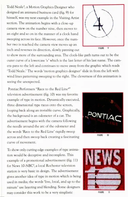
Todd
Neale3,
aMotion
Graphics
Designer
whodesigned
an animatedbusiness
card(fig.
9)
for
himself,
wasmy
next examplein
theVisiting
Artist
section.
The
animationbegins
withaclose-up
camera viewon thenumber
nine,
thenmoves toan eight and so on
in
themanner of a clockhand
sweeping
acrossits
face.
However,
once the number
twois
reached the cameraviewmovesup
aninch
and reversesits
direction,
slowly panning
outtoshow more of the
surrounding
area.The
clock-like pathturns out tobe
theouter curve of a
lowercase
'e'which
is
thelast letter
ofhis
last
name.The
camera pans to the
left
and continues tomoveaway
from
the graphic whichreads'Todd
Neale.'The
words'motion
graphicsdesigner'
slide
in
from
theleft
withwind
lines
patterning sweeping
to the right.The
cleverness ofthis animationis
seeing
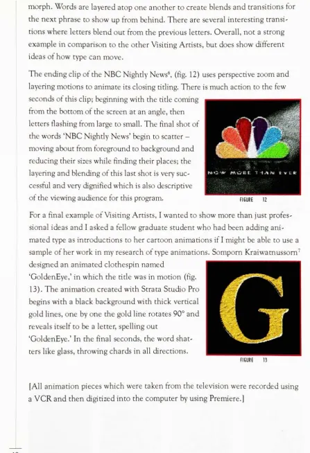
the unexpected.Ponriac Performers "Race
to theRed
Line4"televisionadvertisement
(fig.
10)
wasmy
favorite
example oftype
in
motion.Dynamically
executed,
three
dimensional
typeraces onto thescreen,
looping
back
along
aninvisible
curve.Graphically,
the
background
is
anodometer of a car.The
advertisement
begins
with the camerafollowing
theneedle around the arc ofthe odometer and
the words
'Race
to theRed
Line'rapidly
sweep
across andthen
swoop
back
creating
afascinating
curve ofmovement.
To
showonly cutting
edgeexamples oftype animationwould
be deceptive
andincomplete.
This
exampleof a promotional advertisement
(fig.
11)
for
News
10-NBC5,
alocal Rochester
televisionstation
is very
basic
in
design. The
advertisementgives another
idea
oftypein
motion whichis
being
used
in
media;
thewords'live, local,
andup
to theuse
layering
andblending.
Some designers
may
considerthiswork tobe
avery
simplisticFIGURE
[image:16.559.69.499.39.701.2]morph.
Words
arelayered
atop
one another tocreateblends
and transitionstor
the next phrase to show
up
from behind.
There
are severalinteresting
transitionswhere
letters
blend
outfrom
the previousletters.
Overall,
not astrong
example
in
comparison to the otherVisiting
Artists,
but
does
showdifferent
ideas
ofhow
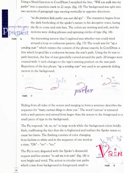
type can move.The ending clip
oftheNBC
Nightly
News6,
(fig.
12)
uses perspective zoomandlayering
morions to animateits
closing
titling.There
is
much action to thefew
secondsofthis
clip;
beginning
with the titlecoming
from
thebottom
ofthe screen at anangle,
thenletters
flashing
from
large
to small.The
final
shot ofthewords
'NBC
Nightly
News'
begin
to scatter-moving
aboutfrom foreground
tobackground
andreducing
theirsizeswhilefinding
theirplaces;
thelayering
andblending
ofthislast
shotis very
successful and
very
dignified
whichis
alsodescriptive
ofthe
viewing
audiencefor
thisprogram. riGURE 12For
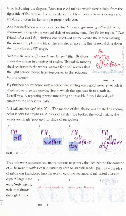
afinal
example ofVisiting
Artists,
I
wantedtoshowmore thanjust
professional
ideas
andI
asked afellow
graduate studentwhohad been
adding
animatedtype as
introductions
toher
cartoon animationsif
I
mightbe
able to use asample of
her
workin my
research oftype animations.Somporn
Kraiwatnussorn7designed
an animated clothespin named'GoldenEye,'
in
which the title wasin
motion(fig.
13).
The
animation createdwithStrata
Studio
Pro
begins
withablack
background
wath thick verticalgold
lines,
oneby
one thegoldline
rotates90andreveals
itself
tobe
aletter,
spelling
out'GoldenEye.'
In
thefinal
seconds,
the wordshatters
like
glass,
throwing
chardsin
alldirections.
FIGURE
[All
animation pieces which were takenfrom
thetelevision
were recordedusing
a
VCR
and thendigitized
into
the computerby
using
Premiere.]
[image:17.559.52.500.53.708.2]SPIDER AND THE FLY
The
final
andfeature
exhibitin
theMotion
Gallery
was'The
Spider
andtheHy;'
ananimated
nursery
rhyme made of a compilation ofmany
different
motions.
I
have
afuture
interest
ofanimating
typefor
interactive
children'slitera
ture and
this
projectbecame
one ofmany stepping
stones to thatgoal.A
nursery
rhyme
is
a whimsicalditty,
intended
toentertain and enlighten.Right
from
thestart
I
designed
thispiece withtheintentions
thatit
was not tobe
readwordfor
word;
only
key
words and phraseswouldbe
highlighted. Repetition
became
avery
important
concept-the process of
repeating
key
wordsmade greaterimpact
thanaccurately
reciting
a verseofthepoem.
One
important
noteis
thatwhenanimating
type, it
theintent is
not tobe
readwordfor
word,
avoice-over
is
essential.[In 'The
Spider
andthe Fly'there were
two
charactervoiceswhich spoke theirparts
in
aconversationaltone.]
The
story
line behind
the rhymeis
ofacunning
Spider
inviting
theFly
for
avisit,
For
thedesign,
I
choose adark
environmentfor
the spider'sweb flGUR '4because
ofhis
conscious efforttobe deceptive,
(fig.
14)
As
the spider charms afriendship
from
thefly,
the environmentbecomes
colorful andbright.
In
the endthe animation returns to the
dark design.
In
essence,
"The
Spider
andthe Hy"is
a piece where the actions ofthe type mimic thecontent.
The
animationbegins
withthe spiderclimbing
down his
weband thenspinning
a
line
towards thebottom
ofthe screen.As
he
reachesthebottom,
the title oftherhyme
"grows"
from
thebottom
ofthe screen.To
create a'growing'
motion,
duplicate
theword,
thenpartially
erase aroughedgealong
thetop
oftheletters
ofthe
duplicated
word.Duplicate
again,
and continue theprocess,
erasing only
a small portion at a time.
Import
theimages into
Director
making
thefirst
step
ofthe sequence the smallestportion ofthe
image
andin
the
last
step,
thewordin its
completeform.
3&&
mo
my.
13
Using
ablend function
in
CorelDraw
I
morphedtheline,
"Will
you walkinto
my
parlor"
into
a questionmarkin
22
steps,(fig.
15)
The
background
was splitinto
two sectionsofparagraph type
moving vertically in
oppositedirections.
*?-FI6URE 16
"tis
theprettiest
little
parlor
you everdid
-The
transition
begins
from
the
dark
foreboding
ofthe spider'snature tohis deceptive
voice,
luring
fn-ciiwsi
Ihtie
[Hrlrntne
fly
to come andvisithim.
The
colors areinviting
andsoft,
andthef??*fe
^-$P
S.
t,
motins weresliding
phrases andspinning
circlesoftype(fig. 16).
An
interesting
motion thatI
exploredwas whethertextcouldwindaround a
loop
or corkscrewpattern,(fig.
17)
The
result wasfor
"up
awinding
stair "which mimics the contentof the phrase exactly.
In
CorelDraw,
aline
whichlooped like
a corkscrewbecame
the text's path.Using
thefit
text topath
function,
theline
oftextgracefully
curved aroundthepath.20
images
werecreatedwith
Vi
inch
changes to the type'sstarting
position onthe textpath.Repetition
of thekey
phrase"up
awinding
stair"
wasused
in
an upwardssliding
motion
in
thebackground.
%
.<-<, ^dP^^t.^^ FIGURE 17 ^j".-. *f
* F S u^
uinding
sicurr
arhr
Sliding
from
all sides ofthe screenandmerging
toform
a sentencedescribes
thesequence
for
"many
curiousthings to showyou."
The
word'curious'
is
texturedwitha web pattern and moved
from larger
than the screenin
theforeground
to asmall piece oftype
in
thebackground.
The
Hy
responds"oh,
no,
no"in
large
wordswhile thebackground
colorsboldly
flash,
reaffirming
thefact
that sheis
frightened
and realizes theSpider
wantstocause
her harm. The
flashing
consists of colorchanging
from fuchsia
towhite andin
the sequenceof one wordata
time,
Oh
-no - no.
The
Hy
is very
disgusted
withtheSpider's distasteful
request and
her
answer"to
ask meis in
(fig.
18)
is
very
bright
andvivid.The
actionis
circulartextpathswhichcome
from
background
toforeground,
small to
->-FIGURE 18
[image:19.559.39.518.55.720.2]large
indicating
thedisgust.
'Vain'is
a vividfuchsia
whichslowly
slidesfrom
theright side of the screen.
The
typestylefor
theFly's
responseis very
flowery
andscrolling,
chosenfor
her
uptightproperbehavior.
Another
corkscrewmotion was usedfor "can
ne'er godown
again" which winds
downward,
along
with a vertical slide ofrepeating
text.The
Spider
replies,
"Dear
Friend,
what canI
do,
"blinking
oneword-at a time
-onto the screen
making
the viewercomplete the
idea.
There
is
also arepeating
line
oftextsliding
down
the right side at a90 angle.
the
|;
"to
prove
the warmaffectionI
have for
(fig.
19)
slidesWfciff^h)
about thescreenin
avariety
of angles.The
subtly moving
CC
6
shadows
beneath
thewords'warm
affection,'
reveals that ?JJ
V
^
|
the
light
source movedfrom
top
corner to the adjacent *Vf-'+&^hm
j^'tjeif
bottom
corner.FIGURE 19
Hy
finished
her
responsewitha polite"and
bidding
youa goodmorning" which
is
displayed
as a gentlecurving
line
in
which the typewasfit
toa pathin
CorelDraw.
A repeating
phrase runsalong
aninvisible
funnel
shapedpath,
similarto the corkscrew path.
"I'll
callanother day"(fig.
20)
-The
motion ofthis phrasewascreatedby
adding
color
blocks for
emphasis.A
block
of similarhue backed
thewordmaking
thewords
seemingly
'pop'up into
place when spoken.I
////
7/
another
This
following
sequencehad
many
motions toportray
theidea
behind
thecontentof-
"he
wove a subtle web
in
a cornersly,
thensethis
tableready"
(fig. 2
1)
-the
idea
of subtle was
introduced into
thestoryline,
so thebackground
mimickedthatconcept.
A large
sized ,1 2 3
' ' ''-"'
ttm
TH
I7L
eaf
~JI.ll.
-FIGURE 20 -:
-;;;
,'^z^'f
word 'web'
having
web
lines drawn
through
letters
2 3
. ' "
15
jaik01,ybEk!5cWeJ airlJjs yaihcJ^YbBir:aWcJ eiriJo
[image:20.559.73.493.35.752.2]1 t
ine
n
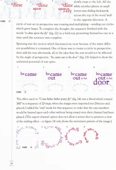
FIGURE 22ine
upon
upon
slowly
crept to theleft.
All
theQHlc
while another phrasein
smallthej
lV
letters
wassliding
backwards
across the
top
oftheword'web'
in
the oppositedirection.
A
circle oftextset
in
perspective wasrotating
andmultiplying
-sending
out circleswhich grew
larger.
To
complete thethought,
the sequencefinished
with thewords
"to
dine
uponthefly"(fig.
22)
in
abold
red,
presenting
themselvesone at arime
until the sentence wascomplete.Spinning
was the motionwhichfascinated
me mostbecause
of themany
differ
ent possibilities
it
contained.One
ofthose was to create a circlein
perspective,
thenaddthe text
afterwards,
allin
theidea
that the textwouldnotbe
affectedby
the angle of perspective,"he
came out tohis
door"
(fig.
23)
helped
toshow theunlimited potential oftext spins.
12 3 4
he
came
he
came
he
came
out
tohis
FIGURE 23
\*
k
-ke
came
-j*
OUt
tohis
door
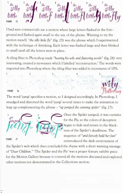
The
effect used on"Come
hither,
hither
pretty
fly"
(fig.
24)
wasablend
whichrotated360
in
a sequence of20
steps,
whentheimages
wereimported into
Director
andplaced;
I
addedthe'trail'
mode
for
thatsequencein
order that the castmemberswould
be layered
upon each otherwithoutbeing
erased oncetheirchannelhad
been
played.
[The
exportchannel optiondoes
notallowa screen shot topreserve a viewofthe
trailing
effect-so
figure
24
only
shows themovement pattern oftheimage.]
SF
A
P'l/?^
?=
2
\&v''^
*fe.
* Jtj, VfA*
;-J
FIGURE 24 \-Nfy*J>
t
v
V?i
^
%
[image:21.559.50.516.55.736.2]Q>
the
.,git1'
Me
liftl
FIGURE 25 (*
I
had
seen commercials use a motion wherelarge letters
flashed
in
thefore
groundand
flashed
again small to the size ofthe phrase.Wanting
totry
themotion
myself,
"the silly
little
fly"
(fig.
25)
was thephrase whichI
experimentedwith the techniqueof shrinking.
Each
letter
wasflashed large
andthenblinked
to small until allthe
letters
werein
place.A tiling
filter
in
Photoshop
made"hearing
his
wily
andflattering
(fig.
26)
very
interesting,
created a movement whichI
labelled
'reconstruction.'
The
wordswereimported
into
Photoshop
wheretheriling
filter
wasaddedin increments
of10%.
l 2 3 4 5
-,
/:
FIGURE 26
jkmefhicf
The
word'jump'
specifies a
motion,
soI designed
accordingly.In
Photoshop,
I
smudged and
distorted
the word'jump'
several times to make the animation to
leap
up complementing
thephrase-"up
jumped
thecunning
spider"
(fig.
27)
.Once
theSpider jumped,
it
was curtainstor
theHy,
so thecolors ofdeception
^m
began
tofade
and return to theblack
ness ofthe
Spider's deadliness.
The
sequence of
"and
fiercely
held her
fast"
reintroducedthe
dark
environmentofthe
Spider's
web which then concludedthe rhymewith a shortwarning
messageof
"Dear
Children."
'The
Spider
andthe Hy'was a properfeature
exhibit piecefor
theMotion
Gallery
because
it
coveredallthe motionsdiscussed
andexploredothermotionsnot
demonstrated
in
theCollections
section. FIGURE 27 [image:22.559.73.492.50.707.2]Evaluation
ofThesis Project
In
theintroduction,
I
stated that'When
all the contents are strippedfrom
type, it
becomes
imagery'The
wordsI
animatedbecame
images moving
about,
they
nolonger held
theiroriginalmeaning;
instead
theimages
blended
withand enhanced theirenvironment.
Factors
that affect type animations are theaudience,
the environment and thelevel
of communication tobe
achieved.The
viewerbecame
the audience andwasin
the role ofcontroller tomoveabout the
interactiveness
oftheMotion Gallery. The design
was simple andtherefore the
interaction
was notcomplicated.How
the type animations affectthe audience
is
where theissue
exists.Hoping
toavoid the typicalwordy
pieces which tend to
become
dull
and uninteresting,it
wasimportant
tokeep
the animations short
but
cleverin
their sights and sounds.Environment
alsoplays a
large
rolein
making
a piece successful.If
thebackground
is
not giventhe attention that the
foreground
received,
it
will show weak points quickly.Often
it is
the subtleties ofthebackground
thatmake the most powerfulstatements
in
design. I
considersound tobe
equal to abackground.
They
both
enhance a piece and add a
different
dimension
to theforeground
events.In
type
animation,
theability
to communicateclearly is
still the mostimportant
aspect.
Within
the scope thatI
designed,
the goal ofeffective communicationwas achieved.
It
is
said thatyou areyour worst critic.With
thatin
mind,
I
consider the workpresented
in my
thesis project notmy
finest
example,
but
the experimentationwas
important
and willbe
essentialfor future
work.Programming
oftheinteractive
design
wasintimidating
andthereforeI based
my
design
aroundbasic
button
controls.That
is
the pointwhereI
am mostdisappointed.
Be
cause of
my
lack
ofconfidencein
programming,
I
let
thatinterfere
withmy
design
idea
and spent timegetting
theinteractive
buttons
working
before
thedesigning. Beyond
theprogramming,
the piece is solidin
concept,
anddoes
notgive
false
impressions
ofwhatit is
not.It
wasdesigned
toinform
and encourage the viewer to
look
at typedifferently;
thesetting
of agallery
was an excellent
choice ofsurroundings.Another
strengthis
the uniquenessof the motions.It
was not enough topresent motions thatwere common to type animation.
Rather
it
was moreimportant
tointroduce
motions thatare notlikely
tobe
found
whenreading is
the
primary function.
When
theintent
is
meant toentertain,
the opportunities are notlimitless.
Looking
from
the standpoint of adesigner
working
on onelarge
projectfor
months;
this experiencedeveloped
new characteristicsin my
designing
ofmultimedia projects.
An
important
lesson
is
to consider all points oftheproject right
from
thebeginning,
and tohave
adefinite
conceptfor
thefinal
piece.
My
projecthad
toomany
loose
endswhenI began
designing.
My
hind
sight would
be
tobe
more organizedfrom
start tofinish
and thoroughin
taking
progress notes.Another
important
pointis
tostay
focused
on thedesign
and not tolet distractions
inhibit ideas.
Several
timesI
became
sidetrackedon tangents that
I
thoughtwereinteresting
ideas,
but
in
theend,
I
had
just
wastedvaluable time.Switching
computer platformsmidway
through theentire projectwas not a wise choice.
Rather,
I
shouldhave
researchedinforma
tion on
cross-platforming
andbeen
morefamiliar
with thedifferences
of thetwo platforms ratherthan to experimentwith
my
thesis project.One
important
pointI
want tomakeis
that our professors encouragednotetaking
of our worksin
progress,
and tojournal
daily
on the work accomplished and
any
problems encountered.It
was a wisedecision
tofollow
theiradvice.
The
writing
ofthe thesispaperis tedious,
but
having
project notesfrom
theinitial
stage ofdevelopment
made thewriting
more manageable.My
noteswerenothing
but
scribbles ofideas,
problems,
and procedures of some oftheeffects created
but
I
was able to use allmy
notes and putinto
wordshow I
came todevelop
anddesign
my
project andmy reasoning
behind
theideas.
PRESSURE,
ITS BITTER
SWEET END
To
permitclosure on the subject of thefirst
project,
"Pressure,"
I
willdiscuss
its
failure
tobe
acceptedinto
thefinal
project.As
thefile
grewlarger,
Director
could notconsistently
run the animation[properly
synching
the sound andthetype animations].
To
solve thisproblem,
I
madeQuicktime
movies of eachphrase ofthe
song
and created anotherDirector
file
into
whichI
imported
allthe
Quicktimes.
However,
if
oneQuicktime
movie was offby
twoseconds,
it
wouldruin the rest ofthe
movies,
making
the piece morebothersome
and notworth the time to correct the problems.
As
alast
resort,
theQuicktime
movies and sound wereimported
into
Premiere,
whereI
reassembled the pieceinto
working
condition.A
movie was renderedusing
animation compression andwhen
finished
it
wouldoccasionally skip
portions ofthe movie.Continuing
onthis
long
road offrustration,
I
decided
before
continuing
thedevelopment
of"Pressure"
tocross platform the movie to
verify
thatit
wouldrun smoothly.An
important
discovery
was madeduring
the process ofcross-platforming; thatcolor palettes
vary greatly
from
each platform.The
piece wasdesigned
tobe
dark,
thebackground
wasblack
and theletters
were metalliccolors;
however,
on the
PC
all the colors on the screen changed toblack. At
thatpoint,
I
realized that
it
would takemore time to correct the colors than to startfrom
scratch.
The
change of color on theWindows
platformfinalized
thedecision
to
discard
the work of"Pressure."Consequences
ofCross
Platformlng
As
mentionedpreviously,
in
the middleofSpring
quarter aWindows
platformedcomputerwas
introduced into
theentirely
PowerMac
computerlab.
Owning
my
own
PC
andhaving
a strongersense offamiliarity
withWindows,
I
decided
tocrossplatform
my
thesisproject.Cross-platforming
was simplein theory,
but
I
quickly
learned
therewereseveralimportant
conceptstobe
aware ofbefore
linking
the twocomputer environments.
Technology
has
madegreat stridesin
industry
by having
the
ability
tostraddle the twoplatforms;
allowing identical information
torun onboth
machines.There
are severalimportant
pointsthatdesigners
should considerbefore
beginning
adesign
thatis intended
tofunction
onboth
computer platforms.I
believe
it
is
avery important
tohave
theability
tocross-platform;
however,
itdoes
have
its
prosandcons.Points
thatI have
found
important
werecolor, speed,
Quicktime
moviesfor
Director,
andfilename
extensions.COLOR
The
color palettesbetween Mac
andPC
are notidentical.A
palette transferredfrom
theMac
platforms willdarken
whenopening
on thePC.
Color
schemesshould
be
decided before
theinitial
design
stages,
verifying
that the palettechosen will
visually satisfy
thedesign
requirementsfor both
systems.SPEED
A
Mac
created animationin
Director
will runsmoothly;
depending
on thefile
size aMac
createdDirector
animationmay
ormay
notrunsmoothly
on aPC. In
short,
theMac
runsgraphicsmoreeffectively
than thePC.
QUICKTIME
MOVIES
A
big
disappointment
in
Director
for
Windows
came whenI
discovered
thatI
could not createQuicktime
animations withsound.Searching
in
theDirector TechNotes
attheMacromedia
website,
I
found
the answer.The
notessimply
said,
"when
Director
for
Windows
wasreleased,
version1.0
ofVideo
for
Windows
didn't
supportwriting
outmovies,
sincetherewasno publishedApplication Programmer's
Inter
face
(API)
for
doing
so."9Macromedia
allowedtheproductionofDirector
for
Windows
toproceedwiththeexporting
videowithsoundfeatures
disabled. Another
technicalnote
from
Macromedia
stated"Quicktime
for
Windows 2.0.3
runs underWindows
95,
but does
not takeadvantage ofthenewfeatures
ofWindows 95.
"10In
effect,
whenDirector
for
Windows
wascreated,
severalimportant
multimediasoftwaretoolswere
intentionally
left
out.As
auser,
it
wasfrustrating
because
thesoftware
is
designed
identical
to theMac
software,
so thefunctions
"look"
available
in
theWindows
software,
but
actually
aredisabled
andonly
misrepresentthecapabilities
offered ofthesoftware.The Mac
has
no problems with sound andvideoexporting
as aunit,
in
fact,
there
is
theability
tohave
two sound channelsin
Director
for
theMac,
whereDirector
for
Windows
only
allows one sound channel at a time to run.FILE EXTENSIONS
Photoshop
for
theMac
savesfiles
the same asPhotoshop
for
PC;
for
sake ofexample,
I
will use .tifas theextension name.In
order toopen the .tiffile
in
Windows [created
on theMac],
youfirst
must rename thefile
and typein
theextension
'.tif
so thatPC
will recognize thefile
as aWindows document.
An
interesting
pointwas that the .tiffile
actually is
labelled
a'tif image in
the'type
of file'
category in
the'main'
directory,
but
it is
the actualfilename
extensionwhich allows the useraccess.
Only
torepeatanimportant
point whencross-platforming
-before
beginning
Research
As
awhole,
this projectwas afun
experiencebecause
it
wassomething
thatI
have
wanted tolearn,
andit alsowas areflection ofmy interest in
typography
anddesign.
Finding
articles on the subject oftypein
motion was neartoimpossible,
ratherI
found
afew
articles on experimental type andthe tools availabletor
type usedin
the multimedia scene.The best
source of type ani mationsI
found
were on televisionThe
scope of animationis
huge.
It
is
quiteinteresting
to seehow
much animationis introduced
to usevery
minute through the visual medium of television.I
watchedhours
of commercialsandtelevision
introductions,
trying
todiscover
theirmethods ofcreating
motionsfor
type.Interestingly
enough,
some ofthebest
examples oftype animationswere
tound
in
theintroductions
to news/talkprograms,
such asDateline
-NBC,
Extra,
Inside
Edition,
andOprah.
Another
source of"unbridled"
type animation
is
theworld wide web.Software
packages are
making
thecreationofanimationsmore simplistic so thatanyonecan create whatever
it is
they
want.With
those capabilities and abit
ofcreativity,
typeanimations can enhanceany
design.
However,
mostcurrentwebtype animations
arecrude,
in
thatthey
use'typical'
movements
[ie.
spinning,
flipping].
Even
still,
they
make waves.In
avery
shorttime,
most,
if
not all websiteswillhave
some sort oftype animation tocatch theviewer's eye.
In
regards to thefact
thatwritten articles on this subjectwerefew,
I
used theresources thatwere available: the television and
my
typography
class.Prof.
Klinkon
openedmy
eyes toa newway
oflooking
attypography,
whichI
inte
grated
into my
final
project.He
taught that typebecomes
imagery
when the artistpermitscreativity
tocontrol.The
mostimportant
pointI
discovered
was todisregard
the rules oftypography [i.e.
paragraphs mustbe
indented,
capitalletters
begin
asentence]
andlet
theimagination
create anidea.
I
began
todevelop
designs
that used twodimensional
typewhichimplied
depth
andthreedimensional
qualities.The
concept ofdepth
throughlayering,
implied in
a twodimensional
environment,became
a subtle effectI
usedto makemy
thesisproject a success.
USER
RESPONSES
Before
and afterpresenting
my
thesisproject,
I
ranit
pastmany
peoplefor
their opinions andfeedback.
The
range ofuserswas variedanddiverse;
mostwerepeople who used computers
frequently
but
severaldid
not.Movement
through the programwasbutton driven
andsimple;
therefore the userinteraction
wasnotcomplicated.
Most
who reviewed the piecefound
it
entertaining.Several
users
found
theinformation
fascinating
andkept
re -running animations untilthey
were able to comprehend thedesign
techniques used.Overall,
feedback
from
the audience waspositive,
pointing
to the uniqueness ofthe subject andthe manner
in
whichit
waspresented.One
professional complimentedthat thedesign
wasrefreshing
amongst thecommondesigns
oftoday.DIRECTION OF FUTURE
WORK
Type
in
motion captivatesmy
attention,
andI
will continue to experiment withhow
different
motions canbe
usedeffectively
in
communicating.This
thesisproject
has
only
been
thestarting
pointfor
my
type animations.I
intend
topursue some
ideas
thathave been
spinning
throughmy
brain.
I
wouldlike
tocreate a type animated cookbook on
CD
which wouldbe
both
entertaining
andfunctional.
The
possibilities are endless andwith advancementin
equipmentand
technology,
I
hope
to see computers networkedthroughouthomes
so thatacomputerizedcookbookwould
become
a cook'sbest
resource.Another
area ofinterest
thatis
morein
demand
than animated cookbooks areinteractively
driven
children's animatedstory
books
which wouldbe
to strengthen notonly
achild's
decision
making
skillsbut
also encouragereading
skillsin
ourvideogame-infested society.
Conclusion
The
goal was todesign
moving
type thathad
theability
tomoreeffectively
communicate toa viewer.
The
goalwasmet throughproject'Motion
Gallery'
Based
on viewerfeedback,
the projectwas successfulin communicating ideas
ofmotions and also
entertaining
in its
design. A
lot
oftheinterest
from
viewerscame
due
to the uniquene