City, University of London Institutional Repository
Citation:
Andrienko, G., Andrienko, N., Demsar, U., Dransch, D., Dykes, J., Fabrikant, S. I., Jern, M., Kraak, M.-J., Schumann, H. and Tominski, C. (2010). Space, time and visual analytics. International Journal of Geographical Information Science, 24(10), pp. 1577-1600. doi: 10.1080/13658816.2010.508043This is the unspecified version of the paper.
This version of the publication may differ from the final published
version.
Permanent repository link:
http://openaccess.city.ac.uk/2853/Link to published version:
http://dx.doi.org/10.1080/13658816.2010.508043Copyright and reuse: City Research Online aims to make research
outputs of City, University of London available to a wider audience.
Copyright and Moral Rights remain with the author(s) and/or copyright
holders. URLs from City Research Online may be freely distributed and
linked to.
City Research Online: http://openaccess.city.ac.uk/ [email protected]
Space, Time, and Visual Analytics
Gennady Andrienko, Natalia Andrienko, Urška Demšar, Doris Dransch,
Jason Dykes, Sara Fabrikant, Mikael Jern, Menno-Jan Kraak, Heidrun
Schumann, Christian Tominski
Department, University, City, Country
Give full correspondence details here
(Received 28 April 2010; final version received …)
Visual analytics aims to combine the strengths of human and electronic data processing. Visualization, whereby humans and computers cooperate through graphics, is the means through which this is achieved. Seamless and sophisticated synergies are required for analyzing spatio-temporal data and solving spatio-temporal problems. In modern society, spatio-temporal analysis is not solely the business of professional analysts. Many citizens need or would be interested in undertaking analysis of information in time and space. Researchers should find approaches to deal with the complexities of the current data and problems and find ways to make analytical tools accessible and usable for the broad community of potential users to support spatio-temporal thinking and contribute to solving a large range of problems.
Keywords: geovisualization; research agenda; spatio-temporal data; users
Introduction
Visual Analytics
Visual analytics is a relatively new term; it has been in use since 2005 when the book “Illuminating the Path” was published (Thomas and Cook 2005). However, the kinds of ideas, research and approaches that are now termed visual analytics emerged much earlier. The main idea of visual analytics is to develop knowledge, methods,
technologies and practice that exploit and combine the strengths of human and electronic data processing (Keim et al. 2008). Visualization is the means through which humans and computers cooperate using their distinct capabilities for the most effective results. This idea penetrated many research efforts in the areas of
information visualization, GIScience, geovisualization, and data mining long before 2005. The foundations of Geographic Information Science involve computational processing of geographic information being reported and steered through graphical representations of data. Geovisualization aimed to speed this process up to support ideation and focussed on the design and use of novel maps and functionality to do so. Various research agendas published in this domain [MacEachren 1994, MacEachren and Kraak 1997, MacEachren and Kraak 2001, Dykes et al. 2005a, Andrienko et al. 2007] had much to do with what is now called visual analytics by addressing key challenges associated with the use of highly interactive graphics to stimulate ideas. Since 2005, an attempt has been made to establish visual analytics as a specific scientific discipline in order to consolidate the relevant research that has been conducted within different disciplines and to give new stimuli to its development. GIScience and Geovisualization can play a leading role in this process.
• emphasis on data analysis, problem solving, and/or decision making;
• leveraging computational processing by applying automated techniques for data processing, knowledge discovery algorithms, etc.;
• active involvement of a human in the analytical process through interactive visual interfaces;
• support for the provenance of analytical results;
• support for the communication of analytical results to relevant recipients. Development of the research agenda
This research agenda for GeoVisual Analytics has been conducted through the collective effort of the scientists participating in the European coordination action VisMaster (http://www.vismaster.eu) to define a roadmap for the future visual analytics research. “Space and Time” were conceived as key topics to consider. Accordingly, a working group on space and time issues in visual analytics was formed. The group started its work by addressing the international community of researchers dealing with spatial and/or temporal information with a questionnaire, in which they were asked about the most important applications for spatio-temporal visual analytics, challenging problems, new opportunities, and major research directions. The responses have been analyzed, summarized, and discussed at the expert workshop with 23 participants, which took place in Hamburg (Germany) in March 2009. On the basis of the collected opinions and discussion results, the working group met in May 2009 to identify the main themes and plan the research agenda. The plan was implemented during the following months.
The result of this work was a text describing the research agenda at a level appropriate to the intended readership. The idea of the VisMaster consortium is that the visual analytics research roadmap should be issued as a book suitable for high-level decision and policy makers and for general public, to raise the awareness about this area of research in society and to gain support for its further development. However, we believe that the topics considered are highly important for the research community and therefore should be communicated through scientific channels as well. In this paper, we present the research agenda in a manner more appropriate for the scientific audience.
Key themes
Two themes stood out distinctly in the process of the work on the research agenda. They can be summarized into the slogans “Everyone is a spatio-temporal analyst” and “Think temporally!”. These themes attracted most attention at the stages of collecting opinions and discussion and then gained high prominence in the resulting document.
Everyone is a spatio-temporal analyst
whether optimizing daily travel across a city or trying to return across a continent when air transportation is crippled. People want to take advantage of the mass of data that is being collected and to which they are contributing.
People need appropriate tools that enable them to do their personal analyses, plan their actions, gain knowledge, and participate in decision making. Hence, the community of users of spatio-temporal visual analytics is potentially unlimited. Just as cartographers have done in the past, visual analytics researchers need to consider all of society as potential users of their techniques. The challenges are to learn and understand the users, to create usable tools satisfying their needs, and to make the tools easily accessible.
Think temporally!
Many of those involved in the development of the research agenda noted that, due to the geographic and cartographic heritage, geovisualization researchers used to think spatially but not temporally or to think spatially ahead of temporally. There is a need to change this way of thinking. The understanding that space and time are inseparable and that there is nothing spatial that is not temporal must permeate the research.
The problem exists not only in geovisualization. Those researchers who primarily deal with time and time-variant data in their work expressed concerns that time is often not properly dealt with also in the other research fields related to visual analytics. Therefore, the specifics of time have been given much attention in the research agenda.
The two key themes will be considered in more detail in the next two sections. After that, the research directions that we judge as being of greatest importance for society are outlined.
Everyone is a spatio-temporal analyst
To demonstrate to the community of spatio-temporal analysts that the need for visual analytics tools is potentially very large and diverse, we have invented the following scenario: slightly futuristic but highly realistic.
Late on Tuesday afternoon in mid-summer a severe thunderstorm passed through The Town.
The Insurance Analyst
http://uksnow.benmarsh.co.uk/). The analysts use an interactive map to position the reported observations and transform them into structured, spatially and temporally referenced data, which are added to the database and simultaneously visualised. Spatial statistics are then used to identify and model possible tracks of the hail-storm derived from the data and probabilities associated with each. The results are also added to the map interface, where data points are visually differentiated from the tracks that are derived from them. By combining these with the depicted observations, the analysts determine areas that are probably affected.
Next, the analysts are interested in the things that were damaged during the storm. Those most vulnerable to hail include cars and agricultural areas. Cars are not static in time and place; therefore data depicting traffic flows are considered. Such data are available from roadside sensors and increasing numbers of vehicle mounted devices. The analysts do not have access to ‘live’ data but quickly extract typical usage patterns for Tuesday rush-hour in the summer-time from a traffic database. By applying spatial and temporal filters to this data set, the analysts can estimate the number of cars that passed through areas affected by the hailstorm during the time when it occurred and make an initial estimate of damage. The analysts put the filtered traffic flow data on the map and look at the typical destinations of the flows, to see in which districts the car owners live and to compare this with the spatial distribution of the clients of the insurance company.
In order to detect the agricultural damage, satellite images showing information about the present status of agricultural areas are considered in
combination with a land use database. One of the analysts recalls driving through the affected area some time ago and noticing strawberry fields. At this time of the year the strawberries should have been already harvested – recently contributed
community imagery confirms this. The analysts locate these areas on the map display and remove them. They also look at the other fields and exclude those where no real damage from the hail-storm is expected. For the remaining fields, they calculate the estimated damage using the data about the types of the crops, the productivity of the fields, and the prices for agricultural products.
Using interactive visual aids for report generation, the analysts communicate their findings to other working groups in the insurance company. Besides a printable illustrated document, a series of annotated snapshots are developed from the visual displays. These are interactive and have links to the corresponding data and analysis artefacts, which are stored in the database.
One of the working groups examines long-term trends in hazard development and damage distribution. They investigate whether the frequency of hail events, their intensity or the associated damage are changing. Are hail events concentrated in certain areas? Another group deals with insurance contacts and customer issues and examines whether the spatial distribution of hail insurance customers is related to the spatial pattern of hail events. How many people in the most affected areas have an insurance policy? Should the insurance conditions be changed? How can exposure to risk be reduced?
The Family
want to know what they could do to protect themselves against hazards. They do this through a ‘risk explorer’ on the Internet. This interactive application enables citizens to examine their exposure to various hazards at different times and places according to different assumptions and levels of uncertainty. They are able to simulate hazard events, such as historical or recent storms or floods and extremes with particular return frequencies to get an impression of their exposure to this type of hazard and the likely consequences. The risk explorer includes a discussion forum and a story-telling facility where people can place information about local hazard events on a map and an associated timeline. They can also post descriptions, annotations, and photos. People can report hazard events and discuss their occurrence and protection measures.
The family subscribes to a warning service that will inform them about hazardous events more precisely in the future. The service provides information tailored to their situation. It derives the family’s current and predicted location from an electronic diary, GPS-enabled mobile device, or cell-phone. If it coincides in time and space with predicted hazards, personal warnings are sent and alternative routing options and travel times are provided that account for the hazard. A visual display, which is adapted to the available device, explains why the warning has been sent and what the options are. By interacting with the display, people can enter additional facts about the current situation and their planned movements and ask the service to update predictions and recommendations. It is possible to compare the suggested options, choose the most appropriate one and, if necessary, further adjust it interactively according to personal needs and priorities.
The Decision-Makers
Although the hail was a heavy and damaging event in The Town, floods are the predominant problem. Politicians and local authorities have heard about an increase of heavy rainfall events and related flash floods as likely effects of climate change. They have to decide how they can protect their community from floods in the future. To support decisions and develop strategy, they need scientifically derived information that is presented clearly with assumptions, uncertainties and alternative outcomes at the fore. Thus, expressive models are needed to simulate situations related to different local conditions and climate parameters. Scientists apply such models to calculate possible scenarios for The Town and explain to the authorities the implications for their community.
An Industrial City is upstream of The Town in a neighbouring country. The River that flows through The Town originates in this country and passes through the Industrial City on its way downstream. In the past floods have inundated factories in the Industrial City and resulted in toxic material reaching The Town and adjacent municipalities. Close collaboration between local and national governments is
necessary in order to discuss safety precautions, to access and share relevant data, and to rapidly exchange information for early warning and protection. The Town’s
The Community
Since local authorities know that successful risk management requires not only technical and planning measures but also well-informed people with high risk
awareness, they have also started a risk-awareness campaign at schools. Teachers and school children work with the Internet ‘risk explorer’. They explore the risk in their home area and also in other areas around the world. They can apply simulation models in a user-friendly manner to get a better impression about the effects of hazardous events and protection measures. A ‘serious game’ allows them to take the role of hazard defenders or decision makers to learn about the complexity of risk management; with a high score they can win a prize.
The Spatio-Temporal Analysts
Note that all actors in these linked scenarios are spatio-temporal analysts: the insurance experts, administrators, politicians, scientists, engineers, insured and affected citizens, and schoolchildren. As spatio-temporal analysts they must be enabled to find, see, summarise, relate, and comprehend changing and alternative relevant information effectively and efficiently and to record, evaluate, report upon, and share discoveries. Sophisticated analytical tools with appropriate interactive visual interfaces for discovering relationships, synthesising knowledge, and making decisions can support this activity by providing the right people with the right information at the right time. Providing these is a challenging task, but one that can take advantage of a number of recent and developing technologies and scientific knowledge. To work effectively and enable beneficial decisions to be made, these tools must appropriately deal with the specifics of time and space.
Think temporally!
Specifics of time
In contrast to common data dimensions, which are usually “flat”, time has an inherent semantic structure. By convention, time has a hierarchical system of granularities, including seconds, minutes, hours, days, weeks, months, years, decades, centuries, and so on. These granularities are organised in different calendar systems.
Furthermore, time contains natural cycles and re-occurrences. Some of these are regular and relatively predictable such as seasons, others are less regular such as social cycles like holidays or school breaks or economic cycles or natural cycles such as those associated with volcanic activity. In particular, two specific aspects of the dimensions of time have to be taken into account when devising analytical methods for temporal and spatio-temporal data.
Secondly, the structural organization of the temporal dimension is a relevant aspect. Three different types of temporal structures exist: ordered time, branching time, and multiple perspectives. Ordered time can be subdivided into two further subcategories: linear and cyclic time. Linear time corresponds to our natural perception of time as being a continuous sequence of temporal primitives, i.e., time proceeds from the past to the future. A cyclic time axis is composed of a finite set of recurring temporal primitives (e.g., the times of the day, the seasons of the year). Natural and social phenomena can also exhibit cyclic behaviour. Branching time is a metaphor that facilitates the description and comparison of alternative scenarios, which is particularly relevant for planning or prediction. Time with multiple
perspectives is a metaphor for representing more than one point of view at observed facts. This type of time-related data may be generated, in particular, when people describe their observations about hazard events via blogs and other online means: each reporting person may have a distinct perspective on the events.
Commonalities between time and space
Those with a professional or personal interest in geography are well aware that spatial data have a number of properties that distinguish them from other types of data (see for instance Anselin 1989). Perhaps, not everyone realizes that some of these properties are not specific solely to space but common for space and time.
Dependencies between observations
The processing, integration, and analysis of spatial data is both constrained and underpinned by the fundamental concept of spatial dependence, which is often referred to as “the first law of geography” or “Tobler’s first law”: “everything is related to everything else, but near things are more related than distant things”
(Tobler, 1970, p.236). According to this law, characteristics at proximal locations tend to be correlated, either positively or negatively. In statistical terms, this is called spatial autocorrelation. Similar concepts of temporal dependence and temporal autocorrelation exist for relationships in time. Spatial and temporal dependences forbid the use of standard techniques of statistical analysis, which assume
independence among observations, and require specific techniques, such as spatial regression models, that take the dependences into account.
Spatial and temporal dependence not only set constraints but also serve as sources of information and give important opportunities for data processing and analysis. Thus, spatial and temporal dependence enable
• interpolation and extrapolation, which can be used to fill gaps in incomplete data,
• integration of information of different types and/or from different sources using references to common locations and/or time units,
• spatial and temporal inference, and many other operations.
people’s lives in two near villages separated by a state border may also differ a lot. Similarly, temporal dependence may be interrupted by events; for example, radical changes may be caused by storms or floods. Relatedness between things may depend not only on their distance (proximity) but also on direction; thus, a flood or water pollution spreads downstream along a river. Events in time have an effect on future rather than past events (however, a predicted future event may have an effect upon decisions taken now or in the past and events related to these decisions). The notion of proximity is also phenomenon-dependent. It may be defined spatially, for example, in terms of distance by roads rather than straight line distance or distance on the Earth surface. In a similar manner, we may measure time in terms of ‘working days’ or ‘number of hours under particular conditions’ – inundation for example.
Some of these discontinuities, complexities and characteristics can be
modelled and accounted for in informed spatio-temporal analysis. But it is impossible to account for all diverse factors affecting spatial and temporal dependence in
developing fully automatic methods for analysis. Instead, visual analytics techniques may allow the analyst to see where and how the effect of the first law is modified by particular local conditions and to make necessary adjustments in the analysis, e.g. by varying parameters of analytical methods or choosing other methods.
Scale
Spatio-temporal phenomena and processes exist and operate at different spatial and temporal extents. Thus, we say that a hail storm is a local, short-term phenomenon while climate change is global and temporally extended.
The scale of spatial analysis is reflected in the size of the units in which phenomena are measured and the size of the units in which the measurements are aggregated. It is well known in geography that the scale of analysis may significantly affect the results. For instance, patterns or relationships discerned at one scale may not be detected when examined at another scale. In extreme cases opposite
relationships may be uncovered when different scales are considered. The scale variance associated with geographic features or characteristics is an important property.
Time can also be considered in a granular manner using a single resolution or multiple resolutions. Temporal primitives can be aggregated or disaggregated into larger or smaller conceptual units. For example, 60 consecutive seconds are aggregated to one minute or five time steps in a discrete simulation model may correspond to one second in physical time. The choice of the temporal scale may affect the analysis in the same ways as the choice of the spatial scale. Laube and Purves (2010) have recently demonstrated this by example of movement data.
scientifically grounded methods that can enable semi-automated approaches to examining the range of scales and detecting the scales at which changes in
phenomenon/process at hand can be perceived and contrasted. These approaches will need to combine algorithmic processing with interactive visual interfaces allowing human judgement to be involved in the analysis.
Spatial and/or temporal units of a particular size can be aggregated into larger units in various ways. The opposite operation, decreasing the unit size, is only possible with involvement of additional data. In aggregation, it is essential to be aware of the modifiable unit problem, which means that the analysis results may depend on how the units are aggregated. This refers not only to the sizes of the aggregates (scale effects) but also to their locations and composition from the smaller units (the delineation of the aggregates). Therefore, it is always necessary to test the sensitivity of any findings to the way of aggregation. Visual analytics may achieve Openshaw’s (1984) vision of the modifiable area unit problem being transformed into a modifiable area unit opportunity for sensitivity analysis that allows us to
discriminate between spurious and persistent patterns.
Furthermore, various scales of spatial and temporal phenomena may interact, or phenomena at one scale may emerge from smaller or larger phenomena. This is captured by the notion of a hierarchy of scales, in which smaller phenomena are nested within larger phenomena. Thus, local economies are nested within regional economies; rivers are nested within larger hydrologic systems, and so on. This means that analytical tools must adequately support analyses at multiple scales considering the specifics of space and time.
Another complexity comes from the frequent need to integrate data that are measured at different scales. For instance, in analyses related to hazard protection, it may be necessary to concurrently analyse outputs of simulation models with monthly resolution, data from weather forecast services specified for days, and annual
estimates coming from prediction models of changing climate conditions. Popular linked data initiatives and open data APIs will only increase these needs. Developing methods and interfaces that achieve this is a challenging task that is inadequately addressed by current methods of visualisation and analysis.
Visualization of time and temporal data
Irrespective of the presence of a spatial component, data that embody change over time pose challenges to all disciplines related to data visualisation and analysis. Visual methods have proved to be useful in analysing time-related data.
Time in geography-related disciplines
Most professional geographical analyses are currently undertaken with the use of geographic information systems (GIS). Although incorporating time into GIS has been discussed in the research literature since the early 1990s (e.g. Langran 1992, Peuquet 1994), current GI systems and GI science are still weak in dealing with the temporal nature of geographic data. Time is routinely modelled as a high-level linear characteristic of spatial entities; maps and other analyses simply compare a limited number of particular moments or intervals rather than take advantage of the full structure of time.
methods used in static maps are limited to small amounts of data and few time units. Interactive maps and other techniques and tools for interactive visual analysis of spatial and spatio-temporal data and for spatio-temporal decision-making are
designed, developed and evaluated predominantly in field of geovisualization (Dykes et al. 2005b, Andrienko and Andrienko 2006). Map animation has become a standard approach to portraying time-dependent data and dynamic phenomena (Harrower 2004). Another well-known technique is the interactive space-time cube
implementing one of the ideas of time geography (Hägerstrand 1969), which considered space and time as inseparable and suggested a three-dimensional representation where two dimensions represent space and the third dimension
represents time (see Figure 3). Coordinated multiple views is also a generic approach to deal with the spatial, temporal, and thematic aspects of data simultaneously.
These interactive techniques, however, also have their limitations and do not meet the present-day challenges in terms of the amounts and complexity of the data and analytical problems (Keim et al. 2008). Further progress can only be achieved by integrating approaches from multiple areas of research, including not only geography-related disciplines but also information visualisation, statistics, data mining, and other cognate disciplines (Andrienko et al. 2008).
Time in information visualization
A wide repertoire of interactive techniques for visualizing datasets with temporal components is available in the field of information visualisation (Aigner et al. 2008). However, because it is difficult to consider all aspects of the dimension of time in a single visualisation, the majority of available methods address specific cases only – mostly the visualisation of data with a linear time axis. Moreover, many of the current visual analytics and information visualisation systems do not take into account the complex nature of time but rather treat time as an ordinary numerical variable.
Visual methods for temporal data can be categorised based on the time characteristics they were developed for:
• linear time vs. cyclic time,
• time points vs. time intervals, and
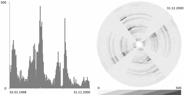
Figure 1: Two views of the same health-related time series. In the linear plot (left) patterns can hardly be discerned. Switching to a cyclic spiral representation makes an inherent cyclic (weekly) pattern apparent.
Figure 1 demonstrates the difference between linear and cyclic representations through an example related to patterns in human health data. While common line graphs are useful to show general trends and outliers, spiral visualisations address cyclic aspects of time-related data (Tominski and Schumann 2008). The spiral’s main purpose is the detection of previously unknown periodic behaviour of the data. This requires appropriate parametrisation of the visualisation method. Usually, it is
difficult to find suitable parameter settings for unknown data sets. Therefore, it makes sense to support the detection of patterns either by applying analytical methods or by animating smoothly through different cycle lengths. In the latter case, periodic behaviour of the data becomes immediately apparent by the emergence of a pattern. Interaction facilities are needed to allow users to fine-tune the visualisation. Only then can we take full advantage our perceptual system, e.g., in recognising patterns and motion.
Whether temporal attributes are conceptually modelled as time points or time intervals, is another important characteristic that influences visualisation methods. Most of the known visualisation techniques that represent time-oriented data consider time points. Other approaches focus on representing temporal intervals and their interrelations. A particular challenge is the representation of uncertain temporal primitives, be it imprecise specifications of time points or fuzzy interval boundaries. Uncertainty might be introduced by explicit specification usually connected with future planning (e.g., “The meeting will start at 11 a.m. and will take approximately one hour” – which means that it is not quite clear when the meeting will be over) or is implicitly present in cases where data are given with respect to different temporal granularities (e.g., days vs. hours).
Most of the visualisation techniques for time-related data known in the literature are designed to represent ordered time. Branching time and time with multiple perspectives however are definitely relevant models of time in visual
future scenarios are required. The few techniques for representing branching and multi-perspective times (e.g. Aigner et al. 2005) are capable of depicting only
univariate qualitative data, or may only visualise temporal primitives; they can neither represent multiple time-dependent attributes nor are they combinable with visual representations of space, predominantly geographic maps. There is a strong need for advanced techniques to effectively visualise multivariate data exhibiting these specific time characteristics.
Recent trends
Besides appropriate handling of the temporal component of spatio-temporal data, there are other research challenges arising from the current needs of our information society to deal with large and complex data and to solve complex problems. Some of the recent trends in the research related to spatio-temporal visual analytics are relevant to these challenges.
Effectiveness of visual techniques
Visual analytics is different from “standard” approaches to analysis. It is based on the assumption that interactive visual representations can amplify human natural
capabilities for detecting patterns, establishing links, and making inferences. This assumption, however, needs to be empirically tested (Fabrikant and Lobben, 2009). In cartography there is a tradition for obtaining empirical evidence by means of
experiments in which people use different variants of maps and graphics to find the information necessary for answering certain questions. Geovisualization is
increasingly being used as the subject of such experiments and as an analytical method for recording the data that are collected. In some experiments, the
measurements of the accuracy of the answers and the time spent seeking information are combined with methods that track the eye movements of those being tested. In this way, for example, it was found that computational and informational equivalence of displays (Larkin & Simon, 1987) — measured to identify display efficiency and effectiveness — depend on the decision-making context (information goal and task) as well as the display design.
For example, in Figure 2 the same spatio-temporal data are presented to a user for the same spatio-temporal inference task by means of three commonly used (but computationally different) depiction modes for visual analytics: a static small multiple map display (A), a non-interactive animation (B), and an interactive animation
offering varying animation speeds (C). The interactive animation also allows users to step through or continuously play the animation backwards. The spatio-temporal inference-making process, as exemplified by a user’s gaze paths overlaid over the three display types, varies greatly, due to the varying display design choices, including varying levels of interactivity. One can see that fixation durations (graduated circles) are significantly longer for the animated map than for the small multiple display. Analysis of think-aloud protocols collected during the experiments suggests that the type and quality of information is also affected by display design choices. Users tested on small multiple map displays seemed more focused on “states” and “spatial patterns” rather than events and temporal processes, while users in the animation conditions emphasized more change and events than spatial
faster or better decisions. The gaze path shown in Figure 2C reveals that this user has not once looked at the backward animation tool provided below the circular map on the left hand side of the speed level bar. Recorded interaction data (i.e., mouse clicks) confirms that this user never used this tool, even though backward animation for this particular task can lead to more efficient and effective detection of certain change patterns.
In general, users are more able to detect what is relevant on a carefully designed, cognitively adequate map that uses established cartographic principles to depict the same information content (Fabrikant et al. 2010).
Figure 2: Individual test participant’s gaze paths for information equivalent displays but different map designs. A: static small multiple map; B: non-interactive animation; C: interactive animation.
It is also not yet investigated whether people perceive visualizations differently when they work in groups in comparison to their individual work. In general, broadening the notion of ‘user’ from a single analyst to a group of collaborating analysts expands the range of issues that one has to reckon with in studying the effectiveness of interactive visual techniques. One of them is the variability of experiences and expertise: When is this a hindrance and when a benefit contributing to achieving a synergistic effect?
Collaborative Visualization
Groups of collaborating analysts are in the focus of the currently emerging research direction called collaborative geovisualisation (e.g., MacEachren and Brewer 2004). It deals with the design and use of technologies to enable groups of analysts to work productively with spatial and temporal information. The need for such approaches in which tacit knowledge is pooled is evident from our scenario.
Collaboration research addresses the following issues:
• collaboration – how interactive visual interfaces (in particular, map interfaces, which are essential for spatial problems) can enable many actors to work together in the same room, between rooms, between offices, between countries, or even between cultures;
• communication – how interactive visual interfaces can facilitate effective transfer of spatially- and temporally-related information, knowledge, evidence, judgments, considerations, etc. from one actor to another.
Dealing with large data sets
One of the existing approaches to visualization involves the direct depiction of each record in a data set so as to allow the analyst to extract noteworthy patterns by looking at the displays and interacting with them. However, these techniques may not be effective when applied to very large and complex data sets that are increasingly common.
Users may also have difficulty perceiving, tracking and comprehending numerous visual elements that change simultaneously. Or the speed at which graphics are displayed and responses to user interactions are acted upon may become too slow for efficient inference making.
Three alternative approaches are being increasingly utilised in response to the current challenges. One modifies the direct depiction approach by involving methods for data aggregation and summarisation prior to graphical representation and
visualisation. An example is presented in Figure 3: tracks of multiple moving objects (ocean vessels) have been aggregated by computing the space-time density of the movement as a volume in the three-dimensional space-time continuum. Volume rendering techniques are used to visually represent the results (Demšar and Virrantaus 2010). Another way of transforming movement data is deriving a series of continuous surfaces, which are further abstracted to networks of topological features: peaks, pits, channels, ridges, and saddles (Rana and Dykes 2003). This method may be
particularly suitable for pre-processing graphics to be used in animations.
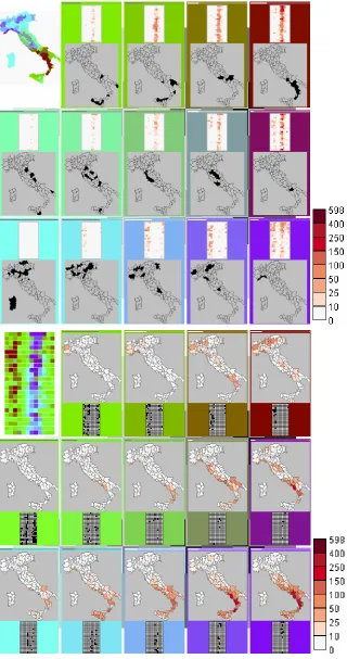
aggregation and, along with the visualisation of summaries, may take advantage of ideas and advances developed in direct depiction. For example, Figure 4 demonstrates the use of the computational method Self-Organizing Map (SOM) (Kohonen 2001, Agarwal and Skupin 2008) for studying the spatio-temporal distribution of forest fires in Italy over the period of 25 years. The data consist of the monthly counts of forest fires for 107 districts of Italy; the counts have been obtained from detailed data by spatio-temporal aggregation. The SOM method groups objects and arranges them in two-dimensional layout according to similarity of their attributes. It is applied to the forest fires data in two ways. In the upper part of Figure 4, the objects are the districts of Italy and the attributes are the respective time series of the counts of forest fires. In the lower part, the objects are the monthly intervals and the attributes are the
respective combinations of the counts of forest fires in all districts. In the first case, the SOM groups and arranges the districts according to the similarity of the temporal patterns of forest fires. The visualization shows the spatial distribution of the temporal patterns. In the second case, the SOM groups and arranges the intervals according to the similarity of the spatial distribution patterns of forest fires. The visualization shows the temporal variation of the spatial patterns. The matrix-like images in the visualization are calendar displays where the columns correspond to 12 months and rows to 25 years. The toolkit is described in (Andrienko et al. 2010).
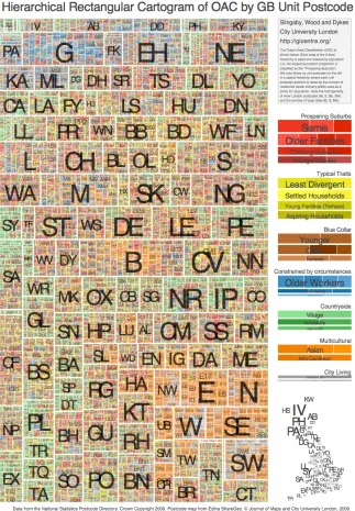
Figure 5. Rectangular hierarchical cartogram of Output Area Classifier for postcodes in Great Britain.
Challenges and Opportunities
Discussion of our respondent’s views has resulted in several challenges being collectively identified as having the maximum importance for the research on spatio-temporal visual analytics. In this section, the challenges and related opportunities are discussed and recommendations for directing further research are formulated.
Deal with diverse data
opportunities for comprehensive analyses and informed decision-making. In parallel, data accessibility is improving. This is being achieved through the design and development of spatial information infrastructures, standards for spatial data,
metadata, and services, and legislative regulations concerning the collection, quality, organisation, sharing, and use of data. For example, OGC (Open Geospatial
Consortium, Inc.) develops international standards to make complex spatial information and services accessible and useful with all kinds of applications. The INSPIRE initiative works to establish the Infrastructure for Spatial Information in the European Community, enabling spatial data from different sources across the
Community to be combined in a consistent way and shared between several users and applications. Furthermore, a variety of models, concepts, algorithms, and data
structures have been developed in the area of temporal databases.
However, this progress relating to the collection and accessibility of spatial and spatio-temporal data poses new challenges related to:
• new types of data, for which no analytical methods yet exist,
• large amounts of data, with which current analysis methods cannot cope,
• dynamic data being sourced in real time, which requires highly efficient methods capable of combining previous results with new data,
• data of diverse types, which need to be analysed in combination,
• data of diverse quality and inconsistent data from multiple sources, which need to be harmonised.
In our example scenario, the analysts combine standard geographic
information from The Town with measurements from sensors, reports about incidents, trajectories of cars, phone call data, satellite images, outputs from simulation models, and historical data about similar events in the past. This is not yet feasible, but the means to address this challenge are emerging.
Hence, visual analytics has to do more than developing adequate methods to visualise and analyse different types of data, large amounts of data, and dynamic data. Visual analytics must also devise solutions for enabling integrated processing and analysis of diverse data and for communicating this heterogeneity and any
implications for analysis and interpretation.
As a prerequisite for any analytical task, analysts must first look at the data and identify uncertainties, inconsistencies and any missing items. Then the data need to be preprocessed to make it suitable for the analysis:
• ameliorate incomplete data by deriving missing parts from related data and from simulation models;
• harmonize inconsistent data by cross-checking with related data and knowledge;
• enrich and refine the data by deriving relevant new characteristics and constructs. These preparatory operations need to be facilitated by interactive visual tools. Thus, in our scenario, the insurance analysts initially had incomplete data from the weather sensors. They used interactive visual tools to transform community-contributed unstructured information into structured data, which were fed into a statistical model for getting an estimated course of the storm. Then, the analysts viewed the model results and the observation data together to derive the probable perimeter of the storm-affected area.
the affected area, the typical traffic flows, and the spatial distribution of the insurance clients. Again, the analyst needs visualisation and interactive tools working in a synergy with appropriate computational techniques.
To allow for effective spatio-temporal analysis, particularly, with the use of data of diverse types and/or from multiple sources, uncertainty has to be considered. Analytical methods must be tuned to the uncertainty in the data and visual
representations have to convey inherently different aspects of uncertainty (MacEachren et al. 2005):
• Accuracy/error – difference between observation and reality,
• Precision – exactness of measurement/estimate,
• Completeness: extent to which information is comprehensive,
• Consistency: extent to which information components agree,
• Lineage: conduit through which information has passed. This is a complex category that has at least the following subcomponents: number of individuals, organizations, processes through which information moves; specification of which individuals, organizations, or processes,
• Currency: time span from occurrence through information collection/processing to use,
• Credibility: combination of factors defining the reliability of information source,
• Subjectivity: the extent to which human interpretation or judgment is involved in information construction,
• Interrelatedness: source independence from other information. This is a common standard used in the news media to assess certainty that a story is authentic.
Only if people are made aware of data quality problems and understand their implications can visual analytics methods help them make informed decisions.
Recommendations
(1)Develop scalable visual analytics solutions to enable integrated processing and analysis of multiple diverse types of spatial, temporal, and spatio-temporal data and information, including measured data, model outputs, and action plans from diverse official and community contributed sources.
(2)Find appropriate ways to deal with data uncertainty and to integrate data with different degrees and kinds of uncertainty.
Support analysis at multiple scales
There is much to do for visual analytics in order to change the traditional practice in analysis, focusing on a single scale. As explained earlier, appropriate scales of analysis are not always clear in advance and single optimal solutions are unlikely to exist. Interactive visual interfaces have a great potential for facilitating the empirical search for the acceptable scales of analysis and the verification of results by
generalisation, including theory, best practice, and algorithms for automatic geometric and semantic generalisation of many types of data (Mackaness et al. 2007).
Since various scales of geographic phenomena interact, analytical tools must also fully support analyses at multiple scales. The research must answer the question: How do we help (a range of) analysts uncover and understand cross-scale
relationships between phenomena?
Recommendation
Develop approaches to support analysts in finding satisfactory scales of analysis, exploring and establishing scale dependency, verifying discovered patterns and relationships at different scales and with different aggregations, and understanding dependencies between phenomena operating at different scales in time and space.
Understand and adequately support diverse users
Professional analysts are usually specially trained. In particular, professional spatial analysts receive training in the use of geographic information systems (GIS) and methods of spatial statistics. However, we argue that a broad community of citizens are spatio-temporal analysts. Of course, it cannot be expected that everyone receives special training before starting to analyse spatio-temporal data and making space- and time-related decisions. Still, there is a need to provide this wide range of spatio-temporal analysts with adequate analytical tools that they are able to use effectively. How can this be achieved?
Fortunately, many potential users of visual analytics tools are relatively sophisticated in terms of their use of information systems. They are experienced in using computers and the Internet. They are familiar with dynamic displays of spatio-temporal information, such as weather maps shown on TV. By playing video games, people become experienced from early childhood in interacting with dynamic visual displays. Adults often use online mapping services and have no problems with basic interactive operations such as zooming, panning, and selection. Virtual globes, in particular, Google Earth and Microsoft’s Virtual Earth, are increasingly popular and the globe is becoming a sufficiently important metaphor for manipulating spatial information to challenge the dominance of the map.
Hence, a certain level of computer and graphical competence can be expected from the potential users of visual analytics tools for spatio-temporal analysis and decision making. We can also expect that motivated users will not mind acquiring a reasonable amount of new knowledge and skills. The problem is how to appropriately convey this knowledge and these skills to the users?
And yet visual analytics is different from “standard” approaches to analysis. It is based on the assumption that interactive visual representations can amplify human natural capabilities for detecting patterns, establishing links, and making inferences. The amplification of human perceptual and cognitive capabilities is not something achievable merely through training. While it is possible to explain the users how to interpret a display and how to use interactive devices, the users can hardly be trained to gain insights from graphics and to reason more efficiently with the help of
While a number of useful design rules and guidelines exist in cartography, the design of interactive maps, dynamic maps, three-dimensional displays, multimedia maps and maps combined with other graphics are still lacking any guidelines, and available empirical evidence is fragmentary and hard to generalise. Furthermore, we still know very little about the effectiveness of visual displays in supporting more sophisticated activities than answering simple questions typically used in
experimental studies, specifically, exploratory data analysis, problem solving, knowledge synthesis, and decision making. These issues definitely require thorough research, which is vital for creating usable and useful visual analytics tools. This research requires interdisciplinary efforts involving computer scientists,
cartographers, psychologists and cognitive scientists.
Recommendations
(1) Improve the understanding of human perceptual and cognitive processes in dealing with spatial and temporal information and visual displays of such information. On this basis, develop appropriate design rules and guidelines for interactive displays of spatial and temporal information.
(2)Develop effective solutions for training both specialist and non-specialist users interested in undertaking spatio-temporal analysis.
Reach the users
Geographic information systems (GIS) are and will remain in the future the main instrument for professional analysis of spatial information. The cutting-edge visualization work being reported by research laboratories across Europe suggests possible solutions that can be adopted by the GIS industry. However, we should not just passively wait for this to happen. We can instead work on creating GI Systems that are temporal and analytical, with an interactive visual emphasis. We can realise the concept of Geographical Visual Analytics as the new applied dynamic GIS that must take advantage of:
• the range of useful algorithms and research in GISystems and GIScience
• the public interest in and experience of spatial data
• geovisualization
• the Internet
Software to support GeoVisual Analytics should be lightweight, easily
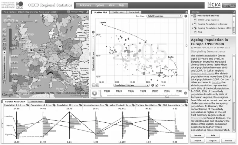
Figure 6: A Web-based interactive visual system OECD eXplorer allows specialists and general public to explore regional statistics data from OECD (Organisation for Economic Cooperation and Development, http://www.oecd.org/home/).
There are also other things to consider in implementing visual analytics tools:
• Seamless integration of visualisations with computational techniques such as spatial statistics, time-series analysis, simulation models, spatio-temporal data mining, etc.;
• Support for documenting the analysis process, keeping provenance of findings, reporting and storytelling;
• Support for collaboration.
These requirements are not unique for tools dealing with spatio-temporal data but generally apply to all kinds of visual analytics software. However, the specifics of space and time may have some impact on implementing the requirements, which may be by itself a research topic.
Recommendations
(1)Develop a new generation of lightweight accessible dynamic visual analytical GIS to support a range of amateur and professional spatio-temporal analysts.
(2)Implement tools for spatio-temporal visual analytics in a way that allows rapid and easy deployment or online use through the Web. Make the tools compliant with the existing and emerging standards, interoperable and combinable; enable integration of the tools into user’s existing workflows.
Conclusion
GeoVisual Analytics draws from GIS, cartography and Information Visualization, but needs to deal with TIME much more effectively and as a starting point and needs to be oriented to a broad and diverse community of potential users. Everything is geared towards the key objectives:
• deal with and make use of characteristics of SPACE
• be visual
• be exploratory
• support sensemaking
• be scalable
• be collaborative
• be lightweight
• develop approaches for new and large data sets
• develop evidence and knowledge to communicate
• derive knowledge from other disciplines through close collaboration.
Acknowledgements
We owe sincere thanks to the researchers who responded to our questionnaire and/or took part in the expert workshop in Hamburg. We are very grateful to Piotr
Jankowski, André Skupin, and Jim Thomas for their valuable comments on the draft of the paper.
Short biographical notes on all contributors
References
Agarwal, P., and Skupin, A., editors (2008): Self-Organising Maps: Applications in Geographic Information Science. Wiley
Aigner, W., Miksch, S., Thurnher, B., and Biffl, S. (2005) PlanningLines: novel glyphs for representing temporal uncertainties and their evaluation.
Proceedings of international conference on information visualisation, London, UK.
Aigner, W., Miksch, S., Müller, W., Schumann, H., and Tominski, C. (2008): Visual Methods for Analyzing Time-Oriented Data. IEEE Transactions on
Visualization and Computer Graphics, Vol. 14, No. 1, pp. 47–60.
Andrienko, G., Andrienko, N., Bremm, S., Schreck, T., von Landesberger, T., Bak, P., and Keim, D. (2010): Space-in-Time and Time-in-Space Self-Organizing Maps for Exploring Spatiotemporal Patterns. Computer Graphics Forum, Vol.29(3).
Andrienko, G., Andrienko, N., Dykes, J., Fabrikant, S. I., and Wachowicz, M. (2008): Geovisualization of Dynamics, Movement and Change: Key Issues and Developing Approaches in Visualization Research. Information Visualization, Vol.7, No.3/4, pp. 173-180
Andrienko, G., Andrienko, N., Jankowski, P., Keim, D., Kraak, M.-J., MacEachren, A., and Wrobel, S. (2007): Geovisual Analytics for Spatial Decision Support: Setting the Research Agenda, International Journal Geographical Information Science, Vol. 21 (8), September 2007, pp. 839-857.
Andrienko, N and Andrienko, G. (2006). Exploratory Analysis of Spatial and Temporal Data: A Systematic Approach, Berlin: Springer-Verlag
Demšar, U. and Virrantaus, K. (2010): Space-time density of trajectories: exploring spatio-temporal patterns in movement data. Submitted to IJGIS in April 2010. Dykes, J. A., MacEachren, A. M., and Kraak, M.-J. (2005a): Advancing
Geovisualization. In Dykes, J. A., MacEachren, A. M., & Kraak, M.-J., eds.: Exploring Geovisualization (Amsterdam: Elsevier), pp. 693-703
Dykes, J. A., MacEachren, A. M., and Kraak, M.-J., eds. (2005b): Exploring Geovisualization, Amsterdam: Elsevier.
Fabrikant, S. I., Rebich-Hespanha, S., and Hegarty, M. (2010): Cognitively inspired and perceptually salient graphic displays for efficient spatial inference making. Annals of the Association of American Geographers, Vol. 100, No. 1: 1-17. Fabrikant, S. I., and Lobben, A. (eds.) (2009): Introduction: Cognitive Issues in
Geographic Information Visualization. Special Issue on Cognitive Issues in Geovisualization. Cartographica, vol. 44, no. 3: 139-143.
Hägerstrand, T. (1970): What about people in regional science? In: Papers of the Regional Science Association, vol.24, pp.7-21.
Harrower, M. (2004): A Look at the History and Future of Animated Maps. Cartographica, Vol.39, No.3, pp.33-42
Keim, D., Andrienko, G., Fekete, J.-D., Görg, C., Kohlhammer, J., and Melancon, G. (2008): Visual Analytics: Definition, Process, and Challenges. In Kerren, A., Stasko, J.T., Fekete, J.-D., and North, C. (Eds.) Information Visualization – Human-Centered Issues and Perspectives. Volume 4950 of LNCS State-of-the-Art Survey, Berlin: Springer, pp.154-175
Kohonen, T. (2001): Self-Organizing Maps. Springer
Langran, G. (1992): Time in Geographic Information Systems. London: Taylor & Francis, 1992.
Larkin, J., and Simon, H. (1987): Why a diagram is (sometimes) worth ten thousand words. Cognitive Science, 11:65-99
MacEachren, A.M. (1994): Visualization in modern cartography: setting the agenda. In Visualisation in Modern Cartography (NY: Elsevier Science Inc.), pp. 1-12. MacEachren, A. M., and Brewer, I. (2004): Developing a conceptual framework for
visually-enabled geocollaboration, International Journal of Geographical Information Science, 18(1), pp. 1-34.
MacEachren, A.M., and Kraak, M.-J. (1997): Exploratory cartographic visualization: advancing the agenda. Computers and Geosciences, 23, pp. 335-344.
MacEachren, A.M., and Kraak, M.-J. (2001): Research challenges in geovisualization. Cartography and geographic Information Science, 28(1), pp. 3-12.
MacEachren, A.M., Robinson, A., Hopper, S., Gardner, S., Murray, R., Gahegan, M., and Hetzler, E. (2005): Visualizing Geospatial Information Uncertainty: What We Know and What We Need to Know. Cartography and Geographic
Information Science, Vol.32, No.3, July 2005, pp. 139-160
Mackaness, W.A., Ruas, A., and Sarjakoski, L.T., editors (2007): Generalisation of Geographic Information: Cartographic Modelling and Applications. Oxford: Elsevier.
Laube, P., and Purves, R. (2010): Cross-Scale Movement Trajectory Analysis. In Haklay, M., Morley, J., and Rahemtulla, H., editors. Proceedings of the GIS Research UK 18th Annual Conference GISRUK 2010. University College London, London, UK, pp. 103-107
Peuquet, D.J. (1994): It’s about time: a conceptual framework for the representation of temporal dynamics in geographic information systems, Annals of the Association of American Geographers, 84 (3), pp. 441-461.
Rana, S. and Dykes, J. (2003): A framework for augmenting the visualization of dynamic raster surfaces. Information Visualization, Vol.2, No.2, pp. 126-139 Slingsby, A., Dykes, J., and Wood, J. (2009): Configuring Hierarchical Layouts to
Address Research Questions. IEEE Transactions on Visualization and Computer Graphics (Proceedings Visualization / Information Visualization 2009), Vol.15, No.6, pp.977-984
Slocum, T. A., Blok, C., Jiang, B., Koussoulakou, A., Montello, D. R., Fuhrmann, S., and Hedley, N. R. (2001): Cognitive and usability issues in geovisualization, Cartography and Geographic Information Science, Vol.28, No.1, pp.61-75 Thomas, J.J., and Cook, K.A., editors (2005): Illuminating the Path. The Research and
development Agenda for Visual Analytics, IEEE Computer Society, 2005. Tobler, W. R. (1970): "A computer movie simulating urban growth in the Detroit
region". Economic Geography, 46(2), pp. 234-240.
Tominski, C. and Schumann, H. (2008): Enhanced Interactive Spiral Display, Proceedings of the Annual SIGRAD Conference – Special Theme: Interactivity, Stockholm, Sweden.
Vasiliev, I.R. (1997): Mapping Time. Cartographica, 34 (2), pp. 1-51.
Wood, J. (2005): Multim im parvo - Many Things in a Small Place. In Dykes, J. A., MacEachren, A. M., & Kraak, M.-J., eds.: Exploring Geovisualization (Amsterdam: Elsevier), pp. 313-324
Wood, J., and Dykes, J. (2008): Spatially Ordered Treemaps, IEEE Transactions on Visualization and Computer Graphics (Proceedings Visualization /