Theses
Thesis/Dissertation Collections
5-1-1999
William Wheatley: A Retrospective
Melissa K. Kaup
Follow this and additional works at:
http://scholarworks.rit.edu/theses
This Thesis is brought to you for free and open access by the Thesis/Dissertation Collections at RIT Scholar Works. It has been accepted for inclusion
in Theses by an authorized administrator of RIT Scholar Works. For more information, please contact
.
Recommended Citation
Rochester,
New York
Certificate
of
Approval
Master
s
Thesis
This is
to
certify
that the
Master
sThesis
ofMelissa K.
Kaup
With
aMajor in Graphic Arts
Publishing
has been
approvedby
the
Thesis
Committee
assatisfactory
for
the thesis
requirementfor
the
Master
ofScience
degree
atthe convocation ofMay
1999
Thesis Committee:
^7/la^
iuJLu^.
GraduateProgram Coordinator
by
Melissa K.
Kaup
A
thesis
project submittedin
partialfulfillment
ofthe
requirements
for
the
degree
ofMaster
ofScience in
theSchool
ofPrinting
Management
andSciences in
the
College
ofImaging
Arts
andSciences
ofthe
Rochester
Institute
ofTechnology
May
1999
William
Wheatley: A
Retrospective
I,
Melissa K.
Kaup,
hereby
grant permission to theWallace Memorial
Library
ofRochester
Institute
ofTechnology
to reproducemy
thesisin
whole or
in
part aslong
asany
reproduction will notbe for
commercialuse or profit.
This
volume
is
the
property
ofthe
Institute,
but
the
literary
rights
ofthe
authormustbe
respected.Please
referto
permission statementin
this
volumefor denial
orpermission,
by
author,
to
reproduce.In
addition, if the
reader obtainsany
assistancefrom
this volume,
he
mustgive proper credit
in his
ownwork.This
thesis
has been
usedby
the
following
persons,
whosesignaturesattestto their
acceptance
ofthe
aboverestrictions.Name
Address
Date
COPYRIGHT
Acknowledgments
I
have many
individuals
whoI
wish to acknowledge and thankfor
their
unselfishparticipation
in
the
process ofthis thesis projecLFirst,
I
wouldlike
tothank
Mr. William
Wheadey
for
dedicating
his
time and effortin
recollecting his
memoirsfrom
such atumultuous
time.Second,
tomy
thesis advisor
Professor
Archie
Provan,
for his
constant guidance anddirec
tion.
Thirdly,
to those
who offered theirfirst-hand knowledge
and adviceon an era
that
has
notbeen
wellrecorded,
specifically Professor
Frank
Romano
andProfessor
Alexander Lawson.
Finally,
I
wouldalsolike
tomention the generous support ofMonotype
Corporation
for
funding
my
travelexpensestoCharlotte,
North Caroli
nato obtain
Mr. Wheatley's
recollections of mechanicaltypesetting.
Table
of
Contents
List
ofFigures
VAbstract
vmChapter
i:Introduction
i.iChapter
2:Background
Significance
2.1Chapter
3:Literature Review
3.1Chapter
4:Statement
oftheProblem
and
Goals
oftheProject
4.1Chapter
5:Methodology
5.1Chapter
6:
Varityper
Corporation,
US
6.1
Chapter
7:Varityper
Corporation,
Europe
7.1Chapter
8:
Compugraphic
Corporation
8.1
Chapter
9:Itek Corporation
9.1Chapter
10:Consulting
10.1Chapter
11:Summary
andConclusions
11.1Chapter
12:Bibliography
12.1Appendix A: Figures
a.iAppendix
B: Varityper
History
andSpecifications
b.iIndex
c.iList
of
Figures
Figure
2.1Linotype
Machine
a.3
Figure
6.1
Resume
ofWilliam
Wheatley
A.4
Figure
6.2
Varityper
720 a.6Figure
6.3
Headliner
880
a.6Figure
6.4
Example
ofVarityper
machine sdifferential
letter
spacing
A.7
Figure
6.5
Bendy
Raak
designing
typefor
theVarityper
A.7
Figure
6.6
Commercial
model ofthe 1881Hammond
typewriter
a.8Figure
6.7
Example
ofMimeographing
A.9
Figure
6.8
Sections
oftheWWII Japanese
surrenderdocument
preparedby
theVarityper
ontheUSS Missouri
a.ioFigure
6.9
Sample
ofVarityper
typedesigns
madefor
psychologicalwarfare a.ii
Figure
6.10
Example
of aVarityper
machinefont
andplacement A.12
Figure
6.11
IBM Selectric
andthe
golfball
A.13
Figure
6.12
Varityper phototypesetting
modelsA.14
Figure
6.13
Example
of a plasticdisc for phototypesetting
A.15
Figure
6.14
A
sample sheetshowing ruling
characters onthe
first
AM
725
discs
A.16Figure
6.15
A
white printusedby
Photon
andAM
as alettercard
to shoot adisc
A.17
Figure
6.16
A Japanese
sample cut out of rubylith A.18Figure
6.17
Comp/Set
500A.19
Figure
6.18
A
drawing
ofthe
design
limitations
during
the
[image:10.518.131.475.97.576.2]Figure
6.19
Univers
designed
by
Fruitiger
A.21Figure
6.20
Process
for
making
glassdiscs
atPhoton
A.22Figure
6.21
Photon
paper tapeA.23
Figure
6.22
Specialty
font
product applicationsA.24
Figure
6.23
Example
of characternumbering
systemA.25
Figure
7.1Original
Helvetica design
by
Max Miedinger
A.26Figure
7.2A
listing
ofthe
variations ofHelvetica
A.26Figure
7.3
Decisions
tobe
made atthe edges of the characterfor
defining
shapeA.27
Figure
7.4
Example
ofBendy
Raak's
calculationsfor
theMegaron
typefacedesign
A.28Figure
7.5
Example
oflanguage
specifichyphenation
rules ....A.29
Figure
7.6Examples
ofdifferent
keyboard layouts
A.30Figure
7.7
Example
of aDiatype
machine A.31Figure
7.8A
sample ofArabic
designed
by
theAM
designers
in Europe
A.32Figure
8.1
Sample
ofthe typefacelistings for
Compugraphic
A.33
Figure
8.2
Compugraphic introduction
for
Garth
Graphic
A.34
Figure
8.3
Introduction
from
Itek
for
Matt Antique
A.35
Figure
8.4
Bill
Wheatley
s article aboutMatt Antique
A.36Figure
8.5
Example
ofCompugraphic EditWriter
7500A.37
Figure
8.6
Examples
ofCynthia Hollingsworth's
typefaces A.38
Figure
8.7
A
listing
ofthelanguages
that
HTS
servicedA.39
Figure
9.1William
Wheadey
withHermann Zapf
atthe
DRUPA
Calligraphy
exhibit A.40Figure
9.2Cover
to
thePacesetter
disc
closeout A.41Figure
9.3
Photograph
ofRonald
Mcintosh
andPeter
Purdy
A.41Figure
9.4
A
leaflet
aboutSpiral Type
A.42Figure
9.5
Example
oftheQuadritek
A.43
Figure
9.6RitaScript designed
by
John Schappler
A.43
Figure
10.1John Warnock
andCharles Geschke
from
Adobe
A.44
Figure
10.2An
example ofWhedon
Davis'
typeface
and picture
A.44
Figure
10.3
An
example ofAdrian
Williams'
typeface
Raleigh
A.45
Figure
11.1Photograph
ofLawrence Wallis
A.46 [image:12.518.137.477.77.302.2]Abstract
William F.
Wheadey
was an active participantduring
the"turbulent"
typesetting
years.His
first
yearsin
the typographicfield
were spentworking beside
Bendy
Raak
atVarityper Corporation.
They
worked withcharacter
designs
for
the
Varityper
andthe
Headliner
"cold-type"line
ofmachines and moved
into
collaborating
withPhoton,
Inc.
for
phototypesetting
machines.As
thenecessity for
typographic
experienceincreased
for foreign lan
guages,
Mr.
Wheatley
wastransferred to
Varityper
sEuropean
division.
In
thedaily
effort ofobtaining
typefaces
anddesigning
proper charactersets,
he became
associated withmany
of theEuropean
typefoundries
and companies.
Mr.
Wheatley
's
experiencein
thefield
alsoincludes
theCompugraphic
Corporation in Europe
and theItek Corporation in
theU.S.,
whichhas
led
tomultipletypographic
consulting
assignments.Chapter
i:
Introduction
The
history
ofthe
printed wordhas
takenmany
turns throughout thepast 500 years.
Unfortunately
many
important
pieces ofthispuzzlehave
been lost
orloosely
recorded.It is
rare thatwehave
the
opportunity
to
interview
a person who wasactively
involved in
the
later
stages of thetypesetting
industry. For
over35
years,
William F.
Wheadey
had
been
one suchactive participantin
thetypographic
field.
He
was an employeefor
three
corporations that engagedin
thetechnological
growth ofprinting
in
the mid-twentiethcentury:Addressograph-Multigraph
Corporation,
Compugraphic
Corporation,
andItek
Corporation.
An interview
withMr.
Wheatley
is the capture of a momentin
history
that
willbenefit
thefuture
generationsin
theprinting
field.
Having
aninterest in
typographical
design,
anopportunity
tointerview
a participantin
the area of mechanicaltypesetting
andthus
explore aportion of
the
history
oftype
design
was appealing.What
wasfound,
was a world of complexitiesin
a"simple"
creationof an alphabet.
Today
it is
arelatively
simpletask toselect atypefacefrom
thesoftwarefont
menu.It is
as simple aspushing
abutton
andit is
aseasily
overlooked.When
aprocessappearseasy
to the user,it
tends to overshadow the technologicalcomplexities.
The
calculations and attention todetail
neededin
the
formation
of agroup
of charactersis
astounding,
as thisinterview
willbegin
to
unveil.Chapter
2:
Background
Significance
The
printing
industry
developed
very slowly in
thefour
centuriesfollowing
Johann
Gutenburg's
discovery
of moveable metaltype.With
theintroduc
tion of theMergenthaler
Linotype
machinein
1886,
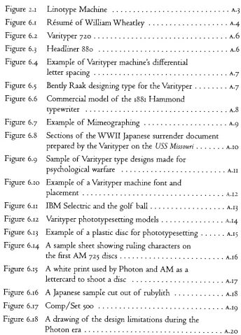
[See figure
2.1,
pageA.2J
the scene changed.The
long-established
procedure ofhandsetting
metal typefrom
atype
case wastransformed
into
a mechanical process.This
newmethodof mechanicaltypesetting
wasknown
as"hot-metal"
composition.
In
additionto theLinotype,
whichcast a moltenlead
alloy
into
matrices,
producing
solidlines
oftype,
there was theMonotype,
which cast one character at a
time,
and theLudlow,
which was used to setdisplay
typefor
headlines. The
technological achievements of these outstretchedthe
experience and capabilities of the press room andit
became difficult for
them to
keep
up
with the rapid changes that weredeveloping
in
the industry.The
nextdevelopment
in
theindustry
was referred to as"cold
type," or
"strike-on
or also as"direct
impression."
It
was theuse oftypewriter-like
machines,
which could setlines
oftextusing
akeyboard.
The
Vantyper,
developed from
theHammond
typewriterin
1933, wasone of the
first
ofthese machines.Once
the textwastyped up,
it
wouldbe
photographed,
andthenit
wouldbe
prepared on aprinting
platefor
offset printing.The
useof photographic projectionfor producing
typespurreddevelop
mentinto
"phototypesetting."
A
typographicimage
wasexposedthrough
a
lens from
aspinning disc
andonto a special photo-sensitivepaper.The
years 1950to 1985,
m which thesedevelopments
tookplace,
wasthe
mostturbulent period
in
the 500 yearhistory
oftypesetting.
At
thefast
rate ofdeveloping
technologies,
theindustry
notonly had
to
worry
about
the
currentmode ofsetting
type,
but
theconstantintroduction
of new methods.This
problem was compounded withthe
dependence
on peripheralproducts,
such as the glassdiscs
usedin phototypesetting
machines,
that addedtheir
ownlimitations
to the
mix.In
additionto the technological problems,
the mental change-over thatwas needed
to
embrace thetechnology
was slow anddifficult.
The
mis understandingsbetween
thedesigners
and the engineers resultedin
diffi
cult and expensive machinedesign
changes,
as well as ahigh-level
offrustration
in
the attempt to meetthedemands
ofthe
clientfaster
than the competition.During
this"turmoil"
period, the
subject of thisinterview
thesis,
Mr.
William F.
Wheatley,
held
afront-row
seatin
the typographic
communi ty.Through working
directly
for
three companies: theVarityper division
ofAddressograph-Multigraph,
Compugraphic,
andItek,
his
memories give abird's
eye viewinto
these times of radical changeandvarying
opinions in
the
typographic
industry.
Chapter
3:
Literature Review
Being
the
nature of aninterview,
mostofthe information was obtaineddirectly
from
Mr. Wheatley. For
clarity,
thefollowing
literature
wasini
tially
referred to:Varityper Typefaces: A
Guide
to
Better
Typography
by
Varityper
An introduction
to theVarityper
productline
capabilities and the typefaces
that were availablefor
theVarityper
models.This
reference produced
by
Varityper
was usedtobecome
morefamiliar
withthecompany
and theproducts thatgaveMr.
Wheadey
his
introduction into
the
typesetting
arena.A Concise
Chronology
of
Typesetting
Developments
l886ig86by
L.
W Wallis
An invaluable
guideto
thehistory
anddevelopments
pertaining
to themany
people, corporations,
and equipmentthatshaped the pastcentury
m typesetting.
In
order tofully
understand the trials and trends of the era whichMr.
Wheadey
was aparticipant,
an overalllook
atthetimein
question was required and was
found
in A Concise
Chronology
of
Typesetting
Developments
18861986.Type
Design Developments
lgyo to290J
by
L.
W. Wallis
A
guide to the major companies and thedesigners
involved in
typefacedevelopments
during
thephototypesetting
anddigital
type era.Type
Design Developments
was used aslook
at the instrumental participants inthe
final
years ofMr. Wheatley's
careerin
thetypesetting
industry.
Chapter
4:
Statement
of
the
Problem
and
Goals
of
the
Project
The
yearsbetween
1950to
1990 were the most turbulent period m the500 year
history
oftypesetting.
At
thefast
rate ofdeveloping
technologies,
the
industry
notonly had
toworry
aboutthe
current mode of setting
type,
but
the
constantintroduction
of new methods.This
problemwas compounded with the
dependence
on peripheralproducts,
such astheglass
discs
usedin phototypesetting
machines,
that addedtheir
ownlimitations
to themix.In
addition to the technologicalproblems,
the mental change-over thatwas needed to embrace the
technology
was slow anddifficult.
The
misunderstandings
between
the
designers
andthe engineersresultedin
diffi
cult and expensive machine
design
changes,
as well as ahigh-level
offrustration
inthe attempt tomeetthe
demands
ofthe clientfaster
thanthe competition.
During
this"turmoil"
period,
the subject of thisinterview
thesis,
Mr.
William F.
Wheadey,
held
afront-row
seatin
the typographic community.
Through working
direcdy
for
three companies: theVarityper divi
sion of
Addressograph
Multigraph,
Compugraphic,
andItek,
his
memories give a
bird's
eye viewinto
these times of radical change andvary
ing
opinions m the typographicindustry.
Chapter
5:
Methodology
Initial
research onthe period i9601985:Mr.
Wheatley
's background
and experienceThe Varityper
and theCoxhead
Company
Typographic
movementsin
the time
periodQuestions
for
Mr.
Wheadey
were generated with the advice ofArchie
Provan,
Alexander
Lawson,
andFrank
Romano.
They
weredivided
into chapter sectionsby
the corporations whichMr.
Wheadey
worked with.Varityper
Corporation,
US
Varityper
Corporation,
Europe
Compugraphic Corporation
Itek
Corporation
Consulting
Summary
andConclusions
A
threeday
interview
withMr.
Wheadey
athis home
in
Asheville,
NC
was accomplishedin June
1998 and the interviewformat
asfollows:
Italic Text
Questions
askedto
Mr.
Wheatley
by
Melissa Kaup.
Normal Text
Answers
by
Mr. Wheatley.
Transcription
oftheinterview.
Continual
access toMr.
Wheatley
via e-mailto
clarify
points.Editing
and verification oftheinterview information
wasaccomplishedby
accesstoMr.
Wheatley
's
files,
theCary
Library,
and professorsArchie
Provan,
Alexander
Lawson,
andFrank
Romano.
Final
proposal presentation.Equipment
A
tape
recorderfor
the
interview withMr. Wheatley.
Facilities
No
ne necessary.sary.Anticipated
Costs
Estimated
$500in
travel
expensesto
visitMr.
Wheatley
athis home
in
Charlotte,
NC. This
stipend wasgraciously
donated
by
Monotype
Cor
poration.
Timetable
Interview
withMr.
Wheatley
was accomplishedin
Line
1998.The
tran
scription of
the
interview
was completedby
the
Winter
quarter 1998.The
research and correspondence withMr.
Wheadey
to
clarify
pointswill
take
placeduring
the
spring
quarter.The
final
thesis
presentationby
the
end ofthe
spring
quarter.Chapter
6:
Varityper
Corporation,
US
What
did
yourbusiness
careercomprise of?The
major part ofmy business
career wasinvolved in
the
typographicdevelopment
field
during
thelargest
transitionoftechnologies.This
periodfrom
1964
through 1985,
saw the mostdevelopments
todate
in
how
typewas set and
how
technology
changed.I
workedfor
threecompaniesduring
that period:Varityper
Corporation,
adivision
ofAddressograph-Multi-graph;
Compugraphic
Corporation;
andItek Corporation.
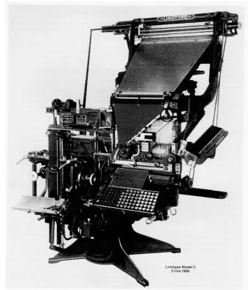
[See figure
6.1,
page
A.4]
All
three
ofthese
companies were created todevelop
equipmentfor
typesetting,
althoughCompugraphic
had
just
been founded
in
i960andItek
did
not exist whenI
startedin
1964.I
called all ofthe
companiesI
workedfor
the"have-nots"
since we
did
not own
any
typefaces,
anddid
nothave
atraditionas atypesetting
com pany.In
thesedays
typefaces
were ownedby
the traditionaltypesetting
machinemanufacturers,
and we wereforced
to
copy
thatwhichalready
existed,
orlicense
it,
which wasin its
infancy.Thus
a"have-not"
when
it
came
to
having
the typefaces
neededto competein
the marketplace.When I
started withVarityper Corporation
in1964,
ithad
a productline
which consisted of
the
Varityper
composing
machines[See figure
6.2,
page
a.6]
in
different
iterations
and theFotolist
camera,
both
using
"strike-on"technologies,
andaHeadliner
[See figure
6.3,
pagea.6]
using
a photographic paper.Compugraphic
wasfounded
by
Bill
Garth
(a former
presidentofPhoton,
Inc.)
andEllis Hanson. The
company'sfirst
machines werehardwired
computers
for
typesetting
control.Itek Corporation
was establishedin
1976 with onephototypesetting
machine called the
Quadritek.
What
memoriesdo
youhave
of
working
withVarityper's
typographic
designer
Bendy
Raak,?
In
1940,
Bendy
Raak joined
Varityper,
thenknown
as theCoxhead Cor
poration as
the
Director
ofTypography.
Bently
wasa native ofIowa
andhe
gainedhis degree
in
Printing
andJournalism
atSouth Dakota State
University. He
spent a short while atSyracuse
University
before
coming
to
the
Coxhead Corporation.
During
his
time
atSyracuse University, he
camein
contact withFreder
ic
W
Goudy,
America's
most wellknown
typedesigner. After
thedisas
trous
fire
whichdestroyed
Goudy's
historic
Village
Press,
Dean
Spencer
of
the
School
ofJournalism
offeredGoudy
theengraving
machines thatthe school
had
just
acquiredfor
cutting
matrices underGoudy's
supervision.
I
believe
the
instructor
ofthis
course wasBendy
whohad
just
resigned to takea position
in
New York
withtheCoxhead Corporation.
It is my
belief
that whenBently
Raak
came onboard
in
1940,
theCox
head
Corporation
gainedone oftheir
greatestassets,
and onethatwouldbe
theguiding
light for
Varityper
and othertypesetting
machines thatwould evolve throughout the next
35
years.Since
all ofthe
company
products
involved
type andtypesetting,
Bendy,
withhis
meticulous eyefor detail
andhis
excellentunderstanding
oftype andtypography
wouldassist
in
thedevelopment
of alltheproducts.Bently
Raak
wasmy
mentor,
and throughhim,
I
learned
so much abouttheindustry.
One
ofBently
's letterpress
books,
As
theSpirit
Moves,
was printedin
Man-hasset,
New York in
1941.He
andhis
associateC. Douglas Barnes
tippedin
athree-centstamp issued
mSeptember
1939,
which was a commemorative of
the
Stephen Daye
Press,
thefirst
English
press usedin
theColonies. The
book
was setin
Goudy's
Truesdell,
which was one ofGoudy's
"lost" typefaces castin
1931.I
gavefour
cases ofTruesdell
foundry
type toRochester Institute
ofTechnology
[RIT]
in
1971 or 72.This
book
was one ofthe two
books
Bently
directly
gave tome,
soI
know
thathe
wasusing
theGoudy
types.Beyond
his
everyday
work,
he
also spenthis free hours
in
designing
aring
in
Aramic
(ancient
Semitic
language)
andweaving
arug using
allthe
early printing
marks offamous
printerslike
Fust
&
Schoffer.
The early
days
ofthetypographic
department
were spentin
developing
for
theVarityper
andHeadliner
machines.It
was not untilIBM
came out with theMagnetic Tape Selectric Composer
[MTSC]
in
1966 that seri ous workbegan
in
developing
typefacesfor
the new photographic technology,
i.e.
second-generation typesetters.This
wasdivided
into
two
diverse
categories:The
first
wasHeadliner
typefaces,
which weredisplay
typefacesfor
use on our series ofHeadliners. These
were thefaces
of theday
usedfor
advertising, newspapers,
bulletins,
etc.,
and all were mainstream typefaces
availablefrom
othertypesetting
machinevendors,
such asLudlow
Typograph
Co. We
did
create some specialapplicationfonts
such as E-13Bfont both for
offset andletterpress
printing
applications.This
was"win
dow
font"which allowedyou to put a negative on
the type
master andactually
produceduplicates
ofartwork,
logos
or whatever.The
secondwastypefaces
for
the
Varityper
machinesthemselves.
We
had
many
different
models,
so wetried
tokeep
adesign
scheduleto
satisfy
themall.
For
instance,
engineering
machines used unitspacing
fonts,
and we created various stylesfor different
applications, such asbills
of material,
specsheets,
anddrawing
dimensions.
The
largest
schedule wasonthe typestylesfor
thevarioustypesetting
Var
ityper
machines.This
evolved throughthedifferent
models,
but
basically
we were
trying
to
create typedesigns
that wouldhelp
sellthese
machines.We
developed
a series ofNews Gothic
faces,
did
aClarendon,
andalso aHelvetica
series,
which we calledMegaron. This
wasa greatbreakthrough,
and
I
think
a great resultbased
on thefact
that we weredesigning
withonly
threeincrements
[set
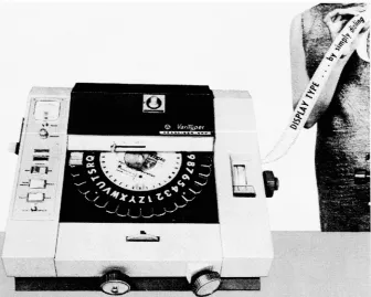
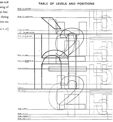
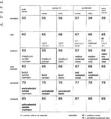
widths].[See figure
6.4,
pageA.7]
This
face
is
a great example ofBently's
inguenity
in
developing
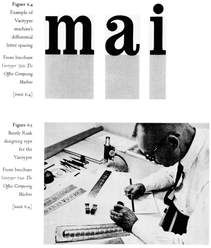
atypeface. [See figure
6.5,
pageA.7]
Bendy
did
everything.He
created amarketing
promotion at onetimefor
a series of
Headliner
machines.He
copied anearly
Roman indulgence.
If
we publishedit,
the promotion wouldhave
statedthat
thefirst
Head
line
wasdone
in
Roman
times.
Not only
did he letter
the promotion,
he
colored
it,
andhe
madeit
look like
a scroll.He
musthave
spent a week onit,
just
making "This
is
the
first
Headline."
We
neverdid anything
withit,
I
endedup writing
all ofBendy
speechesfor him
and alsohandled
allhis
correspondence tomanagement,
as well asinquiries
from
the
field,
consisting
ofapplications,
special typecharacters,
andfuture
develop
ments.
He
wasreally
patient and would nevercross anybody.We
had
amarketing
person who would call at nineo'clock,
"Bendy,
come
up
here."
Bently
wouldgoup
to the executive offices andhe
wouldbe
gonefor hours.
I
would wanderinto
those offices andhe
wouldbe
sitting
there.I
said,
"Why
are you"Well,
he hasn't had
time tosee me
I
said,
"Bently.
get out ofhere.
Get
back
toArguing
withengineering
wasBently's
onevice,
because
he
alwaysfelt
thatengineersdidn't know
anything
andthey demanded
him
toprovehis
point.And
he
alwaysdid.
With
machineslike
theFotolist
camera,
he
would spend a weekfiguring
outthefocal
length
of alens.
When
they
came out withthe
typesetting
machines,
he
satdown
and told them whatkind
oflens
they
needed toresult
in
whatkind
ofmagnification,
so we would get a goodscaling
offonts.
But
obviously
in
atypesetting
machine,
it
is notlike
foundry
type8-point
and io-pointdesigns
are notin
proportion to each other.In
a
typesetting
machinethey
have
tobe.
Do
youhave
any inside information
onVarityper,
how
it started, interactions
between
people?I
don't know
much aboutthe
company
before
Addressograph-Multi-graph
[AM]
bought
it, exceptStuart
Coxhead,
General Manager
for
theInternational
Division,
who was thebrother
ofRalph,
was still activein
the
business.
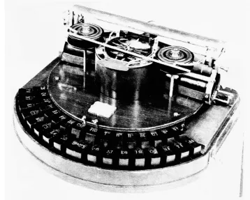
Ralph Coxhead
developed
the originalVarityper
from
theHammond
typewriter.[See figure
6.6,
pagea.8]
Becoming
a part ofAddressograph-Multigraph
did
notbenefit
Vari
typer.
I
don't know how
AM
decided
tobuy
it,
but
I
rememberVarityper
went
through
allkinds
ofdifficulties.
AM
wasconstantly
bought
andsold.
One time
they
were ownedby
Roy
Ashe
who would acquire companies to
just
sell themoff.The
headquarters for
Addressograph-Multigraph
werein
Cleveland,
but
we were m
New
Jersey
atthe
Varityper
typedepartment.
During
oneperiod we were considered the
"typing
Management
from
Cleve
land
would callevery
month to askhow many
employees wehad
andhow
much we typed.It
wasbecause
wejust
didn't fit.
We
weredesigning
typefaces,
but
they
had
nothing
like
that inany
otheroftheirdivisions.
The
wholething
was ridiculous.They
wouldn't recognizeVarityper
as aspecific
division
in
New
Jersey
whilethe rest ofthecompany
was outin
Cleveland
andChicago. It
was a strange company.When
I
first
went towork,
Varityper
was onFrelinghuysen Avenue
inthe center of
Newark,
New Jersey. Beautiful
place!HaJ When
wefirst
moved
there,
my
wife cameby
with the carto pick me up.I
wasing
onthe streetcornerandshedrove
rightby.
She
finally
turnedaround.I
said,
"Why
didn't
youShe
said,
"I
couldn'tbelieve
you workedin
such a terribleAnother missing
elementin
thehistory
of theVarityper
machineis
thebig
Chicago
strikein
1947,
whichactually
wasbroken
by
theVarityper. The
Chicago Tribune
wenton strike andBendy
Raak apparendy
shipped about 5060Varityper
machinesto
Chicago. The
newspapersactually
were published
using
Varitypers,
whichendedup
breaking
the strikein
Chicago.
I
calledtheChicago Tribune
tofind
out more aboutthe eventandthey
saidthey
had
no archives.[Labor
correspondent oftheNew
York
Times
wrote several articles on thisstrike.]
One
timeI
prepared atalkabout type at a show andit is
afunny
story.I
wasplanning
atalkabouttypeandthe transitionoftype.The
first
part ofmy
talk wasgoing
tobe
the noise of aLinotype
machine.Just
the chh-chh-chh-chh-chh.I
can remember years ago whenI
waswalking
down
the streetI
could tell ifI
wasby
a newspaper,it
was a verydis
tinctive noise.I
can't tell anymorebecause
hardly
anyoneis running
aLinotype
machine.I
toldArchie Provan
atRIT,
"I'm
coming up
andI
want to record the sound of theLinotype
machine,because
I'm
going
to useit
asback
groundI
wentup
thereandtherewas not a machinein
operation.Nobody
had
probably
usedtheLinotype
machinein
years.Finally,
they
wereable toget oneworking
andI
gotthenoises ofthe
Linotype. I
stillhave
the tape.It's
now a piece ofhistory.
The
Monotype
machine made noises as well.The
keyboard
makesdiff
erent sounds thanthe
caster.It's
adifferent chug-chug-chug
noise.What
did
the
nameVarityper
standfor?The
nameVarityper
stoodfor
thefact
that
you could changetypefaces,
"variable
types."In
1948the
Varityper
being
marketedby
the
Coxhead
Corporation,
was a unitspacing
machine.Similar
to typewriters of theday,
each charactertook
up
the same amount ofescapement,
thus"unit
During
my
career wedid
notdesign
many
new unitspacing
types,
except weactually
made a 13-pointcap
face,
which was the almostthe
limit
allowedfor
engineering
drawings.
What
methodsdid
you usedto
promote
the
Varityper?
The Varityper
brochures
wereactually
alldone
onthestrike-on machines.We
had
anadvertising department
thatdid
all the promotionalpieces,
andthey
usually
conversed with us on typestylesto
be
useddepending
uponthe
application.In
thetypographic
department
wehad
afull-time
personfor
atypespecimen
book.
As I
think
about itnow,
years were spentjust
doing
specimensfor
our salesforce
andfor
our customers.Everyone
else was in the sameboat,
because
atthis time
our competition wasbasically
theMonotype,
or theLinotype
hot-metal
machines,
because
no onehad
a phototypesetting
machine.What
wasthe
attitudeof
the
typesetting
markettoward the
Varityper?
Well,
that was the problem.Looking
back,
Ralph
Coxhead originally
bought
the rightsto
the machine in 1933.It
was made as an officemachine,
but
it
was an office machine that coulddo
so much morethan
just
type.You
coulddo
typewriting,
you coulddo
officeforms,
andyoucould
do
everything
onthis one machine.Even
the
Linotype
couldn'tdo
that.Of
courseit
was"cold
type" and
in
the
early
days
wasonly done
with unit
spacing
typefaces.
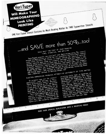
Mimeography
[See figure
6.7,
pageA.9]
wasbig
with secretariesdoing
stencils and theVarityper
was afantastic
machinefor
cutting
stencils.That is
wherethey
thought the
machine wasreally going
to
go.As
the othermachines weredeveloped,
andthis was where theVarityper
was
hurt,
the
other companieshad
truer versions of typefaces.Their
typefaces
looked
like
foundry
typefaces
and we werestruggling
withonly
three
increments
for
the characterwidthsfor
alltypefaces.So
we weregoing
to
go underbecause
our machineshad limited
incre
ments compared with theirtypesetting
machines.Even
ashot-metal
machinesimproved,
more typefacesbegan
coming
out,
and more companies were
making
them.We really
were stuckwiththe
one machine andit's severe
limitations.
So
what marketreally
acceptedthis
product?
The Varityper
machine wasbeing
soldinto
the office market.When
wemoved
into
thephototypesetting
machines,
it
wasa wholedifferent
market
place,
but
wedidn't
have
a salesforce
thatwasbehind
it.
At Varityper
Corporation,
every
new salesperson was sentto the
typedepartment for
training.
This
was part of a weeklong
programcovering
all aspects of
selling
ourequipment.The
basis
ofthelectures
we usedto
give
to the
salesforce
wouldinclude
theclassification oftypefaces,
whatspacing
materialwas,
hot-metal
type,
theVarityper
names ofthe type
faces,
andso on.This
sales class wasmy
first
exposure whenI
came intothe
company
andthis was
how
I,
asthelowly
salesman,
gotmy
positionin
the typedepart
ment.
Eventually
I
wasgiving
the
sales class.In
retrospect,
it
is
interesting
now.Here
was acompany
making
strike-onmachines,
but
yet we wereteaching
our salespeople about realfaces
conceptslike
what old style romanwas,
what a newspaperface
was,
and what a serif was.The
machineprobably
couldn'tdo
any
ofthese
thingsvery
well,
but
we still took the time.In
the
typedepartment,
we were theonly
ones thatdid
anything
abouttype
andtypography
for
thetypesetting
machines.There
were engineers and other peopleworking
withtype,
but
wedirectly
worked on the applications andbrochures.
We
weretalking
to people about whattypeis
andhow
you can getback
into
it.Actually,
we werefairly
successfulin
marketing
machines to customers who weregoing
to tradein
theirVar-itypers
for phototypesetting
machines,
which wasquickly
becoming
theway
ofthe world.It
was a major change over to phototypesetting.In
theVarityper
composing
machine you aredealing
with a piece ofpaper,
you put itin
themachine,
you smash-onthetype,
youtake thepaper offthemachine,
and thenyou pasteit
up.Now in
aphototypesetting
machine you take the paperout,
you putit in
acanister,
take it mto yourdarkroom,
develop
it,
andthen you pasteit
up.You
have
all these other steps todo.
A
lot
of the shops
that
had
thephototypesetting
machinesreally
weren't experts andit
was avery
difficult
transition.Were
the typeface
designs
animportant
partof
the
manufacturing
of
the
Varityper?
In
allmy
experiences,
any
new machinethatwe everreleased,
the typefaces werethe
last
consideration.And in
alot
ofcases,
it
trapped
us.This
was nottrue ofdifferent
models ofmachines,
but only
new machines.Engineering
would work on a projectfor
nine months and comeup
withan
engineering
concept abouthow
itwasgoing
to
work.This
was wherethe
lens
system wasgoing
to
be,
this was wherethe
charactersweregoing
to move,
and this was the escapement ofthe paperandfilm.
They
would come over to thetype
department
andsay,
"Well
now,
how
about
the
type?"
We
wouldsay,
"We
can'tdo
that,
I
meanthereis
noway
we cando
what yousay
you wantit
todo."
Either
they
accepted that or wewouldhave
totry
toconditionthe typefaceinto
whatthey
had done.
It
wasterribly
frustrating,
because
theonly
reason we madethose
machines was tosettype.You
think
thatsomebody
wouldsay,
"Well,
let's
go talk tothe type
peopleandsee whatthey
thinkor whatthey
We
werealwaysin
trouble
with typebudgets.
We
couldneverknow
what we weregoing
togetinto. We
did
specials andchargedafew
characterspecials,
but
wecouldnever make enoughmoneydesigning.
We
always endedup
throwing
away
what waswrong
andstarting
over with a new machine.I
don't
ever rememberdoing
aprojection,
"Ok,
I'm
going
to come out with a newmachine,
andhow
muchdo
you projectit is
going
to cost youin
typefaces?"
I
don't
rememberany
ofthese
projectsbeing
money
driven
on thebasis
of,
"Okay
guys,
youhave
sio.ooo,
550,000 or a million dollars
todevelop
atype."
We just
did
it.
What
equipment were youmaking
typefaces
for?
We
weremaking
typefaces
for
the
Varityper composmg
machme andalso theHeadliner. The Headliner
really
was afascinating
machine andI
amtrying
tofind
out more aboutit.
I
wasthere
when theHeadliner
camein,
but
I
can'tfind
anybody
to tellmehow
it
actually
cameinto
existence.Dick Wurtz invented
theHeadliner
andbrought
it
toVarityper. At
that
time
Varityper
wasits
owncorporation,
before
.AMbought
it. Wurtz
brought
in
abox he had designed.
His
father
was afuneral
director,
so thebox
wasactually
madeout of old wooden casketpieces.It
had
about 5060 springs.It
wasreally
abreadboard,
not amachine.What I
can'tfind
outis
how
Varityper
endedup owning
the
machine.I
know
that
they
bought
therights toit,
but
I
can'tfind
any
ofthe paperwork orpatents.
The
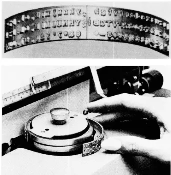
most uniquething
about theHeadliner
was that we weretaking
foundry
type
andactually reproducing
it
on a plasticdisc.
As
thelight
came on and exposed
the
character on the 35mmtractorfeed
paper,
theactual set width ofthe character was
translated
into
a slotdepth
cut mthe plastic
font
master.When
youlocated
aletter
"a,"to print,
you gotthe
slotdepth
of its set.This
wouldbe
offsetby
somany
characters,
sothatpeople couldnot
tell
which slot went with which character.It
was supposedto
be
asecret,
that the characters were offset.I
don't
remembertheexact amount
it
wasoffset,
but
if
you wereprinting
alower
case "a,"
theslot
for
the"a"
was
in
adifferent
area.The
offset was applied so thedisc
couldn'tbe duplicated.
It
wouldbe
very
difficult
tomeasurethe slotsandfigure
which slot went with whichcharacter.
You
know
that thedeepest
slotis
giving
you more paper andthe narrower slots are
giving
youless
paper,
but
wouldtake along
timeto
figure
itall out.The
Headliner
was soeasy
tousethatanybody
coulduse it.The spacing
couldn't
be
screwedup
because
it
provided the accuratecharacter/
character spacing.
When
wephotographed theletters
tomaketheartwork,
wewould
actually
photograph afont
offoundry
type.We
butted
a piece ofbrass
on each side ofthe character andphotographedit,
This
became
the set width thatwas convertedinto
a numericaldecimal
equivalent
There
was somekind
of weirdformula
that took the
actualwidthofthe character plus some magic
number,
which theninterpreted
to
the
slotdepth.
Was
there
a chanceto
adjustthe
kerning
andletterspacing
onthe
Headliner?
On
the
later
Headliner
machines you couldactually
set theletterspacing
or you could set to
kern.
Bendy
came out with one machine, which wascalled
the
AM
880.
Since
you could settext,
weactually
madetextspacesfor
this
machine.The
problemwith theAM
880
was thatit
was so complicatedthat
nobody,
exceptBendy,
knew how
torun it,With
theAM
880,
you could now compose textand setvery
finite line
spacing
tohave
aline
almosttouching
anotherline.
You
could adjusttheleading.
You
could make a whole8.5
x 11 pageon photographic paper.It
was a great
machine,
but it
had
many
dials
tobe
set,I
know
thatpeoplein
thefield didn't
understandit,
because it
wasvery difficult,
Was
there
a cover onit
because
you wereusing
photographicpaper?No,
thatis just
theway
they
designed
thefirst
one.I
don't
quiteknow
why.The
last
machinesdidn't have
a cover.In
fact
they
even tookoffthehan
dle.
They
found
thatpeople werejust putting
theirhands
direcdy
onthefilm disc.
All it
was,
was a piece of plastic withthegrooves cutin it
andapiece of
film
thatwas adheredto theback
ofit.
It
was a special process.When
I
wasin
Europe
withAM,
we wanted to setup
the manufacturing
of alltheEuropean Headliner
discs
in
Europe. We
were not abledo
it because
oftheEuropean
laws for
acetoneand the otherchemicalsusedto affix
the
film
tothe
plastic.They
wouldn't allow us to putit in
ourbudding. We
wouldhave
had
tohave
a separatebudding
for
chemicalprocessing
because
those chemicals arereally
volatde.In
theNew
Jersey
plant,
themanufacturing
division
wasin
the samebudding.
Nobody
cared.In Europe
the}- required anotherbudding
because
it
wouldkill
everyoneif it blew
up.The
difference
in
the cultures was
very
interesting.Were
the
earlierHeadliners
difficult
to
use?The
really
oldHeadliner
machineslook
really
complex,
but
they
were so simple.There
wasreally nothing
todo
withit.
There
was a place to put yourcopy,
the copyholder.They
had handles
tomove thefont disc.
The
machines
became
easier overtime.The
last
machine releasedin
1967,
theAM
810, didn't
evenhave
the
handles
onit;
youjust
moved thedisc
where you wantedit.
Another influence
from
Bently,
was the three-line newspaperHeadliner
discs.
These
discs actually had
threelines
oftype onthemaster,
all the same size.They
were usedby
setting
thefirst line
oftype,
reversing
thepaper,
andsetting
thesecondline,
and thenreversing
again,
andsetting
thethird
line.
Then
youprocessedit,
andhad
athreeline headline
ready
togo.This
wasonly
made avadablein
certainstyles,
such asBodoni,
and therewas a sans serif style.
They
couldbe
usedonany
of our avadable machines.Was
the
Headliner
machine available afterthe
Varityper
line
of
machines?No,
theHeadliner
was avadable about the same time.So,
wehad
two machines: the textmachine andtheheadline
machine.Another
machine thecompany
came out with was aFotolist
camerain
1957.
I'm
trying
tofind
out,
but
I
thinkBendy
holds
the patents onthis
machine.The Fotolist
cameraactually
usedIBM
punch cards.We
had
aspecial model
Varityper
with aholder for
anIBM
punch card.It
wouldjust
the
oneline for directories.
Because
these were punchcards,
you couldactually do
a sort.In
fact,
this washow
the
Japanese
telephone
directory
wasdone.
We
would use a special
Japanese
typewriter
with a card adaptoronit,
it
was a sequential card machine.Then
thedecks
couldbe
sortedany
way
youwanted
it
toduplicate
the
directories.
Smce
there
wasonly
oneline
on acard,
the cardwas thrown outfor
updates and a new one putin.
The Air
Force
did
all oftheirdirectories
ontheFotolist
machine.Also in
i960
it
was usedby
theBritish
to produce theBritish National Bibliography.
When
you getinto
anything like
this,
it is
thekind
of work thatBently
Raak
woulddo.
He
would spendhours
onit.
In using
the
Fotolist
camera you were requiredtohave
many
special chartsfor
sizing,
leading,
charactercounts,
etc.Bendy
would never use the calculatorand
do everything
withhis
pencd.He
wouldjust
sitfor hour
afterhour writing
outformulas.
It
was amazing.It
truly
was amazing.Varitypers
were also usedby
the
military?The mditary
did
theirown publications withtheVarityper
in
WWTI. In
19423
tosavespace,
theNavy
began
toreplacehot-metal
printing
shops on ships.The
surrenderdocument
ofWWII
wasdone
with aVarityper
on
General MacArther's USS Missouri
with, thevictory
mlapan. There
usedto
be
acopy
ofthedocument in
theoffice ofthevice president andgeneral manager of
Varityper Corporation. I
calledhim
and askedhim
whatever
happened
toit.
He
didn't have
a clue.[See
figure
6.8,
pagea.io]
I
wonder if acopy
is still mWashmgton,
D.C. I
assumethat
the gov ernment musthave
acopy
ofone,
because
it was a contract.In
1963, the
Army
collaborated withVarityper
to
develop
a numbercoding
systemfor
someforeign languages.
For
along
time theVarityper
had
been
usedby
the governmentin
thefield
onNavy
ships.Their
purposewas psychological warfare.
We
used toworkfor
the psychologicalwarin
Natick,
Massachusetts.
We
werebeing
contracted todesign
the typefacesfor
theVarityper
andthe
Headliner
thatwere tobe
puttowork as propagandafor
themditary
field
operations.I
wasinvolved
alot
in
these government contracts.I
obviously
didn't know
any
ofthe
languages:
Vietnamese,
Cambodian,
andLaotian.
From
theselanguages
you can tellwhatperiodoftime
this was.Professor
Ray
atSouthern Illinois
University
wouldsend usfrequency
studies
ofthe
language
alphabets.That
was all wehad
to work with.The
first
thing
we wouldhave
todo
is
establishthemostfrequent
useof a characterbased
uponhis
calculations.Then
theArmy
would send usthedrawings.
Frequency
studiesof
a character means?Character
usages.For
example,
how
many
times thelowercase
"e"
was used.
Of
course wedidn't know
what themostfrequent
characterin Cambo
dian
was,
but
the
studies showedit.
Well, they
thoughtthey
did.
We
had
alot
of correspondence with the military.It probably
tookus eighteen monthstodo
one ofthesecontracts.I
spent alot
oftimegoing
back
andforth
withRay. We
wouldfind
thatthey
wouldforget
aboutthepunctuation
in
theirfrequency
studies.There
wasonelanguage,
Gurmukhi,
anIndian
script, that
used a straightbar
for
the
period.Obviously
every
sentence wouldendin
a straightbar,
but
they
had
neglectedit. A
periodis
apretty frequent
character andthey
had left
it
out.This
line
would showup
andI
wouldsay,
"What
is
this?Is
this
a mistake?"
or
in
the olddays
we would callit
a"work-up."
If
youhad
athinspacethatwas not
properly
placedon a pressit
would starttoprint.You
would callthat a work-up.
I
wouldhave
to callRay
andsay,
"Let's
find
out what thatline
is."He
would
say,
"Oh,
that'sthe
I
said,
"Well,
maybe weneedto
moveit up in
thefrequency."
It
wasinteresting
because
you would endup
learning
so much aboutthelan
guage.
Although
I
have
neverlearned
one word ofCambodian,
afterawhdeI
wouldlook
at aCambodian
book
and recognize the shapes andhow
the
word
forms
would reoccur.[See
figure
6.9,
pagea.ii]
It
was all a study.How many
characters
couldthe
Varityper
carry?The
Varityper
carried twofonts
withninety
characters perfont. [See
figure
6.10,
pageA.12]
The
anvdmovedup
andyou couldtwist
it
around.There
was afont
onthe
front
side and one on thebackside.
The
otherthing,
whichit
wouldalsoneed,
was acoder,
especially for
thelanguages.
The
coderwas what settheincrementsfor
theset width ofthetypeface,
whether
it
wastwo,
three,
orfour.
The
whole pointofthe character studieswas todevelop
fonts
using
thehighest
frequency
characters onthe primefont.
Since,
asmentioned, the
Varityper
machine carriedtwofonts
ofninety
characterseach,
we want edmost of thekeyboarding
to
be done from
the primefont.
A
Varityper had
threeshifts andyouhad
todetermine
ninety
characters.If
youhave
only
thirty
keys
on atypewriter
and youhave
ninety
characters,
you needthree
shifts: alowercase,
uppercase,
andthenafigure
shift,We
would comeup
withthe
first
ninety
and thenthe
secondaryninety.That's
how
wehad
todesign
thefonts.
The
other problem with some of theselanguages,
especially
with theArabic
language,
there wouldbe
extra characters that connected.The
character
had
tobe
designed
in
such away
that if youhit
onekey,
you alwayshad
tohit
anotherspecifickey
because
ofthe connector.Figuring
outthis
keyboard
was notsomething
thatwasdone
in
five
min utes.We
did
not want to make thesefonts
with the characters out of positionbecause
we wouldhave
to goback
in
three months andredo all the characters.We
couldn't expect theG.I.'s
tofigure
thelanguage
outeither,
so wehad
tocomeup
with number codes.We
numberedthe
keys
from
oneto thirty,
then alinguist
would number code the copy.In
otherwords, there
would
be
key
one,
key
two,
then a circle would meancaps,
and a triangle would mean
finger
shift,
etc.The linguist
would write outthecopy,
then anyone could
follow
throughand composeit.
It
wasjust
following
the
numbers.We
did
thesamething
ontheHeadliner,
althoughobviously it
was more complex.You
wouldhave
to
follow
thepositions of the characters.When
wasthe
Russian
psychological warfare and whatinvolvement
did
Varityper have
in
it?
It
had
to
be
when we were at theheight
of theCold
War. I
went toEurope in
the70's,
soit
had
tobe
somewherebetween
1965
and 1970.There
wasalways alot going
onin
thoseyears.Even
thepsychologicalwar contracts werefurther
involved.
I
think theonly
reason that we gotinvolved
withthosejobs
isbecause
ofthe confidencethey
had
in
Bently.
Because
ofthepsychologicalwarfare,
theCIA
went into the print shopsin
Russia
to photograph theRussian
specimenbooks.
They
wantedBendy
todesign
some typefacesfrom
thesebooks. He
had
allthe
draw
ings
and printsfor
these typefacesin
his
office.It
neverreally
cameto anything,
I
don't know
why.I
don't know
whetherit
wasthat
they
wantedto
do
a contractualagreement andnobody
want ed todo
it,
ormaybe themoney
wasn't right.I
thought it wasinterestmg
thatBendy
had
thosekind
of connections.He
visitedEast
Germany
with a number of the salesman who wereattending
a salesmeeting,
andtheCIA
knew he
wasthere,
andwhenhe
wentin
and came out ofEast Germany. It is
pretty
amazing
even years afterthat
it is
still unclear.But
you neverreally
knew,
because
Bently
would nevertalk aboutit
These
wereUnited States
government contracts?
They
were allfor
theUnited
States
government's propaganda.Once
wehad
the charactersfigured
out,
wedetermined
what code[set
width]
category
the characterwasgoing
tobe
in.
Is
itcoded afour
or athree
or atwo?
The
designer
wouldfigure
outhow
much width was tobe
allowed.Then
we couldactually
startthe
design
work.Still,
wehad
todetermine
what we weregoing
to
do
withthecharacters.We
had
todesign
acoder,
whichthen wouldmatch theincrements. The
w '
on an
English
keyboard
with the coder wouldbe
replaced with acharacter.
If
we put a 3-unit characterthere
mstead of 4-unitcharacter,
we could change
the
escapementofthatkey
from
4-units to 3-unitsjust
by
changing
the code.What
wasthe
coder usedfor?
It
wasfor
escapementWhen
you press thekey,
it's
advancing
thepaper,
so you
had
to
moveit along
the correct number ofincrements.
All
of theVarityper
strike-on machmes were capable ofjustification,
withtwo
typings.
First
youtyped
theline
youwanted,
hit
atabkey
thenre-typed the same
line.
The
machinemechanism,
whichhad
stored thefirst
typing,
would ensureeachline
tobe
thesamelength.
Obviously
the
extra space
had
tobe
placedbetween
words.With
thedevelopment
of acoder,
we couldnowhave
variablespacing,
as the coder wouldcontrolthe escapement of each character.
It
mustbe
remembered thatwe
only had
threeincrements,
so wehad
widecharactersat
four,
normal atthree,
and thelowercase
"i," "1,"
and punctuationat
two.
What
wasthe
DSJ
machine?All Varityper
composers wereactually
DSJ
machines,
which stoodfor
Differential
Spacing
Justifier,
which meantthey
usedthethree
increment
typefaces
(vs.
unitspacing)
and were capable ofjustifying
aline
oftype.Now
that
you thinkaboutit,
manhas
probably
spent mi