City, University of London Institutional Repository
Citation: Badawood, Donia (2015). Narrative construction in information visualisation.
(Unpublished Doctoral thesis, City, University of London)This is the accepted version of the paper.
This version of the publication may differ from the final published
version.
Permanent repository link: http://openaccess.city.ac.uk/15994/
Link to published version:
Copyright and reuse: City Research Online aims to make research
outputs of City, University of London available to a wider audience.
Copyright and Moral Rights remain with the author(s) and/or copyright
holders. URLs from City Research Online may be freely distributed and
linked to.
City Research Online: http://openaccess.city.ac.uk/ [email protected]
Narrative Construction in Information
Visualization
Donia Yousef M. Badawood
A Thesis submitted for the degree of Doctor of
Philosophy in Information Science
giCentre, Department of Computer Science
City University London
Contents
1 Introduction 16
1.1 Research Context . . . 16
1.2 Research Focus . . . 18
1.3 Overall Research Aim and Objectives . . . 20
1.4 Value and Contribution of the Research . . . 20
1.5 Thesis Structure Outline . . . 21
2 Literature Review 23 2.1 Storytelling in Information Visualization . . . 24
2.2 Narrative Structure . . . 29
2.3 Transitions and Sequences of Events in Storytelling . . . 36
2.4 Communication Modes and Story Delivery . . . 43
2.5 Summary, Emerging Issues, and Need for Empirical Research . 45 3 Research Methods I: Information Visualization Delivery 49 3.1 Research Strategy and Questions . . . 50
3.2 The Experiments . . . 52
3.2.1 Experimental Factors . . . 53
3.2.2 Open-Ended Questionnaire and Subjective Feedback Questions . . . 55
3.2.3.1 Within-Subject Experiment . . . 57
3.2.3.2 Between-Subject Experiment . . . 58
4 Research Methods II: Transitions in Narrative Visualization 60 4.1 An Overview of the Research Strategy and Data-Stories Selection 61 4.2 Coding and Representing Transitions in VAST Challenge Videos 62 4.2.1 Coding Transitions . . . 63
4.2.2 Framework of Transition Types in Narrative Visualization . . . 68
4.3 The Visual Encoding and Creation of Transition Diagrams . . . 82
5 The Effect of Information Visualization Delivery on Narrative Construction and Development 87 5.1 Analysis of Qualitative Data . . . 87
5.2 Q1: Reported Impression . . . 89
5.2.1 Analysis of Qualitative Data . . . 89
5.2.2 Quantitative Summary of Findings . . . 91
5.3 Q2: Re-telling the Data Story . . . 92
5.3.1 Insight Type . . . 93
5.3.1.1 Analysis of Qualitative Data . . . 93
5.3.1.2 Quantitative Summary of Findings . . . 97
5.3.2 Narrative Structure . . . 98
5.3.2.1 Analysis of Qualitative Data . . . 98
5.3.2.2 Quantitative Summary of Findings . . . 103
5.4 Participant Learning (Q3 and Q4) and Narrative Purpose (Q5) 105 5.5 Participants’ Subjective Feedback . . . 106
5.6 Summary of the Differences Between the Two Delivery Models 107
6 Interpretation and Analysis of the Transition Diagrams 113
6.2 Storytelling Styles . . . 116
6.2.1 The Balance between Exploration and Goal/Message in
Data Stories . . . 117
6.2.2 Episodic and Continuous Approaches to Storytelling . 120
6.2.3 Narrative Structure and Messaging Paradigm . . . 123
6.2.4 Storytelling with a Rhythm . . . 127
7 Discussions, Conclusions, and Future Work 129
7.1 Research Objectives: Summary of Findings and Conclusions . 130
7.1.1 Objective 1: To identify the characteristics of
story-telling in general and as an emerging field within in-formation visualization . . . 130 7.1.2 Objective 2: To investigate the effect of the information
visualization delivery on narrative construction and de-velopment . . . 131
7.1.3 Objective 3: To propose and develop a framework of
transition types used to tell data stories through infor-mation visualization based on theories in other story-telling mediums . . . 133
7.1.4 Objective 4: To propose a visual language to
charac-terise transitions in narrative visualization based on the
proposed framework of transition types . . . 135
7.1.5 Objective 5: To use the visual representation of
transi-tions in narrative visualization to summarise a number of storytelling styles in narrative visualization . . . 136
7.2 Review of Thesis Contributions . . . 140
7.3 Limitations, Implications, and Recommendations for Further
Research . . . 142
A The Questionnaire used in the Experiments 158
B Explanatory Statement and Consent Form for Participants 167
C Qualtitative Coding Guidance for Coding Experiments Data 171
D Transitions Coding Guidance 176
E The Transitions Diagrams for the Dataset of VAST Challenge
Videos for 2009, 2010, and 2011 206
E.1 The Transitions Diagrams for VAST Challenge 2009 Videos . . 206
E.1.1 VAST Challenge 2009- MC1 . . . 206
E.1.2 VAST Challenge 2009- MC2 . . . 208
E.1.3 VAST Challenge 2009- MC3 . . . 209
E.2 The Transitions Diagrams for VAST Challenge 2010 Videos . . . 210
E.2.1 VAST Challenge 2010- MC1 . . . 210
E.2.2 VAST Challenge 2010- MC2 . . . 211
E.2.3 VAST Challenge 2010- MC3 . . . 213
E.3 The Transitions Diagrams for VAST Challenge 2011 Videos . . 215
E.3.1 VAST Challenge 2011- MC1 . . . 215
E.3.2 VAST Challenge 2011- MC2 . . . 217
List of Figures
2.1 Charles Joseph Minard (1869) showing the losses suffered in
Napoleon’s Russian campaign of 1812. . . 25
2.2 Freytag’s (1863) pyramid 5-acts narrative structure . . . 31
2.3 The Contour of Communication as illustrated by Duarte (2010) 32
2.4 Panel-to-panel transitions in comics as defined and illustrated
by McCloud (1994, 2006). . . 41
3.1 A screenshot of the interface of Gapminder World software. . . 54
4.1 The visual encoding of the story components and transition
types in each VAST Challenge video. . . 85
4.2 A completed transition diagram summarising the contents of
the data story and transition types used in a video submission to VAST Challenge. (Submission: VAST 2009-MC2-Palantir Technologies) . . . 86
5.1 Reported impression of geographical and temporal patterns
(within-subject experiment) . . . 91
5.2 Reported impression of geographical and temporal patterns
(between-subject experiment) . . . 92
5.3 The number of participants (out of 13) who reported each
5.4 The number of participants who reported each insight type in their stories for each delivery model (between-subject experiment) 98 5.5 Main narrative structures used by participants for each delivery
model (within-subject experiment) . . . 105
5.6 Main narrative structures used by participants for each delivery
model (between-subject experiment) . . . 105
5.7 Participants’ subjective feedback on the level of difficulty of
telling a story for each delivery model (within-subject) . . . . 107
5.8 Participants’ subjective feedback on the level of curiosity about
the data/story for each delivery model (within-subject) . . . . 108
5.9 Participants’ subjective feedback on the level of difficulty of
telling a story for each delivery model (between-subject exper-iment) . . . 109 5.10 Participants’ subjective feedback on the level of curiosity about
the data/story for each delivery model (between-subject exper-iment) . . . 110
6.1 An example of a story that achieved or represents a balance
between analysis/exploration and the answers/message
(Sub-mission: VAST 2009- MC1- University of Maryland- Mindlab). 117
6.2 An example of a story on the exploration/analysis process which
does not provide any findings/conclusions (Submission: VAST 2010- MC1- giCentre). . . 118
6.3 An example of a story on the exploration/analysis process which
does not provide any findings/conclusions (Submission: VAST
6.4 An example of a story that delivered some findings in the begin-ning (the orange nodes/scenes with bold-faced edges) and then did not deliver more findings or provide more evidence (ended with a long series of Action-to-Action and Subject-to-Subject transitions)- (Submission: VAST 2009- MC1- Leonard- EAKOS 2009). . . 120
6.5 An example of an episodic story that is divided explicitly into
a number of sub-topics or high-level scenes (Submission: VAST 2009- MC1- GAMI: International Institute of Information Tech-nologies). . . 120
6.6 An example of an episodic story that is divided explicitly into
a number of sub-topics or high-level scenes (Submission: VAST
2010- MC3- Team Stuttgart and Tubingen). . . 121
6.7 An example of a continuous approach to storytelling, i.e. telling a story in one continuous episode/scene shown in the diagram with the outer high-level box/scene (Submission: VAST
2009-MC1- Georgia Institute of Technology). . . 122
6.8 An example of a continuous approach to storytelling, i.e. telling a story in one continuous episode/scene shown in the diagram with the outer high-level box/scene (Submission: VAST
2011-MC3- Middlesex University/ University of Leeds). . . 122
6.9 An example of a continuous story with a clear separation
be-tween different scenes/parts of the story. In this example, these scenes represent parts of the question being answered
(Submis-sion: VAST 2010- MC3- Georgia Institute of Technology). . . 123
6.10 An example of a continuous story with a clear separation be-tween different scenes/parts of the story. In this example, these scenes represent the analysis done by each participant
6.11 An example of a continuous story (with one episode) that con-sists of a long series of story units or actions and provides the findings at the end (Submission: VAST 2009- MC1- VIDI Surveillance). . . 124 6.12 An example of an episodic story that provides the findings at
the end. (Submission: VAST 2010- MC1- VRVis-ComVis . . . 124
6.13 An example of a data story where the first finding comes after a relatively long series of story units and then subsequent findings are revealed after shorter steps toward the end of the story. (Submission: VAST 2009- MC2- University of Ulm and derive-VIScover) . . . 125 6.14 An example of a data story where the first finding comes after
a relatively long series of story units and then subsequent find-ings are revealed after shorter steps toward the end of the story. (Submission: VAST 2010- MC2- University of Constance- Ap-plied Visual Analytics) . . . 125 6.15 A transition diagram shows a data story with reversed
struc-ture. A finding is represented first and then the exploration process that lead to this finding. The exploration process then unfolds and more findings revealed (Submission: VAST
2011-MC1- Pennsylvania State University). . . 126
6.16 An example of a continuous story that adopts gradual messag-ing, i.e. providing pieces of finding/conclusion after relatively short steps throughout the whole story (Submission: VAST
6.17 An example of an episodic story that adopts gradual messaging, i.e. providing pieces of finding/conclusion after relatively short steps throughout the whole story (Submission: VAST 2009-MC1- GAMI- International Institute of Information Technolo-gies). . . 126 6.18 A transition diagram that shows a rhythm in the first three
episodes of the data story. (Submission: VAST 2010- MC3-University of Konstanz) . . . 127 6.19 A transition diagram of a continuous data story that has a
rhythm in the last three episodes. (Submission: VAST
List of Tables
2.1 A summary of the differences between traditional storytelling
and data storytelling using information visualization. . . 46
3.1 Questions used for each delivery model in both sets of experiments 56
3.2 The Likert-scale questions on each delivery model in both sets
of experiments . . . 57
5.1 Excerpts from transcripts of participants’ answers, illustrating
Acknowledgements
I would never have been able to finish this thesis without the support from many people:
First and foremost, I am very grateful to my first supervisor, Professor Jo Wood, for his continuous support, understanding, encouragement, enthusiasm, and constructive feedback throughout the entirety of my research work, from when I began my MSc dissertation up until the completion of this PhD thesis. Honestly, I could not have wished for a better supervisor.
I am also thankful for my second supervisor, Professor Jason Dykes, for his support, constructive feedback, reading and reviewing papers, and espe-cially for his support during various conferences and for introducing me to well-known academics in our field.
I would like to thank all the giCentre members whether still at City or elsewhere for the useful discussions during our meetings and my presentations to them, and for all their support throughout the past years. Special thanks to Dr. Aidan Slingsby and Sarah Goodwin for qualitatively coding a sample of my data to help me assess the reliability of coding.
stage.
Thanks to Mark Firman and Nathalie Chatelain, for all the administrative tasks, the processing of applications for fund to attend conferences, and the endless letters requests.
My thanks also go to the participants in the experiments I carried out.
I would like to acknowledge all the academics I met during various confer-ences for the constructive discussions about my work.
I would like to express my deepest gratitude to my parents for all their help, sacrifices, and encouragement throughout my whole life.
My thanks to my husband, and my lovely daughter, Hala, for understand-ing, supportunderstand-ing, and sometimes very needed distraction.
My thanks to my family and friends for all their best wishes and under-standing.
Abstract
Storytelling has been used throughout the ages as means of communication, conveying and transmitting knowledge from one person to another and from one generation to the next. In various domains, formulating of messages, ideas, or findings into a story has proven its efficiency in making them comprehen-sible, memorable, and engaging. Information Visualization as an academic field also utilises the power of storytelling to make visualizations more under-standable and interesting for a variety of audiences. Although storytelling has been a a topic of interest in information visualization for some time, little or no empirical evaluations exist to compare different approaches to storytelling through information visualization. There is also a need for work that addresses in depth some criteria and techniques of storytelling such as transition types in visual stories in general and data-driven stories in particular.
of telling a story after experimenting with each model. The findings show that while the delivery model has no effect on how easy or difficult the participants found telling a data story to be, it does have an effect on the tendency to identify and use outliers’ insights in the data story if they are not distracted by direct narration. It also affects the narrative structure and depth of the data story.
Examining some more mature domains of visual storytelling, such as films and comics, can be highly beneficial to this new sub-field of data visualization. In the research in hand, a taxonomy of panel-to-panel transitions in comics has been used. The definitions of the components of this taxonomy have been refined to reflect the nature of data-stories in information visualization, and the taxonomy has then been used in coding a number of VAST Challenge videos. The transitions used in each video have been represented graphically with a diagram that shows how the information was added incrementally in order to tell a story that answers a particular question. A number of issues have been taken into account when coding transitions in each video and when designing and creating the visual diagram, such as nested transitions, the use of sub-topics, and delayed transitions. The major contribution of this part of the research is the provision of a taxonomy and description of transition types in the context of narrative visualization, an explanation of how this taxonomy can be used to code transitions in narrative visualization, and a visual sum-mary as a means of summarising that coding.
Chapter 1
Introduction
1.1
Research Context
For thousands of years, visual and oral storytelling has been one of the most widespread and commonly used forms of communication. In anthropology and
philosophy, the word myth, which was derived from the Greek term mythos,
has its own strategies, models, theories, and techniques. Recently, there has been great interest in storytelling through information visualization, resulting in two notable workshops on telling stories with data at VisWeek conferences in 2010 and 2011. There have also been a number of papers on the topic (Hull-man et al. 2013, Kosara & Mackinlay 2013, Hull(Hull-man & Diakopoulos 2011, Segel & Heer 2010). Although there are obvious differences in the details and ways stories are told through information visualization when compared with films or written text, and there are also differences in the nature and types of stories being told in each medium, there are certain concepts and characteristics of storytelling common to all fields.
To avoid confusion and uncertainty about the terminology that will be used throughout the thesis, it is important to define the terms used before
proceeding. The words narrative and story are commonly used as synonyms,
particularly in domains other than literature or philosophy. However, there
is a difference between them. The Oxford English Dictionary defines
narra-tive as ‘a spoken or written account of connected events’. It is the sequence of events that are organised into a story. On the other hand, a story is all events in the narratives, the kind of things that happen. Therefore, one could construct many narratives with the same underlying story.
organisation of the components and events cannot obviously be random. It takes into account the relationships between different events or components, as well as the intended goal or message. A data story is a story that consists
of data or facts. It can be structured and told using many data narratives.
Combining this with the main essence of information visualization, we can explaindata storytelling through information visualization. Card et al. (1999) defines information visualization as, ‘The use of computer-supported, interac-tive, visual representations of abstract data to amplify cognition’. Hence,data storytelling through information visualization involves using visual represen-tations of data, facts, or events, as well as the relationship between them to tell a data story that communicates a message or answers a question. This is very similar to the focus of data-driven journalism (Gray et al. 2012), where stories are told using some form of data; this particular form of storytelling has become more important and popular with the release and revolution of open data. Websites such as data.gov in the US and data.gov.uk in the UK provide rich sources for data stories that are of interest to many agents, ranging from local governments to business organisations to the general public.
1.2
Research Focus
visualization, as well as how these impact the narratives constructed using each model. For this area, two delivery models were identified, the first model involves watching a video of a presenter/speaker telling a story using informa-tion visualizainforma-tion software, while the second model allows the users to explore an interactive visualization, as well as construct narratives by themselves. The research in hand aims to explore empirically how non-expert general users un-derstand, construct, and tell stories using these two models of story delivery.
1.3
Overall Research Aim and Objectives
The overall aim of this research is to use existing theory and techniques from storytelling more generally, and to investigate their relevance to storytelling in information visualization, and to examine empirically the impact of different forms of storytelling visualization on narrative construction. Specifically, it aims:
1. To identify the characteristics of storytelling in general and as an emerg-ing field within information visualization.
2. To investigate the effect of the information visualization delivery on nar-rative construction and development.
3. To propose and develop a framework of transition types used to tell data stories through information visualization based on theories in other storytelling mediums.
4. To propse a visual language to characterise transitions in narrative vi-sualization based on the proposed framework of transition types.
5. To use the visual representation of transitions in narrative visualization to summarise a number of storytelling styles in narrative visualization.
1.4
Value and Contribution of the Research
The main contributions of this thesis can be summarised as follows:
differences between the direct narration and interactive exploration of data stories narratives, the results of the conducted experiments provide some advice and points for data storytellers to consider when delivering their stories with each delivery model (Chapter 3 and 5).
2. The major contribution of the work on transition types is to provide a taxonomy and description of transition types in the context of narrative visualization, and an analysis of how this taxonomy can be used by oth-ers to code transitions in narrative visualization. In addition, it provides a visual summary as a means of summarising that coding. This visual summary enables the comparison of different stories and their progres-sion, and identification of a number of storytelling styles as a result of this comparison. The taxonomy of transition types should help data sto-rytellers to initiate and control progressions in their stories. The themes found after analysis and visual representation of stories in VAST Chal-lenge videos may also be considered as models that can be adopted as desired by storytellers (Chapter 4 and 6).
1.5
Thesis Structure Outline
The overall structure of this thesis takes the form of seven chapters,
includ-ing this introductory chapter, Chapter 1, which provides information on the
context and main area of the research in hand, together with the scope, aims and objectives of the research, and a summary of the research contributions.
needed to address this topic and the emergence of the research in hand from previous work.
The next two chapters are the methodology chapters. First, Chapter
3 is related to the experimental work done on the effect of direct narrative
compared to interactive exploration of data stories. This chapter provides in-formation on the research strategy that has been chosen for this part, along with summary and justification of the data collection methods and the proce-dure followed when conducting the experiments. It also highlights a number
of research questions to be explored. Next, Chapter 4 provides information
on the taxonomy of transition types, the process of using of this taxonomy to code transitions in VAST Challenge videos, and the visual encoding of the transition used in each video (the transition diagram).
After that come the analysis and findings chapters. First, Chapter 5
provides information on the qualitative and quantitative analyses conducted
on the experiments data, and the emergent findings. Next,Chapter 6
sum-marises a number of styles of storytelling in VAST Challenge videos by exam-ining the transition diagrams created along with the actual videos.
Finally, Chapter 7 is the Discussion and Conclusion chapter, where the
Chapter 2
Literature Review
perceive and comprehend stories. Finally, section 2.5 summarises the main points in the literature review and the need for further work in the area of narrative visualization.
2.1
Storytelling in Information Visualization
Information visualization has two main purposes: exploration and analysis on the one hand, and presentation and communication of information to some tar-get audiences on the other (Fulkerson et al. 2009, Keim 2002). Storytelling or narrative visualization is usually listed under communicative or presentational visualization as one of the main characteristics of any story is the message or the point the storyteller makes or communicates. However, it can be argued that storytelling visualization, particularly with interactivity functions in dy-namic visualization designs where users construct their own stories, combines exploratory and presentational visualizations simply because it is not possible to construct and tell a story using data visualization without first exploring the data using available interactive features or examining the static visualiza-tion.
Figure 2.1: Charles Joseph Minard (1869) showing the losses suffered in Napoleon’s Russian campaign of 1812.
that various types of information may be visualized, and that the informa-tion visualizainforma-tion methods and techniques used do not lend themselves to a one-size-fits-all approach (Heer et al. 2005), storytelling through information visualization becomes a challenging task. Wojtkowski (2001) makes a similar point: data visualization’s defining feature is the complexity of the content to be communicated.
that has different types of audiences and needs, as with information visualiza-tion. The example is the design of an electronic medical records system, to create a story that helps explain the daily routine of hospital nurses as they check in patients and keep records of their medical conditions. Within this example, the framework comprises a three column table: Audience, Relation-ship, and Need. There are multiple types of relationships: for instance, nurses constitute an audience who is part of the story context; a patient is an audi-ence related to the story context but possessing a different perspective from that of the central characters; while database developers assigned to work on a healthcare system for the first time constitute an audience who knows the context from a technical perspective (Quesenbery & Brooks 2010). It can be argued that such a classification and understanding of the intended audience is highly relevant to any visualization design. It is also essential in deciding on the amount of context and detail necessary to deliver a coherent story, and on predicting the path that a particular type of user may take in a highly in-teractive exploratory narrative visualization. A number of studies have been conducted in order to understand the manner in which different users approach information visualization. The importance of knowing the target audience is also highlighted in a number of sources (Grammel et al. 2010, Yau 2011).
To better understand the design space of narrative visualization, Segel & Heer (2010) analysed approximately 50 information visualization case stud-ies that have elements of narrative visualization, mostly from journalistic
sources, and looked for recurring design techniques and strategies. They
2010). Conversely, a reader-driven approach circumvents the rigid formatting of author-direction, allowing for free interactivity with the presentation (Segel & Heer 2010). This implies changes in the story path that each user or audience may follow and that may also change the overall outcome of the story. There are inherent benefits to each approach based on the audience, the primary objectives of the presentation, and the disseminated information, challenging the author to consider the value of each technique before subscribing to one approach or the other if he or she has to choose between them. Furthermore, Segel & Heer (2010) identify seven genres used in storytelling visualization: magazine style, annotated chart, partitioned poster, flow chart, comic strip, slide show, and film/video/animation. They also suggest three main narrative structures based on the author-driven and reader-driven approaches. These structures will be discussed in section 2.2.
could be used. Hullman & Diakopoulos (2011) analysed a number of informa-tion visualizainforma-tions that had storytelling elements, using concepts from other domains such as literacy studies, and tried to provide a theoretical framework of the rhetorical or persuasive techniques such as information access and map-ping used at four stages of visualization design (data, visual representation, annotations, and interactivity), and how these techniques might influence in-terpretation.
As the field of narrative visualization grows, new studies continue to fo-cus on different aspects of data storytelling with information visualization. A recent study by Hullman et al. (2013) analysed a sample of linear slide-show presentations and looked for visualization-to-visualization transitions between slides and users’ preferences in terms of the order of visualizations used in an individual presentation. They found that in slide-show presentations, users are more comfortable and capable of retreiving information if the change between two visualizations/slides occurs on one factor. For example, this is effective when the visualizations in two subsequent slides are identical except that each shows the data for a different time period. This is also true to some degree when a particular transition between any two subsequent visualizations/slides is repeated throughout the presentation. As the focus of the study is related to understanding transitions in narrative visualization, further discussions on this work will be postponed until section 2.3.
objects to be compared separately’), superposition (‘show the objects to be compared in the same space’), and explicit encodings (‘the relationships be-tween objects are shown explicitly by providing a visual encoding of them’) (Gleicher et al. 2011). It can be argued that the use of these three approaches to comparisons in visualization design has an effect on the flow of the data story and how it unfolds, as well as on the ordering, amount, and type of information communicated at any single step in the story, whether this step is provided in a slide, by using some interactivity, told directly by a speaker, or annotations on a visual design. It also has an effect on the effort provided by the audience, viewer, or user to understand the story, as well as on the ability to recall this information or these comparisons.
Finally, a recent paper by Kosara and Mackinlay (2013) summarises and reviews the work done on this area and highlights the need for more empirical work and further research to be done to characterise this emerging area within data visualization. They also encourage attempts to benefit from more mature storytelling disciplines to facilitate understanding and characterisation of this emerging area of information visualization. This is one of the main arguments of the study in hand, where utilising theories and techniques from other visual storytelling mediums should enhance our understanding of some aspects of our domain.
2.2
Narrative Structure
a unitary, coherent story (Block 2001, Gershon & Page 2001, Quesenbery & Brooks 2010). Without this progression and structure, there is no story but a series of facts.
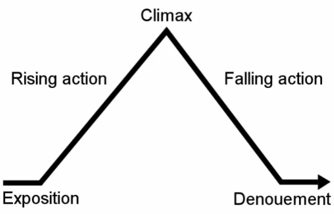
According to Tobin (2007), whichever format is used, the structure of every story follows the same sequence: a beginning, middle, and end. However, Ger-shon & Page (2001) state that in information visualization this format is diffi-cult to apply and that ‘all stories should have beginning, middle, and end but not necessarily in the same order’. This is also related to the widely known five-acts classic narrative structure of Gustav Freytag (1863): Exposition, Rising Action, Climax/Conflict, Falling Action, and Denouement/Resolution (Figure 2.2). This is common in novels and films where the Exposition initiates and introduces the main characters and setting to begin the story, after which the story builds and the action rises, until getting to the point in the story when
the tension highest- the Climax/Conflict. From there, the story proceeds
with falling action and resolving problems and finally we reach the Resolu-tion/Denouement stage where the problem/conflict is resolved and conclusion arrived. However, this does not always happen in this order as Gershon and Page (2001) pointed out. Some storytellers may withhold some exposition or information and reveal them later in the narrative (Richardson 2002, Chap-ter 12). An example of this reversal is the inverted pyramid structure used in journalism (below).
However, the 5-acts structure and its pyramid shape as developed by Frey-tag is usually applied to novels and screenplays where there is a main proFrey-tag- protag-onist, and this 5-acts structure relates to the journey of this protagonist in the
narrative. Duarte (2010) developed what she calledThe Contour of
Figure 2.2: Freytag’s (1863) pyramid 5-acts narrative structure
contour shows Duarte’s argument that presentations have two main turning points that mark the change between the beginning, middle, and end of the story. As can be seen in Figure 2.3, there might be also other turning points between the beginning and end. These can be thought of as a repetition of Freytag’s pyramid to cope with the complex nature of presentations that may extend beyond only one protagonist, topic, or storyline.
Figure 2.3: The Contour of Communication as illustrated by Duarte (2010)
stories enhances comprehension and makes it more memorable (Kuchar et al. 2006, Hullman et al. 2013). Moreover, one of the main arguments for the role of time in structuring and holding a story together is that storytelling is based onevents, and events are successive actions performed during a period of time. Hence, without time, no storytelling is possible. This argument sug-gests that only time-series data can be effectively used in storytelling, but this is clearly not the case in all narrative visualizations. Therefore, alternative solutions for initiating a progression in story events, using information visu-alization in order to provide a coherent unitary narrative without explicitly using time or chronology to order or structure these events, are essential.
Ac-cording to (Kearney 2002, P. 4), ‘storytelling may be said to humanise time
being elected in local elections in the UK studied only one dataset in a specific year, with no change over time in the data (Wood et al. 2011). It can be argued that this visualization told a story, as there was a clue or an answer for which the designers searched for as they investigated the problem in a se-ries of steps, finally achieving a solution to the problem by the end of the story.
specific stages in this framework. According to Sedlmair et al. (2012), during the final stage, write, the aim is ‘to construct an interesting and useful story from the set of events that constitute a design study’. Although the authors are referring to constructing or telling a story in a form of a design study research paper, it can be argued this is relevant to the construction of a data story in any form. This story may involve a combination of some details from the analysis process along with the relevant insights from the data. In such cases, the selected details about the analysis or the design study process may help in adding a structure or chronology to the story that may not involve any time-series data. In other words, there might be no change over time in the data, but change over time in the representation and the analytical technique used. The data story here is about the researcher uncovering insights shaping the design. While this is not a story in the same way that Hans Rosling tells a data story in his various videos (Rosling 2009, 2008), it can be seen in other kinds of communicative visualizations such as the VAST Challenge videos.
story events in the real world, while the discourse time is the period during which the story events unfold when the story is told in a film. This concept can be applied to storytelling presentations using information visualization such as those by Hans Rosling (Rosling 2009, 2008) and VAST Challenge videos that provided and reported answers for specific tasks using information visualiza-tion (Visual Analytics Benchmark Repository n.d.). Specifically, there might be no change over time in the data (actual time) but there is always change over time in the representation, and the analytical technique uses (discourse time). It can be argued that this sequential order and accumulation of pieces of information in order to form the big picture is what makes a story, and that this is a common characteristic of storytelling regardless of the medium.
As stated in section 2.1, narrative structures in storytelling visualization have been examined from a different perspective by Segel & Heer (2010). This study presents three structures of narrative visualization that are used via an author- or reader-driven approach. The unique stylisation of the story pro-vides for variable experiences during the data navigation process, suggesting that in any presentation there is one best-fit structure that could conceivably
enhance the viewer experience over the others. Firstly, the martini glass
structure of a narrative visualization involves a tight narrative path early in the presentation which evolves into an open informational vessel of free, place-marked exploration and information review (Segel & Heer 2010).
Al-ternatively, an interactive slideshowstructure involves user-driven content
theme and the study objectives (Segel & Heer 2010).
The relevance of this discussion of narrative structure to storytelling in information visualization is that different strategies of storytelling with in-formation visualization impact on the structure of the stories perceived by audiences. This in turn alters the insights audience members gain and use to shape their mental model about the data story. There are other aspects of storytelling that can be studied along with narrative structure, one of which is the micro elements of the story structure or the transitions between smaller segments of the story. This is discussed in more detail in section 2.3.
2.3
Transitions and Sequences of Events in
Storytelling
slide-show presentations. However, as communicative visualization and story-telling is usually used to make a specific point, as it has a purpose, whether to persuade or inform, the effective use of transitions to achieve the purpose, keep the flow and continuity of the story, and hold the audience’s attention extends beyond this simple interpretation of the meaning and role of transi-tions and may comprise more than one type or axis of transition at the same point. For example, this may involve changing the visual representation and also introducing or focusing on a new data point/variable.
or make a point and tell a story through information visualization are much more complex. It sometimes requires using several visualization techniques, a combination of conflicting views or facts, etc.
in narrative visualization from a different perspective, using different genre(s) and different theories to tackle this issue, may be highly beneficial and will definitely extend the work done on this area. This is what the research in hand will look at in Chapter 4.
There are a number of factors that may aid understanding, controlling, and carrying out the transitions in any data-driven story delivered or told through information visualization, particularly when stories are interactively explored and constructed. One factor is the use of annotations (Hullman & Diakopoulos 2011). It can be argued that annotations are essential not just as legends or axis-labels, but also in leading the users through the story path to its main message or point in static, and dynamic or interactive visualizations. This contributes to the process of narrative construction and the formation of a mental model by users and audiences. Kosara et al. (2003) discuss the issues of context and focus and how the transitions occurred between them. An ex-ample of this could be an interactive step such as distortion or zooming into a specific area on a map, which entails a transition. However, the discussion of these techniques is beyond the scope of the research in hand.
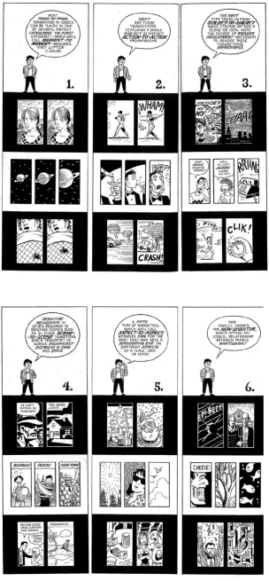
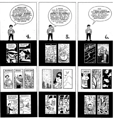
The characteristics and taxonomies of transitions in storytelling vary across domains. In comics, McCloud (1994, 2006) proposes taxonomy of transition types from one panel to another. His taxonomy consists of six types of
tran-sition: (1) Moment-to-moment: ‘a single action portrayed in a series of
mo-ments’. (2) Action-to-action: ‘a single subject (person, object, etc.) in a
series of actions’. (3) Subject-to-subject: ‘a series of changing subjects within a single scene’. (4) Scene-to-scene: ‘transitions across significant distance of
time and/or space’. (5) Aspect-to-aspect: ‘transitions from one aspect of a
represented in McCloud (1994).
This taxonomy of transitions is an important theory in storytellig in comics for a number of reasons. It provides a detailed explanation and analysis of the process of constructing and telling a story in a visual medium through the use of a combination of pictures and words. It can be argued that commu-nicating data stories through information visualization consists of that same combination of pictures (the visual representation) and words (such as anno-tations, labels and oral narration). However, information visualization has one more important component that influences the story development: it is highly an interactive medium. Despite this fact, it can be argued that McCloud’s (1994) taxonomy of transition types is still valid and applicable to storytelling through information visualization as this interactivity still occurs in a sequen-tial manner, with one action at a time leading to the next event or panel. This is agrees with McCloud’s (1994, 2006) definition of comics stories as a sequential art form. In addition, storytelling in general and comics in partic-ular entail the selection of key appropriate images/panels, organising them in a specific period of time or number of words, pages, panels, or shots to make a coherent and meaningful story/narrative. All these strategies can also be easily related and applied to data stories told with information visualization.
2.4
Communication Modes and Story
Delivery
Some may argue that the data stories are created and structured in peoples’ minds and not in the visualization design itself, as the latter only supports them in constructing this mental model. A similar point has been raised by Kosara (2010) where he suggests that ‘stories don’t tell themselves’, and that visualization only sets a background or context, but that stories are told by people, including the users of the data.
Chen (2006) explains that different users may create different mental mod-els even when using the same system. Hullman et al. (2011) also explain that small changes in representing information visualization may provide different results or insights. In the same way, it can be argued that different storytelling strategies with information visualization may result in differences in the way people perceive, understand, and construct narratives from them. There are various factors that can be examined, and one of them is the story delivery model, which will be addressed in the experiments reported in Chapter 3.
the recipients.
Speech and writing are two communication modes that can be used in ed-ucation, in telling stories and in communicating many other forms of content (Schallert et al. 1977). Although some well-crafted information visualization studies have assessed differences in various techniques or features in user tasks such as the use of animation and animated transitions (for example, Heer & Robertson (2007)), no studies have been found that examine differences between communication modes. For example, there is little or no study on the relationship between writing and speech or between direct narrative by a speaker and interactive exploration of the data. The differences between written and spoken communication can be thought of in relation to different communication modes of data stories through information visualization. One of the main differences between the nature of speech and that of writing is that speech has some prosodic features that are missing in writing, such as rhythm and stress. The lack of this information in writing requires the reader to have enough skills to interpret the writer’s message (Schallert et al. 1977). It can be argued that, in the same way, watching a speaker who is using information visualization to tell a story (closer to speech mode) differs from interactive exploration of the data (closer to writing mode). Although both use infor-mation visualization to help deliver a data story, each of them has their own characteristics, advantages, disadvantages and effect on comprehension.
extent to which this technique is used varies from extensively narrated events to restricted narration, where the events in the story just unfold without di-rect narration. An interesting critique of the voice-over narration technique is that it replicates what the visual narrative already shows (Henderson 1983). Hence, it is suggested that this technique should be used to convey something different, and in some cases to highlight or emphasise some information (Hen-derson 1983). A similar delivery model to the voice-over narration technique in information visualization is employed when a speaker uses information visu-alization to tell a story. An example of this model of delivery is Rosling’s talks on various issues in global health and economics using an animated bubble chart (Rosling 2009, 2008). It is difficult to avoid narrating what is shown in the visualization in such talks, but it should provide something different and add depth to the data stories and insights already shown in the visualization. Another consideration relevant to this story delivery technique is the effect of the personal and subjective interpretation and/or recommendations provided by the narrator on the viewers’ engagement in the story, and on their accep-tance of its message (Pramaggiore & Wallis 2011).
The lack of empirical evidence as to what effect an authored narration has on the interpretation of data-rich visualization was the motivation for the work carried out as part of this research. In the experiments reported in Chap-ter 3, the effect of the story delivery and narration model on the narratives constructed by audiences will be explored.
2.5
Summary, Emerging Issues, and Need for
Empirical Research
Table 2.1 summarises the differences between traditional storytelling and sto-rytelling with information visualization.
Table 2.1: A summary of the differences between traditional storytelling and data storytelling using information visualization.
Traditional Storytelling Data Storytelling using Information Visualization
In classic narratives, it is possible to have science fiction, fantasy, and/or things that are apparently removed from real life.
Data visualization is used to explore real things, facts, or data.
In classic narratives, there is usually a
pro-tagonist. Therefore, a classic narrative
structure such as Freytag’s (1863) 5-act structure that relates to the journey of a single protagonist in the narrative can be followed more easily. This does not inter-fere with the possible existence of many other characters, but the main focus is on this protagonist.
Data storytelling using information visu-alization usually lacks an obvious protag-onist and extends beyond only one pro-tagonist, topic, or storyline. Hence, more recent structures such as Duarte’s (2010) contour of communication, which allows many turning points (i.e. not just those marking the separation between the be-ginning, middle, and end), could be more suitable to the nature of this form of sto-rytelling.
Stories usually follow a strictly authored ordering of events, and mostly the audi-ence cannot change the order of the nar-ratives in the story.
In addition to the author-driven approach to storytelling, a more reader-driven ap-proach, which allows for free interactivity with the presentation (Segel & Heer 2010) is also possible and common. The inter-action between the audience/user and the story may imply changes in the story path and therefore, may also change the overall outcome of the story.
In traditional storytelling, there are sets of conventions, theories, and devices that can be used to enhance the storytelling experience. These are well known and well understood by people who consume these stories.
Because storytelling using information vi-sualization is relatively new, there is a dif-ferent set of conventions. Scholars in this domain are still exploring new ones.
com-pare different approaches of storytelling with information visualization. The lack of these studies was the motivation for conducting empirical experiments comparing two different models of story delivery; the first is a direct narrative by a speaker using information visualization software, and the second is inter-active exploration of a dataset using information visualization software. These experiments focus on comprehension/understanding rather than usability and metrics such as error and time commonly used in information visualization evaluation studies. The experiments conducted, as well as their procedures and contributing factors are detailed in Chapter 3.
of transitions within this dataset. Subsequently, it will explore the patterns of the use of these transitions within the chosen case studies. The details of the work done in this part are presented in Chapter 4.
Chapter 3
Research Methods I:
Information Visualization
Delivery
to address the research question is expected to outweigh the advantages and disadvantages of each and provide richer explanations of some findings. More details are provided in the subsequent sections.
3.1
Research Strategy and Questions
The primary aim of this research is to gain insight into the area of narrative visualization, to understand and characterise some of its aspects, and to con-duct some empirical work to fill in the gaps and expand the work in this area. It starts with a general question as to how different models of information visualization delivery differ and impact on narrative construction and devel-opment (Objective 2). More specifically, this research compares the effects of two different information visualization delivery models on people-constructed narratives:
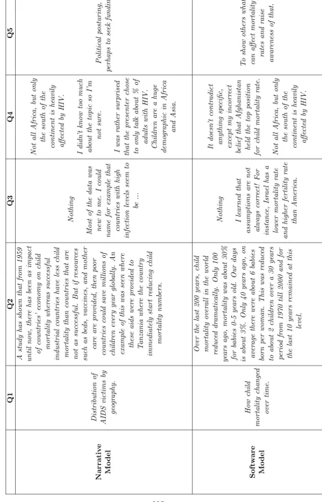
1. Narrative model: Direct narratives by a speaker using information visu-alization software to tell a data story to the audiences.
2. Software model: Lets the users explore the data interactively using the visualization software to construct data stories.
presented in the visualization. The following questions have been identified:
1. To what extent does the information visualization delivery model af-fect reporting/spotting outlier insights in the constructed narratives?
2. To what extent does the information visualization delivery model af-fect the depth of the constructed narratives?
3. To what extent does the information visualization delivery model im-pact the level of curiosity about the data story?
4. To what extent does the information visualization delivery model impact the level of difficulty of constructing narratives or telling a data story?
close-ended questions/tasks are not appropriate. Open-ended questioning as a data collection method will be important in the experiments. The questions to be used will be further detailed in section 3.2.2, but the important thing to note here is that using an open-ended questionnaire, which will obviously generate qualitative data, does not interfere with the ability to statistically describing the magnitude of the expected effects of the delivery models. This can be achieved by first performing a qualitative thematic content analysis on the data in order to categorise the data, and a quantification of occur-rences of these categories will then be used to measure the size of the effect using estimation techniques (Guest et al. 2011, Cumming 2014). The mixed methods approach to dealing with and analysing the data generated from the experiments, with both quantitative and qualitative results, will provide an opportunity for an in-depth analysis of the user response. Thomas (2003) and Creswell (2009) argue that in a complex, modernised sociological environment, mixed-method research provides academics with a best-fit model for capturing multiple, interrelated streams of data.
3.2
The Experiments
en-able discussion of the effect of the dataset used in each set of experiments. Due to the nature of the within-subject experimental design, whereby each participant is exposed to both delivery models, the dataset should be different in each model. While this may limit our ability to judge the effect of the models themselves, we should be able to compare the effects of the dataset and its underlying data story on the participants’ constructed narratives by combining the results of this round of experiments with those of the between-subjects tests. In this regard, it is possible to use the same dataset for both delivery models, as each participant is exposed to one model.
Both sets of experiments examined the effect of the two delivery models: the narrative model and the software model. The same open-ended high-level questions were used to explore the differences in the users constructed narratives from these two models. Hence, the technique for the analysis of qualitative data used in both rounds was also the same; however, of course, the statistical techniques and measures appropriate for each experimental de-sign were used. Due to the overlap between the two sets of experiments, those identical elements such as the experimental factors were summarised in one sub-section for both rounds. As the main difference between the two sets is the experimental procedure, these were described in two separate subsec-tions, one for each round of experiments. The following sub-sections are as follows: Sub-section 3.2.1 describes the experimental factors, and sub-section 3.2.2 describes the questionnaire used. Finally, sub-section 3.2.3 details the experiment procedure for each set separately.
3.2.1
Experimental Factors
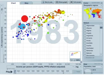
Figure 3.1: A screenshot of the interface of Gapminder World software.
The information visualization used to explore the difference between the effect of the two delivery models and to answer the questions above is
Gap-minder World software (Gapminder n.d.). This is an animated bubble chart
with x- and y-axes that allow user-selected variables to be compared, and the bubbles represent countries. These bubbles are coloured by continent, and an animation and/or timeline slider can be used to show how the bubbles move over time (Figure 3.1 shows a screenshot of the interface of Gapminder World software). Within this context, the two delivery models of information visual-ization, the narrative and software models, were examined.
income-per-person in USD, and y-axis is the percentage of adults infected by HIV (Rosling 2009). For the second set of experiments, between-subject, the video chosen concerns child mortality. The x-axis is the income-per-person in USD, and the y-axis is the child mortality rate (Rosling 2008).
For the software model, Gapminder World software was used (Gapminder
n.d.). Using Gapminder, the participants interactively explored a dataset
on child mortality (y-axis) and fertility rate (x-axis) in the within-subject experiments, and a dataset on child mortality (y-axis) and income-per-person in USD (x-axis) in the between-subject experiments.
3.2.2
Open-Ended Questionnaire and Subjective
Feedback Questions
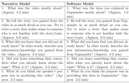
In both sets of experiments, participants were required to answer five ques-tions after watching a video (narrative model) and/or equivalent quesques-tions after exploring data on Gapminder (software model). For each question, an estimation of the time required to answer the question was given. This helped control the overall experiment time and assisted participants in estimating the amount of emphasis and focus needed for each question.
were discovered (North 2006, North et al. 2011). An open-ended question was asked to trigger the re-telling of a story. Re-telling is a widely used task in education to assess comprehension (Fulkerson et al. 2009). The five open-ended questions on each delivery model are shown in Table 3.1. As can be seen from the table, both sets of questions (those on the narrative model and those on the software model) had exactly the same layout and approximate time needed for each question. The only difference was the precise wording of the questions. This was changed slightly to refer to the correspondence model.
[image:57.595.129.574.425.712.2]At the end of the experiment (in both sets), participants were asked to an-swer two five-point Likert-scale questions on each model. These Likert-scale questions are shown in Table 3.2. The answers ranged from ‘easy’ to ‘diffi-cult’ for the first question and from ‘not at all’ to ‘very curious’ for the second.
Table 3.1: Questions used for each delivery model in both sets of experiments
Narrative Model Software Model
1. What was the video mostly about?
(Approx. 1-2 min)
1. What was the data you explored in
Gapminder mostly about? (Approx. 1-2 min)
2. Re-tell the story you gained from the video in as much detail as you can. Try to write a story that makes sense to someone who is not familiar with the story/topic. (Approx. 6-8 min)
2. Re-tell the story you gained from Gap-minder in as much detail as you can. Try to write a story that makes sense to someone who is not familiar with the story/topic. (Approx. 6-8 min)
3. What did you learn that you did not al-ready know? In other words, describe new information/knowledge you gained from the video. (Approx. 2-3 min)
3. What did you learn that you did not al-ready know? In other words, describe the new information/knowledge you gained from Gapminder? (Approx. 2-3 min) 4. Did you learn something that
contra-dicts what you already know about the topic? What is it? (Approx. 2-3 min)
4. Did you learn something that contra-dicts what you already know about the topic? What is it? (Approx. 2-3 min) 5. What do you think the speaker’s
pur-pose was in producing this video? (Ap-prox. 2-3 min)
5. What do you think the purpose was in providing this data in Gapminder? (Ap-prox. 2-3 min)
Table 3.2: The Likert-scale questions on each delivery model in both sets of experiments
Narrative Model Software Model
1. How easy or difficult did you find telling a story after watching the video?
1. How easy or difficult did you find telling a story after exploring the data in Gap-minder?
2. How curious were you about the
data/story in the video?
2. How curious were you about the
data/story in Gapminder?
3.2.3
Participants and Experiments Procedures
3.2.3.1 Within-Subject Experiment
Thirteen students (9 females and 4 males) from a local university were re-cruited. The age of the participants ranged from 23 to 48. Three main selec-tion criteria were identified: participants had not taken any data visualizaselec-tion course/module, they did not have advanced knowledge in information visu-alization, and they were not professional data analysts. In other words, this part of the research was aimed at educated but non-expert information visu-alization users. Participants came from varied academic backgrounds where some wanted to take a data visualization course but had not yet started one, and the others came from courses where data visualization was not covered. As it is difficult to recruit subjects from the general public, students who were likely to be motivated about the scope of the study but also did not have advanced knowledge about the topic have been chosen. The entire experiment was carried out in a single session for each participant. The total participation time for a single participant was about an hour.
Participants were allowed to take notes while watching the video or explor-ing Gapminder if they wished, and they were given notepaper for this purpose. Group I watched a ten-minute video of Hans Rosling presenting data on the global HIV epidemic using an animated bubble chart (Rosling 2009). Then they answered Part I of the questionnaire, which included the five open-ended questions about the video (narrative model). Next, they were briefed about Gapminder and they interactively explored some data for 10 minutes. The dataset the participants explored using Gapminder in this set of experiments was about child mortality and fertility rates. Participants were asked not to change the indicators (x- and y-axes) when exploring the data in order to con-trol the number of indicators they had to work with in both delivery models. After exploring the data, they answered Part II of the questionnaire, which included the five open-ended questions on the data they explored in Gapmin-der (see Table 3.1). Finally, after finishing the experiment, they were asked to answer the four Likert-scale questions (two on each delivery model) shown in Table 3.2.
3.2.3.2 Between-Subject Experiment
Group I watched a ten-minute video of Hans Rosling presenting data on child mortality using an animated bubble chart (Rosling 2008). Then they answered the five open-ended questions on the video (narrative model) shown in Table 3.2. After the experiment, they were asked to answer the two Likert-scale questions on the narrative model shown in Table 3.2 and to comment on the overall experiment.
Group II were briefed about Gapminder and interactively explored a dataset on child mortality (software model), which was the same dataset used in the video in the first delivery model. Participants were asked not to change the indicators (x and y-axes) when exploring the data in order to control the num-ber of indicators the participants had to work with in both groups/delivery models. Then they answered the five open-ended questions on the software model shown in Table 3.1. After the experiment, they were asked to answer the two Likert-scale questions on the software model shown in Table 3.2 and to comment on the overall experiment.
Chapter 4
Research Methods II:
Transitions in Narrative
Visualization
This chapter describes the process of refining the taxonomy of panel-to-panel transitions in comics (McCloud 1994, 2006) and applying the refined frame-work on the VAST Challenge videos. It mainly relates to Objective 3 and
Objective 4 of the study: 3. To propose and develop a framework of
4.1
An Overview of the Research Strategy and
Data-Stories Selection
As stated above, the research in hand aims to explore and model transition types used in telling data stories with information visualization. A dataset of a number of data-driven stories is needed to address this objective, and to explore and analyse the transitions in the stories. This dataset should be suit-able for the comparison and modelling of transition types. To accomplish this, a systematic review of the VAST Challenge videos dataset has been conducted.
The proposed framework for characterising transitions in data stories in the VAST Challenge videos dataset was inspired by McCloud’s (1994, 2006) taxon-omy discussed in section 2.3 in the literature review chapter above, and shown in Figure 2.4. This taxonomy consists of six types of transitions: Moment-to-moment, Action-to-action, Subject-to-subject, Scene-to-scene, Aspect-to-aspect, and Non-Sequitur.
4.2
Coding and Representing Transitions in
VAST Challenge Videos
4.2.1
Coding Transitions
Before adopting the categories in McCloud’s (1994, 2006) taxonomy and ap-plying them to the VAST Challenge videos, this model should be refined and each type of transition should be defined in the context of data visualization. The coding steps are first summarised in this sub-section, and the categories of components and transitions proposed are summarised in the next sub-section (sub-section 4.2.2).
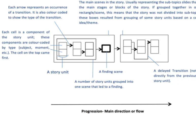
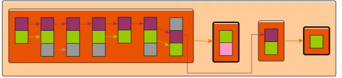
and story development/construction using mainly these annotated transcripts. This allowed us only to refer to the videos when more details were needed, or when we needed to revise or check a point. The semantics revealed by the oral narration that accompanies each video represent the progression of the data story in this type of narrative visualization (i.e., video presentations). The next step was to work through each video transcript and to identify the com-ponents of the transition types by colour coding them. As we went through each transcript, we segmented the story into smaller units. Each story unit contains a piece of information. A story unit is usually represented by one or more sentences, depending on the completion of the meaning that accompa-nies or follows a visual. In some cases, a sentence might be segmented into more than a single story unit. The story unit may also contain one or more transition components. Next, the transition type(s) between the story units and/or the groups of story units is identified based on which of the components has been changed or held constant. Finally, each story is visually represented by a transition diagram. The framework used in coding transition types and their components in the context of information visualization is detailed in the next sub-section; however, before moving to the framework and applying it to the VAST Challenge videos, several issues/details should be taken into ac-count and covered in this sub-section. These issues relate to the nature and characteristics of storytelling in general, as well as to specific types of narra-tive visualization such as video presentations. These are also important when transferring/translating the taxonomy and its main blocks/definitions from comics to data visualization and in visually representing each story by a tran-sition diagram.
what is considered aStory Unit and the identification of boundaries between different story units. In some domains, identifying story units is very straight-forward. In the comics domain, by which the proposed framework is isnpired, and on which it is built, each individual panel is considered a story unit. Each panel consists of components that represent part of the categories/types of the transition between panels. For example, a panel showing asubject or character who does something (i.e.,action), and shown from a specific angle or specific part of the room/place (i.e., aspect). The transition between this panel and the next depends on the changed component(s) in the next panel, and the transition is based on this change. For instance, if the character (subject) is changed, it will be a subject-to-subject transition, while if the same character is there but now doing something else (i.e., a different action), it will be an action-to-action transition. To be able to apply the same process/concept, some guidelines of what constitute a story unit when coding a VAST Chal-lenge video are needed.
production technologies and do not usually consist of many shots. Story units and the boundaries between them cannot be automatically detected using these algorithms. In addition, the main focus of this part of the research is to look at the progression of these stories depending on the meaning and pieces of information they delivered, as this is what contributes to the grad-ual/cumulative building of data stories. Hence, the task of segmenting a story into smaller units is a bit more challenging. A review of the literature reveals that people are quite consistent in segmenting goal-driven, everyday activi-ties/events, even with little instructions (Hard et al. 2011). The literature also shows that ‘breakpoints’ that mark boundaries between each segment, unit, or task are distinctive (Hard et al. 2011). Hence, relative flexibility in judging or identifying story units is important and should not negatively affect the consistency of segmentation.
Another important point to take into account when coding and visually representing transition in each video is narrative hierarchy or what we can call
are listed under each sub-topic.
Furthermore, it is not usually true that only one type of transition occurs at a time, especially in the case of narrative visualization. Multiple Transi-tions may occur between two story units. For example, if a story unit consists of a subject (a data point/variable), an action done on this subject (e.g. filter-ing or calculatfilter-ing somethfilter-ing), and an aspect (a visual representation to look at this subject, e.g. a timeline or bar chart), and in the next story unit another subject is addressed and a different action is performed. In this case, we have two types of transitions between these two story units, a Subject-to-Subject and Action-to-Action transition. Finally, the transitions between story units do not only occur between juxtaposed/subsequent story units. In some cases
we can seeDelayed Transitions.