City, University of London Institutional Repository
Citation:
Slingsby, A. ORCID: 0000-0003-3941-553X (2018). Tilemaps for Summarising
Multivariate Geographical Variation. Paper presented at the VIS 2018, 21-26 Oct 2018,
Berlin, Germany.
This is the accepted version of the paper.
This version of the publication may differ from the final published
version.
Permanent repository link:
http://openaccess.city.ac.uk/20884/
Link to published version:
Copyright and reuse: City Research Online aims to make research
outputs of City, University of London available to a wider audience.
Copyright and Moral Rights remain with the author(s) and/or copyright
holders. URLs from City Research Online may be freely distributed and
linked to.
City Research Online:
http://openaccess.city.ac.uk/
[email protected]
Tilemaps for Summarising Multivariate Geographical Variation
Aidan Slingsby∗
City, University of London
ABSTRACT
We discuss the ‘tilemap’ design space which encompasses ap-proaches that use regular arrays of glyphs to depict geographical variation in multivariate data. We particularly focus on the poten-tial for tilemaps to depict geographical variation in rich summary statistics of distributions, separating data out by category, showing associations between variables and studying multivariate outputs of geographically-weighted statistics. We consider the parameters of the design space, some design considerations, examples of its use and how it compares to other approaches. The tilemap design space is intended to help and encourage the use of rich geographical summaries of data where there are multiple variables, particularly for their comparison by location.
Index Terms: Human-centered computing—Visualization—Visu-alization techniques—Treemaps; Human-centered computing— Visualization—Visualization design and evaluation methods
1 INTRODUCTION
There are various approaches to depicting geographical variation in multivariate data. Our contribution is to conceptualise a design space – ‘tilemaps’ – which encompasses approaches that use regular arrays of glyphs to depict geographical variation in multivariate data, such as the examples in Fig. 1. We consider the parameters of this design space, some design considerations, examples of its use, and how it compared to other approaches.
Although we consider multivariate data in general, we are partic-ularly interested in their use where the multivariate data summarise
distributions of data within geographical aggregations. A univariate choropleth map indicating the percentage of people in employment may have regions coloured by the weighed average of the employ-ment average for each region. In a tilemap, instead of a simple mean, a rich graphical set oflocalsummary graphics (e.g. box plots or violin plots) is arranged geographically to show how the distri-butionsof data vary geographically. We are also interested in the potential of tilemaps to depict fuzzy membership (e.g. for population categories [18]; Fig. 3) and outputs of multivariate geographically-weighted statistics [2] .
The tilemap design space is intended to make it easier to design richer summaries of geographically-varying data and to illustrate and encourage its use.
2 RELATED WORK
There are many approaches to depicting geographical variation in multivariate data.
2.1 Multivariate maps
Choropleth maps and heatmaps are usually univariate. In choropleth maps,existing geographical regionsare coloured according to rep-resentative single variable values, whereas heatmaps use finegrid cells. It is quite common to adapt both to make them more multi-variate, by using combinations of visual variables including colour
[image:2.612.316.559.139.395.2]∗e-mail: [email protected]
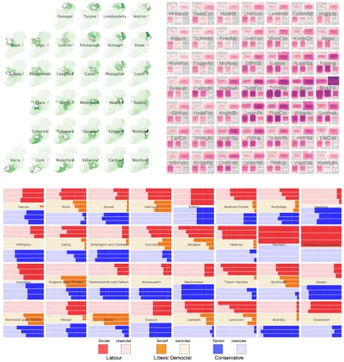
Figure 1: TilemapsTop left: Small multiple maps (non-contiguous tilemap) of migration destination maps, geographically ordered by origin. Source: [14]Top right: Contiguous tilemap of traffic in Lon-don by vehicle type, day of week and hour of day, in 1km2 grid
squares. Source: [20] (excerpt). Bottom:Small multiple barcharts (non-contiguous tilemap) of voting results, geographically ordered by London borough. Source: [26]
lightness, hue, bivariate colour schemes, saturation, transparency and texture. However interference between these visual variables limits the number that can be used simultaneously.
Maps can also have multivariatesymbolsincluding charts and glyphs (section 2.5) at particular locations. These encode data relat-ing to that location usrelat-ing various visual variables to depict multiple data variables. A limitation of these is that where multiple locations are too close, they may overlap, and this may limit legibility [4]. Distortion can by used, either by distorting the coordinate systems (density-normalising cartogram algorithms can spread points more evenly, distorting angles and distances whilst facilitating broad spa-tial comparisons [8]; Fig. 6) or locations can be moved (e.g. by spring-embedded layout algorithms [11]) to reduce overlap.
The most common way to depict multiple geographical variables is to juxtapose multiple maps as small-multiple [22] maps. This is very effective at showing geographical variation for each variable, but it is more difficult to relate all the variables to one location. This is something that tilemaps can facilitate.
2.2 Embedded and hierarchical approaches
non-cartography layouts. Small multiples can be considered as tables with embedded graphics, each depicting a different variable. Pixel barcharts encode details of the aggregated elements that make up the bars using colour [13]. Treemaps [12] and mosiac plots [6] are hier-archical approaches that can be effective for exploring multivariate data when used with “false hierarchies” [17].
Geographically-arranged small multiples ordered in two-dimensions are a good basis for geographical comparisons – e.g. “matrix-map2” [10]. Similar geographical ordering has been used in
treemaps [27] and is the basis for grid maps (section 2.3).
In addition, graphics can be embedded in more conventional geographical representations; for example, timeseries data can be embedded into roads on maps to give temporal information about vehicles that move along that stretch of road (e.g. [21]).
2.3 Gridmaps
Gridmaps (also called ‘tilemaps’ in [9]) owe much to spatially-ordered small multiples. They are two-dimensional arrays of grid cells laid out in partial geographical layout – where each tile rep-resents a discrete geographical region. Each grid cell reprep-resents a discrete geographical region and various characteristics of each region can be visually encoded into each tile. There are many pa-pers that focus on layout algorithms [5, 15] and the introduction of gaps [15] can help make layouts closer to that of the original geography.
OD maps [28] are examples of embedded grid maps (Fig. 1).
2.4 Distortion
Various types of distortions are used in cartograms to improve read-ability and reduce clutter. In continuous distortion, coordinates are continuously deformed away from the original geographical coordi-nate system. This affine transformation produces an output where adjacencies are preserved. This may be based on the data (e.g. area-normalising cartograms that transform the size of geographic areas according to some data value [8]) or through user-interaction such as with a fish-eye lens [7]. Non-contiguous distortion is where the positions of elements are independently adjusted to avoid or reduce visual occlusion and the rectangular [23] and Dorling [3] cartograms are examples of these, along with geographically-arranged small-multiples and grid maps. The tilemap design space includes some that use non-contiguous distortions of space.
2.5 Glyphs
Glyphs are complex visual encodings that use multiple marks and visual variables to convey multivariate data [25]. Often, they refer to specialist customised icons such as weather observation symbols, but in fact, many statistical graphics such as box plots, sparklines and barcharts can be considered as glyphs. One of the uses of glyphs is to represent multivariate summaries of data. For example a boxplot represents multiple summary statistics of a set of data and a piechart can represent the relative proportions of categories that exist in data. It is common to juxtapose them to compare summary statistics, distributions and multivariate characteristics of multiple samples of data.
3 ‘TILEMAP’ DESIGNSPACE
We describe a design space for ‘tilemaps’. This design space en-compasses graphics where a set of tessellating ‘tiles’ represent a set of geographical locations or regions, where each tile is of the same shape and size (we use squares, but they could be other symmetrical tessellating shapes). Each tile contains a glyph that represents data relating to the geographical location or region that the tile represents. Gridmaps and geographically-arranged small-multiples fit into this design space. As well as these non-contiguous (partially-geographical) layouts, the design space also includes those that contiguously grid space where each tile represents the geographical
region indicated by the tile in the same geographical coordinate system. Thus, the set of tiles can either be:
• Non-contiguous: The tiles represent already-defined regions (e.g. countries) where each tile represents one region (e.g. ‘Germany’), in a partial geographical layout, which may con-tain gaps to improve the layout [15]. Gridmaps and spatially-ordered small-multiples, treemaps and some OD maps fall into this category. Examples of non-contiguous tilemaps are in Fig. 1, (top left and bottom).
• Contiguous: The tiles represent a gridded set of locations that result from the exhaustive gridding of a geographical space based on the original map projection where each tile represents an equally-sized and -shaped area, as indicated on the base map. Raster maps produce the discretisation used by this category of tilemap. Changing the size of the tiles would result in a new gridding.
Both type of maps contain tiles that are aligned into rows and columns. This ensures there is no occlusion between tiles and – depending on the design of glyph (section 3.2) – this alignment will facilitate comparison of neighbouring glyphs.
Fig. 1 (top left) is a non-contiguous tilemap based on an OD map [28]. Each tile represents a (historical, pre-independent) Irish county from which there is internal migration. A choropleth map of destinations is the ‘glyph’ that shows the spatial distribution of destinations from the original square. The darker colours around the origin county in the glyph indicates that migration is mainly local. The other non-contiguous is in Fig. 1 (bottom) where tiles represent London boroughs and local election results are indicated for the three candidates for each party in each borough. The ‘glyph’ is a barchart which indicates the number of votes per candidate where candidates within each party are ordered by the order they appear on the ballot paper. There does not seem to be strong geographical pattern here, but order on the ballot paper does seem to have an effect on the number of votes.
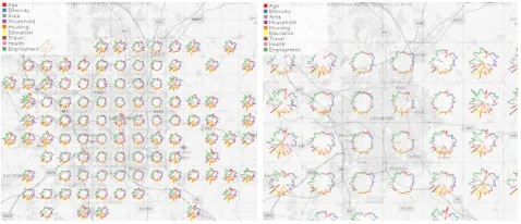
Now, we consider contiguous tilemaps. Fig. 1 (top right) is contiguous tilemap that is based on a 1km gridding of London. The ‘glyph’ inside each tile indicates the temporal patterns of five vehicles types in each tile. Unlike the maps above, tiles represented equally-sized and adjacent grid squares of Central London. Fig. 2 is a contiguous tilemap which depicts variable values for the demographic variables that relate to the population that lies within the tiles. It shows how the mix of population demographics varies over space. Fig. 4 shows bird occupancy as places, but does this on a hourly and monthly basis.
Fig. 3 is another contiguous tilemap, but it shows rich statistical summaries, not seen in the other examples. It shows the relative (width) and absolute (height) fuzzy membership of the population within the grid square to seven geodemographic categories (a clas-sification of small geographical areas based on the characteristics of the people that live there [24]) within these grid squares. The standard way of characterising geodemographics is to use the most likely membership, but this example shows how tilemaps can help produce summaries that go beyond this.
We now identity and discuss the characteristics and issues that need to be considered when working with tilemaps.
3.1 Layout
Tilemaps are designed for geographical comparison and so consider-ation of the layout is important.
Figure 2: Contiguous tilemap of demographic data. Multivariate glyphs that depict multiple demographic variables of different types (hue) of the population that lies within the tile. Variables are shown as deviation from the median, where a circular glyphs would indicate all variables are their median values.
Figure 3: Contiguous tilemap of geodemographic data. Glyphs depict the relative (width) and absolute (height) similarity of the population contained within the tile to each of seven geodemographic categories (Output Area Classification [24].
of the glyph and reducing the number of tiles. In the latter case for contiguous tilemaps, this can be achieved easily and interactively. In the non-continguous tilemap case where there are existing spatial units to honour, this may not be possible. However, if there are enough spatial units, it can very easily be converted to a contiguous tilemap – this is the case for Figs. 2 and 3. This is the preferred approach where there are hundreds or thousands of spatial units, as is often the case for large-scale census geography.
MAUP.For contiguous tilemaps, the discretisation is usually based on a fairly arbitrary imposition of a grid. This means that tiles are subject to the Modifiable Areal Unit Problem (MAUP) [16] in which tile-based summaries are dependent on the arbitrary imposition of a grid, potentially introducing visual artifacts. One way to explore the effects of this is to have an interactive environment where the grid can be interactively panned and have its size changed. Observed differences in the tile summaries as this happens will indicate the sensitivity of the tilemap to the imposition of a grid. A way to reduce the effect of MAUP would be to use a distance-decay kernel that is larger than the tiles. The reducing smoothing may reduce spatial precision, but it would likely make the tile summaries
night time in the last few month of the year day time in the last few
month of the year
flying on a winter's night (low occupany)
night time in winter day time all year
night time in winter, all day in summer
[image:4.612.319.558.243.346.2]day time with effect of increasing/decreasing length of day apparent
Figure 4: Contiguous tilemap where glyphs indicate the presence of an animal by hour (x-axis) and by month (y-axis) Source: [19]
Figure 5: Interactive resizing of tiles in a contiguous tilemaps showing the tradeoff between spatial precision and legibility of glyph.
more robust, reducing the effect of MAUP.
Scale. In addition to concerns about the impact of the size of tile on glyph legibility, the scale at which data are discretised into tiles has implications of the scale of variation in the data depicted. For non-contiguous tilemaps, often the scale is fixed and there is no desire to try re-aggregating the data at different scales. For contiguous tilemaps, interactive techniques such as those mentioned above help explore the geographical scale of data.
Partial geographical layout. For non-contiguous tilemaps the difference between the original geographical layout and the tilemap layout will affect the ease with which geographical inferences can be made in a non-linear way. Meulemanset al.[15] have devel-oped metrics to help quantify this and there are a variety of layout algorithms. Although discrete regions already exist, there may be reasons to combine and split regions to improve the layout.
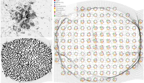
[image:4.612.54.296.277.449.2]Figure 6:Left top:Geographical distribution of samples.Left bottom:
Density-normalised of above using a Gastner Cartogram algorithm.
Right:Contiguous tilemap of samples using the cartogram projection with a distortion grid.
3.2 Glyph design
Shape and size of glyph. A wide range of glyph designs are pos-sible. The most obvious physical design constraints are the shape of the tiles and the size. Parallel coordinates tend to be much wider than they are tall, so may not be appropriate for square tile. We used a circular version in Fig. 2.
Number of variables.The number of variables that can be de-picted depends on the glyph design and its screen size. In Fig. 3 there are 14 values for each tile. If there many more geodemographic categories, one might consider making the tiles bigger or aggregat-ing the geodemographic categories into a smaller set. Glyphs that are too complex will be illegible if the screen-space of the tiles is too small.
Easily comparable.Since glyphs can be small, it helps if they have a consistent layout. In Fig. 1 (top right), the vehicles types occupy the same corner of the cell in all cells. When glancing across multiple tiles, positional memory as to which part of the glyph corresponds to which variable will make reading the graphic easier.
Comparison in rows and columns.Tiles will usually be com-pared across rows, columns and (perhaps even) diagonally, so it might be worth designing symmetrical glyphs to that comparison in all directions is effective.
3.3 Possibilities, advantages and disadvantages As mentioned, tilemaps are suitable for depicting geographical vari-ation on multivariate data, but we want focus on demonstrating possibilities for the depiction of rich summaries of geographically-varying data that might not otherwise be depicted.
Distributions.Each tile represents a summary of a geographical region. Although set of univariate maps can depict multiple sum-mary statistics in separate juxtaposed maps – e.g. 25thpercentile, median and 75th– box plots within tiles would allow the place the information about the whole distribution at the same geographical location rather than being spread across different maps. This is done at the expense of geographical precision, because tiles need to be large enough to accommodate the glyph.
Reporting by category.Tilemaps also open up the possibility to separate data out by categorical variable. Using a representation such – as that in Fig. 3 – enables geographical variations in both relative (width) and absolute (heights) amounts of seven categories to be shown. Again, there is a tradeoff between geographical precision and the number of categories to be shown, where tiles can be enlarged or categories aggregated into a small set, or even some categories omitted altogether. The other way of achieving this is with small multiple maps which is more appropriate in some case.
Associations between variables. Tiles can also accommodate more complex glyphs such as scatterplots for depicting the asso-ciation between a pair of variables and correlation matrices for indicating the degree of pairwise correlations between a set of vari-ables.
Geographically-weighted statistics.Geographically-weighted versions of statistics [2] use a distance-weighted kernel to produce lo-cal versions of statistics. Some of these statistics generate multivari-ate data for which is helpful to compare by location. Tilemaps may be a good means to do this. For example, in multiple geographically-weighted regression, the coefficients of the independent variables vary geographically. Beechamet al[1] tried to understand reasons behind why people voted the way they did in the UK’s EU referen-dum by considering how these coefficients varied with respect to each other and geographically. There is potential for tilemaps to assist with this.
Suitability. Tilemaps are not always appropriate. One of their characteristics is that glyphs visually break up geographical conti-nuity, so they are more suited where multivariate data need to be gathered into one map location, such as with the summary statistics above. This works well in Fig. 4, but in Fig. 1 (top right), the vehicle types break up the temporal patterns. In this case, it might be more effective to have a small multiple tilemap for each vehicle type [20]. For tasks that compare the geographical distribution of vehicles at one time, a heatmap would be more effective than a tilemap.
4 CONCLUSION
Tilemaps can help depict how multivariate data vary geographically. They do this by representing geographical space as a regular array of tiles, each tile representing a geographical unit and each tiles containing a multivariate glyph that summarises multivariate aspect of the geographical units it represents. Tilemaps can use existing geographical units of space in a partial geographical layout (non-contiguous tilemaps) or they can exhaustively grid space ((non-contiguous tilemaps) to form the tiles. Adjusting the tile size of contiguous tilemaps allows a tradeoff between spatial precision and tiles that are large enough for glyphs to be legible. We particularly focus on the potential for tilemaps for depicting geographical variation in rich summary statistics of distributions, separating data out by category, showing associations between variables and studying multivariate outputs of geographically-weighted statistics. The tilemap design space is intended to help and encourage the use of rich geographical summaries of data where multiple variables need to be compared with each other by location.
Tilemaps have some advantages, but are not suitable in all cases. The main issue is that the glyphs break up the geographical conti-nuity of variable values so if can be hard to perform tasks in which understanding the geographical variation for one variable is im-portant. In these cases, one would use a choropleth map or small multiples of multiple maps or tilemaps. Depending on the glyph design, they can also look unfamiliar or be unintuitive.
The tilemap design space is intended to help and encourage the use of rich geographical summaries of data where multiple variables, particularly for their comparison by location.
REFERENCES
[1] R. Beecham, A. Slingsby, and C. Brunsdon. Locally-varying explana-tions behind the united kingdom’s vote to leave the european union. Journal of Spatial Information Science, 2018(16):117–136, 2018. [2] C. Brunsdon, A. Fotheringham, and M. Charlton. Geographically
weighted summary statistics a framework for localised exploratory data
analysis. Computers, Environment and Urban Systems, 26(6):501 –
524, 2002. doi: 10.1016/S0198-9715(01)00009-6
[3] D. Dorling.Area Cartograms: Their Use and Creation, chap. 3.7, pp.
252–260. Wiley-Blackwell, 2011. doi: 10.1002/9780470979587.ch33 [4] G. Ellis and A. Dix. A taxonomy of clutter reduction for
Graphics, 13(6):1216–1223, Nov 2007. doi: 10.1109/TVCG.2007. 70535
[5] D. Eppstein, M. van Kreveld, B. Speckmann, and F. Staals. Improved
grid map layout by point set matching. In2013 IEEE Pacific
Vi-sualization Symposium (PacificVis), pp. 25–32, Feb 2013. doi: 10. 1109/PacificVis.2013.6596124
[6] M. Friendly. Extending mosaic displays: Marginal, conditional, and
partial views of categorical data.Journal of Computational and
Graph-ical Statistics, 8(3):373–395, 1999. doi: 10.1080/10618600.1999. 10474820
[7] E. Gansner, Y. Koren, and S. North. Topological fisheye views for
visu-alizing large graphs. InIEEE Symposium on Information Visualization,
pp. 175–182, Oct 2004. doi: 10.1109/INFVIS.2004.66
[8] M. T. Gastner and M. E. J. Newman. Diffusion-based method for
pro-ducing density-equalizing maps.Proceedings of the National Academy
of Sciences, 101(20):7499–7504, 2004. doi: 10.1073/pnas.0400280101
[9] M. Graham and H. S. A. Generating tile maps.Computer Graphics
Forum, 36(3):435–445. doi: 10.1111/cgf.13200
[10] D. Guo, J. Chen, A. M. MacEachren, and K. Liao. A visualization
system for space-time and multivariate patterns (vis-stamp). IEEE
transactions on visualization and computer graphics, 12(6):1461–1474, 2006.
[11] B. Jenny, D. M. Stephen, I. Muehlenhaus, B. E. Marston, R. Sharma, E. Zhang, and H. Jenny. Force-directed layout of origin-destination
flow maps.International Journal of Geographical Information Science,
31(8):1521–1540, 2017. doi: 10.1080/13658816.2017.1307378 [12] B. Johnson. Treeviz: treemap visualization of hierarchically structured
information. InProceedings of the SIGCHI conference on Human
factors in computing systems, pp. 369–370. ACM, 1992.
[13] D. A. Keim, M. C. Hao, U. Dayal, and M. Hsu. Pixel bar charts: a
visu-alization technique for very large multi-attribute data sets.Information
Visualization, 1(1):20–34, 2002.
[14] M. Kelly, A. Slingsby, J. Dykes, and J. Wood. Historical internal
migration in ireland. InGIS Research UK (GISRUK), 2013.
[15] W. Meulemans, J. Dykes, A. Slingsby, C. Turkay, and J. Wood. Small
multiples with gaps.IEEE Transactions on Visualization and Computer
Graphics, 23(1):381–390, 2017. doi: 10.1109/TVCG.2016.2598542
[16] S. Openshaw.The Modifiable Areal Unit Problem. Geobooks, 1984.
[17] A. Slingsby, J. Dykes, and J. Wood. Configuring hierarchical layouts
to address research questions. IEEE Transactions on Visualization
and Computer Graphics, 15(6):977 – 984, November 2009. doi: 10. 1109/TVCG.2009.128
[18] A. Slingsby, J. Dykes, and J. Wood. Exploring uncertainty in
geode-mographics with interactive graphics.IEEE Transactions on
Visual-ization and Computer Graphics, 17(12):2545–2554, 2011. doi: 10. 1109/TVCG.2011.197
[19] A. Slingsby and E. van Loon. Temporal tile-maps for characterising
the temporal occupancy of places: A seabird case study. In25th
Geographical Information Science (GIS) Research UK Conference, April 2017.
[20] A. Slingsby, J. Wood, and J. Dykes. Treemap cartography for showing
spatial and temporal traffic patterns.Journal of Maps, pp. 135 – 146,
2010. doi: 10.4113/jom.2010.1071
[21] G. Sun, R. Liang, H. Qu, and Y. Wu. Embedding spatio-temporal
information into maps by route-zooming.IEEE Transactions on
Visu-alization and Computer Graphics, 23(5):1506–1519, May 2017. doi: 10.1109/TVCG.2016.2535234
[22] E. R. Tufte.The Visual Display of Quantitative Information. 1983.
[23] M. van Kreveld and B. Speckmann. On rectangular cartograms.
Com-putational Geometry, 37(3):175 – 187, 2007. Special Issue on the 20th European Workshop on Computational Geometry. doi: 10.1016/j. comgeo.2006.06.002
[24] D. Vickers and P. Rees. Creating the uk national statistics 2001 output
area classification.Journal of the Royal Statistical Society: Series A
(Statistics in Society), 170(2):379–403, 2007.
[25] M. O. Ward.Multivariate Data Glyphs: Principles and Practice, pp.
179–198. Springer Berlin Heidelberg, Berlin, Heidelberg, 2008. doi: 10.1007/978-3-540-33037-0 8
[26] J. Wood, D. Badawood, J. Dykes, and A. Slingsby. Ballotmaps:
De-tecting name bias in alphabetically ordered ballot papers.IEEE
Trans-actions on Visualization and Computer Graphics, 17(12):2384–2391, 2011.
[27] J. Wood and J. Dykes. Spatially ordered treemaps.IEEE Transactions
on Visualization and Computer Graphics, 14(6):1348–1355, Nov 2008. doi: 10.1109/TVCG.2008.165
[28] J. Wood, J. Dykes, and A. Slingsby. Visualisation of origins,
destina-tions and flows with od maps.Cartographic Journal, The, 47(2):117 –