P
RAISE FORA
PPLIEDS
ECURITYV
ISUALIZATION“If we subscribe to the sage advice of Confucius, ‘What I hear, I forget. What I see, I remember. What I do, I understand,’ then Raffael Marty’s Applied Security Visualizationwill surely bring us much wisdom. Marty embraces the security visualization discipline with panache, fluid grace, and exquisite detail...a must read for sec vis experts and novices alike.”
—Russ McRee, HolisticInfoSec.org
“Collecting log data is one thing, having relevant information is something else. The art to transform all kind of log data into meaningful security information is the core of this book. Raffy illustrates in a straight forward way, and with hands-on examples, how such a challenge can be mastered. Let’s get inspired.”
—Andreas Wuchner, Novartis
“This book starts with the basics of graphing and visualization and builds upon that with many examples of log analysis, compliance reporting, and communicating security information. I recommend this book for anyone with the task of analyzing volumes of security and compliance data who must then report their findings in a clear and concise manner.”
—Ron Gula, CTO, Tenable Network Security
“Raffael Marty truly shows you the ropes to security visualization from the very basics to complete case studies. The broad range of use-cases and the wealth of hands-on examples throughout the book continuously inspire you to new visualization applica-tions in your domain of competence.”
—Jan P. Monsch, Senior Security Analyst
“Amazingly useful (and fun to read!) book that does justice to this somewhat esoteric subject—and this is coming from a long-time visualization skeptic! What is most impressive, is that this book is actually ‘hands-on-useful,’ not conceptual, with examples usable by readers in their daily jobs. Chapter 8 on insiders is my favorite!”
Raffael Marty
Applied
Security
Visualization
Upper Saddle River, NJ • Boston• Indianapolis • San Francisco New York • Toronto •Montreal • London•Munich • Paris • Madrid
The author and publisher have taken care in the preparation of this book, but make no expressed or implied warranty of any kind and assume no responsibility for errors or omissions. No liability is assumed for incidental or consequential damages in connection with or arising out of the use of the information or programs contained herein. The publisher offers excellent discounts on this book when ordered in quantity for bulk purchases or special sales, which may include electronic versions and/or custom covers and content particular to your business, training goals, marketing focus, and branding interests. For more information, please contact:
U.S. Corporate and Government Sales (800) 382-3419
For sales outside the United States please contact: International Sales
Library of Congress Cataloging-in-Publication Data: Marty, Rafael,
1976-Applied security visualization / Rafael Marty. p. cm.
Includes index.
ISBN 0-321-51010-0 (pbk. : alk. paper) 1. Computer networks—Security measures 2. Information visualization. 3. Computer security. I. Title.
TK5105.59.M369 2008 005.8—dc22
2008023598 Copyright © 2009 Pearson Education, Inc.
All rights reserved. Printed in the United States of America. This publication is protected by copyright, and permission must be obtained from the publisher prior to any prohibited reproduction, storage in a retrieval system, or transmission in any form or by any means, electronic, mechanical, photocopying, recording, or likewise. For information regarding permissions, write to:
Pearson Education, Inc
Rights and Contracts Department 501 Boylston Street, Suite 900 Boston, MA 02116
Fax (617) 671 3447 ISBN-13: 978-0-321-51010-5 ISBN-10: 0-321-51010-0
Text printed in the United States on recycled paper at RR Donnelley, Crawfordsville,
Preface xiii
Acknowledgments xix
About the Author xxiii
Chapter 1 Visualization 1
What Is Visualization? 2
Why Visualization? 3
Visualization Benefits 5
Security Visualization 6
Security Visualization’s Dichotomy 7
Visualization Theory 8
Perception 9
Expressive and Effective Graphs 11
Graph Design Principles 13
Information Seeking Mantra 18
Summary 19
Chapter 2 Data Sources 21
Terminology 22
Security Data 23
Common Problems 24
Incomplete Information 25
Source/Destination Confusion 26
Packet Captures 27
Traffic Flows 30
Collecting Traffic Flows 32
Aggregating Traffic Flows 35
Clustering Traffic Flows 36
Anonymizing Traffic Flows 36
Firewalls 37
Intrusion Detection and Prevention Systems 40
Passive Network Analysis 43
Operating Systems 45
Real-Time Operating System Information 46
Operating System State Information 49
Operating System Log Problems 53
Applications 55
Web Proxy 56
Mail 58
Databases 60
Configurations 62
Summary 64
Chapter 3 VisuallyRepresenting Data 65
Graph Properties 66
Data Types 66
Color 68
Size, Shape, and Orientation 69
Chart Axes 69
Simple Charts 70
Pie Chart 71
Bar Chart 72
Line Chart 73
3D Bar Charts 74
Stacked Charts 75
Stacked Pie Chart 76
Stacked Bar Chart 77
Stacked Line Chart 78
Histograms 78
Box Plots 80
Scatter Plots 82
Link Graphs 87
Maps 93
Treemaps 96
Three-Dimensional Views 100
Three-Dimensional Scatter Plots 101
Three-Dimensional Link Graphs 103
Interaction and Animation 104
Interaction 104
Animation 105
Choosing the Right Graph 109
Challenges 115
Summary 117
Chapter 4 From Data to Graphs 119
Information Visualization Process 119
Step 1: Define the Problem 121
Step 2: Assess Available Data 122
Step 3: Process Information 124
Adding Additional Data 126
Filtering Log Entries 127
Aggregation 128
Data Processing Challenges 129
Step 4: Visual Transformation 132
Data Mapping 132
Size and Shape 137
Color 140
Step 5: View Transformation 143
Aggregation 144
Step 6: Interpret and Decide 146
Tools for Data Processing 150
Excel, OpenOffice, and Text Editors 151
Regular Expressions 151
UNIX tools 152
Perl 155
Parsers 157
Other Tools 158
Summary 158
Chapter 5 Visual Security Analysis 161
Reporting 162
Reporting Tools 164
Issues and Problems 165
Reporting Machine Access—An Example 165
Historical Analysis 169
Time-Series Visualization 169
Correlation Graphs 189
Interactive Analysis 192
Forensic Analysis 197
Real-Time Monitoring and Analysis 228
Dashboards 228
Situational Awareness 236
Summary 237
Chapter 6 Perimeter Threat 239
Traffic-Flow Monitoring and Analysis 240
Service Characteristics 240
Service Anomalies 245
Worm Detection 250
Denial of Service 254
Botnets 257
Policy-Based Traffic-Flow Analysis 264
Firewall Log Analysis 268
Firewall Visualization Process 268
Firewall Ruleset Analysis 272
Intrusion Detection System Signature Tuning 278
Wireless Sniffing 286
Email Data Analysis 290
Email Server Analysis 291
Social Network Analysis 298
Vulnerability Data Visualization 302
Risk-Posture Visualization 304
Vulnerability-Posture Changes 310
Summary 312
Chapter 7 Compliance 315
Policies, Objectives, and Controls 316
Regulations and Industry Mandates 318
Logging Requirements 324
Audit 328
Audit Data Visualization 332
Business Process Monitoring 333
Compliance Monitoring 338
Risk Management 343
Control Objective Prioritization 345
Risk Visualization 346
Separation of Duties 356
An Example of Applying Visualization to an SoD Audit 357
Generating SoD Graphs 360
Database Monitoring 362
Summary 370
Chapter 8 Insider Threat 373
Insider Threat Visualization 374
What Is a Malicious Insider? 374
Three Types of Insider Crimes 375
Information Theft 376
Fraud 382
Sabotage 387
Who Are the Malicious Insiders? 390
Information Theft 390
Fraudster 391
Saboteur 391
A Detection Framework for Malicious Insiders 392
Precursors 392
Assigning Scores to Precursors 394
Insider-Detection Process 396
Summary of Insider-Detection Process 408
Insider-Detection Process at Work 409
Improved Insider-Detection Process 414
Watch Lists 415
Adding Watch Lists to the Insider-Detection Process 419
Grouping Precursors into Buckets 420
Challenges 431
Proactive Mitigation 432
Sample Precursors 433
Summary 444
Chapter 9 Data Visualization Tools 445
Data Inputs 446
Comma Separated Values 446
TM3 447
DOT 448
GML 449
Freely Available Visualization Tools 450
Static Data Graphs 451
Stand-Alone Applications 464
Open Source Visualization Libraries 492
Java Libraries 493
Non-Java Libraries 494
Charting Libraries 495
Libraries Summary 496
Online Tools 497
Swivel 498
Many Eyes 499
Google Maps and Google Earth 499
Google Chart API 501
Commercial Visualization Tools 502
Advizor 502
Other Commercial Visualization Tools 504
Summary 505
This book is about visualizing computer security data. The book shows you, step by step, how to visually analyze electronically generated security data. IT data must be gathered and analyzed for myriad reasons, including GRC (governance, risk, and compliance) and preventing/mitigating insider threats and perimeter threats. Log files, configuration files, and other IT security data must be analyzed and monitored to address a variety of use-cases. In contrast to handling textual data, visualization offers a new, more effective, and simpler approach to analyzing millions of log entries generated on a daily basis. Graphical representations help you immediately identify outliers, detect malicious activ-ity, uncover misconfigurations and anomalies, and spot general trends and relationships among individual data points. Visualization of data—the process of converting security data into a picture—is the single most effective tool to address these tasks. After all…
A picture is worth a thousand log entries.
To handle today’s security and threat landscape, we need new analysis methods. Criminal activity is moving up the network stack. Network-based attacks are becoming more sophisticated, and increasingly attacks are executed on the application layer.
Criminal techniques have adapted. Are you prepared to deal with these new develop-ments? Are you aware of what is happening inside of your networks and applications? In addition to monitoring your networks, you must make sure you are taking an in-depth look at your applications. Because of the vast amount of data that requires analysis, novel methods are needed to conduct the analysis. Visualization can help address these complex data analysis problems.
W
HATT
HISB
OOKC
OVERSFollow me on an exciting journey through security data visualization. We will start with the basics of data sources needed for security visualization. What are they? What infor-mation do they contain, and what are the problems associated with them? I then discuss different ways to display data in charts or more complex visualizations, such as parallel coordinates. You will learn which graphical methods to use and when. The book then takes you through the process of generating graphical representations of your data. A step-by-step approach guarantees that no detail is left out. By introducing an informa-tion visualizainforma-tion process,visualization of security data becomes a simple recipe, which I apply in the core of this book to analyze three big areas of security visualization: perimeter threat, compliance, and insider threat. These chapters are hands-on and use-case driven. Open source visualization tools and libraries are discussed in the last chapter of the book. You can find all the tools introduced on the accompanying CD. Without dealing with installations, you can immediately start analyzing your own security data.
The book is a hands-onguide to visualization. Where it covers theoretical concepts and processes, it backs them up with examples of how to apply the theory on your own data. In addition to discussing—step by step—how to generate graphical representations of security data, this book also shows you how to analyze and interpret them.
The goal is to get you excited and inspired. You are given the necessary tools and infor-mation to go ahead and embed visualization in your own daily job. The book shows example use-cases that should inspire you to go ahead and apply visualization to your own problems. If one of the chapters covers a topic that is not your responsibility or focus area (for example, compliance), try to see beyond the topic specifics and instead explore the visualizations. The concepts may be valid for other use-cases that you want to address.
WHATTHIS BOOK DOESN’T COVER
This book covers visualization of computer security data. I do not discuss topics such as binary code or malware analysis. I don’t get into the topics of steganogra-phy (the art or science of hiding information in images) or system call visualiza-tions. This book is about time-based data and system status records. The data visualized is data you use to operationally secure an organization.
A
UDIENCEI wrote this book for security practitioners. I am introducing new ways to analyze secu-rity data to the people who can implement them. Whether you are analyzing perimeter threat issues, investigating insider crimes, or are in charge of compliance monitoring and reporting, this book is meant for you.
The reader should have a basic understanding of programming to follow the Perl and UNIX scripts in this book. I assume that you are familiar with basic networking concepts and have seen a log file before. You don’t have to be an expert in IT security or compli-ance. It helps to have an understanding of the basic concepts, but it is definitely not a prerequisite for this book. Most of all, I want you to read this book with an open mind. Try to see how visualization can help you in your daily job.
S
TRUCTURE ANDC
ONTENTThis book follows a simple organization. It introduces basic visualization and data graphing concepts first. It then integrates those concepts with security data and shows how you can apply them to security problems. In the following list, I briefly describe each chapter:
• Chapter 1: Visualization
Visualization is the core topic of this book. The first chapter introduces some basic visualization concepts and graph design principles that help generate visually effec-tive graphs.
• Chapter 2: Data Sources
Visualization cannot exist without data. This chapter discusses a variety of data sources relevant to computer security. I show what type of data the various devices generate, show how to parse the data, and then discuss some of the problems associ-ated with each of the data sources.
• Chapter 3: Visually Representing Data
Data can be visualized in many different ways. This chapter takes a closer look at various forms of visualizations. It first discusses generic graph properties and how they can help encode information. It then delves into a discussion of specific visual-izations, such as charts, box plots, parallel coordinates, links graphs, and treemaps. The chapter ends with a discussion of how to choose the right graph for the data visualization problem at hand.
• Chapter 4: From Data to Graphs
This chapter introduces the information visualization process. It is a step-by-step process that guides you through how to take the data and generate a graphical repre-sentation of it. It also discusses how to interpret the resulting visual reprerepre-sentation. In addition, the chapter discusses ways to process data with various tools, such as UNIX scripts or Perl.
• Chapter 5: Visual Security Analysis
Visually analyzing security data can be separated into three classes: reporting, histor-ical analysis, and real-time monitoring. Historhistor-ical analysis I discuss in four sections: time-series visualization, correlation graphs, interactive analysis, and forensic analy-sis. These are the topics discussed in this chapter.
• Chapter 6: Perimeter Threat
This chapter is a collection of use-cases. It starts out with a discussion of use-cases involving traffic-flow analysis. Everything from detecting worms to isolating denial-of-service attacks and monitoring traffic-based policies is covered. The use-cases are then extended to firewall logs, where a large firewall log is analyzed first. In a second part, firewall logs are used to assess the ruleset to find potential misconfigurations or security holes. Intrusion detection signature tuning and wireless access log analysis are the next two use-cases that deal with network layer data. The remainder of the chapter looks at application layer data. Email server logs are first analyzed to find open relays and identify email-based attacks. A second part then looks at social net-work analysis using email transaction logs. The chapter closes with a discussion of visualizing vulnerability scan data.
• Chapter 7: Compliance
• Chapter 8: Insider Threat
Instead of looking from the outside in, insider threat focuses on monitoring inside the perimeter. This chapter first introduces the topic and discusses different aspects of it, such as who a typical insider is. The chapter then introduces a detection frame-work that helps assess and monitor individuals. Through the use of so-called precur-sors, we can then identify potential malicious insiders and find users behaving suspiciously. Visualization is a key component of the insider detection process.
• Chapter 9: Data Visualization Tools
After a short introduction to different data formats used by visualization tools, this chapter then surveys visualization tools and libraries. The chapter then introduces about 20 tools and open source visualization libraries that you can use in your own programs. All of these tools are also available on the accompanying CD, the Data Visualization and Analysis Linux (DAVIX).
C
OLORColor is a key property of information visualization. Unfortunately, the cost of printing a book in color is quite high. This is why the images in the book are printed in black and white. However, because color is an important graph property, the book contains an insert of 16 color pages in the middle of the book. This insert is a collection of figures from throughout the book that illustrate how color enhances the readability of the visualizations. The following table lists the figures that are featured in the color insert.
Color Insert Table Figures that appear in the color insert
Figure Number Page Number
Figure 3-1 68
Figure 3-17 86
Figure 3-27 95
Figure 3-39 116
Figure 4-10 141
Figure 4-11 143
Figure 4-12 146
Color Insert Table Figures that appear in the color insert (continued)
Figure Number Page Number
Figure 4-15 150
Figure 6-7 251
Figure 6-12 260
Figure 6-13 261
Figure 6-16 263
Figure 6-17 264
Figure 6-18 265
Figure 6-19 267
Figure 6-24 276
Figure 6-26 284
Figure 6-27 285
Figure 6-38 305
Figure 6-41 308
Figure 6-43 311
Figure 6-44 312
Figure 7-6 342
Figure 8-6 386
Figure 8-16 412
Figure 8-17 413
Figure 8-19 420
Figure 8-23 428
Many people have shaped my journey into the world of security data visualization. It all started with my cryptography professor, Ueli Maurer. He awakened my curiosity about computer security. His war stories inspired me to learn more about the topic. He was also responsible for introducing me to my first internship in the Silicon Valley. What was intended as a stay of seven months turned, two years later, into my new home.
After my internship, I was fortunate enough to receive an introduction to security research. The internship at IBM Research’s Global Security Analysis Lab (GSAL) taught me my first log analysis skills. I am still in touch with many of my old colleagues, and one of them even served on my review committee. Thanks Andreas, Dominique, James (thanks for all the tips and tricks around UNIX; I shall never forget sash), Marc, Morton, and all the other people at the IBM Rüschlikon lab for fueling my interest in intrusion detection and log analysis.
I cannot thank Toby Kohlenberg enough for everything he did for me. Toby is respon-sible for putting me in touch with my first U.S. employer. He also connected me with many people in the security arena that, today, are invaluable contacts. And that is not enough. Toby also introduced me to my first writing gig—a chapter for Syngress’s Snort book.1I first met Toby on a mailing list. Over time, we became close friends. Toby,
thanks!
My fascination with visualization started during my employment at ArcSight. The event graph feature in the product first fascinated me because of its artistic value. After a
Acknowledgments
while, I realized that there had to be more, and I started visualizing all kinds of data. After a while, the developers stopped implementing my feature requests. At that time, Christian Beedgen, the lead developer at ArcSight, and I started working on AfterGlow.2
This gave me a way to implement the visualization features that I needed to analyze my log files. Christian wrote all of the original AfterGlow code. I merely added some more features to configure the graphs in different ways. Thanks, Christian. Many other ArcSight colleagues are responsible for my knowledge of log analysis. Ken Tidwell, my first boss at ArcSight, was a great mentor in many ways, and I attribute a lot of what I know to him.
Greg Conti let me write two chapters of his book Security Data Visualization.3He beat
me to market by more than an arm’s length with a book about the topic. Greg and I had numerous discussions about visualization, which were always inspiring. Thanks, Greg.
This book comes with a CD for visualization (DAVIX)4that contains all the tools
dis-cussed in this book. Jan Monsch approached me and asked whether I was interested in helping out with the development of DAVIX. I cannot tell you how excited I was. Jan did a great job with the CD. What an amazing project. Jan, thanks for having me onboard.
I had discussions about visualization with so many people. To just name a few: Jake Babbin (thanks for some great discussions of perimeter threat visualization), Vincent Bieri (thanks for the numerous discussions about visualizing risk), Neil Desai (thanks for the piece of AfterGlow code), Ross Graber (thanks for the feedback on compliance and fraud; that fraud examiner handbook is scary), Dave Anderson (thanks for having an early look at my compliance chapter and patiently explaining the auditor jargon to me), Peter Haag (thanks for helping me with nfdump, NetFlow-related questions, and the DoS example graphs), Greg Stephensen (thanks for introducing me to treemaps and inspiring my insider threat work), Mike Murray (thanks for entertaining my crazy ideas about the human psyche and looking over my introduction to the visualization chapter), Advizor Solutions—especially Doug Cogswell (thanks for allowing me to use your prod-uct for some of the graphs in the book), Ralph Logan (thanks for endorsing my book proposal and providing me with some visualization examples), Alain Mayer (thanks for the discussions about treemaps and vulnerability data visualization), Kathy Dykeman (thanks for inspiring me with examples of visualization outside of the computer security world and the many hours you had to listen to my visualization talk), Beth Goldman (thanks for helping me clean up the graph decision process). And thanks to all the people who contributed to http://secviz.org.
2 http://afterglow.sf.net
3 http://nostarch.com/securityvisualization.htm
Thanks to all of my friends, especially Quinton Jones, who always encouraged me to finish the book and who were my company when I was writing at Farley’s, the local coffee shop.
A huge thanks goes out to the best review committee that I could have hoped for. Adam O’Donnel, Andrew Jacquith, Diego Zamboni, Jan Monsch, and John Goodall. Your feedback was absolutely amazing.
I want to also thank the folks at Pearson who have been fantastic to work with. Starting with Jessica Goldstein, who didn’t think twice when I proposed the book project to her. She has been a great coordinator and motivator along the way, as were Karen Gettman, Andrew Beaster, Romny French, and Chris Zahn. Chris, your feedback was invaluable.
And finally, I want to thank my parents, who during my entire life always let me make my own decisions. Thanks for all the encouragement and support!
There are many more people who were instrumental in my journey. My sincerest gratitude to you all.
Raffael Martyis Chief Security Strategist and Senior Product Manager for Splunk, the leading provider of large-scale, high-speed indexing and search technology for IT infra-structures. As customer advocate and guardian, he focuses on using his skills in data visualization, log management, intrusion detection, and compliance. An active partici-pant on industry standards committees such as CEE (Common Event Expression) and OVAL (Open Vulnerability and Assessment Language), Marty created the Thor and AfterGlow automation tools and founded the security visualization portal secviz.org. Raffy’s passion for security visualization is evident in the many presentations he gives at conferences around the world. Prior to writing Applied Security Visualization, he con-tributed to a number of books on security and visualization. Before joining Splunk, Raffy managed the solutions team at ArcSight, served as IT security consultant for PriceWaterhouseCoopers, and was a member of the IBM Research Global Security Analysis Lab.
“I saw it with my own eyes!”
This sentence usually expresses certainty and conviction. It is a strong sentence. It is stronger than saying, “I heard it with my own ears.” Often, this sentence is interpreted as expressing the speaker’s conviction that she is privy to some truth. And we treat that conviction as authentic. It must have happened if she saw it. We want people to say this about the security data we analyze. We want them to look at a picture of our work prod-uct and have that experience. A picture says more than a thousand words. A visual repre-sentation of data can communicate a lot of detail in a way that is instantly accessible and meaningful.
More of the human brain is devoted to visual processing than to any other sense. It is the “broadband” access to understanding. This ability of the human mind to rapidly process visual input makes information visualization a useful and often necessary tool, enabling us to turn data into information and knowledge.
Images are very interesting. They are different from the written or the spoken word in many ways. It is not just the bandwidth of information that can be transferred. There is a much more interesting phenomenon called thecritical facultyor the skepticism filter.1
When you listen to someone speak, or while you are reading these words, you are con-stantly asking yourself, “Is he saying the truth? Does this match up with my experience?” If you look at a picture, this skepticism filter does not seem to be there in the first
1
Visualization
1 Barnett, E. A.Analytical Hypnotherapy: Principles and Practice(Glendale, CA: Westwood Publishing
moment. We trust a photograph. Do we? At first glance, we seem to. However, the closer we look, the more detail we start seeing, the more we analyze the picture, and the more skeptical we get. What is happening?
For the brain to process an image and understand its contents, it has to formulate sen-tences and words around the image. The image, and more specifically color, is put into sentences.2The longer we look at an image, the more sentences the brain constructs. And
the more sentences, the more reason we give our brain to apply the skepticism filter. What does this all have to do with visualization, you might wonder? When we visual-ize data, we have to make sure that the output is going to be as simple and clear as possi-ble. We have to make sure that the viewer needs as few sentences as possible to interpret the graph. This not only decreases the time that someone needs to process and under-stand a visualization, it also minimizes the surface area for viewers to apply the skepti-cism filter. We want them to trust that the image correctly represents the data.
This chapter explores visualization, encourages you to visualize security data, and explains some of the fundamental principles that anybody who is trying to communicate information in a visual form should understand.
W
HATI
SV
ISUALIZATION?
The proverb says, “A picture is worth a thousand words.” Images are used to efficiently communicate information. An image can capture a sunset in all of its beauty. It would be impossible to capture the same impression in words. I like to say that
A picture is worth a thousand log records.
Instead of handing someone a log file that describes how an attack happened, you can use a picture, a visual representation of the log records. At one glance, the picture com-municates the content of this log. Viewers can process the information in a fraction of time that it would take them to read the original log.
Visualization, in the security sense, is therefore the process of generating a picture based on log records. It defines how the log records are mapped into a visual representation.
2 A. Franklin et al., “From the Cover: Categorical perception of color is lateralized to the right hemisphere
W
HYV
ISUALIZATION?
Why should we be interested in visualization? Because the human visual system is a pattern seeker of enormous power and subtlety. The eye and the visual cortex of the brain form a massively parallel processor that provides the highest-bandwidth channel into human cognitive centers.
—Colin Ware, author ofInformation Visualization: Perception for Design
Visual representations of data enable us to communicate a large amount of information to our viewers. Too often, information is encoded in text. It is more difficult to immedi-ately grasp the essence of something if it is just described in words. In fact, it is hard for the brain to process text. Pictures or images, on the other hand, can be processed
extremely well. They can encode a wealth of information and are therefore, well suited to communicate much larger amounts of data to a human. Pictures can use shape, color, size, relative positioning, and so on to encode information, contributing to increased bandwidth between the information and the consumer or viewer.
Many disciplines are facing an ever-growing amount of data that needs to be ana-lyzed, processed, and communicated. We are in the middle of an information explosion era. A big percentage of this information is stored or represented in textual form: data-bases, documents, websites, emails, and so forth. We need new ways to work with all this data. People who have to look at, browse, or understand the data need ways to display relevant information graphically to assist in understanding the data, analyzing it, and remembering parts of it. Browsing huge amounts of data is crucial for finding informa-tion and then exploring details of a resultset. Interacinforma-tion with the visualizainforma-tions is one of the key elements in this process. It is not just the expedited browsing capabilities that visualization has to offer, but often a visual representation—in contrast to a textual rep-resentation—helps us discover relationships well hidden in the wealth of data. Finding these relationships can be crucial.
A simple example of a mainstream visualization application is the Friend Wheel, a Facebook3application that generates a visualization of all Facebook friends (see Figure
1-1). Each person who is a friend of mine on Facebook is arranged in a circle. Friends of mine who know each other are connected with a line. Instead of me having to explain in written form who my friends are and what the different groups are that they belong to, this visualization summarizes all the relations in a simple and easy-to-understand picture.
WHYVISUALIZATION?
Figure 1-1 The Friend Wheel visualizes friend relationships on Facebook.
entire stack needs to be analyzed: starting on the network layer, going all the way up to the applications, which are amazingly good at generating unmanageable amounts of data.
V
ISUALIZATIONB
ENEFITSIf you have ever analyzed a large log file with tens of thousands of entries, you know how hard it is. A visual approach significantly facilitates the task (as compared to using text-based tools). Visualization offers a number of benefits over textual analysis of data. These benefits are based on people’s ability to process images efficiently. People can scan, recog-nize, and recall images rapidly. In addition, the human brain is an amazing pattern-recognition tool, and it can detect changes in size, color, shape, movement, and texture very efficiently. The following is a summary of visualization benefits:
• Answers a question:Visualization enables you to create an image for each question you may have about a dataset. Instead of wading through textual data and trying to remember all the relationships between individual entries, you can use an image that conveys the data in a concise form.
• Poses new questions:One interesting aspect of visual representations is that they cause the viewer to pose new questions. A human has the capability to look at a visual representation of data and see patterns. Often, these patterns are not antici-pated at the time the visual is generated. What is this outlier over here? Why do these machines communicate with each other?
• Explore and discover:By visualizing data, you have a new way of viewing and investi-gating data. A visual representation provides new insights into a given dataset. Different graphs and configurations highlight various different properties in the dataset and help identify previously unknown information. If the properties and relationships were known upfront, it would be possible to detect these incidents without visualization. However, they had to be discovered first, and visual tools are best suited to do so. Interactive visualizations enable even richer investigations and help discover hidden properties of a dataset.
• Support decisions:Visualization helps to analyze a large amount of data very quickly. Decisions can be based on a large amount of data because visualization has helped to distill it into something meaningful. More data also helps back up decisions. Situational awareness is a prime tool to help in decision support.
• Communicate information:Graphical representations of data are more effective as a means of communication than textual log files. A story can be told more efficiently, and the time to understand a picture is a fraction of the time that it takes to under-stand the textual data. Images are great for telling a story. Try to put a comic into textual form. It just doesn’t do the trick.
• Increase efficiency:Instead of wading through thousands of lines of textual log data, it is much more efficient to graph certain properties of the data to see trends and outliers. The time it takes to analyze the log files is drastically cut down. This frees up people’s time and allows them to think about the patterns and relationships found in the data. It also speeds up the detection of and response to new developments. Fewer people are needed to deal with more data.
• Inspire:Images inspire. While visually analyzing some of the datasets for this book, I got inspired many times to try out a new visualization, a new approach of viewing the same data. Sometimes these inspirations are dead ends. A lot of times, however, they lead to new findings and help better understand the data at hand.
If data visualization has all of these benefits, we should explore what visualization can do for security.
S
ECURITYV
ISUALIZATIONThe field ofsecurity visualizationis very young. To date, only a limited amount of work has been done in this area. Given the huge amount of data needed to analyze security problems, visualization seems to be the right approach:
• The ever-growing amount of data collected in IT environments asks for new methods and tools to deal with them.
• Event and log analysis is becoming one of the main tools for security analysts to investigate and comprehend the state of their networks, hosts, applications, and business processes. All these tasks deal with an amazing amount of data that needs to be analyzed.
• Regulatory compliance is asking for regular log analysis. Analysts need better and more efficient tools to execute the task.
fraud, information theft, and crime-ware are just some examples of new types of attacks that generate a load of data to be collected and analyzed. Beware!
Applications are really chatty and generate a lot of data.
• Today, the attacks that you really need to protect yourself from are targeted. You are not going to be a random victim. The attackers know who they are coming for. You need to be prepared, and you have to proactively analyze your log files. Attackers will not set off your alarms.
Because of the vast amount of log data that needs to be analyzed, classic security tools, such as firewalls and intrusion detection systems, have over time added reporting capa-bilities and dashboards that are making use of charts and graphics. Most of the time, these displays are used to communicate information to the user. They are not interactive tools that support data exploration. In addition, most of these visual displays are fairly basic and, in most cases, an afterthought. Security products are not yet designed with visualization in mind. However, this situation is slowly improving. Companies are start-ing to realize that visualization is a competitive advantage for them and that user tasks are significantly simplified with visual aids.
The problem with these tools is that they are specialized. They visualize only the information collected or generated by that specific solution. We need to visualize infor-mation from multiple tools and for use-cases that are not supported by these tools. Novel methods are needed to conduct log and security data analysis.
S
ECURITYV
ISUALIZATION’
SD
ICHOTOMYMost tools available for security visualization are victims of a phenomenon that I call the
dichotomy of security visualization.
Most security visualization tools are written by security people who do not know much about visualization theory and human-computer interaction; the rest are written by visualization people who do not know much about computer security and adjacent technical fields, such as operating systems or networking. Therefore, tools lack one of two important aspects: either the security domain knowledge and accuracy or the visual efficiency.
Complete security visualization expertise requires knowledge of two worlds: the secu-rity world and the visualization world. The secusecu-rity world consists of bits and bytes, of exploits and security policies, of risk and compliance mandates. It is absolutely necessary to know these concepts to build a tool that is easy to use and effective for security
experts, but also to be technically accurate. The knowledge of the visualization world encompasses visual perception and human-interface design. These two aspects are neces-sary to build a usable tool. We have all seen what happens when security experts build visualization tools. Three-dimensional pie charts, shades on bar charts, and illegible leg-ends often result. I am sure you have seen the opposite, too, where a beautiful program was developed, but unfortunately it was completely useless because it was developed for one specific use-case that has nothing to do with real-world applications and problems that security professionals are facing.
There should not be a gap or a dichotomy between these two disciplines. We have to make sure they grow together. We have to work toward a security visualization commu-nity that has expertise in both areas. I do not want to claim that this book bridges the gap between security and visualization completely. However, I do attempt to show both worlds. By choosing a use-case-driven approach for most of the discussions in this book, I hope to keep the discussions on a level that stimulates the thinking about the problems in both fields: security and visualization.
V
ISUALIZATIONT
HEORYMost readers of this book are going to have a more technical background in computer security than in visualization. Therefore, in an attempt to bridge the gap in the
dichotomy of security visualization, I will delve into visualization theory for just a little bit to help most readers better understand why some displays are so easy to read, whereas others are just horrible and do not seem to serve their purpose of quickly com-municating information and letting the user interactively explore it.
After reading these sections about visualization theory, you will by no means be a visualization expert. Entire books cover the topic. I want to provide you with a basic overview and some concepts that are I hope you find useful in your future journey through security visualization. I encourage you to read more about these topics and pick up one of these books:
• Information Visualization: Perception for Design,by Colin Ware (San Francisco: Morgan Kaufmann Publishers, 2004).
This book provides a great overview of visualization theory.
• Information Graphics: A Comprehensive Illustrated Reference,by Robert L. Harris (New York & Oxford: Oxford University Press, 1999).
• Envisioning Information (Cheshire, CT: Graphics Press, 1990).
Visual Explanations (Cheshire, CT: Graphics Press, 1997).
The Visual Display of Quantitative Information(Cheshire, CT: Graphics Press, 2001).
Beautiful Evidence(Cheshire, CT: Graphics Press, 2006).
These four books by Edward R. Tufte provide great information about visualization that covers everything from visualization history to simple design principles for graphs.
The first and most important topic for visualizing data is visual perception.
P
ERCEPTIONThe human visual system has its own rules. We can easily see patterns presented in cer-tain ways, but if they are presented incorrectly, they become invisible. If we can under-stand how perception works, our knowledge can be translated into rules for displaying information. Following perception-based rules, we can present our data in such a way that the important and informative patterns stand out. If we disobey the rules, our data will be incomprehensible or misleading. What is the best way of visualizing data? What choice of color best supports the communication of properties we are interested in? Does shape and placement help improve perception? A fair amount of research has been done in this area. Two of the people who are instrumental in the field of modern visual perception are Edward Tufte4and Jacques Bertin.5They are not the ones who historically
created the field of visual perception, but they greatly helped introduce a broader public to some of these visual principles.
When we look at an image, some elements are detected immediately by the human visual system. No conscious attention is required to notice them. These elements are dec-orated with so-called pre-attentive visual properties.Visual properties are all the differ-ent ways of encoding data, such as shape, color, oridiffer-entation, and so forth. Some visual properties require the viewer to serially process an image or a visual representation of data to notice them and interpret them. Pre-attentive properties pop out. They catch a viewer’s attention immediately. A famous example used to illustrate pre-attentive pro-cessing is shown in Figure 1-2. The leftmost illustration makes it really hard to find the eights. The rightmost side uses color to make the eights visually different. You can see them immediately.
VISUALIZATIONTHEORY
4 www.edwardtufte.com
Figure 1-2 How many eights are in this sequence of numbers? The leftmost illustration requires you to serially scan all the numbers. On the rightmost side, the eights are colored differently, which directly addresses a human’s pre-attentive capabilities.
Visual properties that are pre-attentive can be grouped into four groups6:form, color,
position,andmotion.Each of these four groups consists of a number of visual attrib-utes. For example, form consists oforientation, size,andshapethat can be used to emphasize information. Color uses two attributes:hueandintensity.Figure 1-3 shows a few more examples of pre-attentive visual attributes. It illustrates how pre-attentive attributes can be used to make information display more effective. The important infor-mation in an image should use these attributes, such that a viewer sees the important information immediately, instead of having to serially parse the images.
18240987120097
90723098273093
08023497293694
24702394628346
1
8
2409
8
7120097
9072309
8
273093
0
8
023497293694
2470239462
8
346
6 For a more in-depth discussion of pre-attentive visual properties, see Information Visualization: Perception
for Design, by Colin Ware (San Francisco: Morgan Kaufman Publishers, 2004).
Group
Form
Attribute
Orientation
Line length
Line width
Size
Shape
Enclosure
Illustration Group
Position
Color
Attribute
2D location
Hue
Intensity
Illustration
Figure 1-3 A list of pre-attentive visual attributes, illustrating how they can help emphasize information in a graphical display
well with each other. The human brain cannot easily process some combinations. Attributes that work well together are called separable dimensions,and ones that do not work together are calledintegral dimensions.
If a display uses two integral dimensions to encode two different data dimensions at the same time, a human perceives them holistically. Figure 1-4 shows an example. The example of two integral dimensions is shown on the left side of the image. The ovals are using width and height and integral dimensions to encode information. It is hard to sep-arate the width and height of the ellipses. It takes almost serial processing to analyze the image and decode it. The right side of Figure 1-4 shows two separable dimensions: color and position. Separable dimensions enable the viewer to quickly separate the different visual elements into multiple classes. You can immediately separate the gray circles from the black ones and the group of circles on the top left from the ones on the bottom right.
VISUALIZATIONTHEORY
Figure 1-4 The leftmost example shows a graph that uses two integral attributes, width and height, to encode information.The graph on the right uses separable attributes, color and position, to do the same.
Perception is just one visual property that we need to be aware of when creating power-ful visual displays. Let’s take a look at two principles for creating expressive and effective graphs. After exploring the two principles, we will explore some more graph design prin-ciples that we should use to generate graphical representations of data.
E
XPRESSIVE ANDE
FFECTIVEG
RAPHSExpressiveness
Two principles that are known as the Mackinlay criterion7can be used to further
improve legibility and efficiency of graphs. The first principle, Mackinlay’s expressive-ness criterion, states the following:
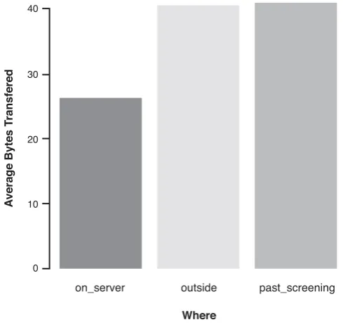
A set of facts is expressible in a visual language if the sentences (i.e., the visualiza-tions) in the language express all the facts in the set of data, and only the facts in the data.
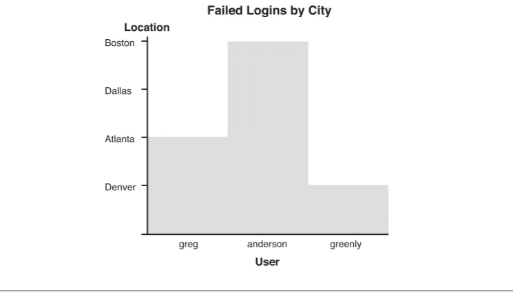
This sounds very theoretical, but let’s look at it. In Figure 1-5, the length of the bars in the graph does not encode facts from the underlying data. It therefore, does not follow the expressiveness criteria. Although this example might look too obvious, keep this principle in mind when designing your own graphs. After you have generated the graph, think hard about what it really communicates.
7Mackinlay, J., “Automatic Design of Graphical Presentations,” Ph.D. Dissertation, Computer Science Dept.,
Stanford University, Stanford, California, 1986. Boston
Dallas
Atlanta
Denver
Location
Failed Logins by City
greg anderson
User
[image:37.506.74.447.260.474.2]greenly
Effectiveness
The second Mackinlay criterion reads as follows:
A visualization is more effectivethan another visualization if the information con-veyed by one visualization is more readily perceived than the information in the other visualization.
This ties directly back to the discussions throughout this chapter. By applying all the principles we have discussed so far, we will come up with more effective visualizations, based on Mackinlay’s effectiveness principle.
G
RAPHD
ESIGNP
RINCIPLESWhen creating graphs, you should pay attention to a few simple design guidelines to generate easy to read, efficient, and effective graphs. You should know and understand the following list of graph design principles:
• Reduce nondata ink. • Distinct attributes. • Gestalt principles. • Emphasize exceptions. • Show comparisons. • Annotate data. • Show causality.
Try to apply these principles on your graphs, and notice how they do not just esthetically improve, but also get much simpler to understand.
Reduce Nondata Ink
One of the most powerful lessons that I have learned stems from Edward Tufte. In his book,The Visual Display of Quantitative Information,he talks about the data-ink ratio. Thedata-ink ratiois defined by the amount of ink that is used to display the data in a graph, divided by the total amount of ink that was used to plot the entire graph. For example, take any bar chart. If the chart uses a bounding box, an excessive number of grid lines, or unnecessary tick marks on the axes, it increases the ink that was used to paint nondata elements in the graph. Three-dimensional bars and background images are some of the worst offenders of this paradigm. Get rid of them. They do not add any-thing to make a graph more legible and do not help to communicate information more
clearly.Reduce nondata ink.It is a simple principle, but it is very powerful. Figure 1-6 shows how a graph can look before and after applying the principles of reducing non-data ink. The right side of the figure shows the same non-data as on the left side, but in a way that is much more legible.
Risk Risk Department Engineering HR Sales Legal IT Finance Marketing 8 7 6 5 4 3 2 1 0 7 6 5 4 3 2 1 0 5 5 4 5
7 7 7
Figure 1-6 An example illustrating the data to ink-ratio and how reducing the ratio helps improve the legibility of a graph
Distinct Attributes
We briefly touched on the topic of perception in the preceding section. One perceptual principle relates to the number of different attributes used to encode information. If you have to display multiple data dimensions in the same graph, make sure not to exceed five distinct attributes to encode them. For example, if you are using shapes, do not use more than five shapes. If you are using hue (or color), keep the number of distinct colors low. Although the human visual system can identify many different colors, our short-term memory cannot retain more than about eight of them for a simple image.
Gestalt Principles
To reduce search time for viewers of a graph and to help them detect patterns and recog-nize important pieces of information, a school of psychology called Gestalt theory8is
often consulted. Gestalt principles are a set of visual characteristics. They can be used to highlight data, tie data together, or separate it. The six Gestalt principles are presented in the following list and illustrated in Figure 1-7:
• Proximity:Objects grouped together in close proximity are perceived as a unit. Based on the location, clusters and outliers can be identified.
8 Contrary to a few visualization books that I have read,Gestaltis not the German word for pattern. Gestalt
• Closure:Humans tend to perceive objects that are almost a closed form (such as an interrupted circle) as the full form. If you were to cover this line of text halfway, you would still be able to guess the words. This principle can be used to eliminate bounding boxes around graphs. A lot of charts do not need the bounding box; the human visual system “simulates” it implicitly.
• Similarity:Be it color, shape, orientation, or size, we tend to group similar-looking elements together. We can use this principle to encode the same data dimensions across multiple displays. If you are using the color red to encode malicious IP addresses in all of your graphs, there is a connection that the visual system makes automatically.
• Continuity:Elements that are aligned are perceived as a unit. Nobody would inter-pret every little line in a dashed line as its own data element. The individual lines make up a dashed line. We should remember this phenomenon when we draw tables of data. The grid lines are not necessary; just arranging the items is enough.
• Enclosure:Enclosing data points with a bounding box, or putting them inside some shape, groups those elements together. We can use this principle to highlight data elements in our graphs.
• Connection:Connecting elements groups them together. This is the basis for link graphs. They are a great way to display relationships in data. They make use of the “connection” principle.
VISUALIZATIONTHEORY
Column1 Value 1 Row 2 Entry 1
Column2 Value 1,2 Row 2,2 Entry 6
Proximity Closure
Continuity Enclosure
Similarty
Connection
Emphasize Exceptions
A piece of advice for generating graphical displays is to emphasize exceptions.For exam-ple, use the color red to highlight important or exceptional areas in your graphs. By fol-lowing this advice, you will refrain from overusing visual attributes that overload graphs. Stick to the basics, and make sure your graphs communicate what you want them to communicate.
Risk
Department
Engineering
HR
Sales
12
10
8
6
4
2
0
Figure 1-8 This bar chart illustrates the principle of highlighting exceptions.The risk in the sales depart-ment is the highest, and this is the only bar that is colored.
Show Comparisons
A powerful method of showing and highlighting important data in a graph is to com-pare graphs. Instead of just showing the graph with the data to be analyzed, also show a graph that shows “normal” behavior or shows the same data, but from a different time (see Figure 1-9). The viewer can then compare the two graphs to immediately identify anomalies, exceptions, or simply differences.
Annotate Data
figure caption or a text bubble in the graph (see Figure 1-10). Annotate as much as needed, but not more. You do not want the graphs to be overloaded with annotations that distract from the real data.
VISUALIZATIONTHEORY
Risk Department Engineering HR Sales Leg al Finance 6 5 4 3 2 1 0 Risk Department Engine
ering HR Sales Legal Finance 3.5 3 2.5 2 1.5 1 0.5 0
Figure 1-9 Two bar charts.The left chart shows normal behavior.The right side shows a graph of current data. Comparing the two graphs shows immediately that the current data does not look normal.
6 5 4 3 2 1 0 Risk Department Engine
ering HR Sales Legal Finance 6 5 4 3 2 1 0
The sales department performed poorly due to an increase in sales hires.
Figure 1-10 The left side bar chart does not contain any annotations. It is impossible for a user to know what the data represents.The right side uses axis labels, as well as text to annotate the outlier in the chart.
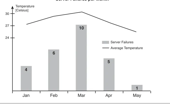
Show Causality
findings (see Figure 1-11). A lot of visualizations are great about identifying interesting areas in graphs and help identify outliers but they do not help to take action. Have you ever asked yourself, “So what?” This is generally the case for graphs where root causes are not shown.
30
27
24
[image:43.506.91.444.149.366.2]Server Failures Average Temperature Temperature
[Celsius]
Server Failures per Month
4
6
10
5
1
Jan Feb Mar Apr May
Figure 1-11 This chart illustrates how causality can be shown in a chart.The number of servers failing per month is related to the temperature in the datacenter.
By applying all the previously discussed principles, you will generate not just visually pleasing graphs and data visualizations, but also ones that are simple to read and ones that communicate information effectively.
I
NFORMATIONS
EEKINGM
ANTRAIn a paper from 1996,9Ben Shneiderman introduced the information seeking mantra
that defines the best way to gain insight from data. Imagine you have a large amount of data that needs to be displayed. For others to understand the data, they need to under-stand the overall nature of the data—they need an overview. Based on the overview, the
viewer then wants to explore areas of the data (i.e., the graph) that look interesting. The viewer might want to exclude certain data by applying filters. And finally, after some exploration, the viewer arrives at a part of the data that looks interesting. To completely understand this data, viewers need a way to see the original, underlying data. In other words, they need the details that make up the graph. With the original data and the insights into the data gained through the graphical representation, a viewer can then make an informed and contextual statement about the data analyzed.
The information seeking mantra summarizes this process as follows:
Overview first, zoom and filter, then details on-demand.
We revisit the information seeking mantra in a later chapter, where I extend it to support some of the special needs we have in security visualization.
S
UMMARYApplying visualization to the field of computer security requires knowledge of two dif-ferent disciplines: security and visualization. Although most people who are trying to visualize security data have knowledge of the data itself and what it means, they do not necessarily understand visualization. This chapter is meant to help those people espe-cially to acquire some knowledge in the field of visualization. It provides a short intro-duction to some visualization principles and theories. It touched on a lot of principles and should motivate you to learn more about the field. However, the visualization ciples will be enough to guide us through the rest of this book. It is a distilled set of prin-ciples that are crucial for generating effective security visualizations.
This chapter first discussed generic visualization and then explained why visualization is an important aspect of data analysis, exploration, and reporting. The bulk of this chapter addressed graph design principles. The principles discussed are tailored toward an audience that has to apply visualization to practical computer security use-cases. This chapter ended with a discussion of the information seeking mantra, a principle that every visualization tool should follow.
Visualization cannot happen without data or information. Therefore, before we can start talking about graphs and visualization, we have to talk about data. We need to create an understanding of the data sources that we have available. What data sources do we need to look at for security visualization? If we do not intimately understand each of the data sources that we use for visualization, we cannot generate meaningful graphs.
I start this chapter with a quick introduction to important terminology. This intro-duction leads into a short discussion about data. The concept oftime-series datais one that I address first. Time-series data is very central to security visualization. The other type of data I discuss is static data or configuration data. I continue with a brief discus-sion about how we have to transform the data to make it useful for visualization. This is going to be only a very short discussion, but is extended and presented in much more detail in Chapter 5, “Visual Security Analysis.” This section also covers a couple of chal-lenges and problems associated with security data sources.
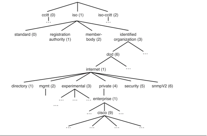
The remainder of the chapter is organized such that I am discussing important secu-rity data sources by going through the networking stack. Figure 2-1 shows the data sources that I discuss in this chapter, based on a network layer model. I am starting from the bottom with network captures and move up the stack one by one discussing the data sources.
2
Figure 2-1 Network stack, indicating the data sources discussed in this chapter
The list of data sources I discuss in this chapter is not at all complete. Many more sources in your environment are useful for security visualization. This discussion should give you a good starting point for understanding these data sources and for understand-ing all the other data sources you might encounter.
Make sure you go through this chapter to be ready for the next one, where I actually start talking about visualization.
T
ERMINOLOGYBefore I start talking about data sources, we should agree on the usage of some key terms. The definitions are slight modifications of the ones that the Common Event Expression (CEE) standard published.1I start with the concept of an event:
An event is an observable situation or modification within an environment that occurs over a period of time. An event may be a specific state or a state change of a system.
An event can be described or recorded. An individual record is often called a log entry:
A log entry is a single record involving details from one or more events. A log entry is sometimes referred to as an event log, event record, alert, alarm, log message, log record, or audit record.
Applications Network Services
Operating System
Traffic Flows
Packet Captures
Proxies
Intrusion Detection
Systems Firewalls
Passive Network Analysis
Finally, the collection of multiple log entries is called a log:
A log is the collection of one or more log entries typically written to a local log file, a database, or sent across the network to a server. A log may also be referred to as a log file, an audit log, or an audit trail.
Throughout this book, I use the term event fairly loosely. A lot of people call a log entry an event. In cases where the colloquial user would refer to a log entry as an event, I do too.
With these definitions we can now move on to take a look at security data, the actual data we need for visualization.
S
ECURITYD
ATAEverything that I show you in this book is based on security data. What is security data? From where do you get this data? These are questions we have to answer before we can do any visualization. We need to understand the data we are working with.
Security data is all the data that can help us with security analysis, investigations, reporting, or monitoring. Security data is not a distinct class of data. Records from sources such as networking devices (i.e., network flows or routing information), transac-tion records from financial systems, DHCP logs, and so on are all security data if they help us solve a security problem or answer a security question.
We can separate security data into two broad categories: time-series and static data.
Time-seriesdata is all data that can be attributed to a point in time. Log records fall into this category. Each record generally has a timestamp associated with it, identifying the time the activity was logged. Note that it is not necessarily true that the timestamp iden-tifies the exact time an event (i.e., the physical manifestation of an activity) occurred. In certain cases, the recorded timestamp is the time when the log record was written.Static
data is information that has no inherent time associated with it (files or documents, for example). Also, any kind of information about the machines in your environment or information about users can be considered static information. In certain cases, you can utilize static information as time-series data. For example, configuration files can be associated with a point in time by utilizing their last modification time.
One of the challenges of working with static files is that they span multiple lines. Processing this data is significantly harder than working with, for example, single-line log records. Why is this? It has to do withparsingof your data. Parsing is the process of taking a log record and identifying the individual parts in it. For example, assume you are given a firewall log entry. To generate a statistic over the most active machines, you need to extract that source address from the entry. This process is called parsing. You will
find more on parsing in Chapter 4, “From Data to Graphs.” It is significantly harder to parse a multiline record or a file because the information is not contained in a single line and information is context sensitive. It matters, for example, in what part of a configura-tion file a certain statement shows up. The parser therefore has to keep state, which com-plicates its design. As an example, take a vulnerability scan recorded as an XML file. If you want to do any analysis of vulnerabilities per host, you need to identify the place in the file where the host information is stored, and then relative to that find the vulnerabil-ities for the host and stitch that information together. The information is not contained in a single, easy-to-process entry.
For visualization tools to work with our data, we have to convert it to specific formats that the tools understand. Most of them do not contain built-in parsers that can be used to directly read the log files. Chapter 9, “Data Visualization Tools,” discusses a few com-mon formats used by visualization tools. To use your own data with those tools, you must transform your log files into these formats. The reason that many tools require dif-ferent types of inputs is that each tool requires a slightly difdif-ferent set of information to operate.
It does not help that there is no currently established common format for writing log records. Parsers are needed for each and every log source to transform the data into the specific format that the visualization tool uses. There have been attempts in the past to standardize log records (for example, the Intrusion Detection Message Exchange Format [IDMEF]).2Unfortunately all of those attempts have failed. A new effort was started by
MITRE at the beginning of 2007. It is called Common Event Expression (CEE).3The
standard is still in its early stages. No specific log formats have been published. Some proposals have been submitted to the discussion mailing list,4but so far, nothing has
been formally accepted. Hopefully, CEE, which is heavily influenced by industry and aca-demic entities, is defining a widely accepted standard and will eliminate the need to write parsers for hundreds of different log formats. Visualization of security data would defi-nitely benefit from such a development.
C
OMMONP
ROBLEMSDuring your journey through analyzing log files and visualizing security data, you will come across a couple of problems. It is important to be aware of them. The first and most important one that you will most likely encounter is incomplete information. The
2 http://xml.coverpages.org/idmef.html