Rochester Institute of Technology
RIT Scholar Works
Theses
Thesis/Dissertation Collections
4-26-2017
Assembly
David Flynn
Follow this and additional works at:
http://scholarworks.rit.edu/theses
This Thesis is brought to you for free and open access by the Thesis/Dissertation Collections at RIT Scholar Works. It has been accepted for inclusion in Theses by an authorized administrator of RIT Scholar Works. For more information, please [email protected].
Recommended Citation
Rochester Institute of Technology
A Thesis Submitted to the Faculty of
The College of Imaging Arts and Sciences
School for American Crafts
In Candidacy for the Degree of
MASTER OF FINE ARTS IN FURNITURE DESIGN
Assembly
by
David Flynn
Date: 4/26/17
Thesis Title:_______________________________________________ Thesis Author:_____________________________________________
Thesis Committee Final Approvals:
__________________________________________________________________________
Chief Advisor : Richard Tannen Date
Professor, School for American Crafts
__________________________________________________________________________
Andy Buck Date
Professor, School for American Crafts
__________________________________________________________________________
Peter Pincus Date
Visiting Assistant Professor, School for American Crafts
Department Chairperson:___________________________________ (Please Type)
___________________________________ (Signature)
Date:__________________________
1.1 Proposal
I am interested in utilitarian objects that encourage and support human gatherings.
Within this design research, I aimed to develop a personal language of aesthetics marked by
strong graphic moments. These details were created by intersections that occur from the
interplay of color, natural wood & geometric form. With wood as the primary material, the
transitions between these elements were carefully considered in order to emphasize points of
interest and highlight structure as well as function. Each object explored the idea of furniture as
a vehicle for interactions through the act of sharing conversation, food and drink.
1.2 Abstract
The primary motive for this body of work was to begin an ongoing study and
development of traditional craftsmanship in the realm of furniture design. While the resulting
body of work is not necessarily about craft, it is certainly a conversation of understanding craft
and traditional techniques. I do not consider myself a master of my own craft, though I do
believe that a high level of respect should be given to tradition. In other words, before one can
undergo the development of a personal perspective regarding design, I believe it is imperative
to take the time to build the proper skills and knowledge. Whatever the craft might be.
Within this was dialogue of furniture, I also engaged myself in the development of a
personal aesthetic direction. The presence of influence was heavily considered and recognized,
and as a result, the body of work gives a nod to other furniture designers. I also took cues from
past design movements including the Art Deco and the Memphis Design group. As color played
a large role in each piece, I was also strongly inspired by the works of past and contemporary
painters including Josef Albers, and Ellsworth Kelly.
As mentioned in the proposal, the idea of gathering and sharing was also at the center of
my research. It came down to understanding how these objects would exist in a living space.
This concept served to help me choose which archetypes of furniture pieces to investigate. A
dining table supports shared meals, a bar cart promotes shared drinks, armchairs paired with a
side table encourages shared conversation and perhaps a shared drink.
2.1 Sources & Research
The initiation point of my studies was based upon an initial study of making, followed by
an in-depth study of design. When it comes to the fabrication of an object, no matter the scale, I
believe craft and structural understanding comes before design. It’s important to be aware of
correct construction procedures, and when we’re in the conversation of furniture objects, one
needs to have a strong understanding of structure. A chair shouldn’t be built if it won’t hold an
individual’s mass. Once you have an introductory knowledge of craft & structure, design can
begin. Aesthetics can thus develop, and in the process, a developed understanding and a basis
of craft will also develop.
Before I can discuss the development of my own aesthetic direction, I’d like to return to
the idea of furniture as a vehicle for human interaction. This was a major theme and underlying
element within each piece. My aim was to choose archetypes of furniture that support
gatherings through the sharing of food, drink and the exchange of conversation. This interest
was also extended through a curiosity and enthusiasm for the hospitality industry; restaurants
and bars. I’m attracted to the atmospheres that are created and how interaction become natural
through the arrangement of furniture and a strong attention to aesthetic details. My goal was to
charge this sense of gathering into each furniture piece through my choice of function
accompanied by strong visual language.
My thesis body of work officially began with the Ada Bar Cart, named for the pivotal,
early 20th- century London bartender, Ada Coleman (try a hanky panky cocktail next time you
visit your local craft cocktail bar). As my thesis investigation dealt with the idea of sharing and
Fig. 1 English Bartender Ada Coleman
gathering, I wanted to start out with the development of a bar cart. This focus also served to
reflect my interest in the international craft cocktail revival taking place and my hope to share
this passion with others. that is presently coming back into popularity with the rise of the cocktail
revival. It was a prominent piece found in home living rooms and offices during the “Mad Men”
period, when people would display their personal collections of spirits and appropriate
glassware for easy access and daily use. I chose to design a bar cart for the modern cocktail
enthusiast, equipped with a mixing station, and ample storage for spirits, glassware and bar
tools.
Fig. 2. Ada Bar Cart, 2015, Walnut, Maple, Paint, Glass, Corian, Cork L 41” x W 26” x H 38 1/2”
Beyond the inclusion of important functional components, the visual direction was
heavily considered as I knew it would likely lay the path for each successive piece in my thesis
studies. I ultimately chose to simplify the structural form into very linear members, while
accenting the termination points and transitional details. American black walnut was the obvious
material to use, as it was a subtle reference to mid-century Modern and Danish Design, where
walnut was prominently used. From its inception, another goal was to include materials other
than wood. This desire was for aesthetic and logical reasons, as well as a respectful nod to the
Italian Memphis Design Group who believed in using a combination of modern materials in their
works.
The members of the Memphis Design Movement embraced modern methods of
production and modern building materials. When the group’s works were first debuted, it was
seen as “....a homage to kitsch….a form of neo-classicism….[and] a 30’s [as well as] 50’s
revival.” In a way, all of these descriptors were correct. Memphis was very inspired by earlier
design movements with a lens on contemporary culture and modern technologies. Their leading
designer, Ettore Sottsass, believed that the fundamental component of his practice was “design
as communication [with] the objective of arriving at a closer correspondence between design
and culture” (Burney 148).He was very aware of the present, and wanted to offer new ways of
experiencing the present through design. Sottsass, as well as the other designers of the group
recognized the significance of comprehending past periods of design and reinterpreting such
ideas in a contemporary context. Italian designer Gio Ponti held a similar awareness and
respect for the past and the present in the context of design. Ponti “played a role in mediating
between different times, between tradition and the Modern”. (Roccella 7) He made a constant
effort to reinvent himself every decade, to ultimately stay with the times while being rooted in
earlier times. I share the same goal, to stay Modern as I look back to the past for inspiration. My
objective is to design and build pieces of furniture that reflect my perspective of contemporary
culture, with historical references.
The direction of Ada was very much connected to the Memphis design beliefs, with an
underlying connection to traditional craft ideas. Every connection detail was carefully considered
to provide maximum strength and durability. Each material was specifically chosen to reference
the functional aspects of the piece. The storage surfaces are painted plywood with a layer of
1⁄4” glass, which references the use of storage for glass bottles and space for glassware. The
white Corian surface on top is a material reference to kitchen or bar countertops. It serves as a
space for the preparation of food and beverages. Corian is a durable, waterproof surface that is
perfectly suited to this function. The maroon accents lead the eyes to the functional importance
of the stemware rack and the cork-lined drawer for assorted cocktail mixing tools. The vivid
cerulean blue of the maple dowels highlight the perimeter of the shelving units, which helps to
keep bottles and glassware from falling off the cart.
When looking at my furniture works, it’s obvious that color plays an essential role in my
process. As I was considering the use of color with each piece of furniture, the main thing that I
was focused on was a sense of balance. This could have manifested itself in a balance of loud,
contrasting hues or I might have aimed for more of a subtle sense of balance. In each case, the
choice of color was meant to compliment the tones of the hardwood I chose to use. I found that
specific colors accompany certain wood grains more successfully. The right tones can bring out
the range of colors found in each wood species. For example, shades of cerulean blue bring
out the rich purples, oranges and deep browns found in American Black Walnut. The idea of
how each piece interacts in a living space also played a huge role in the color selection process.
While I wanted there to be moments of “pop” in each piece, I didn’t necessarily want them to
“pop” in a living space. They needed to be able to work with other pieces of furniture, all of
varying periods, styles and materials.
Within the conversation of color and other aesthetic choices, the idea of “ornamentation”
becomes relevant and significant. In regards to the Ada bar cart, the ornamentation is quite
minimal. The majority of the piece was constructed from rectilinear components which transition
into extruded circular members. Apart from these details, the main ornamentation is supplied by
the use of color. There is no organic shaping to the wooden components, everything is quite
rectilinear. The ornamentation and richness is supplied through the thoughtful transitions
between natural wood and color, as well as the visual weight of each component.
The idea of visual weight is another important idea connected to the overarching concept
of balance. The piece that followed Ada, the Mable bar table, contended with the challenge of
achieving balance through the awareness of visual weight. The bar table focused on the use of
separate shapes and components which were broken down by the contrast between color and
natural wood. One of the main goals for Mable was to design and construct a table that was
well-suited for both a residential setting as well as a commercial setting, such as a restaurant or
[image:10.612.193.421.123.408.2]a bar.
Fig. .3 Mable Bar Table, 2016, maple, steel paint L 36” x W 36” x H 42”
Fig 4. Eero Saarinen Tulip Table
The bar table was visually inspired by the Eero Saarinen Tulip Table, which I believe
was inspired by classic diner style round-top tables that utilize a single-post system for their
main structure. It’s undeniable that this piece was certainly more visually louder as a result of
the use of multiple bold colors and contrasting shapes. My main intention for this piece was to
focus on the idea of “building blocks”. The structure was presented as an assemblage of
components simplified by form and color. Each adjoining, separate component was either
natural maple, or painted a solid color, thus dematerializing the component. In terms of color
choices, I was attempting to explore a broader range of values with this piece, which I think
resulted in a very lively, playful aesthetic.
At the halfway point of completion with Mable, I decided to start the production of the
Ludwig dining table. During the design process, I chose to step back for a moment to evaluate
the direction of my aesthetic progression. I recognized a connection to the design elements of
the Art Deco period of design. Art Deco was an aesthetic movement that developed in the
1920s and “responded to the demands of the machine and of new materials such as plastics
and vita-glass “ (Hiller 11).In a way, it was visually in opposition to the Art Deco movement.
While Art Nouveau works dealt with flowing, organic, curvilinear lines and shapes, Art Deco art
and design was more austere, with simplified and streamlined forms and strong lines. This
association with my own work was something I was not aware of previously. I thought it would
be interesting to embrace this discovery and reference it further in the dining table. I found an
affinity for the works of Austrian designer Josef Hoffmann as I was researching this period. I
would argue that he was one of the major figures to lay the path for the Modernist movements of
the 20th century. He stood out to me as a designer who was profoundly ahead of his time. He’s
described as an individual who made a point in his work to “[turn] away from historicism….by
rejecting functionalism”. (Sarnitz 10). The Ludwig table was designed using his works as
inspiration, as well as some of the major motifs from the Art Deco period. Once again, I aimed to
[image:12.612.177.435.150.410.2]keep an awareness of past periods while presenting my views in a contemporary context.
Fig. 5. Ludwig Dining Table, 2016, maple, poplar, paint L 80” x W 32” x H 30”
To finish off my thesis body of work, I chose to revisit the aesthetics of the bar cart by
applying its language to the development of a side table to accompany my existing armchair
design. My main intention was to design a piece that utilized multiple materials and still
possessed the simple forms with an accent of color. I was aiming at achieving an overall visual
balance in a somewhat chaotic combination of elements. Each component was carefully
considered so that each visual decision would support the next. The edge of the glass has a
green hue which accents the green painted dowels. The color of the leather complements the
warm natural tones of the steamed beech. The bleached maple was chosen in hopes that it
would appear visually lighter than the glass surface and the primary structure. For aesthetic
inspiration, I looked to classic British automobile design of the 50s and 60s, specifically the
beautiful details of the Aston Martin coupe and Jaguar E-types, referencing their rich, regal
[image:13.612.159.489.154.398.2]colors and fine materials.
Fig. 6. Hemmy Side Table, 2016, Steamed Beech, glass, leather, pickled maple, paint L 28 1/2” x W 19” x H 22 3/4”
III. Critical Analysis
I chose to use wood as my primary building material. This was a decision I made at the
initiation point of my thesis year. Not only is it important to me that I respect the traditions of the
furniture design program in the School for American Crafts, but also to appreciate the history of
furniture made with wood. I’m primarily using traditional joinery methods that are time tested and
incredibly structural. Beyond the use of wood, my choice of surface treatment and finishing was
incredibly important to my process as well. To some individuals, applying paint directly to the
surface of the wood might seem heinous, but people have been doing it for centuries. The
Shakers often painted their furniture with traditional milk paint, using colors that were dictated by
their specific sect. Ultimately, I used color to compliment the human environment. Naturally, a
totally black armchair has a very different presence in a living room than a black armchair with
cerulean blue accents and a neutral blue upholstered seat. They offer very different overall
moods, and they have different effects on the viewer’s eye path, as well as the overall
atmosphere and experience.
The simple, geometric forms were very much inspired by the works of hard edge and
color field Modern painters such as Josef Albers, and Ellsworth Kelly. Albers was best known for
his “Homages to the Square”. He described these pieces as “platters to serve color”: vehicles for
the presentation of different color climates and various color effects…..simple yet significant”
(Fox 14). The effect of different materials, colors and visual textures in direct proximity was
intriguing during this exploration. These seemingly very simple large scale blocks of juxtaposing
colors are incredibly moving, poetic, and entirely change the feel of an interior environment.
Ellsworth Kelly’s works have a very similar feel, as they also deal with color blocking and color
fields. He presented a new and “inventive approach to abstraction” of “flat planes of rectilinear
[image:14.612.76.153.520.625.2]color” (Paik 6).
Fig. 7. Orange and Gray 1993 by Ellsworth Kelly
Fig. 8. Black Bar For A Wall by Ellsworth Kelly
Each artist had their own subjects and concepts, although they share some aesthetic
similarities. In general, each individual created paintings that deal with large fields of solid colors
that build flat picture planes. When translating these ideas into a discussion of design, my eye
was drawn to the simple geometric color forms that these painters use to create their “fields”.
The simple language of the shapes allow for a more easily examined relationship between the
chosen colors. I also used these types of simple forms in the hopes of building an accessible yet
stimulating visual language.
The composition of the Mable bar table was greatly inspired by the paintings of Ellsworth
Kelly and the design work of Ettore Sottsass. When designing the structure of the table, I was
studying Kelly’s minimal geometric forms which he places in close proximity, in a vivid selection
of colors. This ultimately transforms the wall into the picture’s ground, similar to the way that
furniture interacts directly with an interior space. The presence that my furniture pieces might
have in a space is another huge consideration through the design process. The boldness of
each piece suggest a very specific type of interior, perhaps with more modern and
design-forward attributes.
From piece to piece, I was experimenting with different levels of visual boldness. For
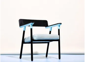
example, with the 923 CW9 Edition armchair, I was attempting to create a piece that was more
visually subtle and quiet in nature. To achieve this, I paired the blackened leather-dyed ash with
tones of light cerulean blue in the choice of the upholstery and the accent paint additions. While
the blue is a bold color, the chair has a quality that I believe allows it to harmoniously exist in an
interior space among other pieces of furniture and decor. On the opposite side of the spectrum,
the 923 Gulf Edition armchair does the very opposite with bold, perhaps heavy handed
contrasting colors. The first version of the Mable bar table also plays with this bold presence,
first and foremost as a result of the diverse color palette but also as a result of the bold
interconnected forms. These 3 pieces exist in heavily differing ways when placed in an interior
[image:16.612.133.479.415.671.2]space filled with other pieces of furniture and decorative objects.
Fig. 9. 923 Armchair CW9 Edition , 2015, Dyed Ash, wool, paint L 21" x W 26 3/4" x H 32”
The gathering and researching of specific visual sources was also an important part of
my design process. Each piece has multiple references used as design inspiration, ranging from
historical pieces of furniture, to classic car design, to the color palettes of different paintings. My
most recent piece, the Hemmy side table, took inspiration from classic automobiles and
motorcycles. The material choices are connected to classic Jaguar and Aston Martin race cars
as well as WWII-era Indian motorcycles. The green dowels referenced the signature British
racing green color. The glass circle referenced the simple single tier windshields on classic
convertibles. The russet-colored leather referenced the interiors of classic speedsters as well as
the leather saddlebags on the Indian motorcycles. The steamed European beech referenced the
tone of woods used for the interior components found in automobiles during this era.
The naming process for each piece was an important and very enjoyable finishing touch.
The majority of the piece’s names referenced the initial research development as well as the
theme of sharing and gathering around food and drink. The Ludwig dining table was named for
King Ludwig I of Bavarian Germany who held the first Oktoberfest in 1810. The structure and
composition of the table was inspired by the large, sturdy trestle-style tables used in German
beer gardens. The 923 CW9 Edition was inspired by the works of Italian designer and Architect
Gio Ponti who debuted his works at an Italian Biennale in 1923. It was also inspired by the first
year of the French automobile race held on the island of Le Mans, first held in 1923. The color
composition of the CW9 edition was inspired by the blue and black livery of the first car that won
the 24-Hour Le Mans race in France.
IV. Conclusion
As a whole, my thesis body of work can be broken down into three main parts. The first
surrounded the idea of gathering and sharing, which served as an aid for choosing which
archetype of furniture to design. The second was a study of form, which resulted in the
development of a visual language derived from simplicity and geometry. The third and perhaps
most apparent part was the investigation of “how to use color”, and “where to use color”. Each
piece took a slightly different approach to these constructs.
The notion of timelessness was also undeniably a constant subject of contemplation in
regards to each successive piece. Rather than evaluating every single decision in attempt to
achieve some form of ultimate understanding, it’s simply on to the next piece, on to the next
idea, on to the next aesthetic direction. This in turn brings forth the most important question,
what comes next after such a considerable venture? The search for a solution and a setting that
allows me to continue designing and producing. Beyond that, I feel that designing and building
out the entirety of an interior space, in particular a restaurant or bar setting, would be an
incredibly rewarding challenge. Having total control over each detail in a space, with close
consideration to every relationship between different pieces of furniture and other aesthetic
details. On top of the visual design, the architecture of atmosphere and composing experience
within a space seems to be the apex of my curiosity and a logical objective to work towards.
Bibliography
Burney, Jan, Ettore Sottsass: The Barbarians and Emperors of Design, (New York : Taplinger Publishing Company, 1991, pp. 148).
Fox, Nicholas, Josef Albers : A Retrospective, (New York : Harry N. Abrams, Inc., 1988, pp. 14 ).
Hiller, Bevis, Art Deco, (London : The Herbert Press Limited, 1985, pp. 11). Paik, Tricia Y., Ellsworth Kelly, (London : Phaidon Press Limited, 2015, pp. 6). Roccella, Graziella, Ponti, (Cologne : Taschen, 2009, pp. 7).
Sarnitz, August, Hoffman, (Cologne : Taschen, 2016, pp. 10).