This is a repository copy of Delivering Census Interaction Data to the User: Data Provision and Software Development.
White Rose Research Online URL for this paper: http://eprints.whiterose.ac.uk/5004/
Monograph:
Stillwell, J., Duke-Williams, O., Feng, Z. et al. (1 more author) (2005) Delivering Census Interaction Data to the User: Data Provision and Software Development. Working Paper. School of Geography , University of Leeds.
School of Geography Working Paper 05/01
[email protected] https://eprints.whiterose.ac.uk/
Reuse
Unless indicated otherwise, fulltext items are protected by copyright with all rights reserved. The copyright exception in section 29 of the Copyright, Designs and Patents Act 1988 allows the making of a single copy solely for the purpose of non-commercial research or private study within the limits of fair dealing. The publisher or other rights-holder may allow further reproduction and re-use of this version - refer to the White Rose Research Online record for this item. Where records identify the publisher as the copyright holder, users can verify any specific terms of use on the publisher’s website.
Takedown
If you consider content in White Rose Research Online to be in breach of UK law, please notify us by
Working Paper 05/01
Delivering Census Interaction Data to the User:
Data Provision and Software Development
John Stillwell and Oliver Duke-Williams
School of Geography, University of Leeds,
Leeds LS2 9JT
Zhiqiang Feng and Paul Boyle
School of Geography & Geosciences, University of St Andrews,
St Andrews, Fife, KY16 9AL
ABSTRACT
The Census Interaction Data Service (CIDS) is a Data Support Unit providing access for researchers in the UK to the interaction data sets that are produced by the Census Offices. These migration and commuting data sets are large and complex, differing from the area statistics by virtue of the fact that they involve two geographies – one of origin and the other of destination.
WICID, the web-based software system developed to provide the user interface to the Special Migration Statistics (SMS) and the Special Workplace Statistics (SWS) from the 1991 Census, has now been upgraded to allow registered users of census data to extract subsets of the 2001 interaction data sets. These include 2001 SMS and SWS as well as a new set of Special Travel Statistics (STS) for flows in Scotland. The data sets are different from those in 1991, not least because aggregate flow counts are available at the scale of output areas, as well as wards and districts, and because the method of data adjustment to eliminate the risk of disclosure is different from that used in 1991.
This paper is in three sections. Firstly, the 2001 interaction data sets are outlined and compared with what was produced in 1991. Work on the re-estimation of 1981 and 1991 data consistent with 2001 geographical boundaries is summarised and the effects of the small cell adjustment method (SCAM) are examined using migration data at three different spatial scales. Secondly, we illustrate the developments of the WICID user interface that have been made to incorporate 2001 data and to add some analytical functionality. Finally, we exemplify the type of analysis that the WICID system can be used to support choosing selected data sets from the 2001 Census.
TABLE OF CONTENTS
Page
ABSTRACT ii
CONTENTS iii
LIST OF TABLES iv
LIST OF FIGURES iv
1 Introduction 1
2 Data sets and characteristics 2
2.1 Primary interaction data sets for 2001 2
2.2 Data tables and counts in 2001 compared with 1991 3
2.3 Shortcomings and derived data sets 10
2.4 The effects of small cell adjustment 13
3 Interface developments 19
3.1 Building queries in WICID 19
3.2 Map selection tool 23
3.3 Analytical functions 25
4 Using the data: some examples 26
4.1 Internal migration and ethnicity in London in 2001 27
4.2 Migration effectiveness by age 29
4.3 Migration and commuting connectivity by ethnic group 31
4.4 Commuting to London 33
5 Conclusions 35
Acknowledgements
LIST OF TABLES
Table 1: The geographical units used 2001 SMS/SWS/STS at different levels Table 2: Tables and counts in the 2001 and 1991interaction data sets
Table 3: Numbers of moving groups within UK, 2000-01
Table 4: Tables and counts available from 2001 SMS Level 1 and 1991 SMS Set 2 Table 5: Tables and counts available from 2001 SMS Level 2 and 1991 SMS Set 1 Table 6: Tables and counts available from 2001 SWS Level 2 and 1991 SWS Set C Table 7: 1991 interaction datasets re-estimated for 2001 at ward level
Table 8: 1981 interaction datasets re-estimated for 2001 at ward level
Table 9: Net migration rates for London boroughs in 2000-01 derived from four different source tables
Table 10: Commuting flows into London boroughs, 1991 and 2001
LIST OF FIGURES
Figure 1: Distribution of interior cell values in 2001 SMS Table MG301
Figure 2: Distribution of differences between alternative totals in 2001 SMS Level 2 Figure 3: The Welcome screen in WICID
Figure 4: Summary of commuting flows to and from the City of London, 1991 Figure 5: Age pyramid of commuters from Havering to the City of London, 1991 Figure 6: The general query interface in WICID prior to selection
Figure 7: Query to select commuting data to City of London, 2001 Figure 8: The map selection window in WICID
Figure 9: Example of map selection of City of London as destination area Figure 10: The analysis indicators available in WICID
Figure 11: Patterns of net migration for London boroughs, 2000-01
Figure 12: Distribution of white and non-white and selected non-white ethnic populations, 2001
Figure 13: Net migration balances for selected ethnic groups, 2000-01
Figure 14: Migration flows and net migration balances by age group for London, 2000-01 Figure 15: Net migration effectiveness by age group for London, 2000-01
Figure 16: Out-migration connectivity by ethnic group for London boroughs, 2000-01 Figure 17: In-commuting connectivity by ethnic group for London boroughs, 2000-01 Figure 18: Commuting inflows to London boroughs, 1991 and 2001
Figure 19: Percentage shares of commuting flows to London boroughs, 2001
Figure 20: Percentage changes in commuting inflows to London boroughs, 1991-2001
1 Introduction
The decadal Census of Population is the most reliable and comprehensive source of
information on migration and commuting in Great Britain and Northern Ireland,
providing counts of flows of individuals, households or moving groups between origins
and destinations. These extensive data sets, often referred to as the Origin-Destination
Statistics or interaction data sets, provide information about the composition and pattern
of migration in the 12 month period prior to the census as well as details of journey to
work flows at the time when the census was carried out. During 2004, the interaction
data collected by the 2001 ‘one-number’ Census in the UK were released by the census
agencies through a phased programme of delivery.
As with 1981 and 1991, there are two major interaction data sets for 2001, the Special
Migration Statistics (SMS) and the Special Workplace Statistics (SWS). However, in
Scotland, the SWS are replaced with a new set of Special Travel Statistics (STS) that
include journeys to place of study and well as place of work. Various sets of
SMS/SWS/STS were released at different times during 2004 by the census agencies
according to spatial scale and also type of migration flow. Origin-destination data
covering the UK as a whole were initially made available for flows between census
output areas and flows between wards. Data on local authority level flows and on
migration flows for moving groups were released subsequently, followed by the flows
between postcode sectors covering people living in Scotland.
The initial aim of this paper is to explain the structure and content of the interaction data
sets that are currently accessible via the Census Interaction Data Service (CIDS), an
ESRC/JISC-funded Data Support Unit enabling members of the academic community
and data suppliers registered with the Census Registration Service, to extract and
download data for research and teaching. This process is undertaken using WICID, the
web-based system that is used to store the data sets and to provide user-friendly query
facilities so that extraction can be achieved with the minimum of difficulty (Stillwell and
Duke-Williams, 2003). Since the 2001 data sets have been added to the existing database,
the data are compared with those available in 1991, the deficiencies in the data sets are
considered and the 1991 data sets that have been re-estimated for 2001 geographical
features of the WICID system that have been incorporated to facilitate query construction
but also to enable some online analysis with extracted data prior to downloading. Finally,
in the last part of the paper, some examples are presented of the analysis of migration and
commuting data using flows for the boroughs of Greater London extracted from the SMS
and SWS.
2 Data sets and characteristics
2.1 Primary interaction data sets for 2001
The 2001 SMS and SWS are larger and more complex data sets than those that preceded
them in 1991 or in 1981. They are larger partly because the 2001 Census results were the
first to include data for Northern Ireland alongside the rest of the UK, but primarily
because flows are provided between spatial units at a new scale below that of wards.
Whilst data were collected in the 2001 Census by enumeration district as in previous
censuses, these collection units have not been used for output. Instead, data are released
for a set of output areas (OAs) at the smallest scale, areas that are built from postcode
units that tend to have around 125 households within each of them. The OA is the
building block for geographies based on either of the two postcodes collected on the
census form in the migration and commuting questions, i.e. address one year ago and
destination of travel to work (or study in Scotland).
The primary 2001 migration and commuting data come in three sets, where each set
refers to a particular level or set of spatial units (Table 1). Level 1 contains the local
authority districts across Great Britain, together with parliamentary constituencies in
Northern Ireland. Level 2 is referred to as the ward level and contains and amalgamation
of Census Area Statistics (CAS) wards in England and Wales and Standard Table (ST)
wards in Scotland. Wards used in the CAS are slightly different from those used in the
Standard Tables. This arises because there were some instances (about 50) where CAS
ward counts were below the permitted threshold and therefore these units had to be
merged with neighbours. There are no differences between the CAS and ST wards in
Northern Ireland. Thus, since there is a mixture of wards at level 2, the spatial units are
referred to collectively as ‘interaction wards’. The spatial units at level 3 across the UK
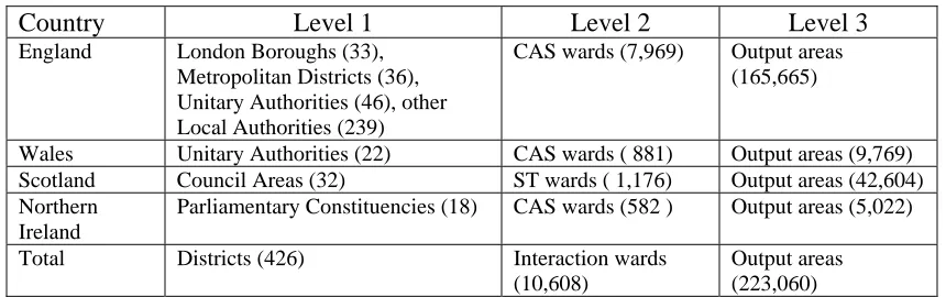
Table 1: The geographical units used for 2001 SMS/SWS/STS at different levels
Country Level 1 Level 2 Level 3
England London Boroughs (33),
Metropolitan Districts (36), Unitary Authorities (46), other Local Authorities (239)
CAS wards (7,969) Output areas
(165,665)
Wales Unitary Authorities (22) CAS wards ( 881) Output areas (9,769)
Scotland Council Areas (32) ST wards ( 1,176) Output areas (42,604)
Northern Ireland
Parliamentary Constituencies (18) CAS wards (582 ) Output areas (5,022)
Total Districts (426) Interaction wards
(10,608)
Output areas (223,060)
There is one further set of primary data not shown in Table 1. This data set relates only to
Scotland and contains postcode versions of SMS and STS originally issued at ST ward
level. The geography is awkward because some ‘postcode ward’ areas include more than
one postcode sector whereas in other cases, a single postcode sector can stretch across
more than one ST ward.
2.2 Data tables and counts in 2001 compared with 1991
The 2001 interaction data sets are prepared as counts contained within series of tables at
each of the three levels. There may be some confusion when comparing between 1991
and 2001 SMS because 1991 SMS Set 2 refers to the district level whilst 1991 SMS Set 1
refers to the ward scale. The interaction data tables and counts available from both
censuses are shown in Table 2 and this summary indicates that whilst the number of
tables is much the same, the number of counts available in 2001 is much greater; there is
more disaggregation in the counts compared with 1991. There are more STS that SWS
counts in 2001 because the former contain counts for children aged under 16 and
therefore require additional categories in certain tables. No SWS Set C primary data were
produced at district level in 1991.
Table 2: Tables and counts in the 2001 and 1991interaction data sets
Data sets Level 1 Level 2 Level 3
2001 SMS 10 tables, 996 counts 5 tables, 96 counts 1 table, 12 counts
1991 SMS Set 2: 11 tables, 94 counts Set 1: 2 tables, 12 counts -
2001 SWS 7 tables, 936 counts 6 tables, 354 counts 1 table, 36 counts
2001 STS 7 tables, 1,176 counts 6 tables, 478 counts 1 table, 50 counts
1991 SWS* - Set C: 9 tables, 274 counts -
One major difference between the migration data sets in 2001 and 1991 is the treatment
of students. In 1991, most students were recorded at their place of parental domicile
rather than at their term-time address, unless they were living away from the parental
home. In order to address concerns about the poor recording of students in 1991, the
Office of Population Censuses and Surveys (OPCS) produced an additional table, Table
100, as part of the SAS/LBS series of tables, giving counts of resident students for every
local authority district (LAD) by LAD of term-time address1. In the 2001 Census,
students were counted at their term-time address where appropriate and, consequently,
students migrating from the parental home to term-time location, from one term-time
location to another or from term-time location to another area (after graduation) in the 12
months prior to the Census are included in the data. This may cause some problems when
interpreting migration data classified by occupation, for example, because migrant status
refers to that at the time of the 2001 Census. A student living in Leeds who graduated in
the summer of 2001 and moved to London to take a new job working for a finance
company would be classified as a higher professional rather than a student; consequently,
places exporting graduates would be seen to be losing human capital. In order to facilitate
comparison between 1991 and 2001, it is our intention to create a set of data which
amalgamates counts in Table 100 with 1991 SMS Table 3.
The inclusion of student migrants in 2001 relates to another new dimension of the
composition of the migration data which is the introduction of an entirely new unit of
measurement in 2001, the ‘moving group’. The concept of a moving group refers to a
single person or a group of people within a household or communal establishment who
have moved together from the same usual address one year before census day. Thus, a
single ‘migrant’ who moves alone actually constitutes a moving group as does a ‘wholly
moving household’, a household in which all members of the household are migrants and
have moved from the same address, as used in 1991. To provide some clarification and
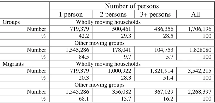
indication of the relative volumes of counts in different categories, Table 3 indicates, for
flows within the UK, the numbers in wholly moving households and other moving groups
by size of group. Note that the one person counts for wholly moving households and
other moving groups are the same for groups and migrants. Other moving groups include
migrants into households that contain residents at census date who were non-migrants.
1
Table 3: Numbers of moving groups within UK, 2000-01
Number of persons
1 person 2 persons 3+ persons All
Groups Wholly moving households
Number 719,379 500,461 486,356 1,706,196
% 42.2 29.3 28.5 100
Other moving groups
Number 1,545,286 178,041 104,753 1,828080
% 84.5 9.7 5.7 100
Migrants Wholly moving households
Number 719,379 1,000,922 1,821,914 3,542,215
% 20.3 28.3 51.4 100
Other moving groups
Number 1,545,286 356,082 367,029 2,268,397
% 68.1 15.7 16.2 100
Source: 2001 Census SMS level 1, Table6
This table indicates that there were approximately 5.8 million migrants within the UK in
2000-01, moving in 3.5 million moving groups, of which 48% were wholly moving
households and 52% were other moving groups, a high proportion of which were
individual movers. Amongst the 3.5 million persons in wholly moving households, over
half involve three or more persons moving together, with 28.3% in two person
households and one fifth as single persons. In contrast, over two thirds of migrants in
other moving groups were single persons, with similar numbers split between two person
and three or more person groups. Where there is only one person in the moving group,
that person is the moving group reference person (MGRP). For a group of students
moving from one house to another, for example, the MGRP would be the eldest of the
group. If each of the students had moved from a different address one year previously,
then they would each be recorded as a separate household. A household is described as
partly moving if one or more members of the household is a migrant but not all members
of the household have moved from the same usual address.
What is different about the interaction tables and counts of flows in 2001 compared with
1991? In what follows, we initially consider migration and, thereafter, commuting. In
Table 4, we compare the different tables from the two censuses at level 1 (district) scale,
using the categories of age, status, ethnicity, illness, economic activity, moving groups,
tenure, occupation and language. Thus, for example, in 2001 SMS Table 1, migrants are
disaggregated into 24 age groups and 3 sex categories, whereas in the 1991 SMS, there
Table 4: Tables and counts available from 2001 SMS Level 1 and 1991 SMS Set 2
2001 Census SMS Level 1 tables (459 spatial units)
Counts 1991 Census SMS Set 2 tables
(426 spatial units)
Counts
Age
Table 1: Age (24 categories) by sex (3 categories) plus totals
75 Table 1: Age (5 categories) by sex (2 categories)
Table 3: Age (19 categories) by sex (2 categories)
10
38
Family status
Table 2: Family status (17 categories) by sex (3 categories) plus totals
54
Ethnicity
Table 3: Ethnic group (7 categories) by sex (3 categories) plus totals (GB destinations)
Table 3N: Ethnic group (2 categories) by sex (3 categories) plus totals (NI destinations)
24
9
Table 5: Ethnic group (4 categories) 4
Limiting long term illness
Table 4: Whether suffering illness or not by sex (20 categories) by age (4 categories) plus totals
84
Table 6: Whether suffering illness or not (2 categories) by resident in household or not (2 categories)
4
Economic activity
Table 5: Migrants by economic activity (13 categories) by sex (3 categories) Table 8: Moving groups (8 categories) by
sex and economic activity (42 categories)
42
336
Table 7: Migrants aged 16+ by economic position (7 categories) Table 9: Wholly moving households
by sex (2 categories) and by economic position of household head (5 categories)
Table 10: Residents in wholly moving households by sex (2 categories) and by economic position of household head (5 categories)
7
7
7
Moving groups
Table 6: Moving groups (8 categories) by groups and migrants
16 Table 2: Wholly moving households
and residents in wholly moving households
2
Tenure
Table 7: Moving groups (8 categories) by tenure (3 categories) plus totals
32 Table 8: Wholly moving households
by tenure (3 categories) (excluding Scotland) Table 8S: Wholly moving
households by tenure (4 categories) (Scotland)
3
4
Occupation Table 9: Moving groups (8 categories) by
sex and NS-SEC of group reference person (36 categories)
288
Some knowledge of Gaelic/Welsh/Irish Table 10: Age (11 categories) by sex (3
categories) plus totals
36 Table 11S: Gaelic speakers in
Scotland
Table 11W: Welsh speakers in Wales 1
1 Marital status
Table 4: Marital status (3 categories )
Unlike 1991, where infants aged less that one were excluded altogether (since they were
not born 12 months before the census), the 2001 migrant status for children aged under
one in households is determined by the migrant status of their ‘next of kin’ (defined as in
order of preference, mother, father, sibling (with nearest age), other related person,
household reference person). There were no family status or occupation tables for the
district migration data in 1991, whereas the marital status table used in 1991 has been
discontinued in 2001. Important changes introduced in 2001 are the increased
disaggregation of counts in the ethnicity table, the addition of age and sex categories in
the illness, economic activity and language tables, and the introduction of an occupation
table based on the new National Statistics Socioeconomic Classification (NS-SeC) that
replaced the classification of social class based on occupation and socio-economic group.
At level 2, there are five tables for ward migration data in 2001 compared with two in
1991 as shown in Table 5. This provision contains important new information on
ethnicity (although only for whites and non-whites), on occupation and on tenure, as well
as a more disaggregated age groups in SMS Table 1. The new data counts of migration
by ethnic group at district and ward level are useful in providing insights into the internal
migration behaviour of ethnic minority groups, although the disaggregation at ward scale
is only between whites and non-whites.
Table 5: Tables and counts available from 2001 SMS Level 2 and 1991 SMS Set 1
2001 Census SMS Level 2 tables (10,608* spatial units)
Counts 1991 Census SMS Set 1 tables
(10,933 spatial units)
Counts
[image:12.595.84.525.501.734.2] [image:12.595.85.526.502.732.2]Age
Table 1: Age (16 categories) by sex (3 categories) plus totals
51 Table 1: Age (5 categories) by sex
(2 categories)
10
Moving groups
Table 2: Moving groups and migrants by wholly moving households and other moving groups
4
Table 2: Wholly moving households and residents in wholly moving households
2
Ethnicity
Table 3: Ethnic group (2 categories) by sex (3 categories) plus totals
9
Occupation
Table 4: Moving groups (2 categories) by sex and NS-SEC of group reference person (36 categories)
24
9 Tenure
Table 5: Moving groups (2 categories)
by tenure (3 categories) plus totals 8
However, it is disappointing that the flows of immigrants in 2001 are confined only to
one count of those migrants with origin outside the UK. This is a retrograde development
from the 98 foreign origins that were specified in 1991 and prevents separation of white
from non-white immigrants, let alone analysis of non-white immigrants from different
world regions. As in 1991, the 2001 SMS do contain counts of those whose address 12
months prior to the census was unknown. In 2001, the number of those migrating within
or into the UK with no prior address was 456,736 compared with 325,630 migrants
within or into GB with origin unknown in 1991.
At level 3, the 2001 Census SMS data for output areas consist of one table with counts
for four age groups (all age, 0-15, 16-pensionable age, pensionable age+) for three sex
groups (person, male, female) plus totals, giving 12 counts altogether. Since there are
over 223,000 OAs in the United Kingdom, the matrices of flows for these 12 counts are
enormous in theory, In practice, of course, the matrices will be relatively sparsely
populated with most cells containing non-zero values being close to the diagonal.
The 2001 commuting data are divided into the journey to work or SWS data sets in
England, Wales and Northern Ireland and the travel to work or study (STS) in Scotland.
The destination location in the SWS refers to the place where a person works in their
‘main job’ or the depot address for people who report to a depot, whereas the destination
in the STS is the place a person travels to for their main job or course of study (including
school). Like the SMS, the 2001 SWS/STS have been produced at three levels, whereas
the 1991 SWS Set C were produced only for wards. Moreover, the 2001 SWS/STS are
100% counts whereas the 1991 SWS are a 10% sample of the population and need to be
scaled up when used for analysis.
Tables and counts for the two SWS data sets at this spatial scale are compared in Table 6.
There are similarities in the tables on age, family status and mode of travel, but the main
differences are the counts for the new NS-SeC classification of occupation that are
included in 2001 SWS Table 4 and the discontinuation in 2001 of counts relating to hours
worked, distance travelled and cars available, all of which were included in the 1991
Table 6: Tables and counts available from 2001 SWS Level 2 and 1991 SWS Set C
2001 Census SWS Level 2 tables (10,608* spatial units)
Counts 1991 Census SWS Set C tables
(10,933 spatial units)
Counts
Age
Table 1: Age (5 categories) by sex (3 categories) and by employment type (9 categories) plus totals
72 Table 1: Age (8 categories) by sex
(2 categories) and by economic position (4 categories) plus totals
54
Family status
Table 2: Family status categories (9 categories) by sex (3 categories) and employment type (9 categories) plus totals
108
Table 3: Family position (5 categories) by sex (2 categories) plus totals
12
Mode of travel
Table 3: Mode of travel (13 categories) by employment type (4 categories) plus totals
52 Table 5: Mode of travel (10
categories) by sex (2 categories) plus totals
22
Occupation
Table 4: NS-SEC groups (12) by employment type (4 categories) and totals
Table 5: Occupations (10 categories) by employment type (4 categories) plus totals
46
40
Table 7: Occupation (23 categories) by sex (2 categories) plus totals Table 8: Social class (6 categories and SEG (20 categories) by sex (2 categories) plus totals
48
54
Employment Table 6: Employment status (23
categories by sex (3 categories) and employment type (9 categories) plus totals
36
Table 9: Industry divisions (23 categories) by sex (2 categories) plus totals
48
Hours worked
Table 3: Hours worked (4 categories) by sex (2 categories) plus totals
10
Distance to work
Table 4: Distance (7 categories) by sex (two categories) plus totals
16
Cars available
Table 6: Cars (4 categories) by sex (2 categories) plus totals
10
A similar set of SWS tables to the 2001 level 2 suite have been provided at level 1 with
the addition of one further table on ethnic groups (7 categories) by employment type (all
persons, full-time student, in full-time employment, in part-time employment) by sex (2
categories). This table is available for Parliamentary Constituencies in Northern Ireland
except that the ethnic group categories are restricted to white and non-white. At level 3,
one table is available providing 36 counts of commuters by mode of travel to work for all
persons, students and non-students. The STS data sets for Scotland at all three levels are
very similar to those of the SWS for the rest of the UK except that the age categories
extend to ages below 16 and cells are masked out that refer to counts of those aged 16-74
2.3 Shortcomings and derived data sets
It is very important to acknowledge and understand the deficiencies associated with
interaction data sets derived from successive censuses. In this section, we summarise
briefly the problems associated with 1991 data and report on the new sets of derived data
that have been estimated to enable comparisons to be made between the last three
censuses. The implications of the small cell adjustment methodology (SCAM) used to
control the risk of disclosure in 2001 are discussed in the subsequent section.
Whilst the 1991 SMS have been reviewed by Flowerdew and Green (1993) and critiqued
by Rees et al. (2002), Cole et al. (2002) have highlighted how the quality of the SWS was
compromised by the postcode processing problem. One key problem with the 1991 SMS
Set 2 resulted from the methodology adopted by the Census Offices of suppressing flows
of fewer than 10 individuals or wholly moving households in order to preserve
confidentiality. Rees and Duke-Williams (1997) developed a methodology to re-estimate
suppressed flows in Tables 4-10 of SMS Set 2 and these derived data are available in
WICID in a data set called SMSGAPS. The problem of under-enumeration was
investigated by Simpson and Middleton (1999) whose research led to further corrections
to SMS Set 2 Table 3 (Migrants by five year age group and sex) now included as the
MIGPOP data set in WICID.
One of the main objectives in creating the WICID system has been to enable users to
compare patterns of migration or commuting over time. This task is confounded by
changing definitions of variables measured in the census (such as flows by occupation)
and by changes in the definitions of spatial units. Local government re-organisation
during the 1990s, particularly associated with the creation of unitary authorities in Wales,
Yorkshire and the Humber and the South West, as well as the redrawing of ward
boundaries, poses huge problems for those seeking to compare census data in 2001 with
similar data in 1991 and 1981 in a consistent way. This challenge has been approached
within the CIDS project in two ways. Firstly, zone systems have been designed using
lookup tables (LUTs) to produce geographical areas above the level 1 (district) scale that
are approximately consistent between 1991 and 2001. The hierarchy of zones (known as
CIDS common 1991/2001 geographies) for the UK that have been constructed from the
• ‘district’ geography with 417 zones;
• ‘intermediate’ geography with 219 zones;
• ‘100 zone’ geography has 99 zones in GB corresponding to the previously
established ’99 zone DETR geography’ plus Northern Ireland;
• ‘city region’ geography with 47 zones; and
• ‘Government Office Region’ geography of 12 zones based on 1999 definition of
GORs.
The second approach used by the CIDS team has been to re-estimate 1991 and 1981
interaction data for 2001 geographies to create a full set of time-series data from 1981,
1991 to 2001 using a methodology spelt out in Boyle and Feng (2002) whose initial work
has produced 1981 migration and commuting counts based on 1991 geographical areas.
The transfer of socio-economic data from one geography to another incompatible
geography is a problem of areal interpolation. We can refer to the reporting zones for
which data are collected as ‘source zones’ and the reporting zones for which data are to
be estimated as ‘target zones’. One popular method of interpolation is to assume that the
attribute of interest distributes evenly over space and thus we can use ‘area of zone’ as a
weight to estimate the attribute for intersection zones. These intermediate results are then
aggregated into target zones. However, this method is not suitable for the interpolation of
flow data. Suppose that in 1991 there is a flow from origin ward A to destination ward B
and that in 2001, the ward B splits into two equal-area wards B1 and B2. It is inadequate
to simply divide the flow from the origin ward into two equal-volume flows due to the
same size of their area in the destination wards. First, this approach would ignore the fact
that migration decays with distance and, if the two new destination zones are not
equidistant from the origin zone, it is more likely that more of the migrants to terminate
in the destination that is closer to the origin. Second, the method assumes that the
population is evenly distributed across the zone, an assumption that is likely to be
unrealistic. In fact, the half with the largest population would probably attract more
migrants. Interpolating flow data is therefore more difficult than interpolating static data
The methodology that we have developed to tackle the problem can be divided into a
number of steps. Let us consider the re-estimation of 1991 interaction data for 2001 ward
geography. The first step is to construct a gravity model for the 1991 flows at ward level
and then apply the calibrated parameters derived from the ward-level model for
predicting 1991 flows at the enumeration district (ED) scale. Thus, the second step is to
disaggregate ward-level flows in 1991 into flows between EDs. The ED-level model uses
ED populations, the distance between origin and destination EDs, and parameters which
are derived from the ward-level model. The flows between EDs are estimated to be
randomly proportional to the flows estimated using the gravity model. If a pair of EDs
have a larger flow value estimated from the model then the pair tend to share more flows
disaggregated from the inter-ward flows. The third step is to construct a lookup table
between 1991 EDs and 2001 ST wards. In the fourth step the lookup table is then
employed to aggregate the 1991 inter-ED flows to 2001 inter-ward flows. Table 7
indicates the SMS Set 1 and the SWS Set C tables in 1991 that have been re-estimated for
[image:17.595.94.508.423.531.2]2001 geographies using the above method.
Table 7: 1991 interaction datasets re-estimated for 2001 at ward level
1991 data set
2001 origin geography
2001 destination geography
Number of tables
Number of counts 1991 SMS
Set 1
2001 ST ward; 1991 foreign origin; unstated origin
2001 ST ward
2 12
1991 SWS Set C
2001 ST ward 2001 ST ward; workplace at
home; no fixed workplace; workplace unstated; workplace outside UK
9 274
One problem that arose in constructing the 1981 EDs to 2001 ST wards lookup table was
that 17 ST wards did not have any 1981 EDs falling within their boundaries. This could
be due to genuine change taking place in the last twenty years; the new development
simply does not exist in 1981. However, this might also be due to some errors in the
centroids of the 1981 EDs. Because there are no 1981 ED boundaries, we cannot identify
which is the correct answer. We have assumed that since 2001 ST wards are quite large
(with an population average about 5,000), there may be small communities there since
1981. Therefore we have overlaid 1981 ED centres over 2001 ST ward boundaries using
ArcMap and manually assigned each 1981 ED to each of 17 ST wards if the 1981 EDs on
the basis of proximity. If it was difficulty to distinguish which ST ward was the closest
same ST ward. The 1981 data sets that have been re-estimated for 2001 ST wards are
summarized in Table 8. Additional sets of tables have been produced that contain counts
of 1981 data re-estimated for 1991 geographical areas, and of further counts in which
[image:18.595.87.519.195.326.2]flows with origin unknown have been allocated origins pro rata.
Table 8: 1981 interaction datasets re-estimated for 2001 at ward level
Data set Origin geography Destination geography Number
of tables
Number of variables Special Migration
Statistics (Set 2) re-estimated for 2001 geography
2001 ST ward; 1981 foreign origin; unstated origin
2001 ST ward 1 2
Special Workplace Statistics (Set C) re-estimated for 2001 geography
2001 ST ward 2001 ST ward;
no fixed workplace; workplace unstated; workplace outside UK
5 170
One of the data sets missing in 1981 contains the interaction flows between postcode
sectors in Scotland and the 1981 Scottish interaction data for 1991 geography
re-estimated by GRO(S) were found to have errors in them. GRO(S) have expressed a
willingness to recreate the 1981 flows in due course.
2.4 The effects of small cell adjustment
In 2001, following a consultation exercise and discussion on a number of alternatives,
ONS decided to adopt a series of methods to prevent risk of disclosure. The first of these
is the setting of ‘minimum thresholds’ of numbers of persons and households for the
release of sets of output. These thresholds are 100 persons and 40 households for the
CAS and 1,000 persons and 400 households for the Standard Tables. Secondly, a process
of ‘record-swapping’ has been introduced in which a sample of records was swapped
with similar records in other geographical areas. The proportion of records swapped is
confidential. The third technique used to prevent disclosure has become known as ‘small
cell adjustment method’ (SCAM) and involves the adjustment of small counts appearing
in the tables. It is this adjustment which has caused most profound concern amongst the
user community since it is fact that many of the cells of interaction matrices will contain
small flows, particularly as the level of spatial resolution reduces.
Although the methodology has not been released, it is assumed that small counts refer to
way that there is a two thirds probability that a value of one will be adjusted to zero and
one third probability that it will be adjusted to three, whilst the probabilities for adjusting
the value of two to zero or three are the other way around. These assumptions are
supported by the observation that the values 1 and 2 do not appear in tables which have
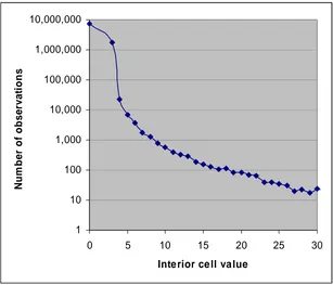
been modified using SCAM. The graph in Figure 1 shows the frequency counts of
observed values of interior cells (those which are not totals or sub-totals) in a set of flows
in Table MG301 from the 2001 SMS. The counts are of flows between (and within) all
OAs (origins) in the UK to all OAs (destinations) in the UK except those in Scotland.
SMS flows to Scottish destinations were not subject to SCAM (neither were any of the
STS data sets).
1 10 100 1,000 10,000 100,000 1,000,000 10,000,000
0 5 10 15 20 25 30
Inte rior ce ll va lue
N
u
m
b
e
r of
obs
e
rv
a
ti
[image:19.595.93.400.294.557.2]ons
Figure 1: Distribution of interior cell values in 2001 SMS Table MG301
Figure 1 has a logarithmic y-axis because of the wide range of counts in the data, and the
x-axis is truncated: there is a long tail of observed interior cell values going up to the
largest observed value of 297. The logarithmic scale removes some emphasis of the
distribution. The first two points plotted are for observed values of 0 and 3. There are
nearly 10 million zero values in the tables and over 1 million values of 3. It can be seen
from Figure 1 that values of 4 and above exhibit a steady rate of decline in frequency,
whilst the value of 3 has a higher frequency than suggested by a linear extrapolation of
flows are either 0 or 3, and 95% of migrants in the flows are accounted for by these
values. Of course, the majority of the zero cells will have been zero originally; only a
proportion are ‘adjusted to zero’ cells. The assumptions we presume were made about
the SCAM process dictate that had SCAM not taken place, 95% of migrants would still
be in cells of value less than 4, but that these would be distributed across the values 1, 2
and 3 rather than all clustered on the values 0 and 3.
Turning to the SWS, we observe that although the interior cells of Table W301 (OA level
journey-to-work flows) have been modified by SCAM in the same way, the clustering is
not quite as extreme. The proportion of all interior cells that are either 0 or 3 is almost
the same as is the case with MG301, at 99.5%. However, these account for a smaller
proportion (77.5%) of all workers. The remaining 22.5% of workers are tabulated in
un-modified cells of this table. The difference between the SMS and the SWS is explained
by the spatial focusing of commuting flows: some OAs have very high numbers of
workers traveling to them.
Thus, from the analyses reported above, SCAM has affected the interaction data by
changing the distribution of values found in the data. In addition to this aggregate
perspective, there are two noticeable ways in which the effects of SCAM will impact on
users. Firstly, SCAM has caused varying conceptually equivalent counts within sets of
tables for a single flow at the same scale; and secondly, SCAM has created varying
conceptually equivalent values within the same count table across different spatial scales.
The variation in conceptually equivalent totals between sets of tables for a specific flow
is most obvious when totals and sub-totals are studied. Totals and sub-totals in tables are
calculated as the sum of the adjusted data so all tables are internally additive. However,
different tables are independently adjusted and this means that counts of the same
population in two or more different tables at the same scale may not necessarily be
equivalent. The problem occurs in the SMS and SWS data sets at level 2 (ward) and
level 1 (district); it is not relevant to any level 3 (OA) data sets, as those data sets only
contain a single output table for each flow. There are two direct counts of total migrants
in SMS level 2, and five in SMS level 1. SWS level 2 has five counts of total commuters,
The way in which SCAM introduces differences between equivalent totals can be
examined by comparing the two available totals in SMS level 2. Of 1,156,804 flows to
destinations outside Scotland, the two totals are different in 714,693 (61%) cases.
However, the majority of these are cases where the total is taken from one cell, and is
equal to 0 in one table and 3 in the other table. Excluding such cases, (that is, where the
total number of commuters is reported as being greater than 0 in both tables), there are
235,498 flows (20%) for which the totals differ. The absolute differences are rarely
large, with the most frequent difference (accounting for 44.6% of all cases) being 3.
Figure 2 shows the distribution of all differences in flows to destinations excluding
Scotland where the total is greater than 0 in both tables. The most extreme difference
between the two totals is 21. In this case, the total taken from table MG201 is 60, whilst
the total taken from table MG203 is 39. Clearly, using a value from one table as a
denominator for a value taken from the other table could lead to very misleading results,
yet it would be a mistake that would be easy to make.
0 20000 40000 60000 80000 100000 120000
0 5 10 15 20 25
Diffe re nce be tw e e n tota ls
Fr
e
qu
e
nc
[image:21.595.104.468.390.627.2]y
Figure 2: Distribution of differences between alternative totals in 2001 SMS Level 2
The other noticeable effect of SCAM – that conceptually equivalent totals may not be the
same across spatial scales is similar to the effect discussed above. Since all tables for all
migrants within the Headingley ward of Leeds, West Yorkshire by aggregating relevant
flows from the OA level information in SMS Level 3 gives a result of 4,651. Finding an
equivalent value from SMS Level 2 with which to compare this re-introduces the second
problem described above: that there are two alternative totals for migration within the
ward. Of these two totals, one is 4,632 and the other is 4,635. The difference between
these two alternatives is minor, and the aggregated total has a deviation of less than 0.5%.
However, the differences may be large enough to introduce problems if the ‘wrong’ total
is used as a denominator, and are certainly large enough to cause confusion and loss of
confidence in users of the data.
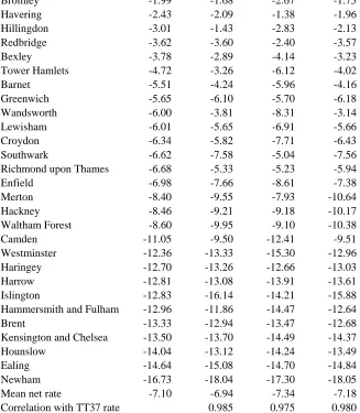
We can use net migration rates for London boroughs to exemplify the effects of SCAM at
different spatial scales. Table 9 shows net rates computed directly using data from SMS
104 for migration between London boroughs and all other local authorities in the country
compared against net rates computed from data aggregated from level 2(SMS 204) and
from Level 3 (SMS 304). These three sets of rates are presented for London boroughs, in
descending rank, against an equivalent set of rates derived from TT37 of the Theme
tables. As expected, the large majority of boroughs lose migrants in net terms, many at
very high rates. Only the very central borough of City of London and the peripheral
borough of Kingston upon Thames record positive rates of net migration across all four
measures. The average net rates vary from -6.94 for SMS104 to -7.34 for SMS204 and
the highest correlation is between data from the TT37 and from SMS 104. This is to be
expected since the rates are based on data counts adjusted at the district level and likely to
contain fewer adjusted values. The series of rate values for the City of London do vary
more than those for other boroughs and this highlights the problem that will occur when
dealing with smaller counts. The City of London is a relatively small area with a
population of just under 7,200 and migration inflows and outflows in 2000-01 that are
only around 1,000 in either direction.
Table 9: Net migration rates for London boroughs in 2000-01 derived from four different source tables
Net migration rates per 1000
Borough TT 37 SMS 104 SMS 204 SMS 304
City of London 4.87 5.01 11.70 3.34
Kingston upon Thames 3.33 3.95 2.76 3.14
Lambeth 0.00 0.55 -0.69 0.76
Bromley -1.99 -1.68 -2.67 -1.75
Havering -2.43 -2.09 -1.38 -1.96
Hillingdon -3.01 -1.43 -2.83 -2.13
Redbridge -3.62 -3.60 -2.40 -3.57
Bexley -3.78 -2.89 -4.14 -3.23
Tower Hamlets -4.72 -3.26 -6.12 -4.02
Barnet -5.51 -4.24 -5.96 -4.16
Greenwich -5.65 -6.10 -5.70 -6.18
Wandsworth -6.00 -3.81 -8.31 -3.14
Lewisham -6.01 -5.65 -6.91 -5.66
Croydon -6.34 -5.82 -7.71 -6.43
Southwark -6.62 -7.58 -5.04 -7.56
Richmond upon Thames -6.68 -5.33 -5.23 -5.94
Enfield -6.98 -7.66 -8.61 -7.38
Merton -8.40 -9.55 -7.93 -10.64
Hackney -8.46 -9.21 -9.18 -10.17
Waltham Forest -8.60 -9.95 -9.10 -10.38
Camden -11.05 -9.50 -12.41 -9.51
Westminster -12.36 -13.33 -15.30 -12.96
Haringey -12.70 -13.26 -12.66 -13.03
Harrow -12.81 -13.08 -13.91 -13.61
Islington -12.83 -16.14 -14.21 -15.88
Hammersmith and Fulham -12.96 -11.86 -14.47 -12.64
Brent -13.33 -12.94 -13.47 -12.68
Kensington and Chelsea -13.50 -13.70 -14.49 -14.37
Hounslow -14.04 -13.12 -14.24 -13.49
Ealing -14.64 -15.08 -14.70 -14.84
Newham -16.73 -18.04 -17.30 -18.05
Mean net rate -7.10 -6.94 -7.34 -7.18
Correlation with TT37 rate 0.985 0.975 0.980
The general advice that ONS has given (for all data products) is that users should
generate counts that they intend to use from as few components as possible. Suppose that
a user is interested in the total number of male migrants, at district scale. This is
available from a variety of the 2001 SMS Level 1 tables. Naïvely, a user might assume
that the correct table to use is table MG101, ‘Age by Sex’. The number of males is
available as a column total. This total is the sum of all other values in the ‘Male’ column:
a total of 24 values, each of which may potentially have been affected by SCAM. The
[image:23.595.94.421.79.454.2]total number of males can also be calculated from tables MG102 (Family Status by sex),
table MG103 (Ethnic group by sex), table MG104 (Whether suffering limiting long-term
illness by whether in household by age by sex), and table MG105 (Economic activity by
sex). Of these, it is table MG103 that allows the user to calculate the total number of
3 Interface developments
WICID has undergone considerable development over that last two years from the
version that was reported in Stillwell and Duke-Williams (2003). In this section of the
paper, we outline two of the new features of the system, the map selection tool developed
to support query-building, and the analysis tool, designed to provide users with some
additional insights into the data sets that they have extracted. Initially, however, we
provide a short resumé of the basic query-building procedure for users of the system,
because this has also undergone some modification.
3.1 Building queries in WICID
One of the fundamental aims of the Census Interaction Data Service (CIDS) has been to
create a user-friendly interface to these complex data sets in order to enhance usage of the
data. Consequently, a great deal of effort has been directed at building a flexible, yet
simple query interface. Once logged into the system and running WICID, the user is
confronted with the screen shown in Figure 3, containing a number of hotlinks that
provide information about the data sets held in the system, details about the user’s
[image:24.595.92.523.426.734.2]account and links to another useful web sites.
For users wanting to build queries and extract data, there are three mechanisms for
‘Getting the data’ from WICID. The first is through the ‘Off-the-shelf’ facility of
downloading data from a library of prepared queries. The second allows users to
generate ‘Flow summaries’ for individual areas that they can specify. Figure 4 is an
example of a summary in which the user has asked for commuting flows to and from the
City of London in 1991, including flows from within that borough. The data comes from
the 1991 SWS Set C and has been aggregated to show the top ten districts of origin
(London boroughs in this case) and of destination. The user can produce similar lists for
other zones by clicking on any one of the other areas in either of the two lists; a flow
pyramid can be generated by clicking on the pyramid icon in the left hand column of each
list. Figure 5 illustrates an age-specific pyramid for commuters between Havering and the
City of London.
Figure 5: Age pyramid of commuters from Havering to the City of London, 1991
Building queries in WICID begins from the query interface (Figure 6) where the user is
given the option of selecting ‘Geography’ or ‘Data’. Of course, the interaction data sets
all require double geographies and consequently the user has to decide which origin and
destinations are required. One of the most innovative features of WICID is the facility to
build geography selections in which the origins and destinations are drawn from sets of
areas at different spatial scales and are not required to be the same. Consequently, it is
possible, for example, for the user to select a single destination (e.g. the City of London)
and to extract flows originating from other London boroughs, from other districts
adjacent in the South East GO region and from other GO regions in the rest of the
country. If the flows required are commuters, then the user would make a selection of the
appropriate variables from the table in the SWS. Figure 7 is an example of a query to
extract data on flows of employees and self-employed persons from the 2001 SWS for
110 origins (100 districts and 10 regions). Once the traffic lights are green, the user can
run the query or refine the query in some way (e.g. my merging some of the variables
Figure 6: The general query interface in WICID prior to selection
[image:27.595.97.522.421.744.2]There are various methods of selecting geographical areas: ‘Quick selection’ enables all
areas at a certain scale to be selected; ‘List selection’ allows areas to be chosen from a list
of all areas at each scale; ‘Type-in-box’ selection provides for one area to be selected at a
time; and ‘Copy selection’ allows areas selected for origins to be copied into destinations
or vice versa. One of the new developments in WICID using web-mapping software is
that of ‘Map selection’, enabling users to pick their origins and destinations from a map
on screen.
3.2 Map selection tool
The map selection tool for choosing origins and destinations is crucial when users are
unfamiliar with the geographical areas that they need to extract data for. We have found
that this facility is particularly important when users are students doing project work,
especially for small areas like wards. The initial screen for map selection (Figure 8)
contains one panel on the left hand side which is the map window and three panels on the
right hand side, the topmost of which is where the user chooses to select either areas or
elements of areas by clicking the cursor in the map window. There is a scroll down menu
available to facilitate the selection of areas at more detailed spatial scales. The panel
below enables the user to zoom in and out or to reposition the map in the window.
Finally, the lower panel contains various links to other screens where the user can
customise the map size, labelling and colour shading of the map if required and can reset
the map to its original scale and view. As the user moves between of areas, the legend at
the bottom of the screen will change to incorporate each level that has been specified.
The example shown in Figure 9 illustrates the selection of the City of London at the
district scale as a destination. Note that the status specification at the top of the figure
Figure 8: The map selection window in WICID
[image:29.595.90.415.432.747.2]3.3 Analytical functions
Once the selection has been made, the data can be extracted and downloaded. However,
WICID also allows users to undertake some analysis of the data set extracted. The
analytical facilities are comprised of a suite of five sets of indicators (Figure 10) that are
computed for a selection of any five of the counts that have been selected in the query.
This maximum of five is to allow easy output on a single screen. The general statistics
consist of descriptive statistics for all the flows extracted together with correlation
coefficients that indicate the strength of any statistical correlation between each pair of
variables. The distance indicator is simply the average distance travelled and this
measure relies on the availability of a additional data on distances between origins and
destinations. The distance measure is not available when the origins and destination sets
are drawn from different scales.
Additional data are also required for computation of the crude intensities. In most cases,
these intensities are commuting or migration rates whose computation requires that the
flow is divided by the appropriate population at risk (PAR). For some variable counts,
the PAR are straightforward (e.g. the PAR for migration outflows of those in age group
1-4 is the population of the area aged 1-4 on census date obtained from the area statistics)
but for other variable counts, PAR are much less straightforward to define (e.g. PAR for
outflows of moving groups) and may not be available from area statistics or standard
tables. PAR counts for the 2001 interaction data sets are currently being prepared
Three further indicators are available in the current WICID system, none of which require
additional information. These are indicators of connectivity, inequality and effectiveness.
The latter two tend to be used for migration analysis whilst the index of connectivity,
measured as the number of pairs of zones that have a flow between them divided by the
total number of pairs of zones selected, can be used with commuting as well as migration
data. The index of migration inequality is derived in two alternative ways. Users can
choose to follow the method defined in Bell et al. (2002) which computes half the sum of
the absolute differences between each observed flow and the observed mean value across
all origins and destinations, except where the origin is the same as the destination. In fact,
the index in WICID uses the observed and expected shares of total migration rather than
the flow count and the index can be computed as a measure of out-migration inequality
for each origin and of in-migration inequality for each destination, as well as an overall
index for all flows in the system. Alternatively, the expected (mean) value can be
replaced with another value (e.g. from another matrix). An index of inequality value of
zero indicates that all origin-destination flows in the system are equal to the mean,
whereas a value of unity would suggest only one positive flow in the system with all
other flows being zero. The index of migration effectiveness computes net migration as a
proportion of the total of its constituent inflows and outflows, giving a measure of how
efficiently net migration redistributes the population in the category selected. Some of
these analytical facilities are exemplified in the next section of the paper.
4 Using the 2001 data: some examples
aggregate net migration for boroughs and then investigate variations by ethnic group. In
the second, we extract data to compute net migration balances by age for London as a
whole and then use WICID to compute migration effectiveness scores. In the third
example, SMS and SWS data are used to compute migration and commuting connectivity
indices for different ethnic groups in London. Finally, we compare commuting patterns to
the City of London using primary SWS data for 2001 and derived data for 1991.
4.1 Internal migration and ethnicity in London in 2001
Greater London is the hub of the British internal migration system. In the 12 months
before the 2001 Census, London lost, in net terms, over 50,000 people to the rest of Great
Britain. In Figure 11, we contrast the pattern of overall net migration rates for the London
boroughs with net rates for migration between London boroughs and the rest of Britain
and net rates for migration occurring between boroughs of London. The patterns are very
different suggesting that London has its own internal migration dynamics. Overall, all the
boroughs except City (‘the square mile’), Kingston upon Thames, Sutton and Lambeth
record let losses when data from SMS Table 104 is used. However, it is the boroughs that
constitute the outer ring that are losing to the rest of Britain; the inner London boroughs,
with the exception of Hackney, are all gaining from internal net migration from the rest
of the Britain. On the other hand, the pattern of net migration rates for migration within
London shows net migration gains in the outer band of boroughs and losses for a wider
set of inner boroughs. In other words, people are leaving inner London for the outer
suburbs, but these net gains are being offset by net out-movement from the outer suburbs
to the rest of Britain.
(c) Net rate with rest of GB (d) Net rate within London
Figure 11: Patterns of net migration for London boroughs, 2000-01
One question that emerges from these maps is whether the patterns of deconcentration
within London are occurring for different ethnic groups, recognising that London has a
huge proportion of ethnic minorities, many of whom are non-white (Figure 12) according
to the 2001 Census Key Statistics.
(a) White and non-white (b) Non-white groups
Figure 12: Distribution of white and non-white and selected non-white ethnic populations, 2001
In this instance we choose to show how the net migration balances vary across the
London boroughs for four ethnic groups: whites; Indians; Pakistanis and other South
Asians; and blacks (Figure 13). The general patterns are remarkably similar, with inner
London boroughs losing through migration in all ethnic groups and outer boroughs
[image:33.595.96.528.411.599.2]are highest from the west end, whilst blacks and Pakistanis and other South Asians are
leaving boroughs both on the north and south sides of the river in which they have a
significant presence. The set of boroughs on the outskirts of London experiences net
gains across all the ethnic categories. These maps suggest patterns of deconcentration of
non-white populations that following those of whites.
(a) Whites (b) Blacks
[image:34.595.92.496.202.557.2](c) Indians (d) Pakistanis and other South Asians
Figure 13: Net migration balances for selected ethnic groups, 2000-01
4.2 Migration effectiveness by age
It is unfortunate that the Census interaction data tends to be uni-dimensional, allowing
little cross-classification of variables. Thus, for example, there is no data available on
migration by ethnic group and age or occupation and researchers requiring this type of
data would have to use microdata from the Samples of Anonymised Records (SARs).
Age is clearly an important influence on migration propensity in all systems of interest as
Rogers and Castro (1981) and. In this example, we have used WICID to extract data for
2000-01 for flows within London and between London and the rest of GB and to
calculate the effectiveness of migration for different quinary age groups.
The graphs in Figure 14 show, in absolute volume terms, the size of the respective flows
and the net balance for London as a whole. The peak of migration within London and
from London to the rest of GB occurs for those aged 25-29. However, London attracts a
peak inflow of migrants aged 20-24 and this creates an age schedule of negative net
migration balances in all ages apart from 20-24 and 25-29. The peak gains at age 20-24
are likely to occur due to the influx of students and young workers to the capital.
Students will be represented in this age group because many of those aged 19 on entry to
HE will be aged 20 at the time of the 2001 Census.
-40000 -20000 0 20000 40000 60000 80000 100000 120000 140000 160000 1-4 5-9 10 -14 15 -19 20 -24 25 -29 30 -34 35 -39 40 -44 45 -49 50 -54 55 -59 60 -64 65 -69 70 -74 75 -79 80
-84 85+
[image:35.595.96.494.335.710.2]Age group Mi g ra ti o n Intra-migration In-migration Out-migration Net migration
The net migration balances shown in Figure 13 demonstrate the magnitude of the
difference between inflows and outflows for London resulting in a net loss of around
50,000 persons during the 12 month period. It is interesting to note that no retirement
peaks are evident from these data since they have not been standardised for population
size. In order to assess the importance of these migration balances for each group, WICID
has been used to compute the migration effectiveness scores for each age group (Figure
15). Migration effectiveness measures the net flow as a proportion of migration turnover
(inflow plus outflow), demonstrating that although the net losses appear to be relatively
small in magnitude for older age groups, it is in these age groups, where the impact of net
out-migration is most important. The retirement age groups in particular, involving those
in their 60s, have net migration losses that reach 68% of migration turnover, whereas the
young adult net gains aged 20-24 in fact only involve 32% of the those arriving and
leaving. -80 -60 -40 -20 0 20 40 1-4 5-9 10-14 15-19 20-24 25-29 30-34 35-39 40-44 45-49 50-54 55-59 60-64 65-69 70-74 75-79 80-84 85+
Age group
[image:36.595.92.459.358.568.2]M ig rat io n ef fect iven ess
Figure 15: Net migration effectiveness by age group for London, 2000-01
4.3 Migration and commuting connectivity by ethnic group
In the third example, we have chosen to consider ethnic group variations in the extent to
which London boroughs are connected with one another. Two dimensions of connectivity
are considered here. The first involves flows of migrants from London boroughs to other
London boroughs on the one hand, and to other local authorities in the rest of Britain on
the other. The second involves those aged 16-64 who commute to work in each London
WICID that indicate for any one borough, what proportion of the other boroughs in
London or of local authorities in the rest of GB they have some connection with (i.e.
where there at least three out-migrants from the origin borough to a destination).
In Figure 16, boroughs have been ranked according to their connectivity index for each
ethnic group, showing that as far as whites are concerned, virtually all boroughs are
connected with one another within London. At the other end of the spectrum, least
connectivity is exhibited by the Chinese. There is some evidence to suggest lower levels
of connectivity for out-migrants belonging to the Pakistani and other South Asian group
than the Indian group. When we consider migration between London boroughs and
elsewhere in Britain, variations between whites and other ethnic groups are much more
clearly defined. Half the London boroughs are connected by out-migration to 80% or
more of the other local authorities in Britain, whereas most boroughs have out-migration
connections with less than 20% of boroughs in the remainder of the country.
[image:37.595.86.555.368.580.2](a) Flows within London (b) Flows outside London
Figure 16: Out-migration connectivity by ethnic group for London boroughs, 2000-01
The second measure of connectivity is for in-commuters to each London borough from
other London boroughs and, in this example, we distinguish between all flows and flows
of full-time students in Figure 17. Commuting connectivity is greater within London than
migration connectivity, but similar differences occur between white, black, Asian and
Chinese ethnic groups.
0.00 0.20 0.40 0.60 0.80 1.00
1 3 5 7 9 11 13 15 17 19 21 23 25 27 29 31 33
Boroughs rank e d by inde x
Ou tf lo w C I ( wi th in GL ) White Indian
Pakistani and OSA Chinese Black 0.00 0.20 0.40 0.60 0.80 1.00
1 3 5 7 9 11 13 15 17 19 21 23 25 27 29 31 33
Boroughs rank e d by inde x