R E S E A R C H
Open Access
Visual parameter optimisation for biomedical
image processing
AJ Pretorius
1*, Y Zhou
2, RA Ruddle
1From
5th Symposium on Biological Data Visualization
Dublin, Ireland. 10-11 July 2015
Abstract
Background:Biomedical image processing methods require users to optimise input parameters to ensure
high-quality output. This presents two challenges. First, it is difficult to optimise multiple input parameters for multiple input images. Second, it is difficult to achieve an understanding of underlying algorithms, in particular, relationships between input and output.
Results:We present a visualisation method that transforms users’ ability to understand algorithm behaviour by integrating input and output, and by supporting exploration of their relationships. We discuss its application to a colour deconvolution technique for stained histology images and show how it enabled a domain expert to identify suitable parameter values for the deconvolution of two types of images, and metrics to quantify deconvolution performance. It also enabled a breakthrough in understanding by invalidating an underlying assumption about the algorithm.
Conclusions:The visualisation method presented here provides analysis capability for multiple inputs and outputs in biomedical image processing that is not supported by previous analysis software. The analysis supported by our method is not feasible with conventional trial-and-error approaches.
Background
Biomedical image processing is fundamental to many biological research methods [1]. These algorithms take parameter values and images as input, and produce annotated images and quantitative measures as output. Because they are sensitive to parameter values, imaging artefacts, and factors like tissue type, it is difficult to find robust parameter values that ensure high-quality output. Consequently, user judgment is an integral part of the optimisation process.
Optimisation problems may be classified in different ways, including the scale of parameter and output space. For the class of problem we consider, users deal with 2-7 input parameters and 2-7 output measures. Users also want to review image-based output for up to five images. We obtained these numbers by consulting domain experts and by observing users. They also correspond to
observations in previous work [2-5]. There are problem classes with more parameters, but they are beyond the scope of this paper.
In this section we first review existing approaches for parameter optimisation. We then identify two important challenges (multiple inputs and outputs, and supporting understanding) and show that they are not addressed by this work. In further sections we describe a novel visualisa-tion method to address the challenges and discuss a case study where our approach was used.
Visual parameter optimisation
The most prominent approach for parameter optimisation is parameter tweaking. This involves repeatedly adjusting parameter values and reviewing output. It is tedious and incurs time and quality costs [5,6]. Automated parameter optimisation methods also exist, but require specialised mathematical insight and do not allow subjective analysis of output [7,8].
* Correspondence: [email protected] 1School of Computing, University of Leeds, Leeds, UK
Full list of author information is available at the end of the article
To address the shortcomings of parameter tweaking and automation, a number of visualisation methods have been developed (for example, see [9]). We classify them as follows. First, guided navigation approaches rely on an objective function or a distance measure from an ideal output (ground truth). Some show neighbourhoods in parameter space to guide users to optimal values [2,4]. Others support systematic exploration of para-meter space by combining modelling, simulation, and visualisation [6,10]. These methods require an under-standing of complex mathematical concepts for interpre-tation, which users may find challenging. Also, objective functions and ground truths are not always available (for example, see [5,11]).
A second class of methods relies on interactive visual exploration and qualitative evaluation of output. This includes dynamic queries of distribution plots of input and output [12,13]. It is also possible to visualize the parameter search graph to let users revisit and refine existing outputs [14,15]. Other methods visually struc-ture parameter space to support the identification of suitable values [3,16]. An alternative is to emphasise the characteristics of output space and to let users select the output that best suit their needs [17,18].
Third, parameter space is typically high-dimensional and standard multidimensional visualisation methods can be used. This includes: dimensional stacking, where data items are embedded in a hierarchy of nested scat-terplots [19]; hierarchical clustering, similar to dimen-sional stacking, but nested dimensions are shown as a directed tree; scatterplot matrices, where a matrix of scatterplots shows all two-way combinations of dimen-sions [20]; and parallel coordinates, where every variable is represented by a parallel axis and data items by poly-lines that intersect the axes. Hierarchical clustering and parallel coordinates have been extended to embed one image per parameter combination [21].
Finally, there are methods specifically for considering parameters in conjunction with image-based output. “Open-box”methods are custom-developed for specific image processing algorithms [22-24]. As parameter values are changed, they show algorithm-specific inter-mediate measures and update an output image. In pre-vious work, we presented a visualisation method to analyse input parameters and image-based output for arbitrary algorithms [5]. It shows a Cartesian sampling of parameter space as a tree with a node-link diagram. Users select smaller contiguous regions of sampled para-meter space to view associated output images in a coor-dinated view. This was followed by a case study, where users were able to analyse larger parts of parameter space and achieved higher quality results compared to parameter tweaking [25].
Challenges
We now describe two unaddressed challenges, identified by analysing the above case study, a review of related work, and discussions with domain experts (Broad Insti-tute, Leeds, and TU Darmstadt). We omit guided navi-gation since objective functions and ground truths usually do not exist in our application domain.
Multiple inputs and outputs
Image processing algorithms require multiple input parameters to be set and users are usually interested in analysing the results of an algorithm on multiple input images (typically of the same class, for example, tissue type). Users also want to examine the multiple output images and multiple output measures generated during algorithm execution. Hence, users need to combine an objective analysis of parameters and measures with a subjective analysis of images.
In Table 1, we show the ways in which previous visua-lisation methods are deficient. All methods deal with multiple input parameters, though some only treat pairs [3,16]. However, none support the analysis of algorithms applied to multiple input images. Further, previous methods are not designed to support visual analysis of multiple output measures (some offer limited capabil-ities [3,12,13,22-25]). Standard multidimensional visuali-sation methods can visualise parameters and measures but generally do not cater for images (it is sometimes possible to show a single output image per parameter combination [21]).
In sum, there is an unmet challenge to visually sup-port analysis of multiple input parameters, input images, output measures, and output images.
Understanding
Helping users understand their image processing algo-rithms is an important requirement to achieve confi-dence and generalise findings. With conficonfi-dence in optimal parameter values for input images of the same class (for example, a tissue type), users can automate the processing for large volumes of similar data. An understanding of underlying algorithms also lets users generalise their findings to process input images with different characteristics. Finally, there is a need to vali-date image processing algorithms and to identify errors, particularly in a research context.
parameter values [21]. Some methods let users investi-gate different scenarios in terms of input parameters [3,12,13], support the parameter search process [14,15], or permit exploration of simulations in a goal-oriented manner [17]. Nonetheless, they are geared to finding sui-table parameter values.
We conclude that the challenge of supporting under-standing is unmet. For previous visualisation methods, understanding is a bonus and not a design objective.
Methods
To address the above challenges, we developed a visuali-sation technique to optimise parameters for biomedical image processing algorithms and implemented it in a tool called Paramorama2 [26]. Our technique is novel because: it enables holistic analysis of numerical and image-based inputs and outputs, and it provides interac-tive capabilities to enable flexible exploration of relation-ships between inputs and outputs. This work is the result of 30 months of close collaboration between the authors and diverse domain experts. Although our approach extends our previous work [5,25], there are important differences in conceptual approach, visual
design, and the analysis it supports. In this section, we describe our design decisions.
Our data is generated offline by taking a Cartesian sampling of parameter space. For each (real-valued) input parameter, a user-specified interval is sampled. For each input image, the algorithm is executed once for each unique combination of sampled parameter values. This generates multiple output measures and output images that are associated with a particular com-bination of input parameters and the set of input images. Output measures are descriptive metrics that capture information about the output. We refer to a unique combination of input parameters, input images, output measures, and output images as a data record.
Multiple inputs and outputs
As shown below, we combine a tabular visualisation of input parameters and output measures with an image browser for input and output images. We also describe design alternatives that we considered.
Tabular visualisation
[image:3.595.56.540.99.224.2]We show the relationships between input parameters and output measures in a tabular visualisation (see
Table 1 Summary of visual support for multiple inputs and outputs.
Input parameters Input images Output measures Output images
Distribution plots[12,13] Supported No Supported No
Search graph[14,15] Supported (changes) Single only No One per parameter set
Structured parameter space[3,16] Pairs only Single only [16] Supported [3] One per parameter set
Structured output space[17,18] Supported (changes) No Single objective function One per parameter set
Dimensional stacking[19] Supported No Supported No
Hierarchical clustering[21] Supported No Supported One per parameter set
Scatterplot matrices[20] Supported No Supported No
Parallel coordinates[21] Supported No Supported One per parameter set
[image:3.595.58.540.263.443.2]Parameters & images[5,22-25] Supported Single only Limited One per parameter set
Table 2 Summary of visual support for algorithm understanding.
Supported Unsupported
Distribution plots[12,13] Relations between parameters and measures Analysis of images
Search graph[14,15] Identification of single suitable output image; relations between single input image and input parameter values
Analysis of multiple images, input parameters, or output measures
Structured parameter space[3,16] Identification of suitable output images; relations of pairs of input parameters and output images
Analysis of multiple images or output measures
Structured output space[17,18] Relations between input parameters and output images Analysis of input images or output measures
Dimensional stacking[19] Relations between parameters and measures Analysis of images
Hierarchical clustering[21] Relations between parameters and measures; relations between input parameters and one output image per combination
Analysis of input images; support for multiple output images
Scatterplot matrices[20] Relations between parameters and measures Analysis of images
Parallel coordinates[21] Relations between parameters and measures; relations between input parameters and one output image per combination
Analysis of input images; support for multiple output images
Parameters & images[5,22-25] Primarily, relations between input parameters and one output image per combination
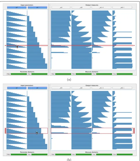
Figure 1(a)). Columns at the left represent parameters and columns at the right represent measures. Each data record is represented by a row that spans across the columns. The value taken for a parameter or measure is encoded in the corresponding column. If the vertical space per row is more than four pixels, a bar chart encodes every column, otherwise a line chart is used. Although line charts do not prevent over-plotting, they are effective to let users discern high-level patterns when limited vertical space is available.
Our tables are similar to a table lens, which was devel-oped primarily as a focus+context method [27]. Our objective, however, is to use the tabular representation to assist users in flexibly identifying and analysing rela-tionships between parameters and measures. As we will show, we achieve this by extending our method with a number of interactive features.
Image browser
Our method has an image browser at the right of the user interface. It shows a horizontal list of input images at the top (see Figure 1(b)). When users select rows in
the tabular visualisation, the corresponding output images are shown below the input images in a grid (Fig-ure 1(c)). Columni shows the output images produced by applying the algorithm to theithinput image. Each row represents a data record and the top-to-bottom order corresponds to the order of selected records in the tabular visualisation (Figure 1(d)).
By viewing the column of output images below each input image, users can compare output produced by dif-ferent input parameter combinations for difdif-ferent input images. Each output image is blended with the input image to make comparisons easier (the amount of blending is user-specified). Users can also define a rec-tangular region of interest in each input image to view for the output images. This helps when there are parti-cular regions that are known to be problematic for an algorithm (see Figure 1(b) and 1(c)). Users can also adjust output image magnification.
[image:4.595.58.540.351.642.2]The primary mechanism to analyse relationships between input and output is interaction (seeUnderstanding, below).
As an additional aid, we provide a summary where horizon-tal strips represent the domains of parameters and mea-sures (see Figure 1(e)). Dark regions indicate the values to which currently displayed images correspond.
Design alternatives
We also considered alternative visualisation methods. The most applicable highlight the structure of input or output space, but no existing ones integrate both (see Tables 1 and 2). Standard multidimensional visualisation methods were ruled out for the reasons below.
For dimensional stacking and hierarchical clustering, the real-estate requirements increase exponentially with the number of dimensions. Scatterplot matrices can visualise an arbitrary number of dimensions but, due to perceptual limitations, it is difficult to analyse relation-ships that span across more than two. For example, the multiway correlations that show up as nested patterns in Figure 1(a) cannot be easily discerned in Figure 2(a), which shows the same data. Our approach directly shows cyclical patterns in columns (for example, m1,
m2,m1 −1, and m2−1 in Figure 1). By contrast,
paral-lel coordinates often mask such patterns when polylines overlay each other, requiring further interaction (see Figure 2(b)). To highlight cyclical patterns, we also con-sidered spiral representations (for example, [28]). These require tuning an additional parameter to find a rotation interval and do not support multidimensional data. In fact, these alternatives all require far more effort for interacting with the data than our approach (seeUnderstanding, below).
While developing our image browser we considered existing work for browsing photo libraries. Some, like PhotoFinder [29], show grids of sequentially ordered images. Others, like PhotoMesa [30], show the hard disk directory structure as a treemap. These methods were not designed to show relationships with and facilitate understudying of associated inputs and outputs.
Understanding
Users need to discover and analyse relationships between input and output. Interaction is key to flexibly select data records and inspect associated images. For this, we combine column-based sorting, including auto-mated sorting, with context-sensitive selection.
Column-based sorting
Users can interactively sort the rows in the tabular visualisation to identify relationships, such as correla-tions, that span across input parameter and output mea-sure space. It is precisely this type of analysis that previous methods, including our own work, do not enable users to perform, instead focussing either on input or output (see Tables 1 and 2).
When users click on a column header, data records are sorted by the values of the corresponding input parameter or output measure. In Figure 3(a), the data have been sorted by the second parameter (p2). A
step-like pattern has emerged where records are grouped into a number of bins with the same value for para-meterp2. It is possible to identify relationships between
[image:5.595.60.539.475.693.2]p2and some of the output measures at the right. When
multiple columns are selected, the order in which they were selected matters and all previously applied sortings are maintained. Figure 3(b) shows the result of sorting Figure 3(a) onp1. The records are only reordered within
each of the bins ofp2to show a nested step-like pattern.
Now, even more striking relationships with the output measures appear.
Automated sorting
During prototyping, we repeatedly observed users search-ing for the parameter that most highly correlates with out-put measures. We consequently implemented a simple automated sorting facility that we call“smart sorting”. When users click on“Smart sort”(see Figure 1, lower left), our method computes the aggregate correlation of each input parameter and all output measures. The parameter with the highest correlation is identified and the data records are sorted by this parameter (Figure 3(a)).
Context-sensitive selection
During prototyping, users found selection of individual data records too tedious to effectively analyse relation-ships between input and output. To address this, we developed context-sensitive selection. Suppose the cur-sor intersects row rand column c. In addition to high-lighting rowr, all directly adjacent rows with the same value for column c also receive focus. For example, compare the highlighted rows in Figure 4(a), where the cursor intersects column one, to Figure 4(a) where it intersects column two. Rows in focus are enclosed by a red frame and marked by two red disks in the margins. Clicking selects all rows in focus and marks each selected record with blue disks. Compound selections are made by multiple selections of this type.
Clicking on the button labelled“Show”, below the tab-ular visualisation at the right, displays all images asso-ciated with selected data records in the image browser (Figure 1(d)). To provide more flexibility, users can rapidly filter records by clicking on“Filter” below any column and then specify an interval of interest. All records where the corresponding parameter or measure falls outside the interval are hidden. A strip below each column indicates which parts of its domain are currently displayed (see Figure 1).
There are situations where users want to look at out-put images associated with a single data record in real time. By holding the shift key, output images for the table row directly under the cursor are temporarily shown in the image browser. Images for a single record can be read and drawn at interactive speeds.
Design alternatives
We also investigated updating the image browser in real time as users select data records, or to use image cach-ing. The former imposes a performance penalty for reading large numbers of images from disk, while the memory footprint of the latter limits scalability.
Column sorting combined with context-sensitive selec-tion is an effective and efficient way to investigate mean-ingful subsets of data. We also considered“hard sorting” rows by column 1, then by column 2, and so on. This imposes a column-based hierarchy on the data and forces users to reorder columns to change the hierarchy. Instead, our approach lets users choose a column to sort on with one button click.
For automated sorting, it is possible to rank all input parameters on their individual correlations and to sort the data by all parameters, in this rank order. However, our users indicated that they prefer sorting by the single most significant parameter and our method therefore implements this approach. Providing automation as a “one-click” option, which can be visually verified and easily undone, alleviated fears about added complexity introduced by automated analysis.
Results and Discussion
In this section, we describe applications of our method by providing an intuitive example and a case study. We also consider further biomedical applications, lessons learned, and opportunities for future work.
Example: cell nuclei detection
Cell nuclei detection is an important but challenging step in many high-throughput assays. As demonstrated in Addi-tional file S1, Figure 5 shows the results of a cell nuclei detection algorithm for photomicrographs of human HT29 cells (colon cancer) that had been stained (Hoechst 33342) to highlight nuclei [31]. The algorithm has five input para-meters that had been sampled three times each on mean-ingful intervals. For each combination of parameter values, the algorithm was run on two input images. For each para-meter value combination, object counts for each image were captured as output measures and the outlines of detected nuclei were saved as output images.
The results have been sorted on column 6, the nuclei count for the first input image. This shows relationships with the second (minimal nucleus diameter) and fourth (lower threshold) parameters. By considering the values of the two parameters in combination with the output measures and images, it is straightforward to identify values for both that produce accurate nuclei detection (nucleus diametertakes its second value and threshold
takes its first or second value). These results have been selected in Figure 5. A biomedical novice (first author) was able to identify these values in less than five min-utes. The same task takes more than an hour with con-ventional parameter tweaking [5].
Case study: colour deconvolution for histology
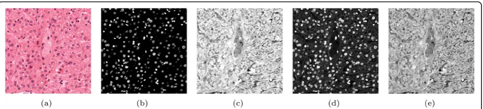
glass slides, and stained with dyes that highlight differ-ent cellular compartmdiffer-ents and structures. Hematoxylin and eosin dyes are often combined (H&E) to, respec-tively, colour cell nuclei blue and cytoplasm and con-nective tissue pink (see Figure 6(a)). However, different sub-cellular structures and proteins have overlapping absorption spectra, which makes it hard to differentiate contributions of individual dyes. Colour deconvolution is an image processing method that can extract indivi-dual dyes. This has important biological implications because it allows for quantitative tissue characterisation (seeApplications, below).
For colour deconvolution, a suitable deconvolution matrix must be found. When applied to the original RGB image, this matrix splits it into several images, each representing the contribution of an individual dye. A biomedical image analysis expert (second author) had been investigating the assumed optimality of Ruifrok and Johnson’s deconvolution matrix [32]. He had two objectives. (O1) Develop quality measures to quantify the performance of colour deconvolution. This requires an understanding of the behaviour of the deconvolution method. (O2)Find optimal values for two corrective parameters to optimise the deconvolution matrix. If
non-zero, this would show that Ruifrok and Johnson’s method is not optimal in all cases.
The expert had been working on the problem just short of a year when we got involved. The description below of how he achievedO1 andO2with our method was obtained by a diary study and follow-up interview. Preparation
The expert worked on two tissue types, liver and lym-phoma (a type of blood cancer), which had been stained with H&E [33]. By using prior knowledge of the light absorption properties of tissue (the Beer-Lambert law [32]), the expert had developed two corrective para-meters,p1 andp2 to apply to the deconvolution matrix
and six candidate output measures to quantify the out-put quality.
The first parameter (p1) characterizes the
haematoxy-lin stain in absorbing the red, green and blue compo-nents of the incident light. This parameter can be used to isolate cell nuclei in most cases. The second para-meter (p2) characterises the eosin stain and can be used
to isolate cytoplasm and connective tissue. Respectively,
m1-m3 are the percentage of negative coefficients, mean
[image:9.595.55.538.90.376.2]while m4-m6 record the same results for the second
stain. Detailed rationale of these parameters and mea-sures are beyond the scope of this paper (involving optics and material light absorption properties), but an appreciation of the value of the insights gained with our method does not rely on a specialist understanding.
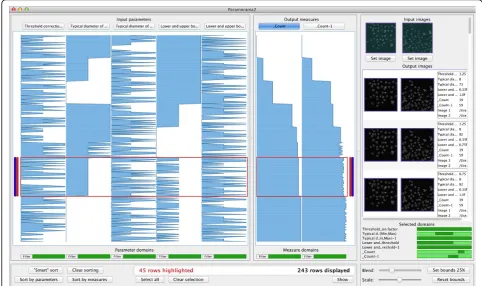
The expert was keen to find an alternative to para-meter tweaking and immediately saw the potential of our method. He customised his software to sample the input parameters 11 times each on intervals identified based on domain knowledge. This yielded 121 unique combinations. Next, for each of the two input images, colour deconvolution was performed for each unique combination of sampled parameter values, and the cor-responding data record was saved to disk. Input and output images measured 1, 000 × 1, 000 pixels.
Visual analysis
The expert’s data is typical for our application domain. Each data record contained two input parameters, two input images, 12 output measures (six per input image), and four output images (two per input image). The expert started by analysing the deconvolution results for the liver section image (see Figure 6(a)).
O1. After loading the data, the expert applied smart sorting. This identified and sorted the data on p2, the
parameter with the highest aggregate correlation with the variance of the output measures (see Figure 3(a)). The expert observed a number of patterns suggesting correlations betweenp2 and several of the output
mea-sures. Some appeared to be direct, while others appeared to be inverse relationships. The expert then sorted on p1. He was surprised by the result shown in
Figure 3(b), where clear correlations between the input parameters and the output measures are evident. Before using our method, he had only seen single results (out-put image + quality scores) and had not been able to piece together the relationships shown here.
The expert now analysed these relationships (see Figure 3(b)). First, asm4 andm5 only took one of two
values, they did not appear to carry sufficient informa-tion and the expert discarded them, reducing the complexity of the subsequent investigation. Next, the expert noticed that m2 and m3 appeared to be
inver-sions of each other: when m2 increases, m3 decreases
and vice versa. Finally, output measures m1 and m6
also closely resemble each other.
The expert concluded thatm1andm2are sufficient to
analyse the quality of results. The overview and analysis provided by our method enabled him to understand the behaviour shown by the output measures and, conse-quently, he was confident in this selection. He confirmed his choice by performing a similar analysis of the results of colour deconvolution on the lymphoma image. Figure 1 shows our method with the results of deconvolution applied to both input images. The two input parameters
p1andp2are at the left of the tabular visualisation. At the
right is the reduced set of output measures,m1andm2for
the liver images andm1−1andm1−2for lymphoma. In this
way, the expert was able to addressO1.
O2. The results in Figure 1(a) show a direct relationship between the value assumed for parameterp1and output
measuresm1andm1−1. Based on the assumed optimality
of Ruifrok and Johnson’s deconvolution matrix [32], the expert expected to find high-quality output whenm1and
m1−1approach zero. Also, the parametersp1andp2
repre-sent deviations from the original deconvolution row vec-tors, where their 6thvalue represents no change. Since the default deconvolution matrix was derived from numerous empirical experiments, the expert wanted to veer away from it as little as possible to achieve improved quality output. Having establishedp2as the parameter most
[image:10.595.59.540.88.197.2]clo-sely correlated with variation of the output measures, the expert decided to first review those data records closest to where p2 takes its 6th value and where m1 and m1-1
approach zero. Figure 4(b) shows how he selected these records using context-sensitive selection.
The expert next reviewed the output images in the image browser. Because deconvolution splits each input image into two output images (one for hematoxylin, one for eosin), there are four columns of images in Figure 1. The first two columns correspond to the output for the liver section input image while the last two correspond to lymphoma. By reviewing these images, and cross-referencing parameters and measures, the expert identi-fied a combination of input parameter values wherep2
≠0 that yielded higher quality results for both input images than the original deconvolution matrix proposed in [32]. This enabled the expert to addressO2and show that the Ruifrok and Johnson deconvolution matrix is not always optimal.
Reflection
We followed up by conducting an unstructured debriefing interview. From this and our analysis of the case study, we conclude the following. First, with our approach the expert was able to effectively and efficiently address his research objectives. In particular, by addressingO2, our technique led him to a breakthrough in understanding. By discover-ing that an underlydiscover-ing assumption about the deconvolu-tion algorithm he considered is invalid, he showed that Ruifrok and Johnson’s deconvolution matrix is not optimal for all cases. Figure 6 illustrates this for the liver section.
Second, the total analysis time for both data sets was roughly 20 minutes. In contrast, the expert estimated that an attempt at a similar analysis using his conven-tional approach (parameter tweaking) would have required several days.
Third, the expert noted that despite previously focus-ing on O1andO2 for nearly a year, he had little confi-dence in the results obtained with his conventional methods. By contrast, he was very confident of the results achieved with our method. In fact, based on his experience, he held a strong conviction that the rigour of analysis that our technique supports is practically unfeasible using his conventional approach.
Applications
By applying the above algorithm to stained histology sections of engineered articular cartilage, scientists at the University of Leeds have found a direct correlation between stain intensity, which isolates an extracellular matrix, and the compressive strength of the cartilage. Cartilage repair with engineered tissue is an important new regenerative therapy for ageing populations and this approach offers a novel method for quantifying a key property using histology sections that are already routinely taken for subjective inspection.
Research into regenerative treatment also requires accurate models of, for example, spinal biomechanics.
For this, biologists at Leeds are using the above algo-rithm to investigate if the distribution of stains obtained by deconvolution can be used to derive models of the structural properties of intervertebral disks.
Finally, image processing is a fundamental part of high-content screening workflows. Effective and efficient optimisation of these algorithms dramatically reduces the associated time and quality costs (for example, see
Example: cell nuclei detection, above).
Lessons learned
The parameter visualisation method described in this paper treats multiple input parameters, input images, output mea-sures, and output images as first-class citizens for the first time. It results from an evolution in our understanding of the problem space. This is mirrored in the progression from our initial work that focuses only on input parameters and output for a single input image [5], to a limited and makeshift treatment of measures [25], to the work pre-sented here. The long-term collaboration between us (first and third author) and diverse domain experts (like the sec-ond author) has been absolutely essential for this.
During this time, our collaborators’understanding and expectations of the role of visualisation also changed. Our joint work has convinced them that interactive visualisation is an important analysis paradigm. As our case study shows, visualisation enables them to address their problems in new and more effective ways.
By focusing on the problem, and not intrinsically on technical novelty, we were able to achieve a step-change for users. Due to the gap in previous parameter visuali-sation approaches, which are either parameter- or out-put-centric, they were limited in the types of analysis they could perform. Although our approach is partly based on existing methods, it combines these in a novel way to bridge this gap. By documenting the problem space and the design space, we argue that others will also be able to benefit from this work. This echoes calls for design studies by other authors [34,35].
Future work
Despite over-plotting, we have successfully analysed just over 17,000 data records of browsing behaviour from an unrelated usability study, where a total of nine parameters and measures were investigated and where sensitivity plots were viewed in the image browser. This suggests that our approach could scale to larger data sets than designed for and that it has potential for pro-blems outside biomedical image processing.
Still, our approach requires sample sizes to be chosen in accordance with the number of data records to visualise. We see two ways to cater for scenarios that require greater scalability. First, a brute-force approach is to visualise more samples by using larger displays such as powerwalls, by letting visualisations scroll, or by implementing focus + context techniques (for example, [37]). A second approach is computational steering, where visualisation is integrated into a larger iterative cycle aimed at specifying and resam-pling regions of parameter space on the fly (for example, see [38]). We can, for instance, envision our visualisation interface integrated into an image processing framework like CellProfiler [39]. More work is required to investigate these possible approaches.
Another challenge is scaling to very large numbers of input and output images. Discussions with experts revealed that they would like to follow up on analyses like our case study with larger-scale validation exercises that involve hundreds or thousands of input images and their corre-sponding output. This would be valuable to validate the robustness of a set of parameter values. Here the emphasis shifts from dealing with the complexity of parameter space to also dealing with the complexity of very large collections of image-based input and output. There are currently no methods that enable users to interactively analyse the out-put generated for very large numbers of inout-put images and this is an important open challenge for future research.
Conclusions
We presented a visualisation technique for parameter optimisation of biomedical image processing algorithms. It addresses two challenges: dealing with multiple inputs and outputs (parameters, measures, and images) and enabling understanding of underlying algorithms. To show this, we provided a case study where a biomedical image processing expert used our method for colour deconvolution of histology images.
Additional material
Additional File 1:
Competing interests
The authors declare that they have no competing interests.
Authors’contributions
AJP carried out visualisation design and implementation, conducted parts of the case study, and drafted the manuscript. YZ provided expert input for visualisation design, carried out and helped to draft the case study. RAR helped with visualisation design and to draft the manuscript. All authors read and approved the final manuscript.
Acknowledgements
The authors thank Anne Carpenter and Mark Bray (Broad Institute), Duane Carey and Scott Finlay (University of Leeds), and Tatiana von Landesberger (TU Darmstadt) for crucial input. This research was supported by WELMEC, a Centre of Excellence in Medical Engineering funded by the Wellcome Trust and EPSRC (WT088908/Z/09/Z). Write up was made possible by a Leverhulme Early Career Fellowship award to AJP (ECF2012-071).
Declarations
Funding for publication of this article was provided by WELMEC, a Centre of Excellence in Medical Engineering funded by the Wellcome Trust and EPSRC (WT 088908/Z/09/Z).
This article has been published as part ofBMC BioinformaticsVolume 16 Supplement 11, 2015: Proceedings of the 5th Symposium on Biological Data Visualization: Part 1. The full contents of the supplement are available online at http://www.biomedcentral.com/bmcbioinformatics/supplements/16/S11
Authors’details
1School of Computing, University of Leeds, Leeds, UK.2School of Computing, Engineering and Physical Sciences, University of Central Lancashire, Preston, UK.
Published: 13 August 2015
References
1. Walter T, Shattuck DW, Baldock R, Bastin ME, Carpenter AE, Duce S,et al:
Visualization of image data from cells to organisms.Nat Methods2010,
7(3 Suppl):S26-S41.
2. Berger W, Piringer H, Filzmoser P, Gröller E:Uncertainty-aware exploration of continuous parameter spaces using multivariate prediction.Computer Graphics Forum2011,30(3):911-920.
3. Booshehrian M, Möller T, Peterman RM, Munzner T:Vismon: facilitating analysis of trade-offs, uncertainty, and sensitivity in fisheries management decision making.Computer Graphics Forum2012,
31(3pt3):1235-1244.
4. Piringer H, Berger W, Krasser J:HyperMoVal: interactive visual validation of regression models for real-time simulation.Computer Graphics Forum 2010,29(3) :989-992[http://onlinelibrary.wiley.com/doi/10.1111/j.1467-8659.2009.01684.x/abstract].
5. Pretorius AJ, Bray MA, Carpenter AE, Ruddle RA:Visualization of parameter space for image analysis.IEEE Trans Vis Comput Graphics2011,
17(12):2402-2411.
6. Torsney-Weir T, Saad A, Möller T, Weber B, Hege HC, Verbavatz JM, Bergner S:Tuner: principled parameter finding for image segmentation algorithms using visual response surface exploration.IEEE Trans Vis Comput Graph2011,17(12):1892-1901.
7. Ansari N, Hou E:Computational Intelligence for OptimizationSpringer, New York, New York, USA; 1997.
8. Onwubiko C:Introduction to Engineering Design OptimizationPrentice Hall, Upper Saddle River, New Jersey, USA; 2000.
9. Sedlmair M, Heinzl C, Bruckner S, Piringer H, Möller T:Visual parameter space analysis: a conceptual framework.IEEE Transactions on Visualization and Computer Graphics2014,20(12):2161-2170[http://ieeexplore.ieee.org/ xpl/articleDetails.jsp?arnumber=6876043].
10. Bergner S, Sedlmair M, Möller T, Abdolyousefi SN, Saad A:ParaGlide: interactive parameter space partitioning for computer simulations.IEEE Transactions on Visualization and Computer Graphics2013,19(9):1499-1512. 11. Steger S, Bozoglu N, Kuijper A, Wesarg S:Application of radial ray based
segmentation to cervical lymph nodes in CT images.IEEE Trans Med Imaging2013,32(5):888-900.
13. Tweedie L, Spence R:The prosection matrix: a tool to support the interactive exploration of statistical models and data.Computational Statistics1998,13(1):65-76.
14. Callahan SP, Freire J, Santos E, Scheidegger CE, Silva CT, Vo HT:Managing the evolution of dataflows with VisTrails.Data Engineering Workshops, 2006. Proceedings. 22nd International Conference on2006, 71 [http:// ieeexplore.ieee.org/xpl/articleDetails.jsp?arnumber=1623866].
15. Ma KL:Image graphs - a novel approach to visual data exploration.VIS
‘99 Proceedings of the conference on Visualization‘99: celebrating ten years 1999, 81-88 [http://ieeexplore.ieee.org/xpl/articleDetails.jsp?
arnumber=809871].
16. Jankun-Kelly TJ, Ma KL:A spreadsheet interface for visualization exploration.Proceedings of the conference on Visualization‘002000, 69-76 [http://ieeexplore.ieee.org/xpl/articleDetails.jsp?arnumber=885678]. 17. Bruckner S, Möller T:Result-driven exploration of simulation parameter
spaces for visual effects design.IEEE Transactions on Visualization and Computer Graphics2010,16(6):1468-1476.
18. Marks J, Andalman B, Beardsley PA, Freeman W, Gibson S, Hodgins J,et al:
Design Galleries: a general approach to setting parameters for computer graphics and animation.Proceedings of the 24th annual conference on Computer graphics and interactive techniques1997, 389-400 [http://dl.acm. org/citation.cfm?id=258887].
19. LeBlanc J, Ward MO, Wittels N:Exploring N-dimensional databases. Visualization, 1990. Visualization‘90., Proceedings of the First IEEE Conference on1990, 230-237 [http://ieeexplore.ieee.org/xpl/articleDetails.jsp? arnumber=146386].
20. Hartigan JA:Printer graphics for clustering.Journal of Statistical Computation and Simulation1975,4(3):187-213.
21. Beham M, Herzner W, Gröller ME, Kehrer J:Cupid: cluster-based exploration of geometry generators with parallel coordinates and radial trees.IEEE Transactions on Visualization and Computer Graphics2014,
20(12):1693-1702.
22. Schultz T, Kindlmann GL:Open-box spectral clustering: applications to medical image analysis.IEEE Transactions on Visualization and Computer Graphics2013,19(12):2100-2108.
23. Von Landesberger T, Andrienko G, Andrienko N, Bremm S, Kirschner M, Wesarg S, Kuijper A:Opening up the“black box”of medical image segmentation with statistical shape models.Vis Comput2013,
29(9):893-905.
24. Von Landesberger T, Bremm S, Kirschner M, Wesarg S, Kuijper A:Visual analytics for model-based medical image segmentation: opportunities and challenges.Expert Systems with Applications2013,40(12):4934-4943. 25. Pretorius AJ, Magee D, Treanor D, Ruddle RA:Visual parameter
optimization for biomedical image analysis: a case study.SIGRAD 2012 2012, ,081:67-75 [http://www.ep.liu.se/ecp_article/index.en.aspx?issue=081; article=009].
26. Paramorama2 website.[http://www.comp.leeds.ac.uk/scsajp/applications/ paramorama2/], Last accessed 15 April 2015.
27. Rao R, Card SK:The table lens: merging graphical and symbolic representations in an interactive focus + context visualization for tabular information.CHI‘94 Conference Companion on Human Factors in Computing Systems1994, 222[http://dl.acm.org/citation.cfm? doid=259963.260391].
28. Weber M, Alexa M, Müller W:Visualizing time-series on spirals.Proceedings of the IEEE Symposium on Information Visualization 2001 (INFOVIS’01)2001, 7-13 [http://ieeexplore.ieee.org/xpl/articleDetails.jsp?arnumber=963273]. 29. Kang H, Shneiderman B:Visualization methods for personal photo
collections: browsing and searching in the PhotoFinder.Multimedia and Expo, 2000. ICME 2000. 2000 IEEE International Conference on2000,
3:1539-1542 [http:// http://ieeexplore.ieee.org/xpl/articleDetails.jsp? arnumber=871061].
30. Bederson BB:PhotoMesa: a zoomable image browser using quantum treemaps and bubblemaps.Proceedings of the 14th annual ACM symposium on User interface software and technology2001, 71-80[http://dl. acm.org/citation.cfm?id=502359].
31. Broad Institute of MIT and Harvard: Broad Bioimage Benchmark Collection, SBS Bioimage CNT. [https://www.broadinstitute.org/bbbc/ BBBC001/], Last visited 15 April 2015.
32. Ruifrok AC, Johnson DA:Quantification of histochemical staining by color deconvolution.Anal Quant Cytol Histol2001,23(4):291-299.
33. University of Leeds: Leeds Institute of Cancer and Pathology.[http:// www.virtualpathology.leeds.ac.uk/tissuebank/], Last accessed 15 April 2015. 34. Sedlmair M, Meyer M, Munzner T:Design study methodology: reflections from the trenches and the stacks.IEEE Transactions on Visualization and Computer Graphics2012,18(12):2431-2440 [http://ieeexplore.ieee.org/xpl/ articleDetails.jsp?arnumber=6327248].
35. Meyer M:Designing visualizations for biological data.Leonardo2013,
46(3):270-271.
36. Link WA, Barker RJ:Modeling association among demographic parameters in analysis of open population capture-recapture data. Biometrics2005,61(1):46-54.
37. McLachlan P, Munzner T, Koutsofios E, North S:LiveRAC: interactive visual exploration of system management time-series data.Proceedings of the SIGCHI Conference on Human Factors in Computing Systems2008, 1483-1492 [http://dl.acm.org/citation.cfm?id=1357286].
38. Matkovic K, Gracanin D, Jelovic M, Hauser H:Interactive visual steering -rapid visual prototyping of a common rail injection system.IEEE Transactions on Visualization and Computer Graphics2008,14(6):1699-1706. 39. Carpenter AE, Jones TR, Lampbrecht MR, Clarke C, Kang IH, Friman O,et al:
Cellprofiler: image analysis software for identifying and quantifying cell phenotypes.Genome Biology2006,7(10):R100.
doi:10.1186/1471-2105-16-S11-S9
Cite this article as:Pretoriuset al.:Visual parameter optimisation for biomedical image processing.BMC Bioinformatics201516(Suppl 11):S9.
Submit your next manuscript to BioMed Central and take full advantage of:
• Convenient online submission
• Thorough peer review
• No space constraints or color figure charges
• Immediate publication on acceptance
• Inclusion in PubMed, CAS, Scopus and Google Scholar
• Research which is freely available for redistribution