City, University of London Institutional Repository
Citation:
Turkay, C., Slingsby, A., Hauser, H., Wood, J. and Dykes, J. (2014). Attribute
Signatures: Dynamic Visual Summaries for Analyzing Multivariate Geographical Data. IEEE
Transactions on Visualization and Computer Graphics, 20(12), pp. 2033-2042. doi:
10.1109/TVCG.2014.2346265
This is the accepted version of the paper.
This version of the publication may differ from the final published
version.
Permanent repository link:
http://openaccess.city.ac.uk/id/eprint/3867/
Link to published version:
http://dx.doi.org/10.1109/TVCG.2014.2346265
Copyright and reuse: City Research Online aims to make research
outputs of City, University of London available to a wider audience.
Copyright and Moral Rights remain with the author(s) and/or copyright
holders. URLs from City Research Online may be freely distributed and
linked to.
City Research Online: http://openaccess.city.ac.uk/ [email protected]
Attribute Signatures: Dynamic Visual Summaries
for Analyzing Multivariate Geographical Data
Cagatay Turkay,Member, IEEE, Aidan Slingsby,Member, IEEE,
Helwig Hauser,Member, IEEE, Jo Wood,Member, IEEE, Jason Dykes,Member, IEEE
Population Density
Agriculture & Fishing
Detached Houses
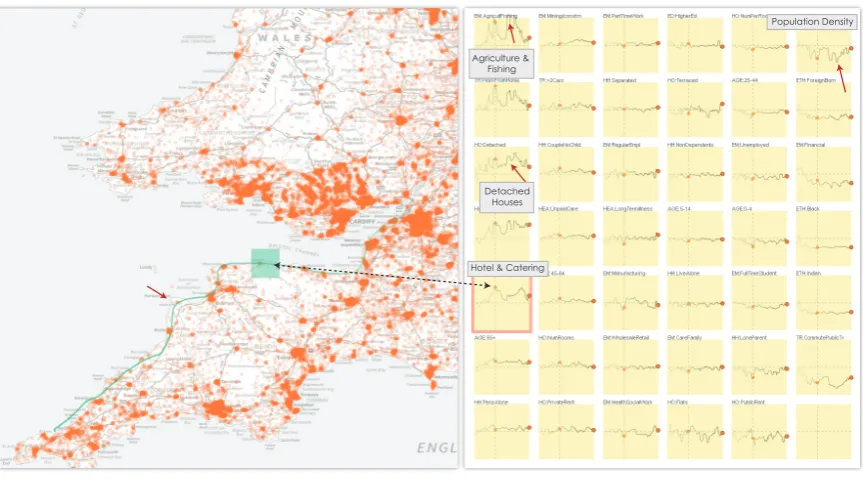
[image:2.595.87.519.175.415.2]Hotel & Catering
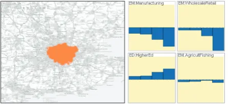
Fig. 1. Attribute signatures (right) are dynamically created in response to an interactive geographic selection sequence (left) that follows the coastline from South Gloucestershire to St Ives on the north Cornwall coast where each output area is represented with an orange dot. The signatures show how the average values for 41 attributes vary as the selection moves. The trace of the brush sequence is linked to the signatures – the faded points and the vertical dashed lines on the signatures are linked to the location highlighted on the map. A small holiday resort, Lynton (green rectangle), is characterized by the high proportion of population in the hotel and catering industry. Fishing & agriculture towns, such as Hartland (red markers), are characterized with low population densities where population is in mostly detached houses.
Abstract— The visual analysis of geographically referenced datasets with a large number of attributes is challenging due to the fact that the characteristics of the attributes are highly dependent upon the locations at which they are focussed, and the scale and time at which they are measured. Specialized interactive visual methods are required to help analysts in understanding the characteristics of the attributes when these multiple aspects are considered concurrently. Here, we developattribute signatures– interactively crafted graphics that show the geographic variability of statistics of attributes through which the extent of dependency between the attributes and geography can be visually explored. We compute a number of statistical measures, which can also account for variations in time and scale, and use them as a basis for our visualizations. We then employ different graphical configurations to show and compare both continuous and discrete variation of location and scale. Our methods allow variation in multiple statistical summaries of multiple attributes to be considered concurrently and geographically, as evidenced by examples in which the census geography of London and the wider UK are explored.
Index Terms—Visual analytics, multi-variate data, geographic information, geovisualization, interactive data analysis
1 INTRODUCTION
• Cagatay Turkay, Aidan Slingsby, Jo Wood, and Jason Dykes are with the
Dep. of Computer Science at City University London, UK. E-mail:
{Cagatay.Turkay.1, Aidan.Slingsby.1, J.D.Wood, J.Dykes}@city.ac.uk.
• Helwig Hauser is with the Department of Informatics at University of
Bergen, Bergen, Norway. Email: [email protected].
Manuscript received 31 Mar. 2014; accepted 1 Aug. 2014; date of publication xx xxx 2014; date of current version xx xxx 2014. For information on obtaining reprints of this article, please send e-mail to: [email protected].
Interna-tional agencies and governments invest heavily in maintaining accu-rate statistics about changes in demographics, employment levels, mi-gration and other related statistics. In some cases, the dominant and most interesting aspect of variation relates to geography.
Designing mechanisms to support the exploration of the geographi-cal variation in multiple attributes simultaneously is challenging since geographical distributions tend to be heterogeneous and are often strongly related and influenced by topographic features [3]. Whilst “everything is related to everything else but nearby things more so” [42], such relations vary according to the scale at which measure-ments are made [4]. Some phenomena, such as population density, vary greatly – a phenomenon that is highly dependent upon the extent of the spatial units used to measure it as well as the location at which it is measured. Understanding how attributes vary over geography and over the different scales involves the design challenges that we discuss in this paper. The visual and interaction mechanisms we propose are designed to support analysis of geographical data by addressing these challenges.
In this paper, we consider key issues associated with the geographic variation of multivariate data and develop approaches to support those working with such datasets. We suggest visual encodings and interac-tion mechanisms configured for this activity. We design, discuss and demonstrate how this can be done using map brushing in multiple co-ordinated views that show how multiple attributes vary in geographical space, extent, and resolution. In doing so, we demonstrate a series of effects that are indicative of the kinds of complexities associated with multivariate geographical analysis. Our contributions involve:
• approaches for investigating the role of location, spatial extent and spatial resolution in multiple attributes concurrently;
• plausible visual encodings and novel interactions that facilitate this analysis while maintaining the spatial context;
• illustrating why the consideration of these multiple aspects is im-portant through geographical exploration of multivariate data.
2 ANALYZINGGEOGRAPHICALDATA
The special characteristics of geographical space often require partic-ular approaches and methods, developed over the past three decades in geographical information science.
2.1 Graphical depiction
Maps are often appropriate means for graphically depicting geograph-ical variation in data. However, this is only really effective where there are few attributes. Since maps already use position- and size-related visual variables, visual variables for depicting other attributes are lim-ited. Choropleth maps [37] and geographical heatmaps [51] convey data using different aspects of colour, including lightness, saturation and hue [6]. Bi- and multi-variate colour schemes that use these dif-ferent aspects of colour can depict multiple attributes concurrently. These work particularly well where the attributes are related – such as when aspects of topography are visualized concurrently [7]. Ad-ditional attributes can be added by combining more visual variables or by using glyphs or other embedded matrices, but often at the ex-pense of the geographical resolution at which the data are displayed – a data rich example is Dorling’s use of non-continuous population cartograms containing Chernoff faces coloured using a multivariate scheme [14]. Even these judiciously designed examples can depict a limited number of attributes concurrently in their spatial context.
Interactive techniquesare widely used to help make sense of many variables. These often avoid the problem of depicting spatial varia-tion directly by facilitatinggeographical filtering. This usually results in non-geographical graphical depictions of the multiple attributes for one location only [36], but visual variables in such graphics may be used to encode aspects of space – such as distance from the selected location in geocentric parallel plots [18]. These methods equally ap-ply to spatial variation between two non-geographical attributes – as in a generic scatterplot. However, the nature of geographical informa-tion, in particular the scale, often requires the use of specific meth-ods. For example, Butkiewicz et al. [8] allowed selection at vari-able spatial scales. The interactive nature of these interfaces makes
geographical comparisons equivalent to that of animation, except the user has the control to direct the animation – often with a geographic emphasis. Although animation can be an effective means topresent
trends, it does not allow trends to bedetectedwell [33]. Harrower [22] suggests usingvisual benchmarksto aid memory in the cartographic context, a technique used in Wood’s traces [53, 54] for interactively comparing topographic features at a sequence of locations. Alterna-tively, non-temporal forms of comparison may be preferable. Gleicher et al. [20] identify difference, juxtaposition and superposition as can-didate means of presenting multiple geographic selections, examples of which were implemented by Slingsby et al. [36]. Related to this aremultiple coordinated views[40, 41] in which geographical filter-ing through brushfilter-ing [5] on a map updates other views that depict multivariate data for the brushed subset, used by Haslet et al. [23] for identifying the statistical outliers in space. Similarly, Ferreira et al. [19] made use of spatial queries that are reflected and compared in linked visualizations of spatio-temporal data. Our work adds to these interactive methods by making the variation (i.e, the interaction axis) an integral part of the visualizations to enable a concurrent analysis of many variables on different scales.
A different approach is to use dimension reduction techniques such as PCA and clustering/classification to select or generate de-rived attributes that aim to summarise important variation in a way that can be mapped [2]. Spatial statistical modelling such as kriging or weighted regression can produce geographically-varying parameters and residuals that can be mapped to give insight into the multivariate phenomena [28]. We preclude the former ap-proach from our work since we focus on exploring how all attributes respond geographically.
Putting into perspective –Visualizing how phenomena change over space and time has been investigated in the GTDiff method by Hoe-ber et al. [24] and by Kehrer et al. [26] who present examples of change maps in their design study on small multiples. These techniques and most of the visualization methods already discussed above [14, 18, 37, 51] are good examples of how one can get an overview of the changes at a high scale and often for a single location or variable. Our approach, on the other hand, provides insight into pat-terns at different scales depending on how the interaction is carried out by the analyst, i.e., we take a highly explorative approach in curating the dynamic graphics. In that respect, our methods are complementary to the existing techniques that provide an overview of the data.
2.2 The nature of geographical variation
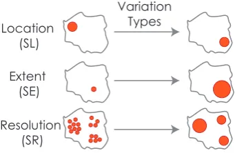
Many geographical phenomena arestrongly influenced by topographic features(coastlines, rivers, roads, relief),political boundariesand eco-nomic activity. As such many geographic data sets contain edges, boundaries and directional variability. Thus important variation may be along linear features as well as distributed through Euclidean rep-resentations of space. Different aspects of the phenomenon may vary independently at differentgeographical scales. We distinguish three aspects of space that are the basis of our analysis: location, scale extent and scale resolution [27]:
Location– the geographical point at which a measurement is made.
Scale extent(ordomain) – the geographical extent around a loca-tion that is under consideraloca-tion – defining an area [27]. Increasing the extent is often likely to increase the number of data points for which multiple attributes are considered at any location.
Scale resolution– the amount of detail that is considered in char-acterising a location [39]. It may be related to sampling strategy or data availability. The nature of the summaries will change as they are computed at these different spatial resolutions – an understanding of which reveals the scales at which homogeneity or heterogeneity exist in different aspects of population.
mea-Location (SL)
Extent (SE)
Resolution (SR)
Variation Types
Fig. 2. Geographical variation can be investigated under three perspec-tives: one can vary the location under consideration (SL), change the extent being investigated on a specific location (SE), or vary the resolu-tion at which locaresolu-tions are being investigated (SR).
sure. For example, considerincome– a variable that is not collected in the UK census. We may find differences at a regional scale in the aver-age and variance of income between the north and south. Comparing the averages and variances at more local levels will tell us whether dif-ferences in income involve solely these national phenomena or more local processes, or a combination of each.
2.3 An example dataset
We use a single data set dataset through this paper to demonstrate the methods developed for analyzing multivariate geographic data. It con-sists of records taken from the UK Census of Population in 2001 and 2011 for the 181,000 Output Areas (OA) of England and Wales. Each OA has 41 attributes associated with it, those deemed discriminating in developing the Output Area Classifier (OAC) [49], and made avail-able through the Office for National Statistics’Data Explorer [29]. The result is a 41 x 181,000 multivariate table of values containing geographic characteristics likely to be sufficiently comprehensive to enable us to generalize our approaches to other point and area-based geographic datasets. The OA data are additionally aggregated into smaller numbers of records for analysis at different resolutions through the EU-developed “Nomenclature of Units for Territorial Statistics (NUTS)”, NUTS3, NUTS2 and NUTS1 levels.
3 FRAMEWORK AND DESIGN
The different perspectives on geographical variation provide us a structure that we build upon in designing and developing our analy-sis methods. In the following, we start with a framework that sets the structure of our analysis space. We then discuss interactive visual methods to address the various parts of this space.
3.1 Framework
We consider geographical variation in terms of spatial location (SL), spatial extent (SE) and spatial resolution (SR) as introduced in Sec-tion 2.2. In Figure 2, these forms of geographical variaSec-tion is illus-trated. Within our framework, we enable an analyst to interactively determine and vary one of these aspects. The possibilities for inves-tigating the effects of these aspects of geography on the analysis of multiple attributes are summarised in Table 1.
For each exploration, we vary anyoneof these characteristics, hold-ing the others constant as shown in Table 1. This variation is facilitated through interactive inputs and map brushing. We refer to this interac-tively determined aspect asthe axis of variation. Our framework then moves on to representing the characteristics of this variation through the use of one or more statistics that are visualized simultaneously. These views often have a comparative nature, thus reported against abaseline. This comparative axis is referred to asthe axis of com-parison. These aspects determine the design choices we make in the following section where we define attribute signatures.
The axis of variation can either becontinuousordiscrete. Notice that this variation character is reflected in our notation presented in
Variation Aspect
Constant Aspect
Variation Character Notation
SL SE, SR Discrete SLd
SL SE, SR Continuous SLc
SE SL, SR Discrete SEd
SE SL, SR Continuous SEc
SR SL, SE Discrete SRd
[image:4.595.89.260.84.195.2]SR SL, SE Continuous SRc
Table 1. To investigate variation for the three aspects of geography – SL (spatial location), SE (spatial extent) and SR (spatial resolution) – we vary one, discretely or continuously, and hold the others constant.
Table 1, i.e., SLc vs. SLd. For example, spatial location can be varied continuously (SLc) along a linear feature of interest (e.g. a motorway, river or coastline) or can be a set of discrete locations (e.g. cities or reg-ularly sampled points) that are geographically distant from each other (SLd). Equally, spatial resolution can be varied continuously or in discrete steps through a spatial hierarchy of administrative geography (such as the various levels of the NUTS).
3.2 Attribute Signatures
Anattribute signaturedepicts a user-defined geographical variation of an attribute using one or more summary statistics as a sparkline [43]. Figure 3 illustrates how these aspects are represented in an instance of an attribute signature. Theaxis of variation(x-axis) represents either SL, SE or SR. The variation in the attribute along the axis of variation is depicted using one or more summary statistics compared to an ap-propriate baseline (Section 3.4). The resulting comparative values are then visualized along theaxis of comparison(y-axis).
For each attribute, we construct a single attribute signature and ar-range these using ordered juxtaposition [20] as a series of small mul-tiples (see Figure 1, right). These can be ordered in various configu-rations according to their similarity (section 3.6). The small multiples view is a component of a multiple-coordinated views environment in which interactive selections can be performed on location, extent and resolution on a map view. Brushing in multiple coordinated views is common, with Mondrian [40] and Improvise [50] being particu-larly elegant examples. One example of linking signatures to a map view can be seen in Figure 1. Here, the user performs a sequence of selections on the map and the attribute signatures are generated dy-namically in response to support SLc type (i.e., continuous location) analysis. Since we are varyinglocation(by moving the selection on the map),locationbecomes thevariation axison the signatures. For each point onx-axis, acomparative statistic(e.g. normalized differ-ence between means) is computed between the selection and the base-line (Sections 3.4 and 3.4.1).
Axis of comparison
[image:4.595.346.512.583.680.2]Axis of variation Comparison baseline
3.3 Interactivity for generating attribute signatures
Three modes of geographical brushing relate to the three geographical aspects under consideration. In each case, a user can vary one aspect while the others remain constant (Table 1). Each of these modes allows these aspects of geography to be varied continuously or discretely.
Spatial location (SL).The zoomable map enables geographical se-lections (SL) to be made along a continuous path or at an ordered set of discrete locations, each of which is at a constant spatial extent (SE) and spatial resolution (SR). This interaction and visual encoding en-ables us to identify geographic patterns and anomalies between places or along trajectories of varying fractal dimension.
Spatial extent (SE).Keeping the brush at a fixed location (SL) and using a constant spatial resolution (SR), varying the extent of the brush area selects increasingly larger or smaller geographical areas. The cor-responding attribute signature response indicates the distance at which different aspects of population remain homogeneous at a fixed loca-tion. This interaction and visual encoding is designed to reveal struc-ture in the scale-based variation of multiple attributes concurrently at any location, as in a work by Dykes and Brunsdon [17].
Spatial resolution (SR).Fixing the location (SL) and spatial extent (SE), but varying the spatial resolution (aggregation level) reveals dif-ferences caused by generating statistical summaries from different ag-gregations of data. Attribute signatures indicate the effect of reporting these data using different spatial units. This interaction and visual encoding supports analysis of the effects of aggregation on statistical summaries at a single location – a key component of the MAUP [31], the analysis of which results in what Openshaw has described as a “modifiable areal unit opportunity”.
3.4 Statistical summaries for comparison
In response to the interactive selections on a map, we dynamically compute statistics to help investigate how attributes vary along the axis of variation. We employ a multiple-coordinated views approach, in which brushing on a map geographically conditions the data. Each attribute is summarised with a summary statistic relating to this area using Turkay et al.’s methods [44] whereby a statisticλ, e.g., a de-scriptive statistic such as meanμor standard deviationσ, is computed using only the data points that are selectedSiat a particular locationi on the variation axis. We then compare these “locally” computed re-sultsλSito abaselinevalueλBito calculate the difference at location
iwith:Δi=λSi−λBisimilar to difference plots by Turkay et al. [45]. These computations are undertaken in real time for all the attributes, andΔiandλ are vectors of sizep– the number of attributes in the data.
During an interactive session, the user selects (i.e., incrementingi) either location or scale (either extent or resolution). In response, a new comparison computation is performed on the fly and the result-ing difference is depicted in each attribute signature. This mechanism enables us to dynamically create the signatures in real time.
We can describe variation in a number of attribute statistics in the signatures (see Turkay et al. [44] for a complete list). However, since the comparison of means is a common analytical task [25], we com-pute the differences for the mean values of each attribute between the selection and a baseline by default, i.e.,λ=μ. Moreover, to achieve a more robust comparison between the means, we normalize this differ-ence with the standard deviation of the attribute. The resulting measure is known as the effect size [30] and is a robust version of the difference between the means of two sample sets.
3.4.1 Baselines
The interpretation of what is observed on an attribute signature de-pends on how we set the baseline according to the analytical ques-tion we want to tackle. In suggesting baseline alternatives, we take a similar approach to Kehrer et al. [26] who discuss a model to design comparative small multiples for structured data. Unlike their work, our baseline design is also applicable to unstructured data. In our ap-proach, we offer:
• No baseline
• Constant baselineUses the same value for the whole axis of variation,λBi=c,∀i∈N. The interpretation is then based on
what we set as thecvalue. If we want to compare, for instance, each location to the national average,cvalue is set to the average values for all the attributes using the entire data set. Alterna-tively, we enable the user to set any statistics computed locally as thecvalue. One example could be to compute the mean values of the attributes for London and save these as the baseline. After such a setting is done, the signatures then display the difference to London average. This option is useful, for instance, when an analyst is trying to understand the local variations within a city. Another alternative is to use statistics computed for a particu-lar variable and generate visualizations of relative differences or correlations, e.g., displaying correlations of all the variables with the age variable.
• Varying baselineVaries the baseline with the axis of variation, e.g. computing a local averageλBi as we vary location on the
map. This is, however, a special case where we compute the same local statistics over different datasets.
3.4.2 More dimensions: time and scale
Each attribute may have more than one dimension, for example it may bemeasuredat different times and scales. We consider data recorded for each of the 41 census attributes in two successive censuses here (2001 and 2011) and released at four different resolutions: Output Area (OA), NUTS3, NUTS2, NUTS1. Our approach enables this kind of comparison by computing the local statistics at the same location for different datasets. For example we can compute the differences for all variables between the two census years. Our difference computation becomesΔi=λ2011Si −λ
Si
2001. As a result, attribute signatures display the difference – temporal change in this case – between two values for a local selection. Such computations make use of the fact that the two datasets relate to the same physical location andSiis determined by the actual physical boundaries set through a selection on the map. This capability enables us to carry out comparative analysis even if two datasets are sampled or aggregated differently – as is so in the case of OAs we analyze where 2.6% of OA locations changed between 2001 and 2011 [38]. The nature of geographic phenomena means that such changes were not spatially independent, but the approaches used here remain relatively robust to such changes.
3.5 Visual design alternatives
The nature of variation and the number of attributes we encode in a single small multiple determines the design of attribute signatures. Ex-amples of these design alternatives are provided in Section 4.
• Single sparkline:where the variation axis iscontinuousand the analyst wants to observe asinglestatistic or the difference to a baseline, we employ a signature attribute with a single sparkline.
• Multiple sparklines:where the variation axis iscontinuousand the analyst wants to observe the response ofseveral statistics or their differences to baselines for each attribute, we switch to signatures with multiple sparklines, i.e, drawing several lines to represent theλSivalues asichanges and supporting comparison
through superposition.
• Bar charts:where the variation isdiscrete, and the analyst wants to observe asinglestatistic or the difference to a baseline, we use discrete bars to communicate the discrete nature of the variation. One example where such visualizations are employed could be the comparison of different cities.
to complement these dynamic views by providing an overview of the distribution of all the variables over the space, one can make use of small multiples of heatmaps or choropleth maps [1].
3.6 Supporting Interactive Exploration
Since we design attribute signatures as part of an explorative analy-sis framework, we develop additional interactions to enhance the use of this visualization method. Here, we suggest three mechanisms to aid: the comparison between the attributes, the investigation of the re-lations between the variation of location and scale with variation of attributes, and the generation of structured selection sequences.
3.6.1 Reordering attribute signatures
Attribute signatures are arranged in a 2D table which can be ordered column-by-column by the characteristics of the signature. To order the signatures, we first let the user select an attribute of interest by clicking on the small multiple. At this stage, we make use of the fact that each signature can be treated as a trajectory defined in 2D space. Thus, we compute the Euclidean distance between the selected attribute and the others. We then place the selected attribute to the top-left corner of the small multiple table and order all the other attribute signatures in a descending order of similarity with this first one. The most similar attribute is placed below the first one in the first column and so on, i.e., a column by column ordering. This mechanism helps the analysts to quickly spot the attributes that behave similarly (following the selected one within the same column) or very differently. This can be seen as a quick mechanism to represent groupings visually. Alternatively, one can also order the signatures according to the values at a particular location ati. This method, on the other hand makes it possible to compare the attributes for a particular location, or a scale.
An important point to mention here is that there are alternative ways and alternative distance measures [32] to order these signatures. One mechanism that can be employed here is to include a 2D ordering as suggested by Schreck et al. [35].
3.6.2 Linking signatures
To more effectively study how the attributes vary over space, we dis-play the path along which the map was brushed or disdis-play the set of discrete locations selected. This has the effect of leaving trails on the map. This allows us to see how attributes vary as we move along the trail on the map. Highlighting the interaction location along thex-axes of all signatures ensures that signatures are interactively linked to each other (via small dots displayed on the sparklines) and to the location and extent on the map at which the summary statistics are computed (via a path and a rectangle showing the selection). Moreover, bidi-rectional linking between the map and attribute signatures enable the identification of locations, extents or resolutions at which variations in the statistics occur. This type of linking between the map and ab-stract visual representations is shown to be effective in understanding the urban structures [10] and supporting multi-focus analysis [8].
3.6.3 Key-framed brushing
Spatial traces are created through selection sequences in which selec-tion brushes are dragged across the map. Although this provides flexi-bility in performing an analysis, there might be arbitrary patterns in the signatures due to the pace that these selections are defined, i.e., how slow/fast the user moves a selection. In order to support users in de-veloping their selection sequences, we introduce a semi-automated in-teraction mechanism calledkeyframed brushing. This method aids the user in quickly defining selection sequences that are precisely struc-tured, by making equally placed selections that follow a straight line. This provides a regular spatial sample across any linear transect. In this mechanism, the user defines two or more brushes (according to their analytical goal) just as one might define key frames in computer-assisted animation [9]. Using thesekey brushes, a sequence of in-betweenbrushes are generated automatically over a linear path that connects these key brushes. After the brush sequence is computed, the system starts traversing through this without the need for further input by the user.
4 ANALYSISEXAMPLES
The way in which attribute signatures are used to reveal structure, variation and features of interest in geographic data is demonstrated through a series of analysis examples in which attribute signatures are built interactively. We present these examples in line with the analysis alternatives outlined in Table 1 within the description of our frame-work.
4.1 Continuous geographical variation (SLc)
Here, we vary spatial location continuously along a user defined path.
4.1.1 Geographically-significant linear features
Geographical features influence human activity. Where these are lin-ear, this category of exploration can help investigate how this affects population characteristics along the feature (e.g., Dorling’s work on demographic differences along London’s Central Line underground railway [15]) or perpendicular to it (e.g., the effect of the proximity of railway stations on house prices [12]). These features can be both nat-ural such as coastlines, mountain ranges, or man-made such as roads or city boundaries.
One of these features,coastlines, are interesting linear geographi-cal features that have strong impacts on human activity. Areas on the coast tend to have particular characteristics with high levels of resi-dents reliant upon tourism, fishing industry and in retirement. In our first example in Fig. 1, we investigate the coastline from just north of Bristol to the north coast of Cornwall. We drag the brush along the coast, holding the spatial extent constant. Resulting attribute signa-tures shown in Fig. 1 depict the different characteristics of the towns and cities. Locations along the path can be highlighted interactively and their position shown in the attribute signatures. For example, the area highlighted in green in Fig. 1 is indicated with a vertical line on each signature, allowing statistical summaries for all attributes to be compared to that location. The attributes that show the greatest change along this section of coast are settlement-related, such as pop-ulation density, housing type, working from home and certain types of employment. We order signatures by their similarity to employ-ment in agriculture or fishing(upper left) to investigate characteristics of settlements where this characteristic dominates. As expected, this characteristic is most closely associated with locations with low popu-lation density, thus with more detached housing and fewer flats. Hart-land is a good example, with high fishing and agriculture employment (red arrows) and low population density. The same is true for Lynton in Devon (highlighted in green), a small town popular with tourists, characterized by hotel employment, fewer jobs in manufacturing and elderly residents. The way in which variables vary as resort towns are peppered along the coast is evident. Some attributes vary little and are independent of these characteristics, such as the proportion of res-idents of Black and Indian ethnicity, which is consistently low in the South West other than around the city of Bristol.
4.1.2 Transects through cities
The structure of cities has long been studied in urban geography [52] and various models of their structure have been proposed, including Burgess’ concentric structure with the ‘central business district’ cen-trally, Hoyt’s concentric and wedge model and more modern polycen-tric model [34], with multiple centers of economic activity.
Inspired by Duany’s concept of the ‘urban transect’ [16], we ex-plore transects through London (a polycentric city) and Leicester (a monocentric city). We employ our key-framed brushing mechanism to create a linear west-easttransectthat starts at the westernmost out-skirts of the city, passes through the center and continues to the eastern outskirts (Figure 4). We report values in attribute signatures using ef-fect sizeand local baselines so we can compare local variation in cities. Attribute signatures across London (Fig. 4) are variously shaped as
London
Leicester
London Leicester
1
2 3
4
5 6
7
8 9
10 11
12
13
[image:7.595.82.511.84.274.2]14
Fig. 4. A transect through the centers of London (polycentric city, left, top) and Leicester (monocentric city, left bottom) using keyframed brushing. Attribute signatures for London (centre) and Leicester (right) are ordered by similarity to that at the top-left of each series of small multiples. The numbered attributes are discussed in the text.
in Fig. 1. The lack of symmetry as we move across London reveals interesting structure, such as the lowproportion of home workers(5), highproportion of infants(6) andproportion of adults separated or divorced(7) at the eastern fringes of the city compared to the west. These figures vary significantly despite other similarities between the east and west ends of the city relating topopulation density(4), and the data oncommuting(1).
In Leicester, the very sharp dips or peaks at a single location at the city centre for attributes such as% of detached houses(8),% of chil-dren(9), or% people living alone(10) reflects the concentration of students and young professionals living in apartments in this part of town, which is distinct in character from the other locations along the selected path. This is typical of a monocentric city and the variation is captured with the scale of the extent used here. Note, however that as is the case in outer London example, the city is asymmetrical in terms of population characteristics. The attribute signatures are skewed as they highlight the more densely populated East of Leicester that is domi-nated byterraced housing(11) and highlevels of employment(12),
infants(13) and residents identifying themselves as being ofIndian, Pakistani or Bangladeshi origin(14).
In addition to the above analysis, we consider different statisti-cal measures concurrently - for example the median and interquartile range. These two robust measures of the center and spread of the data distribution are shown using superimposition in Figure 5 through mul-tiple sparklines. Generally, the more atypical values in the center with respect to the baseline show low variation (marked 1,2,3), suggesting they are more homogenous, further indicating the distinctiveness of city centers.
4.1.3 Comparing the 2001 and 2011 Census
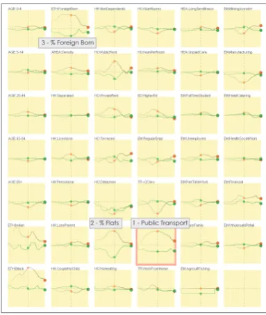
Populations are highly dynamic, as captured officially every ten years in the UK census. For each attribute, we can compare data for the past two censuses, those undertaken in 2001 and 2011. To investigate this change, we again create a linear transect through London that gen-erates signatures using the temporal comparison computation. Fig. 6 allows us to see that some attributes have changed consistently across London, such as households with no central heating (as housing im-proved) and increasing privately rented accommodation (highlighted). In other cases, attributes in West London are relatively stable while East London displays more evident demographic change. Proportions with ahigher education qualification, ofunemployed, belonging to
minority ethnic groupsand living indetached housingare up in Lon-don’s east over the last decade. We will not speculate as to the reasons
for these changes, but draw attention to the fact that these interactively selected comparative graphics support precisely this activity.
4.2 Discrete geographical variation (SLd)
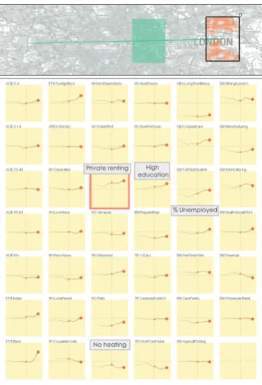
Here, we compare distinct places. Rather than moving a brush along a path, we allow discrete locations to be selected. We compared the populations of six most populated cities in England. In order of popu-lation, these are London, Manchester, Birmingham, Leeds, Liverpool and Southampton. Rather than using sparklines, we use bar charts to emphasise the discrete nature of the locations and our axis of vari-ation. The discrete locations are ordered by population from left to right in Fig. 7, where bar charts are sized against a national baseline so
1 - Public Transport 2 - % Flats
3 - % Foreign Born
[image:7.595.324.516.482.709.2]No heating Private renting High
education
[image:8.595.332.525.80.311.2]% Unemployed
Fig. 6. Comparing 2001 and 2011 census as we move from West to East London. East London shows changes in more attributes than West London indicating more dynamic demographics over the last decade.
that comparisons are meaningful. As an additional visual variable, we color the bar charts to reflect the number of samples that is represented with a bar. This mechanism informs the user about the ordering of the bars and aims to support their association with the cities.
Strong demographic differences are apparent, but these do not ap-pear to vary by city size, suggesting other reasons for these differ-ences. London consistently shows the largest difference from the na-tional mean. In terms of housing, London stands out for having a high proportion of its residents inprivately rentedaccommodation and in
flats. Liverpool is an outlier in terms of a number of attributes includ-ing theforeign born,long term illness, employees inhealth and social workandhouseholds with non-dependent children. Southampton is the smallest city of the six. Its center was rebuilt in the 1950s for car usage, so, as expected, public transport for commuting is low and the households with more than two cars is high.
4.3 Continuous geographical extent variation (SEc)
Keeping geographical location constant and studying how statistical summaries of multiple attributes vary for changing geographical extent can help reveal thegeographical scalesat which characteristics of the population vary. We can do this by centering the map on a location and attribute signatures will update as we zoom in or out. Thus, the axis of variation is the spatial extent rather than spatial location. The result is ascalogram[17], which tend towards the global mean as the extent increases.
In Fig. 8, we start with selecting a number of OAs around Charing Cross Station in London (London’s central point) and continuously zoom out to cover the whole country keeping the center constant. The rate at which attributes converge to the national mean varies. Most of the attributes vary at local scales. For instance,the black African population(dashed circle) displays local variations within the city, al-though this attribute is significantly higher than the country average in London. Such local variations are clear indications of a need for local
Private rent
London % Foreign-born
Liverpool
Long-term illness Non-dependants
> 2 Cars
Public Transport
[image:8.595.80.269.83.360.2]Southampton
Fig. 7. Comparing six cities in the UK ordered according to population from left-to-right: London, Manchester, Birmingham, Leeds, Liverpool, Southampton. Attribute signatures are grouped by attribute type. Notice that the coloring is mapped to the number of samples selected, i.e., higher number of samples are darker blue.
analysis rather than comparisons to global averages.
We highlight two scales, the two maps on at the top of Fig. 8, where most of the attributes change significantly. The first of these corre-sponds to Central London, where there are changes the housing stock (marked with circles). The second of these corresponds to a scale that covers outer London. Demographics vary significantly at this scale,% of Indian,Black African, andforeign bornpopulation see a decrease at this larger scale. For public transport, although comparably higher across the whole city, its use increases further (top-left signature) for the area between inner and outer London. This relates to the fact that many travel to the city center for work.
4.4 Discrete geographical extent variation (SEd)
Fig. 8. The scale extent is varied continuously from OAs around Char-ing Cross Station in London and extendChar-ing to cover the whole UK. Most attributes show variations at local scales, e.g. the black African popula-tion (dashed circle). Moving from central London (left) to outer London (right), we observe changes in transport, and housing (black circles).
4.5 Discrete geographical resolution variation (SRd)
Summary statistics are computed and reported at various standard out-put scales. Here we analyse the effects of these differing levels of resolution by keeping location and extent constant whilst varying the scale of resolution at which the statistics used in calculating our sum-maries are aggregated. We make use of the different NUTS levels here, aggregating the data according to these discrete levels. Our con-stant selection of extent covers all points within Greater London (Fig-ure 10). The attribute signat(Fig-ures display differences (using effect size as the measure) between London and the whole nation at scales from fine to coarse, i.e., OA, NUTS3, NUTS2, and NUTS1. The baseline in all cases is kept constant as the national average computed at OA level. The attributes respond differently to aggregation. For instance, when ‘manufacturing’ is considered at OA level, we see that London is below the national average. However, as this comparison is made with larger administrative regions (NUTS1), the difference is even more significant. Similar patterns are observed for% working in wholesale and retailand those withhigher education qualifications. These at-tributes are more sensitive to variations in resolution than others. For certain attributes, such as% people working in agriculture & fishing, the aggregation level does not affect the results – this indicates that analysis on this variable can be undertaken at any level of aggrega-tion safely. Although, we do not show the results here, when we vary the location, the resolution-related behaviour of the attributes changes, i.e., the relation between the scale resolution and the attributes is lo-cation dependent. Considering such variability is highly challenging
NUTS 3 (Leicester) NUTS 3 (Leicestershire) NUTS 2 NUTS 1
> 2 Cars
Public Transport
Work @ home Pop. Density
Indian Pop.
Employed in hotels
Fig. 9. The geographical extent is varied using areas defined by the discrete levels of the NUTS hierarchy showing Leicester as defined by (from left to right in both the map and attribute signature views): NUTS 3 Leicester; NUTS 3 Leicester and NUTS 3 Leicestershire; NUTS 2 Leicestershire, Rutland and Northamptonshire; NUTS 1 East Midlands. Variables respond differently to scale changes.
without the support of interactive visual approaches.
5 DISCUSSION AND FURTHER WORK
Table 1 outlines the various analysis alternatives that are possible over the different perspectives in geographical data. We use this table as a guideline to perform the analysis cases in the previous section. Al-though we demonstrate most of these alternatives, we have not in-cluded an example for the continuous variation of geographical res-olution (SRc). Varying this continuously by distance would produce statistical summaries that could be visualized using the sparkline tech-nique shown in Fig. 8. Wood [54] applies this techtech-nique in the context of geomorphometry.
In the design of our framework (Section 3.1), one decision we made to frame our discussion is the consideration of the axis of variation to be one-dimensional. However, one can easily think of analysis ques-tions that relate to the variation of two of the aspects we determine in this paper, i.e., any two aspects from SL, SE, SR. One example of this could be varying the location SL and geographical extent simul-taneously, e.g., comparing the response of the attributes in six distinct cities (discrete location) over locally varying NUTS level based ex-tents (discrete extent) – in other words, generating an output similar to Figure 9 for each selection location on the map. Such an extension suggests a significantly wide domain of analysis possibilities, espe-cially when variation characters, whether discrete or continuous, are also considered, i.e.,
6 2
[image:9.595.69.263.81.408.2]Fig. 10. The levels of aggregation are varied for a constant extent and location in London with a fixed baseline (some multiples omitted). Bars in the multiples are ordered from fine grained resolution to coarse. While the% in agriculture & fishingattribute (right bottom) is invariant across all aggregation levels, the variation of the% manufacturingattribute (left top) is highly dependent upon the level of aggregation used.
enable us to find combinations that are of interest for certain places and phenomena, but we are far from knowing precisely what is likely to be important when. Such questions about this analysis space call for more systematic study where multiple aspects of spatial variation are investigated concurrently. With this paper, we move into this large analysis space and introduce a framework and visual methods that set the ground for such a study.
An aspect of variation that needs further investigation is time. Al-though we have only discussed geographical variation in Section 3.1, the same principles apply to time and all the concepts in Table 1 ap-ply: TL (a point in time), TS (the varying period over which events are considered – a temporal extent) and TR (the resolution at which measurements are made – whether these are daily, hourly or decennial recordings). In this paper we treat time differently and do not include it as a varying aspect in our examples. Instead, we consider time as an inherent part of our statistical computations (Section 3.4 and 4.1.3). In order to demonstrate our approach over time at its full extent, mecha-nisms that can vary time and computations to accommodate this vari-ation need to be incorporated. One option here is to extend the in-teractive temporal summaries suggested by Turkay et al. [47]. One difference is the cyclic nature of time – in order to represent this, dif-ferent granularities of time can be treated as the variation axis and a specific cycle can be selected as the baseline, a similar approach is taken by Kehrer et al. [26].
One question regarding the statistical computations relates to the number of points selected by a brush, i.e., the sample size. Summary statistics such as those computed here are known to be unreliable in the case of low sample sizes. In the demonstration cases used in this paper, the OAs used as data points are already aggregated representations (of an average of just over 300 households). Thus, the computed statistics are less affected by the low size of data points. However, for most datasets, where there is no such aggregation, the consideration of the sample size is important. This number can be used as one measure of uncertainty of an observation. This information can be highlighted as an additional measure as in Figure 5 or can be represented as a visual encoding over the trail drawn on the maps.
In order to support the user in generating well-defined selection patterns for the dynamic signatures, we introduce the concept of key-framed brushing in section 3.6.3. There are, however, several ways to develop this mechanism further. Currently, when in-between frames are generated, we place them on equal steps over the visu-alizations’ projected coordinate system, alternatively, one can con-strain such auto-generated selections with actual geographical dis-tances, e.g., moving the selection by 1 km. at each step. Moreover, the extent and the shape of the selection can be varied in relation to well-defined criteria. A number of alternatives are: constraining the number of samples selected by a selection, keeping a constant mutual overlap within two consecutive selections, or a selection that automat-ically snaps to a geographautomat-ically defined unit such as administrative
borders. Such extensions could result in more systematic but more constrained ways of exploring the data interactively.
Selection is binary in the examples presented here and the selected extents are of arbitrary quadrilateral shape. In this paper, we use a binary selection mechanism in our calculations and this might lead to discontinuities where the selection moves from scarcely to densely populated parts of the data. This might be useful for particular tasks, for instance, to determine abrupt changes in the population. However, for tasks where discontinuities are not required, employing a selection mechanism with a variable kernel size with weighted selections [13, 17] could be preferable.
Scalability : The use of small multiples that involve the interactive computation of statistics opens up questions on two aspects of scal-ability: available screen-space and computational resources. When the number of variables is high, the small multiples can become small and hard to read – a fact that has been raised in the literature [48]. In such cases, a strategy to take is to use a filtering approach based on how much a variable changes, i.e., hiding those variables that have not changed significantly unless they are not of particular interest to the analyst. Alternatively, representative factors can be generated to reduce the number of variables and the response of these factors can be visualized instead – a method that has been effective in analyzing very high-dimensional data [46]. The second scalability issue relates to maintaining the interactivity while several statistics are computed. In our prototype, we use efficient vectorial data structures to speed-up the computations and no delays are observed in the computations. However, for very large datasets where the computations are becom-ing an issue, progressive computation systems and samplbecom-ing strategies can be employed [11].
6 CONCLUSIONS
Our stated aim is to develop techniques to help understand how mul-tiple attributes vary over space as a means of gaining knowledge of the phenomena represented by geographic data. Attribute signatures meet that need relatively effectively, enabling us to see how character-istics of geography vary across scale, space and time. The scenarios presented in Section 4 demonstrate that using attribute signatures in an interactive context can reveal how the “multivariate analysis of popula-tion characteristics” varies with respect to the locapopula-tion and scale, and how we can assess changes in these characteristics over time. This analysis makes it evident that when all variations of location, scale, and time are considered concurrently the investigation becomes wieldy. One option is to select a location, a scale and a time to un-dertake analysis – perhaps arbitrarily. This is often deemed an easy and satisfactory option, perhaps because of a lack of alternatives, but the result will be an incomplete picture. Another is to use interactive enquiry-based mechanisms for analysis to sift, select and understand the characteristics of the geographical data and their variability. This more progressive approach can take advantage of the multi-variate, multi-scale, multi-location view afforded by attribute signatures.
The framework, techniques and tool that we present here facilitate this activity through a structured set of analytical perspectives and as-sociated visualizations and computations. Through a structured se-quence of examples we demonstrate several forms of uncertainty re-lated to an observation when the different locations, scales and tempo-ral aspects are considered. Being able to access these different repre-sentations of the data and perform comparative visual analysis on them simultaneously is important in dealing with the characteristics of geo-graphic data that make them interesting. It enables us find and present the stability of the numbers that we compute to describe geography and use broad visual channels to show how they vary using visual-ization methods that are applicable to a broad range of multivariate geographic data.
ACKNOWLEDGMENTS
REFERENCES
[1] G. Andrienko, N. Andrienko, U. Demsar, D. Dransch, J. Dykes, S. I. Fab-rikant, M. Jern, M.-J. Kraak, H. Schumann, and C. Tominski. Space, time and visual analytics.International Journal of Geographical Information
Science, 24(10):1577–1600, 2010.
[2] G. L. Andrienko, N. V. Andrienko, J. Dykes, S. I. Fabrikant, and M. Wa-chowicz. Geovisualization of dynamics, movement and change: Key is-sues and developing approaches in visualization research. Information
Visualization, 7(3-4):173–180, 2008.
[3] L. Anselin.What is special about spatial data? Alternative perspectives
on spatial data analysis. National Center for Geographic Information and
Analysis Santa Barbara, CA, 1989.
[4] G. Arbia, R. Benedetti, and G. Espa. Effects of the MAUP on image classification.Geographical Systems, 3:123–141, 1996.
[5] R. A. Becker and W. S. Cleveland. Brushing scatterplots.Technometrics, 29(2):127–142, May 1987.
[6] C. A. Brewer. Color use guidelines for mapping and visualization.
Visu-alization in modern cartography, 2:123–148, 1994.
[7] C. A. Brewer and K. A. Marlow. Color representation of aspect and slope simultaneously. InASPRS Autocarto Conference, pages 328–328, 1993. [8] T. Butkiewicz, W. Dou, Z. Wartell, W. Ribarsky, and R. Chang. Multi-focused geospatial analysis using probes.IEEE TVCG, 14(6):1165–1172, 2008.
[9] E. Catmull. The problems of computer-assisted animation. InProc. of
the 5th Conf. on Computer Graphics and Interactive Techniques,
SIG-GRAPH ’78, pages 348–353, New York, NY, USA, 1978. ACM. [10] R. Chang, G. Wessel, R. Kosara, E. Sauda, and W. Ribarsky. Legible
cities: Focus-dependent multi-resolution visualization of urban relation-ships.IEEE TVCG, 13(6):1169–1175, 2007.
[11] J. Choo and H. Park. Customizing computational methods for visual an-alytics with big data.IEEE CG&A, 33(4):22–28, 2013.
[12] G. Debrezion, E. Pels, and P. Rietveld. The impact of railway stations on residential and commercial property value: A meta-analysis.The Journal
of Real Estate Finance and Economics, 35(2):161–180, 2007.
[13] H. Doleisch, M. Gasser, and H. Hauser. Interactive feature specification for focus+ context visualization of complex simulation data. InProc.
Symp. Data visualisation 2003, pages 239–248, 2003.
[14] D. Dorling.A new social atlas of Britain.Chichester England John Wiley and Sons 1995., 1995.
[15] D. Dorling.The 32 Stops: The Central Line. Penguin UK, 2013. [16] A. Duany. Introduction to the special issue: The transect. Journal of
Urban Design, 7(3):251–260, 2002.
[17] J. Dykes and C. Brunsdon. Geographically weighted visualization: In-teractive graphics for scale-varying exploratory analysis. IEEE TVCG, 13(6):1161–1168, 2007.
[18] J. A. Dykes and D. Mountain. Seeking structure in records of spatio-temporal behaviour: visualization issues, efforts and applications. Com-putational Statistics & Data Analysis, 43(4):581–603, 2003.
[19] N. Ferreira, J. Poco, H. T. Vo, J. Freire, and C. T. Silva. Visual ex-ploration of big spatio-temporal urban data: A study of new york city taxi trips. Visualization and Computer Graphics, IEEE Transactions on, 19(12):2149–2158, 2013.
[20] M. Gleicher, D. Albers, R. Walker, I. Jusufi, C. D. Hansen, and J. C. Roberts. Visual comparison for information visualization. Information
Visualization, 10(4):289–309, 2011.
[21] S. Gratzl, A. Lex, N. Gehlenborg, H. Pfister, and M. Streit. Lineup: Visual analysis of multi-attribute rankings. IEEE TVCG, 19(12):2277– 2286, 2013.
[22] M. Harrower. Visual Benchmarks: Representing Geographic Change
with Map Animation. PhD thesis, Pennsylvania State University, 2002.
[23] J. Haslett, R. Bradley, P. Craig, A. Unwin, and G. Wills. Dynamic graph-ics for exploring spatial data with application to locating global and local anomalies.The American Statistician, 45(3):234–242, 1991.
[24] O. Hoeber, G. Wilson, S. Harding, R. Enguehard, and R. Devillers. Ex-ploring geo-temporal differences using gtdiff. InPacific Visualization
Symposium (PacificVis), 2011 IEEE, pages 139–146. IEEE, 2011.
[25] R. Johnson and D. Wichern. Applied multivariate statistical analysis, volume 6. Prentice Hall Upper Saddle River, NJ:, 2007.
[26] J. Kehrer, H. Piringer, W. Berger, and M. E. Groller. A model for structure-based comparison of many categories in small-multiple dis-plays.IEEE TVCG, 19(12):2287–2296, 2013.
[27] N. S.-N. Lam and D. A. Quattrochi. On the issues of scale, resolution and
fractal analysis in the mapping sciences. The Professional Geographer, 44(1):88–98, 1992.
[28] J. Mennis. Mapping the results of geographically weighted regression.
The Cartographic Journal, 43(2):171–179, 2006.
[29] Office for National Statistics. Census Dataset Finder - Data Explorer (Beta) - http://j.mp/onsDX, 2014.
[30] S. Olejnik and J. Algina. Measures of effect size for comparative studies: Applications, interpretations, and limitations.Contemporary Educational
Psychology, 25(3):241–286, 2000.
[31] S. Openshaw and P. Taylor. The modifiable unit areal problem.Norwich:
Geobooks, 1984.
[32] N. Pelekis, I. Kopanakis, G. Marketos, I. Ntoutsi, G. Andrienko, and Y. Theodoridis. Similarity search in trajectory databases. In14th Symp.
Temporal Representation and Reasoning, pages 129–140. IEEE, 2007.
[33] G. G. Robertson, R. Fernandez, D. Fisher, B. Lee, and J. T. Stasko. Ef-fectiveness of animation in trend visualization.IEEE TVCG, 14(6):1325– 1332, 2008.
[34] C. Roth, S. M. Kang, M. Batty, and M. Barth´elemy. Structure of urban movements: polycentric activity and entangled hierarchical flows. PloS one, 6(1):e15923, 2011.
[35] T. Schreck, J. Bernard, T. Von Landesberger, and J. Kohlhammer. Visual cluster analysis of trajectory data with interactive kohonen maps.
Infor-mation Visualization, 8(1):14–29, 2009.
[36] A. Slingsby, J. Dykes, and J. Wood. Exploring uncertainty in geode-mographics with interactive graphics. IEEE TVCG, 17(12):2545–2554, 2011.
[37] T. A. Slocum. Thematic cartography and visualization. Prentice hall Upper Saddle River, NJ, 1999.
[38] A. Tait. Changes to Output Areas and Super Output Areas in England and Wales, 2001 to 2011. page 13, 2012.
[39] N. Tate and J. Wood. Fractals and scale dependencies in topography. In N. Tate and P. Atkinson, editors,Scale in Geographical Information
Systems, pages 35–51. Wiley, Chichester, 2001.
[40] M. Theus. Interactive data visualization using mondrian.Journal of Sta-tistical Software, 7(11):1–9, 11 2002.
[41] M. Theus. Statistical data exploration and geographical information vi-sualization. In J. Dykes, A. M. MacEachren, and M.-J. Kraak, editors,
Exploring geovisualization. Elsevier, 2005.
[42] W. R. Tobler. A computer movie simulating urban growth in the detroit region.Economic Geography, 46(2):234–240, 1970.
[43] E. Tufte. Sparklines: Intense, simple, word-sized graphics. Beautiful
Evidence, 1:46–63, 2004.
[44] C. Turkay, P. Filzmoser, and H. Hauser. Brushing dimensions – a dual vi-sual analysis model for high-dimensional data.IEEE TVCG, 17(12):2591 –2599, dec. 2011.
[45] C. Turkay, A. Lex, M. Streit, H. Pfister, and H. Hauser. Characterizing cancer subtypes using dual analysis in caleydo stratomex.IEEE CG&A, 34(2):38–47, Mar 2014.
[46] C. Turkay, A. Lundervold, A. Lundervold, and H. Hauser. Representative factor generation for the interactive visual analysis of high-dimensional data.IEEE TVCG, 18(12):2621–2630, 2012.
[47] C. Turkay, J. Parulek, N. Reuter, and H. Hauser. Interactive visual anal-ysis of temporal cluster structures. InComputer Graphics Forum, vol-ume 30, pages 711–720. Wiley Online Library, 2011.
[48] S. van den Elzen and J. J. van Wijk. Small multiples, large singles: A new approach for visual data exploration. InComputer Graphics Forum, volume 32, pages 191–200. Wiley Online Library, 2013.
[49] D. Vickers and P. Rees. Introducing the national classification of census output areas.Population Trends, 125:380–403, 2007.
[50] C. Weaver. Building highly-coordinated visualizations in improvise. In
IEEE Symp. Information Visualization, 2004, pages 159–166, 2004.
[51] L. Wilkinson and M. Friendly. The history of the cluster heat map.The
American Statistician, 63(2), 2009.
[52] A. G. Wilson. Complex spatial systems: the modelling foundations of
urban and regional analysis. Pearson Education, 2000.
[53] J. Wood. Multim im parvo - many things in a small place. In J. Dykes, A. MacEachren, and M.-J. Kraak, editors,Exploring Geovisualization, pages 313–324. Elsevier, London, 2005.