1
THEME 12004 EDITION
Regions:
Statistical
yearbook 2004
P
Europe Direct is a service to help you find answers to your questions about the European Union
New freephone number:
00 800 6 7 8 9 10 11
A great deal of additional information on the European Union is available on the Internet. It can be accessed through the Europa server (http://europa.eu.int).
Luxembourg: Office for Official Publications of the European Communities, 2004
ISBN 92-894-7148-4 ISSN 1681-9306
Foreword
As with all other services of the European Commission, Eurostat has been undergoing a momen-tous year in 2004. As 10 countries take their place as full members of the European Union, their national statistical offices complete a long apprenticeship within the European statistical system. The smoothness of that transition is a tribute not only to the professionalism of their officials, often in the face of severe resource and personnel constraints, but also to the important contribu-tion made by the various Phare preparatory programmes in statistics. In particular these have had a very clear impact in the increasingly important field of regional statistics. Phare funding made it possible to prepare regional portraits of most accession countries between 1998 and 2001 and to expand the data holdings of the REGIO database in 1999 and 2000 to include regional data about them. Along with many other Eurostat units, the regional team has also been assisted by a num-ber of Phare trainees in recent years — each combining enthusiasm to learn about the EU with the statistical traditions of their country of origin. On returning to their home countries, these trainees have continued to promote regional statistics, aided by their knowledge of Eurostat procedures and requirements.
A further milestone is reached by the 2004 regional yearbook: for the first time, it contains data collected in accordance with a regional nomenclature laid down in EU legislation. Adoption of the NUTS regulation in July 2003 was an important contribution to placing regional statistics on a more stable footing and reflects the wider recognition this branch of statistics now enjoys. The regional yearbook’s traditionally broad readership will doubtless be expanded by the 2004 enlarge-ment as citizens all over the EU seek to learn more about the diversity of Europe.
Joaquin Almunia
CONTENTS
■
INTRODUCTION
. . . 9New shape for Europe — new NUTS nomenclature . . . 11
A detailed look at the new nomenclature . . . 11
Enlargement. . . 11
Content and structure . . . 11
Specialist input . . . 12
NUTS 2003 — regions list . . . 12
More regional information needed? . . . 12
Regional interest group on the web . . . 13
Closure date for the yearbook data . . . 13
■
POPULATION
. . . 15Introduction. . . 17
Ageing population. . . 17
Causes of the ageing population. . . 20
Consequences of an ageing population . . . 22
Expectations for the future . . . 23
Literature . . . 24
■
AGRICULTURE
. . . 25Introduction. . . 27
Animal-rearing in Europe’s regions . . . 27
Pigs . . . 27
Sheep . . . 27
Cattle . . . 30
Location of milk production . . . 31
Milk production. . . 31
■
REGIONAL GROSS DOMESTIC PRODUCT
. . . 35What is regional gross domestic product? . . . 37
Regional GDP in 2001 . . . 39
Major regional differences within the countries . . . 40
Peripheral regions and new Member States catching up . . . 40
■
HOUSEHOLD ACCOUNTS
. . . 43Introduction: Measuring wealth. . . 45
Private household income . . . 45
Results for 2001. . . 46
Extended concept of income . . . 50
Regional income of all sectors. . . 52
Conclusion . . . 52
■
REGIONAL LABOUR MARKET
. . . 53Introduction. . . 55
Employment rate of age group 15–64 . . . 55
Change in employment . . . 55
Services . . . 59
Unemployment rate . . . 60
Change in unemployment . . . 60
Female unemployment . . . 61
Youth unemployment . . . 64
Long-term unemployment . . . 66
■
STRUCTURAL BUSINESS STATISTICS
. . . 67Introduction. . . 69
Industry predominates in the new Member States . . . 71
High wages around capital cities, particularly in industry . . . 73
Employment in industry unevenly distributed across the regions . . . 76
Capital-intensive industries in the regions . . . 79
Conclusion . . . 79
■
HEALTH
. . . 81Introduction. . . 83
Mortality in the EU regions . . . 83
Many factors influence regional mortality. . . 83
Remarkably few cerebrovascular deaths in France . . . 84
Colon-cancer rates reflect similarities in eating habits . . . 87
High UK female mortality from influenza and pneumonia . . . 87
Prostate cancer — clear north–south divide . . . 88
Breast cancers: sharp geographical distinction. . . 90
Fatal accidents — men in traffic, women in falls . . . 91
Fewer traffic deaths in urban areas . . . 91
Falls — regional diversity in Belgium and Germany . . . 92
Healthcare resources in EU regions . . . 94
Changes in the number of doctors . . . 94
Changes in the number of hospital beds . . . 95
Comments on methodology . . . 96
Socio-health regions . . . 97
Mortality indicators . . . 97
Resource indicators . . . 97
■
TOURISM
. . . 99Introduction. . . 101
Methodological notes . . . 101
Capacity (infrastructure) statistics . . . 101
Occupancy data . . . 103
Conclusion . . . 105
■
URBAN STATISTICS
. . . 109Background . . . 111
Content and spatial coverage . . . 111
Some interesting results . . . 112
Dissemination of results . . . 120
■
NUTS 1 STATISTICS
. . . 123NUTS 1 — potential unrealised . . . 125
NUTS 1 in the Member States. . . 125
Administrative NUTS 1 regions — historical and cultural entities. . . 125
Non-administrative — primarily geographical divisions. . . 127
What does the NUTS 1 level offer? . . . 127
Contrasting NUTS 1 with NUTS 2 . . . 129
Constraints and expansion . . . 131
■
EUROPEAN UNION: NUTS 2 REGIONS
. . . 133New shape for
Europe — new NUTS
nomenclature
2004 is a momentous year for Europe. It has seen the largest enlargement in the history of the Euro-pean Union — bringing the Union 10 new Mem-ber States and nine new official languages.
In fact, the regional statistical yearbook has long foreshadowed this expansion of the Union and has for some years already contained data for these countries (and indeed also for Bulgaria and Romania although they are not scheduled for membership until around 2007).
What does make this 2004 edition of the year-book innovative, however, is the use of the NUTS 2003 nomenclature, adopted in July 2003, as the basis of the data collection. Accordingly, all maps in this edition are based on NUTS 2003, whereas last year’s edition still used NUTS 99. Over the past year, the future structure and nature of re-gional statistics at European level have been shaped by the adoption of the NUTS regulation and by the steady march towards enlargement in 2004.
A detailed look
at the new
nomenclature
The European Parliament’s adoption of the regu-lation finally provided the NUTS nomenclature with a legal base. Perhaps more importantly, giv-en the importance to data users of a stable region-al breakdown, it sets out a well-defined procedure for managing modifications to the nomenclature in individual countries. The text of the regulation is available on the enclosed CD-ROM. Full details of the NUTS 2003 breakdown may be found on Eurostat’s RAMON server (1).
Whereas (until the regulation was signed) region-al statistics in Europe had been collected in
ac-cordance with the 1999 version of the nomencla-ture (known as ‘NUTS 99’), NUTS 2003 is now the only valid and acceptable regional breakdown for supplying data to Eurostat. All Eurostat data-bases were adapted in November 2003 to contain only the NUTS 2003 codes. Although NUTS 2003 strongly resembles NUTS 99 (only 10 of the more than 200 NUTS 2 regions were modified) the five countries affected by the changes have had some difficulty in calculating data for the new breakdown, thus causing occasional grey zones in some maps. The maturing of the new nomencla-ture should see the elimination of this problem well before the 2005 yearbook and readers are in-vited to consult Eurostat’s databases to observe the improvements in coverage since the maps were compiled.
Enlargement
The long lead times associated with data collec-tion campaigns mean that although there has been continued improvement in coverage for the new Member States, a small minority of maps and ta-bles do not fully cover them. As noted for exam-ple in the ‘Science and technology’ chapter, the necessary action is under way to remedy this situ-ation and considerable improvements are expect-ed by the time this yearbook is publishexpect-ed. Once again, no distinction is made in the yearbook be-tween those countries that became Member States in 2004 and those due to join around 2007: wher-ever data are available for Bulgaria and Romania, these of course also feature in the maps and com-mentaries. In the case of Turkey, the situation is rather different. Although a regional breakdown has been agreed between Turkey and Eurostat, there continues to be too little regional data to justify including Turkey in the yearbook analyses.
Content and
structure
In broad terms, the 2004 structure follows that of 2003 — but with certain significant differences. Last year’s exploratory coverage of household ac-counts earned a permanent place for this chapter and it has been grouped alongside the closely-related GDP chapter. In turn, a new exploratory
(1) From the Eurostat home page (www.europa.eu.int/comm/
chapter is included, this time examining the po-tential of the NUTS 1 level of the nomenclature. Also, the recruitment to the regional team in 2003 of a labour-market specialist has made it possible to integrate coverage by merging the previously separate ‘Labour force survey’ and ‘Unemploy-ment’ chapters. Sadly, progress on the collection of regional environmental data has not, as hoped, permitted the restoration of the environment chapter this year. Even more regrettable is that re-source cuts in the relevant thematic unit have made it impossible to process regional transport data. Accordingly, the transport chapter has had to be dropped from this year’s edition.
In each chapter, regional distributions are again highlighted by colour maps and graphs, which are then evaluated by experts in text commentaries. In keeping with the traditions of the yearbook, an effort has again been made to focus on aspects not recently covered. The population chapter, for ex-ample, is devoted to the ‘greying’ of Europe’s pop-ulation, a theme of considerable social, political and economic importance but a phenomenon that is far from uniformly apparent across Europe’s re-gions.
A major break with past practice is the removal from the CD-ROM of the data tables previously specially compiled for the yearbook. With Euro-stat’s databases due to be available online, free of charge, from 1 October 2004, there was no justi-fication for such a drain on resources by provid-ing a limited selection of data when users will have the entire wealth of tables available in the REGIO database. To enable readers to make the fullest possible use of this opportunity, the CD-ROM again contains the latest edition of the ref-erence guide to the database.
Specialist input
Once again the commentaries within each of the thematic chapters reflect the specialist knowledge of Eurostat’s thematic units (2). By exploiting their
experience of data at the national level, the au-thors are in a position to place the regional varia-tion noted in an appropriate context. The region-al statistics team gratefully acknowledges the contribution made by the following authors, each of whom has had to find the necessary time with-in an already overcrowded schedule:
Chapter Author(s)
1. Population E. Beekink
2. Agriculture F. Weiler, L. Harley 3. Regional gross domestic
product A. Krueger 4. Household accounts B. Feldmann 5. Regional labour market M. Mlady 6. SBS P. Feuvrier,
F. Faes-Cannito 7. Health D. Dupré 8. Tourism H.-W. Schmidt 9. Urban statistics B. Feldmann 10. NUTS 1 statistics N. Finn
NUTS 2003 —
regions list
In the maps in this yearbook, the statistics are pre-sented at NUTS 2 level (2). A map giving the code
numbers of the regions may be found in the sleeve of this publication. At the end of the publication, there is a list of all the NUTS 2 regions in the en-larged European Union, together with a list of the level 2 statistical regions in Bulgaria and Roma-nia. Full details of these national regional break-downs, including lists of level 2 and 3 regions and the appropriate maps, may be consulted on the RAMON server by following the link in foot-note 1.
More regional
information needed?
The REGIO database contains more extensive time series (which may go back as far as 1970) and more detailed statistics than those given in this yearbook (for example, population by single years of age — deaths by single years of age — births by age of the mother — detailed results of the Community labour-force survey — economic accounts aggregates for 17 branches — detailed breakdown of agricultural production — data on
INTRODUCTION
(2) In the case of the NUTS 1 chapter, a list of NUTS 1 regions
the structure of agricultural holdings, etc.). More-over, there is coverage in REGIO of a number of indicators at NUTS 3 level (such as area, popula-tion, births and deaths, gross domestic product, unemployment rates). This is important because there are now no fewer than eight EU Member States (Cyprus, Denmark, Estonia, Latvia, Lithu-ania, Luxembourg, Malta and Slovenia) that do not have a level 2 breakdown.
For more detailed information on the contents of the REGIO database, please consult the Eurostat publication European regional statistics — Refer-ence guide 2004, a copy of which is available in PDF on the accompanying CD-ROM.
Regional interest
group on the web
Eurostat’s regional statistics team maintains a publicly accessible interest group on the web (‘CIRCA site’) with many useful links and docu-ments.
To access it, simply click on the URL:
http://forum.europa.eu.int/Public/irc/dsis/regstat/ information
Among other resources, you will find:
• a list of all regional coordination officers in the Member States and the candidate countries;
• the Regional Gazettepublished at intervals by the regional team;
• the latest edition of the REGIO reference guide;
• Powerpoint presentations of Eurostat’s work concerning regional statistics;
• the regional classification NUTS for the Mem-ber States and the regional classification of the candidate countries;
Closure date for the
yearbook data
P O P U L A T I O N
Introduction
Since the 1980s, all countries in the EU have been experiencing an ageing population; a decreasing number of young people and, at the same time, an increasing number of the elderly. The result is an unbalanced population structure. Not all EU Member States experience these demographic de-velopments to the same degree. Countries with a relatively high proportion of people aged 65 and over (more than 17 %) at 1 January 2002 were Germany, Spain and Sweden. The Slovak Repub-lic, Cyprus and Ireland were at the same time the countries within the European Union with the lowest proportion of elderly (below 12 %). With-in the NUTS 2 regions of the European Union the differences are even more pronounced.
What does an ‘ageing population’ mean exactly? What does it look like? In the following section, the population structure at national and regional level (NUTS 2) will be described. In the next sec-tion the causes of these developments will be dis-cussed, followed by a short section about the con-sequences for society of this demographic phenomenon. What kind of impact do these dem-ographic developments have on public expendi-tures? As an example, there will be a focus on public spending on pensions. In the last section, we will look into the future and analyse briefly whether there are demographic solutions to stop the process of ageing.
Ageing population
An ageing population, as argued in the introduc-tion, shows an unbalanced population structure; the number of elderly people in society is relative-ly high compared to the size of the younger gener-ations. As a demographic process, we observe that the number of elderly people increases, while at the same time the number of youngsters decreas-es. The results of these developments are clearly visible in the (estimated) population pyramid for the EU-25 on 1 January 2002 (Graph 1.1).
The population pyramid of a stable population, a population where demographic behaviour com-pensates for the natural ageing of a population, looks like a real pyramid, with a wide base (youngest ages), slowly decreasing to a small top (oldest ages). The shape of the pyramid of the
EU-25 differs clearly from this picture. We observe a small base followed by a considerable number of persons born in the 1950s and 1960s, the so-called babyboom. The top of the pyramid shows relatively large numbers of people aged between 65 and 80 years old (light-grey shading in this and the following pyramids) and people in the 80+ age group: the ‘oldest old’ (white in this and the fol-lowing pyramids). Remarkable in the pyramid is the size of the group of people who are 90 and older.
The shape of this population pyramid hides exist-ing differences between the population structures in the various regions in the EU, as Graphs 1.2–1.5 show. These examples of population structures show besides some similarities, such as the number of people born during the babyboom, obvious differences in the proportion of elderly and younger generations.
Graph 1.2, showing the structure of the popula-tion in the Southern and Eastern region of Ireland, approaches most closely the shape of an ‘optimal’ pyramid as described earlier. This is one of the few regions in the EU with a relatively high birth rate.
The two following pyramids (Graphs 1.3 and 1.4) respectively Flevoland in the Netherlands and Vý -chodné Slovensko in Slovakia show a relatively young population, but also an increasing group of people in the 65+ age group. Flevoland in the Netherlands is a young region, built on land re-claimed from the sea in the last century, with a correspondingly young population: 61 % of the population are aged under 40 and live in the new residential districts, where most housing is de-signed for (young) families. Although the number of old people has increased in recent years, their share in this region is still the lowest in the Neth-erlands at only 9 %. Also the region of Vý chod-né Slovensko is one of the youngest regions in Slo-vakia. There are fewer people aged 65 and over than anywhere else in the country.
POPULA
TION
1
Graph 1.1 — Age pyramid on 1 January 2002 for the Member States (estimated)
0.0 0.2 0.4 0.6 0.8 1.0 1.2 1921 1931 1941 1951 1961 1971 1981 1991
0.0 0.2 0.4 0.6 0.8 1.0 1.2
0 10 20 30 40 50 60 70 80 90 + 1921 1931 1941 1951 1961 1971 1981 1991 1911 2001 2001 1911 Y
ear of birth
Y
ear of birth
Males Females
Percentage of total population Age
Graph 1.2 — Age pyramid on 1 January 2002 for Southern and Eastern region (IE)
Y
ear of birth
Y
ear of birth
Males Females
Percentage of total population
Graph 1.3 — Age pyramid on 1 January 2002 for Flevoland (NL)
Graph 1.4 — Age pyramid on 1 January 2002 for V´ychodné Slovensko (SK)
Graph 1.5 — Age pyramid on 1 January 2002 for Principado de Asturias (ES) Age 1921 1931 1941 1951 1961 1971 1981 1991 2001 1911 0 10 20 30 40 50 60 70 80 90 + 1921 1931 1941 1951 1961 1971 1981 1991 2001 1911 0.0 0.2 0.4 0.6 0.8 1.0
1.2 0.0 0.2 0.4 0.6 0.8 1.0 1.2
Y
ear of birth
Y
ear of birth
Males Females
Percentage of total population Age 1921 1931 1941 1951 1961 1971 1981 1991 2001 1911 0 10 20 30 40 50 60 70 80 90 + 1921 1931 1941 1951 1961 1971 1981 1991 2001 1911 0.0 0.2 0.4 0.6 0.8 1.0
1.2 0.0 0.2 0.4 0.6 0.8 1.0 1.2
Y
ear of birth
Y
ear of birth
Males Females
Percentage of total population Age 1921 1931 1941 1951 1961 1971 1981 1991 2001 1911 0 10 20 30 40 50 60 70 80 90 + 1921 1931 1941 1951 1961 1971 1981 1991 2001 1911 0.0 0.2 0.4 0.6 0.8 1.0
1.2 0.0 0.2 0.4 0.6 0.8 1.0 1.2
Y
ear of birth
Y
ear of birth
Males Females
Percentage of total population Age 1921 1931 1941 1951 1961 1971 1981 1991 2001 1911 0 10 20 30 40 50 60 70 80 90 + 1921 1931 1941 1951 1961 1971 1981 1991 2001 1911 0.0 0.2 0.4 0.6 0.8 1.0
The population pyramids show the considerable differences in the population structure between regions. Map 1.1 shows the changes in the num-ber of older people between 1 January 1998 and 1 January 2002 for the various NUTS 2 regions in the EU (i.e. the percentage of people aged 65 and older as a proportion of the whole population). In the blue coloured regions, the share of people in that age group decreased during the period. This
decreasing number of elderly during the last five years can be observed in both regions in Ireland, most of the regions in England and Wales in the United Kingdom, in Denmark, in Noord-Hol-land, Zuid-HolNoord-Hol-land, Utrecht, Flevoland and Gro-ningen in the Netherlands, in the regions of Syds-verige, VästsSyds-verige, Östra Mellansverige and Stockholm in Sweden, and in Praha and the sur-rounding region in the Czech Republic.
Population change rate
as a percentage (65+)
1998–2002 — NUTS 2
> 8 6–8 4–6 0–4 0
Data not available
Statistical data: Eurostat database: REGIO © EuroGeographics, for the administrative boundaries Cartography: Eurostat — GISCO, May 2004
Regions with a relatively high increase, the dark red regions, can mainly be observed in the eastern part of Germany, in parts of the new Member States, such as Latvia and Lithuania, Slovenia and in major parts of Bulgaria and Romania. In most of the regions of France, Austria, Hungary, the Czech Republic and the Slovak Republic, the cal-culated change rate is rather low.
Causes of the ageing
population
In general one could say that the ageing of the population is caused by a population dynamic which is too low: the relative influx of youngsters and outflow of older people is too low to
compen-sate each other. Population dynamics are the re-sult of demographic behaviour and are mainly in-fluenced by mortality (the mean life expectancy), fertility (the average number of children born and the mean age at which women have children) and migration (the relative number of immigrants and emigrants and their age distribution).
To start with the last mentioned cause, the conse-quences of specific immigration and emigration flows in certain regions can have a great impact on the population structure. Within the European Union we can observe flows of young people to regions with more jobs; the elderly stay behind. In the Netherlands we also see an opposite flow, as mentioned earlier, in Flevoland. In that specific example the government developed a policy to at-tract young people and young households to set-tle in this region. Graph 1.3 clearly shows these working age people and their children.
POPULA
TION
1
Graph 1.6 — Life expectancy at birth 1960–2002, EU-25
1960 1962 1964 1966 1968 1970 1972 1974 1976 1978 1980 1982 1984 1986 1988 1990 1992 1994 1996 1998 2000 2002 Year Males Females 66 67 68 69 70 71 72 73 74 75 76 77 78 79 80 81 82
Number of years
In the course of the 20th century, life expectancy increased considerably. Graph 1.6 shows the trend in life expectancy at birth for men and wom-en within the EU-25 over the period 1960–2002.
In 1960 the average life expectancy at birth was 67.1 years for men and 72.6 for women. During the following years this expectancy increased for men by nearly eight years and for women by
In a study, commissioned by the Council of Eu-rope, Dragana Avramov and Miroslava Maskova consider this point:
‘… the increase in life expectancy in the course of the 20th century was accompanied by a compres-sion of morbidity to higher ages, resulting in a double trend: better health and increasing capa-bilities of the younger aged and an increasing frailty of the oldest old who are no longer suffer-ing or dysuffer-ing from infectious diseases but are con-fronted with the degenerative processes of senes-cence at a very high age. At the same time large proportions of the new generations of elderly peo-ple have benefited from higher levels of education
acquired in youth, enjoyed the advantages of the modern affluence culture and experienced less de-manding or debilitating living conditions during their life course …’
Either way, it is inescapable that the increase in life expectancy also means an increase in the costs for healthcare.
The most important explanation for the changing population structure however, is the level of fertil-ity. In general, it can be argued that the process of our ageing population was caused directly by the remarkable trends in the number of births since the Second World War.
Graph 1.7 — Total fertility rate 1960–2002, EU-25
1960 1962 1964 1966 1968 1970 1972 1974 1976 1978 1980 1982 1984 1986 1988 1990 1992 1994 1996 1998 2000 2002
Year
Rate
1.40 1.50 1.60 1.70 1.80 1.90 2.00 2.10 2.20 2.30 2.40 2.50 2.60 2.70 2.80
In most of the countries of the European Union, there were high numbers of births during the first 25 years after the war. However, after 1970 birth rates dropped dramatically as women had fewer children and at a later age. The babyboom can clearly be observed in all of the previous popula-tion pyramids; a considerable group of persons born in the 1950s and 1960s moves like a bulge up the pyramid.
Graph 1.7 shows the overall trend in the total fer-tility rate (TFR) in the EU-25 since 1960. The to-tal fertility rate is the mean number of children
Consequences of an
ageing population
In economic terms the consequences of the ageing population are often expressed in the old-age de-pendency ratio, the ratio of the number of elderly persons of an age when they are generally
eco-nomically inactive (here 65 and over) to the num-ber of persons of working age (here 15 to 64).
Map 1.2 shows the regional differences in old-age dependency ratios (65+/(15–64)). As can be ob-served, a high dependency ratio (the dark brown regions) can mainly be found in northern and cen-tral Spain and Italy, in the south-west of the Unit-ed Kingdom, southern and central France and parts of Sweden. Regions with low dependency
POPULA
TION
1
Regional differences in old-age dependency ratios (65+/(15–64))
2002 — NUTS 2
> 30 26–30 24–26 20–24 20
Data not available
EL, UK: 2000; FR, IT: 2001
Statistical data: Eurostat database: REGIO © EuroGeographics, for the administrative boundaries Cartography: Eurostat — GISCO, May 2004
ratios, coloured light brown, can especially be ob-served in Poland, the Czech and Slovak Republics, Ireland and in Romania.
A special working group within the European Commission is currently studying the consequen-ces of the ageing populations on society, in partic-ular on public finances. The working group is es-pecially focusing on the impact on public spending on pensions, healthcare and long-term care. The discussion around the impact on health-care was mentioned earlier in passing. With re-gard to pensions, it can be noted that most of the countries of the European Union have a public pension system called ‘pay-as-you-go’. This sys-tem implies that the active population has to pay the State pensions for the elderly, in the form of taxes. The higher the dependency ratio, the small-er the active population who have to bear the in-creasing burden of the growing number of elderly.
At this moment there are for every person aged 65 and over around three or four persons in the ac-tive age group. In the future, this will decrease to between 1.5 and 2 persons.
Expectations for the
future
The previous section ended with expected devel-opments with regard to the relation between ac-tive and inacac-tive population in the EU. According-ly, we cannot finish this chapter without turning our attention to the future. The pyramids present-ed earlier show people (the ‘babyboom bulge’) moving slowly upwards in the population struc-ture; these are our future elderly.
Graph 1.8 — Old-age dependency ratio (65+) 2005–50, EU-25 (1) (based on UN population estimates)
2005 2010 2015 2020 2025 2030 2035 2040 2045 2050
Year 20
25 30 35 40 45 50 55
Ratio
(1) Cyprus excluded.
Graph 1.8 shows expected developments (median scenario) in the old-age dependency ratio in the coming decades in the EU-25 (excluding Cyprus), based on the population estimates calculated by the United Nations. The graph shows a steady growth of the ratio from 25 to 50 % in 2050. Re-searchers expect that after 2040 a turning point will be reached in most of the EU countries after which the proportion of elderly within the popu-lation will slightly decrease.
postponing the age of retirement, reallocating State resources and private supplementing of State pensions.
Literature
Evert van Imhoff and Leo van Wissen, ‘Bevolk-ingsveroudering en de arbeidsmarkt in Europa’, Bevolking en gezin, 30 (2001) 2, pp. 5–34.
C. van Ewijk e.a., Vergrijzing als uitdaging. Kan-sen en bedreigingen van een vergrijzende Eu-ropese bevolking, Den Haag, December 2003.
Dragana Avramov and Miroslava Maskova, ‘Ac-tive ageing in Europe’, Population Studies, No 41, Volume 1, Council of Europe, September 2003.
POPULA
TION
2
Introduction
Eurostat’s coverage of regional agricultural statis-tics comprises three main fields; land use and crops, agricultural accounts and livestock. This latter aspect is the focus of this year’s agriculture chapter — first in terms of major types of farm an-imals found throughout Europe and then with specific attention to the dairy industry. In the lat-ter case, there is an historical overview of the de-velopment of the relevant European legislation with regard to milk statistics.
Animal-rearing in
Europe’s regions
Pigs, cattle and sheep are among the earliest farm animals to have been domesticated and are an in-tegral part of the farming landscape throughout the EU-25 countries. However, as the following maps demonstrate, there are very clear regional disparities in their distribution.
Given the great range in area between NUTS 2 re-gions, it would clearly have been misleading to map absolute numbers of animals. Similarly, some regions have terrain and land cover that permit al-most all the land surface to be used for agricul-ture: in others, a harsh climate, dense forest cover or altitude may mean only a fraction of the land area can be used in this way. Accordingly, Maps 2.1, 2.2 and 2.3 relate the numbers of animals in each region to the area of utilised agricultural land. The same logic is taken a step further in Map 2.4, where the surface area concept used is that of land permanently under grass.
Pigs
Because pigs can be raised effectively indoors in ‘zero grazing’ systems, it might be assumed that they would most often be found where human population density is high enough to put pressure on farming land. In fact, Map 2.1 shows that this is not the case. While the most dense concentra-tion of pigs is found in Belgium (in such regions as Antwerpen, Oost-Vlaanderen and Limburg), in the Netherlands (from Limburg in a sweep across the south of the country from Dutch Limburg to Drenthe and in the adjoining German region of Münster, these are not in fact zones with the
dens-est human population in each of these countries. This concentrated area of pig farming is probably much better explained by the co-existence of ara-ble land on which the pig slurry can be spread and the availability of grain imports via the ports of Rotterdam and Antwerpen. Denmark, Bretagne in France, Cataluña in Spain and Lombardia in It-aly follow close behind in terms of the intensity of pig-raising. Among the new Member States, all Hungarian and Czech regions have significant numbers of pigs, as do all Polish regions except Podkarpackie. Indeed, Poland is the EU-25’s third largest producer, after Germany and Spain, which together make up over one third of EU-25 pig production.
Obviously, there is a close interrelationship, built up over many centuries, between the farming tra-dition of a region and its tratra-ditional diet. Over a large part of western and central Europe, the om-nivorous nature of pigs (which could be fed on food wastes and forest acorns and beech nuts) and the many ways it was possible to preserve their meat, gave them an important role in permitting communities to survive the winter. Accordingly, even in today’s less climate-dependent lifestyle, they form part of the diet (and thus the agricul-ture) in a zone that (as Map 2.1 clearly shows) is not bounded by national frontiers.
Sheep
of this form of livestock in the two countries, clearly visible in Map 2.1, may differ in having cli-matological and historical origins respectively. The ability of sheep to cope with relatively arid conditions, and hence poor grass growth, is an important aspect in regions such as Extremadura in Spain (and also Provence-Alpes-Côte d’Azur in
France). In the UK, the high prices paid in conti-nental Europe for English wool in the Middle Ages resulted in large-scale landowners reserving huge areas for sheep and laying the basis for a ma-jor sheep-rearing industry, a precedent followed in the Highland clearances in Scotland some cen-turies later.
AGRICUL
TURE
2
Pigs per hectare
of utilised agricultural area
2002 — NUTS 2
> 6.0 2.0–6.0 0.5–2.0 0.2–0.5 0.2
Data not available
EE, EL, ES, CY, BG: 2001; SK: 2000 UK: NUTS 1
DE: estimated data
Statistical data: Eurostat database: REGIO © EuroGeographics, for the administrative boundaries Cartography: Eurostat — GISCO, May 2004
Sheep per hectare
of utilised agricultural area
2002 — NUTS 2
> 2.0 1.0–2.0 0.3–1.0 0.1–0.3 0.1
Data not available
EE, EL, ES, CY, MT, BG: 2001; SK: 2000 UK: NUTS 1
DE: estimated data
Statistical data: Eurostat database: REGIO © EuroGeographics, for the administrative boundaries Cartography: Eurostat — GISCO, May 2004
Cattle
Unlike sheep, which are subject to footrot in bog-gy conditions and bloat when the feed is too rich, cattle thrive in conditions where the rainfall is plentiful and the grass is good. Not surprisingly, Map 2.3 therefore includes a number of clear con-trasts with the previous map, reflecting, in partic-ular, altitude and climate differences. Western Eu-rope lies squarely across the predominant
westerly airstreams at this latitude. Typically, where these moisture-rich winds strike the coast, rainfall is abundant, and, as a result, rich pasture is available for cattle. The Spanish regions of Ga-licia, Principado de Asturias and Cantabria fall into this category, as do Pays de la Loire, Bretag-ne and Basse-Normandie in France. Further north, this applies to both Irish regions, to North-ern Ireland and to the whole westNorth-ern seaboard of England (as noted above, however, the
mountain-AGRICUL
TURE
2
Cattle per hectare
of utilised agricultural area
2002 — NUTS 2
> 2.0 1.0–2.0 0.6–1.0 0.3–0.6 0.3
Data not available
EE, EL, ES, CY, BG: 2001; SK: 2000 UK: NUTS 1
DE: estimated data
Statistical data: Eurostat database: REGIO © EuroGeographics, for the administrative boundaries Cartography: Eurostat — GISCO, May 2004
ous nature of Wales and Scotland mean sheep re-main important there). A similar well-watered coastal crescent is visible across the north-western corner of continental Europe comprising the An-twerpen, Oost-Vlaanderen, West-Vlaanderen and Luxembourg regions of Belgium, most of the Netherlands except for the very low-lying region of Zeeland, and into the Schleswig-Holstein re-gion of northern Germany. This ‘coastal rainfall’ effect is less noticeable in the much drier Mediter-ranean environment but still clearly apparent in the mountain regions lying north of the Po Valley in Italy, which face onto winds moving north up the Adriatic.
In the drier ‘rain shadow’ area further inland, es-pecially behind coastal hills or mountains, arable farming or sheep-rearing tend to be more fa-voured than cattle (for example, Centre in France). However, if the air masses encounter fur-ther high ground the cooling effect produces more rain — again favouring cattle-rearing, particular-ly where slopes are too steep for arable farming. This pattern is clearly evident in Limousin and Auvergne in France (both famous cheese-produc-ing regions) and along the whole arc west and north of the Alps (except for Alsace, lying in the Rhine rift valley). In particular, the southern re-gions of Germany (Tübingen, Schwaben, Ober-bayern, NiederOber-bayern, Oberpfalz and Mittelf-ranken) are major milk-producing areas. Cattle are less common in Scandinavian and Mediterra-nean countries, reflecting a short grass-growing season and rainfall shortages respectively. Unsur-prisingly, therefore, the three biggest cattle-pro-ducing countries are France, Germany and the United Kingdom, which together produce about half of the EU-25 total production (2002 provi-sional figures).
Location of milk
production
There are two possible modes of milk production: on grazing land, which requires sufficiently pro-ductive grassland, and in stalls. The second meth-od needs either arable land for the prmeth-oduction of fodder or concentrated feed (e.g. cereals), or im-ports of feed from other regions or countries. This flexibility explains why in Map 2.4 the number of dairy cows is not necessarily linked to the propor-tion of grassland. In the Southern and Eastern
re-gion of Ireland we can see that the high percent-age of grassland (dark green) corresponds with a large number of dairy cows (red circle). The same is true for the Basse-Normandie region. However, in Bretagne the amount of livestock is just as high despite a lower percentage of grassland. Finally, we can see regions in dark green with a lower, sometimes much lower, number of dairy cows. One possible explanation in the case of the drier regions (such as Alentejo in Portugal, Sardinia or the Yugozapaden region of Bulgaria) is that be-cause the grazing land is not as rich it is therefore first and foremost used for sheep or goats. Else-where, it is beef cattle which use the grasslands, as we can see in Map 2.5, in regions such as Bourgo-gne in France, Scotland and Andalucía in Spain.
Map 2.5 shows that bovine livestock in the new Member States, and in Romania and Bulgaria, is largely dominated by dairy cows. In the Member States of the former EU-15, the situation is much more varied. In France, Spain, Portugal and Greece (except the largely urban area surrounding the capital) the most southern regions have a high proportion of beef cattle. In Italy, the situation is less clear-cut.
Milk production
AGRICUL
TURE
2
Grassland and dairy cows 2002 — NUTS 2
Grassland Dairy cows as % of total area (in 1 000 heads)
> 40 20–40 15–20 5–15 0–5
Data not available
ES, CY, BG: 2001; BG: 2001; SK: 2000 UK: NUTS 1 UK: NUTS 1
Statistical data: Eurostat database: REGIO © EuroGeographics, for the administrative boundaries Cartography: Eurostat — GISCO, May 2004
Map 2.4
Dairy cows
Production of cows’ milk and share of dairy cows
2002 — NUTS 2
Dairy cows Production of cows’ as % of total cows milk (in 1 000 t)
> 80 50–80 20–50 20
Data not available
UK: NUTS 1 BE, DK, IT, NL, FI, UK: 2000 BG:2001 ES, IE, AT, PL: 2001 RO: including buffalo cows BE, UK: NUTS 1
BE1, BE2 data are merged
Statistical data: Eurostat database: REGIO © EuroGeographics, for the administrative boundaries Cartography: Eurostat — GISCO, May 2004
Map 2.5
REGIONAL GROSS DOMESTIC PRODUCT
What is regional
gross domestic
product?
The economic development of a region is, as a rule, expressed in terms of its gross domestic product (GDP). It is also an indicator frequently used as a basis for comparisons between regions. But what exactly does it mean? And how can comparability be established for regions of differ-ent size and differdiffer-ent currencies?
Regions of differing size achieve different GDP levels. However, a real comparison can only be made by indicating the regional GDP per inhabit-ant for the region in question. This is where the distinction drawn between place of work and place of residence becomes significant: gross do-mestic product measures the economic perform-ance achieved within national or regional bound-aries, regardless of whether this was attributable to resident or non-resident employed persons. Reference to GDP per inhabitant is therefore only straightforward if all employed persons engaged in generating this value are also residents of the region in question.
In areas with a high proportion of commuters, re-gional GDP per inhabitant can be extremely high, particularly in such economic centres as London or Vienna, Hamburg, Prague or Luxembourg, and relatively low in the surrounding regions, even if these are characterised by high household purchasing power or disposable income. Region-al GDP per inhabitant should not, therefore, be equated with regional disposable income (see Chapter 4 of this yearbook).
Regional GDP is calculated in the currency of the country in question. In order to make GDP com-parable between countries, it is converted into eu-ros using the official average exchange rate for the given calendar year. However, not all differences in price levels between countries are reflected by exchange rates. In order to compensate for this ef-fect, GDP is converted using currency conversion rates, known as purchasing power parities (PPPs), to an artificial common currency, called purchas-ing power standards (PPS). This makes it possible to compare the purchasing power of different na-tional currencies (see box).
Purchasing power parities and
international volume comparisons
International differences in GDP values, even aft-er convaft-ersion via exchange rates to a common currency, are not due simply to differing volumes of goods and services. The ‘level of prices’ com-ponent is also a contributing factor. Given that exchange rates are determined by many factors influencing demand and supply in the currency markets, conversion via exchange rates in cross-border comparisons is of limited use. To obtain a more accurate comparison, it is essential to use special conversion rates (spatial deflators) which remove the effect of price-level differences be-tween countries. Purchasing power parities (PPPs) are such currency conversion rates that convert economic data expressed in national cur-rencies to an artificial common currency, called purchasing power standards (PPS). PPPs are therefore used to convert the GDP of various countries into comparable volumes of expendi-ture, expressed as purchasing power standards.
With the introduction of the euro, prices can now, for the first time, be compared directly be-tween countries in the euro zone. However, the euro has different purchasing power in the differ-ent countries of the euro zone, depending on the national price level. PPPs must therefore also continue to be used to calculate pure volume ag-gregates in PPS for Member States within the euro zone.
In their simplest form, PPPs are a set of price rel-atives, which show the ratio of the prices in na-tional currency of the same good or service in dif-ferent countries (e.g. a loaf of bread costs EUR 1.87 in France, EUR 1.68 in Germany, GBP 0.95 in the UK, etc.). A basket of comparable goods and services is used for price surveys. These are selected so as to represent the whole range of goods and services, taking account of the con-sumption structures in the various countries. The simple price ratios at product level are aggregat-ed to PPPs for product groups, then for overall consumption and finally for GDP. In order to have a reference value for the calculation of the PPPs, a country is usually chosen and used as the reference country and set to 1. For the European Union, the PPS of the EU is used as an artificial common unit of reference.
Unfortunately, for reasons of cost, it will not be possible in the foreseeable future to calculate re-gional currency conversion rates. If such region-al PPPs were available, the GDP in PPS for nu-merous peripheral or rural regions of the EU would probably be higher than that calculated using the national PPPs.
GDP per inhabitant, in PPS 2001 — NUTS 2
EU-25 = 21 288 > 26 000 20 000–26 000 14 000–20 000 8 000–14 000
8 000 Data not available
Statistical data: Eurostat database: REGIO © EuroGeographics, for the administrative boundaries Cartography: Eurostat — GISCO, March 2004
Map 3.1
REGIONAL GROSS DOMESTIC PRODUCT
3
2001 the Polish region Śląskie was recorded as having a per capita GDP of EUR 5 834, ranking above the Hungarian region of Közép-Dunántúl with EUR 5 298. However, with PPS 11 208 per capita Közép-Dunántúl ranks above Śląskie, with its PPS 10 526 per capita.
In terms of distribution, the use of PPS rather than the euro has a levelling effect, as regions with a very high per capita GDP also generally have
rela-tively high price levels. This reduces the range of per capita GDP in NUTS 2 regions in EU-25 plus Bulgaria and Romania from around EUR 66 000 to around PPS 57 000.
Regional GDP in 2001
Map 3.1 provides an overview of the regional dis-tribution of per capita GDP (in PPS) for the Euro-pean Union, plus Bulgaria and Romania. It ranges from PPS 4 088 per capita in north-east Romania to PPS 61 316 per capita in the UK Inner London region. Région de Bruxelles-Capitale/Brussels Hfdst. Gew. (PPS 50 749) and Luxembourg (PPS 45 310) follow in second and third place, with Hamburg (PPS 39 862) and the French capital re-gion Île-de-France (PPS 38 452) in fourth and fifth place.
Prague (Czech Republic), the region with the highest GDP per inhabitant in the new Member States, has already risen to 16th place with PPS 31 639 (149 % of the EU-25 average) among the 268 NUTS 2 regions of the countries examined here (EU-25 plus Bulgaria and Romania). It should be noted, however, that Prague is an exception. The next regions of those joining the EU in May 2004 follow a long way behind: Bratis-lavský kraj (Slovakia) is in 65th place with PPS 23 782 (112 %), Közép-Magyarország (Hungary) is 147th with PPS 18 993 (89 %), Cyprus is 157th with PPS 18 281 (86 %), Malta is 179th with PPS 16 221 (76 %) and Mazowieckie (Poland) 196th
BE CZ DK DE EE EL ES
FR (1)
IE IT CY LV LT LU HU MT NL AT PL PT SI FI RO SE UK SK BG
100 150 200 300
50 0 Bruxelles-Capitale Prov. Hainaut Praha Severozápad Hamburg Dessau Sterea Ellada Dytiki Ellada
Comunidad de Madrid Extremadura
Île-de-France Corse
Southern and Eastern Border, Midland and Western
Provincia Autonoma Bolzano Calabria Közép-Magyarország Észak-Magyarország Utrecht Flevoland Wien Burgenland Mazowieckie Lubelskie Lisboa Açores
Bratislavsk ´y kraj V ´ychodné Slovensko
Åland Itä-Suomi
Stockholm Norra Mellansverige
Inner London Cornwall and Isles of Scilly
Yugozapaden Yuzhen tsentralen
250
Bucure ¸sti Nord-Est
Graph 3.1 — GDP per capita (in PPS) 2001, NUTS 2 level, in % of EU-25 average (EU-25 = 100)
REGIONAL GROSS DOMESTIC PRODUCT
3
with PPS 15 033 (71 %). All other regions of the new Member States are below 70 % of the EU-25 average.
Major regional
differences within
the countries
There are also substantial differences within the countries, as Graph 3.1 shows. In 2001, the highest per capita GDP was more than twice the lowest in 12 of the 19 countries examined here incorporating NUTS 2 regions. The largest regional differences are in the United Kingdom, where there is a factor of 4.4 between the two extreme values (Inner London: 288 % of the EU-25 aver-age; Cornwall and the Isles of Scilly: 65 %), and in Belgium, with a factor of 3.1 (Région de Brux-elles-Capitale/Brussels Hfdst. Gew.: 238 %; Hain-aut: 76 %). In 10 countries, the highest regional per capita GDP is between twice and three times that of the lowest. Half of this group of countries is made up of the older Member States, plus four of the new Member States and Romania. Comparatively marked regional disparities in per capita GDP therefore emerge in both the old and the new Member States.
Moderate regional disparities in per capita GDP (i.e. factors between the highest and the lowest value of less than 2) are, however, almost exclu-sively found in the older Member States. This is particularly true of Sweden (Stockholm: 159 %; Norra Mellansverige: 98 %) and Ireland (South-ern and East(South-ern: 141 %; Border, Midland and Western: 97 %). Bulgaria (Yugozapaden: 40 %; Yuzhen tsentralen: 24 %) is the only country in this group that is not one of the older Member States.
In both the older and the new Member States, a substantial share of economic activity is concen-trated in the capital regions. This is borne out by the fact that in 14 of the 19 countries included here with NUTS 2 regions, the capital regions are also the regions with the highest per capita GDP. For example, Map 3.1 clearly shows the promi-nent position of the regions of Région de Brux-elles-Capitale/Brussels Hfdst. Gew., Praha, Co-munidad de Madrid, Île-de-France, Lisboa as well
as Budapest, Bratislavskýkraj, London, Sofia and București.
Peripheral regions
and new Member
States catching up
Map 3.2 shows how much per capita GDP changed between 1999 and 2001 by comparison with the EU-25 average (expressed in percentage points of the EU-25 average). Economically dy-namic regions, whose per capita GDP increased by more than 1 percentage point when compared with the average, are shown in orange and red. Less dynamic regions (those with a fall of more than 1 percentage point in per capita GDP as against the EU-25 average) are shown in yellow. Figures range from + 21.2 percentage points for Inner London in the United Kingdom to – 7.1 percentage points for Schwaben in Germany.
Of the 10 most dynamic NUTS 2 regions, three are in Greece and one each in the Czech Republic, Ireland, the Netherlands, Hungary, Slovakia, the United Kingdom and Romania. The fastest grow-ing regions are therefore scattered relatively broadly across the 27 countries examined here.
Conversely, 6 of the 10 least dynamic regions are in Germany, with 2 in the United Kingdom and 1 each in Austria and Romania.
Upon closer examination, we can see that be-tween 1999 and 2001, numerous somewhat pe-ripheral regions of the enlarged European Union managed to catch up by comparison with central regions with higher per capita GDP. This is partic-ularly true of Ipeiros (+ 9.6 percentage points) and Peloponnissos (+ 9.3) in Greece, Região Autóno-ma da Madeira (+ 6.7) in Portugal and Pohjois-Suomi in Finland (+ 5.1), but also of Alentejo (+ 1.4) in Portugal, Andalucía (+ 1.4) in Spain and South Western Scotland in the United Kingdom (+ 1.3).
with clear below-average growth rates (less than – 1 percentage point) were among these countries.
Of the 10 most dynamic regions in the 2001 to 1999 comparison, 4 are to be found in the acces-sion countries: București (+ 14.2 percentage points) in Romania, Praha (+ 12.1) in the Czech Republic, Közép-Magyarország (+ 9.7) in Hunga-ry and Bratislavský kraj (+ 8.8) in Slovakia. Al-though these are all capital regions,
above-aver-age growth has also been recorded elsewhere in the new Member States plus Bulgaria and Roma-nia, e.g. in Közép-Dunántul (+ 3.3) and Észak-Magyarország (+ 2.1) in Hungary, Jihovychod (+ 2.3) in the Czech Republic and in Severoza-paden (+ 4.2) in Bulgaria. With the exception of Malta (– 2.4), all new Member States where the national and NUTS 2 levels are the same achieved above-average growth: the figures range from
Change of GDP per inhabitant (in PPS)
in percentage points of the average EU-25
2001 as compared with 1999 — NUTS 2
> + 4 + 1 to + 4 – 1 to + 1 – 4 to – 1
– 4
Data not available
Statistical data: Eurostat database: REGIO © EuroGeographics, for the administrative boundaries Cartography: Eurostat — GISCO, April 2004
REGIONAL GROSS DOMESTIC PRODUCT
3
+ 3.9 percentage points in Cyprus to + 1.1 in Slo-venia; Estonia, Latvia and Lithuania recording + 3.6, + 3.4 and + 3.1 respectively.
An analysis of the individual countries shows that the dynamics of economic development between the regions of a country are far from being more evenly balanced than between countries: between 1999 and 2001, per capita GDP (in PPS) in the most dynamic region of the United Kingdom increased by comparison to the EU-25 average by 27 more percentage points than in the weakest. At the opposite end of the scale, Ireland has a regional range of 1.0 and Bulgaria a difference of 1.6 percentage points.
H O U S E H O L D A C C O U N T S
Introduction:
Measuring wealth
One of the major aims of regional statistics is un-doubtedly to measure regions’ wealth. It is inter-esting not only from an intellectual standpoint, but also as a basis for policy measures, so that support can be given to less well-off regions. However, providing a statistical record of region-al weregion-alth is not as easy as it may first appear.
The indicator most frequently used to measure re-gions’ wealth is regional gross domestic product (GDP). GDP is usually expressed in purchasing power standards (PPS) and per capita to make the data comparable between regions. This use of re-gional GDP is described in detail in this yearbook.
GDP is calculated using the output approach; it is the value of the goods and services produced in a region. GDP contributes to regions’ wealth by generating income. However, the multitude of in-terregional links and measures taken by the State mean that there is absolutely no guarantee that this income actually reaches the inhabitants of the region in which it is generated.
Regional per capita GDP has some undesirable features as an indicator of wealth, one of which is that a of-work’ figure is divided by a ‘place-of-residence’ figure. This inconsistency is of rele-vance wherever there are commuter flows — i.e. more or fewer people working in one region but living in another. The most obvious example is the UK Inner London region, which has by far the highest regional per capita GDP. This GDP is not, however, directly translated into income for the re-gion of Inner London, as thousands of commuters journey to work into London every day but live in neighbouring regions. Hamburg, Wien and Praha are other examples of this phenomenon.
Given this and other conceptual weaknesses in-volved with GDP, it therefore seems worthwhile to take a closer look at private household income itself.
Private household
income
In market economies with State redistribution mechanisms, a distinction is made between two types of household income distribution.
The primarydistribution of income indicates the income of private households generated directly from market transactions, i.e. the purchase and sale of the factors of production and goods. These include in particular the compensation of employ-ees, i.e. income from the sale of labour as a factor of production. Private households can also receive property income and, finally, there is also income in the form of an operating surplus or self-em-ployment income. Any interest payable is record-ed as a negative item. The balance of all these transactions is termed the primary incomeof pri-vate households.
Primary income is the point of departure for the
secondarydistribution of income, which denotes the State redistribution mechanism. All social benefits and transfers other than in kind are now added to primary income. Out of their income, households have to pay taxes on income and wealth, pay their social contributions and effect transfers. The sum remaining after these transac-tions have been carried out, i.e. the balance, is
Note: the measurement unit
When analysing household income, we first need to decide which unit of measurement to use for the data to ensure that comparisons are meaning-ful.
For the purposes of making comparisons be-tween regions, regional GDP is generally ex-pressed in purchasing power standards (PPS) so that volume comparisons can be made. The same process should therefore be applied to the private household income parameters, so that these can then be compared with regional GDP and with each other.
However, there is a problem with this. PPS are designed to apply to GDP as a whole. The calcu-lations use the expenditure approach and PPS are sub-divided only on the expenditure side.
In regional accounts, on the other hand, the expenditure approach cannot be used, as this would require data on regional import and export flows. These data are not available, so regional accounts are only calculated from the output side. This means, however, that there is no exact correspondence between the income pa-rameters and the PPS. PPS only exist for private consumption.
Primary income of households
per capita, in PPCS
2001 — NUTS 2
> 20 000 15 000–20 000 10 000–15 000
10 000 Data not available
AT: 2000 UK: 1999
EL, FR, NL, PL, UK: Eurostat estimates
Statistical data: Eurostat database: REGIO © EuroGeographics, for the administrative boundaries Cartography: Eurostat — GISCO, May 2004
Map 4.1
HOUSEHOLD ACCOUNTS
4
called the disposable income of private house-holds.
It is only in recent years that Eurostat has had a regional breakdown of data for these income cat-egories of private households. The data are col-lected in the regional accounts for NUTS 2 level. It is the results of these statistics that are discussed here.
Results for 2001
The two following maps show primary income (Map 4.1) and disposable income (Map 4.2) for 2001 at regional level. There are currently no data for Luxembourg, Slovenia, Cyprus, Malta and Bulgaria.
defined here) in central and southern England, Île-de-France, northern Italy, Comunidad de Madrid, the País Vasco and Cataluña, Flanders, Stockholm and in parts of Nordrhein-Westfalen, Baden-Württemberg and Bavaria. In the new Member States, however, household primary income is clearly below the European average. There is also a clear north–south divide in Italy and a west-east divide in Germany.
For household disposable income, on the other hand, it is much more difficult to identify any clear structures. The redistributing influence of the general government is apparent. However, this does not mean that disposable income is the same in all regions. The old Member States are wealth-ier than the new Member States, and peripheral regions such as southern Spain, northern Finland and Greece have a lower income than central
re-Disposable income of private households
per capita, in PPCS
2001 — NUTS 2
> 15 000 10 000–15 000 5 000–10 000
5 000 Data not available
AT: 2000 UK: 1999
EL, FR, NL, PL, UK: Eurostat estimates
Statistical data: Eurostat database: REGIO © EuroGeographics, for the administrative boundaries Cartography: Eurostat — GISCO, May 2004
HOUSEHOLD ACCOUNTS
4
gions. The same also applies to the new Member States, where eastern Poland, eastern Hungary, Romania and the Baltic States are less well-off than the more central regions of the new coun-tries.
The third map shows available income as a per-centage of primary income.
Here there are major differences between the re-gions. In southern Sweden and southern Finland,
but also in Flanders and the Netherlands, dispos-able income is below 80 % of primary income. This reflects the strong redistributing influence of general government.
There are, however, also some regions in which the disposable income of households is higher than their primary income on account of mone-tary social benefits and other transfers. It is they then who profit from State redistribution policy.
Disposable income of private households
as % of primary income
2001 — NUTS 2
> 100 90–100 80–90
80
Data not available
AT: 2000 UK: 1999
EL, FR, NL, PL, UK: Eurostat estimates
Statistical data: Eurostat database: REGIO © EuroGeographics, for the administrative boundaries Cartography: Eurostat — GISCO, May 2004
Households in several regions of eastern Germa-ny, Poland, southern Italy, Greece and Lithuania have a higher disposable income than primary in-come.
It is also noticeable that there are countries where general government activity is very high and dis-posable household income is very low. This would seem to suggest that in these instances the general government claims a large proportion of private
household income. On the other hand, this does not mean that those regions are particularly poor as they may perhaps benefit considerably from this government activity in the form of non-monetary services, such as roads and kindergartens. This subject will be addressed in more detail below.
However, first let us look at the rates of change in nominal private household disposable income over the last five years.
Yearly average growth rate
of the disposible income per capita
1996–2001 — NUTS 2
> 5 4–5 3–4 2–3 2
Data not available
AT: 1996 to 2000 UK: 1996 to 1999
EL, FR, NL: Eurostat estimates
Statistical data: Eurostat database: REGIO © EuroGeographics, for the administrative boundaries Cartography: Eurostat — GISCO, May 2004
Unfortunately, there are often no data for the new Member States, since there are no statistics for previous years (up to 1996). Otherwise, the differ-ences in growth rates are substantial.
In Germany, Italy and large areas of the United Kingdom, growth areas are very low. The house-holds’ level of prosperity has stagnated in these areas for the last five years. The growth rate is particularly low, i.e. below the rate of inflation, in Schleswig-Holstein, Niedersachsen, East Anglia, East Wales, Hampshire and Isle of Wight, Piem-onte, Emilia-Romagna, Valle d’Aosta and Crete.
In contrast, above-average increases in prosperity have been recorded in Ireland, nine regions of Spain, almost all of France and Austria and in two regions of Slovakia. Disposable income has also risen noticeably in southern Sweden and Finland, in the three Baltic States and in two regions of Greece.
Here we see again the same dynamism — or lack of dynamism — that we saw in the analysis of re-gional GDP in Chapter 3.
Extended concept of
income
How prosperous are private households in the various regions of Europe? This is a question we will be attempting to answer in this chapter of the yearbook, and have already addressed in our analysis of households’ primary income and dis-posable income. However, it seems reasonable to extend the concept of income beyond its strictly monetary sense and include public goods which are provided free of charge, since they also pro-vide utility and can therefore equally be consid-ered as income.
This analysis is pragmatic, concentrating on data which are currently available. An indicator is re-quired which uses available information as effi-ciently as possible.
As is widely known and mentioned above, the proportion of disposable household income in the GDP varies widely from country to country (be-tween 45 and 70 %), in particular due to differen-ces in the level of government activity.
These huge differences make it difficult to com-pare, let alone rank, regional disposable house-hold income. Differences between countries relat-ing to fixed capital consumption and primary income balances or the balance of transfers to/from abroad are not taken into consideration, and in particular the whole issue of government activity is completely neglected. If, nonetheless, such a comparison is drawn, the regions of Swed-en and Finland Swed-end up in the bottom third of the table, as the general government accounts for a large slice of economic performance in these countries, thus leaving households with a relative-ly lower income at their disposal.
On the other hand, general government activity is usually for the benefit of citizens, with the result that less of their disposable income has to be spent. One example should make this clear: if the government uses its income to finance cheap childcare facilities, then private households do not need to purchase this service at a high cost on the private market. Equally, a good public transport system reduces private expenditure on cars. To sum up, it can be established that comparing re-gional disposable income does not reflect the ac-tual prosperity of a region, which should be ex-pressed in the consumption of private and public goods and services.
The following analysis therefore covers not only disposable income of private households at re-gional level, but disposable income of all sectors of the economy, since all income is to the benefit of the individual in some form or other. This also applies to the operating surplus and property in-come of corporations, as these do ultimately also belong to private individuals.
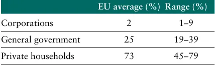
It is useful first of all to get an idea of the figures involved. Disposable household income in the Eu-ropean Union is by far the largest component of total disposable income, making up an average of 73 % of the total. General government disposable income accounts for 25 %. The rest makes up the rather modest average total of 2 %.
HOUSEHOLD ACCOUNTS
[image:41.595.325.539.103.168.2]4
Table 4.1 — Proportion of disposable income for different sectors
EU average (%) Range (%)
Moving on to the regional distribution of these components, figures are available for the regional distribution and level of disposable household in-come, but not for the regional distribution of dis-posable income for other sectors (operating sur-plus and property income of corporations, and government activity).
Assuming that the disposable income of these oth-er sectors is of equal benefit to citizens in all
re-gions, the difference between the ‘disposable come of all sectors’ and ‘disposable household in-come’ is divided per capita among the populations of the various regions.
This is the easiest and most transparent method of dividing up the remaining balance. This approach seems to be easier to justify for the general govern-ment sector than for private organisations. Given, however, how low a percentage of the total figure
Regional disposable income
per capita in PPCS, all sectors
2001 — NUTS 2
> 22 500 20 000–22 500 17 500–20 000 15 000–17 500
15 000 Data not available
AT: 2000 UK: 1999
EL, FR, NL, UK: Eurostat estimates
Statistical data: Eurostat database: REGIO © EuroGeographics, for the administrative boundaries Cartography: Eurostat — GISCO, May 2004
is involved, this has only a marginal influence on the results. Experiments with other distribution keys, such as value added or persons in employ-ment, resulted in a virtually identical regional structure. The per capita approach was therefore chosen for transparency reasons.
Regional income of
all sectors
Map 4.5 shows the results of these calculations for 2001. Unfortunately, no data are available from the national accounts for Malta and Cyprus, nor for Hungary, Poland and Slovenia, although there are regional data for households.
Per capita disposable income, taking into account all sectors, is particularly high in Stockholm, Lon-don, Hamburg, Région de Bruxelles-Capi-tale/Brussels Hfdst. Gew., Niederösterreich and Wien, Oberbayern, Île-de-France, Lombardia and Emilia-Romagna. Capital cities and city regions are clearly the wealthiest.
By contrast, the regions in southern Spain, Portu-gal, Greece and the new Member States for which data are available are the poorest.
In general, the prosperity divide usually drawn for per capita GDP appears here too, but with a few interesting details: within Germany and the Unit-ed Kingdom, for example, households in all gions have a similar income as a result of State re-distribution.
Conclusion
Analysis of the income accounts of private house-holds at regional level is a useful addition to the previous technique of measuring wealth by means of regional GDP per capita. It makes important detailed corrections and enhances the objective comparison of Europe’s regions.
When the data on regional household accounts are completed in the near future, these statistics should be used in addition to the GDP per capita for decisions on regional policy measures.