Theses
Thesis/Dissertation Collections
10-23-2013
I Am Pakistan
Shehzil Malik
Follow this and additional works at:
http://scholarworks.rit.edu/theses
This Thesis is brought to you for free and open access by the Thesis/Dissertation Collections at RIT Scholar Works. It has been accepted for inclusion in Theses by an authorized administrator of RIT Scholar Works. For more information, please [email protected].
Recommended Citation
I Am Pakistan
Shehzil Malik October 23, 2013 Title
Submitted by Approval Date
Thesis Documentation
for the Master of Fine Arts Degree
Master of Fine Arts in Visual Communication Design School of Design
Thesis Committee Approval
Chris Jackson, Graduate Program Director, Visual Communication Design, CIAS
Adam Smith, Program Chair, New Media Design, CIAS
Raj S. Murthy, Assistant Professor of Marketing, Saunders College of Business
Peter Byrne
Shehzil Malik Chief Thesis Adviser
Associate Thesis Adviser
Associate Thesis Adviser
School of Design Administrative Chair
I Am Pakistan is a project that aims to address the question of whether interaction design can be used to create human connections and foster the intrinsic motivation needed for becoming an agent of social change.
Pakistan is a country riddled with crippling problems such as poverty, illiteracy, terrorism and injustice. There is a need to make young people aware of proactive measures they can take to help change this dire situation.
Figures show that around 55% of Pakistani nationals are under the age of 251 with over 30 million Internet users in the
population2. This indicates that there is a large target audience
of students and young professionals who can potentially be mobilized for social causes. Volunteering is one way of bringing about positive social change in the community.
My specific scope of research is to create a design solution for “strategic volunteerism,” aiming to:
Promote volunteerism in an innovative manner
Highlight credible channels for volunteer energy
Add value to the volunteer experience by making it more personal and social
Enable volunteers to contribute to a process having impact
I Am Pakistan is an interactive storytelling experience about
volunteering. Users are engaged on two fronts: they can choose to read stories as well as add their own story to the compendium. This peer-reviewed collection of volunteer stories provides a true account of a volunteer’s experiences, which can further be shared across social media.
The goal of such user-generated online content is simple: to promote volunteerism in a young audience using a medium they are accustomed to, and inspire others to contribute.
1 “The World Factbook”. Central Intelligence Agency. https://www.cia.gov/library/ publications/the-world-factbook/geos/pk.html
I Am Pakistan is an interactive storytelling experience which highlights the experiences of volunteers in Pakistan as well the success stories of those they meet along the way.
These stories use a combination of videos, photographs and text to highlight the role of the volunteer and provide an experiential account of their time spent working with a volunteering organization.
In order to facilitate a user’s specific interest, the stories are categorized into three subjects: “Community Development”, “Children and Youth” and “Women Empowerment”. Users are
able to filter and choose to read from stories of their interest. Each story is also linked to a trusted volunteer organization allowing the user to reach out to the organization directly and ideally volunteer their services.
At its core, the project aims at highlighting the best of Pakistan, showcasing stories that would otherwise go unnoticed, and to hopefully inspire users to volunteer their time. The primary goal of the project is to utilize innovations in interaction design to further the bonds of human connection.
State of the World’s Volunteerism Report
This is a comprehensive report on volunteering, making a case for the recognition of volunteering as a fundamental way of bringing about social change through participation and empowerment of citizens. It states that there is an untapped potential of volunteers worldwide that can be mobilized to bring about this change.
The report acknowledges that there needs to be more research done on volunteering and that so far no comprehensive
statistics are available to show volunteering trends and practices worldwide. However, it does cover the advantages of volunteerism in nation-building, its contribution in conflict resolution and in decreasing the disparity in society. It dedicates a section of the report to “Volunteering in the 21st Century” where online volunteerism is discussed, as well as its booming potential in developing countries. Examples are given to show how technology has been utilized to harness the power of the people for the greater good.
This proved to be an incredibly pertinent report that became a great starting point for my research into the feasibility of using technology to generate interest in volunteerism in a developing country such as Pakistan.
Digital Citizenship: Exploring the Field of Tech for Engagement
This report is on a summit which covered the topic of how technology can be used to engage people and bring them together to aid their communities. The author covers the role of technology in being a responsible citizen as well as possible business models and evaluation methods of success.
This is a useful report in terms of what brainstorming has been done on the topics of making successful models for socially-driven technological efforts, as well as giving project examples. A check list of how to measure success is also included.
However, there could be more projects and examples, especially from the developing world.
Nonprofit Tech for Good
As a blog on promoting non-profits to affectively use social media, the author uses short articles written in an easy-to-understand format to illustrate her points. The blog covers the major social media websites and gives updates and advice on how to use them effectively to foster volunteerism, as well as data on how social media has changed how volunteerism is conducted. I feel this could be a useful resource for me to better understand how non-profits market themselves online and what are the best practices in the field.
Another similar blog: http://www.bethkanter.org/
“Education in Pakistan, Past and Future”
This is a comprehensive report on the state of education in Pakistan. It provides details of the level of education based on parameters like location, rural versus urban, wealth and gender. Initiatives launched to counter the problems are also described, as well as details about the organizations working in the field. This report was highly useful in understanding the context of my design solution, as well as giving an insight into how non-government organizations work, and what volunteers can help them with.
Designing for social change: Strategies for community-based graphic design
The authors show case studies to highlight their findings on how to go about designing for social change. Advice is given on how to immerse yourself in the community you are designing for, and how different designers have tackled social problems by understanding the values of their target audience and using feedback to evaluate the design solutions. The authors go into the fundamental principles on how to
approach a socially-driven design project using examples from professional designers and student work to serve as a hands-on guide for the subject. The informatihands-on is helpful in guiding my design principles and to help me monitor how I approach my issue; making sure I put the needs of my target audience before my own preconceived notions.
The Design of Everyday Things
The author uses psychology to explain how good design can be created. Case studies illustrate Norman’s design principles of visibility, affordances, mapping, constraints, feedback and conceptual models. These powerful concepts can be applied to not only products and artifacts, but also to user interface design, making a compelling argument for the reasoning behind each design decision a designer makes.
Designing with the Mind in Mind
Designers are given an insight into cognitive and perceptual psychology in order to make informed decisions about user interface decision. The guidelines laid out provide a foundation for good practices, making the reasoning behind them easy to understand and intuitive.
Hacking for Change: 17 Apps That Could Make a Difference
The author discusses a Hackathon event based on creating apps that will affect social change. All entries and concepts are listed. The article was useful as it stated the various app ideas that were generated by the event. The winning concept whereby SMS texts can be sent to neighbors for their help is simple in its scope and highly effective in its nature. I feel this is close to a solution I was considering for my Pakistani audience.
The Googlization of Philanthropy
Interesting article stating, “Philanthropy is unlike industries in which the Internet has destroyed business models that relied on the information producer’s maintaining control of distribution. The very technology that is killing newspapers and record
companies will revolutionize philanthropy for the better.” The author lists various websites that aim at providing
information about the philanthropic opportunities that exist, making them easy for potential volunteers to find and utilize. This article was helpful as it supported my theory that volunteer
Cause.It Unites Volunteers, Local Business, and Nonprofits in One App
Author describes a new app aimed at boosting community engagement that was debuted at SXSW Interactive. The founder Gagan Dhillon sums it up as, “We came up with the idea based on seeing a need in the communities—how do you connect the volunteers with nonprofits and small businesses at the same time?” The article covers the basic functionality of the app as well as a video showing how it works.
Users earn points by volunteering at local food banks, animal shelters or other similar organizations. Those points can then be redeemed for discounts or free goodies from nearby small businesses, who earn an image boost through partnership with philanthropic groups. Cause.it makes money by charging those groups a small monthly fee to engage with volunteers directly on the platform.
Good start in researching precedents that exist, but I disagree with the model used to motivate people to contribute. It seems to undermine any intrinsic motivation the users would have to do good for the sake of helping their community.
Do Good Design: How Designers Can Change the World The author gives his reasoning on how design can be used
for the social good, citing examples from graphic design and advertising to clarify his points. He tries to show fellow designers how they have the power to make a difference through their work and the strategies used to implement this vision.
How to Build an App: 45 great tutorials
This post on Creative Bloq gives tutorials for building apps for iOS, Windows, Android as well as tablets. Could prove to be a good resource once the design stage is reached.
Website: http://www.creativebloq.com/app-design/how-build-app-tutorials-12121473
Social-media
This is a good resource for looking into how social-media can be used by nonprofits to promote their work and gain recruits. I will need to go through these articles and steps to get a better understanding of how my project could be marketed. However, this is really part of the last stage of my project.
Responsive Design Fundamentals
This tutorial covers important aspects about responsive web design such as how to design for a variety of screens, working with media queries, fluid grids and optimizing site performance.
It also covers strategies on how to build responsive mockups and testing designs out. I think this tutorial will lay a strong foundation for understanding how to design for the web and numerous devices out there.
Foundations of UX: Prototyping
This tutorial covers the basics of prototyping including
sketching ideas, building low and fidelity prototypes and testing and evaluating them; as well as information about the different prototyping tools available. If I do end up designing a web database and mobile app, prototyping will play a key role in the design and testing stages. Hence this tutorial will help me understand how to go about this.
jQuery Essential Training
This tutorial covers the fundamentals of jQuery such as how to use them to manipulate page content and add polished effects to a web experience such as transitions and custom animations. For my website, jQuery plugins could help to add to the user experience.
Volunteer Karachi
This website has a similar goal to mine, but focuses their efforts on Pakistan’s largest city, Karachi. Their mission statement reads: “Volunteer Karachi seeks to empower children, teenagers and adults to discover how they can support deserving causes all around Karachi. There are so many ways to initiate positive change — give of your time at non-profit institutions, schools, community-based organizations or any other initiatives that require help.”
The website lists volunteering opportunities according to different fields of interest (Arts and Craft, Children and Youth, Community Development, Education, Health, etc.) and gives details on the organizations working within the field as well as ways to contact them. Users can also sign up for alerts. A short list of guidelines for volunteers is also provided. Volunteering organizations can post an opportunity by becoming a partner of the website. They also have a Facebook page and a Twitter account.
Website: http://volunteerkarachi.wordpress.com/
Alif Ailaan
According to the website, “Alif Ailaan was founded to bring together and empower all those Pakistanis who want to respond to the country’s education emergency, and equip our children to succeed for themselves and for Pakistan”
The site seeks to raise awareness about the Education-emergency in Pakistan and runs a campaign to demand universal education for all Pakistani children. It has resources regarding the dire situation In Pakistan, mapping out the information via an interactive map that lets you contact government representatives in your constituency. It allows users to sign up and get updates on the campaign’s mission and progress.
A well-organized and well-designed website, Alif Ailaan
provides resources and ways to help the education crisis back home. Great example of using design to create social change and get people involved in the conversation.
NYC Service
This website is a great example of how the government can use the web to list volunteering opportunities and help foster recruitment. The functionality of the website allows both volunteers to look for opportunities and nonprofit organizations post these opportunities, as well as help in disaster relief.
The website allows the user to search for opportunities
primarily based on their interests. Users can further refine their search according to high need areas, their location, time-frame and skill-set. Users can also post their own individual listing for a volunteering project and make donations. Service reports are available and links to social-media are clearly shown.
This website has clear visual hierarchy with a friendly user interface that is easy to navigate. There are many useful features and a clear branding identity that uses bold typography that sets it apart from other volunteering websites.
Website: http://www.nycservice.org/
Other websites to see: http://www.beextra.org/, http://www. newyorkcares.org/ (NYC Cares has a much more vigorous sign-up process that encourages people to sign up for an hour long orientation before they can search for projects.)
Ushahidi
“Ushahidi”, which means “testimony” in Swahili, was a website that was initially developed to map reports of violence in Kenya after the post-election fallout at the beginning of 2008. Since then, the name “Ushahidi” has come to represent the people behind the “Ushahidi Platform”. Our roots are in the collaboration of Kenyan citizen journalists during a time of crisis. The original website was used to map incidents of violence and peace efforts throughout the country based on reports submitted via the web and mobile phones.”
A fascinating example of how mobile phones have been used to gain information, track and help in relief efforts, starting from Kenya and now used around the world. The technology was also used to help map the floods and relief efforts in Pakistan via the website, “Pak Reports” (http://pakreport.org/flood2010/). Good case to study and learn from.
Design Process
Initial Concept This project has certainly been a study in evolution and change over the course of the year that I have worked on it. Inspired by my own volunteering experience and the
friendships cultivated within the volunteering sector, a need was felt to involve more young people in volunteering opportunities. It was also important to ensure that volunteers have a rewarding experience that prompts them to remain involved. By talking to those in the development sector, there was a realization that volunteering efforts were seen as invisible, duplicative, having limited impact and providing little value to the volunteer as well as the organization involved. Informal channels were used to find volunteering work and many volunteer programs were mismanaged; giving little guidance and asking for limited feedback from their volunteers. This resulted in many volunteer opportunities having little
impact and providing little motivation for the volunteer to continue on this path.
In order to narrow the scope of my research, I initially chose to focus on education from amongst the numerous social issues targeted by volunteering organizations.
The idea of a website started as a pragmatic solution for
promoting strategic volunteerism in Pakistan’s education sector. It would match well-suited candidates to credible opportunities within different streams in education (teaching, co-curricular activities, community service and mentorship). Volunteers would be able to access a database of relevant organizations, check peer-reviewed rankings of each organization and sign up for alerts about opportunities they were interested in. On the other hand, organizations would be able to reach out to candidates with the desired skill set, as well as have access to resource packs for improving volunteer interaction (seen as a future development).
This idea was further developed when I took part in a
Interviews I decided to start my primary research by talking to those in the volunteering sector to get a better idea of their operations and use of online solutions.
I targeted the following individuals:
Aneeq Cheema and Imran Server: Founders of Rabtt, a youth-based organization encouraging critical thinking skills in children via summer camps held in public schools.
Rameez Mumtaz: Founder of Green Volunteers, an
organization encouraging the young to get involved in activities for positive social change, especially in emergency relief services.
Samina Ansari: Founder of Volunteer Karachi, a website listing volunteering opportunities available in the city of Karachi.
Neha Ansari: Community Service Representative at Lahore Grammar School.
While the project won second-place at the event, it soon became clear to me that restricting the platform to exclusively promote educational opportunities was not a feasible option. Quite simply, enough opportunities in the field of education did not exist in Pakistan.
Operations
Name of organization
What is the size of your operation? (Number of employees. offices, revenue)
Where are your operations? (rural / urban)
How do you operate?
How do you find volunteers?
How big is your volunteer group? (per month/ per cycle/ per year, whatever is appropriate)
Describe the volunteer’s duties
What channels do you use to communicate with volunteers? Facebook
Newspapers
Word of mouth (how)
Print (newsletters, brochures) Schools
Corporations
How do most volunteers hear of you? (Do they know?)
How do you mobilize people for a cause? How do you get people to care?
What incentives do you give to potential volunteers to sign up?
Do you have a marketing strategy? Do you use promotional material? What kind?
Do you make people aware of your achievements/ how they can make a difference? How?
Do you have your own mailing lists of past volunteers by which you keep in touch?
Do previous volunteers return/ spread the word?
Do you think a sufficient number of people are volunteering?
What do you think are the barriers to volunteering?
Volunteers
Describe your volunteer base. (Age, gender, social group, job, industry)
Who would be your ideal volunteer? In terms of education/ skills/ experience/ gender?
Are you happy with the kind of volunteers you find? What qualities would you like to see improved?
Do you get enough volunteers or would you want more?
Do you provide orientations to your volunteers? What is the medium/ method/ material provided?
Do you have resources on volunteering you could share?
Do you ask volunteers to review/rate their experience?
What kind of technology do your volunteers have access to? (computers/ internet/ smartphones/ mobile phones)
Do you reach out to them using the internet?
Volunteer Applications
Do volunteers apply to volunteer? What is the process?
How do you select volunteers? What is the criteria by which you check suitability?
Would you be able to process online applications? Would they be of use to you?
Technology (if not already stated)
Is your staff trained to use technology? Describe operations.
How do you use technology in the dealing with volunteers?
Do you use social media? (if not already discussed)
If yes, how does social media help? In advertising opportunities/ raising awareness?
Would a website that helps you find volunteers that match your needs help you?
Rank what services would be most relevant to you? Visibility of organization
Applications from volunteers wanting to join
Alerts being sent to volunteers that suit your volunteering opportunities
Orientation given to volunteers
Would you want to send out alerts to interested volunteers when opportunities start/ special programs are launched?
31
32
33
34
35
36
Interviews
Response Summary The overall consensus seemed to be that volunteer programs State of volunteering in Pakistan were not developed to create value for either the organization or the volunteer. The youth involved were left under-utilized and activities were made on the spur-of-the-moment by volunteers themselves with little training in the subject. A lot volunteering efforts were also felt to be invisible as people were not aware of efforts being made around them and so did not contribute.
Motivating young people
Most felt that young people in school volunteer for extrinsic factors such as to join their friends in activities or to get a certificate for their transcript. Ideally organizations wanted people with a genuine interest in the organization’s work. An older segment of 20–25 year olds was seen as the best volunteer base as they had the experience and maturity needed for the job. However, it was felt that even volunteers motivated by extrinsic factors could end up being inspired as a result of volunteering. The core goal of volunteering becomes creating a meaningful connection between the volunteer and the organization so that the person has a positive experience and they stay involved.
Reputation and Trust
It was also stressed that people only volunteer at organizations with a trustworthy reputation. This is especially true for girls whose parents are reluctant to give them permission to volunteer for an unknown organization. Students will usually find organizations through their school’s trusted community service group and or through recommendations of friends and family. If an online database for volunteering jobs were to be made, unbiased ratings of the organizations would be needed. Additionally, for these ratings to work, it was also pointed out
that critical mass is needed for them to be meaningful and fair. On the other hand, a few trusted and known reviewers could also help persuade potential volunteers.
Use of the Internet
Mobilization
A pertinent question to all volunteering organizations was quite simply, how do you mobilize people for a cause? How does one go beyond the clicking of a “like” or “share” button online to the physical act of showing up to volunteer?
The interviewees all agreed that in order to convince people that a cause is worthy, they must be clearly shown the value of their contribution. It was also noted that emotional triggers always get the most attention on social media.
Another insight into volunteer recruitment was how the interviewees stressed the importance of the quality of volunteers over their quantity. All agreed that this was not a numbers game. While they wanted their posts to become popular on Facebook, they remained concerned about
Online Surveys Survey1 1 2 3 4 5 6 7 8 9 10 11 12 13
What is your age group? 15-20
21-25 26-30 30+
What is your gender? M/F
What is your current occupation? Professional
Student
What is your field of study/occupation?
What is your location? (city, country)
How often do you use the internet? Daily
Few times a week Occasionally
What are the 3 websites you visit most?
Do posts on social media (Facebook/ Twitter) help you in decision-making?
Y/N
What social media sites do you use the most? (Check all that apply)
Facebook Twitter Tumblr
Instagram Pinterest
Do you own a smartphone? Y/N
If Yes, is it Android or an iPhone?
What mobile apps do you use the most?
Do you feel that citizens have a responsibility to help eliminate social problems?
Y/N
Do you want to volunteer? Why? (check all reasons that apply) I want to contribute to causes I care about
I want a well-rounded resume for college/job applications My friends volunteer so I join them
My school/job makes it mandatory to be involved Other: __________________
Have you volunteered in the past? Y/N
If you have volunteered in the past, please answer the following questions. Otherwise skip to the next section. Note: In the survey the term “volunteering opportunities” can also be interpreted as internships done with nonprofits/ NGOs.
How do you usually find volunteering opportunities? Through family/friends
Through school/job Search engine (website) Social media
Publication (newspaper/magazine) Other : __________________
Which volunteer organizations have you worked with previously?
What work were you doing for these organizations? Please list and state your job description.
If you were given an orientation before you began volunteering, what information was given to you? Do you think it properly prepared you for your tasks?
Was it easy or hard to find a rewarding volunteering opportunity?
Easy Hard
Please explain your answer:
Do you have any preferences regarding when you want to volunteer? (such as time of year, time of day)
What would have made your volunteering experience better?
If you haven’t volunteered before, what are the reasons for it? (check all that apply)
I don’t have any free time
I don’t have any interest in volunteering I don’t know where to volunteer
Other: __________________
What would motivate you to volunteer?
Apart from times of disaster, do you think there is enough of a culture of volunteerism in Pakistan?
Y/N
If No, what do you think are the reasons why few people take the time out to volunteer?
Do you know people active in volunteering? Why do you think they do so?
Would a website that helps you find volunteering opportunities be useful to you? Briefly explain your answer.
Rank in order of importance what features would be most useful to you the website.
A list of volunteer opportunities to choose from Search option to match your interest to opportunities Online application for opportunities
Reviews of opportunities by other volunteers/ friends Ability to save opportunities to come back to them later Alerts sent to notify you of new opportunities
If you know of a website/Facebook page that already helps you to find volunteering opportunities, please share it here:
What suggestions would give to someone working to improve volunteering experiences? (optional)
Online Surveys
Survey2 15-20What is your age group?
21-25 26-30 30+
What is your gender? M/F
What is your location? (city, country)
What device do you mostly use to access the internet? Computer
Mobile phone Tablet
Have you uploaded pictures to the internet? Y/N
If Yes, what device did you use? (check all that apply) Computer
Mobile phone Tablet
Have you uploaded videos to the internet? Y/N
If Yes, what device did you use? (check all that apply) Computer
Mobile phone Tablet
What platform/s have you used to upload content? (check all that apply)
An online survey was conducted with 62 respondents, most falling within the 21-25 age group. Since this survey was anonymous, the goal was to get honest responses about the driving force behind volunteering.
My findings from the survey revealed that most of my
respondents had indeed volunteered before and most claimed that they did so because they wanted to contribute to causes they cared about. This was important in terms of understanding how people themselves saw the motivation behind their acts of volunteering. Unlike the extrinsic motivation highlighted by the interviewees, volunteers themselves stressed their intrinsic motivation. This was crucial in the design of the platform.
If the desire for socializing with friends or resume-building had been highlighted by the survey, the design would have taken a gamification approach to volunteering (as seen in the online platform, “cause.it”). However, the stress on volunteering for community development showed that instead of external reward systems, users appreciated self–actualization and a sense of community.
Another seemingly obvious but significant point revealed was that people wanted to be involved in causes they cared about. This implied that the platform should be able to match volunteers to their field of interest. Also, the importance of fostering social connections was noted, as well as the need for people to see a measurable impact of their efforts. Other important factors were the organization’s reputation and its location (safe versus unsafe locations).
A second survey was done in order to better understand the online activities of users. All 80 respondents falling between the ages 21-30 indicated that they uploaded content to the Internet, all of them using Facebook to do so and primarily using their computers versus mobile devices. This meant the platform would be designed for desktop devices and that Facebook would be critical in sharing and uploading content. Online Surveys
Target audience After my research I established the following parameters to establish my target audience to better understand the users of the platform.
30 mill
internet
users
67% of
nationals
under 35
Location Access to Technology
Pakistan Computers
Occupation Age range
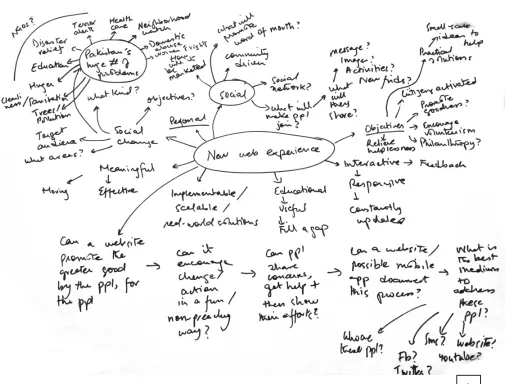
Mindmap to understand the web experience Diagrams
Fig 1. Mindmap about web experiences
Mindmap listing possible objectives and functions Diagram
Fig 2. Mindmap of objectives and functions
Mindmap listing possible functions of the platform Diagrams
Fig 3. Mindmap about functionality
Keeping all the research in mind, it initially became difficult to decide the project’s design direction. While mapping out diagrams for the platform it became clear to me that this project had too wide a scope.
An overwhelming array of functions had so far been
considered: from displaying existing opportunities to the ability to search, add, rate and share content. Existing precedents like VolunteerMatch.org and NYC Service served as great examples on how pragmatic online services could improve a volunteer’s experience. However, it remained a challenge to find a unique direction to take on the subject of volunteerism.
For this reason it was important to go back to the primary goal for the project which was to create a web experience to encourage volunteerism and cultivate a sense of community. The direction the website was so far taking as a database to
connect users to relevant opportunities seemed to lack the personal connection between the users and the subject matter. The passion towards civic responsibility that needed to be
communicated had gotten lost in the pursuit of an all-purpose volunteering hub.
A turning point came when I stumbled across a Google ad narrating how its services helped reunite two childhood friends separated by the partition of the Subcontinent (Ogilvy and
Mather India, Reunion, Google advertisement, 2013, https://
www.youtube.com/watch?v=ljUrawZN55g). I realized that
It soon became clear that the very nature of volunteerism encouraged an anecdotal manner of communication and designing a platform that brought stories of volunteers straight to the target audience would be a unique undertaking.
Furthermore, users are now actively devising online content. From posting on Facebook and Instagram to writing blogs and curating images on Pinterest, my target audience was comfortable generating and sharing their ideas online. Could this energy be harnessed to encourage young people to share their stories of volunteering? Could storytelling become a tool for social change?
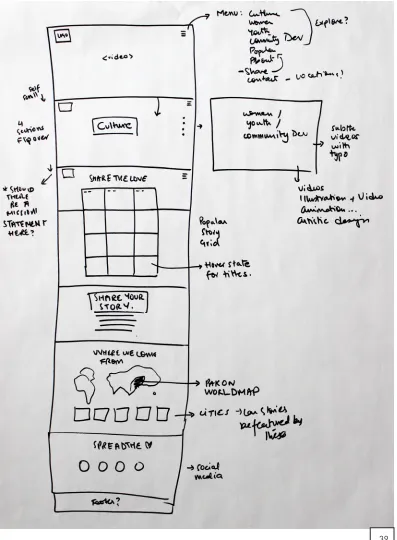
[image:30.612.233.519.328.659.2]A feature set was decided and taxonomy maps made to list all the components of the website. A use-case was also drawn up to understand how the platform would be used.
Fig 4. Feature set
Listing out possible functions of the website Diagrams
Fig 5. Listing functions of the website
Trying to chart the adding story feature Diagrams
Fig 6. Sketches of the wizard to add a story
Call to Action
Greeting Infographic/Animation
Footer
Copyright Site map
Way Finding/ Filter Parameters Search Filtered Opp Mosaic Opportunities Mosaic
Image Org Name Opp Description Join Expand
Opp Module Login/ Sign Up Google Map Join Description Share Save to Wishlist Photos Close Online Application Directions/ Location Fb/Email Login/ Sign Up Login/ Sign Up Online Application Peer reviews Navigation
Logo Utilities Social Media Contact
Login
Sign Up
Facebook Description
How it works
Your Account Wish List Terms & Conditions
Initial Taxonomy Map Listing components of the homepage
Initial User Flow How a user would access and sign up for opportunities
Read/ watch Story
Organization
details Reviews Location/Timing
Join
Share on Fb/
Email Sign up for Alerts
Register
Populate list of choices
Register as a member to sign up for text/ email alerts about application deadlines
Depending on the kind of opportunity, joining could be as simple as an email informing you when and where to show up, or as deatiled as an online applictaion form to be processed by the organization
To sensitize volunteers about the seriousness of volunteering, an engaging online orientation could be given as part of the package Results displayed
Choose a story User Filter Stories Story Mosaic Filtered
Mosaic ModuleStory
Sent to org for review Sign Up/
Log in Application for Opp OrientationMini
Fig 8. Initial user flow
After mapping out the system; a further need was felt to
simplify the platform. The addition of alert systems, application forms, orientations and the like were taking away from the core objective of fostering human connections. For this reason, the next critical question needed to be asked was: what is the one thing this website should do best?
In the process of simplification, I was left with two primary functions for the website: to either experience stories or to add stories to the platform. Focusing on my larger goal of fostering the desire to volunteer, it seemed clear that experiencing the stories took precedent over all else. These stories would allow users to form a personal connection with the organization in an organic manner and possibly lead to more volunteering efforts. Revised taxonomy maps and use cases were made to list all the components of the website and to facilitate usability. Concept Simplified
Fig 9. Deciding the primary function of the website
Taxonomy Map
Homepage
Logo Edge-to-edgeImage transitions Utilities Social Media Navigation
Login
Sign Up
Description
Sound control
I Am Pakistan Homepage
Fig 10. Final taxonomy map of homepage
Taxonomy Map
Navigation
Home Stories Join
All Stories
Community Dev
Children & Youth
Women Empowerment
About Contact
I Am Pakistan
Navigation
Fig 11. Final taxonomy map of navigation
Home
Stories
Join
About
Contact
All Stories Default;
All stories Filtered stories Filtered stories Filtered stories Stories
Logo Story Mosaic Utilities Social Media Navigation
Login
Sign Up
Navigation
Sound control Community
Dev
Children & Youth
Women Empowerment
I Am Pakistan
Stories Page Taxonomy Map
Fig 12. Final taxonomy map of Stories page
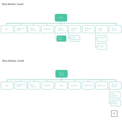
Stories
Organization Name
Logo StoryCategory Storyteller ImageChapters VolunteerButton Next StoryButton
Link to external site Stories
Level2
Social
Media CloseButton
Twitter I Am Pakistan
Story Module- Level1
Stories Level 2
Image Story Title Chapter title Chapter text Story navButtons
Next Chapter Previous Chapter Organization Name
Logo StoryCategory Storyteller
I Am Pakistan Story Module- Level2
[image:39.612.67.559.144.681.2]Taxonomy Map
Fig 13. Final taxonomy map of Story module
Join
Logo Navigation Utilities Social Media Pagination
Login
Sign Up
Wizard Navigation Buttons
Next Step
Previous step
I Am Pakistan
Join Page Taxonomy Map
Fig 14. Final taxonomy map of Join page
Wizard
Step 1
Welcome Text Step 2Org name Step 3StoryText Step 4Upload media Step 6Submission
Text box (upto
500 words) FromFacebook
From Desktop
Step 5 Personal details
Text box (Name)
Text box (Email) Text box
(Org Name) Preview StoryButton
Submit Story Button
I Am Pakistan Join Wizard Taxonomy Map
Fig 15. Final taxonomy map of Join wizard
About
Logo Navigation Utilities Social Media Edge-to-edgePromo video
Login
Sign Up
About Project Description
I Am Pakistan About Page Taxonomy Map
Fig 16. Final taxonomy map of About page
User Stories Story Mosaic
Filter
Categories FilteredStories
Story Module
Volunteer Read
story chapters
Share on social media
Link to Volunteer Org
Close
User clicks
”Stories”link Stories displayed via imagery
User Flow This use case illustrates the path of the user to read a story
Fig 17. Final use case
Initial design direction Since it was decided that showcasing stories took precedent in the design, the initial wireframes were focused simply on displaying imagery of volunteering stories. Inspired by existing precedents (Adidas website. http://www.global. adidas.com/originals/Originals,en_NG,sc.html#/content/ womenslookbookfw11 and IKEA website. http://spazioallavita.
ikea.it/), the wireframes were concept-driven and image-heavy
but without the personality needed to differentiate them from the existing platforms.
Initial Wireframes
Fig 18–21. Initial wireframes
18 19
Initial Wireframes
Fig 22. Initial wireframes
Moodboards The next step was to establish keywords that described the platform. Moodboards were made to communicate the core values of “Personal”, “Warm”, “Inspiring” and “Nostalgic”. These images helped establish the mood, emotion, color tones
and narratives that needed to be communicated.
Warm tones and corresponding hues were picked from the moodboards to establish the kind of colors and emotion the website would portray.
Fig 23. Color palettes
Metaphor 1: Teatime It was felt that using a metaphor for storytelling in Pakistan would help drive the design towards a more grounded and tangible interface that would be both familiar and innovative. This metaphor could be translated into UX design.
Metaphor 1: Teatime
UX Principles The image of a teacup was used to derive design parameters like having fluidity, physical dimensions, circular forms and lifting affordances.
Fig 24. Tea time metaphor sketch
Metaphor 1: Teatime
Sketches The initial sketches translated the teacup metaphor into various circular UI elements. Ideas like circular story pods was investigated, alongside the idea that users could make collections of the stories by drag-dropping the story modules into a central circular element. Progress also be shown via a circle being completed as stories were read, and stories types could also be color-coded bands.
Fig 25. Tea time UI concepts
Metaphor 1: Teatime
Sketches Other ideas included having circular stories pods “float” in the web space, with their size increasing corresponding with their popularity over social media. More conventional ideas included having trendy circular thumbnails which could be animated upon hover.
Fig 26. Tea time UI concepts
Metaphor 1: Teatime
Low-fidelity wireframes Low fidelity wireframes were then made and divided into literal and abstracted translations of the teacup metaphor. Literal translations included the idea of using physical spaces as the interface. Architectural features like traditional building
facades with windows (with the windows treated as insights
into the lives of its inhabitants) were considered, as well as the cluttered desk of a storyteller drinking tea. The scene of a traditional roadside teashop was also considered where videos of people conversing could be integrated into the interface.
27
29
28
Fig 27. Windows interface; each window displays a story
Metaphor 1: Teatime
Low-fidelity wireframes In moving away from these realistic scenarios, I abstracted the teacup into an interface with a inherent three dimensionality,
story modules that existed in z-space and could move fluidly.
Ideas of circular story pods was investigated, as well as the idea that popular stories could increase in size as they were shared across social media to highlight their success.
Fig 30. Three dimensionality explored by story cuboids; the more popular the story, the more it increased in z-space. Fig 31. Circular story modules that get larger as they get shared online.
Fig 32. Circles that were linked to location services, the user was driven deeper in the heart of a story. Fig 33. Circular thumbnails with built-in location information and edge-to-edge videos.
30
32 33
Metaphor 1: Teatime
High-fidelity wireframes The high-fidelity mockups of these designs primarily used circles to imply the idea of fluidity and connectivity and
experimented with the notion of circular navigation.
However, these designs could not fully realize the more
innovative dimensionality of the concept, and lacked character. There was no cultural connotation to the designs.
Fig 34–35. Tea time high fidelity mockups
34 35
Metaphor 1: Teatime
Evaluation ProsCircle implies the idea of fluidity and connectivity Possibilities of circular navigation
Cons
Metaphor 2: Pakistani Motifs Unsatisfied with the direction of these designs, I decided to probe into a new kind of metaphor, that of traditional Pakistani motifs.
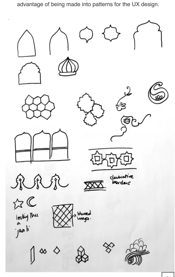
Metaphor 2: Pakistani Motifs
UX Principles Isolating these motifs helped in finding geometrical patterns that could be formed from the shapes and checking their suitability for showcasing imagery from stories. These
[image:57.612.199.542.136.679.2]shapes were seen as having cultural character, as well as the advantage of being made into patterns for the UX design.
Fig 36. Isolating Pakistani motifs
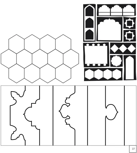
Metaphor 2: Pakistani Motifs
[image:58.612.84.542.149.662.2]Shape experiments Tile patterns, wedding tent designs and architectural features were isolated as UI elements.
Fig 37. Pakistani motifs as UI elements
Metaphor 2: Pakistani Motifs
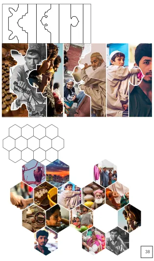
[image:59.612.228.543.135.667.2]Shape experiments These shapes were then fitted with images from the volunteering stories to ascertain whether they gave the user enough information to want to click and read more.
Fig 38. Shape experiments using Pakistani motifs
Metaphor 2: Pakistani Motifs
[image:60.612.146.543.142.682.2]Sketches These motifs were then used as UI elements to create new mockups of webpages with parallax scrolling and sections of content that transitioned from one to another.
Fig 39. Parallax scroll website sketch
Metaphor 2: Pakistani Motifs
[image:61.612.73.543.173.599.2]Sketches Sketches to determine how to fit the pattern-rich elements into the wireframe designs.
Fig 40. Fitting Pakistani motifs into the parallax scroll website
Metaphor 2: Pakistani Motifs Low-fidelity wireframes
Fig 41–42. Low fidelity mockups of the parallax scroll website
Fig 43–44. Low fidelity mockups of the parallax scroll website
Fig 45–46. Low fidelity mockups of the parallax scroll website
Metaphor 2: Pakistani Motifs
Evaluation However, I soon realized that in trying to make the website look inherently Pakistani using these traditional motifs, I had strayed from the UX goal of having an innovative interface. The motifs had become mere decorative elements and lent
themselves only to the form, not function.
Pros
Use of traditional patterns not seen in web design Innovation in how shapes transition to form patterns
Cons
Uses conventional parallax scrolling
Metaphor 3: Jaali The third metaphor I found myself drawn towards was derived from both these previous experiments with architectural spaces and traditional patterns.
The “Jaali” is a perforated screen that is a prominent feature in traditional Subcontinental architecture. The purpose of a jaali is to create privacy of indoor spaces by abstracting the view from the outside. Those dwelling within can look out of the screen while outsiders have difficulty looking in.
Metaphor 3: Jaali
UX Principles The UX design challenge became how to interpret the jaali’s design to create a UI of experiential story-telling. The Islamic patterns found in a jaali-screen became the
[image:67.612.76.545.242.576.2]building blocks for different shape experiments. A number of patterns were extracted from traditional floor tiles, textile prints and ceramics.
Fig 47. Sketches of the building blocks of the jaali pattern
Metaphor 3: Jaali
UX Principles An idea emerged where each fractal in the jaali pattern acted as real estate for a story module. The stories could fit into the larger whole; building a tapestry of stories. In terms of a collective communal narrative, this idea worked well with the concept of the whole being greater than the sum of its parts.
[image:68.612.72.518.261.552.2]These shapes could then be used as transitional elements to bring the web experience alive by revealing new content.
Fig 48. Sketches of how to use the jaali within the website
Metaphor 3: Jaali
[image:69.612.235.536.171.663.2]Shape experiments Shape experiments were used to see how a simple shape like a hexagon could be used to further build into a traditional motif, and further into a larger pattern that could be broken into different segments.
Fig 49. Shape experiments to build the jaali pattern
Metaphor 3: Jaali
[image:70.612.183.540.191.667.2]Shape experiments Positive and negative space within the pattern was checked to ensure that the pattern afforded enough space so as to feature story imagery. The final pattern chosen was such that it had both variety and consistency, as well as suitable real estate for imagery. It also afforded a modern triangular grid system that lent itself well to the notion of modernizing these traditional motifs.
Fig 50. Determining the positive and nagative space in the chosen jaali pattern
Metaphor 3: Jaali
[image:71.612.86.534.194.616.2]Concept The next step was to experiment with transitions within the chosen pattern. If each smaller shape was treated as a story module, what were the ways it could be revealed and added to grid?
Fig 51. Sketches for animating the pattern
The final idea was to have pattern grow and expand to reveal various story modules held within. The user should then be able to click and experience the story. The story mosaic becomes an experimental user interface where an
ever-expanding pattern of stories is created. The design becomes a constantly evolving interface as the addition of stories adds to the larger pattern.
[image:72.612.106.542.198.481.2]Story mosaic design
Fig 52. High fidelity mockup of the pattern building
Animation tests were used to experiment with the timing and placement of shapes, as well as their interaction with the perceived three dimensions of the screen space. It was
necessary to ensure that user’s eye movement was able to
appreciate the unfolding of the shapes and focus on each story as it appeared.
[image:73.612.124.541.180.675.2]Story mosaic design Transition test 1
Fig 53. Jaali transition test 1
Story mosaic design Transition test 2
Fig 54. Jaali transition test 2
Story mosaic design
[image:75.612.123.544.137.626.2]Transition test 3 The pacing of this transition test was preferred and so this was the chosen animation to reveal stories.
Fig 55. Jaali transition test 3
When users were shown the final story mosaic, it was seen
that users were unsure of what to click on within the story mosaic. For this reason, a hover effect was added to highlight that each shape is a clickable module. When a user hovers over a shape, the image goes from black and white to fully saturated and expands slightly. This effect also alludes to the jaali metaphor as the user is made to feel that he is looking in through a window of a screen that reveals more information.
[image:76.612.72.541.293.660.2]To facilitate the addition of stories, empty shapes are also shown within the pattern. Hovering over these reveals to users that clicking will let them add their story to the collection.
Fig 56. Jaali transitions and hover effects
The final design set the triangular grid that is to be used throughout the website. This pattern is also widely used in Subcontinental architectural tiles.
[image:77.612.113.543.201.664.2]Story mosaic design Final design
Fig 57. Final Story mosaic
The navigation also needed to fit into the chosen triangular
grid. Numerous design iterations were done including a conventional top navigation bar and more experimental triangular shaped links.
[image:78.612.113.542.216.509.2]Navigation design
Fig 58. Navigation design options
Animation tests were also designed to explore the idea of a hidden navigation system where a menu icon clicked to reveal the 3 links: “Explore Stories”, “Share Stories” and “About Project”.
However, a simple user test revealed that the menu icon tucked away in the top right corner of the screen was
[image:79.612.123.542.285.666.2]unnoticeable. Also, this was a bad design choice for a platform primarily designed to be seen on a computer screen as the menu icon is a convention used for condensing the navigation for mobile and tablet devices. User testing revealed that the visibility of the navigation links and the current system state was necessary.
Fig 59. Hidden navigation design options
Navigation transition test where the links are shown full-screen once the menu icon is pressed. Attention to detail was given to how the menu icon changes into a cross shape in order to close the menu.
[image:80.612.91.543.187.606.2]Navigation design Transition test
Fig 60. Hidden navigation transition 1
Navigation transition test where the links are shown in an angled sub-menu once the menu icon is pressed.
[image:81.612.93.541.171.573.2]Navigation design Transition test
Fig 61. Hidden navigation transition 2
Navigation transition test where the links are shown full-screen once the navigation tab is pressed.
[image:82.612.93.541.209.609.2]Navigation design Transition test
Fig 62. Hidden navigation transition 3
However, despite having an element of delight to them, these hidden navigation designs were discarded after user testing. A simpler navigation system was needed. The final navigation
therefore was designed to fit into the chosen grid structure and
show all the links up-front within a pentagonal shape. Each side of the pentagon was a designed to be a separate link and the use of a highlight color made sure that the user was aware of the page they were currently on.
The question of whether users should be given the additional
option of filtering stories was brought up throughout the design
process. Since initial research highlighted that users wanted
to volunteer in subjects that were of interest to them, the final decision was made to be able to filter stories. Story categories
were then built into the primary navigation structure. Clicking on the “Stories” tab would further open a submenu with the categories listed.
However, intensive user testing could not be done to validate the navigation structure. Such testing is a future development that is needed in order to test whether users are able to notice the irregularly shaped navigation and are able to use it. It might be the case that a more conventional structure like a top navigation bar may be needed.
Navigation design Final design
Fig 63. Final navigation design
For the story module itself, the design needed to incorporate text, images and/or videos that users could upload.
Considerations for the design included that every combination of the three types of content needed to be accommodated; users should be able to upload up to 5 images/ videos and that the design also needed to maximize interactivity.
Initially, the design was image-heavy and had images from the story divided into sections of the screen. The story’s text was revealed and overlapped on top of the imagery. There was little interactivity and users had little involvement in what was revealed on the screen.
Story module design
Fig 64. Sketches for using the triangular grid for the Story page
Story module design
Transition tests The element of delight was the main consideration when designing the transitions that revealed the story module.
Fig 65. Story page transition test1
Fig 66. Story page transition test2
Page fold
To increase user involvement in the story, one idea was to make each picture segment clickable to reveal the larger image. Text would only be seen if the user scrolled down. However these designs had their drawbacks as user testing revealed that users did not know that these areas were
clickable and had little incentive to scroll down to read the text.
Fig 67. Story Module design option
These wireframes helped determine how the screen could be divided into different sections to cater to the number of media files the user uploaded. Although this design was not ultimately used, the grid system for dividing the content sections was incorporated into the final design.
Fig 68. Story Module designs showing how the grid was used to show up to 4 story images
The final design tried to rectify many of the challenges seen in the initial designs.
The story module would open to reveal different chapters of the story via the sectioned images. A simple hover effect would reveal the title of the chapter, indicating to the user that extra information was revealed by clicking on each image.
Story module design Final design
Fig 69. The story module design with 4 image-chapters
Fig 70.The story module with the hover effect when the cursor is on top of one of the image-chapters
69
Each story would be broken into the number of chapters as the media it had, and users could read the text in smaller, more manageable chunks.
Within the story itself a call to action button labeled “Volunteer” was placed in a prominent position, linking each story to its volunteering organization and directing the user towards ways of contacting them. Social media buttons were also built into the system for ease of sharing the story.
Fig 71. A story chapter within the story module.
The final story module with imagery and story-text plugged in.
Fig 72. Final story module. Fig 73. Final story chapter.
72
To allow users to add their content to the platform, existing precedents were studied and a step-by-step wizard designed. A wizard would allow users to focus on each step and allow
them to fill in the necessary information in order.
Users were asked to identify the organization they worked with, write up to 500 words about their experience and add up to 5 photographs and/or videos. After giving their personal information, the option is given to preview or submit the story. Share module design
Fig 74. Add Story wizard option1
User testing showed that it was not only important to have pagination to show users what step they were on, but also to have buttons to allow them to navigate steps. A carousel list view was chosen to allow users to move left or right and enter data. The hexagon shape for each step tied it into the triangular grid structure employed by the website.
Share module design Final design
Fig 75. Add Story wizard, step 1 and 2
A carousel design showed the next and previous steps
ghosted alongside the current step the user was on. The user is able to click and get to either step directly.
Fig 76. Add Story wizard, step 3 and 4
The penultimate step asked for personal information so that the user could be notified once their story is reviewed and published on the website. The last step allows the user to either preview what they submitted, or submit the story.
Fig 77. Add Story wizard, step 5 and 6
In terms of the homepage’s design, it was necessary that it united the different elements involved in the website and be able to clearly communicate the function of the platform.
Beautiful photographs from Pakistan were used to
communicate the mood and location that the website was based on. The homepage design featured edge-to-edge imagery from Pakistan coupled with a descriptive statement highlighting the purpose of the website. Friends in the
volunteering sector as well as local photographers granted me permission to use their stories and imagery.
A number of high-fidelity mockups were designed and tested to see what piqued user interest more.
Fig 78.High fidelity homepage mockup options
I also realized that apart from beautiful imagery, sound played an important part in creating experiential design. For this reason, I used transitions of different scenes from Pakistan accompanied by corresponding sound effects.
A beach scene for instance, was enhanced by the sound of waves crashing upon a shore; a shot of locals urchins was used alongside the muffled conversations of a crowd. The idea of adding sounds to the stories was also considered. Could users identify pre-set tags that were found in their story which would in term trigger corresponding sounds? A tag for “children” for instance could add the sound of laughing children
to the story, adding to the sensory experience. However, this feature was left to future developments.
The final homepage design is left deliberately simple. Pictures transition from one to the next via triangular building blocks to hold interest, and navigation remains fixed on the top right corner. The option to sign up or login to the platform act as secondary options, and so remain in the bottom right corner. The option to turn sound off or on is also given.
Homepage design Final designs
Fig 79. Final homepage design.
Fig 80. Screenshots of how the homepage imagery transition from one to the next.
Branding The goal behind the platform’s branding was to communicate
the human connections that the website represents. Initial keywords were concepts like “inspiring”, “sum of parts” and “many voices”.
Naming the platform was also an important consideration that was debated on and changed numerous times. When the website had solely targeted education, the name “Takhti”
(“writing board”) was used. However, when the scope
expanded to numerous social issues, the name “Do Better” was chosen.
However, like the initial design direction, the name also
seemed to lack any cultural significance. To try to counter
this, the name “Mai Pakistan Hun” was adopted. This Urdu phrase translates as “I Am Pakistan” and it was felt that it encapsulated the concept behind the platform. Not only did the phrase address the user directly, it also had conversational
and cultural significance.
However, I soon realized that having the name in Urdu while all the content on the website remained in English was seen as contradictory. Also, non-Urdu speakers would not be able to understand the name or the meaning behind the title and so would not be pushed to explore a culture that may be unfamiliar to them. For these reasons, I decided to adopt the
translated version of the name, and the project was finally
Sketches Initial sketches, in both Urdu and English, for the phrase, “Mai
Hun Pakistan” (“I Am Pakistan”).
Fig 81. Logo sketches
The final logo ties into the concept of having a conversational,
personalized identity by using a handwritten script. This is done in order to visually demonstrate the humanity of the platform and act as a distinct foil to the highly geometric nature of imagery used in the website.
Different handwritten styles were tried out, as well as the idea of incorporating a sans-serif typeface juxtaposed with a handwritten approach.
Concept
Fig 82. Logo type experiments
Final logo The final logo uses a handwritten script which is further echoed
in the story titles in order to keep a consistent visual identity.
Fig 83. Final logo