City, University of London Institutional Repository
Citation
:
Xu, K., Zhang, L., Pérez, D., Nguyen, P. & Ogilvie-Smith, A (2017). Evaluating
Interactive Visualization of Multidimensional Data Projection with Feature Transformation.
Multimodal Technologies and Interaction, 1(3), doi: 10.3390/mti1030013
This is the published version of the paper.
This version of the publication may differ from the final published
version.
Permanent repository link:
http://openaccess.city.ac.uk/19057/
Link to published version
:
http://dx.doi.org/10.3390/mti1030013
Copyright and reuse:
City Research Online aims to make research
outputs of City, University of London available to a wider audience.
Copyright and Moral Rights remain with the author(s) and/or copyright
holders. URLs from City Research Online may be freely distributed and
linked to.
City Research Online:
http://openaccess.city.ac.uk/
[email protected]
Article
Evaluating Interactive Visualization of
Multidimensional Data Projection with
Feature Transformation
Kai Xu1,*,†, Leishi Zhang1,†, Daniel Pérez2,†, Phong H. Nguyen3,†and Adam Ogilvie-Smith4,5,†
1 Department of Computer Science, Middlesex University, London NW4 4BT, UK; [email protected]
2 University of Oviedo, Oviedo 33002, Spain; [email protected]
3 Department of Computer Science, City, University of London, London EC1V 0HB, UK; [email protected]
4 CGI Defence Innovation, Science & Technology, CGI IT UK Limited, London N1 9AG, UK;
5 Aberdeen Business School, Robert Gordon University, Aberdeen AB10 7QE, UK
* Correspondence: [email protected]; Tel.: +44-20-8411-5510
† These authors contributed equally to this work.
Received: 31 May 2017; Accepted: 04 July 2017; Published: date
Abstract:There has been extensive research on dimensionality reduction techniques. While these make it possible to present visually the high-dimensional data in 2D or 3D, it remains a challenge for users to make sense of such projected data. Recently, interactive techniques, such asFeature Transformation, have been introduced to address this. This paper describes a user study that was designed to understand how the feature transformation techniques affect user’s understanding of multi-dimensional data visualisation. It was compared with the traditional dimension reduction techniques, both unsupervised (PCA) and supervised (MCML). Thirty-one participants were recruited to detect visual clusters and outliers using visualisations produced by these techniques. Six different datasets with a range of dimensionality and data size were used in the experiment. Five of these are benchmark datasets, which makes it possible to compare with other studies using the same datasets. Both task accuracy and completion time were recorded for comparison. The results show that there is a strong case for the feature transformation technique. Participants performed best with the visualisations produced with high-level feature transformation, in terms of both accuracy and completion time. The improvements over other techniques are substantial, particularly in the case of the accuracy of the clustering task. However, visualising data with very high dimensionality (i.e., greater than 100 dimensions) remains a challenge.
Keywords:human-centered computing; empirical studies; visual analytics; dimensionality reduction
1. Introduction
With the explosive growth in the size of available data (Big Data), there is an increasing demand to help users better understand the Big Data they have. A large portion of the Big Data is high dimensional and is notoriously difficult for humans to comprehend because of the lack of physical analogy of data with more than three dimensions. Various dimension reduction techniques have been developed to reduce the data dimensions, so they can be visually displayed [1,2]. Dimensionality Reduction (DR) techniques such as Principal Component Analysis (PCA) and Multidimensional Scaling (MDS) allow analysts to project multidimensional data to a lower dimensional (2D or 3D) visual display as scatterplot diagrams where patterns such as groups and outliers can be easily identified. The approach is widely used for explorative analysis of large information spaces.
However, most of these techniques are not designed for human perception, but rather optimising for certain metrics such as minimising the distance distortion after the projection. While these
techniques have been shown to be very useful, they inadvertently introduced difficulties for data visualisation and sense making in lower dimensions such as visual cluttering that affects the interpretation of a projection. Moreover, with increasing dimensionality and noise in the data, such methods become less effective due to the curse of the dimensionality problem [3]. When the dimensionality is high, the distance measure becomes less meaningful as all objects tend to be similar and dissimilar in many ways, leading to points being projected to similar locations in the projection space (over-plotting problem). Given a particular pattern recognition task, often not all the recorded information is relevant. The irrelevant information will obscure the patterns in the visualisation, leading to blurred group boundaries and patterns being hidden behind overlapping group boundaries. A recent study by Etemadpour et al. [4] compared five different DR techniques from the user perception perspective, and the results confirmed the two issues discussed earlier.
Recently, there have been a number of works that aim to improve the existing dimension reduction techniques by producing more understandable visualisation or allowing user interaction during the process [5–10]. These are later summarised by Sacha et al. in their survey [11]. Among these, one approach is to use a supervised DR technique that employs class labels to compute the projection. Supervised DR helps improve visual clarity of projections but an uncluttered projection can hardly be guaranteed. On the other hand for explorative analysis, it is important to gain an overview of the data before detailed analysis [12]. Schaefer et al. [8] proposed a feature transformation approach that can be applied in conjunction with any existing DR technique to reduce the over-plotting problem and improve group separation in the visual space. The essential idea is to integrate prior knowledge in the projection process by extending certain features in the original data space before projection to achieve projections that better reveal hidden patterns in the data. Schaefer’s work is further extended by Pérez et al. [9,13] where interactive visualisations are proposed to provide analysts with more flexibility and user control over the feature transformation process. Although the feature transformation approach “distorts” the original feature space to a certain degree, testing results in both Schaefer’s and Pérez’s work demonstrate a good compromise can often be made between maintaining the original characteristics of the data and achieving better visual clarification in the final projection. This was demonstrated through the assessment of the projections using quality measures that showed an improvement of visual overlapping with a small variation of the structural preservation. However, both works do not include user studies that evaluate the effectiveness of the feature transformation approach from the perspective of user perception and comprehension.
This paper describes an experiment studying the effectiveness of feature transformation techniques in supporting analysts making sense of high-dimensional data. The participants were asked to perform common analysis tasks, i.e., cluster and outlier identification, using 2D projection (i.e., visualisation) produced by feature transformation and other DR methods. The experiment used a number of benchmark datasets that cover a wide range of size and dimensionality. Both task accuracy and completion time were recorded, and the result analyses show significant difference among these methods.
The remainder of the paper is organised as follows: Section2provides a more complete and in-depth discussion on the existing work related to the study. The details of the feature transformation are described in Section3. This is followed by experiment design, hypotheses, data sets and protocol (Section4). The experiment results are reported in Section5, followed by in-depth discussions in Section6. Section7concludes the paper.
2. Related Work
newer non-linear techniques, based on neighbour embedding, were proposed. These algorithms compute a manifold in a low-dimensional space from high dimensional data with an underlying structure. Some of the best known examples are isometric embedding mapping or Isomap [17], Laplacian Eigenmaps (LE) [18], locally linear embedding (LLE) [19], local tangent subspace alignment (LTSA) [20] and t-Distributed Stochastic Neighbour Embedding (t-SNE) [21].
Moreover there are methods that use class information to guide the computation of the projection, that is, supervised dimensionality reduction. Available supervised methods include the Linear Discriminative Analysis(LDA) [22] that extracts the discriminative features to the class labels and uses them to generate embedding, theNeighborhood Components Analysis(NCA) [23] that learns a distance metric by finding a linear transformation of input data such that the average classification performance is maximized in the projection space, and theMaximally Collapsing Metric Learning(MCML) [24] that aims at learning a distance metric that tries to collapse all objects in the same class to a single point and push objects in other classes far away.
DR techniques estimate the underlying structure and reveal relationships in multidimensional data. However, due to noise and irrelevant attributes, a satisfactory projection is not always obtained. Feature selection and transformations have been developed to improve performance of many applications in several research fields [25,26]. A recent approach [8] transforms the feature space by extending specific features of selected dimensions. The result can be applied to improve group separation and reduce visual cluttering in the final embedding.
Furthermore, with the increasing size and complexity of data, it becomes more difficult to generate meaningful projections in a fully automatic way. This leads to the development of interactive multidimensional data projection techniques that facilitate interactive analysis by integrating the analyst’s knowledge about the data with the knowledge gained during the learning process. Examples include the iPCA approach [6] that provides coordinated views for interactive analysis of projections computed by PCA method and the iVisClassifier system [7] which improves data exploration based on a supervised DR technique (LDA). Moreover, the DimStiller framework [27] analyzes dimension reduction techniques with interactive controls that guide the user during the analysis process and Dis-Function [28] provides an interactive visualisation to define a distance function. Similarly, AxiSketcher [10] allows user to change the projection dimensions interactively. Perez et al. [9] proposed an interactive framework for feature space extension that allows the user to incorporate class labels into the projection gradually. A hierarchical interpretation can be done using the clusters of the initial projection and the class labels that are revealed by the method. More details of this technique can be seen in Section3.
The previously mentioned techniques are only part of a rich body of research that exists on multidimensional data visualisation. Integrating human knowledge into the analysis loop requires understanding of the usability of the techniques mentioned. There are metrics for comparing the quality of visualisation layouts, but they do not consider human perception. Examples include the rank-based criteria framework by Lee and Verleysen [29] that is scale independent and many high-dimensional data visualisation quality metrics discussed in the survey by Bertini et al. [30].
3. Feature Transformation
The main idea of the interactive feature transformations proposed in [9] is to extend the attributes based on prior knowledge such as class labels. Assuming a data matrixXwhere rows correspond to objects, columns are features, and the labelsydescribe the categorical class of each object:
X=
xij
∈Rn×d y= [y
i]∈Nn (1)
Being i = 1, . . . ,n and j = 1, . . . ,d, where n is the number of points andd the number of dimensions. Then a new data matrixX0is defined using the original data matrixXand a new extended partX˜ as follows:
X0 =
X|X˜
(2)
This extended part corresponds to the statistical value based on the class labels. Here we use the mean values of each class member. Using the extension of the full feature space, then this part ˜X
corresponds to the centroids of each class member.
˜
X= [˜xi]∈Rn×d being ˜xi = 1
|Cyi|i∈
∑
Cyixij (3)
whereCyi is the set of objects belonging to classyi.
A real parameterλ∈[0, 1]allows the transition between original data (X) and the extended part
( ˜X) by applying simple changes in the metrics of the feature space using the matrixWλ ∈ R2d
×2d.
This matrix allows a weighted feature extension of the both parts of the matrix:
Xweight=X0Wλ (4)
where the matrixWλis defined as follows:
Wλ=
(1−λ)I 0
0 λI
!
, λ∈R (5)
The parameterλcontrols the changes between the original data structure and the centroids of
the introduced classes. Theses changes are independent of the technique used for computing the projection. They produce a better separation of the introduced groups in the projections. Therefore a visual improvement is achieved by means of a controlled modification of the original structure, essentially a trade-off between visual clarification and structural preservation.
Below is an example using theirisflower data [35] that contains three species of iris:setosa,virginica andversicolor. Each species has four features: the length and width of the sepals and petals, measured in centimetres. This data set has been used in data analysis, as an example by many classification techniques in machine learning. Below is part of this data set represented as a matrix as described in Equation (1):
X= .. . ... ... ... ... 5.3 3.7 1.5 0.2 setosa 5.0 3.3 1.4 0.2 setosa 7.0 3.2 4.7 1.4 virginica 6.4 3.2 4.5 1.5 virginica
.. . ... ... ... ... (6)
vector for each class. For instance, if the mean feature vector for setosa ismsetosa= (5.01, 3.43, 1.46, 0.25)
and for virginicamvirginica= (5.93, 2.77, 4.26, 1.32), then the new data matrix is as follows:
X0 =
.. . ... ... ... ... ... ... ... 5.3 3.7 1.5 0.2 5.01 3.43 1.46 0.25 5.0 3.3 1.4 0.2 5.01 3.43 1.46 0.25 7.0 3.2 4.7 1.4 5.93 2.77 4.26 1.32 6.4 3.2 4.5 1.5 5.93 2.77 4.26 1.32
.. . ... ... ... ... ... ... ... (7)
The two parts of this new matrix are then weighted using theλparameter defined in Equation (5),
whereλ = 0 corresponds to the original matrix andλ = 1 leaves the extended part only. Finally,
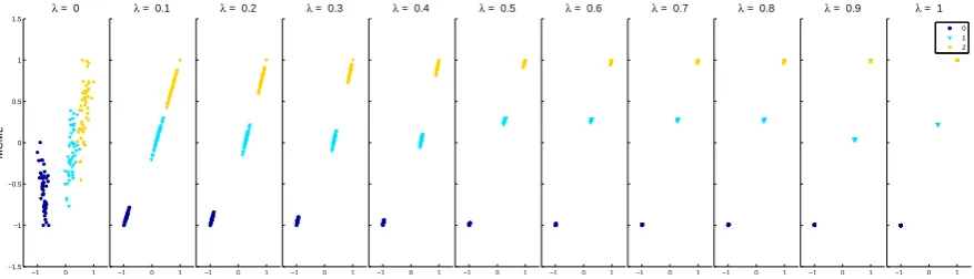
embeddings can be computed with a DR technique. Figure1shows the resulting projections with a series ofλvalues using a supervised DR technique MCML (as discussed in Section2).
−1 0 1 −1.5 −1 −0.5 0 0.5 1 1.5 λ
= 0
MCML
−1 0 1
λ = 0.1
−1 0 1
λ = 0.2
−1 0 1
λ = 0.3
−1 0 1
λ = 0.4
−1 0 1
λ = 0.5
−1 0 1
λ = 0.6
−1 0 1
λ = 0.7
−1 0 1
λ = 0.8
−1 0 1
λ = 0.9
−1 0 1
λ = 1
[image:6.595.80.519.288.414.2]0 1 2
Figure 1.Projections of theIrisdataset withλvalue from 0 to 1. The colour is used to help illustrate different clusters here, and was not used in the actual experiment.
4. Experiment
A controlled experiment was conducted to evaluate the effectiveness of the interactive feature transformation technique. The goal is to understand its impact on high dimensional data visualisation, and consequently the user’s ability to gain insight from the data. The experiment followed a within-subject design, and task accuracy and completion time were collected for comparison.
4.1. Pilot
A pilot study was conducted with three participants using the three conditions:
1. Visualisation generated byPCA. This is the same as the first condition in the final experiment (as described in Section4.2).
2. Static Feature Transformation. The visualisation in this condition included the distortion introduced by the feature transformation. However, the user was not allowed to change the level of distortion, so the visualisation was static.
3. Interactive Feature Transformation. This is similar to the previous condition, but users could interactively change the level of distortion introduced by feature transform. This is achieved through a slider that changes theλvalue.
Two issues were identified after analysing the results from the pilot study:
• There was large variation in the performance of the interaction feature transformation condition. One participant always set theλto the maximum value. As a result, each cluster transformed into
a single point and the tasks became trivial. To avoid this scenario, we removed the interactive feature transformation condition, and replaced it with two static feature transformation conditions that have low and high level of distortion respectively.
4.2. Conditions
Four revised conditions were included in the main experiment:
1. Visualisation generated by PCA. The PCA is used as an example of DR technique that does not utilize clustering information. While it is possible to include additional DR method such as MDS, it will make the experiment overly long (it is close to one hour already with the four conditions) and it is not the focus of this study to compare DR techniques that do and do not use clustering information.
2. Visualisation generated byMCML. This represents supervised techniques that take into account the class labels information during dimension reduction, since feature transformation also requires class information. This should produce visually more separated results than PCA because of the additional class labels information. Because feature transformation is independent of the DR technique used, any technique that uses class label can be used, so long as it is also used in the two feature transformation conditions.
3. Visualisation generated bylow-levelfeature transformation distortion (FT-low), based on the results of MCML. The visualisation in this condition includes low level distortion introduced by the feature transform, and the user was not allowed to change the level of distortion. A smallλ
value was selected manually to ensure considerable visual difference from the MCML condition. This is to emulate the scenario when a low level of distortion is introduced through interactive feature transformation.
4. Visualisation generated byhigh-levelfeature transformation distortion (FT-high), based on the results of MCML. This is similar to the last condition except that the distortion level was higher. A largerλvalue was selected manually to (1) ensure considerable visual difference from the
FT-low condition, and (2) avoid reducing the question to a trivial task, e.g., every cluster is reduced to a single point. This is to emulate the scenario when a high level of distortion is introduced through interactive feature transformation.
We selected λ = 0.1 and λ = 0.3 for the FT-low and FT-high condition respectively after
considering differentλlevels for all the datasets used. This ensures for all datasets enough visual
difference between these two conditions and from the MCML only condition (Condition 2), without reducing the question to a trivial task. For example, Figure1shows the distorted projections of theiris dataset with differentλvalues. Please note that the colour here is to help demonstrate the effect of
feature transformation. All the data points appear black in the experiment; no clustering information was provided through colour.
4.3. Tasks
• Clustering:The participants were asked to identify visually the number of clusters in the display. This is to test how well the resulting visualisation reveals the clustering structure within the original high-dimensional dataset.
• Outlier:Similarly, this task requires participants to identify visually an outlier within the original dataset, which is another important property of high-dimensional data. To simplify the accuracy measurement, each dataset has exactly one outlier, so the answer can be either correct or incorrect. This avoids the case of ‘partially correct’ answers when there are two or more outliers.
We deliberately did not give formal definition of ‘clustering’ and ‘outlier’ during the training stage of the experiment. We wanted to see the participants’ intuition about these concepts, and its impact on task performance. As it turned out, all participants were able to grasp these concepts easily with the examples given during the training stage, and apply them successfully in the following tasks.
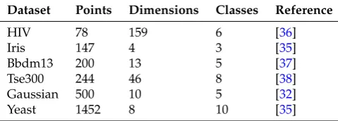
4.4. Datasets
[image:8.595.177.417.394.480.2]We used a number of benchmark and synthetic datasets in the experiment. The goal was to cover a wide range of data size, dimensionality, and number of clusters in the dataset. The benchmark datasets are widely used by machine learning and visualisation communities, and their details are in Table1. The projections of all four conditions were checked before the experiment to ensure that the datasets do not favour any particular condition. We manually checked all the projections to make sure there were no trivial cases where clusters collapse into points.
Table 1.Experiment Datasets.
Dataset Points Dimensions Classes Reference
HIV 78 159 6 [36]
Iris 147 4 3 [35]
Bbdm13 200 13 5 [37]
Tse300 244 46 8 [38]
Gaussian 500 10 5 [32]
Yeast 1452 8 10 [35]
For each dataset, a new point was added as the outlier. For half of the datasets, we added an outlier with extremely large value, using the formula below:
x>Q3+IQR×1.5
For the rest of the datasets, we added an outlier with extremely small value:
x<Q1−IQR×1.5
whereQ1is the lower quartile (or the 25th percentile),Q3is the upper quartile (or the 75th percentile),
andIQRthe inter-quartile range (Q3−Q1). This computation was applied to all dimensions in the
corresponding dataset.
4.5. Participants and Procedure
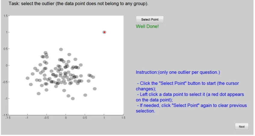
The study lasted approximately 45 min and consisted of three sections: training, experiment, and feedback. The training section started with the consent and demographic information form. After that, the two experiment tasks were explained using one example each. This part also showed the participants how to answer questions using the experiment software interface. The last part of training was practice, during which participants needed to complete one question for each task type. During practice, feedback was given if the participant did not answer correctly. Figure2is a screen-shot of the training interface.
Figure 2.The training interface for the outlier task that includes the instructions (bottom right corner) and feedback (‘Well Done!’ for a correct answer).
The second section was the main experiment. The interface was the same as the training stage, except without feedback. As a within-subject design, each participant completed the two tasks on all six datasets under all four conditions. This led to in total 2×6×4=48 questions. The order of the questions were counter balanced using Incomplete Block Design to avoid learning effect. Also, the same dataset appears quite differently under the four conditions, so it is unlikely that participants can recognise them under different conditions. Figure3shows the four conditions of theHIVdataset. Please note the data point colour and shape are for illustration only and they are not used in the actual experiment. It is not easy to recognize that these four projections are the same dataset, even when placing them next to each other with the colour and shape. The chance is very small that a participant can recognize so during the experiment when they appear randomly and without colour or shape. The task accuracy and completion time were recorded for further analysis.
Figure 3.The four conditions of theHIVdataset. Please note the data point colour and shape are for illustration only and they are not used in the actual experiment. It is not easy to recognize that these four projections are the same dataset, even when placing them next to each other with the colour and shape. So when they appear randomly and without colour or shape, the chance that a participant could recognize them during the experiment was very small.
4.6. Hypotheses
Hypotheses 1. We hypothesise that participants will perform significantly better, in terms of both accuracy and completion time, with MCML than with PCA, because MCML takes advantage of additional clustering information. We hypothesise that this will be the case for both the clustering and outlier tasks, because the two require similar visual information, i.e., it is easier to identify outliers if the clustering is visually clear.
Hypotheses 2. Similarly, we hypothesise that participants will perform significantly better with FT-low than MCML, in terms of both accuracy and completion time. The only difference between the two is the distortion introduced by the feature transformation, which makes the clustering/outlier structure visually more obvious.
Hypotheses 3. Finally, We hypothesise that participants will perform significantly better with FT-high than FT-low, but only in accuracy. The higher level of distortion in FT-high will usually result in even clearer clustering/outlier structure, thus better accuracy. While it is likely the completion time will be shorter with FT-high, it can be already quite short with FT-low. As a result, the difference may not be significant.
5. Results
We used a repeated-measure analysis of variance (RM-ANOVA) to analyse the task accuracy and completion time of 31 participants with valid collected data. Accuracy was measured as the percentage of correct answers. Completion time was measured in seconds; however, it was not normally distributed as shown by the result of a Shapiro-–Wilk test. We used the logarithm of completion time to normalize the skewed distribution.
5.1. Accuracy
×task (F(3, 90) = 28.56,p < 10−12). Follow-up paired t-tests with Holm correction revealed that FT-high was significantly more accurate than FT-low (p<10−13), and both FT-low (p <10−8) and PCA (p<0.02) were significantly more accurate than MCML. FT-low (M=0.54,SD=0.50) was more accurate than PCA (M=0.48,SD=0.50), but the difference was insignificant (p=0.09). The results are summarised in Figure5a, where each line indicates a significant difference, pointing towards the less accurate condition.
0
25
50
75
100
All Tasks
Clustering
Outlier
Accur
acy (%)
PCA MCML FT−low FT−high
0
25
50
75
100
All Tasks
Clustering
Outlier
Accur
acy (%)
PCA MCML FT−low FT
(a)
0
3
6
9
12
All Tasks
Clustering
Outlier
Time (s)
PCA MCML FT−low FT
[image:11.595.166.431.173.493.2](b)
Figure 4. Mean accuracy and completion time overall and for each task. (a) Mean accuracy in
percentage (the higher is better); (b) Mean completion time in seconds (the lower is better).
FT-high X
FT-low
PCA
MCML
(a)
FT-high FT-low X
PCA
MCML
(b)
FT-high
PCA
FT-low
MCML
(c)
Figure 5.Significant results of paired t-tests for task accuracy. An arrow from condition A to condition
B indicates that participants performed significantly more accurately under A than under B. (a) All
Tasks; (b) Clustering; (c) Outlier.
[image:11.595.98.506.549.657.2]was insignificant (p=0.08). The results are summarised in Figure5b, following the same notation as in Figure5a.
For Outlier task, a RM-ANOVA test showed a significant effect of method (F(3, 90) = 28.67, p <10−12). Follow-up paired t-tests with Holm correction revealed that FT-high was significantly more accurate than FT-low (p < 10−5), and FT-low was significantly more accurate than MCML (p=0.01). PCA (M=0.63,SD=0.48) was more accurate than FT-low (M=0.59,SD=0.49), but the difference was insignificant (p=0.3). Again, the results are summarised in Figure5c, following the same notation.
5.2. Time
Figure4b shows the mean completion time. A RM-ANOVA test showed a significant main effect of method (F(3, 90) =13.97,p<10−6), task (F(1, 30) =87.46,p<10−9), and the interaction method
×task (F(3, 90) = 51.55,p < 10−18). Follow-up paired t-tests with Holm correction revealed that
FT-high was significantly faster than FT-low (p<0.02), and MCML was significantly faster than PCA (p <0.001). MCML (M =5.44,SD= 0.19) was faster than FT-high (M =6.03,SD=0.23), but the difference was insignificant (p=0.06). The results are summarised in Figure6a.
MCML
FT-high
PCA
FT-low
(a)
X
MCML FT-low FT-high PCA
X
(b)
PCA X
FT-high
MCML
FT-low
(c)
Figure 6. Significant results of paired t-tests for completion time. An arrow from condition A to
condition B indicates that participants completed the tasks much faster under A than under B. (a) All
Tasks; (b) Clustering; (c) Outlier.
For Clustering task, a RM-ANOVA test showed a significant effect of method (F(3, 90) =24.2, p < 10−10). Follow-up paired t-tests with Holm correction revealed that MCML was significantly faster than FT-low (p<0.023), FT-low was significantly faster than FT-high (p<0.021), and FT-high was significantly faster than PCA (p<10−5). The results are summarised in Figure6b.
For Outlier task, a RM-ANOVA test showed a significant effect of method (F(3, 90) = 55.46, p<10−19). Follow-up paired t-tests with Holm correction revealed that PCA was significantly faster than MCML (p < 10−5), and MCML was significantly faster than FT-low (p < 10−14). FT-high (M = 4.23,SD = 0.16) was faster than MCML (M = 4.54,SD = 0.17), but the difference was insignificant (p=0.075). The results are summarised in Figure6c.
6. Discussions
6.1. Methods
Overall, FT-high performed the best: it is significantly more accurate than the three other conditions (Figure5a) and took significantly less time than PCA and FT-low (Figure6a). This supports our Hypothesis3and demonstrated that feature transformation can help users better understand multi-dimensional data. The improvement is more obvious in term of accuracy (Figure4a) and less so for completion time (Figure4b).
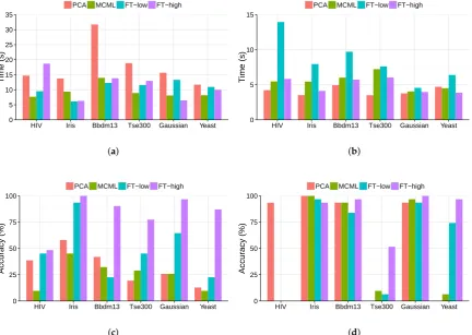
[image:12.595.90.510.326.420.2]and outlier task respectively, ordered by dataset size. Figure7a shows that the completion time under the FT-low is comparable to other conditions for the clustering task. However, its time is much longer than the rest for the outlier task (Figure7b), especially the HIV dataset. As in Table1, the HIV data has the highest dimensionality (159) among all the data sets, which can be the cause of the poor completion time of the outlier task under FT-low.
0 5 10 15 20 25 30 35
HIV Iris Bbdm13 Tse300 Gaussian Yeast
Time (s)
PCA MCML FT−low FT−high
(a)
0 5 10 15
HIV Iris Bbdm13 Tse300 Gaussian Yeast
Time (s)
PCA MCML FT−low FT−high
(b)
0 25 50 75 100
HIV Iris Bbdm13 Tse300 Gaussian Yeast
Accur
acy (%)
PCA MCML FT−low FT−high
(c)
0 25 50 75 100
HIV Iris Bbdm13 Tse300 Gaussian Yeast
Accur
acy (%)
PCA MCML FT−low FT−high
[image:13.595.83.516.185.492.2](d)
Figure 7.The results of the clustering and outlier task, ordered by data size. (a) Completion time of the
clustering task; (b) Completion time of the outlier task; (c) Accuracy of the clustering task; (d) Accuracy
of the outlier task.
to select the true outlier. This can be the reason for the poor performance of these three conditions, as shown in Figure7d.
The completion time of MCML is surprisingly fast. Overall there is no significant difference between MCML and FT-high, which was expected to have the fastest completion time (Figure6a). However, the detailed results in Figure7a,b show that the absolute difference is not that substantial, even if it is statistically significant.
Finally, PCA performed better than expected in the experiment. It was expected to be the least accurate method overall (Hypothesis1), but this is not the case (Figure5a). The poor performance of other methods on the HIV dataset, particularly the outlier task (Figure7d), can be a contributing factor. Also, it is interesting that its accuracy varied dramatically for the outlier task among the datasets (Figure7d): while it performed extremely well for the HIV dataset, the accuracy dropped to 0% for the Tse300andYeastdataset. Time-wise, PCA is comparable to other methods, except for the clustering task (Figure4b). The detailed results in Figure7a show that this may be the result of the large difference with the Bbdm13 dataset. However, further investigation into the individual completion time did not reveal any anomaly. Overall, being one of the classic DR methods, PCA does a reasonably good job to support user understanding even though it was not designed for this purpose.
6.2. Data Size and Dimensionality
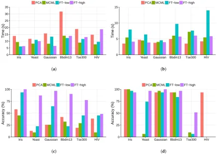
It is important to understand how the performance of different methods scale with data. This is particularly relevant if these approaches are to be applied to Big Data. There are two possible scaling: data size, i.e., number of data points, and data dimensionality. The data sets in Figure7a–d are ordered by their sizes, i.e., increasing from left to right. Figure7a,b show that the completion time does not increase with data size. In fact, it took longer with the HIV dataset, which has the smallest number of data points (78), than the Yeast dataset, which has the largest number of data points (1452). This is the result ofpre-attentativevisual processing [39]: users use the data pointlocation, which is one of pre-attentative visual features, to decide clustering structure, and the processing of such visual feature takes constant time, regardless the number of points. This is one of the main advantages of data visualisation: information represented with pre-attentative visual features can be processed very quickly irrespective of the data size. There is no obvious trend in the task accuracy (Figure 7c,d), either. Other factors, such as the complexity of the clustering structure and appropriateness of the visualisation method, may have more of an impact on the task performance than the data size does.
0 5 10 15 20 25 30 35
Iris Yeast Gaussian Bbdm13 Tse300 HIV
Time (s)
PCA MCML FT−low FT−high
(a)
0 5 10 15
Iris Yeast Gaussian Bbdm13 Tse300 HIV
Time (s)
PCA MCML FT−low FT−high
(b)
0 25 50 75 100
Iris Yeast Gaussian Bbdm13 Tse300 HIV
Accur
acy (%)
PCA MCML FT−low FT−high
(c)
0 25 50 75 100
Iris Yeast Gaussian Bbdm13 Tse300 HIV
Accur
acy (%)
PCA MCML FT−low FT−high
[image:15.595.78.516.107.418.2](d)
Figure 8. The results of the clustering and outlier task, ordered by data set dimensionality.
(a) Completion time of the clustering task; (b) Completion time of the outlier task; (c) Accuracy
of the clustering task; (d) Accuracy of the outlier task.
6.3. Tasks and Participants
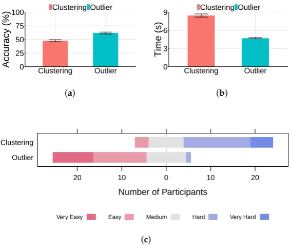
0 25 50 75 100
Clustering Outlier
Accur
acy (%)
Clustering Outlier
(a)
0 3 6 9
Clustering Outlier
Time (s)
Clustering Outlier
(b)
Number of Participants
Outlier Clustering
20 10 0 10 20
Very Easy Easy Medium Hard Very Hard
[image:16.595.155.439.98.338.2](c)
Figure 9.Clustering vs. outlier task. (a) Task accuracy (higher is better); (b) Task completion time
(lower is better); (c) User preference.
There is a weak correlation between user preference and performance. For the clustering task, the Spearman’s correlation coefficient is 0.0692892 (almost no relation) between rating and accuracy, and 0.3012618 (a weak positive—more difficult, more time spent) between rating and completion time. Similarly, for the outlier task, the Spearman’s correlation coefficient is –0.2622217 (a weak negative—more difficult, less accurate) between rating and accuracy and –0.1281551 (a weak positive) between rating and completion time.
We analysed the relationship between participants’ performance and their demographic information such as age group. Both completion time and accuracy of the three age groups are shown in Figure10, and they appear to be similar across the groups. The small number of participants (11) who provided their information does not allow any meaningful significance tests.
0 5 10 15 20
Clustering Outlier
Time (s)
< 19 19−25 26−39
(a)
0 25 50 75 100
Clustering Outlier
Accur
acy (%)
< 19 19−25 26−39
(b)
[image:16.595.115.484.549.732.2]Finally, we checked the performance variations among the individuals participated the study. Figure11shows the average completion time (Figure11a) and accuracy (Figure11b) of each participant across all tasks. There appears to be larger variation among the performance of the completion time than that of the accuracy, and this is the confirmed by their coefficient of variation: 0.4198652 for time and 0.129759 for accuracy.
0 5 10 15 20
1 2 3 4 5 6 7 8 9 10111213141516171819202122232425262728293031
Participant
Time (s)
(a)
0 25 50 75 100
1 2 3 4 5 6 7 8 9 10111213141516171819202122232425262728293031
Participant
Accur
acy (%)
[image:17.595.83.515.178.331.2](b)
Figure 11.Individual performance. (a) Individual completion time; (b) Individual accuracy.
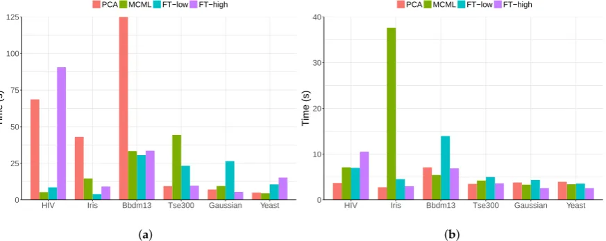
We further investigated participant 14 who had the longest completion time. For the clustering task, his completion time (Figure12a) appears to be similar to the average time (Figure7a) except for a few questions, such as Bbdm13–PCA and HIV–FT-high. We speculate that he struggled with these questions and spent long time to find the right answers: he correctly answered four out of five questions that he spent most time on (>40 s). This is much higher than the average accuracy. Similarly for outlier task, his completion time is also close to the average except for one question (Iris–MCML), which he answered correctly.
0 25 50 75 100 125
HIV Iris Bbdm13 Tse300 Gaussian Yeast
Time (s)
PCA MCML FT−low FT−high
(a)
0 10 20 30 40
HIV Iris Bbdm13 Tse300 Gaussian Yeast
Time (s)
PCA MCML FT−low FT−high
[image:17.595.82.519.489.663.2](b)
Figure 12.Time completion of participant 14 broken down by condition and dataset. (a) Cluster task;
(b) Outlier task.
6.4. Limitations
one outlier in the outlier-detecting task. We were aware of these limitations, and consulted the end users during the experiment design stage. While not fully realistic, they thought the simplified tasks were good enough approximation of the real-world analysis as the first step to explore the performance difference among these techniques. More realistic set-up will be explored in the further studies.
7. Conclusions
This paper described a user study that was designed to understand how feature transformation technique affects the user’s understanding of multi-dimensional data visualisation. Four different conditions were included: PCA, MCML, low-level feature transformation (FT-low), and high-level feature transformation (FT-high). Thirty-one participants were recruited to detect clusters and outliers using visualisation of six different datasets. Both task accuracy and completion time were recorded for comparison.
7.1. Techniques
• There is a strong case for the feature transformation technique. Participants performed best with the visualisation produced with high-level feature transform (FT-high), in term of both accuracy and completion time. The improvements over other techniques were substantial, particularly in the case of the accuracy of the clustering task.
• Low-level feature transformation has a lesser impact on visualisation readability, and as a result does not have a clear advantage over existing techniques, represented by MCML (supervised DR) and PCA (un-supervised DR).
• Very high dimensional data seems to be a challenge for all the techniques, but particularly MCML and to certain extend FT-low. MCML performed poorly with the HIV dataset, which has a much higher dimensionality (139) than the rest of the data sets.
• The results of PCA were better than expected; its performance was close to that of the FT-low and MCML. Also, it performed surprisingly well on the very high-dimensional HIV dataset, matching the results of FT-high.
7.2. Scalability
• All the visualisation methods scaled well with data size, particularly with completion time. There is no apparent increase in completion time as the number of data points grow (20 fold difference between the size of the smallest and largest dataset). This is the result of human pre-attentative visual processing, which requires constant time regardless of data size. This makes visualisation an effective tool for understanding large data.
• The data dimensionality appears to have a larger impact on the user performance than the data size. It leads to an increase in completion time as the data dimensionality grows. The effect on the accuracy is less clear, with the performance of a certain method changes dramatically between data sets. This indicates that the suitability of a visualisation method to a particular data set can be the dominant factor for task accuracy.
7.3. Tasks and Participants
• Clustering is a more difficult task than outlier identification. Its accuracy is significantly lower and took significantly longer to complete. Except for FT-high, all techniques led to accuracy of only around 25%. This demonstrates that it is almost impossible to perform visual clustering analysis without feature transformation.
and dimensionality. Therefore, selecting an effective visualisation method is important for a successful analysis.
• Participants perceived clustering as the significantly more difficult task, but there was only a weak correlation between user preference and actual performance. There is a larger variation among the individual completion time than that of the task accuracy.
In summary, the experiment results showed that visualisation is an effective approach for high dimensional data analysis, because it does not require additional time as the data size grows. The feature transformation technique can significantly improve user’s understanding, increasing task accuracy and reducing completion time simultaneously. It is almost impossible to obtain meaningful results from visual clustering analysis without feature transformation. Visualising data with very high dimensionality (i.e., greater than 100 dimensions) remains a challenge. It will be an interesting future work to evaluate further the effectiveness of the feature transformation with more realistic task settings and when in combination with more advanced approaches such as t-SNE.
Acknowledgments:The authors would like to thank CGI Group for their financial support, without which the study would not be possible. They also would like to thank Peter Passmore for his careful proof reading of the manuscript.
Author Contributions:For research articles with several authors, a short paragraph specifying their individual contributions must be provided.
Kai Xu contributed to the design and planning of the study, the running of the experiment, and the writing and the revision of the manuscript.
Leishi Zhang contributed to the design and planning of the study, the running of the experiment, and the writing and the revision of the manuscript.
Daniel Pérez contributed to the design and planning of the study, the implementation of the experiment system, the running of the experiment and its data analysis, and the writing and the revision of the manuscript.
Phong H. Nguyen contributed to the implementation of the experiment system, the running of the experiment and its data analysis, and the writing and the revision of the manuscript.
Adam Ogilvie-Smith contributed to the design and planning of the study, the analysis of the experiment data, and the writing and the revision of the manuscript.
Conflicts of Interest:The authors declare no conflict of interest.
References
1. Lee, J.; Verleysen, M.Nonlinear Dimensionality Reduction; Springer: Berlin, Germany, 2007.
2. Van der Maaten, L. An introduction to dimensionality reduction using matlab. Available online:https:
//pdfs.semanticscholar.org/a082/e615d1d6676808eaf061819180114a4eb250.pdf(accessed on 31 May 2017).
3. Donoho, D.L. High-dimensional data analysis: The curses and blessings of dimensionality. In Proceedings
of the American Mathematical Society Conf. Math Challenges of the 21st Century, Los Angeles, CA, USA, 6–11 August 2000.
4. Etemadpour, R.; Motta, R.; de Souza Paiva, J.; Minghim, R.; Ferreira de Oliveira, M.; Linsen, L.
Perception-Based Evaluation of Projection Methods for Multidimensional Data Visualization.IEEE Trans.
Vis. Comput. Gr.2015,21, 81–94.
5. Paulovich, F.; Silva, C.; Nonato, L. User-Centered Multidimensional Projection Techniques. Comput. Sci. Eng.
2012,14, 74–81.
6. Jeong, D.H.; Ziemkiewicz, C.; Fisher, B.; Ribarsky, W.; Chang, R. iPCA: An Interactive System for PCA-based
Visual Analytics. Comput. Gr. Forum2009,28, 767–774.
7. Choo, J.; Lee, H.; Kihm, J.; Park, H. iVisClassifier: An interactive visual analytics system for classification
8. Schäfer, M.; Zhang, L.; Schreck, T.; Tatu, A.; Lee, J.A.; Verleysen, M.; Keim, D.A. Improving projection-based
data analysis by feature space transformations. InIS & T/SPIE Electronic Imaging; International Society for
Optics and Photonics: Burlingame, CA, USA, 2013; p. 86540H.
9. Pérez, D.; Zhang, L.; Schaefer, M.; Schreck, T.; Keim, D.; Díaz, I. Interactive feature space extension for
multidimensional data projection.Neurocomputing2015,150 Pt B, 611–626.
10. Kwon, B.C.; Kim, H.; Wall, E.; Choo, J.; Park, H.; Endert, A. AxiSketcher: Interactive Nonlinear Axis Mapping
of Visualizations through User Drawings. IEEE Trans. Vis. Comput. Gr.2017,23, 221–230.
11. Sacha, D.; Zhang, L.; Sedlmair, M.; Lee, J.A.; Peltonen, J.; Weiskopf, D.; North, S.C.; Keim, D.A. Visual
Interaction with Dimensionality Reduction: A Structured Literature Analysis.IEEE Trans. Vis. Comput. Gr.
2017,23, 241–250.
12. Keim, D.A.; Kohlhammer, J.; Ellis, G.; Mansmann, F. Mastering The Information Age—Solving Problems
with Visual Analytics. Available online:
http://www.vismaster.eu/wp-content/uploads/2010/11/title-page-to-chapter-1.pdf(accessed on 31 May 2017)
13. Pérez, D.; Zhang, L.; Schaefer, M.; Schreck, T.; Keim, D.; Díaz, I. Interactive Visualization and Feature
Transformation for Multidimensional Data Projection. Available online:http://homepage.tudelft.nl/19j49/
eurovis2013/papers/0103-paper.pdf(accessed on 31 May 2017)
14. Jolliffe, I.Principal Component Analysis; Spring-verlag: New York, NY, USA, 1986.
15. Torgerson, W. Multidimensional scaling: I. Theory and method.Psychometrika1952,17, 401–419.
16. Sammon, J.W., Jr. A nonlinear mapping for data structure analysis.IEEE Trans. Comput.1969,100, 401–409.
17. Tenenbaum, J.B.; De Silva, V.; Langford, J.C. A global geometric framework for nonlinear dimensionality
reduction.Science2000,290, 2319–2323.
18. Belkin, M.; Niyogi, P. Laplacian eigenmaps and spectral techniques for embedding and clustering.
In Proceedings of the NIPS, Vancouver, BC, Canada, 3–8 December 2001; Volume 14, pp. 585–591.
19. Roweis, S.T.; Saul, L.K. Nonlinear dimensionality reduction by locally linear embedding. Science2000,
290, 2323–2326.
20. Zhang, Z.-Y.; Zha, H.-Y. Principal manifolds and nonlinear dimensionality reduction via tangent space
alignment.J. Shanghai Univ. (English Edition)2004,8, 406–424.
21. Van der Maaten, L.; Hinton, G. Visualizing Data using t-SNE.J. Mach. Learn. Res.2008,9, 2579–2605.
22. Fisher, R.A. The Use of Multiple Measurements in Taxonomic Problems. Ann. Eugen.1936,7, 179–188.
23. Goldberger, J.; Roweis, S.; Hinton, G.; Salakhutdinov, R. Neighbourhood components analysis.
In Proceedings of the NIPS’04, Vancouver, BC, Canada, 13–18 December 2004.
24. Globerson, A.; Roweis, S. Metric learning by collapsing classes. In Proceedings of the NIPS, Vancouver, BC,
Canada, 5–8 December 2005; Volume 18, pp. 451–458.
25. Blum, A.L.; Langley, P. Selection of relevant features and examples in machine learning. Artif. Intell.1997,
97, 245–271.
26. Guyon, I.; Elisseeff, A. An introduction to variable and feature selection. J. Mach. Learn. Res. 2003,
3, 1157–1182.
27. Ingram, S.; Munzner, T.; Irvine, V.; Tory, M.; Bergner, S.; Möller, T. DimStiller: Workflows for dimensional
analysis and reduction. In Proceedings of the 2010 IEEE Symposium on Visual Analytics Science and Technology (VAST), Salt Lake City, UT, USA, 25–26 October 2010; pp. 3–10.
28. Brown, E.T.; Liu, J.; Brodley, C.E.; Chang, R. Dis-function: Learning distance functions interactively.
In Proceedings of the 2012 IEEE Conference on Visual Analytics Science and Technology (VAST), Seattle, WA, USA, 14–19 October 2012; pp. 83–92.
29. Lee, J.A.; Verleysen, M. Scale-independent quality criteria for dimensionality reduction.Pattern Recognit. Lett.
2010,31, 2248–2257.
30. Bertini, E.; Tatu, A.; Keim, D. Quality Metrics in High-Dimensional Data Visualization: An Overview and
Systematization. IEEE Trans. Vis. Comput. Gr.2011,17, 2203–2212.
31. Rensink, R.A.; Baldridge, G. The perception of correlation in scatterplots. Comput. Gr. Forum2010,29,
1203–1210.
32. Sedlmair, M.; Tatu, A.; Munzner, T.; Tory, M. A taxonomy of visual cluster separation factors.
33. Albuquerque, G.; Eisemann, M.; Magnor, M. Perception-based visual quality measures. In Proceedings of the 2011 IEEE Conference on Visual Analytics Science and Technology (VAST), Providence, RI, USA, 23–28 October 2011; pp. 13–20.
34. Lewis, J.M.; Van Der Maaten, L.; de Sa, V. A behavioral investigation of dimensionality reduction.
In Proceedings of the 34th Conf. of the Cognitive Science Society (CogSci); 1–4 August 2012, pp. 671–676.
35. Frank, A.; Asuncion, A. UCI Machine Learning Repository; School of Information and Computer Science,
University of California: Irvine, CA, USA, 2010; Volume 213.
36. Sips, M.; Neubert, B.; Lewis, J.P.; Hanrahan, P. Selecting good views of high-dimensional data using class
consistency. Comput. Gr. Forum2009,28, 831–838.
37. Statistical Data and Software Help. 2011. Available online: http://www.umass.edu/statdata/statdata/
(accessed on 31 May 2017 ).
38. VisuMap Data Repository. 2011. Available online:http://www.visumap.net/(accessed on 31 May 2017 ).
39. Ware, C. Information Visualization: Perception for Design, 2nd ed.; Morgan Kaufmann Publishers Inc.:
San Francisco, CA, USA, 2004.
c
2017 by the authors. Licensee MDPI, Basel, Switzerland. This article is an open access