City, University of London Institutional Repository
Citation:
Le Goc, M., Perin, C. ORCID: 0000-0002-7324-9363, Follmer, S., Fekete, J-D.
and Dragicevic, P. (2019). Dynamic Composite Data Physicalization Using Wheeled
Micro-Robots. IEEE Transactions on Visualization and Computer Graphics, 25(1), pp. 737-747.
doi: 10.1109/TVCG.2018.2865159
This is the accepted version of the paper.
This version of the publication may differ from the final published
version.
Permanent repository link:
http://openaccess.city.ac.uk/21254/
Link to published version:
http://dx.doi.org/10.1109/TVCG.2018.2865159
Copyright and reuse: City Research Online aims to make research
outputs of City, University of London available to a wider audience.
Copyright and Moral Rights remain with the author(s) and/or copyright
holders. URLs from City Research Online may be freely distributed and
linked to.
City Research Online:
http://openaccess.city.ac.uk/
[email protected]
HAL Id: hal-01848436
https://hal.inria.fr/hal-01848436v2
Submitted on 3 Oct 2018
HAL
is a multi-disciplinary open access
archive for the deposit and dissemination of
sci-entific research documents, whether they are
pub-lished or not. The documents may come from
teaching and research institutions in France or
abroad, or from public or private research centers.
L’archive ouverte pluridisciplinaire
HAL
, est
destinée au dépôt et à la diffusion de documents
scientifiques de niveau recherche, publiés ou non,
émanant des établissements d’enseignement et de
recherche français ou étrangers, des laboratoires
publics ou privés.
Dynamic Composite Data Physicalization Using
Wheeled Micro-Robots
Mathieu Le Goc, Charles Perin, Sean Follmer, Jean-Daniel Fekete, Pierre
Dragicevic
To cite this version:
Dynamic Composite Data Physicalization
Using Wheeled Micro-Robots
[image:3.612.76.546.127.307.2]Mathieu Le Goc, Charles Perin, Sean Follmer, Jean-Daniel Fekete, Pierre Dragicevic
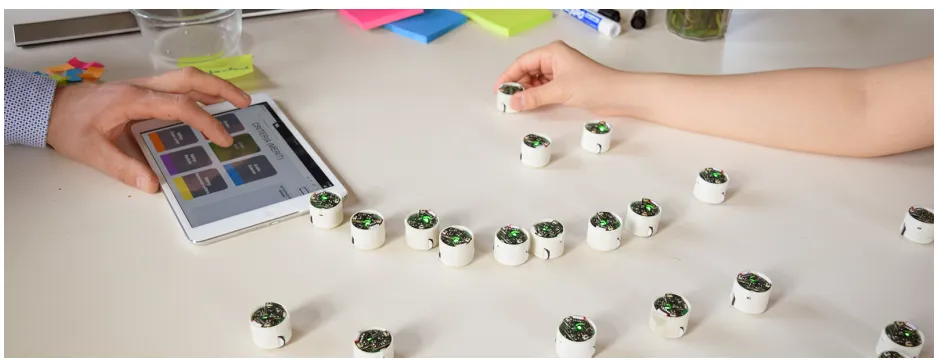
Fig. 1. Collaborative data exploration and analysis using a dynamic composite data physicalization.
Abstract— This paper introducesdynamic composite physicalizations, a new class of physical visualizations that use collections of self-propelled objects to represent data. Dynamic composite physicalizations can be used both to give physical form to well-known interactive visualization techniques, and to explore new visualizations and interaction paradigms. We first propose a design space characterizing composite physicalizations based on previous work in the fields of Information Visualization and Human Computer Interaction. We illustrate dynamic composite physicalizations in two scenarios demonstrating potential benefits for collaboration and decision making, as well as new opportunities for physical interaction. We then describe our implementation using wheeled micro-robots capable of locating themselves and sensing user input, before discussing limitations and opportunities for future work.
Index Terms—information visualization, data physicalization, tangible user interfaces
1 INTRODUCTION
This paper introducesdynamic composite data physicalizations, i.e, physical visualizations made of actuated or self-propelled physical ob-jects. It describes a design space for composite data physicalizations and reviews previous work within this design space. It then illustrates the benefits of dynamic composite data physicalizations through sce-narios where several people perform collaborative data exploration and analysis tasks using wheeled micro-robots.
Humans have used physical representations of information for mil-lennia, from the Ishango Bone (around 22,000 BC) to Mesopotamian clay tokens, to coins, for tasks such as information storage, account-ing, and currency exchange [33, 36]. Building on findings in cogni-tive science and educational psychology, the information visualization community has worked towards better understanding the benefits of physicality to represent information [34, 40, 91]. Researchers have shown that passive physical representations of data can promote en-gagement [91], support data exploration [39], and benefit the vision impaired [55]. This new field of research, data physicalization, aims at investigating “how computer-supported, physical representation of data
• Mathieu Le Goc and Sean Follmer are with Stanford University, USA. E-mail: [email protected], [email protected].
• Charles Perin is with the University of Victoria, Canada, and City, University of London, UK.
E-mail: [email protected].
• Jean-Daniel Fekete and Pierre Dragicevic are with INRIA, Saclay, France. E-mail: [email protected].
can support cognition, communication, learning, problem solving and decision making” [39]. However, most existing physicalizations are passive and monolithic, and thus do not support interaction and cannot update when the dataset changes. Our work addresses this limitation.
One particular kind of data physicalizations we callcomposite phys-icalizationsconsists of collections of objects. It has been shown that even simple collections of colored wooden tiles allow non-experts to rapidly create, edit and explain visual data representations [35]. While they can support a wide range of data representations, most composite physicalizations are not actuated, and thus updates need to be done manually. For instance, Jacques Bertin’s physical matrices [8] support rich manipulations to reorder rows and columns, but they are tedious and time-consuming to manipulate, especially when the dataset is large.
Dynamic physicalizationsremain largely unexplored, mainly due to the lack of suitable technologies [40]. However, recent advances in actuated Tangible User Interfaces (TUIs) make it possible to sup-port richer interactions and feedback with data physicalizations. We show how classical visualizations (e.g., 2D scatterplots) as well as novel interactive data visualization [62, 90] can be supported by dy-namic composite data physicalizations where the dydy-namic elements are physically detached from each other and free to move independently.
In this article, our contributions are:
• A working definition for dynamic composite physicalizations, • a design space situating dynamic composite physicalizations among
other beyond-desktop visualization techniques,
2 BACKGROUND
We discuss our work in the context of traditional information visualiza-tion and data physicalizavisualiza-tion. In particular, we focus on the similarities and the differences between our system and existing screen-based in-teractive visualizations. Differences between our system and previous data physicalizations will be developed more fully in the next section.
2.1 Data Physicalization
Data physicalization has been defined as“a research area that examines how computer-supported, physical representations of data (i.e., physi-calizations), can support cognition, communication, learning, problem solving, and decision making”[40]. A physicalization, or physical visualization, is a“physical artifact whose geometry or material prop-erties encode data”[40]. Data physicalizations are a different – and complementary – medium for information visualization. They can in some cases facilitate information retrieval [39], and promise to promote user engagement and collaborative activities [40].
There is a vast number of existing examples and an increasing amount of academic work on data physicalization.1Although dynamic data physicalizations have received comparatively less attention, recent work has investigated the use of 2.5D shape displays for visualizing data [82, 83]. However, the range of interactive visualizations that can be supported with 2.5D shape displays is limited. This is partly because these displays are not fully composite – the moving parts are not physically detached and are not free to move independently.
No work has explored data physicalizations that are both dynamic and fully composite, with the exception of a preliminary exploration by the authors of this article [54], which we discuss next.
2.2 Zooids
In a previous article [54] we introduced Swarm User Interfaces as“a class of human-computer interfaces comprised of many (typically 10-200) autonomous robots that handle both display and interaction”, and proposed an open-source platform for developing such interfaces, named Zooids. Zooids are 2-cm wheeled robots that can move on horizontal surfaces and sense user input. Zooids were designed with visualization in mind and we briefly illustrated how they can be used to display line charts and scatterplots [54]. However, we mostly focused on the hardware and software design, and on non-visualization applica-tions such as curve editing, stop-motion animation, and notification.
In the present article, we exclusively focus on using Zooids to visu-alize information. We explore this space more deeply by contributing two extensive information visualization scenarios involving group de-cision making, a larger set of visual representations (2D scatterplots, barycentric coordinates, map visualizations, unit charts), and a richer set of interaction designs (a magnet metaphor, use of rotation input, techniques combining a touch tablet with Zooids, sandboxes to con-figure 2D plots). We also illustrate impromptu physical and social interactions such as annotation actions. Finally, we contribute extensive discussions about the use of dynamic composite data physicalizations like Zooids for information visualization. These discussions include a characterization of dot-based visualizations, discussed next, and a taxonomy of data physicalization, detailed in the next section, that defines and situates dynamic composite data physicalizations within the broader landscape of existing work on data physicalization.
2.3 Dot-Based Visualizations
Micro-robots like Zooids can be used to support a range of data ex-ploration tasks, some of which are already supported by computer visualization systems through virtual means. In particular, Zooids are compatible with most interactive visualizations that convey data through collections of small visual objects. Since the information visu-alization literature lacks the vocabulary to describe such visuvisu-alizations, we refer to them asdot-based visualizations, and briefly review them here. We will only focus on planar (2D) dot-based visualizations.
1See dataphys.org/list for a list of 200+ examples and
data-phys.org/wiki/Bibliography for a regularly updated academic bibliography.
A first family of dot-based visualizations uses dots to represent
data cases(i.e., the dots are visual marks [9]), and use absolute or relative dot position to convey attribute values. In2D scatterplots, for example, the Cartesian coordinates of a dot reflect its value across two data dimensions. Although additional information can be conveyed through other means (e.g., dot color, size or shape), the most important information is typically conveyed through the position of dots. Besides the perceptual effectiveness of using position as a visual variable [15], dots remain interpretable when they are very small and thus, such displays can accommodate large collections of data cases.
Other examples of visualizations that use dots as visual marks includestar coordinatesandmultidimensional projection visualiza-tions. Star coordinates extend scatterplots to more than two axes us-ing a curvilinear coordinate system that maps multiple dimensions to the 2D plane [41]. Similarly, 2D multidimensional projections are a set of techniques for computing 2D positions from high-dimensional datasets [66]. In multidimensional scaling (MDS), for example, the distance between any two dots approximately encodes their distance in the high-dimensional space [47].
A second family of dot-based visualizations use dots to represent
valuesinstead of data cases. For example,unit chartsconsist of stacks of dots, where each dot represents a unit value [26, p. 427]. They are analogous to bar charts and are read in a similar way, but values are encoded by cardinality instead of length. Similarly, some charts use grids of dots to convey proportions [61], and some variants of Euler diagrams exist that decompose areas into discrete sets of unit objects [61]. An alternative approach, used for example indot density maps[51], consists of encoding values with dot density instead of dot cardinality. Although variants of all these visualizations exist that use icons or symbols instead of dots [25, 35], the primary encoding relies on dot cardinality or density, while dot appearance is secondary.
Finally, other visualizations can be considered as dot-based as a first approximation. Althoughnode-link diagramsinclude segments in addition to dots, some of these diagrams focus on conveying node similarity (encoded by their distance) rather than node connectivity [30].
Tabular visualizations[67] andadjacency matrices[7] can also be approximated as sets of dots when cells take on binary values, as in Bertin’s famous “Towns” dataset [8].
Clear counter-examples of dot-based visualizations includei) space-filling visualizations such as treemaps, where information is mostly conveyed through areas and visual containment;ii)conventional bar charts, where information is mostly conveyed through length; andiii)
heat maps, where information is mostly conveyed through color. We do not address such visualizations here.
2.4 Animated Visualizations
So far we only considered visual representations that are compatible with collections of small physical objects like Zooids. For such a platform to be interesting, however, the dot-based visualizations need to exhibit a dynamic behavior. One type of dynamic behavior is animation. Among the many types of animations that have been used in in-formation visualization, some are relatively complex and involve 3D transformations [22, 73] or shape deformations [27]. Meanwhile, many animations only involve rigid 2D motions, and among these, many involve the spatial rearrangement of dot-based visualizations [14, 19]. Examples include time-evolving scatterplots [74], as well as animated transitions between unit charts that can potentially be visually rich and complex [65, 92]. All such animations can serve as inspirations for the design of visualization systems based on small wheeled robots like Zooids, although physical robots have constraints (e.g., maximum speed, collision avoidance) that virtual objects do not have.
2.5 Direct Manipulation in Visualization
over the years, largely evolved, and has been superseded by the notion ofdirectnessof manipulation [6, 37]. In information visualization, a dynamic query widget lies at the beginning of the directness spectrum. Going further on the directness spectrum, we find what Tweedie termed “mechanized direct manipulation” [85]. An example of mecha-nized direct manipulation is the brushing and rearrangement of parallel coordinates [81], where the axes are manipulated directly, but not the data points. Similarly, surrogate objects can be used to manipulate multiple objects in a visualization [49].
Infovis researchers have experimented with ways of interacting even more directly with the data. For example, Touchwave [5] features a gesture set to manipulate time series visualizations, and researchers have looked at directly manipulating data representations to navigate in the temporal dimension of multi-dimensional datasets [45, 70, 87]. Many existing examples are dot-based visualizations. With Dust & Magnet [90], data cases are represented as dust particles scattered on the screen. One can create and move magnets representing queries, which attract dust according to their attribute values. Similarly, Kinetica [75] is a physics-based visualization that provides physically-inspired tools to directly interact with the data points. For example, a ruler can be used to push away all data points having a specific attribute value.
Physical objects like Zooids support a range of highly-direct ma-nipulation techniques natively, without the need to implement and to document them [40]. For example, it is possible to move individual Zooids, but also collections of Zooids using multiple fingers, the edge of the hand or of the arm [53], or even a physical tool. However, physi-cal objects also suffer from limitations – for example, they cannot go through each other, neither can they disappear or replicate, and several of the interactions mentioned previously are physically too unrealis-tic to be replicable in the physical word. At the same time, because Zooids can move by themselves, they can support “synthetic interac-tions” [40] involving dynamic query widgets or surrogate objects that would otherwise be impossible with passive physical tokens.
3 TAXONOMY OFDATAPHYSICALIZATIONS
We return to the area of data physicalization, of which we lay out a brief taxonomy in order toi)better situate our work within the broader landscape of existing data physicalizations, andii)better understand the unique opportunities and challenges offered by such a medium.
3.1 Monolithic vs Composite Physicalizations
A first useful criterion to classify data physicalizations is whether a physicalization is monolithic or composite.
Much of current data physicalizations and so-called “data sculptures” aremonolithic, i.e., they are in one piece. Others are made of multi-ple elements whose topology can be reconfigured, or can reconfigure itself [37]. In this article we refer to these data physicalizations as
composite. Note that many examples of tangible user interfaces (TUIs) exist that involve multiple handles and controls that can be physically rearranged (e.g., [38, 86]). However, these objects are typically used to interact with screen-based or video-projected information, and do not encode data. Since we focus on visualizing data, these TUI systems will not be covered in this article.
The rest of this section will focus oncomposite physicalizations, which support richer interactions and are our focus of interest.
3.2 Dimensions of Composite Physicalizations
We identify three key dimensions of composite physicalizations. We list them first, and then discuss concrete examples.
Level of Granularity.Thelevel of granularityof a composite data physicalization refers to the number of elements it is composed of. The more the elements, the higher the granularity. Also, for a given physicalization size, the higher the granularity the smaller the elements. A physicalization made of sand can be considered as having a very high granularity, while a physicalization made of only two or three large objects has a very low granularity [54].
[image:5.612.330.555.49.182.2]Degree of Manipulability.Thedegree of manipulabilityof a com-posite data physicalization refers to the extent to which its elements can be manually rearranged. While monolithic physicalizations can only be
Fig. 2. Physicalizations classified according to their degree of manipula-bility and their level of actuation: (A) 3D bar chart [39]; (B) reorderable matrix [8, 68]; (C) wooden tiles [34]; (D) ART+COM’s “kinetic sculp-tures” [4]; (E) EMERGE [83]; (F) Zooids [54].
inspected from different angles, composite physicalizations can offer a rich way of interacting with data through physical manipulation [37,40].
Level of Actuation. The level of actuationof a composite data physicalization refers to the extent to which its elements can rearrange themselves without human intervention. By introducing actuation and computation, it is possible to make physicalizations dynamic and reflect, e.g., changes in data or in its physical representation [40].
In the next two subsections, we situate existing systems within this design space by focusing on two broad families of data physicaliza-tions: manually-arranged physicalizations and those based on 2.5D shape displays. Some of the examples we discuss are plotted in Fig. 2, according to their degree of manipulability and their level of actuation.
3.3 Manually-Arranged Data Physicalizations
A straightforward way to create a composite data physicalization is by manually arranging physical objects. Some of the very first data representations were presumably built this way, i.e., by arranging peb-bles or clay tokens to represent numerical quantities such as sheep counts or number of oil jars [76]. A recent study suggests that non-experts can create their own data physicalizations by arranging wooden tiles [34] (Fig. 2-C). Although these examples focus on construction, physicalizations can also be re-arranged to support data exploration or storytelling. For example, Fraser has glued pieces of MRI images on 60 wooden blocks, allowing him to physically dig into cross sections of the brain [24]. Similarly, Hans Rosling has used various physical props to build and “animate” physicalizations in order to explain world statis-tics [20]. Such physicalizations are fully manipulable, since elements are detached from each other and can be manipulated independently.
An example of partially manipulable physicalization is Jacques Bertin’s physical matrix [67] (Fig. 2-B), where physical elements are linked with rods to form rows or columns. Physical linking facilitates matrix reordering operations, but once linked the elements cannot be manipulated independently. A related approach is the use of physical constraints, such the rails in Jansen’s rearrangeable 3D bar chats [37] or the LEGO bricks in Hunger’s activity logging system [32].
Manually-arranged physicalizations are highly flexible, and can be built and operated with little expertise [34]. However, constructing and updating such data physicalizations can be time-consuming, espe-cially when their granularity is high. For extreme granularities (e.g., as in Stan’s Cafe installations where each data point is mapped to a grain of rice [13]), group manipulation can be aided by physical tools such as cups or rakes. However, constructing and updating complex physicalizations will often remain tedious, unless actuation is used.
3.4 Data Physicalization with 2.5D Shape Displays
Less work has explored actuated data physicalizations because they are more difficult to build [40]. Some data physicalizations can update themselves with new data2, but most are domain- and data-specific.
2.5D shape displays like inFORM [23] or EMERGE [82] (Fig. 2-E) are more versatile in that they can physicalize 3D bar charts and approximate 3D surfaces. Compared to static 3D bar charts [39], such dynamic 3D bar charts can be updated to reflect, e.g., new data. The possibilities for physical manipulation are however limited, as each bar is fixed and can only move up or down. Both inFORM and EMERGE sense user input (e.g., pushing or pulling the bars, mid-air gestures, and touch input on the table around the physicalization), making it possible to navigate in the data through synthetic [37] interaction. However, many of the supported gestures have a low degree of directness.
There are several variations around 2.5D shape displays. For exam-ple, ART+COM’s “kinetic sculptures” [4] are made of winch-controlled beads whose height can be accurately controlled to create complex 3D surfaces (Fig. 2-D). Such sculptures are not data physicalizations as they do not convey data, but the same hardware could be used to build dynamic data physicalizations. But even if the beads can be moved independently, in practice manipulability would be limited because beads would oscillate for a long time before returning to rest.
3.5 Other Approaches
Many other types of physicalizations exist, including physicalizations that lie in a gray area between manually-arranged and actuated physi-calizations. Of these, one early and particularly inspiring example is Durrell Bishop’s Marble Answering Machine [17], which physicalizes incoming voice messages as marbles. Since marbles fall automatically in a container with each new voice message, the system supports actua-tion. Marbles are also fully manipulable, and users can move them to different containers to perform actions, such as listening to a message. However, the system is not fully actuated because marbles have to be manually repositioned in the storage container once they have been heard. Durrell Bishop’s Marble Answering Machine was only a design concept, but a similar system has been recently built that physicalizes incoming e-mails and tasks using physical tokens [52].
3.6 Towards the Ideal Composite Physicalization
Among all composite data physicalizations, two characteristics are key: theirmanipulabilityand theirdegree of actuation. None of the existing examples is able to fully support both. There are two major design and technological challenges involved in creating such a system.
A major technological challenge is to support full actuation while ensuring the full mobility of objects, all of this with a reasonably high granularity. As demonstrated by 2.5 shape displays, one cannot fully manipulate objects that are physically constrained. Durrell Bishop’s marbles are not constrained in any way, but they cannot move by them-selves other than through the force of gravity. To make such objects fully mobile, two approaches are possible: either through external actu-ation (e.g., magnets) or through internal actuactu-ation (e.g., wheels – see [54] for a review). Although several systems exist that use external actuation (e.g., [58, 64, 89]), internal actuation has the benefit of scal-ing up to arbitrary numbers of objects and does not require a tightly controlled environment to operate. Among existing systems, Zooids is currently the only system supporting small objects that can move rapidly on any horizontal surface [54].
[image:6.612.332.533.49.177.2]The choice of form factor for the objects, tightly coupled to granular-ity, is important as it impacts possible manipulations such as grouping, stacking or assembling. For instance, square objects like LEGO bricks can be assembled and stacked easily while spherical objects cannot. The right form factor and granularity is context-dependent – for ex-ample, it is often desirable to have objects with a flat base to insure stability, but round objects can be also be exploited to ease actuation like in Bishop’s Marble Machine. The size and material also affect manipulation. Medium-sized objects are easy to handle but users can-not manipulate many (dozens) at a time. Furthermore, low friction can make objects slippery and difficult to control, while heavy material can make manipulation tiresome. The choice behind Zooids is to use cylindric objects whose size is similar to objects people are used to manipulate both individually and in groups such as coins, board game pieces or casino chips. In addition, their neutral shape makes them appropriate for physicalizing point-based visualizations.
Fig. 3. A committee of four faculty members meets to select students for a new summer school program. Each Zooid embodies an applicant.
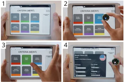
Fig. 4. Tablet interface to the applicant dataset: 1) The main attributes of the dataset; 2) A magnet is created by placing and holding a Zooid on an attribute; 3) Touching an attribute visualizes the values on each Zooid, through LED brightness; 4) Details are displayed on an applicant when their Zooid is placed in a dedicated area.
In the next section, we describe a system that uses Zooids to physi-calize data, and illustrate the opportunities offered by such a system.
4 INTERACTIVEDATAPHYSICALIZATION WITHZOOIDS In this section, we present our Zooids-based data physicalization system. We first illustrate the different features of our system through two scenarios. The first scenario has been implemented, and the second one is hypothetical. Then, we discuss implementation details.
4.1 Summer School Selection Scenario
Our scenario illustrates a data-driven group decision-making task. We use a synthetic dataset generated for the purposes of the scenario. The interactions we describe are also illustrated in the accompanying video.
Context.Suppose a University offers a summer school to promote arts and sciences. Undergraduate students from all over the world submit their GPA scores, a portfolio, a cover letter and reference letters. Over 300 students apply, but only about 10 can be retained.
First, incomplete applications and applicants with low GPA scores are automatically discarded. Then, eligible applications are distributed across a committee of four faculty members who read cover letters, portfolios and reference letters, and rate them on a scale ranging from 0 to 5. Applicants with insufficient ratings are again automatically discarded. At the end of this pre-selection, 24 applicants remain.
[image:6.612.331.534.220.355.2]Setting up. As they sit around the table, Sylvia, who presides the committee, empties a box of Zooids on the table. All Zooids move to one side of the table, waiting to be used. Sylvia opens a web interface on her tablet and loads the data on the 24 pre-selected applicants. Twenty-four Zooids move and scatter across the table, shining a dim light to indicate that they now each embody one applicant. The tablet displays the main dimensions of the applicant dataset as buttons, each in a different color (see Fig. 4-1). Sylvia places the tablet on the table.
Revealing distribution of science grades with a magnet. Terry, a science professor, suggests to examine science grades to begin with. To do so, he creates a magnet by grabbing an unassigned Zooid and placing it on the “GPA” tablet button, as shown in Fig. 4-2. This highlights the button in blue and the Zooid emits a pulsing glow with the same color. Terry puts the Zooid on the table, after which the 24 applicants start moving towards it according to their GPA score in science, as in Dust & Magnet [90]. Since GPA scores are rounded to one decimal place, applicants form concentric arcs around the magnet (like in Fig. 3).
Terry then holds the magnet to activate color encoding: the bright-ness of the LED of each applicant depends on their GPA score in science. Applicants who are strong in science shine strongly, are close to the magnet, and quickly react the magnet’s movements.
Accounting for math grades with a second magnet.Julia, the math professor, suggests to now consider grades in mathematics. She grabs another unassigned Zooid and, using the same method as Terry, creates a “math” magnet. The applicants are now under the influence of both magnets. They stay away from one of the two magnets if they perform poorly in either science or mathematics. The group of five applicants that gather between the two magnets (in Fig. 5) have good grades in both science and mathematics. Julia reaches out for the tablet and touches the “math” button, which activates color encoding (Fig. 5). Terry and Julia are starting to express strong opinions about which applicants look promising, while other participants can witness their rationales.
Annotating applicants with markers and containers. Terry grabs the five excellent applicants and marks them by placing a green sticker on each of them. These stickers are not recognized by the system, but Sylvia brought them to keep track of interesting applicants over time. Terry then puts a green sticky note on the table, and writes down “5 outstanding in math & science”. Everyone feels that the weakest applicant (bottom left of Fig. 5) should not be accepted. They further identify three other applicants with weak math or science grades that they agree to discard. Sylvia grabs the four Zooids and puts them in a container she labels “rejected”. This leaves twenty applicants.
More magnets, more annotations. Sylvia suggests to examine the quality of application documents. She puts back the three existing magnets with unassigned Zooids. Julia grabs the tablet and creates a “cover letter” magnet, and Sylvia, who is a professor of arts, adds a “portfolio” magnet. The five applicants labeled with a green sticker who were outstanding in math and science also have high scores for their cover letters and portfolio. The committee decides to accept them, and Sylvia places them on a sheet of paper on which she writes “accepted”. The committee also agrees to move two applicants, which are far from both magnets, to the “rejected” container.
Tuning magnet strength. Sylvia is still interested in finding who submitted a strong portfolio. She increases the force of the “portfolio” magnet by rotating it clockwise and rotates the “cover letter” magnet counterclockwise until it has lost all of its influence. This makes it clear which applicants have the highest-rated portfolios. Julia grabs the tablet, and touches each dimension in sequence to reveal other grades and ratings through LED intensity. Sylvia does not notice any strong weakness thus marks them with yellow stickers, to remember them.
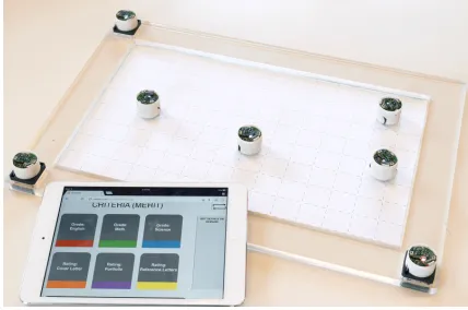
Examining candidates in more detail using scatterplots. The re-maining students being similar, the committee switches to more precise plots. Sylvia picks a “sandbox”, a physical area whose frame has three slots for placing Zooids (see Fig. 6). She places in the sandbox a sheet of paper on which she has printed a coordinates frame. Then she
[image:7.612.337.548.50.193.2]con-Fig. 5. Touching the “math” button visualizes math GPA grades on the Zooids. The two magnets, whose LED is pulsing, are labeled.
Fig. 6. A sandbox with a scatterplot background. By placing a magnet on each axis, committee members can select which dimensions to show.
figures the sandbox to display a 2D scatterplot comparing scores for cover letters with recommendation letters: she first plugs the “cover letter” magnet in thex-axis slot, then creates a “recommendation letter” magnet and plugs it in they-axis, and finally plugs an unassigned Zooid in the origin. Meanwhile, Don, a design professor, configures a second sandbox to compare portfolio ratings with English grades, and starts examining applicants by moving them within the plotting area.
Sylvia places the three applicants she previously labeled with yel-low stickers in her own sandbox, with four other applicants she finds promising. The applicants move to their position in the scatterplot. Two of the three yellow-tagged applicants show excellent ratings on both dimensions, while the remaining has poorer recommendation letters. Sylvia picks up the two best ones and places them in Don’s scatterplot to check their English grades and portfolio quality. Both students show good results, so the committee moves them to the “accepted” container.
Finalizing with details-on-demand.Seven applicants have been ac-cepted so far. The committee continues to move the remaining eleven applicants between scatterplots and to cross-check other dimensions using the tablet and the color encoding feature. They agree to admit two more applicants and reject four more. Since the remaining five appli-cants are hard to distinguish, the committee grasps them one by one and places them in the detail-on-demand area on the tablet; this brings up a window summarizing all information regarding the applicant (Fig. 4-4). This leads the committee to accept three more applicants.
[image:7.612.334.548.237.379.2]further check geographical diversity. He creates a map visualization in a similar way as scatterplots, except he replaces the grid background with a map background and uses latitude and longitude of city of origin asxandyaxes. The committee is happy to see that the accepted pool covers four continents (see Fig. 7). Sylvia calls the end of the meeting and puts the Zooids back in her bag after carefully separating the twelve accepted candidates from the rest. Later she will give the Zooids to the summer school office, who will be able to retrieve the identity of accepted and rejected candidates, and notify them by e-mail.3
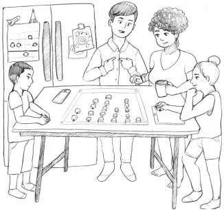
4.2 Holidays Planning Scenario
To illustrate a more casual decision-making scenario, suppose an Amer-ican family with two children wants to go on holidays for the summer. The parents want their children to be part of the decision process as every member of the family has different preferences. The parents put all their Zooids on the table and load data about 30 places they have preselected from a website that provides typical weather, travel cost, usual touristic peak periods and dominant activities about holiday destinations. Fig. 8 illustrates this hypothetical scenario.3
Using magnets for coarse filtering.Helen, the mother, starts by dis-carding the five most expensive places using a “cost” magnet. Mean-while, Emma the daughter and Eric the father focus on weather as they are looking for warm conditions. They use a temperature magnet combined with details-on-demand to remove four places with low and extreme values. The children argue about the activities to pursue during these holidays. Emma is interested in outdoors activities, while her brother Jack would like to visit museums. Each identifies locations that are suited to their interests using magnets, but no location seems to accommodate them both. The parents intervene to encourage them to compromise. To do so, they reconsider the places they had previously discarded and look for locations that sit somewhere in-between their two magnets. The children get more engaged in the conversation, as they try to find a trade off between culture and outdoor activities. They finally isolate a group of twelve places that suits them both.
Comparing ratings with a unit chart.To compare the visitors’ rat-ings of selected places, Eric creates a “rating” magnet and places it on thexaxis of a sandbox, then adds an empty Zooid on theyaxis. After dropping the Zooids in the sandbox, each Zooid aligns with its matching rating on thexaxis. This forms a unit chart as Zooids stack on top of each other along theyaxis. Based on the distribution of ratings, they agree to remove places with a rating lower than 3 out of 4, bringing the count down to seven.
Comparing places on a map.Concerned by travel time, Helen wants to check the geographical locations of the selected places. She creates a map visualization using a sandbox, like in the first scenario. Among the five selected places, the mother removes the two farthest. The family is happy with all five remaining locations, which offer good tradeoffs in terms of cost, weather, activities and distance.
Monitoring dynamic changes.To help them make their final decision, the parents decide to spend the next few days monitoring the cost of the cheapest flight for each of the five destinations. Eric creates a scatterplot with a cost magnet on theyaxis of a sandbox and an empty Zooid on thexaxis, and places it on the door of fridge to keep the dining table clear (Fig. 8). They place the five selected destinations on the sandbox and distribute them on thexaxis. As Zooids can move on any ferromagnetic vertical surface [42], each sticks to the door and moves to theycoordinate corresponding to its current cost.
As the costs are updated in real time through online feeds, the five remaining Zooids slowly move up and down over time, with some occasional rapid movements reflecting fluctuating prices. Helen would like the price of the flights not to exceed $500 per person, so she draws a horizontal line on the background to help them detect interesting flights. As the parents prepare breakfast a few days later, the son notices that prices for one of the destination has dropped significantly. Excited, the whole family agrees on the destination and the parents buy the plane tickets immediately.
[image:8.612.327.539.50.161.2]3Features not currently implemented in our system.
Fig. 7. By placing Lattitude and Longitude magnets in the sandbox, the scatterplot become a map, showing the city of origin of applicants.
Fig. 8. A family explores holidays destinations using Zooids.
4.3 Implementation
We first briefly recall the technology behind the Zooids platform. Then, we describe the implementation of our experimental data physicaliza-tion system, whose architecture is summarized in Figure 9.
4.3.1 Zooid Platform
Zooidsare an open source wheeled multi-robot system for implement-ing swarm user interfaces. Individual robots (that we refer to as Zooids) locomote non-holonomically (like a car) using differential drive of two DC motors. They use a room-mounted structured light projector and two photodiodes on each robot for localization. Each Zooid can sense when they are touched through capacitive sensing. They also have a single-pixel RGB LED. The physical setup is described in detail in a previous paper [54]. For our system, we use 30 Zooids to represent both data points as well as interface elements. The Zooids communicate with a radio receiver that connects to the server.
4.3.2 Server
The server receives the current position, orientation and touch events of each Zooid through the Zooid API; and it sends back a target position, orientation, and LED color to each of the Zooids.
In our system, the server implements a physics simulation inspired by Dust & Magnet [90]. Assigning a data dimension to a Zooid transforms it into a magnet which attracts each data Zooid (a Zooid representing a data case) with a force that is a function of magnet strength and of the Zooid’s value in the magnet’s dimension. Unlike the original Dust & Magnet, our implementation applies forces continuously, with the positions of the data Zooids being updated every 15 milliseconds.
[image:8.612.351.514.208.362.2]WEB APPLICATION SERVER
ZOOID PLATFORM
Position Orientation Touch events
Physics simulation Magnet assignation Sandbox management
Color shading
Dataset selection Dimension selection
Details on demand
[image:9.612.113.509.49.175.2]ZOOID API WEBSOCKET
Fig. 9. Our implementation extends the original Zooids implementation [54] by adding connectivity to a web server with a generic client architecture. It makes it easy to develop new web applications to interact with Zooids.
magnet’s dimension. Adding more magnets creates a barycentric coor-dinates system, where data Zooids converge where the attractive and repulsive forces from all magnets cancel each other (Fig. 5). In our implementation, rotating a magnet like a dial changes its strength.
The Zooids server also tracks the sandboxes. It determines in real-time whether there is a combination of two magnets (xandyaxes) and one unassigned Zooid (origin). Data Zooids inside the boundaries of a recognized sandbox move to a new position based solely on their values in the dimensions associated to thexandyaxes of the sandbox.
4.3.3 Web Server and Client
The server communicates with the outside world through a web server that sends and receives JSON messages via WebSockets. A sim-plezooidconnector.jsJavaScript library handles the connection between a client and the web server. The client can then be any web-based application supporting JavaScript. It simply needs to in-stantiate aZooidConnectorand override itssend(message)and
receive(message)functions.
4.3.4 Cross-device interaction
Some interactions presented in the scenario involve simultaneous ma-nipulations of both Zooids and the client tablet application, such as summoning details on demand by placing a robot on a dedicated area, or creating a magnet by placing a Zooid on the tablet. Both operations require touching the Zooid and the tablet button simultaneously. This approach, inspired by the TouchTokens technique [63], eliminates the need to track the tablet. The system works as follows:
When a Zooid is grasped or released, the Zooids server sends a message to the client indicating the identity of the Zooid and the nature of the event (grasped or released). On the client side, the application sends a message indicating which dimension is touched. Upon recep-tion, the Zooids server creates a magnet that associates the touched dimension to the first unassigned grasped Zooid. If no grasp event is found among the unassigned Zooids, the LEDs of all data Zooids then shine according to their value in the touched dimension. The client also sends a message when the detail-on-demand area is touched. In that case, it asks the Zooids server whether a data Zooid has been grasped, and shows the corresponding detailed information if that is the case.
Our implementation has clear limitations in terms of handling con-current actions. However, we found that these were sufficient for illustrating the potential of dynamic composite data physicalizations.
5 DISCUSSION
The scenario we described was purely hypothetical, and we have not yet tested our system with real tasks and users. Nevertheless, the scenario helps to think about the opportunities offered by dynamic composite physicalizations like ours, as well as the pending challenges. We first summarize the envisioned benefits offered by our system compared to other types of data physicalizations we discussed previously. We then go through the current limitations of our system. Finally, we discuss the opportunities such systems can open up for the future.
5.1 Benefits of Physicalizing Data with Zooids
In Sect. 3, we offered a simple taxonomy of composite data physicaliza-tions with three major dimensions. In this section we discuss Zooids in this context and compare it to existing composite data physicalizations and also screen-based interactive data visualizations.
5.1.1 Manipulability
The physical nature of Zooids allows for richer tangible interaction relative to both screen based data visualizations and existing dynamic data physicalizations. Zooids, being physically-detached objects, can be manipulated independently. This stands in contrast with current dy-namic data physicalizations such as EMERGE [82, 83], where moving parts are constrained in their motion, as well as screen based systems. We expect this physical manipulability to manifest itself in terms of cognitive, improvisational, collaborative, and user experience benefits.
The degree of physical manipulability alters not only the interactions with the system but also potentially the ways in which users think about a task [44]. Collections of physical objects tap into humans’ ability to use the physical space around them to simplify complex cognitive tasks, for example by arranging objects to track the state of a task over time [43]. The physical affordances also allow for easy manipulation of tokens while visually attending to other areas or people.
The ability to freely manipulate data physicalization elements opens up a wide range ofphysical interactions, i.e., interactions that take place in the physical world and do not need to be explicitly implemented or documented [40], allowing for richer improvisation. Our scenarios illustrated different ways space can be opportunistically used, includ-ing by placinclud-ing Zooids in different containers as a way of classifyinclud-ing individual data cases, or annotating the physical table where the Zooids are positioned. Another example of opportunistic physical interaction consists of physically tagging data cases with stickers. Tagging is also possible with other physicalizations like EMERGE, but needs to be ex-plicitly supported in on-screen visualizations. Physical objects support not only opportunistic annotation, but also personalization [78]. More extensive personalization capabilities for Zooids could for example involve non-permanent coloring or painting materials, or malleable materials like plasticine.
The large physical interaction space allows for many users to interact, which could benefit both collaborative work and data story telling. The physicality can help ground conversation and facilitate joint visual attention [77]. Beyond this as our scenarios illustrated, group work can be facilitated since users can temporarily take ownership of data cases or data subsets, pass them along, or place them in shared areas, which is not possible with a computer display or a fixed layout like EMERGE. Physicality may also have benefits for data story telling, similar to Hans Rosling’s props [20], where manual demonstrations and explanations can engage viewers and help them to ground complex concepts.
HCI, allows people to sense that they did something, as opposed to “the system did something” [16]. Personal agency has been shown to benefit data visualization users, in particular when they are not experts [46]. And finally, tangible user interfaces may increase engagement, espe-cially in informal, public settings [28] both due to novelty as well as their inherent differences with graphical user interfaces.
5.1.2 Degree of Actuation
All the putative benefits previously mentioned also apply to physicaliza-tions made of collecphysicaliza-tions of passive objects, such as physical tiles [34]. However, such physicalizations can be time-consuming to update. By adding motion capabilities to tokens, Zooids bring physicalizations closer to the capabilities of today’s on-screen visualizations, including support for animation and dynamic changes in visual representation, as our scenario illustrated. Other possibilities not illustrated include support for dynamic datasets, persistence and interaction history/replay. Dynamic physicalizations also offer new opportunities to encode information using this new modality that is motion. Motion could be used for example to encode data uncertainty, as in Gregor Aisch’s jittery gauge [1]. A stable Zooid could indicate a reliable data case, while a jittery Zooid could signify a highly uncertain data case. Such encodings are possible on screens, but not with static data physicalizations.
5.1.3 Level of Granularity
Several tangible user interfaces have been proposed in the past whose elements could be both freely manipulated and move on their own (see [54] for a review). However, they typically consist of 2–5 rela-tively bulky objects, making them impractical for data physicalization purposes. Although more work is needed to make Zooids small enough to handle realistic datasets, their current form-factor already makes it possible to explore datasets of around 20–30 data cases. Such small datasets are not uncommon in the area of personal data analytics [67].
5.2 Limitations
There are clear limitations to our current system. Some of these are technical (e.g., the size of Zooids, their non-holonomic drive, their tracking that requires a high-speed projector) and have been already discussed in [54]. None of these pose serious challenges. Here, we focus on the limitations of our data physicalization system regarding the supported data representations and interaction techniques.
5.2.1 Axes, Text and Legends
The first and foremost limitation is that Zooids can only physicalize the dots in dot-based visualizations. In almost all visualizations, extra visual elements are necessary for their interpretation. As we discussed previously [54] and illustrated in our scenario, some of these elements can be physical (e.g., a sheet of paper with a coordinates frame or a map). However, such an approach does not allow these elements to change dynamically. Supporting complete dynamic physicalizations could be an interesting goal to pursue4, but would require designing a physical device for each type of visual element (axis, label, legend, etc.). A more practical approach is to embed extra displays (like the tablet in our scenario), or use top-projection as is commonly the case in tangible user interfaces. Since Zooids can move on any surface, they can also be placed on top of a regular display [54]. Such “virtual” displays add lots of versatility, but they also weaken the physical metaphor.
5.2.2 Other Data Representations
The system we illustrated only supports two data representa-tions: scatterplots, and a proximity-based encoding inspired from Dust&Magnets [90]. However, all other dot-based visualizations men-tioned in Sect. 2.3 can in principle be implemented. For node-link diagrams, which are not fully dot-based, it may be possible to physi-calize edges with strings on rollers [21], although it seems technically challenging and will likely be limited to exploring different layouts for networks with a fixed topology. A simpler approach would be to overlay a virtual display as discussed previously.
4See tinyurl.com/tenisonroad for a domain-specific example.
In principle, Zooids can also be used to physicalize non-dot-based visualizations, although this is currently not the best use of Zooids. Zooids are consistent with two display paradigms:thingsandstuff[54]. Under thethingsparadigm, adopted in this article, each Zooid embodies a well-defined object. Meanwhile, in thestuffparadigm, Zooids act as physical pixels or atoms that can combine to form arbitrary shapes or surfaces. This paradigm is already used in visualization [65], but will become more interesting to explore when robots like Zooids become small enough to behave as “programmable matter” [40].
5.2.3 Other Visual Variables
While dots in dot-based visualizations can employ other visual variables than position (e.g., color, size, shape, or icon), Zooids are currently limited to LED color and rotation. Furthermore, LED perceived bright-ness depends on the Zooid orientation, an issue that will need to be addressed to support accurate color encoding. Future work such as shape changing robots [60] or integrated LCD screens [59] could en-able more visual varien-ables. Control over the appearance of individual Zooids will also make it much easier to visually distinguish them by their function, as it is currently difficult for example to distinguish magnets from data cases in the system we presented. Work on haptic feedback or temperature actuation may also be able leverage non-visual variables that are absent from traditional visualizations [40].
5.2.4 Overlapping Data Cases
On screens, visual marks typically overlap when values are equal or similar, but Zooids cannot overlap. While this can be an issue in some cases, overlap is often considered undesirable in visualization, and overlap removal techniques (i.e., “jitter”) are sometimes used to overcome this issue. Zooids support “physical jitter” natively, but when several Zooids are asked to take on the same position, they “fight” for the position and never come to rest. This behavior may or may not be desirable, but is easy to prevent with a software jitter mechanism.
5.2.5 Data Scalability and Cost
As we mentioned before, Zooids are currently limited in the size of the datasets they can physicalize, due to their granularity and to the limited number of robots available. We currently run up to 30 in our lab, but we could in theory run up to 50 or more. However, above a certain number of robots, space becomes scarce and collisions become frequent, limiting movement efficacy. When the number of robots is low, automatic re-assignment techniques [54] allow re-using Zooids across data subsets or visualizations. However, re-assignments can be confusing and are incompatible with physical interactions such as tagging. In the context of data visualization, there are clear benefits in having each Zooid represent one data case in a persistent manner. Scalability is therefore limited technically and also due to the cost of the robots, about $100 each when built in small numbers, plus $1500 for the high-speed projector. The cost could be lowered with novel technologies. The projector can be replaced with off-the-shelf laser optical tracking systems costing about $150 [29], and producing the Zooids industrially could possibly reduce their cost to $10. While data scalability would not increase, Zooids would be usable in more setups, such as museums and schools where the number of data points used is typically small, but the engagement factor is of paramount importance.
5.2.6 Other Synthetic Interactions
future work will require to understand how to best combine physical and virtual displays, as well as physical and synthetic interactions [40].
5.2.7 Evaluation
Future work will need to empirically establish how Zooids compare to other setups in terms of task efficacy, engagement, support for col-laboration, or memorability. As with the evaluation of any data phys-icalization, one difficulty lies in the choice of meaningful baselines of comparison [40]. One such baseline is a tabletop setup where all implemented interactions are identical but the data points are virtual (i.e., flat) instead of physical. A study has already suggested it is easier to rapidly manipulate groups of physical tokens than tokens with zero thickness [53]. With touch interfaces, it is also impossible to lift tokens, hand them over to people, or put them into one’s pocket [53]. Future studies could investigate the benefits of supporting such actions in terms of, e.g., engagement and collaboration. Another interesting dependent variable to measure would be support for empathy (see Sect. 5.3.2).
5.3 Future Opportunities
Having covered the benefits and limitations of our current prototype of dynamic composite physicalization, we now discuss what future evolutions of such systems may have to offer.
5.3.1 Promoting Personal Analytics and Visualization Literacy
As technologies like Zooids improve and become affordable, they can contribute to bringing visualization into people’s personal lives.
There is a growing interest in personal visualization and personal an-alytics [31, 69]. The goal of personal visualization is to bring analytical tools into people’s everyday lives in order to support “casual informa-tion visualizainforma-tion” [72]. The physical medium is complementary to traditional visualizations for personal visualization. While computer and mobile displays are versatile and convenient, people tend to as-sign more symbolic meaning and lasting value to physical mementos and physical representations of personal data [71]. In addition, the physical construction of personal data representations, which involves manual construction and personalization, is thought to promote self-reflection [84], a key goal of personal visualization.
By contributing to making visualization ubiquitous and part of peo-ple’s everyday lives, dynamic composite data physicalizations also have the potential to play an important role in improving data literacy and visualization literacy (or graphicacy [88]). Visualization literacy is a relatively new area of interest (e.g., [2, 11, 56]), with important socio-technical implications. While simple physical blocks have already shown promise for educating people about data [20, 33], full actuation can make them more powerful and versatile, and thus more ubiquitous. The home place is full of opportunities for collaborative analytic activities, such as finding a restaurant for dinner among friends, or a place to go for vacation that would suit the entire family. Our previ-ous scenario illustrates how dynamic composite physicalizations like Zooids could support such collaborative activities. Although we have only investigated co-located synchronous collaboration, there are op-portunities to expand to support synchronous remote collaboration. With active tangibles many of the benefits of physical collaboration can be maintained by synchronizing the physical motion of the tangible elements through actuation. While there have been some investigations in the context of remote physical telepresence [12, 57], there are many opportunities to expand and better study how physical manipulatives change the way people collaborate remotely. One question is how best to represent person space. Another topic for exploration is on interaction techniques for shared control.
5.3.2 Promoting Empathy
Our own experience with Zooids suggests that they are often perceived as alive and “cute”. In our first scenario, when Zooids representing applicants clumsily move towards a magnet, it is hard not to feel sym-pathy for them. Emsym-pathy is becoming a topic of interest in infovis: it is one of the four categories of Narrative Patterns for Data-Driven Storytelling (http://napa-cards.net/), and is used in the narrative pattern “Humans behind the dots”, which is thought to make abstract
data more relatable and help in establishing an emotional connection with the data. However, a recent study found that using anthropomor-phic icons as visual marks may not increase the likelihood of people donating to charity [10].
We reasoned that the “cuteness” of Zooids may be a side effect of their irregular movements. Both smallness and clumsiness have indeed been associated with cuteness [18]. Therefore, it would seem informative to test whether imparting similar movements to traditional visual marks could have positive effects on empathy. At the same time, it is also possible that empathizing with virtual objects behind a computer screen is much harder than with physical objects that have a real existence in our physical environment. Studies comparing virtual with real robots do seem consistent with this conjecture [48]. Research is underway for trying to understand the affective impact of different types of swarm motions [42], but more research is needed.
Support for direct physical manipulation (as opposed to indirect or impoverished manipulation by the means of a computer mouse or touch screen) may also play a role, as previous studies on moral reasoning have found that people are more hesitant to cause harm through direct physical contact than through an intermediary mechanism [50]. Relat-edly, direct contact can make people less likely to cheat (e.g., people are more reluctant to illegally move a golf ball by picking it up than by pushing it with their golf club or their shoe [3]).
As a complement to all these questions, it would seem worthwhile investigating whether empathy can cause analysts to examine the data more carefully and to be more fair in their judgments and decisions. This type of research can have profound implications for all data anal-ysis applications where data cases are individuals, and decisions are made that can impact their lives (e.g., when deciding whom to hire, fire, or award financial help). If there are ways to use physicality to elicit more empathy in such situations, then the applications of dynamic composite data physicalization can be far-reaching.
6 CONCLUSION
We introduced dynamic composite physicalizations, a new class of physical visualizations that use collections of self-propelled objects to represent data, and illustrated their capabilities using a prototype implemented with the Zooids platform [54]. We discussed the benefits and limitations of our current prototype, as well as directions for future research and promising opportunities in terms of promoting personal analytics, visualization literacy and empathy.
Much of today’s information visualization research and practice builds on Bertin’sSemiology of Graphics[9], which defined visual-izations as resting on a flat surface (initially a white paper page), and composed of three types of marks (points, lines, and areas), as well as visual variables. When visualization moved from the analog paper-based world to the digital world, it lost a few features of Bertin’s semiology, such as the infinite resolution of ink and paper-based physi-cal interactions [8, 67]. Meanwhile, it gained the support for advanced interactions, animations, and additional visual variables such as trans-parency, motion, flicker, and 3D effects.
Dynamic composite physicalizations like Zooids introduce another media, different and complementary to both paper and computer screens. Due to their form-factor, Zooids are appropriate for physical-izing dot-based visualizations, but currently less so for physicalphysical-izing line-based and area-based visualizations. From Bertin’s world, they share the analog nature of physical objects, their persistence, and their ability to be directly manipulated. From the virtual world, they share the ability to support powerful and elaborate computationally-mediated interactions. Meanwhile, they are integrated to the physical environ-ment surrounding us. In the same way as the digital world has evolved to improve pixel size and drawing speed, Zooids will evolve too. For all these reasons, they are novel and interesting research objects.
ACKNOWLEDGMENTS
REFERENCES
[1] G. Aisch. Why we used jittery gauges in our live election forecast. Online. https://vis4.net/blog/2016/11/jittery-gauges-election-forecast/, 2016. [2] B. Alper, N. H. Riche, F. Chevalier, J. Boy, and M. Sezgin. Visualization
literacy at elementary school. InProc. CHI ’17, pp. 5485–5497. ACM, New York, NY, USA, 2017. doi: 10.1145/3025453.3025877
[3] D. Ariely and S. Jones.The (honest) truth about dishonesty: How we lie to everyone–especially ourselves, vol. 336. HarperCollins New York, NY, 2012.
[4] ART+COM Studios. Kinetic sculpture — the shapes of things to come. Online. https://artcom.de/en/project/kinetic-sculpture/, 2008.
[5] D. Baur, B. Lee, and S. Carpendale. Touchwave: Kinetic multi-touch manipulation for hierarchical stacked graphs. InProc. ITS ’12, pp. 255– 264. ACM, New York, NY, USA, 2012. doi: 10.1145/2396636.2396675 [6] M. Beaudouin-Lafon. Instrumental interaction: an interaction model for
designing post-wimp user interfaces. InProc. CHI ’00, pp. 446–453. ACM, 2000.
[7] M. Behrisch, B. Bach, N. Henry Riche, T. Schreck, and J.-D. Fekete. Ma-trix Reordering Methods for Table and Network Visualization.Computer Graphics Forum, 35:24, 2016. doi: 10.1111/cgf.12935
[8] J. Bertin.Graphics and graphic information processing. Walter de Gruyter, 1981.
[9] J. Bertin.Semiology of Graphics. University of Wisconsin Press, 1983. [10] J. Boy, A. V. Pandey, J. Emerson, M. Satterthwaite, O. Nov, and E. Bertini.
Showing people behind data: Does anthropomorphizing visualizations elicit more empathy for human rights data? InProc. CHI ’17, pp. 5462– 5474. ACM, 2017.
[11] J. Boy, R. A. Rensink, E. Bertini, and J. D. Fekete. A principled way of assessing visualization literacy.IEEE Transactions on Visualization and Computer Graphics, 20(12):1963–1972, Dec 2014. doi: 10.1109/TVCG. 2014.2346984
[12] S. Brave, H. Ishii, and A. Dahley. Tangible interfaces for remote collab-oration and communication. InProc. CSCW ’98, pp. 169–178. ACM, 1998.
[13] S. Cafe. Of all people in all the world. Online. https://neil.fraser.name/news/2008/01/04/, 2006.
[14] F. Chevalier, P. Dragicevic, and S. Franconeri. The not-so-staggering effect of staggered animated transitions on visual tracking.IEEE transactions on visualization and computer graphics, 20(12):2241–2250, 2014. [15] W. S. Cleveland and R. McGill. Graphical perception: Theory,
experimen-tation, and application to the development of graphical methods.Journal of the American statistical association, 79(387):531–554, 1984. [16] D. Coyle, J. Moore, P. O. Kristensson, P. Fletcher, and A. Blackwell. I
did that! measuring users’ experience of agency in their own actions. In
Proc. CHI ’12, pp. 2025–2034. ACM, New York, NY, USA, 2012. doi: 10. 1145/2207676.2208350
[17] G. Crampton Smith. The hand that rocks the cradle. ID magazine, pp. 60–65, 1995.
[18] J. P. Dale, J. Goggin, J. Leyda, A. P. McIntyre, and D. Negra. The aesthetics and affects of cuteness. Routledge, 2016.
[19] P. Dragicevic, A. Bezerianos, W. Javed, N. Elmqvist, and J.-D. Fekete. Temporal distortion for animated transitions. InProc. CHI ’11, pp. 2009– 2018. ACM, 2011.
[20] P. Dragicevic and Y. Jansen. 2010 – Hans Rosling adopts physical visu-alizations. Online. http://dataphys.org/list/hans-rosling-adopts-physical-visualizations/, 2013.
[21] J. Ducasse, M. J. Mac´e, M. Serrano, and C. Jouffrais. Tangible reels: construction and exploration of tangible maps by visually impaired users. InProc. CHI ’16, pp. 2186–2197. ACM, 2016.
[22] N. Elmqvist, P. Dragicevic, and J.-D. Fekete. Rolling the dice: Multidi-mensional visual exploration using scatterplot matrix navigation.IEEE transactions on Visualization and Computer Graphics, 14(6):1539–1148, 2008.
[23] S. Follmer, D. Leithinger, A. Olwal, A. Hogge, and H. Ishii. inform: dynamic physical affordances and constraints through shape and object actuation. InUist, vol. 13, pp. 417–426, 2013.
[24] N. Fraser. Wooden brain. Online. https://neil.fraser.name/news/2008/01/04/, 2008.
[25] S. Haroz, R. Kosara, and S. L. Franconeri. Isotype visualization: Working memory, performance, and engagement with pictographs. InProc. CHI ’15, pp. 1191–1200. ACM, 2015.
[26] R. L. Harris.Information Graphics: A Comprehensive Illustrated Refer-ence. Oxford University Press, Inc., New York, NY, USA, 1999.
[27] J. Heer and G. Robertson. Animated transitions in statistical data graphics.
IEEE transactions on visualization and computer graphics, 13(6):1240– 1247, 2007.
[28] M. S. Horn, E. T. Solovey, R. J. Crouser, and R. J. Jacob. Comparing the use of tangible and graphical programming languages for informal science education. InProc. CHI ’09, pp. 975–984. ACM, 2009.
[29] HTC Corp. Vive - base station. Online. https://www.vive.com/us/accessory/base-station/, 2018.
[30] Y. Hu, E. R. Gansner, and S. Kobourov. Visualizing graphs and clusters as maps.IEEE Computer Graphics and Applications, 30(6):54–66, 2010. [31] D. Huang, M. Tory, B. A. Aseniero, L. Bartram, S. Bateman, S. Carpendale,
A. Tang, and R. Woodbury. Personal visualization and personal visual analytics.IEEE Transactions on Visualization and Computer Graphics, 21(3):420–433, 2015.
[32] M. Hunger. On lego powered time-tracking; my daily column. Online. http://jexp.de/blog/2008/08/on-lego-powered-time-tracking-my-daily-column/, 2008.
[33] S. Huron. Constructive Visualization. Theses, Univerist´e Paris-Saclay, Sept. 2015.
[34] S. Huron, Y. Jansen, and S. Carpendale. Constructing visual represen-tations: Investigating the use of tangible tokens.IEEE Transactions on Visualization and Computer Graphics, 20(12):2102–2111, Dec 2014. doi: 10.1109/TVCG.2014.2346292
[35] S. Huron, R. Vuillemot, and J. D. Fekete. Visual sedimentation. IEEE Transactions on Visualization and Computer Graphics, 19(12):2446–2455, Dec 2013. doi: 10.1109/TVCG.2013.227
[36] Y. Jansen.Physical and tangible information visualization. PhD thesis, Universit´e Paris Sud-Paris XI, 2014.
[37] Y. Jansen and P. Dragicevic. An interaction model for visualizations beyond the desktop.IEEE Transactions on Visualization and Computer Graphics, 19(12):2396–2405, 2013.
[38] Y. Jansen, P. Dragicevic, and J.-D. Fekete. Tangible remote controllers for wall-size displays. InProc. CHI ’12, pp. 2865–2874. ACM, New York, NY, USA, 2012. doi: 10.1145/2207676.2208691
[39] Y. Jansen, P. Dragicevic, and J.-D. Fekete. Evaluating the efficiency of physical visualizations. InProc. CHI ’13, pp. 2593–2602. ACM, New York, NY, USA, 2013. doi: 10.1145/2470654.2481359
[40] Y. Jansen, P. Dragicevic, P. Isenberg, J. Alexander, A. Karnik, J. Kildal, S. Subramanian, and K. Hornbæk. Opportunities and challenges for data physicalization. InProc. CHI ’15, pp. 3227–3236. ACM, New York, NY, USA, 2015. doi: 10.1145/2702123.2702180
[41] E. Kandogan. Visualizing multi-dimensional clusters, trends, and outliers using star coordinates. InProc. KDD ’01, pp. 107–116. ACM, New York, NY, USA, 2001. doi: 10.1145/502512.502530
[42] L. Kim and S. Follmer. Ubiswarm: Ubiquitous robotic interfaces and investigation of abstract motion as a display.Proc. IMWUT’ 17, 1(3):66, 2017.
[43] D. Kirsh. The intelligent use of space.Artificial intelligence, 73(1-2):31– 68, 1995.
[44] S. R. Klemmer, B. Hartmann, and L. Takayama. How bodies matter: five themes for interaction design. InProc. DIS ’06, pp. 140–149. ACM, 2006. [45] B. Kondo and C. Collins. Dimpvis: Exploring time-varying information visualizations by direct manipulation.IEEE Trans. on Visualization and Computer Graphics (Proc. of the IEEE Conf. on Information Visualization), 20(12):2003 – 2012, Dec. 2014. doi: 10.1109/TVCG.2014.2346250 [46] P. Koytek, C. Perin, J. Vermeulen, E. Andr´e, and S. Carpendale. Mybrush:
Brushing and linking with personal agency.IEEE TVCG (Proc. Infovis ’17), 2018. doi: 10.1109/TVCG.2017.2743859
[47] J. B. Kruskal and M. Wish.Multidimensional scaling, vol. 11. Sage, 1978. [48] S. S. Kwak, Y. Kim, E. Kim, C. Shin, and K. Cho. What makes people empathize with an emotional robot?: The impact of agency and physical embodiment on human empathy for a robot. InRO-MAN, 2013 IEEE, pp. 180–185. IEEE, 2013.
[49] B. c. Kwon, W. Javed, N. Elmqvist, and J. S. Yi. Direct manipulation through surrogate objects. InProc. CHI ’11, pp. 627–636. ACM, New York, NY, USA, 2011. doi: 10.1145/1978942.1979033
[50] A. Lanteri, C. Chelini, and S. Rizzello. An experimental investigation of emotions and reasoning in the trolley problem.Journal of Business Ethics, 83(4):789–804, 2008.
[51] S. Lavin. Mapping continuous geographical distributions using dot-density shading.The American Cartographer, 13(2):140–150, 1986.
![Fig. 2. Physicalizations classified according to their degree of manipula-bility and their level of actuation: (A) 3D bar chart [39]; (B) reorderablematrix [8, 68]; (C) wooden tiles [34]; (D) ART+COM’s “kinetic sculp-tures” [4]; (E) EMERGE [83]; (F) Zooids [54].](https://thumb-us.123doks.com/thumbv2/123dok_us/1346315.88313/5.612.330.555.49.182/physicalizations-classied-according-manipula-actuation-reorderablematrix-kinetic-zooids.webp)
![Fig. 9. Our implementation extends the original Zooids implementation [54] by adding connectivity to a web server with a generic client architecture.It makes it easy to develop new web applications to interact with Zooids.](https://thumb-us.123doks.com/thumbv2/123dok_us/1346315.88313/9.612.113.509.49.175/implementation-extends-original-implementation-connectivity-architecture-applications-interact.webp)
