Research paper
Animated analysis of geoscienti
fi
c datasets: An interactive
graphical application
Peter Morse
a,*, Anya Reading
a, Christopher Lueg
b aSchool of Physical Sciences (Earth Sciences), University of Tasmania, Hobart, TAS, 7001, Australia bSchool of Engineering and ICT, University of Tasmania, Hobart, TAS, 7001, AustraliaA R T I C L E I N F O
Keywords:
Visual analytics Interactive Animated Time series analysis
A B S T R A C T
Geoscientists are required to analyze and draw conclusions from increasingly large volumes of data. There is a need to recognise and characterise features and changing patterns of Earth observables within such large datasets. It is also necessary to identify significant subsets of the data for more detailed analysis.
We present an innovative, interactive software tool and workflow to visualise, characterise, sample and tag large geoscientific datasets from both local and cloud-based repositories. It uses an animated interface and human-computer interaction to utilise the capacity of human expert observers to identify features via enhanced visual analytics.‘Tagger’enables users to analyze datasets that are too large in volume to be drawn legibly on a reasonable number of single static plots. Users interact with the moving graphical display, tagging data ranges of interest for subsequent attention. The tool provides a rapid pre-pass process using fast GPU-based OpenGL graphics and data-handling and is coded in the Quartz Composer visual programing language (VPL) on Mac OSX. It makes use of interoperable data formats, and cloud-based (or local) data storage and compute.
In a case study, Tagger was used to characterise a decade (2000–2009) of data recorded by the Cape Sorell Waverider Buoy, located approximately 10 km off the west coast of Tasmania, Australia. These data serve as a proxy for the understanding of Southern Ocean storminess, which has both local and global implications. This example shows use of the tool to identify and characterise 4 different types of storm and non-storm events during this time. Events characterised in this way are compared with conventional analysis, noting advantages and limitations of data analysis using animation and human interaction. Tagger provides a new ability to make use of humans as feature detectors in computer-based analysis of large-volume geosciences and other data.
1. Introduction
1.1. Geosciences data
The volume of data generated by scientific instruments, sensor sys-tems and computational models is growing at an increasing pace (Hey et al., 2009) and most geosciences disciplines and technologies exhibit this trend (Sellars et al., 2013). Typical datasets might comprise time variant observations atfixed geographic locations such as tide-gauges and oceanographic buoy data, spatially distributed data such as soil geochemistry analyses, or combined spatial/time variant data such as those observed by satellites. Other large datasets include outputs of model simulations and forecasts. Interpretations of geosciences data are commonly carried out using graphs and maps, however, there is a
necessary limitation on how much information can be presented in a single representation and how many graphs or maps can be usefully incorporated in one study (Ware, 2012; Munzner, 2014). Statistical an-alyses afford the ability to summarise in a systematic way but at the expense of exploratory analysis and much pattern characterization.
Graphical and other diagrammatic representations of data can be thought of as visualisations (Tufte, 1990, 1997; Few, 2009). Existing visualisation tools are generally used for the presentation of results rather than being an inherent part of the data inference process (Ware, 2012; Few, 2015; Victor, 2005). However, interactive visual analytics could be used much more widely at earlier stages in the workflow, prospectively generating new insight into the underlying data (Thomas and Cook, 2005; Keim et al., 2008; Ward et al., 2010).
* Corresponding author.
E-mail address:[email protected](P. Morse).
Contents lists available atScienceDirect
Computers and Geosciences
journal homepage:www. elsevi er.com/ locat e/cageo
http://dx.doi.org/10.1016/j.cageo.2017.07.006
Received 2 September 2016; Received in revised form 24 July 2017; Accepted 29 July 2017 Available online 7 August 2017
1.2. Human interaction with data displays
The human comprehension of graphical representations is complex, as it involves the interplay between physiology, visual perception, cognition and experience, together with factors such as information density, dataset size, graphic design and color (Ware, 2012; Healey and Enns, 2012). Someflexibility in the display allows for physiological and experiential differences in scientific data analysts. Expert human analysts can identify structures and patterns that are challenging for statistical classification systems. Both comprehension and pattern detection are influenced by the graphical abstraction of data and the levels of detail present (Carpenter and Shah, 1998; Friel et al., 2001). Taken together, there is a point where visual data density impairs comprehensibility (Walker et al., 2016), as illustrated by the two static plots (Fig. 1).
1.3. Static and animated interactive representations of data
Geoscientists and other data scientists routinely use software pack-ages to visualise and present results as static graphs and charts. This graphing and underpinning ‘spreadsheet’ document model is user-friendly, robust and has been in use for many decades (Campbell-Kelly, 2003; ch.12) with more recent capabilities that enable dynamic updating of variables. Whilst adequate for many scientific purposes, this approach becomes unwieldy and can lead to missed insights, as datasets increase in size and complexity. As an alternative, many users engaged in scientific research are comfortable creating visual output using programming models and scripting (e.g. Python, R, Matlab) as datasets become larger. Animated interactive representations of data enable more
sophisticated visualisations for interpretation. With the advent of high performance computer graphics, the repertoire of graph types has significantly expanded, including adaptive and network representations (Herman et al., 2000; Liu et al., 2014). Programming languages widely used in science such as Python are also moving beyond the conventional static charts and visualisations produced by MatPlotLib (Hunter, 2007), with an array of tools that leverage programming languages in concert with vector graphics libraries (Khronos Group, 2016), e.g. Bokeh ( Con-tinuum Analytics, 2015). Alternatively, using a programming language together with OpenGL enables the processing of significantly greater data volumes (e.g. VTK and Paraview (Kitware, 2016); Vispy (VisPy De-velopers, 2015)). These softwares combine, in varying degrees, features for interaction and animation, constrained by their underlying archi-tecture (Kloss, 2009). 2D plotting libraries predominantly execute upon the CPU, limiting their ability to handle very large datasets and real-time interactivity. In contrast, OpenGL-based plotting systems (Supplement 1) afford the possibility of handling millions to billions of datapoints as well as handling high-frame-rate animation and interactivity, via the trans-action of events and data across CPU and GPU (Rossant and Har-ris, 2013).
1.4. GPU-enhanced scientific-oriented software
[image:2.595.117.476.379.718.2]Scientific visualisation has been able to exploit these hardware de-velopments for the analysis and visualisation of massive datasets (Guha et al., 2005; Cuntz et al., 2007; Fogal et al., 2010). Examples of previous studies in the geosciences include the development of sophisticated computer simulations, such as weather forecasting (Rautenhaus et al.,
2015) and climate modelling (Michalakes and Vachharajani, 2008) and other notable contributions making use of GPUs from cosmology (K€ahler et al., 2006; Sainio, 2010; Bard et al., 2013). More general packages with sophisticated client-server models that implement distributed back-end compute and rendering have also been developed, e.g. Paraview ( Hen-derson et al., 2004), VisIt (Ahern et al., 2013), SciVi (Ryabinin and Chuprina, 2013). While recognizing the utility of these packages, their potential for customization of the visual interactive interface is con-strained by their underlying architecture and implementation of inter-face controls.
We make use of the practical convergence between the technical capabilities afforded by GPU-enabled graphics and processing (Supple-ment 1 provides an extensive technical background), and the goals of contemporary scientific data analysis. The interaction functionality and the capabilities afforded by performant GPU-accelerated graphics are combined with cloud-enabled ability to connect with agile scientific data formats. We use the NeCTAR Research Cloud (National Research Infrastructure for Australia, 2016) to host a virtual machine configured with a THREDDS data server (TDS) (Supplement 2). Given the desir-ability of exposing data to the scientific user in a dynamic way, we present a new software application for animated, interactive data analysis.
2. Tagger: interactive graphical application
2.1. Application aims and development framework
We address the need for a highly performant visual analytics plat-form that connects with scientific data formats, enables the reconnais-sance viewing of large datasets, and has an interactive selection/tagging capability. The new application Tagger aims to leverage the capabilities of the human visual-cognitive system to observe patterns in data, through an animated interface, that may lead to new insight into the underlying patterns or other characteristics of the data. The application aims to be readily customizable for different data throughflow scenarios and to be easily adaptable for a variety of human-computer interfaces, providing the insightful use of visual enhancements to aid scientific data characterization, pattern detection and data selection for further analysis.
Tagger is programmed in Quartz Composer (QC), a Visual Program-ming Language (VPL) delivered as part of Apple's freely available Xcode development environment (Apple Computer, 2007). As QC is not widely used for programming in geosciences, a short overview is provided as Supplement 3. QC provides a high-level VPL interface to underlying technologies such as OpenGL, OpenCL, Core Image, Core Video and other OSX graphics technologies. It is extensible via a plug-in architecture and also permits the development of text-coded routines in Objective-C, OpenCL or Javascript, in concert with the visual programming para-digm. Quartz Compositions (dataflow programs) can be distributed as freely-modifiable programs or can be compiled into stand-alone software applications via Xcode. Of key relevance to the functionality of this language for scientific data visualisation is the ease of customising inputs, outputs and workflows. The visual programming environment enables rapid iteration through application prototypes to working interfaces for a wider spectrum of users than would be possible with a non-visual lan-guage (Sousa, 2012).
Tagger is a multi-layered QC program constructed in a modular fashion, comprising a series of routines for performing manipulations upon the data streaming in and being rendered to screen. The application accesses data through a cloud-hosted server accessible via OPeNDAP and THREDDS (see Supplement 1 and 2). It can also read local.txt and .csv datafiles.
2.2. Tagger user interface
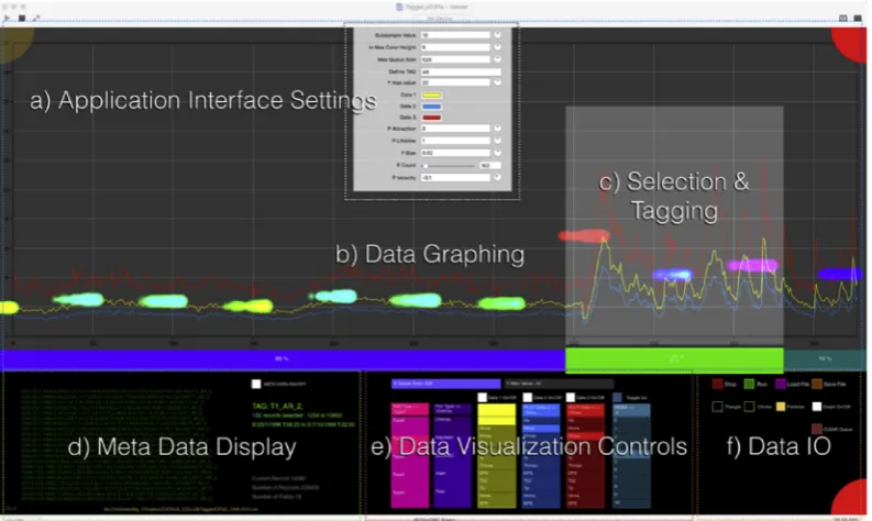
The Tagger GUI is arranged in a series of panes, menus and tools (Fig. 2): a) Application Interface Settings (drop down menu); b) The Data Graphing pane; c) Selection and Tagging Tool, d) Meta Data Display; e) Data Visualisation Controls; f) Data Input and Output Controls.
[image:3.595.101.498.487.724.2]The Data Graphing pane can be switched between a variety of graph types and views (e.g. independent overlay, stacked fraction, stacked value, various tiling modes). The usual mode of operation is that the data are animated, in the chosen graph type/view. The graph moves across the screen for perusal by the analyst, data selection and tagging. A robust link to the input scientific data is made through the Meta Data Display which shows a moving list of all data being visualised as well as dynamically generated summaries, e.g. the total number offields, data point values and current range selection. The choice of data to be
visualised within the chosenfile is made through the Data Visualisation Controls pane. File selection, either local or cloud-based, is made through the Data IO pane toggle buttons and via standard operating systemfile open and save windows. Toggle buttons are placed here to start and stop animation, as well as toggling on and off visualisation overlays. Application Interface Settings (drop down menu) enable further customization to suit user experience and the nature of the incoming data.
Using the application for data selection and tagging should be intui-tive to scientific users. Areas of the graph that displays events of interest are selected using the mouse, with the‘t’key being pressed to tag that data. This can be done whether the data are‘playing’or stopped. The data and its tag are written out to a local savedfile, each tag is auto-matically numerically incremented and appended to that file as the analysis proceeds. Tags are user-defined alphanumeric strings that can be used as keys to identify different types of events.
The Data IO pane can be used to assign visual analytic aids, such as particle systems, to the on-screen data divisions, overlaying the graph. Particle systems are small graphics objects displayed on screen, designed to draw attention to a particular feature of the data, such as the animated data stream exceeding a threshold level. The graph can be turned off and the data visualised as an abstract animation. This potentially accelerates movement through the data and the procedure of tagging by the user. Examples of different usage modes are given in our illustrative case study below and in the accompanying video (Supplement 6).
2.3. Tagger application capabilities
The application achieves the objectives as visualisation software that can perform data queries and visual analytics tasks on both local and remote Earth Sciences data. Cloud storage and a VM THREDDS data server are implemented (Supplement 2), hosting an OPeNDAP network-addressable database of NetCDFfiles.
The application capabilities enable the user to:
(i) Graph time-variant data using a performant, animated interface to visualise an extensive stream of time-variant data.
(ii) Access and query both local and remote multi-parametric data held in variety of formats including agile (NetCDF) and traditional (.txt, csv) data formats.
(iii) Zoom in and out on the datastream in order to examine it at different timescales and levels of detail.
(iv) Overlay unconventional visual cues driven by visually enhanced animation on the animated datastream, in order to alert users to different types of events occurring in the data.
(v) Counterpoise multiple data streams in the animation so that different values can be compared.
(vi) Pause the animation, make a visual selection of some of the data currently in the main window, and tag regions of interest, for output to a local savedfile.
The user-defined selections append a user-defined metadata tag to the lines corresponding to that selection. The localfile‘captures’the expert observation of the user, who has some familiarity with the type of data being observed; these saved observational and event subsets can later be subjected to conventional computational (e.g. parametric) analysis. A subset of the application capabilities is illustrated in the following case study.
3. Illustrative case study: Cape Sorell Waverider Buoy data
The Cape Sorell Waverider Buoy (WRB) is a swell-measuring buoy, located approximately 10 km west of Macquarie Harbor, Tasmania (42.9S, 145.03E) (Australian Bureau of Meteorology, 2016). It was chosen as an indicator location for the variability of large wave events on Australia's southern margin (Macaulay, 2009), where it is openly exposed
to the westerly wind-driven Southern Ocean wave climate. Data from this buoy may be interpreted as a proxy for marine storms in the Australian sector of the Southern Ocean (Hemer, 2010). The aim of this case study analysis was to provide an appraisal of storm character in addition to, and complementing, a parametric approach (Hemer, 2010; Hemer et al., 2010).
3.1. Data and methods
The data used in our study represent wave height information recorded continuously over 10 years (2000–2009), sampling every 30 min, captured in 18 datafields. This totals over 4 million (4,099,680) data points recorded across 227,760 rows. Whilst this is an order of magnitude less than datafiles considered in science as high volume, it is nevertheless a challenge to visualiseinteractivelythis quantity of data in a way that is scientifically useful. The case study is readily scalable to higher data volumes (Supplement 7) and provides an example in which dynamical visualisation can afford a reconnaissance of characteristics of major features of the data.
An observer (with broad general science experience) undertook a visual analysis of 10 years of Cape Sorell Waverider Buoy data (2000–2009). The aim of the reconnaissance was to identify and char-acterise storm events, and other features of the wave activity measured at the buoy. Three data streams were visualised, Maximum (Hmax), Sig-nificant (Hs) and RMS (Hrms) Wave Heights. Tagger was configured to display 11 days of data across the graph. The WRB samples 48 times every 24hrs, generating 480 samples per 10 days. Half-day ‘visual buffers’were chosen on either side of this data, resulting in a display in which 528 samples moved across the graph. This provided an adequate amount of data to display, for analysis purposes, as well as a usable frame rate for display and animation (20 frames per second).
Enhanced visualisation was applied to the middle data stream (Hs) such that storms, unusually quiet interludes and other features were easily identified. A particle-system overlay was chosen, generating streams of particles at each division (0–10) across the display – 11 points in total. Particle dimensions and colorization are parametrically driven by underlying values in the data. Other features of particles, such as scaling, velocity and lifespan, were user-adjusted in the dropdown application interface settings, until an initial set of useful visual pa-rameters were arrived at: RGB color-space mapping identifies low value inputs as yellow-green, medians as cyan-blue, high values as magenta-red.
3.2. Results
The visualisation of wave height information using the Tagger application was run on a Mac Pro 2014 model, with 12GB VRAM on two ATI graphics cards. This proved more than sufficient to run the software at a highly-performant frame rate. After some initial trials, visual analysis for the 10-year dataset took 5 h (approximately 25 min per year of data, with a 10 min break each hour). The trials served the dual functions of running the data to identify a logical visual classification, and gaining facility with the application.
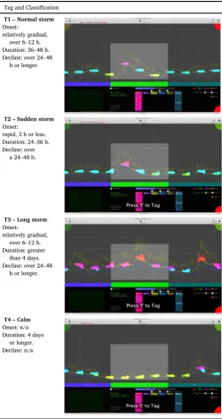
Storm events were identified with an arbitrary threshold of Hs>6 m. They range from single to multi-day duration, each with distinctive characteristics. The most obvious features of the visual characterization were tagged for subsequent analysis (Table 1). Observations fell into four categories: normal storms, sudden storms, long storms and calm periods (T1-T4) with other remarkable features being tagged as T0.
3.3. Interpretation
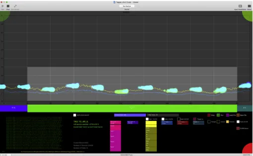
A timeline of the storm events identified is shown (Fig. 3) for the 10-year dataset including the different categories of storm identified. The new insights obtained through the animated visual analysis are: 1) characterization of different storm categories and 2) identification of other events (e.g. calm periods). One category, the‘sudden storm’could be subsequently detected through an automated algorithm, but this category would not have been evident without reconnaissance viewing and the benefit of hindsight. After the second or third viewing, more wave character events become evident, e.g. lengthy elevated wave ac-tivity, a ‘substorm’that falls below the level of a full storm (Fig. 4). Hence, there is also considerable potential for other observations that are more difficult to categorise.
We compare a conventional analysis (Hemer, 2010) counting
‘exceedances’with the animated visual analysis (this case study) total storm counts (Fig. 5). The total counts are comparable with a shift relating to the chosen threshold levels. Our study, however, adds the ability to characterise qualitatively the storms, and also to show other useful characteristics of the wave climate, i.e. the propensity for long calms, and long‘substorms’which may be of utility in assessing the potential for marine operations or wave power initiatives. While the value of the event characterization may have to be experienced by the analyst to be fully appreciated, it is evident (i.e. fromTable 1) that there is great value in being able to add enhanced information to conventional analyses and further explore features of the data.
4. Discussion
4.1. New capacity in data analysis
Foremost in our criteria regarding the appraisal of animated anal-ysis, and the Tagger application, is whether the visualisation recon-naissance process makes a positive difference in analysis and knowledge generation. The full potential of this analysis will be clear only to those who have run a full dataset 2 or 3 times, however, we have been convinced by our experience of the new insights that emerge from such an approach. As evidenced through use of the new application, animated analysis has proven successful in making possible 1) the visual reconnaissance analysis of a large dataset and 2) the identification of previously unrecognised events. Feature characteristics and captured metadata could potentially be translated into algorithmic constraints for ongoing automated analysis (Fayyad and Smyth, 1999; Amershi et al., 2014; Hammer et al., 2014).
One strong feature is the ability to make a key connection between modelled scenarios (e.g. Hemer et al., 2010) and the experienced result of such scenarios (e.g. different storm types). This has signifi -cance in the translation of research to practical outcomes for industry and community. A further strong feature is the ability to connect spot observations to models of wide scope. Where on-ground observations exist over a suitable time frame, the application will facilitate feedback into general models with the potential for more effective ground-truthing of such models. It is also worth emphasizing the added value that comes from being able to view efficiently a long run of data: features emerge that would not otherwise be identified by standard means.
4.2. Limitations
Tagger is alpha-stage research software. It is robust (having never crashed during our case study) but could undergo further performance optimization. It requires a fast computer with a high-end GPU and 8GBþRAM to run smoothly, and Mac OSX 10.10þwith a run-time environment that includes XCode Tools and QC plugins. We anticipate porting the VPL architecture of Tagger from QC to Vuo (Vuo Developers, 2016) or Origami Studio (Facebook Design, 2016), analogous VPLs developed in response to the uncertain support and development of QC by Apple. Vuo and Origami Studio will have near feature-parity with QC, modern faster implementations of OpenGL, as well as cross-platform support.
[image:5.595.39.289.97.566.2]A short-coming of the interactive analysis is eventual user fatigue, with the risk of human errors affecting the taggedfile. We recommend a few minutes break every half hour to a maximum of about 5 h in one day. A related remark is that human interaction is dependent upon the decisions and consistency of the end-user. Hence, Tagger is intended as a tool for first-pass visualisation of data, for annotating and developing a sense of what is occurring in the data. With practice, as with any tool, we anticipate that repeat runs will inform the devel-opment of insight. Tagged data can be subjected to quantitative analysis, informed by the visual reconnaissance, as part of the scien-tist's analytical toolkit.
Table 1
Visual characterisations of storm events made for a decade of Waverider Buoy data from Cape Sorell. The visualisation screen shots show enhanced visualisation using particle streams. The pale centre rectangle indicates the data subset that is captured and written to
file with each‘Tag’, for subsequent analysis. Tag and Classification
T1–Normal storm
Onset: relatively gradual,
over 6–12 h. Duration: 36–48 h. Decline: over 24–48
h or longer.
T2–Sudden storm
Onset: rapid, 3 h or less. Duration: 24–36 h. Decline: over
a 24–48 h.
T3–Long storm
Onset: relatively gradual,
over 6–12 h. Duration: greater
than 4 days. Decline: over 24–48
h or longer.
T4–Calm
Onset: n/a Duration: 4 days
4.3. Flexible application
Tagger can be used to analyze visually a wide variety of numerical data, represented as 1-D value series, optionally, multiple 1-D series. Examples of these include other types of buoy or time variant sensor data, borehole depth-relative data and spatial transects. The data should be formatted as a local. csv/.txt or remote NetCDFfile, with appropriate OPeNDAP query structures. Tagger can be configured to ingest data over a network, for human expert analysis.
Quartz Composer is extremely versatile in its output beyond the conventional 2D screen display interface used in the case study
[image:6.595.137.458.53.229.2](Supplement 3). The Tagger GUI has been developed in various trial versions to demonstrate the utility of a 3D GUI, with multiple graphs displayed in an XYZ coordinate space. Its outputs can be arbitrarily mapped to other types of scenarios, such as immersive dome projec-tion (e.g. fulldome display), projecprojec-tion mapping (multiple projectors in arbitrary arrangement) and for augmented reality (AR) and virtual reality headsets (e.g. Oculus Rift)(Morse et al., 2015). It can also accept inputs from a variety of interface devices, extending the mo-dalities of user interaction beyond conventional mouse/key-board input.
Fig. 3.Summary of storm event types identified during the animated analysis of a decade (2000–2009) of wave height data from the Cape Sorell Waverider Buoy.
[image:6.595.43.554.265.580.2]5. Conclusions
We have demonstrated the utility of a highly performant OpenGL GPU-based software tool for the animated analysis of time-series geo-sciences data. The software has successfully interrogated a cloud-based data repository running a THREDDS data server, delivering requested data subsets of NetCDFfiles via OPeNDAP queries. Features include the ability to customise visual enhancements to aid feature identification by a human observer. Data throughflow may also be varied to match the desired analysis task and optimise human interaction. As a demonstra-tion case study, our software has been used to characterise qualitatively a variety of different storm and non-storm events in Waverider Buoy data in a manner that complements conventional statistical analysis or static graphing.
Increasing volumes and complexities of data in the earth sciences demand new ways of interrogating the data, including the development of innovative forms of human-computer interaction that can facilitate discovery of underlying characteristics and patterns. The ability to interface highly-performant GPU-based OpenGL software with a cloud-hosted TDS system has broad applicability. Tagger extends the capa-bility of visual analytics in a geosciences context.
Acknowledgements
PM holds a Tasmanian Graduate Research Scholarship from the University of Tasmania. Cape Sorell Waverider Buoy data are recorded and made available through a joint initiative Australian Bureau of Meterology/CSIRO Marine and Atmospheric Research initiative. The authors thank Mark Hemer for his expertise regarding the Cape Sorell Waverider Buoy data used in the case study, and thank Daniel Keim and Stephen Hardy for their insights from conference presentations and other discussions. The manuscript has been improved by constructive com-ments from two anonymous reviewers.
Tagger is available on Github:https://github.com/pemorse/Tagger.
Appendix A. Supplementary data
Supplementary data related to this article can be found athttp://dx. doi.org/10.1016/j.cageo.2017.07.006.
References
Ahern, S., Brugger, E., Whitlock, B., Meredith, J.S., Biagas, K., Miller, M.C., Childs, H., 2013. VisIt Experiences with sustainable software. arXiv Prepr. arXiv:1309.1796.
Amershi, S., Cakmak, M., Knox, W.B., Kulesza, T., 2014.“Power to the people: the role of humans in interactive machine learning. AI Mag. 35 (no. 4), 105–120.
Apple Computer, 2007. Quartz Composer User Guide.https://developer.apple.com/ library/mac/documentation/GraphicsImaging/Conceptual/
QuartzComposerUserGuide/qc_intro/qc_intro.html. (Accessed 25 August 2016). Australian Bureau of Meteorology, 2016. Cape Sorell Waverider Buoy Observations.
http://www.bom.gov.au/products/IDT65015.shtml. (Accessed 27 January 2016).
Bard, D., Bellis, M., Allen, M.T., Yepremyan, H., Kratochvil, J.M., 2013. Cosmological calculations on the GPU. Astronomy Comput. 1, 17–22.
Campbell-Kelly, M., 2003. The History of Mathematical Tables: from Sumer to Spreadsheets. Oxford University Press.
Carpenter, P.A., Shah, P., 1998. A model of the perceptual and conceptual processes in graph comprehension. J. Exp. Psychol. Appl. 4 (no. 2), 75.
Continuum Analytics, 2015. Bokeh Python Library.http://bokeh.pydata.org. (Accessed 19 January 2016).
Cuntz, N., Kolb, A., Leidl, M., Rezk-Salama, C., B€ottinger, M., 2007. GPU-based dynamic flow visualization for climate research applications. SimVis 371–384.
Facebook Design, 2016. Origami Studio.https://facebook.github.io/origami/. (Accessed 22 August 2016).
Fayyad, U.M., Smyth, P., 1999. Cataloging and mining massive datasets for science data analysis. J. Comput. Graph. Statistics 8 (no. 3), 589–610.
Few, S., 2009. Now You See it: Simple Visualization Techniques for Quantitative Analysis. Analytics Press.
Few, S., 2015. Signal: Understanding what Matters in a World of Noise. Analytics Press.
Fogal, T., Childs, H., Shankar, S., Krüger, J., Bergeron, R.D., Hatcher, P., 2010. Large data visualization on distributed memory multi-GPU clusters. In: Proceedings of the Conference on High Performance Graphics, pp. 57–66.
Friel, S.N., Curcio, F.R., Bright, G.W., 2001. Making sense of graphs: critical factors influencing comprehension and instructional implications. J. Res. Math. Educ. 124–158.
Guha, S., Krisnan, S., Venkatasubramanian, S., 2005. Data visualization and mining using the gpu. In: Tutorial at ACM SIGKDD, vol. 5.
Hammer, B., He, H., Martinetz, T., 2014. Learning and modelling big data. In: ESANN 2014 Proceedings.
Healey, C.G., Enns, J.T., 2012. Attention and visual memory in visualization and computer graphics. IEEE Trans. Vis. Comput. Graph. 18 (no. 7), 1170–1188.
Hemer, M.A., 2010. Historical trends in Southern Ocean storminess: long-term variability of extreme wave heights at Cape Sorell, Tasmania. Geophys. Res. Lett. 37 (no. 18).
Hemer, M.A., Church, J.A., Hunter, J.R., 2010. Variability and trends in the directional wave climate of the Southern Hemisphere. Int. J. Climatol. 30 (no. 4), 475–491.
Henderson, A., Ahrens, J., Law, C., et al., 2004. The ParaView Guide. Kitware, Clifton Park, NY.
Herman, I., Melançon, G., Marshall, M.S., 2000. Graph visualization and navigation in information visualization: a survey. Vis. Comput. Graph. IEEE Trans. 6 (no. 1), 24–43.
Hey, A.J., Tansley, S., Tolle, K.M., et al., 2009. The Fourth Paradigm: Data-intensive Scientific Discovery. Microsoft Research, Redmond, WA.
Hunter, J.D., 2007. Matplotlib: a 2D graphics environment. Comput. Sci. Eng. 9 (no. 3), 90–95.
K€ahler, R., Wise, J., Abel, T., Hege, H.-C., 2006. GPU-assisted raycasting for cosmological adaptive mesh refinement simulations. In: Machiraju, R., M€oller, T. (Eds.), Eurographics/IEEE VGTC Workshop on Volume Graphics (Boston, Massachusetts, USA, 2006). Eurographics Association, pp. 103–110.
Keim, D., Andrienko, G., Fekete, J.-D., G€org, C., Kohlhammer, J., Melançon, G., 2008. Visual Analytics: Definition, Process, and Challenges. Springer.
Khronos Group, 2016. OpenVG.https://www.khronos.org/openvg/. (Accessed 27 January 2016).
Kitware, 2016. Visualization Toolkit (VTK).http://www.vtk.org. (Accessed 27 January 2016).
Kloss, G.K., 2009. Python data plotting and visualisation extravaganza. In: Proceedings of the First Kiwi PyCon (New Zealand). Christchurch: the Python Papers Monograph.
Liu, S., Cui, W., Wu, Y., Liu, M., 2014. A survey on information visualization: recent advances and challenges. Vis. Comput. 30 (no. 12), 1373–1393.
Macaulay, C., 2009. Tracking bigger wave action. ECOS Mag.
Michalakes, J., Vachharajani, M., 2008. GPU acceleration of numerical weather prediction. Parallel Process. Lett. 18 (no. 04), 531–548.
Morse, P., Reading, A., Lueg, C., Kenderdine, S., 2015. TaggerVR: interactive data analytics for geoscience-a novel interface for interactive visual analytics of large geoscientific datasets in cloud repositories. In: Big Data Visual Analytics (BDVA), 2015, pp. 1–2.
Munzner, T., 2014. Visualization Analysis and Design. CRC Press.
National Research Infrastructure for Australia, 2016. NeCTAR Research Cloud.https:// www.nectar.org.au. (Accessed 27 January 2016).
Rautenhaus, M., Kern, M., Sch€afler, A., Westermann, R., 2015.“Three-dimensional visualization of ensemble weather forecasts-Part 1: the visualization tool Met. 3D (version 1.0). Geosci. Model Dev. 8 (no. 7), 2329–2353.
Rossant, C., Harris, K.D., 2013.“Hardware-accelerated interactive data visualization for neuroscience in Python. Front. Neuroinformatics 7.
Ryabinin, K., Chuprina, S., 2013.“Adaptive scientific visualization system for desktop computers and mobile devices. Procedia Comput. Sci. 18, 722–731.
Sainio, J., 2010. CUDAEASY-a GPU accelerated cosmological lattice program. Comput. Phys. Commun. 181 (no. 5), 906–912.
Sellars, S., Nguyen, P., Chu, W., Gao, X., Hsu, K., Sorooshian, S., 2013. Computational earth science: big data transformed into insight. Eos, Trans. Am. Geophys. Union 94 (no. 32), 277–278.
Sousa, T.B., 2012. Dataflow programming concept, languages and applications. In: Doctoral Symposium on Informatics Engineering.
Thomas, J.J., Cook, K.A., 2005. Illuminating the Path: the Research and Development Agenda for Visual Analytics. IEEE Computer Society Press.
Tufte, E.R., 1990. Envisioning Information. Graphics Press.
Tufte, E.R., 1997. Visual Explanations: Images and Quantities, Evidence and Narrative. Graphics Press, Cheshire, CT.
Victor, B., 2005. Magic Ink: Information Software and the Graphical Interface, 2005.
http://worrydream.com/MagicInk/. (Accessed 28 April 2016).
VisPy Developers, 2015. Vispy Python Library.http://vispy.org/. (Accessed 19 January 2016).
Vuo Developers, 2016. Vuo.https://vuo.org. (Accessed 27 January 2016).
Walker, J., Borgo, R., Jones, M.W., 2016. TimeNotes: a study on effective chart visualization and interaction techniques for time-series data. Vis. Comput. Graph. IEEE Trans. 22 (no. 1), 549–558.
Ward, M.O., Grinstein, G., Keim, D., 2010. Interactive Data Visualization: Foundations, Techniques, and Applications. CRC Press.