OpenIntro Statistics
Third Edition
David M Diez
Quantitative Analyst [email protected]
Christopher D Barr
Graduate Student Yale School of Management
Mine C
¸ etinkaya-Rundel
Assistant Professor of the Practice Department of Statistics
Duke University [email protected]
There is a download icon above!
If you’d like to buy the book, visit
openintro.org/os/amazon
Updated: August 19th, 2017.
Contents
1 Introduction to data 7
1.1 Case study: using stents to prevent strokes . . . 7
1.2 Data basics . . . 9
1.3 Overview of data collection principles . . . 15
1.4 Observational studies and sampling strategies . . . 19
1.5 Experiments. . . 24
1.6 Examining numerical data . . . 26
1.7 Considering categorical data. . . 43
1.8 Case study: gender discrimination (special topic) . . . 50
1.9 Exercises . . . 55
2 Probability (special topic) 76 2.1 Defining probability (special topic) . . . 76
2.2 Conditional probability (special topic) . . . 88
2.3 Sampling from a small population (special topic) . . . 102
2.4 Random variables (special topic) . . . 104
2.5 Continuous distributions (special topic) . . . 113
2.6 Exercises . . . 116
3 Distributions of random variables 127 3.1 Normal distribution . . . 127
3.2 Evaluating the normal approximation . . . 137
3.3 Geometric distribution (special topic) . . . 141
3.4 Binomial distribution (special topic) . . . 145
3.5 More discrete distributions (special topic) . . . 152
3.6 Exercises . . . 158
4 Foundations for inference 168 4.1 Variability in estimates. . . 169
4.2 Confidence intervals . . . 174
4.3 Hypothesis testing . . . 180
4.4 Examining the Central Limit Theorem . . . 194
4.5 Inference for other estimators . . . 197
4.6 Exercises . . . 203
5 Inference for numerical data 219
5.1 One-sample means with thet-distribution . . . 219
5.2 Paired data . . . 228
5.3 Di↵erence of two means . . . 230
5.4 Power calculations for a di↵erence of means (special topic). . . 239
5.5 Comparing many means with ANOVA (special topic). . . 246
5.6 Exercises . . . 257
6 Inference for categorical data 274 6.1 Inference for a single proportion. . . 274
6.2 Di↵erence of two proportions . . . 280
6.3 Testing for goodness of fit using chi-square (special topic) . . . 286
6.4 Testing for independence in two-way tables (sp. topic) . . . 297
6.5 Small sample hypothesis testing for a proportion (special topic) . . . 302
6.6 Randomization test (special topic) . . . 307
6.7 Exercises . . . 312
7 Introduction to linear regression 331 7.1 Line fitting, residuals, and correlation . . . 333
7.2 Fitting a line by least squares regression . . . 340
7.3 Types of outliers in linear regression . . . 349
7.4 Inference for linear regression . . . 351
7.5 Exercises . . . 356
8 Multiple and logistic regression 372 8.1 Introduction to multiple regression . . . 372
8.2 Model selection . . . 378
8.3 Checking model assumptions using graphs . . . 382
8.4 Introduction to logistic regression . . . 386
8.5 Exercises . . . 395
A End of chapter exercise solutions 405 B Distribution tables 427 B.1 Normal Probability Table . . . 427
B.2 t-Probability Table . . . 430
Preface
This book may be downloaded as a free PDF atopenintro.org.
We hope readers will take away three ideas from this book in addition to forming a foun-dation of statistical thinking and methods.
(1) Statistics is an applied field with a wide range of practical applications. (2) You don’t have to be a math guru to learn from real, interesting data.
(3) Data are messy, and statistical tools are imperfect. But, when you understand the strengths and weaknesses of these tools, you can use them to learn about the real world.
Textbook overview
The chapters of this book are as follows:
1. Introduction to data. Data structures, variables, summaries, graphics, and basic data collection techniques.
2. Probability (special topic). The basic principles of probability. An understanding of this chapter is not required for the main content in Chapters3-8.
3. Distributions of random variables. Introduction to the normal model and other key distributions.
4. Foundations for inference. General ideas for statistical inference in the context of estimating the population mean.
5. Inference for numerical data. Inference for one or two sample means using the
t-distribution, and also comparisons of many means using ANOVA.
6. Inference for categorical data. Inference for proportions using the normal and chi-square distributions, as well as simulation and randomization techniques.
7. Introduction to linear regression. An introduction to regression with two variables. Most of this chapter could be covered after Chapter1.
8. Multiple and logistic regression. A light introduction to multiple regression and logistic regression for an accelerated course.
OpenIntro Statistics was written to allow flexibility in choosing and ordering course
topics. The material is divided into two pieces: main text and special topics. The main text has been structured to bring statistical inference and modeling closer to the front of a course. Special topics, labeled in the table of contents and in section titles, may be added to a course as they arise naturally in the curriculum.
Videos for sections and calculators
The icon indicates that a section or topic has a video overview readily available. The icons are hyperlinked in the textbook PDF, and the videos may also be found at
www.openintro.org/stat/videos.php
Examples, exercises, and appendices
Examples and Guided Practice throughout the textbook may be identified by their distinc-tive bullets:
Example 0.1 Large filled bullets signal the start of an example.
Full solutions to examples are provided and may include an accompanying table or figure.
J
Guided Practice 0.2 Large empty bullets signal to readers that an exercise has been inserted into the text for additional practice and guidance. Students may find it useful to fill in the bullet after understanding or successfully completing the exercise. Solutions are provided for all Guided Practice in footnotes.1
There are exercises at the end of each chapter for practice or homework assignments. Odd-numbered exercise solutions are in Appendix A. Probability tables for the normal, t, and chi-square distributions are in Appendix B.
OpenIntro, online resources, and getting involved
OpenIntro is an organization focused on developing free and a↵ordable education materials.
OpenIntro Statistics is intended for introductory statistics courses at the college level.
We o↵er another title,Advanced High School Statistics, for high school courses.
We encourage anyone learning or teaching statistics to visitopenintro.org and get involved. We also provide many free online resources, including free course software. Data sets for this textbook are available on the website and through a companion R package.2 All
of these resources are free and may be used with or without this textbook as a companion. We value your feedback. If there is a particular component of the project you especially like or think needs improvement, we want to hear from you. You may find our contact information on the title page of this book or on theAboutsection ofopenintro.org.
Acknowledgements
This project would not be possible without the passion and dedication of all those involved. The authors would like to thank the OpenIntro Sta↵ for their involvement and ongoing contributions. We are also very grateful to the hundreds of students and instructors who have provided us with valuable feedback over the last several years.
1Full solutions are located down here in the footnote!
2Diez DM, Barr CD, C¸ etinkaya-Rundel M. 2015. openintro: OpenIntro data sets and supplement
Chapter 1
Introduction to data
Scientists seek to answer questions using rigorous methods and careful observations. These observations – collected from the likes of field notes, surveys, and experiments – form the backbone of a statistical investigation and are called data. Statistics is the study of how best to collect, analyze, and draw conclusions from data. It is helpful to put statistics in the context of a general process of investigation:
1. Identify a question or problem. 2. Collect relevant data on the topic. 3. Analyze the data.
4. Form a conclusion.
Statistics as a subject focuses on making stages 2-4 objective, rigorous, and efficient. That is, statistics has three primary components: How best can we collect data? How should it be analyzed? And what can we infer from the analysis?
The topics scientists investigate are as diverse as the questions they ask. However, many of these investigations can be addressed with a small number of data collection techniques, analytic tools, and fundamental concepts in statistical inference. This chapter provides a glimpse into these and other themes we will encounter throughout the rest of the book. We introduce the basic principles of each branch and learn some tools along the way. We will encounter applications from other fields, some of which are not typically associated with science but nonetheless can benefit from statistical study.
1.1
Case study: using stents to prevent strokes
Section 1.1introduces a classic challenge in statistics: evaluating the efficacy of a medical treatment. Terms in this section, and indeed much of this chapter, will all be revisited later in the text. The plan for now is simply to get a sense of the role statistics can play in practice.
In this section we will consider an experiment that studies e↵ectiveness of stents in treating patients at risk of stroke.1 Stents are devices put inside blood vessels that assist
1Chimowitz MI, Lynn MJ, Derdeyn CP, et al. 2011. Stenting versus Aggressive
Med-ical Therapy for Intracranial Arterial Stenosis. New England Journal of Medicine
365:993-1003. www.nejm.org/doi/full/10.1056/NEJMoa1105335. NY Times article reporting on the study:
www.nytimes.com/2011/09/08/health/research/08stent.html.
in patient recovery after cardiac events and reduce the risk of an additional heart attack or death. Many doctors have hoped that there would be similar benefits for patients at risk of stroke. We start by writing the principal question the researchers hope to answer:
Does the use of stents reduce the risk of stroke?
The researchers who asked this question collected data on 451 at-risk patients. Each volunteer patient was randomly assigned to one of two groups:
Treatment group. Patients in the treatment group received a stent and medical management. The medical management included medications, management of risk factors, and help in lifestyle modification.
Control group. Patients in the control group received the same medical manage-ment as the treatmanage-ment group, but they did not receive stents.
Researchers randomly assigned 224 patients to the treatment group and 227 to the control group. In this study, the control group provides a reference point against which we can measure the medical impact of stents in the treatment group.
Researchers studied the e↵ect of stents at two time points: 30 days after enrollment and 365 days after enrollment. The results of 5 patients are summarized in Table 1.1. Patient outcomes are recorded as “stroke” or “no event”, representing whether or not the patient had a stroke at the end of a time period.
Patient group 0-30 days 0-365 days 1 treatment no event no event 2 treatment stroke stroke 3 treatment no event no event ..
. ... ...
450 control no event no event 451 control no event no event
Table 1.1: Results for five patients from the stent study.
Considering data from each patient individually would be a long, cumbersome path towards answering the original research question. Instead, performing a statistical data analysis allows us to consider all of the data at once. Table1.2summarizes the raw data in a more helpful way. In this table, we can quickly see what happened over the entire study. For instance, to identify the number of patients in the treatment group who had a stroke within 30 days, we look on the left-side of the table at the intersection of the treatment and stroke: 33.
0-30 days 0-365 days stroke no event stroke no event
treatment 33 191 45 179
control 13 214 28 199
Total 46 405 73 378
1.2. DATA BASICS 9
J
Guided Practice 1.1 Of the 224 patients in the treatment group, 45 had a stroke by the end of the first year. Using these two numbers, compute the proportion of patients in the treatment group who had a stroke by the end of their first year. (Please note: answers to all Guided Practice exercises are provided using footnotes.)2
We can compute summary statistics from the table. Asummary statisticis a single number summarizing a large amount of data.3 For instance, the primary results of the
study after 1 year could be described by two summary statistics: the proportion of people who had a stroke in the treatment and control groups.
Proportion who had a stroke in the treatment (stent) group: 45/224 = 0.20 = 20%.
Proportion who had a stroke in the control group: 28/227 = 0.12 = 12%.
These two summary statistics are useful in looking for di↵erences in the groups, and we are in for a surprise: an additional 8% of patients in the treatment group had a stroke! This is important for two reasons. First, it is contrary to what doctors expected, which was that stents would reduce the rate of strokes. Second, it leads to a statistical question: do the data show a “real” di↵erence between the groups?
This second question is subtle. Suppose you flip a coin 100 times. While the chance a coin lands heads in any given coin flip is 50%, we probably won’t observe exactly 50 heads. This type of fluctuation is part of almost any type of data generating process. It is possible that the 8% di↵erence in the stent study is due to this natural variation. However, the larger the di↵erence we observe (for a particular sample size), the less believable it is that the di↵erence is due to chance. So what we are really asking is the following: is the di↵erence so large that we should reject the notion that it was due to chance?
While we don’t yet have our statistical tools to fully address this question on our own, we can comprehend the conclusions of the published analysis: there was compelling evidence of harm by stents in this study of stroke patients.
Be careful: do not generalize the results of this study to all patients and all stents. This study looked at patients with very specific characteristics who volunteered to be a part of this study and who may not be representative of all stroke patients. In addition, there are many types of stents and this study only considered the self-expanding Wingspan stent (Boston Scientific). However, this study does leave us with an important lesson: we should keep our eyes open for surprises.
1.2
Data basics
E↵ective presentation and description of data is a first step in most analyses. This section introduces one structure for organizing data as well as some terminology that will be used throughout this book.
1.2.1
Observations, variables, and data matrices
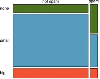
Table 1.3displays rows 1, 2, 3, and 50 of a data set concerning 50 emails received during early 2012. These observations will be referred to as the email50data set, and they are a random sample from a larger data set that we will see in Section1.7.
2The proportion of the 224 patients who had a stroke within 365 days: 45/224 = 0.20.
3Formally, a summary statistic is a value computed from the data. Some summary statistics are more
spam num char line breaks format number
1 no 21,705 551 html small
2 no 7,011 183 html big
3 yes 631 28 text none
..
. ... ... ... ... ... 50 no 15,829 242 html small
Table 1.3: Four rows from theemail50data matrix.
variable description
spam Specifies whether the message was spam
num char The number of characters in the email
line breaks The number of line breaks in the email (not including text wrapping)
format Indicates if the email contained special formatting, such as bolding, tables, or links, which would indicate the message is in HTML format
number Indicates whether the email contained no number, a small number (under 1 million), or a large number
Table 1.4: Variables and their descriptions for theemail50data set.
Each row in the table represents a single email orcase.4 The columns represent
char-acteristics, called variables, for each of the emails. For example, the first row represents email 1, which is a not spam, contains 21,705 characters, 551 line breaks, is written in HTML format, and contains only small numbers.
In practice, it is especially important to ask clarifying questions to ensure important aspects of the data are understood. For instance, it is always important to be sure we know what each variable means and the units of measurement. Descriptions of all five email variables are given in Table 1.4.
The data in Table1.3 represent adata matrix, which is a common way to organize data. Each row of a data matrix corresponds to a unique case, and each column corresponds to a variable. A data matrix for the stroke study introduced in Section 1.1 is shown in Table1.1 on page 8, where the cases were patients and there were three variables recorded for each patient.
Data matrices are a convenient way to record and store data. If another individual or case is added to the data set, an additional row can be easily added. Similarly, another column can be added for a new variable.
J
Guided Practice 1.2 We consider a publicly available data set that summarizes information about the 3,143 counties in the United States, and we call this thecounty
data set. This data set includes information about each county: its name, the state where it resides, its population in 2000 and 2010, per capita federal spending, poverty rate, and five additional characteristics. How might these data be organized in a data matrix? Reminder: look in the footnotes for answers to in-text exercises.5
Seven rows of thecountydata set are shown in Table1.5, and the variables are summarized in Table1.6. These data were collected from the US Census website.6
4A case is also sometimes called aunit of observationor anobservational unit.
5Each county may be viewed as a case, and there are eleven pieces of information recorded for each
case. A table with 3,143 rows and 11 columns could hold these data, where each row represents a county and each column represents a particular piece of information.
all variables
numerical categorical
continuous discrete (unordered categorical)nominal
ordinal
(ordered categorical)
Figure 1.7: Breakdown of variables into their respective types.
1.2.2
Types of variables
Examine the fed spend,pop2010, state, andsmoking ban variables in thecountydata set. Each of these variables is inherently di↵erent from the other three yet many of them share certain characteristics.
First considerfed spend, which is said to be anumerical variable since it can take a wide range of numerical values, and it is sensible to add, subtract, or take averages with those values. On the other hand, we would not classify a variable reporting telephone area codes as numerical since their average, sum, and di↵erence have no clear meaning.
The pop2010 variable is also numerical, although it seems to be a little di↵erent than fed spend. This variable of the population count can only take whole non-negative numbers (0, 1,2, ...). For this reason, the population variable is said to bediscretesince it can only take numerical values with jumps. On the other hand, the federal spending variable is said to becontinuous.
The variablestatecan take up to 51 values after accounting for Washington, DC:AL, ..., and WY. Because the responses themselves are categories,stateis called acategorical
variable, and the possible values are called the variable’slevels.
Finally, consider the smoking ban variable, which describes the type of county-wide smoking ban and takes values none, partial, or comprehensive in each county. This variable seems to be a hybrid: it is a categorical variable but the levels have a natural ordering. A variable with these properties is called an ordinalvariable, while a regular categorical variable without this type of special ordering is called a nominalvariable. To simplify analyses, any ordinal variables in this book will be treated as categorical variables.
Example 1.3 Data were collected about students in a statistics course. Three variables were recorded for each student: number of siblings, student height, and whether the student had previously taken a statistics course. Classify each of the variables as continuous numerical, discrete numerical, or categorical.
The number of siblings and student height represent numerical variables. Because the number of siblings is a count, it is discrete. Height varies continuously, so it is a continuous numerical variable. The last variable classifies students into two categories – those who have and those who have not taken a statistics course – which makes this variable categorical.
J
Guided Practice 1.4 Consider the variablesgroupandoutcome(at 30 days) from the stent study in Section1.1. Are these numerical or categorical variables?7
7There are only two possible values for each variable, and in both cases they describe categories. Thus,
1.2. DATA BASICS 13
F
eder
al Spending P
er Capita
0 10 20 30 40 50
0 10 20 30
Poverty Rate (Percent)
●
32 counties with higher federal spending are not shown
Figure 1.8: A scatterplot showing fed spend against poverty. Owsley County of Kentucky, with a poverty rate of 41.5% and federal spending of
$21.50 per capita, is highlighted.
1.2.3
Relationships between variables
Many analyses are motivated by a researcher looking for a relationship between two or more variables. A social scientist may like to answer some of the following questions:
(1) Is federal spending, on average, higher or lower in counties with high rates of poverty? (2) If homeownership is lower than the national average in one county, will the percent of multi-unit structures in that county likely be above or below the national average? (3) Which counties have a higher average income: those that enact one or more smoking
bans or those that do not?
To answer these questions, data must be collected, such as thecountydata set shown in Table 1.5. Examining summary statistics could provide insights for each of the three questions about counties. Additionally, graphs can be used to visually summarize data and are useful for answering such questions as well.
Scatterplots are one type of graph used to study the relationship between two nu-merical variables. Figure 1.8compares the variablesfed spendandpoverty. Each point on the plot represents a single county. For instance, the highlighted dot corresponds to County 1088 in thecounty data set: Owsley County, Kentucky, which had a poverty rate of 41.5% and federal spending of$21.50 per capita. The scatterplot suggests a relationship between the two variables: counties with a high poverty rate also tend to have slightly more federal spending. We might brainstorm as to why this relationship exists and investigate each idea to determine which is the most reasonable explanation.
J
Guided Practice 1.5 Examine the variables in the email50data set, which are described in Table 1.4 on page 10. Create two questions about the relationships between these variables that are of interest to you.8
8Two sample questions: (1) Intuition suggests that if there are many line breaks in an email then there
P
ercent of Homeo
wnership
0% 20% 40% 60% 80% 100%
0% 20% 40% 60% 80%
Percent of Units in Multi−Unit Structures
Figure 1.9: A scatterplot of homeownership versus the percent of units that are in multi-unit structures for all 3,143 counties. Interested readers may find an image of this plot with an additional third variable, county population, presented atwww.openintro.org/stat/down/MHP.png.
Thefed spendandpovertyvariables are said to be associated because the plot shows a discernible pattern. When two variables show some connection with one another, they are called associatedvariables. Associated variables can also be calleddependentvariables and vice-versa.
Example 1.6 This example examines the relationship between homeownership and the percent of units in multi-unit structures (e.g. apartments, condos), which is visualized using a scatterplot in Figure1.9. Are these variables associated?
It appears that the larger the fraction of units in multi-unit structures, the lower the homeownership rate. Since there is some relationship between the variables, they are associated.
Because there is a downward trend in Figure1.9– counties with more units in multi-unit structures are associated with lower homeownership – these variables are said to be
negatively associated. A positive association is shown in the relationship between thepovertyandfed spendvariables represented in Figure1.8, where counties with higher poverty rates tend to receive more federal spending per capita.
If two variables are not associated, then they are said to be independent. That is, two variables are independent if there is no evident relationship between the two.
Associated or independent, not both
1.3. OVERVIEW OF DATA COLLECTION PRINCIPLES 15
1.3
Overview of data collection principles
The first step in conducting research is to identify topics or questions that are to be inves-tigated. A clearly laid out research question is helpful in identifying what subjects or cases should be studied and what variables are important. It is also important to consider how
data are collected so that they are reliable and help achieve the research goals.
1.3.1
Populations and samples
Consider the following three research questions:
1. What is the average mercury content in swordfish in the Atlantic Ocean?
2. Over the last 5 years, what is the average time to complete a degree for Duke under-graduate students?
3. Does a new drug reduce the number of deaths in patients with severe heart disease?
Each research question refers to a target population. In the first question, the target population is all swordfish in the Atlantic ocean, and each fish represents a case. Often times, it is too expensive to collect data for every case in a population. Instead, a sample is taken. A sample represents a subset of the cases and is often a small fraction of the population. For instance, 60 swordfish (or some other number) in the population might be selected, and this sample data may be used to provide an estimate of the population average and answer the research question.
J Guided Practice 1.7 For the second and third questions above, identify the target
population and what represents an individual case.9
1.3.2
Anecdotal evidence
Consider the following possible responses to the three research questions:
1. A man on the news got mercury poisoning from eating swordfish, so the average mercury concentration in swordfish must be dangerously high.
2. I met two students who took more than 7 years to graduate from Duke, so it must take longer to graduate at Duke than at many other colleges.
3. My friend’s dad had a heart attack and died after they gave him a new heart disease drug, so the drug must not work.
Each conclusion is based on data. However, there are two problems. First, the data only represent one or two cases. Second, and more importantly, it is unclear whether these cases are actually representative of the population. Data collected in this haphazard fashion are called anecdotal evidence.
9(2) Notice that the first question is only relevant to students who complete their degree; the average
cannot be computed using a student who never finished her degree. Thus, only Duke undergraduate students who have graduated in the last five years represent cases in the population under consideration.
Each such student would represent an individual case. (3) A person with severe heart disease represents a
Figure 1.10: In February 2010, some media pundits cited one large snow storm as valid evidence against global warming. As comedian Jon Stewart pointed out, “It’s one storm, in one region, of one country.”
Anecdotal evidence
Be careful of data collected in a haphazard fashion. Such evidence may be true and verifiable, but it may only represent extraordinary cases.
Anecdotal evidence typically is composed of unusual cases that we recall based on their striking characteristics. For instance, we are more likely to remember the two people we met who took 7 years to graduate than the six others who graduated in four years. Instead of looking at the most unusual cases, we should examine a sample of many cases that represent the population.
1.3.3
Sampling from a population
We might try to estimate the time to graduation for Duke undergraduates in the last 5 years by collecting a sample of students. All graduates in the last 5 years represent the
population, and graduates who are selected for review are collectively called the sample.
In general, we always seek to randomly select a sample from a population. The most basic type of random selection is equivalent to how ra✏es are conducted. For example, in selecting graduates, we could write each graduate’s name on a ra✏e ticket and draw 100 tickets. The selected names would represent a random sample of 100 graduates.
Why pick a sample randomly? Why not just pick a sample by hand? Consider the following scenario.
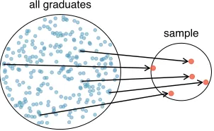
Example 1.8 Suppose we ask a student who happens to be majoring in nutrition to select several graduates for the study. What kind of students do you think she might collect? Do you think her sample would be representative of all graduates?
1.3. OVERVIEW OF DATA COLLECTION PRINCIPLES 17
all graduates
[image:17.576.202.353.68.161.2]sample
Figure 1.11: In this graphic, five graduates are randomly selected from the population to be included in the sample.
all graduates
sample
graduates from health−related fields
Figure 1.12: Instead of sampling from all graduates equally, a nutrition major might inadvertently pick graduates with health-related majors dis-proportionately often.
If someone was permitted to pick and choose exactly which graduates were included in the sample, it is entirely possible that the sample could be skewed to that person’s inter-ests, which may be entirely unintentional. This introduces bias into a sample. Sampling randomly helps resolve this problem. The most basic random sample is called a simple random sample, and which is equivalent to using a ra✏e to select cases. This means that each case in the population has an equal chance of being included and there is no implied connection between the cases in the sample.
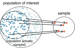
The act of taking a simple random sample helps minimize bias. However, bias can crop up in other ways. Even when people are picked at random, e.g. for surveys, caution must be exercised if the non-response is high. For instance, if only 30% of the people randomly sampled for a survey actually respond, then it is unclear whether the results are
representative of the entire population. Thisnon-response bias can skew results. Another common downfall is aconvenience sample, where individuals who are easily accessible are more likely to be included in the sample. For instance, if a political survey is done by stopping people walking in the Bronx, this will not represent all of New York City. It is often difficult to discern what sub-population a convenience sample represents.
J Guided Practice 1.9 We can easily access ratings for products, sellers, and
com-panies through websites. These ratings are based only on those people who go out of their way to provide a rating. If 50% of online reviews for a product are negative, do you think this means that 50% of buyers are dissatisfied with the product?10
10Answers will vary. From our own anecdotal experiences, we believe people tend to rant more about
[image:17.576.203.352.211.305.2]population of interest
sample
[image:18.576.197.356.65.169.2]population actually sampled
Figure 1.13: Due to the possibility of non-response, surveys studies may only reach a certain group within the population. It is difficult, and often times impossible, to completely fix this problem.
1.3.4
Explanatory and response variables
Consider the following question from page13for thecountydata set:
(1) Is federal spending, on average, higher or lower in counties with high rates of poverty?
If we suspect poverty might a↵ect spending in a county, then poverty is theexplanatory
variable and federal spending is the responsevariable in the relationship.11 If there are
many variables, it may be possible to consider a number of them as explanatory variables.
TIP: Explanatory and response variables
To identify the explanatory variable in a pair of variables, identify which of the two is suspected of a↵ecting the other and plan an appropriate analysis.
might affect explanatory
variable
response variable
Caution: association does not imply causation
Labeling variables asexplanatoryandresponse does not guarantee the relationship between the two is actually causal, even if there is an association identified between the two variables. We use these labels only to keep track of which variable we suspect a↵ects the other.
In some cases, there is no explanatory or response variable. Consider the following question from page13:
(2) If homeownership is lower than the national average in one county, will the percent of multi-unit structures in that county likely be above or below the national average?
It is difficult to decide which of these variables should be considered the explanatory and response variable, i.e. the direction is ambiguous, so no explanatory or response labels are suggested here.
11Sometimes the explanatory variable is called theindependent variable and the response variable
is called the dependent variable. However, this becomes confusing since a pair of variables might be
1.4. OBSERVATIONAL STUDIES AND SAMPLING STRATEGIES 19
1.3.5
Introducing observational studies and experiments
There are two primary types of data collection: observational studies and experiments. Researchers perform anobservational studywhen they collect data in a way that does not directly interfere with how the data arise. For instance, researchers may collect information via surveys, review medical or company records, or follow a cohort of many similar individuals to study why certain diseases might develop. In each of these situations, researchers merely observe the data that arise. In general, observational studies can pro-vide epro-vidence of a naturally occurring association between variables, but they cannot by themselves show a causal connection.
When researchers want to investigate the possibility of a causal connection, they con-duct an experiment. Usually there will be both an explanatory and a response variable. For instance, we may suspect administering a drug will reduce mortality in heart attack patients over the following year. To check if there really is a causal connection between the explanatory variable and the response, researchers will collect a sample of individuals and split them into groups. The individuals in each group areassigned a treatment. When individuals are randomly assigned to a group, the experiment is called arandomized ex-periment. For example, each heart attack patient in the drug trial could be randomly assigned, perhaps by flipping a coin, into one of two groups: the first group receives a
placebo (fake treatment) and the second group receives the drug. See the case study in Section 1.1 for another example of an experiment, though that study did not employ a placebo.
TIP: association 6=causation
In general, association does not imply causation, and causation can only be inferred from a randomized experiment.
1.4
Observational studies and sampling strategies
1.4.1
Observational studies
Generally, data in observational studies are collected only by monitoring what occurs, while experiments require the primary explanatory variable in a study be assigned for each subject by the researchers.
Making causal conclusions based on experiments is often reasonable. However, making the same causal conclusions based on observational data can be treacherous and is not rec-ommended. Thus, observational studies are generally only sufficient to show associations.
J
Guided Practice 1.10 Suppose an observational study tracked sunscreen use and skin cancer, and it was found that the more sunscreen someone used, the more likely the person was to have skin cancer. Does this mean sunscreencauses skin cancer?12
Some previous research tells us that using sunscreen actually reduces skin cancer risk, so maybe there is another variable that can explain this hypothetical association between sunscreen usage and skin cancer. One important piece of information that is absent is sun exposure. If someone is out in the sun all day, she is more likely to use sunscreenand more likely to get skin cancer. Exposure to the sun is unaccounted for in the simple investigation.
sun exposure
use sunscreen
?
skin cancerSun exposure is what is called a confounding variable,13 which is a variable that
is correlated with both the explanatory and response variables. While one method to justify making causal conclusions from observational studies is to exhaust the search for confounding variables, there is no guarantee that all confounding variables can be examined or measured.
In the same way, the county data set is an observational study with confounding variables, and its data cannot easily be used to make causal conclusions.
J Guided Practice 1.11 Figure1.9shows a negative association between the
home-ownership rate and the percentage of multi-unit structures in a county. However, it is unreasonable to conclude that there is a causal relationship between the two vari-ables. Suggest one or more other variables that might explain the relationship visible in Figure1.9.14
Observational studies come in two forms: prospective and retrospective studies. A
prospective study identifies individuals and collects information as events unfold. For instance, medical researchers may identify and follow a group of similar individuals over many years to assess the possible influences of behavior on cancer risk. One example of such a study is The Nurses’ Health Study, started in 1976 and expanded in 1989.15
This prospective study recruits registered nurses and then collects data from them using questionnaires. Retrospective studies collect data after events have taken place, e.g. researchers may review past events in medical records. Some data sets, such as county, may contain both prospectively- and retrospectively-collected variables. Local governments prospectively collect some variables as events unfolded (e.g. retails sales) while the federal government retrospectively collected others during the 2010 census (e.g. county population counts).
1.4.2
Four sampling methods (special topic)
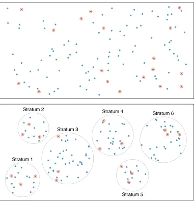
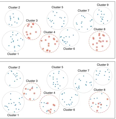
Almost all statistical methods are based on the notion of implied randomness. If observa-tional data are not collected in a random framework from a population, these statistical methods – the estimates and errors associated with the estimates – are not reliable. Here we consider four random sampling techniques: simple, stratified, cluster, and multistage sampling. Figures 1.14and1.15provide graphical representations of these techniques.
Simple random samplingis probably the most intuitive form of random sampling. Consider the salaries of Major League Baseball (MLB) players, where each player is a member of one of the league’s 30 teams. To take a simple random sample of 120 baseball players and their salaries from the 2010 season, we could write the names of that season’s
13Also called alurking variable,confounding factor, or aconfounder.
14Answers will vary. Population density may be important. If a county is very dense, then this may
require a larger fraction of residents to live in multi-unit structures. Additionally, the high density may contribute to increases in property value, making homeownership infeasible for many residents.
1.4. OBSERVATIONAL STUDIES AND SAMPLING STRATEGIES 21 Index ● ● ● ● ● ● ● ● ● ● ● ● ● ● ● ● ● ● ● ● ● ● ● ● ● ● ● ● ● ● ● ● ● ● ● ● ● ● ● ● ● ● ● ● ● ● ● ● ● ● ● ● ● ● ● ● ● ● ● ● ● ● ● ● ● ● ● ● ● ● ● ● ● ● ● ● ● ● ● ● ● ● ● ● ● ● ● ● ● ● ● ● ● ● ● ● ● ● ● ● ● ● ● ● ● ● ● ● ● ● ● ● ● ● ● ● ● ● ● ● ● ● ● ● ● ● ● ● ● ● ● ● ● ● ● ● ● ● ● ● ● ● ● ● ● ● ● ● ● ● ● ● ● ● ● ● ● ● ● ● ● ● ● ● ● ● ● ● ● ● ● ● ● ● ● ● ● ● ● ● ● ● ● ● ● ● ● ● ● ● ● ● ● ● ● ● ● ● ● ● ● ● ● ● ● ● ● ● ● ● ● ● ● ● ● ● ● ● ● ● ● ● ● ● ● ● ● ● ● ● ● ● ● ● ● ● ● ● ● ● ● ● ● ● ● ● ● ● ● ● ● ● ● ● ● ● ● ● ● ● ● ● ● ● ● ● ● ● ● ● ● ● ● ● ● ● ● ● ● ● ● ● ● ● ● ●● ● ● ● ● ● ● ● ● ● ● ● ● ● ● ● ● ● ● ● ● ● ● ● ● ● ● ● ● Stratum 1 Stratum 2 Stratum 3 Stratum 4 Stratum 5 Stratum 6
828 players onto slips of paper, drop the slips into a bucket, shake the bucket around until we are sure the names are all mixed up, then draw out slips until we have the sample of 120 players. In general, a sample is referred to as “simple random” if each case in the population has an equal chance of being included in the final sample and knowing that a case is included in a sample does not provide useful information about which other cases are included.
Stratified sampling is a divide-and-conquer sampling strategy. The population is divided into groups called strata. The strata are chosen so that similar cases are grouped together, then a second sampling method, usually simple random sampling, is employed within each stratum. In the baseball salary example, the teams could represent the strata, since some teams have a lot more money (up to 4 times as much!). Then we might randomly sample 4 players from each team for a total of 120 players.
Stratified sampling is especially useful when the cases in each stratum are very similar with respect to the outcome of interest. The downside is that analyzing data from a stratified sample is a more complex task than analyzing data from a simple random sample. The analysis methods introduced in this book would need to be extended to analyze data collected using stratified sampling.
Example 1.12 Why would it be good for cases within each stratum to be very similar?
We might get a more stable estimate for the subpopulation in a stratum if the cases are very similar. These improved estimates for each subpopulation will help us build a reliable estimate for the full population.
In acluster sample, we break up the population into many groups, calledclusters. Then we sample a fixed number of clusters and include all observations from each of those clusters in the sample. A multistage sample is like a cluster sample, but rather than keeping all observations in each cluster, we collect a random sample within each selected cluster.
Sometimes cluster or multistage sampling can be more economical than the alternative sampling techniques. Also, unlike stratified sampling, these approaches are most helpful when there is a lot of case-to-case variability within a cluster but the clusters themselves don’t look very di↵erent from one another. For example, if neighborhoods represented clusters, then cluster or multistage sampling work best when the neighborhoods are very diverse. A downside of these methods is that more advanced analysis techniques are typi-cally required, though the methods in this book can be extended to handle such data.
Example 1.13 Suppose we are interested in estimating the malaria rate in a densely tropical portion of rural Indonesia. We learn that there are 30 villages in that part of the Indonesian jungle, each more or less similar to the next. Our goal is to test 150 individuals for malaria. What sampling method should be employed?
1.4. OBSERVATIONAL STUDIES AND SAMPLING STRATEGIES 23 Index ● ● ● ● ● ● ● ● ● ● ● ● ● ● ● ● ● ● ● ● ● ● ● ● ● ● ● ● ● ● ● ● ● ● ● ● ● ● ● ● ● ● ● ● ● ● ● ● ● ● ● ● ● ● ●● ● ● ● ● ● ● ● ● ● ● ● ● ● ● ● ● ● ● ● ● ● ● ● ● ● ● ● ● ● ● ● ● ● ● ● ● ● ● ● ● ● ● ● ● ● ● ● ● ● ● ● ● ● ● ● ● ● ● ● ● ● ● ● ● ● ● ● ● ● ● ● ● ● ● ●● ● ● ● ● ● ● ● ● ● ● ● ● ● ● ● ● ● ● ● ● ● ● ● ● ● ● ● ● ● ● ● ● ● ● ● ● ● ● ● ● ● ● ● ● ● ● ● ● ● ● ● ● ● ● ● ● ● ● ● ● ●● ● ● ● ● ● ● ● ● ● ● ● ● ● Cluster 1 Cluster 2 Cluster 3 Cluster 4 Cluster 5 Cluster 6 Cluster 7 Cluster 8 Cluster 9 ● ● ● ● ● ● ● ● ● ● ● ● ● ● ● ● ● ● ● ●● ● ● ● ● ● ● ● ● ● ● ● ● ● ● ● ● ● ● ● ● ● ● ● ● ● ● ● ● ● ● ● ● ● ● ● ● ● ● ● ● ● ● ●● ● ● ● ● ● ● ● ● ●● ● ● ● ● ● ● ● ● ● ● ● ● ● ● ● ● ● ● ● ● ● ● ● ● ● ● ● ● ● ● ● ● ● ● ● ● ● ● ● ● ● ● ● ● ● ● ● ● ● ● ● ● ● ● ● ● ● ● ● ● ● ● ● ● ● ● ● ● ● ● ● ● ● ● ● ● ● ● ● ● ● ● ● ● ● ● ● ● Cluster 1 Cluster 2 Cluster 3 Cluster 4 Cluster 5 Cluster 6 Cluster 7 Cluster 8 Cluster 9
1.5
Experiments
Studies where the researchers assign treatments to cases are called experiments. When this assignment includes randomization, e.g. using a coin flip to decide which treatment a patient receives, it is called a randomized experiment. Randomized experiments are fundamentally important when trying to show a causal connection between two variables.
1.5.1
Principles of experimental design
Randomized experiments are generally built on four principles.
Controlling. Researchers assign treatments to cases, and they do their best to control
any other di↵erences in the groups. For example, when patients take a drug in pill form, some patients take the pill with only a sip of water while others may have it with an entire glass of water. To control for the e↵ect of water consumption, a doctor may ask all patients to drink a 12 ounce glass of water with the pill.
Randomization. Researchers randomize patients into treatment groups to account for variables that cannot be controlled. For example, some patients may be more suscep-tible to a disease than others due to their dietary habits. Randomizing patients into the treatment or control group helps even out such di↵erences, and it also prevents accidental bias from entering the study.
Replication. The more cases researchers observe, the more accurately they can estimate the e↵ect of the explanatory variable on the response. In a single study, wereplicate
by collecting a sufficiently large sample. Additionally, a group of scientists may replicate an entire study to verify an earlier finding.
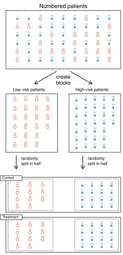
Blocking. Researchers sometimes know or suspect that variables, other than the treat-ment, influence the response. Under these circumstances, they may first group in-dividuals based on this variable intoblocks and then randomize cases within each block to the treatment groups. This strategy is often referred to as blocking. For instance, if we are looking at the e↵ect of a drug on heart attacks, we might first split patients in the study into low-risk and high-risk blocks, then randomly assign half the patients from each block to the control group and the other half to the treatment group, as shown in Figure1.16. This strategy ensures each treatment group has an equal number of low-risk and high-risk patients.
It is important to incorporate the first three experimental design principles into any study, and this book describes applicable methods for analyzing data from such experi-ments. Blocking is a slightly more advanced technique, and statistical methods in this book may be extended to analyze data collected using blocking.
1.5.2
Reducing bias in human experiments
Randomized experiments are the gold standard for data collection, but they do not ensure an unbiased perspective into the cause and e↵ect relationships in all cases. Human studies are perfect examples where bias can unintentionally arise. Here we reconsider a study where a new drug was used to treat heart attack patients.16 In particular, researchers wanted to
know if the drug reduced deaths in patients.
16Anturane Reinfarction Trial Research Group. 1980. Sulfinpyrazone in the prevention of sudden death
1.5. EXPERIMENTS 25
Numbered patients
create blocks
Low−risk patients High−risk patients
randomly split in half
randomly split in half
Control Treatment ● 1 ●2 ● 3 ● 4 ●5 ●6 ● 7 ●8 ● 9 ● 10 ● 11 ● 12 ●13 ● 14 ● 15 ●16 ●17 ● 18 ● 19 ● 20 ● 21 ● 22 ● 23 ● 24 ● 25 ● 26 ● 27 ● 28 ● 29 ● 30 ● 31 ● 32 ● 33 ● 34 ● 35 ● 36 ● 37 ● 38 ● 39 ● 40 ● 41 ● 42 ● 43 ● 44 ●45 ●46 ●47 ● 48 ● 49 ● 50 ● 51 ● 52 ● 53 ● 54 ●2 ●5 ●6 ●8 ● 13 ● 16 ●17 ●21 ●23 ●29 ●33 ●34 ● 36 ● 37 ● 39 ● 41 ● 45 ● 46 ● 47 ● 50 ● 53 ● 54 ● 1 ● 3 ● 4 ● 7 ● 9 ● 10 ● 11 ● 12 ● 14 ● 15 ● 18 ● 19 ● 20 ● 22 ● 24 ● 25 ● 26 ● 27 ● 28 ● 30 ● 31 ● 32 ● 35 ● 38 ● 40 ● 42 ● 43 ● 44 ● 48 ● 49 ● 51 ● 52 ● 1
●2 ●
3 ● 4 ●5 ●6 ● 7 ●8 ● 9 ● 10 ● 11 ● 12
●13 ●
[image:25.576.157.410.65.588.2]14 ● 15 ●16 ●17 ● 18 ● 19 ● 20 ●21 ● 22 ●23 ● 24 ● 25 ● 26 ● 27 ● 28 ●29 ● 30 ● 31 ● 32 ●33 ●34 ● 35 ●36 ●37 ● 38 ●39 ● 40 ●41 ● 42 ● 43 ● 44 ●45 ●46 ●47 ● 48 ● 49 ●50 ● 51 ● 52 ●53 ●54
These researchers designed a randomized experiment because they wanted to draw causal conclusions about the drug’s e↵ect. Study volunteers17 were randomly placed into
two study groups. One group, thetreatment group, received the drug. The other group, called the control group, did not receive any drug treatment.
Put yourself in the place of a person in the study. If you are in the treatment group, you are given a fancy new drug that you anticipate will help you. On the other hand, a person in the other group doesn’t receive the drug and sits idly, hoping her participation doesn’t increase her risk of death. These perspectives suggest there are actually two e↵ects: the one of interest is the e↵ectiveness of the drug, and the second is an emotional e↵ect that is difficult to quantify.
Researchers aren’t usually interested in the emotional e↵ect, which might bias the study. To circumvent this problem, researchers do not want patients to know which group they are in. When researchers keep the patients uninformed about their treatment, the study is said to beblind. But there is one problem: if a patient doesn’t receive a treatment, she will know she is in the control group. The solution to this problem is to give fake treatments to patients in the control group. A fake treatment is called a placebo, and an e↵ective placebo is the key to making a study truly blind. A classic example of a placebo is a sugar pill that is made to look like the actual treatment pill. Often times, a placebo results in a slight but real improvement in patients. This e↵ect has been dubbed theplacebo e↵ect.
The patients are not the only ones who should be blinded: doctors and researchers can accidentally bias a study. When a doctor knows a patient has been given the real treatment, she might inadvertently give that patient more attention or care than a patient that she knows is on the placebo. To guard against this bias, which again has been found to have a measurable e↵ect in some instances, most modern studies employ adouble-blind
setup where doctors or researchers who interact with patients are, just like the patients, unaware of who is or is not receiving the treatment.18
J Guided Practice 1.14 Look back to the study in Section1.1 where researchers
were testing whether stents were e↵ective at reducing strokes in at-risk patients. Is this an experiment? Was the study blinded? Was it double-blinded?19
1.6
Examining numerical data
In this section we will be introduced to techniques for exploring and summarizing numerical variables. The email50 andcountydata sets from Section1.2 provide rich opportunities for examples. Recall that outcomes of numerical variables are numbers on which it is reasonable to perform basic arithmetic operations. For example, the pop2010 variable, which represents the populations of counties in 2010, is numerical since we can sensibly discuss the di↵erence or ratio of the populations in two counties. On the other hand, area codes and zip codes are not numerical, but rather they are categorical variables.
17Human subjects are often calledpatients,volunteers, orstudy participants.
18There are always some researchers involved in the study who do know which patients are receiving
which treatment. However, they do not interact with the study’s patients and do not tell the blinded health care professionals who is receiving which treatment.
19The researchers assigned the patients into their treatment groups, so this study was an experiment.
1.6. EXAMINING NUMERICAL DATA 27
1.6.1
Scatterplots for paired data
A scatterplotprovides a case-by-case view of data for two numerical variables. In Fig-ure 1.8 on page 13, a scatterplot was used to examine how federal spending and poverty were related in thecountydata set. Another scatterplot is shown in Figure1.17, comparing the number of line breaks (line breaks) and number of characters (num char) in emails for the email50 data set. In any scatterplot, each point represents a single case. Since there are 50 cases in email50, there are 50 points in Figure1.17.
0 10 20 30 40 50 60
0 200 400 600 800 1000 1200
Number of Lines
●
●
●●
●
●● ●
● ●
●
●
●
●
●
●
● ●
● ●
●● ● ●
● ●
● ●
● ●
●
●
●●
●
●
● ●
●
● ●
● ●
●
●
●
● ●
● ●
Number of Characters (in thousands)
Figure 1.17: A scatterplot ofline breaksversusnum charfor theemail50data.
To put the number of characters in perspective, this paragraph has 363 characters. Looking at Figure 1.17, it seems that some emails are incredibly verbose! Upon further investigation, we would actually find that most of the long emails use the HTML format, which means most of the characters in those emails are used to format the email rather than provide text.
J
Guided Practice 1.15 What do scatterplots reveal about the data, and how might they be useful?20
Example 1.16 Consider a new data set of 54 cars with two variables: vehicle price and weight.21 A scatterplot of vehicle price versus weight is shown in Figure1.18.
What can be said about the relationship between these variables?
The relationship is evidently nonlinear, as highlighted by the dashed line. This is di↵erent from previous scatterplots we’ve seen, such as Figure 1.8 on page 13 and Figure1.17, which show relationships that are very linear.
J
Guided Practice 1.17 Describe two variables that would have a horseshoe shaped association in a scatterplot.22
20Answers may vary. Scatterplots are helpful in quickly spotting associations relating variables, whether
those associations come in the form of simple trends or whether those relationships are more complex.
21Subset of data fromwww.amstat.org/publications/jse/v1n1/datasets.lock.html
22Consider the case where your vertical axis represents something “good” and your horizontal axis
2000 2500 3000 3500 4000 0
10 20 30 40 50 60
Weight (Pounds)
Pr
ice ($1000s)
Figure 1.18: A scatterplot of priceversusweightfor 54 cars.
1.6.2
Dot plots and the mean
Sometimes two variables are one too many: only one variable may be of interest. In these cases, a dot plot provides the most basic of displays. A dot plotis a one-variable scatter-plot; an example using the number of characters from 50 emails is shown in Figure 1.19. A stacked version of this dot plot is shown in Figure 1.20.
Number of Characters (in thousands)
0 10 20 30 40 50 60
Figure 1.19: A dot plot of num charfor theemail50data set.
Themean, sometimes called the average, is a common way to measure the center of a
distributionof data. To find the mean number of characters in the 50 emails, we add up all the character counts and divide by the number of emails. For computational convenience, the number of characters is listed in the thousands and rounded to the first decimal.
¯
x= 21.7 + 7.0 +· · ·+ 15.8
50 = 11.6 (1.18)
The sample mean is often labeled ¯x. The letterxis being used as a generic placeholder for ¯
x
sample
mean the variable of interest,number of characters in the 50 emails was 11,600. It is useful to think of the mean as thenum char, and the bar over on thexcommunicates that the average
1.6. EXAMINING NUMERICAL DATA 29
Number of Characters (in thousands, with rounding)
● ● ● ● ● ● ● ● ●
● ● ● ● ● ●
● ● ● ●
● ● ● ● ● ●
● ● ● ● ● ● ● ●
● ● ● ●
● ● ● ●●●● ● ●
● ●● ●
0 10 20 30 40 50 60 70
Figure 1.20: A stacked dot plot of num char for the email50 data set. The values have been rounded to the nearest 2,000 in this plot.
Mean
The sample mean of a numerical variable is computed as the sum of all of the observations divided by the number of observations:
¯
x=x1+x2+· · ·+xn
n (1.19)
wherex1, x2, . . . , xn represent thenobserved values. n
sample size
J
Guided Practice 1.20 Examine Equations (1.18) and (1.19) above. What does
x1 correspond to? And x2? Can you infer a general meaning to what xi might represent?23
J
Guided Practice 1.21 What wasnin this sample of emails?24
Theemail50data set represents a sample from a larger population of emails that were received in January and March. We could compute a mean for this population in the same way as the sample mean. However, the population mean has a special label: µ. The symbol µ
population mean
µ is the Greek lettermu and represents the average of all observations in the population. Sometimes a subscript, such asx, is used to represent which variable the population mean
refers to, e.g. µx.
Example 1.22 The average number of characters across all emails can be estimated using the sample data. Based on the sample of 50 emails, what would be a reasonable estimate ofµx, the mean number of characters in all emails in theemail data set? (Recall thatemail50is a sample fromemail.)
The sample mean, 11,600, may provide a reasonable estimate of µx. While this number will not be perfect, it provides apoint estimate of the population mean. In Chapter 4 and beyond, we will develop tools to characterize the accuracy of point estimates, and we will find that point estimates based on larger samples tend to be more accurate than those based on smaller samples.
23x
1corresponds to the number of characters in the first email in the sample (21.7, in thousands), x2
to the number of characters in the second email (7.0, in thousands), andxicorresponds to the number of
characters in theithemail in the data set.
Example 1.23 We might like to compute the average income per person in the US. To do so, we might first think to take the mean of the per capita incomes across the 3,143 counties in thecountydata set. What would be a better approach?
Thecountydata set is special in that each county actually represents many individual people. If we were to simply average across theincomevariable, we would be treating counties with 5,000 and 5,000,000 residents equally in the calculations. Instead, we should compute the total income for each county, add up all the counties’ totals, and then divide by the number of people in all the counties. If we completed these steps with thecounty data, we would find that the per capita income for the US is
$27,348.43. Had we computed thesimple mean of per capita income across counties, the result would have been just$22,504.70!
Example 1.23used what is called aweighted mean, which will not be a key topic in this textbook. However, we have provided an online supplement on weighted means for interested readers:
www.openintro.org/d?f=wtdmean
1.6.3
Histograms and shape
Dot plots show the exact value for each observation. This is useful for small data sets, but they can become hard to read with larger samples. Rather than showing the value of each observation, we prefer to think of the value as belonging to a bin. For example, in the email50data set, we create a table of counts for the number of cases with character counts between 0 and 5,000, then the number of cases between 5,000 and 10,000, and so on. Observations that fall on the boundary of a bin (e.g. 5,000) are allocated to the lower bin. This tabulation is shown in Table 1.21. These binned counts are plotted as bars in Figure 1.22into what is called ahistogram, which resembles the stacked dot plot shown in Figure1.20.
Characters
(in thousands) 0-5 5-10 10-15 15-20 20-25 25-30 · · · 55-60 60-65
Count 19 12 6 2 3 5 · · · 0 1
Table 1.21: The counts for the binnednum chardata.
Histograms provide a view of thedata density. Higher bars represent where the data are relatively more common. For instance, there are many more emails with fewer than 20,000 characters than emails with at least 20,000 in the data set. The bars make it easy to see how the density of the data changes relative to the number of characters.
Histograms are especially convenient for describing the shape of the data distribution. Figure 1.22 shows that most emails have a relatively small number of characters, while fewer emails have a very large number of characters. When data trail o↵ to the right in this way and have a longer right tail, the shape is said to be right skewed.25
Data sets with the reverse characteristic – a long, thin tail to the left – are said to be
left skewed. We also say that such a distribution has a long left tail. Data sets that show roughly equal trailing o↵in both directions are calledsymmetric.
25Other ways to describe data that are skewed to the right: skewed to the right,skewed to the
1.6. EXAMINING NUMERICAL DATA 31
Number of Characters (in thousands)
Frequency
0 10 20 30 40 50 60
0 5 10 15 20
Figure 1.22: A histogram of num char. This distribution is very strongly skewed to the right.
Long tails to identify skew
When data trail o↵in one direction, the distribution has along tail. If a distri-bution has a long left tail, it is left skewed. If a distridistri-bution has a long right tail, it is right skewed.
J
Guided Practice 1.24 Take a look at the dot plots in Figures1.19and1.20. Can you see the skew in the data? Is it easier to see the skew in this histogram or the dot plots?26
J
Guided Practice 1.25 Besides the mean (since it was labeled), what can you see in the dot plots that you cannot see in the histogram?27
In addition to looking at whether a distribution is skewed or symmetric, histograms can be used to identify modes. Amodeis represented by a prominent peak in the distri-bution.28 There is only one prominent peak in the histogram of num char.
Figure 1.23 shows histograms that have one, two, or three prominent peaks. Such distributions are called unimodal, bimodal, andmultimodal, respectively. Any distri-bution with more than 2 prominent peaks is called multimodal. Notice that there was one prominent peak in the unimodal distribution with a second less prominent peak that was not counted since it only di↵ers from its neighboring bins by a few observations.
J
Guided Practice 1.26 Figure1.22reveals only one prominent mode in the number of characters. Is the distribution unimodal, bimodal, or multimodal?29
26The skew is visible in all three plots, though the flat dot plot is the least useful. The stacked dot plot
and histogram are helpful visualizations for identifying skew.
27Character counts for individual emails.
28Another definition of mode, which is not typically used in statistics, is the value with the most
occurrences. It is common to haveno observations with the same value in a data set, which makes this
other definition useless for many real data sets.
29Unimodal. Remember that uni stands for 1 (thinkunicycles). Similarly, bi stands for 2 (think
0 5 10 15 0
5 10 15
0 5 10 15 20
0 5 10 15
0 5 10 15 20
0 5 10 15 20
Figure 1.23: Counting only prominent peaks, the distributions are (left to right) unimodal, bimodal, and multimodal. Note that we’ve said the left plot is unimodal intentionally. This is because we are countingprominent
peaks, not just any peak. See the Tip box for more thoughts.
J
Guided Practice 1.27 Height measurements of young students and adult teachers at a K-3 elementary school were taken. How many modes would you anticipate in this height data set?30
TIP: Looking for modes
Looking for modes isn’t about finding a clear and correct answer about the number of modes in a distribution, which is whyprominent is not rigorously defined in this book. The important part of this examination is to better understand your data and how it might be structured.
1.6.4
Variance and standard deviation
The mean was introduced as a method to describe the center of a data set, but the variability in the data is also important. Here, we introduce two measures of variability: the variance and the standard deviation. Both of these are very useful in data analysis, even though their formulas are a bit tedious to calculate by hand. The standard deviation is the easier of the two to understand, and it roughly describes how far away the typical observation is from the mean.
We call the distance of an observation from its mean itsdeviation. Below are the deviations for the 1st, 2nd, 3rd, and 50th observations in thenum charvariable. For com-putational convenience, the number of characters is listed in the thousands and rounded to the first decimal.
x1 x¯= 21.7 11.6 = 10.1
x2 x¯= 7.0 11.6 = 4.6
x3 x¯= 0.6 11.6 = 11.0 ..
.
x50 x¯= 15.8 11.6 = 4.2
30There might be two height groups visible in the data set: one of the students and one of the adults.
1.6. EXAMINING NUMERICAL DATA 33
Number of Characters (in thousands), x = 11,600, sx = 13,130
−1.5 11.6 24.7 37.8 50.9 64.0
Figure 1.24: In thenum char data, 41 of the 50 emails (82%) are within 1 standard deviation of the mean, and 47 of the 50 emails (94%) are within 2 standard deviations. Usually about 70% of the data are within 1 standard deviation of the mean and 95% are within 2 standard deviations, though this rule of thumb is less accurate for skewed data, as shown in this example.
If we square these deviations and then take an average, the result is about equal to the
samplevariance, denoted bys2: s2
sample variance
s2= 10.1
2+ ( 4.6)2+ ( 11.0)2+
· · ·+ 4.22 50 1
= 102.01 + 21.16 + 121.00 +· · ·+ 17.64 49
= 172.44
We divide by n 1, rather than dividing by n, when computing the variance; you need not worry about this mathematical nuance for the material in this textbook. Notice that squaring the deviations does two things. First, it makes large values much larger, seen by comparing 10.12, ( 4.6)2, ( 11.0)2, and 4.22. Second, it gets rid of any negative signs.
Thestandard deviationis defined as the square root of the variance:
s=p172.44 = 13.13
The standard deviation of the number of characters in an email is about 13.13 thousand.
s
sample standard deviation
A subscript ofxmay be added to the variance and standard deviation, i.e. s2xandsx, as a
reminder that these are the variance and standard deviation of the observations represented byx1,x2, ...,xn. Thexsubscript is usually omitted when it is clear which data the variance
or standard deviation is referencing.
Variance and standard deviation
The variance is roughly the average squared distance from the mean. The standard deviation is the square root of the variance. The standard deviation is useful when considering how close the data are to the mean.
Formulas and methods used to compute the variance and standard deviation for a population are similar to those used for a sample.31 However, like the mean, the population
values have special symbols: 2 for the variance and for the standard deviation. The 2
population variance
population standard deviation
symbol is the Greek lettersigma.
−3 −2 −1 0 1 2 3
−3 −2 −1 0 1 2 3
−3 −2 −1 0 1 2 3
Figure 1.25: Three very di↵erent population distributions with the same meanµ= 0 and standard deviation = 1.
TIP: standard deviation describes variability
Focus on the conceptual meaning of the standard deviation as a descriptor of vari-ability rather than the formulas. Usually 70% of the data will be within one stan-dard deviation of the mean and about 95% will be within two stanstan-dard deviations. However, as seen in Figures1.24and1.25, these percentages are not strict rules.
J
Guided Practice 1.28 On page 30, the concept of shape of a distribution was introduced. A good description of the shape of a distribution should include modality and whether the distribution is symmetric or skewed to one side. Using Figure 1.25 as an example, explain why such a description is important.32
Example