City, University of London Institutional Repository
Citation
:
Andrienko, N., Andrienko, G., Camossi, E., Claramunt, C., Cordero Garcia, J.
M., Fuchs, G., Hadzagic, M., Jousselme, A-L., Ray, C., Scarlatti, D. & Vouros, G. (2017).
Visual exploration of movement and event data with interactive time masks. Visual
Informatics, 1(1), pp. 25-39. doi: 10.1016/j.visinf.2017.01.004
This is the published version of the paper.
This version of the publication may differ from the final published
version.
Permanent repository link: http://openaccess.city.ac.uk/17427/
Link to published version
:
http://dx.doi.org/10.1016/j.visinf.2017.01.004
Copyright and reuse:
City Research Online aims to make research
outputs of City, University of London available to a wider audience.
Copyright and Moral Rights remain with the author(s) and/or copyright
holders. URLs from City Research Online may be freely distributed and
linked to.
Contents lists available atScienceDirect
Visual Informatics
journal homepage:www.elsevier.com/locate/visinf
Visual exploration of movement and event data with interactive time
masks
Natalia Andrienko
a,b, Gennady Andrienko
a,b,*
, Elena Camossi
c, Christophe Claramunt
d,
Jose Manuel Cordero Garcia
e, Georg Fuchs
a, Melita Hadzagic
c, Anne-Laure Jousselme
c,
Cyril Ray
d, David Scarlatti
f, George Vouros
gaFraunhofer Institute IAIS, Sankt Augustin, Germany bCity University London, London, UK
cNATO Science and Technology Organization, Centre for Maritime Research and Experimentation, Italy dNaval Academy Research Institute, France
eCRIDA - Reference Center for Research, Development and Innovation in ATM, Madrid, Spain fBoeing Research & Technology Europe, Spain
gDepartment of Digital System, University of Piraeus, Greece
a r t i c l e i n f o
Article history:
Available online 18 January 2017
Keywords:
Data visualization Interactive visualization Interaction technique
a b s t r a c t
We introduce the concept of time mask, which is a type of temporal filter suitable for selection of multiple disjoint time intervals in which some query conditions fulfil. Such a filter can be applied to time-referenced objects, such as events and trajectories, for selecting those objects or segments of trajectories that fit in one of the selected time intervals. The selected subsets of objects or segments are dynamically summarized in various ways, and the summaries are represented visually on maps and/or other displays to enable exploration. The time mask filtering can be especially helpful in analysis of disparate data (e.g., event records, positions of moving objects, and time series of measurements), which may come from different sources. To detect relationships between such data, the analyst may set query conditions on the basis of one dataset and investigate the subsets of objects and values in the other datasets that co-occurred in time with these conditions. We describe the desired features of an interactive tool for time mask filtering and present a possible implementation of such a tool. By example of analysing two real world data collections related to aviation and maritime traffic, we show the way of using time masks in combination with other types of filters and demonstrate the utility of the time mask filtering.
©2017 Published by Elsevier B.V. on behalf of Zhejiang University and Zhejiang University Press. This is an open access article under the CC BY-NC-ND license (http://creativecommons.org/licenses/by-nc-nd/4.0/).
1. Introduction
In interactive exploration of spatiotemporal data, such as data describing spatial events or trajectories of moving objects, it is often necessary to filter the data (Shneiderman, 1996), i.e., select subsets of events, trajectories, or segments of trajectories based on the spatial locations, time references, values of attributes, and/or other conditions (Andrienko et al., 2013a). There are two common approaches to temporal filtering. First, it can be done by selecting a continuous time interval within the time range of the data. This kind of filter adheres to the linear view of time, in which time is treated as a continuous linearly ordered sequence of time instants. Another possible view of time is cyclic, in which time is
*
Corresponding author at: Fraunhofer Institute IAIS, Sankt Augustin, Germany.E-mail address:[email protected](G. Andrienko). Peer review under responsibility of Zhejiang University and Zhejiang University Press.
considered as repetition of cycles, particularly, diurnal, weekly, and annual (seasonal). Time-related data can be filtered according to the positions of the time references within a time cycle. These two types of filtering can be called linear and cyclic, respectively.
We introduce one more type of temporal filtering, in which time intervals are selected based on satisfaction of query conditions formulated in terms of time-variant attributes. We call this type of filteringtime maskas it hides (i.e., removes from the consid-eration) the time intervals in which the query conditions do not hold. The remaining active (selected) time intervals may thus be separated by temporal gaps. A time mask filter allows an analyst to see when certain conditions are fulfilled and what else happened during those times. Hence, it provides additional opportunities for analysis with regard to the commonly used types of temporal filtering. In particular, it may be very useful in joint analysis of several time-referenced datasets for finding relationships between different phenomena.
http://dx.doi.org/10.1016/j.visinf.2017.01.004
these intervals sequentially using animation is questionable due to the irregularity of the intervals and the gaps between them. The most reasonable way to deal with the selected data items is to create and analyse various aggregates. Furthermore, these ag-gregates should be dynamic: whenever the filter condition change, the aggregates should be recreated by applying the aggregation operations to the newly selected subset of data items.
Hence, the primary contribution of the paper is presentation of the time mask filter as a generic analytical technique used together with dynamic aggregation of filter-selected data. The use of the time mask filter is demonstrated with two examples of analysing complex real-world data related to the air and sea traffic. It is typ-ical that analysis of complex data requires application of multiple analytical techniques. In our example analyses, the time mask filter is used in combination with other techniques, including several types of filtering. The demonstration of the joint power of different types of filters used in combination is another contribution of our paper.
2. Related works
Our concept of time mask is similar to the concept of temporal element in temporal databases, which is defined as a finite union ofn-dimensional time boxes (Jensen et al., 1992). Query languages for temporal databases allow selection of time-referenced data tuples the times in which belong to several disjoint time inter-vals satisfying some query conditions (Gadia, 1988). However, interactive tools enabling this kind of querying in the context of visual data exploration have been missing so far, although a variety of interactive querying and filtering techniques have been developed since the pioneering work of Shneiderman(1994). The book on visual analytics of movement (Andrienko et al., 2013a) describes multiple filter types that are useful in exploration of spatiotemporal data, in particular, movement data, and provides examples of using different filters in combination. The filter types include the linear temporal filter, several variants of spatial filters, attribute-based filter, filter by direct selection, trajectory segment filter, and cross-filtering between two datasets using references from one of them to items in the other one. These types of filters have been used in the data analyses described further on in this paper.
Weaver(2010) discusses interactive cross-filtering across
mul-tiple coordinated displays by direct manipulation in the dis-plays. Aigner et al.(2011) give a brief overview of a few types of interactive filtering (a.k.a. querying) that can be used in vi-sual analysis of time-referenced data. Apart from linear tem-poral filtering and attribute-based querying, they mention Time Searcher (Hochheiser and Shneiderman, 2004), a tool for interac-tive selection of time series lines with particular shapes in a time graph.
There are several literature examples of tools for cyclic temporal filtering. The system described by Fredrikson et al.(1999) allows
ration. The techniques are applied to 2D projections of 3D aircraft trajectories and allow the user to select trajectories based on the flight altitude or the speed of the accent or descent. With Trajectory Lenses (Krüger et al., 2013), the user can interactively select trajectories based on trip origins, destinations, and/or traversed areas. Multiple filters can be flexibly combined to create sophis-ticated queries. For the resulting selections, various attributes are represented in aggregated forms. Particularly, data are aggregated over time at several temporal scales.
To visually represent results of interactive filtering in an ag-gregated form, the concept of ‘‘dynamic aggregators’’ has been proposed (Andrienko et al., 2008;Rinzivillo et al., 2008). A dynamic aggregator is a special object having references to a number of data records. It is able to check which records satisfy current filters and to derive certain statistical summaries from these records. The aggregators are responsible for the representation of the sum-maries on visual displays and for updating the view when the filters change.
Generally, aggregation is a common technique used for visualiz-ing large datasets (Fredrikson et al., 1999). Based on a hierarchical organization of data in an OLAP (Online Analytical Processing) database, the level of aggregation of visualized data can be dynam-ically changed as the user zooms in or out in a data display (Stolte
et al., 2002, 2003). This dynamic behaviour is possible because all
meaningful data aggregates at different levels are pre-computed and organized in special data structures called data cubes (Gray et
al., 1997). However, a full data cube is often too big to fit in the main
memory of a computer, while accessing it in an external database may be prohibitive to various interactive operations, particularly, brushing and linking among multiple coordinated views. Recently, visualization researchers have been devising such representations of very large datasets that can fit in the main memory to enable effective visualizations and prompt responses to user’s interactive operations. Liu et al. (2013) decompose a full data cube into sub-cubes with at most four dimensions, which are sufficient for supporting brushing and linking between any pair of one- or two-dimensional binned plots (i.e., visual displays in which data are aggregated into bins). Furthermore, the decomposed cubes are further segmented into multivariate data tiles. The representation scheme supports parallel processing in response to user’s queries. Nanocubes (Lins et al., 2013) is a compact representation of a data cube designed specifically for spatiotemporal data. The memory is saved by maximizing shared links across the data structure. Hashed cubes (Pahins et al., 2017) that appeared recently allow even more compact representation and much simpler implemen-tation. Gaussian Cubes (Wang et al., 2017) extend the idea of data cubes even further: instead of counts and sums, the best multivariate Gaussian models are pre-computed for data subsets. This allows novel ways of visual exploration of large datasets, e.g., with the use of the principal component analysis.
filtering, provided that the temporal resolution (i.e., the minimal time step) of the time mask is not finer than the minimal level of aggregation along the temporal dimension of the data. Thus, if data are pre-aggregated with the minimal bin of one hour, it will be impossible to compute an accurate result for a mask with the resolution of minutes or seconds. Another consideration is that, in the course of data analysis, the analyst may not only look at existing data but also derive from them new data. This is the case in our example analysis scenarios. The data structures and aggregation mechanisms must be able to accommodate new data generated by the analyst. Apart from these considerations, the use of the time mask filter is in-dependent of the data aggregation technology and data representation.
3. Introduction of the time mask tool
A time mask is a query that selects time intervals in which some conditions are fulfilled. The conditions can be described in terms of attributes whose values change over time. To understand what conditions may be reasonable to set, the analyst may need to see a visual representation of the temporal variation of the attribute val-ues. Furthermore, after specifying one or more conditions, the an-alyst needs a visual feedback showing the time intervals in which these conditions are fulfilled. With regard to these requirements, an interactive tool for specifying filter conditions and creating time masks can be based on a display with one dimension representing time. Along this dimension, the temporal variation of the values of one or more attributes is shown. Apart from the attribute values, the display can also visually represent the time mask, i.e., the selected time intervals.
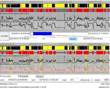
A possible implementation is demonstrated inFig. 1. The hori-zontal display dimension is used to represent time. The space along the vertical dimension is divided into rows in which the value vari-ations of different attributes are shown. Qualitative (categorical) attributes can be represented by coloured segmented bars, as in the upper two rows of the display inFig. 1; the colours encode different attribute values. Numeric attributes can be represented by line graphs, as in the lower two rows of the example display. The numeric values are mapped onto vertical positions within the rows, and consecutive positions are connected by lines. The display may include controls for temporal zooming, such as the slider bar visible in the upper image inFig. 1.
Obviously, the time series included in the display may come from different and disparate datasets and data sources. Some time series may be originally present in the data, e.g., weather observa-tions or speed values of a moving object; others may be derived from available time series or generated from other data types, for example, time series of counts of events or moving objects.
Query conditions based on the represented time series can be set through direct manipulation of the display. In our example implementation, clicking on a segment of a bar representing a qualitative attribute value. Initially all values are selected. When the user clicks on a segment of a particular colour, all segments having this colour become deselected. Accordingly, the time inter-vals in which the attribute had the value represented by this colour become also deselected. The second click on any segment with this colour makes the value selected again. The selection status of different values of qualitative attributes is represented by the vertical width of the corresponding bar segments: the segments representing deselected values are narrower than those represent-ing selected values. An example can be seen in the lower image in
Fig. 1, in the second row.
For a numeric attribute, dragging the mouse vertically across the line graph representing this attribute selects an interval within the attribute value range. The starting and ending vertical positions of the mouse cursor are mapped onto the corresponding attribute
values, which are taken as the interval boundaries. The selected value interval is represented by background painting (light pink in the lower image in Fig. 1). Through mouse-clicking on the background, the user receives a popup window with interaction controls allowing more precise specification of the interval. In response to interval selection, all attribute values outside of this interval become deselected, as well as the time intervals in which these values are attained. Double-clicking on the strip representing the query condition inverts this condition: the values inside the in-tervals become deselected and the outside values become selected. The selection of the time intervals is also inverted.
Besides the visual representation, the current query conditions are also shown to the user in the text form at the bottom of the display. The user can create composite queries involving two or more attributes. In response, only those time intervals are selected in which all query conditions are fulfilled. These time intervals are visually represented by yellow background painting in the time series display. Thus, the vertical yellow strips in the lower image
inFig. 1mark the time intervals in which two query conditions
are fulfilled. One condition selects one of two possible values of a qualitative attribute, and the other condition selects an interval of low values of a numeric attribute.
Hence, the tool presented inFig. 1satisfies the following re-quirements: (1) represent the value variations of time-dependent attributes that can be used for defining query conditions; (2) allow interactive creation and modification of queries; (3) represent current query conditions; (4) show which time intervals satisfy these conditions.
A time mask filter is not created automatically as soon as the user specifies a query but requires an explicit request (checking of a checkbox). The user can choose an appropriate temporal resolution (time step) of the time mask. The default resolution is one finest time unit according to the precision of the time stamps in the time series represented in the display. Thus, in the example inFig. 1, the time stamps are specified with the precision of milliseconds. Hence, the default resolution of a time mask is one millisecond. However, knowing that the actual temporal resolution of the data under analysis is 200 ms, the user has changed the default resolu-tion of the time mask to 200 ms.
To use a time mask as a filter, the user checks the checkbox ‘‘Propagate’’ (visible in the lower image of Fig. 1). The filter is applied to time-referenced data in the following way. For data representing events (i.e., objects having certain specified times of existence), the filter selects only those events the existence times of which are within or overlap with at least one of the selected time intervals. For data representing trajectories of moving objects, only those trajectory segments are selected that represent movements during the selected time intervals.
Data subsets selected by a time mask filter can, in principle, be visually represented by direct depiction of each selected item. However, this approach is not scalable to the size of the data. In practical applications dealing with large datasets, it is necessary to apply various ways of data aggregation: temporal, spatial, and categorical (Fredrikson et al., 1999). Multiple examples of ag-gregation are provided later on in our paper. It is important that the aggregation is not static but dynamically reacts to changes of the time mask filter (as well as other filters), i.e., the aggregation operations are re-applied to the selected data subsets when the selection changes.
Fig. 1. Top: a time series display with the temporal variation of the values of four time-dependent attributes shown along the horizontal dimension. The upper two rows represent qualitative attributes, and the lower two rows represent numeric attributes. Bottom: the display represents the query conditions of a time mask filter. The time intervals in which the conditions are fulfilled are shown using yellow background painting.
interval with interesting variation of attribute values for a detailed inspection.
As mentioned in the introduction, time mask filtering may be instrumental for detecting and exploring relationships between several datasets. This kind of analysis is performed by applying the following workflow. The analyst defines some conditions of interest based on one dataset (it may also be two or more), creates a time mask, propagates it to the other datasets, and examines the features of the selected data subsets. Then, the analyst inverts the time mask and investigates the features of the data which were filtered out before. Significant differences between the features of the data subsets selected by the initial time mask and its inverse indicate the presence of relationships between the data used for setting the query and the data to which the time mask was applied. Upon detecting such differences, the analyst investigates and ver-ifies them, which may require the use of additional types of data filtering. For comprehensiveness and validity of the conclusions, there may be a need to iterate this workflow with setting different conditions.
In the following section, we demonstrate examples of data analysis in which the time mask filter is used in combination with other kinds of filters and with dynamic aggregation of filtering outcomes.
4. Example applications
4.1. DatAcron project
The EU-funded project datAcron (http://datacron-project.eu/) aims at advancing the state of the art in methods and technologies for management and analysis of very large amounts of spatiotem-poral data, including ‘‘data-at-rest’’ (archived data collected in the past) and ‘‘data-in-motion’’ (constantly arriving new data). The application areas are air traffic management and maritime traffic
surveillance, where there is a need to improve both the overall understanding of how the respective complex systems function and the situational awareness and decision making in the day-to-day operations. The vision of datAcron is to significantly advance the capacities of systems and humans and thereby promote the safety and effectiveness of critical operations for large numbers of moving objects in large geographical areas. The project develops technologies for management and processing of heterogeneous multi-source data, methods for advanced analysis of these data and prediction of situation development, and interactive visual interfaces aiming to enhance the abilities of humans to explore data and understand the complex phenomena reflected in the data.
4.2. Air traffic: seeking regularity in regulations
4.2.1. Introduction into the domain
In air traffic management, good planning of flights and related activities has vital importance for airlines, air navigation service providers (ANSPs), and airports. Air-lines define their flight plans in coordination with ANSPs. Until the day of operation, adjustments to the plans can be done for adapting to expected events and weather conditions. Flight plans involve much uncertainty related to the weather, overall traffic, and availability of navigation re-sources. To account for possible delays, airlines usually add buffers in their schedules, thus increasing further the unpredictability of the day-to-day operations.
the departures and also increase the uncertainty, as a
[−
5,
+
10]
minutes tolerance window with respect to the assigned departure time is allowed for organizing the departure sequence at the airport.
Often decisions to balance demand and capacity have to be taken two hours and more prior to the time of occurrence of the predicted overload situation in order to ensure the needed effect of these measures. Due to the uncertainty of the flight plans, the estimation of the expected demand may also have low certainty. For the sake of safety, the flow managers need to account for the worst case among all possible, which may lead to introducing unnecessary flight delays. Hence, the low predictability of the actual flight implementation leads to losses of time, inefficient use of resources, financial losses, and inconveniences for passengers.
Apart from the excess of the demand over the capacity, there may be other reasons for applying regulations, such as bad weather conditions, strikes, technical problems, etc. While in such cases regulations may be unavoidable, it appears possible to reduce the use of capacity-related regulations through better planning of the flights and more accurate forecasting of the demands. To understand how this can be achieved, it is necessary to analyse historical data concerning regulations and their effects.
4.2.2. Data and exploratory task
In our example, we use two datasets describing (1) the flights performed fully or partly in the air space of Spain during April 2016 and (2) the regulations that were issued during this period in ECAC (European Civil Aviation Conference) area and affected some of the flights. The data, which were generated by the Spanish ANSP ENAIRE and EUROCONTROL as the network manager, were gath-ered, prepared, and provided by CRIDA (www.crida.es)—Reference Centre for Research, Development, and Innovation in ATM (air traffic management).
The flight data include, for each flight, the flight identifier, the codes of the departure and arrival air ports, and the estimated and actual times of take-off (ETOT and ATOT) and arrival (ETA and ATA). For the regulation-affected flights, the data additionally include the calculates departure and arrival times (CTOT and CTA) prescribed by the regulations, the count of the applied regulations, the identifier of the most penalizing regulation, and the ATFM delay, which is the difference in minutes between CTOT and ETOT. The delay durations range in this dataset from 0 to 408 min, with 99% of them being in the range from 0 to 60 min. As ATOT may differ from CTOT due to the aforementioned
[−
5,
+
10]
minutes tolerance window (in particular, ATOT may be earlier than CTOT), the actual delay may differ from the ATFM delay. The flight dataset describes 152,051 flights, of which 25,600 (16.8%) were regulated, 15,512 (10.2%) were assigned ATFM delays (CTOT–ETOT) of at least 1 min, and 15,103 of the latter flights (9.9% of all) were actually delayed by at least 1 min (ATOT–ETOT>
=
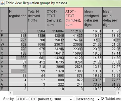
1 min). Our exploration focuses on these actually delayed flights.The regulation dataset describes 2704 regulations. For each regulation, the data include the start and end times, the reference location, the duration, in minutes, and the regulation reason code. The reason codes that occurred in the dataset can be seen in the leftmost column of the table inFig. 2. For a small fraction of the regulations, brief text descriptions are provided.
[image:6.595.318.558.66.264.2]To see the frequency and severity of the regulations, due to the different reasons, we aggregated the data of the delayed flights based on the identifiers of the most penalizing regulations. InFig. 2, we see that the most frequent regulation reason is C (ATC capacity deficit), which occurred 633 times, and it is also responsible for the maximal number of delayed flights (6904) and the longest total delay duration (112,168 min
=
1869.
47 h=
78 days). The other reasons for the regulations that affected many flights and caused much overall delay were P (special event; most of these regulationsFig. 2.Statistics of the flight regulations by the reasons.
were related to the implementation and use of ATM systems), I (ATC industrial action, including strikes), W (bad weather condi-tions), S (ATC staff deficit), O (other), and G (aerodrome capacity deficit).
Our exploratory task is to understand the spatial and temporal patterns in the creation of regulations, particularly those that are caused by ATC capacity deficits. Knowing these patterns may be instrumental for more reliable planning of flights and management operations and more accurate forecasting of resource demands.
Please note that the term ‘‘spatial pattern’’ may refer to the locations of the regulation events (i.e., where the regulations were issued) or to the locations (origins and destinations) of the affected flights. The term ‘‘temporal pattern’’ may refer to the starting and times of the regulations or to the times of the flights affected by the regulations. For good understanding of the air traffic manage-ment problems, it is necessary to study the spatial and temporal distributions of both the regulation events and the affected flights.
4.2.3. Data exploration
The upper series of maps inFig. 3shows the spatial patterns of the regulation events for the reason C (based on the locations where the regulations were issued) while the lower series of maps shows the spatial patterns of the delayed flight departures due to these regulations (based on the locations of the airports in which the flights were delayed). In the upper row, the first map shows the density of the regulation events while the second and third maps show the densities weighted by the numbers of the delayed flights and the delay durations, respectively. In the lower row, the map on the left shows the density distribution of the delayed departures and the map on the right shows the density weighted by the delay durations. These and other density maps included in this section have been produced by means of kernel density estimation with the bandwidth (radius) of 150 km and a linear kernel (smoothing function).
Fig. 4shows a fragment of a map representing the spatial
Fig. 3. Upper row, from left to right: density of the regulation events caused by the ATC capacity deficit (reason code C), weighted density of the regulation events by the number of delayed flights, and weighted density by the delay duration. Lower row: density of the delayed departures (left) and weighted density of the delayed departures by the delay duration (right).
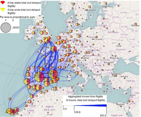
The pie charts inFig. 4show the numbers and proportions of the flight departures (red segments) and arrivals (yellow segments) in the areas resulting from the tessellation. Although the flight origins and destinations are distributed worldwide, most of them are within the territory shown inFig. 4, as the dataset describes the flights that used the airspace of Spain. The blue curved lines represent aggregated movements (flows) between the areas; the curvature increases in the direction towards the destination. The line widths encode the flight counts. To reduce the clutter, the flow lines representing less than 100 flights are hidden. Both the pie charts and flow lines show high symmetry of the movements be-tween the areas: each area contains approximately equal numbers of flight departures and arrivals, and the flow lines in two opposite directions between any two areas have equal widths.
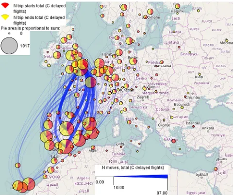
InFig. 5, the same representation as inFig. 4is applied to the
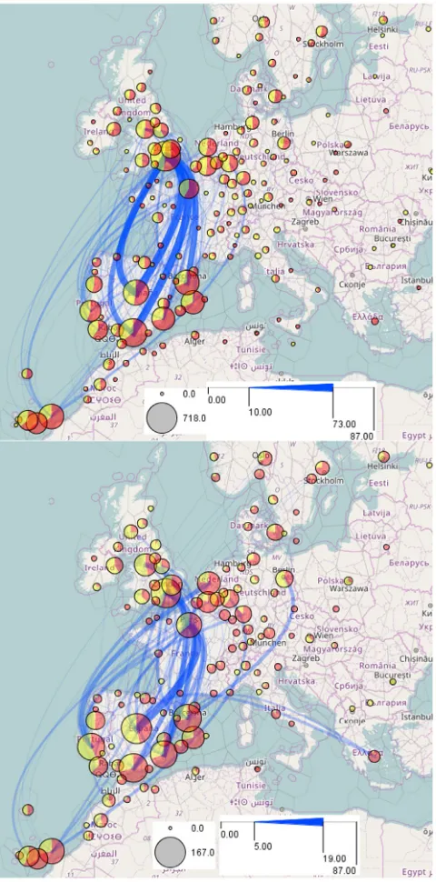
6904 flights that were delayed due to the ATC capacity deficit. The spatial pattern differs much from the one inFig. 4. We ob-serve high asymmetry between the numbers of the flight depar-tures and arrivals as well as asymmetric flows between areas. The pie charts show us that there were more delayed departures due to the capacity deficits on the south and east of Spain as well as on Canary Islands. The flow lines show that the largest numbers of delayed flights happened on the connections from Madrid, Seville/Malaga, and Barcelona to London and from London to Madrid and Seville/Malaga.
The two-dimensional time histogram inFig. 6shows the tem-poral distribution of the flight departures delayed for the reason
Fig. 4.Aggregated unregulated flights. The pies show the numbers and proportions of the flight starts and ends, and the curved flow lines show aggregated moves between the flight origins and destinations.
[image:7.595.309.549.477.677.2]Fig. 5.Aggregated flights delayed due to ATC capacity deficits. The visual encoding is the same as inFig. 4.
existed during the interval [ETOT, ATOT], i.e., from the estimated to the actual time of the take-off. We see that the delays were not uniformly distributed over the days, but there were several days with much higher numbers of delayed flights than in the other days. The highest numbers were attained on April 9 and 16 (both were Saturdays), April 10 (Sunday), and a few other days. There is no periodic pattern regarding the weekly time cycle. It is reasonable to consider separately the times with extremely many delayed flights and those with smaller numbers.
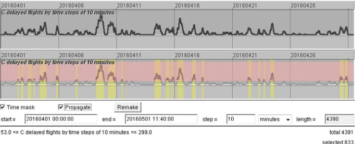
The upper part ofFig. 7shows a fragment of a time series display representing the counts of the delayed flights for the reason C by 10-minutes time intervals. To aggregate the flights by the time intervals, we treated each delayed flight as an event that existed during the time interval [ETOT, ATA], i.e., from the estimated time of the take-off to the actual time of the arrival. For each 10-minutes interval, the delayed flights that existed during this interval were counted. The counts range from 0 to 299; 3350 out of 4391 intervals had at least one delayed flight. Among these intervals, the first quartile, median, and third quartile of the delayed flight counts are 5, 20, and 52, respectively. In the lower part ofFig. 7, we have applied a query condition that selects the time periods when the numbers of the delayed flights exceeded the third quartile. The filter selects 833 10-minutes intervals, which are marked by yellow background painting.
To see the spatial patterns of the flight delays in these intervals, we propagate the time mask filter from the time series display to all time-referenced datasets. The application of the time mask filter to the set of delayed flights selects those flights that were conducted during the selected time intervals. This triggers reaggregation of the flights by the origin and destination areas. Only the selected flights are aggregated. As a result, we can observe the spatial distri-bution of the delayed flights at the times of extremely many delays
(Fig. 8, top). For comparison, the lower map inFig. 8shows the
distribution of the delayed flights at the times when the number of delays was from 1 to 20, which is the median. Please note that the pie charts and flow lines are scaled differently in each map, the scales being adjusted to the respective value ranges.
[image:8.595.318.554.68.367.2]We see that the spatial pattern of the delayed flights at the times of high numbers of delays (Fig. 8, top) is similar to the overall spatial pattern for the whole time (Fig. 5), which may mean that the overall pattern is much affected by the times of the extreme delays. The spatial pattern for the times with the low numbers of delayed
Fig. 6. The distribution of the flight departures delayed for the reason C (ATC capacity) by the days (rows of the matrix) and day hours (columns). The counts of the delayed departures are represented by the proportional sizes of the rectangles in the matrix cells.
flights (Fig. 8, bottom) is notably different. A possible reason for the differences is that flight regulations emerge in different areas during the times with low and high delays.
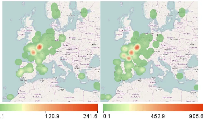
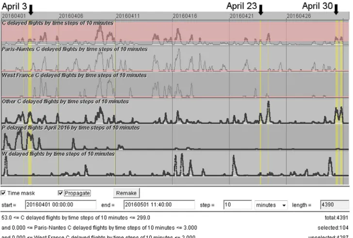
To check this, we look at the weighted densities of the regu-lation events with the reason code Cat the times of low (Fig. 9, left) and high (Fig. 9, right) numbers of flight delays. The densities are weighted by the numbers of the affected flights. We see that there are two hotspots of the regulations that existed during both subsets of the time intervals. They are located in France around Paris and Nantes. At the times of high numbers of flight delays, three additional hotspots existed along the western coast of France. Now we want to compare the sets of the flights delayed by the regulations created on the west of France and around Paris and Nantes. We do this by means of cross-filtering between the set of regulations and the set of ATFM delayed flights. We use spatial filtering to select the regulations created on the west of France and apply cross-filtering to select the flights delayed by these regulations. We have previously removed the time mask filter to see the whole subset of the flights delayed by the regulations in the selected area. After the cross-filter has been applied to the set of flights, the selected subset of flights has been dynamically re-aggregated. The result of the flight selection and aggregation is shown on the left ofFig. 10. We see that the regulations created on the west of France are responsible most of all for delaying the flights between the UK, on one side, and Spain and Portugal, on the other side. The flights from the UK are affected more than the opposite flights.
Fig. 7.Top: the counts of the flights delayed for the reason C by 10-minutes time intervals are represented in a time series display. Bottom: the appearance of the display after setting a query that selects the time intervals with 53 or more delayed flights.
Murcia to the UK, as well as the flights between the Netherlands, Belgium, and Germany, on one side, and Spain and Portugal, on the other side. It is interesting that the flights from the UK to Spain are affected notably more by the regulations issued on the west of France (Fig. 10, left) whereas the flights from Spain to the UK are affected slightly more by the regulations issued in the areas of Paris and Nantes (Fig. 10, right).
To compare the temporal patterns of the delays due to the regulations in the areas of Paris–Nantes and west coast of France, we create time series of the counts of the flights delayed by these two groups of regulations and put them in the time series display
(Fig. 11, the second and third rows from the top). For completeness,
we also create a time series for the remaining delayed flights (the fourth row inFig. 11). By comparing the former two time series, we see that in the period from April 4 to April 17 peaks in both time series emerged very frequently and nearly simultaneously, with a few exceptions. After April 17, there were almost no peaks of delayed flights due to regulations at the west coast of France. There were peaks due to regulations around Paris–Nantes, but they were fewer and mostly smaller than before. To find a probable reason for the high number and frequency of the ATC capacity-related regulations issued on the territory of France from April 4 to April 17, we look at the spatial and temporal distributions of the regulations due to other reasons, specifically, P (special event), I (industrial action), W (bad weather), and S (ATC staffing issues). We find that the regulations for the reason S are neither temporally nor spatially related to the regulations in France in the time period of interest. Some of the regulations with the reason code ‘‘I’’ hap-pened on April 9 and 10 due to a strike in Italy. Experts believe that these regulations might have had a network effect: the limitations in the Italian air space could increase the demands for the ATC services elsewhere, in particular, in the space of France. This could trigger further regulations due to the ATC capacity deficits and thus be responsible for the very high numbers of flight delays on April 9 and 10 (seeFig. 6). However, there was also a strike in France from April 27 to 29 that had no observable effects on ‘‘C’’ regulations.
The time series for the regulations due to bad weather (shown in the lowest row of the display inFig. 11) has three peaks in the middle (April 16–17), when there were also peaks of the delays due to ‘‘C’’ regulations in France (rows 2 and 3). By direct manipulation in the display (mouse dragging), we select the time range of each of the weather-related peaks and observe the weighted density dis-tributions of the respective regulations. The first peak corresponds to regulations around Barcelona and Lisbon and on Canary Islands, and the second and third peaks were due to bad weather on Canary Islands. As we know fromFig. 10, many flights to and from these areas cross the air space of France. It is probable that delays of some of these flights due to bad weather could increase the demand for
the ATC services in the air space of France at later times, which might trigger ‘‘C’’ regulations. However, this kind of explanation is not applicable to the peaks of the delays due to ‘‘C’’ regulations in France that happened on April 14 and 15.
The spatial distribution of the regulations for the reason P
(Fig. 12) perfectly matches the hotspots of the ‘‘C’’ regulations
visi-ble on the right ofFig. 9, but we see inFig. 11(the second row from the bottom) that most of the flight delays due to the ‘‘P’’ regulations happened from April 1 to April 4, i.e., before the period of the severe regulations in France (rows 2 and 3 from top). Nevertheless, there may be a relation. All ‘‘P’’ regulations in the time from April 1 to April 4 happened in France. The explanations available for many of them tell us that they were caused by implementation of ATC systems. It might happen that the systems did not function perfectly in the initial period after the implementation, which might have caused severe regulations in the air space of France.
We have seen so far that most of the peaks of the flight delays due to the ATC capacity deficits (row 1 of the time series display
inFig. 11) were caused by regulations in Paris–Nantes (row 2)
and western France (row 3); however, some of the peaks emerged when the regulations in these areas were small. We create a time mask filter (Fig. 11) to look at the spatial patterns of the regulations and delayed flights at the times of these peaks. Being propagated to all datasets, the filter selects the regulations and the delayed flights that existed during these times. The map on the left ofFig. 13shows the density of the ‘‘C’’ regulations weighted by the number of the affected flights. The main hotspot is around Barcelona; there are also lesser hotspots around Lisbon and on Canary Islands. The map on the right ofFig. 13shows the aggregated delayed flights. These are mostly flights from Spain and Canary Islands to central Europe and from the UK to Canary Islands.
The visual representation of the time mask filter (Fig. 11) shows us that there were three major periods satisfying the query con-ditions. By sequentially selecting each of these periods in the time series display, we find out that most regulations on April 3 were on Balearic Islands, and the affected flights were from there to central Europe. On April 23, regulations emerged around Lisbon and on Canary Islands and affected many incoming and outgoing flights. On April 30, severe regulations near Barcelona and on Canary Islands delayed many flights to and from these areas.
Fig. 8.The spatial distributions of the delayed flights at the times of extremely high numbers of delays (top) and at the times with low numbers of delays (bottom).
4.2.4. Conclusion
The goal of our exploration was to detect regular patterns and/or dependencies in flight regulations that could suggest pos-sible directions for improving the flow management. We found that, in general, there is no temporal regularity in the emergence of regulations, except for a few areas. We also found that the major bottlenecks throughout the whole studied period were the areas around Paris and Nantes, where severe regulations emerged very frequently. The high frequency and severity of the regulations in these areas and on the western coast of France in the beginning of April can, possibly, be attributed to the adaptation period after the implementation of a new ATC system. There is also some evidence that the emergence of ATC capacity deficits and respective regu-lations could sometimes be provoked by reguregu-lations due to other reasons, such as strikes and bad weather. However, the frequency
of the regulations in the Paris and Nantes areas cannot be fully ex-plained by these effects. Hence, there areas require improvements in flight planning and flow management above all others.
4.3. Maritime navigation: abnormal events
4.3.1. Introduction into the domain
Safety and security are constant concerns of maritime nav-igation, especially when considering the continuous growth of maritime traffic around the world and persistent decrease of crews onboard. This favoured the development of automated monitor-ing systems such as AIS (Automatic Identification System), which provides real-time positioning of a vessel to other vessels and to shore stations located in its radio range. The International Maritime Organization requires AIS transmitters to be installed aboard in-ternational voyaging ships with gross tonnage of 300 or more and all passenger ships regardless of the size. Apart from the positions, an AIS device also transmits navigation data such as ship identi-fication, course, heading, speed, next port more and all passenger ships regardless of the of call, destination, and expected time of arrival. There are also other systems used for sea traffic monitoring. However, the availability of this information does not by itself ensure the safety of the maritime traffic. Officers on the watch and monitoring authorities require the development of decision-aid solutions that will take advantage of these communication sys-tems (Claramunt et al., 2007). Particularly, detection and analysis of anomalous events occurring size in movement of vessels is a crucial asset for improving the security of vessel traffic (Devogele
et al., 2013). The range of possible events of interest is very large:
from collision at sea to unreported and unregulated fishing and illicit activities.
In our paper, we focus on events of near-location (small dis-tance between two vessels that can bring to collisions) and high sinuosity (curvy movement) patterns occurring when vessels are manoeuvring, but the approach can be straightforwardly extended to other kinds of anomalous events.
4.3.2. Data and exploratory task
The data consist of 5244 vessel trajectories reconstructed from AIS messages obtained in the bay of Brest in France (Fig. 14) during the time period from the 11th of February till 21st of December, 2009; however, the data are not available for all days. Our analysis focuses on the trajectories of those vessels that moved through the strait (1.8 km length) either into or out of the bay (Fig. 14, bottom). We have selected 2411 such trajectories by means of spatial filter-ing. The task is to detect near-location and high sinuosity events and investigate the conditions when these events occur using the proposed time mask filter.
4.3.3. Data exploration
For detecting near-location events, different approaches have been developed so far (Fujii et al., 1970;Pedersen, 1995). Our ap-proach is based on a search of a spatiotemporal nearest neighbour for each point in the trajectory of each vessel: given the positionp
Fig. 9.Weighted (by the number of delayed flights) densities of the regulation events with the reason code C (ATC capacity) at the times of low (left) and high (right) numbers of flight delays.
Fig. 10.Spatial patterns of the flights delayed by the regulations issued on the west of France (left) and around Paris and Nantes (right).
events. We have extracted 2579 such events that occurred in 578 trajectories. A density map of the extracted events is shown in
Fig. 15, left. The density maps in this example are built with the
kernel radius of 300 m. Some of the events occurred outside of the main traffic lanes. We are primarily concerned with the events that happened within the traffic lanes because they are potentially more dangerous to the navigation. We apply spatial filtering to select these events, which gives us 2105 events originating from 447 trajectories (Fig. 15, right).
To understand the circumstances of the occurrence of the near-location events, we want to compare the traffic patterns at the times when these events happened and in the remaining time. We create a time series of the event count by hourly time intervals and put it in a time series display. The length of the time series is 7482 h, according to the duration of the whole time span of the
data. Please note that only 1860 hourly intervals within this time span contain data about vessel positions. Thus, the first row in the display inFig. 16shows the time series of the vessel counts by the hourly intervals. Large gaps in the temporal coverage of the data are clearly seen.
The second row of the display shows the time series of the counts of the near-location events. We interactively select the time intervals containing at least one near-location event. Our query selects 248 hourly intervals, in which the event counts range from 2 to 71.
Fig. 11.The time series display shows, from top to bottom, the counts of flights delayed due to (1) all regulations with the reason C (ATC capacity), (2) those issued around Paris and Nantes, (3) those issued on the west of France, (4) the remaining ‘‘C" regulations, (5) the regulations for the reason P (special event), and (6) the regulations for the reason W (bad weather). A time mask filter selects the times when many flights were delayed due to reason C while the numbers of such regulations in the areas Paris C Nantes and western France were low.
Fig. 12. Spatial pattern of the regulations with the reason code P (special event, including ATC system implementation).
trajectories that switched from one traffic lane to another. When we invert the time mask filter, i.e., select the time intervals without near-location events, we see a notably different spatial density pattern (Fig. 17, right): the two lanes are quite well separated; the density of the trajectories that switch the lanes is relatively low. The inverse time mask filter has selected 2238 trajectories.
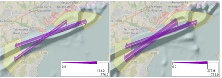
To obtain numeric characteristics of the movements between and within the lanes, we create (by drawing on the map) four
polygonal areas (Fig. 18), two per lane, in the eastern and western parts of the lane. Then we aggregate the trajectories into flows between these areas. From the whole set of 12 links between the areas, we select the four links going across the lanes from west to east and from east to west and investigate the flows on these links at the times of occurrence of the near-location events and in the remaining time. This is done using the time mask filter described earlier. The flows are dynamically recomputed and the map is updated when the filter changes.
The flow map on the left ofFig. 18corresponds to the time mask selecting the time intervals with the near-location events. When the mask is inverted, the map looks as is shown on the right of
Fig. 18. At the times of the near-location events (left) 134 vessels
moving westwards switched from the southern to the northern traffic lane. The remaining flows between the lanes were much lower. Thus, there were only 31 moves on the opposite link and 57 and 58 moves on the other two links. The flows at the times with no near-location events (Fig. 18, right) were much more symmetric. There were 277 moves from the southwest to the northeast and 256 opposite moves; 170 and 183 ships moved from the northwest to the southeast and in the opposite direction. The comparison of the two spatial patterns suggests that near-location events occur when unusually many vessels move from the eastern part of the Brest harbour to the west using the northern traffic lane. As it has been explained by the domain experts, it often happens that mul-tiple ships, especially fishing ships, leave the harbour together. The occurrence of near-location events may increase at these times.
Fig. 13.Spatial patterns of the ‘‘C’’ regulations and respective delayed flights at the times selected by the time mask shown inFig. 11.
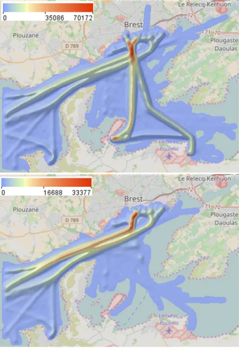
Fig. 14. The bay of Brest with the densities of all vessel trajectories (top) and the trajectories going through the strait (bottom).
events that occurred within the main traffic lanes and therefore apply spatial filtering to select these events. 403 sinuosity events
from 204 trajectories occurred in or near the major traffic lanes, this being a bad news for traffic safety. Using the time mask filter, we find out that 290 out of these 403 events (72%) happened during the times of the occurrence of the near-location events. Moreover, these 290 sinuosity events happened in 166 trajectories, of which 165 had also near-location events. Hence, there is a clear relationship between the near-location and sinuosity events. Evidently, movement with high sinuosity happens when vessels deviate from their course in order to avoid collisions with other vessels, as required by maritime navigation rules.
In Fig. 20, we have applied the filter of trajectory segments
to select the parts of the trajectories were the distances to the nearest vessels were under 100 m. For these trajectory parts, we have built a weighted density surface using the sinuosity values as the weights. This means that trajectory segments contribute to the calculated densities proportionally to their sinuosity values. We see that the highest density of sinuous movements is reached inside the strait, mostly in the northern traffic lane, and between the strait and the harbour in the southern lane. We also observe a spot of relatively high density at the harbour in the northern lane (a port entrance of 300 m width creates a bottleneck favouring near-location events and collision-avoiding manoeuvres). Judging from the spatial configuration of the dense area, this can be attributed to vessels that were sailing from the western part of the harbour and heading to the southern traffic lane. Evidently, sinuosity events occurred at the location where the flows coming from the western and eastern parts of the harbour conjoin. Also, relatively high sinuosity was reached at the intersection of the two traffic lanes.
Hence, we can conclude that the anomalous events can be attributed to intersecting traffic flows at the times of increased amounts of outgoing traffic from the Brest harbour.
4.3.4. Conclusion
[image:13.595.39.278.345.694.2]Fig. 15.The density of the extracted near-location events (left: all events; right: the events that occurred in the main traffic lanes).
Fig. 16. A time series display shows the counts of the vessels (upper row) and the near-location events (lower row) by 1-hour time steps. A query selects the intervals containing at least one event.
Fig. 17.The density of the trajectories in the times of occurrence of near-location events (left) and in the remaining times (right).
[image:14.595.123.484.397.537.2] [image:14.595.122.486.575.703.2]Fig. 19.Trajectory segments corresponding to curvy movement.
Fig. 20. Weighted density of the trajectory segments where the distances to the nearest vessels are below 100 m. The sinuosity values are used as the weights.
•
The near-location events most often occurred at the times when the outgoing traffic from the Brest harbour exceeded the incoming traffic.•
A major part of the near-location events happened to vessels that moved out of the harbour in the southern traffic lane and then switched to the northern lane before entering the strait, this reflecting some navigation routes predefined in the area.•
The sinuosity events are closely related to the near-location events.•
Both types of anomalous events are related to intersecting traffic flows between the harbour and the strait and, possi-bly, narrow space and high traffic density in-side the strait, where the vessels need to go in two parallel lanes.5. Discussion
The two examples of non-trivial analysis scenarios show the possible purposes and ways of using time masks. Generally, the time mask filtering is useful in analysing temporal and spatiotem-poral phenomena with the aim to uncover relationships between different phenomena or different aspects of a phenomenon. The essence of the approach is to determine the time intervals when some of the aspects have particular states or behaviours and comparatively investigate the states and behaviours of the other aspects during these intervals and in the remaining times. Signifi-cant differences may indicate the existence of relationships, which may need to be verified by detailed examination with the use of
mask filter and its inverse with a subsequent comparative analysis of the results may be insufficient, and it may be necessary to iterate this workflow with setting different filter conditions.
When large amounts of data are analysed, an appropriate way to present the results of filtering and other operations to the analyst is by applying aggregation. In our analysis scenarios, we applied temporal aggregation by days and hours, continuous spatial ag-gregation producing fields of density and weighted density, and discrete spatial aggregation by a chosen set of places and pair wise links between the places. The aggregation was dynamically reapplied to the results of data filtering after each change of the filters. Such a dynamic behaviour is only partly good for support-ing exploratory activities: on the one hand, it gives immediate feedback to user’s interactive operations, but, on the other hand, it complicates comparative analyses between results of different filtering operations. Since the use of time masks in data analysis essentially requires making such comparisons, it is desirable to support this by appropriate tools that go beyond making and juxtaposing screenshots. Thus, it could be convenient to use two or more workspaces each dealing with its own set of filters applied to the same data. The comparison of filtering results between the workspaces could be further supported by generation of difference views representing the differences visually. This kind of support is missing yet in our prototype system.
The time mask technique can be further developed to enable detection and exploration of temporally lagged relationships. For such an investigation, the analyst should be able to select the time intervals that precede or follow the intervals in which specified conditions fulfilled. For example, in our aviation use case, it might be relevant to consider specifically the times preceding the peaks in the flight delays due to ATC capacity deficits or the times after the delays due to bad weather conditions. The investigation of these in-tervals would promote our reasoning concerning the relationships between different types of regulations. In the future, we plan to enhance our interactive time mask tool with these possibilities.
6. Conclusion
[image:15.595.37.277.265.410.2]Acknowledgement
This work was supported in part by EU in project datAcron (grant agreement 687591).
References
Andrienko, N., Andrienko, G.,2011. Spatial generalization and aggregation of mas-sive movement data. IEEE Trans. Vis. Comput. Graphics 17 (2), 205–219. Aigner, W., Miksch, S., Schumann, H., Tominski, C.,2011. Visualization of
Time-Oriented Data. Springer Science & Business Media.
Andrienko, G., Andrienko, N., Bak, P., Keim, D., Wrobel, S.,2013a. Visual Analytics of Movement. Springer Science & Business Media.
Andrienko, G., Andrienko, N., Bartling, U.,2008. Visual analytics approach to user-controlled evacuation scheduling. Inf. Vis. 7 (1), 89–103.
Andrienko, G., Andrienko, N., Hurter, C., Rinzivillo, S., Wrobel, S.,2013b. Scalable analysis of movement data for extracting and exploring significant places. IEEE Trans. Vis. Comput. Graphics 19 (7), 1078–1094.
Claramunt, C., Devogele, T., Fournier, S., Noyon, V., Petit, M., Ray, C.,2007. Maritime GIS: from monitoring to simulation systems. Inf. Fusion Geogr. Inf. Syst. 34–44. Devogele, T., Etienne, L., Ray, C.,2013. Maritime monitoring. Mobility Data: Model.
Manag. Underst. 224–243.
Edsall, R. and Peuquet, D. 1997. A graphical user interface for the integration of time into GIS. In: Proceedings of the 1997 American Congress of Surveying and Mapping Annual Convention and Exhibition, Seattle, WA, pp. 182–189. Fredrikson, A., North, C., Plaisant, C., Shneiderman, B.,1999. Temporal,
geograph-ical and categorgeograph-ical aggregations viewed through coordinated displays: a case study with highway incident data. In: Proceedings of the 1999 Workshop on New Paradigms in Information Visualization and Manipulation in Conjunction with the Eighth ACM Internation Conference on Information and Knowledge Management. ACM, pp. 26–34.
Fujii, Y., Yamanouchi, H., Mizuki, N.,1970. On the fundamentals of marine traffic control. Part 1 probabilities of collision and evasive actions. Electronic Naviga-tion Research Institute Papers 2, 1–16.
Gadia, S.K.,1988. A homogeneous relational model and query languages for tempo-ral databases. ACM Trans. Database Syst. 13 (4), 418–448.
Gray, J., Chaudhuri, S., Bosworth, A., Layman, A., Reichart, D., Venkatrao, M., Pellow, F., Pirahesh, H.,1997. Data cube: a relational aggregation operator generalizing group-by, cross-tab, and sub-totals. Data Min. Knowl. Discov. 1 (1), 29–53. Harrower, M., Griffin, A.L. and MacEachren, A. 1999. Temporal focusing and
tempo-ral brushing: assessing their impact in geographic visualization. In: Proceed-ings of 19th International Cartographic Conference, Ottawa, Canada, vol. 1, pp. 729–738.
Harrower, M., MacEachren, A., Griffin, A.L.,2000. Developing a geographic visual-ization tool to support earth science learning. Cartogr. Geogr. Inf. Sci. 27 (4), 279–293.
Hochheiser, H., Shneiderman, B.,2004. Dynamic query tools for time series data sets: timebox widgets for interactive exploration. Inf. Vis. 3 (1), 1–18. Hurter, C., Tissoires, B., Conversy, S.,2009. Fromdady: spreading aircraft trajectories
across views to support iterative queries. IEEE Trans. Vis. Comput. Graphics 15 (6), 1017–1024.
Jensen, C.S., Clifford, J., Gadia, S.K., Segev, A., Snodgrass, R.T.,1992. A glossary of temporal database concepts. ACM Sigmod Record 21 (3), 35–43.
Krüger, R., Thom, D., Wörner, M., Bosch, H., Ertl, T.,2013. Trajectorylenses c a set-based filtering and exploration technique for long-term trajectory data. Comput. Graph. Forum (ISSN: 1467-8659) 32 (3pt4), 451–460.
Lins, L., Klosowski, J.T., Scheidegger, C.,2013. Nanocubes for real-time exploration of spatiotemporal datasets. IEEE Trans. Vis. Comput. Graphics 19 (12), 2456–2465. Liu, Z., Jiang, B., Heer, J.,2013. immens: Real-time Visual Querying of Big Data.
Comput. Graph. Forum 32 (3pt4), 421–430.
Pahins, C.A., Stephens, S.A., Scheidegger, C., Comba, J.L.,2017. Hashedcubes: simple, low memory, real-time visual exploration of big data. IEEE Trans. Vis. Comput. Graphics 23 (1), 671–680.
Pedersen, P.T.,1995. Collision and grounding mechanics. Proc. WEMT 95 (1995), 125–157.
Rinzivillo, S., Pedreschi, D., Nanni, M., Giannotti, F., Andrienko, N., Andrienko, G.,
2008. Visually driven analysis of movement data by progressive clustering. Inf. Vis. 7 (3–4), 225–239.
Shneiderman, B.,1994. Dynamic queries for visual information seeking. IEEE Softw. 11 (6), 70–77.
Shneiderman, B.,1996. The eyes have it: A task by data type taxonomy for informa-tion visualizainforma-tions. In: Visual Languages, 1996. Proceedings., IEEE Symposium on. IEEE, pp. 336–343.
Stolte, C., Tang, D., Hanrahan, P.,2002. Query, analysis, and visualization of hier-archically structured data using polaris. In: Proceedings of the Eighth ACM SIGKDD International Conference on Knowledge Discovery and Data Mining. ACM, pp. 112–122.
Stolte, C., Tang, D., Hanrahan, P.,2003. Multiscale visualization using data cubes. IEEE Trans. Vis. Comput. Graphics 9 (2), 176–187.
Wang, Z., Ferreira, N., Wei, Y., Bhaskar, A.S., Scheidegger, C.,2017. Gaussian cubes: Real-time modeling for visual exploration of large multidimensional datasets. IEEE Trans. Vis. Comput. Graphics 23 (1), 681–690.