White Rose Research Online URL for this paper: http://eprints.whiterose.ac.uk/5006/
Monograph:
Vickers, D. (2003) The Difficulty of Linking Two Differently Aggregated Spatial Datasets: Using a Look-up Table to Link Postal Sectors and 1991 Census Enumeration Districts. Working Paper. School of Geography , University of Leeds.
School of Geography Working Paper 03/02
[email protected] Reuse
Unless indicated otherwise, fulltext items are protected by copyright with all rights reserved. The copyright exception in section 29 of the Copyright, Designs and Patents Act 1988 allows the making of a single copy solely for the purpose of non-commercial research or private study within the limits of fair dealing. The publisher or other rights-holder may allow further reproduction and re-use of this version - refer to the White Rose Research Online record for this item. Where records identify the publisher as the copyright holder, users can verify any specific terms of use on the publisher’s website.
Takedown
If you consider content in White Rose Research Online to be in breach of UK law, please notify us by
THE DIFFICULTY OF LINKING TWO DIFFERENTLY AGGREGATED SPATIAL
DATASETS: USING A LOOK-UP TABLE TO LINK POSTAL SECTORS AND 1991
CENSUS ENUMERATION DISTRICTS
Daniel Vickers School of Geography
University of Leeds Leeds LS2 9JT United Kingdom
CONTENTS
Section Title Page
Abstract iii
Acknowledgement iv
List of Figures v
List of Tables viii
1 Introduction 1
2 Postcode Geography 2
2.1 The development of postcodes as areal output units and their changing
role in census geography
4
2.2 The Applications of postcodes through data linkage 6
2.3 The Role of GIS in the development of postcoding 7
2.4 Experian Postal Sector Data 7
3 Census Geography 8
3.1 The Geography of the 1991 Census of England and Wales 9
3.2 The Role of GIS in the changing nature of census geography 11
4 Ecological Fallacies and the aggregation effect of the Modifiable Areal
Unit Problem
13
4.1 Ecological Fallacies 13
4.2 The Modifiable Areal Unit Problem and the consequences of data
aggregation
14
5 How well does the Experian data reflect the 1991 Census? 18
5.1 Descriptive statistics and correlations between and within the datasets 21
5.2 Erroneousness and observed differences between the two data sets 27
5.3 Neighbourhood variations between the two datasets 30
5.4 The accuracy of the Experian look up table 46
6 Conclusions 61
ABSTRACT
ACKNOWLEDGEMENTS
Firstly, I would like to thank the European Social Fund (ESF) for the funding they provided during the completion of my MSc. Course at the University of Nottingham during which most of the work on this paper was completed. This project would not have been possible without the provision and availability of data, for this I must thank Experian Ltd, the Office for National Statistics and Manchester Information & Associated Services (MIMAS). I wish to thank the staff of the University of Nottingham Geography Department, especially Bob Abrahart, who was responsible for the initial idea behind the project and Michael McCullagh who oversaw the development of the idea into a working project. Phil Rees of the University of Leeds for answering many of my queries about census geography.
LIST OF FIGURES
Figure # Figure Title Page
Figure 1 An Illustration of the hierarchy of Postal Geography in the UK 2
Figure 2 The process of creating areal unit boundaries for the output of the 2001 Census based on postal address points and postcode boundaries.
5
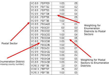
Figure 3 A sample section from the Experian postal sector to ED look-up table 8
Figure 4 An Illustration of the hierarchy of Census Geography of England and Wales
10
Figure 5 An illustration of the process of census design in England and Wales pre 2001
12
Figure 6 An illustration of the process of 2001 Census design in England and Wales
12
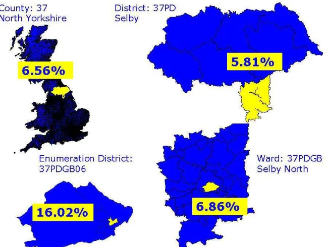
Figure 7 An example of ecological fallacy using census data (percentage of Males above 65 years of age in Selby, North Yorkshire)
14
Figure 8 Sample dataset to illustrate the effect of aggregation on areal units 15
Figure 9
(a - d)
An illustration of the effect of data aggregation of socio-economic data 16
Figure 9
(e - l)
An illustration of the effect of data aggregation of socio-economic data 16
Figure 10 An illustration of the effect of the modifiable areal unit problem using census geography (example a census ward in Selby, North Yorkshire percentage of males above 65)
17
Figure 11 The location of the 11 sample Postal Areas used in this study 18
Figure 12 An initial comparison of two datasets aggregated using different spatial systems (population in North Yorkshire); (a) shows Experian data applied to postal sectors. (b) Shows Census data applied to enumeration districts.
20
Figure 13 The relationship between the population of postal sectors in the Experian and Census datasets using the look-up table to apply Census data to postal sectors.
23
Figure 14 The relationship between the number of cars in postal sectors in the Experian and Census datasets using the look-up table to apply Census data to postal sectors.
Figure 15 The distribution of the differences between the values in the Experian data, and the Census data, which has been applied to postal sectors using the look-up table.
25
Figure 16 A comparison of the number of cars per person in postal sectors, for the Experian and Census data sets using the look-up table to apply Census data to postal sectors.
26
Figure 17 Postal Area AB (Aberdeen) the percentage difference in the value of postal sectors between the Experian and Census datasets using the look-up table to apply Census data to postal sectors (a) Population (b) Number of cars
31
Figure 18 Postal Area CA (Carlisle) the percentage difference in the value of postal sectors between the Experian and Census datasets using the look-up table to apply Census data to postal sectors (a) Population (b) Number of cars
31
Figure 19 Postal Area CF (Cardiff) the percentage difference in the value of postal sectors between the Experian and Census datasets using the look-up table to apply Census data to postal sectors (a) Population (b) Number of cars
32
Figure 20 Postal Area E (London East) the percentage difference in the value of postal sectors between the Experian and Census datasets using the look-up table to apply Census data to postal sectors (a) Population (b) Number of cars
33
Figure 21 Postal Area EH (Edinburgh) the percentage difference in the value of postal sectors between the Experian and Census datasets using the look-up table to apply Census data to postal sectors (a) Population (b) Number of cars
33
Figure 22 Postal Area GU (Guilford) the percentage difference in the value of postal sectors between the Experian and Census datasets using the look-up table to apply Census data to postal sectors (a) Population (b) Number of cars
34
Figure 23 Postal Area NG (Nottingham) the percentage difference in the value of postal sectors between the Experian and Census datasets using the look-up table to apply Census data to postal sectors (a) Population (b) Number of cars
35
Figure 24 Postal Area NR (Norwich) the percentage difference in the value of postal sectors between the Experian and Census datasets using the look-up table to apply Census data to postal sectors (a) Population (b) Number of cars
35
Figure 25 Postal Area TQ (Torquay) the percentage difference in the value of postal sectors between the Experian and Census datasets using the look-up table to apply Census data to postal sectors (a) Population (b) Number of cars
36
Figure 26 Postal Area WR (Warwick) the percentage difference in the value of postal sectors between the Experian and Census datasets using the look-up table to apply Census data to postal sectors (a) Population (b) Number of cars
37
Figure 27 Postal Area YO (York) the percentage difference in the value of postal sectors between the Experian and Census datasets using the look-up table to apply Census data to postal sectors (a) Population (b) Number of cars
37
Figure 28 Postal Area AB (Aberdeen) the percentage difference between the rate of car ownership in the Experian and Census datasets using the look-up table to apply Census data to postal sectors
39
Figure 29 Postal Area CA (Carlisle) the percentage difference between the rate of car ownership in the Experian and Census datasets using the look-up table to apply Census data to postal sectors
39
Figure 30 Postal Area CF (Cardiff) the percentage difference between the rate of car ownership in the Experian and Census datasets using the look-up table to apply Census data to postal sectors
40
Figure 31 Postal Area E (London East) the percentage difference between the rate of car ownership in the Experian and Census datasets using the look-up table to apply Census data to postal sectors
41
Figure 32 Postal Area EH (Edinburgh) the percentage difference between the rate of car ownership in the Experian and Census datasets using the look-up table to apply Census data to postal sectors
42
Figure 33 Postal Area GU (Guildford) the percentage difference between the rate of car ownership in the Experian and Census datasets using the look-up table to apply Census data to postal sectors
42
Figure 34 Postal Area NG (Nottingham) the percentage difference between the rate of car ownership in the Experian and Census datasets using the look-up table to apply Census data to postal sectors
43
Figure 35 Postal Area NR (Norwich) the percentage difference between the rate of car ownership in the Experian and Census datasets using the look-up table to apply Census data to postal sectors
44
Figure 36 Postal Area TQ (Torquay) the percentage difference between the rate of car ownership in the Experian and Census datasets using the look-up table to apply Census data to postal sectors
44
Figure 37 Postal Area WR (Warwick) the percentage difference between the rate of car ownership in the Experian and Census datasets using the look-up table to apply Census data to postal sectors
45
Figure 38 Postal Area YO (York) the percentage difference between the rate of car ownership in the Experian and Census datasets using the look-up table to apply Census data to postal sectors
45
Figure 39 Postal sector YO8 9 the overlap of postal sectors and census EDs, (a) EDs that are linked to the postal sector in the Experian look-up table. (b) EDs that the postal actually intersects.
49
Figure 40 Postal sector YO10 4 the overlap of postal sectors and census EDs, (a) EDs that are linked to the postal sector in the Experian look-up table. (b) EDs that the postal actually intersects.
52
Figure 41 Postal sector NG17 6 the overlap of postal sectors and census EDs, (a) EDs that are linked to the postal sector in the Experian look-up table. (b) EDs that the postal actually intersects.
55
LIST OF TABLES
Table # Table Title Page
Table 1 The technological development of Census design through time 11
Table 2 The effect of data aggregation on the sample dataset (shown in figure 8) 17
Table 3 Descriptive statistics of the differences between the Experian and Census datasets
21
Table 4 Descriptive statistics of the differences between the Experian and Census datasets, cars variable
21
Table 5 Selected examples of the 642 postal sectors in the Experian dataset, which have more cars than people.
27
Table 6 The 13 English Census EDs, which contain more cars than people 29
Table 7 Experian Weightings look-up as in the table weightings for postal sector YO8 9
Table 8 Weightings produced from the actual amount the postal sector covers each ED for postal sector YO8 9
51
Table 9 Differences in population using different weightings for postal sector YO8 9
52
Table 10 Differences in the number of cars using different weightings for postal sector YO8 9
52
Table 11 Experian Weightings as in the look-up table weightings for postal sector YO10 4
53
Table 12 Weightings produced from the actual amount the postal sector covers each ED for postal sector YO10 4
54
Table 13 Differences in population using different weightings for postal sector YO10 4
54
Table 14 Differences in the number of cars using different weightings for postal sector YO10 4
55
Table 15 Experian Weightings as in the look-up table weightings for postal sector NG17 6
56
Table 16 Weightings produced from the actual amount the postal sector covers each ED for postal sector NG17 6
56
Table 17 Differences in population using different weightings for postal sector NG17 6
56
Table 18 Differences in the number of cars using different weightings for postal sector NG17 6
56
Table 19 Differences in 'reverse look-up' table from postal sectors to EDs,
population example
58
Table 20 Differences in 'reverse look-up' table from postal sectors to EDs, cars example
1 INTRODUCTION
In 1987 the Department of the Environment chaired by Lord Chorley published a report titled 'Handling Geographic Information'. The report discusses the way in which, data should be spatially referenced to increase uniformity. The report concluded that two different systems should be employed as standard as they were ideally suited to different situations and could be accurately linked together. The Ordnance Survey's British National Grid co-ordinate system and the Royal Mail's postcode system were recommended.
Since the publication of the Chorley report some changes have taken place, for example the 1991 Census in Scotland was largely built upon postcodes, as were many commercial datasets. However, the 1991 Census of England and Wales was still based on arbitrary output units, called enumeration districts (EDs). Experian postal sector data contains socio-economic data based on the geography of the Royal Mail's postcode system, it also contains a look-up table linking the postal sectors, to Census EDs. The linking of the 1991 Census data and the Experian postal sector datasets through the look-up table will enable an assessment of how well two datasets can be accurately linked. This would also enable the accuracy of the undocumented Experian data set to be assessed against the transparently produced census dataset.
geographically, but also applies the 1991 Census data to the geography of Royal Mail's postal system.
2. POSTCODE GEOGRAPHY
The British Postcode system was created with the sole aim of enabling the automated sorting and delivery of mail. This purpose is clearly reflected in the geography of postcodes. Postcodes are made up of an 'outcode', used to establish which sorting office to send the mail 'out to' and an 'incode', used to establish what part of the local area the mail is to be sent to
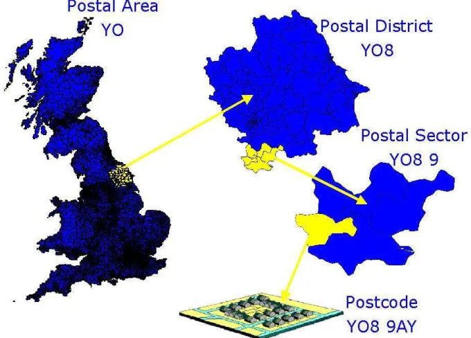
[image:12.595.131.471.383.627.2]when it comes 'in to' the local sorting office. Both the incode and outcode are made up of two geographic parts creating a four tier hierarchy to postal geography.
Figure 1: An Illustration of the hierarchy of Postal Geography in the UK
The geography of the British postal system is illustrated in figure 1,the outcode (e. g. YO8)
2700. The incode (e.g. 9AY) is made up of the postal sector (e.g. YO8 9) of which there are approximately 9200, and the unit postcode (e.g. YO8 9AY) made up of on average of 14 addresses, of which there are approximately 1.7 million in Britain (Martin 1992).
Postcodes are the most widely recognised spatial referencing system. If you were to ask an individual which Census ED it falls within they would be dumbfounded, yet ask them their postcode and they will know automatically (Martin 1992). Postcodes have been widely adopted as the primary reference codes by a wide variety of organisations, therefore the use of postcodes within spatial analysis could provide useful and valuable information, which is more difficult to gain from other areal units (Raper et al 1992).
2.1 The development of postcodes as areal output units and their changing role in
census geography
In the 1971 Census of Scotland EDs fitting into larger postal sectors were used, representing the first step in the British Census being based around postal geography (Raper et al 1992). In 1981 full integration of the Scottish Census with postal geography was decided upon, this contrasts with the more cautious way in which postcodes and EDs were phased together in England and Wales (Martin 2000). It would have seemed beneficial to use the postcode as the design basis for the 1991 Census, which was the case in Scotland. Following the 1987 Chorley report, the 1991 British Census was to be based around postal geography. However, due to spiralling development costs and opinion at the time that it was more important that the areal units used linked reliably to the units used in 1981, the idea was shelved until the planning of the 2001 Census (Martin 1992). The growth of Geographical Information Systems (GIS) through the 1990's led to a dramatic increase in the use of digital geographic data. The popularity of the postcode as a spatial unit was reinforced by the Chorley report of 1987 and 'Postcodes the new geography' by Raper et al. (1992). This led to the reengineering of census output geography in the planning of the 2001 Census count.
being accumulated into EDs and then stored, as had previously been the case. When the data is stored at the individual level it can be aggregated in to many different spatial units, including for the first time postal geographies.
[image:15.595.88.518.183.409.2](a) (b) Figure 2: The process of creating areal unit boundaries for the output of the 2001 Census,
based on postal address points and postcode boundaries. (Source Martin 2002 pp 10)
Postcodes have no boundaries, so to enable the production of census data based on postal
geography postcode boundaries was to be created. Figure 2 explains how this was done, (a)
2.2 The Applications of postcodes through data linkage
Linking geographic datasets together provides 'added value', it increases the number of applications of the dataset and enables comparisons between datasets to observe consistency
and compare accuracy (Raper et al. 1992). The ease of linking of datasets depends upon the
format of the data. When only one of the datasets are in the form of postcodes, linking data through postcodes becomes more complicated and other strategies of exploiting the postcode need to be employed, in order to provide a meaningful answer.
Postcode boundaries enabled the creation of the Office of Population Censuses (OPCS) ED to postcode directory. The OPCS ED to postcode directory was created with the use of population weighted EDs. This was done by finding the population centre of each ED, the ED centriods could then be linked to postcodes using a 'nearest neighbour analysis' where the centre point of each postcode is assigned to the nearest population weighted ED centriod (Raper et al. 1992). Analysis of the OPCS ED to postcode directory has questioned the accuracy of the process. Long thin EDs or inner city areas where EDs are very small were
found to be especially unreliable when linked in this way (Collins et al. 1998). 50% of the
2.3 The role of GIS in the development of postcoding
The rapid growth of GIS during the 1990's has changed the way, in which spatial data can be created, updated and used. The use of GIS has a two-fold benefit when used in conjunction with postal geography, namely the analysis of postal based geographic information and the maintenance of the geography of the postal system. This is especially relevant to the constantly changing postal geography of Britain, which requires constant updating. Existing boundaries can be changed and new boundaries created and immediately saved to the postcode file, which is stored digitally. Previously all maps of postal geography affected by a change would require reprinting and reissuing. GIS not only enables the rapid and easy
update of data but provides a means of quick and simple data analysis (Raper et al. 1992).
2.4 Experian Postal Sector Data
Figure 3: A sample section from the Experian postal sector to ED look-up table Weighting for Enumeration Districts to Postal Sectors
Postal Sector
Weighting for Postal Sectors to Enumeration Districts
Enumeration District
(missing county number)
3. CENSUS GEOGRAPHY
Population censuses held by national statistical offices have the following favourable characteristics:
H they are comprehensive;
H they represent the gold standard of data collection;
H they provide data for all geographical scales;
H they provide objective attributes for the population;
H They have the confidence of the people.
They have the following unfavourable characteristics:
H they suffer from underenumeration;
H there are always arguments about how to estimate and locate the missing population;
H the data are only collected at periodic intervals;
H the range of characteristics gathered is very limited
H Respondents make a great many "errors" when they fill in the census questionnaire.
(Rees 1996 pp 2)
3.1 The Geography of the 1991 Census of England and Wales
planners and academic researchers. The total cost of the 1991 Census was £135 million but its benefit to the country went far beyond its outlay (Raper et al. 1992). Census data is produced at several different levels as illustrated in figure 4, the smallest of which being enumeration districts.
Figure 4: An Illustration of the hierarchy of Census Geography of England and Wales
Census. Haynes et al. (1995) partly blames the under-count in the 1991 Census for differences observed in ward population estimates between the 1991 Census and National Health Service patient registers. The number of people on National Health Service patient registers on the day of the 1991 Census count exceeded the number of people counted in the Census in the counties of Norfolk and Suffolk (Haynes et al. 1995).
3.2 The Role of GIS in the changing nature of Census geography
GIS has played an ever-increasing role in the development of the census (Openshaw and Rao
1995). Table 1 explains how census management has evolved from an entirely manual
process before the 1960's, to computerisation with the advent of the first computers in the 1960's data encoding was computerised. With the birth of GIS geographic encoding could take place on computers and now with new concepts and techniques, the geographical design of census geography can now also take place in the digital environment (Martin 1998).
Table 1:The technological development of Census design through time
Stage Approximate Date (in UK)
Data encoding Geography encoding Geography design
1 Pre 1960 Manual Manual Manual
2 1960s Digital Manual Manual
3 1980s Digital Digital Manual
4 2000s Digital Digital Digital
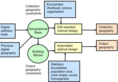
(Martin 1998 pp2) Figures 5 and 6 show how the design of the census developed in the years between the 1991
and 2001 counts. Figure 5 explains the way in which the 1991 Census was designed
geography of the Census are resolved by re-digitising, either manually or on screen (Martin 1998). Enumerator Workload; census organisation Collection geography constraints: Digital address base Previous digital geography Statutory boundaries; population size; zone shape; social homogeneity Collection geography Output geography Output geography constraints: GIS-assisted manual design Automated optimal design Geographical Base Building Blocks
Figure 5: An illustration of the process of census design in England and Wales pre 2001 (Adapted from Martin 1998 pp 5)
isation Manual or GIS-assisted design Collection and output geography constraints: Collection and output geography Previous paper geography Enumerator Workload; statutory boundaries; population size; census organ
Figure 6 illustrates the way in which the 2001 Census was designed, including the two main differences to its predecessor. The use of digital mapping rather than paper maps as the geographic base for the design of collection geography (Martin 2000), and more importantly the separate design of output geography based on postal geography, which is created through an automatic optimal design process (Martin 1998).
4. ECOLOGICAL FALLACIES AND THE AGGREGATION EFFECT OF THE
MODIFIABLE AREAL UNIT PROBLEM
Since the demise of the region as the primary method of geographic study, very few people have expressed a view as to the nature and definition of spatial objects/units being studied (Openshaw & Taylor 1981). The areal units used in the majority of geographical studies are arbitrary, they do not reflect real world geography, and are subject to whims and fancies of whomever aggregated the data (Openshaw 1984a).
4.1 Ecological Fallacies
An ecological fallacy arises when statistics relating to an aggregated areal unit are incorrectly assumed to represent an individual or a smaller unit within the original area (Tranmer & Steel
1998). Figure 7 is a simple example of ecological fallacy based upon census geography, it
Figure 7: An example of ecological fallacy using census data (percentage of Males above 65 years of age in Selby, North Yorkshire)
in 1991 census the threshold level of which population had to exceed to be published was set at 50 people, below this level data was suppressed. Therefore the level/size of area at which the census information is released is critical. If the area is too small the data is suppressed or not available. If the area is too large the data is smoothed to a level where it becomes unrepresentative of its constituent parts. In both instances the likelihood of inaccuracy and ecological fallacy is great (Raper et al. 1992).
4.2 The Modifiable Areal Unit Problem and the consequences of data aggregation
to be specific to each dataset (Openshaw 1984a). The MAUP is especially relevant to this study in that, it examines data for the same area aggregated in two different ways. It is likely that some of the differences observed between the two datasets can be attributed to the fact that they are aggregated into two contrasting geographic systems.
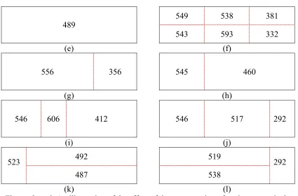
It is possible to produce significantly different correlation rates by choosing an appropriate size or shape of unit area on which to base a study. Therefore the results of studies based on modifiable units will depend on the units used (Openshaw 1984a). With this in mind, the use of the postal sectors could produce significantly different results in comparison to the use traditional census boundaries such as EDs. Figures 8 and 9 show an example of MAUP. Figure 8 represents a grid of 24 fictitious census EDs each one square mile in area. The numbers inside the boxes represent the number of people who live in each ED.
624 587 543 237 321 501 475 509 652 720 526 175
442 605 731 551 599 116
549 574 504 585 235 376
Figure 8: Sample dataset to illustrate the effect of aggregation on areal units
Figure 9 (a – l) illustrate the values that are created if the values in figure 8areaggregated in
489
489
566 412
(a) (b)
543 416
435 561
[image:26.595.70.495.459.739.2](c) (d) Figure 9 a – d: An illustration of the effect of data aggregation of socio-economic data
It is clear that by splitting the grid in different places it is easy to make the population of the two areas look both uniform and irregular. By splitting the grid into different numbers of areas, of varying shapes and sizes further manipulations of the population of the area can be made. The average population of the whole area (figure 9e) is 489 people per square mile, by aggregating the data into six areas (figure 9f) a difference of up to 40% can be produced. Many more different values can be produced by aggregating the data into different sized and shaped areas illustrated in figure 9 g - l.
549 538 381 489
543 593 332 (e) (f)
556 356 545 460
(g) (h)
546 606 412 546 517 292
(i) (j)
492 519 523
487 538
292
Table 2 demonstrates that by aggregating the data in many different ways it is possible to make the red square in figure 8 have many different values ranging from 412 (-139/25%) to 593 (+42/8%) a difference of 181 or 31%. None of the aggregations of the data kept the original value of the square.
Table 2: The effect of data aggregation on the sample dataset (shown in figure 8) Example
Number
Original Value
(a) (b) (c) (d (e) (f)
Value 551 489 412 435 561 489 593
Difference -62 -139 -116 +10 -62 +42
% Difference -11 -25 -21 +2 -11 +8
Example Number
Original Value
(g) (h) (i) (j) (k) (l)
Value 551 556 460 412 517 487 538
Difference -62 +5 -91 -139 -34 -64
% Difference -11 +1 -17 -25 -6 -12
Figure 10 displays a simple example of the MAUP within census geography, it is clear that the way in which the data is aggregated is responsible for two very different patterns of values produced for the same area. Aggregation (a) produces two extreme units with one value being significantly larger than the other. In contrast (b) produces two areas with comparatively similar values.
(a) (b) Figure 10: An illustration of the effect of the modifiable areal unit problem (MAUP) using
There is no real solution to ensuring that multi-level and scale aggregations of data that display the similar geographic patterns whatever the aggregation. The only real way of getting round the problem is to store all data in the least aggregated form possible (i.e. individual level where possible). When stored at this level the data can then be aggregated to the required level or scale, whether this is postal sectors, census EDs, or electoral wards.
5. HOW WELL DOES THE EXPERIAN DATA REFLECT THE CENSUS?
The Experian dataset was too large to examine in its entirety so a sample was selected as a
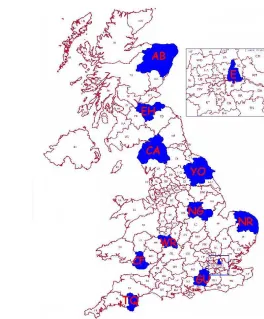
representation of the dataset. Figure 11 shows the 11 postal areas, representing 1005 of the
9216 postal sectors (10.9%) randomly selected. The sample areas are spread throughout the country, in both urban and rural areas to give a representative cross-section of both the population and geography of Britain.
AB Aberdeen CA Carlisle CF Cardiff
E London (East)
[image:28.595.205.469.415.734.2]EH Edinburgh GU Guilford NG Nottingham NR Norwich TQ Torquay WR Warwick YO York
Although both datasets represent socio-economic data for Britain very few variables in each of the datasets have identical data, which is necessary to compare the accuracy of the Experian data to that of the census. Fields that are represented on both the Experian and Census datasets are the population and car ownership variables. From these total population and total numbers of cars were chosen as the link between the two datasets. Scottish sectors should be more accurate as the Scottish census is based on postal geography. However the postal geography of Scotland has changed significantly since the time of the 1991 census and many of the sectors have been renamed and changed in their geography. Therefore the Scottish postal sectors in the Experian datasets don't relate to those when the 1991 census was published. The Experian look-up table links Scottish postal geography to the 'output areas' in the Scottish census (equivalent to EDs in England and Wales).
In order to compare the two datasets they must be viewed at the same geographical level and aggregated using the same geographic system so that the data values are of a similar size. Figure 12 compares the population of the YO (York) postal area at two different
aggregations. The map in figure 12 (a) illustrates the data aggregated by postal sectors,figure
(a) (b)
Quartile Postal Sector
Value
ED Value
Lower Quartile 203 - 2715 0 - 245
Second Quartile 2795 -4905 246 - 398
Third Quartile 4937 - 6248 399 - 497
Upper Quartile 6383 - 11197 498 - 1128
Figure 12: An initial comparison of two datasets aggregated using different spatial systems (population in North Yorkshire), (a) shows Experian data applied to postal sectors. (b) Shows Census data applied to enumeration districts.
Scarborough Scarborough
York
York
Selby
Selby
0 25km
0 25km
50km 5km
5km 50km
5.1 Descriptive statistics and correlations between and within the datasets
Table 3 compares descriptive statistics about the population variable in the Experian dataset
and the Census dataset applied to postal geography with the use of the ED to Postal sector look-up table. The two datasets appear similar. However the Experian dataset has greater maximum and mean values and a larger standard deviation.
Table 3: Descriptive statistics of the differences between the Experian and Census datasets, population variable
Min Max Mean Standard deviation
Experian 0 18,571 6,665 3,534
Census 0 17,563 6,061 3,285
Table 4 compares descriptive statistics about the cars variable in the Experian and the Census datasets applied to postal geography with the use of the ED to Postal sector look-up table. It is clear from these simple statistics that there are obvious differences between the two datasets for the number of cars variable. The maximum value of car ownership in the Experian dataset is four times that of the Census dataset. The mean of the Experian dataset is over 20% greater than the Census and the standard deviation of the Experian dataset is over 30% greater than the Census dataset. This suggests that there are pertinent differences between the number of cars in the two datasets.
Table 4: Descriptive statistics of the differences between the Experian and Census datasets, cars variable
Min Max Mean Standard deviation
Experian 0 28,723 2,808 1,748
Census 0 7,407 2,367 1,304
would represent large differences within one or both of the datasets. To assess the strength of correlation between the datasets both Pearson Product Moment Correlation and Spearman's Rank Correlation were both used.
Relationship between the population of postal sectors in the two datasets
0 4000 8000 12000 16000 20000
0 4000 8000 12000 16000 20000 Population of postal sector in Experian data
Po
p
u
la
ti
o
n
o
f
p
o
st
a
l
se
ct
o
r
in
C
e
n
su
s
d
a
ta
Figure 13: The relationship between the population of postal sectors in the Experian and Census datasets using the look-up table to apply Census data to postal sectors.
Figure 14demonstrates the relationship between the population variable in the two datasets,
showing a near perfect correlation for the Spearman's Rank correlation (0.902 two tailed test
significant at the 0.01 level). However the simple Pearson Correlation although showing a
significant correlation (0.661 two tailed test significant at the 0.01 level) is far from perfect.
This suggests that the car ownership figures have a very significant level of correlation in
terms of their rank. However the Pearson’s correlation suggests that the values within the two
datasets are not as correlated and could suggest a significant differences between the two
datasets. Figure 14 reveals that the number of cars in the Experian dataset isgreater than in
datasets for the car ownership variable. However, looking at figure 14, a few outliers could be responsible for the lesser level of correlation, as the overall trendline (solid line) shifts away from the main trend of the majority of the dataset (dashed line).
Relationship between the numberof cars in postal sectors in the two datasets 0 1000 2000 3000 4000 5000 6000 7000 8000
0 5000 10000 15000 20000 25000 30000
Number of cars in postal sector in Experian data
Nu mb e r o f c a rs i n p o s ta l s e c to r in C e n s u s d a ta
Figure 14: The relationship between the number of cars in postal sectors in the Experian and Census datasets using the look-up table to apply Census data to postal sectors.
Figure 15 reveals that the percentage difference between the value in the Experian and
Figure 15: The distribution of the differences between the values in the Experian data, and the Census data, which has been applied to postal sectors using the look-up table.
-100 -75 -50 -25 0 25 50 75
100 -75 -50 -25 0 25 50 75 100 Differences between values in Experian and Census datasets
-125 100 125
-125 - 125
% difference between the population of the two data sets
% d if fe re n ce b e tw e e n t h e n u mb e r o f ca rs in t h e t w o d a ta se ts
Population: Higher in Census Cars: Higher in Experian
Population: Higher in Experian Cars: Higher in Experian
Population: Higher in Census
Cars: Higher in Census Population: Higher in Experian
Cars: Higher in Census
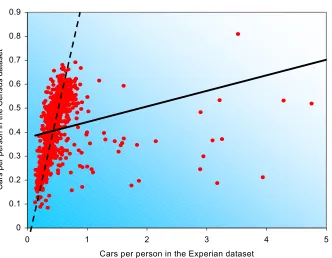
Figure 16 shows car ownership per person for both datasets, this is a combination of both the population and car variables. Tests of correlation were run on the number of cars per person calculated for each dataset it was found that, Pearson's 2-tailed test (at the 0.01 level) produced a not significant correlation of 0.014. This is a surprising result suggesting that there is no correlation between the two datasets, the correlation is greatly affected by several extreme outliers. The Spearman's Rank correlation, which is less affected by outliers,
produced a correlation of 0.697 (significant at the 0.01 level). The trendlines in figure 16 represent the effect that the outliers have on the relationship between the two datasets, the solid trendline represents the trend of the whole dataset, the dashed line represents the trend within the data ignoring outliers and represents a greater relationship between the two datasets.
Comparison of Cars per person
0 0.1 0.2 0.3 0.4 0.5 0.6 0.7 0.8 0.9
0 1 2 3 4
Cars per person in the Experian dataset
[image:36.595.140.472.428.686.2]C a rs p e r p e rs o n i n t h e C e n s u s d a ta s e t 5
5.2 Erroneousness and observed differences between the two data sets.
[image:37.595.71.529.448.652.2]There is a 9-year time difference between the two datasets, the census from 1991 and the Experian data projected for the year 2000. The Experian data set shows 8.30% population growth shown by the 4,337,192 million extra people in the Experian dataset, in comparison to the census data. The Experian data also contains 4,274,428 (20.82%) more cars than the census dataset. These differences could be due to a number of factors, including, real time growth in the period between the two datasets, differences in the Experian dataset, and the well-documented underenumeration in the 1991 census. This difference between the two datasets has been taken into account when making comparisons between them and creates an range of fuzzy accuracy when the Experian value is greater than the census value by an amount less than the average difference between the two datasets for that variable.
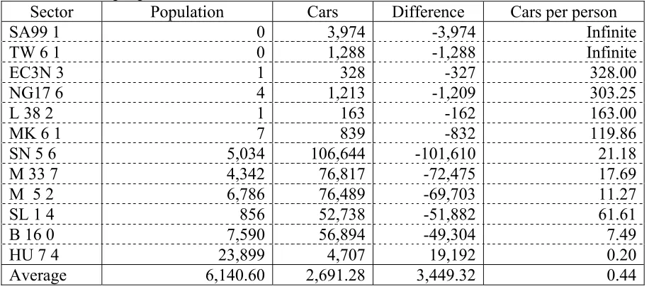
Table 5: Selected examples of the 642 postal sectors in the Experian dataset, which have more cars than people.
Sector Population Cars Difference Cars per person
SA99 1 0 3,974 -3,974 Infinite
TW 6 1 0 1,288 -1,288 Infinite
EC3N 3 1 328 -327 328.00
NG17 6 4 1,213 -1,209 303.25
L 38 2 1 163 -162 163.00
MK 6 1 7 839 -832 119.86
SN 5 6 5,034 106,644 -101,610 21.18
M 33 7 4,342 76,817 -72,475 17.69
M 5 2 6,786 76,489 -69,703 11.27
SL 1 4 856 52,738 -51,882 61.61
B 16 0 7,590 56,894 -49,304 7.49
HU 7 4 23,899 4,707 19,192 0.20
Average 6,140.60 2,691.28 3,449.32 0.44
lives in the sector. This is not an area of incredible car ownership, it is the location of the Honda car factory where all the cars have been pre-registered before they are sold. There are 145 sectors that have 0 residents but have cars the worst case being SA99 1, which has 3,974 cars, the question here is how do people who do not exist own cars? These incongruities are almost certainly point to differences within the car variable in the Experian dataset. It is possible that some of these differences occurred during the input of data. However the number of this type of difference suggest that they are endemic to the original source of the Experian cars variable data
Table 6: The 13 English Census EDs, which contain more cars than people
ED Population Cars Difference Cars per person
01AAFT01 31 64 -33 2.06
03BNFK30 31 46 -15 1.48
01ADFR03 71 105 -34 1.48
16FAFP09 54 74 -20 1.37
01APFZ30 76 93 -17 1.22
01APFZ27 43 50 -7 1.16
25JQFM01 45 52 -7 1.16
25JLFK09 107 120 -13 1.12
01ADFR02 137 150 -13 1.09
01AGFH36 62 66 -4 1.06
04BYFQ21 52 55 -3 1.06
01AMFJ30 98 103 -5 1.05
03BRFL23 72 75 -3 1.04
03BRFL22 100 104 -4 1.04
Average 419.63 168.02 251.61 0.39
If the Experian data were correct a comparatively larger percentage of instances of more cars than people would be expected in the census data than the Experian data as the EDs are smaller than the postal sectors and are more likely to show local extremes. In fact only 0.013% of EDs (1 in every 7700) in the census data set had more cars than people, compared to 6.966% of postal sectors (one in every 14) in the Experian postal sector data.
5.3 Neighbourhood variations between the two datasets
It has been established that the Experian dataset contains significant variations from the census data, but the question remains, whether the differences between the two datasets show
any geographic patterns. Figures 17 – 27 show how the percentage differences between the
two datasets vary geographically. The time difference between the two datasets means that many of the instances where the value for the Experian dataset is slightly higher than the census could be down to growth over that period. However, instances where the census data is greater than the Experian data are unlikely, as on average the Experian values are 8.3% greater than the census in terms of population and 20.8% greater than the census in terms of number of cars. However the large number of outliers observed in the Experian cars data suggests that the large difference between the two datasets for this variable could be as much due to differences in the dataset as an increase in car ownership. Therefore, when the Experian data value is significantly greater than census or the census value greater than the Experian value by any level this is likely to represent an difference in either the Experian dataset or the look-up table used to join the EDs to the postal sectors.
The most noticeable pattern that figure 17 displays is in the city of Aberdeen where the census data is greater than Experian data. This is in contrast to the rest of the area where the Experian dataset is significantly greater than the census data in most cases. The question therefore arises whether this suggests that the Experian dataset underestimates values in
urban areas? Figure 17 also illustrates that the cars variable shows greater variation in the
value of the two datasets than the population variable. This demonstrates that the cars variable contains more a more apparent geographic difference between the two datasets than
Percentage by which the Experian data is greater than Census
-100% - -50% -50% - -20% -20% - -10% -10% - -5% -5% - -1% -1% - 1% 1% - 5% 5% - 10% 10% - 20% 20% - 50% 50% - 100%
[image:41.595.73.515.89.306.2](a) (b)
[image:41.595.77.523.482.698.2]Figure 17: Postal Area AB (Aberdeen) the percentage difference in the value of postal sectors between the Experian and Census datasets using the look-up table to apply Census data to postal sectors (a) Population (b) Number of cars
Figure 18displays greatest variation in the population variable for the CA postal area which
is in contrast to the previous example The large underestimation of the number of cars in Aberdeen is not repeated in Carlisle the main urban area in the CA postal area.
Percentage by which the Experian data is greater than Census
-100% - -50% -50% - -20% -20% - -10% -10% - -5% -5% - -1% -1% - 1% 1% - 5% 5% - 10% 10% - 20% 20% - 50% 50% - 100%
(a) (b)
Figure 18: Postal Area CA (Carlisle) the percentage difference in the value of postal sectors between the Experian and Census datasets using the look-up table to apply Census data to postal sectors (a) Population (b) Number of cars
Aberdeen 0 5km 25km 50km 50km 25km 5km 0
0 25km
50km 5km
0 25km
Figure 19 shows postal area CF illustrating significant variations between the two datasets, interestingly the location of sectors that show the census values greater than the Experian values differs between the population and cars variables. This suggests that there is much inconsistency between the variables in the Experian dataset. If the population and cars data were obtained from the same data source whether it is accurate or not the difference for each variable should be similarly large or small, variation in the location of high and low difference values for the two different variables. This suggests that they are from different data sources and have different levels of accuracy.
Percentage by which the Experian data is greater than Census
-100% - -50% -50% - -20% -20% - -10% -10% - -5% -5% - -1% -1% - 1% 1% - 5% 5% - 10% 10% - 20% 20% - 50% 50% - 100%
[image:42.595.78.525.334.576.2](a) (b)
Figure 19: Postal Area CF (Cardiff) the percentage difference in the value of postal sectors between the Experian and Census datasets using the look-up table to apply Census data to postal sectors (a) Population (b) Number of cars
0 20km
0 20km
40km 4km
40km 4km
Figure 20 illustrates that postal area E has no distinct pattern, although the difference, both
Percentage by which the Experian data is greater than Census
-100% - -50% -50% - -20% -20% - -10% -10% - -5% -5% - -1% -1% - 1% 1% - 5% 5% - 10% 10% - 20% 20% - 50% 50% - 100%
[image:43.595.92.508.86.332.2](a) (b)
Figure 20: Postal Area E (London East) the percentage difference in the value of postal sectors between the Experian and Census datasets using the look-up table to apply Census data to postal sectors (a) Population (b) Number of cars
0 5km
10km 1km
Figure 21 reveals how in postal area EH the Experian dataset underestimates both the
population and the number of cars for several sectors around the city of Edinburgh, a very similar pattern to that seen in the AB postal area (figure17).
Percentage by which the Experian data is greater than Census
-100% - -50% -50% - -20% -20% - -10% -10% - -5% -5% - -1% -1% - 1% 1% - 5% 5% - 10% 10% - 20% 20% - 50% 50% - 100%
[image:43.595.72.526.485.692.2](a) (b)
Figure 21: Postal Area EH (Edinburgh) the percentage difference in the value of postal sectors between the Experian and Census datasets using the look-up table to apply Census data to postal sectors (a) Population (b) Number of cars.
Edinburgh
0 25km
0 25km
50km 5km
Figure 22 appears to show no distinct patterns, random both positive and negative difference can be seen within the Guilford area. There is not as much clustering evident as in other postal areas. However some of the sectors with higher census than Experian values do relate to some of the towns in the area.
Percentage by which the Experian data is greater than Census
-100% - -50% -50% - -20% -20% - -10% -10% - -5% -5% - -1% -1% - 1% 1% - 5% 5% - 10% 10% - 20% 20% - 50% 50% - 100%
[image:44.595.70.522.199.411.2](a) (b)
Figure 22: Postal Area GU (Guilford) the percentage difference in the value of postal sectors between the Experian and Census datasets using the look-up table to apply Census data to postal sectors (a) Population (b) Number of cars
Woking Camberley
Guilford
0 20km 0 20km
40km
4km 4km 40km
Figure 23 shows how Experian data for postal area NG appears to underestimate cars the
Percentage by which the Experian data is greater than Census
-100% - -50% -50% - -20% -20% - -10% -10% - -5% -5% - -1% -1% - 1% 1% - 5% 5% - 10% 10% - 20% 20% - 50% 50% - 100%
[image:45.595.73.519.89.293.2](a) (b)
Figure 23: Postal Area NG (Nottingham) the percentage difference in the value of postal sectors between the Experian and Census datasets using the look-up table to apply Census data to postal sectors (a) Population (b) Number of cars
Mansfield
Nottingham
0 25km
50km 5km
0 25km
50km 5km
The pattern of underestimation by Experian in urban areas can be seen again in figure 24. This pattern can been clearly in areas which contain both urban and rural areas such as postal area AB (figure 17), EH (figure 21), NG (figure 23), NR (figure 24) and especially YO (figure 27).
Percentage by which the Experian data is greater than Census
-100% - -50% -50% - -20% -20% - -10% -10% - -5% -5% - -1% -1% - 1% 1% - 5% 5% - 10% 10% - 20% 20% - 50% 50% - 100%
(a) (b)
Figure 24: Postal Area NR (Norwich) the percentage difference in the value of postal sectors between the Experian and Census datasets using the look-up table to apply Census data to postal sectors (a) Population (b) Number of cars
Lowestoft Great Yarmouth Norwich
0 25km
0 25km
50km 5km
[image:45.595.78.527.462.677.2]Postal area TQ (figure 25) exhibits only very tangible evidence of any significant geographic pattern. In contrast to the pattern showing underestimation by the Experian dataset in urban areas for some postal areas. When the area is mainly rural such as CA (figure 18) or when
relatively urban throughout such as E (figure 20), GU (figure 22), and WR (figure 26), the
pattern showing the census value being higher than the Experian value in urban areas cannot be seen to any degree of clarity as these areas do not have a rural/urban contrast.
Percentage by which the Experian data is greater than Census
-100% - -50% -50% - -20% -20% - -10% -10% - -5% -5% - -1% -1% - 1% 1% - 5% 5% - 10% 10% - 20% 20% - 50% 50% - 100%
[image:46.595.77.527.281.537.2](a) (b)
Figure 25: Postal Area TQ (Torquay) the percentage difference in the value of postal sectors between the Experian and Census datasets using the look-up table to apply Census data to postal sectors (a) Population (b) Number of cars
0 10km 0 10km
20km
2km 2km 20km
Percentage by which the Experian data is greater than Census
-100% - -50% -50% - -20% -20% - -10% -10% - -5% -5% - -1% -1% - 1% 1% - 5% 5% - 10% 10% - 20% 20% - 50% 50% - 100%
[image:47.595.73.518.91.294.2](a) (b)
Figure 26: Postal Area WR (Warwick) the percentage difference in the value of postal sectors between the Experian and Census datasets using the look-up table to apply Census data to postal sectors (a) Population (b) Number of cars
Warwick
0 15km 0 15km
30km
3km 3km 30km
Figure 27 shows postal area YO to have perhaps the largest degree of underestimation by the Experian dataset in urban areas. Many of the postal sectors that have a higher value in the census dataset than the Experian dataset can be attributed to some of the areas largest urban areas.
Percentage by which the Experian data is greater than Census
-100% - -50% -50% - -20% -20% - -10% -10% - -5% -5% - -1% -1% - 1% 1% - 5% 5% - 10% 10% - 20% 20% - 50% 50% - 100%
[image:47.595.78.524.471.688.2](a) (b)
Figure 27: Postal Area YO (York) the percentage difference in the value of postal sectors between the Experian and Census datasets using the look-up table to apply Census data to postal sectors (a) Population (b) Number of cars
Thirsk Pickering
Ripon
York
Malton Selby
0 30km 0 30km
60km
The population figures seem to show the same pattern of underestimation in urban areas and over estimation in rural areas but not to such a large or obvious extent. It is not known how much of the difference between the two datasets is due to growth over time, differences within the Experian dataset, or differences in the way that the census data links to the postal sectors. Therefore the difference that is measured is the suitability of the Experian and census data to be linked together as an added-value dataset.
One thing that is clear is that any sectors that appear blue in figures 17 – 27 are particularly important, as they rule out growth over time as a reason for the difference between the two datasets. Therefore sectors coloured blue in figures 17 - 27 point to differences in the Experian data or the Experian look-up table, which links the census EDs to postal sectors. The geographic variation in difference demonstrates that the difference between the two datasets is not geographically random. It also backs up evidence from the large number of sectors observed with more cars than people as seen in (table 5) that the cars variable displays more variation from the census dataset than the population variable.
Percentage by which the Experian data is greater than Census
-100% - -50% -50% - -20% -20% - -10% -10% - -5% -5% - -1% -1% - 1% 1% - 5% 5% - 10% 10% - 20% 20% - 50% 50% - 100%
Figure 28: Postal Area AB (Aberdeen) the percentage difference between the rate of car ownership in the Experian and Census datasets using the look-up table to apply Census data to postal sectors
Aberdeen 0 25km
50km 5km
Postal area AB (figure 28) shows very clearly the urban rural disparity between the two
datasets, Aberdeen the main urban centre in the region displays a much higher level of car ownership in census data than the Experian data. This reflects the pattern shown in (figure 17b) showing the number of cars in the AB postal area.
Percentage by which the Experian data is greater than Census
-100% - -50% -50% - -20% -20% - -10% -10% - -5% -5% - -1% -1% - 1% 1% - 5% 5% - 10% 10% - 20% 20% - 50% 50% - 100%
Figure 29: Postal Area CA (Carlisle) the percentage difference between the rate of car ownership in the Experian and Census datasets using the look-up table to apply Census data to postal sectors
Carlisle
0 25km
Figure 29 displays geographic variation in car ownership between the two datasets for postal area CA. There is not the large cluster of blue coloured sectors as seen for postal area AB (figure 27), however there is one postal sector in the centre of Carlisle, for which the Census dataset has a much high rate of car owner ship than the Experian dataset.
Percentage by which the Experian data is greater than Census
[image:50.595.89.512.201.417.2]-100% - -50% -50% - -20% -20% - -10% -10% - -5% -5% - -1% -1% - 1% 1% - 5% 5% - 10% 10% - 20% 20% - 50% 50% - 100%
Figure 30: Postal Area CF (Cardiff) the percentage difference between the rate of car ownership in the Experian and Census datasets using the look-up table to apply Census data to postal sectors
Cardiff
0 10km
20km 2km
Percentage by which the Experian data is greater than Census
[image:51.595.123.423.89.337.2]-100% - -50% -50% - -20% -20% - -10% -10% - -5% -5% - -1% -1% - 1% 1% - 5% 5% - 10% 10% - 20% 20% - 50% 50% - 100%
Figure 31: Postal Area E (London East) the percentage difference between the rate of car ownership in the Experian and Census datasets using the look-up table to apply Census data to postal sectors
0 5km
10km 1km
Percentage by which the Experian data is greater than Census
[image:52.595.89.514.440.683.2]-100% - -50% -50% - -20% -20% - -10% -10% - -5% -5% - -1% -1% - 1% 1% - 5% 5% - 10% 10% - 20% 20% - 50% 50% - 100%
Figure 32: Postal Area EH (Edinburgh) the percentage difference between the rate of car
ownership in the Experian and Census datasets using the look-up table to apply Census data to postal sectors
Edinburgh
0 25km
50km 5km
Postal area EH (figure 32) displays the rural/urban differences as seen previously the census values are higher than the Experian values in the main urban area of Edinburgh whereas the Experian values are higher than the census in most other postal sectors.
Percentage by which the Experian data is greater than Census
-100% - -50% -50% - -20% -20% - -10% -10% - -5% -5% - -1% -1% - 1% 1% - 5% 5% - 10% 10% - 20% 20% - 50% 50% - 100%
Figure 33: Postal Area GU (Guildford) the percentage difference between the rate of car ownership in the Experian and Census datasets using the look-up table to apply Census data to postal sectors
Camberley Woking
Guilford
Haslemere
0 10km
Postal area GU (figure 33) shows some small groupings of areas where the census value is higher than the Experian value but no real clustering can be seen. This is perhaps not surprising as postal area GU covers parts of Outer London and Surrey, which mainly suburban, therefore not showing an urban rural/urban contrast. However, some of the postal sectors that have a higher Census value than Experian correspond to some sizeable settlements such as, Camberley, Woking and Haslemere, but there are many postal sectors with a higher value from census data than Experian, which do not correspond to urban areas.
Percentage by which the Experian data is greater than Census
[image:53.595.82.514.309.526.2]-100% - -50% -50% - -20% -20% - -10% -10% - -5% -5% - -1% -1% - 1% 1% - 5% 5% - 10% 10% - 20% 20% - 50% 50% - 100%
Figure 34: Postal Area NG (Nottingham) the percentage difference between the rate of car ownership in the Experian and Census datasets using the look-up table to apply Census data to postal sectors
Nottingham
0 25km
50km 5km
Percentage by which the Experian data is greater than Census
-100% - -50% -50% - -20% -20% - -10% -10% - -5% -5% - -1% -1% - 1% 1% - 5% 5% - 10% 10% - 20% 20% - 50% 50% - 100%
Figure 35: Postal Area NR (Norwich) the percentage difference between the rate of car ownership in the Experian and Census datasets using the look-up table to apply Census data to postal sectors
0 25km
50km 5km
Great Yarmouth Norwich
Postal area NR shows the pattern of the census data being greater than the Experian value in urban areas this can be seen in Norwich the main urban centre of the region and the coastal town of Great Yarmouth.
Percentage by which the Experian data is greater than Census
[image:54.595.158.458.452.680.2]-100% - -50% -50% - -20% -20% - -10% -10% - -5% -5% - -1% -1% - 1% 1% - 5% 5% - 10% 10% - 20% 20% - 50% 50% - 100%
Figure 36: Postal Area TQ (Torquay) the percentage difference between the rate of car ownership in the Experian and Census datasets using the look-up table to apply Census data to postal sectors
0 10km
Figure 36 illustrating postal area TQ does not show the rural urban pattern that other areas show, the sectors where the Census data is greater than the Experian data appears to be randomly distributed. The main urban centres in this area are on the east coast.
Percentage by which the Experian data is greater than Census
-100% - -50% -50% - -20% -20% - -10% -10% - -5% -5% - -1% -1% - 1% 1% - 5% 5% - 10% 10% - 20% 20% - 50% 50% - 100%
Figure 37: Postal Area WR (Warwick) the percentage difference between the rate of car ownership in the Experian and Census datasets using the look-up table to apply Census data to postal sectors
Warwick
0 15km
30km 3km
Postal area WR (figure 37) appears random in terms of how the values of the sectors are distributed. Warwick the main urban centre does not show the trend of having higher census values, which are displayed, in urban areas in other areas.
Percentage by which the Experian data is greater than Census
[image:55.595.114.509.491.700.2]-100% - -50% -50% - -20% -20% - -10% -10% - -5% -5% - -1% -1% - 1% 1% - 5% 5% - 10% 10% - 20% 20% - 50% 50% - 100%
Figure 38: Postal Area YO (York) the percentage difference between the rate of car ownership in the Experian and Census datasets using the look-up table to apply Census data to postal sectors
York Selby Pickering Malton Thirsk Ripon
0 25km
Postal area YO (figure 38) perhaps more than any other clearly displays the pattern of the Experian data underestimating the rate of car ownership in rural areas. Clusters of the sectors where the Census value is greater than the Experian value can be seen to relate to urban areas.
As in the maps of differences in number of cars, the variation in the level of car ownership appears to show a clear geographic pattern. The census data having a higher level of car ownership in urban areas and the Experian dataset having the highest level of car ownership in more rural areas. This suggests that the differences between the two data sets are not geographically random. It has already been established that the cars variable in the Experian dataset contains differences. It has now been recognised that these differences are affected by geography. This would suggest that when the Experian car values were worked out, the process used in some way underestimated in urban areas and overestimated in more rural areas actual values. Another possibility is that because the urban postal sectors and EDs are much smaller than their rural counterparts, this could create larger differences for urban sectors when they are linked via the look-up table. This is a phenomenon that is recognised to have taken place in the OPCS postcode to ED directory (see section 3.1).
5.4 The accuracy of the Experian look up table
The look up table that is provided with the Experian postal sector data enables the users to link the postal sector data to census EDs. This enables the user to either apply the census data or other data at ED level to postal sectors, or alternatively the Experian data currently at postal sector level can be applied to census EDs. This is indeed a very valuable tool if you want to link two data sets at different spatial scales, however the accuracy of data that is linked in this way will rely heavily on the accuracy and precision of the look-up table.
There are several different ways in which the look-up table could have been made; however no information is provided as to which method has been employed. Different forms of Interpolation between areal units include:
H Percentage of individual EDs covered
H Centriods
H Population weighted centriods
The poor way in which the look-up table has been put together illustrated by 0 weightings, which have no practical use for inclusion also suggest unreliability and indecision. The EDs used in the look-up table are a very poor illustration of the EDs which the postal sectors correspond to geographically. This is evident by the fact that some EDs are included which do not correspond to the postal sectors and others EDs that the postal sectors correspond to are not included.
much longer. As much as anything else this is another example of the apparent lack of care in the creation of the look-up table.
The use of look-up table has been generally been discussed as poor way of linking datasets
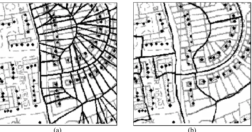
due to several inherent sources of difference (such as the assumption of uniformity) within its makeup. With difference in the look-up table being unavoidable it is important that it is produced as accurately and reliably as possible. Figures 39 – 41 show examples of how the Experian look-up table matches the geography of the postal sectors and EDs. Figure 39, (a) demonstrates that the EDs that the look-up table links to the postal sector, (b) shows all the EDs that intersect the postal sector. Figure 39 reveals that the Experian look-up table links postal sector YO8 9 to 25 census EDs, while Postal sector YO8 9 actually encompasses 36 census EDs. Also two of the EDs that the look-up table links sector YO8 9 to do not intersect
that postal sector. Figure 40 exhibits that theExperian look-up table links postal sector YO10
4 to 18 Census EDs, whereas postal sector YO10 4 actually overlaps 25 census EDs. Figure
41 reveals that the Experian look-up table links postal sector NG17 6 to 2 census EDs,
(a) (b) Figure 39: Postal sector YO8 9 the overlap of postal sectors and census EDs, (a) EDs that are
linked to the postal sector in the Experian look-up table. (b) EDs that the postal actually intersects.
0 5km
0 1km
10km 1km
2km 0.2km
Table 7 presents the values produced for the postal sector YO8 9 using the look-up table
equivalent to what is seen in figure 39 (a). Table 8presents the values produced for the postal
Table 7:Experian Weightings look-up table weightings for postal sector YO8 9 ED Weight Population Cars Weighted Population Weighted Cars
37PDFF02 1 638 280 638 280
37PDFF03 1 519 227 519 227
37PDFF04 1 702 281 702 281
37PDFF05 1 354 113 354 113
37PDFF06 1 692 286 692 286
37PDFF07 1 524 218 524 218
37PDFF08 1 496 223 496 223
37PDFF09 1 603 369 603 369
37PDFT02 1 171 113 171 113
37PDFT03 1 462 229 462 229
37PDFT04 1 433 183 433 183
37PDFT05 1 515 293 515 293
37PDFT06 1 119 60 119 60
37PDGA03 0.1257 358 116 45.0006 14.5812
37PDGD01 0.0038 538 290 2.0444 1.102
37PDGD02 0.1282 536 219 68.7152 28.0758
37PDGD03 1 490 207 490 207
37PDGD04 1 515 189 515 189
37PDGD05 1 573 187 573 187
37PDGD06 1 559 219 559 219
37PDGK01 1 582 289 582 289
37PDGK02 1 610 240 610 240
37PDGK03 1 487 224 487 224
37PDGK04 1 566 301 566 301
37PDGK05 1 582 251 582 251
Table 8: Weightings produced from the actual amount the postal sector covers each ED for postal sector YO8 9
ED Weight Population Cars Weighted Population Weighted Cars
37PDFD03 0.0195 111 54 2.1645 1.053
37PDFF01 0.0012 489 241 0.5868 0.2892
37PDFF02 0.6769 638 280 431.8622 189.532
37PDFF03 0.8343 519 227 433.0017 189.3861
37PDFF04 1 702 281 702 281
37PDFF05 0.9365 354 113 331.521 105.8245
37PDFF06 1 692 286 692 286
37PDFF07 0.9616 524 218 503.8784 209.6288
37PDFF08 0.9462 496 223 469.3152 211.0026
37PDFF09 0.8913 603 369 537.4539 328.8897
37PDFF10 0.0284 450 243 12.78 6.9012
37PDFK03 0.0072 402 219 2.8944 1.5768
37PDFK05 0.0584 355 180 20.732 10.512
37PDFT02 0.8152 171 113 139.3992 92.1176
37PDFT03 0.8771 462 229 405.2202 200.8559
37PDFT04 0.9996 433 183 432.8268 182.9268
37PDFT05 0.5969 515 293 307.4035 174.8917
37PDFT06 1 119 60 119 60
37PDFT07 0.0813 153 80 12.4389 6.504
37PDFX03 0.0963 336 174 32.3568 16.7562
37PDGA05 0.0328 398 114 13.0544 3.7392
37PDGA06 0.1283 362 138 46.4446 17.7054
37PDGB01 0.0618 258 148 15.9444 9.1464
37PDGC02 0.0119 503 116 5.9857 1.3804
37PDGD02 0.1748 536 219 93.6928 38.2812
37PDGD03 0.9038 490 207 442.862 187.0866
37PDGD04 1 515 189 515 189
37PDGD05 0.9916 573 187 568.1868 185.4292
37PDGD06 1 559 219 559 219
37PDGE03 0.0147 207 109 3.0429 1.6023
37PDGF02 0.059 247 153 14.573 9.027
37PDGK01 0.9423 582 289 548.4186 272.3247
37PDGK02 1 610 240 610 240
37PDGK03 1 487 224 487 224
37PDGK04 1 566 301 566 301
37PDGK05 1 582 251 582 251