This is a repository copy of
PETMiner - A visual analysis tool for petrophysical properties
of core sample data
.
White Rose Research Online URL for this paper:
http://eprints.whiterose.ac.uk/113580/
Version: Accepted Version
Article:
Harrison, DG, Efford, ND, Fisher, QJ orcid.org/0000-0002-2881-7018 et al. (1 more author)
(2018) PETMiner - A visual analysis tool for petrophysical properties of core sample data.
IEEE Transactions on Visualization and Computer Graphics, 24 (5). pp. 1728-1741. ISSN
1077-2626
https://doi.org/10.1109/TVCG.2017.2682865
© 2017 IEEE. Personal use of this material is permitted. Permission from IEEE must be
obtained for all other users, including reprinting/ republishing this material for advertising or
promotional purposes, creating new collective works for resale or redistribution to servers
or lists, or reuse of any copyrighted components of this work in other works.
[email protected] https://eprints.whiterose.ac.uk/ Reuse
Items deposited in White Rose Research Online are protected by copyright, with all rights reserved unless indicated otherwise. They may be downloaded and/or printed for private study, or other acts as permitted by national copyright laws. The publisher or other rights holders may allow further reproduction and re-use of the full text version. This is indicated by the licence information on the White Rose Research Online record for the item.
Takedown
If you consider content in White Rose Research Online to be in breach of UK law, please notify us by
PETMiner – A Visual Analysis Tool for
Petrophysical Properties of Core Sample Data
Dave G. Harrison, Nick D. Efford, Quentin J. Fisher, Roy A. Ruddle
Abstract—The aim of the PETMiner software is to reduce the time and monetary cost of analysing petrophysical data that is obtained from reservoir sample cores. Analysis of these data requires tacit knowledge to fill ’gaps’ so that predictions can be made for
incomplete data. Through discussions with 30 industry and academic specialists, we identified three analysis use cases that exemplified the limitations of current petrophysics analysis tools. We used those use cases to develop nine core requirements for PETMiner, which is innovative because of its ability to display detailed images of the samples as data points, directly plot multiple sample properties and derived measures for comparison, and substantially reduce interaction cost. An 11-month evaluation demonstrated benefits across all three use cases by allowing a consultant to: (1) generate more accurate reservoir flow models, (2) discover a previously unknown relationship between one easy-to-measure property and another that is costly, and (3) make a 100-fold reduction in the time required to produce plots for a report.
Index Terms—Visualization Systems and Software, Information Visualization, Design Study
F
1
I
NTRODUCTIONT
HIS paper addresses a class of problem where the sparseness of the data and the subjectivity of some aspects of its interpretation make analysis difficult, but the potential benefits are high-value. The specific focus of our work is on petrophysics, and the analysis of core samples extracted from tight gas sandstone reservoirs.A joint industry project (PETGAS) was established with the following objectives: (i) create a high quality dataset of measurements of the properties of tight gas sandstones; (ii) improve the understanding of key controls on the petro-physical properties of tight gas sandstones; (iii) identify relationships between different petrophysical properties.
Rock cores are recovered from subsurface reservoirs, then samples are selected for laboratory testing. Analysis of such data requires considerable expertise to extrapolate findings from tested samples to the material in untested regions of the core or reservoirs. This difficulty is increased because of the excessive interaction cost and cognitive load that is placed on users by current analysis tools (e.g., Excel [1], Spotfire [2] and Interactive Petrophysics [3]).
These difficulties led us to develop a novel visualization tool called PETMiner, which transforms the ease with which sparse petrophysics data may be analysed. Our work takes the form of a design study [4], and in the following sections of this paper describe key use cases that are difficult to achieve with current analysis tools, leading to the derivation of important requirements that need to be satisfied. Then, after reviewing related work in commercial tools and visu-alization research, we describe the design of PETMiner and its evaluation with an expert end-user.
The primary contributions of the research are: (1) the steps we took to avoid pitfalls that can occur at the Winnow, Design and Deploy stages of a design study [4], (2) a concept called image-based data points, which helps users to interpret subjective and objective aspects of the samples together, and (3) a wholesale reduction in interaction cost by carefully assessing the deficiencies of current visualization
tools.
2
D
ATA ANDT
ASKA
BSTRACTIONThis section explains how the PETGAS data was acquired and the process we applied to understand the tasks that petrophysicists perform during data analysis.
To understand the analysis context, workflow and chal-lenges (e.g., those posed by sample damage), we met with end-users experienced in the analysis of core sam-ples on more than 10 occasions over a 1.5 year period. These sessions tended to include two to eight users with a range of backgrounds including geology, petrophysics and petroleum engineering. In total we met with more than 30 users, most of whom worked for the project’s industrial sponsors. The majority of the meetings included an aca-demic consultant who, due to the complexity and subtlety of important features in the data, is one of a very limited number of people with the expertise necessary to conduct analyses using current tools.
Initially these sessions involved the users describing their aims and workflows during analysis in order to ob-tain typical use cases and requirements. This led to the development of a prototype system. Subsequent sessions generally took two forms. In the first, prototype function-ality was demonstrated to sponsors who then suggested key functionality that could be added to make the software more useful in their day-to-day workflows. In the second, development versions of PETMiner were used to estimate the petrophysical properties of recently drilled wells that were performing badly in terms of low production rates. Although the primary focus of these sessions was to use PETMiner to solve actual problems, they also resulted in sig-nificant discussion regarding new functionality that would improve data analysis.
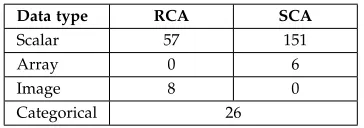
Table 1: Summary of the number of RCA and SCA fields in the PETGAS database at the end of the evaluation period. There were 240 samples. Array data contained up to 10 measures per sample. The categorical fields (e.g., rock type) were defined separately from the RCA and SCA tests.
Data type RCA SCA
Scalar 57 151
Array 0 6
Image 8 0
Categorical 26
data analysis with the three software packages that the ex-perts use today: Excel, Spotfire and Interactive Petrophysics. Interactive Petrophysics is primarily designed for the analy-sis of wire-line log data, (this involves lowering tools into a bore hole to obtain measurements such as ultrasonics along the entire bore length), but also provides scatter-plot functionality for the visualization of core sample properties. Each of the seven project sponsors provided around 40 samples. All of the samples were subject to ‘Routine Core Analysis’ (RCA) to obtain measures of porosity, permeabil-ity and grain denspermeabil-ity using a variety of standard petro-physical tests, and photographed using a Scanning Electron Microscope (SEM) to determine the microstructure of the samples. All samples were also tested using less common laboratory techniques termed ‘Special Core Analysis’ (SCA), to determine a variety of additional petrophysical properties (e.g. electrical resistivity, mercury injection, etc.).
Around 35% of the samples were subjected to further SCA to measure additional properties, such as gas relative permeability. These additional tests are rarely used by in-dustry as they are more costly (£10,000 per sample), and can be very time consuming (up to two years per sample), but can provide better characterization of rock behaviours at in situ well conditions. This time delay is particularly problematic in situations where well yields are lower than expected, as decisions on whether to abandon the well or invest in further drilling or fracturing need to be made quickly. It follows that the ability to obtain rapid estimates of these key properties based on easy to obtain data (e.g., microstructural information from SEM micrographs, RCA and other SCA) could provide a massive benefit.
These data are stored in spreadsheets, and are aug-mented with nominal and ordinal data [5] by petrophysi-cists during data analysis. The fields in the PETGAS database are summarized in table 1.
During data analysis a petrophysicist plots subsets of data to discover key relationships (see Use CaseU2, below) that can be used to improve the interpretation of wire-line log data, and to understand the key underlying controls on the petrophysical properties. The core samples came from a broad variety of geological formations, sedimentary environments, well depths, and global locations. This di-versity mandated filtering and clustering sample data prior to analysis to produce new categorical data, often from image sources (seeU1). Analysis then consisted of cycles of filtering data, making numerous plots of various attributes against the filtered set, amending the filters, and replot-ting. This was a time consuming process, involving many copy/paste operations within Excel prior to outputting
the data for visualization in Spotfire and interpretation of wire-line logs using Interactive Petrophysics. Spotfire was adopted as the main visualization tool to explore relation-ships between attributes. The exploration task was used to identify data points of interest, and subsequent plots were made in Spotfire or Excel to compare additional attributes of identified samples.
In addition to the analysis operations, the project spon-sors required frequent reporting, which involved a set of reports that contained a total of more than 700 plots to present the data, as well as more than 2000 images on the knowledge transfer website, to summarize the properties of a sample.
3
U
SEC
ASESFrom our investigations, we identified three use cases where current tools are particularly deficient. The first (Image-based Comparison) involves the difficulty of using subjec-tive data (SEM images) as guidance in the estimation of objective properties of rock samples. The second (Deep Re-lationships) explores relationships by computing on-the-fly measures between a suite of sample properties, or creating a sequence of similar plots that encompass a suite of variables. The third (Creating and Updating Reports) concerns how laborious it is to generate plots for inclusion in analysis reports. The remainder of this section describes how each use case is currently performed.
We generalize the use cases by adopting thewhyandhow
terminology of Brehmer and Munzner (see Table 1 of [6]) to describe the operations that users perform. Those terms are highlighted below in amonospacedfont.
U1: Image-based Comparison. The principal properties of interest from core analysis are porosity, which controls the volume of gas contained in a reservoir, and permeability, which controls the ease with which this stored gas can be extracted. These properties are influenced by a core’s microstructure, which can be assessed by examining micro-graphs. For this reason cores are routinely imaged early in sample analysis with a variety of techniques (e.g., SEM, or Computer Tomography (CT)).
The use of images assists the user to analyze the data, which isconsumedtogeneraterelationships based on visual properties of a sample (e.g., microstructure), or to verify attributes of samples to determineoutliers. These operations are either browse to observe outlying data, or lookup to identify individual data points by a known property.
These images may also be used to explore the data and derivenew categorical groups (e.g., rock types with similar structure and composition). By combining these objective (experimental measurement) and subjective (mi-crostructure) approaches, petrophysicists can improve the accuracy of their predictions about a well’s viability.
well properties. The images allow outliers to be determined, leading to improved regression equations and more accurate estimations of trends. This process is currently achieved by matching plotted samples’ identifiers with their associated images. The user then manually selects images which provide valid robust reasons for the exclusion of the outlier from the regression (e.g., the presence of fractures), and the relevant sample is filtered from the existing plot. Again, this is a manual, error-prone process which must be repeated for each plot.
U2: Deep Relationships. This use case describes how the user explores the data to compare attributes and
discover distributions and correlations. The analysis produces equations of models derived from the visual analysis. Thegeneratedmodels are then used in external tools to forecast well production rates, and to
verifynew measures as being within thedistribution
of attributes of existing samples.
Controls on properties are often evaluated through the use of multiple similar plots, where one axis is varied. For example, varying the colour axis (changing the vi-sual encoding) when plotting porosity against permeability showed electrical resistivity measurements can provide an indication of sample damage. Sometimes the results of one analysis can expose underlying relationships between derived measures and known sample properties. For exam-ple, the presence of delicate clays in some of the samples produced large errors in the residuals of calculated models of capillary threshold pressure and permeability. This led the analyst to conclude that threshold pressure is a poor indicator of permeability when the sample contains delicate clays.
These types of relationships are currently investigated as follows. First a pair of properties is encoded as a scatter-plot in Excel, and the equation of the fitted curve is derived. A new data column is added to calculate the residual between the model and the actual data. The fitting equation is manually entered into this new column by copying from the plot, and then adjusted to read in values for the dependent and independent properties to calculate the residual. A new plot is then created of this residual against the independent property.
The above process makes explicit deep relationships in the data, rather than only hinting at them implicitly. How-ever, the manual nature of the process inhibits users in their investigations. Also, the residual is calculated across all of the data, and could be refined by restricting the calculation to only include similar samples as detailed inU1.
U3: Creating and Updating Reports. The project spon-sors required frequent reports to be produced which
recordmeasured experimental properties and discovered trends and features. Even though each sponsor’s report has a similar format, data confidentiality means that the information presented in plots must often be filtered ac-cording to the report’s destination and intellectual property. Overall, the general and sponsor-specific reports contain over 700 plots, all of which need to be updated when new data are added, or errors in measurement are identified. This involves pasting the relevant data into a master Excel spreadsheet and importing the data to each plot as a new data series, taking care to manually select appropriate
display properties for the new data. Finally the plots are exported for inclusion into the updated reports. It typically takes five minutes to create each plot, which is excessively laborious, and the effort coupled with the many cut, paste and other manual operations means that the whole process is prone to user error.
4
R
EQUIREMENTSA
NALYSISThe use cases helped us characterize the ways in which current tools do not meet users’ requirements, which we refined during several of the many meetings we had with academic specialists and industrial partners (see Section 2). This led to the following core requirements for a new visual analysis tool. R1-4 are general requirements, and R5-9 are requirements for specific aspects of comparative data exploration. The mapping between the uses cases and requirements is summarized in Table 2.
R1: Run from a local folder. The software should be able to be run from a local folder, without installation or administrator rights. This is necessary to allow geoscientists from the project sponsors to evaluate versions of PETMiner during our iterative development process, without the soft-ware having to first undergo a lengthy validation process by each company’s IT department.
R2: Dynamic Multimodal Data Entities. The tool needs to allow users to store and analyse point, series and image data for samples, and allow new data and properties to be added as they become available.
R3: Ordinary and 4k displays. Petrophysics users travel considerably and, therefore, need to be able to analyse data on the go using ordinary computers (e.g., a laptop). How-ever, the data are complex and so, when office-based, users would benefit from being able to use larger displays so that scrolling is reduced and multiple plots may be compared with the glance of an eye. This led to the requirement for PETMiner to run on both ordinary and 4k displays (3840 x 2160 pixels; ultra-high-definition).
R4: Reduce Interaction Cost. A primary driver for our research is to substantially reduce the effort of conducting data analysis. To achieve this, users should be able to create and modify plots with a minimal number of actions. The plots should automatically update when new data are available (e.g., to create a new report).
R5: Image Data Points. To allow objective data to be interpreted in the context of other, subjective information (e.g. the effect of microfractures in a core sample on electrical resistivity) it should be possible to replace the data points in plots with images. The images may be created from scans (e.g., SEM images) or previously saved plots. Users should be able to adjust the images’ positions and sizes to avoid occlusion, and drill down by clicking to display additional data. Some properties which determine petrophysical prop-erties are very fine, so users need to be able to zoom in to the images.
residual calculations may be performed on homogeneous subsets of the data, and interact to change the filters and formatting of individual plots, rows/columns of plots, or all plots together.
R7: Flexible Filtering. Users should be able to filter the data displayed in a given plot with any quantitative or categorical (nominal) variable in the dataset, and use tacit reasoning to filter individual data points. This fosters the discovery of patterns by allowing users to remove outliers and clutter from plots.
R8: Derived Measures. Users need to be able to calculate new measures by binning quantitative measures (on both linear and logarithmic scales), grouping categorical proper-ties, and calculating the curve fitting residual of data points so that subsequent plotting may reveal deep relationships in the data. A selection of curve types should be supported, including linear, quadratic, logarithmic, exponential, and power law relationships. Both the correlation coefficient (R2) and equation should be displayed.
R9: Contextual Data. Each plot needs to be capable of displaying three types of contextual data: data points that have been filtered out (seeR7), data shown in other plots of the same properties (i.e., where plots are partitioned by category; seeR6), and third party reference data. Each type of contextual data should be distinguishable from the others and the main (non-contextual) data that is shown in a given plot.
5
R
ELATEDW
ORKThis section is divided into two parts. First we assess the capabilities of commercial tools against the requirements that were described in the previous section. Then we review research that is related to those requirements.
5.1 Commercial Tools
The primary tool used for the analysis and visualization of core data among geoscientists, including all of the in-dustrial and academic partners of the PETGAS project, is Microsoft Excel [1]. The next most commonly used software package for interpretation and visualization is Spotfire [2]. In addition, all of the companies interpret wire-line log data using tools such as Interactive Petrophysics [3]. This section assesses the capabilities of these commercial tools, and the well-known visualization tool Tableau [7] from Tableau Software, against our users’ requirements (see Table 2).
As is the norm for commercial tools, they are designed to be installed and maintained by an organization’s IT depart-ment, rather than running as a local, uninstalled application (see Requirement R1). Data confidentiality may often rule out the usage of a petrophysics tool running on third party Cloud infrastructure.
Supporting dynamic multimodal entities (R2) requires a means to import new or updated data and properties into the software. Tableau, Spotfire and Excel offer extensive con-nectivity options to ingest data from external data sources. These include flat files, Excel files and numerous databases (via Open Database Connectivity (ODBC)). Database tables can be ingested directly, but the user must specify the
linkage between tables manually. Interactive Petrophysics allows data to be loaded from a number of widely used petrophysics file formats, and links to a number of pro-prietary third party application databases, e.g., PETCOM Powerlog (Petcom Inc, Dallas, TX), without users needing to define relationships.
None of the tools allow images to be used as data points (R5), but both Tableau and Spotfire allow images to be dis-played for a point on mouse-over. However, this approach only displays a single image at a time. This inhibits the user from making comparisons between images for different data points simultaneously.
One of our users’ key requirements is the ability to display multiple plots to make comparisons across different data relationships and between categories of samples (R6). Interactive Petrophysics only allows one plot to be created at a time, although users may then manually layout multiple plot windows. Spotfire allows multiple plots to be created at once as a trellis [8], [9], and in Tableau users can create multiple plots by dragging a categorical dimension onto a plot to create multiple rows. Spotfire and Tableau have a two-stage approach to comparative plotting, allowing users to create visualizations on a worksheet and then arrange worksheets on a dashboard. A dashboard would have to be used to display the multiple relationships (e.g., x1 vs. y1 and x2 vs. y2 for different sedimentary environments) that our users require. It is possible to create dashboards with Excel through scripting but, due to the complexity of scripting, users typically only ever create one plot at a time.
All four tools allow users to filter (R7) the data that is displayed in a plot with quantitative or categorical vari-ables. Spotfire and Tableau achieve this in a straightforward manner: users drag dimensions and measures onto the Filters shelf and choose appropriate values from the exposed widget (e.g. range sliders, or checkboxes). Additionally, points may be filtered directly from a plot by selecting them and choosing to exclude them from a context menu. Excel requires users to either apply filters to the data used by all plots or copy/paste subsets of the data for a given plot, but the user can also create widgets prior to plotting to filter data. Interactive Petrophysics allows filtering during plot creation via calculation.
All of the tools have the capability to derive new measures, group data into bins, and provide curve fitting functionality. Each tool allows calculation of new data using functions that can be entered by a user and so provide the capability to create additional plots against the residuals (R8) from the equation of curves fitted to the plotted data. With Excel, users create additional spreadsheet columns to hold the residual data calculated from the equation of the fitted curve. In Interactive Petrophysics, Spotfire, and Tableau users create a calculated data field and enter the fitting equation by hand, in order to calculate the residual and expose it as new data. However, none of the tools allow a plot to be created directly against the residual of an existing plot.
Table 2: Commercial software compared with PETMiner’s requirements. ◦ - good support, • - somewhat supported, •- not
supported
Requirement Use Cases Excel Spotfire Tableau Interactive Petrophysics R1: Run from a Local Folder U1, U2, U3 Requires system installation
R2: Dynamic Multimodal Entities U1, U2, U3 Many data formats; ODBC databases, but tables manu-ally linked
As other tools, plus propri-etary databases and petro-physics file formats R3: Ordinary and 4k Displays U1, U2, U3 Acceptable use on all screen sizes with manual font size changes R4: Reduce Interaction Cost U2 Click heavy; cut and
paste
Plots adjusted after creation Plot properties set by dialog box
R5: Image Data Points U1, U2, U3 Not possible Single image via mouse-over Not possible R6: Comparative Plotting U1, U2, U3 Two stage (worksheet; dashboard) Manual plot layout R7: Flexible Filtering U1, U2 Via data and widgets Via widgets and plot At plot creation R8: Derived Measures U1, U2 Allow calculation, binning and fitting, but not direct creation of residual plots R9: Contextual Data U2 Large effort and
sep-arate data
Not possible Additional data source
for contextual data, or bring in data from unrelated wells. However, Tableau and Spotfire do not allow third party data to be added, as they require the data source to be joined to the existing data.
With all four tools, interaction for some key tasks is inefficient (R4). For example, certain important choices are only possible after a plot has been created (e.g., choosing a logarithmic axis in Excel or Tableau), or involve having to position the cursor precisely (e.g., to select a specific data point for curve-fitting in Excel). Another example is that with a large number of properties, the user must search a list of all properties, rather than the properties being grouped in a meaningful way to the analyst. This causes the filtering process to be scroll- and search-heavy. Interactive Petrophysics presents all plot options to the user at plot creation via a tabbed dialog box. This dialog is complicated by additional functionality to link properties to wire-line log data, additional wells and depth ranges, because wire-line log analysis is Interactive Petrophysics’ main focus.
For complex or repetitive operations Excel has a rich scripting environment, but the level of expertise that is needed limits its suitability for our users, making tasks such as report-generation particularly laborious (e.g., see Use CaseU3). Spotfire, Interactive Petrophysics and Tableau are also poorly suited for creating reports because of the sheer number of clicks that would be required to create each plot. However, in fairness, these tools are primarily designed for data analysis rather than report generation.
5.2 Previous Research
This section reviews visualization research from a perspec-tive of the cost of user interaction, using the framework provided by Lam [10], as Requirement R4 specifically ad-dresses reducing interaction costs. That framework divides interaction costs into seven categories, four of which (De-cision costs to form goals; Physical-motion costs to execute sequences; View-change costs to interpret perception; State-change costs to evaluate interpretation) relate directly to the present paper and are used to structure this review.
5.2.1 Decision costs to form goals
This category discusses the costs associated with choosing a subset of data to display. One way of reducing such costs
is to provide flexible ways of filtering data (Requirement R7), and a second is trellis layouts [8], [9]. These techniques reduce clutter in individual plots by separating subsets of data into their own plots and is some of the key functionality that underpins Requirement R6. Research tools such as Polaris [11] showed how trellis layouts may be achieved by simple drag-and-drop actions, which have the added advantage of encouraging users to try alternative “what if” subsets, and this is now a feature of commercial tools such as Tableau.
Guided visualization techniques reduce decision costs by suggesting combinations of variables that are likely to be informative to a user. The choice of candidate dimensions to visualize may be guided by statistics of the underlying dataset (e.g., obtained from principal component analysis), and perhaps weighted by the user [12]. The candidate visualizations are provided to the user as a starting point for visual analysis [13], with subsequent visualizations sug-gested in response to user interaction [14], [15], [16], [17].
Another cost is deciding which visual encoding to use for each variable. The Polaris system [11] developed the VizQL specification language to automatically select visual encodings for the plots, a concept that was widened by Show Me to include alternative encodings [18] and incor-porated into Tableau. A similar capability is provided by an open source project called Vega-Lite [17].
5.2.2 Physical-motion costs to execute sequences
Lam discusses the costs associated in terms of physical motion and accumulated motions [10]. Physical motion in-volves the distance and precision with which a cursor needs to be moved, and has been used widely in studying human-computer interaction tasks using Fitts’ Law (e.g., [19], [20], [21]).
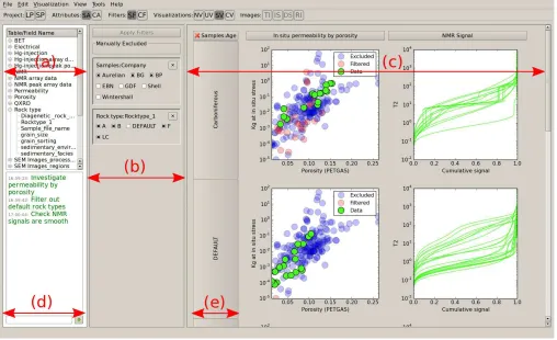
Figure 1: PETMiner application window. (a) The schema panel contains all properties of the data, organized by table name. These properties can be dragged into the filter window to filter on a property, and the visualization window to break plots into rows based on discrete values. (b) The filter window allows categorical properties to be excluded by checkboxes, and quantitative properties by range sliders. (c) The visualization window displays created plots as columns, which can be extended into multiple rows by dragging categorical properties from the properties panel. (d) The comments panel shows user comments, and system messages if enabled in the settings. (e) Categorical properties used to create rows of plots are displayed here, with multiple properties ordered left to right in order of selection.
Accumulated motions may also be reduced if all plots in a trellis [8], [9] are automatically given consistent axes [11]. This approach is adopted by tools such as Tableau and Spotfire. By contrast, if a set of plots were created with Excel then a user would need to make manual adjustments to the plots so that the axis limits matched.
5.2.3 View-change costs to interpret perception
Lam divides view-change costs into four subcategories [10], of which our research is concerned with augmented inter-action and multiple-view association. One way of provid-ing augmented interaction is to reduce a user’s cognitive load by computing derived measures to show relationships directly in visualizations. An example is plotting a curve-fitting residual against a given property, rather than requir-ing a user to deduce the relationship by presentrequir-ing the data and curve together with additional plots that show the given property. Allowing derived measure plots to be directly created and viewed alongside the original plots further reduces this cost. It is also worth noting that derived measures may also be used to quantify subjective data with examples ranging from image processing [22], [23] and the similarity of tree structures [24], to methods for integrating multiple criteria (for a review, see [25]).
The multiple-view association subcategory is primarily concerned with the presentation of data at multiple levels of detail [10]. Context (R9) necessitates allowing users to assess data within its surroundings,and visualization tools typically provide this by allowing users to switch between one view that contains fine-grained detail and another that shows the global context (e.g., [17]). Alternatively, a high-definition display may be used to embed details within a wider context [26], [27], so that the cognitive effort of un-derstanding patterns is reduced by users’ ability to directly perceive the position or alignment of details.
5.2.4 State-change costs to evaluate interpretation This category of Lam’s framework [10] focuses on the cost of comparing data projections, rather than the multiple levels of detail of view-change costs. Trellises [8], [9] reduce the cost because multiple projections of the data are visible at one time, which clearly benefits comparative plotting (R6). Ultra-high-definition displays are likely to provide further benefits by reducing the amount of panning and zooming that users need to perform [28].
second class citizens since they are assembled from other visualizations rather than being created from the underlying variables in a dataset. This limitation is partly addressed by Voyager [17], which allows each plot to show different vari-ables and helps users to associate information by placing plots with shared axes in close proximity.
Context (R9) necessitates allowing users to assess data within its surroundings. It is common for visualization tools to provide multiple levels of detail so that users may interpret fine-grained detail in a global context simply by switching attention between views (e.g., [17]). Alternatively, a high-definition display may be used to embed details within a wider context [26], [27], so that the cognitive effort of understanding patterns is reduced by users’ ability to directly perceive the position or alignment of details.
Data analysis often involves the combination of objective and subjective judgements. For example, understanding spatial patterns in quantitative data that is shown in a scientific visualization, or changes that take place from one stage of an analysis to another [30]. Our requirement for images as data points (R5), however, is to allow users to leverage subjective data (e.g., SEM images) in their analysis of quantitative data (e.g., permeability). For this we char-acterize previous research according to the relationship be-tween images and data points (one-to-one vs. one-to-many) and the method of visualization (integrated vs. separated).
Several examples of previous research use images to rep-resent clusters of outputs from computations (i.e., a one-to-many relationship). These include parametrically generated geometry, classifications from data mining, and graphics an-imations that are embedded as examples into scatter-plots, network visualizations or parallel coordinates [31], [32], [33], [34]. Other examples use images of specific data records (a one-to-one relationship). These examples either display a small selection of those records as images that are integrated into scatter-plots or network visualizations [11], [35], [36], or images of a larger number of records in a visualization that is separate from the ones that show the associated quantitative data [23]. Our requirement combines both types of examples, because of the need to show images for tens or hundreds of data records, integrated with visualizations that are showing quantitative data.
6
PETM
INERPETMiner is implemented in Python, uses Matplotlib for vi-sualization, and SQLAlchemy for database access. Python’s introspection capabilities have allowed a novel use of SQLAlchemy’s object-relational mapping to provide a user defined backend database schema, which can by amended by the user during usage of the application. SQLAlchemy provides a degree of database agnosticism, and allows the software to switch to other relational database managers if required.
[image:8.567.295.541.40.287.2]The user interface is written using Qt, and operated via the Python binding provided by PySide. The interface comprises three columns as shown in Fig. 1: The schema panel (a), containing a list of properties organized by table into logical structures, and a panel to show user comments and system messages (d); a drag and drop filter panel (b); and a visualization area (c) to display created plots and
Figure 2: Permeability (RCA) plotted against porosity (RCA), with images used as data points. Three images at the top of the plot have been moved by the user. Arrows are used to link the moved images to their original locations.
any categorical properties used to split visualizations into partitions (e). The visibility of each of these columns can be toggled to maximize screen space as necessary.
There is a notepad area for users to enter their intentions and findings while using the software (d). This area can also display system messages which summarize user activity, such as the definition of visualizations and filters. The user’s entries are saved to a log file, which provides a diary that captures the user’s train of thought in the context of the interaction operations that they perform. The system’s messages are also saved to the log file.
A single dialog is used to create and update visualiza-tions. All properties available for plotting are organized beneath table names as created by the user during the data ingest. Beside each property are a set of checkboxes, labelledx,y,z,s,cXand cY. The user selects the required properties for the x and y axes of plots; the z axis allows the user to colour plotted points and lines by colour bars (for quantitative properties) or colour panels (for categorical properties); the s axis allows for points to be sized; the
a column allows multiple properties to be selected and displayed as an annotation callout when the user clicks a point. The cXand cY axes allow the selection of contextx
Figure 3: Derived measures in PETMiner. The image on the left plots the calculated Schlumberger Doll Research (SDR) Permeability against measured permeability (Kg at in situ stress) (RCA measures) and calculates a fitted line. The image on the right plots the residual of the line’s equation against the Archie cementation exponent (m), an SCA measure.
multiple tables from subsets of columns from the same Excel workbook. Second, the mapping file reduces the need to amend a source Excel data file into an appropriate format prior to ingestion into PETMiner.
The following subsections describe how PETMiner fulfils the requirements defined in Section 4.
R1: Run from a local folder.The PETMiner sponsors are very restrictive in allowing the installation of new software, with lengthy compliance checks performed against all new software and their updates. To avoid this administrative overhead, PETMiner does not require installing into system paths. The binary distribution is simply extracted into a user directory.
R2: Dynamic Multimodal Data Entities.PETMiner al-lows the ingest of new data sources by creating tables in the underlying database, and dynamically mapping these to classes which are exposed as properties in the schema panel of the user interface. The properties are organized by table name, because this groups related data in a way that is meaningful to the analyst. The ingest of new data is driven by a mapping file which describes the modality of the new table’s fields as quantitative or discrete numeric values, or categorical data such as strings and image paths, and links to other tables. The new data are then exposed as new properties of the underlying data entities (in PETGAS those entities are the core samples).
To alleviate users from having to define the relationships between tables, as is necessary with Spotfire and Tableau, PETMiner requires a table to be marked as “canonical”. This table must be reachable from any query on the data, to allow subsequent data operations to be related to the underly-ing data entities. When new user tables are added to the application, the shortest path between any two tables (via link fields) is calculated and stored in a system table. This allows the dynamic generation of joins enabling samples to be filtered on any data, including data added in the future.
R3: Ordinary and 4k displays.In order to facilitate the use of differing screen sizes and resolutions no components
of PETMiner have a fixed size, and are scaled relative to the screen size. This scaling to screen size is also applied to font sizes, allowing easy readability of text on larger resolution displays, even when viewed at a distance. The automatic scaling of font size is not included in the other software tools discussed in section 5.1. Additionally, the visibility of all panels can be toggled to maximize screen space.
R4: Reduce Interaction Cost. Compared with existing tools, interaction cost has been reduced by the following approaches. First, from the outset PETMiner has been de-signed to run on both ultra-high-definition and ordinary displays, with the former allowing users to make many more comparisons with the glance of an eye instead of having to scroll the visualization area a multitude of times (‘screen-thrashing’ [27]).
Second, plots may be fully defined at the time of creation via a single dialog to allow users to create a complete visual-ization in a single operation. By contrast, Excel, Spotfire and Tableau only allow operations such as choosing logarithmic axes and fitting curves to be performed after a plot has been created, using a separate dialog.
Third, when PETMiner saves projects it saves the defi-nition of all plots in a visualization, so reloading a project automatically includes any updated data. This allows re-ports to be updated with new data easily, and the facility to split plots by attributes (partitioning), especially by com-pany, makes it straightforward to address the confidentiality needs of project sponsors. The application also makes use of (user-configurable) default values to reduce clutter by removing seldom changed values from the visualization interface, and placing them in the application settings, avail-able via a separate interface.
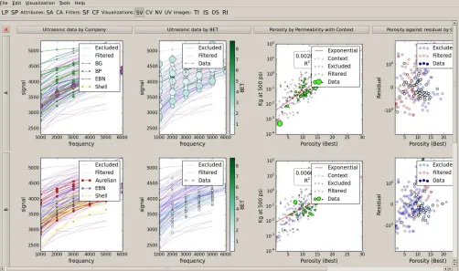
Figure 4: PETMiner showing a grid of plots for comparison. Each column contains plots independent from other columns, while each row splits each column plot to show only those data from samples of a given rock type. Each type of data (Excluded, Filtered, etc.) may be toggled on/off to reduce over-plotting.
measures (see Fig. 2). Individual images may be toggled on/off, rescaled and repositioned to avoid occluding un-derlying points. This enables in situ comparison of sample images, rather than the two-stage approach described in U1. Additionally, double-clicking an image allows it to be viewed at native resolution or panned and zoomed via a built-in image viewer.
R6: Comparative Plotting.Plots are arranged in a ma-trix. Users add new columns with the create visualization dialog, and each column may have different xand y axes (see Fig. 4). This is something that can only be achieved in Tableau if users first create a worksheet for each column and then a dashboard to show multiple columns.
Users add new rows by dragging categorical attributes into the visualization area (see Fig. 1) to partition the data, in a manner that is similar to Tableau. This generates a row of plots for each category, with each row showing only data for the samples in that category. Multiple attributes can be active in this way, but the number of rows is the Cartesian product of the currently selected attributes. In practice, users rarely select more than two attributes at once. Rows may also be hidden from display by filtering categorical attributes to reduce clutter.
R7: Flexible Filtering.Filtering is provided in two main ways. Firstly, attributes can be dragged into the filter area where the range of quantitative data can be adjusted, or categorical data can be toggled via checkboxes. Multiple attributes can be selected and bounds placed upon these attributes via ranges for quantitative data, or binary masks
for categorical data. Secondly, individual data points can also be selected and filtered with a mouse click (e.g., to remove outliers). Filtering operations are applied to all plots (linking). Filtered data are not included in the calculation of regression curves. The display of filtered points in a plot can be toggled by the user to provide context if necessary.
R8: Derived Measures. PETMiner allows a variety of curves to be fitted to the data, providing the fitting equation and R2 values. Additionally, PETMiner allows users to
select a checkbox so that the curve fitting residual is stored and can be plotted against other variables to interactively explore deep relationships in the data. Users may also de-rive categories from quantitative data by setting the number of bins, minimum and maximum cut-off values, and to bin the raw data value or its logarithm.
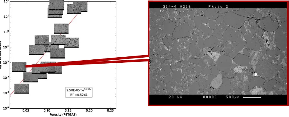
resistiv-Figure 5: Example of using images to explain outliers. The plot (left) shows porosity vs. permeability (RCA measures), with images as data points. The callout (right) shows the SEM image of a data point with a suspiciously high permeability for its porosity. The top right of this SEM shows that the core has been damaged during extraction from the well, producing dilated grain boundaries which enhance flow through the damaged region of the sample and artificially increase the sample’s permeability measurement.
ity measurements (SCA measures), which was significantly better than that obtained from only using NMR data.
R9: Contextual Data. When a user creates or updates a visualization they may choose whether to display three types of contextual data. The first is data that would nor-mally be displayed in a particular plot, but has been filtered out (seeR7). The second is partitioned data that is shown in other plots in a given column (i.e., data for other categories of an attribute; see R6). The third is third party reference data. We term these three types of data as filtered, excluded and reference, respectively. Users may customize the colour of each context type if the default colours are inappropriate. Additionally, brushing is used so that samples may be highlighted in a plot causing related data points in all plots to be highlighted, which shows the sample in context with all plotted properties.
To manage over-plotting, reference data is plotted first, followed by excluded data and filtered data, and then a plot’s main (non-contextual) data of interest. This ensures that the main data is overlaid on any contextual data. Over-plotting is also addressed by allowing users to toggle on/off each of those types of data. Contextual data is not considered for picking operations or curve-fitting.
7
E
VALUATIONThis section describes the evaluation of PETMiner against the three use cases. The evaluation involved 11 months of usage by the academic consultant who was pivotal in its development (see Section 3), and has over 20 years of experience in analysing properties of drilled core samples from SEM micrographs. The consultant used PETMiner on a laptop (15-inch screen; 1366 x 768 pixels) for some of the analysis, and an 85-inch 4k display when office-based. The relative processing power of the computers was not a factor in determining usage as the user reported similar response times for each system.
System log files recorded details of the user’s interac-tion, including session start and end times, the variables that were plotted in each visualization, and the usage of filters and partitions. The log files were complemented by follow-up interviews in which the user clarified the purpose of certain interaction patterns and explained some of the insights that the user had gained.
The log files were post-processed in Excel as follows. First, extraneous data such as exceptions and stack traces from occasional crashes were removed. Then interleaved sessions that were caused by the user simultaneously run-ning multiple instances of PETMiner were resolved by cre-ating separate log files for each session (log data was written in event ‘chunks’, so interleaved sessions could be detected by timestamps that were out of order between neighbouring ’chunks’).
The log file entries were then sorted into timestamp order to calculate the time interval between logged events. If one session started within five minutes of another one ending, and the sessions involved similar visualizations or usage patterns, then the sessions were merged into the same “meta-session”. The timestamp of each event was then used to calculate the total session time. Periods of five minutes or longer inactivity were summed as the session idle time, and subtracted from the total session time to calculate the active session time.
7.1 Usage Data
There were 93 meta-sessions of PETMiner usage totalling 55 hours of active time. On average each meta-session included 35 minutes 27 seconds of active time (SD 54m 29s) and, excluding three particularly long 4k display sessions (active time 6h 20m, 4h, and 4h respectively), the active time was similar for the laptop and 4k display meta-sessions.
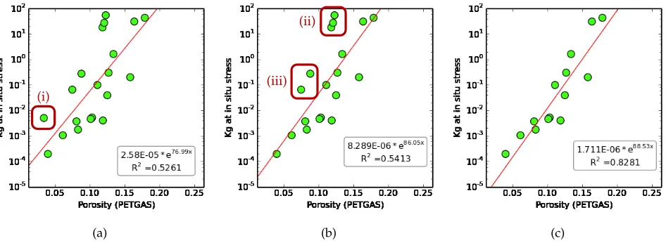
[image:11.567.46.529.41.237.2](i)
(a)
(iii) (ii)
[image:12.567.50.523.39.212.2](b) (c)
Figure 6: Example of outlier removal to improve model generation: (a) Initial Porosity vs. Permeability plot (RCA measures), with regression line and equation. (b) Same plot with an outlier (i) removed (damaged sample). (c) Same plot with outlier groups (ii) and (iii) removed (damaged samples). Plot (a) is reproduced with images as data points in Fig. 5.
minute 58 seconds (SD1m 5s), and this was similar for the laptop and 4k display (M=1m 53s vs 1m 59s).
The log files and interviews also allowed the meta-sessions to be related to the use cases described earlier (see section 3), and these provide the structure for the following sections. Amonospacedfont is used to highlightwhyand
how terms from Brehmer and Munzner [6] to describe the operations the user performed.
7.2 U1: Image-based Comparison
Image-based comparison occurred in 58 of the 93 meta-sessions (35 of the 54 4k meta-meta-sessions, and 23 of the 39 laptop meta-sessions). There were two notable differences between the laptop and 4k display meta-sessions for images. The first concerned the size of the plots. Due to the limited screen space of the laptop, the user chose to fill the screen with a single image plot in 40% of instances, with a mean plot width of 872 pixels (SD 278). Available screen space was much less of an issue on the 4k display, so image plots were larger (M 1311 pixels wide; SD 513). The 4k display allowed the user to expand the plots for closer inspection, and reduce the size of the images when multiple columns of image plots were visualized together, accounting for the larger standard deviation.
The second concerned the use of image-based plots and non-image-based plots at the same time. In 25 of the 4k display meta-sessions image and non-image plots were displayed simultaneously. However, this only occurred in two of the laptop meta-sessions.
If many image data points were plotted then clutter and occlusion was, of course, a potential problem. However, in practice image data points were only used when plots were
aggregated(segregated) by the source well of the samples (52 of the 58 sessions), company (4 sessions), rock type and sedimentary environment (one session each). This reduced the number of images per plot to an average of 6.4 (SD
4.8). By default, the display size of each image was 205 x 189 pixels (20% of native image size), but images could be rescaled interactively using the mouse wheel. The user also applied filtering to reduce the number of images per
plot, for example, by removing outlying data points after inspecting image properties. The loss of precision incurred by replacing data points with larger image thumbnails was mitigated by the user both toggling image display, and drag-ging images away from their default location, tochangethe visualization and reveal the underlying data points.
The use of image data points can be characterized as two different tasks: togeneratean understanding of how microstructure is related to other core properties; and to
verifyextrema as outliers. These two motivations for the use of image data points, and the sequence of operations the user employed to achieve them are described below.
Combining the data for both display sizes, in 43 of the 58 image meta-sessions the user investigated correlations between measured properties and sample microstructure to
generate understanding of how structural characteristics might be used to estimate the other properties. This pattern of usage was characterized by the user creating plots to
discover quantitative relationships beforechangingthe visualization to replace data points with associated images (annotate), or replicating the plot with image data points (import). The ability for analysts to accurately estimate property values from SEM images was one of the key re-quirements (R5) of PETMiner, and one of the ways in which its functionality is fundamentally different from commercial tools (see Table 2).
The second purpose of image data points, which oc-curred in 12 meta-sessions, was toverifyoutliers by using images to reveal features of a sample that explain why quantitative measures deviated from expected values (see Fig. 5). This pattern of usage was characterized by the creation of non-image plots, thenchangingplots to include images as points, followed byfilteringindividual data points,changingback to non-image data points, and then curve-fitting toderiverelationships. If the cause of outlier points can be determined then these points can be removed prior to curve-fitting, leading to a reduced error (R2).
(Tem-pest Reservoir Engineering, by Emerson Process Manage-ment). Using images to guide the removal of three groups of outliers from permeability/porosity plots (see Fig. 6), resulted in models that reduced the error of the Tempest flow rate estimate from 40% to only 10%, compared to a ground-truth that was provided by the actual experimental measurement.
PETMiner’s ability togeneratemodels that accurately estimate flow rates will allow better prediction of yields for new resource plays. This will affect real world production by allowing reservoir engineers and managers to make faster and cheaper predictions.
Finally, in three meta-sessions, image plots were cre-ated (or loaded from previously saved sessions) to be
presentedfor the purpose of discussion among analysts. These sessions were distinguished from the outlier determi-nation scenario above by a lack of filtering and fitting.
7.3 U2: Deep Relationships
The user investigated deep relationships between properties by displaying multiple plots simultaneously, fitting then
filtering data to reduce the error, or plotting residu-als from previously derived regression equations. These comparative meta-sessions allowed the user to understand the controls on given properties and observe correlations. We classified 50 meta-sessions as deep relationship ses-sions, with 38 meta-sessions being multi-column (including residual plots in eight meta-sessions), and 12 meta-sessions involving iterative fitting and filtering with a single col-umn of plots. Exploring deep relationships accounted for 72% of meta-sessions over 10 minutes in duration. Three requirements were central to the user’s investigation of deep relationships: comparative plotting (R6), derived measures (R8), and a general reduction in interaction cost (R4) that encouraged the user to investigate “what if” possibilities.
When exploring deep relationships, the user commonly (34 out of 38 multi-column meta-sessions, and 8 of 12 single-column meta-sessions) partitioned (aggregate) plots into rows for either company or well, as there is less variance of rock type for a given company or well in the PETGAS data set. Partitioning plots also reduced clutter by lowering the number of points per plot, allowing the analyst to observe relationships more clearly. PETMiner applies the partitions to all new and existing plots, avoiding the need to repeat the partition operation for each plot, as required by Tableau.
In 31 of the 50 deep relationship meta-sessions, multi-ple plots were created with the same x and y axes and
arranged in columns. The plots differed by varying the colour or size of data points to reveal controls on the relationship between the mainxandyaxis properties. The single operation required to create a complete plot and have existing filters and data partitions applied via linking, is simpler than the multi-stage approach to plot creation taken by Tableau, Spotfire and Excel (i.e., having to change an axis to log scale post-creation).
A particularly notable insight was achieved by a user by performing the following operations: First, dry rock permeability and porosity (RCA measures) wereencoded
as scatter-plots, and coloured by rock type (categorical data). Thisidentifieda relationship with rock type. The plots
were then aggregated (segregated) by partitioning the data on rock type. Outlier points where identified and
filtered, before an exponential was derived from the plotted data. Data for brine saturated permeability (an SCA measure) was then plotted against porosity and the
derivedexponential relationship was observed to be sim-ilar to the dry rock permeability. Additional permeability data for the rocks at different brine saturations (SCA mea-sures) were then imported and arranged as additional columns (five columns and three rows of scatter-plots in to-tal). By visual comparison of the plots in different columns, it was observed that the gradient of the fitted exponentials was a function of the brine saturation, with a different relationship observed across each microstructural rock type (rows). Brushing was used toselectindividual data points to check their ordering was consistent in each plot. Using the
derived equations a previously unknown mathematical relationship between the relative permeability of the rock at different brine saturations to the dry rock permeability for each microstructural rock type was formulated.
A relative permeability measurement is significantly more costly and takes between a month and six months to perform. To put this into perspective, obtaining this rela-tive permeability data for the PETGAS dataset (60 samples analysed) required three years of laboratory time and cost £150,000. By contrast, a dry rock permeability measurement only takes a few hours, which clearly offers the opportunity for petroleum companies to make substantial savings.
Performing operations for the above analysis requires 75 mouse clicks in PETMiner. Recreating the analysis, we estimate that Tableau requires 70% more clicks, and Excel requires more than five times as many (129 and 402 mouse clicks, respectively). Key reasons for PETMiner’s efficiency are allowing plots to be fully defined via a single dialog rather than retrospectively modified (e.g., to change an axis to log scale), and allowing bulk operations on plots (all plots, or particular rows or columns).
7.4 U3: Creating and Updating Reports
The user exported plots in six out of the 93 meta-sessions. The most notable of these was a meta-session during which the userproduced153 plots while making only 30 visual-ization changes. The 20 minutes 42 seconds that the user spent generating these plots with PETMiner would have taken approximately one week with Excel, because of the number of clicks that would have been required (see use case U3). This time-saving was achieved through the ease with which large numbers of partitioned plots could be created and updated in a single operation, and the bulk printing of plots to a directory with names generated from a combination of partition name and plot title.
8
C
ONCLUSIONIn this paper, we describe a novel interactive visualization application for analysing the petrophysical properties of core samples. We relate our work to the commercial tools, and previous research in human-computer interaction and information visualization. We held interviews with geo-physicists from six multi-national petroleum corporations and academic geoscientists to understand the process of core analysis. These interviews informed three difficult or time-consuming data analysis use cases, and led to nine important user requirements. Our novel solution addressing these requirements was a visualization tool called PET-Miner, which was evaluated over an 11 month period on both a 4k display and a laptop.
The present research makes three main contributions. The first concerns the ways in which we avoided the many pitfalls that design studies can have [4], and leads to a recommendation for each of three stages in such studies. In the “Winnow” stage it is important to nurture the re-search idea but have patience. From meeting a promising collaborator (the academic consultant), it took us two years to identify a suitable project (PETGAS), and another two years before that project needed a novel visual analysis tool. During that time we created a giant (3 x 1.5 meter) paper mockup that could be taken to sponsors’ sites to bring to life our ideas for PETMiner. In the “Design” stage one cannot overemphasize the importance of spending time to understand what users want to do. We met many times with end-users, and observed and videoed them analyzing their data to gain both a high- (the use casesU1-3) and low-level understanding of their work (why current tools are deficient and how interaction cost could be reduced). Lastly, starting the ‘Deploy’ stage early helped us to produce quick wins. That enthused our users, which in turn extended the project funding by more than two years.
The second contribution was image-based data points, which extended previous work [31], [32], [33], [34], [11], [35], [36], [23] to integrate image data about every data point into users’ primary (scatter-plot) visualizations. Over-plotting was not a major issue because PETMiner allowed users to toggle the images on and off, present image-based and conventional plots in adjacent columns, and adjust individual images. Image-based data points help users to combine subjective and objective information during anal-ysis (this was one of six output requirements in [39]), and were particularly effective on a 4k display (see Challenge 5 in [39]). As our evaluation showed, forU1image data points allowed the user to generate substantially more accurate reservoir flow models, which would improve companies’ ability to make predictions about new resource deposits.
The third contribution was the set of design principles that we adopted to reduce the interaction cost substantially below that of specialist visualization software (Tableau) and general-purpose analysis software (Excel). One principle was that users could fully define a plot at the time of creation, rather than having to first create a plot using the Tableau or Excel defaults and then modify components such as an axis (e.g., set it to logarithmic). A second principle was to minimize the depth of the menu/dialog box interface, by providing one dialog for the whole plot rather than one
per component (X axis, Y axis, etc.). A third principle was to allow each column of plots in a trellis to have different X and Y axes, bypassing the need to create a dashboard after creating worksheets. The fourth and final principle was to export plots in a folder and file structure that matched a user’s requirements. Allowing low-cost investigation of the relationships between properties helped the user to make a number of break-through findings (e.g., for dry rock vs. brine permeability; U2) and allowed the plots for the PETGAS reports to be generated in a few minutes rather than several days (U3).
We plan to continue development of PETMiner to in-clude statistical, clustering and image analysis techniques for data mining. Our initial investigations have shown computer vision techniques are ill-suited to the analysis of core SEM images as the important features are subtle, and masked by macro-structures in an image. The new function-ality will enable users to more accurately infer missing RCA and SCA values for new samples using the rich database already acquired by the parent PETGAS project. We also plan further evaluation as we deploy PETMiner to more petrophysicists.
9
A
CKNOWLEDGEMENTSWe wish to thank our sponsors for supporting the PET-Miner project: British Gas, BP, EBN, GDF Suez, Shell and Wintershall. Aurelian provided core samples, but did not participate in the PETMiner project.
R
EFERENCES[1] (2016) Microsoft Excel homepage. Microsoft. [Online]. Available: https://products.office.com/en-us/excel
[2] (2016) Spotfire homepage. TIBCO. [Online]. Available: http://spotfire.tibco.com/
[3] (2016) Interactive Petrophyics homepage. LR Senergy. [Online]. Available: http://www.lr-senergy.com/software/interactive-petrophysics
[4] M. Sedlmair, M. Meyer, and T. Munzner, “Design study method-ology: Reflections from the trenches and the stacks,”IEEE Trans-actions on Visualization and Computer Graphics, vol. 18, no. 12, pp. 2431–2440, 2012.
[5] T. Munzner and E. Maguire,Visualization analysis and design, ser. AK Peters visualization series. Boca Raton, FL: CRC Press, 2015. [Online]. Available: https://cds.cern.ch/record/2001992 [6] M. Brehmer and T. Munzner, “A multi-level typology of abstract
visualization tasks,”IEEE Transactions on Visualization and Com-puter Graphics, vol. 19, no. 12, pp. 2376–2385, 2013.
[7] (2016) Tableau homepage. Tableau Software. [Online]. Available: http://www.tableausoftware.com/
[8] R. Becker, W. Cleveland, and M. J. Shyu, “The visual design and control of trellis display,” Journal of Computation and Graphical Statistics, vol. 5, no. 2, pp. 123–155, 1996.
[9] E. R. Tufte,The Visual Display of Quantitative Information. Cheshire, CT, USA: Graphics Press, 1986.
[10] H. Lam, “A framework of interaction costs in information visual-ization,”IEEE Transactions on Visualization and Computer Graphics, vol. 14, no. 6, pp. 1149–1156, 2008.
[11] C. Stolte, D. Tang, and P. Hanrahan, “Polaris: A system for query, analysis, and visualization of multidimensional relational databases,”IEEE Transactions on Visualization and Computer Graph-ics, vol. 8, no. 1, pp. 52–65, 2002.
[13] D. Asimov, “The grand tour: A tool for viewing multidimensional data,” SIAM Journal on Scientific and Statistical Computing, vol. 6, no. 1, pp. 128–143, Jan. 1985. [Online]. Available: http://dx.doi.org/10.1137/0906011
[14] J. Seo and B. Shneiderman, “A rank-by-feature framework for un-supervised multidimensional data exploration using low dimen-sional projections,” inIEEE Symposium on Information Visualization, 2004. INFOVIS 2004, 2004, pp. 65–72.
[15] A. Artero, M. de Oliveira, and H. Levkowitz, “Enhanced high dimensional data visualization through dimension reduction and attribute arrangement,” inTenth International Conference on Infor-mation Visualization, 2006. IV 2006., July 2006, pp. 707–712. [16] S. Johansson Fernstad, J. Shaw, and J. Johansson, “Quality-based
guidance for exploratory dimensionality reduction,” Information Visualization, vol. 12, no. 1, pp. 44–64, 1 2013.
[17] K. Wongsuphasawat, D. Moritz, A. Anand, J. Mackinlay, B. Howe, and J. Heer, “Voyager: Exploratory analysis via faceted browsing of visualization recommendations,”IEEE Transactions on Visualiza-tion and Computer Graphics, vol. 22, no. 1, pp. 649–658, 2016. [18] J. D. Mackinlay, P. Hanrahan, and C. Stolte, “Show Me: Automatic
presentation for visual analysis,”IEEE Transactions on Visualization and Computer Graphics, vol. 13, no. 6, pp. 1137–1144, 2007. [19] S. K. Card, W. K. English, and B. J. Burr, “Evaluation of mouse,
rate-controlled isometric joystick, step keys, and text keys for text selection on a CRT,”Ergonomics, vol. 21, no. 8, pp. 601–613, 1978. [20] A. Goguey, M. Nancel, G. Casiez, and D. Vogel, “The performance
and preference of different fingers and chords for pointing, drag-ging, and object transformation,” in Proceedings of the 2016 CHI Conference on Human Factors in Computing Systems. ACM, 2016, pp. 4250–4261.
[21] T. Isenberg, P. Isenberg, J. Chen, M. Sedlmair, and T. Moller, “A systematic review on the practice of evaluating visualization,” IEEE Transactions on Visualization and Computer Graphics, vol. 19, no. 12, pp. 2818–2827, 2013.
[22] S. Steger, N. Bozoglu, A. Kuijper, and S. Wesarg, “Application of radial ray based segmentation to cervical lymph nodes in CT images,”IEEE Transactions on Medical Imaging, vol. 32, no. 5, pp. 888–900, 2013.
[23] A. J. Pretorius, Y. Zhou, and R. A. Ruddle, “Visual parameter op-timisation for biomedical image processing,”BMC bioinformatics, vol. 16, no. Suppl 11, p. S9, 2015.
[24] M. Hess, S. Bremm, S. Weissgraeber, K. Hamacher, M. Goesele, J. Wiemeyer, and T. von Landesberger, “Visual exploration of pa-rameter influence on phylogenetic trees,”IEEE Computer Graphics and Applications, vol. 34, no. 2, pp. 48–56, 2014.
[25] I. B. Huang, J. Keisler, and I. Linkov, “Multi-criteria decision analysis in environmental sciences: ten years of applications and trends,”Science of the total environment, vol. 409, no. 19, pp. 3578– 3594, 2011.
[26] B. Yost, Y. Haciahmetoglu, and C. North, “Beyond visual acuity: the perceptual scalability of information visualizations for large displays,” inProceedings of the SIGCHI conference on Human factors in computing systems. ACM, 2007, pp. 101–110.
[27] R. A. Ruddle, W. Fateen, D. Treanor, P. Sondergeld, P. Quirkeet al., “Leveraging wall-sized high-resolution displays for comparative genomics analyses of copy number variation,” in2013 IEEE Sym-posium on Biological Data Visualization (BioVis). IEEE, 2013, pp. 89–96.
[28] R. A. Ruddle, R. G. Thomas, R. S. Randell, P. Quirke, and D. Treanor, “Performance and interaction behaviour during visual search on large, high-resolution displays,” Information Visualiza-tion, vol. 14, no. 2, pp. 137–147, 2015.
[29] M. A. Smith and A. T. Fiore, “Visualization components for persistent conversations,” in Proceedings of the SIGCHI conference on Human factors in computing systems. ACM, 2001, pp. 136–143. [30] J. T. Morisette, C. S. Jarnevich, T. R. Holcombe, C. B. Talbert,
D. Ignizio, M. K. Talbert, C. Silva, D. Koop, A. Swanson, and N. E. Young, “VisTrails SAHM: visualization and workflow man-agement for species habitat modeling,”Ecography, vol. 36, no. 2, pp. 129–135, 2013.
[31] M. Beham, W. Herzner, M. E. Gröller, and J. Kehrer, “Cupid: Cluster-based exploration of geometry generators with parallel coordinates and radial trees,”IEEE Transactions on Visualization and Computer Graphics, vol. 20, no. 12, pp. 1693–1702, 2014.
[32] S. Bruckner and T. Möller, “Result-driven exploration of simula-tion parameter spaces for visual effects design,”IEEE Transactions
on Visualization and Computer Graphics, vol. 16, no. 6, pp. 1468–1476, 2010.
[33] J. Marks, B. Andalman, P. A. Beardsley, W. Freeman, S. Gib-son, J. Hodgins, T. Kang, B. Mirtich, H. Pfister, W. Ruml et al., “Design galleries: A general approach to setting parameters for computer graphics and animation,” inProceedings of the 24th annual conference on Computer graphics and interactive techniques. ACM Press/Addison-Wesley Publishing Co., 1997, pp. 389–400. [34] C. Seifert and E. Lex, “A novel visualization approach for
data-mining-related classification,” in Information Visualisation, 2009 13th International Conference. IEEE, 2009, pp. 490–495.
[35] T. Torsney-Weir, A. Saad, T. Möller, H.-C. Hege, B. Weber, J.-M. Verbavatz, and S. Bergner, “Tuner: Principled parameter finding for image segmentation algorithms using visual response sur-face exploration,”IEEE Transactions on Visualization and Computer Graphics, vol. 17, no. 12, pp. 1892–1901, 2011.
[36] J. Waser, R. Fuchs, H. Ribiˇci´c, B. Schindler, G. Blöschl, and M. E. Gröller, “World lines,”IEEE Transactions on Visualization and Com-puter Graphics, vol. 16, no. 6, pp. 1458–1467, 2010.
[37] W. E. Kenyon, P. I. Day, C. Straley, and J. F. Willemsen, “A three-part study of NMR longitudinal relaxation properties of water-saturated sandstones,”SPE Formation Evaluation, vol. 3, pp. 622– 636, 1988.
[38] G. Archie, “The electrical resistivity log as an aid in determining some reservoir characteristics,” Petroleum Transactions of AIME, vol. 146, pp. 54–62, 1942.
[39] T. von Landesberger, D. Fellner, and R. A. Ruddle, “Visualization system requirements for data processing pipeline design and opti-mization,”IEEE Transactions on Visualization and Computer Graphics, in press.
Dave Harrisonreceived a BSc in Computer Sci-ence in 2007, and a PhD in Computing in 2012, both from the University of Leeds. He worked as a software engineer for 15 years, before return-ing to university. His research interests include data analytics and machine learning, and has previously worked on an open-science portal for digital archaeology. He is currently a research fellow in the Computational Science and Engi-neering group at the University of Leeds.
Nick Efford graduated from Imperial College with a BSc in Physics, before completing a PhD in planetary remote sensing at Lancaster Univer-sity. He has spent 15 years at the University of Leeds researching image analysis and computer vision.
Quentin Fisheris Professor of Petroleum Geo-engineering at the University of Leeds. He has more than 20 years’ experience works as a con-sultant and researcher for the petroleum indus-try. He spent 15 years working for Rock Defor-mation Research Ltd where he led the collection of the world’s most extensive database of fault properties. In the last 8 years, he has become more involved in characterizing the petrophysical properties of unconventional reservoirs.