Missing out
Why ordinary workers are
experiencing growth without gain
Matthew Whittaker
Lee Savage
July 2011
© Resolution Foundation 2011
The Resolution Foundation Commission on Living Standards:
Improving the lives of people on low-to-middle incomesThe Commission on Living Standards is an independent and wide-ranging investigation into the pressures facing people on low-to-middle incomes in modern Britain. Its work is focused on the long-term economic trends that are changing the reality of life on a low-to-middle income, from trends in the jobs market and tax-benefit system, to new pressures from the cost of living and modern working patterns.
The Commission is bringing together a wide range of leading thinkers to examine these trends, from private and public sector employers to economists, experts in public opinion and representatives of parent networks. The Commission is independent and is engaging with politicians from across the spectrum. The members of the Commission are:
Clive Cowdery, Chairman, Resolution Group (Chair)
Phil Bentley, Managing Director, British Gas
Sir Win Bischoff, Chairman, Lloyds Banking Group
Professor Mike Brewer, Institute for Social and Economic Research, University of Essex
Dr. Chris Gibson-Smith, Non-executive Chairman, British Land
Gaby Hinsliff, author and former Political Editor, The Observer
Paul Johnson, Director, Institute for Fiscal Studies
Gavin Kelly, Chief Executive, Resolution Foundation
Professor Stephen Machin, Research Director, Centre for Economic Performance, London School of Economics
Julie Moore, Chief Executive, University Hospitals Birmingham
Chris Nicholson, Director and Chief Executive, CentreForum
Frances O’Grady, Deputy General Secretary, TUC
Ben Page, Chief Executive, Ipsos MORI
Sally Russell, Director, Netmums
The Commission’s work is supported and hosted by the Resolution Foundation, represented by Tina Alexandrou
(Resolution Foundation Trustee) and James Plunkett (Secretary to the Commission). The Foundation will be working with a wide range of organisations in the coming months to produce a series of reports that will form the evidence base for the Commission’s discussions. If you would like to contribute to the work of the Commission, please get in touch at: [email protected]
This work contains statistical data from ONS which is Crown copyright and reproduced with the permission of the controller of HMSO and the Queen's Printer for Scotland. The use of the ONS statistical data in this work does not imply the endorsement of the ONS in relation to the interpretation or analysis of the statistical data. This work uses research datasets which may not exactly reproduce National Statistics aggregates.
The authors would like to thank a number of external experts, particularly Mike Brewer, Paul Gregg, Craig Holmes, Paul Johnson, Steve Machin and Chris Nicholson, for comments and advice on earlier drafts of this report. Any remaining errors are entirely the responsibility of the authors.
The Resolution Foundation Commission on Living Standards
Contents
Executive summary ... 2
1
When the UK economy grows where does the value go? ... 5
1.1 The relationship between GDP and wages ... 6
1.2 The share of value going to workers in the bottom half ... 8
1.3 The increasing importance of bonuses ... 9
2
What explains the declining share of workers in the bottom half? ... 12
2.1 The share of income going to labour ... 13
2.2 The share of labour’s income going to wages ... 15
2.3 The share of wages going to the bottom half ... 16
2.4 Quantifying the importance of each factor ... 17
2.5 Trends within the 30 year period ... 18
3
What has changed in the UK economy to account for these trends? ... 20
3.1 Labour share at the sector level ... 21
3.2 Wage share at the sector level ... 23
3.3 Wage distribution at the sector level ... 24
3.4 The wider picture ... 34
The Resolution Foundation Commission on Living Standards
2
Executive summary
It is a central assumption of modern, democratic economies that economic growth leads to rising living standards for the great majority of people. Now, evidence is emerging that questions that assumption. Median wages in the UK were stagnant from 2003 to 2008 despite GDP growth of 11 per cent in the period. Similar trends are evident in other advanced economies from the US to Germany. For some time, the pay of those in the bottom half of the earnings distribution has failed to track the path of headline economic growth.
If a central goal of government is to secure a new period of rising living standards then these trends point to one of the great economic challenges of our time: the need to restore the link between economic growth and the pay of ordinary working people. That challenge raises a number of immediate questions. Which factors decide whether the pay of ordinary workers rises when the economy grows? How have these factors changed over time in the UK? How have changes in the UK’s industrial make-up affected these trends?
This paper builds on our earlier work1 by considering these questions in more detail. We use the wages of those in the bottom half of the earnings distribution as a proxy for the earnings of people on low-to-incomes.2 Our focus is specifically on earnings and the outcomes of the jobs market before the redistribution that is carried out by government through taxes and benefits.3 As with all
of the work of the Commission on Living Standards, our concern is not the immediate fallout from the recent recession but longer term trends.
Where does the value generated by the UK economy go?
Economic growth is most commonly reported in terms of gross domestic product (GDP), which measures the value produced – in terms of goods and services – by all firms and workers in the nation. Therefore, if all else remains equal, the pay of ordinary workers rises in line with the value generated by economic growth. But if the distribution of the added value changes of over time – if it moves from one group of recipients to another – that relationship may weaken.
Over the past three decades, this is precisely what has happened in the UK. In 1977, of every £100 of value generated by the UK economy, £16 went to the bottom half of workers in wages; by 2010 that figure had fallen to £12, a 26 per cent decline.4 Indeed, the trend may be even starker:
inclusion of bonus payments reduces the bottom half’s share to just £10 in 2010.5
In simple terms, the value generated by an economy feeds through into wages for the bottom half in three steps. Those three steps help us to understand the nature of the decline in the share going to ordinary workers:
1
Plunkett, James, Resolution Foundation, Growth without gain? The faltering living standards of people on low-to-middle incomes, May 2011
2
See Box 1 for a full explanation.
3
The Commission will be examining the impacts of the tax-benefit system later in the course of its work.
4
Of the remainder in 2010, £39 went to the top half of workers, £11 was paid by employers in the form of social contributions and £39 went to businesses and owners in the form of profits.
5
No comparable figure is available for 1977 but, over the period for which comparable data is available (1999-2008), the share of value accounted for by the bottom half declined more quickly when bonuses were included than when they were excluded.
The Resolution Foundation Commission on Living Standards
3
First, the value generated by the economy accrues either to employees in the form of remuneration (labour share), or to corporations and shareholders in the form of profits (capital share). Over the period considered in this paper, the share of value that goes to employees declined, while the share going to profits increased. This shift explains one-seventh (14 per cent) of the decline in the share of overall value accruing to the wages of the bottom-half of workers.
Secondly, within the share of value that goes to workers, a portion is paid out in the form of wages and salaries (wage share) and a portion is taken up by the social contributions of employers (from employer National Insurance payments to pension contributions). The decline in the former over the period, and the increase in the latter, explains one-sixth (16 per cent) of the fall in share experienced by the bottom half of employees.
Thirdly, wages and salaries are shared out between employees across the earnings
distribution. In the years analysed here, growing wage inequality meant that a smaller share found its way to employees in the bottom half. These changes in the distribution of wages explain the majority – 70 per cent – of the decline in the share of value added accounted for by the bottom half of earners.
It is important to note that wages are not the only form of income; the tax-benefit system and public services also play an important role. Some of the trends we outline, for example rising employer National Insurance contributions (NICs), serve to both shrink the wage-pot and boost other aspects of well-being; for example by funding investment in public services. Earnings though remain by far the largest component of household income – on average comprising three-quarters of gross income among low-to-middle income households6 – and are the focus of this paper.
What has changed in the UK economy to account for these trends?
In the past 30 years, important cross-cutting trends, such as technological advances and the wage-returns to education and skills, have driven changes in the distributions of rewards within all sectors of the UK economy. At the same time, significant changes in the nation’s industrial structure have produced shifts between sectors.
In the case of the growing share of value that goes to profits rather than to workers, the trend was driven primarily by the shift in the economy from industry (covering manufacturing jobs in the main), where a relatively high share of value is distributed to workers, to the finance & business activities
sector, where more value is retained as profits rather than being distributed to workers.
When it comes to the second factor, the proportion of labour’s ‘pie’ that goes to salaries rather than to employer NICs or pension contributions, the overall growth in employer social contributions occurred largely because of government policies that affected all industries, not because of shifts in the underlying sector mix.
Finally, in the case of the third and most important trend – the rise in wage inequality – the
aggregate level picture was driven by growth in pay dispersions across all sectors, with the finance,
business activities and retail sectors recording particularly high levels of wage inequality in 2010.
6
The Resolution Foundation Commission on Living Standards 4 16% 12% 11% including bonuses 10% 0% 2% 4% 6% 8% 10% 12% 14% 16% 18%
1977 1981 1985 1989 1993 1997 2001 2005 2009
The share of national income associated with growth that is accounted for by the wages of workers in the bottom half of the earnings distribution has declined by one-quarter over the past
30 years... declining wage share growing wage inequality declining labour share
One-third of the decline can be explained by an overall reduction in the size of wage pie associated with falling labour share and wage share; however, growing wage inequality has been much more influential... 4.7 4.4 3.9 3.3 3.2 2.7 2.8 2.9 6.2 4.7 3.8 3.4 3.3 3.2 3.0 3.0
0 1 2 3 4 5 6 7
Finance Business activities Retail Health etc. Manufacturing Construction Education Public admin.
Ratio of 90th percentile of pay to 10th percentile
1999 2008
Which in turn has been driven primarily by changes in inequality within all sectors of the economy - rather than shifts in the industrial structure; the trend in inequality in recent years has been dramatically more pronounced in the finance sector.
Summary of findings
The Resolution Foundation Commission on Living Standards
5
Structure of the report
The report is structured as follows: Chapter 1 begins by setting out how the value generated by the UK economy translates into pay for workers in the bottom half. It sets out the problem we are seeking to explain, that the share of value of going to ordinary workers in the form of pay has declined;
Chapter 2 looks at the extent to which these shifts derive from changes in the three factors that explain the distribution of value – described in shorthand as the ‘labour share of income’, the ‘wage share of employee compensation’ and the ‘wage distribution’ – quantifying the contribution of each;
Chapter 3 considers how these aggregate level trends have been influenced by different sectors in the UK economy, identifying in particular the extent to which they are due to shifts in the UK’s industrial structure and the extent to which they are due to more general, economy-wide trends;
Chapter 4 concludes and sets out plans for future work on a series of important questions that remain unanswered by this report.
A Technical Appendix contains a number of additional analyses and discussions that some readers will find useful.
The Resolution Foundation Commission on Living Standards
6
1
When the UK economy grows where does the value go?
In 1977, of every £100 of value generated in the UK economy, workers in the
bottom half of the earnings distribution received £16 in the form of wages; by
2010 this share had fallen by a quarter to £12. Workers in the top ten per cent
increased their share of value from £12 to £14 over the same period (a 22 per
cent rise). The share of the top 1 per cent grew from £2 to £3, a rise of 58 per
cent.
The UK economy nearly doubled in value in real terms over the same period (93
per cent increase). But just 8 per cent of this growth was accounted for by the
wages of workers in the bottom half of the earnings distribution. By contrast,
workers in the top half accounted for 39 per cent of the total, with those in the
top 1 per cent alone sharing 4 per cent of the proceeds.
This chapter begins by explaining where the value generated by the UK economy goes. Specifically, we set out the link between GDP – or the value that is generated by the UK economy – and the wages of employees in the bottom half of the earnings distribution. We then look at long-term trends in the proportion of value generated by the economy that accrues to workers in the bottom half of the earnings distribution in the form of wages.
1.1
The relationship between GDP and wages
GDP is the most common measure of national economic output.7 It includes a measure of wages, alongside a number of other components. Put simply, GDP is equal to:
7
This definition is based on the ‘income method’ of calculating GDP. In national accounts there are three methods for measuring GDP; income, expenditure and output. Each method arrives at (broadly) the same result, but reaches it by counting different elements of economic output. The income method – GDP(I) – adds up all income earned by resident individuals (employee compensation) or corporations (capital share) in the production of goods and services. Some types of income are not included; transfer payments like unemployment benefit, child benefit or state pensions. Although they do provide individuals with money to spend, they are a redistribution of existing incomes and do not represent any addition to current economic activity. Note that for the public sector, GDP(I) is almost entirely based on compensation of employees; public corporations will earn profits and some public sector agencies/departments may earn rental income, but the overwhelming majority of GDP for the public sector comprises of salary costs. More detail is provided in the ONS publication United Kingdom National Accounts Concepts Sources and Methods.
Compensation of employees
+
Gross operating surplus
+
Gross mixed income
+
Taxes on production and imports
-Subsidies on production and imports
paid by government total remuneration to employees for work done, comprising wages and salaries (cash and in-kind) and employer contributions to social security and other such programs
the surplus (or profits) due to owners of incorporated businesses the surplus (or profits) due to owners of
unincorporated businesses levied by government
The Resolution Foundation Commission on Living Standards
7
To understand the link between GDP and wages, we can remove taxes and subsidies from the equation set out above in order to focus on production at basic prices. This measure captures the value that is generated by any unit engaged in production (for example, an employee at work or a machine producing goods), and covers both the private and public sectors. In a simple sense, it tells us the value that is generated by the UK economy. This ‘value generated by the UK economy’ will be referred to hereafter by its technical name, ‘Gross Value Added’ (GVA). It is this value that we are interested in ‘tracking’ through to the pockets of ordinary workers.
There are three ‘stages’ to the relationship between the overall value generated in the economy and the proportion of that value that ends up in the pockets of workers in the bottom half of the
earnings distribution in the form of wages:
First, the value generated by the economy can flow either to workers or to ‘capital’. That is, of every £1 of value generated by the UK economy, a part goes to employees and a part to profits. The part that goes towards employees is known as the ‘labour share’.8
Second, of the proportion of value that goes to employees, only part finds its way into wages and salaries. This is known as the ‘wage share’. The remainder goes into indirect employee benefits associated with employer social contributions (the largest part of which is employer NICs and pension contributions).
Third, this final pot of wages and salaries is distributed by the market across all employees (the ‘distribution of wages’). A portion goes to workers in the bottom half of the earnings distribution and a portion to workers in the top half.9
The diagram below sets out this three-stage relationship:
8
See for example, ILO, Global Wage Report 2010 or Lansley, Stewart, Unfair to Middling: How Middle Income Britain’s shrinking wages fuelled the crash and threaten recovery, TUC Touchstone Extras, 2009
9
It is important to take this decomposition in the context of a broader understanding of the ways in which benefits accrue to households. For example, because GVA records income before the interaction between workers and the state, it measures employer but not employee taxes. Our decomposition therefore does not take account of the living standard effect of movements between employee and employer taxes. That is, a rise in employer NICs reduces the wage share and therefore the GVA share flowing to workers in the bottom half of the earnings distribution, but an increase in employee NICs or income tax has no corresponding effect, even though it would leave members of the group equally worse off in terms of disposable income.
Gross Value Added
Bottom half of earnings distribution Non-salary
employee compensation Profits and
business returns
Wages and salaries Employee
compensation
Top half of earnings distribution
Bottom 10% Top 10%
Top 1 %
labour share
wage share
distribution of wages
The Resolution Foundation Commission on Living Standards
8
1.2
The share of value going to workers in the bottom half
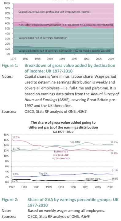
Figure 1 details the breakdown of value, and shows how it was distributed over time, in the period 1977-2010. It splits out the proportion of value that accrues to capital in the form of profits, to non-salary employee compensation (employer NICs and pension contributions), and to wages in both the top and bottom half of the earnings distribution. It shows that workers in the bottom half of the earnings distribution accounted for a declining share of GVA over the period. Their share fell from 16 per cent in 1977, to 12 per cent in 2010.
Figure 1: Breakdown of gross value added by destination of income: UK 1977-2010
Notes: Capital share is ‘one minus’ labour share. Wage period used to determine earnings distribution is weekly and covers all employees – i.e. full-time and part-time. It is based on earnings data taken from the Annual Survey of Hours and Earnings (ASHE), covering Great Britain pre-1997 and the UK thereafter.
Sources: OECD, Stat; RF analysis of ONS, ASHE
Figure 2: Share of GVA by earnings percentile groups: UK 1977-2010
Note: Based on weekly wages among all employees. Sources: OECD, Stat; RF analysis of ONS, ASHE
In the same period, there was a (rounded) 2 percentage point increase in the share of value that accrued to capital, from 36 per cent to 39 per cent, along with a 2 percentage point increase in the share of non-salary employee compensation from 9 per cent to 11 per cent.
Those in the top half of the wage distribution increased their share of the declining pot of wages, and thereby maintained a broadly constant overall share of GVA of 39 per cent.
Figure 2 drills down to focus on the share of GVA that flowed to employees across the earnings distribution. While the top 1 per cent of earners steadily increased their share of GVA, from 2 per cent to 3.1 per cent, the bottom 10 per cent’s share fell to less than 1 per cent. At the start of the period, the top 10 per cent of earners accounted for a smaller share of GVA than the bottom 50 per cent of workers (11.7 per cent and 16.2 per cent respectively). By 1990 this situation reversed, and by 2010 the top 10 per cent of earners accounted for 14.2 per cent of GVA, while low-to-middle income workers10 accounted for just 12 per cent.
In other words, for every £100 of value created by the UK economy, £12 ended up as pay in the pockets of the bottom half of earners, compared to £16 in 1977. It is interesting to note that the rising share of GVA going to the top 10 per cent of earners took place even as the overall share of wages declined: these high earners were receiving a bigger slice of a shrinking pie.
10
See Box 1 for an explanation of why we consider the bottom half of the earnings distribution to be a reasonable, if imperfect, proxy for the low-to-middle income group.
0% 10% 20% 30% 40% 50% 60% 70% 80% 90% 100%
1977 1981 1985 1989 1993 1997 2001 2005 2009 The distribution of value generated in the UK economy
UK 1977 - 2010
Capital share (business profits and self-employment income)
Non-salary employee compensation (e.g. employer NICs, pension contributions)
Wages in top half of earnings distribution
Wages in bottom half of earnings distribution (low-to-middle income workers)
16.2%
Bottom half
low-to-middle income workers
12.0%
2.0% Top 1% 3.1%
11.7%
Top 10% 14.2%
1.2% Bottom 10 % 0.8%
0% 2% 4% 6% 8% 10% 12% 14% 16% 18%
1977 1981 1985 1989 1993 1997 2001 2005 2009 The share of gross value added going to
different parts of the earnings distribution UK 1977 - 2010
The Resolution Foundation Commission on Living Standards
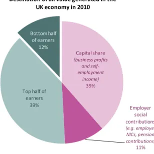
9 Figure 3: Breakdown of GVA in 2010: UK
Note: Based on weekly wages among all employees. Source: OECD, Stat; RF analysis of ONS, ASHE
Figure 4: Breakdown of increase in GVA recorded between 1977 and 2010: UK
Note: Based on weekly wages among all employees. Source: OECD, Stat; RF analysis of ONS, ASHE
Figure 3 shows how total generated value was distributed across different recipients in 2010, with the green sections detailing the proportion going to workers in the form of wages and the dark green section relating specifically to those in the bottom half of the distribution.
While all of the analysis above is
focused on describing the distribution of GVA within each year (and the change in this distribution over time), an
alternative calculation involves
determining the allocation of the overall increase in value added over the 30 year period. Figure 4 sets out some results. It shows that less than half of the overall value added was paid out as wages, with two-fifths (41 per cent) of the total going to capital/profits.
The bottom half of accounted for just 8 per cent of the total, compared with 39 per cent among the top half of workers (50th to 90th percentile of earners plus
90th to 99thplus top 1%).
The top 1 per cent alone accounted for around half as much (4 per cent) as the entire bottom half, while the top 10 per cent received more than twice the share (17 per cent) of these ordinary workers.
1.3
The increasing importance of bonuses
The analysis above reveals important changes in the shares of value that go to different parts of the workforce. It is important to note though, that this analysis uses data for weekly earnings. This data understates the true value of remuneration for some members of the distribution – particularly
Capital share (business profits and self-employment income) 39% Employer social contributions (e.g. employer NICs, pension contributions) 11%
Top half of earners
39%
Bottom half of earners
12%
Destination of all value generated in the UK economy in 2010
Capital share 41%
Employer social contributions
13% 50th to 90th
percentile of earners
22% 90th to 99th
percentile 13% Top 1% 4% Bottom half of earners 8%
Destination of all additional value generated in the UK economy between 1977 and 2010
The Resolution Foundation Commission on Living Standards
10
those at the top – because incentive payments (e.g. bonuses) are typically paid on an annual basis and are not accurately captured as weekly equivalents.11
The level of understatement is likely to have grown over time, because bonus payments have become more important aspects of remuneration, adding significantly to overall pay in some occupations. For example, in 2002 bonus payments made up 13 per cent of average pay in the
finance sector; by 2008 they had jumped to 23 per cent.12
To better capture the effect of incentive pay, we can repeat the GVA share calculations carried out above using earnings distribution data based on reported annual salaries, which more accurately picks up the effects of bonuses. Unfortunately such data is only available in comparable form from 1999 so we cannot track trends over the longer period.
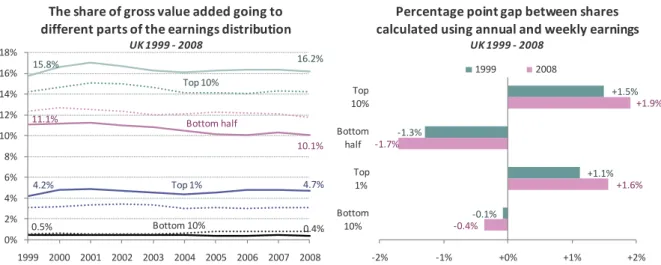
Figure 5: Differences in shares of GVA by earnings percentile groups calculated using annual and weekly earnings data: UK 1999-2008
Notes: Solid lines based on annual wages (including bonuses) among all employees. Dotted lines based on weekly wages (with estimated weekly equivalents of bonuses) among all employees. Data labels refer to annual wages-based GVA shares only.
Sources: OECD, Stat; RF analysis of ONS, ASHE
Figure 5 sets out the results. The dotted lines in the left hand chart relate to the weekly data we have already discussed (and are the same as those presented in Figure 2). The solid lines show that when incentive payments are more accurately captured, the differences in the fortunes of high- and low-paid workers are even more divergent.
Inclusive of bonus payments, the top 10 per cent and top 1 per cent of earners accounted for 16.2 per cent and 4.7 per cent of GVA respectively in 2008, compared with 14.3 per cent and 3.1 per cent using weekly earnings data. Conversely, the bottom half of earners and the bottom 10 per cent
11
Prior to 1997, the ASHE and New Earnings Survey – which form the basis of the earnings distribution analysis in Figure 1 and Figure 2 – only asked directly for details of weekly wages for employees. Other earnings variables such as hourly and annual are included in those datasets, but are simply derived from the weekly wage measure. Respondents to the ASHE survey were asked to include incentive payments by calculating weekly equivalents of their annual receipts. However, the reliability of such estimates is questionable. Only since 1999 has ASHE directly asked respondents for annual earnings and annual incentive payments.
12
This is considerably higher than the proportion in the next highest sector – business activities,real estate & renting – in which bonus payments accounted for just 7 per cent of average earnings.
11.1% Bottom half
10.1%
4.2% Top 1% 4.7%
15.8%
Top 10%
16.2%
0.5% Bottom 10% 0.4%
0% 2% 4% 6% 8% 10% 12% 14% 16% 18%
1999 2000 2001 2002 2003 2004 2005 2006 2007 2008 The share of gross value added going to different parts of the earnings distribution
UK 1999 - 2008
+1.5%
-1.3%
+1.1%
-0.1%
+1.9%
-1.7%
+1.6%
-0.4%
-2% -1% +0% +1% +2%
Top 10% Bottom half
Top 1% Bottom
10%
Percentage point gap between shares calculated using annual and weekly earnings
UK 1999 - 2008
The Resolution Foundation Commission on Living Standards
11
accounted for 10.1 per cent and 0.4 per cent respectively, compared with 11.8 per cent and 0.8 per cent using weekly data.
It is also notable that the gaps between the GVA shares calculated using annual and weekly earnings data increased over the period for each section of the earnings distribution, reflecting the growing importance of incentive pay in labour remuneration. For example in 1999, the share of GVA of the bottom half of workers was 1.3 percentage points lower when calculated using annual, rather than weekly, earnings data; by 2008 the gap had widened to 1.7 percentage points.
As noted elsewhere by Bell and Van Reenen,13 bonuses have been an increasingly important channel through which the highest earners have captured value generated by the UK economy. Indeed, when bonuses are included, the story of pay distribution in the last ten years changes quite significantly. For example, using annual earnings data the share of GVA going to the bottom half of the earnings distribution declined in the last decade rather than staying flat (as it did on a weekly data basis). The portion going to the bottom 10 per cent also fell, rather than increasing as it does when weekly earnings are used. Conversely, the share of GVA going to the top 10 per cent and top 1 per cent increased, rather than remaining flat as it does when weekly earnings are used.
13
Bell, Brian and Van Reenen, John, ‘Bankers’ pay and extreme wage inequality in the UK’, Centre for Economic Performance, London School of Economics, 2010
The Resolution Foundation Commission on Living Standards
12
Box 1: Situating low-to-middle income adults in the earnings distribution
The Commission’s work, and the wider work of the Resolution Foundation, focuses on people living on low-to-middle incomes. By that we mean people living in households below middle (median) income, but above the bottom 10 per cent, and not heavily reliant on means-tested benefits. In conceptual terms, the intention of our work is to focus on a group that is too rich to be
traditionally considered in need of state support, yet too poor to thrive independently. In technical terms, our definition is: adults living in working-age households in income deciles 2-5 who receive less than one-fifth of their gross household income from means-tested benefits (excluding tax credits). For the purposes of the income distribution we use ‘equivalised’ household incomes, to take account of the importance of different household sizes and compositions.
Defined as above, 11 million working-age adults live in low-to-middle income households in the UK, making up around one-third of the working-age population. Because the Resolution Foundation’s definition takes into account household size, the income boundaries of the group depend on the number of children living in a household. For example, couples with no children fall into the group if their incomes range from £12,000-£30,300 a year (from all sources), while couples with three children fall into the group if their incomes range from £19,200-£48,500 a year.
It is important to note that while our definition is income-based, in this report we are primarily focused on earnings. Figure B1 shows that 78 per cent of working adults living in low-to-middle income households are located in the bottom half of the earnings distribution (deciles 1-5). Figure B2 shows that 51 per cent of adults in the bottom half of the earnings distribution live in low-to-middle income households. In this report we therefore take the bottom half of the earnings distribution to be a reasonable, if imperfect, proxy for the low-to-middle income group.
Figure B1: Distribution of low-to-middle income adults across earnings deciles: UK 2008/09
Note: Earnings distribution includes all employees – i.e. full-time and part-time Source: Resolution Foundation analysis of DWP,
Family Resources Survey 2008-09
Figure B2: Composition of earnings deciles by
household income group of adult: UK 2008/09
Note: Earnings distribution includes all employees – i.e. full-time and part-time Source: Resolution Foundation analysis of DWP,
Family Resources Survey 2008-09
14% 17% 17% 16% 14% 10% 7% 4% 2% 0% 0% 2% 4% 6% 8% 10% 12% 14% 16% 18% 20%
1 2 3 4 5 6 7 8 9 10
Distribution of low-to-middle income adults across earnings deciles
UK 2008/09
25% 13%
5% 2% 1%
48% 55% 56% 52% 45% 32% 22% 13% 5%
27% 32% 38%
46% 54% 68% 78% 87% 95% 100% 0% 20% 40% 60% 80% 100%
1 2 3 4 5 6 7 8 9 10
Composition of earnings deciles by household income group of adult
UK 2008/09
The Resolution Foundation Commission on Living Standards
13
2 What explains the declining share of workers in the bottom half?
The trends in GVA identified in the previous chapter can be attributed to three
factors. First, over the 30 years considered, the
share of value going to labour
diminished
, while the share going to capital/profits grew. Secondly, within the
share of value going to labour, the
portion paid as wages fell
because
employer social contributions like NICs increased. Thirdly, this
reduced pot of
wages became less equally distributed
, such that workers in the bottom half
lost share while earners at the top of the distribution gained it. This
growing
wage inequality accounts for the majority
–
70 percent
–
of the overall
decline in the share of gross value added that flowed into the wages for the
bottom half
.
In this chapter we consider the three factors that lie behind the decline in the share of GVA accounted for by workers in the bottom half in the past 30 years: the labour share of income, the
wage share of employee compensation and the wage distribution. Wecalculate the specific
contributions made by each of these factors to trends in the share of GVA going to the wages of the bottom half of employees.
It is important to bear in mind that wages are not the only form of income, and some of the trends we outline in this chapter have the effect of reducing the share of GVA going to the bottom half in the form of wages, but potentially benefit them in other ways. For example, growth in employer NICs might feed through into higher investment in public services, while shareholders in the group may have benefited from increasing returns. That said, earnings are by far the largest component of household income, comprising three-quarters of gross income on average among low-to-middle income households,14 so it is important that we understand their drivers.15
2.1
The share of income going to labour
If we return to the equation set out in Chapter 1 (p6), we can see that the value that is generated by the UK economy can be expressed as the sum of ‘employee compensation’ and ‘profits and business returns’. The first part of this equation is known as the labour share of income; the latter part is known as the capital share. The labour share is calculated by dividing employee compensation in each sector of the UK economy by the associated GVA16 and producing a composite based on the contribution of each sector to the aggregate level GVA. In simple terms, this gives us a sense of the proportion of value that accrues to labour as opposed to the owners of capital.
14
See Section A1 of the Technical Appendix for more detail.
15
We also make no attempt in this chapter to determine whether any movement between capital and labour, and between workers at different points in the earnings distribution simply reflects the distribution of productivity. This question will be considered in more detail in a forthcoming paper for the Resolution Foundation by Professor John Van Reenen of the London School of Economics.
16
The Resolution Foundation Commission on Living Standards
14
This relatively straightforward equation is complicated by the presence of the self-employed in the capital share part of the expression rather than in the employee compensation element.17 In other
words, the compensation of people who are self-employed is categorised in the capital share rather than in the labour share (because self-employed workers are, in effect, simply retaining the profits of their business). As a result, if underlying economic trends, definitional changes or tax incentives mean that the proportion of people are who are self-employed has risen over time, the labour share measure as defined above will under-report the value that accrues to ‘workers’ in the way we might typically view them.
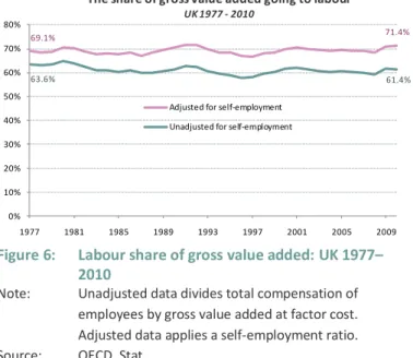
To understand the importance of this we can calculate a second, adjusted, labour share by applying a self-employment ratio to the initial labour share.18 This approach is imperfect because it assumes that labour compensation per person is equivalent between the self-employed and paid-employees. For this reason, and because the wage distribution stage of the GVA equation relates exclusively to employees, we concentrate in this paper on the unadjusted labour share data. Our conclusions should therefore be seen as applying to employees, rather than workers in the more general sense. Nevertheless, it is worth briefly considering the adjusted labour share. As Figure 6 shows, once controlled for a long-term rise in self-employment, the UK labour share has been broadly flat over the past 30 years, ending the period slightly higher than it began.19
Figure 6: Labour share of gross value added: UK 1977– 2010
Note: Unadjusted data divides total compensation of employees by gross value added at factor cost. Adjusted data applies a self-employment ratio. Source: OECD, Stat
Turning to the unadjusted labour share data, as Figure 6 highlights, profits tend to fall more sharply during a recession than wages, and recover more quickly afterwards. The labour share therefore displays counter-cyclical movements (declining during recoveries and
increasing during recessions, such as the one beginning in 2008). However, over several economic cycles, there has been a slight, but persistent, long-run
downward trend in the labour share. As such, the proportion of GVA accounted for by employee
compensation declined from 64 per cent in 1977, to 61 per cent in 2010.20
In percentage terms, this decline may not appear to be significant but it equates to £29 billion in 2010 prices, which is equivalent to around £1,200 per employee per year.
17
The gross mixed income section of the GDP equation effectively covers the operating surplus of unincorporated enterprises owned by households, which implicitly includes remuneration for work done by the owner or other members of the household. This remuneration cannot be identified separately from the return to the owner as entrepreneur.
18
Total employment in each sector divided by numbers of employees in each sector. Strictly speaking, hours-worked data is better still, but such data is often unreliable.
69.1% 71.4%
63.6% 61.4%
0% 10% 20% 30% 40% 50% 60% 70% 80%
1977 1981 1985 1989 1993 1997 2001 2005 2009 The share of gross value added going to labour
UK 1977 - 2010
Adjusted for self-employment Unadjusted for self-employment
The Resolution Foundation Commission on Living Standards
15
2.2
The share of labour’s income going to wages
The share of value accounted for by the overall pot of employee compensation can therefore be seen to have declined over time. What has happened within that pot? We turn now to the second stage in the distribution of value added; the portion of the labour share that flows to employees in the form of wages and salaries, and the portion that is paid out by employers in the form of social payments such as NICs and pension contributions.19
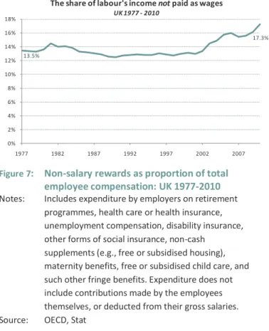
Figure 7: Non-salary rewards as proportion of total employee compensation: UK 1977-2010 Notes: Includes expenditure by employers on retirement
programmes, health care or health insurance, unemployment compensation, disability insurance, other forms of social insurance, non-cash
supplements (e.g., free or subsidised housing), maternity benefits, free or subsidised child care, and such other fringe benefits. Expenditure does not include contributions made by the employees themselves, or deducted from their gross salaries. Source: OECD, Stat
Figure 7 sets out the proportion of the labour share that does not take the form of salaries paid to employees. This includes employers’ social contributions, including employer NICs, employer pension contributions (including an imputed value for unfunded benefits) and employer health insurance payments for example. It does not
include contributions made by employees themselves, such as employee NICs.
It shows a clear increase in the share of total labour rewards being paid as non-salary compensation over the period. Having accounted for around 14 per cent of total employee compensation in 1977, the non-salary share rose to 15 per cent by 1981. It subsequently fell slightly, but increased once again at the end of the period, from 13 per cent in 2001 to 17 per cent in 2010. The rise since 2001 is particularly marked. The converse of this increase is a decline in the wage share of employee compensation, from 87 per cent in 1977 to 83 per cent in 2010. Again, in terms of their cash value these trends are not trivial. If we use the actual labour share figures recorded over the period, but this time hold constant the proportion of employee compensation paid as wages and salaries, the overall wage pot would have been worth in the region of £30 billion more in 2010; equivalent once again to around £1,200 per employee per year.
19
More detailed discussion of the adjusted labour share, and its implications for our analysis, is presented in section A2 of the Technical Appendix.
20
Earlier labour share data is available, but a dramatic (and temporary) squeeze on profits associated with the oil price crisis in the mid-1970s means that it is more appropriate to use this later start year.
21
As described in Chapter 1, the wage share includes employee wages and salaries paid both as cash and in-kind (that is, an imputed amount is included to cover the cost of non-cash rewards such as free use of leisure facilities or season ticket loans).
13.5%
17.3%
0% 2% 4% 6% 8% 10% 12% 14% 16% 18%
1977 1982 1987 1992 1997 2002 2007 The share of labour's income notpaid as wages
The Resolution Foundation Commission on Living Standards
16
The combined impact of the declining labour share and wage share sums to around £55 billion. That is, if both the labour share and wage share had been unchanged over the period, employees would have received salaries of £2,200 more a year on average in 2010.
2.3
The share of wages going to the bottom half
Finally, we turn to the third element in the distribution of the value generated by the economy; the way in which wages are distributed between workers. While the two factors considered above –
labour share and wage share – relate to the share of GVA flowing to all workers (the total wage pie), here we are interested in trends in the share of that wage pie that accrues to the bottom half of earners.
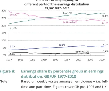
Figure 8: Earnings share by percentile group in earnings distribution: GB/UK 1977-2010
Note: Based on weekly wages among all employees – i.e. full-time and part-full-time. Figures cover GB pre-1997 and UK thereafter.
Source: ONS, ASHE
Figure 8 outlines the earnings shares accounted for by different sections of the earnings distribution. It shows that the share among workers in the bottom half of the earnings distribution fell from 30 per cent in 1977 to 24 per cent in 2010. Over the same period, the top 10 per cent of earners increased their share of the total wage bill from 21 per cent to 28 per cent.
A similar story is evident at the
extremes of the distribution. The top 1 per cent of earners experienced an increase in share from 3.6 per cent to 6.1 per cent; conversely, the share of wages going to the bottom 10 per cent of earners declined from 2.1 per cent to 1.6 per cent.
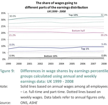
Capturing bonus payments
As Figure 8 shows, the highest earners have been taking an increasingly larger share of the wage pot in recent decades. However, as we set out in Chapter 1 in the case of overall GVA, these
distributional figures are likely to (increasingly) understate the true level of wage dispersion in the economy. That is because they are based on weekly earnings rather than annual, and therefore do not fully capture the impact of incentive payments.
As in Chapter 1, while we do not have annual data for the same time period shown in Figure 8, we can present findings on this basis for 1999-2008, as detailed in Figure 9.
In comparison to the weekly data presented in Figure 8 (and as dotted lines here), once bonuses are included, the overall share of earnings gained by the top 10 per cent and top 1 per cent was higher. For example, while the share of weekly earnings accrued by the top 1 per cent varied between 5.8 and 6.1 per cent over the period 1999-2008, the share of annual earnings going to this group varied between 8 and 9.4 per cent.
3.6% Top 1% 6.1%
21.2%
Top 10%
28.0% 29.5%
Bottom half 23.7%
2.1% Bottom 10% 1.6%
0% 5% 10% 15% 20% 25% 30%
1977 1981 1985 1989 1993 1997 2001 2005 2009 The share of wages going to
different parts of the earnings distribution GB /UK 1977 - 2010
The Resolution Foundation Commission on Living Standards
17 Figure 9: Differences in wage shares by earnings percentile
groups calculated using annual and weekly earnings data: UK 1999 - 2008
Note: Solid lines based on annual wages among all employees – i.e. full-time and part-time. Dotted lines based on weekly wages. Data labels refer to annual figures only. Source: ONS, ASHE
Trends over time are also different when looked at inclusive of bonus payments.
On the basis of annual data, the share of earnings gained by the bottom 10 per cent did not increase between 2005 and 2008, in contrast to the data on weekly earnings; similarly, the share of wages gained by the top 10 per cent of earners did not fall between 2002 and 2004, as it did on the weekly measure; and the share of earnings going to the top 1 per cent rose between 2002 and 2008 in terms of annual earnings, but fell in relation to weekly earnings.
This last finding highlights the growing importance over the last decade of incentive or bonus payments to final wages at the top of the distribution. As in the case of overall GVA, which we looked at above, once bonus payments are included, the story of wage inequality in the last ten years changes quite dramatically.
2.4
Quantifying the importance of each factor
In sum then, each of the three factors discussed above has contributed to the declining share of GVA that has accrued to workers in the bottom half of the distribution in the form of wages in the past 30 years. In doing so, they each help to explain why the pay of ordinary workers has increasingly failed to track the overall performance of the UK economy.
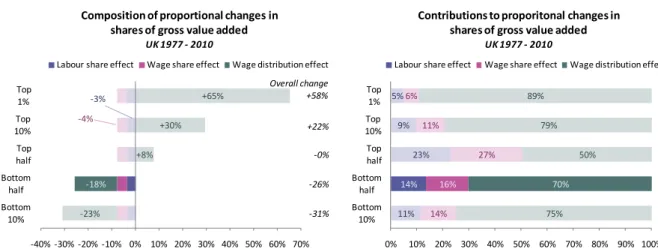
Figure 10 breaks down the changes in GVA shares experienced by different sections of the earnings distribution set out in Figure 2, specifying the precise contributions made by each of the three trends we have considered.
We noted at that point that, for every £100 of value generated in the UK economy in 1977, £16 was distributed to members of the bottom half of the earnings distribution in the form of wages, but that by 2010 this share had fallen to just £12. This equates to a 26 per cent fall.
The first section of Figure 10 shows that, of this overall 26 per cent fall among low-to-middle income workers: 3 percentage points were contributed by the decline in the labour share; 4 percentage points by the falling wage share; and 18 percentage points by growing wage inequality.22
The second section presents these contributions as proportions. It shows that 14 per cent of the decline in GVA share experienced by members of the bottom half of the earnings distribution was accounted for by the falling labour share; 16 per cent was due to the drop in wage share; and 70 per cent flowed from growth in wage inequality.
22
Totals do not sum due to rounding.
8.0%
Top 1%
9.4%
30.0% Top 10% 32.3%
21.2%
Bottom half
20.2%
0.9% Bottom 10% 0.8%
0% 5% 10% 15% 20% 25% 30% 35%
1999 2000 2001 2002 2003 2004 2005 2006 2007 2008
The share of wages going to different parts of the earnings distribution
The Resolution Foundation Commission on Living Standards
18
Figure 10: Contributions to changes in GVA shares accounted for by different sections of the earnings distribution: UK 1977-2010
Notes: ‘Wage distribution effect’ based on weekly wages among all employees – i.e. full-time and part-time. ‘Contribution’ proportions are based on overall magnitude of changes rather than the balance. For example, for the top 1% group, the per cent change in GVA share accounted for by the wage distribution effect (65%) is divided by the positive sum of all three effects (i.e. 65% plus 3% plus 4%), rather than the overall change figure of +58 per cent, producing a contribution figure of 89 per cent.
Sources: OECD, Stat; RF analysis of ONS, ASHE
Because the labour share and wage share effects relate to the total size of the wage pie, they had the same effect across all members of the earnings distribution. That is, they produced a combined negative impact of 7 percentage points on the GVA share accounted for by all workers. This can be seen in the consistent size of the pink and blue bars in the first of the two charts. In other words, in terms of their pay, all employees lost out to the same (relative) degree from the decline in the labour share and the decline in the wage share over the period.
The same is not true for changes in the distribution of wages, which affected workers differently across the earnings distribution. More specifically, changes in the wage distribution were positive for workers in the top half of the distribution and negative for those in the bottom half. That is, wage inequality counteracted the shrinking pot of wages for higher earners, but accentuated it for the lower paid.
The impact of rising wage inequality is greatest at the extremes of the earnings distribution. In the bottom 10 per cent of the earnings distribution, growing wage inequality produced a negative effect on the GVA share of the group of 23 percentage points, representing three-quarters of the overall decline of 31 per cent. In contrast, in the top 1 per cent of the earnings distribution, growing wage inequality produced a positive effect of 65 percentage points, more than counteracting the negative effects of the decline in labour share and wage share, and contributing to the overall increase in GVA share of 53 per cent experienced by the group.
2.5
Trends within the 30 year period
The analysis above relates to the period 1977-2010. Clearly, within this 30 year period, we can recognise variations in the main trends we have identified. Most obviously, Figure 2 shows that the majority of the decline in the share of GVA accounted for workers in the bottom half of the earnings distribution took place during the first half of the period. From the mid-1990s onwards their share remained relatively flat. Although the picture looks less stable when we more accurately capture
-3% -4% -23% -18% +8% +30% +65% -31% -26% -0% +22% Overall change +58%
-40% -30% -20% -10% 0% 10% 20% 30% 40% 50% 60% 70% Bottom 10% Bottom half Top half Top 10% Top 1%
Composition of proportional changes in shares of gross value added
UK 1977 - 2010
Labour share effect Wage share effect Wage distribution effect
11% 14% 23% 9% 5% 14% 16% 27% 11% 6% 75% 70% 50% 79% 89%
0% 10% 20% 30% 40% 50% 60% 70% 80% 90% 100% Bottom 10% Bottom half Top half Top 10% Top 1%
Contributions to proporitonal changes in shares of gross value added
UK 1977 - 2010
The Resolution Foundation Commission on Living Standards
19
bonus payments (Section 1.3), the pace of decline is still somewhat slower than that recorded during the late-1970s and 1980s.
This finding reflects the literature on wages and, more broadly, income inequality over this timeframe.23 It also chimes with the findings we present on the distribution of earnings at the household level in Section A1 of the Technical Appendix. While there may be some merit in repeating the analysis set out in the above sections for a range of different timeframes within the overall period, here we limit ourselves to this most obvious division, taking 1996 as the crossover year.
We find that, while the share of GVA flowing to the bottom half of earners declined from 16 per cent to 12 per cent over the period as a whole, between 1996 and 2010, the proportion remained
unchanged. In part this is because of the counter-cyclical movement of the labour share in the last two years – if we instead compare 1996 with 2008, the GVA share of ordinary workers does decline slightly – but it primarily reflects the slowing pace of wage inequality over these years.
Figure 11 repeats the decomposition undertaken in Figure 10, and shows that the lack of change in the GVA share of the bottom half between 1996 and 2010 was the result of an upward pressure associated with increasing labour share (+6 percentage points) that was precisely offset by a downward pressure related to a significant reduction in wage share (-5 percentage points) and a smaller increase in wage inequality (-1 percentage points).
As a result, while the wage distribution effect explains 70 per cent of the overall decline in the share of GVA accounted for by the bottom half for the 30 year period, between 1996 and 2010 it was responsible for just 8 per cent of the outcome experienced by the group. Instead, increasing labour share (50 per cent contribution) and falling wage share (42 per cent) proved much more influential.
Figure 11: Contributions to changes in GVA share accounted for by different sections of the earnings distribution: UK 1996-2010
Sources: OECD, Stat; RF analysis of ONS, ASHE
23
For example, see Machin, Stephen and Van Reenen, John, ‘Changes in Wage Inequality’, Special Paper No. 18, Centre for Economic Performance, London School of Economics, 2007 and Brewer, Mike, Muriel, Alastair, Wren-Lewis, Liam, ‘Accounting for changes in inequality since 1968: decomposition analyses for Great Britain’, Government Equalities Office, 2009 +6% -5% +53% -1% +0% +5% +10% +54% +0% +1% +6% Overall change +11%
-40% -30% -20% -10% 0% 10% 20% 30% 40% 50% 60% 70% Bottom 10% Bottom half Top half Top 10% Top 1%
Composition of proportional changes in shares of gross value added
UK 1996 - 2010
Labour share effect Wage share effect Wage distribution effect
10% 50% 53% 37% 29% 8% 42% 44% 31% 24% 82% 8% 3% 32% 46%
0% 10% 20% 30% 40% 50% 60% 70% 80% 90% 100% Bottom 10% Bottom half Top half Top 10% Top 1%
Contributions to proporitonal changes in shares of gross value added
UK 1996 - 2010
The Resolution Foundation Commission on Living Standards
20
3 What has changed in the UK economy to account for these trends?
More than two-thirds of the decline in UK
labour share
between 1977 and 2010
is explained by the shift in the UK economic structure, away from industry
(mainly manufacturing) – in which a relatively high proportion of value flows to
labour – and towards finance – in which a much higher proportion of value
accrues as profits.
By contrast, trends in
wage share
over the period were almost identical across
all sectors. The overall decline was therefore the result of changes in
government policy rather than shifts in the UK’s industrial structure.
Finally, in the case of
wage distribution
, economy-wide trends affecting all
sectors proved most influential, explaining three-quarters of the headline level
increase between 1975 and 1999, and more than four-fifths of the movement
in the last decade. Changes in the UK’s industrial structure played an increasing
– though still secondary – role over the course of the 2000s. In this period,
wage inequality was primarily driven by the finance sector.
The analysis in the previous chapter quantified the contribution of three different factors to the declining share of wages in the bottom half: falling labour share of income, falling wage share of labour compensation and growing wage inequality. This chapter seeks to explain these trends. It asks: how have changes in these three factors played out across the UK economy? In particular, we consider two routes by which trends at the sector level might have affected the national level distribution of GVA:
First, changes that have taken place in all sectors – or at least in those that are most
important to the UK economy. For example, returns to skills might have changed, driving up the wage premium associated with having a degree across all industries; alternatively, inequality might have increased significantly in the three largest sectors. We refer to these as within-sector effects.
Secondly, the industrial structure of the UK might have changed. For example, a particularly unequal sector might have grown in size; alternatively, the economy might have shifted towards sectors with low labour share and away from sectors with high labour share. We refer to these as between-sector effects.
In this section we quantify the relative importance of these two explanations. We also determine which sectors have been the most influential in the trends identified in Chapter 2. We proceed by taking each of the factors in turn: first the labour share.
The Resolution Foundation Commission on Living Standards
21
3.1
Labour share at the sector level
Chapter 2 showed that the labour share contributed 14 per cent of the decline in GVA going to the wages of bottom half workers. To what extent have trends in the labour share been due to changes in the UK industrial structure as opposed to more general factors affecting all sectors?
Figure 12 looks at how the industrial structure of the UK economy has changed over time. It details changes in the contribution of each broad sector of the economy to overall GVA in the period 1977-2010.24 It highlights the growing importance of finance, the consistently high weight given to the
retail and other services25 sectors and the falling share of industry.
Figure 12: Sector contributions to total GVA at factor cost: UK 1977-2010
Notes: Shares calculated on the basis of expenditure-based GDP method. Value of each sector is shown as a proportion of total gross value added in all sectors. Figures are at factor cost rather than basic prices to reflect the fact that labour share data is calculated by dividing compensation of employees by GVA at factor cost. Sectors are comprised as follows. Agriculture etc: agriculture, forestry, fishing and hunting;
Construction: construction; Other services: education, health and public administration; Finance etc: finance, real estate, computers and other business activity; Retail etc: wholesale and retail trade, repair of motor vehicles, hotels, restaurants, transport, storage and communications; and Industry: mining, manufacturing and energy.
Source: OECD, Stat
What, then, has happened to the labour share within sectors?26 Figure 13 provides details for the same set of sectors covered in Figure 12. We can see that, compared to the national labour share figure – which moved between 64 per cent and 61 per cent over the period – construction and
finance recorded below-average labour shares, while retail, industry and especially other services all recorded above-average shares.
24
The sectors detailed here are deliberately broad, reflecting the level at which labour share data is available. Analysis elsewhere in this chapter focuses on more detailed sectors.
25
As noted in footnote 7, GVA in the public sector is almost entirely based on compensation of employees. Therefore, changes over time in the contribution to overall GVA made by the other services sector, where many public sector workers are located, will have a disproportionate impact on labour share at the aggregate level. However, while certain industries within the public sector expanded over the period (education and health for example), Figure 12 makes clear that the overall increase in the other services sector was relatively modest, suggesting that any associated distortion is limited.
26
Again, as with the overall figure, the initial labour share in each sector can be adjusted to take account of self-employment. Our focus on employees means that we only consider the unadjusted data here, but adjusted figures are presented in Section A3 of the Technical Appendix.
0% 10% 20% 30% 40% 50% 60% 70% 80% 90% 100%
1977 1981 1985 1989 1993 1997 2001 2005 2009 Share of aggregate gross value by economic sector
UK 1977 - 2010
Industry Retail etc. Other services Finance etc. Construction 15.7% 20.6% 23.2% 33.6% 6.1% 0.7% 33.1% 20.6% 20.8% 16.3% 6.7% 2.5%
0% 5% 10% 15% 20% 25% 30% 35% 40% Industry Retail etc Other services Finance etc. Construction Agriculture, forestry etc
Share at start and end of period UK 1977 - 2010
1977 2010
The Resolution Foundation Commission on Living Standards
22 Figure 13: Labour share of income in selected economic sectors: UK 1977-2010
The Resolution Foundation Commission on Living Standards
23
Labour share fell significantly over the period in industry, from 73 per cent to 60 per cent, but rose in every other sector shown. However, despite a number of relatively large movements in share over the period at the sector level, the change registered at the aggregate level was small (-2.2
percentage points).
Sectoral decomposition
In order to quantify the relative importance of the industrial sector and of more general trends we need a statistical method that can ‘decompose’ national trends in the labour share into the impacts of these two trends. We have followed the decomposition methodology used in the IFS’ annual
Poverty and Inequality in Britain publication.27 We focus on the same set of sectors considered above, using the labour share and contribution to GVA figures for the period 1977-2010.28
Based on our calculations, movements in labour shares within sectors had a small positive impact on the overall picture, while shifts between sectors had a larger negative effect. Overall, the findings show that the decline in overall labour share was largely a function of the changing industrial structure of the UK rather than of trends within sectors.
More specifically, a large fall in labour share in the industry sector was more than offset by modest increases in the retail, finance and other services sectors, producing a positive contribution to the aggregate labour share figure. In other words, these trends in the labour share within different sectors partially cancelled each other out.
By contrast, the dramatic shift in the industrial structure of the UK from industry, where a relatively large proportion of value generated flows to labour, to finance, where a much higher proportion of value is retained as profits, produced a strong negative effect. These between-sector effects accounted for two-thirds (70 per cent) of the movement in UK labour share.
Finally, if we take both of these effects together, by far the most influential sectors on the change in labour share were industry (which contributed 52 per cent to the aggregate outcome), finance (30 per cent) and other services (12 per cent).
3.2
Wage share at the sector level
We now turn to the second of our three explanatory factors: the wage share. As was shown in Figure 7, the proportion of total employee compensation accounted for by non-salary sources such as employer social contributions increased by 4 percentage points in the UK over the period 1977-2010 (from 13.5 per cent to 17.3 per cent). This means that the share being paid as wages and salaries fell. This fall drove 16 per cent of the overall decline in the share of value going to the wages of lower half workers.
How has this played out in different sectors? Unlike the trends in labour share discussed above, the pattern of decline across sectors was identical. This points firmly to the conclusion that shifts in the economic composition of the UK economy had zero effect on this phenomenon. Instead, what appears to have driven the change across the economy is movements in employer NICs rates, with alterations in the wage share tending to coincide with rises and falls in the main rate.
27
See the 2006 report for a full explanation.
28