A Tool for the Analysis of Dynamic Networks
Alexandra Lee
Swansea University Swansea, UK [email protected]
Daniel Archambault
Swansea University Swansea, UK
Miguel Nacenta
University of St Andrews St Andrews, UK [email protected]
ABSTRACT
Network data that changes over time can be very useful for studying a wide range of important phenomena, from how social network connections change to epidemiology. However, it is challenging to analyze, especially if it has many actors, connections or if the covered timespan is large with rapidly changing links (e.g., months of changes with changes at second resolution). In these analyses one would often like to compare many periods of time to others, without having to look at the full timeline. To support this kind of analysis we designed and implemented a technique and system to visualize this dynamic data. The Dynamic Network Plaid (DNP) is designed for large displays and based on user-generated inter-active timeslicing on the dynamic graph attributes and on linked provenance-preserving representations. We present the technique, interface and the design/evaluation with a group of public health researchers investigating non-suicidal self-harm picture sharing in Instagram.
CCS CONCEPTS
•Human-centered computing→Visualization toolkits;User interface programming; Touch screens;
KEYWORDS
Information Visualization, Dynamic Network Analysis, Large Dis-play Visualization
ACM Reference Format:
Alexandra Lee, Daniel Archambault, and Miguel Nacenta. 2018. Dynamic Network Plaid: A Tool for the Analysis of Dynamic Networks. InProceedings of CHI (CHI 19).ACM, New York, NY, USA, 12 pages. https://doi.org/10.475/ 123_4
1
INTRODUCTION
Analyzing dynamic networks in a scalable way is a difficult prob-lem [11]. Long in time dynamic networks that span long periods of time (months) with respect to their temporal resolution (seconds) are particularly difficult to analyze. If two or more points in time are separated by a large temporal distance, they become difficult to compare. Time-to-space mappings (multiple snapshots of the graph
Permission to make digital or hard copies of all or part of this work for personal or classroom use is granted without fee provided that copies are not made or distributed for profit or commercial advantage and that copies bear this notice and the full citation on the first page. Copyrights for components of this work owned by others than ACM must be honored. Abstracting with credit is permitted. To copy otherwise, or republish, to post on servers or to redistribute to lists, requires prior specific permission and/or a fee. Request permissions from [email protected].
CHI 19, May 2019, Glasgow UK
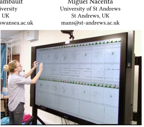
[image:1.612.317.562.135.351.2]© 2018 Association for Computing Machinery. ACM ISBN 123-4567-24-567/08/06. . . $15.00 https://doi.org/10.475/123_4
Figure 1: Dynamic Network Plaid (DNP) running on a Mi-crosoft Surface Hub 84".
on a timeline) don’t have enough screen space to show relevant time points simultaneously for comparison. Time-to-time mappings (animations) require the user to remember two frames of the anima-tion and interactively navigate through all states of the animaanima-tion between them. These two main methods for dynamic graph analysis are significantly limited when analyzing such datasets.
When analyzing dynamic network data, not only would we like to compare distant points in time but we would like to compare the dataset as it is being visualized now to some previous state in the session. Provenance information helps the analyst understand how a particular insight was obtained. An effective visualization of this information can help in comparing two or more interesting views of the data at different points in the session.
Our goal is to visualize both long in time dynamic graphs and provenance information simultaneously in an intuitive manner. In order to accomplish this task, we use large displays. Effectively using the space provided by these devices gives additional space to simultaneously compare distant points in the time series and multiple visualizations of the dataset in the session, supporting collaboration and new dynamic graph visualization methods.
In this paper, we present Dynamic Network Plaid (DNP) a system and technique that addresses the challenges of analyzing long in time dynamic networks along with provenance information. Our technique is the first to present dynamic graphs of this type together with provenance in an effective way. We designed for and deployed to a physically large display because the additional physical space enables physical navigability and the display of large amounts of information. The technique is validated through an experiment with public health researchers on a dataset of self-harming behaviour.
2
BACKGROUND AND RELATED WORK
2.1
Dynamic Visualization
Beck et al. [11] categorize all existing dynamic graph layouts into two main categories – time-to-space mapping and time-to-time mapping. In these two main categories, the three dimensions of scalability are considered: the number of vertices, the number of edges, and the number of graphs (in cases where the dynamic graph is modeled as a series of timeslices). Various approaches for visualizing dynamic graph data have been proposed, but suffer from scalability issues in at least one of these three dimensions.
2.1.1 Time-to-Time Mapping. Animation involves mapping the graph at each time stamp and then running these mappings con-currently as an interactive video. When the mapping of the graph takes the form of node link diagrams, the result is a reasonably intuitive dynamic graph visualization. Node-link diagrams remain the most popular approach [7, 18, 27, 30, 33, 36], with one work combining matrices and animation [51].
The principal drawback of animation is that all temporal infor-mation is not displayed simultaneously and that the user must interact with the system to show certain periods of time, relying heavily on memory for moments not displayed on screen.
2.1.2 Time-to-Space Mapping.Timeline-based visualizations map the time dimension to a space dimension in a non-animated diagram. Timeline-based approaches can be largely split into three categories: node-link based approaches [20, 29, 34], matrix based approaches [8, 13, 14, 16, 17, 38, 54, 62], hybrid approaches [35], and pivot-graph based approaches [58]. Line charts can also be used for effectively showing the variations in an attribute value over time [59]. Javed and Elmqvist use a form of timeslicing to enable stack zooming on a line graph showing dynamic data [39]. Zooming interaction provenance is supported for line graphs. Bach et al. [6] introduce a novel way of visualizing dynamic data via paneled ‘comics’.
There have been a number of studies that have demonstrated clear advantages of time-to-space mappings on dynamic graphs [5, 28] and visualization in general [56]. When many time points need to be analyzed, time-to-space techniques quickly run out of available screen space. We use a time-to-space mapping to leverage the advantages of this approach while benefiting from the larger display area of a wall display.
2.2
Event-Based Visualization
Event-based analytics deals with many discrete events happening through time. In these methods, the events are visualized individu-ally and using aggregation. Aggregations can be used to reduce the visualization to a specific number of categories [45]. Event-based
methods can be effective for novice users who may need assistance to find a starting point for data exploration as visualizations of large datasets can be crowded and difficult to read [24]. Our work can be considered a method for visualizing event-based dynamic graphs. In contrast to previous work on event-based network visu-alization [53], we do not attempt to draw the dynamic graph in its entirety; rather we allow the user to select windows of time and cre-ate timeslices containing all events in this window. These windows are represented using node-link diagrams and time-flattening.
2.3
Visualization of Provenance Information
Analyzing large networks can be challenging due to the size of the graph and the potential number of attributes. The analysis of such networks can often be time-consuming, requiring many different steps to reach an end-point; making it difficult for a user to accurately remember their interaction history. User studies have shown that providing a view to support provenance visualization can aid the process memory of the user [37, 48, 49]. Several systems have support for interaction histories [21, 25, 55] and report positive results related to insight discovery and exploration recall. Given this work, we support the visualization of provenance information as the user interacts with a long in time dynamic graph.
2.4
Large Displays
Bezerianos et al. [12] present several interaction and visualization techniques for large, high resolution, displays. The displays in this work are much larger than ours as users could not reach certain areas of the screen. Instead, bridging tools are provided for access to areas out of reach and there is a focus on organizing content so that all relevant items can be displayed without being obstructive. Andrews et al. [2] elicit the design issues and differences of design-ing information visualization systems for large displays. They find that “rather than being small portals in which the user must fit their work, they are human-scale environments that are defined more by the abilities and limitations of the user than by the technology" [2]. Kister et al. [41] present a technique for the visualization of static graphs on wall displays with mobile devices to investigate how the two can be used in interaction simultaneously.
Physical navigation and wall displays have advantages over standard size displays used with traditional interaction techniques. Ball et al. [9] found that higher resolution displays using physical navigation significantly outperform smaller displays using pan and zoom navigation. The idea that using a larger display creates a better sense of user confidence and reduced user stress is also supported. High-resolution displays can be beneficial in that they significantly improve performance time for basic visualization tasks in finely detailed data [22, 44]. High-resolution displays can also help people find and compare targets faster, feel less frustration, and have more of a sense of confidence about their responses [10]. Large displays can support collaborative visualization work more easily than standard sized displays. Prouzeau et al. [47] present a collaborative method for selecting nodes based on the distance to a source node of a static graph in a collaborative situation.
for visualizing long in time dynamic networks along with a visual-ization of interaction provenance simultaneously.
3
EXAMPLE DATASET
Our tool is designed to address the analysis of dynamic network data that is large in time span relative to its given resolution, relatively large in number of links, and still relatively large in terms of number of nodes. In this section, we describe a specificself-harmdataset for four main reasons: a) it provides a good real-world example of the type of challenging data that the tool can help analyze; b) this is the dataset that we used to develop, test, and validate the tool; c) it is useful to illustrate the design and features of the data concretely, and; d) it is a socially relevant dataset.
The data was collected and rated by Brown et al. [19] for mental health research purposes. The dataset describes interactions be-tween people on the photo and video-sharing social networking serviceInstagram1. The interactions are centred on non-suicidal self-injury behavior (e.g., self-harm in the form of cutting one’s body), which are shared on the platform in the form of pictures of the harm, and can be commented on or “liked” by other members of the social network. This data is important since it can help char-acterize self-harm behaviour and determine whether it is socially contagious.
The data was collected from Instagram between 31 March 2016 and 30 April 2016 and tracks interactions centred around images tagged with a self-harm related hashtag set, in the German language. The dataset captures interactions between actors which represent Instagram accounts that either posted images of self-harm (tagged with specific hashtags–1,154 accounts did this) or commented/liked these images (12,541 accounts did this). Each interaction between nodes is recorded as an edge between a source and a target node. Edges have unique identifiers and are associated to their occur-rence time (with second precision), do not have a duration (i.e., are considered atomic, only measured at the time of posting), and are tagged with wound grade. Wound grade is a measure of self-harm severity between 0 and 3 assigned by an expert in the area. Images posted appear in the dataset as edges with the origin and the target as the account that is posting and a wound grade of 4 if very severe to 1 if light self harm. A wound grade of zero means that the image did not show self-harm (but still had relevant tagging). Comments and “likes” of an image show as links of wound grade zero, where the origin of the link is the commenter account and the destination is the account that posted the commented image. The dataset has 41,073 edges (2,826 of them are posted images), occurring at 40,487 distinct time points (an average of 1,370 interactions per day).
This dataset presents multiple and varied challenges (CH) for data analysis which are also representative of other large dynamic network datasets (i.e., network data of long time span and relatively large numbers of nodes and interactions). Practitioners typically start their analysis by calculating global numerical statistics. This is a necessary step but provides little access to unexpected or inter-esting occurrences in this data, since there might be much variance in which actors are dominant and how they behave throughout the time span (CH1). Research practitioners use popular analysis tools (from this study [19] and from our own experience) and often
1https://www.instagram.com
try to visualize their data, but creating good visualizations of the data (node-link diagrams are popular) can be fiddly and very time consuming (CH2). When they visualize this kind of data, they often have to produce intermediate data outputs and sometimes draw the data with a force-directed algorithm. If the results are unsatisfac-tory, they adjust parameters and repeat the process, which results in delayed feedback because of non-interactive workflows (CH3). Even when they produce visualizations, these tend to be global views, but these become tangled and uninformative due to the large number of nodes and interactions (CH4). The natural solution is to create timeslices, but this means, especially if the slicing has to be done programmatically, that significant patterns in network events can easily be missed if they are distributed throughout the data set at different resolutions (CH5–[53]). Aggregate node-link diagrams across the full timespan of the dataset flatten time so that it becomes difficult to notice more subtle interactions where the timing is key (CH6–e.g., a ping-pong-style interchange of comments).
4
DESIGN GOALS AND PRINCIPLES
The overarching goal of this work is to facilitate the exploratory analysis of the notoriously difficult to analyze and visualize dy-namic networks. As we have argued in the previous section, this kind of data presents specific challenges to visualization due to their structure and the potentially long periods of time during which networks change. In addition, several common challenges of infor-mation visualization apply, such as finding appropriate interaction (CH7–[61]), effectively representing the connection between mul-tiple representations (CH8–[52]), maintaining awareness of what processing the data being visualized has undergone (provenance, CH9, [21, 23]), and helping users navigate a potentially complex interface (CH10–[60]).
In order to address the challenges, we made two a priori decisions and selected a set of design principles. The first a priori decision (D1) was to design for large displays. Displays that are physically large and have sufficient resolution offer the opportunity to display large amounts of data and simultaneously support physical navigation in space for individuals and groups of people [9, 10]. Although physical size and number of pixels are not completely independent, one key consideration is that dense resolutions do not necessarily support visibility of visual elements if the screen is medium or small. We believe large displays can be valuable for dynamic network data by partially addressing CH4. The second a priori decision (D2) was not to try to show the full data in a single view and instead apply a small multiple approach [11, 57] (addresses CH4, CH5, CH6 and CH8) and allow the timeslices to be created interactively (addresses CH1, CH3, CH5, and CH6). This decision is based on our own experience, observation and workflow of analysis of dynamic network data, and fits with the large display paradigm [63]. We consider the following design principles:
DP1.–Provide Stable Global Spatial Mappings.Although it is good to give analysts flexibility, we believe that in exploration of complex data it is important to keep mappings stable to avoid analysts getting confused about the representations (CH10).
is particularly relevant if the work is collaborative [26]. Therefore we aim at visualizing interaction provenance information whenever possible (CH9).
DP3.–Enable Consistent Cross-Representation Highlighting. Dy-namic network analysis can involve recognizing how the same node or edge connects through time. Since we use an interactive small multiples approach (D2), we need to be able to track elements or groups throughout multiple representations whenever possible (CH8, CH10). Note that DP3 and DP2 mutually reinforce each other, since provenance information allows the establishment of cross-representation links across different stages of the processing of sections of data.
DP4.–Familiarity.Whenever possible, to reduce learning over-heads, we aim to use workflows and interface elements that are familiar (CH7).
5
METHODOLOGICAL APPROACH
Our design process was principled, iterative, and evidence based. Our starting point was the identification of the specific problems of the analysis of this kind of data, which arose from our previous collaboration with public health researchers. In particular, a group of researchers were interested in looking at a self-harm dataset (described in Section 3). We got acquainted with the current ap-proaches of the researchers and created a first prototype through short iterative cycles of design, implementation, and critique. We presented and studied the first prototype with the target scientists in an open ended observation, from which we obtained important insights and change suggestions. After another period of redesign and re-implementation, including some new features, we carried out another observation session and made a final set of changes. The observation/evaluation sessions are described in Section 8 and use interviews and qualitative coding of the researchers interaction with the system.
6
THE DYNAMIC NETWORK PLAID
The general shape of the Dynamic Network Plaid is structured across columns and rows of small multiple representations, inter-leaved by thinner rows (this structure resembles that of a plaid or tartan fabric, hence the name). The key distinction and guiding principle for the interface is that the vertical space dimension rep-resents data transformations by the users (e.g., filtering, change of representation, timeslicing), whereas horizontal space represents dataset time (left to right). This mapping is consistent for the whole interface and at any point of time, which enforces DP1 in order to allow analysts to navigate and interpret the space in a simple way, without having to keep track themselves of which representations correspond to which parts of the data. Because user operations on the data always generate new rows underneath, this helps to also navigate provenance information (DP2).
An example view of the interface after some timeslicing, filter-ing and representation operations appears in Figure 2. We further describe the different elements vertically, starting with the narrow rows (timelines), continuing with the different types of checkered rows (vignette rows), and then describing the filtering, selection and
brushing mechanisms, to finish with a description of miscellaneous interface features.
6.1
Timelines
Timelines are area line graphs that aggregate number of edges per unit time, and that run continuously from the left screen border to the right screen border, always representing the full data time span (see Figure 2.A). When the interface starts, the first and only visualization element on the screen is themain timeline(Figure 3. Top). The main timeline provides an appropriate overview of the full time span. The different colors of the stream represent the different values of the main attribute of the link. In our case, there are four colors which correspond with the four wound severity grades of interactions (from 0 to 3 they go from yellow to dark blue also decreasing in brightness). This scale draws from the cividis colour map [46], which is optimized for the general population, inclusive of viewers with non-typical color vision. The main timeline provides an appropriate overview of activity across the full timespan. In our experience, this provides the desired entry point to analysts, who usually want to then zoom into details at specific periods of time (usually with unusually large amounts of activity) [52].
Two main operations are possible on the main timeslice. First, we can filter for a specific type of event (e.g., only events of wound grade 3). This creates another timeline (Figure 3.Bottom). The sec-ond, and most important operation, is to select timeslices. When the analyst “brushes” the timeline horizontally (i.e., performs a tap-and-drag motion), this creates a timeslice. The slice is represented in the timeline as a section with a background color (Figure 2.E). This slice can also be dragged to a different location in the timeline, or its size changed by dragging its edges. In our current configuration we allow up to eight slices, which can contain and overlap each other. Each timeslice is assigned a different color.
Importantly, the timeslices are always the same for all interface elements and timelines. This means that elements in the same col-umn always correspond to the same period of time (DP1), and that changing the span covered by a slice will propagate the changes ver-tically to all the rows (for that column). Underneath each timeslice there are two narrow rows which can contain selected statistics of all nodes represented in the timeline (top) and of only the selected nodes (bottom). The selection mechanism is described below in Section 6.3. Example statistics supported are average links per node, average wound grade, and number of unique sources and targets.
6.2
Vignette Rows
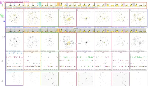
Figure 2: Example DNP screenshot. A) timelines, B) vignette rows, C) a visibility column, and D) modal menu.
Figure 3: Example of the main timeline (top) and a derived filtered timeline (bottom). Timelines in DNP always cover the full horizontal space and represent the full timespan of the data.
analysts can only look at two vignettes contiguously if there was no intermediate timeslice between them, and that vignettes would not be usable as a type of lens on the dynamic data by dragging the timeslice around the timeline while observing changes in the dynamic graph. Our analysts performed this operation often, and we found it quite compelling (an example of leveraging DP3).
All vignettes have asubtimeline(Figure 4. top) which shows how events by the different nodes are distributed within the timespan of the vignette (i.e., its timeslice). This timeline highlights interaction by offsetting any nodes that post upwards from the horizontal line and any nodes that like/comment down from the horizontal line.
The two thin rows at the bottom of each vignette show the globally selected statistics, as applied only to the timeslice (top) and the same statistics but applied only to selected nodes (see Section 6.3).
Most of the area of each vignette is occupied by the main repre-sentation. In the default vignette row, this is a force-directed dia-gram as shown in Figure 4, where each node is colored according to the grade of its latest interaction within the timeslice. However, there are three additional types of vignette rows that offer different visual representations: time-shaded node-link diagrams, matrices and scatterplots.
Time-Shaded Node-Link Diagrams.These are node-link di-agrams drawn with a force-directed algorithm where the node’s color (grey to black) encodes the time of the last interaction in the timeslice (see Figure 5). This representation was meant to help when subtle time-based interaction takes place (CH6).
[image:5.612.60.559.412.467.2]Figure 4: Two node-link diagram vignettes with a node of wound grade 1 selected. Within timeslice highlighting by offset can be seen in both vignette timelines.
Figure 5: Two time-shaded vignettes. The bottom row con-taining statistical measures of selected nodes is blank as no nodes are currently selected.
nodes (Figure 6). The color indicates wound grade of the target node. Nodes can be ordered by name, wound grade, and commu-nity2.
Scatterplots.This representation does not necessarily consider network structure but provides an important perspective of the multivariate data. The scatterplot view allows custom mapping of the vertical and horizontal dimensions, as well as the size of the dots (see Figure 7). Each dot represents a link, and available attributes to map are time, wound grade, and community. Community is an off-line calculation of groups of nodes that are tightly linked together that can be used in network research [42].
For provenance information visualization (DP2) reasons, vignette rows do notchangerepresentations. Instead, new rows appear below the current one with the new representation if one of the corresponding buttons in the menu is pressed (see Figure 2.D), allowing the user to trace how they arrived at a particular view. The interface grows vertically; if the page height is exceeded the analyst is able to scroll up and down the page. To avoid clutter there is also a mechanism to “minimize” vignette rows by pressing a round button
2Community membership is calculated globally over the entire dataset using Infomap
[image:6.612.317.560.259.395.2][50] the first time the dataset is loaded into the system. From human-centred [43] and metric [42] perspectives, Infomap has been shown to be effective.
Figure 6: Two Adjacency Matrix vignettes. The same dataset as Figure 5 is shown. Edges are coloured by wound grade.
Figure 7: Two Scatterplot vignettes. The same dataset as Fig-ure 5 is shown. Points are coloFig-ured by global community membership.
Figure 8: An example of the lasso being used to select a group of nodes. A previous selection had taken place prior to this so the second row of statistical measures has been popu-lated.
[image:6.612.53.295.269.405.2] [image:6.612.317.559.445.584.2]6.3
Zooming, Selection and Filtering
Vignettes can be zoomed in by using a reverse pinch movement on the vignette of interest, which offers the ability to closely examine the network structure in a part of the graph (CH7, CH8). A zoom operation creates a new row of vignettes that preserves provenance information (DP2). The zooming operation can be considered a type of filtering that is dependent on network structure (i.e., only nodes in a particular region).
Sometimes it is important to be able to track the same nodes throughout the timeline. However, it can be challenging to represent every actor in a distinctive and recognizable way when there are thousands of them that can be active at potentially any point in the timeline. We address this through selection and linking (DP3). Analysts can select a single node on any given vignette by tapping on it. The node will be highlighted in all of the vignettes where it is present by doubling the size of the selected node (dot in the scatterplots and cell in the matrices). In the timeline view, the node is represented as a vertical line (see Figure 2).
Groups of nodes can be selected with a lasso tool (see Figure 8), which highlights all the nodes pertaining to that group in all vi-gnettes except matrix and scatterplot vivi-gnettes (the exception is because highlighting many elements in matrix cells makes the ma-trix hard to read – in matrices with many cells, the squares are too small to clearly show colour or size changes). If the selected set is of particular interest to the analyst, it is possible to press theselection filterbutton, which creates a new row with the selection.
Selecting a node, or group of nodes, also causes a change in each individual vignette activity timeline. Dots where the selected node is the source raise above the centre line and are colored according to the wound grade of the interaction. Dots where the selected node is the target move below the line. In some cases this can show turn taking behaviour and ensures that network evolution events are not lost through the flattening of the timeslice into a node link diagram.
6.4
Stability of the Drawing
A stable drawing of a dynamic network supports the mental map of the user in a way that helps them retrieve particular nodes and paths in the dynamic graph as it evolves [3, 4]. Thus, supporting a stable representation across vignettes is an important factor for effective visualization.
As our dynamic graph is long in time compared to its temporal resolution, drawing the entire dataset beforehand is prohibitive. Thus, we compute a stable drawing to support the mental map on the fly as vignettes are added to the display. When a new vignettev is added, we compute what nodes are present in the specified time interval. For any node invalready existing in a vignette that has been previously created, it is pinned to the coordinates that have been already calculated. If the node has not previously appeared in a vignette, its position is computed using a force-directed algorithm taking into account the pinned nodes and other non-pinned nodes.
6.5
Other facilities
DNP also allows for data export in a format that is compatible with R. After the user has defined timeslices, they are able to export only the data that appears in these timeslices for statistical analysis.
7
IMPLEMENTATION
DNP was developed using a customized version of the D3.js library [15]. The main modifications include a change to the way that brushes are handled by the system and a change to the behaviour of selections and data bound to elements. Support for cloning via shallow copy was also introduced. Smaller modifications to the way that elements are defined have simplified the process of creating multiple views simultaneously. It also leverages the Underscore.js3 and the JStat4libraries. DNP has been designed as a browser-based tool; as a result it runs through a localhost server into Chrome, Safari, or Firefox. Touch screen input from the large display is the native input that the system expects to encounter. It is possible to run DNP on any machine, although at the moment the screen size is set at a width of 3840px. DNP provides a method for translating mouse and keyboard input events into expected touch screen events.
The asynchronous nature of JavaScript presented a particular challenge when drawing multiple representations in which ele-ments require access to previous representations for item position-ing. This is the case for node link diagrams as a way of supporting the mental map of the user. This issue was addressed primarily via JQuery ‘Promises’ with some exceptions. Due to the method used to parse the dataset, and in our attempt to make DNP re-usable in as many cases as possible, it was not realistic to load the dataset once and save it to a global variable. Every time the data is required the dataset is simply reloaded until operations have completed and then offloaded again. This is functional up to two million edges on a machine with average performance (16GB RAM, 2.5GHz i5 processor). Past two million edges there is a clear deterioration in performance though there is the potential for this to be addressed through modification to the rendering engine.
For some functions, however, reloading the data each time would be cumbersome and unnecessary. To address this some SVG ele-ments existing in DNP have data bound to them so that they can be quickly retrieved when necessary - this is used principally for node tracking purposes. The data bound to the DOM elements does not reflect the complete dataset but is sufficient for quick access for selection purposes.
8
VALIDATION
This section describes the main two events at which we validated and tested our designs. These took the form of structured obser-vations of a group of expert practitioners. The participants were three public health researchers. When dealing with networks, their area of research typically employs statistical measures on static graphs computed by aggregating long periods of time into a single network. Interactive visualization is not yet widespread in this field. In addition, dynamic network actor models were only introduced to their research area within the last 18 months. One of the partici-pants could not attend the second evaluation session, therefore we tested only two people in session 2.
The observations took approximately 90 and 110 minutes re-spectively. They were both structured in three parts. First, the
participants provided written consent. Second, they underwent a guided explanation of the features and organization of the inter-face, which was displayed in a Microsoft Surface 84" device with 3840px by 2140px resolution and touch input. After this, they began to use the Plaid to explore their dataset. Participants could work together or in groups. We recorded video of all their interactions with the interface and collected the answers to the interview and questionnaires.
We coded the video for occurrences of the following types of events: a) participants obviously being confused about or making a mistake with a feature of the interface; b) participants encountering data insights through the interface, and; c) participants expecting a feature or asking for a feature in the interface. We analyzed the answers to the questionnaires and interview in a similar manner. The following two subsections provide a summary of the most important findings of each session. Notice that the findings below might relate to features that are not included in the final interface as described in Section 6, or that were created as a consequence of our observations. We make this explicit when appropriate.
8.1
Session 1
The first session was carried out with an early version of DNP. The analysts started exploring the interface individually but ended collaborating in the exploration. This version of the interface did not have network statistics, data export, group node tracking, full-timeline tracking of nodes, zooming, or vignette activity time-lines. Additionally, most of the interaction happened via contextual menus activated on top of the vignettes. Our main findings for this session are related to how participants go from general overviews to detecting unexpected patterns in the data, exploring implications of the data, and being able to follow specific actors.
F1.A.-Activity timelines are a good entry-point for explo-ration.We observed on six occasions that participants used the main timelines to focus on areas of increased activity in the data. Encoding wound grade as color on timelines allowed participants to identify the wound grade responsible for the greatly increased activity level. These areas of increased activity would be challeng-ing to identify without visual aids. Participants found that the time periods surrounding these activity features were helpful for initial data exploration. One analyst asked “Why do I see a peak, and is there really a peak, at the 15 day mark?". This supports the design decision to use timelines as entry points.
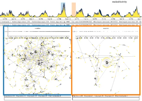
[image:8.612.319.559.86.257.2]F1.B.-Network structure becomes important in comparison. After finding times of high activity, the next step became to examine the network structure of those peaks and the surrounding times. For example, an analyst was interested in the underlying structure of the largest activity peak of the graph (Figure 9). However, a single look at the structure of the peak does not offer enough information about abnormality. The researcher created several timeslices on the peak as well as other days compare the network structures at different times. Through the vignettes, he found that, surprisingly, the network was very decentralised at the peak, the product of many posts with many interactions, rather than one or two specific very popular posts (Figure 9 left). A new timeslice of the valley occurring immediately after the peak of interest showed that the
Figure 9: The large peak on the timeline with vignettes show-ing the difference in the network structure at the peak and in an nearby valley.
valley had one actor with very high in-degree which led to the majority of interactions for that vignette (Figure 9 right).
Within vignette two, there are lots of people respond-ing to a srespond-ingle image; within vignette one, there are not people focusing on one image, there are more im-ages and the reactions are more spread out between them.
F1.C.-Selection and Linking are Key.The analysts then wanted to know whether the high in-degree actor of the valley above was also a contributor to the peak. They could check this very quickly by selecting the node on the valley vignette, which revealed that this node did not appear in the peak vignette. This corroborates how, through features supporting DP1 and DP3, the system could offer very quick answers to the analysts through interactive analy-sis. It’s easy to imagine the challenges that one might encounter when trying to generate the same kind of question-answers through a textual-programming approach (consider challenges CH1, CH5, and CH8).
F1.D.-DP1 and DP3 together facilitate navigation and repe-tition.We observed that analysts quickly familiarized themselves with the main consistent conventions of the interface (DP1) and oriented themselves very quickly in the interface. They selected an additional three slices to compare their structures (centralized vs decentralized) and discovered that the biggest group in the third vignette had the same central actor as in the second. However, the level of wound grade had increased. The central actor also had a much higher in-degree in the third vignette than in the second vignette. The analysts then questioned whether users were increas-ing the grade of image they posted in order to receive a greater level of feedback.
distribution over each of the previously defined timeslices. They created a scatterplot vignette row with time encoded on the hori-zontal axis, wound grade on the vertical axis, and points colored by global community membership. This allowed them to hypothesize that: “time of day is relevant to actor activity".
The previous paragraphs show specific examples of how different features resulted in interesting questions and new hypotheses–a landmark of good exploratory analysis. The examples above were a result of synergies between features implementing different design principles. Examples of other hypotheses and findings range from very specific questions regarding a specific actor (how central is this particular actor to the dynamic of the full network and the generation of peaks) to more generic hypotheses about whether there were contagion effects for certain kinds of actors, whether actors escalate in wound grade because they receive reaction or because they do not, characterization of “actor popularity” and “time of day” effects, or even speculations about ‘what is the best
moment to intervene?’
The analysts explicitly stated that “we would not have found this actor behaviour [F1.D] over time with statistics due to the way we bin data before processing.” Based upon feedback from participants in this session, we were also able to identify missing features (e.g., multi-node selection in vignettes, vignette timelines) and interac-tions that were cumbersome (e.g., application of operainterac-tions and representation changes using contextual menus). These resulted in changes incorporated in the next version of DNP.
8.2
Session 2
This session used the most recent version of DNP described in Section 6. This time the analysts worked collaboratively from the beginning. We observed many of the patterns and uses of Session 1; however, we focus on features that were not present in the previous implementation of DNP.
F2.A.-Value of per-vignette timelines.We observed that par-ticipants queried the activity distribution of a single actor within their defined timeslices (i.e. not over the whole graph) on eight occasions. The point in time at which an image was posted may ex-plain why some networks appeared more dense than others due to an artifact intrinsic to timeslicing (CH5 and CH6). If a post is made at the beginning of a timeslice, it is likely to have received more likes/comments than one that is posted at the end of a timeslice. The per-vignette timeslices allowed the analysts to recognize this problem and to attempt to determine whether their observations were due to the artifact and whether it interacted with the “popular-ity effect” [32] described previously. In combination with the node selection function (DP3), analysts were able to use the vignette activity timelines to examine ABAB interactions which would nor-mally be very difficult to observe with existing visualizations (CH4, CH5, CH6, CH7). Vignette activity distribution timelines also allow participants insight into within-timeslice actor behaviour, ensuring that network evolution events are not lost through time flattening (CH5, CH6, and CH8).
F2.B.-Global tracking of supporting behavior.We observed on two occasions that participants queried the global behaviour of supporters of high in-degree nodes. Participants identified several
timeslices in which two distinct clusters of nodes existed with both primary target nodes having high in-degree and a wound grade always greater than one. The two clusters did not intersect at any point. The introduced group selection feature (which reinforces DP3) and the ability to filter a group creating a new vignette row creation (DP2) allowed participants to highlight all source nodes from cluster one from which they could create a new vignette row to compare to the previous cluster selection. The analysts concluded that the actors in the clusters were very different, with the first group primarily posting images of no harm and engaged in like/comment activity on lower grade images and the second posting high-wound-grade images of self injury and only occasional like/comments on other high-wound grade images.
F2.C.-Tracking changes in actor behavior.Following from F2.B (two different type of supporter clusters), the analysts were in-terested in whether supporter activity influenced long-term future activity of the high in-degree nodes. The availability of all their previous selections as rows above (DP2), accessible in a familiar way (DP4) was particularly useful, since they did not have to repro-duce intermediate states. Just by clicking on one of the earlier row vignettes they were able to quickly determine that the activity of one of these central actors became more sparse in time (by looking at the highlighted vertical in the global timelines—DP3) and lower in wound grade (going from 3 to 1). In contrast, the central actor of the second cluster became more active (the analysts could just compare the two relevant rows vertically, by hiding everything else in between).
9
DISCUSSION
for most researchers in these areas to see the potential value of visualization a priori. Any single operation that they did with our system is reproducible without too much effort by a competent programmer; yet, the agility of the interface, how some patterns jump at the analysts without having to switch to a “programming mode”, and the value to work collaboratively in the exploratory part of the analysis are only now evident to the researchers, who want to use the tool in their daily practice. In other words, it is the multiplicative effect of features designed with this dataset in mind that make the difference, not any single one of them in isolation.
Throughout our design work we have also gained new respect for supporting provenance. Effective support of interaction prove-nance information not only allow analysts to trace their analysis backward, but it has advantages for finding new routes of explo-ration and direct new insights. We believe that new designs and programming models for integrated provenance in visualization (e.g., [21, 25, 48]) have great potential for dynamic network analy-sis. It is nonetheless important to highlight that our system does not offer comprehensive coverage of interaction provenance. For example, changes in the span or position of a timeslice are not recoverable or visible in the current version. It could be difficult to provide comprehensive coverage without over-complicating the interface; this is a fertile area for future research.
Naturally there are still many challenges to tackle in the analysis of this kind of data. One of the hardest elements for us to address has been the performance issues to achieve responsive visualiza-tions with dense links between the large numbers of small multiples. There are several multi-objective optimization tradeoffs that are par-ticularly intricate. For example, when laying out the force-directed diagrams it is necessary to have some pre-computation of final node positions and layout decay constants.
10
CONCLUSION AND FUTURE WORK
In this paper we have presented Dynamic Network Plaid, a novel approach to facilitate the visualization and exploration of large continuous dynamic network data. The increasing availability and popularity of this type of data requires effective, efficient, visualiza-tions to aid exploration and discovery. Visualizavisualiza-tions of this data are generally complex and of limited use for many complex graph tasks, in part due to display restrictions of small screens. We designed DNP specifically for a large display to ameliorate this restriction through the extended physical navigability and usable visual area of large displays. The extra available screen space also allowed us to provide (partial) interaction provenance information of the visualizations, something that is useful in reducing the mental load of a user when a large number of representations are visible.
We validated our design and implementation via two experi-ments with public health researchers. Results of the first exper-iment were used to inform the final design of DNP. The second evaluation shows that users are able to use DNP to find insights in complex data that they would not normally look for and that would be almost impossible to detect using traditional statistical methods. Findings from the second experiment illustrate how DNP is able to facilitate complex graph tasks [40] that are not supported by any other current approach. Both validation sessions show the clear benefit of many linked sequence views and the ability to
view multiple representations simultaneously. These sessions also validate our approach for addressing the loss of temporal infor-mation through temporal aggregation and ABAB events within user-defined timeslices.
The design of the DNP specifically considered the extended visible area made available by the large display and the interaction techniques required for such set-up. Many approaches attempt to ‘scale up’ existing work for large screens but this does not provide the user with the tools that they need to explore a dataset of this type in depth. When designing a visualization, it is important to consider the method of display; mobile devices differ substantially from wall displays. As part of the design we have also provided a novel method of combining certain types of information provenance and consistent spatial mappings.
Some features of DNP could be adapted for small screens. Activity distribution timelines that use height to encode node ownership, and therefore ensure that ABAB interactions and network evolution events are not lost through time-flattening, may be useful for some more dense node link diagrams with several actors of high in-degree. Allowing users to define their own timeslices, rather than having the system carry this out, ensures that the user is able to fine-tune the visualization as and when they require. Computing an optimal timeslicing is an important problem and remains future work.
Due to our current implementation approach, DNP is currently limited to networks with a maximum circa two million edges. Future implementations might require moving away from browser-based stacks due to the additional computational load generated by DOM layout operations with large number of elements.
Currently, communities are computed globally on the entire data set. Local communities computed on each selected timeslice could offer value. However, this will also require further work on the algorithms required locally meaningful communities in the context of the full timeline.
The admittedly partial coverage of our interaction provenance model also offers the opportunity to improve user support in un-derstanding and exploring the data. Interaction provenance in col-umn/timeslice changes would be particularly useful to explore.
Statistics were integrated into DNP at the request of participants but to greater support certain types of statistical measures it would be beneficial to integrate an environment such as R into the tool so that visualization and statistics can become more closely linked. For some fields this has the potential to dramatically reduce the amount of time that is spent on validation and data exploration. Having both environments integrated together has the potential to further reduce the cognitive load of the user.
Finally, large displays still offer unexplored potential for new interaction techniques useful for this kind of visualization. Alterna-tive and more sophisticated sets of interaction techniques for DNP could be beneficial in many scenarios.
ACKNOWLEDGEMENTS
REFERENCES
[1] B. Alper, B. Bach, N. Henry Riche, T. Isenberg, and J.-D. Fekete. 2013. Weighted Graph Comparison Techniques for Brain Connectivity Analysis. InProceedings of the ACM SIGCHI Conference on Human Factors in Computing Systems (CHI ’13). 483–492.
[2] C. Andrews, A. Endert, B. Yost, and C. North. 2011. Information visualization on large, high-resolution displays: Issues, challenges, and opportunities.Information Visualization10, 4 (2011), 341–355.
[3] D. Archambault and H. C. Purchase. 2013. Mental Map Preservation Helps User Orientation in Dynamic Graphs. InProceedings of Graph Drawing (GD’ 12). 475–486.
[4] D. Archambault and H. C. Purchase. 2016. Can animation support the visualisation of dynamic graphs?Information Sciences330 (2016), 495 – 509.
[5] D. Archambault, H. C. Purchase, and B. Pinaud. 2011. Animation, Small Multiples, and the Effect of Mental Map Preservation in Dynamic Graphs.IEEE Transactions on Visualization and Computer Graphics17, 4 (2011), 539–552.
[6] B. Bach, N. Kerracher, K. Wm Hall, S. Carpendale, J. Kennedy, and N. Henry Riche. 2016. Telling stories about dynamic networks with graph comics. InProceedings of the ACM SIGCHI Conference on Human Factors in Computing Systems (CHI ’16). 3670–3682.
[7] B. Bach, E. Pietriga, and J. D. Fekete. 2014a. GraphDiaries: Animated Transi-tions and Temporal Navigation for Dynamic Networks.IEEE Transactions on Visualization and Computer Graphics20, 5 (2014), 740–754.
[8] B. Bach, E. Pietriga, and J-D. Fekete. 2014b. Visualizing dynamic networks with matrix cubes. InProceedings of the SIGCHI conference on Human Factors in Computing Systems (CHI ’14). 877–886.
[9] R. Ball and C. North. 2005. Effects of tiled high-resolution display on basic visualization and navigation tasks. InProceedings of the ACM SIGCHI Conference Extended Abstracts on Human Factors in Computing Systems (CHI ’05). 1196–1199. [10] R. Ball, C. North, and D. A. Bowman. 2007. Move to improve: promoting physical navigation to increase user performance with large displays. InProceedings of the ACM SIGCHI Conference on Human Factors in Computing Systems (CHI ’07). 191–200.
[11] F. Beck, M. Burch, S. Diehl, and D. Weiskopf. 2014. The state of the art in visualizing dynamic graphs.EuroVis STAR(2014).
[12] A. Bezerianos and R. Balakrishnan. 2004. Interaction and visualization techniques for very large scale high resolution displays.University of Toronto Technical Report DGP-TR-2004-002(2004).
[13] A. Bezerianos, F. Chevalier, P. Dragicevic, N. Elmqvist, and J.-D. Fekete. 2010a. GraphDice: A system for exploring multivariate social networks. InComputer Graphics Forum, Vol. 29. 863–872.
[14] A. Bezerianos, P. Dragicevic, J-D. Fekete, J. Bae, and B. Watson. 2010b. Geneaquilts: A system for exploring large genealogies.IEEE Transactions on Visualization and Computer Graphics16, 6 (2010), 1073–1081.
[15] M. Bostock, V. Ogievetsky, and J. Heer. 2011. D3data-driven documents.IEEE
Transactions on Visualization and Computer Graphics17, 12 (2011), 2301–2309. [16] U. Brandes, D. Fleischer, and T. Puppe. 2006. Dynamic Spectral Layout of Small
Worlds. InProceedings of Graph Drawing (GD’ 05). 25–36.
[17] U. Brandes and B. Nick. 2011. Asymmetric Relations in Longitudinal Social Networks. IEEE Transactions on Visualization and Computer Graphics17, 12 (2011), 2283–2290.
[18] U. Brandes and D. Wagner. 2004. Analysis and Visualization of Social Networks. InGraph Drawing Software, M. Jünger and P. Mutzel (Eds.). Springer Berlin Heidelberg, 321–340.
[19] R. C. Brown, T. Fischer, A. D. Goldwich, F. Keller, R. Young, and P. L. Plener. 2017. #cutting: Non-suicidal self-injury (NSSI) on Instagram.Psychological Medicine (2017), 1–10.
[20] M. Burch, C. Vehlow, F. Beck, S. Diehl, and D. Weiskopf. 2011. Parallel Edge Splat-ting for Scalable Dynamic Graph Visualization.IEEE Transactions on Visualization and Computer Graphics17, 12 (2011), 2344–2353.
[21] S. P. Callahan, J. Freire, E. Santos, C. E. Scheidegger, C. T. Silva, and H. T. Vo. 2006. VisTrails: visualization meets data management. InProceedings of the 2006 ACM SIGMOD International Conference on Management of Data. 745–747. [22] M. Czerwinski, G. Smith, T. Regan, B. Meyers, G. G. Robertson, and G.
Stark-weather. 2003. Toward Characterizing the Productivity Benefits of Very Large Displays. InInteract, Vol. 3. 9–16.
[23] S. B Davidson and J. Freire. 2008. Provenance and scientific workflows: chal-lenges and opportunities. InProceedings of the 2008 ACM SIGMOD International Conference on Management of Data. 1345–1350.
[24] F. Du, B. Shneiderman, C. Plaisant, S. Malik, and A. Perer. 2017. Coping with vol-ume and variety in temporal event sequences: Strategies for sharpening analytic focus.IEEE Transactions on Visualization and Computer Graphics23, 6 (2017), 1636–1649.
[25] C. Dunne, N. Henry Riche, B. Lee, R. Metoyer, and G. G. Robertson. 2012. Graph-Trail: Analyzing large multivariate, heterogeneous networks while supporting exploration history. InProceedings of the ACM SIGCHI Conference on Human Factors in Computing Systems (CHI ’12). 1663–1672.
[26] T. Ellkvist, D. Koop, E. W Anderson, J. Freire, and C. T. Silva. 2008. Using prove-nance to support real-time collaborative design of workflows. InInternational Provenance and Annotation Workshop. 266–279.
[27] C. Erten, P. J. Harding, S. G Kobourov, K. Wampler, and G. Yee. 2004. Exploring the computing literature using temporal graph visualization. InVisualization and Data Analysis. 45–56.
[28] M. Farrugia and A. Quigley. 2011. Effective temporal graph layout: A comparative study of animation versus static display methods.Information Visualization10, 1 (2011), 47–64.
[29] P. Federico, W. Aigner, S. Miksch, F. Windhager, and L. Zenk. 2011. A Visual Analytics Approach to Dynamic Social Networks. InProceedings of the 11th International Conference on Knowledge Management and Knowledge Technologies (i-KNOW ’11). 47:1–47:8.
[30] Y. Frishman and A. Tal. 2004. Dynamic Drawing of Clustered Graphs. InIEEE Symposium on Information Visualization. 191–198.
[31] M. Ghoniem, J.-D. Fekete, and P. Castagliola. 2004. A comparison of the readability of graphs using node-link and matrix-based representations. InIEEE Symposium on Information Visualization. 17–24.
[32] P. B. Goes, M. Lin, and C. Au Yeung. 2014. “Popularity effect” in user-generated content: Evidence from online product reviews.Information Systems Research25, 2 (2014), 222–238.
[33] T. E. Gorochowski, M. di Bernardo, and C. S. Grierson. 2012. Using Aging to Visually Uncover Evolutionary Processes on Networks. IEEE Transactions on Visualization and Computer Graphics18, 8 (2012), 1343–1352.
[34] M. Greilich, M. Burch, and S. Diehl. 2009. Visualizing the Evolution of Compound Digraphs with TimeArcTrees.Computer Graphics Forum28, 3 (2009), 975–982. [35] S. Hadlak, H.-J. Schulz, and H. Schumann. 2011. In situ exploration of large
dynamic networks.IEEE Transactions on Visualization and Computer Graphics 17, 12 (2011), 2334–2343.
[36] A. Hayashi, T. Matsubayashi, T. Hoshide, and T. Uchiyama. 2013. Initial Position-ing Method for Online and Real-Time Dynamic Graph DrawPosition-ing of Time VaryPosition-ing Data. In17th International Conference on Information Visualisation. 435–444. [37] J. Heer, J. Mackinlay, C. Stolte, and M. Agrawala. 2008. Graphical histories
for visualization: Supporting analysis, communication, and evaluation. IEEE Transactions on Visualization and Computer Graphics14, 6 (2008), 1189–1196. [38] N. Henry Riche, A. Bezerianos, and J.-D. Fekete. 2008. Improving the
readabil-ity of clustered social networks using node duplication.IEEE Transactions on Visualization and Computer Graphics14, 6 (2008), 1317–1324.
[39] W. Javed and N. Elmqvist. 2010. Stack zooming for multi-focus interaction in time-series data visualization. InProceedings of the IEEE Pacific Visualization Symposium (PacificVis ’10). 33–40.
[40] N. Kerracher, J. Kennedy, and K. Chalmers. 2015. A Task Taxonomy for Temporal Graph Visualisation.IEEE Transactions on Visualization and Computer Graphics 21, 10 (2015), 1160–1172.
[41] U. Kister, K. Klamka, C. Tominski, and R. Dachselt. 2017. GraSp: Combining Spatially-aware Mobile Devices and a Display Wall for Graph Visualization and Interaction. InComputer Graphics Forum, Vol. 36. 503–514.
[42] A. Lancichinetti and S. Fortunato. 2009. Community detection algorithms: A comparative analysis.Physical Review E80 (2009), 056117. Issue 5.
[43] A. Lee and D. Archambault. 2016. Communities Found by Users – Not Algorithms: Comparing Human and Algorithmically Generated Communities. InProceedings of the ACM SIGCHI Conference on Human Factors in Computing Systems (CHI ’16). 2396–2400.
[44] M. R. Marner, R. T. Smith, B. H. Thomas, K. Klein, P. Eades, and S.-H. Hong. 2014. GION: interactively untangling large graphs on wall-sized displays. In Proceedings of Graph Drawing (GD’ 14). 113–124.
[45] M. L. Mauriello, B. Shneiderman, F. Du, S. Malik, and C. Plaisant. 2016. Simplify-ing overviews of temporal event sequences. InProceedings of the ACM SIGCHI Conference Extended Abstracts on Human Factors in Computing Systems (CHI ’16). 2217–2224.
[46] J. R. Nuñez, C. R. Anderton, and R. S. Renslow. 2018. Optimizing colormaps with consideration for color vision deficiency to enable accurate interpretation of scientific data.PLOS ONE13, 7 (2018), 1–14.
[47] A. Prouzeau, A. Bezerianos, and O. Chapuis. 2017. Evaluating Multi-User Se-lection for Exploring Graph Topology on Wall-Displays.IEEE Transactions on Visualization and Computer Graphics23, 8 (2017), 1936–1951.
[48] E. D Ragan, A. Endert, J. Sanyal, and J. Chen. 2016. Characterizing provenance in visualization and data analysis: an organizational framework of provenance types and purposes.IEEE Transactions on Visualization and Computer Graphics 22, 1 (2016), 31–40.
[49] E. D. Ragan, J. R. Goodall, and A. Tung. 2015. Evaluating how level of detail of visual history affects process memory. InProceedings of the ACM SIGCHI Conference on Human Factors in Computing Systems (CHI ’15). 2711–2720. [50] M. Rosvall, D. Axelsson, and C. T. Bergstrom. 2009. The map equation. The
European Physical Journal-Special Topics178, 1 (2009), 13–23.
[52] B. Shneiderman. 1996. The eyes have it: A task by data type taxonomy for information visualizations. InIEEE Symposium on Visual Languages. 336–343. [53] P. Simonetto, D. Archambault, and S. Kobourov. 2018. Drawing Dynamic Graphs
Without Timeslices. InProceedings of Graph Drawing (GD ’17). 394–409. [54] K. Stein, R. Wegener, and C. Schlieder. 2010. Pixel-Oriented Visualization of
Change in Social Networks. In2010 International Conference on Advances in Social Networks Analysis and Mining. 233–240.
[55] C. Tominski, H. Schumann, G. Andrienko, and N. Andrienko. 2012. Stacking-based visualization of trajectory attribute data.IEEE Transactions on Visualization and Computer Graphics18, 12 (2012), 2565–2574.
[56] B. Tversky, Julie B. Morrison, and M. Betrancourt. 2002. Animation: can it facilitate?International Journal of Human-Computer Studies57, 4 (2002), 247– 262.
[57] S. van den Elzen and J. J. van Wijk. 2013. Small multiples, large singles: A new approach for visual data exploration. Computer Graphics Forum32, 3 (2013), 191–200.
[58] C. Vehlow, M. Burch, H. Schmauder, and D. Weiskopf. 2013. Radial Layered Matrix Visualization of Dynamic Graphs. In17th International Conference on Information Visualisation. 51–58.
[59] J. Walker, R. Borgo, and M. W. Jones. 2016. TimeNotes: A study on effective chart visualization and interaction techniques for time-series data.IEEE Transactions on Visualization and Computer Graphics22, 1 (2016), 549–558.
[60] M. Q. Wang Baldonado, A. Woodruff, and A. Kuchinsky. 2000. Guidelines for using multiple views in information visualization. InProceedings of the working conference on Advanced Visual Interfaces (AVI ’00). ACM, 110–119.
[61] J. S. Yi, Y. ah Kang, and J. Stasko. 2007. Toward a Deeper Understanding of the Role of Interaction in Information Visualization.IEEE Transactions on Visualization and Computer Graphics13, 6 (2007), 1224–1231.
[62] J. S. Yi, N. Elmqvist, and S. Lee. 2010. TimeMatrix: Analyzing temporal social networks using interactive matrix-based visualizations.International Journal of Human-Computer Interaction26, 11-12 (2010), 1031–1051.