Developing an interactive television application for the
elderly: a longitudinal usability evaluation comparing
elderly and younger users
Master thesis – September, 2011
Jye Liang Hiah
University of Twente
Supervisors
PDEng. Hester Bruikman Philips Consumer Lifestyle B.V.
Dr. Martin Schmettow University of Twente
Department of Cognitive Psychology and Ergonomics
Ing. Gerard van Loon
Dutch National Foundation for the Elderly
Dr. Matthijs Noordzij University of Twente
Department of Cognitive Psychology and Ergonomics
Designing a usable service application for elderly users is a highly challenging task. This study reports findings from usability evaluations carried out with both elderly and younger participants that were repeated over three sessions, allowing for the investigation of usability
effects over time and making comparisons between these two groups. As expected, elderly participants encountered significantly more problems interacting with the video-calling application during the first session. However, a large learning effect was found during the
second session, which showed that the elderly users eventually might catch up with the younger participants in their ability to operate the application. Additionally, as younger users got more familiar with the system, they started reporting missing functionality. This indicates that the simplified version of the product becomes less usable for this group. Surprisingly, it did
Acknowledgments
The research findings in this report are the result of a 10-month internship at Philips Consumer Lifestyle in Eindhoven, in collaboration with the Dutch National Foundation for the Elderly. I have learned many things during my stay there, meeting and working with an amazing group of people whom I would all like to give my thanks to.
First, I would like to say thanks to my daily supervisor Hester Bruikman who recruited me to work on the HOMEdotOLD project and together with my professor Martin Schmettow gave me advice throughout the duration of the project (and after my internship ended when I still had to finish this thesis). I would also like to show my gratitude to Matthijs Noordzij for getting me started in this project.
Special thanks to Gerard van Loon for giving me practical advice and on-site support during the evaluation sessions. It was a pleasure working with you!
My thanks also go out to the HOMEdotOLD project team at Philips whom I worked a lot with preparing the materials required for the usability evaluations. Francien Clijsters, Aleksandar Ostojic, Erik Lieuwen, Miro Bojic and Roy van de Korput, it was great working with you guys!
Also, I would like to say thanks to the students at Philips who made my stay in Eindhoven a very memorable one and sharing their knowledge on topics I was less familiar with.
1.
Table of Contents
Acknowledgments ... 2
2.
Introduction and motivation ... 5
The HOMEdotOLD project ... 5
Usability needs of the Elderly ... 5
A longitudinal approach ... 6
3.
Research goals ... 7
4.
Methods and procedure ... 8
Study design ... 8
Participants ... 8
Elderly users ... 8
Younger users ... 9
Experimental setup and materials ... 9
Experimental setup ... 9
Technical setup ... 10
Materials for the evaluation study ... 11
Measuring Usability ... 11
Measurements ... 11
Effectiveness ... 11
Efficiency ... 12
Satisfaction ... 12
Usability problems ... 13
Missing functionality ... 14
Recordings ... 14
Procedure ... 14
First session ... 14
Repeating sessions ... 15
Scenarios and tasks ... 15
5.
Results and analysis ... 16
Analysis of usability problems ... 16
Problems associated with the remote control device ... 19
Problems of visibility ... 19
Difficulty understanding some application concepts ... 20
Differences in reported usability problems between the elderly and younger participants ... 20
Changes over time ... 21
Usability problems over time ... 23
Efficiency: the amount of button presses it takes to complete a task ... 24
Erroneous button presses ... 25
Missing functionality ... 26
Satisfaction ... 27
Comparing younger users with the elderly ... 28
6.
General discussion ... 29
Learnability ... 29
Missing features and satisfaction with the system ... 30
Bias and testing with bugs ... 30
7.
Conclusions and future steps ... 31
List of figures
Figure 01 Schematic overview of the testing setup 9 Figure 02 Overview of the test-‐setup for the usability evaluation sessions 10 Figure 03 Observed usability problems per group across all sessions 21 Figure 04 Usability problems per group per session 22 Figure 05 Mean usability problems per group per session 23 Figure 06 Mean usability problems panels: per group over sessions 23 Figure 07 Mean total button presses per group per session 24 Figure 08 Mean total button presses panels: per group per session 24 Figure 09 Mean erroneous button presses per group per session 25 Figure 10 Mean missed functionality, per group per session 26 Figure 11 Sum of unique functions missed per group 26 Figure 12 Mean PSSUQ total scores per group per session 27 Figure 13 Mean ASQ scores for each task per group per session 28
List of tables
2.
Introduction and motivation
With the advance of the Internet, people all over the world have the option to keep in touch through social networks such as Facebook and connectivity services such as Skype or instant messaging applications. Smartphones have these options now as well, offering users the ability to access these services anytime, anywhere. Being socially connected to one’s peers and relatives is of great importance to an individual’s well being and contributes to one’s happiness and contentment (Baumeister & Leary, 1995; Biemans, van Dijk, Dadlani, & van Halteren, 2009). It is therefore no surprise that online services that offer users such ways of connecting have become so popular.
These technologies however, are not very usable and sometimes even inaccessible to a large group of users who are often overlooked (Wisniewski & Polak-Sopinska, 2009). One of these groups of potential users is the elderly.
Projections show that in Europe, the number of people who have reached the age of 65 will increase from 17.1% of the entire population in 2008, to 23.5% in 2030 (Eurostat, 2010). A similar growth is expected for the United States, going from 13% in 2010 to 19% in 2030 (U.S. Census Bureau, 2010). In the Netherlands, this number is expected to rise from the current 15% in 2009 to 23.7% in 2030 (Centraal Bureau voor de Statistiek, 2010). These numbers reflect the demographical, structural and social trends in most industrialized countries, which are moving towards an increase in the elderly population and single households. It is this group of the population that suffers most from social isolation, loneliness, and a lack of adequate support. This exacts a significant toll on their psychological well-being and physical health (Cohen, 2000; Sorkin, Rook & Lu, 2002).
The HOMEdotOLD project
The HOMEdotOLD (HOME services aDvancing the sOcial inTeractiOn of eLDerly people) project aims to improve the social interaction and connectivity support in IT products for the elderly through a TV-based platform:
“The HOMEdotOLD project aims to provide a TV-based platform with cost-effective services that will be delivered in a highly personalized and intuitive way and will advance the social interaction of elderly people, aiming at improving the quality and joy of their home life, bridging distances and reinforcing social voluntariness and activation, thus preventing isolation and loneliness.”
The HOMEdotOLD project is but one of several EU projects aimed at improving older people’s well-being and quality of life. The importance of addressing social isolation and loneliness that elderly people have to cope with is increasingly recognized in international policy and national health strategies (Cattan, White, Bond & Learmouth, 2005).
Usability needs of the Elderly
To ensure the usability of the final product, the HOMEdotOLD project actively involves elderly users throughout the whole design process of the services applications. The current study evaluates a first functional prototype of the video calling application. This application aims to provide eldery users with a visual communication service that is easy to access, with which they can enjoy video calling with their friends and family. The service will be delivered through a television platform.
An interesting topic that arises here is whether there are any differences in usability needs between elderly users and younger generations who generally have far more experience with computers and technology (Holzinger, Searle & Nischelwitzer, 2007; Obrist et al., 2007). The elderly user is often less familiar with the way that information is represented in today’s technologies (Carmichael, 1999). When designing a television application that the elderly user has to interact with, this may pose quite some challenges (Obrist et al., 2007).
Aiming to develop an application that is both usable for younger and elderly users fit in the domain of inclusive design. Inclusive design suggests to compromise on product design to satisfy the needs of both those with special requirements and those without (Newell & Gregor, 2002). The idea of inclusive design, or universal design, could be attractive for developers as it removes the need of having to publish multiple versions of their products. The HOMEdotOLD applications will be provided on a television platform, which is a relatively new mode of interaction for this type of services. Differences in interaction between elderly and younger users for such applications have not yet been studied extensively. Addressing this question will help resolve the issue of universal design for elderly and younger users.
Prior to this investigation a user requirements analysis was done for the project to help developers create an application that is geared more towards the elderly user. Findings from that study directed the design of the application towards simplicity: the elderly participants agreed that the fewer options this new application would have, the easier it would be for them to understand its use. In fact, during the focus group sessions held for the requirements analysis, participants were actively rejecting functionality they deemed unnecessary for basic operation just to limit the amount of features.
In a study that investigated the usability of a simplified e-mail application, which was designed specifically for the elderly user, Hawthorn (2002) found that more experienced users missed additional functionality. To satisfy the usability needs of the elderly, an oversimplified version of an e-mail application had to be designed. Such an application conflicts with the requirements for more complex functions that younger and more experienced users ask for (Hawthorn, 2002). Therefore, he argues that moving towards developing products that are focused purely on the needs of the elderly and disabled will lead to usability issues for the younger and more able user. However, the literature on this topic has not been exhaustive. Instead, Johnson & Kent (2007) have investigated usability issues of web applications that are designed for elderly users with younger participants and conclude that it is in fact possible to develop such applications without hindering usability for more able-bodied users’ needs. Additionally, Worden et al. (1997) argued that applications designed for users with special needs could also benefit users without particular requirements.
A longitudinal approach
2007). It is argued that such studies focus too much on initial issues because testing of usability is done at only one point in time (cross-sectional studies). It is highly likely that usability issues will change over time once users become more experienced with the application (Gerken et al., 2007).
The current study goes beyond initial usability problems by adopting a longitudinal approach for the usability evaluation research. It is often assumed that elderly have great difficulty learning to use applications compared to younger users (Hawthorn, 2002; Kleinberger, Becker, Ras, Holzinger, Muller, 2007; Obrist, Bernhaupt, Beck, & Tscheligi, 2007). Findings of the current study support this assumption, showing that elderly users need more time to “get started” using the application and that some usability problems found in early stages of testing can be addressed as learnability issues rather than obstacles that elderly users have when interacting with the application. Running a longitudinal usability evaluation indicates which usability problems fade over time. Arguably, such problems indicate users’ difficulties learning to use the application and should be addressed differently than issues that hinder usability after users gained more experience with the system. Developers should address these different types of usability problems accordingly.
3.
Research goals
Prior to the current user evaluation study of the functional prototype, a user requirements analysis was completed using the focus group method. The prototype that is developed is catered to the needs and requirements of the targeted elderly end user.
This study encompasses two main goals. Most importantly, the usability evaluation is part of a user-centered design process to develop the HOMEdotOLD videoconferencing service application. In such evaluations, data such as user feedback and observation on task performance is gathered to analyze how the system is used. Therefore, our first goal is to:
• Investigate the usability of the HOMEdotOLD videoconferencing prototype
for elderly users
These findings will contribute to a better understanding of how the elderly user interacts with the application. Developers will then be able to use this information to adjust and improve the service application (Sharp, Rogers, & Preece, 2003).
Not only are we interested in developing a usable video calling application for elderly users, we also studied whether the usability of such an application is acceptable for a younger generation of users. The underlying question is if it is possible to design one product to cater to the needs of both end user groups. The second goal therefore, is to see whether designing an application for the elderly compromises usability for younger users.
• Study the differences between usability needs for elderly and younger users
Related to the second goal is the question whether usability problems change when users gain more experience with the application. Results from user-evaluations are expected to change over time (Gerken et al., 2007). The question is: how will they change, when, and in which direction. Thus, the third goal is to investigate if there are changes in the usability issues found after users become more experienced with the application. This investigation also reveals changes in differences between the usability needs of the two groups.
• Do usability problems change over time?
A comparative analysis was done with findings of the usability evaluation for both groups of participants. Differentiations were made within-group to address the question if usability issues, in fact, change over time. Additionally, between-group comparisons were made to study the differences in these changes over time.
4.
Methods and procedure
Study design
Two groups of participants (representing elderly and younger users) evaluated the same functional prototype of the video calling application. A total of three individual evaluation sessions were held per participant. These sessions took place on different days within a one-week period. One exception to this scheduling occurred due to a participant going on vacation after the second session and came back for the last evaluation session one week later.
Participants
A total of 16 participants were recruited for this study. Participants were divided into two groups: nine elderly users and seven younger users.
Elderly users
Nine elderly people (five male, four female) were recruited for participation in user studies in the HOMEdotOLD project by the NFE. The age of the elderly participants ranges from 69 to 80 (mean = 72.7, standard deviation = 3.3). Participants have previously filled in consent forms and agreed to participate in possible studies that evaluate products and services that are being developed within the project.
Before taking part in the current study, the eldery participants have been involved in two rounds of user requirements analysis (one for the HOMEdotOLD project in general, and one specifically for the videoconferencing application service) and one usability evaluation of semi-functional prototypes of the HOMEdotOLD services excluding the video-calling application (which is not integrated into the other services menus for technical reasons).
be taken into consideration, the focus of this study is to evaluate the usability of the video-calling application’s user interface and functionality.
Younger users
For the comparison study, seven participants were recruited to represent the younger user age group. These participants were found through contacts in the Philips Interns Community. All participants in this group speak fluent Dutch; have normal or adjusted-to-normal eyesight, adjusted-to-normal hearing and no motor-control difficulties.
The age of the participants in this group ranged from 20 to 28 (mean = 24.7, standard deviation = 2.7).
Experimental setup and materials
Philips developed a functional prototype application of the HOMEdotOLD video calling service. This study reports results from the first evaluation of this prototype product. The underlying technology used for this application is the freely available Skype communications service that offers users the ability to communicate through audio and/or video.
Some system bugs in the prototype were solved after the first session of the first participant. These bugs would have otherwise been a large distraction for users and interfere with the user’s interaction with the application. The first participant, a student, was told to ignore these bugs and wait for the evaluator to have fixed the problem before continuing. While Norgaard and Hornbaek (2006) argue that usability evaluators should not fear making alterations to prototypes or changing evaluation procedure if they believe those changes will help answer important questions; the purpose of this study goes beyond design research and includes scientific comparisons of data. Therefore, other than these bugs in the system during the first trial, no further adjustments were made to the prototype application during the execution of this study to avoid increasing additional external influences to the measured constructs.
Experimental setup
For the participant, interaction with the application happened by using the television’s remote control and the television screen. The evaluator had access to Skype and other software that was needed for the evaluation on the computer.
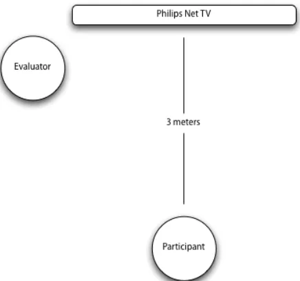
[image:9.595.274.492.520.724.2]The distance between participants and the television screen was approximately three meters. However, for some participants, the size or contrast of text and other on-screen details were insufficient and after realizing this, they were placed closer towards the television screen. See figure 1 for a schematic overview
of the testing setup.
Technical setup
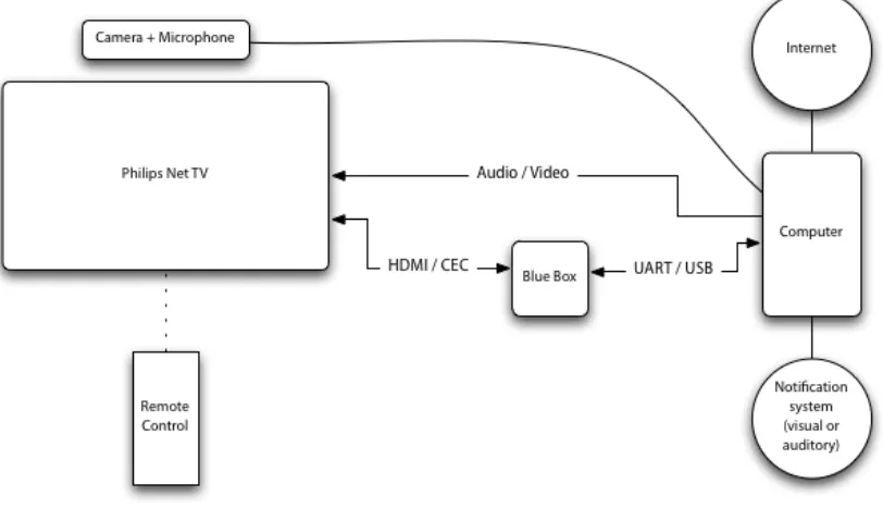
For the HOMEdotOLD video-calling prototype to function properly, the following materials were used:
• A Philips Net TV with remote control device
• A “blue box” that translates the television’s remote control’s CEC signals from HDMI and forwards it to the computer
• A computer that is connected to the Internet and runs the HOMEdotOLD video-calling prototype. The computer will send the audio and video signals to the television and serves only as a platform that runs the prototype software
• A webcam with a built in microphone
The prototype software was designed to keep a log of incoming signals from the remote control device operated by the participant. However, the software could only recognize and record signals that were used to control the prototype product. This means that button-presses regarding navigation in television menus could not be logged. Although it would have been interesting to take into account aspects of the television’s user interface, the focus of this study is the HOMEdotOLD video-calling application and not the Philips TV product itself. The log file was used for the analysis of usability problems as described in the measurements section below.
[image:10.595.97.503.484.718.2]An overview of the test setup is illustrated in the image below (figure 2). The participant only interacted with the television using the remote control device. The rest of the setup, with exception of the webcam, was placed out of sight for the participants during the evaluation sessions.
Materials for the evaluation study
Aside from the equipment that was necessary for the application prototype to run, the following materials were used in the evaluation study:
• A camera aimed at the participant to record user behavior
• A notebook to record observations for the researcher
• Screen capturing software that records a screencast of user actions in the application
• Workbooks for the participants (see the appendix for a copy) that included a small introduction, a consent form, specification of the tasks and the questionnaires
Measuring Usability
Usability has had many different definitions in applied psychology and human-computer interaction literature (Jeng, 2005). Nielsen (1993) defined usability as having five attributes: learnability, efficiency, memorability, error recovery, and satisfaction. In his view a product can be usable, even if it has no utility. However, a differentiation between usefulness and usableness can be specified: usableness refers to functions such as “Can I turn it on?” or “Can I invoke that function?” Whereas usefulness refers to effectivity of the system, such as “Did it really help me?” or “Was it worth the effort?” (Gluck, 1997). Shackel (1991, p. 24) explained usability as “the capability to be used by humans easily and effectively” which supports Gluck’s (1997) definition of the term. Bevan extended this description of usability as meaning “Quality in use” (Bevan, 1995), and the ISO (1998, p. 2) specified later that usability has three sub-characteristics: effectiveness, efficiency and satisfaction. Bevan (2009) has updated the concept of quality and defined usability as one of its characteristics.
Usability is an elusive concept and it is generally agreed that what it means is context dependent: determined by the tasks, users, product and environment (Newman & Taylor, 1999; Jeng, 2005). Thus, what usability means is largely determined by how we measure it (Hornbaek 2006). In the end, the goal of usability research is to improve the design of a product for human use.
For the purposes of the current study, we adopt ISO’s (1998) definition of usability and measurements that reflect its sub-characteristics of effectivity, efficiency, and satisfaction as discussed by Hornbaek (2006). Correlations between these three aspects of usability were shown to be weak and the relations between them are not well understood (Frokjaer, Hertzum, Hornbaek, 2000). Generally, effectivity, efficiency and satisfaction should be treated as independent of one another and measured separately to give an overall indication of usability (Frokjaer et al., 2000; Hornbaek, 2006).
Measurements
Effectiveness
Hornbaek (2006) categorizes error rates as measurements of accuracy. In the current study, we quantify the number of errors made by users while trying to complete a task, leading to an indication of the system’s effectiveness.
Efficiency
For each task, the total amount of button presses a user needed to complete a given task was counted. This corresponds to measurements of use frequency and gives a good approximation of how the interface was used by the participant. Such measurements are indicative of the resources users expend when attempting to complete a task (Hornbaek, 2006) and therefore a good approximation of how efficient the user was using the HOMEdotOLD video-calling application.
Satisfaction
Satisfaction, as specified in the ISO (1998), is the users’ freedom from discomfort with and positive attitudes towards the use of the system. Hornbaek (2006) acknowledges the large variety in methods that usability practitioners apply in measuring satisfaction. He argues for more consistency and use of standardized questionnaires in measurements of satisfaction. Such an approach allows for better comparison of satisfaction across studies. Using standardized questionnaires, or building on those used in previous research, ensures the validity of satisfaction measures.
The post-‐study system usability questionnaire (PSSUQ) and after-‐scenario questionnaire (ASQ)
The PSSUQ is the result of research in subjective usability measurement at IBM (Lewis, 1995). The measurement scale, originally published in 1991 has been revised and added to over the years (Lewis, 2002). The scale has been validated and evaluated to be a reliable measurement of subjective usability for different types of systems and products. Lewis (2002) replicated findings using data from areas very different from previous psychometric evaluations and concluded that the PSSUQ’s measurement of satisfaction is generalizable across different types of systems.
The latest version of the PSSUQ consists of 19 items and comes with an optional after-scenarion questionnaire (ASQ) of 3 items. The 19 items of the PSSUQ measure users’ overall satisfaction with the system and distinguishes between system usefulness (SysUse), information quality (InfoQual), and interface quality (IntQual). Scores on items of both the PSSUQ and ASQ are given equal weight and the scale scores for specific factors can be calculated by simply averaging the responses on corresponding items (Lewis, 1995; Lewis, 2002).
For the purposes of evaluating the HOMEdotOLD’s video-calling application, two items were removed. Item 8: I believe I became productive quickly using this system, was dropped from the questionnaire after an initial round of pilot testing where participants indicated they did not understand this question. The evaluated system did not have any functionality that would improve productivity. After some discussions it was decided to leave this item out. Additionally, question 9, The system gives error messages that clearly tell
me how to fix problems, was removed as well due to the fact that the prototype system
The ASQ was administered after each task. These items measure perceived efficiency (perception of time), perception of interaction (difficulty of the task), and satisfaction with on-screen information (Lewis, 1995). Such measurements give an indication for user satisfaction about a specific part of the system. Additionally, the ASQ scores allow for a comparison of satisfaction between elderly and younger users per task and shows information on satisfaction changes over time (in subsequent evaluation sessions).
Usability problems
A usability problem can generally be seen as a misconception in design that causes the user to have difficulty completing a task (Sharp, Rogers, & Preece, 2003). As discussed earlier, this difficulty can be further specified as the system lacking in effective, efficient, or satisfactory use (ISO, 1998; Bevan, 2009; Hornbaek, 2006; Frokjaer et al., 2000). The measurements discussed above are quantitative and give us a clue about usability of the evaluated system. Although the data of such measurements can indicate during which tasks, where in the system, participants are having issues using the application; it does not reveal the actual usability problem. This knowledge is necessary to be able to improve the usability of the software. For this purpose, to pinpoint the misconceptions in design that make users struggle with operating the software, participants were asked to think aloud
during task performance.
Think aloud procedures ask participants to verbalise their thoughts while working through the tasks given by the evaluator to analyze working with the software. The data obtained this way reflects actual use of the product, and not users’ judgments of its usability (Ericsson and Simon, 1993). The problem with this concurrent think aloud (CTA) method is that it has been shown to influence the way participants work through tasks (Haak, De Jong, & Schellens, 2003). It takes them more time to carry out tasks, thus preventing the researcher from using time measurements as indicators of efficiency.
Concurrent versus retrospective thinking aloud
An alternative is to use retrospective thinking aloud (RTA), which records participants’ actions and behavior during task completion and asks them to think aloud during playback of these videos. Haak et al. (2003) have shown that the CTA method detects significantly more problems by means of observation only. The RTA method revealed problems that could only be detected by means of verbalisation. Both approaches have pros and cons methodologically, but the biggest drawback of the RTA protocol is that the whole evaluation will take up more time compared to using the CTA method. Additionally, RTA requires the support of recording software and being able to quickly replay it after participants complete a task.
Guidelines for running experiments with elderly users indicate that a session should take no longer than 90 minutes (Barrett & Kirk, 2000; Lines & Hone, 2004). While the HOMEdotOLD video-calling application only has simple functions, all use-cases had to be tested as to be able to find possible issues for each application screen. This lead to the creation of 10 tasks (these will be discussed in the procedure section below), which took participants during a pilot evaluation approximately 90 minutes to complete. Therefore, timing became a constraint. This prevents us from using a simple video camera to record a task, rewind and play as required for the RTA procedure.
of video-output (the user interface from the computer application that is shown on the television screen, the user interface of the television software, and the pop-up interface that is overlayed on top of the user interface of the television software) that cannot be recorded correctly from the computer.
Thus, the method applied for this current study to find specific usability problems was the concurrent think aloud procedure asking participants to think aloud during task performance. The researcher used this information to observe issues users encountered while operating the video-calling service on the television.
Missing functionality
In the light of Hawthorn’s (2002) conclusions that simplified applications developed specifically for a target user group with special needs are less usable for experts and more able users due to the latter missing more powerful functionalities, we are very interested in the amount of functions that our participants would indicate they missed in the evaluated prototype system. While the PSSUQ does have an item concerning the functionality of the system, in this case, we are interested in the amount of functions that participants miss and what these specific functions are.
Participants were asked during the final task of the evaluation sessions, task 10, what they thought of the application, and if they felt they missed functionality. When they indicated missing certain features, they were asked what and why.
Recordings
A screencast (video recording of screen activity) was made of the television screen. However, due to the nature of the recording software used, it was only possible to make recordings of video output of the computer running the software. Therefore, user interface elements such as television menus and the user interface for answering while watching television could not be recorded. As this study’s purpose is to evaluate the video-calling application and not the native television software, this was considered not to be an issue.
One part of the prototype application, however, takes place exclusively in the television software and therefore could also not be recorded. Tasks 5 and 7 required participants to use parts of the software that were not recordable (the popup overlayed on the television’s user interface) the study will only consider observation data gathered from the CTA procedure and questionnaires.
Additionally, audio and video recordings were made using voice recording software on a mobile phone and a small video camera facing the participant. These recordings were used alongside the system-log and CTA observation notes to encode and analyze results after the evaluation sessions.
Procedure
First session
group were then asked to sign a consent form (the elderly participants had already done this for participation in the project in general). After this introduction to the evaluation study, participants were explained what was expected of them and how to apply the think
aloud method.
The researcher then followed with a walkthrough of how the remote control device works and which buttons (the UP, DOWN, LEFT, RIGHT, OK, BACK, and HOME buttons) are necessary for working with the application. Additionally, users were told they could adjust the volume of the television if needed.
Participants were given the opportunity to ask questions and were afterwards reminded to keep thinking aloud during task execution. The evaluation then started with a task. After each task, participants were asked to answer the three items of the ASQ. Below the ASQ items they could write down any optional comments (this was only done sparingly and comments usually were in the line of “it was more difficult than expected” or “nice work!” in a couple of cases, they repeated verbalizations of the CTA findings).
Once all tasks were completed, participants were asked to complete the PSSUQ. The session concluded with the researcher going through the observation notes with the participant to see if the participants agreed with the findings and conclusions that were drawn. Norgaard and Hornbaek (2006) found that usability practitioners often do not discuss their observations and argue that such an analysis can provide valuable insights when discussed between evaluators due to the evaluator effect (Hertzen & Jacobsen, 2001). As the current study only had one evaluator, it was decided to have a short discussion with the participant about the findings instead.
Repeating sessions
For the second and third evaluation session of a participant, the procedure remained almost exactly the same. The introduction was shorter and the participants did not have to sign another informed consent form. Participants were, however, still reminded to think
aloud while executing the tasks.
Scenarios and tasks
In total, participants were given 10 tasks to complete. These tasks cover every use-case possible with the HOMEdotOLD video-calling application:
1. Making an out-going video call using the contact list and ending a call.
2. Checking missed calls and making an out-going video call using the missed calls list.
3. Turning the camera on and off.
4. Calling back after connection was lost (use-case is the same whether connection is lost intentionally, or due to technical problems such as bad internet connection, or due to one of the parties accidentally hanging up).
5. Answering an incoming call while watching television.
6. Answering a call without activating own camera (in full application UI). 7. Declining an incoming call while watching television.
8. Responding to contact requests (one request made to look as “spam”, one request from a person which participants were told was a good friend, and one request that was a stranger but had a nearly similar name as the close friend).
Task 10 did not test any other use-case but instead had the evaluator go to a nearby room and make a video call with the participant. This task was added to have participants evaluate video and sound quality of the application. Additionally, it was during task 10 that the evaluator asked participants whether they missed any functionality in the application. See the appendix for a copy of the “workbook” that participants were given during the evaluation sessions.
5.
Results and analysis
Analysis of usability problems
The screen recordings and user videos were analyzed together with the logfiles of remote control button presses. This analysis resulted in counts of usability problems encountered per task. Notes of certain events were taken during the evaluation from the CTA data, which formed the basis of the post-test analysis using recorded materials. These events were then mapped to what seemed to be the cause of the event. For example: the participant continuously presses the right arrow button on the remote control without any effect. From the CTA data, it can be derived that the participant is trying to access the button on the right of the screen. From the screencast, the researcher can see that the right button is actually already selected. This leads to the conclusion that the way this application’s user interface depicts a selected button is unclear.
Some usability problems, such as the example given above, were easier to spot while the evaluation was still running. When the investigator could draw such conclusions “on the fly”, they were always checked with the participant after completing the evaluation by walking through the notes that were taken during the study session. In some cases in which the participant had difficulty with a certain task, the evaluator would ask after task completion what the problem exactly was and why the participant made certain actions in the application. For example: a very common problem was that (elderly) users did not realize which UI element was selected. Especially during the first few evaluations this was not clear to the evaluator and thus it was necessary to ask why the participant kept pressing random arrow keys without any apparent goal.
One of the most persistent and destructive usability problems was the fact that the application was not limited in time in the amount of actions it could receive from the remote control. Combined with the mechanical functioning of the remote control that was highly sensitive to button presses, this caused for buttons to be “repeatedly pressed” without the user’s intention. When this happened in the main menu with an arrow button, the worst that would happen was that the participant scrolled down the menu items or contact list. However, in the case of the OK button that is used to confirm actions, this sometimes caused irreversible damage (task-completion wise), such as the accidental acceptance of a Skype contact request of an unknown person (task 8) whose profile was set up to look like that of a spammer. Such “double-OK presses” also needed to be verified with the participant, as the evaluator has no means of finding out whether the double OK press was intentional or caused by the over-sensitive remote control device.
the videostream to not function at all for moments, and specifically for task 9 in which participants complained a lot about the time the television needed to start up from stand-by mode. Because the latter did not relate to the videoconferencing application software itself, it was disregarded for the usability comparison.
Table 1. Overview of usability problems.
Category Problem Description
Remote control (RC) Double OK Unintentional repeated button (OK) presses
due to remote control’s sensitivity
OK to enter menu User tries to use the OK button to enter a menu (actually has to use the Right Arrow
button)
Tried mapped button User tries to use a button on the remote control which they think (or hope) maps to a user interface element they wish to access Mistaken on-screen cue for
remote control button
User misinterpreted visual element on screen to be a cue for using a certain remote control button (arrows)
OK to confirm not understood
User needed explanation of how to access a user interface element. This happened only with elderly users who did not realize they had to “confirm” a button selection
HOME to hang up/return The HOME button was sometimes used as a go-to button to start from scratch.
However, due to the nature of the
application this did not work and returned users back to the screen they tried to leave
BACK to previous menu User tries to exit a certain screen with the
BACK button which did not have a function (on that screen)
Unclear how to return User asked for help as they did not understand how to go back to a previous screen which they were on
Outer ring User accidentally presses a nearby button
on the remote control instead of the one aimed for (only happened for the arrow buttons which are surrounded by an “outer ring” of buttons)
RC held upside down One user did not realize they were holding the remote control upside down (thus the left arrow was thought to be the right one, etc.)
System problems (not counted as usability problems)
System bugs and errors Problems with the application due to unforeseen bugs and problems with the code
Slow Users complaining about the start-up time
of the system
Webcam problems Webcam malfunctioning
Mistake Impatient User pressing seemingly random buttons
due to lack of feedback while television was starting up (task 9)
Accepted incorrect CRQ User unintentionally accepted a contact request (task 8).
Wrong task completion, had to redo
response and the task had to be redone.
Visibility Selected unclear User does not understand which user
interface element is currently selected Button function overlooked User does not realize a certain button’s
function / does not seem to register the button
Cannot read screen element
Text size too small or contrast too low
Change in menus not seen When switching menu items, the content of the screen changes (effectively switching menus). Users sometimes did not notice this and were wondering how to access the menu they were already viewing
Understanding Function misunderstood Users misunderstood, or did not
understand a button’s functionality Popup interactable unclear Some users would, instead of using the
pop-up (task 5 and 7) to react upon a call, go to the Skype menu using the HOME
button and respond there
CRQ concept unclear To many elderly users, the whole concept of contact requests was unclear. This needed to be explained before continuation.
UDLR concept difficult For a few elderly users, the UP, DOWN, LEFT, RIGHT, OK buttons were difficult to grasp: they needed explanation on how to use them to navigate. This quickly changed after experiencing the first task though. Contact list concept unclear One user did not understand the concept of
having a contact list and was looking for a way to input numbers to make a call Feedback: what happened? Users got confused after finishing an action
because there was no feedback of what happened
Hesitant to enter CRQ Users were hesitant to press OK after selecting a contact request they did not want to accept (actions were only available after opening the request)
Missed call info unclear Users did not notice that the contacts in the missed calls menu were missed calls (did not notice the “called you on xx” text)
Status indicator The Skype status indicator was
misunderstood or misinterpreted
Feedback: cam off? Some users did not realize what happened after they activate the “turn camera off” button. Insufficient feedback information was given.
Menu items unclear Users would not understand which menu
to go to for a certain task because they did not understand the meaning of the text (mostly for “contact requests”)
Feedback unclear Feedback that was noticed was not
understood or information was misinterpreted
aim of the project is to make this application usable for the elderly. An overview of the problems that should be addressed is given in the table above. Next follows a discussion of the most prevalent issues that warrant further explanation.
Problems associated with the remote control device
Double OK
One of the most prevalent usability problems encountered during the evaluations is associated with the high sensitivity of the remote control buttons. When users accidentally pressed the button for too long, the system would register two keypresses instead of the intended single button push. This happened most often for the OK button, which at the same time is also the most destructive mistake that one can make. The OK button is used to confirm actions once the user has selected a UI element. All parts of the UI are built in such a way that an element is always selected. There is no screen upon which a user has to press a button to begin selection: a default selection is offered in “starting situations.” This also goes for new screens that appear, following a user’s actions.
Because there is no information available for the user to know when such double button presses happen, it is hard for them to understand what went wrong. This makes it harder for the user to learn how to operate the application. For example, when trying to place an outgoing video call, the next screen is a feedback screen showing that one is trying to establish a connection. The only action that is available on this screen is to cancel the call. This button is selected by default. When the user presses OK to start a call, but the remote control sends two consecutive OK signals, a call is made and half a second later cancelled. Likewise, but more destructive, is when users deal with contact requests. After pressing the OK button to review such a request, the function that is selected by default on the next screen is to accept the request.
Information visualization and interaction using the remote
For a few users it was difficult to understand the use of the UDLR buttons on the remote control in combination with the on-screen UI. Some users would try to use other buttons on the RC, even though they were instructed only to make use of the UDLR, OK, Back and HOME buttons. For example: a couple of users tried the green color button on the remote control because they thought it was associated with the green status indicator shown next to the person they wanted to call on the contact list. This is a combination of not understanding the meaning of the status indicator and a wrongfully assumed link between the button and the status-color.
Similarly, some users thought that simply by pressing the UP or DOWN arrow key would allow them to browse through contacts in their list, just because they saw the arrow cues given on the screen above and below the contact list. These arrows were placed to indicate that the user could scroll. In this case however, they were misinterpreted and regardless of where the user “was” (selection) on the screen, they thought the arrow buttons were the key to success.
Problems of visibility
the pop-up window where users have two options to interact with the system: either answer the incoming call, or decline it. These functions were colored green and red respectively. The method used to show a selected button is by changing the opacity of the unselected button so it became more transparent and lighter of color. Many users had to switch selection between these buttons before it became clear to them which of these functions were selected.
This problem is related to some participants being unable to read some texts displayed by the UI. While text-size was considered during development and made larger than the default design, for some users this proved to be still too small. Some other users had difficulty reading text due to low contrast differences between text and background color. After realizing this, these users were moved closer to the television screen.
A known problem for elderly users is that they have difficulty understanding menu structures and hierarchies (Carmichael, 1999). They often do not realize which menu they are in. This was also found in this study, even though the amount of submenus was limited and simplified. When switching menus, participants would sometimes not realize that the switching of menus already happened. This could be explained by the fact that most elderly participants tended to look at the RC when pressing a button instead of looking at the television screen (heads-down control) whereas younger users are used to press RC buttons “blindly” while looking at the television screen (heads-up control). This causes the elderly participants to miss the subtle changes in user interface when switching menus.
Difficulty understanding some application concepts
For most elderly participants, it was difficult to explain the concept of contact requests. This aspect of the application was actually discussed with them during focus group sessions held six months before the usability evaluations. There they made a request for a system where they would have protection in getting called by random strangers. Skype uses a contact or friends request system where users can decide who may or may not call them. During the usability evaluations, the elderly participants did not seem to understand this very much. In combination with a menu item text for “contact requests” that was not very clear (in Dutch, the menu item was often read as “request contact/communication”) this lead to task 8 to be the most difficult assignment of the evaluation.
Additionally, in the case of a request that participants did not want to approve, they were often hesitant to press OK when a contact request was selected. Information about this functionality is not very clear and more feedback should be given as to what one’s options are with regard to such requests. Users were afraid that pressing OK means accepting the request, whereas it actually opens up the request, giving the user more information and the option to either accept or reject it. In the current prototype, the user is not given any feedback of their action in the contact request menu, making some of them wonder if what they did was successful or not.
Differences in reported usability problems between the elderly and
younger participants
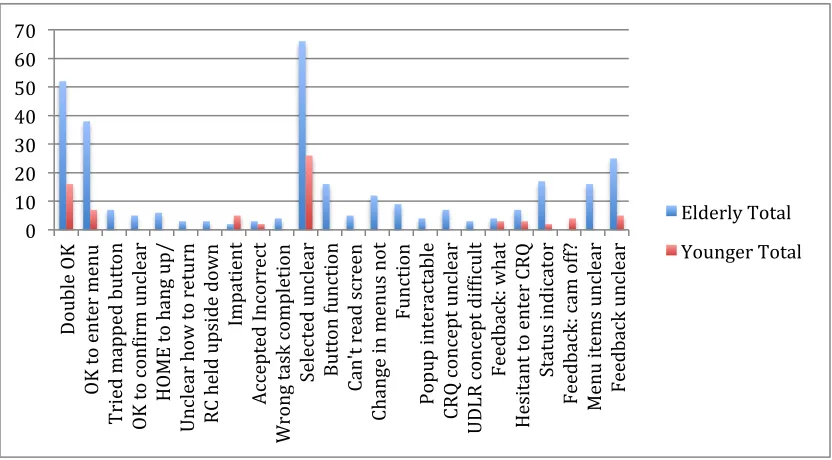
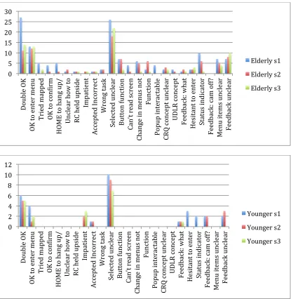
Figure 3 shows the total amount of times a certain usability problem was observed or reported by each group across all sessions. It is clear from this chart that both groups have trouble with the sensitive remote control and that the application needs to improve its design in showing which visual element is selected on the television screen. The chart might give a somewhat unfair perspective of the prevalence of usability issues due to the nature of certain problems. Some interaction difficulties shown are specific to certain tasks whereas others, such as the RC sensitivity (Double OK) and visibility of selected elements (Selected unclear) are general problems and can be found in any given task.
Figure 3. Observed usability problems per group across all sessions
On the other hand, it also shows that for the most prevalent issues, both groups are agreeable. One peculiar finding however, is that only participants from the younger group have observed usability issues with feedback given specific to the (de)activation of the webcam. This finding I would ascribe to be due to younger participants desiring more clarity about the status of the camera and elderly users simply accepting the fact that when their own image disappears, the other party cannot see them either. During our discussion on a remark about camera feedback, one of the younger participants referred to webcams that were designed to allow the user to slide something in front of the lens, making physically sure that the camera would not record (useful) video.
Changes over time
Figure X shows two charts that give an overview of usability problems found per group over three evaluation sessions. This data shows changes in usability problems over time. The chart on top indicates that elderly users keep having difficulty with the remote control, but the problems are halved after the first session. Apparently it is not too hard for them to understand the way of interacting with the UI using the RC once they have done it. Problems in understanding the user interface such as which item is selected does not show a very strong learning effect.
A strange result is that as the elderly participants got more familiar with the application, they also started reporting more problems of feedback being unclear to them. All the other results generally show either a learning effect or no change. It could be possible that participants were focused on more crucial aspects of task solving than complaining about
0 10 20 30 40 50 60 70
Dou
bl
e
O K O K to e nt er me nu T ri ed ma pp ed b ut to
n
O K to c on Uir
m
un
cl
ea
r
HO
M
E
to
ha
ng
u
p/
Uncl
ear how
to ret
urn
RC
held upside down
Imp at ie nt Ac ce pt ed In co rr ec
t
W ro ng ta sk c omp le ti on
Selected unclear
Butto
n f
uncti
on
Ca
n't
rea
d
screen Ch an ge in me nu
s
no
t
Fu
nct
ion
Popup int
eract
ab
le
CR
Q
con
cep
t u
ncl
ea
r
UDLR concept
difUicul
t
Feedb
ack
: w
ha
t
Hesit
an
t t
o
en
ter
CR
Q
Status indicator
Fe
ed
ba
ck
: c
am
of
f?
M
en
u
it ems u nc le ar Feedb ack u ncl ea
r
Elderly Total
[image:21.595.90.506.188.418.2]information feedback that was not very understandable for them. To solve tasks, the only information that needed to be interpreted was mostly understanding button functionality and waiting for calls to go through. Perhaps once they could better find their way through the application, they started noticing additional information provided by the UI such as birthdays of contacts, usernames, mood messages, and did not understand this, less important information. Another possibility is that because of the problems with the sensitive RC, screens were often skipped during the first session, such as when selecting a contact from the list to make an out-going call. The next screen that would appear is a confirmation screen, giving the user information about the selected contact and one action: to make a video-call. With the “double OK” problem, this screen was often skipped.
[image:22.595.91.506.278.704.2]Changes in usability problems found with the younger participants are fewer: there is not much difference in using the problematic, oversensitive RC. Nonetheless, younger users have learnt better about menu interaction and understanding what visual elements are selected.
Figure 4. Usability problems per group per session. 0
5 10 15 20 25 30
Dou
bl
e
O K O K to e nt er me nu T ri ed ma pp ed O K to c on Uir
m
HO
M
E
to
ha
ng
u
p/
Uncl
ear how
to
RC
held upside Imp
at ie nt Ac ce pt ed In co rr ec
t
Wr
ong tas
k
Selected unclear
Butto
n f
uncti
on
Ca
n't
rea
d
screen Ch an ge in me nu
s
no
t
Fu
nct
ion
Popup int
eract
ab
le
CR
Q
con
cep
t u
ncl
ea
r
UDLR concept
Feedb
ack
: w
ha
t
Hesit
an
t t
o
en
ter
Status indicator
Fe
ed
ba
ck
: c
am
of
f?
M
en
u
it ems u nc le ar Feedb ack u ncl ea
r
Elderly s1
Elderly s2 Elderly s3
0 2 4 6 8 10 12
Dou
bl
e
O K O K to e nt er me nu T ri ed ma pp ed O K to c on Uir
m
HO
M
E
to
ha
ng
u
p/
Uncl
ear how
to
RC
held upside Imp
at ie nt Ac ce pt ed In co rr ec
t
Wr
ong tas
k
Selected unclear
Butto
n f
uncti
on
Ca
n't
rea
d
screen Ch an ge in me nu
s
no
t
Fu
nct
ion
Popup int
eract
ab
le
CR
Q
con
cep
t u
ncl
ea
r
UDLR concept
Feedb
ack
: w
ha
t
Hesit
an
t t
o
en
ter
Status indicator
Fe
ed
ba
ck
: c
am
of
f?
M
en
u
it ems u nc le ar Feedb ack u ncl ea
r
Younger s1
Usability problems over time
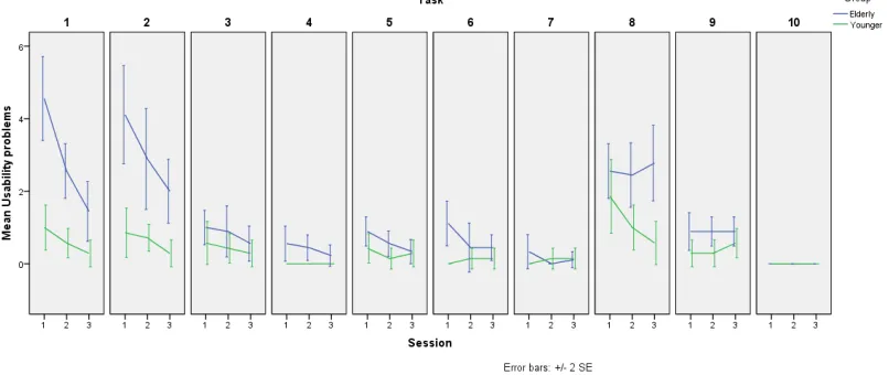
The number of usability problems found per user per session was recorded. In the diagram on the right it is clearly visible that, especially for elderly participants, these problems fade after experience whereas the younger participants do not seem to have much difficulty operating the system from the start. While this graphic shows a general trend in the decrease of usability issues once a user has come to understand certain operations within the system, we should take a look at what specific problems from the table above persist after experience.
When we split the information from the combined graph into usability problems per task per session, it becomes clear that the difference in experienced problems between the younger group and elderly users declines during tasks 3 through 7 and task 9. One could argue that after completing the first two tasks, users have gotten a good understanding of how the application works and therefore encounter fewer problems. A much more likely explanation however, is that during these tasks (3 through 7 and 9), the user is navigating in a very limited section of the application where there are very few buttons and functions available. This also explains why the gap between both groups increases again during task 8 (the contact requests task). For example, task 3 requires users to turn off their camera during a call. While in a call, the only two options available to the user are to either hang up the call or to turn their camera on/off. The same can be said for task 4 where users are asked to call back after their call got disconnected: in this screen, they have the choice between calling back, or returning to the main application menu.
[image:23.595.275.484.107.302.2]Apart from task 8, throughout all tasks and especially the first two, the learning curve we saw in the combined graph for elderly participants is recognizable. An explanation for the results of task 8 could be that the elderly users do not adequately understand the whole concept of contact requests. As the graph indicates a learning effect over time for younger
Figure 5. Mean usability problems per group per session
[image:23.595.80.483.584.754.2]participants, this shows that task 8 was not easy for these more able users either. A lack of feedback after any actions could be the result and in general, most participants only realized how to reject a request by selecting a “safe” request first: one they were willing to accept. This allowed them to preview what would happen after pressing OK on a contact request, showing a screen where further action could be taken. A combination of not understanding the concept of this functionality in the application with low usability could explain the results for task 8.
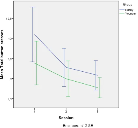
Efficiency: the amount of button presses it takes to complete a task
Because all button presses within the application were recorded in the system’s logfile, it was easy to calculate the amount of button pressing action each user took to complete a task. However, for tasks 5, 7, 9 and 10 these statistics were not measured as these tasks required actions outside of the video-calling application and as such, were not logged. The amount of button presses it takes to complete a task is an approximation of path length and a measure of efficiency
(Hornbaek, 2006).
The graph on the right shows a learning effect for both groups. As users gain more experience working with the application, they become more efficient in operating it. While the elderly user starts slightly less efficient than their younger counterparts, the image indicates converging lines, showing that after an initial learning phase, the elderly may become just as efficient as younger users.
Efficiency as discussed here, is merely in the sense of the amount of button presses. We
[image:24.595.260.494.289.507.2]cannot say much about efficiency in time, as there were no formal measurements made of this aspect. However, generally the duration of evaluation sessions held with elderly
Figure 7. Mean total button presses per group per session.
[image:24.595.81.482.584.754.2]participantsalways lasted as long as, or longer, than the sessions with younger users.
When we split the data per task, the image becomes slightly harder to interpret and it does not always seem like there is a large difference between the two user groups. While running the evaluations, it became clear that certain users, mainly from the younger group, were curious to browse around in the application. For example, some of the younger users would start the first task by scrolling through the contact list to see what was in there whereas most other users chose to (try to) finish the task as quickly as possible. There was also another user from the younger group who had the habit of randomly pressing buttons while re-reading a task (idly pressing buttons, for example: UP,
DOWN, UP, DOWN while in the contact list).
It would be difficult to encode certain button presses as belonging to “free browsing” or “idly pressing buttons”. This procedure would rely heavily on the researcher’s interpretation of a participants’ action based on the recorded data. One way of how this could be approached is to have multiple judges perform this coding and then calculate inter-rater reliability scores. However, due to the amount of data and lack of resources (time and additional judges to go through this data), the data was left as-is.
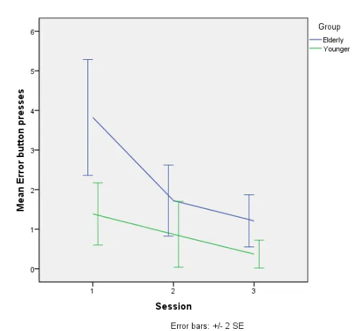
Erroneous button presses
Because not all buttons that are used for the application function at all times, a measurement was taken to count the amount of button presses a participant made that had no consequence: erroneous button presses. Hornbaek (2006) categorizes error rates as usability measurements of effectivity.
In our application, an erroneous button press implies that the user either does not realize what is happening on the screen and keeps pressing buttons that do not work, or they think that a certain button would execute actions, which they do not.
Some erroneous button presses were “doubled” due to the remote control’s sensitivity. Not only would it cause a double OK button press which could cause damage when, for example, handling contact requests, but when pressing any of the other buttons it could cause for an unintentional repeated button press. When the first button press was erroneous, the unintentional
repeats thus fall under the same category.
[image:25.595.230.483.528.763.2]In the graph on the right, we recognize the same curve as with total button presses (path length). Both these graphs show similar learning curves as the usability problems found per session per group. Elderly users start at a disadvantage but after some time spent with the application, they get better in handling the situations prescribed to them in the tasks. Thus, they do not only
become more efficient at operating the system, but also more effective.
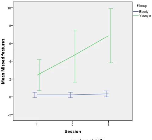
Missing functionality
Before starting the evaluation, users were explained that the research they are participating in is meant to get feedback for users to possibly enhance the product. Room was left on the questionnaires, after each task and after the PSSUQ, for comments.
During the evaluation some participants would suggest that certain functionality would be useful and that they missed it in the prototype application. In task 10, a short interview was held with participants in which they were asked if they felt like they missed certain functionality in the video-calling system. All
“missing functionality” data was combined and plotted in figure 10. It is very clear that the younger participants reported nearly all missed functions, and they increased over time. All elderly participants had a combined request of 3 missed functions across all sessions. To remind the reader: this study had more elderly than younger participants (respectively 9 and 7).
A combined total of 31 unique functions were missed in the video-calling prototype, 29 of which came from the younger users. While the elderly lack in quantity in these statistics here, they apparently make up for it with originality.
These results could be interpreted as reflecting the differences in usability needs between elderly and younger users. Another explanation is that the younger participants in this study were more experienced with Skype on the computer platform and therefore knew about more possibilities. The cause of these
[image:26.595.249.498.138.367.2]results is hard to pinpoint right now, as it may just as well reflect the participant’s creativity in coming up with possible functions for the application. One function that was missed was the ability to chat, as that is generally available for Skype on other systems. While text-input methods using a remote control were not tested during the current study, results