Lincoln
University
Digital
Dissertation
Copyright
Statement
The
digital
copy
of
this
dissertation
is
protected
by
the
Copyright
Act
1994
(New
Zealand).
This
dissertation
may
be
consulted
by
you,
provided
you
comply
with
the
provisions
of
the
Act
and
the
following
conditions
of
use:
you
will
use
the
copy
only
for
the
purposes
of
research
or
private
study
you
will
recognise
the
author's
right
to
be
identified
as
the
author
of
the
dissertation
and
due
acknowledgement
will
be
made
to
the
author
where
appropriate
you
will
obtain
the
author's
permission
before
publishing
any
material
from
the
dissertation.
The Effect of Visualisation on the Resource
Consent Process:
A Case Study in Christchurch City
A Dissertation
submitted in partial fulfilment
of the requirements for the Degree of
Master of Environmental Policy
at
Lincoln University
by
Benjamin M Baird
Abstract
Abstract of a Dissertation submitted in partial fulfilment of the
requirements for the Degree of Master of Environmental Policy.
The Effect of Visualisation on the Resource Consent Process:
A Case Study in Christchurch City
By Ben Baird
Visualisations are becoming increasingly prevalent with the growth in use and capabilities of technology. Currently visualisations can be included in the resource consent process but are without guidelines on their use. This exacerbates the tension between the potential of visualisations to inform and mislead decision-makers. The role of visualisation in environmental policy and resource consent processes may be significant areas in which this tension is apparent. Such issues were explored predominantly in the early 2000s, but the improvement in visualisations since then to create hyper-real physical renderings of space, as well as increased accessibility of visual software, may have increased the risk that they are, in fact, misleading planners who have to make decisions on the significance or other aspects of projects. This research explores and assesses how visualisations are created by architects and then interpreted by planners through a literature review and interviews within Christchurch City.
Acknowledgements
I would first like to acknowledge my wife, Jules, who has been incredibly supportive of me whilst I disappear down the rabbit hole of a dissertation.
I would also like to thank my supervisor, Hamish Rennie, who has encouraged, challenged and directed me in this undertaking.
I would like to thank Odette White and Clare Piper at the Christchurch City Council for suggesting a potential area of study and for putting up with my naive questions that helped build my initial understanding of the topic.
Table of Contents
Abstract ... iii
Acknowledgements... iv
Table of Contents ... v
List of Tables ... vii
List of Figures ... viii
Chapter 1 Introduction ... 9
Chapter 2 Theoretical Background ... 14
2.1 The Potential and Promise of Visualisation ... 14
2.2 The Technology Advancement of Visualisation ... 17
2.3 The Critiques of Visualisation ... 19
2.4 The Gaps in Knowledge about Visualisation ... 27
2.5 The Challenge of Visualisation ... 28
2.6 Summary of Issues ... 29
Chapter 3 Methodology ... 30
3.1 Research Aims and Objectives ... 32
3.2 Background ... 33
3.3 Framework for Assessing Visualisation ... 34
3.3.1 Comprehensible ... 35
3.3.2 Trustworthy ... 35
3.3.3 Legitimate ... 36
3.3.4 Accurate ... 36
Chapter 4 Results ... 39
4.1 Architect’s Responses ... 39
4.1.1 Audience ... 39
4.1.2 Composition ... 41
4.1.3 Visualisation Examples ... 45
4.1.4 Planning ... 46
4.1.5 General ... 49
4.1.6 Summary of Architects’ Results ... 52
4.2 Planner’s Responses ... 54
4.2.1 Audience ... 54
4.2.2 Composition ... 56
4.2.3 Planning ... 61
4.2.4 General ... 65
4.2.5 Summary of Planners’ Results ... 67
Chapter 5 Discussion ... 69
5.2 Example Two ... 75
5.3 Discussion Summary ... 76
Chapter 6 Conclusion ... 78
6.1 Implications ... 80
List of Tables
Table 1: Visual Image Symbolism ... 23
Table 2: What part of the industry the Architects and Planners were from ... 31
Table 3: Questions arising from Literature issues ... 37
Table 4: Summary of Architect’s questions relating to Forester’s Framework ... 38
Table 5: Summary of Planner’s questions relating to Foresters Framework ... 38
Table 6: Summary of Architect Results - Audience... 40
Table 7: Summary of Architect Results - Composition ... 44
Table 8: Summary of Architect Results - Planning ... 48
Table 9: Summary of Architect Results – General ... 51
Table 10: Summary of Architect Results ... 53
Table 11: Summary of Planners Results - Audience ... 55
Table 12: Summary of Planners Results - Composition ... 60
Table 13: Summary of Planners Results - Planning ... 64
Table 14: Summary of Planners Results - General ... 66
List of Figures
Figure 1: Contrasting Images of The Terrace ... 10
Figure 2: Contrasting Image found in the same CCDU video ... 10
Figure 3: Simplified RMA Resource Consent Process for Christchurch ... 33
Figure 4: Visualisation example from CCDU‘s Government Accommodation Project ... 45
Figure 5: From Interest.co.nz Release on each major Bank’s return to CBD ... 69
Figure 6: CCDU City Promenade Visualisation ... 74
Chapter 1
Introduction
This dissertation seeks to understand how visualisations are created and understood within the resource consent process in New Zealand. The purpose is to understand how architects produce visualisations and the differences between how planners, in turn, interpret them. It begins with an introduction to the problem, an understanding of the theoretical background, a summary and discussion of the results.
It has always been intriguing viewing drawings of the future, seeing how previous
generations interpreted their future, our present. A classic example would be the Back
to the Future film series. In Part 2, the main character Marty McFly has to travel to the future to save his future son; that future date is next year (2015). In their future there are hover-boards, and ever since that film kids have dreamed, demanded, and eventually been let down, by the promise of hover-boards (Hanson, 2013). Simultaneously, the birth of computer games has shown these generations the promise of computer graphics. The most applicable game is ‘SimCity’, which I grew up playing, whose gameplay is strategically managing and growing a city. Furthermore, it is the games evolution, SimCity 2000, 3000, 4 and 2013, that has whet the appetite of these generations for better graphics, especially in terms of cities – their buildings and systems.
Figure 1: Contrasting Images of The Terrace
The image (Figure 1), shows a comparison between The Terrace (The Terrace, n.d.) and the Avon River Precinct (CCDU, n.d.) projects revealing a stark contrast in the representation of the riverbank and, to a lesser extent, the fronting buildings. Furthermore, there is a contrast between the government imagery as seen in Figure 2
below(CCDU, n.d.).
Figure 2: Contrasting Image found in the same Central City Development Unit (CCDU) video
Issues also arise when what is created does not match the promise of any of these images. This research proposes that as technology improves visualisation, so too does the potential of the visualisations to not match the realisation. Furthermore, the planning framework may lack the ability to protect the council and the public from this difference.
renderings’ (Xie, 2013). This issue is not just in art installations, it is also seen in subdivision planning.
New housing developments do their best to present some romantic version including innovative ideas creating better living but it is only when ‘roll-out takes place that questions begin to be asked about where the innovation might have gone’ (Montgomery & Page, 2013). These examples highlight the ‘disconnect’ between the finished product and the idea presented, when the visualisation and realisation do not match. Here the issue is even more pertinent as people invest into a dream that may never be delivered. However, where does the problem lie? Is the designer deliberately misleading or are the public and the council misunderstanding the information and how should this transaction be safeguarded?
This is not a conspiracy theory; that designers are producing higher-quality visualisations in an attempt to mislead the public. Rather, that this may be happening subconsciously, that objects in the mirror are closer than they appear, but without the warning (Smallman & St. John, 2005, p. 12). This is compounded by, as Sheppard (2001, p. 192) describes, ‘the wild west’ in terms of visualisation use in the planning process. Currently architects are responsible for ‘providing an honest and neutral visual representation ... by seeking to avoid bias in responses’, thus providing legitimacy (Sheppard, 2001, p.196).
Furthermore, this misunderstanding between designers and the public stems from the introduction of technology into the process. Before computer renderings, graphics were hand-drawn, and therefore cannot ‘be mistaken for anything but illustrations’ (Xie, 2013). So the rendering was a hyper-reality and justifiably viewed as just an idea. However, following an increase in the use and ability of technology, computer images are more accessible and more realistic and therefore the public may in fact perceive these as fact rather than illustrations.
found that the difference between the visualisation and the real world experience is as vast as between the plan and what is built. Sheppard (2001, p. 188) is also concerned that the effect of poor decision-making is that unworthy projects are approved and good design is declined and planners and the public get ‘that which they did not expect’. Despite this, these renderings have become an effective tool in communicating and engaging the public.
As these images are becoming more accessible for the non-architecturally literate, it is helping conceptualise ideas or planning rules and improve community involvement. However, there needs to also be communication of the potential misleading elements. It is true that these renderings never come with a promise that what you see will be what you get and that these designs are marketing tools so in order for visualisation to reach its full potential ‘we should at least be savvy shoppers’ (Xie, 2013). This communication could, though, come from city planners. Montgomery & Page (2013) echo this point in their critique of suburban development; ‘planners and planning students need to be
wary of that which is trumpeted initially as innovative design’. It is the validation of
visualisations that is essential for them to be used as evaluation tools for understanding potential changes to the environment (Lange, 2001, p. 169).
Sheppard (2001, p. 188) states there is insufficient research to determine the influence of technology as well as the role of visualisation in planning and their influence. This
debate is also encapsulated in Planning Quarterly. Coggan (2007) exudes excitement at
the potential of technology within the planning process; with this technology, ‘there is no question that it is realistic and accurate’ (p. 26). He states that it can be used in the process by members of council or the Environment Court for various scenarios such as subdivision and wind farms. They can ‘take the visuals to the survey point and see for themselves that the base data is an accurate reflection of what they can see with the naked eye’ (p. 26). However, Carrie (2007) urges restraint with regards to technology. ‘I would caution about the appropriateness of the technology ... and any reliance that the Court or the planning profession might place on its validity for recognizing the variability of appropriate cognitive visual responses in the community to any potential change in a receiving environment’ (p. 29).
without any ability to understand how the images are created (under what assumptions) and how they fit within the current area. However, with no ability for recourse if the visualisation and realisation differ, this leaves the council and public vulnerable to manipulation. This research is important now because this exchange is becoming more prevalent. This is exacerbated in Canterbury following the earthquakes. As the town is flattened, new ideas of areas and buildings are graphically created to present its new future. Yet, there is no control or ability for action when the idea presented does not match the actual building created. Recently the Canterbury Earthquake Recovery Authority (CERA) stated a new ‘innovative digital model’ would help ‘visualise the significant changes to the central city landscape’ (CERA, 2014). CERA see the potential in technology and visualisation in ‘creating a strong foundation for 3D visualization of the city’ (CERA, 2014). CERA state that ‘architects and their clients will contribute 3D models of ‘to be built’ developments to accompany the models of remaining buildings’ with the hope that these models can ‘design better buildings and outdoor spaces. With the models, they can visualise the developments around their designs and simulate environmental effects’ (CERA, 2014). The excitement at this proposal needs to be tempered with caution at the potential for manipulation.
Chapter 2
Theoretical Background
Visualisation is an exciting tool; a picture is worth a thousand words. Visualisation has increasing potential through technological advancement, and for the improvement of interaction between the council, the public and the developers. It ‘offers a method for seeing the unseen’ (Averbukh, 2001, p. 227). Visualisations are becoming an increasing part of everyday life (Lange, 2001, p. 179). This can be seen in billboards around town, as well as part of the consenting process. However, visualisations have been criticised in their limited ability and vulnerability to manipulation. The concern for visualisations is seen in the planning discipline’s hesitant embrace of visualisation as a communication tool demonstrating the real world’s three dimensions in a simplified representation (Lange, 2001, p. 179). This debate, and articles written on the topic, seems to have peaked in the early 2000s and since then there has been limited research. This may match the rise in the use of technology. The reduction in research may be because the issues have been resolved, or the focus of technological research has shifted, potentially to social media, or the issues are still outstanding, but simply are not discussed anymore.
Throughout this research, the use of the word visualisation will refer to the use of Computer Aided Design (CAD) drawings or other static images used to represent potential future situations. This research will not look at the effect of the use of maps or films but rather the use of realistic drawings or a photo-drawing mix to portray the future building on a specific site.
The following review focuses on the potential, and the technology used in visualisation before moving to a critical discussion of its limitations and nature.
2.1
The Potential and Promise of Visualisation
not only between experts but with planners and the public, with the potential for improved understanding and decision-making (Appleton & Lovett, 2003, p. 117). This is because it can translate information better and present multiple options while saving time (Lewis, Casello, & Groulx, 2012, p. 86). Furthermore, this potentially could be significant in increasing public engagement. This is because quicker, more understandable information helps foster consensus building, with visualisations as the interactive tool (Seebohm, n.d., p. 175). Pietsch (2000, p. 521) suggests that visualisation’s potential is in its ability to translate conventional plans and elevations into something that is understood by everybody. In other words, visualisation is a ‘means of translating technocratic information to a common graphic language’ (Lewis, Casello, & Groulx, 2012, p. 85). This is becoming critical because, as Coggan (2007, p. 27) states, it is essential to consult with people early on, as time is valuable. Wissen et al. (2008, pp. 184-185) see visualisations as having potential in communicating and understanding environments through showing and modelling visual and non-visual information. This is done by overlaying map information allowing problems to become visible and providing a common language for discussion. Furthermore, traditional tools, such as maps and diagrams, are regularly misunderstood or incomprehensible for the public (Liben, 2009, p. 310), as map comprehension requires understanding how cartographic decisions are made. Better communication leads to better interaction and allows exploration of the underlying data.
experience. This is especially important as the demand for public involvement increases in planning decisions (Pietsch, 2000, p. 521).
In addition to improving understanding, visualisation helps promote creative problem solving (Lagendorf, 1992, p. 723). Visualisation can ‘encourage experimentation and openness to the opportunities afforded by a city’ (Pietsch, 2000, p. 528). In Christchurch, the Canterbury Earthquake Recovery Authority (CERA) provides an open license virtual database for developers and the public to use; this is so the models and visualisations can be improved and seen by the public (CERA, 2014). Levy (1995, pp. 356-357) describes an approach where committees examine visualisations, alternatives are discussed and examined and this helps identify and discuss concerns. In this scenario, visualisations gave a sense of place, and a comprehension of the environment. This allows the depiction of technical information; property boundaries, gradients etc. and alternatives (Lewis, 2012, pp. 551-552), which increases the level of participation in the planning process (Lewis et al., 2012, p. 85).
However, planners firstly must become accustomed to visualisations and the ‘experimentation and adaption’ (Lagendorf, 1992, p. 737) involved within the visualisation process. This would allow planners to ‘control and coordinate’ what and how information is used (Lagendorf, 1992, p. 735). It would also lead to improved participatory decision-making, as the ability for the public to visualise the project proposed within what they know is vital (Coggan, 2007, p. 27). Visualisations already have an established role in planning research and practice (Lewis, 2012) allowing the public to see the relationship between individual parcels, and how these fit the context (Rabie, 1991, p. 65). However, Coggan (2007, p. 26) argues this involvement is only successful if implemented early in the process, as it helps interpret and visualise the future, even if the design is less accurate (Lewis, 2012, p. 553). There is not a need for visualisations to be used earlier but also at the end of the process, after more decisions have been made (Seebohm, n.d., p. 184), and the visualisation can be more accurate.
‘which can extend beyond the boundaries of a single project’ (Levy, 1995, p. 344). Daniel and Mietner (2001, pp. 61-62) also agree that visualisations can provide good options when based on data. The assumption is that visualisation’s effectiveness is based on data and is therefore objective, allowing decisions to be made (Lewis, 2012, p. 553). Furthermore, it is still cheaper than taking all people to the particular site. Coggan (2007, p. 27) summarises the potential as results will improve as quicker and better visualisations are introduced into the planning process. However, Coggan did not use or offer criteria in order to judge the quality and accuracy of visualisations so his claims of successful results need to be tempered with caution. Visualisation’s success is linked to the similarity between a person’s response to an image and to the real environment. This has demanded greater sophistication and become a focus of visualisation research and development (Lewis, 2012, p. 553).
Visualisation’s promise lies in its ability to entice and improve community interaction through translation of technical information into visual representation, as well as its potential to present multiple options simultaneously allowing for public involvement earlier in the process (Lewis, 2012, pp. 552-553). In other words, visualisation needs to be ‘understood from multiple viewpoints with a variety of information’ by improving ‘the understanding of complex information, and improves communication’ (Lagendorf, 1992, p. 723). Improvement in technology is often heralded as the mechanism in which this growth in understanding and collaboration between planners, architects and the public can happen and lead to more successful environmental change (Lewis, 2012, p. 562). However, its success depends on its implementation within the planning process, as well as the experience and expertise of the users (Lewis et al., 2012, p. 100).
2.2
The Technology Advancement of Visualisation
scale and complexity of situations, which allows greater graphical representation of traditional plans and elevations that assist in understanding (Lagendorf, 1992, p. 730). This advancement has had a substantial effect on planners and architects ability to assess effects and design elements (Coggan, 2007, p. 26). Bresi (1995, p. 16) suggests that visualisations are objective, allowing people to see patterns from the representation of data, to show the potential and resolve disputes, because of the ‘dead hand’ of the computer. Bresi argues that this shifts the discussion from ideologies to ideas, because the computer presents without prejudice.
In addition, the growth of personal computing and the improvement in user-friendly graphic editing tools (Lewis et al., 2012, p. 89) has increased the exposure and hence, demand for visualisations. Daniel and Meitner (2001, p. 64) predicted the continual advances in computer technology would increase use. Levy (1995, p. 343) agrees saying the lower costs and higher performance has increased the reach of visualisations within planning and architectural firms. Furthermore, research has shown that, in fact, visualisation is guiding technological change. This increase in technology has, in turn, fed the need for a better technological capacity (Lagendorf, 1992, p. 725). The appetite of the public has been exacerbated by the increased ability of visualisation in popular culture, which is shifting the emphasis towards a futuristic ideal. Smallman and St John (2005, p. 7) suggest that the pace of technological growth actually perpetuates the belief that more photo-realistic visualisations lead to more accurate results. Developers are therefore focused on maximising realism rather than effectiveness (p. 10). This growth in technology has given the ability for visualisations to merge the designed with actual landscapes (Pietsch, 2000, p. 529). Daniel and Mietner (2001, p. 65) state that high-resolution visualisations can represent landscapes and are indistinguishable from photographs.
2.3
The Critiques of Visualisation
The rapid technological advances and associated boosterism tends to obscure the significant inherent limitations. Some researchers remain unconvinced about the benefit of being able to visualise projects (Averbukh, 2001). Despite early claims that improved computer power and subsequent sophistication has improved visualisation, the question has now moved from the limits of technology to how to measure the perceived accuracy (or control of manipulability) of a wide range of visualisations, from the abstract to the realistic photo style techniques (Lewis et al., 2012, p. 91). Sheppard (2001, p. 192) believes that the increased use of visualisations in public decision-making processes will lead to more debate over their authenticity resulting from ‘differences between the visualisation and the built designs’.
Averbukh (2001, p. 227) suggests that visualisations by design is a manipulation of the real world and therefore can only be considered a metaphor, a tool to allow the communication of complex ideas. Lange (2001, p. 165) argues that detailed visualisations do not necessarily correlate with accuracy or realism. Realism is, in fact, more about connecting users with visualisations rather than visual correctness (Lewis, 2012, p. 561). Furthermore, visualisations are still, and arguably can only be, a conceptualised version of reality; as textures, subtlety of colours, shadows and reflections are all lost on paper. It is the idea that scuffmarks and chipped paint are part of the visual experience. Visualisations can only capture one moment, one day of a season whereas the real environment is dynamic and continuously changing (Lange, 2001, p. 180). Daniel and Meitner (2001, pp. 61-63) are also concerned that it is assumed the visualisation can elicit the same judgements as if the person was actually there; a photograph focuses on the picturesque rather than how it connects to people’s lives. Visualisations are depictions that can be manipulated to highlight important aspects that can end up influencing decision-making (Lewis, 2012, p. 552).
with the purpose of selling the final product. This allows visualisations to be created that are not ‘entirely technical in nature’ (Lewis, 2012, p. 554). This shifts the control within the process, from the planners to the architects (Rabie, 1991, p. 62). Technological improvements along with the change in the visualisation production process places ‘virtual reality beyond the reach of local planning authorities’ (Pietsch, 2000, p. 533), as planners do not encounter the creation of visualisations.
These inherent problems may be the reason that the ‘implementation of visualisation on
a routine basis within planning remains limited’ (Pietsch, 2000, p. 521). This could be
because there is a frustrating gap between what visualisation can do, and how it is applied (Lewis et al, 2012, p. 85). This gap is further exacerbated by the ‘complexity of the planning problems involved; certain ideas in the philosophy of modernism in architecture; the multiplicity and discordant character of our democratic society’ (Rabie, 1991, p. 57). Levy (1995, p. 345) asks for a bigger commitment to the improvement of interaction of visualisations with the audience to allow for greater public involvement, but who is the audience? As Levy suggests, revisions are generally done privately and presented to the client, not the public (p. 344). Improvement in quality may have negative consequences that may ‘alienate the intended audience’ (Lewis et al., 2012, p. 95). The desire for more accurate visualisations may in fact be contrary to the designer’s needs. Additionally, Sheppard (2001, p. 187) is concerned about the level of funding and influence of clients over visualisation design, leaving the architect no safety of professional standards to negotiate from. Furthermore, preparers of visualisations need to understand the power they have to influence emotions. Lewis’ (2012, p. 560) research showed that ‘presentation style variation is associated significantly with perceptions of visualisation credibility, apparent realism and environmental design preference’.
visualisation. Lewis et al. (2012, p. 91) reiterates that visualisations need to be used in a way that users are aware of the benefits and limitations of visualisation. They sum this up succinctly; ‘no matter how much control the user is afforded, interactive visualization applications remain a ‘black box’ into which ideas, preferences, and choices are conveyed’ (Lewis et al., 2012, p. 99).
It is important that planners and the public are aware that visualisations incorporate designer’s values that may not necessarily represent the real world. Duncan (2008) suggests that objectivity is lost if the developers’ formative value frameworks are not systematically identified. Duncan argues that the ability for something to be objective (i.e. represent the real world) it needs to be value free which, when dealing with modelling (or visualisations), is impossible due to the assumptions required to establish a model (or visualisation). Therefore people inform science as much as science informs people. Moreover, Smallman and St. John (2005, p. 6) propose that science is disjointed in its understanding of the implied principle of visualisations; that the more realistic a visualisation is, the better. They describe it as ‘naive realism’, commenting that there is a ‘misplaced faith in people’s ability to extract information from realistic displays’ (p. 7). Lewis (2012, p. 562) states that visualisations will continue ‘to push a priori messages.’ This is exacerbated by the fact that planners, historically, have relied on architects’ plans and elevations for urban design concepts (Levy, 1995, p. 344). This difference is exemplified in architects’ training – they are taught to present ‘in the most favourable light’ rather than planners objectively using it as a tool (Sheppard, 2001). This allows architects the freedom of imagery. Furthermore, the identification of values does not rest solely with planners. The public should be encouraged to ‘become more critical and analytical’ (Lewis, 2012, p. 563). The public is aware that visualisations can potentially mislead but require a way of deciphering images; more information about assumptions and decisions will help this process and make sure architects are less abstract and more upfront (Lewis, 2012, p. 563). This goes against the assumed understanding that the public can see beyond embellishment and can interpret the image correctly (Lewis, 2012, p. 554).
rather than the technology advancement in and of itself. Sheppard (2001, p. 183) asks whether we need improved knowledge and control over visualisations rather than improved technology. His concern is that the increase in accessibility – through the drop in cost and increased familiarity from younger generations – jeopardises the process. Sheppard suggests that there is a need for control because of the influence, potential misuse and lack of control over it (pp. 184-6) - the ‘persuasive power of visualisations has not been lost on the entertainment, business, and advertising industries’ (Sheppard, 2001, p. 186). Lewis et al. (2012, p. 86) contend the focus is on technology and its rapid evolution rather than how it can be used to help the planning process. Rabie (1991, p. 60) similarly was concerned that adaptation of visualisations has not been ‘adequate or appropriate’. Rabie (1991) suggests its development is not coherent. Pietsch (2000, p. 522, 534) too, is worried that the established pursuit of technology to provide validity diminishes the focus on the creation of a clear vision for how best to use it.
Since 1991, the concern is about how to adequately apply technology (visualisation in particular) to the planning process. This can be seen in visualisations that ‘largely overlook how the proposed building will engage with the existing urban context’ (Xie, 2013). Carrie (2007) highlights this in an example;
This wind farm scene has the predominantly dark areas of imagery on the right foreground rocks. This naturally emphasizes the foreground area of the image at the expense of the wind farm and background hills which are far more lacking in differential contrast. This leads to the wind turbines having ‘less visual impact (or intrusiveness)’ than what is ‘likely to be experienced’. Furthermore, perspective by the human eye has been approximated to the focal length of 25mm film camera lens of about 50mm (pp. 27-28).
negatively to visualisations in which they do not like the design. Smallman and St. John (2005, pp. 8-9) also found that in perspective views within visualisations, depth compresses faster than widths distorting the image. Furthermore, the range of distance is generally greater than the visualisations scope leading to further distortion. Appleton and Lovett (2003, p. 130) suggest that not all visualisation elements are equal in terms of viewer importance and therefore visualisations should focus on the foreground. Halbur and Haugh (2010) describe the fervent clamour to create ‘vibrant and active’ visualisations by cutting and pasting young, happy people in the shot. However, they concede that people help show scale. Halbur and Haugh (2010) suggest that visualisations are about enticing customers into purchasing or investing and those decisions are design not people driven. Halbur and Haugh (2010) and Kidd (1998) ultimately think that a trained eye can see through these tricks and understand where the problems are, and users will take them with a grain of salt. However, an inexperienced user may not be conscious of the potential manipulation.
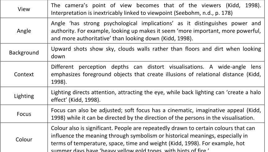
An explanation of the use of camera techniques by Kidd (1998) to convey meaning led to the development of questions about the composition of visualisations. These are: view, angle, background, context, lighting, focus, and colour. These techniques are explained in Table 1.
Table 1: Visual Image Symbolism View The camera’s point of view becomes that of the viewers (Kidd, 1998).
Interpretation is inextricably linked to viewpoint (Seebohm, n.d., p. 178) Angle
Angle ‘has strong psychological implications’ as it distinguishes power and authority. For example, looking up makes it seem ‘more important, more powerful, and more authoritative’ than looking down(Kidd, 1998).
Background Upward shots show sky, clouds walls rather than floors and dirt when looking down
Context
Different perception depths can distort visualisations. A wide-angle lens emphasizes foreground objects that create illusions of relational distance (Kidd, 1998).
Lighting Lighting directs attention, attracting the eye, while back lighting can ‘create a halo effect’ (Kidd, 1998).
Focus Focus can also be adjusted; soft focus has a cinematic, imaginative appeal (Kidd, 1998) while it can be directed by the direction of the persons in the visualisation. Colour
Therefore, it has been argued that these high quality visualisations should be seen as ‘a declaration of intention’ rather than a statement of what is there or to be there (Rabie, 1991, p. 64). With this assumed the problem then becomes the selection of information used within this process; how to fill in an image to make it readable rather than using all information available. Visualisation is affected by what information is selected and this ‘can be affected by ad hoc or intentional misinformation’ (Lewis et al., 2012, p. 92). This problem highlights that beyond just information, ‘social, political, and economic pressures’ exist and these can ‘distort the way visualisation technology is employed and perceived in decision-making contexts’ (Lewis et al., 2012, p. 90). Moreover, the information chosen and the assumptions made create ‘an aura of certainty rather than one potential outcome among many’ (Lewis et al., 2012, p. 93). The concern is when manipulation undermines objectivity leading to confusion and uncertainty, which is ignored or contested (Lewis, 2012, p. 553). The issue of accuracy is linked, therefore, to who creates the visualisation and therefore, the preparer is ‘central to the whole process ... which raises concerns about how those individuals mediate inputs through their own perspectives such as colour, populating and lighting the environment’ (Lewis et al., 2012, p. 92). It is exacerbated by the fact that these decisions occur ’quite intuitively, hence erratically, via the designer’s expertise and sensibility’ (Rabie, 1991, p. 60).
visualisation presents but rather visualisations are used to ‘elicit emotional effects’ (Lewis et al., 2012, p. 95). Here Lewis et al. (2012) highlight the subjectivity of visualisation as an aspect that is often overlooked in the planning process. Bresi (1995, p. 19) believes selecting specific databases and approximating can help save costs but acknowledges that this makes the process subjective. Furthermore, visualisations only present from one point of view and so they solve some problems but not all of them. Additionally, Sheppard (2001, p. 190) is concerned with the seemingly interchangeability of modelled landscapes and pure fantasy, that the representation of what is there is indistinguishable from the fictional additions.
Lewis et al (2012, p. 95) suggest that visualisations need to be openly scrutinised until an established practice is enforced or in other words, there is ‘a need for planning authorities to be able to check its validity’ (Pietsch, 2000, p. 525). Lagendorf (1992, p. 736) sees this process enabling ‘disputing parties tie into the consultants’ computer model and carefully examine the assumptions’. Coggan (2007, p. 25) believes that investing ‘in a high level of accuracy for visual simulations in order to consult with the community is becoming more essential, particularly for potentially controversial topics’. However, this raises another concern other than its lack of application, and that is, how to measure accuracy. A process of investigating each aspect of a visualisation and trying to understand the assumptions is a comprehensive yet time consuming process.
There is a concern that while it is impossible to assure accuracy ‘there is a danger in permitting major inaccuracies’ (p. 195). Appleton and Lovett (2003, p. 127) are concerned that important elements may be tougher to simulate and detrimental to the project, so these aspects are downplayed or left out. Seebohm’s (n.d., p. 175) research shows that visualisations are not objective and by focusing instead on interpretation, it is hoped to counter this assumption. Interpretation is independent of the data and so visualisation is, therefore art, ‘which depends primarily on the user than on the system software and hardware’ (Seebohm, n.d., p. 184). Levy (1995, pp. 343-344) states it as misunderstanding, that visualisations can hide or distort information; ‘the acts of creating a concept, testing its feasibility, and producing detailed drawings have become less distinctive’ (Levy, 1995, p. 344).
assumptions and errors in the visualisation. This means that the perception is better understood and legitimate.
The questions around application, accuracy and subjectivity points to the lack of understanding within the planning sector. Planners must interact, enabling them ‘to move beyond the role of subjects to become active investigators in the development of alternative environmental futures’ (Lewis et al., 2012, p. 96). Rabie (1991, p. 70) believes that the computer could be considered ‘a bridge between the perceptual experiences and expectations of different groups participating in the elaboration of an
urban project and therefore, planners must embrace technology’.There is, therefore, an
important balance to achieve between selecting essential (environmental) information whilst not oversimplifying but also not confusing or clouding essential information within unessential elements. This is the context that planners need to work within (Pietsch, 2000, p. 524). Forester (1982, p. 71) presents criteria to help reduce potential manipulation. This involves the information and communication in the process being: ‘(1) clear and comprehensible, (2) sincere and trustworthy, (3) appropriate and legitimate, and (4) accurate and true’. An educated planner, then, ‘expects, anticipates, and works to counteract misinformation hampering publicly accessible, informed and participatory planning’ (Forester, 1982, p. 76). However, in New Zealand, this seems to not happen. There have been the two articles discussed above (Coggan and Carrie) in the Planning Quarterly, with one critiquing the other. Moreover, whilst studying my masters at Lincoln as a planning student I have received no training in how visualisations are used and how to critique them.
2.4
The Gaps in Knowledge about Visualisation
Researchers seem to be in consensus regarding one thing; the need for more research. Lewis et al. (2012) asks for ‘additional research to explore and develop a fuller appreciation of visualisation effectiveness’ (p. 101) as there is a lack of professionally recognised standards for visualisations (Lewis, 2012, p. 552). Specifically, the criticisms and limitations of visualisation stated previously require future research. Rabie (1991), for example, has called for an extension of simulations ‘with an expert system based on the resolution of building code regulations’ (p. 67). Lange (2001, p. 163) says there has been limited research into the validation of visualisations in terms of realism. Lewis (2012, p. 553) states that some researchers are shifting in recognition that there needs to be a balance of information. There is also unconvincing evidence of whether visualisations perception is valid and further research is needed (Lewis, Casello, & Groulx, 2012, p. 97). Furthermore, there is limited research about the effect on visualisation’s users and whether they ‘provide accurate and defensible representations that inform’ rather than confuse or mislead users (Lewis, Casello, & Groulx, 2012, p. 90). There has been positive uses of visualisation within the decision-making process but ‘too many questions remain unanswered for it to become a routine part of the planning process’ (Pietsch, 2000, p. 534). There is little evidence in seeing how visualisations are used within the planning process (Lewis, 2012, p. 551) or in other words the continued ‘incoherence and lack of cohesion which have characterised much recent urban development’ (Rabie, 1991, p. 57) requires more research.
realism on viewer’s interpretation, ‘realistic images may imply defensibility and accuracy ... but potential limitations can actually be camouflaged’ by designers assumptions. Smallman and St John (2005, p. 6) ask how visualisations should be compiled more effectively and intuitively. In other words, ‘there have been few investigations of its use in the assessment procedure of local authorities’ (Pietsch, 2000, p. 522).
2.5
The Challenge of Visualisation
Sheppard (2001, p. 188) posits that two designers working with the same software and data would present two different visualisations. Visualisation, in order to be effective, needs to overcome the issues surrounding it. This is the challenge of visualisation, to balance the pressures created by technology. Pietsch (2000) states it as visualisation needs to be ‘flexible, simple, quickly rendered, and to a degree of detail accepted by the participants in the planning process’ (p. 535). Lewis et al (2012) suggest that these issues are not the end of visualisations use; that by making the objectives and transparency explicit the users can be ‘fully aware of both visualization’s benefits and shortcomings’ (p. 91) for a more informed decision. Sheppard (2001, p. 183) proposes the development of a code of ethics to govern visualisation designers who ‘conjure up and interpret imagery’ as a way forward. Levy (1995) stresses that if visualisations are to become part of the planning process then there needs to be a consideration to how the users and public interact with the visualisations.
There needs to be a realisation that more information and detail does not equate to greater understanding (Pietsch, 2000, p. 524). Further, the technical aspects of visualisation must be ‘considered within the broader social, economic, aesthetic and cultural perceptions’ (Carrie, 2007, p. 29). In other words for effective visualisation there needs to be active collaboration, with the ‘users technical, financial, and administrative capacities in mind’ (Lewis, Casello, & Groulx, 2012, p. 101).
people who understand that values and their own subjective interpretations are part of the visualisation design process. The focus should not be on presenting ‘visual outputs with levels of detail and realism that are unsuited to the objectives or stage of the project’ (Lewis, Casello, & Groulx, 2012, p. 101), but rather embrace the idea of visualisation being a simplified representation of future reality. These images can become a stylistic interpretation that inadvertently can embody architects interests; it is therefore unsuitable to chase higher levels of detail and realism (Lewis, 2012, p. 552). Visualisation has the ability to be misused and overawe planners and the public but the extent to which this happens is unknown (Lewis, 2012, p. 554).
2.6
Summary of Issues
The following is a summary of issues that the literature research highlight:
There is concern about how visualisation has been developed and how it is used.
There is debate as to whether visualisations will lead to better outcomes,
decisions and collaborations.
Visualisations present a ‘common language’ of interpretation but is this really the
case?
The literature suggests it improves communication with the public but is that the
intended audience?
Visualisations are not as straightforward or objective as initially considered.
There is potential for manipulation and use of symbolic imagery
There is unease regarding how influential visualisations are within the planning
profession.
Chapter 3
Methodology
The purpose of this research is to understand how architects produce visualisations and the differences between how planners interpret them. This chapter explains the structure, approach and limitations of the research, concluding with an exploration of a framework to organise and compare questions and results.
Following the theoretical background, which provides an overview of the current understanding of this topic, the research will follow a case study approach. Yin (2003, p. 2) identifies that this method ‘allows investigators to retain the holistic and meaningful characteristics of life events’; this is important as visualisations are depicting real-life structures. Furthermore, this approach is suitable for my research as it allows the exploration of examples that will work in parallel with my literature review. This is the strength of case studies, to deal with ‘a full variety of evidence’ (Yin, 2003, p. 8).
This research focused geographically around Christchurch. This is because of its proximity to my study, making it easier to undertake qualitative interviews. Furthermore, Christchurch is facing unprecedented change and re-building following the Canterbury Earthquakes. This has led to more visualisations because of the new development happening and furthermore, a legislative change in the normal speed of consenting (CERA, n.d.). These factors combined make Christchurch an ideal case study for understanding the effect of visualisation within the planning process.
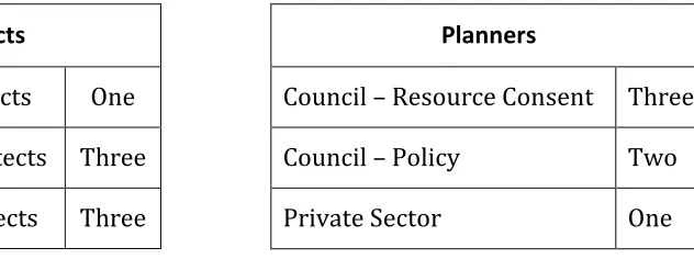
Most interviewee’s were happy and intrigued by the topic, willing to engage and the intricacies and tensions of visualisation interpretation. However, a few were less willing to engage, sticking to the prepared questions or stating their position rather than discussing it. Interviews generally took an hour with some thirty minutes while others an hour and twenty minutes. Interviews were recorded, then transcribed and sent to each interviewee for approval. They took place at their workplace or a cafe nearby and were either around 10am or 3pm. Speaking out of their workplace helped the interview seem more of a discussion and made it easier to talk about the questions. It could have also been beneficial speaking away from superiors or co-workers. The time chosen was a less stressful part of the day to allow for more discussion.
Architects
Landscape Architects One
Commercial Architects Three
Residential Architects Three
Planners
Council – Resource Consent Three
Council – Policy Two
Private Sector One
Table 2: What part of the industry the Architects and Planners were from
Architects were interviewed first as it allowed the development of questions for planners and to obtain visualisation examples to help the dialogue. People from the council were those involved in making consent decisions. The architects are people designing these images and were chosen on the basis that they could explain how they are put together. The process of choosing interviewee’s was through snowball sampling. This is a process by which one contact refers another, and so on (Vogt, 2005, p. 300). This was helpful as it allowed the identification of specialists in visualisations to be found. Furthermore, ‘snowball sampling is used most frequently to conduct qualitative research, primarily through interviews’ (Atkinson & Flint, 2001, Snowball Sampling Section). It also involved a mix of convenience (the most accessible) and judgement (most productive) sampling. This is the least costly in terms of ‘time, effort and money’
interviews because of the need to discuss and work around physical images, which is easier face-to-face. This is supported by the case study approach as it allows ‘significant opportunities for extensive analysis, enhancing the insights into a single case’ (Yin, 2003, p. 46). These allow the exploration of the ideas and explore and interpret the
inferences of what is being asked (Yin, 2003, p. 61). This sample size was also
appropriate as responses became repititive or focussed on a common theme, demonstrating an adequately answered question (Marshall, 1996, p. 523).
The following summarises the research steps undertaken.
1. Research began by exploring the theoretical background to the problem and
understanding what other researchers had concluded.
2. Questions or gaps in knowledge identified, particularly to the Christchurch
setting.
3. Potential interviewees were contacted by email to arrange a face-to-face
interview.
4. Interviews were conducted over seven weeks with architects, and then planners.
5. Data was collated and summarised.
6. Data analysed.
7. Conclusions and points of discussion extrapolated.
This research is a limited glimpse of the use and effect of visualisations within Christchurch because it does not incorporate all architects or planners, rather a select few. Although research is limited to Christchurch, it can be used to infer a more national problem, which could be confirmed through future research. A comparison to non-disaster related visualisation and design is not necessary at this level of study but could be an area of future research.
3.1
Research Aims and Objectives
aim of this dissertation is to understand how visualisation technology is used within the planning process and how the public interest is protected.
This research aim addresses the following issues:
1. Exploring how the current New Zealand planning process, the Resource
Management Act’s, directs the use of visualisations, especially the use of resource consents.
2. Evaluate current practices, if any, used to manage the issue of visualisations.
3. Identify key strengths and weaknesses in current planning practice’s use of
visualisations
3.2
Background
To explore how visualisation are directed within the planning process, an overview of the Resource Consent process for Christchurch was researched and, as outlined in the Resource Management Act (1991) (RMA) is summarised in Figure 3 as:
Figure 3: Simplified RMA Resource Consent Process for Christchurch (Ministry for the Environment, n.d.)
The Urban Design Panel, in Christchurch, provides expert advice and recommendations on the design of the project to help improve how the project fits within its context. This panel is made up of architects, landscape architects, urban designers, planners and property professionals. Applications are then submitted and the council decides whether to notify the application depending on the scale of effects. This decision is where the impact of visualisation is most critical, as the visualisation can emphasise or diminish the effect on its surrounding environment. This dissertation explores the use
Consultation with Council
Applicant
Urban Design Panel
Application to Council Council Decision on Scale of Effects
Non-Notified
Limited Notification
Public Notification
of visualisations within applications and how these may impact the council’s decision on whether or not to notify (step 3).
The decision to notify is outlined through 95 to 95G in the RMA. Section 95A determines how the council shall decide how to notify, namely, if the adverse effects on the environment are more than minor. Quality Planning (Quality Planning, n.d.) outlines some aspects to consider for assessing whether effects are more than minor:
the cumulative nature of any effect over time, or in combination with other
effects
the probability of occurrence
temporary effects, including adverse effects associated with construction work
the scale and consequences (or potential) of the effect
the duration of the effect
the permitted baseline
the frequency or timing of any effect
whether the effect relates to a S6 (Matters of National Importance) or S7 (Other
Matters).
the area affected
the sensitivity of surrounding uses to that effect
reverse sensitivity issues
whether the effect is to be mitigated or avoided by a condition contained in the
application or offered by the applicant in the application, which the applicant has agreed to.
3.3
Framework for Assessing Visualisation
3.3.1 Comprehensible
Lewis et al (2012, p. 94) describes ‘comprehensible’ as being that the image contains enough information ‘to render a clear and reliable judgement of the project depicted’. Sheppard (2001) sees this as all details being clearly communicated. This also needs to be in balance with maintaining user’s attention. Averbukh suggests that visualisation is built upon comparison and ‘adequacy in visualisation should be the main parameter of evaluation’ (Averbukh, 2001, p. 235). However, Smallman and St John (2005, p. 6) state that designers believe that the more realistic a visualisation is, the less interpretation is needed.
3.3.2 Trustworthy
Forester (1982) spoke of visualisations being sincere and trustworthy. Lewis et al (2012, p. 94) refer to it as ‘credible and defensible’. In other words, the presenter of the visualisation ‘must be able to demonstrate how it was produced’ (Lewis et al, 2012, p. 94). This requires some sort of disclosure with each image but how effective would this be? How to approach this is less clear and gets to the crux of the visualisation issue. Is it important that people understand all the variables involved or that some assumptions have been made? Can we really expect the producers to outline their own flaws and assumptions when this could harm the effectiveness?
3.3.3 Legitimate
‘Appropriateness and Legitimacy’ refers to the rationale behind the visualisation. This is done through the disclosing of information; the ‘written and verbal means’ documenting ‘methods, rationales, assumptions’ (Lewis et al., 2012, p. 100). Legitimacy also refers to consultation with end-users ‘to identify their current practices, technical capacity and limitations and needs and visions for visualization technology’ (Lewis et al., 2012, p. 100). Sheppard (2001) expects visualisations to be defensible through making assumptions transparent. This is so visualisation reflects current interpretation and practices for consistency. Lewis et al (2012, p. 101) suggests that a level of ‘scepticism is warranted and should be encouraged on the part of visualization interpreters when it is unclear how their values, ideas, and design preferences’ have been calculated but not disclosed. An easy improvement could be to present do-nothing cases that presently are rarely done (Lewis et al., 2012, p. 95).
3.3.4 Accurate
‘Accuracy’ is trickier to define and strikes at the purpose of visualisation. Is visualisation accuracy to get as ‘close to the real view as possible’ (Lewis et al., 2012, p. 94) or is to balance ‘the interrelation of abstraction, accuracy and realism’ (Pietsch, 2000, p. 525). Sheppard (2001) defines ‘accuracy’ as simulating the actual or expected appearance as closely as possible. Furthermore the issue relates to how much information is presented to the public, too much and it may begin to have a detrimental effect on interpretation. Pietsch (2000) debates how far this should go, for example should the street tree be the correct variety for its location (Pietsch, 2000, p. 532)? Pietsch (2000) continues by relaying an example pertinent to accuracy; ‘if a proposal is modelled without street trees, is it inaccurate or are the trees simply irrelevant to other issues under evaluation’ (Pietsch, 2000, pp. 532-533). However, context, Smallman and St. John (2005, p. 10) suggest, is generally left to be assumed rather than depicted.
with those who develop visualisations and those who may be provided with these during decision-making.
Table 3 shows how the questions were developed from the issues found and summarised from the literature.
Table 3: Questions arising from Literature issues
Following are two tables showing how each question for the architects (Table 4) and the planners (Table 5) addresses Foresters framework.
Issues Architects Questions Planners Questions
There is concern about how has visualisation been developed and how it is used.
How do you approach Resource Consent visualisations? How has visualisation changed over
time?
Do you have a checklist for legitimacy?
There is debate as to whether visualisations will lead to better outcomes, decisions
and collaborations.
Do you think planners can be
influenced by design? Do these visualisations help picture the application?
Visualisations present a ‘common language’ of interpretation but is this
really the case?
Do planners understand the process of rendering visualisations? Do you consider planning elements?
Do you see visualisations playing a part in helping the public understand development?
Do you think architects understand planning rules? What aspects are important for you, the planner? What aspects of the visualisation are important to
architects? The literature suggests it
improves communication with the public but is that the
intended audience?
Who is the intended audience? Who is the intended audience?
Visualisations are not as straightforward or objective
as initially considered.
How about the context of the visualisation?
Should a visualisation be artistic or realistic?
Is there benefit to accurate visualisations?
Is context important in decision-making? Are you aware of how visualisations are composed and how architects consider angle, light, colour, contrast etc.?
Do you consider visualisations artistic or realistic? Do you think visualisations are as most flattering or worst
case scenarios?
Do you think visualisations represent the final build? Is there a process of evaluation post-build?
There is potential for manipulation and use of
symbolic imagery
How would you represent the day? How is the angle chosen? How would you represent transport? How would you treat the landscape?
To what extent can visualisations mislead the public? Do you disregard artistic aspects?
There is unease regarding how influential visualisations
are within the planning profession.
Is there potential for misinterpretation from the public?
Can the council control images used in the public? Do any of them affect your perception of the project? Do you have discretion in infringement violations or are
Table 4: Summary of Architect’s questions relating to Forester’s Framework
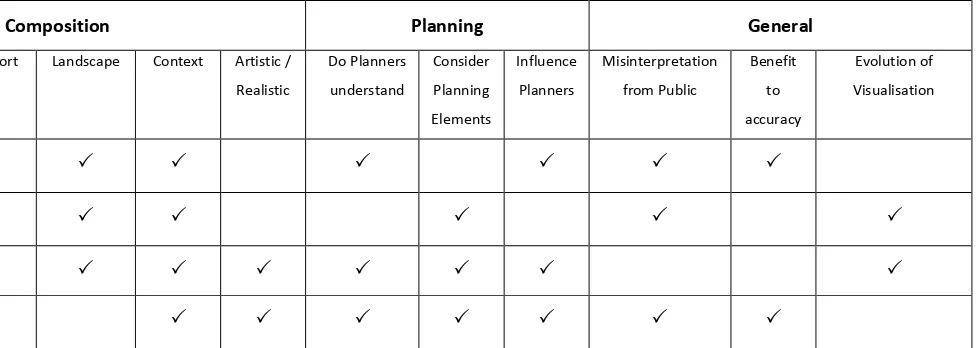
Table 5: Summary of Planner’s questions relating to Foresters Framework Architect’s Questions relating to Forester’s Framework
Audience Composition Planning General
Intended Audience
Resource Consent Visualisations
Day Angle Transport Landscape Context Artistic /
Realistic Do Planners understand Consider Planning Elements Influence Planners Misinterpretation from Public Benefit to accuracy Evolution of Visualisation
Comprehensive
Trustworthy
Legitimate
Accurate
Planner’s Questions relating to Forester’s Framework
Audience General Composition Planning Control Public
Intended Audience
Images Used
Assist Affect Realistic or Artistic Architect Aspects Planner Aspects Is Context Important Best or Worst Case Architects Understand Rules Planners aware of Aspects Represent Final Rule Bound
Checklist Image help Public Aid or Hinder Council Control Images
Comprehensive
Trustworthy
Legitimate
Chapter 4
Results
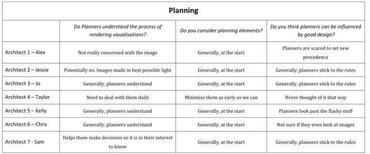
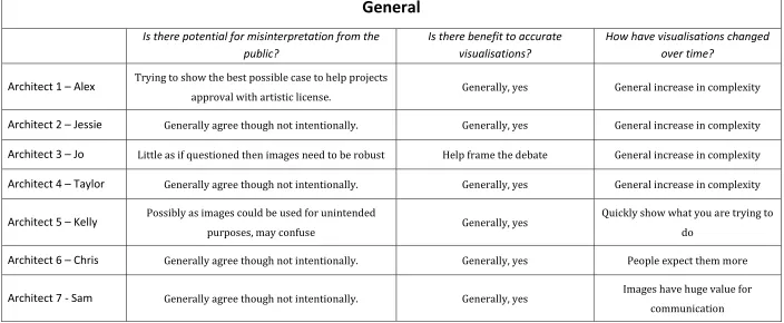
Below is a summary of the results following the interview process. All names have been changed to keep the interviewee’s anonymous. Interview responses were printed, manually separated, and then collated by themes identified as Audience, Composition, Planning and General.
4.1
Architect’s Responses
The following is a summary of the interviews with various architects. The architects ranged from small residential focused to large corporate buildings as well as landscape architects. The responses are categorised by the sub-headings: audience, composition, planning, and general.
4.1.1 Audience
Who is the intended audience?
Generally, visualisations are developed for the client. The client sometimes uses them internally or for marketing, while some are added to resource consent applications. Kelly suggested that architects may have designed them for clients but they end up used in the public, which may be misleading.
How do you approach Resource Consent visualisations?
visualisation to save time and money. Sam would do enough to get resource consent; the visualisations are presented in the best possible light to market the project to the planner.
Generally it depends on the consent non-compliances, for example, Jo said that ‘if it is part of the conditions, then colour may be important to model.’ Alex agrees stating ‘what you produce is dependent on what the issue is...we put enough detail in to get it approved.’
Alex pointed out an interesting tension; planners want as much detail as they can; however the detail is determined by the resource consent conditions. Alex continues by saying this helps maintain the future scope of design.
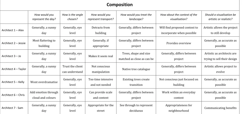
The following table (Table 6) summarises particular key answers from specific architects. Each question was asked to all interviewees.
Audience
Who is the intended audience? How do you approach Resource Consent visualisations?
Architect 1 – Alex Generally, the client. Give as little information to allow for building modifications
Architect 2 – Jessie Generally, the client. Generally, Downplay
Architect 3 – Jo Generally, the client. Generally, Downplay
Architect 4 – Taylor Generally, the client. Downplay Resource Consent images to allow objectivity
Architect 5 – Kelly Client but Public sometimes
outside the control of the architect Generally, Downplay
Architect 6 – Chris Generally, the client. Remove additional information in image for Resource Consent
Architect 7 - Sam Generally, the client. Enough to get Resource Consent
4.1.2 Composition
How would you represent the day?
Respondents generally considered a sunny day as appropriate with the sun displayed correctly. Also, seasonal variations were not important unless requested. Kelly said ‘we are not trying to overdramatise any of it’, while another said it is about getting the clearest day to have the least impact. However, Jessie said that it is ‘all selected as to be the most flattering to the project and what best reveals the design intent’. Another interesting response from Chris was about adding ‘emotion in the clouds’ that dramatises the image.
How is the angle chosen?
Respondents all said that the angle is from eye level and from a street view. Some also stated that adding in landmarks or street views helped provide context. Most agreed that an image looking down on the building is meaningless as it is not a viewing angle. Sometimes, though eye height can be a challenge ‘to fit on a sheet and not skew the perspective’. Taylor said that it is important to trust the client’s understanding of the job; ‘I often send images trying to capture a whole side but end up giving too much information and in reality they will not see it from there.’
How would you represent transport?
The use of transport seemed to rely on each person’s preference. Taylor said ‘it is just a difference between architects; it could be subconscious but are not designed to manipulate’. Sam said ‘you need to be appropriate for the street’. Chris uses cars for scale and providing context; ‘the things around it are factual and it is important to show how it will interact’. Jo says transport helps it look more real, keeping ‘the building in context’.