GOING MOBILE
Developing Apps for
your librAry using bAsic
HTMl progrAMMing
AlA editions •
spEcIaL rEpOrts
scOtt La cOuNtE
aMErIcaN LIBrary assOcIatION chicago 2012
© 2012 by the American Library Association. Any claim of copyright is subject to applicable limitations and exceptions, such as rights of fair use and library copying pursuant to Sections 107 and 108 of the U.S. Copyright Act. No copyright is claimed in content that is in the public domain, such as works of the U.S. government.
Printed in the United States of America 16 15 14 13 12 5 4 3 2 1
While extensive effort has gone into ensuring the reliability of the information in this book, the publisher makes no warranty, express or implied, with respect to the material contained herein. ISBN: 978–0-8389–1129-7 (paper); 978-0-8389-9318-7 (PDF); 978-0-8389-9319-4 (ePub);
978-0-8389-9320-0 (Mobipocket); 978-0-8389-9321-7 (Kindle). For more information on digital formats, visit the ALA Store at alastore.ala.org and select eEditions.
Library of Congress Cataloging-in-Publication Data La Counte, Scott, 1978–
Going mobile : developing apps for your library using basic HTML programming / Scott La Counte.
p. cm.
Includes bibliographical references. ISBN 978-0-8389-1129-7 (alk. paper)
1. Mobile communication systems—Library applications. 2. Library Web sites—Design. 3. Smartphones—Programming. 4. Application software—Development. 5. Mobile computing. I. Title.
Z680.5.L32 2012
025.04'2—dc23 2011027672
Series cover design by Casey Bayer.
Series text design in Palatino Linotype and Avenir by Karen Sheets de Gracia. Composition by Dianne M. Rooney.
This paper meets the requirements of ANSI/NISO Z39.48-1992 (Permanence of Paper).
Scott La Counte is a librarian at Anaheim (Calif.) Public Library. He is the author of the book Quiet, Please: Dispatches from a Public Librarian (Da Capo Press, 2008), which began as a series for McSweeney’s Internet Tendencies. He teaches writing online for the Gotham Writers’ Work-shops. His iPhone app, LibFind, gives the addresses and phone numbers of public libraries across the United States.
iii
cONtENts
Introduction v
1
Before You Begin
1
2
Developing a Mobile Web Application
7
3
Using CSS
13
4
JavaScript and Mobile Website Design
19
5
PhoneGap
25
6
Building Your First Native App
29
7
Beyond the Basics
41
8
Other Ways to Go Mobile
45
ALA Editions purchases fund advocacy, awareness, and accreditation programs
v
t
here are more than one hundred thousand mobile apps for the iPhone, andAndroid is quickly catching up to that number. Universities have apps, sports teams have apps, authors have apps—everyone seems to be in the app market, and for obvious reasons. Unlike the previous generation, which didn’t mind waiting to get their information when they got home, today’s generation wants their information on the go. In many respects they could be called Generation Mobile, because for the first time, there is a group of people who can have everything they could ever want in the palm of their hand.
What’s alarming, however, is of the hundreds of thousands of mobile apps available for phones, the amount of apps that librarians have built for libraries can be counted on one hand! The District of Columbia Public Library has an app to help you find books in its catalog. By the time this book is published, a few other libraries will likely have joined in, but the number isn’t anywhere near where it should be.
What does this mean? That there’s an entire generation that’s being overlooked. Businesses have successfully found a new generation of clients simply by promot-ing services to them in ways that speak to a new type of user: the mobile user. They have proved that successful apps work and should not be overlooked.
For as long as computers and the Internet have been around, libraries have been on the cutting edge of implementing them; perhaps for the first time, libraries are lagging, and it’s time to catch up.
Mobile app development has become a pretty lucrative business; it’s a fair statement to say that it is the twenty-first century’s equivalent of a gold rush—upstart companies are making millions. In 2010, a developer for the Android phone reported that he was making $10,000 a month on an app that helped people find where they had left their car. He’s not alone.
It’s not in libraries’ best interest to go into app development with the intention of making money, but still, there is a huge market for mobile development.
Mobile websites allow patrons to avail themselves of library services no matter where they are. The sites can be set up to allow patrons to reserve books, to surf the card catalog, and more. Mobile websites, however, are a much different interface from the sites that you’re used to seeing on the Internet.
There are a lot of reasons libraries have, by and large, stayed away from phone apps. One of the biggest reasons, however, is that the skills needed to successfully build them
vi
i n T r o D u c T i o n
have historically been greater than what most libraries can afford; an app programmer can cost several hundred dollars an hour. Building a phone app using the phone’s native programming language can be hard work and can take hundreds of hours.
Fortunately, new open-source software has made it easy for people with more lim-ited programming skills to take advantage of apps. Using the technologies available, it’s possible for any library to create an app at a low cost and to offer patrons a way to access the wealth of knowledge and entertainment stored in every library facility.
The point of this book is to show you what an app is, how to build one, and how to successfully market your app to library patrons. In the forthcoming chapters, you will learn not just how to build an app with relatively no programming skills but also the best practices for marketing the book to your target audience, as well as both free and paid services that are available to make going mobile even simpler and seamless.
There are many challenges ahead for any library attempting to enter this new form of development—and the challenges are among the biggest roadblocks for many librar-ies interested in extending their library services into the mobile market. I address some of the problems and challenges in this book, but the main point is to offer cost-effective solutions to library staff who are interested in experimenting with building an app for the library.
1
1
BEFOrE yOu
BEGIN
MOBILE app: a DEFINItION
It’s difficult to write about mobile devices because that phrase can mean so many things. When I say “mobile app,” does that refer to an app that runs on any phone? Or on a specific phone? Just to be clear, there are two types of cell phones:
Feature phone: A feature phone is what the average person carries in his or her pocket. Although many feature phones are becoming more sophisticated, for the most part, feature phones are the more popular basic phones that you can buy. They make calls, they offer texting, and most can take pictures and have very limited web browsing. More than 80 percent of Americans have a feature phone.
smartphone: Smartphones are best described as computers in the palm of your hand. Several times more powerful than feature phones, smartphones not only can surf the Internet but also can surf at relatively fast, third-generation (3G) speeds. The iPhone, Android, BlackBerry, and Windows Mobile are all examples of this kind of phone.
Many of the ideas in this book are universal; they can be tried on pretty much any phone in existence. The majority of ideas, however, are maximized for use with smartphones.
What is the point of developing apps that fewer than 20 percent of the population can access? Smartphones are the future of cellular technology. Smartphone prices have dropped significantly in recent years. When the iPhone was released in 2007, it cost $599; less than five years later, it cost as little as $99. The same is true of BlackBerries and nearly all other smartphones. As costs continue to drop, the smartphone is becoming more and more affordable to the average consumer.
Mobile development has become one of the biggest growth sectors of web develop-ment. People still use computers to surf the Internet, but the amount of time they spend on a computer will decrease as other devices become more prevalent.
The advent of XHTML-MP (XHTML for the Mobile Phone) and WCSS (Wireless CSS) converted two of the most powerful tools in web design into forms that are suit-able for those who need to build mobile websites. At the same time, WYSIWYG (what
2
b e f o r e y o u b e g i n
you see is what you get) editors currently provide templates for mobile websites, which makes it possible for just about anyone to design simple websites.
Perhaps the biggest reason libraries need to embrace this growing technology is because the youth of the world use it to speak to one another. The average teen, if given the option, would probably prefer to text a librarian than to visit the reference desk.
What Is a MOBILE app?
Another question that should be answered before proceeding any further is, What do I mean by “mobile app”? Mobile apps generally refer to two different things:
Mobile website: A mobile website is mobile phone friendly and developed taking into consideration the limitations of cellular devices. If you invested the right amount of time in your library’s website, it probably looks pretty good on a ten- to twenty-inch screen (the size of the average desktop or laptop screen). But if you try to access the website from a mobile phone, it probably will look pretty lousy—if it even loads at all. Having a mobile-friendly website would simply mean that the library has a separate web address (e.g., m.library.com— the m standing for mobile) to point mobile phones to. This can be done easily by inserting code that redirects the device on the basis of its resolution. For example, if the site detects a device resolution of 1280 × 1024, then it’s obvi-ously a desktop, laptop, or tablet computer, and so would be directed to the main page; if the resolution is 320 × 480 or less, then it’s some sort of mobile device, and so would be directed to a mobile page.
Native app: A native app is one for which the library has gone the extra step to create an app that is available for purchase in mobile app stores (e.g., iTunes, Android Market)
At the very least, every library should have a mobile-friendly website; it’s a relatively easy process that I’ll talk about in forthcoming chapters.
DEvELOpING a MOBILE app
Libraries that want to take the extra initiative and do something more innovative should devote some time to developing a plan for the delivery of native apps to their users. To develop a native app, you have to understand how to develop a mobile website app— so by understanding one, you are actually learning to do two things. By the end of this book, you might realize that you don’t want to have a native app, but you will at least know how to develop one, and in doing so, you will be able to develop a mobile app.
The problem with developing a native app isn’t the skill level (which is actually about the same as for developing a mobile-friendly website); the problem is the number of phones that are on the market. If you want to develop a native app for all users, then
3 b e f o r e y o u b e g i n
you have to develop one for every phone: iPhone, BlackBerry, Android, Palm, Windows Mobile—and those are just the major ones! In short, developing a native app requires a substantial time investment, and each library needs to consider that when deciding whether to invest in a native app.
The good news is that most phone makers supply app developers with plenty of free tools and resources to make development a little easier. The bad news is that actu-ally getting the app into the marketplace requires a bit of money; each phone requires that developers pay a fee, and some apps are compatible only with Mac operating sys-tems, such as those for the iPhone. These costs, though, help prevent people who are not serious about app development from flooding the markets with apps. Box 1 illustrates the system requirements and fees for each of the five major phones.
The information in box 1 can be a little overwhelming, and chances are that you will not be able to get a library app on every phone. What you need to consider, however, is that if you get a native app on just two phones (e.g., iPhone and Android), then it will be compatible with most smartphone users. In the summer of 2011, more than half of
BOX 1 n system requirements and Fees
Android
Fee: $25 unlimited
System requirements: The Android software development kit (SDK) is free. It requires
▪
Windows Xp (32-bit) or vista (32- or 64-bit)▪
Mac os X version 10.5.8 or later (x86 only)▪
linux (tested on linux ubuntu Hardy Heron)BlackBerry
Fee: $200 for 10 app submissions
System requirements: The BlackBerry SDK is free. It requires
▪
Windows 2000 spi or later, or Windows Xp▪
32-bit Windows vista (blackberry JDe v4.2.1 and higher)▪
Java se JDK v6.0iPhone
Fee: $99 per year
System requirements: The iPhone SDK is free. It requires Mac OS X or later to run the program.
Palm
Fee: $99 per year
System requirements: The Palm SDK is free. It runs on Mac, Linux, and Windows.
Windows Mobile Fee: $99 per year
System requirements: Windows XP or later with Visual Studio 2008 and Microsoft .NET Compact Framework v2 SP2.
4
b e f o r e y o u b e g i n
smartphone users are expected to have iPhones; Android is catching up quickly, with more than 30 percent of the market. That means that if ten people walk into a store to buy a smartphone, eight or nine will walk out with either an iPhone or a phone with the Android operating system.
thE EssENcE OF thE MOBILE WEB
Mobile websites should look and interact much differently than traditional websites. Mobile websites involve different design concerns than regular websites that you view on a computer. In some ways, designing mobile websites is like designing sites in the past, when the download speed of a page was of primary concern. Although today most mobile connections are quite fast, some mobile phone users pay by the minute for Internet connectivity; thus, it’s in their best interest to access sites that download in short order.
All of this plays into simplicity, a major component of all good mobile websites. Regular websites offer a host of options to visitors, as well as graphics, images, naviga-tion menus, Flash elements, and JavaScript elements that add funcnaviga-tionality and style to the page. But where mobile websites are concerned, the aesthetic elements have to work hand in hand with practical concerns. On a small screen, there’s no room for overblown design elements, multiple navigation menus, or a great deal of text. Unlike regular web-sites, mobile sites also require that you accommodate the technology that users have to view them.
The language of the Web is HTML, or HyperText Markup Language. For older mobile browsers, the language is WML, or Wireless Markup Language. Today smart-phones and mobile browsers generally make use of XHTML-MP. The differences between HTML and XHTML-MP aren’t too radical, and anyone with HTML experience should be able to figure out XHTML-MP with little difficulty. There are other require-ments that mobile websites have to accommodate to make sure that their elerequire-ments dis-play correctly on all of the many mobile browsers on the market. Some of the features they require are the following:
▪
very simplified navigation▪
layouts specified using Cascading Style Sheets (CSS), not tables▪
compact, efficiently written content▪
a color scheme that is consistent across all browsers▪
reduction in bandwidth-heavy elements, such as pictures, videos, and audio▪
navigation options such as “back” and “next” on every pageMost mobile websites are built around a utilitarian aesthetic. They aren’t the places to show off your design department’s abilities or to debut new and untested features. When people surf the mobile-friendly Internet, they’re generally looking to find the information they want as quickly as possible, and that information is usually not for pure entertainment. Efficiency is always the first order of business with mobile sites.
5 b e f o r e y o u b e g i n
For example, for library sites, most users will primarily look to browse the catalog and reserve items from the stacks, to call the library, and to get directions to different branches. This means that the mobile site should be integrated with the library’s data-base to allow customers to log in and access their account.
Another concern in developing mobile websites is space. A smartphone, useful as it is, has a small-format screen. This means that you must maximize the space available and not create a mobile site that is useful only to those users who have relatively large mobile screens.
It’s also important to see the actual phones and know what they look like. Box 2 provides the range of dimensions for most smartphones; the average phone has a screen dimension of 320 × 480 (about the same as a playing card); ideally, that is the resolution that you should aim to develop your mobile website for.
BOX 2 n Dimensions in pixels
▪
iPhone: 320 × 480▪
Blackberry: 160 × 160 to 480 × 360▪
Android SDK: 320 × 240 (because different phones use the Android plat-form, here the dimension is the standard resolution in the developer kit)▪
Generic Windows Mobile: 240 × 320 (standard resolution, but varies from phone to phone)▪
Nokia: 95 × 95 and higher (varies from phone to phone, but 240 × 320 is standard)▪
Palm Pre: 320 × 480survEyING usErs
Before you continue with developing an app, it’s a good idea to understand who your patrons are and what kinds of mobile services they want. For example, what percent-age of patrons have smartphones? What kinds of smartphones do they have (many people don’t know which kind of phone they have, so it’s a good idea to ask to see their phone)? If they don’t have smartphones, do they use the Web on their feature phones? Most web analytics sites (e.g., Google Analytics, StatCounter) will indicate users’ resolu-tion, which lets you figure out whether they are using a phone to view the site. But this doesn’t always help because these sites let you know only whether users are accessing the site via their phone, not what kind of phone (e.g., iPhone, BlackBerry, Droid).
A lot of this book focuses on the iPhone, because when people talk about wanting to learn how to make apps, they are usually referring to making them for the iPhone—the holy grail of app development. Depending on your patrons, however, you might want to consider starting on another device. There is no point developing an iPhone app if most of your smartphone-carrying patrons have BlackBerries.
If you decide to continue with developing an app, then you have to ask, What do your patrons want? Access to the library’s catalog? Photos from events? A calendar of events? GPS tracking to find the nearest library or book? To know when the next library
6
b e f o r e y o u b e g i n
computer is available? Instant messaging with a librarian? It’s important to consider that what librarians find important is not necessarily what patrons find important.
traINING staFF
The library might face resistance early on from staff. Many people don’t like change, so to avoid resistance, it’s useful to get everyone on staff involved as early as possible. Another good idea is that when you survey your patrons, you can also survey your staff to find out who already understands the technology and wants to jump on board and who will need a little bit more help. Also, it helps to show, not tell. Basically, that means that it’s better to show a scene than to simply talk about what is happening. So, if you simply tell staff what the library wants to do, many might not see the necessity of an app, but if you show them the app and what it can do for the library, they’re more likely to get excited.
How do you show? The best way is to carry out a survey on an iPod Touch or Android tablet. SurveyMonkey and other popular online surveys are great tools for col-lecting data, but actually placing a device in the hand of a librarian unfamiliar with such devices will help him or her become more comfortable with using the interface. These devices also are small, so they’re easy to store. And for surveying patrons, you can buy an iPod lock (e.g., the Targus Defcon Notebook/iPod Lock Combo costs $39.99) or lock an iPod to an unattended desk for patrons to fill out the survey.
The iPod and Android tablets also use the same kind of interface as the iPhone, and there are plenty of survey apps that you can purchase for them; best of all they are rela-tively cheap (less than $200). The Samsung Galaxy and Dell Streak tablet have received a lot of media attention, but there are many other tablets available—there are many Android tablets available on eBay for less than $150.
You can use Survey on the Spot (free for iPhone) or Askdroid and ODK Collect (free for Android) to create a survey and then have librarians use the app to ask patrons a series of questions. Or use Tally Counter (free for iPhone) or CodeArk Tally Counter (free for Android) to count the number of people using smartphones. More powerful (and detailed) tally counts are also available for a cost: Tallymander ($3.99 for iPhone) and Advanced Tally Counter Pro ($0.99 for Android) let users count several different stats at once (e.g., types of questions patrons ask at the reference desk).
The results of the surveys, in most cases, won’t be as powerful or specific as those you would get from sites like SurveyMonkey, but that doesn’t matter; what matters is your letting people who don’t regularly use the device know what it is. Even though people might resist change, almost everyone loves to play with gadgets!
Many times libraries implement technological innovations that don’t take off because the library staff members don’t promote them to patrons. But in surveying staff and patrons on an iPhone or tablet, even though you might not convert anyone to a smart-phone user, you will at least give people a better understanding of their importance.
7
2
DEvELOpING a MOBILE
WEB appLIcatION
O
nce you know who your users are, it’s time to start developing. This chapter and the following ones provide a crash course in mobile development. We’ll review the essence of HTML, CSS, and JavaScript programming, and we’ll learn the very basics of what it takes to develop a mobile website.sEttING up thE DOMaIN
Mobile websites are housed in a separate part of your server from your main site. In most cases, the site name will simply have “mobile” added on at the beginning of the domain. For example, the mobile version of the URL YourLibrary.com would be Mobile. YourLibrary.com. The “Mobile” directory holds all the files required to display your mobile site. This type of organization also makes things easier on your information tech-nology staff, because the “Mobile” directory is a convenient way to deal with a site.
Once your domain is set up and ready to go, the hard work begins.
uNDErstaNDING thE prOcEss
Most of the process of designing a mobile website involves simplifying and reformat-ting the information and features that appear on your main website. This means that, to build a mobile website, you first need to prepare the text and images for the site so that they fit the site’s format.
MOBILE WEB vErsus staNDarD WEB
Everything on your mobile website will be slightly different from how it appears on your regular website. This is inevitable. Although there are some features that your users will expect from your website, some of what you offer on your main site is impractical for mobile users. It’s important to remember that you’re trying to replicate the functionality and content of your regular website as much as possible on your mobile site. You’re not simply duplicating your main website and putting it in your mobile directory.
8
D e v e l o p i n g A M o b i l e W e b A p p l i c A T i o n
<p align=“center”>Call Us:
<a href=“wtai://wp/mc;5555551212”>555-555-1212</a><br/>
<a href=“wtai://wp/ap;5555551212;City_Library”>Add Us to Your Phone Book!</a> </p>
Your mobile website, therefore, should largely be its own entity—it will have some features from your main site, but you’ll abandon others. You can start building your mobile site by streamlining your regular website.
NavIGatION
Most websites feature navigation menus with many options on the side or top of the page. For mobile sites, you’ll need to reduce the number of navigation elements down to those that are the most practical and necessary for the patrons visiting your site. You will also want to add a “Back” and “Forward” button on every page. Some mobile browsers don’t have these buttons built in, so it’s easy for surfers to end up at a dead end on the site, which can be extremely frustrating.
The first thing that should appear on your mobile home page is the name of your library and your location. Your telephone number should also be one of the first pieces of information that your visitors see. Many visitors to your mobile website will simply opt to call and ask their questions directly to a librarian. You can make this easy for them by inserting a link that allows visitors to dial your phone number directly from the page. To insert the link, which should appear at the very top of the page, there is a fairly simple code that will display your phone number and allow visitors to dial the library just by clicking on the link:
By clicking on Call Us, patrons can dial the number listed. Notice that the unfor-matted phone number appears at the end of the line that starts “wtai” in both cases. In the second link, “Add Us to Your Phone Book!” the tag “City_Library” determines how your number will be added to the user’s phone book. Providing the ability to both dial your phone number right from the mobile home page and to add your number to the visitor’s phone book with just a click is a huge convenience for your patrons—and it definitely has a wow factor.
Navigation buttons on a mobile website need to be very simple. In most cases, users prefer to move through your site using navigation menus. Entering text is difficult on some phones and, therefore, users tend to avoid doing so whenever possible. Also, your navigation choices should be intuitive, and ideally, it should take a minimal amount of clicks for patrons to find the page they’re looking for.
Keep the shapes of your navigation buttons as simple as possible and use fonts that are bold and readable. Some mobile screens have very low-quality graphics, so make efforts to accommodate users of those devices when you’re designing your site. For example, text links are preferable to graphics links.
The home pages of some mobile websites are little more than a small section of infor-mation with links provided underneath the main content. For examples of the effective
9 D e v e l o p i n g A M o b i l e W e b A p p l i c A T i o n
<p>You can browse our card catalog by clicking below</p>
<h1>Browse Card Catalog</h1>
to
use of this design, take a look at the mobile websites of some of the larger retailers— many of them follow this design.
For libraries, it also makes sense to organize navigation menus following the con-ventions for organizing books. For example, if patrons can browse the card catalog on the site, then a patron trying to find an Oscar Wilde novel might follow the navigation series “W_Wi-Wo_Wilde, Oscar” to find to the desired records. Each element of this navigation could be a different button—“W,” “Wi-Wo,” “Wilde, Oscar”—which would allow users to easily reach their destination without typing anything into the interface.
You can also use header tags to make your content easy to navigate. Headers are preferable to long text blocks on mobile websites. For instance, convert options such as
cONtENt
The content for mobile websites needs to be much different from that of standard web-sites. For example, the content on mobile websites should be much briefer than on stan-dard sites. Think about it like this: a mobile website page is to a normal website page what a card catalog record is to the book it represents. Your mobile pages have to be designed for people who are surfing for different reasons but whom you can cater to in the same fashion.
Most of the users of a library’s mobile site will seek out very specific information. It doesn’t matter what they’re doing at the time that they’re browsing. They might be rushing from class to the library, or they might be sitting in a coffee shop in no particular rush. Both kinds of users, however, want to be able to find what they’re looking for in a reasonable amount of time. This means that content on a mobile site can be drastically cut back in comparison to that of a regular website.
The home page of a regular website often contains news, notices of updated pages, and much more. Some contain an “About Us” statement or other public relations infor-mation. None of this is really necessary on a mobile website. Regular websites are designed to be something of an experience in and of themselves, but mobile sites wow users with their functionality.
So, in designing your mobile site, reduce your content to the bare minimum. You can even probably eliminate altogether most of the material about your organization that appears on the home page of your regular website.
FOrMattING cONtENt
Even though small screen sizes are always a concern with mobile websites, there are several larger screen resolutions in use among smartphones. Some of them are more
10
D e v e l o p i n g A M o b i l e W e b A p p l i c A T i o n
common than others. At the smallest end, 128 × 160 is fairly common. This screen size applies for most of the cheaper phones on the market. At the high end, 320 × 480 is fairly common among newer-model smartphones and other more sophisticated mobile devices. These screens are of different shapes, which makes it difficult to predict the look of a given mobile website on any particular phone. Designers have ways of get-ting around this, though, and many companies offer several websites—one for standard computers, one for smartphones, and one for feature phones.
Designs for mobile websites should incorporate many linear elements. Keep your lines simple and your design functional. People using mobile devices with very small screens will have a hard time viewing a page that is crowded with large elements. If you position elements on your page on the basis of how they look on a specific device, you may be disappointed to find that the page looks much different when viewed on a different device. The more basic and linear the page design, the easier it will be for more of your visitors to use.
Remember that there is little flexibility in horizontal movement on mobile websites. You should orient your content so that users naturally move from the top to the bottom of the page.
INtEractIvIty
People using mobile devices generally aren’t using a mouse. Instead of a mouse, how-ever, smartphones have many different features that users can activate by tapping on the screen, and some of them have drag-and-drop functionality.
One of the conventions of web design is to avoid including elements that only users who have the most advanced equipment can access. In design parlance, this is some-times called accessibility. To make your site accessible to everyone, you should mini-mize the elements that depend on the user having touch-screen functionality.
For example, on navigation menus, most users will navigate with “Up” and “Down” buttons to move from one option to the next. This means that some of the elements com-mon to regular websites—drop-down menus, links in discrete areas of a site—are not always suitable for mobile websites. They can be downright frustrating to users whose devices don’t allow for easy interaction with those particular elements.
Arrange navigation elements logically from the standpoint of someone using “Up” and “Down” buttons to move around the site. Doing so doesn’t diminish the functional-ity of the site at all for users with more advanced devices, but it makes life much easier for those who have older phones.
If a lot of your users don’t have or aren’t likely to have newer mobile devices or smartphones, you might want to consider offering your mobile site in WML. Any mobile device can render pages written in this language. Not all older devices will be able to render the XHTML-MP elements that you may intend. One difference between mobile devices and personal computers, however, is that mobile devices tend to have shorter lifetimes and that people tend to upgrade them much more frequently than they do their computers.
11 D e v e l o p i n g A M o b i l e W e b A p p l i c A T i o n
IMaGEs
Mobile devices, and especially the newer generation of smartphones, can accommodate images on their screens. All mobile devices have two characteristics, however, that make them inherently bad venues for large images and animations:
1. They have to accommodate very short download times. 2. The screen size makes viewing large images difficult.
As much as possible, eliminate images from your site. Then, you have to compress any images that remain, such as logos or banners. Both JPEG and GIF formats are excellent for mobile devices. As much as possible, however, your site should be text based to optimize download times.
BrINGING It aLL tOGEthEr
Most WYSIWYG HTML editors today can accommodate mobile pages, and they usu-ally include several different templates. Use one of these templates to lay out your site. You don’t have to move beyond basic layout at this point, but concentrate on arranging things in logical order and, if you have a test server, test the site on different mobile devices.
It’s vital at this point to make sure that your graphics display as intended and that your navigation menus are sensible and easy to move through on a mobile device. To add style to mobile websites, it’s best to use CSS, which reduces the size of each page and allows you to change design elements across the whole site by altering only one file.
WOrLD cONFErENcE ON sOFt cOMputING
The World Conference of Soft Computing (WSC3) conventions on HTML design are very important when designing mobile sites as well. Check all of your code against the conventions to make sure it’s valid. You can use online validators or the ones built into most of the commercially available WYSIWYG editors. Because of the tremendous vari-ability in how a page displays from one phone to the next, it’s important that your site operates as predictably as possible, and that means making sure that your code is valid.
13
3
usING
css
t
his chapter is a crash course in Cascading Style Sheets, or CSS; if you already know how to use CSS, then this chapter will be a refresher. For a comprehensive view of CSS, I recommend that you check out CSS: The Missing Manual, by David McFarland (published in 2006 by O’Reilly Media). What’s important for you to know is that, although CSS is certainly useful and beneficial in developing a mobile website, it is not essential. If you don’t use it, you can still develop a fully functional mobile website. So here are the basics.The CSS tool was created to solve a specific problem with HTML, and it has since proved among the most useful of all Internet innovations. In HTML, every piece of text can have its properties specified individually. For example, you can specify that a cer-tain line of text is red, underlined, and 12 points. If you want to, you can specify these properties separately for each letter on a page. This method, however, vastly increases the page’s size and, more important, creates a lot of extra work for the designers, who have to specify each instance of how a link should look, how paragraph text should be displayed, and so forth. CSS eliminates this hassle.
A Cascading Style Sheet is really just a text file. It is usually separate from the main HTML code and, on the page, there is a call for that style sheet written into it that deter-mines which style sheet will be used and, thus, how the page will look. Using CSS with mobile devices requires the inclusion of some tweaks to the codes language. This led to the development of Wireless CSS (or WCSS), which is tailored to mobile sites. If you understand CSS fairly well, you should have no trouble understanding WCSS.
To understand how CSS works, think of your website as consisting of two main parts. The first part is the content of the site, which is specified in the XHTML-MP docu-ment that you created on the basis of your HTML site. The second part of the site is the WCSS component, which determines how your site actually looks when it’s displayed in a browser. With WCSS, you can also add some functionality and text effects.
hOW pOWErFuL Is Wcss?
WCSS is enormously powerful. Basically, one text file controls the entire look of your site, including every element on the page.
14
u s i n g c s s h1 {color: green} p {color: 000000} p { font-size: 8pt; color: black; } #special { color: orange; }
The syntax of CSS and WCSS are easy to understand. A selector identifies every element on your page that can be tagged with HTML (e.g., H1, P, A). These selectors have properties, such as color, size, ornamentation, and so forth, and all of those prop-erties have values, such as red, 12 point, or underline. These propprop-erties are entered in a very simple format. For example, if you want every H1-level heading on your site to be green, the WCSS code is as follows:
You can also use the number code (i.e., hexadecimal code) to specify color. For example, for all your paragraph text to be black, you would use the following code:
You can use any HTML tag as a selector. To specify multiple properties for any given selector, separate them with a semicolon. In most cases, designers also place each property on a separate line, with the closing curly bracket on a line of its own. For example, for all paragraph text to be 8-point black, and specified as such in the style sheet, you would properly express it in the following way:
This formatting of the text file does nothing to change how the WCSS renders your page. It does, however, make it easier for other designers to pick up your work and to see how you have set up everything—where mobile web pages are concerned, adhering to standards is vital.
EXpaNDING thE FLEXIBILIty
ID selectors allow you to be more specific about the look of your page. An ID selector refers to a single instance of an item. So, for example, if you want one specific text ele-ment to render differently than all others, you could specify it in the CSS by using the following line (for the purposes of example, we’ll name this class “special”):
15 u s i n g c s s .policy { color: red; }
Class tags allow you to specify this for an entire class of recurring elements on your page. For example, you could make all of the text that specifies library policy its own class and set it off in red as follows:
The power in this is that you could change any property of every instance of the specified class, or type of text, with no more than a few keystrokes. This has some cre-ative uses as well. For instance, for the Fourth of July, you can change your mobile site’s color scheme to red, white, and blue; during Halloween, you can make it orange and black. You can make special style sheets and keep them on hand for various occasions, or you can revamp your website by changing just one file.
usING css INtELLIGENtLy
CSS is primarily useful because it reduces the amount of work it takes to develop and maintain a site by reducing the complexity of making changes across your entire web-site. To use CSS effectively, you need to keep your style sheets properly formatted and your classes and IDs limited to elements that merit those distinctions. For example, the more you separate common elements of your site into separate IDs and classes, the harder it will be to make large-scale changes. As much as possible, keep your site con-sistent with respect to the look of the headers and other elements; doing so will make it easier to make broad changes.
You can also use CSS to format links. This is a good way to reduce your site’s depen-dency on graphics, because you can get rid of JavaScript rollover images and other resource-consuming elements that add little in the way of functionality. Simplifying your site with CSS can reduce page-load times; keep a consistent look throughout the pages; and make it easier to put new ideas into place when you want to change the site around a bit, whether those changes are permanent or temporary.
BrOWsEr sIzEs, css, aND pOsItIONING
You can use CSS to determine how all the elements on a web page are positioned in rela-tion to one another, in relarela-tion to the corners of the screen, and in other ways. Because of this, CSS more easily accommodates the needs of diverse visitors than HTML does.
css vErsus taBLEs
One of the easiest ways to position elements on a page in HTML is to use tables. The use of tables dates back to when the language was first designed, and older pages tended
16
u s i n g c s s h1 { position:absolute; left:25px; top:50px; }
to use tables heavily. However, the use of tables has several disadvantages for mobile websites.
Tables add information to the HTML page, as their dimensions and other proper-ties have to be defined in the document. For mobile sites, reducing the size of files is paramount, and CSS allows for this by keeping that information in an external file, not in the document itself.
Tables are also clumsier with respect to laying out objects. When the specified dimen-sions of objects are too large to be accommodated by a specific screen, tables tend to crowd objects together or to bleed them off the side of the page. When objects are too small, tables waste valuable page space. In this regard, CSS offers superior positioning options.
aBsOLutE pOsItIONING
Absolute positioning means specifying that elements of the page appear in specific areas of the screen, regardless of the screen size. Absolute positioning can be used to accommodate all users because the page elements display correctly on even the small-est of screens. A well-designed page will always look good on larger screens, but there will be more unused space on the display. The CSS for setting an element’s position in absolute terms is written as follows:
This code tells the browser to display anything labeled <h1> at 25 pixels from the left of the screen and 50 pixels from the top. That way, no matter the user’s screen size, the mobile device will display content tagged “h1” in that position.
rELatIvE pOsItIONING
Relative positioning allows you to specify a container and position the page elements within that container. This type of positioning is sometimes used on sites to better con-trol for smaller resolutions. For example, if you have a borderless background, you can frame your page within the confines of an 800 × 600 monitor resolution and position all the elements on your page within that container.
FLOatING
Most web designers use floating to position elements, as this simply places elements preferentially to the right or the left of the screen. If there isn’t room to accommodate
17 u s i n g c s s
<link rel=“stylesheet” type=“text/css” href=“your_style_sheet_here.css” media=“all”>
the elements on the screen, then they can appear in a logical order that flows from top to bottom. This accommodates the linear design requirements of mobile websites, which makes this method very convenient.
MakING yOur FIrst css DOcuMENt
All you need to make a CSS document is a text editor. The selectors, their properties, and their property values are expressed as detailed above, and there is little complexity to deal with.
Embedded style sheets appear at the top of the document, within the header. To change any given page that uses such a style sheet, you must change each style sheet individually.
Linked style sheets are stored in a separate file, which offers the most convenience when you need to make massive changes to a site. Your style sheet is called for in the header of your document. The tag looks like this:
If you’re creating a style sheet manually, simply give it a name and save it in a direc-tory on your website. In the header of your web page, paste in the previous tag. This will link the page to the style sheet, and the style sheet will then determine the look of the page. If you want to change the look of the page, simply specify a different style sheet in the link.
kEEpING It sIMpLE
Remember that mobile devices have considerably less display area than computers. When you start putting together the layout of your site, keep it very simple.
A popular page design for libraries makes use of three elements that allow users to make the most of the mobile presence:
1. A banner with a phone number 2. Text links to other pages 3. A search field
For most libraries, these three elements make for an excellent home page. There are few elements to arrange and, as long as the elements are designed with forethought and correctly positioned, they should display effectively in every mobile web browser. Because there is so little on the page, it will also load quickly. You can even eliminate the graphic for the library logo altogether and replace it with a simple text link. This makes the site more accommodating for those who have older-generation mobile devices.
Remember that the more your navigation relies on simple text links, the less space you will lose to graphics. Of course, you can use CSS to make elegant text links, including
18
u s i n g c s s
ones that provide rollover effects and other visually interesting elements—this is yet another reason to employ the CSS tool whenever possible.
If you want to add graphical menus and other functionality to your mobile site, you’ll need to learn a bit about JavaScript, which is a ubiquitous web language. However, it is also complex and takes a qualified programmer to write it. Understanding how JavaScript works and what it offers, however, is the last step in determining how to put together your page.
19
4
JavascrIpt aND MOBILE
WEBsItE DEsIGN
t
his chapter is meant to give you an overview of what JavaScript is and how it functions—not to teach you everything you need to know; Danny Goodman’s JavaScript Bible (published by Wiley in 2010) is the most comprehensive book you’ll find on the subject. As with CSS, JavaScript isn’t required for developing a mobile app, and it is less essential to designing a good app.JavaScript is a client-side scripting language that allows users’ computers to execute specific functions. In a less technical sense, JavaScript tells a device to perform various tasks. For example, some search pages automatically place your cursor in the search field for you. The cursor doesn’t go there on its own; the site often uses JavaScript to place the cursor there.
JavaScript does not actually contribute a great deal to the layout of your page. There are no websites, mobile or otherwise, that are built on JavaScript alone. It is, however, an important element for adding functionality to your site, and to some extent, it can add some visual appeal.
GEttING JavascrIpt
JavaScript is extremely popular with both designers and programmers of regular web-sites. The reason for this is the power that it allows designers to wield over the function-ality of their pages. This is especially important for libraries, because using tools such as these can cut costs considerably. For example, JavaScript allows coders to use a much better known and more frequently used code and not take the time to learn a phones-native language to do essentially the same thing.
You can download libraries of various JavaScript resources and include them in your site, which is often easy to do and doesn’t take any real programming knowledge. Usually, you only need to add a small script into the web page.
For mobile sites, though, JavaScript brings up some significant compatibility issues. Moreover, by adding code directly to your page, you increase its size. For users with browsers that lack JavaScript compatibility, that amounts to downloading extra data that offer no benefit at all.
20
J A v A s c r i p T A n D M o b i l e W e b s i T e D e s i g n
<script type=“text/javascript”>
document.write(‘Your message here!’); </script>
</noscript> </body> </html> <html> <head> </head> <body> <script type=“text/javascript”> document.write(‘ Your message here!’); </script>
<noscript>
thE BasIcs OF INcLuDING JavascrIpt
Although you can add more advanced features with JavaScript, its support among mobile devices is spotty at best, and you should test it thoroughly before deploying the site to patrons.
JavaScript is a scripting language that works on any computer. It is included in the HTML of a page and allows browsers to perform a variety of functions. The code appears in the following format:
In the context of a full page, the script would be expressed in the following way:
Your browser either does not support JavaScript, or you have JavaScript turned off.
This script would tell the browser to write “Your message here!” on the page in the posi-tion determined by the script’s locaposi-tion in the HTML. You can specify the font and other attributes of the text, just as you can for any other element on an HTML page. JavaScript can get very complex, though, and some large scripts constitute large parts of the con-tent of some web pages.
In the event that the visitor’s browser doesn’t support JavaScript, the site visitor would receive the message “Your browser either does not support JavaScript, or you have JavaScript turned off.”
Some scripts are contained in the header of the HTML document and are called at the point in the body where their output is desired by a second code. These scripts can perform functions such as displaying dynamic information, providing messages based on user actions, or date and time. They can also be used to process some types of information and to perform simple functions. JavaScript can be custom coded, but even
21 J A v A s c r i p T A n D M o b i l e W e b s i T e D e s i g n
professional designers tend to make heavy use of the free libraries available on the Web, as those resources address the most common JavaScript issues.
JavaScript also is used in some cases to provide better accessibility to web page con-tent, such as allowing users to make the page’s text bigger.
JavascrIpt aND FOrMs
JavaScript is used heavily for the handling of forms. For libraries, these might be forms that allow users to do a quick search of the site or of the card catalog or to update their library account information. There’s no reason that you can’t provide these functions on a mobile site; to perform them, however, the user has to provide you with specific information. This can be more resource intensive than it sounds.
If a user submits a form with missing information to the server, the server has to process the form, figure out what’s missing, and send it back to the user with the miss-ing elements indicated. For mobile users, this can use up their airtime as they wait for all this to happen. JavaScript can inspect a form as it’s filled out and, if there’s something wrong, point that out to the user before they send it. This saves them time and saves your server’s resources.
The drawback of using JavaScript is that many mobile web browsers do not sup-port it at all. Therefore, adding JavaScript to your pages benefits only some of your patrons and may make the site work more poorly for the rest of them. So, designing with JavaScript is all about using it intelligently.
WhErE tO usE JavascrIpt
If accessibility is an issue for your library, then you should have a version of your mobile website that does not employ JavaScript at all. Older phones often cannot execute Java-Script, which will make some of your site’s features unavailable to some users. It’s prob-ably the case, though, that most users are using newer-generation phones.
On newer-generation phones, there are several ways you can enhance their experi-ence on your site. For example, you can add code to your site that will detect the size of users’ screen and change the style sheet used to render the site accordingly. This means that you can have a developed, ornate version of your site for the smartphone crowd and a simpler version for those using older phones. Combined with CSS, JavaScript can greatly increase accessibility in this way.
The way this works is fairly complex, but the overall concept is easy to understand. Whenever a mobile device visits your website, you can query as to what kind of device it is. When the information is sent back to the server, the server looks up the device on a list of mobile devices and matches it to the right phone on the basis of the dimensions of the screen. The phone information returned includes the screen dimensions, which the server then uses to send users the right web page for those dimensions.
JavaScript is often used to make pop-up windows—the useful kind, not the kind that was the source of much irritation in the past—animated menus, and other features that
22
J A v A s c r i p T A n D M o b i l e W e b s i T e D e s i g n
add visual interest to the page. On mobile sites, these things are best avoided, mostly because users navigate mobile websites differently than they do regular websites.
If you have different versions of your website for different devices, then you can offer some JavaScript functionality for those devices that can run it. This can make sure that devices that cannot process JavaScript do not receive versions of your page that are unusable.
Mobile devices are increasingly making use of nearly full-fledged browsers rather than specific apps for surfing the Web. This means that support for JavaScript among mobile browsers is increasing, and it will likely become a more common element in mobile web design.
Setting up a JavaScript element to detect smartphones can be useful, but it might not always work out as you plan. Some mobile browsers don’t identify themselves cor-rectly or are set up to identify themselves as a different type of browser, such as Internet Explorer. In addition, not everyone with mobile devices that support JavaScript will have the right feature turned on. In some cases, users block JavaScript altogether to enable faster page-load times and to keep their browsers more secure. These are all con-siderations when designing with JavaScript.
JavascrIpt MIsstEps
One of the most popular uses of JavaScript is to create menus. In some cases, menus can be confusing to users. Users on mobile devices tend to navigate with buttons, not a mouse, so that’s another reason to avoid going overboard with menus. For mobile devices, you should avoid rollover mouse effects (e.g., a button lights up or shifts posi-tion when you roll the cursor over it). On mobile devices, such menus require too much code and too many resources.
It’s also important to make sure that your JavaScript applications are compatible with mobile devices. For example, not all mobile devices might have a substitute for the mouse, which means that the device might ignore altogether any events that are linked to the mouse, which may cause problems with the page. There are variations on JavaScript cursor actions designed to accommodate smartphones, but they are not universal. For example, the current generation of smartphones does not reliably support the drag-and-drop functionality that you can add to web pages with JavaScript.
There is expanding support for more mobile browsers, however. Free JavaScript libraries have more and more features with every revision that can provide added functionality to smartphone browsers. Some of the newest innovations include the following:
▪
increasing support for touch screens▪
support for scroll bars being placed within browsers▪
support for more sophisticated animationBecause there is so much variation among mobile devices, however, there is still great inconsistency in JavaScript compatibility.
23 J A v A s c r i p T A n D M o b i l e W e b s i T e D e s i g n
JavascrIpt appLIcatIONs
JavaScript is oftentimes used to create browser-based applications, such as measure-ment converters and simple games. However, these applications can become very com-plex, especially on very developed websites that offer a great deal of user functionality. On mobile websites, applications can be a problem because of compatibility issues. Although they’re great for incorporating into your main website, the mobile versions of most major websites eliminate JavaScript applications altogether. The potential benefits of using complex JavaScript applications are simply not reliably delivered even by the most advanced smartphones, although compatibility is sure to increase with time.
Is It vIaBLE?
Presently, mobile devices do not universally support JavaScript. This means that, in terms of accessibility, a library would have to offer a JavaScript-free version of any page it currently publishes on its website to enable the widest variety of users to access it. Functions that are completely dependent on JavaScript will not be available to those whose phones cannot support it. Some phones do support JavaScript, but it may not function as intended, particularly for user-action-triggered events, such as mouse-overs and hovers. This may make JavaScript unsuitable for some libraries and for the majority of their patrons.
However, you can use JavaScript in limited deployments and offer your visitors increased functionality and more convenience, especially in handling forms and other basic needs.
You can quite easily and inexpensively test JavaScript’s suitability on your website. Because of the many free JavaScript libraries available and because anyone who can edit HTML can install the scripts on a page quite easily, you can check to see whether adding a feature based on JavaScript provides a better experience for your clients. Make sure you test it yourself on various devices: smartphones use different browsers, so check the functionality of your page on all smartphones.
Again, the most important element of mobile web design is simplicity. However advanced and developed your main site is, you’ll have to strip it down to the essentials to make it useful for those who prefer to access it on the go. In some ways, your mobile site mirrors what you have on your main site, but it is better thought of as a separate entity altogether. It might contain a great deal of the same content as your main site, but it will be directed toward providing the fastest, most efficient, and most no-nonsense user experience possible. However, as mobile web use rapidly increases, there will be a significantly increased demand among library users to have library resources available on mobile devices.
WhErE caN LIBrarIEs usE JavascrIpt?
If you are trying to decide whether you should learn JavaScript, you first need to ask how the library can use it. Two common uses for JavaScript is in developing forms and
24
J A v A s c r i p T A n D M o b i l e W e b s i T e D e s i g n
providing a chat-based reference service. It also is nice to have a place for patrons to add and send comments, or to create a library application page where patrons can apply for a library card from their phone, or to find out when the next computer is available, or to create a mobile-friendly catalog. But whether it’s worth the time to learn the language is up to you. For chat-based services especially, there are relatively cheap non-JavaScript options as well, so it might be in your interest to use one of those services and save your-self the trouble of learning the language. If you don’t already know Java programming, then you will probably be better off designing an app without it and looking into adding in JavaScript to the app later.
25
5
phONEGap
I
decided that I was going to develop an iPhone app several months ago. It was the lat-est way to make money, so I figured, Why don’t I jump on the bandwagon? I checked out some books on iPhone development and watched a few YouTube videos. After about ten hours of research, the furthest I was able to get was to download the iPhone SDK. I’ve had my share of programming courses in college, and I was developing web-sites before most people even had computers with modems. I say this so you under-stand just how complicated programming apps can be.I’m not an expert in programming language; I understand the theories behind it, but I know little about how to actually write code. When mobile development was just getting started, I was out of luck. However, a relatively new program called PhoneGap is helping bridge the divide for people with no or limited programming skills.
PhoneGap got started in 2009 at the iPhoneDevCamp. The program allows devel-opers to create a page like they would for the mobile web—with HTML, CSS, and JavaScript—and quickly convert it to a language that’s supported as a native app. Although PhoneGap is simple enough for anyone to use, companies like Wine.com have successfully built powerful apps with its framework.
The best thing about PhoneGap is that it’s free and open source. But regardless of whether you will develop a mobile app, PhoneGap is a valuable resource if only because it has simulators to let you see what a website looks like on a particular phone without actually having the phone.
phONEGap FEaturEs
So, exactly what does PhoneGap do? In short, the PhoneGap software helps you turn a website into a mobile app. In theory, instead of learning several different mobile pro-gramming languages, you only need to know HTML. In practice, it’s best to also know CSS and JavaScript, but knowing HTML will get you started.
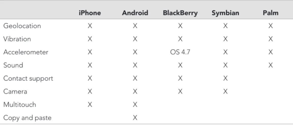
PhoneGap also lets you take advantage of the features of individual cell phones (e.g., geolocation, accelerometer). Table 5.1 shows a list of all supported features of PhoneGap.
26
p H o n e g A p
What follows is a brief explanation of the PhoneGap features and examples of how they work in practice:
Geolocation: Geolocation is a feature in every newer-generation smartphone that enables the phone to use its internal GPS to determine its real-time location. What does that mean for an app? It could, for instance, let library patrons find out where the library is located in relation to their own position and help them get directions.
vibration: Vibration lets you take advantage of the internal vibration setting available on phones. For example, developers could create an app that notifies users of alerts through vibration.
accelerometer: An accelerometer is a feature first made popular by the iPhone but now available in nearly all phones. This feature rotates the screen when the phone is turned on its side.
camera: All camera phones are built differently, and using the camera feature will likely result in some glitches.
A complete list of PhoneGap’s features can be found online (http://wiki.phonegap .com/Roadmap/); the site is updated often and includes extra documents and discus-sions where developers can find support.
vIEWING yOur WEBsItE ON phONEGap
Now it’s time to see how your library’s website looks on a mobile device. If you have a mobile phone, then this is easy; but just because your website looks great on Android doesn’t mean that it will look equally great on an iPhone or a BlackBerry.
iphone android BlackBerry symbian palm
geolocation X X X X X vibration X X X X X Accelerometer X X os 4.7 X X sound X X X X X contact support X X X X camera X X X X Multitouch X X copy and paste X
27 p H o n e g A p
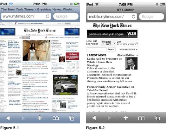
Figures 5.1 and 5.2 show two websites from the New York Times; figure 5.1 shows how the site looks on the iPod and iPhone as a regular site (not a mobile one); it’s nearly impossible to read without zooming in, which isn’t always practical for every user. Figure 5.2 is the New York Times mobile site, which is much easier to read on a smaller screen.
Figure 5.1 Figure 5.2
You want to know what your mobile site looks like on every phone imaginable. PhoneGap makes this easy; it has cell phone skins for testing websites on nine different phones (iPhone, Android G1, Blackberry Storm, Blackberry Bold, Palm Pre, Nokia N97, Samsung Epix, Sony Ericsson Satio, Sony Ericsson Rachael).
To test a website, run the PhoneGap Simulator (www.phonegap.com/tools/). When the Debug Panel (shown in figure 5.3) appears, type in the website address in the address bar and then click the right-arrow button.
28
p H o n e g A p
rEDIrEctING tO a MOBILE sItE
If you decide to have a mobile version of your site, then you will have to decide how to get phone users to it. There are two ways. First, simply have two addresses that you give out: a computer address and a mobile address. You can tell your patrons to add “m” to the address when accessing the site from a phone (e.g., m.library.com).
The second way is a little more difficult. It requires that you add code into your page that tells the page to search for the user’s browser. If they are using a mobile browser, then they will be redirected to the mobile-friendly site. You need to understand PHP programming to implement such a task. You can also buy the code for $50 (http://detect mobilebrowsers.mobi/).
IMpLEMENtING phONEGap
I won’t go into detail here about how to get the apps onto every phone—it varies widely depending on the phone and there are often monthly updates. But you can readily find any information you need on each phone’s website or check out the information pro-vided at PhoneGap:
▪
iphone: http://www.phonegap.com/start#ios▪
android: http://www.phonegap.com/start#android▪
BlackBerry: http://www.phonegap.com/start#blackberry▪
WebOs: http://www.phonegap.com/start#webos▪
symbian: http://www.phonegap.com/start#symbian▪
Windows Mobile: http://phonegap.pbworks.com/ Getting-Started-with-PhoneGap-(WiMo)If you want to view the website using a different skin, then click once on Menu in the PhoneGap Debug Panel, select Skin, and pick the phone that you want to switch to (figure 5.4).
29
crEatING a BarE-BONEs NatIvE app
This chapter will help you create a quick, bare-bones app that will run on the iPhone. I use the iPhone as an example because it is the device that most users will have for native apps—although Android is quickly catching up. The iPhone is also the easiest device to quickly develop apps for.
Despite some negative press about the iPhone app process being overly protec-tive and the rejection of apps left and right, it is surprisingly easy and very friendly to PhoneGap’s open-source framework. As long as you adhere to the iPhone guidelines, which aren’t as strict as they are sometimes made out to be, you will have no problem developing your app.
The first thing you need to do before you begin developing any app, be it mobile or web, is to draft a concept of what you want it to include and look like. I recommend MockApp (www.mockapp.com), a free service that lets you use PowerPoint to develop a sample iPhone app, one that you can run on your device as a PDF. It’s one thing to tell library administrators that the library needs an iPhone app; it’s another thing to show them what the app will look like. Developing a
sam-ple app will let you quickly demonstrate what the app will look like and how patrons can take advan-tage of its features. As you develop the app, keep in mind that you don’t want to have to update things too frequently.
I show here the app that I developed for this book (it’s meant to look like an iPhone screen). The end of the chapter provides the code for the app.
Unlike a mobile web app, for which you have to be very careful with images, native apps can feature a few more graphics (see figure 6.1). All of the images I used for this basic app came from the Open Clip Art Library (www.openclipart.org), a great resource for libraries.
Box 3 shows the code used for figure 6.1 for your reference.
6
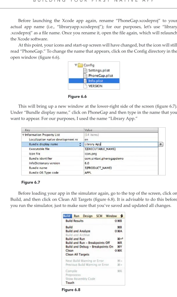
BuILDING yOur FIrst
NatIvE app
30
b u i l D i n g y o u r f i r s T n A T i v e A p p
BOX 3 n code for Library app
<HTML> <head>
<title>Generic Library Logo</title> <style type=“text/css”> .style1 { text-align: center; } .style2 { text-align: center; font-size: x-large; } .style3 { margin-right: 0px; } </style> </head> <body>
<table style=“width: 852px; height: 115px”> <tr>
<td class=“style2” colspan=“3” style=“height: 19px”><strong>Generic Library Logo</strong></td>
</tr> <tr>
<td class=“style1” style=“height: 23px; width: 283px”><strong><br /> <img height=“90” src=“call.jpg” width=“65” /><br />
<br />
Callstrong></td>
<td class=“style1” style=“height: 23px; width: 283px”><br /> <strong><img height=“90” src=“hours.jpg” width=“90” /><br /> <br />
Hours</strong></td>
<td class=“style1” style=“height: 23px; width: 284px”><strong><br /> <img class=“style3” height=“86” src=“map.jpg” width=“94” /><br /> <br />
Locations</strong></td> </tr>
<tr>
31 b u i l D i n g y o u r f i r s T n A T i v e A p p
<img height=“88” src=“book_catalog.j