Worcester Polytechnic Institute
Digital WPI
Masters Theses (All Theses, All Years) Electronic Theses and Dissertations
2013-04-19
Leveraging User Testing to Address Learnability
Issues for Teachers Using ASSISTments
Joshua Bodah
Worcester Polytechnic Institute
Follow this and additional works at:https://digitalcommons.wpi.edu/etd-theses
This thesis is brought to you for free and open access byDigital WPI. It has been accepted for inclusion in Masters Theses (All Theses, All Years) by an authorized administrator of Digital WPI. For more information, please [email protected].
Repository Citation
Bodah, Joshua, "Leveraging User Testing to Address Learnability Issues for Teachers Using ASSISTments" (2013).Masters Theses (All Theses, All Years). 227.
Leveraging User Testing to Address Learnability Issues for
Teachers Using ASSISTments
by Joshua Bodah
A Thesis
Submitted to the Faculty of the
WORCESTER POLYTECHNIC INSTITUTE In partial fulfillment of the requirements for the
Degree of Master of Science in
Computer Science by
May 2013 APPROVED:
Professor Neil Heffernan, Major Thesis Advisor
Professor David Brown, Thesis Reader
Abstract
The goal of this thesis is to demonstrate how user testing can be used to identify and remediate learnability issues of a web application. Experimentation revolved around ASSISTments (www.assistments.org), an intelligent tutoring web applica-tion in which teachers create virtual classrooms where they can assign problem sets to their students and gain valuable data which can be used to make informed deci-sions. Recent log analysis uncovered very low task completion rates for new users on tasks that were intended to be trivial. Suspecting that this could be due to poor user interface design, user tests were conducted to help identify usability problems. Sessions were analyzed, and changes were made between each user test to address issues found.
Feedback from user testing led to the implementation of an embedded support system. This support system consisted of a splash page which gave an overview of how the system should be used and a collection of context-sensitive tooltips which tried to give the user instructions on what to do as well as explain various parts of the interface. A randomized control trial was performed to measure the effectiveness of the embedded support. 69 participants were shown one of two interfaces: one with embedded support and one without. Task completion rates were analyzed for each of the groups. We found that the support system was able to influence which links a user clicked. However, although the support system was intended to address poor task completion rates, users in the conditions had similar task completion rates regardless of whether the support system was enabled.
Acknowledgements
I would like to thank Neil Heffernan for providing me with the opportunity to be part of the ASSISTments lab.
I would also like to thank David Brown for reading my thesis and giving me useful advice and direction.
Last, but not least, I’d like to thank the members of the ASSISTments lab for making it all worth it.
Contents
1 Introduction 1 1.1 ASSISTments . . . 1 1.2 Problem Background . . . 2 1.3 Problem Significance . . . 4 1.4 Usability . . . 42 Literature Review & Background 6 2.1 User Research . . . 6
2.1.1 Teachers and Technology . . . 7
2.1.2 Learning Theory of Computer Applications . . . 7
2.1.3 Eye Tracking . . . 9
2.2 User Interface Design . . . 9
2.2.1 General Guidelines . . . 10
2.2.2 Paper Prototyping . . . 12
2.3 Forms of Instruction in Computer Applications . . . 13
2.3.1 Documentation and Manuals . . . 13
2.3.2 Help Menus . . . 14
2.3.3 Embedded Support . . . 15
2.4.1 User Testing . . . 16
2.4.2 Heuristic Evaluation . . . 17
2.4.3 A/B Testing . . . 19
2.4.4 Comparison of Usability Evaluation Methods . . . 20
2.4.5 Final Word . . . 21
3 Preliminary Usability Analysis 22 3.1 Motivation . . . 22
3.2 ASSISTments Object & Interaction Models . . . 22
3.3 Navigation Layout . . . 23 3.4 Interface Analysis . . . 26 3.5 Conclusions . . . 31 4 User Tests 34 4.1 Overview . . . 34 4.2 Methods . . . 35 4.2.1 Interview . . . 36 4.2.2 Observation . . . 36 4.2.3 Post-Test Discussion . . . 37 4.2.4 Analysis . . . 37 4.2.5 Development . . . 38
4.3 Test 1: Initial Design . . . 38
4.3.1 Session Brief . . . 38
4.3.2 Analysis . . . 39
4.3.3 Development . . . 40
4.4 Test 2: Page with Reduced Noise, Changed Vocabulary, and Stronger
Redirection . . . 41
4.4.1 Session Brief . . . 42
4.4.2 Analysis . . . 43
4.4.3 Development . . . 44
4.5 Test 3: Context-sensitive Embedded Tooltips . . . 45
4.5.1 Session Brief . . . 45
4.5.2 Analysis . . . 47
4.5.3 Development . . . 48
4.6 Test 4: Paper Prototype Landing Page with Site Overview . . . 48
4.6.1 Session Brief . . . 49
4.6.2 Analysis . . . 50
4.6.3 Development . . . 51
5 Controlled Experiment for Embedded Support 52 5.1 Overview . . . 52
5.2 Methods . . . 52
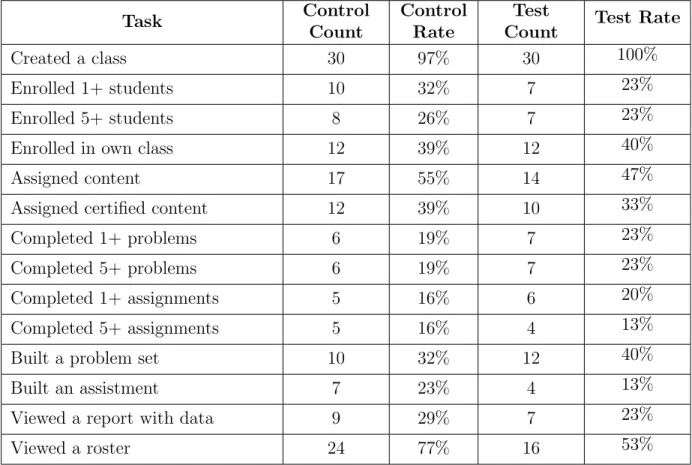
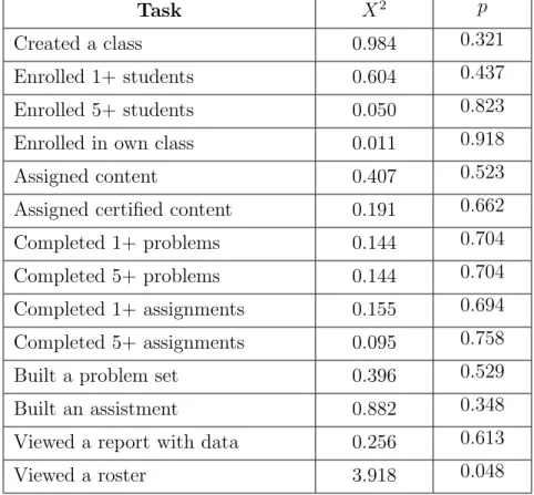
5.3 Results . . . 56
5.4 Analysis . . . 56
5.5 Discussion . . . 59
6 Summary & Conclusions 61 6.1 Summary of Results . . . 61
6.2 Conclusions . . . 61
A Interface Screenshots 63
List of Figures
3.1 (Original design) Account tab . . . 24
3.2 (Original design) Assess tab . . . 25
3.3 Outline of navigation . . . 26
3.4 ASSISTments home page . . . 27
3.5 (Original design) Assess tab with one class . . . 28
3.6 (Original design) Class’ assignments page . . . 29
3.7 (Original design) Class’ assignments page, browsing content . . . 30
3.8 (Original design) Class’ assignments page, after assigning . . . 31
4.1 (Original design) Assess tab . . . 38
4.2 (Iteration 1) Teacher tab . . . 42
4.3 (Iteration 1) Teacher tab with one class . . . 42
4.4 (Iteration 2) Create a class tooltip . . . 45
4.5 (Iteration 3) Paper prototype of landing splash . . . 49
5.1 (Iteration 1) Teacher tab . . . 53
5.2 (Iteration 1) Teacher tab with one class . . . 53
5.3 (Iteration 4) Landing splash . . . 54
5.4 (Iteration 4) Create a class and disable explanation tooltips . . . 55
A.2 (Original design) Account tab . . . 65
A.3 (Original design) Assess tab . . . 65
A.4 (Original design) Assess tab with one class . . . 66
A.5 (Original design) Class’ assignments page . . . 66
A.6 (Original design) Class’ assignments page, browsing content . . . 67
A.7 (Original design) Class’ assignments page, after assigning . . . 67
A.8 (Iteration 1) Teacher tab . . . 68
A.9 (Iteration 1) Teacher tab with one class . . . 68
A.10 (Iteration 2) Create a class tooltip . . . 69
A.11 (Iteration 2) Navigate to assignments tooltip . . . 69
A.12 (Iteration 2) Browse for content tooltip . . . 70
A.13 (Iteration 2) Navigate to Student tab tooltip . . . 70
A.14 (Iteration 2) Complete the assignment tooltip . . . 71
A.15 (Iteration 2) Navigate to Item Report tooltip . . . 71
A.16 (Iteration 2) Navigate to Item Report tooltip 2 . . . 72
A.17 (Iteration 2) View Item Report tooltip . . . 72
A.18 (Iteration 3) Paper prototype of landing splash . . . 73
A.19 (Iteration 4) Landing splash . . . 73
A.20 (Iteration 4) Create a class and disable explanation tooltips . . . 74
A.21 (Iteration 4) Navigate to assignments and roster explanation tooltips 74 A.22 (Iteration 4) Browse for content tooltip . . . 75
A.23 (Iteration 4) Scroll up to enroll tooltip . . . 75
A.24 (Iteration 4) Navigate to Student tab tooltip . . . 76
A.25 (Iteration 4) Enroll in your class tooltip . . . 76
A.26 (Iteration 4) Navigate to student assignments tooltip . . . 77
A.28 (Iteration 4) Navigate to Item Report tooltip . . . 78 A.29 (Iteration 4) Navigate to Item Report tooltip 2 . . . 78 A.30 (Iteration 4) View Item Report tooltip . . . 78
List of Tables
5.1 Task completion data for controlled experiment . . . 57 5.2 Chi-squared of task completion data . . . 58
Chapter 1
Introduction
Formal user interface development methods have contributed to significant usability gains in a number of application areas. In this paper we discuss how formal usabil-ity methods were applied to ASSISTments, an intelligent tutoring web application. Our focus is on teachers who are new to the system. We discuss how several user tests were conducted to assess the user interface and uncover usability issues. New interfaces were developed between user tests to try an address usability issues found. Additionally, we ran a controlled experiment to analyze the effectiveness of an em-bedded support system which was designed to give users a better understanding of the system.
The following sections will give a general overview of what ASSISTments is and how it can be used. We will discuss why we felt the application had usability issues.
1.1
ASSISTments
ASSISTments is an intelligent tutoring web application developed by the Tutor Research Group (TRG) of WPI [RMN+07]. In ASSISTments, teachers can create a virtual classroom, have students enroll in their class, assign problem sets to their
class for their students to work on, view reports of how their students did, and provide remediation using a variety of interesting features. Teachers are also allowed to build, edit, and share content. The system provides users with a lot of flexibility, freedom, and depth.
Teachers in ASSISTments are generally considered to be proficient at the most basic level if they know how to complete three major tasks: create a class, assign content, and view a report. While there is no data to support it, there is an intuition within the TRG that the best way for a new teacher to learn how to complete these major tasks is by following a specific sequence of steps (which we will henceforth refer to as the “TRG-proposed learning sequence”). It is believed that new teachers should, in order:
1. Create a class.
2. Assign pre-built content to their class. 3. Enrolling in their own class as a student. 4. Complete their assignment as a student.
5. View the data they generated in their Item Report as a teacher.
The validity of whether or not this sequence is the best way for a teacher to learn the system is up for debate, but it certainly seems reasonable. Teachers who do this will have gained experience handling most of the major structural components of the system.
1.2
Problem Background
Research in ASSISTments up until now has mostly targeted students, usually in
Little research has been conducted on teachers using the system, and none has been done that addresses usability. However, recent analysis has shown that teachers, in general, have very low task completion rates. We analyzed teachers who created an account during the 2011-2012 school year and found the following statistics:
• 53% created a class;
• 17% enrolled 5+ students;
• 17% enrolled in their own class as a student;
• 33% assigned any content;
• 22% assigned WPI certified content;
• 18% had students complete at least 1 assignment;
• 12% had students complete at least 5 assignments;
• 50% built a problem set.
As one can see, only half of new users even complete the first step of the “TRG-proposed learning sequence”. These numbers don’t come as a big surprise. It doesn’t take much effort to realize that the site is complicated and confusing.
In-depth personal training has been the TRG’s primary way of teaching the system to new teachers. As the system’s popularity grows and spreads, the require-ments for training have been stretched beyond the TRG’s capabilities. In the Fall of the 2012-2013 school year, a controlled experiment was performed to measure the effectiveness of an online class. Half of the users who signed up for ASSISTments were enrolled in an online class which lasted several weeks. In this class user’s were provided with assignments which consisted of using ASSISTments to do various
things (such as create a class and build content). Users were also provided with a forum to ask questions and communicate with other users. The control group did not have any class and had to learn ASSISTments from the interface and documen-tation alone. Users in the online class were found to have no significant advantage over users who simply tried using the site with existing documentation. The only difference was that the online class took a lot more time, money, and effort.
At that point, the TRG decided to test if the problem was inherently a user interface problem. Usability, learning theory, and user interface design techniques were researched and applied in an effort to address this learnability problem. It was decided that a series of user tests would be performed to identify usability issues and drive development decisions aimed at addressing them. The development of these tests was then analyzed further using a controlled experiment to assess the effectiveness of the changes.
1.3
Problem Significance
Our research has two significant components. First, it is a case study which shows how a formal user interface design process can be used to make a site easier to use. It also examines the effectiveness of embedded support as a tool to address learnability issues.
1.4
Usability
Before we talk about the various literature that exists, it makes sense to first define
usability. The International Organization for Standardization (ISO) defines usability as “the extent to which a product can be used by specified users to achieve specified goals with effectiveness, efficiency and satisfaction in a specified context of use”
[fS98]. Additionally, Nielsen explains that usability is composed of five principles [Nie12]:
1. Learnability How easy is it for users to accomplish basic tasks the first time they encounter the design?
2. Efficiency How quickly users can perform tasks once they’ve learned the design?
3. Memorability How easily can users regain proficiency with a design after a
period of not using it?
4. Errors How many errors do users make, how severe are those errors, and how
easily can they recover from them?
5. Satisfaction How much do users like the design?
In our research we are particularly interested in learnability. We want to make it easier for new teachers to use ASSISTments. This mean that we will be interested in knowing how they reason about the user interface. We will want to identify the parts of the interface make it difficult to understand which tasks the system can be used for as well as how the system can be used to perform those tasks.
Chapter 2
Literature Review & Background
2.1
User Research
It makes sense to start by trying to understand the users who use the ASSISTments interface. The target user base for the interface we are concerned with consists primarily of middle school math teachers. From interacting with users, we know that most of these teachers were born roughly between 1950 and 1990. Note that this population stretches the technology divide caused by the introduction of the Internet, so users have a wide range of previous experience with computers. Some teachers are extremely well-versed in or have come to teaching from technology-centric fields such as engineering, while others have very little experience using the Internet.
Bridging this gap between users is a serious challenge. Understanding how in-dividuals use technology has provided us with a deeper insight into fundamental issues relevant to the existing learnability issues in ASSISTments.
2.1.1
Teachers and Technology
Technology is a rapidly growing force in education, and many schools are approach-ing a one-to-one student-to-computer mappapproach-ing. Maine, for example, recently started a program requiring middle schools to provide laptops for all of its students [SL04]. Despite this rapid growth in technology, survey results show that only 20% of teach-ers feel well prepared to use technology in the classroom [CFCM02].
While teachers’ feelings about technology improve greatly with professional de-velopment [CFCM02], training is costly and doesn’t scale well to a large number of users. As an application developer, it is crucial to understand that many users already have trouble using technology to begin with. This implies that many teach-ers may not be familiar with certain paradigms that those of us who use computteach-ers every day take for-granted (e.g. the concept of copying and pasting text). An effec-tive interface for teachers would be usable even by teachers with minimal experience with computers.
2.1.2
Learning Theory of Computer Applications
Carroll and Rosson published an influential paper in 1987 which addresses issues relative to the learnability of computer applications [CR87]. In particular they note that people have difficulty learning how to use computers, and peoples’ skills with an application tend to peak before mastering a system. Carroll and Rosson claim that these problems are due to “conflicting motivational and cognitive strategies” as opposed to design.
They introduce the concept of the active user. In the case of an inexperienced computer user, this could refer to someone who is overwhelmed by advertisements, instructions, graphics, and links, among other things. Such users do their best to
make sense of all of the information they are given and make an educated decision, but it could be the case that some information is ignored. These users often just try something and see what happens; they “simply strike out into the unknown”. Experienced users are only different in the sense that they can build on their previous knowledge. In both cases, users rely on adaptive learning strategies to solve issues of learnability. However, these adaptive strategies may not be adequate for a given situation, and this leads to learning problems.
Carroll and Rosson continue to describe two paradoxes. The first is the produc-tion paradox. Users only want to learn new tools so that they can use them to get work done, but getting work done can be an issue if users lack the skills necessary to use a tool. They do not typically want to simply learn a tool; they want to learn that tool to do something with it. This explains situations where users may get frustrated with long-winded tutorials and wizards.
The second paradox Carroll and Rosson discuss is one they call the assimilation paradox. Often the new concepts that people learn are built on previously mastered knowledge. However, it must also be true that people learn other ways or else they would never learn new things. This previous knowledge can sometimes influence users such that they are unreceptive to new ideas and they can get stuck by relating existing knowledge to their current context incorrectly. This can lead to a negative transfer of learning, in which a user’s learning and performance are impaired by some previous experience or behavior.
Carroll and Rosson suggest a number of ways to attack, mitigate, and design for these two paradoxes. For the production paradox, they suggest that a system make learning rewarding and easy, and that it utilizes the user’s desire to learn the system. For the assimilation paradox, they suggest that designers either try to avoid any potentially confusing connections caused by previous knowledge or to embrace
the user’s previous knowledge by describing the system as something familiar. Ad-ditionally, designers should anticipate situations in which previous experience may fail the user while exploiting the situations in which it is beneficial.
2.1.3
Eye Tracking
Knowing how users physically react to interfaces is also of importance to under-standing effective user interface design. Nielsen reports that English-speaking web users spend 69% of their time viewing the left half of the page and only 30% of it viewing the right half [Nie01b]. He goes on to recommend that all of a site’s most important information (like navigation) be all the way to the left so it may get the most attention.
In another article, Nielsen also relates that plain text, along with faces and sexually explicit images, is one of the most effective design elements for attracting a user’s attention[Nie07]. He reports that regular internet users have been trained to ignore anything that resembles an advertisement, hence the adherence to plain text.
He also talks about the F-pattern that users use to scan pages. Users’ eyes follow along the left side of the screen while scanning. When they find something interesting they read across. The pattern makes the shape similar to the letter ’F’. Nielsen also relates that scanning is more common than reading[Nie07].
2.2
User Interface Design
User interface design is sometimes written off as an intuitive matter in which the guiding principles are obvious. Gould and Lewis [GL85] suggest that the process of designing usable human-computer interfaces is guided by three principles:
1. have an early focus on your users and the tasks they perform 2. measure interface changes empirically
3. have an iterative development cycle
They conducted a survey of systems planners, programmers, designers, and devel-opers in the 1980’s asking them to list the steps they thought one should go through when designing a computer system for end users. From this experiment they found that only 62% of the population mentioned an early focus on users, only 40% men-tioned doing any sort of empirical measurement, and only 20% menmen-tioned some form of an iterative design process. While Gould and These results suggest that there is some level of confusion as to what steps one should take while developing an interface as to maximize its effectiveness, and that the process for effective user interface design can not be entirely intuitive.
Today user interfaces get much more attention than did in the days of Gould and Lewis, but their proposed process of iteratively getting feedback from users, creating changes, and testing those changes is the heart of modern user interface design.
2.2.1
General Guidelines
We’ll be designing a user interface for users in an actual production environment so it makes sense to gain a pragmatic understanding of what makes an interface effective. Carroll and Rosson’s ideas discussed previously are the theoretical backbone to a lot of the ideas we are about to present [CR87].
Krug’s book Don’t Make Me Think is a practical guide to interface design and is full of web usability insight [Kru06]. As the book’s title suggests, one of the major ideas Krug pushes for is not making the user think. In other words, make the
interface explicit and clear enough so that users don’t need to spend time trying to deduce how it works. The site should be self evident. Using web conventions that have already been established is one way to achieve this and reduce the mental load on your users.
Krug gives examples of using wording that is easy to understand (e.g. “Jobs” vs. “Employment Opportunities”) and making visual elements clear (e.g. a button that is clearly clickable vs. a string that may or may not be clickable). The idea of using familiar knowledge and making things self-evident are exactly what Carroll and Rosson recommended to deal with the paradoxes of the active user.
Krug goes on to explain some of the ideas presented by Carroll and Rosson[CR87] and Nielsen[Nie07]. He explains how to design pages for scanning suggesting readers to create clear visual hierarchies, use conventions, break pages into clearly defined areas, make clickable things obvious, and minimize visual noise (e.g. condensing large blocks of text, eliminating unnecessary visual elements, etc.).
Krug highlights two features which he considers to be the most important fea-tures of any web site: the navigation and the home page. Navigation is particularly important because computers do not give us the same intuitions as real life naviga-tion does. He mennaviga-tions that we have the same sense of sense of scale, direcnaviga-tion, or location as we do when we are navigating a physical space, so having good naviga-tion in a virtual space is a must. Naviganaviga-tion acts as a familiar fallback for when one is lost. It also tells users what the site provides by establishing a visual hierarchy and tells them how the site can be used.
Some recommendations that Krug gives include having a site logo in the top left of the screen, limiting navigation to two levels and breaking navigation down into clearly defined sections and subsections, separating utilities (e.g. Help) from other navigation elements, having a way to search as well as a way to return to the home
page, and using breadcrumbs, text at the top of a page which details how the user got there (like a trail of breadcrumbs in a maze).
The home page has different objectives. Krug explains that the home page should show users what they are looking for, expose them to some new things that they might not have considered and might be interested in, and show users where to start using the site. A home page should convey the message of the site quickly to the user.
Between the navigation and the home page, users should have a clear idea of what the site can be used for and how they can get started doing what they want to do.
2.2.2
Paper Prototyping
Paper prototyping is a technique in which an interface design is rapidly produced on a piece of paper. It typically occurs early in an interface’s design phase and has the advantage of abstracting many of the details that one might have to focus on during implementation. The key here is that paper prototypes are meant to be cheap and rough. Complex interactions can be simulated by using multiple pieces of paper.
Paper prototypes can be used during user tests to allow for quick iterations and are effective at testing layouts, wording, colors, and getting a general feel for how a user interface might work prior to implementation. They can reducing the overall cost of producing an effective interface since they can find usability problems before any costly development is done.
2.3
Forms of Instruction in Computer
Applica-tions
Most people would agree that having someone teach you something is the best way to learn about it. Unfortunately, that paradigm just isn’t practical in computer applications. While the best-case scenario for any application is that user’s know how to use it from the very start without any instruction, some applications require stand-alone forms of instruction to ensure that users understand how to use it.
Here we discuss some of the types of instruction or support that computer ap-plications have used.
2.3.1
Documentation and Manuals
Many websites provide support to their users in the form of documentation. These are typically elaborate, heavy-weight documents that are thorough but wordy. Es-sentially, these are the digital equivalent of paper manuals. They often times reside in their own section of a website, forcing users who want to view them to experience some misdirection from their current goals.
Documentation is, in fact, so ineffective as a teaching tool that usability expert Jakob Nielsen has devised two “Laws of Computer Documentation”: the first being that “people don’t read it”, a slight exaggeration to prove the point that users very rarely read documentation and the second being that “users read system documen-tation only when they are in trouble” [Nie01a].
Retting reiterates the point that people typically don’t read documentation and goes into detail distinguishing different styles of documentation, commenting on their effectiveness and practical use [Ret91].
2.3.2
Help Menus
Current research supports the claim that users, in general, do not like to refer to external help when learning. Grayling conducted ten user tests (five with inexperi-enced users and five with experiinexperi-enced users) to study how users approached scenarios in a system with a documentation support base [Gra98]. He and his team took great care when designing the support base by performing usability tests throughout its design. Links to the support base were kept in a “Help” menu on the user interface. When it came to testing a working prototype, he and his team found that users ini-tially approached scenarios by trying to learn on their own through trial and error. They reasoned about the information provided by menu titles, tried something, and scanned dialog boxes for anything that seemed relevant to the scenario they were working on.
While this behavior was expected, Grayling was surprised to find that users resisted clicking on the “Help” menu even after failing to learn on their own. He reports that some subjects showed explicit signs of frustration and still ignored the “Help” menu. Some subjects, after failing to learn the interface on their own, did refer to the documentation, but they read it quickly and did not pay much attention it. This just led to more errors. Grayling noticed that those users who – usually out of frustration – did take the time to read the documentation in a careful and methodical manner did perform better. However, users were still very adamant about not using the “Help” menu. In Grayling’s own words: “their whole attitude seemed to be: ‘I don’t want to be here! I don’t want to read all this information that you have so carefully designed and written!”’. Grayling sums up his findings:
• Users go to the help menu only as a last resort
• They are reluctant to even scroll down a help screen
• General overviews are often ignored
Spool reports similar results after conducting over 2,000 user tests [Spo96][Spo97]. Grayling also claims that the users did seem to like the embedded help they received. He hypothesizes that there are several guiding principles for creating a good help system. In particular, he believes that a help system should be:
• Context-specific • Easily available • Obvious to invoke • Useful • Non-intrusive
2.3.3
Embedded Support
Embedded support refers to any help that is given to the user that does not re-quire them to leave their current context in a computer application. Parush and Parush explain how they used embedded support to solve usability issues of users not knowing where to begin using a system and of users not knowing what buttons mean [PP01].
2.4
Usability Evaluation Methods
If science has taught humanity one thing, it’s that our intuitions are often wrong. Due to this, testing is of utmost important when developing a user interface. Small
changes to an interface can have very large results. In one case study involving an e-commerce site, Kohavi et al. studied the effects of adding an input box for a coupon code to a payment form in a checkout process [KLSH09]. One might intuitively believe that giving users a way to use coupons to save money would increase sales. However, upon testing the interface, they found that the interface resulted in a 90% loss of revenue. This could have been due to several reasons: the coupon code could have reminded users that they might be able to find the products for a cheaper price elsewhere; entering the coupon code required typing which is error-prone; and the user experience was disrupted because the user felt the need to go and search for a coupon code.
The following sections describe three of the major ways of evaluating an inter-face’s usability: user testing, heuristic evaluation, and A/B testing.
2.4.1
User Testing
User testing is the most basic, and perhaps the most useful, form of usability testing. It simply consists of watching new users – preferably ones representative of those who would actually use your interface – perform tasks with an interface design. The main idea behind user testing is that those who have worked intimately with a project or interface are already experts on the system and have already made mistakes and learned from them. By working with new users, one gains tangible insight when the user make mistakes with the interface. Theses mistakes can usually be mapped back to specific interface design decisions and act as aids in identifying design flaws.
There are many variations in user testing that vary from case to case. One particular area for variation is in the choice, length, and frequency of the tasks for the user. In some cases it may be best to give the user one broad scenario, while in
others it would be more revealing if the user was given many short, specific tasks. The “think aloud” protocol, as described by Lewis[Lew82], is the backbone of many forms of user testing. Users are encouraged by the test administrator to speak about what they are trying to do, what they believe elements of the design will do, and what they think they need to do next to achieve their goals. This allows the observer to better understand the user’s thought process relative to the task and design. Observers may take notes, which are often in the form of audio-video recordings and screen captures, which they can compile later to draw inferences about how well the design worked and what improvements could be made. It is often the case that the testing is done in a dedicated testing room equipped with a one-way mirror so that others can observe the test as well.
It is important during the test that the test administrator let the user provide feedback which is uninfluenced by the tester. The user should be free to fail or succeed in using the design to complete tasks. With that said, it’s important to keep in mind the reason why a test is being performed. For example, if the purpose of the test is to identify new usability problems, then the test administrator should make sure that the test time is used effectively as to pursue this goal. There’s no sense in frustrating a confused user, especially if no new useful data is coming from it. Krug writes about how to conduct user testing inexpensively [Kru10]. He covers everything from scheduling sessions and finding participants to analyzing results.
2.4.2
Heuristic Evaluation
Nielsen and Molich developed heuristic evaluation in 1990 [NM90]. It is a usability testing method in which evaluators are given a list of heuristics which they will use to judge an interface design. Evaluators need to be trained, but they do not need to be representative of the users who will use the design. The purpose of heuristic
evaluation is to identify problems with a design without having to go through the effort of testing it with users. It is cheap and can be done with any individuals capable of providing an unbiased evaluation of the design based on the heuristics chosen. Nielsen defines ten heuristics in his book Usability Engineering[Nie94]:
1. Visibility of system status The user should always know what the system is
doing and receive responses in a reasonable amount of time.
2. Match between system and the real world The system should abide to the
standard domain language used by the user and follow real-world conventions.
3. User control and freedom The system should provide clear ways to easily
leave an unwanted state.
4. Consistency and standards The system should use the same language and
protocols throughout its entirety so as to keep from confusing the user.
5. Error prevention Eliminate error-prone conditions or alert the user before
they commit an action which may result in an error.
6. Recognition rather than recall Minimize the user’s memory load by making
objects, actions, and options visible.
7. Flexibility and efficiency of use Use accelerators to hasten the interaction
for expert users, but hide them from novice users so that the system may cater to both.
8. Aesthetic and minimalist design Hide information that is irrelevant or rarely needed.
9. Help users recognize, diagnose, and recover from errors Express error
10. Help and documentation Provide help and documentation that is easy to search, focused on the user’s task, and give clear and concise instructions.
2.4.3
A/B Testing
A/B Testing is a way of running a randomized control trial to measure the effects of interface changes on the web [KLSH09]. It is sometimes also referred to as split testing or multivariate testing. In this approach, two (or more) interfaces are de-signed for the same task and fully implemented. Users are randomly split into experimental groups (one for each interface) and each is shown a different interface. An overall evaluation criterion (OEC), which is also sometimes called a key perfor-mance indicator, is predetermined and measured throughout the experiment. The OEC’s purpose is to monitor some goal objective. For example, an OEC that an e-commerce site might use is the number of sales, so the experiment may measure the difference in the number of sales between multiple interfaces. If the difference is found to be statistically significant, it can be said with some degree of accuracy that one interface is better than the other given the OEC chosen.
Kohavi and Longbotham mention several important topics regarding A/B test-ing such as the importance in choostest-ing an OEC in advance, how to avoid web crawlers which may skew results, and the pros and cons of various implementations. Some interesting design pitfalls (such as picking a poor OEC like “time spent on a page”), as well as explanations of the analysis on some puzzling experiments, are also documented [KDF+12][KCL09][CFKL09]. One particularly interesting finding that Kohavi mentions (with respect to a study done at Microsoft) is that only one third of the ideas that were designed to improve some OEC actually showed an improvement after testing [KCL09].
small changes can have very large impacts. Siroker writes about how simple A/B testing was used during Barack Obama’s presidential campaign to try and gain more supporters [Sir10]. Splash pages with different text and images were compared, the best of which had an 11.6% supporter sign-up difference. The average supporter ended up donating around $21 which translated to an additional $60 million in donations. Burke provides a list of problems that are often approached by apply-ing A/B testapply-ing which includes makapply-ing decisions about page layouts, navigation schemes, button placement, category names, and much more [Bur05].
2.4.4
Comparison of Usability Evaluation Methods
The three previously mentioned evaluation methods are all very different; each excels at something different. User testing can be very insightful as it can help the testers understand why a particular error is occurring, leading to a potential for a larger benefit. It helps the test team in determining what is confusing. User testing also doesn’t need full implementations and can work on paper prototypes. However, pinpointing small differences through user testing can be difficult. User testing also requires a significant amount of time and money to schedule and conduct. Lastly, the conditions of the test environment may not accurately reflect those of the real world [Nie05].
Heuristic evaluation is very cheap and does not require representative users at all. This makes it a very convenient choice for testing as it doesn’t require finding and scheduling specific types of users like user testing does. It also works on paper prototypes. However, the biggest criticism for heuristic evaluation is that it does not involve the end-user at all. Some believe that heuristic evaluation loses credit since it does not measure actual behavior under real-world conditions.
set-up once a testing framework is established. However, it can require a large number of samples to yield a statistically significant result. For this reason, it is particularly popular on the web because of the amount of traffic that a site can get. With enough traffic, it can be performed on a weekly basis and can be used to test almost anything. A/B testing can be used to detect very small differences with high statistical significance. Some drawbacks include a restriction to measuring a single OEC at a time, they only work with fully implemented designs, they often require a large sample size to get meaningful results, and they do not provide behavioral insight like user testing [KLSH09].
2.4.5
Final Word
It’s important to remember that each of these usability methods have specific pur-poses. Heuristic evaluation, for example, is very good for getting meaningful feed-back very quickly in the early design stages as well as with implemented systems. In an ideal world, it could help narrow down which interfaces to try with actual users. User testing is excellent for getting behavioral insight which can help identify large misconceptions. A/B testing excels where user testing is too unclear. It is best used for aiding in decisions about small changes like button placement or color.
Chapter 3
Preliminary Usability Analysis
3.1
Motivation
Prior to performing any user testing, a preliminary analysis of the interface was performed as preparation. The interface was analyzed with respect to the principles of design researched and discussed earlier in this paper. This process was informal and did not follow any specific heuristics. The purpose of this analysis was to see if poor usability seemed like reasonable cause for the issues that teachers were experiencing.
3.2
ASSISTments Object & Interaction Models
In this section we will define the vocabulary, structure, and interaction model used in ASSISTments. To make this section easier for the reader, we will denoteobjects in bold and actions in italics.For all relevant purposes, there are two types of users in ASSISTments: students
andteachers. Both types of users must first create an account. Teachers may create
A problem set is a collection of questions. These questions are called assist-ments. There is a great deal of pre-built content that teachers have access to. Problem sets are organized in folders. Teachers may assign problem sets to their classes. These assigned problem sets are referred to as assignments. Students enrolled in a teacher’s class may open any assignment in the Tutor and complete
that assignment. After that, a teacher may view the student’s data in the Item
Report.
Teachers have several other special privileges. They maybuild content, whether it be a problem set or an assistment. They may also organize their assignments and built content into folders. Lastly, any teacher is allowed to do anything that a student can do. That is, every user that is a teachercan act as a student.
3.3
Navigation Layout
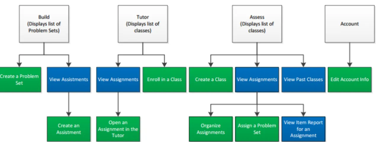
The general navigation of the site is broken down into a tab structure (see Figure 3.1). There are four major tabs: Build, Tutor, Assess, and Account. Students can see the Tutor and Account tabs, while teachers can see all four tabs. Each tab is associated with different tasks.
Figure 3.1: (Original design) Account tab
The Build tab allows a user to create their own custom problem sets and assist-ments.
The Tutor tab allows a user to enroll in a class. It also allows the user to view a list of a class’ assignments. Users can open up an assignment in the Tutor, where they can then answer assistments and complete the assignment.
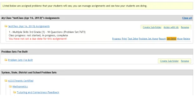
The Assess tab is where a teacher can create a class (Figure 3.2). They can also disable a class and view classes that they might have taught in the past (a list of disabled classes). A teacher can view their class’ assignments. They may also
browse through folders there to assign a problem set. Once a student has completed an assignment, the teacher may then view the Item Report for that assignment.
Figure 3.2: (Original design) Assess tab
The Account tab displays a user’s account information such as their login and e-mail (Figure 3.1). Users can edit their account information here.
In summary, the important parts of the navigation are structured as in Figure 3.3. The white blocks represent the four navigation tabs, each of which is always accessible. The blue blocks are more for navigation (e.g. viewing a list of assign-ments) while the green blocks are more task-oriented (e.g. can assigning a problem set).
Figure 3.3: Outline of navigation
3.4
Interface Analysis
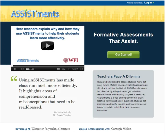
When a user visits ASSISTments, they are greeted with the home page, an adver-tising page designed to entice users into creating an account (Figure 3.4). Once a teacher has created an account, they are sent to the account tab (Figure 3.1). The reason for this is so that user’s won’t forgot their login information (such as their display name). There is a yellow box of text at bottom of the screen with an out-dated screenshot (it is missing the Tutor tab and the subtabs are incorrect) which is supposed to tell the user how to get started. It also references a Wiki-style documentation page. Other than that, there is no indication of what to do. The wording of the tabs feels unclear. Teachers have questioned this wording in the past.
Figure 3.4: ASSISTments home page
The “TRG-proposed learning sequence” would have a user click the Assess tab. The Build tab is the left-most tab, and Nielsen claims that the left-most part of the screen gets the most attention from users [Nie01b]. This helps explains why 50% of users in 2011-2012 tried to build a problem set.
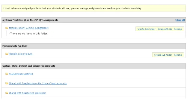
Supposing a teacher does click the Assess tab, they are sent to a page where they can create a class (Figure 3.2). There is some help dialogue and a link to the user’s past classes (even though the user has no classes, past or otherwise). Once a user clicks to create a new class, they are given a form which asks for various class details. Once the form is submitted, the interface dynamically populates the class
list with the new class (Figure 3.5). The user can then view their class’ roster, view their class’ assignment list, or disable the class.
Figure 3.5: (Original design) Assess tab with one class
The class roster link is to the far left of the class-specific links. This suggests it will get the most attention [Nie01b]. Additionally, the link furthest to the left is not the link the class’ assignment list (which is the next click for the “TRG-proposed learning sequence”). The teacher can also disable the class. One odd thing to note is that the “class [a teacher] taught in the past” are essentially disabled class, so the link to one’s past/disabled classes does not fully explain what the page that is linked to will do.
No links seen so far have provided the user any sense that they can have the ability to view a report or assign something. To view links to these features one has to click the Assignments link on the class instance. This link is a crucial navigational component in the “TRG-proposed learning sequence”, yet it is embedded in the page rather than being at the top left as is conventional for navigation. The user has no idea these features even exist. Clicking on Assignments link would bring the user to that class’ assignments (Figure 3.6).
Figure 3.6: (Original design) Class’ assignments page
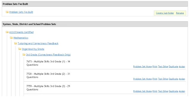
Once at the class’ assignments page, the user is presented with a large number of links: to the roster, various reports, different folder actions, and access to some folders. There’s a select box for choosing a class and a rather uninformative text box. The breadcrumbs at the top of the page add a sense of business as well. The added clutter does not seem worth the small amount of navigational support that they provide. Users can’t click them, and there are no links that allow you to follow your breadcrumbs backwards. Folders are organized into various containers. Again, the place that users should be clicking based on the “TRG-proposed learning sequence” is not supported by the layout; they are expected to click on the ASSISTments Certified folder and to browse for content. When they find something they are interested in, they can click the Assign link (Figure 3.7). The links are very close
together making it hard to distinguish them. The Assign link is all the way to the right, one of the worst spots it could be.
Figure 3.7: (Original design) Class’ assignments page, browsing content
After the problem set is assigned, the assignment list at the top of the page gets updated dynamically (Figure 3.8). There is a visual indicator that something was assigned, but it is not very strong. It is very possible that a user might scroll too far and not notice that the assignment list changed. There are several other issues that are similar to those addressed previously regarding links. Additionally, the next thing the user should do according to the “TRG-proposed learning sequence” is click the Tutor tab.
Figure 3.8: (Original design) Class’ assignments page, after assigning
The Tutor tab is actually fairly straightforward. The interface does not allow the user to make very many errors. Enrolling in a class and completing an assignment are fairly intuitive as they are the only things one can do. The hardest part of following the “TRG-proposed learning sequence” then is clicking the Assess tab and navigating to the Item Report.
3.5
Conclusions
The site clearly has some big usability issues. Below is a summary of some of the usability issues that were found:
• No landing page after sign-up, application redirects user to Account tab. The user’s only visual instruction after signing up is a poorly placed, out-dated
image surrounded by a large body of text. There is no overview.
• No explicit home page. Krug claims that the home page is essential for ground-ing the user and lettground-ing them know what their possible actions are and how they can start using the site [Kru06].
• Features seem hidden under layers of navigation.
• Poor wording choice for tabs (e.g. “Assess” vs. “Teacher”). Does not feel like it matches the names of the domain well.
• Link positioning does not support the “TRG-proposed learning sequence”. The “Build” tab, for example, is all the way to the left. Users need to click elements located all over the screen to progress.
• Many pages are very busy and wordy. There is a daunting amount of text at times.
• Links are exposed to the novice user that they don’t need to care about yet (e.g. link to past classes).
While a major refactoring or redesign may seem like the best solution, it would be both expensive to design and implement and problematic for existing users. Krug recommends trying to tweak a user interface rather than trying to perform a large redesign [Kru06]. He recommends trying to look for cheap changes that yield big gains (e.g. hiding things based on a user’s context, removing text, moving links, etc.).
While we could simply jump in and start making changes, we believe that there is a lot of value in waiting until we see users actually stumble on these problems. We will conduct a series of user tests to try and match user errors to usability
issues. The issues found during this preliminary analysis will be treated as a bank of possible issues that we can look to if we are unable to determine why a user might be encountering a particular error.
Chapter 4
User Tests
4.1
Overview
Since several usability issues were identified during the preliminary analysis, it seemed reasonable to assume that a new interface design could produce an in-terface that was easier for teachers to learn. An iterative approach was used to design a new interface following the recommendations of many usability experts [Nie12][Kru10][GL85]. Four user tests were conducted to test a developing ASSIST-ments interface. That is, changes were made between each user test and tested with the next subject.
Each session consisted of an interview phase, an observation phase, and a post-test discussion. Data was analyzed by several members of the TRG to determine which usability issues were worth addressing, and solutions were proposed. Devel-opment occurred between each session and those changes were tested with the next user.
4.2
Methods
All tests were voluntary, and no compensation was provided to the users. In ad-dition, all tests were conducted at the user’s place of work (a quiet, after-hours classroom in all cases). Only the test administrator observed the session. He was the only other person in the room with the test subject. Tests took between 30 minutes and 1 hour. Each user was an experienced middle school or high school teacher. All users were regular internet users although some were more confident in their technical skills than others. Users were found from personal connections. Having worked with many teachers over the years, we were able to contact friends and relatives who did not use the system and were willing to sit down with us. All users tested were either high school or middle school teachers and felt comfortable using computers and the Internet.
User tests consisted of three parts. First a scripted introduction was read to the user which concluded with a short interview of the user to understand their background. The user was then observed for 15-30 minutes, all the time being encouraged to follow the “think aloud” protocol [Lew82]. Finally, an informal post-test discussion was conducted as a means of seeing how the user felt after the experience was over and to see if they could further describe what they were feeling during the test. Data consisted of server request logs which tracked where the user clicked on the site and written logs collected by the test administrator to record the user’s verbal and emotional responses. User tests were analyzed and changes were made to address specific usability problems. Revisions were then tested in the following user test.
4.2.1
Interview
The interview component of the user test was scripted. Instructions were read aloud to users prior to the observation. The script was based on the one provided by Krug [Kru10]. It explained the purpose of the test, how the user should be honest in their feelings and reactions, and described the think aloud protocol to the user.
After the reading, the user was asked to answer several questions so a background for the user could be established. These questions focused on their experience as a teacher, their experience with the Internet, and their experience using educational software as a whole (whether it be something they use directly with their students or something that supports their teaching, like a grade book).
After these questions, the test moved into the observation phase.
4.2.2
Observation
During the observation phase of the user test, the user was asked to use the system, and the test administrator watched and encouraged the user to follow the think aloud protocol. The test administrator was not allowed to answer questions which might guide the user but was allowed to help the user if they were not uncovering any new usability problems.
The user was first asked to look at the ASSISTments home page. This page is essentially an advertising page which explains ASSISTments in a way to entice teachers to sign-up for an account. The user was asked to explain what they thought they knew about ASSISTments from that page. The user was then assisted in making an account. After an account was made, they were given a general, open-ended scenario to complete:
class next week. I’d like for you to setup ASSISTments such that you can do this.
This scenario was chosen to be intentionally vague to see how teachers’ reasoning compared to that of the “TRG-proposed learning sequence”. Users were then given 15-20 minutes to try to complete this scenario as they see fit. In general, the first 10 minutes were the most useful. Once this time was up and the test administrator felt there was nothing more to learn from the session, the test moved into the post-test discussion phase.
4.2.3
Post-Test Discussion
This phase of the test is where the user was allowed to ask any questions they wanted. The discussion was informal but insightful. The user was told what interface ele-ments were being tested during the session, and the user’s reaction upon hearing this was logged. The user was also asked if they could give a general overview of how ASSISTments worked. The purpose of this was to see whether or not they un-derstood the major components of the system and how they were meant to react. It was used as a metric to see whether the user actually knew how ASSISTments could be used to get work done. They were told the “TRG-proposed learning sequence”, and their reaction was recorded.
4.2.4
Analysis
In the analysis phase, notes and server logs were compiled to identify usability issues. Issues were characterized by misunderstanding, frustration, navigation errors, or slow navigation. They were listed and prioritized by several TRG members. Possible solutions were proposed, and subset of the changes were pushed into development
based on a balance of predicted effect and difficulty to implement.
4.2.5
Development
Changes in each iteration were limited to those chosen in the analysis phase. The changes were made and deployed on a test server for the next user test. In one case, a paper prototype was used due to time constraints.
4.3
Test 1: Initial Design
The original ASSISTments interface was tested first (As in Figure 4.1. See Figures A.3 to A.7 for all screenshots of the original design). No issues found in the pre-liminary usability analysis were addressed. The reason for this was to ensure that every usability change could be mapped to a specific observed usability bug.
Figure 4.1: (Original design) Assess tab
4.3.1
Session Brief
The user tested was a high school Physics teacher of 17 years. She was a regular internet user and had some experience using supportive educational software for
comparing test scores.
Reading the home page, she was able to figure out that the site had something to do with giving students assessments. After signing up, the user was redirected to the Account tab. She expressed verbal signs of confusion as to what she should be doing and clicked back and forth between the Build, Assess, and Tutor tabs. After about two minutes of floundering, she decided to start building content. While building, she managed to view some pre-built content but couldn’t figure out how to make use of it. After roughly ten minutes of exploring the Build tab, the user – still confused – tried exploring the Assess tab. There she began completing the tasks in the “TRG-proposed learning sequence”. She created a class and then immediately accessed her roster. She was greeted with a text blurb which explained how students could enroll in her class and a link to a video which demonstrated how to use the roster page, each of which she glanced over at first and didn’t pay much attention to. When she finally did, she figured out that students sign-up for an account on their own. She then went on to assign some pre-built content, and enroll in her own class. The observation was then terminated by the test administrator due to time.
During the post-test discussion, she related that she felt that the navigation was confusing.
4.3.2
Analysis
Analysis revealed several usability problems. First, the user didn’t have a clear idea of what the intent of the site was after creating an account. It was clear that ASSISTments had something to do with assessment, but she didn’t understand how to begin using the site. The first page she saw was the Account tab which didn’t seem very helpful or meaningful. Naturally, her first click was on the Build tab (rather than the Assess tab) due to it’s top-left position on the interface. Pages
were fairly busy with a lot of text and visual content (horizontal rules, borders, etc). She seemed to have a hard time focusing on the elements that would progress her along the “TRG-proposed learning sequence”. She scanned over much of the instructional text embedded in the site without reading it, relying on intuition first. Once she found that too difficult, she gave in and read the instructions. After being presented the scenario, she had little idea of where to start. Additionally, when she finally started exploring the Assess tab, she followed the “TRG-proposed learning sequence” fairly closely, stumbling upon only minor problems along the way.
4.3.3
Development
The goal of this development iteration was to try and make it so that creating a class was the first thing that users did. Once the user in the this test created a class, she progressed quickly. The majority of her time spent with problems was spent being lost before she tried to explore the Assess tab and create a class.
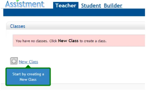
Four major changes were made during this iteration. First, instead of having teachers land in the Account tab after creating an account, they would land in the Assess tab. Relevant account information would be displayed in a flash notice at the top of the Assess tab. This was done to encourage teachers to explore the Assess tab first and to avoid misdirection caused by the Account tab.
Second, many of the pages were made cleaner. Instructional text was removed or shortened, redundant navigation elements were replaced with white space, and information specific to more advanced users was encapsulated and dynamically hid-den for new users. Reducing the amount of visual noise on the page should help the important parts of the page (like the link for creating a new class) catch the user’s attention.
“As-sess”, and “Tutor” are non-standard to the domain of education. In an effort to make the site more self-explanatory, these were changed to the more standard “Builder”, “Teacher”, and “Student” respectively.
Lastly, the tabs were reordered – “Teacher”, “Student”, “Builder” – in an effort to place more emphasis on the Teacher tab [Nie01b].
4.3.4
Post-Development Analysis
The changes from this revision were released on the ASSISTments production servers shortly after they were developed. The TRG felt that the interface already seemed much better. The changes from this revision were monitored for one month. 119 teachers created accounts during this month, and 107 (90%) of those teachers created a class. In the previous month, 99 teachers created an account, 74 (75%) of which created a class. Running chi-squared on these values yields a chi-squared statistic of 8.82, or about a 0.3% chance that the change was by chance. It’s worth noting that the populations were not sampled from the same distribution, given that some users came from one month and more from another, but these numbers provide at least some support that the development made was an improvement if we assume the populations similar. Note that these numbers are significantly better than the class creation rate of 56% over the 2011-2012 school year described earlier.
4.4
Test 2: Page with Reduced Noise, Changed
Vocabulary, and Stronger Redirection
The development from the previous iteration was aimed at getting users to first create a class (Figures 5.1 and 5.2). Thus, one of the goals of this user test was to see whether the actions that users took with the new interface supported these
goals.
Figure 4.2: (Iteration 1) Teacher tab
Figure 4.3: (Iteration 1) Teacher tab with one class
4.4.1
Session Brief
The user had taught high school English for 11 years. She was a regular internet user who mostly used the web for social purposes (e-mail, social media, etc.). She had limited experience with software applications specific to education, but she did use the Internet to help her find content to use in her class. ASSISTments was
presented to her school once a year or two ago, but she did not have a clear idea of what it was. She knew it had something to do with getting data on her students.
During the observation, she created an account and then was redirected to the Teacher tab. The scenario was presented, and the user immediately exclaimed that she was unsure of what to do. She began by creating a class and then examined her roster. She was curious how she got students into her class and was under the impression that she had to enter her students’ names. While there was some instructional text and a link to a video, it was mostly ignored. To save time, the test administrator intervened and told her that she didn’t need to worry about her roster and asked her to assume that her students were already in her class. She was instructed to go back to her class list. She then got very lost; she went into the Student tab and enrolled in her own class. After that, she went into the Builder tab and started creating a problem set. There was lots of terminology used on the site that the user was asking about. She created a problem set and then went into her Student tab to see her class’s assignments. She was surprised that the problem set she created wasn’t already assigned to her class. The user seemed very frustrated, so the test administrator decided to end the observation.
In the discussion after the test the user immediately related that she had no idea what she was doing and claimed that she would have given up had she tried this on her own. When asked to explain the main use of the site, her response was full of gaps of confusion and misunderstanding.
4.4.2
Analysis
There were a number of takeaways from this user test. So far the changes from the first user test seemed to be working; the first thing that the teacher did was create a class. Prior to this however, she explicitly noted that she didn’t know what
it was that she should be doing. This set the tone for the entire session. At no point did it seem like she had any idea of how she would complete the scenario. Some sort of lightweight navigational recommendations or a quick overview of the major components of the site could have gone a long way towards helping the user. Instead, she did her best to do what she thought was logical by creating content. She never realized that there was already a large bank of pre-built content which she could make use of.
Another thing worth mentioning is that she was confused by some of the termi-nology in the Builder tab. Since the Builder is not a part of the “TRG-proposed learning sequence”, this issue was left to be dealt with at a later date.
The user also, like the user from the first session, was interested in knowing about how to fill her roster after creating a class. She was under the impression that she had to submit the names of her students in some kind of form when the actual answer was that her students needed to make accounts and enroll in her class.
4.4.3
Development
The biggest issue was that the user didn’t know what to do. To address this issue, context-sensitive tooltips which showed the user where to click were developed and embedded on pages throughout ASSISTments. The tooltips were designed to walk a user through the “TRG-proposed learning sequence”. Different tooltips would show up based on what the user had already done. The purpose was to give the user direction without restricting the their freedom to explore.
Several other usability problems were noted and solutions were proposed, but they were left out of this development cycle to isolate the changes.
4.5
Test 3: Context-sensitive Embedded Tooltips
The interface in this test had context-sensitive tooltips embedded in it (As in Fig-ure 4.4. See FigFig-ures A.10 to A.17 to see all changes from Iteration 2). The tooltips pointed to the links that walked a user through the“TRG-proposed learning se-quence”. The system made queries about the user’s state and displayed the appro-priate support. Each tooltip had five to eight words explaining what the user was clicking the link for.Figure 4.4: (Iteration 2) Create a class tooltip
4.5.1
Session Brief
The user in this test had 13 years of experience as a high school Math teacher. He was a very experienced internet user with a background working with computer systems. He used several computer applications which assisted him in outlining his lesson plans, but otherwise had limited involvement with educational software. ASSISTments was presented at his school once, but he never tried using it and wasn’t sure how it worked.
Upon viewing the home page, he figured that ASSISTments was a tool that could be used to show evidence of learning. The user created an account and was read the scenario. He created a class and then viewed his roster. Note that he did not follow the tooltip which asked him to assign some content and instead followed his own intuitions. The test administrator let the user explore the roster for a brief period of time and then asked him to assume that enrolling his students was not an issue. The user then continued to follow the tooltips by viewing his class’s assignments. The user browsed the pre-built content and then assigned something. After assigning something, he wasn’t sure of what to do next. He had scrolled down past the view of the tooltip which asked him to enroll in his own class as a student, so the test administrator asked him to scroll up. The user noticed that the problem set he assigned was now listed in his class’s assignments. He also saw the tooltip which encouraged him to enroll in his own class, but he was very adverse to the idea of clicking it. He didn’t understand why the system wanted him to be a student. He felt that he should not be doing this and likened the tooltips to “carrot dangling”. Though reluctant, he followed the tooltips to their completion which eventually led him to his item report. After allowing the teacher to view his item report for a short time, the test administrator ended the observation and transitioned into the discussion phase of the test.
In the discussion the user was able to relate the major components of the system and stated that the system seemed to be a “substitute for paper-and-pencil”. The test administrator encouraged the user to talk about his reluctance in following the tooltips regarding clicking the Student tab. In his response he explained that he didn’t understand why he would act as a student when he is really a teacher. He was told that the intent was two-fold: so that he could experience what his students would experience and so he could generate data which he could then view in an item