Mobile Devices and the New Media: Trends,
Standards, and Development
An introduction to new media prospects on
tablet devices
Apple announced the release of its iPhone back in 2007, and the iPad tablet
in late January 2010. Both were ground- breaking technological initiatives in
mobile computing, and the mobile device concept was born. Based on the
study of information technology’s future, it’s believed that the adoption and
use of iPads and similar mobile devices will grow rapidly in coming years.
Functional significance of this technical specification guide
This Technical Specification Guide will help media designers and developers
to learn and adapt the new media standards and technologies efficiently. This
guide will also examine the current worldwide focus on media development
standards, best practices, and strategies for mobile and tablet devices.
In this document, you will learn about:
•
The latest technical details of mobile devices
•
New media standards
Facts about the mobile device and
tablet market
Currently, worldwide there are four popular operating systems available on tab-lets or mobile devices:
• Apple Touch screen API - iPads, iPhones and iPod Touch devices • Google Android API - Samsung Galaxy Tab, Note, S2, etc.
• BlackBerry’s “Research In Motion” (RIM) API - BlackBerry PlayBook • Windows Touch Screen API - Nokia Lumia with Windows 7.5 Mango
Now mobile devices are increasingly “always connected” devices, not just through text messages and phone conversations, but also as doorways to con-tent on the Internet. Mobile devices, especially smart phones and tablets, enable “anytime/anywhere” access to information, social networks, tools for learning and productivity, and thousands of web applications designed for all aspects of daily life. New devices can capture multimedia, access the internet, or geo-locate. Tablets and smart phones are used for productivity, education, entertainment, social interaction, and more.
Projections suggest that internet-capable mobile devices will outnumber PCs by 2013. However, the mobile web experience has yet to live up to its full potential as compared to the traditional web experience web developers and designers need to understand practical techniques that will enhance mobile web browsing experience. Designing the content and media for the mobile web is not the same as designing for the traditional web.
The newer technological advancements, media trends, and standards in this field are getting restructured very fast, so we have to learn to adapt quickly to these new changes as well as adjust to market demands.
Importance of mobile
devices and emerging
technologies
Just as there has been a major
shift in consumer focus from PCs to Tablets since 2010, Flash-based media developments are not going to stay forever; modern needs will always bring newer per-spectives. Therefore, our common discussion should be divided into
two parts, new HTML5 as Tech
-nology and new Media strategies to support the HTML5 platform. That’s why Adobe Labs recently
developed Adobe® Edge, which is a new web motion and interaction design tool that allows design-ers to bring animated content to web sites, using web standards
like HTML5, JavaScript, and
CSS3. Adobe has already also announced the phase out of Flash Player for browsers.
Apple’s decision to ban Flash from the iOS has had a significant and
continuous impact. Web designers,
including digital and creative staff, shun Flash-based designs for more device-friendly, keyword-rich
formats (HTML5).
While the world has been divided
over Apple’s stand on doing away with Flash, we need to understand that the step in the direction has
already been taken. With Google openly adopting HTML5 for
YouTube, it is only a beginning of
the things to come with HTML5.
Designers need to understand this paradigm shift and devote their efforts toward not only
learning about HTML5 but also, at
the same time, doing\ away with Flash.
New strategies for tablets
More and more web users are accessing the web from mobile devices. As a result, a growing number of businesses and organizations are now beginning to develop a mobile strategy, and make their web presence accessible on tablets and smart phones.
With the availability of sophisticated HTML5 development platforms, organizations are now capable of generating mobile applications and web sites with functionality almost identical to native apps. Several content and media strategies can be applied to design tablet-based applications:
• Effective UX design
• Use of rich media
• Simplicity in design
• Adaptive layout approach
• Fluid width design
Effective UX design: To compete in today’s design-savvy market-place, mobile UX designs not only have to work great, they also have to look great. Beyond that, those looks must enhance the overall mobile experience and create an emotional connection with the user. Too much graphic excitement becomes distracting, and too little makes your interface boring. The best mobile UX design must achieve a balance.
We also suggest incorporating a bit of users’ freedom and flexibility in mobile UX design strategies, because most mo-bile applications and web sites are intuitive in nature, and offer seamless media animations and interactivities without affecting overall functionality. Examples include interactive mobile applica-tions, games, and books and magazines on tablets.
Use of rich media: Viewing all kinds of multimedia content on a mobile device is common these days, so we should think ahead in terms of applying rich media content and meeting market demands appropriately. On the other hand, rich multi-media content may not be openly accessible on mobile devices or tablets because of internet connectivity and technology limitations—mobile web infrastructure still needs significant improvement. Also note that handheld devices such as tablets provide users with the best screen detail, smart touch navigation, ease of viewing, and management of rich media. The popularity of tablets is growing fast, and the demand to have high-end media content will definitely increase.
Simplicity in design: The great part about the mobile web is its simplicity. In the context of mobile content design, simplicity connects to usability. Keep the design clutter-free, and as lightweight as possible. Maximize the use of screen real estate to provide more, while navigating through a simple and uncluttered interface. Since the traditional keyboard and mouse are not required on tablets, a simple design is critical for users to be able to move around with ease.
Adaptive layout approach: Adaptive or responsive web design is the approach suggesting that design and development should respond to the user’s behavior and environment based on screen size, plat-form, and orientation. The practice consists of a mix of flexible grids and layouts, images, and an intelligent use of CSS media queries. As the users switch from their laptops to iPads, the web site should automatically switch to accommodate for resolution, image size, and scripting abilities. In other words, the web site should have the tech-nology to automatically respond to the user’s preferences, eliminating the need for a different design and development phase for each new gadget on the market.
The concept of adaptive or responsive web design is not only about adjustable screen resolutions and automatically resizable images, but also about a whole new way of thinking about design. As we know from the rising popularity of the iPhone, iPad, and advanced smart phones, many new devices are able to switch from portrait to landscape at the user’s whim. Our design strategies should be ready for these situations.
Fluid width design concept: The iPad has no “right” way of viewing web sites; you can view web sites either in landscape or in portrait mode. But for the designer, this means two completely different layouts to design. It is for this specific reason that the iPad highlights the need for smart fluid width design. Using a smart combination of CSS and JavaScript, the user experience can be made to improve drastically. The iPad has a screen resolution of 1024 x 768, so de-signing the layout with 960 pixels (or the 960 grid system) should be fine. However, it’s important to note that the iPad can and will show the web site in both portrait and landscape modes automatically, so having some fluidity or flexibility is a good idea.
Tablet essentials: The screen, colors, and more
Tablets are a new concept in computer technology. Because they are handheld devices, it would be inap-propriate to dismiss them as “mini laptops. They are branded as “slates or tablets” by computer manu -facturers, and mainly contain a touch screen in sizes ranging from 5 to 10 inches. Their touch interfaces enable you to watch movies, read email, browse the web, flip through e-books, or play games.
Understanding the tablet screen myths and screen aspect ratio
It is widely believed that the 10.1-inch screens (measured diagonally) of Android tablets are larger than the 9.7-inch iPad screens, but they are actually 5 percent smaller than the iPad in terms of the image area of the screen. This is due to both aspect ratio geometry (the screen area decreases as the aspect ratio increases) and the Android system bar, which reduces the image area.
The shapes of the tablet screens are also significantly different. The iPad has an aspect ratio of 4:3 = 1.33 (the ratio of width to height) and the Android tablets all have an aspect ratio of 16:10 = 1.60. But because of the Android system bar, the aspect ratio of the image area is larger—1.70—which is rather close to the HDTV 16:9 aspect ratio of 1.78. Therefore, Android tablets are very well suited for watching widescreen videos in landscape mode. They are generally considered too narrow to be useful in portrait mode, however.
On the other hand, the iPad—instead of having a widescreen—has an aspect ratio very close to the standard 8.5 x 11-inch paper, so it is naturally suited for reading a lot of content in portrait mode. In many cases, it is also better for reading content in landscape mode. Because the iPad’s image height is 5.8 inches, and the Android tablets have an image height of only 5.0 inches, you can read more on the iPad before you need to scroll. For watching 16:9 widescreen videos however, the iPad image height is only 4.4 inches—smaller than the Android height of 4.8 inches for 16:9 widescreen videos. The best screen shape will really depend on your intended mix of applications.
Optimizing visuals for high pixel density displays on mobile devices
Recent mobile device releases have raised the bar in terms of display pixel density. The iPhone 4 326 PPI ‘retina display’ is getting a lot of well-deserved attention in this respect. That’s because the retina display’s pixel density is so high that your eye is unable to distinguish individual pixels. This means that text in books, web pages, and email is crisp at any size. Images in games, movies, and photos pop off the screen, and everything is sharper. This trend and the concurrent surge in tablet popularity means we’re now designing for an extremely wide range of display specifications, so high pixel density tablets are becoming the reality.
Display-Related Information for Popular Tablets and Mobile Devices
Categories Apple - iPad2 Galaxy TabSamsung Motorola Xoom TransformerAsus CommentsTester’s Useful media-related understanding
OS Version
for the Tests iOS 4.3 Android 3.1 Android 3.1 Android 3.1
The current OS versions
available during testing. Operating System (OS) is one of the most important features of tablets in the
market. Media focus will de -pend a lot on this aspect.
Display
Technology IPS LCD9.7 inch 10.1 inchPLS LCD 10.1 inchLCD 10.1 inchIPS LCD
LCD – Liquid Crystal
Display
IPS - In Plane Switching
PLS - Plane to Line
Switching
Most tablets do have a common screen size (well almost), so media display
area also remains almost the same on all tablets.
Screen Shape Aspect Ratio4:3 = 1.33 16:10 = 1.60 Aspect Ratio 1.60 Aspect 16:10 =
Ratio
16:10 = 1.60
Aspect Ratio
The iPad screen has the
same shape as 8.5x11
paper and Android Tablets have an active screen similar to HDTVs.
Screen aspect ratio defi-nitely changes the viewing
ease of HD movies/images
with 16:9 ratios. But it also plays perfectly fine on an iPad. Display Resolution 1024 x 768 pixels 1280 x 800 pixels 1280 x 752 active 1280 x 800 pixels 1280 x 752 active 1280 x 800 pixels 1280 x 752 active
The more pixels and sub-pixels, the better. Android 3.1 tablets reserve 48 pixels for but-tons and status.
Screen resolution of an iPad is low but it doesn’t affect much, hopefully, the next version of iPads will get it fixed.
Pixels Per
Inch (PPI) 132 ppi Good 149 ppi Good 149 ppi Good 149 ppi Good
At 12 inches from the
screen, 20/20 vision is
286 ppi. Best human
vision is about 20/10 vision, or 572 ppi.
The recent release of iPhone 4 with 326 PPI
Retina Display is the begin -ning of Apple’s strategy on PPI usage on all mobile
devices. (Please check the discussion above.) Display Color Depth Full 24-bit color 256 Intensity Levels No dithering Full 24-bit color 256 Intensity Levels No dithering Full 24-bit color 256 Inten -sity Levels No dithering 18-bit color with dithering to 24-bit color
24-bit displays produce images with relatively smooth and artifact-free colors and intensities.
24-bit display color is the lowest standard now on all display devices worldwide, so greater display depth is equal to better color output results for any kind of me-dia on the screen.
Photo Viewer Color Depth Full 24-bit color No dithering Full 24-bit color No dithering 16-bit color with poor dithering to 24-bit color 16-bit color with poor dithering to 24-bit color Android 3.1 continues with a poor Gallery viewer that provides 16-bit color with poorly implemented dithering. The Galaxy Tab over-writes 16-bit images with 24-bit color.
This Photo Viewer Color Depth comparison clearly makes Apple mobile de-vices stand out in the tablet market worldwide.
Media standards for tablets and
mobile devices
The primary media standards for mobile devices (mainly tablets) are categorized as fonts, images, videos, and audio.
Font and typography standards
Today, everything that type can do on a personal computer, on the web, or in print, can also be done on mobile devices. Typefaces can bring drama and emo-tion to games and theme-based applicaemo-tions, and hierarchy to user interfaces. Type can complement multimedia effects and take the mobile experience to a new level.
Apple iOS Mobile Devices: Apple’s iPhone and iPad use 58 fonts (http:// iosfonts.com/). Tablets like iPad support web fonts, but when they run Mobile Safari, only SVG fonts are supported. Similarly, Embedded Open Type (EOT) fonts supported for Internet Explorer, TTF/OTF for Safari and Opera, WOFF for Firefox 3.6, and now SVG fonts for Mobile Safari.
Android Mobile Devices: Every Android device comes with a collection of three standard fonts: Droid Sans, Droid Sans Mono, and Droid Serif, which are known as the Droid family of fonts. They were designed to be optimal for mobile dis-plays, but can be customized further.
Today, the typography options on mobile devices or mobile browsers move closer to their desktop cousins in all respects. Typography for tablets may not have hard rules, but do require certain guidelines. Using proper contrast, size, hierarchy, and space makes the typography interesting, similar to designing for any other web page.
Browser fonts
EOT fonts: Embedded OpenType
(.eot) is a font format similar to
TrueType, but with modifications for use on web sites. EOT allows web fonts to be
bound to a specific domain, so they are protected against use on a different server. EOT fonts can also use sub setting and be compressed so that the size of the font file is reduced.
Raw fonts: When fonts in the TrueType (.ttf) or OpenType (.ttf/. otf) format are directly linked in
web pages, they are usually
re-ferred to as “raw fonts,” because
they were not converted into a web font format. The possibility of using raw fonts was first introduced in Safari 3.1 in 2008— later Firefox and Opera followed. Commercial fonts usually can’t be used as raw fonts on web sites because of license restric-tions.
WOFF: Web Open Font Format (WOFF) is a font format based on the sfnt file structure (used in TrueType and OpenType fonts)
and specifically designed for web use with the @font-face declara-tion.
It was developed by Mozilla Cor
-poration and few others. A WOFF
font is a repackaged version of a TrueType or OpenType font in a compressed form. The font format also allows metadata and private-use data to be included separately from the font data.
SVG: SVG fonts are text files that contain the graphic symbol or a small picture, e.g., on an icon, with their outlines represented as standard SVG elements and attributes, as if they were single
Media standards for images and objects
iOS image formats Android image formats Blackberry (RIM) image formats
JPEG (.jpg) JPEG (.jpg) JPEG (.jpg)
GIF (.gif) GIF (.gif) GIF (.gif)
PNG (.png) PNG (.png) PNG (.png)
BMP (.bmp) BMP (.bmp) BMP (.bmp)
TIFF (.tiff) WebP (.webp)
SVG (.svg)
Tech Specs: Image formats used in these three tablets
The desktop web is rich with a variety of embedded content; however, due to hardware limitations of many tablet devices, you cannot assume that all devices have the same capabilities.
Media standards for animation and videos
iOS animation/video
formats Android animation/video formats Blackberry (RIM) animation/video formats
-H.264 video up to 1080p, 30 frames per second, High Profile level 4.1 with
AAC-LC audio up to 160
Kbps, 48kHz, stereo audio in .m4v, .mp4, and .mov file formats H.263 • 3GPP (.3gp) • MPEG-4 (.mp4) H.264 AVC • 3GPP (.3gp) • MPEG-4 (.mp4)
• MPEG-TS (.ts, AAC audio
only, not seek able, Android
3.0+) 3GP 3GP2 M4A M4V MOV MP4 MPEG-4 • Codec - H.264 • Codec - MPEG-4 MPEG-4 video up to 2.5 Mbps, 640 by 480 pixels,
30 frames per second, Simple Profile with
AAC-LC audio up to 160 Kbps
per channel, 48kHz, stereo audio in .m4v, .mp4, and .mov file formats
Motion JPEG (M-JPEG) up to 35 Mbps, 1280 by
720 pixels, 30 frames per
second, audio in ulaw, PCM
stereo audio in .avi file format Source: http://www.apple. com/ipad/specs MPEG-4 SP • 3GPP (.3gp) VP8 • WebM (.webm) • Matroska (.mkv, Android 4.0+) Source: http://developer. android.com/ guide/appen -dix/media-formats.html AVI • Codec - MPEG-4 • Codec - H.264 • Codec - Xvid®
ASF (Advanced Systems Format by Microsoft) WMV WMA • Codec - VC-1 F4V (Flash Video) • Codec - VP6 • Codec - Sorenson Spark® Source: Supported_Media_Types_ on_BlackBerry_Tablets_ (English).pdf
Tech Specs: Animation and video formats used in these three tablets
Essential tips for
designers
Font & typography: The best font for any mobile device and any application should have the following attributes and design qualities:
• Open counters (White space between letters)
• Adequate lowercase x height • Reasonable contrast in stroke
thickness
• Distinguishing character shapes • Marked difference between bold
and medium weights of the same type family
Images and objects: Nearly all mobile devices support the JPEG, GIF, and PNG formats. Both 8-bit PNG and 24-bit PNG with alpha transparency are supposed to be
supported as of WAP 2.0,
but some older devices may not support these due to hardware
limitations. Whenever possible,
use PNGs, as they are the rec-ommended image format for the mobile web as well as tablets.
Animation and videos: Aspect ra-tio refers to the rara-tio of the width of the image to the height of the image, as shown on the screen. There are three common aspect ratios in use for commercial video content today:
• 4:3 used for almost all standard
definition
TV broadcast content
• 16:9 used for almost all high-definition TV content (HDTV) and
many theatrical DVD releases
• 2.35:1 or 21:9 used for “Cinema
-scope” or “Panavision” movies on
Important animation and video information
It’s widely known that the higher the video resolution and bit rate, the better the quality of the resulting video. Here, H.264 and MPEG-4 codecs do an efficient job of producing high-quality videos at lower bit rates.
Understanding the latest animation and video formats/codecs is important. Until a couple of years ago, when animation development required very sophisticated formats, the only option was to use Flash. Now, things have changed, and a key indicator of this change is the fact that Apple has now sold an extremely large number of iPhones and iPads, none of which support Flash. Luckily, multiple techniques are now available through the HTML5 standard and CSS3 tech -niques.
Video encoding: There are plenty of popular video conversion tools that are avail-able for encoding video content onto the iPad or any other tavail-ablet; however, using a tested and proven method is better. Apple’s iPod, iPhone, Apple TV, and the new iPad play back videos encoded using either the MPEG-4 or H.264 codecs. These are open-standard video formats, and not in any way proprietary to Apple, but they remain a very popular around the web. Other tablets also prefer to use the same codecs, but Android and RIM by design play more video formats. HTML5 has some restrictions on playing all video formats, however refer to the note in the right column.
Finding Flash and mobile device connections: Now, Flash Player 10.1 is available for a broad range of Android 2.2 mobile devices, including smart phones, netbooks, and other internet-connected devices, allowing your content to reach your customers wherever they are. To make it possible to deploy SWF content on Android smart phones and other mobile devices that have limited pro-cessing power and memory availability compared to PCs, a tremendous amount of work has gone into making Flash Player 10.1 “ready for mobility.” This work includes performance improvements, such as rendering, scripting, memory, start-up time, battery and CPU optimizations, in addition to hardware acceleration of graphics and video.
It is also known that FLV, or Flash Video, format normally plays only on PDA-based Windows Mobile and PalmOS-PDA-based smart phones. Versions of Android above 2.1 support Flash, unlike Apple’s iOS. FLV movies play through Flash Media Server 4.5, which allows Flash video streaming to iPhones and iPads. It achieves this by delivering the content in an MPEG-2 stream using the HTTP Live Streaming format.
H.264 and Ogg Theora, both codecs are supported by the
cur-rent version of HTML5.
H.264 (mp4)
The H.264 codec is a video com-pression standard developed and
governed by the MPEG Licensing Association (MPEG LA), which is
a partnership between the ITU-T
Video Coding Experts Group (VC EG) and the ISO/IEC Moving Picture Experts Group (MPEG).
The H.264 codec is used across many applications, from com-pressed video for internet streaming applications to HDTV broadcast and digital cinema applications. H.264 is also one of the compression standards used in Blu-ray Disc format. Google, YouTube, Vimeo, and Apple have all announced their support for the H.264 standard.
One of the key issues regarding the H.264 is licensing. In August
2010, MPEG LA announced that
they will not charge a royalty fee for videos encoded using H.264, provided that the videos are free to the end user until at least 2016. This is really good news for supporters of H.264.
Ogg Theora (ogg)
The Theora codec is a video com-pression framework developed by the Xiph.Org Foundation. The mission of the Xiph.Org Founda-tion is to protect the foundaFounda-tions of internet multimedia from control by private interests. All of
the foundation’s projects support
open standards and are license-free. Ogg is the media container that delivers videos, and was also developed by the Xiph.Org
Foun-dation (an open source commu
-nity). In addition, both Mozilla and
Opera Software support the Ogg Theora video format.
Media standards for audio usage
iOS audio formats Android audio formats Blackberry (RIM) audio formats • HE-AAC (V1 and V2)
• AAC (8 to 320 Kbps) • Protected AAC (from iTunes Store)
• MP3 (8 to 320 Kbps) • MP3 VBR
• Audible (formats 2, 3, & 4,
Audible Enhanced Audio,
AAX, and AAX+), • Apple Lossless, • AIFF, and • WAV • AAC LC/LTP • HE-AACv1 (AAC+) • HE-AACv2 (enhanced AAC+) (Formats .3gp, .mp4, .m4a, .aac, .ts) • AMR-NB (.3gp) • AMR-WB (.3gp) • FLAC (.flac) • MP3 (.mp3) • MIDI (.mid, .xmf, .mxmf) • Vorbis (.ogg) • PCM/WAVE (.wav) • AAC • MP3 • PCM • WMA • WAV
Tech Specs: Audio formats used in these three tablets
In the case of HTML audio, many browsers do not always support all common audio formats. For example, the Firefox browser for Android supports only ogg and wav files, while Safari on iOS does not support ogg. In these cases, all com-mon browsers would need to provide sound in at least two different formats: Ogg in order to work in Firefox, and a different format to work in Safari.
Factsheet of supported audio formats in popular
mobile browsers
Audio formats browsersAndroid Safari (iOS) Firefox for Android Opera Mobile for Android
wav yes yes yes yes
mp3 yes yes x yes
mp4 (m4a) yes yes x yes
3gp (aac) yes yes x yes
ogg yes x yes yes
amr yes yes x yes
Notes on HTML5 and
CSS3
• All Apple mobile devices and Mac (along with the latest version of Apple’s Safari web browser)
support web stadards, including
HTML5, CSS3 (Cascading Style Sheets), and JavaScript. These
web standards are open, reli-able, highly secure, and efficient. They allow web designers and developers to create advanced graphics, typography, animation, and transitions.
• The audio and visual support in HTML5 is exceptional. It is easy
to add audio and video to web-sites without the need for
exter-nal plugins (but not all browsers support all audio and videos). • Mobile phone applications will
be much more accessible if
writ-ten in HTML5 because we will
not have to write applications for a specific brand of phone, rather we can create universal applica-tions for all phones.
• HTML5 and CSS3 together will
give us some serious designer credibility.
• CSS3 offers some exciting new
features to enhance the ap-pearance of a website. It offers increased flexibility in the pre-sentation of website content. In
essence, it just makes everything
prettier. Although CSS3 isn’t supported by all browsers yet, but it’s becoming increasingly popular among web designers be cause of its easy design flexibility.
• See related examples at: http:// www.apple.com/html5/
Case Study: Learning
design and objectives
(Based on media and technical development requirements only) Task: Create a sample course for a digital Grade 2 language arts
lesson (7-8-year-olds) for the U.S.
educational market. This should be a web-based e-learning ap-plication, not an app.
Design strategy: Media and
technical developments should be made using only Adobe Flash,
After Effects, and HTML5. Note: Flash animation later would
be converted into MP4 video for
-mat (with H264 codec) to run on the HTML5 environment. HTML5
remains the base course design architecture here.
Case Study: Discovering the new
media development
techniques for tablets
In the mobile world, the canvas may be as small as your palm, but it still has a lot to say. To achieve maximum impact on the small screen, the key lies in user interface design. Once that is locked down, it’s simply a case of optimizing the graphics for various device platforms. Personal computers and tablets utilize the same logic.
Topic for the case study discussion: ‘Expository Writing’ - The NIIT ELS - K12 team created two creative e-learning demos for a reputed publisher in July of 2011. These were aimed mainly at tablet devices, because the client wanted them to be future-ready. The HTML5-based demos were designed to play seam -lessly on iPads, Android tablets, and a few desktop web browsers.
Introduction to an e-learning course development process: The diagram below explains the unique e-learning development activity cycle, which will help us to understand the different development stages, and plan our actions. It’s also known that most e-learning programs are divided into several learning modules. Each module needs to have minimum two or more activities, which helps in mak-ing the learnmak-ing system more interactive and engagmak-ing.
The solution: Media development steps and standards
A note for media developers: In the beginning, media creation for the HTML5 environment required experiments and conceptualization; this is because the most conventional and useful way of creating animated media is still currently Adobe Flash. Our base HTML5 environment for iPads and other mobile devices does not support Flash, however. This successful detailed media development strategy as explained below will hopefully help all project owners to plan future tablet-based media developments.
Step 1 | Visualization and storyboarding
After finalizing the storyboard or script, the media team and instructional designers visualize the entire course frame-by-frame, on paper or digitally. Then, they identify the media strategy and approach, and study various characters, their sce-narios, actions, and expressions. This process is called character visualization and storyboarding.
Storyboarding sample image
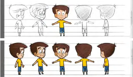
Step 2 | Character creation stage
Graphic designers and animators begin creating the actual character models, and their poses and body parts, in Adobe Flash CS5, vector-based 2D design and animation software.
Sample character creation in Flash (vector) by the animator/graphic designer
Step 3 | Visual compositions of frame animation
After all the characters are digitally created and final-ized, the stage is set for animation creation. Typically, the course frame animation phase begins with this step. Designers or animators start this phase with various background layouts and other element designs, which is a requirement of the elaborate animation techniques in Flash animator.
There are various ways of composing Flash animation with various backgrounds, characters, and elements, but a well-managed animation process is preferable for easy maintenance of the source files.
Step 4 | Expressions and
visual communication
All effective animation seems dry in the absence of expressions and drama. In this stage, designers and animators begin working on adding expression details to the animation. The expres-sions are mainly shown with facial and body postures and gestures.
Step 5 | On-screen text and
typography usage
Both on-screen text and typography play a major role in portraying comfortable and readable layouts on animated frames. OST (on-screen text) could be added for many reasons, i.e., as supportive text, transcript text, interactive layouts, or instruc -tion text.
Interactive screen design strategy on HTML5 platform (non-Flash environment):
The image below shows one of the HTML5-based interactive pages of this e-learning course. The layout uses text and some interactive elements to check the progress of learning periodically. Design strategies used here are as follows: • Interactive page design is possible in the HTML5 environment, where no Flash-based interactive coding is needed or used, but knowledge of HTML5 coding is required.
• As for the media, only one back -ground layout and few transparent images (.png) were used to make this interactive screen with HTML5 options.
• A small-sized MP4 video (with VO) was also used to give animated instructions.
• All text visible on this screen is actually an image, but not from any XML/ HTML source; however, designing with HTML text and ani -mated GIF or static PNG is possible in the HTML5 platform.
Step 6 | VO and SFX
association with the
animation
Audio voiceover (VO) and SFX play a major role in moving animation to a level of audio-visual completeness. Without this, the animation cannot be considered ready, as audio is always synced on the animation timeline.
Step 7 | Publishing Flash animation standards
Designers should follow Flash animation publishing standards to check the quality of their animation output. The standards we followed are summarized with this screen shot:
Step 8 | Flash to MP4 video export standards
To run the e-learning course on tablet devices or iPads, Flash-based output (.swf) was not considered as part of the media strategy. We exported the Flash animation or Flash movies as QuickTime movies from Flash, and then converted the Quick -Time movies into MP4 movies as the final output.
Note: To ensure successful conversion of Flash animation to a QuickTime movie, we must check for the following: • The Flash animation should not contain any ‘action scripting’
• No layer should be in guide mode
• All the unwanted layers should be deleted (removing unwanted symbols also helps)
Activity 1: Flash to QuickTime:
Activity 2: QuickTime to MP4:
The QuickTime to MP4 export settings are as follows Note: You will need to use the original version (not the freeware) of QuickTime Player Pro to export the MP4 video file from the MOV file:
Step 9 | The final output of the movie
on iPad and tablets
The raster-based video output from Flash animation looks almost the same as vector-based Flash animation on iPad. Remember, all of these types of movies played on tablets supported by HTML5 have a default media controller to navigate the movie properly, and the media controller skin changes according to the browsers or tablets the movies run on.
Sample e-learning course running on an iPad
Observations from this case study
Here are some important Flash VS HTML5 media strategy outcomes of this Tablet based e-learning course devel -opment process. This Case Study outcome completely supports both the strategies effectively.
1. Media effort and solution: The process of creating these complex 2D cell-type animations in Flash technology, and then converting those into MP4 video output, has no major impact on the media development effort. In fact, both Flash and HTML5 technology remains the common media development process successfully.
2. Interactivities: The HTML5-based interactivities and interactive animation effects are not as smooth as in Flash, and require complete programming-based controls to get the required effects.
3. Responsive layout: Fluidic or responsive content and image layout compositions were not experimented in this course design; it used only the horizontal layout.
4. The constraints: Media designers may excel in designs using Flash, but coding with media assets in the HTML5 environment will require some training and practice to enable skill enhancement in this area. Moreover, there is very little newly developed media software available in the market for creating multimedia content easily for tablets and mobile devices.
5. Reactions from the actual user: Most users were very excited and happy about the experience of navigating an e-learning course on an iPad. The smooth multimedia animation and visuals look quite different on iPad than on a desktop or a laptop. The user experience in this experiment is very significant.
References
Technical specificationTablet Comparisons: http://www.tabletpccomparison.net/
Apple iPad: http://www.apple.com/ipad/specs/
Android: http://developer.android.com/guide/appendix/media-formats.html Blackberry: http://docs.blackberry.com/en/smartphone_users/deliverables/27267/Supported_Media_Types_on_BlackBerry_Tablets_ (English).pdf HTML5 and CSS3 http://www.focus.com/images/view/11905/ http://www.findmebyip.com/litmus/ http://net.tutsplus.com/tutorials/html-css-techniques/html-5-and-css-3-the-techniques-youll-soon-be-using/ Responsive design http://inspirationfeed.com/inspiration/websites-inspiration/60-examples-of-responsive-website-design/ http://www.pushing-pixels.org/2011/11/08/deep-dive-into-responsive-mobile-design-part-1.html Resolution http://www.w3schools.com/browsers/browsers_resolution_higher.asp High density pixels
http://www.apple.com/iphone/features/retina-display.html http://menacingcloud.com/?c=highPixelDensityDisplays Animations
http://www.newbay.com/blog/index.php/2011/04/14/evolution-web-animation/ http://www.1stwebdesigner.com/css/50-awesome-css3-animations/
Media application and techniques
http://www.sencha.com/products/animator
http://www.scribd.com/doc/57255532/13/Animation-techniques-You-Should-Use-on-mobile-Devices
Adobe Edge Preview: http://success.adobe.com/en/na/sem/products/edge.html?sdid=JAPEF&skwcid=TC|23230|HTML5%20 and%20CSS3||S|b|8325945306
Conclusion
The content of this Technical Specification Guide includes web excerpts. This Technical Specification Guide aims to examine the current worldwide focus on media development strategies for mobile devices (mainly tablets); how -ever, given the ongoing technological advancements in this field, this Technical Specification Guide will be updated from time to time.