1-1-2005
Exploring three-dimensional visualization of intrusion detection
Exploring three-dimensional visualization of intrusion detection
system alerts and network statistics
system alerts and network statistics
Adam Ronald OlineIowa State University
Follow this and additional works at: https://lib.dr.iastate.edu/rtd
Recommended Citation Recommended Citation
Oline, Adam Ronald, "Exploring three-dimensional visualization of intrusion detection system alerts and network statistics" (2005). Retrospective Theses and Dissertations. 19200.
https://lib.dr.iastate.edu/rtd/19200
This Thesis is brought to you for free and open access by the Iowa State University Capstones, Theses and
Dissertations at Iowa State University Digital Repository. It has been accepted for inclusion in Retrospective Theses and Dissertations by an authorized administrator of Iowa State University Digital Repository. For more information, please contact [email protected].
and network statistics
by
Adam Ronald Oline
A thesis submitted to the graduate faculty
in partial fulfillment of the requirements for the degree of MASTER OF SCIENCE
Major: Information Assurance
Program of Study Committee: Dirk Reiners, Major Professor
Thomas Daniels Doug Jacobson
Iowa State University Ames, Iowa
2005
Graduate College Iowa State University
This is to certify that the master's thesis of Adam Ronald Oline
has met the thesis requirements of Iowa State University
TABLE OF CONTENTS
LIST OF FIGURES . . . . CHAPTER 1. INTRODUCTION 1.1 Introduction . . . 1.2 Problem Statement . 1.3 Thesis Statement 1.4 Organization . . CHAPTER 2. FOUNDATIONS 2.1 Intrusion Detection Systems .2.1.1 Knowledge-based IDS 2.1.2 Behavior-based IDS 2.1.3 Host-based IDS . . . 2.1.4 Network-based IDS . 2.2 Previous work . . . .
2.2.1 Dealing with IDS alerts 2.2.2 Visualizing network data
CHAPTER 3. VISUALIZATION APPROACH . . . . 3.1 Dealing with data .
3.1.l Data sources 3.1.2 Data reduction 3.2 Visual concepts 3.2.1 Island . 3.2.2 Alert Plot v 1 1 1 2 2
.
.
.
. .
. . .
3 3 3 4 4 5 5 6 7. . .
.
. .
.
.
14 14 14 15 17 18 213.2.3 Trends . . . . 3.3 Implementation details . CHAPTER 4. RESULTS .
4.1 Evaluation data . . . . 4.2 Data reduction results 4.3 Visualizations results . 4.3.1 Island .. 4.3.2 Alert Plot 4.3.3 Trends . 4.4 Insights CHAPTER 5. CONCLUSION 5.1 Summary .. 5.2 Future Work BIBLIOGRAPHY ACKNOWLEDGEMENTS
. . .
. . .
24 27 30 30 31 31 32 37 41 41 45 45 46 48 51LIST OF FIGURES
Figure 3.1 Example of source port allocation 17
Figure 3.2 Island screenshot
..
19Figure 3.3 Alert Plot screenshot 22
Figure 3.4 Trends screenshot . . 25
Figure 4.1 Island visualization: httptunnel attack 33
Figure 4.2 Island visualization: SYN flood attack 36
Figure 4.3 Alert Plot visualization: portsweep attack 38
Figure 4.4 Alert Plot visualization: dictionary attack 40
CHAPTER 1.
INTRODUCTION
1.1 Introduction
Computer networks are under attack today more than ever before. Whether the attacker is a script-kiddie trying to break into a public web server for fun and bragging rights, or a focused, experienced adversary with intimate knowledge of the targeted organization and a specific goal, security adminstrators have a great challenge in protecting their resources. In the search for tools to aid the security administrator, intrusion detection systems have become popular as a supplement to other basic security devices such as firewalls. Monitoring user behavior or sniffing the packets that enter and leave the organization's network, they look for telltale signs of malicious activity, alerting the administrator whenever a possible break-in attempt is detected.
Intrusion detection systems are not perfect, however. One major criticism is that they often produce false positives, i.e., alerts that correspond to legitimate user or network activity. Stefan Axelsson [Axe99] provides an analysis of network intrusion detection systems that shows, under reasonable assumptions about the activity on a network and the capabilities of the IDS, if the number of false positives is significant, the security administrator's task of sorting through the alerts for serious threats will be nearly impossible.
1.2 Problem Statement
There has yet to be discovered an optimal solution to the problem of dealing with the typically large number of false positives produced by intrusion detection systems. This problem is exacerbated by the fact that some IDS implementations can be exploited to produce yet more false positives. Samuel Patton et al. [PYDOl] show how an attacker might take advantage of
the ease with which false positives can be generated. By introducing artificial packets into the network he or she can generate false positives in order to mask their actual attack or desensitize the system monitors to an attack they will use in the future.
Skilled security administrators may be able to tune the IDS products for their particular networks in such a way as to reduce the number of false positives, but not all administrators may have the time or knowledge to do so effectively. With constantly evolving tools and approaches in the hands of foes, the administrator would also be required to tweak the IDS often, so as to avoid missing the newest types of attacks. A better solution is needed, so that security administrators can spend less time setting up their IDS products and more time looking for and reacting to threats to their resources.
1.3 Thesis Statement
In this thesis we take a visual approach to dealing with the amount of information intrusion detection systems provide. We want to aid the security administrator in detecting as many actual attacks as possible, while also helping him or her recognize the false alarms that would otherwise waste their time. The emphasis of our work is exploring the area of three dimensional visualization, an approach that has not received much attention thus far in IDS-related visu-alization. Additionally, we use aggregated statistics about network activity as an additional source of data for visualization, providing the administrator with multiple perspectives on the state of their resources.
1.4 Organization
This thesis is organized as follows. In chapter 2 we discuss the basic concepts of intrusion detection systems, followed by a review of the literature related to dealing with IDS alerts and visualization for intrusion detection purposes. We describe our approach in chapter 3, including details of the aggregated network statistics and the actual visualizations themselves. Chapter 4 presents the experimental results we obtained during evaluation of our implemented visualizations, and chapter 5 concludes with a summary and ideas for future work.
CHAPTER 2.
FOUNDATIONS
2 .1
Intrusion Detection Systems
A multitude of intrusion detection system implementations exist, but they can generally be classified into a small number of types. Two characteristics by which an IDS can be classified are how it analyzes data to detect malicious activity and what type of data it analyzes. Herve Debar et al. [DDW99] classify intrusion detection systems using the former criterion as either knowledge-based or behavior-based, and using the latter criterion as either host-based or network-based. Their classifications are summarized below.
2.1.1 Knowledge-based IDS
Some intrusion detection systems of this type are also known as signature-based or misuse-based. These systems rely on previous knowledge of known attacks to detect attempts to compromise a resource. Generally they use a database of rules, where each rule specifies some key component of an attack. Each event that the IDS analyzes is checked against all rules, and if a match is found an alert is generated.
Knowledge-based intrusion detection systems are useful in that they can provide a lot of information about each detected attack, since the rules are usually very specific. They also, in theory, should have a low false-alarm rate for the same reason. The major disadvantage of knowledge-based IDS is that the rule base must be updated often to catch new types of attacks. Even with updated rules, such systems will still miss novel attacks for which no rules have been written.
2.1.2 Behavior-based IDS
Behavior-based intrusion detection systems are sometimes also known as anomaly-based systems. They try to detect malicious activity by comparing each event to a baseline repre-sentation of expected behavior. If the event differs too much from the expected behavior an alert is generated. A profile of the system resources to be monitored must thus be generated before detection of intrusions can begin.
The major advantage of behavior-based intrusion detection systems is that they can poten-tially detect novel attacks. They may also identify malicious activities of a valid system user if he or she takes some actions that are noticeably different from their normal activities. The drawbacks of behavior-based systems include their propensity for false alarms and the need to develop updated profiles of expected behavior as that behavior changes over time. It is also difficult, if not impossible, to guarantee that no malicious activity is taking place while the profile is being updated.
2.1.3 Host-based IDS
Host-based intrusion detection systems use various sources of audit data generated locally on a single host. The audit data may include user and process listings, memory and processor usage, system calls, and other audit services provided by the operating system. The data is analyzed for malicious activity using either a behavior or knowledge-based approach.
Host-based systems have an advantage over network-based systems in that they are able to analyze what is happening at a user-level. They can potentially analyze data that was encrypted on the network, whereas a network-based system would only be able to analyze the network headers. One disadvantage of host-based systems is the fact that, since they run on the same host they are analyzing, an attacker that has gained privileges may be able to interfere with the intrusion detection system's ability to generate alerts. Additionally, each instance of a host-based system runs on a single host, and more effort is required if alerts generated on each host are to be correlated in some way.
2.1.4 Network-based IDS
Network-based intrusion detection systems, or NIDS, use information gleaned from raw network packets as their source of data. One or more dedicated NIDS devices are installed at strategic locations on the network so as to sniff and analyze communication between as many hosts as possible. In each packet headers may be analyzed at many different levels, including the network layer (Internet Protocol), the transport layer (Transmission Control Protocol, User Datagram Protocol), and the application layer (Simple Network Management Protocol, HyperText Transfer Protocol, File Transfer Protocol, etc.). Payload may also be analyzed as long as it is not encrypted. Again, either behavior-based or knowledge-based analysis may be employed.
Network-based systems are useful for detecting malicious activities directed at the network itself, such as Denial of Service (DoS) attacks. They have an additional advantage over host-based systems in that they usually do not consume any of the resources on a host tasked for other purposes, since network-based systems typically run on dedicated hosts. Disadvantages of NIDS devices include the fact that they are unable to analyze any encrypted data in a packet, and any alerts they generate will likely contain no information identifying which user on a particular system may have been the source of the malicious activity. Additionally, large, high-bandwidth networks may produce more packets than a single network-based system can effectively process.
2.2 Previous work
Some research has been done in finding ways to work with the large number of alerts produced by various intrusion detection systems, both visually and non-visually. There has also been a substantial effort recently to directly visualize network information as a sort of intrusion detection system that uses human visual cognition abilities to detect interesting events, rather than relying on knowledge or behavior-based algorithms. We cover areas of previous work by first examining approaches that deal with IDS alerts, followed by a survey of network data visualization systems.
2.2.1 Dealing with IDS alerts
Frederic Cuppens [CupOl] describes work done in the MIRADOR project to combine alerts from a variety of intrusion detection systems. Alerts are analyzed and clustered into groups that correspond to distinct attacks, and then global alerts are generated from these clusters. The global alerts are correlated to develop a picture of what the attacker may do next. Since typical IDS only generate alerts for elementary attacks, and a serious attacker will probably use a number of attacks as part of an overall plan, Cuppens' efforts are designed to reveal this higher-level plan. Some experimental results obtained using a combination of two NIDS, the open source package Snort [Roe99] and the commercial product eTrust [Com05], demonstrate the feasibility of generating global alerts from clusters.
In a similar effort, Herve Debar and Andreas Wespi [DWOl] describe the concept of an aggregation and correlation component (ACC). An ACC takes alerts produced by any number of external IDS connected to it and analyzes them in order to extract the important security problems an administrator needs to deal with. The work is designed to address the issues of alert flooding, identifying related alerts, false alarms, and scaling for large IDS deployments. In particular, the ACC addresses false alarms primarily by considering the accuracy of each alert. Accuracy is determined by associating a default confidence value with each alert based on its predetermined inaccuracy (which should be modified by the system administrator to reflect peculiarities of the local operating environment). Presumably the confidence value is then used by the ACC as it receives alerts to determine whether there is a serious issue at hand.
In a two-dimensional visual approach, Hideki Koike and Kazuhiro Ohno [K004] develop a visualization tool called Snort View with the goal of helping the security administrator avoid the need to finely tune a network IDS (Snort in this case). On a grid with time as the horizontal axis and source IP address as the vertical, they display information including each NIDS alert, the priority of each alert, and the type of attack, encoded as position, color, and shape, respectively. Additionally, events from a system log are incorporated into the display to provide additional context. These are also drawn as symbols, and clicking any symbol brings
up the text describing the associated alert or event.
Since an alert of one type, associated with one source IP address, may appear multiple times consecutively in the NIDS log, Koike and Ohno take a step to reduce visual clutter by only displaying the first instance of such a sequence of alerts and drawing a vertical line over that instance to indicate how many identical alerts follow. For additional statistical information, they similarly draw a horizontal bar at the vertical axis for each source IP address to indicate how many times an address has appeared in the logs. These two steps are interesting in that they demonstrate effective ways to overlay additional information on a 2D grid without adding much, if any, difficulty in decoding the primary information on display.
Finally, a second grid is placed directly to the right of the first in order to display the destination IP addresses associated with the alerts. The horizontal axis on the secondary grid lists destination addresses, and the vertical axis is implicitly the same as the first. When an alert in the first grid is clicked with the mouse, a line is drawn from that symbol back to the vertical axis of the first grid, and a second line is drawn to the right, into the secondary grid. Once it reaches the column of the associated destination IP address, it makes a 90 degree turn down. These lines allow the user to quickly see which two IP addresses were involved in any particular alert.
2.2.2 Visualizing network data
Robert Erbacher [ErbOl] discusses a method to visualize various network and system activi-ties in an effort to provide enough context for a security administrator to distinguish legitimate threats from normal activity and false alarms. In the two-dimensional display, the host be-ing monitored is represented at the center as an outlined circle. The thickness of the circle represents system load, while the number of short lines protruding outward from the circle represent the number of users on the system. Starting a little farther out from the circle, lines extend outward towards smaller circles, representing connections from other hosts. The lines are varied by color and drawing style (solid, dashed, with arrows, etc.) to differentiate between types of connections like NFS, telnet, and ftp. Attacks identified by the Portsentry tool are
also displayed as thick, bright red lines. Intensity is used to show the time since a node last accessed the monitored host. The distance from the center to an outer circle is determined by how many octets of the IP addresses match. If only the last octet differs, the corresponding smaller circle is drawn on a ring close to the center. If the last two octets differ, then it is drawn on a second ring farther out, and so on. The exact positioning of a node on a ring is remembered so that connections from the same host can be identified over time. Finally, the border of the screen is colored according to the time of day.
Erbacher argues that such a visual display provides enough information to help a security administrator make a better judgement about whether a particular event is suspicous and should be further investigated. He provides one example of a user who is trying to connect to a monitored host via telnet in the middle of the night. The line associated with the user's node is colored red because a reverse-lookup reveals that the node's IP address has no hostname associated with it. Given the time of day, and the fact that the majority of the other (non-highlighted) connections on the display are likely leftover from legitimate users who logged-in earlier, this particular connection stands out.
Rather than working with alerts produced by another IDS, Greg Vert et al. [VFM98] describe a three-dimensional geometric approach to representing system information which could be used as a basis for intrusion detection. A spheroid geometric primitive called a spicule represents the various bits of information related to a single host on a network. The volume of a spicule corresponds to a computed value, based on various factors, that represents the associated host's security fitness. Individual features are displayed using visual components called tracking vectors and fixed vectors. For features which have minimum and maximum values, tracking vectors travel from the horizontal plane towards the positive vertical axis on the surface of the spicule as the value of the feature approaches its maximum. Features that have no bound on growth are represented by fixed vectors around the equator of the spicule which grow outwards as their values increase.
It is proposed that this model could be used for intrusion detection by considering how a spicule changes as a system's state changes. If a system is known to be in a certain state, such
as normal or under attack, the vectors around the spicule for that system may be used as a geometric signature of such a state, represented as angles for tracking vectors and magnitudes for fixed vectors. The geometric signature for a specific attack, for example, could be added to the spicule for a system under normal operation, resulting in a visual of what that system will look like under attack.
Other ideas considered include collapsing the spicule down to a singularity and plotting it with other such singularities in a three-dimensional space, with the x- and z-axes representing the last two octets of the IP address, and the y-axis representing a value derived from the vectors of the spicule. This would allow for the visualization of relationships between hosts and potentially the detection of intrusions from remote hosts. While implementations are not discussed in the paper, linking the two models of visualization through some kind of interactive drill-down would be an interesting way to quickly access the detailed information in a spicule from the higher-level view of host-to-host relationships.
Jonathan McPherson et al. developed an interesting visualization focused on TCP and UDP port traffic called PortVis [MMK+04]. One challenge faced by network security researchers is the lack of available data sets on which to test ideas. Most organizations are understandably reluctant to release real captured traffic from their actual networks due to privacy concerns. The Port Vis tool has an advantage over other efforts in regard to this dilemma because it uses very general information aggregated from network traffic flows. Specifically, the following pieces of data, accumulated over each hour, are used:
• Protocol (TCP or UDP)
• Port
•Hour
• Session count
• Unique source addresses
• Unique source/destinationa address pairs
• Unique source countries
Given the high-level nature of the data being analyzed, an organization that wouldn't normally allow details of their network traffic to be made public might be less inhibited in allowing the use of aggregated statistics. As it turns out, the PortVis developers were able to use network data from United States Department of Energy sites.
The goals for the tool were discovering large-scale attacks and identifying smaller-scale attacks that might be analyzed by people with privileged access to the detailed network traffic. The main visualization consists of a two-dimensional 256 x 256 grid on which each position corresponds to a port; the vertical axis corresponds to the port number mod 256, and the horizontal axis corresponds to the integer value of the port number divided by 256. The color of the dot is determined by the value of a piece of data, which can be selected from the list above, at a given hour. While this part of the visualization takes up the majority of the display space, a number of smaller visuals are included as well. A timeline on the right-hand side gives a higher-level view of the port data. Within the timeline a window may be moved to select the current hour displayed in the main visualization. Back in the main visualization a marker may be moved around to select a small number of ports, which are magnified in a small space at the bottom-left corner of the display. Here the exact port numbers and data values for the selected ports are shown. Further drill-down may be accomplished by choosing one of the magnified ports, which then causes a three-dimensional timeline of all five data categories to be displayed in a window to the right of the magnification window. This timeline conveys the values of each data attribute, and the user is allowed to rotate the port timeline display about the vertical axis to get different perspectives. Finally, a fifth area of the display, called the gradient editor, is used to control the mapping from data values to colors in the main display. This allows the user to highlight different attribute values in the main display.
Using the sample data, McPherson et al. demonstrate the discovery of port scan traffic. They also show anomalous activity occurring during a single hour on three sequential ports near the high end of the port range, which they suggest would warrant further investigation.
Given how general the data used in Port Vis is, it is impressive that some security events can be detected. It would be interesting to run this visualization on network traffic data sets with known attacks to see how many different types of attacks present some visible indication of their presence.
Robert Ball et al. created a visualization tool called VISUAL (Visual Information Secu-rity Utility for Administration Live), which is designed to be part of a larger project called Network Eye [BFN04]. Their aim is to provide an overview of the network traffic on small to medium-sized networks based on packet-level data sources. The "Home-Centric" portion of the visualization comes in the form of a two-dimensional grid of squares, where each square may represent a host on the home, or internal, network. There are a couple of visualization displays to alternate between, one for internal-external traffic and one for internal-only traf-fic. In internal-external mode, the external hosts are represented by individual squares placed around the internal grid. To be more precise, the external squares are actually placed first, and then the internal grid is placed in the largest empty space available. External squares are placed in a manner such that the square for a given host always appears in nearly the same location-the initial location is determined on the horizontal axis by the first two octets of the IP address and on the vertical axis by the last two octets. As the squares are drawn with three different sizes to represent three levels of network traffic, however, special care is taken to avoid overlap. If drawing the square at the original position would occlude part of another square, the new square is moved around nearby until enough empty space is found.
The existence of communication between an internal and external host is represented by a line drawn between the internal host's grid square and the external host's square. Lines are color-coded to indicate the direction of communication: red for external-to-internal, blue for bidirectional, and green for internal-to-external. The ports used in communication between two hosts are indicated by horizontal lines drawn within the external host's square. The distance from the top of the square indicates where the port falls in the range of possible port numbers. The existence of communication between internal hosts is represented more generally by simply coloring an internal host's grid square a shade of green that corresponds to how much
it communicated with other home-network hosts. More detailed information on internal host communication can be seen by switching the visualization to internal-internal mode, in which each internal host is represented twice, once on the grid, and once as what would have been an external-host square in the internal-external mode.
The user is able to filter the data displayed in a number of ways. Individual hosts or groups can be selected to display only the communication data associated with them. Addresses of hosts to display can be selected using Classless Internet Domain Routing (CIDR) notation. Data associated with specific protocols such as TCP, UDP, or ICMP can be isolated on the display. A timeline can also be used to display the communication data for any one-second window of time, instead of displaying the accumulated data for the entire analysis period. This window can be moved rapidly, causing hosts to appear and disappear. Since some hosts may only appear for a very short time, a shadow feature is provided which places a light-gray square in an external host's location if that host appears in the data anywhere in a user-definable window of time (the default is 200 seconds) before the current one-second window. This helps the user avoid overlooking hosts that have bursty communication patterns, or that simply appear very few times overall.
Finally, the visualization allows the user to retrieve the following specific information about a host by selecting it in the display:
• IP address
• IP addresses of all hosts communicated with
• TCP /UDP ports used
• Percentage of total traffic contributed during the analysis period
Ball et al. show that the visualization system they designed is fairly intuitive by conducting a study with untrained users. After describing how the VISUAL tool works and giving them a brief chance to become acquainted with it, each subject was asked to complete a number of analysis tasks using some test data sets. Examples of the tasks include describing anything
striking, identifying four external hosts that seem to be involved in normal communication with internal hosts, and identifying the four internal hosts that made the most connections to external hosts. All of the users in the study were able to find the same abnormalities in the data sets, even though some of them did not know what some of the abnormalities represented, such as a ping sweep in one case.
Although discussed only briefly in the context of a larger project, Christos Papadopoulos et al. mention the use of three-dimensional graphics in their work on an audio-visual system for network security and management [PKS+04]. They start by discussing the use of spectral analysis techniques on network traffic. Two-dimensional graphs are shown that viusalize differ-ences between single and multi-source Distributed Denial of Service (DDoS) attacks, congested and uncongested network links, and other protocol behaviors. The authors then move on to the interesting idea of using auditory cues to represent network data. They propose extending this idea to a multi-channel audio system which would allow more precise placement of distinct sounds in three-dimensional space.
Finally, they bring in the topic of three-dimensional visualization, and more specifically, 3D auto-stereoscopic displays. Unlike previous stereoscopic technology that required the user to wear head-tracking goggles, these systems do not require any extra hardware other than the display itself. Padadopolos et al. show a few examples of how they would make use of such a display. The general idea is to represent a small network topology in a single plane oriented obliquely towards the user. Two-dimensional graphs of data, possibly consisting of raw network statistics or spectral analysis results, may then be drawn adjacently on the left or right of selected nodes in the topology to represent data specific to each of those nodes. The graphs are oriented such that they directly face the viewer. It is an interesting approach that combines familiar two-dimensional displays of network topology and data plots in a novel three-dimensional layout.
CHAPTER 3.
VISUALIZATION APPROACH
Having considered previous work in visualization techniques for the purpose of intrusion detection, we move now to a discussion of the approaches we considered. We focused on developing a variety of three-dimensional visualizations, each one emphasizing different aspects of the data. We first discuss the types of data used as input and some techniques for data reduction, followed by descriptions of each of the visualization concepts. Results are discussed in the next chapter.
3.1 Dealing with data
For any visualization, one must consider the data that will be visualized. Will the raw data itself be useful as is, or will it overwhelm the processing capabilities of either man or machine? While the specific details of any piece of data are generally useful, too many details displayed at once can potentially overwhelm the user. Thus we made an effort to provide a higher-level view of the data in our visualizations, leaving the task of more sophisticated drill-down for future work.
3.1.1 Data sources
We used two primary sources of data as input for our visualizations, though not all of the visualizations make use of both types of data. IDS alerts are the first source, representing any suspcious signs of malicious activity as detected by the intruson detection system. In this case we chose to use the open-source network IDS Snort, due to its popularity in the security community and free availability. The components of an alert that we focused on in the visualizations were the timestamp, priority, source and destination IP addresses, and
the destination port if the alert was associated with TCP or UDP traffic. We used the alert message text to provide additional information for the user in one of our visualizations.
Secondly, we incorporated information on raw network activity as another piece of data for visualization. As one of the common criticisms of intrusion detection systems is difficulty in dealing with false alarms, we wanted to add some background information that might help the user of the visualization make a more informed decision on whether a particular alert is in fact serious. We also discovered that some attacks were evident from visualizing the network activity alone. In particular, we decided to focus on TCP and UDP traffic since these transport layer protocols provide the basis for most all application-level protocols.
3.1.2 Data reduction
Given the volume of network traffic on even a medium-sized network, we needed to use some data reduction techniques to make the network traffic data more manageable. The first technique we used was aggregation of statistics about the network traffic over small time periods. As our aim was to provide a fairly high-level picture of activity, we chose a time period of five minutes. The basic unit of information we consider is a tuple of three elements:
(source IP address, destination IP address, destination port)
Jianqiang Xin [Xin03] calls this tuple an SDP and uses it as a correlation feature in his own work on visualization for network intrusion detection. In each five minute period, we aggregate the following information for each SDP:
• Size of payload in bytes
• Number of packets seen
We utilized a second data-reduction technique to eliminate superfluous SDPs. Consider that when an application on host A sends the first TCP or UDP packet to a listening application on host B, host A must allocate a port from which the packet will be sent. While the operating system has some internal algorithm for allocating these ports, the actual port number chosen
does not generally give any useful information to the external observer. If host B then sends a reponse, it uses the allocated source port on host A as the destination port in each packet. Since our aggregation tool simply looks at the destination port in each packet, it would normally aggregate information about each of these allocated ports separately.
Our view is that aggregating data separately for the dynamically allocated ports does not provide enough useful information to the user of our system to warrant the tracking of such statistics. Thus, we instead give the user the option of adding the size of payload and number of packets seen for traffic destined for these ports in with the aggregated data for the associated privileged port. This option helps the user avoid being overwhelmed with useless information in the visualizations.
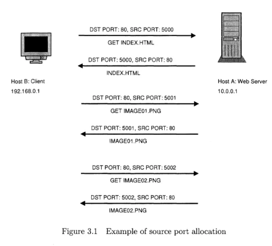
To build on the earlier example, suppose that host A is running a web server on the well-known privileged port 80 using TCP. A user on host B opens her web browser and visits many different pages that are served by host A. As she loads each new page, her web browser will make a series of connections to host A in order to download the hypertext of the page as well as the resources it references. Each of these connections will be allocated a different source TCP port from which to send the request, and downloading the required bits for a single page may use five, ten, or more separate connections. The activity is demonstrated in figure 3.1.
Without the reduction option described above, the network activity in the diagram would result in aggregation of data for four different SDPs:
SDP 1: SDP 2: SDP 3: SDP 4: (192.168.0.1, 10.0.0.1, 80) (10.0.0.1, 192.168.0.1, 5000) (10.0.0.1, 192.168.0.1, 5001) (10.0.0.1, 192.168.0.1, 5002)
By using the data reduction option we would only get the first SDP for the network activity in the figure, and the data on payload size and number of packets for all network activity would be aggregated with the first SDP.
The only potentially useful information we lose by doing this reduction concerns the number of connections made from one host to another. With the four SDPs listed above, we can see
Host B: Client 192.168.0.1 DST PORT: 80, SRC PORT: 5000 GET INDEX.HTML DST PORT: 5000, SRC PORT: 80 INDEX.HTML DST PORT: 80, SRC PORT: 5001 GET IMAGE01.PNG DST PORT: 5001, SRC PORT: 80 IMAGE01.PNG DST PORT: 80, SRC PORT: 5002 GET IMAGE02.PNG DST PORT: 5002, SRC PORT: 80 IMAGE02.PNG
Host A: Web Server 10.0.0.1
Figure 3.1 Example of source port allocation
that three separate connections were made from host B to host A. With regard to intrusion detection, this could be useful as an indicator of a malicious activity like password-guessing (an attacker makes multiple telnet or ssh connections, guessing a different password each time). A solution to address this, which we have not yet implemented, would be to incorporate a count of the number of source ports associated with each SDP. Adding this feature into the visualizations may provide an extra piece of useful information.
3.2 Visual concepts
We came up with three visual concepts, each one creating a different picture for the user. Each visualization does not necessarily use all pieces of information from the packet aggregation process or the IDS alerts, but each piece of information is used by at least one concept. A brief description of each idea follows, along with sample screenshots.
3.2.1 Island
The Island concept (figure 3.2) takes an iconic approach to visualization. We use only the aggregated packet information here, focusing on a port-centric view. As the SDP data is processed by this visualization each record is sorted into a data structure, first by the time period it falls into and secondly by destination port. We use a five minute time period granularity, which is the same as the data reduction tool. For each of these (time period, port) records, we maintain lists of associated source IP addresses and destination IP addresses, as well as the number of bytes of payload transferred.
The island idea works as follows: positions on the surface of the island represent the full port range, 1 to 65535, and tree figures are placed on these positions to represent active destination ports during a time range. The ports from 1 to 1024, the privileged ports, are given positions on three invisible concentric rings at the outer edge of the island. Ports 1 through 359 fall on the outermost ring, ports 360 through 719 fall on a slightly smaller ring, and ports 720 through 1024 fall on a third ring slightly smaller than the second. The lowest port on each of these rings is positioned towards the right side of the island, as oriented in the screenshot, i.e., at 0 degrees if the island were considered a unit circle. Each port in sequence is placed one degree apart from the previous port in counter-closewise fashion. Note that there is a range of empty locations on the third ring due to having just over 300 ports assigned to it; about 60 degrees on the ring is wasted. We did this for simplicity of implementation, but ideally one would space the ports on these three rings more proportionally, so as to make the best use of the space.
Ports 1025 through 65535 are positioned on the inside of these three outer rings. Starting a little further towards the middle of the island, near the location of port 1024, these ports are given positions which spiral inwards toward the middle as their port numbers increase. By arranging ports in this circular fashion, we maintain some visual grouping of ports that are numerically close to one another, which may prove useful in detecting some types of attacks like small-scale sequential port scans. While there are a number of services that have assigned port numbers above 1024, they are not as many as those in the privileged range, and the
..µ 0 ,..q w ~ <l) <l) H u w '"'d ~
7
~ w ~ C'! M <l) H ;::j b.O ~majority of port numbers above 1024 are used for dynamic allocation as source ports. Given this, we are not concerned that a user would find it difficult to predict where on the island a port with a high number would appear, since most of these port numbers have no intrinsic meaning.
The trees on the island are thus drawn at positions based on destination ports. We make use of the additional information accumulated for each port by drawing a number of features based on that information. First of all, multiple branches are drawn perpendicular to a tree's trunk to represent the associated destination IP addresses. We split the address into its four octet components and use the individual octets to affect how the branch is drawn. The first, most-significant octet determines at what angle about the trunk's axis the branch will be positioned. The second octet determines the height at which the branch is attached to the tree. The third octet is used to determine how far out on the branch to draw a smaller twig, and the fourth octet determines the angle about the branch's axis to position the twig. Thus each of the four components of an IP address affects a different property of the corresponding branch.
Similar to the branch idea, we draw leaves at the top of the tree based on the components of the associated source IP addresses. The first and second octets are used to select a color in the red and green components of RGB color space. The third octet determines the angle about the tree to position the leaf, and the fourth octet affects how far the leaf extends out from the tree. Finally we make use of the number of bytes transferred by drawing a purple sphere at the top of each tree, which could be thought of as a piece of fruit. The size of the fruit is logarithmically related to the number of bytes, and the fruit is not drawn if no bytes of payload were transferred.
The user can move through the time domain in this visualization using keyboard input. As the time period changes, the state of trees and their features change to reflect each period's aggregated statistics. Some services will cause trees to be visible for almost every time period, such as high-traffic web servers and domain name service daemons. Other services may appear much less frequently, and in the case of some malicious activity maybe only once. Consider
a trojan application that an attacker manages to get installed on a target system. If the application is designed to open a backdoor remote login service on a high port at a certain time, the attacker may only make use of it once for a short period of time. While our visualization should render a tree associated with this activity, if the user is scrolling through the time dimension quickly they may miss it as it would only be a blip. To address this we added one more feature, which may be toggled while the visualization is running. After rendering the trees for the current time period, if this feature is enabled, trees for each of the previous five time periods will be rendered simultaneously. Each of the previous time periods is rendered with increasing transparency as they go farther back in time, allowing the user to still focus on the opaque trees of the current time period while having some sense of the recent history.
3.2.2 Alert Plot
For this visualization (figure 3.3) we focus on the IDS alerts instead of the packet aggrega-tion informaaggrega-tion. A rectangle with three panels is drawn in the foreground. The horizontal axis of the panels represents the time domain, while the vertical axis represents port numbers. We provide different levels of view of the time domain by using a different scale in each panel. The rightmost panel represents one hour of time, the middle panel represents the previous twenty four hours, and the leftmost panel represents the previous week. For each IDS alert that falls into the time range currently in view, we draw a small cube at the position corresponding to its time of detection and associated destination port (or 0 for ICMP packets). The cubes are color-coded by the priority of the associated alert, which ranges from highest priority (1, red) to lowest priority (5, blue). User input shifts the current period of time in view.
We first tried plotting alerts vertically based on port numbers using a linear scale, but this proved unsatisfactory as it was very difficult to distinguish beteen port numbers in the lower, privileged range (1-1024). We next tried using a logarithmic scale to give more space to the privileged ports, but this had the side-effect of compressing the many alerts associated with higher port numbers into a very small space; we had essentially the same problem as before. Our current solution uses a hybrid scale. The lower half of the vertical axis represents ports 0
through 1024, where 0 is used for alerts associated with ICMP traffic. The upper half is split into 1024 positions, and the rest of the port range is mapped to these positions by taking the port number modulo 1024. This technique provides better spacing between ports while also allowing for interesting clusters of alerts to appear, such as those that might be associated with a port scan.
As Koike and Ohno noted [K004], alerts that are identical in all properties except time may often occur repeatedly. Our experience corroborated this as well, and in fact, during our evaluation phase, there were some portions of the evaluation data set that produced so many alerts as to cause a major decrease in the responsiveness of this visualization. We needed to draw fewer alerts in these cases, and our solution borrows from that of Koike and Ohno. We render the first alert in such a series as a cube, and then draw a horizontal line to the position that the last alert in the series would have occupied had it been rendered. This grouping of alerts is done as the visualization processes the incoming alert data. It remembers the most recent time it saw each alert, and as each new alert is processed we check if one of the same type, with the same destination port and associated IP addresses, has been seen before. If it has been seen, and the new alert occurred within a predefined window of time after the previous one, we group the new alert with the old one instead of creating a new record. The grouping is done simply by maintaining two timestamps for each alert: the timestamp of the first alert in the group, and the timestamp of the last alert in the group. If the two timestamps match, then the "group" actually represents a single alert.
In addition to the foreground panels, we also draw two more panels farther in the back-ground, above the alert panels, and slightly angled. The left of these two panels represents internal IP addresses associated with alerts, where the vertical axis represents the third octet and the horizontal axis represents the fourth octet. The panel on the right represents external IP addresses associated with alerts, where the vertical axis represents the first octet and the horizontal axis represents the second octet. Thus, each panel is a 256 by 256 grid of points. The grid of the left panel provides positions for each host of a class B network, and the grid of the right panel provides positions for each class B network. When an alert is drawn in the
rightmost panel of the rectangle in the foreground (i.e., when it is in the hour-long panel),
lines are drawn up to either or both of the IP address panels to indicate which addresses are
associated with that alert. The lines are color-coded to indicate whether the destination and
source addresses are internal or external. Some alerts may be associated with two internal
addresses or two external addresses, while others are involved in traffic between an inside host
and an outside host. The technique used here is similar to that of parallel coordinates [Ins81],
except instead of using parallel axes in two dimensions, we are using "parallel" planes in three
dimensions. The planes in this visualization are not truly parallel, of course, but the idea of
representing multi-dimensional data is similar.
Alerts may toggled on or off by priority so that if, for example, there are many alerts of
priority two on screen, we can disable them to see if they were covering any alerts of priority
one. Additionally, the user may use the mouse to click on a cube, and the textual details of
the corresponding alert will be printed to standard output.
3.2.3 Trends
Finally, the Trends visualization (figure 3.4) is an attempt to visualize both the packet
aggregation information and the IDS alerts. The layout is a grid in the x-z plane whose dimensions represent time and port numbers. The port axis does not have a position for
every port, but rather it is dynamically modified as the aggregated data is read in, such that
a position is created for each port seen in the data. These positions on the axis are sorted
from low to high and labeled in the visualization. At each point on the grid, then, if there
exists data for that time period and port number, we draw a bar along the y-axis representing
the associated amount of data. The measurement of data can be toggled between number of packets and number of bytes.
Because we are giving much more space to each port in this visualization, compared to
Island, we discovered that we needed to be careful about which ports we decided to put on
the port axis. If an attacker runs a port scan, for example, we might have a thousand or more
display grows much too large. We addressed this by requiring each port to be seen a small number of times, either in distinct time periods or associated with different IP addresses, before it is included in the display. This way we exclude the activity from port scans, where each port on a single host is typically probed a small number of times during a short time span from a single source. Activity from a web server, however, would likely include numerous connections from a variety of sources over many time periods and would easily pass the threshold for inclusion.
As the name implies, we also wanted to visualize longer-term trends in the network traffic along with the actual measured traffic for each time period. We accomplish this by first computing average values of traffic amounts as the aggregated packet data is read in. The average values computed for each time period are based on a predetermined length of time preceding that time period. For example, for this work, we configured the visualization to calculate the average amount of traffic per hour, based on the previous twelve hours of data.
We then visually represent both the average value for a given time period, as well as the actual value. The average value is represented by a transparent red bar, and the actual value is represented by an opaque blue bar which has a slightly smaller footprint, thus fitting inside the footprint of the red bar. By rendering the opaque bar inside the transparent bar, we assist the user in comparing what is actually happening at that time period with the average for that time period based on recent history. For example, this may help a user see that a service which normally sees a constant, significant amount of traffic, like a web server, has suddenly dropped off to nothing, possibly indicating a compromised system, or simply a normal maintenance issue.
In addition to aggregated packet data, we also represent alerts by drawing color-coded spheres above each location on the grid. The spheres are drawn in relation to the bars, so the bars will not occlude them. As in the other visualizations, here to the user can travel through the time dimension using keyboard input.
3.3 Implementation details
This section provides a brief overview of the implementation details for the network data capture and reduction tool, as well as the visualizations. Readers uninterested in these details may skip to the next chapter.
The network statistics capture tool was written in C++ and currently runs only in a Unix . environment. It utilizes the libpcap [Tcp05] library for capturing packet data from a local
net-work interface. By making use of this library and its built-in Berkely Packet Filter (BPF) filter string processing capabilities, we were able to easily provide the user with ability to selectively capture specific types of network traffic. While we considered implementing the capture and reduction tool in an interpreted language like Python [Pyt05) for rapid-development purposes, we decided on C++ because we wanted to avoid any performance issues associated with inter-preted languages that might cause problems like dropping packets on a heavily-loaded network interface.
The tool may read either archived network packet data in the form of tcpdump output files [Tcp05] or directly from a network interface. In the former case, the tool reads through the tcpdump file as quickly as possible, aggregating network statistics for each timeslice, and terminates when all data has been processed. In the latter case, the tool opens the default network interface, or a different interface if the user specifies one, and aggregates packet data in real time. In both the real time and archive input modes, as the tool completes the aggregation of statistics for each time period, it sends the aggregated data to any combination of output devices:
• TCP socket connected to the visualization client
• Binary file located in the local filesystem hierarchy
• Standard output in textual form
The socket output device is mainly intended for use when running the tool in real time mode. As packets are captured and analyzed, the data is sent to the visualization client which
can then update its display with the most recent data. The binary file mode may be used to archive the aggregated statistics. This is useful for capturing network data in real time and visualizing it later, and it is also beneficial for analyzing archived tcpdump data by only incurring the computation time of aggregation once. A separate, much simpler tool, written in Python, may be used to read the binary output file and send it over a TCP socket to the visualization client. Finally the textual standard output mode is mainly useful for debugging purposes, or to give the user feedback indicating when each period of aggregation has been completed.
For a network IDS we used the popular open-source program Snort [Roe99]. Like our aggregation tool, Snort is capable of analyzing network traffic from either a tcpdump file or a live network interface. In both cases we used the default alert rules configuration. Alert output was written to Snort's binary unified format which is supposed to have the lowest overhead of all output modes. While overhead did not turn out to be a problem issue in our research, since we used tcpdump files from a third party for evaluation purposes, this type of configuration will provide more robustness should the tools ever be used on a high-traffic interface. After producing the unified alert output we then use the Barnyard tool [Bar05] to process it and produce a comma separated values (CSV) text file where each line contains only the alert fields we are interested in:
• Time of occurrence in seconds since the epoch
• Event ID - unique integer identifier
• Classname - text string describing the attack class • Priority - integer value from 1 to 5 indicating severity
• Source IP address - dotted decimal notation string
• Destination IP address - dotted decimal notation string
A date string is also prepended to each line of the CSV file to aid the user in browsing
through the file manually, but this string is not used by the visualization client. The Barnyard
tool is designed to either process a group of input files once and quit (batch mode) or run as a background process continually looking for new binary data from Snort (continuous mode). In the latter case Barnyard would append any alerts it finds to the end of the CSV file. We
created another Python tool, very similar to the one described earlier, that reads this CSV file,
converts the numeric values to binary formats to save space over their string representations,
and sends the binary data over another TCP socket to the visualization client. Both of the
Python tools that send data to the client periodically check their respective input files for
updates until the user explicitly closes them.
The visualization client itself is also written in Python. The OpenGL graphics programming library [Ope05], extended for use with Python as PyOpenGL [Pyo05], is used to render each of the visualizations. While it could be argued that we would achieve greater performance
had we implemented the visualizations in a compiled language like C or C++, we felt that
the complexity of our visualizations would not be so great as to tax our development system's
resources, and the rapid application development benefits of using Python persuaded us to
choose it for our effort. As Python is an object-oriented language, we used this to our advantage in developing a framework for the visualizations. A base class defines basic functionality like
window resizing, camera translation and rotation, and mouse and keyboard input handling.
The reading of data from the aggregation and alert tools is also implemented elsewhere as basic functionality. This essentially leaves the task of implementing each visualization idea on
top of the base class, overriding pieces of its functionality if the defaults are not suitable. By
separating the basic functionality of the visualization client from the implementation of each
CHAPTER 4. RESULTS
First we discuss the sources of data used for evaluating the visualizations. Next we describe how well the data reduction techniques worked with respect to making the network statistics more manageable. Finally, we go over each of the visualizations again, this time describing the attacks that showed up particularly well in each of them.
4.1 Evaluation data
To evaluate the visualizations we used the 1999 data set from the well known DARPA
Intrusion Detection Evaluation project at MIT's Lincoln Laboratory [LHF+ 00].
The 1999 data set provided two weeks of test data in the form of tcpdump trace files, host audit data, and file system information. During these two weeks roughly 56 types of attacks were carried out in a total of 201 instances. The following description of classes of attacks from the 1999 data set is taken from the 1999 evaluation schedule at the project's website at MIT [ZisOl ]:
• Denial of Service - Unauthorized attempt to disrupt the normal functioning of a victim host or network.
• Remote to Local - Unauthorized obtaining of user privileges on a local host by a remote user without such privileges.
• User to Root - Unauthorized access to local superuser or administrator privileges by a local unprivileged user.
• Surveillance or Probe - Unauthorized probing of a machine or network to look for
• Data Compromise - Unauthorized access or modification of data on local host or remote host.
Our visualizations focus on the network traffic only, ignoring the host-based audit and file sytsem data. Generally, the second class of attacks, User to Root, would not be detectable in the network traffic, as the related activities take place locally on a single· host. The other classes described are potentially detectable in the network traffic, and in particular the Denial of Service, Remote to Local, and Surveillance or Probe classes are very likely to make use of the network. Thus we focused on these three classes in evaluating our visualizations.
In addition to aggregating information from the raw network data, we also processed the tcpdump files with Snort [Roe99] to generate the IDS alerts used in some of the visualizations. We used Snort's default rule configuration.
4.2 Data reduction results
The reduction of the amount of data achieved with our aggregation tool was significant. The 1999 data set contained roughly 8.6 GB of tcpdump data, and our tool initially reduced that to 24 MB of aggregated statistics. Using the superfluous SDP reduction option, that data is further reduced to 3.6 MB. It should be noted that while the original tcpdump data includes many types of traffic, our tool only aggregates statistics using TCP and UDP packets. Certainly a large majority of the data in the tcpdump files would consist of TCP or UDP traffic, however, as these are the transport layer protocols widely used for most network applications.
4.3 Visualizations results
In the following sections we describe the results for each of the visualizations. We discuss the specific attacks that are visible and how they are manifested in the particular visualization. For the visualizations that make use of aggregated network statistics, we used the data produced by our aggregation tool with the superfluous SDP reduction option enabled. Note that specific information describing the attacks in the 1999 Lincoln Labs data sets is taken from Kris
Kendall's MIT Master's thesis [Ken98]. All times are given in 24-hour format for the United States Eastern timezone, which is the timezone in which the data set was originally created.
4.3.1 Island
One attack that produces some noticeable visual clues in this visualization is httptunnel. This attack involves a multistep process where the attacker must first gain access to a target machine and install an http client program. The client is set up to periodically connect to a predetermined http server which is controlled by the attacker. After the client is set up, possibly using the system's scheduling facilities to run it at a certain time each day, the attacker can log off of the target machine. Each time the client connects to the attacker's http server, the server may send a cookie to the client with instructions embedded in it for the client to carry out. For example, the cookie may tell the client to send the contents of the password file back to the server.
While the first step in the attack of installing the http client is not visible, the second and more interesting step occurs during the second week of the test data and is captured in the series of screenshots in figure 4.1. The client is actually installed at 9:00 on March 30th, and the first automatic connection by the client to the attacker's http server occurs shortly after 12:00. It is this second type of activity that is visible in the Island visualization. Leading up to this time period the middle of the island, representing port numbers greater than 1024, is fairly empty. A few lone trees appear in the middle area from time to time, representing, for example, the client end of an Internet Relay Chat (IRC) connection. Since IRC daemons typically use port 6667, which is greater than 1024, the data reduction technique described in the previous chapter does not aggregate the statistics of traffic leaving the IRC server in with the statistics of traffic destined for the server. Thus, a few spurious trees appearing in the middle of the island are not necessarily cause for alarm.
What should draw the attention of the viewer, however, is the row of trees that appears just after 12:05 on March 30th. Representing packets with destination port numbers 32991, 32992, 32993, 32994, 32998, 32999, 33000, 33001, 33002, 33004, this row of trees seems out