2014
Explorations of the lineup protocol for visual
inference: application to high dimension, low
sample size problems and metrics to assess the
quality
Niladri Roy Chowdhury
Iowa State UniversityFollow this and additional works at:
https://lib.dr.iastate.edu/etd
Part of the
Statistics and Probability Commons
This Dissertation is brought to you for free and open access by the Iowa State University Capstones, Theses and Dissertations at Iowa State University Digital Repository. It has been accepted for inclusion in Graduate Theses and Dissertations by an authorized administrator of Iowa State University Digital Repository. For more information, please [email protected].
Recommended Citation
Roy Chowdhury, Niladri, "Explorations of the lineup protocol for visual inference: application to high dimension, low sample size problems and metrics to assess the quality" (2014).Graduate Theses and Dissertations. 13988.
dimension, low sample size problems and metrics to assess the quality
by
Niladri Roy Chowdhury
A thesis submitted to the graduate faculty
in partial fulfillment of the requirements for the degree of DOCTOR OF PHILOSOPHY
Major: Statistics
Program of Study Committee: Dianne Cook, Major Professor
Heike Hofmann Arka Ghosh
Peng Liu Eric Cooper
Iowa State University Ames, Iowa
2014
DEDICATION
I would like to dedicate this dissertation to my parents, who always inspired me to pursue higher studies.
TABLE OF CONTENTS
LIST OF TABLES . . . vi
LIST OF FIGURES . . . viii
ACKNOWLEDGEMENTS . . . xvi
ABSTRACT . . . xvii
CHAPTER 1. INTRODUCTION . . . 1
1.1 Background . . . 1
1.2 Review of Hypothesis Testing . . . 2
1.3 Introduction to Visual Inference . . . 5
1.3.1 Protocols of Visual Inference . . . 5
1.4 Overview . . . 10
1.5 Scope of my Research . . . 11
CHAPTER 2. USING VISUAL STATISTICAL INFERENCE TO BET-TER UNDERSTAND RANDOM CLASS SEPARATIONS IN HIGH DI-MENSION, LOW SAMPLE SIZE DATA . . . 12
2.1 Introduction . . . 13
2.2 Visual inference methods . . . 15
2.3 Dimension reduction . . . 18
2.4 Amazon Turk experiments . . . 21
2.5 Wasps application . . . 21
2.6 Follow-up simulation experiment . . . 24
2.6.1 Experimental design . . . 24
2.6.3 Producing lineups . . . 26
2.6.4 Data collection . . . 27
2.7 Results . . . 30
2.7.1 Effect of experimental factors on detection rate . . . 30
2.7.2 Time taken to respond under different treatments . . . 32
2.7.3 What affects decisions? . . . 32
2.7.4 How do the null plots affect choices? . . . 35
2.8 Conclusions . . . 35
CHAPTER 3. UTILIZING DISTANCE METRICS ON LINEUPS TO EX-AMINE WHAT PEOPLE READ FROM DATA PLOTS . . . 38
3.1 Introduction . . . 39
3.2 Experimental Data . . . 43
3.3 Null Generating Mechanism . . . 43
3.4 Distance Measures . . . 45
3.5 Distance Metric Distribution . . . 50
3.6 Effect of Plot Type and Question of Interest . . . 53
3.7 Metric Evaluation . . . 54
3.8 Results . . . 55
3.8.1 Turk Experiment 1 – Side by Side Boxplots . . . 56
3.8.2 Turk Experiment 2 – Scatterplots with an Overlaid Regression Line . . 60
3.8.3 Turk Experiment 7 – Largep, SmallnData . . . 65
3.9 Conclusion . . . 70
CHAPTER 4. NULLABOR: AN R PACKAGE FOR VISUAL STATISTI-CAL INFERENCE . . . 73
4.1 Introduction . . . 74
4.2 Null generating mechanisms . . . 75
4.2.1 Generate null data with a specific distribution . . . 75
4.2.3 Generate null data with null residuals from a model . . . 76
4.3 Protocols . . . 77
4.3.1 The lineup protocol . . . 77
4.3.2 The Rorschach protocol . . . 79
4.4 Distance metrics . . . 81
4.4.1 Distance for univariate data . . . 83
4.4.2 Distance based on regression parameters . . . 83
4.4.3 Distance based on boxplots . . . 83
4.4.4 Distance based on separation . . . 84
4.4.5 Binned Distance . . . 84
4.5 Calculation of mean distances and difference . . . 85
4.5.1 Calculating the mean distances for the plots in the lineup . . . 85
4.5.2 Calculating difference measure for lineups . . . 87
4.6 Selection of bins . . . 88
4.7 Distribution of distance metrics . . . 90
4.7.1 Empirical distribution of distance metrics . . . 90
4.7.2 Plotting the empirical distribution of the distance metric . . . 91
CHAPTER 5. GENERAL CONCLUSIONS . . . 95
5.1 General discussion . . . 95
5.2 Possibilities for future research . . . 96
APPENDIX A. SUPPLEMENTARY MATERIALS OF CHAPTER 2 . . . . 97
A.1 Solutions to the Lineups . . . 97
A.2 Choice of dimensions . . . 97
APPENDIX B. SUPPLEMENTARY MATERIALS FOR CHAPTER 3 . . . 102
B.1 Selection of the Number of Bins . . . 102
LIST OF TABLES
1.1 Comparison of visual inference with traditional hypothesis testing. . . 9
2.1 Comparison of visual inference with traditional hypothesis testing.
Start-ing with the same hypothesis, the test statistic in a conventional settStart-ing is a real number while in visual inference it is a plot of the observed data. In conventional testing the value of the test statistic is compared
with all possible values of the sampling distribution. Ho is rejected if it
is extreme. In visual inference, the plot of the data is compared with a finite number of samples drawn from the null distribution. If the actual
data plot is identifiable, then the null hypothesis is rejected. . . 17
2.2 Results of the Turk study on the wasps data. Detection rate for each
lineup is shown, with the number of subjects, and p-value associated.
The detection rate is highest for one of the purely noise lineups, which occurred because the plot with the most difference between groups hap-pened to be the one that is randomly generated as the “real” data.
Averaging the p-values for each set of lineups, for the wasps is 1.0, and
for the pure noise, is 0.67 suggesting that the apparent separation in the wasp data (Toth et al. (2010)) is consistent with pure noise induced by
the high dimensions. . . 23
2.4 Table summarizing results of experiment. Columns correspond to the
estimate, the standard error and the p-value of the parameters used
in logistic regression model. As dimension (p) increases, detection of
separation decreases. Subjects can detect the separation if it exists
even whenp= 100. Subjects were equally good in 1D or 2D projections. 32
3.1 Overview of the different Turk experiments, from where data was taken
to study distance metrics and how subjects read the plots. . . 44
A.1 Numerical summaries of dimensionpfor each value ofδ. As the common
regionδ increases, the median dimension required to obtain the region
increases. . . 101
B.1 Preferable number of bins for different types of observed data to
calcu-late the binned distance. . . 103
B.2 Preferable number of bins for different types of observed data to
LIST OF FIGURES
1.1 Decision regions for classical inference forH0 :µ=µ0 vsHa:µ > µ0. . 4
1.2 A typical lineup plot (m = 20) for testing H0 : µ1 = µ2. When the
alternative hypothesis is true the observed plot should have the largest vertical difference between the centers. Can you identify the observed
plot? . . . 7
1.3 Sampling distribution of the test statistic with the observed value and
the values for the null plots corresponding to the lineup in Figure2.2. 8
2.1 LD1 versus LD2 from an LDA on a randomly selected subset of 40
significantly different oligos : F, Foundress; G, gyne; Q, queen and W, worker. It can be noticed that the groups F and G are separated. This
plot is generated to match Figure 2 in Toth et al. (2010). . . 14
2.2 A typical lineup (m = 20) for testingHo :µ1 =µ2. When the
alterna-tive hypothesis is true, the observed data plot should have the largest vertical difference between the centers. Can you identify the observed
data plot? The solution to the lineup is provided in the Appendix. . . 19
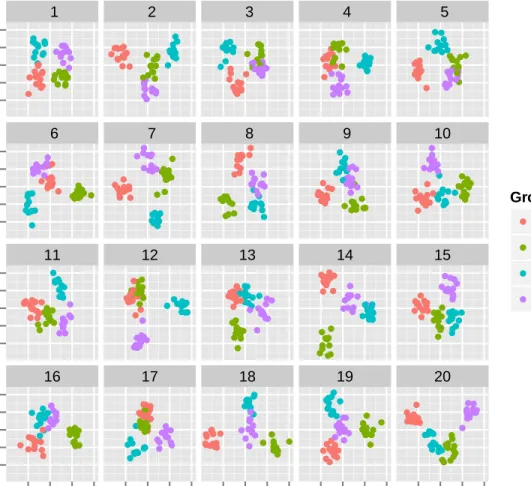
2.3 Lineup of the wasps data. One plot shows the observed data and the
remaining 19 show null data where the wasp type labels were randomly assigned. Each plot was produced by conducting LDA on the 40D data to produce the 2D projection with best separation. Which plot shows the most separation between the 4 groups? The solution is provided in
2.4 Plots showing example 1D projections forp= 2,8,15,22,28 andn= 30 for purely noise data. The probability of obtaining a projection where groups are separated is calculated and displayed below the plots. Of course, once a projection is computed the groups are either separated or not - the event occurred or didn’t - and we can see that the last two plots display separated groups. The difference between the groups
increases as p increases, and the likelihood of obtaining a projection
with separation increases. . . 24
2.5 The visual test statistics V1(Y) and V2(Y) used. V1(Y) is a horizontal
jittered dot plot while V2(Y) is a scatterplot of the first and second
dimensional projections, with color representing groups in both cases. 27
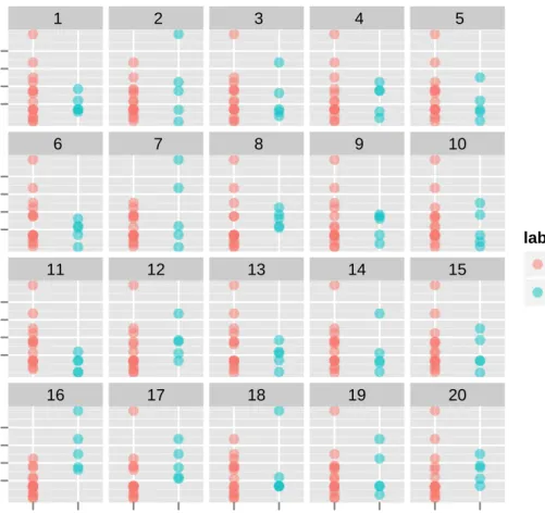
2.6 Lineup (m = 20) from treatment with p = 20, separation = Yes and
d = 1. The subjects were asked to identify the plot with the most
separated colors. Can you identify the observed data plot? The solution
to the lineup is provided in the Appendix. . . 28
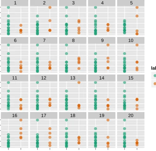
2.7 Lineup (m= 20) from treatment withp= 100, separation = No andd=
2.The subjects were asked to identify the plot with the most separation between the colored groups. Can you identify the observed data plot?
The solution is provided in the Appendix. . . 29
2.8 Detection rate by dimension, faceted by projection and separation. The
three points represents the three replicates for each treatment level. A fixed effects logistic regression model is overlaid on the points. It can be
seen that the detection rate decreases as p increases for data with real
separation. When the data is purely noise data, the detection rate is flat across dimensions. Detection rate does not change with projection.
Even withp= 100 subjects more often detected separation than would
2.9 Time taken in seconds to respond on log scale against dimension colored by separation and faceted by projection. A line shows the trend over dimension for each separation within projection. Bootstrap resampling bands are drawn for each colored lines. Time taken to respond is higher when the data has no separation. Also as dimension increases, the time to answer when there is separation is equal to the time taken when there
is no separation. . . 33
2.10 Comparing the choices that subjects make for each lineup. Relative
frequency of plots chosen against a measure of the average separation between groups, the larger the value the more separated are the groups. Each cell here shows the data for one of the lineups used in the experi-ment, 60 in total, and each “pin” represents a plot in the lineup, 20 for each lineup. Red indicates the observed data plot. Subjects are asked to pick the plot in the lineup where the groups are the most separated, so we would expect that more subjects would pick the plots with the largest average separation. In general, this happens, the tallest pins are in the right of each cell. The top three rows show the results for the data with separation, so the observed data plot (red) is typically the pin on the very left of the cell, less so for the higher dimensions which are the cells at right. Figure (a) shows 1D projections and Figure (b) shows for 2D projections. There is not much difference between the two
2.11 Detection rate and mean time taken to respond in seconds are plotted against the difference for 1D and 2D projections separately. The differ-ence is between maximum separation of all the null plots and separation of the observed data plot for each lineup for 1D projections but for 2D projections the difference is based on the average separation between the groups. The vertical line represents difference equal to 1 when the average separation of the observed data plot is equal to the maximum average separation of the null plots for 2D projection. The points left to the line indicates a difficult lineup in the sense that at least one of the null plots had a lower average separation value than the observed data plot. (a) and (b) As difference increases, detection rate increases. (c) and (d) As difference increases, mean time taken decreases indicating that the subjects have an easier time in identifying the observed data
plot. . . 36
3.1 Lineup plot of sizem = 20 using scatterplots with regression line
over-laid. This tests Ho :βk = 0, where covariate Xk is continuous. One of
the plots in the lineup is the plot of the true data. The other plots are null plots generated by simulating data from a null model that assumes that the null hypothesis is true. Can you identify the plot with the
3.2 If the lineup protocol was to be used instead of classical inference this is what it would look like. (a) Decision region (shaded in red) for classical
inference forH0 :µ=µ0 vs Ha:µ > µ0 and (b) values corresponding
to the true value (red) and the null plots (blue) in a single lineup of size
m= 20 that would be used to test the same null hypothesis. The actual
data plot is extreme relative to the null plots, and observers would likely be able to pick it out, resulting in a decision to reject the null hypothesis. In practice, the lineup protocol would not be used if a classical test can
be used. . . 41
3.3 Illustration of binned distance, for data with strong association (a), and the same data where one variable has been permuted (b). The scatterplot of the data is shown (left) along with the binned view of the data (center) and the number of points in each cell (right). Binned distance is the euclidean distance of these counts. The binned distance between these plots is 6.4807. . . 47
3.4 Illustration of three different distance metrics based on separation. Two dimensional projections are plotted with 3 groups. Minimum Separa-tion (in (a)) calculates the minimum distance between points of each cluster from the other clusters. Average separation (in (b)) calculates the average distance of each point in a cluster to the other clusters. In (c), the cluster mean distance calculates the distance between the means of each cluster. . . 50
3.5 Optional caption for list of figures . . . 52
3.6 Optional caption for list of figures . . . 53
3.8 An example lineup from Turk Experiment 1. The lineup has m = 20
plots of which one is the observed data plot and the remaining m−1
are the null plots generated assuming that the null hypothesis is true. Subjects were asked to identify the plot which has the largest vertical difference between the two groups. Can you identify the observed data
plot? . . . 57
3.9 Optional caption for list of figures . . . 58
3.10 Optional caption for list of figures . . . 60
3.11 Optional caption for list of figures . . . 61
3.12 An example lineup from Turk Experiment 2. In this lineup, one of the plots is the observed plot and the other 19 plots are the null plots generated assuming that the null hypothesisHo :β= 0 is true. Subjects were asked to identify the plot with the steepest slope. Can you identify the observed plot ? . . . 62
3.13 Optional caption for list of figures . . . 63
3.14 Optional caption for list of figures . . . 65
3.15 Optional caption for list of figures . . . 66
3.16 An example lineup from Turk Experiment 7. Here two dimensional projections of the PDA index are plotted for a data with separation having p= 20 dimensions andn= 30 observations. The subjects were asked to identify the plot with the most separated colors. Can you identify the observed data plot? . . . 67
3.17 Optional caption for list of figures . . . 69
3.18 Optional caption for list of figures . . . 70
4.1 A typical lineup. The plot of the actual data is embedded in a set of null plots which are generated assuming that the null hypothesis is true. The variable “mpg” is permuted 19 times to obtain the 19 null plots. Can you identify the plot which has the steepest slope? The true position of the plot can be obtain by copying and pasting “decrypt(...)” from the
output into R console. . . 80
4.2 Illustration of the Rorschach protocol. These nine scatterplots are
ob-tained by permuting the variable “mpg” while keeping the variable “wt” fixed. Does it look like the strength of the relationship is same in all the
plots? Is there a plot which has more interesting pattern than others? 82
4.3 Lineup plot of size m = 20 of scatterplots between “mpg” and “wt”
with a regression line overlaid. The plot of the actual data is randomly placed among the set of null plots. The position of the plot of the actual
data is 10. . . 86
4.4 Illustration of the optimum bin selection procedure. The obtained lineup
data from subsection4.5.1is used to generate difference between the true
plot and the maximum of the null plots using a binned distance for all combinations of number of bins on both x and y axes. The number of bins on x and y axes are plotted on x and y respectively with the colors
showing the differences. The darker color represents larger difference. 89
4.5 Distribution of the regression based distance with the distance for
the null plots of the lineup represented in black and the distance for the plot of the actual data represented by orange. The distance for the actual plot is much higher than the null plots and the actual plot can
4.6 Distribution of thebinned distancewith the distance for the null plots of the lineup represented in black and the distance for the plot of the actual data represented by orange. The number of bins used is 6 on both axes. The distance for the actual plot falls within the distances for the null plots. This shows that the lineup is difficult in the sense that the actual cannot be easily identified. Hence the selection of the
number of bins is important for binned distance. . . 93
4.7 Distribution of thebinned distancewith the distance for the null plots
of the lineup represented in black and the distance for the plot of the actual data represented by orange. The number of bins used is 3 on x-axis and 2 on y-axis. The number of bins are selected by the optimal
bin selection method using Figure4.4. The distance for the actual plot
is larger than the distances for the null plots which matches the lineup. 94
A.1 Plot showing the distribution of the sum of absolute difference of means
for data with and without separation for different dimensions. The
distributions of data with real separation (V) and purely noise data (U) are shown in brown and green respectively with the dark purple line showing the 5th percentile of V. The dark purple area shows the area of U which is greater than the 5th percentile of V. The dark purple region
ACKNOWLEDGEMENTS
First, I would like to thank my wife, Rianka, for her constant support, patience, under-standing and encouragement throughout my graduate education. I would also like to thank my younger brother, Upamanyu, who have always supported and stood by me in my low moments. I would like to thank my major professor, Dr. Dianne Cook for her valuable guidance and support. The various statistical methods learnt from her, specially on data visualizations and academic writing, will help me excel in my future endeavors. But her sense of humor, calmness and balance in life have had the biggest effects on me and it would help me to improve as a human being.
The suggestions provided by Dr. Heike Hofmann have helped improving the quality and scope of my research work. I am very thankful to her.
I really appreciate the valuable comments and suggestions made by my committee members. I would also like to thank them for their time and patience.
Graphics Working Group has provided me various suggestions and participated in a number of pilot studies. I would like to thank everyone in the group. I would specially thank Mahbubul Majumder for helping me whenever I needed.
I would also like to thank the Department of Statistics in Iowa State University for providing me this opportunity to pursue my doctorate degree. The inspiring teaching styles of many professors have helped me understand and learn the subject.
Finally, I thank my family back home and all my friends in Ames who have been more than my family and supported me unconditionally during my graduate education.
ABSTRACT
Statistical graphics play an important role in exploratory data analysis, model checking and diagnosis. Recent developments suggest that visual inference helps to quantify the significance of findings made from graphics. In visual inference, lineups embed the plot of the data among a set of null plots, and engage a human observer to select the plot that is most different from the rest. If the data plot is selected it corresponds to the rejection of a null hypothesis. With high dimensional data, statistical graphics are obtained by plotting low-dimensional projections, for example, in classification tasks projection pursuit is used to find low-dimensional projections that reveal differences between labelled groups. In many contemporary data sets the number of observations is relatively small compared to the number of variables, which is known as a high dimension low sample size (HDLSS) problem. The research conducted and described in this thesis explores the use of visual inference on understanding low dimensional pictures of HDLSS data. This approach may be helpful to broaden the understanding of issues related to HDLSS data in the data analysis community. Methods are illustrated using data from a published paper, which erroneously found real separation in microarray data. The thesis also describes metrics developed to assist the use of lineups for making inferential statements. Metrics measure the quality of the lineup, and help to understand what people see in the data plots. The null plots represent a finite sample from a null distribution, and the selected sample potentially affects the ease or difficulty of a lineup. Distance metrics are designed to describe how close the true data plot is to the null plots, and how close the null plots are to each other. The distribution of the distance metrics is studied to learn how well this matches to what people detect in the plots, the effect of null generating mechanism and plot choices for particular tasks. The analysis was conducted on data collected from Amazon Turk studies conducted with lineups for studying an array of exploratory data analysis tasks. Finally an R package is constructed to provide open source tools to use visual inference and distance metrics.
CHAPTER 1. INTRODUCTION
1.1 Background
Plotting data has its origins long before the development of the classical inference proce-dures, and then developed alongside these methods. The first recorded instance of statistical graphics based on the data was known to be in the year 1644 (variations in determination of longitude between Toledo and Rome as illustrated by Friendly and Denis (2001)). The devel-opment of inferential procedures started with Bernoulli (1700s) and gathered speed with Fisher (early 1900s) and has continued strongly through to present times (Hald, 2004).
The importance of statistical plots in statistical data analysis is widely understood. Model diagnosis and exploratory data analysis is predominantly dependent on statistical plots. Cleve-land and McGill (1984) began to formalize development of graphical methods with experiments in visual perception. Wickham (2009), building on ideas originating in Wilkinson (1999), de-veloped and implemented a grammar of graphics which presents a structured way to generate specific graphics from data and helps to define connections between disparate types of plot. Statistical graphs has been widely used for going beyond the standard paradigms of estimation and testing, to look for patterns in data beyond the expected. As pointed out by Gelman (2004), improvements in technology has helped in the development of statistical graphics. Higher res-olution graphics, more sophisticated user interfaces and accessible software such as R (R Core Team, 2013) has made graphical methods to be more widely available. The problem is, al-though we can explore and represent our findings using statistical graphics, it has been difficult to say that what we see is “real”. This thesis research helps to fill this void.
1.2 Review of Hypothesis Testing
Classical statistical inference can be broadly classified into two categories, namely estimation and testing of hypothesis. In testing of hypothesis we start out with a claim or belief about the population parameter. We need to verify the claim or belief based on whether our sample data matches the belief. In any test, there are two competing hypotheses. The null hypothesis
denoted byH0 is a statement of what we assume to be true which reflects the current condition
about the population parameter. On the other hand, the alternative hypothesis, denoted by
Ha which is a statement against the null hypothesisH0 is what we want to show.
The philosophy behind a statistical hypothesis is the same as in a jury trial. There are only two possibilities:
• “not guilty” corresponding toH0
• “guilty” corresponding to Ha
Like in a jury trial the philosophy is “innocent until proven guilty”, we assume H0 is true
until we have sufficient evidence in the data in favor of Ha. We may have three different types
of alternative hypotheses against the null hypothesis. Let us assume we want to test for a
population meanµ. So against the null hypothesis H0 :µ=µ0, we may have three choices of
alternatives:
• Ha:µ > µ0 • Ha:µ < µ0 • Ha:µ6=µ0
where µ0 is some pre-specified value that we assume holds true under H0. The first two
alternative hypotheses are known as one-sided alternatives and the third one is known as
two-sided alternative. Also H0 and Ha should always contradict each other, and jointly cover the
population parameter space.
Let us assume that we want to test
Now based on the sample we have in hand, we calculate the appropriate sample statistic. So
in this case we calculate the sample mean ¯x and standard deviationsfrom sample of sizen. If
Ha is indeed true, we should expect ¯x to be greater than µ0. Then the question of interest is
how much greater thanµ0 should ¯x be before we start doubting the null hypothesis. In other
words, is the value of ¯x unusually large if it is really true that H0 : µ= µ0. If the answer is
yes, then that would be evidence against H0 in favor ofHa. To assess how unusual or unlikely
our value of ¯x is we need to know something about how the statistic, ¯X, might vary from one
sample to another ifH0 were really true. (Kutner et al. (2005) provides extensive explanations
of these ideas.)
Assuming that the sample comes from a normal population or the sample size is large
enough so that the sampling distribution of ¯X is approximately normal, the standardized score
or the test statistic under H0, also known as the t-score is given by
t= X¯ −µ0
S/√n
Under H0, tfollows a tn−1 distribution. From this model we can determine the probability of
observing that particular value of tor something bigger, which is called the p-value. (See, for
example, Moore et al. (2009).) If it is small then it is pretty unlikely, which is evidence against
H0, which would lead us to believe that the sample comes from a distribution where µ > µ0,
that is,Ha. This is considered to be rejecting the null hypothesis.
More generally we can write the test statistic for any population parameter as
sample estimate of parameter−hypothesized parameter value underH0
standard error of the estimator
Under different situations, we would hope to be able to determine the distribution of this test
statistic in order to compute thep-value.
The next step is the definition of how small is small. This is determined by the level of
significance,α, also called the Type I error. It is the controlled error, the probability that we
are wrong in rejecting H0 when H0 is really true. The value of α is set to a level that we are
willing to risk being wrong, typically 0.05, but sometimes 0.1 or 0.01, or even lower. Deciding
• Reject H0 ifp-value < α
• Fail to rejectH0 ifp-value > α
Equivalently we can also decide to reject or fail to reject H0 by first determining the 100(1
- α) percentile value of tn−1 distribution, called the critical value, tn−1(α). This is compared
to the observed value of the test statistic, t, leading to the decision criteria (Figure1.1) being:
• Reject H0 ift > tn−1(α)
• Fail to rejectH0 ift < tn−1(α)
Different alternative hypothesis require slightly different comparisons. The two-sided
alter-native, Ha:µ6=µ0, requires using:
• Reject H0 if|t|> tn−1(α) • Fail to rejectH0 if|t|< tn−1(α) Reject H0 t>tn−1(α) Fail to reject H0 t≤tn−1(α) Sampling distribution if H0 is true α 0 tn−1(α)
Figure 1.1 Decision regions for classical inference for H0 :µ=µ0 vs Ha:µ > µ0.
Type I error, is the probability of rejecting the null hypothesis H0 when H0 is true. Type
II error, denoted by β is the probability of failing to reject the null hypothesis H0 when H0
is false. Type I error is committed in a jury trial when it is decided that a not guilty person is “guilty”. This is a serious mistake as an innocent person is punished. Type II error is committed when there is a guilty person is not convicted, not considered to be so serious. The
false i.e the power of the test is the probability of correctly rejecting a false null hypothesis. So
the power is the probability of not committing a Type II error and hence is denoted by 1 -β.
(Casella and Berger (2002) and Lehmann (1997) give more thorough treatments of hypothesis testing.)
1.3 Introduction to Visual Inference
Buja et al. (2009) proposes visual statistical methods with an inferential framework. In visual inference the plots take on the role of test statistics, the test statistic is a visual rep-resentation of the data, not a numerical value. Comparison data is generated under the as-sumption that the null hypothesis is true, and plots of this data are generated. These plots, known as the null plots gives the “null distribution of plots” analogous to the null distribution of test statistics. The plot of the data is compared with the null plots. Variations of these ideas have historically been utilized for data analysis, albeit sparingly, which is commented in the introduction of Buja et al. (2009). Gelman (2004) puts these ideas in the context of model building. The key feature of Buja et al. (2009) is that it makes the connection to the process of hypothesis testing, and quantifying significance. There are two protocols defined in this paper.
1.3.1 Protocols of Visual Inference
Buja et al. (2009) introduces two protocols for graphical inference: one is the “Rorschach” and the other is the “lineup”. The purpose of the Rorschach protocol is to measure a data analyst’s tendency to over interpret plots in which there is no or spurious structure. On the other hand the lineup provides a simple inferential process to produce a valid p-value for the observed plot. Here we describe the protocols briefly and refer the reader to Buja et al. (2009) and Wickham et al. (2010) for more details.
• Rorschach: It is possible that the randomness of the data inherits some pattern in the plot. The Rorschach protocol is designed to expose the data analyst’s tendency of over-interpretation of patterns when there is actually no or spurious structure. The results are specific to a particular data analyst and a particular data analysis procedure. The
protocol estimates the effective family-wise Type I error rate. A data administrator may generate the null plots and decides about the prior information that the data analyst is provided. The administrator may program the series of null plots in such a way that the plot of the real data is inserted in a random location. A toned-down version may also be used for self training. This self training may improve the family-wise error rate of the data analyst and develop an awareness of the features they are most likely to spuriously detect. The Rorschach protocol is named after the (pop-)psychology Rorschach test, in which subjects interpret abstract ink blots.
• Lineup: The lineup protocol gets its name after the police lineup of criminal investiga-tion. In a police lineup, the accused is placed among a set of innocent people who may be prisoners, actors or volunteers having no connection with the case. The witness is asked to pick from this lineup. Likewise in a lineup protocol, the accused which is the observed
plot is placed randomly among a set of null plots, say m, and the witness (in this case
the viewer) is asked to identify the plot as most different from the others. If the viewer can correctly identify the observed plot from the lineup, we have reasons to believe that the observed plot has a specific pattern which is missing in the null plots. This protocol leads to the development of the technique of visual inference by defining the test statistic as a plot that mostly show a specific pattern in the data when alternative hypothesis is
true. Figure 2.2shows a typical lineup.
Let us consider the following example. The data represents the concentration of a metal in mg/kg for two sites A and B. We want to test whether there exists a significant difference
between the concentration levels in the two sites A and B. Letµ1denote the mean concentration
level in Site A andµ2 denote the mean concentration level in Site B. To test that, we have the
following null and alternative hypothesis:
H0 :µ1=µ2 versus Ha :µ1 6=µ2
(Technically the problem this data addressed was more interested in testing a one-sided alter-native, whether site B has higher concentration than site A, but it is more interesting for this
example to consider the two-sided alternative hypothesis.) The test statistic is the plot of the
real data. The 19 null plots are generated by assuming that null hypothesis H0 :µ1 = µ2 is
true. So we permute the class variable site to obtain the null plots keeping the other variables fixed. The observed plot is placed randomly among these 19 plots in a lineup given in Figure
2.2. The viewer is asked to identify the plot which is most different. If the viewer can identify
the plot of the real data, we will have reasons to believe that the observed plot has a pattern which is absent in the null plots. So we would reject the null hypothesis. If the viewer cannot identify the observed plot, we fail to reject the null hypothesis.
Site
Conc (mg/kg)
50 100 150 200 50 100 150 200 50 100 150 200 50 100 150 200 1 6 11 16 site A site B 2 7 12 17 site A site B 3 8 13 18 site A site B 4 9 14 19 site A site B 5 10 15 20 site A site B label site A site BFigure 1.2 A typical lineup plot (m = 20) for testing H0 : µ1 = µ2. When the alternative
hypothesis is true the observed plot should have the largest vertical difference between the centers. Can you identify the observed plot?
to believe that there exists a statistically significant difference between the mean concentration levels in site A and site B. So the lineup protocol is the basis of the visual inference while the Rorschach protocol helps viewer understand the extent of randomness.
Majumder et al. (2013) describes a comparative study between the visual inference method and the classical inference methods, focusing on plots that might be used in linear modeling. In his work the expected power of the visual test is compared with the power of the uniformly most powerful (UMP) test. The power of the visual test is computed by responses from several large samples of lineup evaluators recruited through Amazon Turk (Amazon, 2010). The results suggest that the expected power of a visual test is almost as good as the power of UMP test, that visual inference compares favorably with classical testing, in the traditional setting where the classical test performs well. They established properties and efficacy of visual testing procedures in order to use them in situations where traditional test cannot be used. In addition Majumder et al. (2013) provide a nice way of making the leap from traditional hypothesis testing to visual
inference. We have adapted that table for theH0:µ1 =µ2 vsHa:µ1 6=µ2 example described
and plotted in Figure 2.2, which can be seen in Table 2.1.
0 1 3 2 4 5 6 109 87 11 131514 12 17 18 1920 16 0 tobs
Figure 1.3 Sampling distribution of the test statistic with the observed value and the values
for the null plots corresponding to the lineup in Figure 2.2.
In traditional hypothesis testing the sampling distribution of the test statistics is continuous, which allows evaluation of probability on an infinite spectrum. With the lineup, although conceptually we may have an infinite collection of plots from the null distribution, in practice, we sample a finite number of null datasets to generate the lineup. A human judge has a physical
Table 1.1 Comparison of visual inference with traditional hypothesis testing.
Mathematical Inference Visual Inference
Hypothesis H0 :µ1=µ2 vs Ha:µ1 6=µ2 H0:µ1 =µ2 vsHa:µ16=µ2 Test Statistic T(y) = y¯1−y¯2 sqn1 1+ 1 n2 T(y) = 50 100 150 200 site A site B Site C on c (mg /kg ) label site A site B Sampling Distribution fT(y)(t); −tn−1(α2)0 tn−1(α2) fT(y)(t); Site Conc (mg/kg) 50 100 150 200 50 100 150 200 50 100 150 200 50 100 150 200 1 6 11 16 site A site B 2 7 12 17 site A site B 3 8 13 18 site A site B 4 9 14 19 site A site B 5 10 15 20 site A site B label site A site B
RejectH0 if observedT is extreme observed plot is identifiable
limit on the number of null plots they can peruse. This poses one of the issues with using the
lineup protocol. Figure 1.3gives the sampling distribution (black curve) for thet-distribution,
along with the t-statistics of the samples that were drawn from the null distribution (blue
bars) and that of the observed data (red bar) for the plots in the lineup shown in Figure2.2.
Effectively, in visual inference the red line is compared only to these finite number of blue lines visually to make a decision, unlike classical inference where we look at the rejection region
(Figure1.1) to make decisions. So as Tukey suggested, there may be a “bad” random sample
of null plots which may affect our decision. This is a major component of this thesis research to develop techniques to determine the quality of a lineup. In practice, though, it needs to be noted, that visual inference will not typically be used in applications where there is an existing classical test. The purpose of visual inference is not to compete with classical statistics – its purpose is to provide formalism and quantification in problems where there are none, currently. For the purposes of research and assessment we use the classical setting because it provides benchmarks for how visual inference will likely perform.
1.4 Overview
My research extends the visual inference methodology in two ways – by producing metrics to quantify lineups and examine how people read statistical plots, and examining how it applies to assessing dimension reduction in high dimension low sample size (HDLSS) problems.
Chapter 2 explores the performance of dimension reduction methods such as projection
pursuit for high dimension, low sample size (HDLSS) data. The key points of interest were producing a way to evaluate an algorithm when its results are primarily visual, and to examine how well people can distinguish between real separation and noise in HDLSS data. Several hu-man subjects experiment were conducted using simulated data to provide controlled conditions. Results suggest that people can detect real separation from pure noise up to a reasonably high dimension. The broader community still has difficulty in understanding HDLSS data, which can be seen by published papers where the authors get excited about structure in low-dimensional projections, when it is really present simply because of the sparseness of high-dimensions. This chapter suggests that the lineup protocol can potentially explain HDLSS issues effectively. This paper is accepted for publication by Computational Statistics.
Chapter 3 focusses on developing metrics to describe the quality of a lineup. In
conven-tional inference, the test statistic is compared to all possible values of the sampling distribution, but in visual inference only a finite number of plots are drawn randomly from the sampling distribution. Understanding the effect of these finite comparisons is important. This chapter develops a variety of distance metrics that can be used to measure the “closeness” of observed data plot with the null plots. These metrics are compared to the results from human subjects experiments. These metrics may be useful to learn how people detect the observed data plot from the null plots. For example, with the HDLSS simulations, traditional class separation metrics like WBratio do not match the results from people as well as a metric measuring the gap between clusters.
if the observed data and the null generating mechanism are provided. Routines to calculate the distance metrics on the lineup were added. Some common distance metrics are included in the package and users have the freedom of using their own distance metrics. The package also provides diagnostic plots for comparing a lineup with other possible lineups that may have been generated.
Finally, chapter 5provides a summary of the dissertation and discussion of possible future
research work.
1.5 Scope of my Research
This dissertation provides the ground work for the application of visual inference. It applies visual inference methods in a high dimension, low sample size (HDLSS) framework, including using it to show that a gene expression data set does not have the separate clusters as claimed. The research has initiated ideas on metrics that could be used to evaluate the effect of the finite set of null plots in a lineup, cross-validate observer data, and help understand observer responses. Finally, an open source package has been extended to include this new metric methods to improve the use of the lineup protocol for visual inference.
CHAPTER 2. USING VISUAL STATISTICAL INFERENCE TO BETTER UNDERSTAND RANDOM CLASS SEPARATIONS IN HIGH
DIMENSION, LOW SAMPLE SIZE DATA
A paper accepted by Computational Statistics.
Niladri Roy Chowdhury, Dianne Cook, Heike Hofmann, Mahbubul Majumder Eun-Kyung Lee, Amy L. Toth
Abstract
Statistical graphics play an important role in exploratory data analysis, model checking and diagnosis. With high dimensional data, this often means plotting low-dimensional projections, for example, in classification tasks projection pursuit is used to find low-dimensional projections that reveal differences between labelled groups. In many contemporary data sets the number of observations is relatively small compared to the number of variables, which is known as a high dimension low sample size (HDLSS) problem. This paper explores the use of visual inference on understanding low-dimensional pictures of HDLSS data. Visual inference helps to quantify the significance of findings made from graphics. This approach may be helpful to broaden the understanding of issues related to HDLSS data in the data analysis community. Methods are illustrated using data from a published paper, which erroneously found real separation in microarray data, and with a simulation study conducted using Amazon’s Mechanical Turk.
2.1 Introduction
Many problems needing solutions today require the analysis of data where more variables are measured than there are samples taken. This is commonly referred to as high dimensional, low sample size (HDLSS) data (see for e.g. Hall et al. (2005)). HDLSS data occur in many application areas like face recognition, spectroscopy and gene expression analysis. Classical sta-tistical methods often fail in this context, because of insufficient data to support for parameter estimation.
Reducing the dimension, using principal component analysis (PCA), would be a classical first step in the analysis of HDLSS data. PCA requires estimating the eigenvalues (maxi-mum variance) and eigenvectors (direction of maxi(maxi-mum variance) of the population variance-covariance based on the sample. With insufficient data this is a Sisyphean task. Just imagine, estimating a line on the foundation of a single point - there are infinitely many possibilities for lines. For classification tasks, finding a low-dimensional space where the classes are separated is a common first step. Linear discriminant analysis (LDA) is the classical approach. LDA solves an eigenvalue decomposition problem comparing distances between group means with variance around each mean. Estimating the variance-covariance is problematic when there are few points. In addition, when there are few sample points in high dimensions, differences be-tween groups can be found in many different low-dimensional spaces, simply because of the sparseness of space.
Marron et al. (2007) describes the estimation issues associated with HDLSS. Advancements in PCA to handle HDLSS data have been done by Jung et al. (2012) and Yata and Aoshima (2011). Donoho and Jin (2009) and Donoho and Jin (2008) study optimal variable selection and introduce a principle of model selection for problems where only a small fraction of the variables are useful and unknown. Penalization is another common approach to handle HDLSS, and has been applied to classification problems e.g. (Witten and Tibshirani, 2011; Lee and Cook, 2010). Estimates of the variance-covariance are obtained by an interpolation with the identity matrix, effectively reducing the importance of some variables.
models and estimation for HDLSS data, the major issues are still not clear to many data an-alysts. For example, Toth et al. (2010) make a common mistake of seeing structure where
none exists. Figure 2.1 reproduces the result in this paper. They use LDA to examine gene
expression data of wasps containing 447 variables and 50 cases. There are 50 different paper wasps divided into 4 types: Foundress (F), Gyne (G), Queen (Q) and Worker (W), 14 wasps of type Foundress and 12 each of the other 3 types. The authors, knowing that LDA requires
that the dimension (p) should be smaller than the number of observations (n), first reduced
the dimension from 447 to 40 by randomly selecting a subset of significantly different
oligonu-cleotides. LDA produced a 2D projection (d= 2) of best separation. This is almost the same
approach as used in Dudoit et al. (2002), one of the first studies of classification of gene expres-sion data. What results is a picture of the four groups that suggests big differences in the types of wasps. There exists no conventional inferential method that enables us to conclude whether this apparently clear separation is statistically significant or not. For prediction, typically data is broken into training and test sets, or cross-validation is conducted to assess the significance of difference, using test set error. This approach does not work well for visualization.
−5 0 5 −6 −4 −2 0 2 4 6 LD1 LD2 F F FF F F F F F F F F F F G G G G G GGG G GG G Q Q Q Q Q Q QQ Q Q QQ WW W W W W W W W W W W
Figure 2.1 LD1 versus LD2 from an LDA on a randomly selected subset of 40 significantly
different oligos : F, Foundress; G, gyne; Q, queen and W, worker. It can be noticed that the groups F and G are separated. This plot is generated to match Figure 2 in Toth et al. (2010).
un-derstanding very generally. Visual statistical inference was first conceptually introduced by Buja et al. (2009), formalized and validated by Majumder et al. (2013). Using visual inference, it can be shown that there is no real difference between the wasp groups - what you see is a mirage.
Visual inference may also be useful in related applications, such as checking algorithms that produce visual results. We used the approach described in this paper to check the optimization
algorithm of projection pursuit in thetourrpackage (Wickham et al., 2011) inR(R Core Team,
2013). The optimization procedure was new, and we suspected that it was being sensitive to the order of data values, and returning projections of purely noise data that we thought were surprisingly distinct from noise. Visual inference was able to temper our concerns.
This paper describes visual statistical inference as applied to dimension reduction for HDLSS. In particular we focus on dimension reduction using projection pursuit, and the effect that having high dimension has on the robustness of the separation between groups. Small sim-ulation experiments are used to examine the problem in a controlled setting. The next section
explains visual inference methods. Section2.3discusses the dimension reduction methods.
Sec-tion 2.4describes Amazon’s Mechanical Turk (Amazon, 2010) which was used to conduct the
experiment. The application of visual inference methods on the wasp data (Toth et al. (2010))
is described in Section 2.5. Section2.6 discusses the experiment designed to examine people’s
perception of separation in the presence of real separation and “purely noise” for simulated
HDLSS data. Section 3.8discusses the collected data and results.
2.2 Visual inference methods
Buja et al. (2009) proposed two protocols, the Rorschach and the lineup. While the
Rorschach protocol helps to understand the extent of randomness, the lineup protocol is used for testing significance of findings. These methods together are called visual statistical in-ference. Majumder et al. (2013) made a head-to-head comparison between visual statistical inference tests and classical tests which showed that the lineup protocol performs similarly to the classical tests. Unlike classical hypothesis testing, the test statistic in visual inference is not numeric, but a plot that is appropriately chosen to display a distinctive pattern in case
that the null hypothesis is false. The lineup protocol of sizem embeds the observed data plot
amongst (m - 1) null plots. Null plots are created by a mechanism consistent with the null
hypothesis. Human subjects are asked to identify the plot in the lineup with the most distinct feature(s). When the alternative hypothesis is true, it is expected that the plot of the observed data, the test statistic, will have visible feature(s) inconsistent with the null hypothesis. If the subjects choose the plot of the observed data, this is evidence against the null hypothesis and with enough support, the null hypothesis is rejected.
An illustration of the lineup protocol in contrast to the conventional test is shown in Table
2.1. Both start with the same hypothesis but the test statistic in a conventional setting is
the parameter estimate divided by its standard error. In visual inference the test statistic is a plot of the observed data. In this case, a dot plot is used since the variable of interest is continuous with two groups. In a conventional test the value of the test statistic is compared with all possible values of the sampling distribution, the distribution of the test statistic if the null hypothesis is true. If it is extreme, then the null hypothesis is rejected. In visual inference, the plot of the data is compared with a finite number of samples drawn from the sampling distribution. If the actual data plot is selected as the most different, then the null hypothesis is rejected.
For example, suppose we have two sample data on the concentration of a metal inmg/kgfor
sites A and B of sizesn1 andn2 respectively. We want to test whether there exists a difference
between the concentration levels in the two sites A and B. To test for statistically significant
difference between the two populations from which the data was sampled, let µ1 denote the
mean concentration level in Site A andµ2 denote the mean concentration level in Site B. Thus
the null and alternative hypothesis would be
Ho :µ1=µ2 versus Ha:µ1 6=µ2
The conventional test would be a two-sample t-test with test statisticT(y) described in Table
2.1. One way to plot this data is a side-by-side dotplot. Let this be the visual test statistic
V(y). Null plots are generated assuming that Ho is true. Here, this is achieved by randomly
Table 2.1 Comparison of visual inference with traditional hypothesis testing. Starting with the same hypothesis, the test statistic in a conventional setting is a real number while in visual inference it is a plot of the observed data. In conventional testing the value of the test statistic is compared with all possible values of the sampling
distribution. Ho is rejected if it is extreme. In visual inference, the plot of the data
is compared with a finite number of samples drawn from the null distribution. If the actual data plot is identifiable, then the null hypothesis is rejected.
Mathematical Inference Visual Inference
Hypothesis Ho:µ1 =µ2 vsHa:µ16=µ2 Ho :µ1=µ2 vsHa:µ1 6=µ2
Test Statistic T(y) = y1−y2
sqn1 1+ 1 n2 V(y) = 0 50 100 150 200 250 site A site B Site Conc (mg/kg) label site A site B Sampling Distribution fT(y)(t); −tn−1(α2)0 tn−1(α2) fV(y)(t); 1 2 3 4 5 6 7 8 9 10 11 12 13 14 15 16 17 18 19 20 0 50 100 150 200 250 0 50 100 150 200 250 0 50 100 150 200 250 0 50 100 150 200 250
site A site Bsite A site Bsite A site Bsite A site Bsite A site B Site
Conc (mg/kg)
label
site A site B
obtain a lineup. In this example, m = 20 is the size of the lineup - there are 19 null plots. If
Hois not true, the dots of one group should be vertically shifted relative to the other group. If
the human observer can identify the plot of the real data, there will be reason to believe that the observed data plot has a pattern which is absent in the null plots leading to a rejection of the null hypothesis. If the viewer cannot identify the observed data plot, we fail to reject
the null hypothesis. Under the null hypothesis, each observer has a 1/mchance of picking the
observed plot from a lineup of size m. Hence 1/m is the minimal value at which we can set
the Type I error, α, consistent with α = 0.05 if m = 20. Majumder et al. (2013) provides
more detailed discussion about this. For this problem, visual inference enables the handling of the small sample size and non-normality of the population. However, in general the setting for visual inference would be problems where no conventional test exists.
Majumder et al. (2013) describes the methods of obtaining the power of the visual test, by combining results from multiple users. For their simulation experiments human observers were recruited through Amazon’s Mechanical Turk (Amazon, 2010). Power of the visual test used in their simulation was also calculated theoretically. Their results suggest that the power of visual statistical inference is comparable to conventional tests in a setting of testing the parameters of linear regression models. The subject specific power of the visual test can also be estimated from the multiple responses data from each human observer, which might help quantify individual visual skills.
2.3 Dimension reduction
Projection pursuit [e.g. (Friedman and Tukey, 1974)] is used for dimension reduction in our studies. Projection pursuit (PP) finds the most interesting low dimensional projection of high dimensional data by maximizing some criterion of interest, e.g. variance or clustering or group separation. As pointed out in Huber (1985) the most exciting feature of projection pursuit is that it can bypass the curse of dimensionality.
In classification problems, linear discriminant analysis (LDA) can be used to find a low-dimensional space where the groups are most separated. This corresponds to using the LDA
1 2 3 4 5 6 7 8 9 10 11 12 13 14 15 16 17 18 19 20 0 50 100 150 200 250 0 50 100 150 200 250 0 50 100 150 200 250 0 50 100 150 200 250
site A site B site A site B site A site B site A site B site A site B
Site
Conc (mg/kg)
label
site A site B
Figure 2.2 A typical lineup (m = 20) for testing Ho : µ1 = µ2. When the alternative
hy-pothesis is true, the observed data plot should have the largest vertical difference between the centers. Can you identify the observed data plot? The solution to the lineup is provided in the Appendix.
jth observation in theith class, i= 1, . . . , g, j = 1, . . . , ni, gis the number of classes, ni is the
number of observations in class i, and n = Pg
i=1ni. Let Xi. = n1iPnj=1i Xij be the ith class
mean andX..= n1
Pg i=1
Pni
j=1Xij be the total mean. The LDA PP index is
ILDA(A) = 1− A T WA A T W+BA forAT W+B A6= 0 0 forAT W+B A= 0 (2.1)
whereA is an orthogonal projection onto ak-dimensional space and
B =
g X
i=1
ni(Xi.−X..)(Xi.−X..)T : between-class sums of squares,
W = g X i=1 ni X j=1
(Xij−Xi.)(Xij −Xi.)T : within-class sums of squares.
For HDLSS data, the penalized discriminant analysis (PDA) index (Lee and Cook, 2010)
is more robust. LetX∗ij be the standardized vector ofXij. Then
Bs = g X i=1 ni(X ∗ i.−X ∗ ..)(X ∗ i.−X ∗
..)T : between-class sums of squares of the standardized data
Ws = g X i=1 ni X j=1
(X∗ij −X∗i.)(X∗ij−X∗i.)T : within-class sums of squares of the standardized data
where X∗i. is the ith class mean of the standardized data and X∗.. is the total mean of the
standardized data, which is 0. The PDA index is defined as
IP DA(A, λ) = 1− A T (1−λ)Ws+nλIp A A T (1−λ)(Bs+Ws) +nλIp A (2.2)
whereA is an orthonormal projection onto ak-dimensional space andλ∈[0,1) is a
predeter-mined parameter. Penalized LDA (Witten and Tibshirani, 2011) is a similar approach.
These indices are available for projection pursuit using the tourrpackage (Wickham et al.,
2011) inR(R Core Team, 2013). Thetourr package produces tours of multivariate data. The
package also includes functions for creating different types of tours like grand, guided and little
d≤p. The guided tour function is used here. The guided tour will converge to a maximally interesting projection. Here, that is a projection where groups show the biggest separation.
For this paper we used d= 1 or 2.
2.4 Amazon Turk experiments
Amazon’s Mechanical Turk (Amazon, 2010) is a service that enables researchers to employ people to do tasks which computers perform poorly. In exchange for their efforts, the subjects are paid, not substantially, but on the scale of the minimum wage of the USA. For visual inference studies, subjects are typically given a block of ten lineups to evaluate during a job. From this block, one lineup is typically used as a filter, and the remaining lineups produce data for the studies. Because a subject evaluates more than one lineup, and a lineup is evaluated by more than one subject, we obtain some replication in the results upon which to estimate variation. The one filter lineup, in which the observed data plot is markedly different from the nulls, is necessary because Turkers are not manually monitored, and a few attempt to maximize financial gain without taking the exercise seriously.
For this paper, two Turk studies were run, one for the wasps data, and the other for the simulation study. Turkers are redirected from Amazon to a website which describes the study in detail, provides some practice trials, collects demographic details, and responses. The website of
the simulation study ishttp:/mahbub.stat.iastate.edu/feedback_turk7/homepage.html.
2.5 Wasps application
We return to the motivating example. Figure2.1suggested that the expression patterns of
the wasp groups are different. The question of interest is “Is this separation real?” This can be investigated by testing the hypothesis:
Ho: There is NO difference in the expression levels between the types of wasp.
Ha: At least one of the types of wasps has different expression levels.
A lineup is made of the wasp data obtained from Toth et al. (2010) to testHo where the null
difference between the expression levels for the types of wasps then the observed data plot
should be detectable in the lineup. Figure 2.3 shows a lineup. Three different lineups were
created using this procedure.
● ● ●●●● ● ● ● ● ● ● ● ● ● ● ● ● ● ● ● ● ● ● ● ● ● ● ● ● ● ● ● ● ● ● ● ● ● ● ● ● ● ● ● ● ● ● ● ● ● ● ●● ● ● ● ● ● ● ● ● ● ● ● ● ● ● ● ● ● ● ● ● ● ● ● ● ● ● ● ● ● ● ● ● ● ● ● ● ● ● ● ● ● ● ● ● ● ● ● ● ●● ● ● ● ● ● ● ● ● ● ● ● ● ● ● ● ● ● ● ● ● ● ● ● ● ● ● ● ● ● ● ● ● ● ● ● ● ● ● ● ● ● ● ● ● ● ● ● ● ● ● ● ● ● ● ● ● ● ● ● ● ●● ● ●●● ● ● ● ●● ● ● ● ● ● ● ● ● ● ● ● ● ● ● ●● ● ● ● ● ● ● ● ● ● ● ● ● ●● ● ● ● ● ● ● ● ●● ● ● ● ● ● ● ● ● ● ● ● ● ● ● ● ● ● ● ● ● ● ● ● ● ● ● ● ● ● ● ● ● ● ● ● ● ●● ●● ● ●● ● ● ● ● ● ● ● ● ● ● ● ● ● ● ● ●● ● ● ● ● ● ● ● ● ● ● ● ● ● ● ● ● ● ● ● ● ● ● ● ● ●● ● ● ● ● ● ● ● ● ● ● ● ● ● ● ● ● ● ● ● ● ● ● ● ● ● ● ● ● ● ● ● ● ● ● ● ● ● ● ● ● ● ● ● ●● ● ● ● ● ● ● ● ●● ● ● ● ●● ● ● ● ●● ● ● ● ●●●●●●●● ● ● ● ●● ●● ●● ● ● ●● ●●●●● ●●● ● ●● ● ● ● ● ● ● ● ● ● ● ● ● ● ●● ● ● ● ● ● ● ● ● ● ● ●● ● ● ● ● ● ● ● ● ● ● ● ● ● ●● ● ● ● ● ● ●●● ● ● ● ● ● ● ● ●● ● ●●● ● ● ● ● ● ●● ●● ● ● ● ● ● ● ● ● ●●●●●● ● ● ● ● ● ● ● ● ● ● ● ● ● ● ● ● ● ● ●● ● ● ● ●● ● ● ● ● ● ● ● ● ● ● ● ● ● ● ● ● ● ● ● ● ● ● ● ● ● ● ●● ● ● ● ●● ● ● ● ● ● ● ● ● ● ●● ● ●● ● ● ● ● ●● ● ● ● ● ● ● ● ● ● ● ● ● ● ● ● ● ● ● ● ● ● ● ● ● ● ● ● ● ●● ● ● ● ● ● ● ● ● ● ● ● ●● ● ● ● ● ● ●● ● ● ● ● ● ● ● ● ● ●● ● ● ● ● ● ● ● ● ● ● ● ● ● ● ● ● ● ● ● ● ● ● ● ● ● ● ● ● ● ● ● ● ● ● ● ● ● ● ● ● ● ● ● ● ● ● ● ● ● ● ● ● ● ● ● ● ● ● ● ● ● ● ● ● ● ● ● ● ● ● ● ● ● ● ●● ● ● ● ● ● ● ● ● ● ● ● ● ● ● ● ● ● ● ● ● ● ● ● ● ● ● ● ● ● ● ● ● ● ● ● ● ● ● ● ● ● ● ● ● ● ● ● ● ● ● ● ● ● ● ● ●● ● ● ● ● ● ●● ●● ● ●● ● ● ● ●● ● ● ● ● ● ● ● ● ● ● ● ● ● ● ● ● ● ● ●● ●● ● ● ● ● ● ● ● ● ● ● ● ● ● ● ●● ● ● ● ● ● ● ● ● ● ● ● ● ● ● ● ●● ● ● ● ● ● ● ● ● ● ● ● ● ● ● ● ● ● ● ●● ● ● ● ● ● ● ● ● ● ● ● ●● ● ● ● ● ● ● ● ● ● ● ● ● ● ● ● ● ● ● ● ● ● ● ● ● ● ● ● ● ● ● ● ● ● ● ● ● ● ● ● ● ● ● ● ● ● ● ● ● ● ● ● ● ● ● ● ● ● ● ● ●● ● ● ● ● ● ● ● ● ● ● ● ● ● ● ● ● ● ● ● ● ● ● ● ● ●● ● ● ● ● ●● ●● ●● ● ● ● ● ● ● ● ●● ● ● ● ●● ●● ● ● ● ● ● ● ● ● ● ● ● ● ● ● ● ● ● ● ● ● ● ●● ● ● 1 2 3 4 5 6 7 8 9 10 11 12 13 14 15 16 17 18 19 20 −5.0 −2.5 0.0 2.5 5.0 −5.0 −2.5 0.0 2.5 5.0 −5.0 −2.5 0.0 2.5 5.0 −5.0 −2.5 0.0 2.5 5.0 −5 0 5 10 −5 0 5 10 −5 0 5 10 −5 0 5 10 −5 0 5 10
LD1
LD2
Group ● ● ● ● F G Q WFigure 2.3 Lineup of the wasps data. One plot shows the observed data and the remaining 19
show null data where the wasp type labels were randomly assigned. Each plot was produced by conducting LDA on the 40D data to produce the 2D projection with best separation. Which plot shows the most separation between the 4 groups? The solution is provided in the Appendix.
In addition, three more lineups are made containing only null plots, with one plot randomly chosen to act as an observed data plot. These lineups were shown to the subjects recruited from
Amazon Turk. A total of 116 subjects evaluated the 6 lineups. Table 2.2 shows the results.
The detection rate for the plot of the wasp data is 0! This is worse than that of purely noise data. You will notice that for one of the purely noise lineups, subjects very often detected
the (random) observed data plot. This happened because the randomly generated observed data plot actually had more separation than any other plot in that lineup. This is the nature
of randomness, but makes for interesting results here. The p-value is calculated according to
the procedure given by Majumder et al. (2013). The large p-values indicate that there is no
statistically significant evidence upon which we reject the null hypothesis. Thus we have to conclude that the separation in the wasp data (Toth et al. (2010)) is not real. It is purely the effect of high dimensionality.
Table 2.2 Results of the Turk study on the wasps data. Detection rate for each lineup is
shown, with the number of subjects, and p-value associated. The detection rate is
highest for one of the purely noise lineups, which occurred because the plot with the most difference between groups happened to be the one that is randomly generated
as the “real” data. Averaging the p-values for each set of lineups, for the wasps is
1.0, and for the pure noise, is 0.67 suggesting that the apparent separation in the wasp data (Toth et al. (2010)) is consistent with pure noise induced by the high dimensions.
Data Replicate Num Subjects Detection rate p-value
1 25 0.0000 1.0000 Wasps 2 13 0.0000 1.0000 3 27 0.0000 1.0000 1 19 0.2632 0.0002 Purely noise 2 18 0.0000 1.0000 3 14 0.0000 1.0000
The probability of separation by chance between two groups in purely noise data, given a
fixed sample size and dimension, was quantified by Ripley (1996) (Proposition 3.1). Figure2.4
illustrates this result for 1D projections, for different p, where sample size is fixed atn = 30.
When p = 2, P(separation|n= 30, p= 2) = 0 and it reaches 1 when p = 28. For data of the
size of the wasps, n = 50 and p = 40, the probability of obtaining separation with only two
groups is 1, so we would expect that there would certainly be separation between four groups in 2D.
In the original paper (Toth et al., 2010), the dimensionality was reduced from 447 by choosing the genes that showed the greatest separation. So the problem of high dimensionality is actually even worse for these data. In general, reducing the data dimensions so that the
● ● ● ● ● ● ● ● ● ● ● ● ● ● ● ● ● ● ● ● ● ● ● ● ● ● ● ● ● ● 0.0 1.5 3.0 −1 0 1 LD1 (a) P(sep|n,2) = 0.00 ● ● ● ● ● ● ● ● ● ● ● ● ● ● ● ● ● ● ● ● ● ● ● ● ● ● ● ● ●● 0.0 1.5 3.0 −2 −1 0 1 2 LD1 (b) P(sep|n,8) = 0.01 ● ● ● ● ● ● ● ● ● ● ● ● ● ● ● ● ● ● ● ● ● ● ● ● ● ● ● ● ● ● 0.0 1.5 3.0 −2 −1 0 1 2 LD1 (c) P(sep|n,15) = 0.64 ● ● ● ● ● ● ●● ● ●● ● ● ● ● ● ● ● ● ● ● ● ● ● ● ● ● ● ●● 0.0 1.5 3.0 −2.5 0.0 2.5 LD1 (d) P(sep|n,22) = 0.99 ●● ● ● ● ●● ● ● ● ● ● ● ●● ● ● ● ● ● ● ● ● ● ● ●●●● ● 0.0 1.5 3.0 −5 0 5 LD1 (e) P(sep|n,28) = 1.00
Figure 2.4 Plots showing example 1D projections forp= 2,8,15,22,28 andn= 30 for purely
noise data. The probability of obtaining a projection where groups are separated is calculated and displayed below the plots. Of course, once a projection is computed the groups are either separated or not - the event occurred or didn’t - and we can see that the last two plots display separated groups. The difference between the
groups increases as p increases, and the likelihood of obtaining a projection with
separation increases.
sample size is bigger than dimension is not, on its own, sufficient. It is important, even, with so few cases to do cross-validation, or break the sample into training and test sets before conducting analysis. LDA is known also to be a problem for HDLSS data, because it requires estimating more parameters than the available data allows. A better prospect for dimension reduction is the penalized discriminant analysis (PDA) index (Lee and Cook, 2010), which helps adjust for the over-estimation. Other results and the overall conclusions in Toth et al. (2010) are not affected by the inadequacy revealed by this visual inference analysis. A similar LDA performed on wasp gene expression data with a much higher sample size in Toth et al. (2007) did not suffer from the HDLSS problem. We determined that there were robust separations between the groups based on those data (results not shown).
2.6 Follow-up simulation experiment
2.6.1 Experimental design
The goal is to determine how well people can detect the presence of real separation as dis-tinguishable from random noise. To achieve this, the experiment is set up with several factors: real separation or pure noise, data dimension and projection dimension. Real separation is achieved by setting 1 or 2 variables with real separation among a number of noise variables. Sample size is fixed to keep the experiment manageable. Also mean difference is kept fixed.