Worcester Polytechnic Institute
Digital WPI
Major Qualifying Projects (All Years) Major Qualifying Projects
March 2019
Machine Learning for Mental Health Detection
Adonay Zenebe ResomWorcester Polytechnic Institute Jerry Xu Assan
Worcester Polytechnic Institute Maurice Anthony Flannery Worcester Polytechnic Institute Yufei Gao
Worcester Polytechnic Institute Yuxin Wu
Worcester Polytechnic Institute
Follow this and additional works at:https://digitalcommons.wpi.edu/mqp-all
This Unrestricted is brought to you for free and open access by the Major Qualifying Projects at Digital WPI. It has been accepted for inclusion in Major Qualifying Projects (All Years) by an authorized administrator of Digital WPI. For more information, please [email protected]. Repository Citation
Resom, A. Z., Assan, J. X., Flannery, M. A., Gao, Y., & Wu, Y. (2019).Machine Learning for Mental Health Detection. Retrieved from
This report represents the work of one or more WPI undergraduate students submitted to the faculty as evidence of completion of a degree requirement. WPI routinely publishes these reports on its website without editorial or peer review.
Machine Learning for Mental Health Detection
A Major Qualifying Project
submitted to the faculty of Worcester Polytechnic Institute
in partial fulfillment of the requirements for the Degree of Bachelor of Science
in Computer Science
Submitted by: Jerry Assan Maurice Flannery Yufei Gao Adonay Resom Yuxin Wu Advised by: Elke A. RundensteinerDate:
March 21, 2019
ii
Abstract
Our project goal was to develop a depression sensing application that leverages multi-modal data sources collected from a smartphone, focusing on features extracted from audio, text messages, social media data, as well as GPS modalities. We conducted extensive experiments to study the effectiveness of these features to improve our machine learning model. We deployed our EMU app on Amazon Mechanical Turk for crowd-sourced data collection and incorporated feature extraction techniques and machine learning algorithms to reliably predict levels of depression.
iii
Acknowledgments
The success of our Major Qualifying Project (MQP) would not have been possible without the help of many individuals. Firstly, we would like to thank Professor Elke Rundensteiner, and graduate student mentors Ermal Toto and Monica Lauren Tlachac for their continuous support and guidance throughout the project. In particular, we thank Ermal Toto for the extensive help with putting together the machine learning pipeline, development of the back-end server, and general software support. And we thank Monica Lauren Tlachac for her general advice as well as for her suggestions and ideas related to text message related feature extraction in addition to support for the identification of medical literature in this area.
We would also like to express gratitude towards our university, Worcester Polytechnic Institute (WPI), specifically the Computer Science department, for the logistical support and permission to carry out our experiments, while also providing us with funding that allowed us to conduct our study.
A big thanks also goes to graduate student Walter Gerych for helping with GPS feature extraction, and Eirs Wu for helping with the design of EMU’s logo. Also, we thank Damon Ball, Ada Dogrucu, Anabella Isaro, and Alex Perucic, whose prior MQP work, advised by Professors Emmanuel Agu and Elke Rundensteiner in the previous academic year, served as the starting point for our MQP. Our MQP would not have reached this point if it was not for the countless recommendations and guidance in solidifying our project.
iv
List of Figures
Figure 1: The PHQ-9 Questionnaire (Ball et al., 2018) 4
Figure 2: Statistics of the Report (Rude et al., 2004) 11
Figure 3: Praat GUI Analysis 24
Figure 4: Example of KML Data 29
Figure 5: Example of CSV Data 30
Figure 6: KNN Example 32
Figure 7: SVM Linear 34
Figure 8: SVM Non-Linear 35
Figure 9: SVM Space 35
Figure 10: SVM Parameters (Ghose, 2017) 36
Figure 11: Basic Kernel Models (Hsu, Chang, & Lin, 2016) 36
Figure 12: Object Recognition Example (Stricker, n.d.) 37
Figure 13: Random Forest Classification (Holczer, 2018) 39
Figure 14: Tree Ensemble Model (Chen & Guestrin, 2016) 40
Figure 15: Pseudo code for actual boosting (Synced, 2017) 41
Figure 16: Final Equation for AdaBoost Classification (SauceCat, 2017) 42
Figure 17: Example of Decision Tree (Gupta, 2017) 42
Figure 18: Equation of Gini Impurity (Gupta, 2017) 43
Figure 19: Final Equation of Logistic Regression (Binary) (Swaminathan, 2018) 44
Figure 20: Equations for Gaussian Processes (Bailey, 2016) 46
Figure 21: Feature CSV File Structure 48
Figure 22: Machine Learning Pipeline Flow 51
Figure 23: Starting Page of Mturk 52
Figure 24: Sign in Page 53
Figure 25: Choosing Project Type 54
Figure 26: Edit Project Page 55
Figure 27: Design Layout Page 55
Figure 28: Publish Page 56
Figure 29: Manage Page 57
Figure 30: Bonus Page 57
Figure 31: Home Page 59
Figure 32: Error and Alert Pages 60
Figure 33: Permission Page 61
Figure 34: Demographics Page 61
Figure 35: PHQ-9 Page 62
Figure 36: GAD-7 Page 63
Figure 37: Voice Page 63
Figure 38: Voice Page 2 64
Figure 39: Google Page 65
Figure 40: Twitter Page 65
Figure 41: Instagram Page 66
Figure 42: Thank You Page 67
v
Figure 44: Boxplots of Spam and No Spam Performance 72
Figure 45: Boxplots of Different Tools Performance 73
Figure 46: Tuned Classifiers For Text Features Comparison 76
Figure 47: Boxplots of Text Feature Sets Comparison 78
Figure 48: Boxplots of Combined Text Feature Sets Comparison 79
Figure 49: Boxplots of Feature Selection on Sent And Tweets Feature Set 80
Figure 50: Boxplots of Feature Selection on Sent, Received And Tweets Feature Set 81
Figure 51: Boxplots of Tuned Classifiers For Text Features Comparison (New Data) 82
Figure 52: Boxplots of Feature Selection on Sent, Received And Tweets Feature Set 84
Figure 53: Tuned Classifiers For Audio Features Comparison 86
Figure 54: Boxplots of Audio Feature Sets Comparison 88
Figure 55: Boxplots of Feature Selection on Audio All Feature Set (# of features <= 50) 89
Figure 56: Boxplots of Feature Selection on Audio All Feature Set (# of features >= 50) 90
Figure 57: Boxplots of Feature Selection on OpenSmile Feature Set (# of features <= 50) 91
Figure 58: Boxplots of Feature Selection on OpenSmile Feature Set (# of features >= 50) 92
Figure 59: Boxplots of Feature Selection on Praat Combined Feature Set 93
Figure 60: Boxplots of Feature Selection on Praat Signal Feature Set 94
Figure 61: Boxplots of Tuned Classifiers For Audio Features Comparison (New Data) 96
Figure 62: Boxplots of Audio Data Sets Comparison (New Data) 97
Figure 63: Tuned Classifiers For GPS Features Comparison 100
Figure 64: Boxplots of GPS Feature Sets Comparison 102
Figure 65: Boxplots of Feature Selection on Activity Feature Set 103
Figure 66: Boxplots of Feature Selection on Raw GPS Feature Set 104
Figure 67: Boxplots of Feature Selection on Combined GPS Feature Set 105
Figure 68: Boxplots of Feature Selection on All Features Using SVC (10-50) 107
Figure 69: Boxplots of Feature Selection on All Features Using SVC (50-200) 108
Figure 70: Boxplots of Feature Selection on All Features Using SVC (250-600) 109
Figure 71: Boxplots of Different Feature Selection Methods on All Features Using SVC 110
Figure 72: EMU Website - Dataset Page Preview 113
Figure 73: EMU Website - Taken on iPhone X 114
Figure 74: EMU Website - Taken on iPad Pro 10.5-inch 115
vi
List of Tables
Table 1: Some Forms of Depressive Disorders (Ball et al., 2018) 6
Table 2: Some Clinically Validated Measures of Depression (Ball et al., 2018) 6
Table 3: Data Before Grouped 13
Table 4: Data After Grouped 13
Table 5: All Tags of Speech Tag (CLiPS Research Center, 2010) 15
Table 6: Examples of Sentiment Analysis 1 17
Table 7: Examples of Sentiment Analysis 2 17
Table 8: Correlation between SPT and HAMD (Mundt, 2017) 19
Table 9: Audio Features Generated by Praat 26
Table 10: Database Structure 68
Table 11: With Spam and No Spam Performance (F1 Score) 73
Table 12: Different Tools Performance (F1 Score) 74
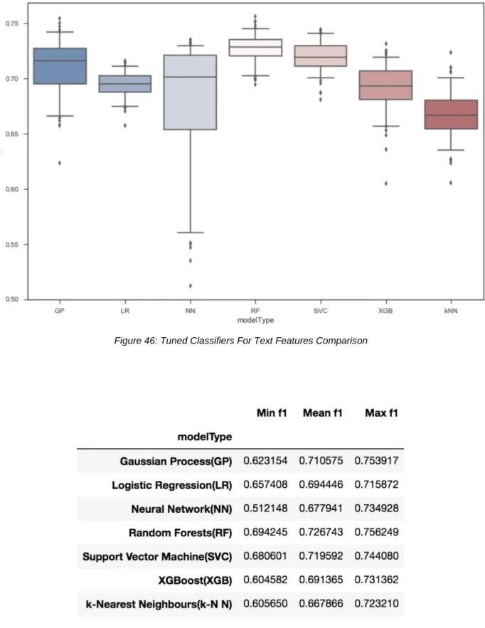
Table 13: Statistic Summary of Tuned Classifiers For Text Features Comparison 76
Table 14: Statistic Summary of Text Feature Sets Comparison 78
Table 15: Statistic Summary of Combined Text Feature Sets Comparison 79
Table 16: Statistic Summary of Feature Selection on Sent And Tweets Feature Set 81
Table 17: Statistic Summary of Feature Selection on Sent, Received And Tweets Feature Set 81 Table 18: Statistic Summary of Tuned Classifiers For Text Features Comparison (New Data) 83 Table 19: Statistic Summary of Feature Selection on Sent, Received And Tweets Feature Set 85
Table 20: Statistic Summary of Tuned Classifiers For Audio Features Comparison 87
Table 21: Statistic Summary of Audio Feature Sets Comparison 88
Table 22: Statistic Summary of Feature Selection on Audio All Feature Set (# of features <= 50) 90
Table 23: Statistic Summary of Feature Selection on Audio All Feature Set (# of features >= 50) 91 Table 24: Statistic Summary of Feature Selection on OpenSmile Feature Set (# of features <= 50) 92
Table 25: Statistic Summary of Feature Selection on OpenSmile Feature Set (# of features >= 50) 93
Table 26: Statistic Summary of Selection on Praat Combined Feature Set 94
Table 27: Statistic Summary of Feature Selection on Praat Signal Feature Set 94
Table 28: Statistic Summary of Tuned Classifiers For Audio Features Comparison (New Data) 96
Table 29: Statistic Summary of Audio Data Sets Comparison (New Data) 98
Table 30: Statistic Summary of Tuned Classifiers For GPS Features Comparison 100
Table 31: Statistic Summary of GPS Feature Sets Comparison 102
Table 32: Statistic Summary of Feature Selection on Activity Feature Set 103
Table 33: Statistic Summary of Feature Selection on Raw GPS Feature Set 104
Table 34: Statistic Summary of Feature Selection on Combined GPS Feature Set 105
Table 35: Statistic Summary of Feature Selection on All Features Using SVC (10-50) 107
Table 36: Statistic Summary of Feature Selection on All Features Using SVC (50-200) 108
Table 37: Statistic Summary of Feature Selection on All Features Using SVC (250-600) 109
vii
Table of Contents
Acknowledgments iii
Abstract ii
List of Figures iii
List of Tables vi
Table of Contents vii
1. Introduction 1
2. Background 3
2.1 Summary of the Previous MQP 3
2.2 Background on Depression 5
2.3 Detecting Depression from Text 7
2.3.1 Sentence Structure 7
2.3.2 Content 8
2.4 Detecting Depression from Voice 8
2.4.1 Speaking Style & Vowel Space 8
2.4.2 Speech Pause Time and Speech Rate 9
2.5 Detecting Depression from GPS Data 9
3. Feature Engineering Methodology 11
3.1 Text Features 11
3.1.1 Feature Selection 11
3.1.2 Data Preprocessing 12
3.1.2.1 Data Pretreatment 12
3.1.2.2 Spam Removal 13
3.1.3 Features Based on Content 14
3.1.3.1 Frequencies and Volume 14
3.1.3.2 The Speech Tag Frequency 14
3.1.4 Features Based on Sentence Structure 15
3.1.5 Feature Extraction 16
3.1.5.1 Empath 16
3.1.5.2 Linguistic Inquiry and Word Count 16
3.1.5.3 TextBlob 17
viii
3.2 Audio Features 18
3.2.1 Feature Selection 18
3.2.2 Features Based on Speech Pause Time (SPT) 19
3.2.2.1 Number of Pauses 20
3.2.2.2 Number of Syllables 20
3.2.2.3 Total Recording Length 20
3.2.2.4 Vocalization Time 21
3.2.2.5 Total Pause Time 21
3.2.2.6 Speech Rate 21
3.2.2.7 Articulation Rate 21
3.2.2.8 Pause Variability (𝜎pause time) 21
3.2.2.9 Percent Pause Time 21
3.2.2.10 Average Syllable Duration 22
3.2.3 Features Based on Signal Analysis 22
3.2.3.1 Jitter 22
3.2.3.2 Shimmer 22
3.2.3.3 Mean Harmonics to Noise Ratio 22
3.2.3.4 Mean Noise to Harmonics Ratio 23
3.2.3.5 Mean Autocorrelation 23
3.2.3.6 Fractional Locally Unvoiced Frames 23
3.2.3.7 Number of Voice Breaks 23
3.2.3.8 Degree of Voice Breaks 23
3.2.4 Feature Extraction (Pratt) 23
3.2.4.1 Extraction of Pause Time Features 25
3.2.4.2 Extraction of Signal Based Features 25
3.2.5 Feature Extraction (openSMILE) 26
3.3 GPS Features 27
3.3.1 Features Based on Raw GPS Data 27
3.3.2 Features Based on Activity Data 28
3.3.3 Data Preprocessing 28
3.3.4 Feature Extraction 30
3.3.4.1 Activity Features 30
ix
4. Machine Learning Methodology 32
4.1 K-Nearest Neighbors 32
4.2 Support Vector Machine 34
4.2.1 The Basic Concepts of SVMs 34
4.2.2 Applications of SVMs 37
4.3 Random Forest 38
4.3.1 Basic Concept of Random Forest Algorithm 39
4.3.2 Advantage of Random Forest - Measuring Feature Importance 39
4.4 XGBoost 40
4.5 AdaBoost 41
4.6 Decision Tree 42
4.7 Logistic Regression 43
4.8 Artificial Neural Networks 44
4.9 Voting 45
4.10 Gaussian Process 45
4.11 Grid Search 46
5. EMU Pipeline 47
5.1 Feature Extraction Pipeline 47
5.2 Machine Learning Pipeline 48
5.2.1 Metrics 48
5.2.2 Resampling and feature reduction 49
5.2.3 Training and testing 50
6. Experimental Methodology 52
6.1 Amazon Mechanical Turk 52
6.1.1 Preparation 52
6.1.2 Publishing a Batch and Viewing the Result 56
6.1.3 Publishing Another New Batch 58
6.2 Mobile Application 58 6.3 EMU Server 67 6.3.1 SQLite Database 67 6.3.2 Raw Data 68 6.3.2.1 Data Table 68 6.3.2.2 IDs Table 69
x
6.3.3 Server Hosting 70
7. Experimental Evaluation and Analysis 71
7.1 Text Features 71
7.1.1 Performance Analysis on Different Feature Subsets 72
7.1.1.1 Spam Removal 72
7.1.1.2 Feature Extraction Tools 73
7.1.2 Performance Analysis on Different Classifiers 74
7.1.3 Performance Analysis on Different Feature Sets 77
7.1.3.1 Manual Selection 77
7.1.3.2 Chi-Squared Selection 80
7.1.4 Analysis of New Text Data 82
7.1.5 Text Features Discussion 84
7.2 Audio Features 85
7.2.1 Performance Analysis on Different Classifiers 85
7.2.2 Performance Analysis on Different Feature Sets 87
7.2.2.1 Manual Selection 87
7.2.2.2 Chi-Squared Selection 89
7.2.3 Analysis of New Audio Data 95
7.2.4 Audio Features Discussion 98
7.3 GPS Features 99
7.3.1 Performance Analysis on Different Classifiers 99
7.3.2 Performance Analysis on Different Feature Sets 101
7.3.2.1 Manual Selection 101
7.3.2.2 Chi-Squared Selection 105
7.3.3 GPS Features Discussion 106
7.4 All Features 106
7.5 Conclusion and Discussion 111
8. Website 112 8.1 Pages 112 8.2 Compatibility 113 8.3 Other Features 116 8.4 Alterations 117 9. Conclusion 118
xi
9.1 Summary of the Project 118
9.2 Future Work 118
References 120
Appendices 129
Appendix A - Table of Division of Labor 129
Appendix B - Table of Literature Papers and Features 131
Appendix C – Pivot Tables of Grid Search Results For Text Features 135 Appendix D – Pivot Tables of Grid Search Results For Audio Features 138 Appendix E – Pivot Tables of Grid Search Results For GPS Features 141
1
1. Introduction
Depression is one of the most common mental disorders in the U.S. It causes severe symptoms that negatively affect how people feel, think, and handle daily activities. To be diagnosed with depression, the symptoms must be present for at least two weeks (The National Institute of Mental Health, 2018). These symptoms may include feelings of sadness, tearfulness, emptiness or hopelessness and many other signs (Mayo Clinic Staff, 2018). About 9.5 million people experience depression in the U.S. each year. According to the World Health Organization, by 2020, depression will become the world's second largest medical burden (The National
Alliance on Mental Illness, 2018). Although depression is so common, it is often over-detected or under-detected by doctors. Currently, less than 25% of people with depression receive treatment (The National Alliance on Mental Illness, 2018). A study about clinical diagnosis of depression found out that general practitioners only correctly identified depression in 47.3% of 50,371 patients who were examined across 41 other studies. There are even more false positives than either missed or identified cases (Mitchell, Vaze, & Rao, 2009).
Recently, more researchers have begun to use machine learning to help doctors diagnose symptoms of depression while being both accurate and as effortless as possible. Using machine learning for mental health detection can prove to be an excellent technique to detect depression as it is more convenient and can be discovered much faster. Under the hood, there are many factors that go into determining whether or not someone is depressed, and studies have shown that various types of data including voice patterns, text post data, GPS data, social media data, and facial expressions are all related to depression (Ball, Dogrucu, Isaro, & Perucic, 2018). Several voice acoustic measures are significantly correlated with depression severity (Mundt, Snyder, Cannizzaro, Chappie, & Geralts, 2007). A recent work reports that depression is associated with vowel space in speech (Scherer, Lucas, Gratch, Rizzo, & Morency, 2016). Moreover, text patterns such as the usage of first-person pronouns, social references words, negatively and positively valenced words are also correlated with depression (Rude, Gortner, & Pennebaker, 2004).
Ball et al. (2018) worked on a similar project and created a mobile application, named Moodable, that aimed to detect depression by collecting these types of data from a patient’s
2 smartphone. This application was designed to give people an on-the-spot depression rating on how severe depression symptoms they show (Ball et al., 2018). Our project goal was to develop a new application, named EMU, that improves the performance of the Moodable application and collect more data for our and further studies, and then lastly to conduct a much more
comprehensive experimental study using machine learning to improve depression detection. To achieve our project goals, we addressed some key objectives. Through background research, we have determined two major aspects to focus on: audio analysis and text analysis. Further, we
advanced feature extraction and generation capabilities for audio analysis, text analysis, and also
for GPS data analysis. We then repeated the baseline machine learning experiments using the k-nearest-neighbors, support vector machine, and random forest machine learning algorithms on the Moodable dataset collected by the prior MQP team. with previous data. After mastering these basic machine learning concepts, we implemented and then applied a variety of more advanced machine learning algorithms, including XGBoost, Adaptive Boosting, decision trees, logistic regression, artificial neural networks, Gaussian processes, and more. We also improved the mobile EMU application itself in several significant ways, both to make it more human-computer friendly and to have more secure storage and security during data collection and subsequent transmissions. Thereafter, we conducted a second study to collect additional
test data in order to test the performance of the improved EMU application. Finally, we built the EMU website for this project with the ultimate objective of sharing our refined data and results, as appropriate.
3
2. Background
Depression as a common mental health disorder is on the rise globally (World Health Organization, 2018). A previous MQP team developed an application for doctors to effortlessly detect depression, and in effect, achieve greater coverage in detecting depression over the general population. Literature reviews found that text and voice features contain sufficient information to indicate people's emotion or mental state, since they carry statistical correlations with depression across many studies.
2.1 Summary of the Previous MQP
The previous MQP team deployed a mobile application that can be used to collect user data (texts, social media content, geospatial data, and voice samples that are two weeks prior to the point when they give consent to the application) on the spot. Simultaneously, these data go through a machine learning pipeline that can introduce an evaluation of the state of the user's mental health. Rather than having to wait for a certain amount of time for the application to obtain data as of previous approaches, such application enables the doctor or medical workers to inquire almost real-time feedback on their patients. Yielding an average test set root-mean-square error (RMSE) of 5.67 in predicting the PHQ-9 score, this approach demonstrates a simple and intuitive way to diagnose depression (Ball et al., 2018).
The team firstly ran an exploratory “willingness to share data” study to determine what information participants feel comfortable giving to a member of medical staff. Their results showed that people were most willing to share their microphone data (say a phrase into a
microphone) and images of their face. For all the other types of data, including text, social media, GPS, call logs, and browser history, about 40% to 50% of the participants were willing to share those kinds of data.
After the team learned what information would the patients feasibly allow them to obtain, they developed an Android application, which takes and gathers the personal information from the participants’ phone. The information included the GPS data, the text message, the message from Instagram, the sleep pattern, and the audio sample. With the different kinds of information,
4 they extracted some features, like pause time speaking rate from the audio sample, number of syllables from the text message, and so on.
Meanwhile, all the participants were asked to fill out a questionnaire, called PHQ-9, which is a multipurpose instrument used by medical professionals to screen, monitor, and measure the severity of depression. The participant need to answer every question of the below 9 form and combine the scores of all the answers indicate. The combined score is the PHQ-9 score of the participant. Scores of 5, 10, 15 and 20 are the cut-points of mild depression,
moderate depression, moderately severe depression and severe depression. The benefit of PHQ-9 is that it provides more information on individual depression symptoms for medical professionals or us to analyze the severity of all participants. According to the questionnaires, the previous group got the PHQ-9 scores of all the participants.
Figure SEQ Figure \* ARABIC 1: The PHQ-9 Questionnaire (Ball et al., 2018)
5 Then, the previous group used these features and the PHQ-9 scores to train the machine learning systems. They used 85% of the data as the training set and the rest as the testing set to test the accuracy of the machine learning systems.
Finally, the previous group’s Android application was deployed with the trained machine learning systems, and gathered data from the participants’ phones and analyze the severity of depression of the participants.
Simultaneously, the previous group hoped that the future developers of the application develop the function of facial image analyze to increase the accuracy. Another area for
improvement is in the machine learning systems, which is also what we aim to achieve. Along with that, more data sets and more complete data are required. The previous team also urged any future groups to gather more data to train the machine learning systems (Ball et al., 2018).
2.2 Background on Depression
Certain factors, such as age and gender, influence the rate of depression among people. Depression occurs across different races, genders, ages, and socioeconomic statuses. Among these, age can be a deciding factor in associating to the rate of depression. Furthermore, within the same age groups, depression incidents happen somewhat more on women than on men. However, such phenomena do not necessarily predict depression by any means, but rather, as depression is a complex biological and social issue, a subset under a complex system.
The table below shows some forms of depressive disorders, which were mentioned in the report of the previous MQP group.
Disruptive Mood Dysregulation Most common type of depression amongst children of
age 12, and is characterized by persistent irritability and frequent episodes of extreme behavioral decontrol.
Major Depressive Disorders Often associated with considerable morbidity, disability
and an elevated risk of suicide and is categorized into two types of chronic and non-chronic major depressive disorders.
6
Persistent Depressive Disorders Persistent depressive disorder is a consolidation of
chronic major depressive disorder and dysthymic disorder, but differ in occurrences.
Premenstrual Dysphoric Disorder A more severe form of premenstrual syndrome that affects about 50 - 80% of women in their menstruation cycle. Symptoms such as irritability, dysphoria, muscle pain and insomnia can be essential features of the premenstrual dysphoric disorder.
Substance/Medication-Induced Depressive Disorders
Refers to the specificity of the substance causing the depressive symptoms.
Table 1: Some Forms of Depressive Disorders (Ball et al., 2018)
This next table shows some clinically validated measures of depression, which were also covered in the previous MQP group’s report.
Screening tools
Number of items Scoring time Psychometric properties
Cost and development
Hamilton Depression Rating Scale (HDR) 21 15 to 20 min Sensitivity: 93% Specificity: 98% Free Beck Depression Inventory (BDI) 21 5 to 10 min Sensitivity: 84% Specificity: 81% Proprietary ($115/kit) Patient Health Questionnaire (PHQ) 9 < 5 min Sensitivity: 88% Specificity: 88%
Free with permission
Major Depression Inventory (MDI) 10 < 5 min Sensitivity: 86% Specificity: 82% Free
7 These tools help people to determine the severity of depression and the diagnosis of depression. In our project, we will use PHQ (also called PHQ-9) as the tool to predict depressive behavior.
2.3 Detecting Depression from Text
The text of messages is always an important indicator for depression. The sentence structure and content are two main things we will analyze.
2.3.1 Sentence Structure
The first of two factors worth considering in text analysis is how a sentence is structured. More simply, arrangement, syntax, grammar choice, and spelling, among other features. The more relevant features for the analysis of text are the number of words, word frequency, the number of syllables, the word case (capitalization), and punctuation usage (Morales & Levitan, 2016). Our word choice can be used to get an idea of how we are feeling at the time of writing a text.
Directly considering a sentence’s word count doesn’t seem too useful alone, but when used in conjunction with the analysis of content features and word frequencies, we can determine how much of the sentence contains words from certain categories. When used with syllable count, we learn just a little bit more about what’s being said. This helps in misleading situations where, for instance, a sentence may be short, but uses words with more syllables and is more useful to us than a simple “yes okay” statement. When it comes to word case and punctuation, we are able to detect the strength of the topic being discussed. A word in ALL CAPS provides emphasis, and punctuation, namely the exclamation point, indicates an increase of intensity without altering the words in the sentence (Hutto, 2015) (e.g., “That lecture was interesting.” versus “That lecture was interesting!”).
A final clarifying notes about analyzing sentences: When analyzing text, we don’t have to look at one sentence at a time. A sentence is just the minimal unit, and we are able to do all of the things stated above on multiple sentences, on paragraphs, on autobiographies, and essentially all kinds of forms of text.
8
2.3.2 Content
The second factor we want to look at is the content. Specifically, we want to know what is being talked about and how the subject is choosing their words. We’ll be considering self-references, social words, positive emotions, and negative emotions. (Morales & Levitan, 2016). The big takeaway from these features is that we want to predict signs of depression, using text samples from the subject.
The amount of occurrences of references to the self is indicative of depressed behavior (Rude et al., 2004). This makes sense, as someone who is going through a hard time would be
inclined to talk a lot about what is going wrong with them; how their day is going; how they feel
about something that has happened, overall being more self-focused (Tausczik, & Pennebaker, 2009). Extraverted persons tend to use more social words, as well as express more positive and less negative emotions (Tausczik, & Pennebaker, 2009). And it’s no surprise that those who do not show symptoms of depression use more positive and less negative words in their everyday life, while conversely, those who either appear or are depressed via diagnosis use a more negative and less positive tone in their conversations with others.
All features of content of text will be discussed in detail in Section 3.1.3.
2.4 Detecting Depression from Voice
Recent research has found that features of human voice play an important role in depression prediction. In particular, speaking style, vowel space, and speech pause time.
2.4.1 Speaking Style & Vowel Space
For speaking style, a study of depression detection concludes that comparing with
reading speech, spontaneous speech has more variability, which increases the recognition rate of depression (Alghowinem et al., May 2013). Another study also suggests that data collections for depression diagnosis or prediction should include spontaneous speech to get more accurate results, rather than only include read speech (Mitra & Shriberg, Apr 2015).
Vowel space is defined as the frequency range spanned by the first and second formant of the vowels (Scherer, et al., 2016). In Scherer, et al.'s journal, they found that people suffering
9 from depression tend to have reduced vowel space, which is often reported when comparing speech affected by depression to speech from healthy subjects (Cummins, Sethu, Epps, Schnieder, & Krajewski, 2015).
2.4.2 Speech Pause Time and Speech Rate
Significant correlation has been found between depression and speech pause time (SPT) in recent years. In fact, SPT is often used as a depression indicating biomarker in clinical studies. Clinicians can even intuitively sense the change in SPT across patients in order to detect their emotional state without the need of any analytical tools. We will discuss SPT related features we used in our study in details in Section 3.2.2.
In addition, scholars have produced reports that show strong statistical correlation between SPT and depression measures/scales. Stassen et. (1998) discovered the SPT and Hamilton Rating Scale for Depression (HAMD) score of 60% her patients were positively
correlated. Cannizzaro et al. (2004) discovered that patients with reduced speaking rates (number of pauses) showed increased level of depression on HAMD scores. Mundt et al. (2012) learned that different properties of pause time (such as percent pause time and speech to pause ratio) correlated strongly with HAMD scores. Hong et al. (2014) revealed a positive correlation between average syllable duration and depression.
Furthermore, studies have shown that the change in the length and frequency of pause can detect different types of depression. Alpert et al. (2001) split depressed patients into groups with agitated and retarded forms of depression. They discovered that the group with retarded depression had briefer pause times but longer utterances while the group with agitated depression exhibited longer pauses and shorter utterances.
2.5 Detecting Depression from GPS Data
A recent study found that GPS data or mobility data sponsored by smartphones can predict depression with good accuracy (Farhan et al., 2016). In their study, for Android, raw GPS data such as longitude and latitude information are collected through Android’s location services, and activity data is sensed using Google’s Activity Recognition API (Farhan et al., 2016). They categorized mobility features into three types, features based on raw GPS data, features based on
10 location clusters, and features based on activity data. The features they extracted include location variance, time spent in moving, total distance, average moving speed, number of unique
locations, entropy, normalized entropy, time spent at home and percentage of time in a state. In Canzian and Musolesi’s study, they used similar features such as the total distance covered and the number of different places visited (Canzian & Musolesi, 2015). Inspired by their work, we also used some of those features in our project. These features will be discussed in detail in Section 3.3.
11
3. Feature Engineering Methodology
To be more specific than “machine learning on text, audio, and GPS data,” the
methodology will go into great detail about how we extract features from those data, and what tools and scripts are used. Moreover, we will explore several machine learning algorithms and apply them to the features that will be extracted from the existing data.
3.1 Text Features
3.1.1 Feature Selection
In the report, Language use of depressed and depression-vulnerable college students,
Stephanie Rude, Eva-Maria Gortner and James Pennebaker found that the number of occurrences of “I,” used in the text, is associated with the mood of the writer. The figure below shows the statistics of the report.
Figure 2: Statistics of the Report (Rude et al., 2004)
All the data from these statistics are collected from the result of an experiment that was held by Rude et al. First of all, all the participants of the experiment were classified into 3 groups
12 of people by their scores of Beck Depression Inventory (BDI) and Inventory to Diagnose
Depression, Lifetime Version (IDD-L). The person, with a BDI score higher than 14, was classified as currently depressed. Among the rest people, the person, with IDD-L score lower than 9, was classified as never depressed, and the person, with IDD-L score higher than 25, was classified as formerly depressed. After that, all the participants were asked to write a paragraph related to a specific topic. Then, all their paragraphs were analyzed to get the statistics above.
They found that the number of the first-person singular (I, me, my) words used by the currently depressed people were greater than the same kind of words used by the never depressed person. Moreover, the difference between the number of first-person singular words was mainly caused by the frequency of the pronoun “I” (Rude et al., 2004).
The number of the first-person singular is also considered to be an indicator of depression (Zimmermann, Brockmeyer, Hunn, Schauenburg, & Wolf, 2017). As a result, the number of first-person singular words is a reliable feature of text analysis for our project. More obviously, more currently-depressed persons tend to use more negative emotion words than someone who has never been depressed (Rude et al., 2004).
The degree modifiers always play an important role in the text. For example, “lonely”, “a little bit lonely”, and “very lonely” are very different in showing the severity of depression. Thus, the degree modifiers should also be considered to keep the precision of the result. To achieve this function, we consider a library of all degree modifiers and combine it with other features to get a better and more reliable result (Wang, et al., 2013).
3.1.2 Data Preprocessing
3.1.2.1 Data Pretreatment
We group all the data in the database by the users’ ID via Python script. Since we are focusing on the extraction of text features, we are only interested in the data which is of type “phq” or “text”. The “phq” data contain the Patient Health Questionnaire (PHQ) score for the user, which indicates whether or not, and if so how much, the patient is depressed. The text data contain the text that has been received by the user, which is what we need to extract the text features.
13 id type content 1111 phq 10 1111 text text1 1111 text text2 1111 tweet tweet1 2222 phq 9 2222 audio audio1
Table 3: Data Before Grouped
id content
1111 phq:10; [text1, text2]
Table 4: Data After Grouped
3.1.2.2 Spam Removal
To increase the effectiveness and accuracy of the extraction of the text features, our team decided to remove the spam in the database. For us, spam mainly means messages sent by business, messages trying to sell something and notifications. We had tried to use Naive Bayes spam filtering to remove the spam. However, the Bayes filtering is too sophisticated for the problem. Because of this, our team tried to use other methods to remove the spam. The first method we used is the keywords method. The keywords method deletes the text which contains the specific words or sentences (like “PLEASE REPLY XXX-XXX” or “PLEASE
DOWNLOAD XXX”). The second method we used is the address check method. This deletes the text which is sent by a suspicious address (phone number), such as ones that start with a letter instead of a number. However, we failed to implement this method in our project.
14
3.1.3 Features Based on Content
3.1.3.1 Frequencies and Volume
For the frequencies of a particular category, we count the number of the words per text message that fall in that category, and then divide by the total number of words in that text message. Additionally, we create a volume feature by counting the number of texts a user receives. These frequencies and volumes are then regarded as text features!
3.1.3.2 The Speech Tag Frequency
The speech tag frequency means the frequency of different kinds of words for every user. The table below shows all the 33 kinds of tag and their abbreviations and examples.
Tag Description Example
CC conjunction and, but
CD cardinal number seven, 16%
DT determiner a, these
EX existential there there is a boy
FW foreign word tsunami
JJ adjective big, small
JJR adjective, comparative bigger, smaller
MD verb, modal auxiliary may
NN noun, singular or mass child
NNS noun, plural children
NNP noun, proper singular God
NNPS noun, proper plural we met two Christmases ago
PDT predeterminer either his children
RB adverb loudly
15
RBS adverb, superlative best
RP adverb, particle about
SYM symbol %
TO infinitival to when to go
UH interjection gosh
VB verb, base form grow
VBZ verb, 3rd person singular
present
it grows
VBP verb, non-3rd person singular
present
I grow
VBD verb, past tense grew
VBN verb, past participle grown
VBG verb, gerund or present
participle
growing
WDT wh-determiner which
WP wh-pronoun, personal who
WP$ wh-pronoun, possessive whose
WRB wh-adverb where
IN conjunction, subordinating or
preposition
on, of
PRP pronoun, personal you, me
PRP$ pronoun, possessive your, my
Table 5: All Tags of Speech Tag (CLiPS Research Center, 2010)
3.1.4 Features Based on Sentence Structure
Two scores are considered when it comes to sentence structure: polarity score and subjectivity score. Polarity score is calculated according to the words and the sentence structure
16 used by a user. It is a float within the range [-1.0, 1.0]. The higher the score is, the more positive that particular segment of the user’s text is. Subjectivity score is calculated according to the words and the sentence structure used by a user. It is a float within the range [0.0, 1.0] where 0.0 means the user’s text is very objective and 1.0 means it is very subjective.
3.1.5 Feature Extraction
In order to get the text data in a format we can work with, we first grouped all texts by participant ID, and ran each ID through the tools mentioned in the following subsections. After getting results, we combined all three tools’ output into one centralized CSV file for easy access and readability.
3.1.5.1 Empath
Empath is a tool developed by a PhD student at Stanford University that allows us to extract features across lexical categories. We passed in the data and enabled normalization, which will return the percentage of the text in each category as opposed to the number of words in each category. The output format of Empath is a JSON file; this had to be converted to a CSV file via Python script.
One thing unique to Empath is category creation. This allows us to extract features from categories that the tool doesn’t extract out of the box. We made use of this to extract features in an acronym category, which encompasses things like “lol”, “omg”, “idk”, and more.
More information about Empath can be found in Ethan Fast, Binbin Chen, and Michael S.
Bernstein’s Empath: Understanding Topic Signals in Large-Scale Text, including access to the
tool itself (Bernstein, Chen, & Fast, 2016).
3.1.5.2 Linguistic Inquiry and Word Count
The Linguistic Inquiry and Word Count (LIWC) tool is a widely-accepted tool for text analysis and using its application program interface (API), we were able to run the data and receive output in the form of a JSON file, which also had to be converted to a CSV file.
LIWC is very special in the sense that it does exactly what we are looking for in regards to text analysis. It that counts words in psychologically meaningful categories (like an emotion
17 dictionary). It detects positive and negative words, words referencing other people, and
“pronouns which can capture inclusive language (us, we) vs. exclusive language (you, they, them), and words referencing how the person is feeling (sad, anxious, sleep)”, to name a few (Morales, 2018).
3.1.5.3 TextBlob
We mainly are interested in two functions of TextBlob to extract text features. One is Sentiment Analysis and the other is Speech Tag. Sentiment Analysis enables us to get the polarity score as well as the subjectivity score of a sentence or a user. The table below shows how Sentiment Analysis works.
Text Polarity Subjectivity
I am so happy. 0.8 1.0
I am so sad. -0.5 1.0
Table 6: Examples of Sentiment Analysis 1
Since most users have more than one text message, we also did tests to figure out how TextBlob works when there are multitudes of sentences instead of just one sentence and found out that TextBlob calculates the average scores of the sentences as the final result.
The table below shows how Sentiment Analysis analyzes a paragraph which contains several sentences.
Text Polarity Subjectivity
I am so happy. 0.8 1.0
I am so sad. -0.5 1.0
I love this world. 0.5 0.6
I am so happy. I am so sad. I love this world.
0.26666 0.86666
18 After concatenating all the texts of a user into a paragraph, we then analyze the polarity score and the subjectivity score of a user, and take the two scores as two text features.
3.1.5.4 Manual Extraction
There are some text features that we’ve decided to extract manually, such as the
frequency of certain words, and the volume of a user’s texts. For the frequency, it is as simple as iterating through the texts and counting the occurrences of the desired word. For volume, we count the number of texts per ID and make that its own feature.
The reason we’ve chosen to do it this way is because none of the tools we’re using have the capability to do these things, but they’re important enough to take the time and manually calculate. Both of the above two features are easily calculated with a Python script created and maintained by us.
3.2 Audio Features
3.2.1 Feature Selection
A previously conducted MQP study (Ball et al, 2018) generated 1583 audio features using OpenSmile, a leading audio feature extraction tool (Eyben et al, 2013). Models were trained using features provided from a dynamic feature selection technique. The technique scans through all 1583 features generated by openSmile and suggests the top 40 features that it
estimates as most correlated with depression. In this study, instead of using dynamic feature selection for audio, we plan to test and use specific biomarkers as audio features in order to improve prediction results as measured by Accuracy, Precision, Sensitivity and F1 scores. There are numerous published studies that have closely examined features that demonstrate sufficient correlation with measurements of depression (PHQ-9, HAMD, BDI-II, etc…) (Morales, 2017). For example, scholars such as Cannizzaro et al. (2004), Mundt et al (2012), and Honig et al (2014) ran studies that performed statistical analysis on acoustic measures such as speaking rate, pause time, and pitch variation. We will test these research approved features against features from the selection process in order to compare their accuracy and performance.
19
3.2.2 Features Based on Speech Pause Time (SPT)
Several features can be generated from acoustic measures related to speech pause time and/or speaking rate.
James C. Mundt et al. gathered controlled voice data from depressed patients and produced the following table that shows the correlation between acoustic measures (including pause time) and the Hamilton Rating Scale for Depression (HAMD).
Table 8: Correlation between SPT and HAMD (Mundt, 2017)
Acoustical measures F0 COV, F1 COV, and F2 COV represent pitch variability across different frequency bands and are not related to pause time (Mundt, 2017). Therefore their negative reliability and association with HAMD scores are irrelevant. However, the table shows a significant correlation between HAMD scores and total pause time, recording duration, ratio of vocalization to pause, pause duration variability and speaking rates. This proposes that subjects that with higher HAMD scores took longer to accomplish speaking tasks. Speaking duration did not increase because of speech content but was instead a result of large number of pauses, longer pause duration, slower speaking rates and lower vocalization to pause ratios. Therefore, all the
20 acoustic measures, except for F0 COV, F1 COV, and F2 COV, in the table can be used as
features that help detect depression.
The correlation to depression of the acoustic measures/features listed above change depending on the type of speech production tasks used by the test subjects. For example, total pause time best correlated to depression (r=0.27, p<0.01) during automatic speech tasks such as counting or reading, and pause time (r=0.21, p<0.01) better correlated to depression during free speech tasks. On the contrary, pause variability and vocalization to pause ratio had a better correlation with depression during free speech tasks (r=0.34, p<0.001) and (r =0.22, p=0.001) than with free speech tasks (r=0.3, p<0.001) and (r=-0.18, p<0.01). Therefore, different acoustic measures should be used as different combination of features while using different type of speech tasks.
The following is a list of features that are related to pause time and speech rate. Features are supported by research work from Mundt et al (2017), deJong et al (2009), and Klára et al (2012):
3.2.2.1 Number of Pauses
This feature is a count of pauses found in between the subject’s speech. Pauses were determined at a silence threshold of -25dB.
3.2.2.2 Number of Syllables
This feature is a count of the number of syllables that found in between the subject’s speech. Syllables were detected by the number of voiced counts in between pauses detected.
3.2.2.3 Total Recording Length
This feature is calculated as the amount of time it took the subject to complete the entire speech task successfully.
21 3.2.2.4 Vocalization Time
This feature is calculated by adding the amount of time it took to complete each syllable during the subject’s speech task. In other words, it’s the total time that the subject was producing sound during the entire recording session.
3.2.2.5 Total Pause Time
This feature is calculated by adding the amount of time that the user took during each pause.
3.2.2.6 Speech Rate
This feature calculates the speed at which the subject speaks. The number of syllables a subject’s produces over the entire recording time represents the speaking rate of the subject.
Speech Rate = Number of syllables / Total recording length
3.2.2.7 Articulation Rate
The articulation rate is a calculation of speech rate where are the pauses are excluded during the calculation process.
Articulation Rate = Number of syllables / Vocalization time
3.2.2.8 Pause Variability (𝜎pause time)
The is a calculation of the standard deviation between all the pause times detected during the subject’s speech task.
3.2.2.9 Percent Pause Time
This feature is the ratio of time spent pausing to the time it took to complete the speech task.
22
Percent pause time = Total pause time / total recording length
3.2.2.10 Average Syllable Duration
This feature calculated the average amount of time it takes a subject to finish one complete syllable.
Average syllable duration = Vocalization time / number of syllables
3.2.3 Features Based on Signal Analysis
3.2.3.1 Jitter
This feature is a measure of frequency instability or periodicity of vocal fold vibration. It is calculated to be the absolute difference between consecutive time periods (T) in speech divided by the average time period, where N is the number of periods and T is the length of the periods. (Klára et al 2012).
3.2.3.2 Shimmer
This feature is a measure of amplitude instability. It is calculated to be the average absolute difference between consecutive differences between the amplitudes of the consecutive periods.
3.2.3.3 Mean Harmonics to Noise Ratio
This feature is the measure that quantifies the additive amount of additive noise in the voice signal. In other words it represents the degree of acoustic periodicity.
23 3.2.3.4 Mean Noise to Harmonics Ratio
This feature is a measure of hoarseness. 3.2.3.5 Mean Autocorrelation
This feature helps detect repeating patterns in signals. Formally, it the measure of the delayed correlation of a given series. Meaning it represents the degree of similarity between the current time series and lagged versions of the current time series over consecutive time intervals. The definition of the autocorrelation between times s and t is
3.2.3.6 Fractional Locally Unvoiced Frames
This feature represents the fraction of pitch frames that are detected as unvoiced frames. 3.2.3.7 Number of Voice Breaks
This feature represents the distances between consecutive pulses that is longer than 1.25 divided by the pith floor.
3.2.3.8 Degree of Voice Breaks
This feature also closely resembles the pause percent time feature. It is the measure of the total duration of voice breaks that exist between vocal sounds.
3.2.4 Feature Extraction (Pratt)
OpenSmile extracts a vast array of audio features, however, the most important research approved features such as pause time and voice breaks are not contained in it. Therefore, another audio analysis tool was required. The tool we are using to generate new features is called Praat. Praat, developed at the University of Amsterdam, is a software package that focuses on speech
24 analysis. It is capable of pitch, formant, intensity and spectral analysis and can also detect
excitation patterns and voice breaks.
Praat can either be used through its graphic user interface or command line interface. The graphic user interface produces detailed graphs of properties such as pitch, intensity and pulse over waves generated by the test subject’s recording. This visual component can help us
understand which features exhibit common properties and patterns among subjects that subjects that produce higher PHQ-9 scores. The following graph, generated by Praat, shows pitch, pulse, and intensity over a select pick of voice frames from a recording.
Figure 3: Praat GUI Analysis
Contrarily, the command line interface of Praat enables us to write custom scripts that generate feature data which is used by other machine learning or other analytic tools. In fact, Praat scripts are commonly used in studies that investigate voice source bio markers and
depression (Wolters, 2015 and Mundt, 2007). In our study, we created a Praat script that takes a sound object and detects minute silences in order to categorize sound sections into intervals. Those intervals are then analyzed for properties such as pause time, number and degree of vocal breaks, fraction of vocally unvoiced pitch frames, and noise to harmonic ratio (which are features that are strongly associated to depression (Liu, 2017).
25 3.2.4.1 Extraction of Pause Time Features
Pause time features were extracted using a praat script. The script takes an input of the audio file and other numerical parameters that are used as configuration values. The
configuration parameters include silence threshold, minimum pause duration and minimum dip between peeks. These inputs are all used during the pause detection process and are essential to improving the accuracy of the features generated. This is because most of the other features are generated by applying various equations and formulas that contain the number of pauses during speech and the amount of time that each pause (as shown above). For example vocalization time is the difference between total recording length and total pause time, average pause time is the ratio of total pause time to the number of pauses, and pause percent time is the ratio of total pause time to total recording length.
The script also tries to improve the accuracy of features generated by doing some extra audio analysis. For example, voiced count (the number of syllables) can be generated by decrementing the number of pauses detected by one. However, there could have been some external or internal factors that generated errors during the pause detection process, which in turn can ruin all other features generated. Therefore the script tries to detect any errors by attempting to detect number of syllables using built in praat syllable detection techniques and comparing it against the voiced count value generated by decrementing the number of pauses. The script used for detecting these features is attached at Appendix F - 1.
3.2.4.2 Extraction of Signal Based Features
OpenSMILE generates thousands of signal based features, however, some signal based features referenced in depression detection literatures were not found among the openSMILE features. Therefore, we used the praat analysis tool and script to extract those features instead. The praat script used to extract this feature set did not require us to deal with audio analysis details through scripting (unlike the pause time features). The script used for detecting these features is attached at Appendix F – 2.
26 The Praat script shown above (along with a smaller python script used to combine
generated files) was used to process 265 .wav audio recordings. The process generated the following list of features and stored them in .csv format files:
Property Features
Voicing Fraction of locally unvoiced frames
Number of voice breaks Degree of voice breaks
Harmonicity Mean autocorrelation
Mean noise-to-harmonics ratio Mean harmonics-to-noise ratio
Jitter Local Local, absolute rap Ppq5 Ddp Shimmer Local Local, dB Apq3 Apq5 Apq11 Dda
Pitch Median pitch
Mean pitch
Standard Deviation Minimum pitch
Pulses Number of pulses
Number of periods Mean period
Standard deviation of period
Table 9: Audio Features Generated by Praat
3.2.5 Feature Extraction (openSMILE)
OpenSMILE feature extraction was done by the previous MQP team. The feature extraction process is simple and direct. Eyben et al. (2017) created a tutorial and user guide that helps install the tool and run commands that automatically generate thousands of signal based features from audio files.
27
3.3 GPS Features
We extracted GPS features from Google GPS data. We have two types of GPS features, features based on raw GPS data and features based on activity data. From these features, we produced three GPS feature sets, includes raw GPS data features, activity data features, and combined features.
3.3.1 Features Based on Raw GPS Data
Features Based on raw GPS data were calculated from the time, latitude, and longitude values. The first feature we extracted, location variance, is the variability in a user’s location. Both Saeb et al. and Farhan et al. found that location variance has a high importance or
correlated with PHQ-9 scores. It is calculated as the logarithm of the sum of variances in latitude and longitude values (Farhan et al., 2016).
We also applied clustering techniques to all coordinates points. The feature number of clusters is calculated from the DBSCAN algorithm (Farhan et al., 2016).
One other feature is entropy. Entropy measures the variability of time that a participant spends at different locations. The entropy is calculated as the equation below, where pi
represents the percentage of time that a user spends in location cluster i (Farhan et al., 2016).
A problem of entropy is that the entropy increases as the number of location clusters increases. Farhan et al. solved this problem by adopting normalized entropy, which is invariant to the number of clusters and depends solely on the distribution of the visited location clusters. The normalized entropy is calculated as the equation below, where Nloc represents the number of clusters calculated formerly (Farhan et al., 2016).
28 Since we have two weeks of GPS data, so we calculated each feature for each day’s data and the data over the two weeks. In this feature set, we have 4 kinds of features and a total of 60 features.
3.3.2 Features Based on Activity Data
The previous MQP team extracted activity data features. After carefully reviewed their code, we fixed errors in their feature extraction methods and added more features. Each user has 14 KML files that contain their geographic and activity data, one KML file for each day. For one user’s one day’s data and one user’s two weeks’ data, we calculated 7 features. So we have 105 features in this feature set in total.
These seven features include the number of placemarks, max distance, total distance, transition time, the number of activities, activities distance and the number of non-activities.
The number of placemarks is the number of different placemarks in a user’s KML files, which indicates the number of places a user has been and activities a user has done. Max distance is the distance of the longest trip of a user. Total distance is the total distance a user traveled. Transition time is the sum of time when the data showed a user was walking, cycling, running, driving, flying, motorcycling, moving, on a bus, on a train, on a tram, or on the subway. The number of activities is the number of times a user did the following activities including walking, running, and cycling. Activities distance is the total distance traveled by a user during those three activities. The number of non-activities is the number of times a user did stationary activities such as staying at a place for a long time.
3.3.3 Data Preprocessing
Two weeks’ worth of data had to be collected immediately after the user first installs the application. Therefore, raw GPS data was not collected from sensors. In order to retrieve location data that existed before our applications installation, data should have had been getting stored by other applications. Fortunately, Google Maps constantly stores location data in the background inform of a KML format. The KML (short for Keyhole Markup Language) format is a type of XML notation that was developed at Google for expressing geographic annotation and
29
Figure 4: Example of KML Data
The KML data shown above contains a “Placemark” tag that represents a point drawn over a map. Placemark tags found in the data collected for this study usually represented the activity that user had been performing at that time. Placemark tags provide valuable attributes such as “name” (shown above), “Point”, and “Track” that give us a good indication of the person’s physical activity and location in between time ranges. These attributes reported very specific details about the user’s current state. For example, it reports it detects if the user is using one of the train, bus or tram and stores it in the structure. In addition, we learnt that the multiple Placemark tags found in a single KML file represented different activities a user completed within a single day for the data collected for our study. The data collection study implemented by the previous MQP group provided us with nearly 14 KML file that represented the users location data for the last two weeks.
The KML (XML) structure does not provide a good structure to process data. The data had to be flattened out in order to write scripts that can generate features from it. Therefore, we wrote a script that converted the KML structure to a CSV structure (the minidom module from xml.dom package was used to parse the KML structure). The following shows the conversion result:
30
Figure 5: Example of CSV Data
The CSV file shown above created a much more helpful structure that tools like pandas
could use during data manipulation or feature extraction.
3.3.4 Feature Extraction
3.3.4.1 Activity Features
Activity based features can simply get detected by reading strings from rows. For example, in the example shown above, we can easily tell that the person was driving for a specific amount of time till he/she stopped at a certain location (at placemark 2) and then
continued driving for given time again. We can generated several features from only this piece of data. For example, we can extract the amount of time the person was driving and count it as part of the “transition_time” feature. We can get the distance driven from the person and add it to the “total_distance” feature. We wrote a python script that goes through the CSV file and automates this process of detecting activity based features from reading strings in rows and columns.
3.3.4.2 Raw GPS Data Features
Raw GPS features were much more complicated to extract. The GPS coordinate data collected from the Google Maps KML file lacked a lot of details and was not compatible for feature generation. However, some extra work was done to artificially fill in missing information in order to test the prediction performance we could attain using the data we already possess. For
31 example, each “Track” tag in a Placemark represents the movement of the user across a specific path. These Track tags contain an arbitrary number of GPS coordinate readings. None of these readings possess timestamps. However, the existence of timestamps is very important to generate the features selected. Fortunately, the Track Placemark comes with a start and end time. We therefore decided to take the range between the start/end times and divide it with the number of coordinates collected in the Track tag. This gives us the average time range between each coordinate. We can use this average time range value to create artificial timestamps for each coordinate by adding the value to each consecutive coordinates’ new timestamp.
After modifying the data using processes similar to the one above, we created the raw
GPS features using a python script. numpy, pandas and sklearn were used to make the complex
32
4. Machine Learning Methodology
4.1 K-Nearest Neighbors
K-Nearest Neighbors (KNN) Algorithm, is one of the supervised machine learning algorithm mostly used for classification. It classifies a data point based on how its neighbors are classified.
K is a user-defined constant, and an unclassified element is classified by being compared with the k nearest classified elements. KNN makes predictions based on how similar training observations are to the new, incoming observations. The figure below illustrates how the KNN algorithm works.
The white rhombus with a question mark at the center is the unclassified new element. The yellow and green rhombuses around the white one are the classified elements. If we use KNN algorithm to classify the white rhombus and take 3 as the value of K, we need to find the 3
Figure SEQ Figure \* ARABIC 8: KNN Example
33 nearest elements, which are two green and one yellow rhombus in the inner circle. Then, the white rhombus will be classified as a green rhombus since there are more green elements next to it. In another case, if we take 5 as the value of K, we need to find the 5 nearest elements, which are two green and three yellow rhombuses in the outer circle. In this case, the white rhombus will be classified as a yellow one since there are more yellow elements next to it.
According to the example above, we can see that the value of K is a significant factor in the KNN algorithm. There are several ways to determine the value of K, such as bootstrap, K-fold cross validation (as known as the KFCV algorithm) and so on. In most cases, the value of k is an odd number to avoid the case that there are same number of element 1 as well as element 2 next to the new element. If the value of k is too large, it will cause underfitting, which refers to a model can neither model the training data nor generalize to new data, in machine learning. If the value of k is too small, it will cause overfitting, which refers to a model that models the training data too well. For example, if the value of k is 1, the machine will just simply classify the new element as its nearest element. Overfitting happens when a model learns the detail and noise in the training data to the extent that it negatively impacts the performance of the model on new data. This means that the noise or random fluctuations in the training data is picked up and learned as concepts by the model. The problem is that these concepts do not apply to new data and negatively impact the models ability to generalize (Brownlee, 2016).
Both underfitting and overfitting deteriorate the performance of the machine learning. Ideally, we can avoid these problems by using techniques like holding back a validation dataset or using a resampling technique to estimate model accuracy. However, all these techniques cost a lot time and are hard to achieve in our project.
Although KNN is simple and solves problems quickly, it has its own limitations. On classifying depression patients and normal subjects, KNN does not have good performance compare with Logistic regression. (Behshad, Mohammad, & Reza, 2012). According to a study on feature selection methods for depression detection, KNN has a relatively low accuracy and larger standard difference among other machine learning algorithms that have been tested in this study (Cai, Chen, Han, Zhang, & Hu, 2018).
34
4.2 Support Vector Machine
Support Vector Machine or SVM, is one of the supervised machine algorithms that, like decision tree, is implemented in regression and classification analysis. Although it was first introduced as a suggested way to create nonlinear classifiers by applying the Kernel trick to maximum-margin hyperplanes, it is applicable in numeric prediction, and is vastly applied in many data analysis models (Ghose, 2017).
SVM generally is complex in that the model is hard to understand. Nonetheless, having high accuracy in numeric prediction, SVM is utilized into a black box method. Thus, to analyze the accuracy of an SVM prediction, one would use a training set to build the model and use a testing set to test the outcome of that particular model.
4.2.1 The Basic Concepts of SVMs
As shown in Figure 7, an SVM performs classification by finding the best fit to separate distinct data sets. In this case, we can see a clear line that lies across the plane, on each side has different categorical data.
Figure SEQ Figure \* ARABIC 9: SVM LinearFigure 7: SVM Linear
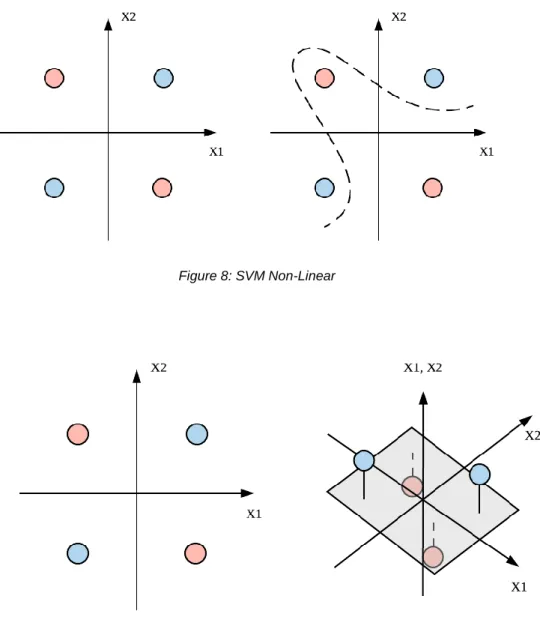
35 As shown in Figure 8, there are times when classification does not work with simple linear or curve lines. However, if the data is mapped into a three-dimensional space (as shown in Figure 9), it is easy to find a hyperplane that separates distinct data. As such, SVM projects datasets into higher dimension so as to increase the accuracy on prediction.
Figure 8: SVM Non-Linear
36
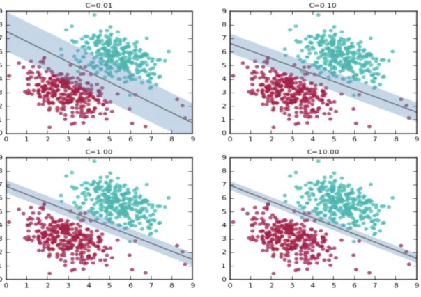
Figure 10: SVM Parameters (Ghose, 2017)
Nonetheless, real life data cannot always be as clean and simple as in the figures, so it is
not always possible to completely classify data. Therefore, a parameter, C, is needed to indicate
the margin of error that the model is willing to take. As shown Figure 10, the increasing value of
C leads to the shrinkage of margin between the line and furthest distinct data; Because at high
values, it tries to accommodate the labels of most of the red points present at the bottom right of the plots.