Central Washington University
ScholarWorks@CWU
All Master's Theses Master's Theses
Fall 2017
Visualizing Multidimensional Data with General
Line Coordinates and Pareto Optimization
Jacob Brown
Follow this and additional works at:https://digitalcommons.cwu.edu/etd Part of theGraphics and Human Computer Interfaces Commons
This Thesis is brought to you for free and open access by the Master's Theses at ScholarWorks@CWU. It has been accepted for inclusion in All Master's Theses by an authorized administrator of ScholarWorks@CWU. For more information, please [email protected].
Recommended Citation
Brown, Jacob, "Visualizing Multidimensional Data with General Line Coordinates and Pareto Optimization" (2017).All Master's Theses. 898.
Visualizing Multidimensional Data with General Line
Coordinates and Pareto Optimization
A Thesis
Presented to
The Graduate Faculty
Central Washington University
In Fulfillment
of the Requirements for the Degree
Master of Science
Computational Science
by
Jacob Brown
December 2017
Central Washington University
Graduate Studies We hereby approve the thesis of
Jacob Brown Candidate for the degree of Master of Science
APPROVED FOR THE GRADUATE FACULTY
Dr. Boris Kovalerchuk, Committee Chair
Dr. Razvan Andonie
Dr. Szilárd Vajda
Abstract
Visualizing Multidimensional Data with General Line
Coordinates and Pareto Optimization
by
Jacob Brown
December 2017
These results, will show that the use ofLinear General Line Coordinates
(GLC-L) can visualize multidimensional data better than typical methods,
such as Parallel Coordinates (PC). The results of using GLC-L will display
visuals with less clutter than PC and be easier to see changes from one graph
to the next. Visualizing the Pareto Frontier with GLC-L allows n-D data to
be viewed at once, compared to typical methods that are limited to 2 or 3 objectives at a time. This method details the process of selecting a ”best”
case, from a group of equals in the Pareto Subset and comparing it against
an optimal solution. Selecting a ”best” case from a Pareto Subset is difficult, because every individual is better in some ways to its peers. The ”best” case is the solution to the specific task for each dataset.
Acknowledgments
Thank you to all the people who helped me to become who I am today. I appreciate the drive of my mother, focus of my father and love of my family. To those long nights in lab, thanks for the memories my friends.
Contents
Page
Contents . . . vi
1 Introduction. . . 1
1.1 Parallel Coordinates . . . 1
1.2 General Line Coordinates . . . 3
1.3 Pareto Optimization . . . 6
1.3.1 Pareto Test, Subset and Frontier . . . 6
1.3.2 Simulating Pareto Optimization on Randomly Gener-ated Data . . . 9
1.4 Interactive Decision Maker . . . 12
1.4.1 Euclidean Weights . . . 13
1.4.2 Best Case . . . 14
2 Methodology . . . 16
2.1 Central Washington University Computer Science Grade Data 17 2.2 Ellensburg Weather Data . . . 19
2.3 Health Search and Frequency Data . . . 21
3 Results of Study . . . 23
3.1 Results on Central Washington University Computer Science Grade Data . . . 24
3.1.2 Evaluating the Pareto Subset . . . 29
3.1.3 Evaluating the Pareto Frontier . . . 32
3.1.4 Evaluating the Optimal Solution and Best Case . . . . 34
3.2 Results on Ellensburg Weather Data . . . 38
3.2.1 Evaluating the Dataset. . . 39
3.2.2 Evaluating the Pareto Subset . . . 41
3.2.3 Evaluating the Pareto Frontier . . . 43
3.2.4 Evaluating the Optimal Solution and Best Case . . . . 45
3.3 Results on Health Search Data . . . 47
3.3.1 Evaluating the Dataset. . . 56
3.3.2 Evaluating the Pareto Subset . . . 62
3.3.3 Evaluating the Pareto Frontier . . . 66
3.3.4 Evaluating the Optimal Solutions and Best Cases . . . 70
4 Future Work . . . 72
5 Conclusion . . . 73
List of Tables
1.1 Dataset . . . 10
1.2 Pareto Subset . . . 10
3.1 CWU Coefficients . . . 25
3.2 Best and Optimal Solutions for Students that dropped the CS Major . . . 36
3.3 Best and Optimal Solution for those in CS Pre-Major . . . 36
3.4 Best and Optimal Solution for those in CS Major . . . 36
3.5 Best and Optimal Solution for the Ellensburg weather dataset with normalized values . . . 46
3.6 Best Case and Optimal Solution for the Ellensburg weather
dataset with original values. . . 46
3.7 Best Cases and Optimal Solutions sorted by year form the
List of Figures
1.1 GLC-L of CWU Dataset . . . 5
3.1 PC of the Non-Constrained CWU Dataset. (a) Is for CS Majors with 25 rows of data visualized (b) Is for CS pre-Majors with 113 rows of data drawn (c) Is for students that dropped the CS Major with 25 rows of data displayed . . . 26
3.2 PC of the Constrained CWU Dataset. (a) No rows removed
from consideration for students classified, as being in the major, because every student in the major had at least taken CS 301. 28 rows of data are drawn. (b) Is for CS pre-Majors with 79 rows of data displayed. (c) Is for students who dropped the CS Major with 12 rows of data graphed. . . 26
3.3 GLC-L on (a) Non-Constrained CWU grade data (b) Con-strained CWU grade data . . . 28
3.4 Parallel Coordinates of the Non-Constrained CWU Pareto Sub-set. (a) Is the Pareto Subset of CS Majors with 12 rows of data visualized, (b) Is the Pareto Subset of CS Pre-Majors with 18 rows of data drawn, (c) Is the Pareto Subset of students that
LIST OF FIGURES - CONTINUED
Figure Page
3.5 Parallel Coordinates of the constrained CWU Pareto Subset.
(a) Is the Pareto Subset of CS Majors with 12 rows of data visualized, (b) Is the Pareto Subset of CS Pre-Majors with 18 rows of data drawn, (c) Is the Pareto Subset of students that
dropped the CS Major with 6 rows of data displayed . . . 30
3.6 GLC-L on the non-constrained Pareto Subset . . . 31
3.7 GLC-L on the Pareto Subset of Students in CS Major . . . 31
3.8 Pareto Frontier of students that dropped the CS Major . . . . 33
3.9 Using GLC-L to visualize the Pareto Frontier of a ”Perfect
Student” . . . 34
3.10 Visualizing the ”Best” case and Optimal Solutions, color coded, as green being the ”Best” candidate and blue for the Optimal Solution . . . 36
3.11 Process of using GLC-L and the IDM for selecting a ”Best”
case from a Pareto Subset . . . 37
3.12 Parallel Coordinates on the normalized monthly Ellensburg weather dataset from 2010 to 2016 . . . 40
3.13 GLC-L on the normalized monthly Ellensburg weather dataset from 2010 to 2016. . . 40
3.14 Parallel Coordinates on thePareto Subset from the normalized monthly Ellensburg weather dataset . . . 42
3.15 GLC-L on the Pareto Subset from the normalized monthly El-lensburg weather dataset . . . 42
LIST OF FIGURES - CONTINUED
Figure Page
3.16 Pareto Frontier of weather dataset, comparing each dimension to Average Monthly Temperature . . . 44
3.17 Visualizing thePareto Frontier withGLC-L on the normalized Ellensburg weather dataset. . . 45
3.18 GLC-L of the Best Case and Optimal Solution from the Ellens-burg weather dataset . . . 47
3.19 Most popular food born illnesses [17] . . . 53
3.20 Comparing GLC-L and Base Coefficients against PC from the
years of 2012-2014 . . . 58
3.21 Comparing GLC-L and Base Coefficients against PC from the
years of 2015-2017 . . . 59
3.22 Comparing Base and Linear Coefficients 2012-2014 . . . 60
3.23 Comparing Base and Linear Coefficients 2015-2017 . . . 61
3.24 Comparing the Pareto Subset and the Original Health Search dataset with PC form 2012-2014 . . . 63
3.25 Comparing the Pareto Subset and the Original Health Search dataset with PC form 2015-2017 . . . 64
3.26 The Pareto Subset viewed withGLC-L from 2012-2017 . . . . 65
3.27 Contrasting the Pareto Subset and GLC-L from 2017 . . . 66
3.28 Pareto Frontier of the 2016 Health Search dataset, comparing each dimension to diabetes, with typical methods for evaluating the Pareto Frontier . . . 68
LIST OF FIGURES - CONTINUED
Figure Page
3.30 GLC-L of the Best Case and Optimal Solutions from the 2012 to 2017 Health Search dataset. Green is for the ”Best” Cases and blue are the Optimal Solutions. . . 71
CHAPTER 1
Introduction
In multi-objective optimization, the “ideal” situation, when one
solu-tion dominates all others, is extremely rare. The major challenge in Pareto
Optimization, is selecting a “best” case among Pareto solutions. This informal
process is typically assisted by traditional visualization of the Pareto
Fron-tier for 2-3 objectives in 2-D or 3-D. This study is devoted to this problem
for higher dimensions, where it is very challenging. Currently the primary
method for this, is the method of PC that has several limitations, including
occlusion. This thesis, details the process of applying new n-D data
visual-izations, called GLC-L and is a subclass of General Line Coordinates (GLC).
Using GLC-L will show the advantages of visualizing multidimensional data,
the Pareto Frontier and the ”best” solution to a task with the help of an In-teractive Decision Maker (IDM), by producing graphs with less clutter than typical methods.
1.1 Parallel Coordinates
PC has uses for focusing on points of data. For example, image that
there is a csv file, text file, database, or any data storage device, which has the stats of all NBA basketball players. If one basketball player is chosen and
an easy way to visualize multi-dimensional data. The use of PC allows a user to see correlations in the attributes and if they meet at similar junctions.
Visualizing multi-dimensional data is difficult, because of the magni-tude of the information. Each dataset can have numerous attributes. These columns can be accompanied by thousands of rows, sometimes referred to, as individuals. When a dataset is over three dimensions and one hundred rows, the human eye has a hard time distinguishing the differences in the data. When looking at a graph and understanding it, less is more, especially in an optimization problem, where there may be an infinite number of
pos-sible solutions. A common problem with PC, is that, as the data becomes
more complex, that the graph becomes increasingly cluttered. Advanced vi-sual techniques strive to limit the amount of details being displayed at one time, by finding similarities and drawing them.
The problem with PC, is that it can be susceptible to clutter. Clutter
onPC comes in two main forms. First, when there are hundreds or thousands
or more lines drawn, the lines start to draw over themselves. Secondly, when
there are too many dimensions visualized at once,PC becomes either squished
or to stretched out. The more dimensions that are graphed in one setting, the
wider or more compact the visualization will become. IfPC produces a display
so wide that it can’t be viewed all at once, then the visualization looses some of its integrity, because the reader must page back and forth to view the data. There are techniques available to remove some of the clutter, such as
using Principle Component Analysis to reduce the number of dimensions to
consider, while still trying to preserve, as much of the integrity of the data, as possible. The draw back to this method, is that the data compression is
[22]. The best way to visualize, is to have a way that won’t impose a loss of data, referred to, as being lossless [12]. In this study, we present ways of viewing data in graphs that are depictions of a lossless data representation.
The use of PC doesn’t make it obvious what attribute of data is the
most important to the user, when high n-D data is used, andPC is susceptible
to clutter. There are ways to remove clutter, but at the expense of losing data.
Thus,PC may not solve the task of finding a ”best” candidate, whereas plots
of GLC-L will.
1.2 General Line Coordinates
The GLC used in this study, is for visualizing and solving a specific
task, better than typical methods can, where most current techniques look to optimize only 2-D or 3-D dimensional data. This process weighs each dimen-sion with a coefficient. This coefficient is between the bounds of 0 and 1, for some data that has been normalized. So, if a column of data isn’t important to the task we are solving, it could be assigned a coefficient of 0, whereas if a dimension of data was considered the most important, it could be assigned 1. Each coefficient used, uses the equation 1.1.
radj =acos(coefj) (1.1)
The symbols used in equation 1.1 are:
1. coefi has one coefficient for each dimension of data.
3. acos is the call for arc cosine in c++, which converts its value to radians
Algorithm 1 is pseudo code to produce graphs ofGLC-L. Using GLC-L
shows the candidates with the greatest weighted sum that we call magnitude, provide a way to spot outliers and produce plots with less occlusion than
PC. Examples of GLC-L can be seen in Figure 1.1 (a), (b) and (c), which
are drawings of the Central Washington University (CWU) computer science
grade data for students classified, as being pre-major, using GLC-L. For a
description of the CWU dataset, please go to the Methodology section.
Algorithm 1 GLC-L
Require: c = number of rows (n-D objects, cases), n = number of columns (dimensions), d[i,j] = data table c x n
1: for i = 0 do i < c
2: x = 0
3: y = 0 ▷Draw a line from one point to the next
4: for j = 0 do j < n
5: draw_dot(x, y)
6: radius = d[i,j]
7: angle = rad[j]
8: new_x = x + radius * cos(angle);
9: new_y = y + radius * sin(angle);
10: draw_line(x, y)
11: ▷ Current point to draw is (new_x, new_y)
12: draw_line(new_x, new_y)
13: x = new_x
14: y = new_y
15: ▷Draw a dot at the bottom for each row of data
16: draw_dot(x, 0)
17:
The dots drawn at the bottom line in Figure 1.1 (a), (b) and (c), detail the magnitude of each row of data displayed. The higher the magnitude a row of data has, the more important that row is to solve the specific task for that dataset and is marked by a dot that is drawn on the bottom of those figures.
In Figure 1.1 (b), the different angles denote a new dimension of data. The coefficients provide angles that give space between rows of data, creating a clearer graph and a way to easily spot, when rows of data are removed from one plot to the next. Figure 1.1 (c) has the projections of each dimension of data mapped to the solid black line [13]. Figure 1.1 (c), also detail the angles that are drawn, with the use of the dashed lines.
(a) (b) (c)
1.3 Pareto Optimization
Pareto Optimization is a Multi-Objective Optimizations Strategy
(MOOS), that looks to optimize multiple objectives at the same time, by
creating a subset of values that are comparable to one another [3] [1]. A
MOOS deals with a set of objectives that may compete, cooperate or have
no relationship. Pareto Optimization seeks to resolve the problems between
conflicting objectives, by finding a subset of cases, where one case may be better in one or more aspects, but won’t be better in all instances. The selected set doesn’t allow for repeats and cannot be dominated by a single case. If successful, the optimization will return a subset that is smaller than the original set of data. If the algorithm returns one value, then the data being analyzed, has a case that dominated all others.
1.3.1
Pareto Test, Subset and Frontier
A Pareto Test states, that a Pareto Optimization algorithm is, where every individual inside its subset are considered equally good, because no one row is better off than its neighbors [6]. In society, there is no such thing, as anything being completely equal, as cultural beliefs will influence a decision.
The importance of usingPareto Optimization, is that it returns a subset of values that can be considered optimal. The subset can also provide a list of alternatives to try and maximize different categories. Imagine a factory with five different production categories. Each category can be improved, but only at the expense of another category, like spending money to build more products or to cut cost and maximize profit, yet still meet the manufacturing needs. The problem is having a form of selector to choose an optimal solution
and ”best” case between the different production categories. Every production category has the same number of predicates assigned to every individual in the
Pareto Subset, specifying that each candidate is equally, as good. A predicate is a Boolean variable that describes a person, object, place or thing. Using predicates based on the American culture and the task we seek to solve, our
method will select a ”best” case from aPareto Subset. Without imposing these
cultural predicates to solve a specific task, like selecting a ”best” case, it is impossible to do so, because there is no way to differentiate between the ”best” case and an optimal solution. This is similar to the analogy by Watanabe’s
Ugly Duckling theorem that states,
unless we superimpose some cultural bias, it is impossible to differ-entiate a swan from a duck. In other words, to recognize different patterns in our cognition and to identify a certain object, we must first weigh a number of predicates with our cultural background and determine which predicates are more important or relevant than others [18].
Watanabe’s argument is that a form of selector is needed to determine that a swan is a duck, because elements in thePareto Subset are equally good [5]. A swan is the ”best” case out of many ducks that are optimal solutions. In our
situation, anIDM selects an optimal solution and ”best” case from thePareto
Subset, declaring that the swan is our ”best” case and the optimal solution is
one of the many ducks in the Pareto Subset.
The Edgeworth-Pareto Hull is a convex hull that surrounds the values
in the Pareto Subset and is a partial representation of the Pareto Frontier.
The Edgeworth-Pareto Hull focuses on upper and lower bound values for the
lower bound values are the points in each dimension that are the minimum
in the Pareto Subset, i.e., the smallest number in dimension z is 1, m is 2
and y is 0. A line is drawn from the minimum dimensions of z to m and
y, as the lower part of the convex hull. In some cases, the list of possible
solutions in the Pareto Subset may be too many. If this is encountered, the
edges of the convex hull, may be used, as an optimal solution [15]. However,
the edges of the Edgeworth-Pareto Hull reflect the Pareto Frontier and the
edges that are greater than the lower bound ones will typically dominate the
values in the Pareto Subset. If the upper edges of theEdgeworth-Pareto Hull
are considered, as a valid candidate, those edges represent the maximum values
for each dimension. SincePareto Optimization creates a subset of values that
are non-dominating, the last thing that would be an acceptable ”best” case, is a solution that dominates and is not considered equally, as good, as the other
candidates in the Pareto Subset. Normally the edges of the Edgeworth-Pareto
Hull are a dominating solution and is why it isn’t often used, as a candidate
for consideration, because they may not be feasible solutions. Therefore, it won’t be considered, as a viable prospect in this study.
The Edgeworth-Pareto Hull also has applications in regard to graph
theory [14]. One way to possibly remove the typical dominated solution that
the Edgeworth-Pareto Hull is limited by, is to visualize the Edgeworth-Pareto
Hull and find the distance between the outer points. The perimeter of the
Edgeworth-Pareto Hull will form edges, allowing weights or distances to be applied to those edges. However, this problem is difficult to do with n-D data that is optimizing more than 2 or 3 objectives at a time. Further study is required to use this strategy and will not be included in this thesis.
1.3.2 Simulating Pareto Optimization on Randomly
Generated Data
The purpose of this section is to give an example of how Pareto
Op-timization is performed on a randomly generated dataset. The reason to use a random dataset, is that the random data can be small and easily viewed, compared to the datasets used in this study, which are complex, by having hundreds of rows of data and more than 5 dimensions. This will be
accom-plished by giving an example of how thePareto Testis implemented on random
data and the formation of thePareto Subset on the random data. The routine
of creating the subset and justifying, why rows of data are added to thePareto Subset, will explain how the three datasets used in this study, will form their own Pareto Subsets, that are used in the Results section of this paper.
We evaluate our data, by performing the Pareto Optimizationupon it,
to find a set of feasible solutions, known, as aPareto Subset. ThePareto Test, compares each row in a dataset, to all others in it. An example of pseudo code
of the algorithm used to form the Pareto Subset, can be seen in Algorithm 2.
A row is added to the Pareto Subset if:
1. It has not been added to the Pareto Subset before.
2. Each dimension in the chosen row, is not less than each value in the row being compared to.
3. The individual has at least one dimension that is greater than the one being compared to and equal to or less than the other dimensions [3].
If successful, the optimization will return a subset of individuals, that has less members in it than the original dataset. Refer to Table 1.1, as a
random dataset and Table 1.2, as a subset of the random data. Note that
Table 1.2 is the results of a successful execution of Pareto Optimization on
Table 1.1. All of the rows in Table 1.2 are unique, one row doesn’t have values that are greater for each of its attributes and the subset has one less row, than the original random dataset [2].
With that in mind, row one from Table 1.1 was excluded from Table 1.2, because the second row in Table 1.1 had the values of 1 3 3 4 5 and is greater or equal in all aspect, than the first row in Table 1.1. That means that the first row in Table 1.1, failed the test on the second row in Table 1.1. If a
row fails against another, that row is excluded from the Pareto Subset.
Table 1.1: Dataset A B C D E 1 2 3 4 5 1 3 3 4 5 1 4 3 2 5 1 5 3 4 2
Table 1.2: Pareto Subset
A B C D E
1 3 3 4 5
1 4 3 2 5
1 5 3 4 2
If the algorithm returns a subset with one row, the dataset being
ana-lyzed had an individual that dominated all others. SincePareto Optimization
is a non-dominated solution, returning one row in a subgroup, is a ”bad”
rep-resentation of a Pareto Subset [3]. Meaning, that for a row to dominates all
others, its values must be greater than all being compared. Algorithm 2 is
pseudo code of the Pareto Optimization algorithm, used in these examples.
There areM number of n-D points inndimensions under consideration.
O(n2). Algorithm 2, illustrates one row being added to the Pareto Subset
and tested against all other rows in the dataset that’s under evaluation. The number of rows in the dataset that are the same, as the row being tested, would normally make the algorithm fail on the tested row, because it would be greater than, less than or equal to the row being compared to. However, this can be fixed by subtracting the total number of possible rows the algorithm needs to succeed on, by the number of rows that are just like that individual. If success, the row stays in thePareto Subset, else it is discarded. The next row is retrieved and the process continues until the end of the dataset is reached.
If the optimization strategy produces a single n-D point in the Pareto
Frontier, we observe why one row dominated all others. The greatest indi-vidual, is recorded and the row that dominated all others is sliced off. We repeat the process, until it is deemed that the dataset can or can’t be used. This method of slicing off upper bound values can also be implemented, when the Pareto Subset only has a few candidates under consideration. In this study, some upper bound rows were removed from consideration for certain datasets. For the CWU dataset describe in the Methodology section, it allows the comparison between new candidates more senior students, than a unique
best student (dominant case). This increased the size of the Pareto Subsets
and justified the removal of those candidates. Look to the Results section for an explanation of why these candidates were removed.
Algorithm 2 Pareto Optimization
Require: c = number of rows (n-D objects, cases), n = number of columns (dimensions), d[i,j] = data table c x n, p = pareto subset, initialized to the first row in d
1: for m = 1do m <= c
2: z = length of p
3: ▷ tRpow is the total number of rows that have passed the test to be
added into the Pareto Subset
4: tRpow = 1
5: ▷Test the current row in pareto against all others
6: for i = 1 do i <= c 7: g = 0 8: l = 0 9: for j = 1do j <= n 10: if p[z, j]≥d[i, j] then g++ 11: if p[z, j] <= d[i, j] then l++
12: ▷ Count the rows the algorithm succeeds on
13: if l < n and g ≤n then tRpow++
14: if tRpow ≥ c then keep row being tested in Pareto Subset and get next unique row
15: else the row failed, so remove it from the Pareto Subset and grab the
next unique row
1.4
Interactive Decision Maker
The drawback of using Pareto Optimization, is that it creates a subset
of values that are considered equally good. From that equality, the Pareto
Subset falls into theUgly Duckling Theorem, of how do you know the difference between a swan and a duck or how do know the difference between the ”best” candidate and an equal partner. We can’t choose the ”best” candidate, until
we impose a way to do so. The disadvantage of using Pareto Optimization, is
also one of its advantages, as it leads to the creation of theInteractive Decision Maker IDM for selecting an optimal value and ”best” case to compare to.
1.4.1 Euclidean Weights
For this study, an Euclidean Distance method will select the mean
average case from the Pareto Subset. First step is to get the average of each
dimension. Next, each element in a row is subtracted, by the average of that dimension, raised to the power of two and returns the square root of the sum. This total is added up to determine, which row of data has the smallest difference to the average of each attribute. This final case is than visualized and compared against all other previous visualizations, depicted in Algorithm 3.
Algorithm 3 Selecting an optimal solution with Euclidean distance
Require: c = number of rows (n-D objects, cases), n = number of columns (dimensions), d[i,j] = data table c x n, avg = an array of mean values for each dimension 1: minNum = 99999 2: index = 0 3: for i = 0 do i < c 4: sum = 0 5: for j = 0 do j < n
6: sum = sum + (d[i, j]−avg[j])2
7:
8: if sum≤minN um then index = i
The IDM selects an optimal solution, that is similar to the use of
K-Means, where K-Means looks to find the centroid of each cluster of data [4].
Our method of using an IDM, settles on an individual that is closest to the
center of the Pareto Subset, with one cluster in that subset, for each class
in a dataset. Rows of data inside a Pareto Subset typically have a smaller
Subset is more like one another and forms a tighter cluster. Therefore, using an
Euclidean Distancemethod to select an optimal solution will pick a candidate that is likely more similar to the ”best” case.
To choose an optimal solution, we select a subset of the Pareto Subset
of n-D points and visualize only this subset. This subset can be defined by the
Euclidean Distance D, from a given Pareto n-D point, i.e., points with D <
T, where T is a threshold included in the subset and D is the distance. This
process measures the distance between the centroid of the Pareto Subset and
its members, by using an Euclidean Distance method, as part of our IDM for
selecting a goal that is declared as optimal [15]. Another comparison is made, and the cycle repeats itself on a different row and finally a row is chosen, as feasible.
A possible problem with Euclidean Distance and selecting an ideal
point, is that, as the data becomes more complex and has more than 3 mensions, the space between each neighbor increases. As the number of di-mensions increase, the space between the center of the data and the edges of the Hypercube can become further spread apart. Which means, that the
data may be closer to the corners of theEdgeworth-Pareto Hull and not at the
center.
1.4.2
Best Case
The decision process selects a ”best” case form a subset in a given
Pareto Subset. In some situations, a few attributes are desired over others
and they get factored into the decision maker [8]. This implies that some
If dimensions of data need to be dropped, GLC-L requires those dimensions to have a weighted coefficient of 0 [8].
One of the ways to define the ”best case is declaring the row of data that has the highest magnitude, when the coefficients are applied to the data, as the ”best.” With n-D data, we take the value of each dimension, multiplied by its respected coefficient and sum up the results. The row with the highest magnitude, has the greatest importance. Note, that the row with the greatest row sum, when adding up the sum of of its columns, is different than the sum of the rows when the coefficients are applied. Thus, rows with the higher magnitude are more important than the rows of data with lower magnitude, even if the lowest magnitude row had the highest sum of all its dimensions
added together. For example, if row g was added up and had a higher row
sum, but had a lower magnitude than row t, then row t is more important
CHAPTER 2
Methodology
Three separate datasets were used in this study. Anonymous data was received from Central Washington University (CWU) for students who had taken classes towards completing the pre-major computer science (CS) courses. Next, weather dataset was retrieved off the National Center for Environmental Information website, for each month in Ellensburg, from 2010 to 2016. Lastly, is the dataset for the frequency of health-related searches of 220 regions around the United States, from 2012 to 2017 and downloaded from kaggle.com.
Using these three datasets, this study shall prove that:
1. visualizing the Pareto Frontier with GLC-L is more efficient, than with
typical methods that only visualize 2 or 3 objectives at a time, where
GLC-L will visualize n objectives in the Pareto Frontier at once
2. graphs made with GLC-L will produce displays with less occlusion than
PC
3. a ”best” case can be picked from a set of values that are considered
equally ”good” in a Pareto Subset and compared against an optimal
solution.
2.1 Central Washington University
Computer Science Grade Data
The grade dataset was anonymously taken from students who started working towards getting into the CS major at Central Washington University, between 02-08-2013 and 05-02-2017. The data consisted of 189 data points of students, all of whom were classified one of four categories. Students were broken up into classes, based on if the student:
1. already completed the Pre-Major classes and were classified, as being in the major
2. currently was working towards completing the Pre-Major classes and were classified, as being Pre-Major
3. switched from the Pre-Major to working on a computer science minor and were classified, as being switched
4. dropped the CS Major and were classified, as being dropped.
From this list of 189 total candidates, a total of 164 students were deemed fit for analysis. Twenty-three students weren’t considered, because they hadn’t completed one or more of the required courses. Two other students weren’t factored in, because there was only 2 individuals, who switched from taking the pre-major courses to switching to a minor in CS.
The range of values in the CWU data is between 0 and 4 for each of the 6 dimensions considered. The courses being evaluated for these students are:
1. CS 110 2. CS 111 3. CS 301 4. English 101 5. English 102 6. Math 172
The dataset is then analyzed for students who had transferred in with higher level credits but were missing a prerequisite class. Higher level classes mean that those prerequisite classes were holes in the data and needed to be solved. To fix this issue, those missing values were replaced with a -2. If a student hadn’t attempted a class yet, those indices’ of data were replaced with a -1. The column averages were taken and only considered elements that didn’t have a -1 or -2 to calculate the average. This way the mean, would reflect the average of the data provided by other students, who had taken those classes. Then the mean of each dimension, replaced the -2 values. Finally, each -1 that signified that a class wasn’t taken yet, was changed to a zero.
Constraints were applied to the data to provide clearer displays. The constraints are, that if a student didn’t have a grade for CS 301, then they must have attempted at least two of the three upper level classes. The upper level classes that were considered for this, are CS 111, English 102 and Math 172. This left 119 rows to consider for visualizing and finding a ”best” case. Look to the Results section, for visual comparisons, between visualizing the
2.2 Ellensburg Weather Data
The weather dataset was retrieved from the National Center for En-vironmental Information, for each month in Ellensburg Washington, between January 2010 and December of 2016. The data consisted of 84 data points and 6 dimensions. The dimensions of the data are:
1. Average Wind Speed and has a range of 2.9 Miles Per Hour (MPH) to
16.3 MPH.
2. Highest Daily Precipitation and has a range of 0 inches in a day to 1.1
inchesper day.
3. Total Precipitation in a month and has a range of 0 inches in a month
to a maximum of 3.46 inches per month.
4. Average Monthly Temperature, between the ranges of 24.6 degrees
Fahrenheit (°F) and 75.9 °F. This dimension of data is the mean value between the Average Highest Temperature and Average Lowest Temper-ature.
5. Average Highest Temperature and has a range of 32.3°F and 92°F. The
average max temperature for each month, was calculated, based on days that were equal to or greater than 32 °F.
6. Average Lowest Temperature and has a range of 16.9 °F and 60.3 °F.
The mean for this dimension, considered only days that were equal to or less than 65 °F.
For further documentation on how these variables were generated, proceed to the National Center for Environmental Information website, go to datasets,
click on global summary of the month and select documentation.
The dimensions that measure temperature, can be influenced by the task that the dataset will solve. The temperature can be scaled through a system of equations for evaluating what temperatures are best for solving the task. The best temperature is between the interval of [30,96]. Where 30 and below and 96 and hotter are less important temperatures than temperatures that are closer to 73°F. This scaling approach, is using a (triangular) radial basis kernel function. The equations to scale the dimensions of data for tem-perature, can be seen below.
A73 + B = 1, A30 + B = 0 A30 + B = 0, B = -A30 A73 + B =1, A73 - A30
A43 = 1, A = 1/43 B = -A30, B = -30/43 C96 + D = 0, D = -C96 C96 + D =1, C73 - C96 -C23 = 1, C = -1/23 D = -C96, D = 96/23 A · X + B, C ·X + D
The range of values for each dimension used in the Ellensburg Weather dataset, is different for each column of data. To give equal consideration to each dimension, the data is normalized between 0 and 1, where 1 is the highest value of that dimension and 0 is the lowest. This normalization for
each dimension, was calculated with the Equation 2.1, where x is the variable
max value extracted from.
(x−min(c))/(max(c)−min(c)) (2.1)
2.3 Health Search and Frequency Data
The health dataset was retrieved from kaggle.com and is based on Google searches from 2005 to 2017. Only the years of 2012-2017 were con-sidered for this evaluation. The reason why, is to get data that people are searching now, instead of in the past. The data consists of 6 classes (one for every year), 210 data points per class and 9 dimensions. The dimensions of the data are:
1. cancer 2. cardiovascular disease 3. stroke 4. depression 5. rehab 6. vaccine 7. diarrhea 8. obesity 9. diabetes
Frequency datasets received from Google are typically normalized be-tween 0 and 100. The health search dataset is no exception and it was nor-malized between 0 and 100, when it was first posted to kaggle.com and thus, when downloaded. Google search frequencies are determined by the number of searches in an area for a given duration and the health dataset duration is for one year. Therefore, Google’s frequency normalization was done with equation 2.2, where f is the frequency, k is the number of times the keyword has come up in the duration and t is the total amount of search queries. For a further description of the health dataset, go to kaggle.com, click datasets and search for Health Searches by Metropolitan Area, 2005-2017.
CHAPTER 3
Results of Study
These results, will show that the use of GLC-L can visualize
multidi-mensional data better than typical methods, such as PC. The results of using
GLC-L display visuals with less clutter than PC and is easier to see changes
from one graph to the next. Visualizing the Pareto Frontier with GLC-L
al-lows n-D data to be viewed at once, compared to typical methods that are limited to 2 or 3 objectives at a time. This method details the process of
selecting a ”best” case, from a group of equals in thePareto Subset and
com-paring it against an optimal solution. Selecting a ”best” case from a Pareto
Subset is difficult, because every individual is better in some ways to its peers. The ”best” case is the solution to the specific task for each dataset.
Each section will first justify the coefficients that were chosen for each dimension of data. The reasons for each coefficient, directly align, with the chosen task for every dataset. So, there will be three sets of coefficients used,
one for each of the major dataset. All the graphs of PC are visualized with
3.1 Results on Central Washington
University Computer Science Grade Data
To use GLC-L, coefficients must be set for each dimension of data,
with respect to solving a given task. The task for the CWU data, is to find a ”best” case for admitting students into the CS major. The sampled data in
Table 3.1, is taken from the Pareto Subset of students in the major. These
were the top five candidates in the Pareto Subset for that class, with the
greatest row sum. The upper level classes of CS 301, English 102 and Math 172 were declared to be the most important. From these classes, CS 301 was deemed to be the most significant, because CS 301 is the most advanced class. Therefore, the coefficient for this dimension is 1. Math 172 is the second most important dimension, because of the difficulty of the task and the problems a student encounters taking that class requires a student to think through complex puzzles. Finally, the third most important dimension is English 102. Multiple iterations of coefficients were experimented on Table 3.1 for best expressing the dataset, by showing that a better grade in CS 301 di-rectly correlates to the likely hood of being admitted into the CS Major. This
involved graphing the subset with GLC-L, creating tables of different
magni-tudes and by expert opinion, that student 1 > student 5 > student 3 > student 2 > student 4. Based on the way the students did in CS 301, dictated how they were ranked. If a student had the same grade for CS 301, then the grades for Math 172 and English 102 were compared.
After the 17th round of experimenting with different weights, the coef-ficient values are:
1. 0.15 for CS 110 2. 0.2 for CS 111 3. 1.0 for CS 301 4. 0.1 for English 101 5. 0.5 for English 102 6. 0.75 for Math 172
These constant weights are applied to the data and summed up to get the total in the column of Magnitude in Table 3.1.
Table 3.1: CWU Coefficients
Student CS 110 CS 111 CS 301 English 101 English 102 Math 172 Sum of Rows Magnitude
1 4 4 4 3.6 3.2 4 22.8 10.36
2 4 4 3.3 3.4 3.8 4 22.5 9.94
3 4 3.1 3.7 4 3.7 3.7 22.2 9.945
4 4 4 3.3 3 4 3.7 22 9.775
5 3 4 3.7 3 4 3.7 21.4 10.025
3.1.1 Evaluating the Dataset
Now that the coefficients are set, we can work to visualize and compare the data. This comparison requires multiple graphs to view the differences in PC and GLC-L, when constraints are and aren’t applied to the data. Re-fer to the Methodology section for a description of the constraints that were developed for the CWU data.
(a) In CS Major (b) In Pre-Major (c) Dropped
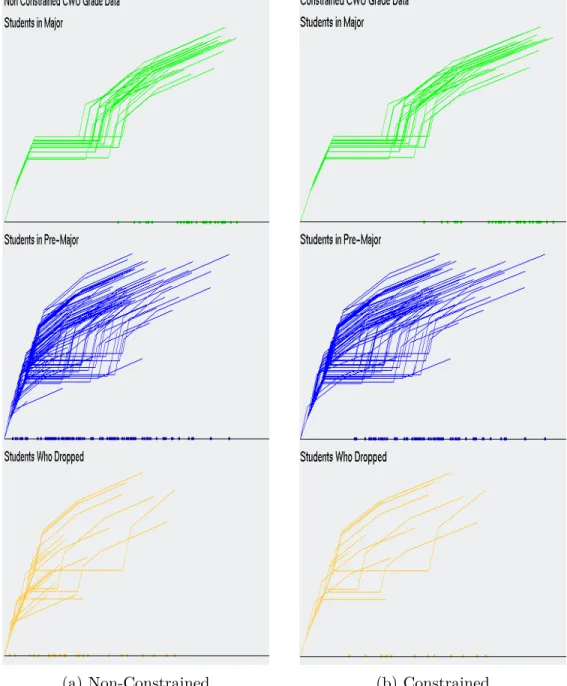
Figure 3.1: PC of the Non-Constrained CWU Dataset. (a) Is for CS Majors
with 25 rows of data visualized (b) Is for CS pre-Majors with 113 rows of data drawn (c) Is for students that dropped the CS Major with 25 rows of data displayed
(a) In CS Major (b) In Pre-Major (c) Dropped
Figure 3.2: PC of the Constrained CWU Dataset. (a) No rows removed
from consideration for students classified, as being in the major, because every student in the major had at least taken CS 301. 28 rows of data are drawn. (b) Is for CS pre-Majors with 79 rows of data displayed. (c) Is for students who dropped the CS Major with 12 rows of data graphed
With the constraints applied to the data, the visualizations with PC
doesn’t clearly show the reduction in the amount of lines being drawn, when comparing Figure 3.1 and Figure 3.2. In fact, the visualizations in Figure 3.2 still look very cluttered.
When there are fewer lines drawn at once, PC does show that less
is visualized in Figure 3.2 (c), compared to Figure 3.1 (c). PC problem with
clutter only gets worse, as more rows of data are visualized, especially when the
data visualized doesn’t seem to follow a pattern. PC also becomes increasingly
scrunched together the more dimensions of data are visualized at once. When the data is constrained, no candidates that were classified, as be-ing in the major, were dropped from consideration. This was because, as shown in Figure 3.1 (a) and Figure 3.2 (a), that every student, who was admitted into the major, passed the constraints that were set (Refer to the Methodol-ogy section for a description of the constraints used on the CWU dataset.).
However, the use ofPC doesn’t make it obvious from one graph to the next if
the same data is represented. Figure 3.3 (a) and (b) with GLC-L is a better
way to see if reductions were made in data.
When usingGLC-L, Figure 3.3 (a) and (b) makes it easier to see, when
rows of data are omitted from the display between the non-constrained and
constrained data. Part of this, is from the angles that are used with GLC-L
to symbolize a dimension and help break up a visualization. The easiest way to see the difference in Figure 3.3 (a) and (b), is to look at the lines with all the dots on it. The reduction of dots on the line in Figure 3.3 (a) to (b), is the decrease in the amount of data being displayed. This is a much better
depiction of data reduction, in a visualization, than PC was capable of in the
(a) Non-Constrained (b) Constrained
Figure 3.3: GLC-Lon (a) Non-Constrained CWU grade data (b) Constrained
3.1.2
Evaluating the Pareto Subset
The next step is to run each class of data through thePareto Test and
form a Pareto Subset for each class. Upper bound values were removed from
consideration form two classes of the CWU data. This was done to yield more
candidates for each Pareto Subset. One row was removed from the class of
students who dropped and two from students already enrolled in the major. This increased the number of candidates by almost double for consideration
for each Pareto Subset. From these experiments, we see that the students
classified, as being in the major and pre-major have the same Pareto Subset,
when the data is constrained or not. This can be visualized in Figure 3.4 and Figure 3.5, which display those subsets inPC and in Figure 3.6 and Figure 3.7,
which graphs those subsets with GLC-L. Figure 3.4 and Figure 3.5, show that
there was a difference in the Pareto Subset, when the data was constrained
or not for students classified, as dropped. From Figure 3.6 and Figure 3.7, we can easily see the difference between the graphs for students who dropped the CS major, vs Figures 3.4 and 3.5, where it’s not, as obvious to notice the difference. From this observation, the data represented by the constrained data has limited the amount to analyze in any one picture, making the visualizations easier to interpret. Also, the data that is constrained in the Pareto Subset for the students who dropped, is closer together. This means that since the data is closer together, that the optimal solution that would be chosen from the constrained data will provide an option that is more optimal and will be a better comparison to the ”best” case, because the optimal solution is the row of data closest to the centroid. From this point onward, the CWU constrained data will be considered for further analysis and the Non-Constrained CWU data will not be further evaluated.
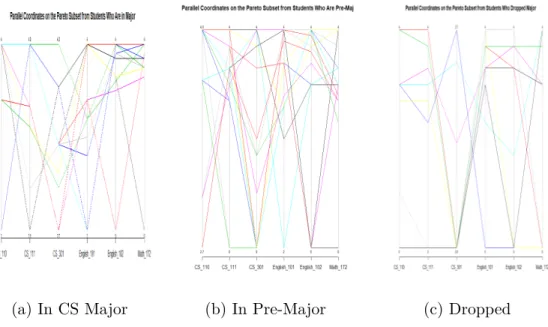
(a) In CS Major (b) In Pre-Major (c) Dropped
Figure 3.4: Parallel Coordinates of the Non-Constrained CWU Pareto Subset. (a) Is the Pareto Subset of CS Majors with 12 rows of data visualized, (b) Is the Pareto Subset of CS Pre-Majors with 18 rows of data drawn, (c) Is the Pareto Subset of students that dropped the CS Major with 9 rows of data displayed
(a) In CS Major (b) In Pre-Major (c) Dropped
Figure 3.5: Parallel Coordinates of the constrained CWU Pareto Subset. (a) Is the Pareto Subset of CS Majors with 12 rows of data visualized, (b) Is the Pareto Subset of CS Pre-Majors with 18 rows of data drawn, (c) Is the Pareto Subset of students that dropped the CS Major with 6 rows of data displayed
Figure 3.6: GLC-L on the non-constrained Pareto Subset
3.1.3 Evaluating the Pareto Frontier
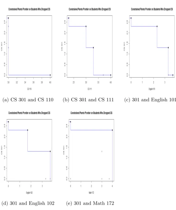
Typically, when visualizing the Pareto Frontier, most strategies only
view 2 to 3 objectives at a time. If more than 3 objectives are encountered in a dataset, which is a common case, there will have to be multiple visualizations to view those objectives. With the CWU data, each dimension can be compared
to the most important attribute, which is CS 301. So, to visualize the Pareto
Frontier with typical means in 2-d, it will be 3 * (6-1) graphs that will need to be produced. 3 stands for the number of classes the CWU data has, 6 signifies the number of dimensions under review and -1 is for all the data being compared to one dimension. The class of students who dropped, was
chosen for visualizing the Pareto Frontier with typical 2-d means and can be
analyzed in Figures 8. ThePareto Frontier in these visualizations, lay between the bold points in each picture. Draw a line between each dot and the values of the data for those dimensions, lay within those bounds.
The Pareto Frontier is an extension of upper bound values, that is used to express the data. Another way to visualize these representations, is
to see its comparison in GLC-L, which uses a ”perfect student” to compare
against. A ”perfect student”, is a fictional candidate that if real, got a 4.0
in every class they took. In Figure 3.9, we see the Pareto Frontier, measured
against each Pareto Subset for the different CWU classes of data. From this
interpretation, the Pareto Frontier visualized with GLC-L, can be achieved
with one visualization, compared to the five that are required for each class of the CWU data. For this dataset, this is a 1:5 ratio, when comparing typical
methods for viewing thePareto Frontier with 2 objectives at a time, compared
to only one drawing implemented with GLC-L. A problem with the typical
needs to constantly scan over visuals they’ve already viewed. Whereas,GLC-L
has everything included in one diagram.
(a) CS 301 and CS 110 (b) CS 301 and CS 111 (c) 301 and English 101
(d) 301 and English 102 (e) 301 and Math 172
Figure 3.9: Using GLC-L to visualize the Pareto Frontier of a ”Perfect Stu-dent”
3.1.4
Evaluating the Optimal Solution and Best Case
The median solution, selects the row of data that is the closest to the
centroid of thePareto Subsetfor each class. That student is compared against
the ”best” case of each class, according to the sum of their magnitude. Tables 3.2, 3.3 and 3.4 details the sum of the rows and the sum of their attributes with the weighted coefficients applied to each dimension of data. In all instances, the ”best” case has the highest magnitude, but not always the highest row sum. This means that the coefficient values that were used, show that some classes are more important than others, for determining if a student should
be allowed into the CS Major. A trend in this data shows that, students who dropped the major have a lower sum of rows, when compared to the next tier up. For example, students who dropped the CS Major, their ”best” case is a student with a sum of their rows totaling 16.3 and the ”best” student for CS Pre-Majors has a sum of 22.7. Another comparison, is the optimal student from those who dropped the CS Major and the optimal candidate for students still working towards the Pre-Major. The students who dropped the CS major have a higher magnitude for their optimal solution, compared to the lower value for students still working towards completing the pre-major
classes. This can be an indication that the Pareto Subset for the CS
Pre-Majors has a wider range of values to consider. After taking a quick glance at Figure 3.9, it can be concluded that there is a wider range for students in the Pre-Major. One way to possibly fix this, is to enforce stricter constrictions on the data, so an optimal solution for students in the Pre-Major is closer to that of the students classified, as being in the Major. Tables 3.2, 3.3 and 3.4 clearly show that students who perform better in CS 301 are more likely to have a higher magnitude than a student who didn’t perform, as well in that class, but did well in others. This is important, as it enforces the idea that the better a student does in upper level classes, the more likely that student will be accepted into the CS Major.
From Figure 3.10, we see that the magnitudes for the optimal and ”best” case are very close together for each class, except for students in the Pre-Major. This is further proof that the range of values for Students in the Pre-Major is greater than the other classes. This also gives an indication, that the optimal solution for the students in the Pre-Major is relatively low, compared to the optimal solution for students already in the CS Major. What we can conclude from this, is that the ”best” case from those in the CS Major
and ”best” case for students in the Pre-Major are very comparable, as they are within 0.08 of each other’s magnitude. This means that there are students in the Pre-Major that are ready to be admitted into the CS Major. For each class of student, the ”best” case is a good representation of a typical student, who would be the most appealing to be admitted into the CS Major. The
process of using GLC-L is visualized in Figure 3.11.
Table 3.2: Best and Optimal Solutions for Students that dropped the CS Major
Student CS 110 CS 111 CS 301 English 101 English 102 Math 172 Sum of Rows Magnitude
Best 3 3 2.3 2.3 1.7 4 16.3 7.43
Optimal 3 3.3 1.3 3.3 3.7 3 17.6 6.84
Table 3.3: Best and Optimal Solution for those in CS Pre-Major
Student CS 110 CS 111 CS 301 English 101 English 102 Math 172 Sum of Rows Magnitude
Best 4 4 3.7 3.3 3.7 4 22.7 10.28
Optimal 4 3.7 1 3.4 3.4 2.7 18.2 6.405
Table 3.4: Best and Optimal Solution for those in CS Major
Student CS 110 CS 111 CS 301 English 101 English 102 Math 172 Sum of Rows Magnitude
Best 4 4 4 3.6 3.2 4 22.8 10.36
Optimal 4 3.6 3.1 4 3.3 3.5 21.5 9.095
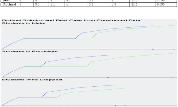
Figure 3.10: Visualizing the ”Best” case and Optimal Solutions, color coded, as green being the ”Best” candidate and blue for the Optimal Solution
(a) Non-Constrained CWU dataset (b) Constrained CWU dataset
(c) Non-Constrained Pareto Subset (d) Constrained Pareto Subset
(e) Pareto Frontier (f) Best Case and Optimal Solution
Figure 3.11: Process of usingGLC-L and the IDM for selecting a ”Best” case
3.2 Results on Ellensburg Weather Data
The task for the Ellensburg Weather dataset, is to find a ”best” case for what month is preferred to do a hike on, when the temperature is hottest, wind speed is lowest and has the smallest accumulated rainfall. The average daily temperature is chosen, as the most important dimension for this task, because the nicer the average weather, the better the day is. This is proven in the data, as the months with the higher temperatures, have less monthly precipitation. Therefore, the coefficient value for the average monthly temperature, is 1.
Since our task will solve what month is the nicest to go on a hike, the highest average temperature has greater significance, than the lowest average temperature. The average speed of the wind will affect how warm a day feels and the months that are hottest can be balanced out with an increase in wind speed. Therefore, the second most important dimension is the average wind speed Average Wind Speed, followed by the average monthly temperature, as 3rd best and lowest average temperature with the 4th highest coefficient.
The highest daily precipitation, occurs so rarely within a month’s time, that its importance is less than the total precipitation within a month. Thus, the coefficient for total precipitation must be greater, than the weighted sum for highest daily precipitation.
The selected coefficient values are:
1. 0.7 for Average Wind Speed
2. 0.25 for highest daily precipitation 3. 0.35 for total precipitation
4. 1.0 for average monthly temperature 5. 0.65 for highest average temperature 6. 0.5 for lowest average temperature
3.2.1 Evaluating the Dataset
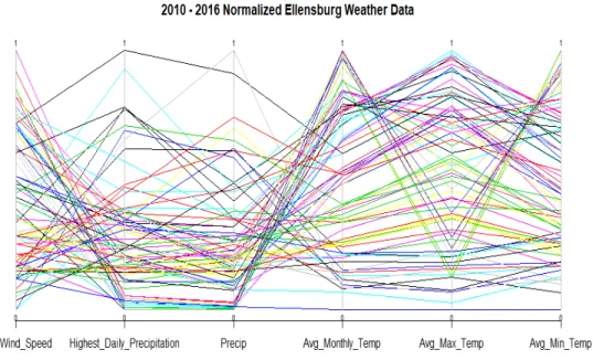
We start by drawing the entire dataset, as seen in Figure 3.12 and Fig-ure 3.13. In both visualizations, 84 rows of data are drawn. One row for each month. Figure 3.12 and its use ofPC, shows that there is separation for high-est and lowhigh-est average temperature. This is an indication of the temperature difference between every month in Ellensburg. What we can’t see clearly in Figure 3.12, is what rows of data have the most and least significance to solv-ing our current task, of what month is the best to go on a hike. We see from
usingGLC-L in Figure 3.13, how important each row of data is, to solving our
current task and finding a ”best” case. Figure 3.13 also separates the data out more, than in Figure 3.12, making it easier to visualize each row of data that is drawn.
Figure 3.12: Parallel Coordinates on the normalized monthly Ellensburg weather dataset from 2010 to 2016
Figure 3.13: GLC-L on the normalized monthly Ellensburg weather dataset from 2010 to 2016.
3.2.2
Evaluating the Pareto Subset
After running the Pareto Test on the Ellensburg weather data, 28 6-D
points were added to the Pareto Subset. Refer to the Methodology section,
subsection 2.2 for further explanation on how and why the Ellensburg weather dataset was normalized.
In Figure 3.14, we see that there is a dramatic reduction in the amount of lines drawn, when compared to Figure 3.12. Figure 3.14 does illustrate an outlier in the data. This outlier has the highest total precipitation in the
Pareto Subset and the smallest values for average highest, lowest and monthly temperature. Figure 3.14 fails to demonstrate what rows of data have the
greatest importance, falling into Watanabe’s Ugly Duckling theorem, of how
do you tell the difference between a swan from a duck. Thankfully, Figure 3.15 is here, to shine the light on the importance of each row of data and how it will solve our specific task. Figure 3.15 also shows the outlier, like what Figure 3.14 does. In fact, the outlier is the easiest value to see in Figure 3.15, as it has the smallest magnitude. The outlier can be identified in Figure 3.15, by glancing at the line at the bottom of Figure 3.15 and observing the dot closest to the far left.
Figure 3.14: Parallel Coordinates on the Pareto Subset from the normalized monthly Ellensburg weather dataset
Figure 3.15: GLC-L on the Pareto Subset from the normalized monthly
3.2.3 Evaluating the Pareto Frontier
Typically, when visualizing the Pareto Frontier, most strategies only
view 2 to 3 objectives at a time. If more than 3 objectives are encountered in a dataset, which is a common case, there will have to be multiple visualizations to view those objectives. With the Ellensburg weather dataset, each dimension can be compared to the most important attribute, which is average monthly
temperature. So, to visualize the Pareto Frontier with typical means in 2-d,
it will be 6-1 graphs that will need to be produced. 6 signifies the number of dimensions under review and -1 is for all the data being compared to one
dimension. The Pareto Frontier are visualized in Figures 3.16. The Pareto
Frontier in these visualizations, lay between the bold points in each picture. Draw a line between each dot and the values of the data for those dimensions, lay within those bounds.
The Pareto Frontier is an extension of upper bound values, that are used to express the data. Another way to visualize these representations, is to
see its comparison inGLC-L, which uses ”perfect weather” to compare against.
”Perfect weather”, is a fictional candidate that if real, got a normalized value of 1.0 in every dimension or the best value possible for every dimension. In
Figure 3.17, we see the Pareto Frontier, measured against the Pareto Subset
for the weather dataset. The Pareto Frontier visualized with GLC-L, can be
achieved with one visualization, compared to the five that are required for the weather dataset. This is a 1:5 ratio, when comparing typical methods for
viewing the Pareto Frontier with 2 objectives at a time, compared to only
one drawing implemented with GLC-L. A problem with the typical approach
with viewing the Pareto Frontier with 2 objectives, is that the reader needs
everything included in one diagram.
(a) Average Maximum Temperature (b) Average Minimum Temperature
(c) Average Wind Speed (d) Highest Daily Precipitation
(e) Total Precipitation
Figure 3.16: Pareto Frontier of weather dataset, comparing each dimension to
Figure 3.17: Visualizing the Pareto Frontier with GLC-L on the normalized Ellensburg weather dataset
3.2.4
Evaluating the Optimal Solution and Best Case
The optimal solution, selects a row of data that is closest to the
cen-troid of the Pareto Subset form the weather dataset. The optimal solution is
compared against the ”best” case, colored coded by the sum of their magnitude in Figure 3.18. Table 3.5 details the sum of the rows and the magnitude of the ”best” case and optimal solution, when the weighted coefficients are applied to each dimension of data. Table 3.6 is the original data for the ”best” case and optimal solution that’s not normalized between 0 and 1. The ”best” case has the highest magnitude and highest row sum, as indicated in Table 3.5. The coefficient values that were used, show that some dimensions are more important than others, for determining what month, would be the best to go on a hike. For example, the ”best” case didn’t have the highest row sum in the
Pareto Subset. This is evidence that the ”best” case is chosen from dimensions of data that have higher numerical values for average monthly temperature, supporting the coefficients chosen for solving this task. Interestingly enough, the ”best” case and optimal solution are from the same month and 6 years apart. Giving an indication that June is the best time to go for a hike, when it’s not too cold or hot.
From Figure 3.18, we see that the magnitude between the optimal and ”best” case are very close together. This is proof that the range of values for the two are comparable to each other, as they have a difference in their magnitudes of only 0.2. However, this gives an indication that the optimal solution is
relatively average, compared to the rest of the Pareto Subset, because the
range of magnitude values in the Pareto Subset, range between 0.75 and 2.54.
This means that there are other months that, would also be viable to go hiking on. Therefore, the ”best” case is a good representation of a month to go hiking.
Table 3.5: Best and Optimal Solution for the Ellensburg weather dataset with normalized values
Student Avg. Wind Speed Highest Daily Precip. Total Precip Avg. Monthly Temp
Best 0.820895522 0.345454545 0.320809249 0.773760331 Optimal 0.73880597 0.327272727 0.187861272 0.841942149
Student Avg. Max Temp. Avg. Min Temp. Row Sum Magnitude
Best 0.944877684 0.760368664 3.966165995 2.541388896 Optimal 0.683046683 0.781105991 3.560034792 2.341209294
Table 3.6: Best Case and Optimal Solution for the Ellensburg weather dataset with original values.
Student Date Avg. Wind Speed H. Daily Precip Total Precip Avg. Monthly Temp Avg Max Temp Avg Min Temp
Best 2010-06 13.9 0.38 1.11 62.05 74.2 49.9
Figure 3.18: GLC-L of the Best Case and Optimal Solution from the Ellens-burg weather dataset
3.3
Results on Health Search Data
The task for the health search dataset, is to find a ”best” case for the most balanced year, between the frequency of search and rate of illness or inoculation or self-betterment. To justify the coefficients for the health search dataset, average values were computed from a collection of statistics on these subjects and how prevalent they are among the American population, giving an indication of how popular they should be for being searched. Most of the statistics were pulled from the Center for Disease Control’s (CDC) website.
For cancer, the statistics are:
1. A total of over 1.5 million new cases of cancer were reported in 2012, (excluding Nevada), for an annual incidence rate of 442 cases per 100,000 individuals.
2. The value 442 was derived from the range of values between (369.9 + 416.5 + 420.4 +445.7 + 470 + 461 + 462.1 + 513.7)/8 = 442 to get the average. These values measure incidence rates by area for the given year and considers cancer in children, men and women in the United States. 3. 442 divided by 100,000 is 0.00442
4. Since the frequency data is between 0 and 100, take 0.0044 and multiply it by 100 for a coefficient value of 0.442. [11]
5. This trend for cancer continued with roughly the same values from 2012 to 2014.
The total number of invasive cancers reported through the years increase,
but so does the total population. In 2014 around 0.045% of the American
population had cancer, or roughly 14.5 million people have cancer, vs 318.6 million for total population in 2014, or the 314 million people living in the U.S. in 2012 or the 323.1 million alive in 2016 [19]. Thus, the coefficient value of cancer is 0.442.
For cardiovascular disease, the statistics are:
1. The number of cardiovascular deaths in 2014 was 614,348 and is the number one cause of death in the US or roughly 1 out of every 4 deaths in the US is from heart disease. Slightly more people who die from cardiovascular disease, then cancer on a yearly bases.
2. Deaths per 100,000 population is 192.7.
3. The number of new people visiting a hospital and being discharged with a form of heart disease and surviving in 2015 was 3.05 million individuals.
This is the growth of the heart disease, compared to the 1.5 million new cases for cancer in 2012.
4. The estimated number of individuals with cardiovascular disease in the United States in 2014 was 15.3 million, or 800,000 more people with heart disease in 2014 than people with cancer, resulting in an increase of
5.5% (15.3/14.5 = 1.055% ) of cases with heart disease, when compared
to cancer [16].
Since heart disease is approximately 5.5 percent more prevalent than cancer (depending on the year), the coefficient for cardiovascular disease can be the coefficient of cancer plus 0.055 for a total of 0.497.
For stroke, the statistics are:
1. That stroke has a mortality rate of 1 out of every 20 deaths in America, compared to the 1 out of every 4 deaths for cardiovascular disease. This equates to about 140,000 deaths per year in the United States.
2. Roughly 795,000 people have a stroke in the US every year, were 610,000 are new cases. This is also roughly 1/5, as many new cases of stroke, as there is for new cases of heart disease.
3. There are 1/3 the number of strokes per year, as there are reports of new cases of cancer.
Since heart disease has a coefficient of 0.497 and is 5 times more likely to happen than a stroke, the coefficient for stroke should be 5 times less than cardiovascular disease. This results in a coefficient value for stroke equal to 0.12425.
For depression, the statistics are:
1. In 2012, the CDC concluded that for the average house hold with people at the age of 12 and over, hit a depression in a 2-week period at roughly 7.6%.
2. In 2014, the number of doctor visits were recorded, as being 10.3 percent of all visits, as being contributed to depression.
3. The number of suicide deaths, because of depression, is 13.4 out of every 100,000
Since the number of suicide deaths for every 100,000 is so small, compared to cancer and cardiovascular disease, a better coefficient value for the dimen-sion of depresdimen-sion is to measure this coefficient by either the depresdimen-sion in the households, or by the percent of doctor visits that were labeled, as steam-ing from depression. An average value is taken from the doctor visits and depression in the household, for a coefficient value of 0.0895.
For rehab, the statistics are:
1. That according to the CDC, 10.1 percent of people aged 12 and up, have used some form of illicit drug