Designs for Multivariate Personal
Health Data
A thesis submitted in partial fulfilment
of the requirement for the degree of Doctor of Philosophy
Majedah Mohammad Alrehiely
April 2020
Cardiff University
To the soul of my father,
To my mother, for her endless support
throughout my life.
Abstract
Over the past decade, self-tracking devices and apps have been increasingly used for personal data collection, particularly in the monitoring of health and physical activity. Data visualization is crucial to helping people understand and make sense of collected data. The literature review carried out on this topic revealed several studies which focus on data visualization, personal informatics systems and people’s self-tracking practice and their requirements. However, in terms of personal health data, there is a significant limitation in addressing the knowledge gap between these areas and the visualizations supported by self-tracking apps/dashboards, which people frequently use when viewing and exploring their health data.
The literature review is followed by a user study and a visualization review, which explores the methods used to represent personal health data on popular self-tracking devices, apps and dashboards in order to understand the main limitations of various designs. The work goes on to address two main challenges: the need for combining multiple personal health variables to support a better representation of an individual’s health status, which could help in understand-ing the relationships between different health data; and to find a more suitable layout that is related to the periodic and temporal nature of personal health data.
Therefore, this thesis focuses on the design and evaluation of visualizations to address these challenges by considering different design aspects of the visual layout, methods and visual en-coding, while taking into account the multivariate nature of the data. With respect to the visual layout, the design proposes a novel Radial layout that utilizes an analogue clock metaphor to provide cognitive support by representing the data on an hourly basis through a clock-type dis-play. The Radial representation is effective for data that naturally exhibit a periodic pattern. It also supports understanding of patterns with either a circular or seasonal behaviour. The
de-veloped visualizations’ evaluation process implements controlled lab-experiments. The evalu-ation follows a two-step method, starting with a preliminary study that leads to the design of the main evaluation study, which includes quantitative and qualitative measures of participants’ performance and preferences in the designs.
The main contributions of the thesis are: (1) A thorough overview of the visualization meth-ods provided by companion apps, dashboards and embedded displays of popular self-tracking devices. It also discusses their limitations and strengths, providing a taxonomy for the applied visualizations. (2) Suggestions and recommendations for addressing the challenges highlighted in personal health visualizations on apps and dashboards. (3) The design and implementation of multiple visualization alternatives to combine multivariate personal health data using vari-ous charts, methods and layouts. (4) Insights regarding personal health visualization gained from the results and in-depth analysis of data resulting from a controlled lab experiment. This experiment evaluated the proposed visualizations with respect to the participants’ perform-ance regarding visual tasks related to real datasets. (5) Insights on people’s preferences on the visualizations and a structured qualitative analysis of their feedback, which demonstrated the effects of each implemented visual element. In addition to structuring design guidelines for this specific data type, the results of the study prove that the traditional Linear layout either outperforms or is comparable to the proposed Radial layout. The study also shows how the applied visual encoding and the visualization method influence the performance according to specific tasks and under different data densities. It provides plausible explanations for the sig-nificant differences in the observed performance and preferences patterns, which inform future visualization designs for personal health data.
Acknowledgements
I wish to express my gratitude and appreciation to my supervisor Dr Parisa Eslambolchilar for her continuous guidance, support and valuable feedback. I really appreciate her patience and the positive criticism she has given me during my Ph.D. journey. Furthermore, I would like to thank Dr Rita Borgo, my external supervisor, for her effort and encouragement to improve my research. I appreciate the effort both my supervisors made to continue guiding me throughout the Ph.D. project that I have started at Swansea University.
In addition, I would like to express my appreciation to my sponsors, the Ministry of Education of Saudi Arabia and Taibah University, for their financial support. Without the funding, it would never have been possible to commence the project.
I would like to express my deepest gratitude to my mother for her endless encouragement and support throughout my life. Special thanks and appreciation are due to all my family members who have stood beside me and provided support, either financially or emotionally, throughout my studies despite the long distance. I am incredibly thankful for having them in my life as they have always encouraged me to pursue my goals, even at times when I have doubted myself. I am grateful to my fellow Ph.D. students in computer science for their support and helpful comments. Special thanks and appreciation go to my extended family and friends for their continued encouragement and support.
Finally, many people contributed, directly and indirectly, to the production of this work, and I apologise to those whom I have inadvertently forgotten to name.
This thesis would not have been possible or complete without the help and support of Allah. I thank Allah for giving me strength and patience and the continuous grace, mercy, and blessings.
Contents
Abstract iii
Acknowledgements v
Contents vi
List of Publications xiv
List of Figures xv
List of Tables xxii
1 Introduction 1
1.1 Introduction . . . 2
1.2 Motivation and Vision . . . 3
1.3 Definitions and Terminology . . . 6
1.4 Research Aims . . . 7
1.5 Research Questions . . . 8
1.6 Research Hypotheses . . . 9
1.8 Research Contributions . . . 12
1.9 Thesis Outline . . . 13
2 Background and Literature Review 16 2.1 Introduction . . . 17
2.2 Personal Health Data . . . 19
2.2.1 Complexity in the Personal Health Data . . . 19
2.2.2 Data Visualization in Personal Informatics . . . 22
2.2.3 Visualization of Personal Health Data . . . 26
2.3 Information Visualization . . . 33
2.3.1 Human Factors in Information Visualization . . . 34
2.3.2 Visualization by Task Taxonomy . . . 42
2.3.3 Visualization of Time-Series Data . . . 48
2.4 Empirical Evaluation Studies . . . 59
2.4.1 Evaluation in Information Visualization . . . 59
2.4.2 Personal Visualization and Evaluation Methods . . . 61
2.5 Summary . . . 62
3 Analysis of the Use and Preferences of Tracker Users 64 3.1 Introduction . . . 65
3.2 Aims and Research Questions . . . 65
3.3 Methodology . . . 66
3.3.1 Survey Design . . . 66
3.4 Analysis and Results . . . 69
3.4.1 Activity Tracking Data . . . 70
3.4.2 Data Visualization and Sharing . . . 73
3.5 Discussion . . . 78
3.6 Conclusion . . . 79
4 A Review of Visualization Tools for Health Data 80 4.1 Introduction . . . 81
4.2 Aims and Research Questions . . . 82
4.3 Methodology . . . 83
4.3.1 Device Selection . . . 83
4.3.2 Device Review . . . 84
4.4 Results and Analysis . . . 85
4.4.1 Data Visualization Methods Taxonomy . . . 86
4.5 Discussion . . . 92
4.5.1 Visual Layouts . . . 92
4.5.2 Sharing Health Data . . . 99
4.6 Suggestions and Recommendations . . . 99
4.7 Insights for the Study’s Design . . . 101
4.7.1 Data Type and Length . . . 101
4.7.2 Selected Visual Choices and Visual Tasks . . . 102
4.7.3 Visualization Layout . . . 103
4.7.5 Visualization Methods . . . 105
4.8 Updates on the Visualizations on the Apps and Dashboards . . . 106
4.8.1 Apple Watch and its Companion Apps . . . 106
4.8.2 Fitbit Watch and its Companion App and Dashboard . . . 107
4.8.3 The Garmin Watch and its Companion App and Dashboard . . . 107
4.8.4 Samsung Watch and its Companion Apps . . . 108
4.9 Conclusion . . . 108
5 Visualization Design and Preliminary Evaluation 111 5.1 Introduction . . . 112
5.2 Aims and Research Questions . . . 112
5.3 Methodology . . . 114
5.3.1 Data Source and Characteristics . . . 114
5.3.2 Visualization Design and Development . . . 115
5.3.3 Visualization Tasks . . . 122
5.3.4 Experiment Variables . . . 123
5.3.5 Participants and Recruitment . . . 124
5.3.6 Procedure . . . 125
5.4 Analysis and Results . . . 127
5.4.1 Task Completion Time . . . 127
5.4.2 Task Answers and Error Rate . . . 134
5.4.3 Overall Groups’ Performance (Time and Accuracy) . . . 142
5.5 Discussion . . . 153
5.6 Lessons Learned and the Main Evaluation Study Design . . . 155
5.7 Conclusion . . . 158
6 Main Evaluation Study of the Visualizations 159 6.1 Introduction . . . 160
6.2 Aims and Research Questions . . . 161
6.2.1 Hypotheses . . . 162
6.3 Methodology . . . 168
6.3.1 Visualization Design and Development . . . 168
6.3.2 Visualization Task Taxonomy . . . 173
6.3.3 Dataset Source and Characteristics . . . 180
6.3.4 Experiment Variables . . . 192
6.3.5 Participants Recruitment . . . 192
6.3.6 Procedure . . . 199
6.4 Analysis and Results . . . 202
6.4.1 Analysis Method . . . 202
6.4.2 Calculating Time and Accuracy . . . 204
6.4.3 Homogeneity of Variance . . . 204
6.4.4 Tasks Analysis . . . 206
6.4.5 Differences in the Datasets and the Results . . . 224
6.5 Discussion . . . 226
6.5.2 T2 Determine . . . 230
6.5.3 T3 Compare . . . 233
6.5.4 T4 Infer . . . 236
6.5.5 T5 Locate . . . 238
6.5.6 Hypotheses Testing Outcomes . . . 240
6.6 Conclusion and Summary of the Outcomes . . . 244
6.6.1 Summary Tables . . . 246
6.6.2 Conclusion . . . 250
7 Participants’ Feedback and Preferences in the Visualizations 252 7.1 Introduction . . . 253
7.2 Research Questions . . . 253
7.3 Methodology . . . 254
7.4 Analysis and Results . . . 255
7.4.1 Visualization Ratings . . . 256
7.4.2 Preferred Visualizations . . . 260
7.4.3 Participants’ Justification for their Choices . . . 267
7.5 Discussion . . . 274
7.5.1 An Overview of Visualizations Ratings and Preferences . . . 274
7.5.2 Insights from People’s Feedback on the Visualizations . . . 276
8 Discussion 287
8.1 Introduction . . . 288
8.2 Visualization of Tracked Health Data . . . 288
8.3 The Developed Visualization Designs . . . 292
8.3.1 Differences from the Visualizations on Apps/Dashboards . . . 293
8.3.2 Differences from the Visualizations in the Literature . . . 294
8.3.3 The Visualizations of the Multivariate Data . . . 294
8.4 Personal Health Visualization Design Implications . . . 295
8.4.1 Task-Related Implications (Based on the Quantitative Data) . . . 295
8.4.2 Insights for Future Designs (Based on the Qualitative Data) . . . 300
8.5 Conclusion . . . 301
9 Conclusion and Future Work 302 9.1 Thesis Summary and Contributions . . . 303
9.2 Limitations . . . 306
9.3 Future Work . . . 307
9.4 Conclusion . . . 310
Bibliography 311 Appendices 336 Preliminary Evaluation Study Surveys 337 .1 Preliminary Evaluation Study: Demographic and Pre-Experiment Questionnaire 338 .2 Preliminary Evaluation Study: Post-Experiment Questionnaire . . . 349
.3 Preliminary Evaluation Study: Training Sessions Samples . . . 357 .4 Preliminary Evaluation Study: Group’s Accuracy Graphs . . . 361
Main Evaluation Study 366
.5 Main Evaluation Study: Participation Forms . . . 367 .6 Main Evaluation Study: Demographic and Pre-Experiment Questionnaire . . . 374 .7 Main Evaluation Study: Post-Experiment Questionnaire . . . 390 .8 Groups Demographic Information . . . 402 .9 Groups and Participants’ Behaviour Analysis . . . 403
List of Publications
Some of the work introduced in this thesis is based on the following publications.
• Majedah Alrehiely, Parisa Eslambolchilar, and Rita Borgo. 2018. A taxonomy for visu-alisations of personal physical activity data on self-tracking devices and their applica-tions. In Proceedings of the 32nd International BCS Human Computer Interaction Con-ference (HCI ’18). BCS Learning & Development Ltd., Swindon, UK, Article 17, 15 pages. DOI: https://doi.org/10.14236/ewic/HCI2018.17
• Majedah Alrehiely, Parisa Eslambolchilar, and Rita Borgo. 2018. Evaluating Different Visualization Designs for Personal Health Data. In Proceedings of the 32nd International BCS Human Computer Interaction Conference (HCI ’18). BCS Learning & Develop-ment Ltd., Swindon, UK. DOI: http://dx.doi.org/10.14236/ewic/HCI2018.205
List of Figures
1.1 PhD Research Stages Diagram . . . 12
1.2 PhD Thesis Structure Diagram . . . 14
2.1 Chapter 2 Structure and Basic Section Diagram . . . 17
2.2 Chapter 2 Health Data Section Diagram . . . 19
2.3 Chapter 2 Information Visualization Section Structure Diagram . . . 33
2.4 Chapter 2 Evaluation Studies Section Diagram . . . 59
3.1 User Study: Participants’ Demographic Information . . . 70
3.2 User Study: Participants’ Used Tracking Devices . . . 71
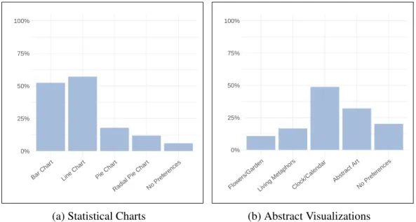
3.3 User Study: Participants’ Preferences in Abstract and the Statistical Visualiza-tions . . . 74
3.4 User Study: Participants’ Responses to Data Visualization Questions . . . 75
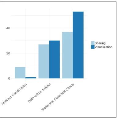
3.5 User Study: Participants’ Preferences for Data Representation and for Sharing . 76 3.6 User Study: Participants’ Responses to the Sharing Questions . . . 77
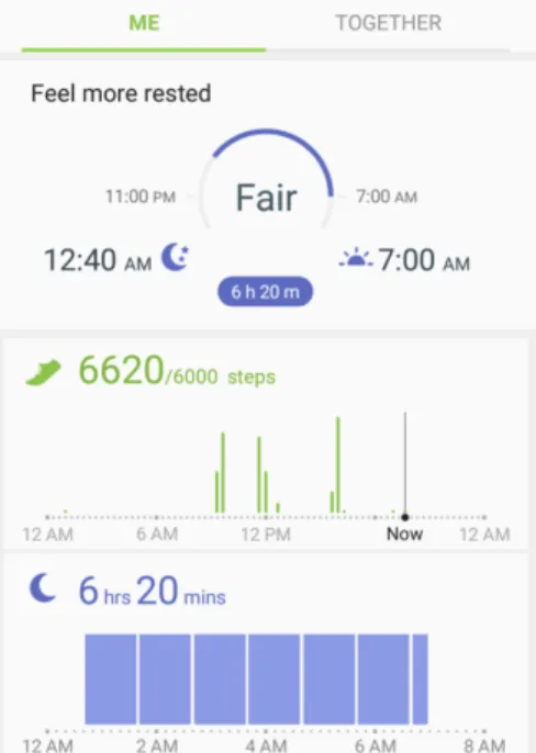
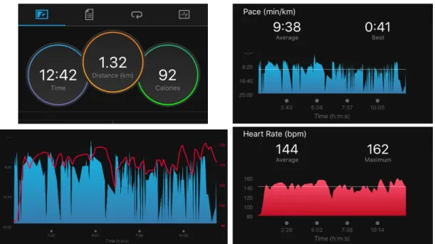
4.1 Screenshots from Fitbit App . . . 87
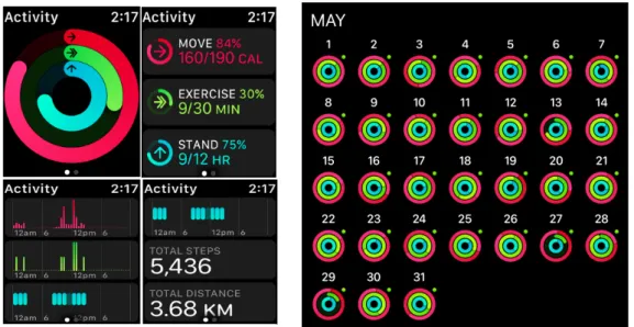
4.3 Visualizations on the Activity app running on iOS and Apple Watch . . . 90
4.4 Screenshots from Apple Activity App . . . 91
4.5 A Screenshot of Samsung Health App . . . 92
4.6 A Screenshot from Garmin Connect App . . . 97
4.7 Four Screenshots from Garmin Connect App . . . 98
4.8 Two Screenshots of Different sleep Visualization on Garmin App . . . 98
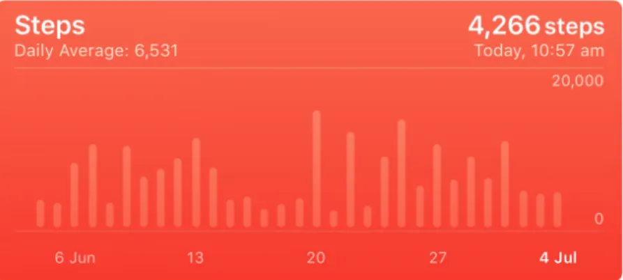
4.9 A Screenshot captured from iOS Activity app. A bar chart represents the move (i.e., total active calories) for the last year . . . 109
4.10 The Visualization of Distance and Step Count on‘ Apple iOS Health App . . . 110
5.1 A Sample of the Dataset Used in Developing the Visualizations in the prelim-inary Evaluation . . . 115
5.2 The Background of the Proposed Radial layout in the Preliminary Evaluation . 117 5.3 The Eight Visualization Designs Developed for the Preliminary Evaluation . . . 120
5.4 Screenshots of the Tooltip Presented on the Visualization . . . 121
5.5 A Screenshot of the Preliminary Evaluation Experiment . . . 127
5.6 Task Completion Time for the Eight Visualizations for Group 1 . . . 130
5.7 Task Completion Time for the Eight Visualizations for Group 2 . . . 131
5.8 Task Completion Time for the Eight Visualizations for Group 3 . . . 132
5.9 Task Completion Time for the Eight Visualizations for Group 4 . . . 133
5.10 Task Accuracy and Completion Time on the Radial and Linear Layouts for the Four Groups . . . 137
5.11 Group 1 Tasks Accuracy . . . 138
5.13 Group 3 Tasks Accuracy . . . 140
5.14 Group 4 Tasks Accuracy . . . 141
5.15 Overall Task Completion Time for the Visualizations for All Groups . . . 144
5.16 Overall Task Error Rate for the Visualizations for All Groups . . . 145
5.17 Overall Task Error Rate for the Visualizations for All Groups (percentage) . . . 146
5.18 Task Accuracy and Completion Time on the Radial and Linear Layouts . . . . 147
5.19 participants’ Ratings for the Visualizations’ Readability and Attractiveness Be-fore the Experiment . . . 149
5.20 Participants’ Preferences in the Visualizations Before the Experiment . . . 151
5.21 Participants’ Preferences in the Visualizations After the Experiment . . . 151
5.22 participants’ Ratings for the Visualizations’ Readability and Attractiveness After the Experiment . . . 152
6.1 The Background of the Proposed Radial layout in the Main Study . . . 169
6.2 The Visualization Designs Developed for the Main Study . . . 172
6.3 Participants’ Demographic Information . . . 196
6.4 Participants’ Health Tracking Routine/Behaviour . . . 197
6.5 The Participants’ Responses of the Chart Familiarity . . . 198
6.6 Two Screenshots of the Main Evaluation Study Experiment’s Interface . . . 201
6.7 Task Completion Time and Accuracy for ‘Identify’ Task on the Eight Visualiz-ation Designs (Dataset 0). . . 209
6.8 Task Completion Time and Accuracy for ‘Identify’ Task on the Eight Visualiz-ation Designs (Dataset 1). . . 209
6.9 Task Completion Time and Accuracy for ‘Determine’ Task on the Eight Visu-alization Designs (Dataset 0). . . 213
6.10 Task Completion Time and Accuracy for ‘Determine’ Task on the Eight
Visu-alization Designs (Dataset 1). . . 213
6.11 Task Completion Time and Accuracy for ‘Compare’ Task on the Eight Visual-ization Designs (Dataset 0). . . 216
6.12 Task Completion Time and Accuracy for ‘Compare’ Task on the Eight Visual-ization Designs (Dataset 1). . . 216
6.13 Task Completion Time and Accuracy for ‘Infer’ Task on the Eight Visualization Designs (Dataset 0). . . 219
6.14 Task Completion Time and Accuracy for ‘Infer’ Task on the Eight Visualization Designs (Dataset 1). . . 219
6.15 Task Completion Time and Accuracy for ‘Locate’ Task on the Eight Visualiza-tion Designs (Dataset 0). . . 223
6.16 Task Completion Time and Accuracy for ‘Locate’ Task on the Eight Visualiza-tion Designs (Dataset 1). . . 223
7.1 Ratings for the Visualizations Readability Before and After the Experiment. . . 258
7.2 Ratings for the visualizations Attractiveness Before and After the Experiment. . 259
7.3 The Participants’ Most Preferred Visualization(s) Before and After the Experi-ment . . . 262
7.4 Participants’ Preferences Justification Model . . . 270
7.5 Task Related Feedback . . . 270
1 Accuracy of All Tasks for the Eight Visualizations for Group 1 . . . 362
2 Accuracy of All Tasks for the Eight Visualizations for Group 2 . . . 363
3 Accuracy of All Tasks for the Eight Visualizations for Group 3 . . . 364
5 Gender Distribution in Each Group . . . 402 6 Age Distribution in Each Group . . . 403 7 The Participants’ Responses of their Education Degree (Distribution Based on
Groups). . . 404 8 The Participants’ Responses of their Education Field (Distribution Based on
Groups). . . 405 9 The Participants’ Responses of their Employment Status (Distribution Based
on Groups). . . 406 10 The Distribution of the Participants who Track and Do Not Track in Each Group 407 11 The Types of the Health/Physical Activity tracked by the Participants in Each
Group . . . 408 12 The Types of the Physical Activity Tracking Devices Used by the Participants
in Each Group . . . 409 13 The Participants’ Responses of their Familiarity with Different Chart and
Stat-istical Data (Distribution Based on Groups). . . 410 14 Task completion time for ‘Identify’ task for the participants in the groups (1, 2,
3 & 4) . . . 411 15 Task completion time for ‘Identify’ task for the participants in the groups (5, 6,
7 & 8) . . . 412 16 Task Accuracy for the ‘Identify’ Task on the Eight Visualization Designs Per
Dataset (Groups 1, 2, 3 & 4) . . . 413 17 Task Accuracy for the ‘Identify’ Task on the Eight Visualization Designs Per
Dataset (Groups 5, 6, 7 & 8) . . . 414 18 Task Completion Time for the ‘Identify’ Task on the Eight Visualization Designs
19 Task Completion Time for the ‘Identify’ Task on the Eight Visualization Designs Per Dataset (Groups 5, 6, 7 & 8) . . . 416 20 Task completion time for ‘Determine’ task for the participants in the groups (1,
2, 3 & 4) . . . 417 21 Task completion time for ‘Determine’ task for the participants in the groups (5,
6, 7 & 8) . . . 418 22 Task Accuracy for the ‘Determine’ Task on the Eight Visualization Designs Per
Dataset (Groups 1, 2, 3 & 4) . . . 419 23 Task Accuracy for the ‘Determine’ Task on the Eight Visualization Designs Per
Dataset (Groups 5, 6, 7 & 8) . . . 420 24 Task Completion Time for the ‘Determine’ Task on the Eight Visualization
Designs Per Dataset (Groups 1, 2, 3 & 4) . . . 421 25 Task Completion Time for the ‘Determine’ Task on the Eight Visualization
Designs Per Dataset (Groups 5, 6, 7 & 8) . . . 422 26 Task completion time for ‘Compare’ task for the participants in the groups (1,
2, 3 & 4) . . . 423 27 Task completion time for ‘Compare’ task for the participants in the groups (5,
6, 7 & 8) . . . 424 28 Task Accuracy for the ‘Compare’ Task on the Eight Visualization Designs Per
Dataset (Groups 1, 2, 3 & 4) . . . 425 29 Task Accuracy for the ‘Compare’ Task on the Eight Visualization Designs Per
Dataset (Groups 5, 6, 7 & 8) . . . 426 30 Task Completion Time for the ‘Compare’ Task on the Eight Visualization Designs
Per Dataset (Groups 1, 2, 3 & 4) . . . 427 31 Task Completion Time for the ‘Compare’ Task on the Eight Visualization Designs
32 Task completion time for ‘Infer’ task for the participants in the groups (1, 2, 3 & 4) . . . 429 33 Task completion time for ‘Infer’ task for the participants in the groups (5, 6, 7
& 8) . . . 430 34 Task Accuracy for ‘Infer’ Task on the Eight Visualization Designs Per Dataset
(Groups 1, 2, 3 & 4) . . . 431 35 Task Accuracy for ‘Infer’ Task on the Eight Visualization Designs Per Dataset
(Groups 5, 6, 7 & 8) . . . 432 36 Task Completion Time for ‘Infer’ Task on the Eight Visualization Designs Per
Dataset (Groups 1, 2, 3 & 4) . . . 433 37 Task Completion Time for ‘Infer’ Task on the Eight Visualization Designs Per
Dataset (Groups 5, 6, 7 & 8) . . . 434 38 Task completion time for ‘Locate’ task for the participants in the groups (1, 2,
3 & 4) . . . 435 39 Task completion time for ‘Locate’ task for the participants in the groups (5, 6,
List of Tables
3.1 The Online Survey Sample . . . 68 3.2 User Study: The Data Tracked by the Users of Different Tracking Devices . . . 72 4.1 Visualization Abbreviations Used in Table 4.3 . . . 93 4.2 Colour Codings Used in Table 4.3 . . . 93 4.3 Main Visualizations Used by the Selected Devices . . . 94 5.1 Tasks/Questions in the Preliminary Evaluation . . . 123 5.2 Data Tracked by the Participants in the Preliminary Evaluation Study and the
Used Devices/ Apps . . . 125 5.3 The Order of the Visualizations in the Preliminary Evaluation . . . 126 5.4 Participants’ Performance in Terms of Task Completion in Each Group . . . 129 5.5 Task Completion Time on the Radial and the Linear Layouts for the Four Groups129 5.6 Participants Performance in Terms of Task Accuracy in Each Group . . . 136 5.7 Task Accuracy on the Radial and Linear Layouts for the Four Groups . . . 136 5.8 Task Completion Time on the Radial and Linear Layouts . . . 143 5.9 Task Accuracy on the Radial and Linear Layouts . . . 143
6.1 Explanation of the Abbreviations Used for the Visualization Names . . . 171 6.2 Tasks/Questions in the Main Study . . . 176 6.3 Correct Responses to Tasks/Questions in the Main Evaluation Study . . . 176 6.4 The Cognitive and the Perceptual Components of the Visual Tasks (T1, T2 and
T3) . . . 178 6.5 The Cognitive and the Perceptual Components of the Visual Tasks (T4 and T5) 179 6.6 Main Evaluation Study Datasets Characteristics . . . 181 6.7 Images Used for the LSBC Visualizations for Dataset 0 and Dataset 1 . . . 182 6.8 Images Used for the LOBC Visualizations for Dataset 0 and Dataset 1 . . . 183 6.9 Images Used for the LSLC Visualizations for Dataset 0 and Dataset 1 . . . 184 6.10 Images Used for the LOLC Visualizations for Dataset 0 and Dataset 1 . . . 185 6.11 Images Used for the RSBC Visualizations for Dataset 0 and Dataset 1 . . . 186 6.12 Images Used for the ROBC Visualizations for Dataset 0 and Dataset 1 . . . 187 6.13 Images Used for the RSLC Visualizations for Dataset 0 and Dataset 1 . . . 188 6.14 Images Used for the ROLC Visualizations for Dataset 0 and Dataset 1 . . . 189 6.15 Demographic Information of the Participants . . . 194 6.16 Tracking Apps Used by the Participants . . . 195 6.17 First Viewed Visualizations for the Eight Groups in the Main Study . . . 195 6.18 Results of the Levene Test for Homogeneity of Variance . . . 206 6.19 Task T1 (Identify) Analysis Within the Linear and the Radial Layouts for
Data-set 0 and 1 . . . 210 6.20 Task T1 (Identify) Analysis Across Both Layouts for Dataset 0 and 1 . . . 211 6.21 Task T2 (Determine) Analysis Within the Linear and Radial Layouts for
6.22 Task T2 (Determine) Analysis Across Both Layouts for Dataset 0 and 1 . . . . 214 6.23 Task T3 (Compare) Analysis Within the Linear and Radial Layouts for Dataset
0 and 1 . . . 215 6.24 Task T3 (Compare) Analysis Across Both Layouts for Dataset 0 and 1 . . . 217 6.25 Task T4 (Infer) Analysis Within the Linear and Radial Layouts for Dataset 0
and 1 . . . 218 6.26 Task T4 (Infer) Analysis Across Both Layouts for Dataset 0 and 1 . . . 220 6.27 Task T5 (Locate) Analysis Within the Linear and Radial Layouts for Dataset 0
and 1 . . . 221 6.28 Task T5 (Locate) Analysis Across Both Layouts for Dataset 0 and 1 . . . 222 6.29 The Hypotheses from the Main Study . . . 240 6.30 Main Evaluation Study Findings Summary T1 . . . 247 6.31 Main Evaluation Study Findings Summary T2 . . . 248 6.32 Main Evaluation Study Findings Summary T3 . . . 248 6.33 Main Evaluation Study Findings Summary 41 . . . 249 6.34 Main Evaluation Study Findings Summary T5 . . . 249 6.35 Best and Worst Visualizations for the Five Tasks (Dataset 0 and 1) . . . 251 7.1 Participants Feedback Questions . . . 256 7.2 The Results of the analysis of the Visualizations’ Ratings Data . . . 257 7.3 The Results the analysis of the Visualizations’ Preferences Data . . . 263 7.4 Participants’ Preferences Changes. . . 264 7.7 Major Categories/Themes identified in the Participants’ Responses . . . 269 7.8 Task Related feedback . . . 285
Chapter 1
1.1 Introduction
Personal tracking has a long history; people have been tracking their activities using differ-ent methods, such as diaries, for many cdiffer-enturies and personal computers for many decades [185]. One of the earliest technologies, which was first used for tracking and self-monitoring in the late 19th century, is the weight scale [50]. More recently, self-tracking has increased in popularity with the advancement of smartphones and wearable devices, which have embedded accelerometers and built-in GPS for activity tracking indoors and outdoors [185]. This thesis focuses on a very popular and important aspect of personal data: health data.
Health and physical activity tracking are no longer limited to specialised fitness and activity tracking devices and heart rate monitors. It is becoming highly popular to track personal health and activity using different types of worn accessories such as multi-functional smartwatches, in addition to the broad range of apps on smartphones. Consequently, with more sophisticated embedded sensors and data classification algorithms becoming available on smartphones and smartwatches, the concept of personal tracking is expanding rapidly to capture different types of data about oneself covering different domains. For example, Fitbit1is used to capture sport
movement data, calorie intake to managed by software such as MyFitnessPal2and many others.
According to a study conducted in 2017 by the “Research 2 Guidance” health research group [181], the number of mobile health or mHealth apps available in the major app stores was around 325K published by around 80K app developers, with a total download rate of 3.7 billion in 2017. In addition, the research group reported a significant increase in the growth of sales of health and fitness tracking devices [180]. These health apps and tracking devices often collect different health metrics (e.g., step count, heart rate and pace); therefore, they generate large collections of heterogeneous health data. These large volumes of collected data can potentially increase the difficulty of integration, understanding and sense-making of the data [149]. This increasing interest in personal health and fitness data has not been restricted to the in-dustrial sector and tracking devices and apps developers. It has received increasing interest from academic researchers from different fields, such as digital health and HCI, and several
1https://www.fitbit.com 2https://www.myfitnesspal.com
workshops (e.g., [3, 4, 5]) have been organised to discuss various aspects of health data. The significance of this research lies in the type of data it considers. It focuses on an important aspect of personal data: health and physical activity. However, physical inactivityis also a crucial aspect to one’s health, as it contributes to the development of various chronic illness and lifestyle-related health issues such as diabetes and heart disease [167]. Therefore, personal health data should not be restricted to physical activity data only or data collected from one device or app, other factors such as diet and nutrition, sleep and family medical history are important to gain a better insight and a comprehensive picture of one’s personal health [148]. Visual encoding of information has always played a major role in communication and, when used appropriately, it can become a powerful tool to guarantee access to information. The visualization aims to support people’s understanding of data by exploiting a human’s visual ability to recognise patterns and spotting trends and outliers [108]. Well-designed visualization of data could improve comprehension, memory and decision-making by replacing cognitive operations with primitive perceptual operations [108]. Data visualization is an important stage in any personal informatics model, and it can help in understanding complex data [65].
1.2 Motivation and Vision
People who track their data, view and explore the collected data using information visualiza-tions. The self-tracking devices and their apps/dashboards support different forms of visual-izations. However, these visualizations are simple and provide minimum interpretations; for example, low-level data view of step count every couple of minutes or high-level summary of step count over a day or month [60]. Therefore, they do not always fulfil users’ needs in the data [135]. Providing higher-level inference is significant to help people obtain complex correlations from the data, this may result in gaining further value from the collected data [60]. Many research studies have focused on finding new methods that help people in gaining new in-sights from different types of personal data [60, 66, 149, 218, 222]. Other types of research have explored people needs in personal tracking devices and the limitations in the current methods [44, 45, 134, 135, 177]. Previous studies have shown that there should be visualization methods
that help participants find relationships between different personal data variables; combining multiple personal data might help people develop a better understanding of patterns in the data and how they relate to each other [60]. It has also been found that people are interested in identifying relationships between different types of personal data to identify the factors that impact their behaviour [135]. Although combining data and analysis has been explored in the literature, there remain a number of research questions about the design challenges regarding multivariate data in personal informatics that require further research, such as identifying the best methods for representing correlations [122].
A major challenge in combining the data into one visualization is that personal health data variables are different in their types and are measured using different units. For example, the step count is discrete and refers to the total number of steps taken during the day or at a specific time point (e.g., a specific hour), while Heart rate is time-series data that is recorded on continuous-time points and they also vary in their possible values. These differences in the data types increase the challenge of creating a visualization that combines those different variables due to the difficulty of mapping the data into a unified scale. In addition, there is no evaluated method that addresses the issue of visualizing the multivariate variables. Designing such visualization requires a deep understanding of the data types, users’ needs and tracking purposes, and visualization principles.
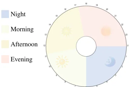
Personal health and physical activity data are often presented on the dedicated platforms over different time frames (e.g., day or a week). Visualizing time-dependent data is a significant topic in information visualization, and it is challenging due to the complexity of time repres-entation [128]. Known visualization layouts for representing time-dependent data are Linear charts (using line, bar or color encoding) and Cyclical layouts (e.g., star and rose charts) [128]. For time-dependent data, Linear charts are possibly the most popular and traditional method to represent a time series, where the time is represented on a Linear axis and the quantitative data on the other axis [128]. The Radial or Cyclical chart on the other hand, provides a compact representation and people’s acceptance of the design might depend on its familiarity to the users and their working habits [128]. The Radial design provides an intuitive understanding of the circular pattern in the data and is aesthetically appealing [36]. Therefore, using a Radial design while imitating an analogue clock metaphor might be easier for people, as it utilises
their skill of reading time on an analogue clock. In addition, the hours in the analogue clock may facilitate referring to the presented data for each hour.
Moreover, the Cyclical timeline has an advantage over the traditional Linear timeline in terms of detecting temporal patterns [92]. Finding patterns in the data is a task that involves identifying and comparing patterns that represent behaviours over multiple reference sets [12]. There are several methods for decomposing time-series data into components (e.g., cyclical, seasonal or irregular components) [12]. With respect to the personal health data, the activity patterns could be depicted within days, weeks or months. For example, a detailed day representation of personal health data shows the person’s activity patterns during the day. The detailed day representation could help in identifying and comparing patterns, which represent the person’s behaviour over the hours of the day. The hours of the day are the multiple reference sets according to Andrienko and Andrienko [12]’s definition of pattern.
Since the difference between the Radial and Linear layout has been studied in the context of time-series data over a long period of time (i.e., weeks and months) such as [6, 32], few studied the difference in case of hourly distribution within days (e.g., [238]). Evaluating the difference between these layouts is important in representing multivariate personal health data, especially as these data often viewed on a daily basis.
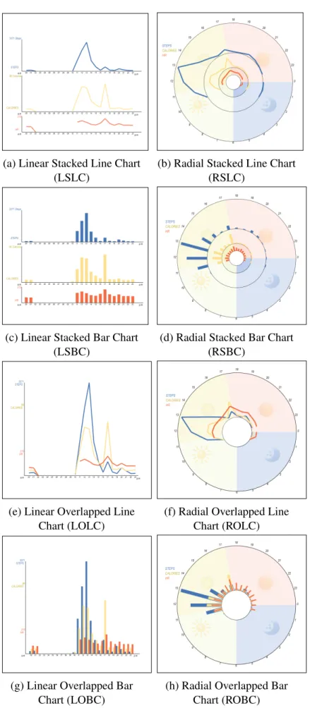
In order to address the highlighted issues, this thesis proposes multiple visualization alternatives which rely on the different options of data encoding, visualization methods and layouts. The design considers the use of the Line and the Bar encoding in representing multivariate health data in the traditional Linear format and the Radial format utilising a clock metaphor.
Therefore, theoverall vision of this thesisis to investigate the best visualization designs for representing multivariate personal health data through developing and evaluating possible visualization choices in order to provide visualization recom-mendations and insights for future visualization designs.
To achieve the research vision, some important requirements should be investigated. For ex-ample, the research should explore the data to understand aspects such as important data vari-ables for the users and how they are represented. These are discussed in the following sections.
1.3 Definitions and Terminology
This thesis uses various terms. This section defines and explains these terms. The definitions are derived from different resources and were adapted to suit the domain of the thesis.
1. Personal Health Data: Personal health data in this thesis refers to the data collected by embedded sensors in smartphones and wearable devices that gather different types of health and physical activity data, such as step count, burned calories and heart rate (HR). 2. Multivariate Data: This is defined as “data comprising at least three covariates per
observation” [212] (p. 147).
3. Multivariate Personal Health Data: In this thesis, the term of ‘multivariate personal health data’ is used to refer to the dataset used in the visualizations. According to the definitions 1&2, it is the personal health data collected from the wearable health-tracking devices and apps, which involves measures of three or more data variables per observa-tion (i.e., time point). In this context, the multivariate personal health dataset used in the visualizations is composed of three variables (i.e., steps, calories and heart rate) plus time.
4. Dataset Complexity: This includes the number of objects, attributes and relationships between them [116]. The dataset complexity here refers to how many objects need to be observed to solve the given task and how distinct the target is from the distractors. The dataset description can be found in section 6.3.3.1, where the dataset complexity regarding each task is discussed in detail.
5. Task complexity:This refers to the load (perceptual and cognitive) incurred by the task, including how many objects are involved and the interactivity between them [116]. In this thesis, it refers to how many variables are involved in solving the task, how many objects (data items to observe) and how many perceptual and cognitive component tasks are involved and how they interact. Task complexity is not related to how the task is introduced to the participant or how it is constructed.
[1]. This is a term used in the evaluation study to describe the clarity and the ability to read the information from the visualization.
7. Visualization Attractiveness: According to the Oxford dictionary [1], attractiveness is “the quality of being pleasant to look at”. Although attractiveness in information visu-alizations could be defined differently according to the context (e.g., aesthetic aspects or engagement), in the context of this thesis, ‘visualization attractiveness’ is used in the evaluation to describe the overall aesthetic aspect of the visualizations [150].
Visualization readabilityand attractivenessdefinitions are used in this thesis to allow the participants to provide their feedback about the developed visualizations.
1.4 Research Aims
The aim of this thesis is to design and evaluate visualizations for multivariate personal health and activity data, all the following aims are sub-aims that are included in the basic aim.
• RA1: Understanding users’ behaviour and preferences in health tracking (e.g., the type of data they track) and their preferences in different visualization designs. It includes aspects such as the most tracked data and used devices, how frequently people check the tracked data (e.g., daily or weekly), and identifying people’s interest in the visualization of different types of health.
• RA2:Identifying the current visualization methods provided by health tracking devices and their associated apps/dashboards in addition to the related literature, and identifying the limitations in these visualizations considering design aspects and the users’ needs. • RA3: Developing different visualization design alternatives for representing
multivari-ate personal health data using options of visual layout and visual encodings to address the identified limitations of the current visualizations methods.
• RA4: Evaluating people performance when using the developed visualizations by im-plementing a set of visual tasks that are related to the real health dataset to identify the most effective design for the data and the implemented tasks.
• RA5: Evaluating people’s preferences in the developed visualizations before and after using them to gain better insight into the visualizations and the design elements. This also includes comparing users’ preferences in the visualizations with how they perform. • RA6:Providing design implications for the visualization of multivariate personal health data that are presented on desktop displays. These design implications are derived from the analysis of the evaluation study.
1.5 Research Questions
This overview of the thesis and research problem presented earlier highlight a set of concepts that need to be explored in the thesis, including the visualization design principles and eval-uation methodologies. This subsequently raised several research questions that need to be addressed through different research stages in order to achieve the research aims. The main research questions are as follows (Chapter indicated as CH):
• RQ1: What types of health data do people most track? What is their behaviour in tracking, their needs, requirements and preferences in the visualization of the tracked data?(CH2 + CH3).
• RQ2: What are the visualization methods supported by most popular tracking devices and their companion apps and dashboards? What are their limitations? And what needs to be addressed?(CH2 + CH4).
• RQ3: What visual layout could be used to support interpreting and identifying daily activity patterns in the data and to provide a relevant context? Would a design informed by data ontological interpretation, e.g., Radial clock layout for daily data, facilitate un-derstanding and interpretation of data and performances of visual tasks?(CH5 + CH6). • RQ4: How can multivariate personal health data be visualized? What are the methods that could be used to integrate the data into one visualization? What could be used as a visual encoding method to represent the data?(CH5 + CH6).
• RQ5: What are the differences between visualization methods that could be used to represent multivariate personal health data in terms of users’ performance? What are the most effective methods for each of the implemented tasks, and what are the least effective ones?(CH6).
• RQ6:What are the users’ preferences in visualizations? What factors (e.g., performance and familiarity) could impact the preferences? In order to construct design guidelines for personal health visualizations that incorporate both preferences and performance(CH7).
1.6 Research Hypotheses
During the research stages, a set of hypotheses were constructed based on previous studies outcomes on the visual perception and evaluation of similar tasks, in addition to the results from the preliminary evaluation study. The main hypotheses are listed below and are based on the selected visual tasks for the evaluation study. The visual tasks are explained and refined in Chapter 5 and 6. The number in each hypothesis name refers to the task, the first part (i.e., the a) is related to a comparison between the two layouts, and the second part (i.e., the b) is related to either the type of the visual encoding or the visualization method. The hypotheses are related to the outcomes of the evaluation study, which are associated with the research questionRQ5. • H1a:It is hypothesised that using the Radial layout (clock metaphor) to represent activ-ity data during the parts of the day (morning, afternoon, and evening) allows users to compare the data and identify trends faster than when using the Linear layout.
• H1b:Using Line chart encodings within the layouts facilitates finding trends in the data over time, therefore, enabling a faster performance of the task than the Bar chart. • H2a:For determining a specific value, it is hypothesised that this task is more accurate
and faster in the Linear layout than in the Radial layout.
• H2b: In terms of the chart type, it is hypothesised that determining value task is more accurate and faster with the Bar chart than with the Line chart on both layouts.
• H3a:The comparison of visualizations over two days is faster and more accurate on the Linear layout than the Radial layout.
• H3b:The comparison of visualizations of the multivariate dataset over two days is faster and more accurate on the Stacked design visualizations than the Overlapped ones. • H4a: The Linear layout is faster and more accurate at finding the relationship between
two variables from the multivariate dataset than using the Radial layout.
• H4b: The Overlapped chart is faster and more accurate at finding the relationship between two data variables from the multivariate dataset, compared to the Stacked chart. • H5a:Locating maximum values occurs faster and more accurately with the Linear
lay-out than the Radial laylay-out.
• H5b: Locating maximum and minimum values occurs faster and more accurately with the Bar chart than the Line chart.
1.7 Research Methodology and Thesis Structure
Users are a significant element in designing and evaluating the visualizations. Therefore, to achieve better applications, users and their requirements and tasks should not be ignored; as is often the case in any evaluation study of visualization systems. Tory [227] explained research methods for evaluating information visualization and described their appropriate data collection procedures, which are usually applicable across different methods. These include: observation; performance measurements; log analysis; surveys and questionnaires. Each type of evaluation methods provides different types of results and offers a different perspective. Sole dependence on quantitative methods does not provide a complete understanding of the problem; however, combining quantitative and qualitative methods (e.g., through a mixed-method approach) can help to answer the research question by providing a more exploratory enquiry [227].
In this thesis, each chapter uses a specific methodology that is suitable for the research question the chapter addresses and the type of the outcome. However, the research methodology could be contextualized using Munzner Nested Model [155]. According to the model [155], the
problem characterization is presented in Chapter 2, 3 and 4. The data types and task abstraction is covered in the literature review and discussed in detail in Chapter 5, while the visual encoding design is discussed in Chapter 5 and 6. The main contribution of the thesis falls in the encoding design level in Munzner’s Model. The thesis presents a laboratory study to evaluate different design choices that are developed to enhance the interpretation of multivariate personal data. The evaluation is based on previous visualization research, which has studied the effectiveness of different visualization designs through a visual task-based evaluation study such as [28, 107, 211]. It compares the visualizations by measuring task completion time and accuracy (i.e., error rate) when the user performs a set of tasks on each visualization. The visualizations are evaluated in accordance with a taxonomy of tasks for multidimensional visualization [234]. In addition, users’ subjective feedback and preferences in the visualizations pre and post the experiment are collected using questionnaires to justify the design choices.
Task completion time, accuracy and preferences are important factors to consider when evalu-ating different visualizations and when providing guidelines. These factors have been used to evaluate the visualizations by many previous studies such as [32, 186, 211]. Collecting par-ticipants opinions and preferences using surveys or semi-structured interviews is a common qualitative approach that usually takes place alongside laboratory experiments [40]. The thesis is divided into three stages, as shown in Figure 1.1 and explained below.
• Investigation and Gathering Information:this stage collects the required information
for the research. It explores personal health data, the process of health tracking, people needs and preferences in the visualizations of the data, how the data is visualized on the dedicated platforms and what are their limitations. These requirements are addressed through the literature review in Chapter 2 and the studies in Chapter 3 and Chapter 4.
• Visualization Development and Evaluation: the proposed visualization designs are
developed and evaluated in this stage. The evaluation follows a two-step method, starting with a preliminary study that leads to the design of the main evaluation study. The evaluation includes quantitative and qualitative measures of participants’ performance and preferences in the designs, and are presented in Chapters 5, 6 and 7.
the conducted research. It puts the results and outcomes in a structured list of design implications, recommendations and insights which direct future visualizations design for personal health data.
Stage 1: Investigation and Gathering Information
Stage 2: Development and Evaluation
Stage 3: Interpreting Results and Outcomes
Literature review of related studies of personal health and information visualization
A review of the visualization methods provided by health tracking tools and identifying their limitations
Visualization development and preliminary evaluation study Main evaluation study of the visualizations (quantitative analysis
of the participants’ performance)
Discussion of the results: providing implications, recommendations and insights for visualization designs for
multivariate personal health data
User study to identify people needs and preferences in personal health tracking and its visualizations
Main evaluation study of the visualizations (qualitative analysis of the participants’ feedback and preferences)
Research Stages
Figure 1.1: PhD Thesis Research Stages and Methodology Diagram.
1.8 Research Contributions
Answers to the research questions are the contributions of the thesis and listed as follows: • For RQ1andRQ2, we provide a taxonomy of the visualization methods available on
widely used health tracking devices’ embedded displays, companion apps and online dashboards (if available). A discussion of the main limitations in the visualizations on the reviewed platforms, in terms of the size of visualized data, visual encoding, visual layout, and sharing from both the information visualization perspective and the per-sonal informatics perspective (i.e., people’s needs and requirements). Finally, the study provides suggestions and recommendations to improve the current visualization methods for representing and sharing and offers suggestions for further studies.
• For RQ3andRQ4is the implementation of eight visualization methods that were de-signed to address the raised challenges. One of these challenges is the significant dif-ferences between the data types and how can they be integrated. The other challenge is the lack of a relevant layout that is suitable for the data. For the visual layout, the im-plementation uses two visual layouts: the conventional Linear layout and a novel Radial layout that implies the design of an analogue clock and uses coloured sectors to refer to the parts of the day with expressive glyphs (e.g., sun and moon) in order to identify the time of the day faster than the traditional layout.
• ForRQ5, the analysis of the evaluation results of the developed visualizations provides implications for design according to the tasks and dataset characteristics. The analysis starts by examining the set of hypotheses, which were constructed according to the type of each task. The hypotheses concern the impact of the tested visualizations options for improving the performance of the task, such as the visual layout used, the type of chart and the combining variables methods.
• ForRQ6, various types of data regarding people’s preferences in the visualizations were collected during this research. A significant stage was in the evaluation study, where the participants were allowed to rate and provide subjective feedback about the visual-izations after performing real tasks. The results section discusses the relation between the preference and the performance, the tracking devices used and the familiarity with the visualization method. The thematic analysis of the open-ended questions highlights the main features people seek in the visualizations. It also discusses all the evaluated visualizations options such as the visual layout and the encoding. For example, to what extent people may accept a specific layout or visualization method and for what specific tasks they would prefer it to be applied to (e.g., using the Radial layout as a support for the traditional Linear visualization).
1.9 Thesis Outline
Background and Literature Review (CH2)
Analysis of the Use and Preferences of the tracker Users (CH3)
A Review of Visualization Tools for
Health Data (CH4)
Visualization Design and Preliminary Evaluation
(CH5)
Main Evaluation Study of the Visualizations
(CH6)
Participants' Feedback and Preferences in the Visualizations (CH7)
Discussion (CH8) Figure 1.2: PhD Thesis Structure Diagram.
• Chapter 2: The background and literature review chapter examines topics from
differ-ent fields that relate to the scope of this PhD. It begins by describing personal health data, then goes on to discuss related works in personal informatics to understand the visualization’s role in the self-tracking process. The chapter also presents an overview of the visualizations methods applied for representing health data, describing the evalu-ation methods for informevalu-ation visualizevalu-ation in general and personal health visualizevalu-ations in particular. Other topics related to the evaluation study are also discussed here; such as human factors in information visualization and tasks taxonomies.
• Chapter 3: This chapter presents an online questionnaire that is deployed before the
visualization implementation phase. It aims to understand more about users’ require-ments and preferences in different visualizations designs for health data. It also includes questions regarding participants’ tracking behaviour and the tools they use.
• Chapter 4: Presents a study that was conducted to review popular health and physical
activity tracking devices, and their companion apps/dashboards, in the visualization they provide to report on the limitations and research opportunities in personal health data representation. It also provides suggestions for addressing the highlighted limitations.
• Chapter 5: Presents the implementation of the visualization designs that are inspired by the studies in Chapter 3 and 4, and validates the evaluation approach. The evaluation compares the visualizations by measuring task completion time and accuracy (i.e., error rate) when the user performs a set of tasks on each visualization. In addition, users’ feedback and preferences in the visualizations are collected.
• Chapter 6: Following the same methodology set out in Chapter 5, after addressing
the issues raised, this chapter describes the main evaluation study used to evaluate the visualizations. It presents the analysis and the results of the quantitative part of the study. It concludes by classifying the visualizations according to their efficiency for each implemented task.
• Chapter 7: Presents the qualitative part of the main evaluation study, which is the
users’ ratings and their subjective feedback of the visualizations. It discusses the rela-tion between visualizarela-tions’ preferences and performance, and tracking behaviour. The chapter discusses participants’ perspectives of the implemented design aspects, and their reflection on the visual tasks.
• Chapter 8: This chapter discusses the outcomes of the studies presented throughout
the thesis. It reflects on recent updates of the visualizations reviewed in Chapter 4 in light of the raised limitations, our research outcomes and the literature. It discusses the significant differences in the design between the developed visualizations in this research and other similar designs. More importantly, the chapter provides design implications, recommendations and insights for future visualization designs for personal health data.
• Chapter 9: Concludes the thesis by providing an overview of the conducted research
and its outcomes. It addresses the research questions and highlights the research con-tributions. Subsequently, it discusses the research limitations, future work, and further directions to be explored based on the presented research.
• Appendices:Supplementary materials include additional information about
implemen-ted studies in Chapter 5, 6 and 7, including the used questionnaires, users’ tasks, parti-cipants training and recruitment details in addition to groups and behavioural analysis and charts of the main study discussed in Chapter 6.
Chapter 2
Background and Literature
Review
2.1 Introduction
2.2 Personal
Health Data 2.3 InformationVisualization Evaluation Studies2.4 Empirical
2.5 Summary
Figure 2.1: Chapter 2 Structure Diagram.
2.1 Introduction
Self-tracking and documenting information about aspects of one’s personal and daily life has a long history. It is an effective method which helps us to learn more about ourselves, rather than depending on our limited memory. Recent technology in mobile devices and the advancements in sensors and wearable devices have significantly reduced the effort required to record such data. Although these advancements have contributed to a massive generation of personal data, they have produced several challenges in managing and extracting usable knowledge from the data. Many research papers have focused on these challenges and built models to understand the process. A well-known study in this field is the personal informatics model by Li et al. [134]. The model includes five stages, which are preparation, collection, integration, reflection and action. According to Li et al. [134], data visualizations is one of the essential methods used to help people to understand their collected personal data in the reflection stage.
This thesis focuses on the visualization of one specific type of personal data: health data. Per-sonal visualization is distributed across different research areas such as visualization, human-computer interaction and personal informatics [114]. The scope of this thesis lies in the inter-section of different fields and relies on many topics: personal visualization and its evaluation methodologies, personal health visualization, people’s preferences and behaviours of personal
health tracking, basic information visualization evaluation research and the used evaluation methodology including visual tasks taxonomies, the perception of different visual encodings used in the primary statistical charts.
Therefore, the topics of this literature review are classified according to the basic elements in the research and divided into three major parts (see Figure 2.1) as follows:
• Part 1: Personal Health Data: The first part of this chapter introduces the health data
in general and discusses a significant type of health data: Personal Health Data, then it discussesPersonal Informaticsand how this relates to personal health visualization.
• Part 2: Information Visualization: The second part of the literature review includes
three main sections: (1)Visualization by Task Taxonomies; (2) Human Factors in in-formation visualization, which discusses topics of cognition and perception, and the last section is (3)Visualization of Time-Series Data.
• Part 3: Empirical Evaluation Studies: This part presents the visualization methods
applied in information visualization in general and in personal visualizations specifically, with a reflection on the evaluation methods applied in part 1.
2.2 Personal Health Data
2.2 Personsl Health Data
2.2.1 Complexity in the
Personal Health Data 2.2.2 Data Visualizationin Personal Informatics Personal Health Data2.2.3 Visualization of
Figure 2.2: Chapter 2 Health Data Section Diagram.
Personal health data is a broad term that incorporates different health-related aspects of indi-viduals. It includes data in different forms and from different resources, such as: patients’ health records in clinics, for example summaries of clinical visits, prescriptions and test results recorded by healthcare providers; manually recorded health-related information by people or automatically tracked data using embedded sensors in smartphones and wearable devices. In terms of the data recorded by individuals about themselves, there are numerous aspects of per-sonal data which some people keep, for example: medications; illness-related symptoms; foods and liquid consumptions; alcohol and caffeine intake; mood and logged exercises, as well as many other types of data. The recent advancements in sensing technology, especially those used by phones and wearables, have facilitated the tracking of different health data (e.g., steps, HR, active minutes and calories). Although these devices are fairly affordable, they are also generating a varied collection of valuable health data. This thesis focuses on the latter type: the personal health data that are automatically generated by health tracking devices and apps.
2.2.1 Complexity in the Personal Health Data
Data collected from self-tracking devices is considered to be multi-dimensional data based on how many signals are being tracked [130]. Personal health data is considered multivariate if it
includes measures of three or more data variables (see section 1.3 for definitions and termino-logy). Several challenges have been identified in personal health data either from the reviewed literature or from dealing with the data in this PhD study, including the lack of accessibility, in-completeness of the tracked data and variability of recording intervals. Each of these challenges is defined and discussed in the following sections.
Accessibility: The type of the data was not easily accessible or found as an open-source or
publicly published data; the focus of this thesis is the multivariate dataset. Personal health data is sensitive and could reveal a significant amount of information about oneself, which in turn restricts its availability. The data also required informed consent from the owners to be used in the research. Several studies have highlighted how treasured this type of data is for personal and public health research. For example, Bietz et al. [24], studied the barriers that prevent researchers from using and benefiting from personal health data from different perspectives including the data owners (i.e. the adopters of self-tracking devices) and the researchers and companies that build the tracking-devices. The results of Bietz et al.’s study have identified challenges which have been classified into six areas: ownership of the data; access for research; privacy; informed consent; data quality, reliability and research methods, in addition, there is the challenge of the evolving ecosystem.
Data Variability (Recording Intervals): In some cases, the collected personal health data is
recorded using different devices. Even when using the same device, the time interval between recorded one data value and the other usually depends on the physical activity (e.g., it is more frequent during an exercise than when one is sedentary). Data recording interval affects data visualization and analysis (e.g., when analyzing or visualizing the data according to minutes, hours or days interval).
Incompleteness:One of the major challenges in understanding and interpreting personal health
data that it is typically incomplete [21, 218, 219]. Many reasons could cause data incomplete-ness, such as faults in the tracking device or because the user is not wearing it. Tracking success requires that the user wears the tracking device continually. Boll et al. [27] stated that the tracking device needs to be easily integrated into one daily’s life to achieve successful per-sonal health tracking. However, some people forget to wear or charge their device, or switch between different devices, or sometimes they do not fit in with the person’s lifestyle, match
their personal taste, or in some cases they are not allowed to be worn [27].
Multivariate Data Variables: the tracking devices collect various types of different data, all
of which are measured using different units. For example, the step count is discrete and refers to the total number of steps taken during the day or at a specific time point, such as a specific hour. The number of calories burned is considered similar to the steps in terms of the type, but they have different data ranges (e.g., the user that walks the recommended 10,000 steps in one day will burn 500 calories [159]) and this shows how the numbers are different between these two variables. Sleep data is recorded and represented as ranges each day. Heart rate is time-series data that is recorded on continuous time points. What follows are definitions of the major data types recorded by activity tracking devices, smartwatches or phone apps.
• Calories:the calorie is defined as a unit of energy used to represent the energy produced from foods and energy consumed by the body [20]. The unit calorie (Cal), is usually abbreviated as (kcal) [20]. The energy is required to keep us alive and for our organs to function normally [162]. Our bodies use the energy we get from food and drinks for every movement from a simple activity (e.g., breathing) to more intense activity such as running [162]. Burning calories depends on how much the person is physically active, and it is affected by other factors such as weight and age [162].
• Distance:is the distance travelled by the person during a specific exercise (e.g., running, walking or cycling) or over the course of a day, and is calculated as km or mile per hour. • Heart Rate (HR):HR is defined as “the number of heart beats per minute” [124]. The average heart rate per minutes for an adult at rest is 60-80 per minute; however, other factors such as exercise, illness, and emotion may affect this average rate and elevate it and produce faster rate [2]. The standard unit for HR measurement is (BPM), which is beats per minute [220]. Other HR measurements, such as the maximum HR (i.e. calculated as 220 - user’s age) and target HR (i.e. a value between 50% and 70% of the maximum HR) are calculated to increase the user’s fitness and strength safely [34]. Some devices also track HR variability, which is defined as a measurement of the variability of the intervals between consecutive heartbeats over time; these can indicate stress and its related issues [160].
• Sleep: the sleep data is often collected by apps and trackers as the number of sleeping hours during the day, it is usually represented as a range between bedtime and waking time. Some apps add information such as sleep quality (deep or light or times being awake). For longer periods (such as a week or a month), sleep is usually represented as the average of sleeping hours during that period.
• Step Count:is the total number of steps the users take during a day. Step count has be-come more popular since 2010, when use of the activity tracker increased [18]. The step count is a preferred metric for measuring physical activity because of its various advant-ages, such as it being easy to understand by laypeople, easy to track and its association with other health variables [18].
The list of data variables is much longer than those listed here. It includes: active minutes that calculate the number of minutes the user is active during the day; the pace that calculates how fast the user is moving; the HR zones that are supported by some trackers, such as Fitbit, the calculation of which is based on the maximum HR.
The field of personal health is broad and overlaps with many fields, such as mobile Health (mHealth), HCI and Information Visualization. In recent years, researchers have explored personal health tracking from different perspectives. The following sections reflect on and discuss the related literature from two research areas, beginning with personal informatics and followed by the visualization of personal health data.
2.2.2 Data Visualization in Personal Informatics
Personal informatics is defined as the process of gathering and reflecting on personal data to gain better self-knowledge [135]. Furthermore, personal informatics systems enable people to collect and review personal information for providing data-driven self-insight to promote better behavioural change [235]. Li et al. (2010) [134], developed a five stage-based model of personal informatics: preparation; collection; integration; reflection and action and they listed the barriers people face at each stage. This model was derived from surveys and interviews with users of different personal informatics tools, with the aim of studying their practice, motivations
and issues in each stage. They identified some problems users faced with the visualization of their data during the reflection stage, which affects transition to the action stage, such as failing to use visualizations effectively to extract knowledge from the data. Li et al. [135] noted the importance of referring to different fields (e.g., information visualization) to resolve issues within each stage. This is performed by identifying people’s needs and requirements in the data (e.g., why do they collect the data? and what do they want to know?) and what is the size of the data to be presented to the user based on their tracking purposes. As the purpose of the visualization and the size of the data is essential in any visualization design, the discussion of the literature in this section is classified into these two important categories: tracking purposes and requirements and data granularities.
Tracking Purposes and Requirements: As developing effective tools for supporting self- re-flection requires sufficient understanding of people’s self-rere-flection needs, Li et al. [135] built on their previous study [134] and interviewed 15 people who used different types of self- in-formatics tools to explore and identify the questions people have regarding their personal data. They also discussed what tool the participants’ used to reflect on their data, how they used it and what issues they encountered. Their study resulted in identifying six types of questions that people usually ask about their personal data during two non-static phases of reflection, i.e. discovery and maintenance. Those six types of questions relate to: status; history; goals; discrepancies; context and factors. Although the authors discussed how the participants used their tools to reflect on the data and to answer their questions, there were no details on the visualization methods used and their limitations.
Choe et al. [44] focused on the reflection stage and they analysed 52 video recordings of Quantified-Selfers talks in Quantified-Self meetings with the goal of understand