Security and Law
Security and Law
Volume 12 Number 1
Article 6
3-31-2017
A Forensic Email Analysis Tool Using Dynamic Visualization
A Forensic Email Analysis Tool Using Dynamic Visualization
Johannes Stadlinger
University of Erlangen-Nuremberg, [email protected]
Andreas Dewald
ERNW Research GmbHFollow this and additional works at: https://commons.erau.edu/jdfsl
Part of the Computer Engineering Commons, Computer Law Commons, Electrical and Computer Engineering Commons, Forensic Science and Technology Commons, and the Information Security Commons
Recommended Citation
Recommended Citation
Stadlinger, Johannes and Dewald, Andreas (2017) "A Forensic Email Analysis Tool Using Dynamic Visualization," Journal of Digital Forensics, Security and Law: Vol. 12 : No. 1 , Article 6.
DOI: https://doi.org/10.15394/jdfsl.2017.1413
Available at: https://commons.erau.edu/jdfsl/vol12/iss1/6
This Article is brought to you for free and open access by the Journals at Scholarly Commons. It has been
accepted for inclusion in Journal of Digital Forensics, Security and Law by an authorized administrator of Scholarly Commons. For more information, please contact [email protected].
A FORENSIC EMAIL ANALYSIS TOOL USING
DYNAMIC VISUALIZATION
Johannes Stadlinger, Andreas Dewald
University of Erlangen, ERNW Research GmbHABSTRACT
Communication between people counts to the most important information of today’s business. As a result, in case of forensic investigations in big companies, analysis of communication data in general and especially email, as the still most widely used business communication platform with an immense and still growing volume, is a typical task in digital forensics. One of the challenges is to identify the relevant communication partners and structures in the suspects surrounding as quickly as possible in order to react appropriately and identify further targets of evaluation. Due to the amount of emails in typical inboxes, reading through all the mails renders impractical. Therefore, forensic investigators need tools that support them in quickly receiving an impression of a suspect’s email communication, identifying the relevant communication partners, and realizing communication patterns in single or even multiple email accounts. We introduce an open source forensic email analysis tool that provides exactly by means of a responsive and interactive graph visualization of email data supported by statistical information.
Keywords: Email Forensics, Investigation, Visualization
1.
INTRODUCTION AND
MOTIVATION
Email communication is an indispensable factor in our most widely digitized world. The Radicati Group (Radicati, 2014) publishes research and even predicts still a slightly growth. They also show that email communication is a huge part of our to-day’s business sector as illustrated by Table 1, pre-senting their results and forecast for business mails sent/received per user/day. But not only daily
busi-2014 2015 2016 2017 2018 Total 121 126 131 136 140 Received 85 88 91 95 97 Legitimate 75 77 79 83 83 Spam 10 11 12 12 14 Sent 36 38 40 41 43
Table 1. Average number of Business emails sent/received per user and day, 2014 – 2018 (Radicati, 2014)
ness is performed via email, but also criminal activ-ities such as launching threats, blackmailing, orga-nization of terroristic activities, and leakage of sen-sitive company data. On such frauds, companies often engage external forensic examiners to investi-gate the email communication of the company to, for
example, identify the source of an information leak. Therefore, the examiners are in need of forensic tools which gather the vast amount of email data and of-fer a platform to investigate the communication in an effective way (Garfinkel, 2010).
1.1
Contribution
We present an open source1 tool for email foren-sics that combines different existing visualization approaches in order to provide a dynamic and re-sponsive way to analyze large amounts of email data from multiple mailbox files to identify communica-tion patterns in unknown mailboxes.
1.2
Outline
We take a closer look at related work in the next section. After that, we introduce our forensic email analysis tool by presenting the basic structure as well as its features in Section 2. In Section 3, the tool is evaluated by means of functionality and usability. In Section 4, we conclude our work and identify lim-itations and future work.
1.3
Related Work
In the past years, various tools forforensic email in-vestigation– besides known commercial tools – were published. Also, more specific scientific tools with
similar approaches have been developed, which we want to describe here.
In 2009, Meng et. al. (Meng, Wu, Yang, & Yu, 2009) introduced their framework called Visualized Association inside Emails (VAIE), which helps the investigators to gather evidence in email communi-cation. The tool provides some data mining features, such as a simple key word search, which classifies emails by key words into several categories. For visualization, this tool offers a spring force model and aradial tree model. Also, the way of visualiza-tion has much in common, e.g. a spring force model where all mail addresses are represented as nodes with edges that emphasize a communication between them. But the frequency of the communication, e.g. the number of messages which are exchanged be-tween those two parties is not represented in VAIE. Another general problem of this approach is that it has no possibility to handle the more actual OST
files of Microsoft Outlook. Further, it lacks a fea-ture to adjust an appropriate time interval in order to minimize the data instead of always showing all the emails. A weakness of this tool that we address in our implementation is the weighting of the num-ber of emails exchanged between two parties, as well as a missing time frame filter and missing Microsoft OutlookOST file support.
Another framework for email forensics by (Hadjidj et al., 2009) is calledIntegrated email Forensic Anal-yse Framework (IEFAF). It is implemented in Java and also provides email visualization. It implements a key word search by using SQL-like queries. Ad-ditionally, it provides data mining models to clas-sify messages in different categories and applies au-thorship analysis (Iqbal, Hadjidj, Fung, & Debbabi, 2008) on the basis of stylemetric (Abbasi & Chen, 2008) features in order to identify the most conceiv-able authors of anonymous messages. A drawback of the tool is that it allows almost no interaction with the resulting graph or charts, as they are are only printed in a static way. It also offers no option to parse existing mailbox files like PST or MBOX.
One of the most known tools is the email Min-ing Toolkit (EMT) developed by (Li, Hershkop, & Stolfo, 2004) at the Columbia University. It is an open-source forensic examination tool that computes
behavior profiles andmodelsof user email accounts. EMT supports various email storage formats includ-ing Microsoft’s PST and MBOX, as well as many others (but not the OST format). It offers auto-matic email classification by applying machine learn-ing techniques and provides a detailed statistical evaluation of the mailbox. The central approach of this system is the underlying data mining and
analysis subsystem that provides information such as group behavior, the path a message has taken in a conversation and the user’s average response dura-tion. The scope of visualization however differs from our approach: we want to concentrate on the entire communication and offer a simple and unique graph-ical visualization to get a quick overview of the mail account instead of going into deep message tracking and data mining.
Uforia (Eijkhoudt & Suerink, 2013) is a simple and extensible framework for analysis and parsing of file meta data. The framework includes possibili-ties to investigate archives like MBOX and Microsoft Outlook’s PST files, too. The front end allows the examiner to filter and search the data for specific
senders,recipients,keywords etc. by using the Elas-ticSearch engine. In contrast to our tool, there is no strong focus on visualizing the email communication to provide the user the opportunity to get a fast and descriptive overview of the communication and then take further actions like adjusting a time interval, and so on.
2.
IMPLEMENTATION
Our tool is implemented in Python and makes use of JavaScript for the interactive user and exploration interface that is served via a local web server. The tool consists of four modules:
1. Initialization Module 2. Parsing Module
3. Graph Generation Module
4. Visualization and Interaction Module
In the following, we provide more detailed informa-tion about each module.
2.1
Initialization Module
The task of the initialization module is to hand the input data over to the respective parsing module, inserting the parsed data into the database and to run the further modules as follows.
2.2
Parsing Module
text content of each email. Now the entire email data corpus in the database can be processed by the graph generation module in the next step.
2.3
Graph Generation Module
After parsing and storing the data of the mailbox files to the database, we need to generate the ba-sis of the first visualization: an undirected graph. The nodes of the graph thereby represent email ad-dresses (or contacts respectively, as explained later) and the edges formalize a communication between two nodes. For each node, we additionally serve some meta information like number of conversation partners andamount of sent/received messages, for example. We implement the graph data structure using the Python graph libraryNetworkX.
To fill the graph, we run SQL queries on the database to select the desired messages and insert them into the graph-object. Thereby, we distinguish if the current sender-recipient-edge is already repre-sented in the graph or we have to add it as a new edge.
After this processing step, we end up with a basic graph that is then exported as a JSON data struc-ture, which then can be handled and dynamically explored within the front end, as described in the next section.
2.4
Visualization and Interaction
Module
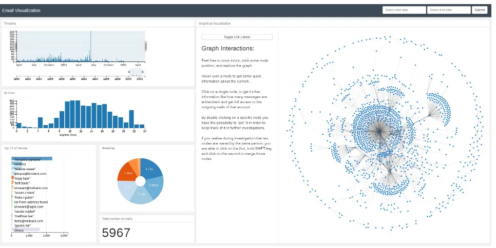
In order to provide a flexible and responsive user in-terface, our tool provides a web-based user interface utilizing HTML5 and JavaScript with the help of the Flask micro framework. Figure 1 on the follow-ing page shows the initial investigation page, which is separated in two areas: the panel on the left gives the examiners meta information about the mailboxes and presents statistic information in different charts and diagrams. On the right, the investigator can access the entire communication data by exploring the graph which the tool built from the data. Both panels deliver a rich set of user interaction possibili-ties and all displayed information is updated in real time after changes or selections in one of them. We now explain the features of the two panels in detail:
2.4.1 Meta Panel
The meta panel offers several different views on the parsed email data. As you can see in Figure 1 on the next page, a bar chart is settled on top and pro-vides a timeline to illustrate the number of emails over time and allows the investigator to select an arbitrary time range as a filter. All the other infor-mation is then updated accordingly. To display the
amount of written/sent messages by the averaged daytime, we show an additional bar chart. Under-neath, there is a top-15 list of the most active senders of the current selection and a pie chart which rep-resents the data per weekday and a counter of the total emails that fall into the current selection. We use thecrossfilterlibrary to calculate and update all the graphs on the fly from the initial data that was provided within the JSON object. With the help of these responsive charts, the investigator is able to filter the entire data by different factors. For ex-ample, by clicking on the pie chart’sSaturday- and
Sunday-slice, all diagrams realign their data, too. 2.4.2 Exploration Panel
The exploration panel on the right offers the main functionality of our front end. It is entirely imple-mented in JavaScript and visualizes the graph by using the d3.js (Bostock, 2011) library. As can be seen from Figure 1 on the following page, the graph consists of blue nodes (the email addresses) and communication between two nodes is illustrated as a link between the nodes. Those links (edges) are of different length and thickness to illustrate the fre-quency of communication: the shorter and thicker the link (the closer the nodes), the more emails have been exchanged between the communication part-ners. This way, the main communication partners are grouped to each other and can be easily iden-tified. Besides those two indications, we decided to add toggleable numbers on each edge to show the exact number of emails (see Figure 2 on the next page). An investigator can begin the investigation by exploring the initial graph and check for nodes with many edges or identify the main communica-tion partners by looking for thick edges, for example. Nodes can get ”sticky” by just double-clicking on it to make it easier for the user to find it again and rearrange the graph. Further, communication pat-terns like rings, oroutsiders, proxies or others can easily be recognized as shown in Figure 2 on the fol-lowing page. After clicking on a node, a report of the node’s attributes is displayed and the single emails be can read, if necessary.
Figure 1. Investigation page with meta panel on the left and graph visualization on the right.
Figure 2. Simple example of a communicationring
pattern in email data. A thicker edge highlights an increased communication frequency.
information – down to every single email. Addi-tional to the side panel, our tool provides some basic node information: when the investigator hovers over a specific node, a pop-up window appears and shows the email address, number of conversation partners, and the number of sent and received emails.
As there might be multiple email addresses be-longing to the same person within an investigation data set, the investigator can select two nodes by holding down the shift key while clicking to group them together. All attributes are updated and the resulting combined node is highlighted in red.
3.
EVALUATION
In order to evaluate the practicability of our tool, we used parts of the ENRON email collection (Klimt & Yang, 2004). From that collection we randomly
picked ten PST files with different message counts from 500 up to 10,000 emails as shown in Table 2.
All tests are executed on our test system with an
Intel Core i5-4670 quad-core processor with a clock rate of 3,400 MHz and 16 gigabytes of main memory. The operating system is aDebian 8 ”Jessie” 64-bit.
3.1
Performance
We first measured runtime performance of our pars-ing modules for PST/OST files of different sized mailboxes. The results are summarized in Table 2. For parsing PST/OST files, the parsing of around 5,000 messages took 1.23 seconds and 10,000 needed around 2.89 seconds.
#Messages Time ENRON-file 483 0.159s bill rapp 000 1 1.pst
1,013 0.301s andrea ring 000 1 1.pst
1,538 0.355s benjamin rogers 001 1 1.pst
2,660 0.462s lindy donoho 000 1 1 1.pst
4,099 1.146s don baughman 000 1 1.pst
4,942 1.226s kenneth lay 000 1 1 1 1.pst
6,091 1.492s Richard Sanders 001 1 1 1.pst
7,550 1.796s andy zipper 000 1 1.pst
8,500 2.384s gerald nemec 001 1 1.pst
10,000 2.897s richard sanders 001 1 2.pst
Table 2. Parsing performance of PST/OST files.
the parsing library used for PST and OST files is much faster than the MBOX parser. This could be improved by implementing an own, optimized MBOX parsing library, but the runtime performance of both formats should still be good enough to allow the use of our framework in real world cases.
3.2
Correctness and Completeness
In this section, we try to argue on the correctness and completeness of the generated graphs, by prov-ing some specific scenarios. For each scenario, we previously specified the expected correct behavior and then checked, whether the output and behavior of our tool corresponds to these.
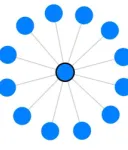
Scenario 1
Issue Are all messages represented in the graph with their right attributes (like number of sent/received emails)?
Input The mailbox includes one mail account, which has writtenfour and receivedeight messages. All written/received messages have a single unique target.
Expected behavior A forced directed graph with one centered node with edges totwelve other nodes, which are representing the source and target of the involved messages. The attributes of the center node should containtwelve conversation partners, as well as four written andfour received messages. In the list there should be four clickable messages with their content. All nodes should have the same dis-tance to the center node and edges should all have the same thickness.
Result Test accomplished (see resulting graph in Figure 3).
Figure 3. Resulting graph of Scenario 1.
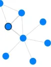
Scenario 2
Issue That test evaluates if the attributes of the inserted nodes are treated correctly, i.e. does the graph recognize all messages and differs betweensent
andreceived.
Input One mail account, which has written four
mail to two different recipients (i.e. two mails to
Aand two mails to B) and receivedfour messages.
One received fromA and the others from three not previously involved accounts.
Expected behavior A graph with six nodes. The mail account acts as the center from which edges spread out to the other five nodes. The registered attributes of the center node should befive conversa-tion partners,four written, four received messages as well as a list of the sentfour mails. NodeAhas sentonemail and receivedtwo. NodeBhas received
twoand sentzero. The others only sentonemessage and should have a higher distance and thinner edge to the center node.
Result Test accomplished (see Figure 4).
Figure 4. Resulting graph of Scen02: One center which has four edges to its contacts. One link is thicker than the others.
Scenario 3
Issue This test proves the visualization in order to represent a more complex communication between multiple mail accounts.
Input Three mailbox files: account A, B and C. User A has written one to B and one message to
C as well as two mails to an external account D. AccountBhas written onlyone message toD. User
C has writtenfourmail toD andonemessage each tothree other external persons.
Expected behavior A cohesive forced graph ap-pears withseven individual nodes. One of the nodes representsAfrom whichthreelinks are spread out to
B,C, and D. The edge betweenA andD is shorter and thicker. Node B has two links, the first to A
and the seconds to D. Followed by node C which has six edges where one links to D, one to A and four to other nodes.
Result Test accomplished (see Figure 5).
This just shows a selection of some of the per-formed tests, the rest of our test series has to be omitted here due to the page limitation.
4.
CONCLUSION
Figure 5. Graphical representation of a more com-plex communication.
4.1
Summary
We implemented a tool for forensic email analysis using dynamic visualization approaches. Our tool is able to handle multiple mailboxes of three of the most common formats to cover as many cases as pos-sible. Mailboxes of different formats can be used at the same time. The centerpiece of our application is the graphical visualization of the email communi-cation. It allows the investigators to identify suspi-cious patterns in unknown email communication and quickly see who are the main contacts. Our tool al-lows users to select a specific time range, group and move nodes manually and updates all information and charts in real time.
4.2
Limitations
The current state of the developed tool is fully func-tional as described. However, we see the following directions for improvements:
First of all, we might improve parsing speed per-formance especially for MBOX files by optimizing the input parsers. Further, parsers for other for-mats, likeMicrosoft’s Electronic Mail (EML), whole
Maildirs, Message Handling (MH), or others could be added.
We further would like to verify that all kinds of malformed messages that can occur in reality are handled correctly.
4.3
Future Work
Besides the limitations we considered above, we plan to enhance the UI to cover the entire process of cre-ating, saving and loading cases and importing email data to it. We further want to implement a full-text keyword search for the email data, and make attachments searchable and viewable, too.
We also plan to implement the possibility to directly generate forensics reports, which describe what has been done during the investigation and ex-port results and bookmarked emails or similar.
4.4
Conclusion
We conclude that we have developed a forensic email analyzing tool which helps the investigator to
iden-tify patterns and clues in a suspected communica-tion. It offers the results in an innovative, dynami-cal way of visualization using forced directed graphs and responsive charts. Although there are some lim-itations and ideas for future work left as discussed before, we provided a practical open source tool that might help investigators in today’s email forensics cases and provides a valuable lineup for existing forensic toolchains.
REFERENCES
Abbasi, A., & Chen, H. (2008). Writeprints: A stylometric approach to identity-level identification and similarity detection in cyberspace. ACM Transactions on Information Systems (TOIS),26(2), 7. Bostock, M. (2011). D3 – Data-Driven-Documents.
Retrieved 2016-05-18, from http://d3js.org/
Eijkhoudt, A., & Suerink, T. (2013). Uforia: Universal forensic indexer and analyzer.
Journal of Computer Virology and Hacking Techniques,9(2), 59–63.
Garfinkel, S. L. (2010). Digital forensics research: The next 10 years. digital investigation,7, S64–S73.
Hadjidj, R., Debbabi, M., Lounis, H., Iqbal, F., Szporer, A., & Benredjem, D. (2009). Towards an integrated e-mail forensic analysis framework. digital investigation,
5(3), 124–137.
Iqbal, F., Hadjidj, R., Fung, B. C., & Debbabi, M. (2008). A novel approach of mining
write-prints for authorship attribution in e-mail forensics. digital investigation,5, S42–S51.
Klimt, B., & Yang, Y. (2004). Introducing the enron corpus. InCeas.
Li, W.-J., Hershkop, S., & Stolfo, S. J. (2004). Email archive analysis through graphical visualization. InProceedings of the 2004 acm workshop on visualization and data mining for computer security (pp. 128–132). Meng, F., Wu, S., Yang, J., & Yu, G. (2009).
Research of an e-mail forensic and analysis system based on visualization. In
Computational intelligence and industrial applications, 2009. paciia 2009. asia-pacific conference on (Vol. 1, pp. 281–284). Metz, J. (2014). libpff library. Retrieved
2016-05-18, from