Semiotics Explorations on Designing the
Information Intensive Web Interfaces
Muhammad Islam1, Mohsin Ali1, Ali Al-Mamun2, and Motaharul Islam3
1
Department of Computer Science and Engineering, Khulna University of Engineering & Technology, Bangladesh
2
Department of Computer Science and Information Technology, Islamic University of Technology, Bangladesh
3
Training and Instrumentation Division, University Grants Commission, Bangladesh
Abstract:The growth of technological innovations, internet developments, and their (web) applications has raised a definite issue on retaining the web interface quite understandable. Moreover, a need is also being felt on developing suitable and coherent guidelines for designing interface to swell the user interpretability of web signs. These design principles are semiotics by nature and semiotics is the science of signs, that is, meaning’s of representations. For this, new and important perspectives for interface design would be discovered by semiotic analysis on interface signs. Therefore, this research mainly focuses on the valuable insights that semiotic analysis could offer to present the fundamental concepts to create understandable signs. The fundamental role of this research is to provide the semiotics background to the web designers with presenting the entire semiotics explanations for a particular web domain and the semiotics golden rules that will help them to designing the web interface signs comprehensible and usable to work with.
Keywords:Usability, human computer interaction, web interface, empirical study.
Received May 4, 2008; accepted June 8, 2008
1.
Introduction
In the last years, Information Intensive websites have been growing in term of complexity and the activity of assessing the quality degree of the applications is becoming an arduous task. Establishing the quality means to take into account the degree of satisfaction that the users have during the interaction with the web site. The most important “units of measurement” of satisfaction is the usability [11], as it is the effectiveness, efficiency, and satisfaction with which specified users achieve specified goals in particular environments (ISO 9241 definition). One of the fundamental design dimensions that affect the usability of an application is the semiotics. Indeed, the capability of an application to use symbols, icons, words and interactive widget familiar and easy to understand for the users, means to establish a fruitful dialogue between the user and the web site. In this paper we try to both highlight how it is possible to increase the user satisfaction and understandability to enhance the usability of web application and to underline the fundamental role of semiotic design
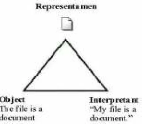
Peirce's model of semiotics consists of a triadic relationship containing: the representamen (representation or sign-vehicle), the object (referent) and the interpretant (meaning) as shown in Figure 1.
The representamen stands to somebody for something in some respect or capacity. It addresses
somebody and creates in the mind of that person an equivalent, or perhaps more developed sign. The object is the actual thing the sign stands for [10]. The interpretant is therefore the sign created in the mind of the perceiver or the reaction caused by the object in the perceiver [1].
Figure 1. Peircean model (symbolic sign).
A sign requires the concurrent presence of these three constituents. Let us make an example: consider a panel at the entrance of a company with “Reception office” written on it. The textual shape of the sign (the text string “Reception office”, the font used, its color, its background, its size, etc.) is the sign-vehicle/ representamen. The concept that the sign makes arise in the mind of the reader, that is, the idea of a
interpretant. The actual object in the real world, that is, the reception’s office as physical object is the referent/ object.
On a website, a sign can be designed and evaluated considering the same elements. Web signs, like signs in general, make use of a complex sign system composed not only by words and grammar from natural language but also by other languages and other grammars that must be understood in order to correctly interpret the interface.
The rest of the paper is organized as follows. Section 2 gives the preliminary concepts about semiotics and web interface design. Section 3 gives shows the references ontology presupposed by the interface sign. Section 4 describes the research methodology. Section 5 presents the research outcomes and section 6 summarize the paper with concluding notes.
2.
State of the Art Semiotics and Web
Interface Design Works
Usability has recently assumed a much greater importance in the internet economy than it had in the past [2], since a web site is an “open product”, accessible by anyone who navigates in the WWW. Recently, relevant branches of Human Computer Interaction (HCI) pointed out the semiotic issues involved in the interaction between the user and the machine. A semiotic unit is a sign-vehicle or group of sign-vehicles composing a unique meaningful and functional message to the user. The three constituents of the Peircean sign are the representation or sign-vehicle (representamen), its referent (object) and its meaning (interpretant) [14].
Semiotics is important to the general field of user interface design, since design is concerned with representation and semiotics provides tools for analyzing these representations. The sign in the user interface is always an intentionalsign, i.e., someone has created it in order to convey some message to the user. As Andersen notes, the designer builds the user interface so it can be used to tell people something [1]. So, the designer combines various signs to make up the interface in order to convey its intended meaning to the user. Further, Nadin [7] maintains that to design means to structure systems of signs in such a way as to make possible the achievement of human goals, one of which is communication. The communication referred to here is that between the user and the designer [6].
The web interface can be seen as a complex sign made up of many smaller signs (link labels, scroll bars, images, etc.) all contributing to the process of communication, with each of the smaller signs having their own triadic relation. The representamen corresponds to the form the sign takes in the interface, the object corresponds to the underlying functionality of the sign and the interpretant corresponds to the sign generated in the mind of the user. This implies that
users are required to guess at the object of the sign when interacting with the interface.
Actually, it is up to the sign-vehicle to be as explicit as possible – through the label, the colour, the position, the shape of the link - and let the user correctly guess the intended semantics of the link. For this, semiotics is important for designers as it allows us to understand the relationships between signs, what they stand for, and the people who must interpret them - the people designers design for. But, ccurrent studies on web semiotics pay little attention to the relation among a sign vehicle composing a web interface, the concepts staying behind it and the actual meaning/purpose that the user can draw upon when interpreting the sign.
Moreover, from Web Interface Design and HCI field many studies and guidelines have been defined to interface design. Nielsen [8] stresses the importance to carefully organize the elements composing a web page, in order to let the reader easily scan them. He defined interesting and useful guidelines related to content writing rather than to interface language design: he suggests – through empirical observation of user satisfaction – which writing styles and strategies should be used on web applications. Guideline defined by Shneiderman [12] and Norman [9] for interface design but many of these recommendations concern the design of computer interfaces like Windows or the Mac Finder or how to make programs easier to use. Some of these recommendations are not so relevant to web design. Still, it is an important area of research, and some of the recommendations relate to any kind of communication between user and computer. A major problem is that a large number of guidelines have been developed in the HCI field that may guide software development, but there is overlap, inconsistency and deficiency.
Due to signs in the web interface being intentional signs as defined above, signs can be said to be successful when the user's interpretant matches the object of the sign, and unsuccessful otherwise . This property allows us to evaluate the web interface, since the ideal web interface would consist only of successful signs. Moreover, such and other linguistics and HCI studies are incomplete and have few main limitations.
First, they focus on the hyperlink, which is only one kind of sign composing an interactive interface and in particular, a web application. Second, a potential problem with applying semiotic analysis to interface signs is imagining that all signs in the user interface are indexical, since all signs found in the interface necessarily have an underlying functionality. This assumes that the interface is the most economic collection of signs that allows the user to perform all the tasks required. Third, from the designing viewpoint designers lack the awareness about the model of (critic) user knowledge for the particular
web domain as well as the factors to feel a sign difficult to the users those could assist them (designers) to re/design the interface signs. And fourth, guidelines provided to interface designers are lack to provide any conceptual guidelines to the representation of interface signs with considering the user interpretation /presupposition of web signs to understand the sign meaning properly.
In particular, what is missing is to provide the semiotics explorations to interfaces sign design considering the (critic) users presupposed knowledge, complexity factors, and the design guidelines. On the basis of these considerations, in the rest of chapters’ semiotics analysis on interface signs will be presented to provide the semiotics explorations to interface sign design.
3.
Web Signs and References Ontology
In this section, web signs and referenced ontologies are described based on the Speroni’s Web-Semiotics Interface Design Evaluation (W-SIDE) model [13]. Even if the purpose of the sign is clear to the user, s/he should be familiar with the “world” the signifier refers to in order to understand its meaning. Let us give an example: let us consider a generic museum website. On the homepage there is a textual link having the label “Exhibitions”; the user can understand the meaning of the link and if it is worth clicking on it only by having the concept of a museum exhibition and what it means. The link “Exhibitions” could be well designed in terms of signifier, position, relation with other signs, but if it refers to a concept unknown by the user it will not be understood anyhow.
This reference “corpus” of knowledge of the world which should be mastered by the user and which is pointed by web signs may be synthetically named “ontology” or knowledge domain. W-SIDE makes use of the term ontology in a broad sense: it is the set of concepts and skills that the user should own for understanding web semiotic units and what they want to communicate. On the web, there is much different ontology a sign could refer to:
• Topic Ontology (TO): the knowledge concerning the concepts belonging to the particular topics the website talks about. In a museum website the textual link “Exhibitions” uses a term that is comprehensible only if the user knows the concepts typical of the Museum’s world.
• Internet Ontology (IO): the knowledge shared among typical web surfers or among people familiar with web browsing in general. When referring to this ontology, signifiers are understandable only if the user is familiar with the “world” of the web and knows its concepts and conventions. For instance, the links “home”, “back”, “add to cart”, “myShop”, “myBlog”, “my Plog”, “guided tour” are terms
intuitive only for users who knows the concept of homepage, of shopping bag, of guided tour, or special kinds of forums, and so on.
• Website Ontology (WO): a website itself can become generator of knowledge or creator of conventions which are valid and shared only within the boundaries of that specific site. In other words, there may be signifiers referring to concepts which do not belong to the external world the website wants to describe, but which belong to the website in itself. For instance, a museum website could use symbols for representing the different section of the website (a special icon for representing the collections, another icon for representing the exhibitions, a symbol for programs & events, etc.). The user could intuitively understand and recognize the meaning of each symbol and associate it to a section of the website only if s/he is familiar with the website itself, or if s/he is helped in this interpretation process by supporting signs (e.g. a text string accompanying the icon).
• Common Sense Ontology (CSO): there are concepts belonging to the common background of users and signifiers can count on this shared knowledge to trigger understanding. These are the signs that designers assume as always and easy comprehensible by the users envisioned, since they do not need any further knowledge or explanation to understand them. As an example, in a website devoted exclusively to informatics engineers, complex terms, symbols, graphics, -even if referring to a particular and technical ‘world’ - are considered background knowledge for that particular kind of users who are experts with such signs.
• InterLocutor/Institution Ontology (ILO): there are set of concepts belonging to the real world of the partner who use the website as a meta tool for communicating something to the user. Very often it is the knowledge concerning the institution staying behind the website: in a museum website a link like “Permanent Collection” refers to a concept belonging to the museum’s world. This sign uses a term that is comprehensible only to users who know the concepts typical of this kind of institution. Such a link, in order to be understood, presupposes that the user is familiar with the “museum world”.
• Context Ontology (CO): the knowledge is not directly concerning the topics the website talks about but relevant for making the dialogue possible and comprehensible. In a museum website there could be semiotic units referring neither to the ILO nor to the TO but to contextual concepts helping the user better understand them. As an example, in a museum website may contain a section devoted to teachers, with some pages providing educational resources (education resources for the art may
discussed using the signs -kindergarten, Grades 1 and 2, Grades 3 and 4 etc). In this section, many semiotic units (kindergarten, Grades 1 and 2, Grades 3 and 4 etc) refer to concepts belonging to the Education world in order to suggest the teachers how reach and use the content about art in an educational environment. Even if art is the topic the website talks about, some semiotic units refer to the “educational world” for triggering user’s understanding.
• Web Domain Ontology (WDO): the knowledge is shared among websites belonging to the same sector/domain. As an example, museum websites typically make use of similar signs for referring to the same informative objects – the term “Collections highlights” for referring to the possibility to browse the online version of artworks, or “Education” for referring to the online resources to be used in didactical environments. Users could understand the referential content of a semiotic unit not because they are familiar with the museum’s world but because they are familiar with museum’s Web sites and indirectly learned museum concepts from there. An interface sign could potentially refer to more than one ontology, and it is not clear to the user which one/ones should be considered, thus makes the ontology conflict. As an example, in the main menu of a museum website the link label “architecture” could potentially refer both to architecture as artistic discipline TO or it could refer to the museum collection ILO. Such ambiguity could cause in the user a misunderstanding in guessing the content that the link proposes
A good way to understand how a user reacts to a web interface is to examine which ontologies are being used (or presupposed) by the web semiotic units and how they relate to the user previous knowledge. The more there is a matching between ontologies presupposed by the sender (website) and the one mastered by the receiver (user), the more the interpretation of the sign can be corrected.
4.
Research Methodology
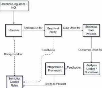
This research has been conducted through the sequential process. We have followed the top-down method, as shown in Figure 2, to provide the semiotic explorations on interface sign design. An empirical case study on web interface has been carried out through the expert analysis and a very short user intuitive test also has been conducted for the interface signs to furnish the additional standards to the final outcomes of empirical study. The study has been conducted having in mind two issues:
• User presupposed knowledge (ontologies) to interpret the web sign.
• Complexity experienced by the user and reasons to feel these difficulties to interpret the sign meaning properly.
Analysis on the museum websites of Cultural Heritage (CH) sector has been carried out during the empirical studies to demonstrate the feasibility and soundness of this research. CH websites are information as well as communication intensive. Moreover, websites of this domain are generally created for the group of people who have a specialized knowledge on this domain and for this museum interfaces make unfamiliar terms and concepts for the users outside this specific community.
Figure 2. Overview of the research method.
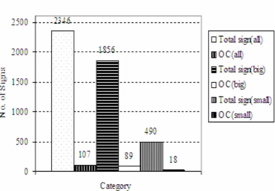
Empirical analysis has conducted on the 2346 interface signs from 200 pages of both big and small size 34 museum websites in case of expert analysis and for the user testing, analysis has performed for 124 signs of sixpages from twomuseum websites.
This activity considered the human computer interaction field and the linguistics/semiotic field, in order to useful analogies and links among the different disciplines. The data has obtained from the empirical study has been used for the statistical analysis to depict the quantitative scenario in different points of view for the user’s presupposed knowledge-domain and complexities belongs to these knowledge-domains.
The main observation and outcomes of statistical analysis has been find out and discussed as an important considerations. After these, a framework for the interpretations factors has been presented based on the analysis upshots and empirical study observations. As this top-down method proceeded, the features identified from the background study and interpretations frameworks for coping with web application semiotic design converged to defining the Semiotics Golden Rules (SGR) for the interface design. Besides, the research work was also
accompanied by a continuous gathering of feedbacks from students, web designers and researchers.
5.
Research Upshots
Research upshots are discussed in the following three ways. Firstly, modeling the presupposed knowledge to interpret the interface signs by classifying the signs into ontologies and depict the complexity experiences belongs to different ontologies. Secondly, creating the interpretation framework based on the complexity factors of interface sign to provide the basis of interpretation difficulties for the interface designers and Finally, twenty guidelines, SGR of interface sign design to defeat the current problems of sign interpretation.
5.1. Modeling the User Presupposed Knowledge
Statistical analyses have been performed by analyzing the data in sixteen different categories with thirty five pictorials presentation using the tools: spotfire decisionSite 7.3, microsoft excel and graphpad prism 4 and reach to twenty important considerations to model the user presupposed knowledge. We have presented here most important considerations (one statistical analyzed consideration is presented with pictorial view as an example) to present the model of the user presupposed knowledge.
• In museum websites, the maximum numbers of signs were belongs to ILO along with the lowest number of signs belongs to context, website and web domain ontologies. The average numbers of sings were belongs to commonsense, topic as well as internet ontologies.
• User feels very high complexity with the Website ontological signs and generally don’t feel any complexity with the common Sense ontological signs. This consideration is presented with pictorial view as an example. In Figures 3 and 4 the total signs as well as signs in ontology conflicts to both types of museums websites has depicted to present the more clear view to the ontology conflicts of the small verses big museum websites. In figures, OC is stands for the ontology conflict. About 4.56% signs of the total signs were in ontology conflicts among them the percentage for the big museum websites (4.80%) were greater than the small museum websites (3.67%). It has observed that about 1.15 % more ontology conflicts has confined to the big museum websites and thus the interpretations problem for the ontology conflict suffered more in case of big museum websites than the small museum websites to the web users.
Figure 3. Graph for the Ontology conflicts for the all websites.
Figure 4. Graph for the Ontology conflicts in percentage for the all websites.
• User feels very high complexity with the website ontological signs and generally don’t feel any complexity with the common sense ontological signs.
• In small websites, the average complexities for the all signs were less than the big websites. For both types of websites, in homepage maximum number of signs belongs to interlocutor and commonsense ontology.
• In every homepage (just about) at least one ontology conflict happened and big website’s homepage showed comparatively high ontology conflicts than the small website’s homepage. 5.2. Interpretation Framework
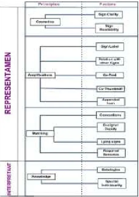
It’s a common phenomenon to browsing a website that people interact with web signs and to interacting with this signs s/he must interpreted about the most possible meaning of that sign to reach the user goal. This interpretation is an important issue to the user satisfaction as well as the web usability. The different sign may refer to the same object as well as the same sign may refer to the different objects other than the real one. It could also happen that some times the user could not interpreted anything about a sign. For this, interpretation considerations become a crucial issue for the interface design. Generally, the reasons to feel complexity to understand properly are the factors associated to the user interpretations to understand a sign meaning. In our research, we have found the complexity problems of a sign for proper interpretations and considered these problems as the
user’s interpretations factors. We have observed these factors of user’s interpretation from the empirical study and its statistical analysis. And the outcomes of these lead me to create a framework for the Interface sign interpretation. In Figure 5, we have presented the different factors associated with a signs to effect the proper interpretations to understand its real meanings. We have used this framework to derive the semiotics design guidelines to design interface signs. In the next sections, we have discussed interpretation framework and the design rules based on this framework in detail to better grasp by the interface designers.
Figure 5. Interpretation framework for the interface signs.
5.2.1. Cosmetics Principle
This category of problem is concerned with the properties of the representamen. This category of cosmetic problems can be discussed into two factors of clarity as well as readability. Problems belongs to cosmetics principles do not impact the perceived meaning of the sign - if the sign is visible the user will generally interpret the sign correctly. However, the way it is represented could cause the user to make errors or waste time identifying the sign. Representamen problems can occur in five ways for these two factors.
For the readability, the representamen can be obscured- the sign does exist but it is not visible to the user. The representamen - the shape of the sign - should be easily readable in itself by the user. This can be the result of text-background contrast, small fonts, typing errors, incomplete images are samples to make them difficult to see as well as read.
For the clarity, the representamens of two different signs may be so similar (or, same sign used in two different purpose) that the user under pressure (or, lack of familiarity with every signs of the same label for a particular website) may mistake one interpretant for the other. This causes an error because the user unintentionally invokes the functionality of the wrong
sign. Then there may be signs that are well understood by the user, but are less important than what their appearance make out to be. This subcategory is called distracting signs. They distract attention from more important signs in the interface. The problem of the signs being too close together is another subcategory. This can also cause the user to make difficulty to understand the sign label and its meaning. Closely situated signs can be mistakenly selected when the user is working at speed as well as sometime user can not understand the sign label at all. The last subcategory is a problem of the signs being no indications to understand its purpose of interactivity. The signs without any special indications (underline, special colour, font sizes, fonts, bullets, etc.) are difficult to understand whether this sign used for the interactivity purpose or just for decorative purpose.
5.2.2. Amplifications Principle
This category of problems is concerned with the making difficulties to understand the real meaning a sign refers to, only for the lack of some amplification factors associated with the sign. The related factor of this principles helps to provide the signs in more convenient way that amplify to reduce the user’s feelings for the interpretation complexity. This distinguishes the problems in this category from those of the representamen problems in cosmetics principles. Problems belongs to amplifications principles does impact the perceived meaning of the sign, sometimes if the sign is clear and readable enough but lack of amplification support then it makes difficulty to the user for proper understanding the meaning of this signs. In this case, the meanings are actually influenced by the representamen and can be further divided into: sign label, relation with other signs, co-text, co-thumbnail, as well as appended icon with a sign.
The sign label itself is an amplification factor to proper interpretation. If the sign label is not understandable to the user then user could feel complexity for that sign. For a sign, it could be unclear the relation with other signs on that page and sometimes lack of proper meaningful thumbnail as well as small text associated with a web sign- leads the signs to feel high complexity for the users understandings. Users, especially who are not familiar with that web domain or that specific website for them these factors greatly offers supportive basis to their interpretation of interface signs. It should be intuitive to the user the dependence of a sign with other signs on the page, attached thumbnail and small text in order to let users correctly interpret its real meaning and purpose.
Moreover, studies have shown that icons are also faster and easier to recognize than text [3]. Good icon design should support the learnability and
rememberability [4] of the user interface but of course, badly designed icons would have the opposite effect. Furthermore, many users are familiar with the iconic signs (for example, icons those are used to the mostly used personnel computer software). And many icons are also understandable to the most of the users from their daily life conventions. For example,
From the above line everyone can easily understand that the icon refers to the meaning of sun, and the full textual line for the above line could be like “One day while the sun was shining”. For these reasons, some cases the lack of proper appending / missing of a good iconic sign with the linguistic sign makes difficulty for the users to proper interpretation of that web signs. 5.2.3. Matching Principle
This category of problems is concerned with the mismatch between the designer's intent with the representamen, and the user's interpretation of it. This distinguishes the problems in this category from those of the representamen problems in cosmetics and amplifications principles. Here the meanings are actually influenced by the representamen and can be further divided into: interpretant-object mismatch as well as required semiosis.
The interpretant, object mismatch, is quite a broad category and it includes all problems where there is a mismatch between the designer's object and the user's interpretant. For example, a user may interpret a sign as representing some referential content, when the designer has in fact attributed a different content to the sign. There are few special cases of problems of this type.
One case is a sign can be unclear because the motivations of the designers are not clear. Some design choices could be unclear and the user could be unable to grasp the argumentation strategy staying behind it, thus causing misunderstandings and complexity problem to proper interpretations. This type’s of problems are defined as designer’s deputy unclear. Another case is when the designer has violated some convention. The user, through convention will create their interpretant of the sign, but unfortunately it will not match the designer's object if the designer has not adhered to the convention. Moreover, when the designers misrepresent some underlying reality, the user may be confused when reality is misrepresented in the interface, thus making the complexity problem.
And, this also observed that sometimes the interface requires the user to go through a constant steps/signs in order to access the information required and when there is no support for remembering- what steps have been taken or the sign labels have been clicked than the result is a required semiosis problem.
However, not all matching problems have conventions, underlying realities or required semiosis. Some signs are simply ambiguous due to factors such as inconsistent use of terminology or colours by the designer, important information about what the sign represents is missing, or the user simply does not understand what the sign is supposed to mean.
5.2.4. Knowledge Principle
Semiotics helps designers not to take reality for granted as something that simply exists. It helps them to understand that reality depends not only on the intentions they put into their work but also the interpretation of the people who experience their work. That’s why, this category of problems is concerned with the required knowledge to understand the real meaning of a sign - lack of concepts or familiarity with the world the sign refers to. Here the meanings are actually influenced mainly by the interpretant and can be further divided into: ontologies and special individuality.
For the ontologies factors referring to the speroni [13], web signs refer to concepts belonging to different sets of knowledge. This knowledge must be shared by the user in order to understand the meaning of the sign. In order to understand the meaning of links, titles, menus, and semiotic units in general, users should be somehow familiar with the “world” a sign refers to. From the receiver perspective (web user), an ontology is the “corpus” of knowledge that should be mastered in order to understand and correctly interpret a sign. From the sender perspective (designer/website), it is the “corpus” of knowledge presupposed and pointed by a sign.
A good way to understand how a user reacts to a web interface is to examine which ontologies are being used (or presupposed) by the web semiotic units and how they relate to the user previous knowledge. The more there is a matching between ontologies presupposed by the sender (website) and the one mastered by the receiver (user), the more the interpretation of the sign can be correct. The set of ontologies used in user’s presupposition for a web signs were given in section 3.
The user could be unfamiliar with the ontology the signs refers to and not able to guess its meaning. Little familiarity with one or more ontologies is one of the most common sources of problems. Moreover, a sign could potentially refer to more than one ontology, and it is not clear to the user which one/ones should be considered. These ontology unfamiliarity as well as ontology conflicts made sign complexity to proper presupposed by the user to understand the real meaning of that sign.
The second factor is special individuality of users. Though the concepts on ontologies could be considered as the personal characteristics for a user
but here ‘Special Individuality’ refers to the characteristics other than ontologies. Since, without ontology there could be many characteristics a person bear those influenced that persons (users) to proper interpretations of interface signs. For example, a user could not bear the concepts of ontologies the web sign refers to, but s/he may be highly educated, matured age, bearing highly intellectual capability, computing power etcetera. In that case s/he could be capable to understand the meaning of a web signs without having the knowledge on ontologies. From the user intuitive test I have observed that, one user without having any knowledge on museum and art world, web domain, specific website, he was capable to interpret the real meaning of the sign ‘Audio guide’ of Metropolitan museum website. So, without having interlocutor as well as web domain ontology, he has able to interpret this meaning only for his high personal profile (high education, high intellectual capability, computing power, etc.). That’s why regardless knowledge on ontologies, the lack of knowledge based on user’s specific individuality also an important factor for the interpretant to proper interpretation of a web sign.
Table 1. List of semiotics golden rules.
Cosmetics Principles Rules
1.1 Make representamens visible.
1.2 Make representamens with different objects look different. 1.3 Do not draw unwarranted attention to the representamen and if
it is not required do not create it in the first place.
1.4 Keep representamens with different objects at a safe distance. 1.5 Make clear representamens to understand whether a sign has
interactivity.
Amplifications Principles Rules
2.1 Make representamen with keeping away from the use of short form in sign labels.
2.2 Create representamen are concise and expressive – not buried in text
2.3 Make representamen with making good relations to other signs.
2.4 Provide an effective short textual description with the signs if it requires / exists.
2.5 Append an appropriate small image or thumbnail to the signs if it requires/exists.
2.6 Append an appropriate icon to the signs if it requires / exists.
Matching Principles Rules
3.1 Adhere to convention if it exists. 3.2 Adhere to reality if it exists.
3.3 Make clear the designer deputy to the sign representamen. 3.4 Allow users the most ‘direct route and constant sign (access)’
to information as possible.
Knowledge Principles Rules
4.1 Make representamen with avoiding critical cultural term. 4.2 Make clear representamen to pass up ontology conflict as
much as possible.
4.3 Strive to avoid the website ontological sign
4.4 Make an effort to use more the commonsense as well as internet ontological signs.
4.5 Strive to use the effective co-text as well as thumbnail while present the topic ontological signs.
5.3. Semiotics Golden Rules
From an interpretation perspective, a semiotic approach is useful because it provides a framework in which to reconcile the perspectives of the websites held by both designer and user. So far semiotic contributions have
tended to be quite theoretical, and where practical applications have been examined their treatment has tended to be quite cursory. Various semiotic principles will be adopted to structure an understanding of user interpretations of the web signs. However, the results of interpretation framework principles, semiotics theory, background literature, empirical studies as well as statistical data analysis will then be made in order to draw out some helpful guidelines for designing interface sign. In my thesis, we have introduced these guidelines of designing interfaces sign as.
The basic categories of sign problems and the related proposed rules were discussed based on the framework of interpretation factors. We have present here two golden rules with motivation and semiotics analysis as examples and than summarize the twenty guidelines in Table 1.
Icons are faster and easier to recognize than text. An appropriate icon besides the sign provides a very effective means to understand the sign meanings. It has observed that the appropriate icon with a sign could be easier to interpret its meaning. For example, the signs of plan your visit page of the national gallery, London, as shown in Figure 6(a) could be clearer to the users for the appropriate icon attached with each of the signs.
(a) Plan your visit page. (b) Learning page. Figure 6. Examples snapshots for the icons appended to the signs.
Suppose the audio icon appended with the sign ‘introduction and general information’ assist almost all the users that this signs will provide the audio information to visit the museum. The same things could be happened for the other signs. Again, the sign ‘Access’ of the national gallery and the sign ‘Access’ of the British museum as shown in Figure 6(b) have the same sign label and both signs refers to the information about the facilities provided to disable persons who have physical impairments. But the sign of the national gallery with the appropriate icon of wheel chair could assist the users to understand its meaning more clearly. Furthermore, sometime if the users were not familiar with the icon or if it was not
appropriate than it did not provide any positive effect to sign interpretation. Thus, choosing most conventional (icon used in most common PC software, everyday life
etc.) and appropriate icon to append with the sign helps to reduce the felt of sign complexity to interpret a sign properly.
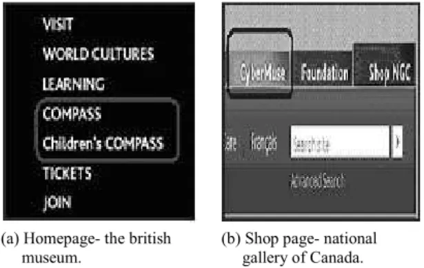
Motivation and Semiotic Analysis- Generally users feel high complexity with the website ontological sign. Generally in average every website, designer use one or two website ontological sign. Though sometimes users could be clicked on this without trying to understand its meaning and wanted to see its content but from the semiotics point of view to get the users full satisfaction they should understood its meaning as well as its referential content. For example, in cultural heritage domain user felt high complexity with the website ontological signs if they were not familiar with that site. The homepage signs ‘COMPASS’ and ‘Children’s COMPASS’ of the British museum as shown in Figure 7(a), labels were absolutely not intuitive for a first time user.
(a) Homepage- the british museum.
(b) Shop page- national gallery of Canada.
Figure 7. Examples snapshots of the website ontological signs.
Even for expert web surfers, these semiotic units could be unknown. The COMPASS was stands for ‘Collections Multimedia Public AccesS System’ that’s why if the designer were used the other conventional sign label that’s were generally used in museum web domain like- online collections, collections, permanent collections etc. than these could be more understandable for the most of the users. Again the shop page sign ‘CyberMuse’ of National Gallery of Canada as shown in Figure 7(b), could be extremely difficult for the most of the users. Whereas this signs refers to the ‘Art Education Resources’ and designers could be used other appropriate sign (like-educational resources, art education, resources, etc.) so that users could guess the designers deputy as well as the sign could be shifted to other ontologies from the website ontology and thus reduces the sign complexity to interpret. That’s why keeping away from the use of website ontological signs by using the other appropriate signs in replace of these signs could reduce the sign complexity as well as increase the user’s satisfactions.
6. Conclusion
This research mainly provides the three main outputs: Modeling the presupposed knowledge to the interface elements + Interpretation factors framework + SGR. These altogether focus to the sign representamen and its interpretations to assist the interface designers in developing web interface that provides users with a consistent visual, behavioral, understandable, satisfactory as well as usable experience to the web signs, and thus this may helps to accomplish the communication goals for both the designers (stakeholders) and users. Following the semiotics explorations as well as guidelines could be the designers and users advantages from the communication perspectives because:
• This enhancing the communications goal between the designers and the users. Since, semiotics can improve the power of communication [5].
• Users will understand the sign meaning properly, if the interface looks and belongs to ontologies they’re already familiar with.
• Users can accomplish their tasks quickly, because well designed signs may be easily interpretable to them.
• Users with sight problem will get the signs in more readable since guidelines suggest providing the interface signs with high visible appearance.
• This will be easier to provide help file or demo tape to browse the website, because an intuitive interface and standard behaviors created by the web signs, don’t require as much explanation.
• User could easily understand the sign meaning thus reducing internet traffic by avoiding the unnecessary click on the signs without having a proper guess about its intended meaning.
• Users supporting call or e-mail could be reduced because user could be success to retrieve all necessary information from the information intensive web applications (if the information is available in that website) without experiencing any difficulties. For example, sometimes important information could be available in a website but the users could not understand by clicking which sign user could get that information, may be for the problem of designer deputy mismatch with the users deputy and thus user may contact (by e-mail, phone call, etc.) with the designers (Stakeholder) to get the support / information.
• Designers are supported in maintaining proper interpretability relations between the sign representamen, their purpose to use (intended meaning) and the user presupposed knowledge. The implementation of semiotics findings to make the web interface what it is: intuitive, friendly, elegant, communicative, comprehensive, and powerful. Finally, we may conclude that becoming aware of
these semiotics explorations and rules and learning to implementing as well as mastering them is the true power of web communication and interface design.
References
[1] Andersen P., “Computer Semiotics,” Computer Journal of Information Systems, vol. 4, no. 2, pp. 3-30, 1992.
[2] Brinck T., Gergle D., and Wood S., “Usability for the Web,”in Proceedings of Designing Web Sites That Work, San Francisco, pp. 123-126, 2002. [3] Collins L. and Lerner D., “Assessment of Fire
Safety Symbols,” Computer Journal of Human Factors, vol. 24, no. 1, pp. 75-84, 1982.
[4] Constantine L. and Lockwood L., Software for Use: A Practical Guide to the Models and Methods of Usage Cantered Design ACM Press, Addison-Wesley Publishing, New York, 1999. [5] De Souze C., The Semiotic Engineering of
Human-Computer Interaction, MIT Press, 2005. [6] Nadin M., “Interface Design: A Semiotic
Paradigm Semiotica,” in Proceedings of International Conference on Human Computer Interaction, Amsterdam, pp. 269-302,1982. [7] Nadin M., “Semiotics in the Individual Sciences,”
in Proceedings of Design and Semiotics, California, pp. 418-436, 1990.
[8] Nielsen J., Designing Web Usability: the Practice of Simplicity, New Riders Press, 1999.
[9] Norman D., The Design of Everyday Things, New York, Doubleday, 1988.
[10] Peirce C., “Collected Papers of Charles Sanders Peirce,” Technical Report, Harvard University Press, 1932.
[11] Rosson B. and Carroll J., Usability Engineering, San Francisco, Morgan Kaufmann, 2002.
[12] Shneiderman B., Designing the User Interface: Strategies for Effective Human Computer Interaction, Addison Wesley Publishing, 1998. [13] Speroni M., “Mastering the Semiotics of
Information Intensive Web Interface,” PhD Thesis, University of Lugano, 2006.
[14] Whiteside J., Bennet J., and Holtzblatt K.,
Usability Engineering: Our Experience and Evolution, Addison-Wesley Publishing, Holland, 1988.
Muhammad Islam received the
BSc degree in computer science and information technology from Islamic University of Technology, Bangladesh and MSc degrees in
computer engineering from
Politecnico di Milano, Italy in 2002 and 2007, respectively. He has been servicing as a faculty member of the Department of Computer Science and Engineering of Khulna University of Engineering and Technology Bangladesh since July, 2003.
Mohsin Ali received the BSc
engineering degree in computer science and engineering from Khulna University of Engineering and Technology, Bangladesh, in 2007. He is currently working as a lecturer in Department of Computer Science and Engineering at Khulna University of Engineering and Technology, Bangladesh.
Ali Al-Mamun received the BSc in
computer science and IT from Islamic University of Technology, Dhaka, Bangladesh in 2002 and
MSc degree in computer
applications from University of Hyderabad, India in 2006. He now is working as a lecturer in Computer Science and IT Department in Islamic University of Technology, Dhaka, Bangladesh.
Mohammad Islam is senior
lecturer and course co-ordinator in computer science and engineering
program at training and
instrumentation division of University Grants Commission of Bangladesh. He holds Bachelor degree in computer science and information technology from the Islamic University of Technology, a subsidiary organ of Organization of Islamic Conference in 2002.