San Jose State University
SJSU ScholarWorks
Master's Theses Master's Theses and Graduate Research
Summer 2018
Machine Learning Methods for Kidney Disease
Screening
Rathna Ramesh
San Jose State University
Follow this and additional works at:https://scholarworks.sjsu.edu/etd_theses
This Thesis is brought to you for free and open access by the Master's Theses and Graduate Research at SJSU ScholarWorks. It has been accepted for inclusion in Master's Theses by an authorized administrator of SJSU ScholarWorks. For more information, please [email protected].
Recommended Citation
Ramesh, Rathna, "Machine Learning Methods for Kidney Disease Screening" (2018).Master's Theses. 4951. DOI: https://doi.org/10.31979/etd.hetg-6336
MACHINE LEARNING METHODS FOR KIDNEY DISEASE SCREENING
A Thesis Presented to
The Faculty of the Department of Computer Engineering San Jos´e State University
In Partial Fulfillment
of the Requirements for the Degree Master of Science
by Rathna Ramesh
© 2018 Rathna Ramesh ALL RIGHTS RESERVED
The Designated Thesis Committee Approves the Thesis Titled
MACHINE LEARNING METHODS FOR KIDNEY DISEASE SCREENING
by Rathna Ramesh
APPROVED FOR THE DEPARTMENT OF COMPUTER ENGINEERING
SAN JOS ´E STATE UNIVERSITY
August 2018
David C. Anastasiu, Ph.D. Department of Computer Engineering Magdalini Eirinaki, Ph.D. Department of Computer Engineering Alessandro Bellofiore, Ph.D. Department of Biomedical, Chemical and
ABSTRACT
MACHINE LEARNING METHODS FOR KIDNEY DISEASE SCREENING by Rathna Ramesh
The number of people diagnosed with advanced stages of kidney disease has been rising every year. Early detection and constant monitoring are the only way to prevent severe kidney damage or kidney failure. Current test procedures require expensive consumables or several visits to the doctor, which results in many people foregoing regular testing. To address this problem, we propose a cost-effective teststrip-based testing system that can facilitate kidney health checks from the comfort of one’s home by using mobile phones. The specially designed teststrip facilitates a colorimetric reaction between alkaline picric acid and creatinine in a blood sample that has been applied to the teststrip. Our system uses state-of-the-art deep learning localization models to capture quality images of the teststrip using a cell phone, and then processes them using computer vision and machine learning techniques to predict the concentration of creatinine in the sample based on the change in color. The predicted creatinine concentration is then used to classify the severity of the kidney disease as normal, intermediate risk, or kidney failure. We thoroughly evaluate the effectiveness of our models, both in the localization and classification tasks, and find that our histogram of color-based, hybrid nearest neighbor methods outperform alternatives and exhibit good overall prediction performance.
ACKNOWLEDGMENTS
I would like to thank my advisor, Dr. David C. Anastasiu, Assistant Professor in the department of Computer Engineering, San Jos´e State University. He was always eager to hear out my ideas and nudged me in the right direction when needed. Without his constant motivation and immense technical expertise, this thesis would not have been possible.
I would also like to thank Dr. Alessandro Bellofiore, Assistant Professor in the department of Biomedical, Chemical and Materials Engineering, and his Masters student Ragwa M. Elsayed, for partnering with us on this research and providing us with the teststrip image dataset used in the experiments. Moreover, I would like to thank Dr. Magdalini Eirinaki, Professor in the department of Computer Engineering, for her encouragement, insightful comments, and the hard questions she posed as part of my thesis committee.
Thanks to the College of Engineering, San Jos´e State University, for providing access to their High Performance Compute cluster to run my many experiments on. I would also like to acknowledge the help extended by my roommates, Neha Kamthe and Mrinal Bijjargi, in annotating the localization model dataset and proof reading the sections of the thesis related to teststrip design, respectively. Finally, I would like to thank the gods for giving me such wonderful parents who have been a wall of support throughout.
TABLE OF CONTENTS
List of Tables . . . viii
List of Figures . . . x
1 Introduction. . . 1
2 Literature Review . . . 4
2.1 Kidney Disease Screening Technologies . . . 4
2.2 Object Detection and Localization Models . . . 6
2.3 Image Processing . . . 8
2.4 Classification and Regression Models . . . 10
3 Chemical Experiment Design . . . 11
3.1 Teststrip Design . . . 11 3.2 Data Collection . . . 13 4 Methodology . . . 19 4.1 KHM Application Design . . . 20 4.2 Teststrip Localization . . . 22 4.3 Feature Extraction . . . 24 4.3.1 RGB Pixel Values . . . 24 4.3.2 Histogram of Colors . . . 25 4.3.3 Histogram of Gradients . . . 27
4.4 Baseline Prediction Models . . . 28
4.4.1 Linear Regression . . . 28
4.4.2 Support Vector Regression . . . 29
4.4.3 Nearest Neighbor Regression . . . 29
4.5 Hybrid Prediction Models . . . 30
4.5.1 Support Vector Classifier. . . 31
4.5.2 Nearest Neighbor Classifier . . . 31
4.5.3 Logistic Regression Classifier . . . 31
5 Experiment Design . . . 33
5.1 Data . . . 33
5.2 Teststrip Localization . . . 34
5.3 Execution Environment. . . 36
5.4 Machine Learning Model Validation . . . 36
6 Results and Discussions . . . 39
6.2 Regression and Classification Experiments . . . 40
6.2.1 Best Performing Features . . . 41
6.2.2 Best Time Point Identification . . . 43
6.2.3 Best Performing Regression Model . . . 46
6.3 Repeatability of Chemical Experiments . . . 47
7 Future Work . . . 49
8 Conclusions . . . 50
Literature Cited . . . 51
Appendix A: Baseline and Hybrid Model Prediction Results . . . 56
A.1 HOC Results . . . 56
A.2 RGB Results . . . 58
LIST OF TABLES
Table 1. Non-analytical Specifications of PoCT Devices . . . 6
Table 2. Distribution of Tested Creatinine Concentrations . . . 17
Table 3. Images Collected as Part of Our Experiment . . . 33
Table 4. Types of Features Extracted from Teststrip Images . . . 34
Table 5. Distribution of Age, Gender and Ethnicity in the U.S. Population and the Number of Teststrips Associated with Each Population Segment . . . 38
Table 6. Teststrip Localization Results Using YOLO Model . . . 39
Table 7. T-test Results for Best Models of Different Feature Types . . . 41
Table 8. Average eGFR Accuracies for Different Feature Types . . . 42
Table 9. Average eGFR Accuracies and Standard Deviation for Different Teststrip Groups . . . 42
Table 10. Baseline eGFR Accuracy Using HOC Features . . . 56
Table 11. Baseline Regression RMSE Using HOC Features. . . 56
Table 12. Hybrid eGFR Accuracy Using HOC Features . . . 57
Table 13. Hybrid regression RMSE Using HOC features . . . 57
Table 14. Baseline eGFR Accuracy Using RGB Features . . . 58
Table 15. Baseline Regression RMSE Using RGB Features . . . 58
Table 16. Hybrid eGFR Accuracy Using RGB Features . . . 58
Table 17. Hybrid Regression RMSE Using RGB Features . . . 59
Table 18. Baseline eGFR Accuracy Using HOG Features . . . 59
Table 19. Baseline Regression RMSE Using HOG Features . . . 59
Table 20. Hybrid eGFR Accuracy Using HOG Features . . . 60
LIST OF FIGURES
Figure 1. Lateral flow assay teststrip design. . . 11
Figure 2. Example teststrips with different creatinine concentrations. . . 13
Figure 3. Testrips created and used in our experiment. . . 13
Figure 4. Kidney disease progression given different eGFR values. . . 14
Figure 5. Variation of the eGFR creatinine factor given different creatinine concentrations (Scr). . . 15
Figure 6. Creatinine concentrations (Scr) vs. age at critical eGFR values. . . 16
Figure 7. Kidney Health Monitor application. . . 21
Figure 8. Teststrip localization by the YOLO model in the darknetframework. 23 Figure 9. Image of detection zone cropped using the bounding box anno-tations (left) and an image further cropped to the central 64×64 pixels (right). . . 25
Figure 10. Cropped detection zone (left), image after masking pixels (center), and the histogram of colors (right) of teststrip before application of creatinine solution. . . 27
Figure 11. Cropped detection zone (left), image after masking pixels (center), and histogram of colors (right) of teststrip 32 minutes after application of creatinine solution. . . 27
Figure 12. Sliding windows with window size 3×3 and stride 1×1. . . 28
Figure 13. Logical flow for model selection in our experiments. . . 35
Figure 14. Intersection of Union (IOU) of predicted and actual bounding boxes for test and train samples. . . 40
Figure 15. Difference in detection zone color in two teststrips before adding the creatinine solution. . . 43
Figure 16. Performance of eGFR classification models at four time points. . . 44
Figure 18. Image of detection zone (left), after masking pixels (center), and the histogram of colors (right) of a teststrip at (a) 2 minutes, (b) 12 minutes, (c) 22 minutes, and (d) 32 minutes.. . . 45 Figure 19. Pairwise cosine similarity of teststrips. . . 47
1 Introduction
Between 8 and 10 percent of the world’s adult population have some form of kidney damage, and every year millions die prematurely of complications related to chronic kidney diseases (CKD) [1]. Luckily, with early diagnosis and treatment, it is possible to slow or stop the progression of kidney disease. However, even the most basic kidney screening tests available, such as the blood urea nitrogen (BUN)/creatinine ratio test, cost $25 or more [2]. The high cost affects the frequency of testing among the lower income population, making early detection less likely. Patients get tested only after they start experiencing symptoms and, by then, it is already too late for treatment to be effective. To address these issues, in this thesis, we present a novel kidney health screening system that is affordable and easy-to-use. Our system uses state-of-the-art computer vision-based machine learning techniques on a mobile phone to analyze a picture of a teststrip and predict the status of kidney health.
Creatine is a compound formed during the protein metabolism. It is a source of energy for muscles. The by-product waste substance created when muscles break down creatine is called creatinine. The kidneys are tasked with filtering almost all of the creatinine from the blood and releasing it into urine. This makes blood creatinine levels a good indicator of kidney health. Most kidney health clinical testing use Jaffe’s reaction, a colorometric reaction of creatinine and picric acid in an alkaline solution, to measure the levels of creatinine in blood and urine. When picric acid and creatinine react, they form a
yellowish red compound. Max Jaffe observed that the color change that occurs is directly proportional to the concentration of creatinine. Our system also makes use of Jaffe’s reaction to estimate the creatinine concentration. We use the predicted creatinine concentration to compute a generalized kidney health indicator, called the estimated glomerular filtration rate (eGFR). In our research, the modification of diet in renal disease (MDRD) equation, proposed by Levey et al. [3] is used to determine the eGFR value. The
MDRD equation accounts for factors such as age, gender and ethnicity, which results in a better estimate of effective renal function. The equation gives a value in the range of 0–150, where 60 and above indicate a healthy kidney, and patients with values between 0–15 require immediate dialysis or kidney transplant.
The current creatinine concentration measuring methods, such as absorbance
spectrometry [4], require expensive devices and expertise in handling the instruments. Our research aims to lower the cost of kidney health checks, which would allow for more frequent testing and could potentially save lives. The testing procedure is designed to be simple and does not require expensive specialized equipment. We are developing a smart phone application, Kidney Health Monitor (KHM), and specially designed cost-effective teststrips, which would lead to a potential cost of less than $2 per test. Although in this work we have tested our system using only synthetic creatinine compounds and did not use human blood for carrying out experiments, the system design and teststrip
construction will not change significantly in a human trial, keeping the cost relatively similar.
Our kidney health monitoring system employs several novel techniques for taking quality pictures of teststrips and analyzing them. The application uses deep learning-based object localization techniques to ensure the quality of the captured teststrip image that will be used in further analysis. The application only captures the image of the teststrip when the teststrip has been correctly positioned and oriented. Machine learning regression models are then used to predict the level of creatinine based on the color pixels captured in the image. Based on the eGFR value determined from the creatinine prediction, the application displays a color indicative of the user’s kidney health. The colors green, yellow, and red are used to indicate healthy kidneys, presence of kidney disease, and need for immediate medical attention, respectively. The main contributions of this research are as follows:
∙ We designed a novel end-to-end system that uses computer vision techniques and machine learning to estimate kidney health from the color change in a teststrip. ∙ The system uses object detection and localization models to capture quality pictures,
eliminating the need for external, more costly devices.
∙ A novel hybrid regression model is introduced that first estimates the range of creatinine concentration and then predicts the actual creatinine concentration value using specialized functions.
2 Literature Review
Blood creatinine concentrations continuously change throughout the day in a healthy adult. The test methods we are developing are designed to act as an early warning system, by letting the user know when creatinine levels in the blood are high. This would prompt the user to seek medical advice early on and avoid allowing the disease to progress unnoticed. To keep the cost as low as possible, we eliminated the need for a smartcard device that attaches to the mobile phone. Instead, our system uses teststrip detection and localization to guide the user in positioning and orienting the teststrip, which will ensure that quality pictures are taken that can result in accurate classification of disease
progression. This section discusses current kidney disease screening technologies, state-of-the-art object detection and localization methods, and image processing and machine learning techniques that informed the choice of our regression models. 2.1 Kidney Disease Screening Technologies
Jaffe’s reaction is still the most prevalent method to measure creatinine concentration in blood/urine sample in laboratories. Otto Folin, in his 1916 Lab Manual of Biological Chemistry [5], formalized using Jaffe’s reaction in clinical and laboratory testing. To measure creatinine concentration, the Centers for Disease Control and Prevention [4] recommend charting absorbance of a precise volume of the sample infused into an alkaline picrate solution. Absorbance readings are taken at 520 nm between 19 and 25 seconds after sample injection. Over the years, laboratories world-wide have automated many analytical processes and developed systems to analyze the samples in bulk, which helped reduce the overall testing cost.
Despite being the most prevalent form of medical diagnostic testing, centralized testing is inconvenient for many patients. The testing and consultation process are often not provided as a combined service in one visit, making a second trip necessary to complete each assessment. In particular, those with a chronic disease require regular
monitoring and laboratory testing. This has led to growth in self-monitoring point-of-care testing (PoCT), which brings medical diagnostic testing to the patients at the time and place of care. The healthcare sector has been making huge strides towards PoCT, partly as a result of economic pressures of high testing fees [2], and also to make healthcare less fragmented and more patient-centered [6]. However, the PoCT devices currently available on the market are expensive, making their utility limited. With the advent of artificial intelligence, PoCT researchers have turned to machine learning for building robust systems that can perform to laboratory standards for a fraction of the cost.
StatSensor [7], a point-of-care whole blood creatinine and eGFR testing device recently launched by Nova Biomedical, has gained wide popularity among medical practitioners. It incorporates multi-well technology adapted from their hospital glucose monitoring system [8]. Like most of the glucose meters, StatSensor uses an
electrochemical reaction to measure creatinine concentration using the coulometric method [9]. Teststrips contain a capillary that absorbs a small amount of blood. The creatinine in the blood reacts with an enzyme electrode containing creatinine oxidase. When the assay on the electrode is reduced, it generates an electric current to re-oxidize the compound. The oxidized creatinine is directly proportional to the total charge passing through the electrode. Despite its mobility and ease of use, the high cost of the device has restricted its popularity with consumers.
Table 1 summarizes specifications of prominent PoCTs currently available in the market for measuring blood creatinine concentrations, as first presented by Shephard [10]. All of these devices require expensive single use consumables, in addition to custom concentration measuring hardware, making them very expensive for frequent domestic use.
Table 1
Non-analytical Specifications of PoCT Devices
Device iSTAT ABL 800 Flex Reflotron StatSensor
Price $14,925.77 [11] $8,500.00 [12] NA $4,080.66 [13]
Method Enzymatic Enzymatic Enzymatic Enzymatic
Principle Amp biosensor Amp biosensor Dye reflectance Amp biosensor
Consumable Cartridge Sensor cassette Dry strip Dry strip
Time for result 2 min 1 min 2 min 0.5 min
Range 0.20-20 mg/dL 0.11-22.62 mg/dL 0.51-10 mg/dL 0.30-11.95 mg/dL
Size Hand held Bench top Bench top Hand held
Weight 0.7 kg 33 kg 5 kg 0.4 kg
2.2 Object Detection and Localization Models
The object localization techniques have evolved, starting with gradient based localization [14], all the way to region proposal-based localization techniques. In these region proposal-based systems, the method looks for presence of an object in certain regions of the image. The regional convolutional neural networks (R-CNN) method by Girshick et al. [15], the first method to achieve mAP of 53.3% on the VOC 2012 dataset for object detection and localization, used the region recognition method proposed by Gu et al. [16] to extract around 2000 bottom-up region proposals. For each of the region proposals, features are computed using a large convolutional neural network, after which each region is classified using class-specific linear SVMs. The Fast R-CNN method, devised by Girshick [17] improved upon its predecessor by using selective search for region proposals. This allowed 9×faster training on large datasets and 213×faster testing than R-CNN. Hosang et al. further improved on the method by adding a region proposal network (RPN) to propose fewer higher quality regions in Faster R-CNN [18]. The RPN network ranks pre-defined region boxes and proposes the ones most likely to contain the object. This drastically reduces the number of regions proposed and thus reduces the time taken to classify and allows testing 5 frames per second on a GPU. A comprehensive literature survey and comparison between different state-of-the-art object proposal methods is provided by Hosang et. al. [19], [20].
For our system, the speed of prediction and ability to use the method in the memory-and computation-constrained space of mobile applications were the primary factors we considered when choosing the method for teststrip detection and localization. As the method needs to run on a smart phone, it needs to be light-weight, as well as accurate. A state-of-the-art fast method that meets these requirements is the Redmon et al. YOLO deep neural network model [21]. The model produces all of the detections in only one pass of the image (hence the name, ”You Only Look Once”). The input image is logically divided intoS×Sgrids. Each grid cell predictsBbounding box coordinates and box confidence scores for the object whose center is likely to be within the grid. That is, if the model is trained to localizeC different objects, then the model would generate
S×S×(B×5+C)bounding box proposals and would provide a confidence level for the likelihood of each bounding box containing the sought-after object.
The single-shot detection (SSD) method by Lin et al. [22] is another viable option which also provides multiple box prediction in only one pass, similar to YOLO. It is more accurate than YOLO and is comparable to slower techniques that perform explicit region proposals and pooling (e.g., Faster R-CNN). In SSD, the input image is split into default bounding boxes of various sizes with aspect ratios and feature map scale values, rather than grids. At prediction time, the network generates confidence scores for the presence of each object category in each default box and produces adjustments to the box, such as scaling, to better fit the object. However, preparing the data for training and decoding the prediction output is a complex task. The generated output bounding boxes need to be mapped to the default boxes in the region by applying size adjustment transformations predicted from the aspect ratio and scale parameters. This makes the adoption of the SSD neural network structure in other artificial intelligence frameworks difficult.
A number of improvements were introduced in YOLO version 2 [23], including pre-computing anchor aspect ratio priors using k-means clustering, adding a pass-through
layer from an earlier layer at 26×26 resolution to the fine-grained feature maps, and augmenting images during training. These changes make the network aware of multiple object scales and lead to improved overall effectiveness. In our work, we adopted YOLO version 2 due its simplicity, effectiveness, and wide usage in mobile-based applications. In the future, we intend to expand our research to combine concentration prediction and teststrip detection in one model, and YOLO’s network architecture makes it possible to make such additions in the prediction outputs.
2.3 Image Processing
Image processing consists of techniques that are applied to images in order to enhance discriminative features for different tasks important in computer vision applications. Noise and unwanted information are generally removed from a processed image. Then, features are sought that can exacerbate similarities and differences between images. The colorspace the image will be represented in and feature extraction techniques are chosen to accommodate the specific application the images is being processed for. The colorspace defines how the colors in the pixels of an image are represented as numbers, generally in a vector or matrix form. The computer can then use the vectors in developing machine learning models, or functions, that can answer real world questions, such as the presence or absence of a cat in a picture. Our application domain requires detecting subtle
differences in color as the creatinine in the blood reacts with the picric acid solution in the teststrip.
Many computer vision applications, such as the famous Viola-Jones real-time face detection [14], use grayscale images in their methods to reduce computation and memory cost. Grayscale images encode only one color, instead of three, and thus require less resources to process. Information such as gradient and focus, which are crucial for pattern recognition problems, can be easily extracted from grayscale images through simple differencing operations. However, our problem is centered around color changes between
images, rather than patterns found within an image. Thus, grayscale images will not be suitable for our application.
Since the popularization of color triangles through photography experimentations by James Clerk Maxwell in the 1860s, colors have been represented as chromatic triplets for use in television and photographic technologies. The most widely used colorspace, RGB, is obtained by linearly combining the values of red (R), blue (B), and green (G) present in the sample. Both chrominance (color information) and luminance (intensity of incident light/exposure) values are combined in the RGB representation. Instead, the HSV color encoding [24] provides more distinction between the chrominance and luminance values. It has a cylindrical representation system where hue (H) is the angular component, encoding the color spectrum as angles between 0°and 360°, and saturation (S) denotes the intensity of the color radially increasing outwards. The value component (V) encodes brightness, ranging from completely dark (0) to intense coloring (255). In our research, we have extracted features from both the RBG and HSV colorspaces to train our machine learning models.
A histogram of colors extracted from the RGB colorspace image representation has been successfully used to index images for image retrieval applications [25]. However, color histograms obtained from RGB are susceptible to light intensity and exposure changes, limiting their application in our research. Color constancy approaches depend on statistics of outputs of linear [26] and non-linear filters [27], [28]. Convolutional neural network-based methods have been proven to be much more effective than statistical methods in achieving color constancy [29]–[31], though the representation of colors in deep neural networks is still poorly understood [32]. In our application, it is also important that the reason behind the output classification decision can be easily understood by the user, if they choose to know.
2.4 Classification and Regression Models
One closely related system that predicts continuous values for color change observed in the reaction between urine and picric acid solutions is the homemade spectrometer by Debus et al. [33]. The system uses a laptop screen and a mobile phone to capture the absorbance spectrum in a strictly light controlled setup. Images of the absorbance spectrum are used to find the creatinine concentration using a Matlab program. Despite being a low cost system, the setup requires technical acumen and the detection is time consuming. We did not find any machine learning system that predicts the amount of color change as continuous values. Almost all of the previous works use a classification model to solve their respective problems.
One of the early experiments to classify images based on color from a camera feed was conducted by Lalanne and Lempereur [34]. They used a supervised algorithm based on Bayesian statistics and a two layer neural network to classify the temperature of thermal paints based on their color. More recently, Paulraj et al. used a 5 hidden layered artificial neural network to predict the ripeness of a banana with an accuracy of 96% [35]. In their experiment, each of the red, blue and green color channels were converted into a three binned histogram, which was given as input to the neural network. Our project focuses on identifying different shades in a smaller color range than in the experiments conducted to decide the ripeness of a banana, and using histogram of RGB color channels image representations may not work as well in our application.
3 Chemical Experiment Design
This project is a collaboration between the department of Biomedical Engineering and the department of Computer Engineering at San Jos´e State University. We collaborated on designing the experiment by verifying that the color change is prominent enough for the image processing techniques to differentiate the minutest change in concentration values. We tested for different concentrations of picric acid, dimensions of the detection zone, light intensities, and distances from the camera to perform the experiments. Our primary responsibility, and the subject of this thesis, was to use the images captured throughout the chemical experiments to develop machine learning models that can predict the amount of creatinine in a blood sample. In contrast, our collaborators, Dr. Alessandro Bellofiore and his student Ragwa Elsayed, executed the chemical experiments and did not participate in processing images or learning prediction models. This section discusses the teststrip design and the data collection process.
3.1 Teststrip Design
The teststrip design is inspired by the simplicity and cost-effectiveness of
over-the-counter pregnancy tests. The design is similar to that of lateral flow assays (LFA). LFAs are simple paper-based devices intended to detect the presence (or absence) of a target compound in a liquid sample without the need for specialized and costly equipment. Fig. 1 shows the typical components of an LFA [36].
Sample pad
Conjugate
pad Membrane
Test line Control line
Absorbent pad Direction of flow
The sample pad is made up of an absorbent material, which ensures that the applied liquid sample spreads evenly and in controlled amounts onto the conjugate pad. The activated analyte from the conjugate pad migrates along the strip into the porous
membrane called the detection zone. There, the analyte whose presence is to be detected in the sample reacts with the reagent in the membrane, producing a colorimetric response. The control line is an optional component and indicates proper liquid flow through the strip. The pad at the other end of the membrane absorbs any extra fluid that flows out of the membrane.
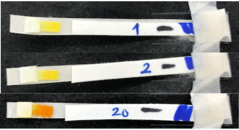
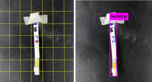
Since the teststrip acts as a reaction bed that facilitates Jaffe’s reaction to quantify the color change, we do not need both the control and test lines in our experiment. The membrane in the detection zone is pretreated with picric acid. The reaction between picric acid (reagent) and creatinine (analyte) in the blood sample creates a color change in the detection zone. The concentration of creatinine in the blood sample is predicted from the degree and direction of the color change observed in the detection zone. Fig. 2 shows three example teststrips on which different creatinine concentrations were applied. Figures in this thesis are best viewed in color. The color difference between the first and the third teststrips, which have had 1.0 mg/dL and 20.0 mg/dL creatinine solutions applied, respectively, is evident even with the naked eye. However, the difference in color is not noticeable between the first and second teststrips, which differ in concentration by only 1.0 mg/dL. This indicates that the feature extraction and prediction models we develop must be able to capture discriminative features humans may not be able to detect. Fig. 3 shows a large number of the teststrips that were used in our experiments.
As this is a preliminary study meant to validate the design of our kidney disease prediction system, we used a synthetic creatinine solution to create our dataset, rather than human or human-analog blood. When the creatinine solution is applied to the sample pad, the solution flows through it into the detection area. There is no conjugate pad in this
Fig. 2. Example teststrips with different creatinine concentrations.
Fig. 3. Testrips created and used in our experiment.
teststrip design as the creatinine solution does not need to be filtered from blood in our experiments. In the next stage of the project, a conjugate pad which separates the red blood cells from the sample will be added to make the teststrip ready for experiments with blood samples.
3.2 Data Collection
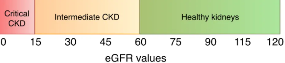
The presence of kidney disease and its progression can be determined using the eGFR scale, as shown in Fig. 4. In our study, we use the MDRD equation [3] to determine the
eGFR value from the creatinine concentration, which is defined as
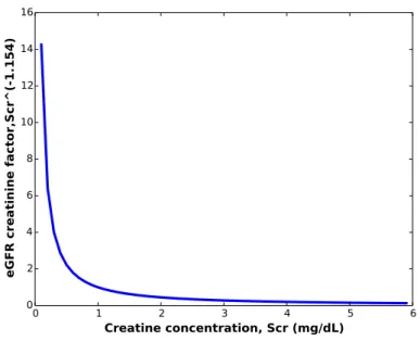
eGFR=175×SCr−1.154×age−0.203×0.742 if female×1.212 if African born, (1)
whereSCr is the creatinine concentration in the blood sample, measured in mg/dL. Analyzing the formula, we can see that the eGFR value is inversely proportional to creatinine concentration to the power of 1.154. The changes in factor contributed by different creatinine concentration in the eGFR equation is shown in Fig. 5. We can see that drastic changes occur in the factor for small changes in creatinine concentrations between 0–2 mg/dL. Beyond 4 mg/dL, the factor is very close to zero. Thus, the precision of the creatinine concentration predicting regression model between 0–4 mg/dL is crucial to ensure good overall kidney health prediction.
0 Intermediate CKD 15 30 45 60 75 90 115 120 Healthy kidneys Critical CKD eGFR values
Fig. 4. Kidney disease progression given different eGFR values.
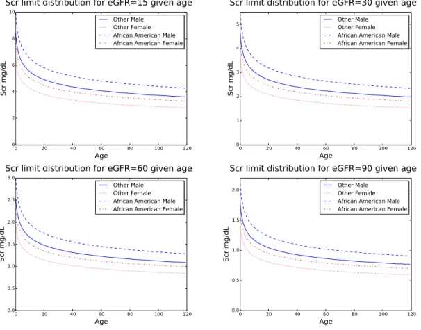
The eGFR values of 15, 30, 60 and 90 are considered critical, as they differentiate between different stages of kidney disease (Fig. 4). To determine the range of creatinine concentrations that give these critical boundary eGFR values, we plotted a graph between the creatinine concentration and the age of the patient for each of the critical eGFR values. To capture the variance introduced by gender and ethnicity, we plotted four functions in the graph, one for each combination of gender and ethnicity noted in the equation. Fig. 6 shows our generated plots for each of the eGFR boundaries. The plots indicate that, for the majority of age groups, creatinine concentrations between 0.4 mg/dL and 10 mg/dL lead tocriticalkidney health conditions. It is thus essential that we capture the color change
0 1 2 3 4 5 6 Creatine concentration, Scr (mg/dL) 0 2 4 6 8 10 12 14 16
eGFR creatinine factor,Scr^(-1.154)
Fig. 5. Variation of the eGFR creatinine factor given different creatinine concentrations (Scr).
observed in creatinine concentrations in smaller steps in this range, to provide machine learning models with enough data to accurately predict the patient’s kidney health.
Given our analysis results, we designed our experiment to collect data in steps of 0.1 mg/dL between 0 mg/dL to 3.9 mg/dL of creatinine concentration, so that we could capture the minutest differences in color. For higher creatinine concentrations, the differentiation between kidney disease severity codes involves wider concentration ranges, which we uniformly sample using wider steps. We tested concentrations between 4 mg/dL and 7.5 mg/dL in steps of 0.5mg/dL, between 8 mg/dL and 19 mg/dL in steps of 1 mg/dL, and between 20 mg/dL and 60 mg/dL in steps of 10 mg/dL. Moreover, we prepared 4 teststrips for each concentration and took pictures of each strip at 5 different stages of applying the creatinine solution, namely
∙ stage 0: before applying the creatinine solution,
0 20 40 60 80 100 120 Age 0 2 4 6 8 10 Scr mg/dL Other Male Other Female African American Male African American Female Scr limit distribution for eGFR=15 given age
0 20 40 60 80 100 120 Age 0 1 2 3 4 5 Scr mg/dL Other Male Other Female African American Male African American Female Scr limit distribution for eGFR=30 given age
0 20 40 60 80 100 120 Age 0.0 0.5 1.0 1.5 2.0 2.5 3.0 Scr mg/dL Other Male Other Female African American Male African American Female Scr limit distribution for eGFR=60 given age
0 20 40 60 80 100 120 Age 0.0 0.5 1.0 1.5 2.0 Scr mg/dL Other Male Other Female African American Male African American Female Scr limit distribution for eGFR=90 given age
Fig. 6. Creatinine concentrations (Scr) vs. age at critical eGFR values.
∙ stage 2: 12 minutes after applying the creatinine solution, ∙ stage 3: 22 minutes after applying the creatinine solution, and ∙ stage 4: 32 minutes after applying the creatinine solution.
The stages were chosen with the knowledge that, as time progresses and the teststrip dries, the saturation and intensity of the color on the teststrip may also change. One of the goals in our experiment is to find a time segment after which the color changes are significant enough for all concentrations of creatinine so that machine learning algorithms can differentiate between them and learn from them. We created 4 teststrips to test the repeatability of the chemical experiment per concentration. Thus, a total of 260 teststrips were prepared for this experiment, as summarized by Table 2. For each stage of the
experiment, except stage 0, we captured two pictures of each teststrip, to ensure that at least one high quality picture existed for each chemical experiment data point.
Table 2
Distribution of Tested Creatinine Concentrations
Concentration No. of No. of
range Steps concentrations samples
0–3.9 mg/dL 0.1 mg/dL 40 160
4–7.5 mg/dL 0.5 mg/dL 8 32
8–19 mg/dL 1 mg/dL 12 48
20–60 mg/dL 10 mg/dL 5 20
In the current research, our goal is to validate the idea of using image processing and artificial intelligence on a smart phone to predict kidney health. In this preliminary study, we eliminated several sources of error that could potentially affect the effectiveness of our prediction models. As changes in ambient light can affect the color being perceived by cameras, we used a light box to avoid external light interference. Moreover, even though our project involves designing methods to aid users in taking quality pictures of the strips, we took all pictures from a fixed distance, using fixed focus and aperture settings on the camera. Additionally, while we developed models for localizing the teststrip in an image taken by the camera, we used manually annotated bounding boxes in training and testing our prediction models. Successful prediction in this setting will signal that our kidney health monitoring system may also work in general lighting conditions and using the localization model to extract the detection zone from the teststrip.
The light box we used in the experiment has a black exterior to keep external light from the sample and a silver interior reflects the light within the light box. An array of white chromatic LEDs attached to the roof are the only source of illumination within the light box. Controls are provided to adjust the intensity of the light within the light box. The light box has a small opening in its roof, big enough for a camera to capture images of objects placed inside it. The teststrips are placed at a distance of 10 cm from the roof of the light box, which ensures that the intensity of the light incident on the teststrips
remains constant throughout the data collection. The teststrips were placed on a black background, which we found gave a better contrast, allowing easier detection and localization of the teststrips.
4 Methodology
To combine the image capture and prediction, we have designed an iOS application that
∙ detects the presence of the custom teststrip in the camera frame and localizes it, ∙ captures a high quality picture of the teststrip and localizes the detection zone, ∙ processes the color change in the detection zone and directly gives a color coded
indication of kidney health.
In this section, we discuss the methods that we designed for teststrip localization, prediction of creatinine concentration, and eGFR-based classification of kidney health.
From a picture of teststrip, the patient’s kidney health is predicted as healthy, intermediate risk, or critical. To determine the appropriate category, we use the MDRD equation noted in Equation 1 to compute the glomerular filtration rate from the predicted creatinine concentration. The eGFR value is influenced not only by the concentration of creatinine in blood but also by age, ethnicity, and the gender of the patient, which makes classifying kidney disease stages impossible from the teststrips directly. As an example, a 20 year old African born male whose blood creatinine concentration is 3.1 mg/dL has moderate renal function with an eGFR value of 31.289mL/min/1.73m2. However, a 70 years old non-African woman is at high risk of kidney failure for the same blood creatinine concentration, with an eGFR value of 14.854mL/min/1.73m2. Accurate creatinine concentration predictions are essential to correctly classify renal function. Thus, we used machine learning to build regression models that can accurately predict blood creatinine concentration. The predicted creatinine concentration value is then used in the MDRD equation to compute the predicted eGFR value for a specific patient and classify the intensity of the kidney disease into the three stages.
In this section, we discuss the design of Kidney Health Monitor (KHM), the mobile application we designed to capture quality teststrip images and predict kidney health.
First, we discuss the localization model we developed to enable KHM to capture quality pictures. Next, we discuss the various feature extraction techniques we developed to enable our machine learning models to make accurate predictions. We then discuss the various baseline machine learning models we used to predict the concentration of creatinine in the teststrip. Finally, we introduce our hybrid concentration-based binned regression models for predicting the creatinine concentration from teststrip images. 4.1 KHM Application Design
Kidney Health Monitor (KHM) is designed to predict the state of a patient’s kidney health in real-time using on-device machine learning models. Until recently, Apple’s Metal library [37] was the only means to run machine learning models on an iOS device. Metal provides application programming interfaces (APIs) to access the built-in GPUs in Apple devices. This requires writing complex code to control different aspects of an application, such as distributing and collecting data, work load balancing, communication between cores, check pointing, and so on. The alternative would be to design a distributed application. The data from the application can be sent to a remote system that can run the machine learning model and send back the results. This requires a robust system that can scale seamlessly to service a large amount of requests in parallel. This may increase the cost of the analysis for users, both due to data transmission costs and the service cost needed to cover the server maintenance.
The recently released Apple Core ML framework for machine learning [38], customized for on-device GPU, supports extensive deep learning models along with standard machine learning models, such as support vector machines and generalized linear model [39]. It is built on top of native low-level libraries, such as Metal and Accelerate, and is capable of optimal power and efficiency for Apple devices. We used the Core ML framework to run our localization and regression machine learning models. To enable the Core ML framework to run the model, the weights from other frameworks
Fig. 7. Kidney Health Monitor application.
need to be converted to themlmodelformat expected by Core ML. The teststrip
localization YOLO model was converted from theweights format used indarknet[40], which YOLO was designed to run on, to the keras-tensorflow supported h5format using YAD2K (Yet Anotherdarknet2 Keras tool) [41]. Then, theh5weights were converted to
mlmodelformat using Core ML tools [42].
We chose to build our app in the Swift 4 programming language. The various online resources made available by educational institutions, Apple, and the community have been very helpful in building the application [43], [44]. Applications written for iOS devices are required to follow strict guidelines on modularity, data and control
the swift language, and the implicit data corruption checks, make it easy to develop iOS applications, despite the restrictions.
The application captures the camera feed at 15 frames per second. We resized these frames to 416×416 pixels, as required by the YOLO model that we trained to detect and localize the teststrip. The bounding box coordinates predicted by the localization model are used to check if the dimensions of the teststrip are as expected. If the ratio between the length and width of the teststrip do not fall under expected values, the user is prompted to re-orient the teststrip. If the length is longer, or shorter, than the expected range, the user is prompted to move the teststrip farther, or closer, accordingly. After the dimensions are verified, the application auto-focuses on the teststrip to get the best picture clarity and stores the image along with the user’s name and the capture timestamp.
The localized image of the teststrip is further processed to identify the detection zone within the teststrip. Specifically, the detection zone is identified as the region containing a high concentration of yellow pixels, where yellow is defined by a range of hue and saturation values in HSV colorspace. From the detection zone, features are extracted and fed to machine learning models, which then predict the creatinine concentration in the sample and the associated eGFR value. The images captured, along with the predictions, are stored in the file system automatically. The user can choose to view or delete them from the history screen.
4.2 Teststrip Localization
We used the YOLO [23] deep neural network model to detect and localize the teststrips in our application. The network has 24 convolutional layers, followed by 2 fully connected layers. The output is optimized for the sum of squares error with a differential confidence scoring scheme for grid cells with and without objects. As each grid cell is responsible for predictingBbounding boxes, there could be a few box predictions without an object within the grid. The sum of squares error for such cells can push the overall
confidence score of the grid cell to be very low. To remedy that, different multiplying factors,λcoord andλnoob j are used to calculate the error for predictions with and without
an object, respectively, within each grid cell. In YOLO version 2,λcoord is set to 5 and
λnoob j to 0.5. To make the model aware that error in prediction bounding boxes of a
smaller object is more costly than that of a larger object, YOLO outputs the square of the width and height of objects internally. This enforces higher penalties for errors when predicting smaller objects, improving the quality of localization for both smaller and larger objects.
As discussed in Section 2.2, YOLO splits the input images into 7×7 grid cells. For each cell, 5 bounding box coordinates and associated confidence scores are predicted for an object whose center is likely to be within the grid. In thedarknetframework, the bounding box coordinates of grids with confidence above a set threshold are returned as detections. Since we need to localize only one teststrip at a time, we chose the bounding box coordinates predicted by the grid with the highest confidence to localize the teststrip.
4.3 Feature Extraction
In our system, to predict the creatinine concentration from the images of teststrips, we use machine learning techniques applied to features extracted from the detection zone. To give our learning models the best chance at prediction, we manually annotated the detection zones for all teststrip images from the concentration prediction dataset. The BBox-Label-Tool [45] was used to identify the detection zone bounding box coordinates.
For each of the images in the dataset, the image is cropped to contain only the detection zone given by the appropriate bounding box coordinates using OpenCV library functions [46]. These cropped images are then used to extract features for the learning models. In the remainder of this section, we discuss the three types of features that we extract from the cropped images of the detection zones.
4.3.1 RGB Pixel Values
In the RGB representation, each pixel in an image is expressed as a vector of three integers, one for each of the red (R), green (G), and blue (B) color channels, with values in the range of(0,28). To extract RGB features, we first extract the detection zone images as 3-dimensional matrices of red, green and blue channels. However, the cropped
detection zone images are each of different sizes. Further, since the detection zones were manually annotated, there is a good chance of annotating areas outside the color change, introducing noise in the pixels, as shown in the left image in Fig. 9.
We further crop the image to the center 64×64 pixels within the bounding box. This solves both the problem of irregular size and unintentional noise introduced in the feature vector. Fig. 9 (right) shows the centrally cropped image used to create our RGB feature vector. The RGB color values for each pixel in the cropped region are concatenated to create a single vector.
Fig. 9. Image of detection zone cropped using the bounding box annotations (left) and an image further cropped to the central 64×64 pixels (right).
4.3.2 Histogram of Colors
One drawback of using the RGB vector representation is that, if the reaction does not happen uniformly throughout the central part of the detection zone, different sections of the RGB vector may have deviations from the color representative of the creatinine concentration. To alleviate this problem, we devised histogram of colors (HOC) feature vectors, which represent the image as a distribution of colors they contain, rather than a sequence of colors contained in the image pixels. A histogram is a representation of distribution of elements within a set of values. An equal width histogram splits the range of the set into bins of equal sizes and counts the number of elements that fall into each bin. Normalizing these counts gives the distribution of the elements in the set.
For our data, we choose to calculate the color distribution based on the HSV color space values. In the HSV colorspace, the effect of change in lighting conditions on the color is captured by the value (V) channel, independent of the hue (H) and the saturation (S) channels. This gives images better color constancy than in the RGB representation, where the color and brightness information are held by all the three channels. In the HSV colorspace, the hue (H) represents the color spectrum information and saturation (S) encodes the intensity of coloring. The brightness, encoded by the value (V) component, is
not significant for our application. Therefore, we created histograms to represent the distribution of only the hue and saturation values.
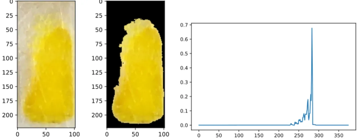
We apply the histogram on the cropped images of detection zones. Since the color change observed in Jaffe’s reaction takes place in a particular range of yellow, pixels belonging to all the other colors are irrelevant to our analysis. Thus, we mask the hue and saturation values that are not encountered in our experiments, leaving an additional small buffer at each extremity. After experimenting with values in the range of [0, 45] for hue and [0, 255] for saturation, we chose the ranges [20, 35] and [100, 255] for masking the hue and saturation, respectively. Fig. 10 and 11 (left) show example images of detection zones before and after masking. From these masked images, histograms are computed.
To compute the histograms, we split the hue and saturation ranges intoα andβ equal-width buckets, respectively, creating a total ofα×β buckets. These buckets make up the feature space for representing our image. Each bucket will record the number of pixels (excluding the masked pixels) whose hue and saturation fall in the range
represented by the bucket. We then compute the similarity between two images as the cosine similarity between their respective HOC vectors, which is defined as
Cos(x,y) = x
Ty ‖x‖2‖y‖2,
wherexTyis the dot-product of the two vectors and‖x‖2 is the L2-norm of the vectorx. Cosine similarity measures the angle between the two vectors and is invariant to vector scaling, since the angle does not change when changing the length of the vector.
Therefore, as a way to improve computation efficiency, we normalize the feature vectors using the L2-norm, which scales the vectors to unit length and reduces the computation of cosine similarities to just finding the dot-product between the vectors. Fig. 10 and 11 (right) show example normalized HOC vectors extracted from the images of the teststrips depicted in the two figures.
0 50 100 0 25 50 75 100 125 150 175 200 0 50 100 0 25 50 75 100 125 150 175 200 0 50 100 150 200 250 300 350 0.0 0.1 0.2 0.3 0.4 0.5 0.6 0.7
Fig. 10. Cropped detection zone (left), image after masking pixels (center), and the histogram of colors (right) of teststrip before application of creatinine solution.
0 100 0 50 100 150 200 250 0 100 0 50 100 150 200 250 0 50 100 150 200 250 300 350 0.0 0.1 0.2 0.3 0.4 0.5 0.6
Fig. 11. Cropped detection zone (left), image after masking pixels (center), and histogram of colors (right) of teststrip 32 minutes after application of creatinine solution.
4.3.3 Histogram of Gradients
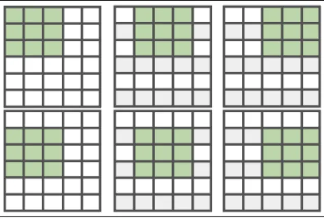
Similar to the HOC features, the histogram of gradients (HOG) features are created as L2-normalized histogram counts of features. However, the features being tracked are gradient orientations in localized portions of the image. To find these features, small portions of the image are multiplied by the kernel (-1,0,1) in both the horizontal and vertical directions. We use the HOG descriptor function from the OpenCV library, which uses sliding windows to extract these features. Fig. 12 shows an example of the sliding
windows concept. Using sliding windows, gradients are extracted and counted from a section of the image, before moving on to the next section, which overlaps the first by a small margin. The extracted gradient feature counts from each section are concatenated into a single HOG feature vector, which is then L2-normalized.
Fig. 12. Sliding windows with window size 3×3 and stride 1×1.
4.4 Baseline Prediction Models
For each of the feature extraction techniques used, we built regression models, one for each of the four time points we captured images at after adding the creatinine solution to the teststrip. In the remainder of this section, we provide a description of each of the baseline models that we used in our research. We did not apply neural network models, as the number of data points we had was limited and insufficient for learning the large number of weights in a neural network without over-fitting.
4.4.1 Linear Regression
The linear regression algorithm fits the data into a straight line equationy=aTx+b, where xis the feature vector, andaandbare meta-parameters, such that most of the data points lie on (or close) to the line. The meta-parameters are learned iteratively, with a goal to reduce the cost of prediction given by a chosen cost function. We use the root mean
squared error (RMSE) as the chosen optimization cost function for the linear regression model. Givennsamples, the RMSE can be computed as
RMSE= 1 n n
∑
i=1 (y′i−yi)2 !1/2 ,wherey′i is the predicted creatinine concentration andyiis the actual creatinine
concentration for theith sample. 4.4.2 Support Vector Regression
The support vector regression (SVM) algorithm, which is based on the support vector machines (SVM) [47] method, uses the features in data to learn a hyperplane that all samples lie on or are close to. The model can predict the values of new query points by computing the hyperplane equation, which is a function on the query features. In
kernelized SVM, the input data is mapped into a higher dimensional space using a kernel function, which allows the samples to be more easily aligned to the hyperplane. The parameters of the kernel are learned such that the data mapped into the new feature space can be linearly represented.
4.4.3 Nearest Neighbor Regression
The nearest neighbor regression (NNR) algorithm is a non-parametric method introduced by N. S. Altman [48]. Unlike the previously discussed methods, it does not make any assumptions about the distribution of data (e.g., LR assumes that the data is distributed approximately along a straight line). Instead, at prediction time, the algorithm finds the closestkneighbors in the training set for each query sample and predicts the regression value as a function of the actual regression values of the identified neighbors. The NNR implementation in the sklearnlibrary, which we used in our experiments, allows for three different ways to combine the regression values of neighbors. Uniform weighting assigns all the neighbors the same weight, computing the query regression
value as the mean of allkneighbor regression values. Distance-based weighting uses the inverse of distance from query of each neighbor as coefficients for the neighbor regression values. This results in neighbors closer to the query influencing the predicted query regression value much more than other neighbors. The third option is to provide a custom weight distribution vector to the algorithm. Finally, the proximity between points can be measured using different functions, such as the L2 distance or cosine similarity. In the case of a similarity proximity function, similarity values, which range between 0 and 1, are transformed into distances by subtracting them from 1.
4.5 Hybrid Prediction Models
In Section 3.2, we established that creatinine concentrations between 0 and 4 mg/dL result in major changes in eGFR values (Fig. 5). Also, the critical eGFR values of 15, 30, and 60 fall in the creatinine concentration range of 0.4–3.5 mg/dL for all age, ethnicity and gender combinations (refer Fig. 6). We hypothesize that we can improve eGFR classification performance by splitting the regression prediction task among several concentration ranges. For each range, we build specialized prediction models that focus on a subset of the samples with creatinine concentrations in the given range. In our experiments, we built regression models for four different concentration bins, choosing the same ranges as the ones used during data collection. When a new query sample is received, it is first classified into one of the four concentration bins. Then the specific regression model for that bin is used to predict the creatinine concentration. Finally, the MDRD equation is used to determine the eGFR classification given the predicted creatinine concentration.
We experimented with three different classification algorithms, support vector
classification, nearest neighbor classification, and logistic regression classification, to find the classifier-regression combination that gives the least error for each time point. The
three regression algorithms from the baseline methods are used to train for the concentration bin-specific regression models.
4.5.1 Support Vector Classifier
The support vector classifier (SVC) uses the SVM algorithm to find a hyper plane which maximizes the distance between the closest points belonging to different classes. For a two class classification problem, the support vectors are made up of the positive and negative class objects closest to the separating boundary. A hyperplane that maximizes the distance between the support vectors is the optimal choice for a decision boundary that can distinctively separate the two classes. For a dataset with more than two classes, a one-versus-all approach is often used, where objects of one class are considered positive and objects of all other classes are considered negative. A different model is learned for predicting each class. At prediction time, the class of the class-specific model with the highest confidence is chosen.
4.5.2 Nearest Neighbor Classifier
The concept behind the nearest neighbor classification (NNC) algorithm is the same as that of the nearest neighbor regression detailed in Section 4.4.3. After thekneighbors are found, the final class is decided based on the votes of each of the neighbors. Generally, the class represented by the majority of the neighbors is predicted as the class of the query. This method of choosing the prediction class is called majority voting. Alternatively, the query class can be computed as the linear combination of the neighbor classes and a weight vector consisting of the similarities between the query and the neighbors. 4.5.3 Logistic Regression Classifier
Logistic regression (LR) is a classification algorithm that predicts, for each query sample, the probability that it belongs to each of the predefined classes. In most cases, the model learns the hyper-parameters of a linear equation, as in the case of a linear
regression model. The regression values are then transformed using the logistic sigmoid function to a range of 0 to 1. Functions with a characteristic S-curve are termed as sigmoid functions. The sigmoid function used for logistic regression is given by,
S(x) =1/(1+e−x),
5 Experiment Design 5.1 Data
We have created and used two datasets in this project. The localization dataset consists of 1121 images of teststrips taken in different backgrounds and lighting conditions. The images are 416×416 pixels in dimension and are in JPEG format. The concentration prediction dataset contains images from the chemical experiments
conducted to capture the magnitude of color change observed in Jaffe’s reaction. For each of the 65 test creatinine concentrations we identified in Section 3.2, the experiment was carried out using four different teststrips. For each teststrip, an image was captured before applying the creatinine solution to the teststrip. Subsequently, two images were captured 2, 12, 22, and 32 minutes after the application of the solution. Table 3 summarizes the distribution of the collected creatinine teststrip samples. Images in the concentration prediction dataset are in PNG format, have a resolution of 3024×4032 pixels, and each takes up 15.5 MB of storage.
Table 3
Images Collected as Part of Our Experiment
Conc. bin Conc. gap # Strips # Time points # Duplicates Total per teststrip per time point
0-4 mg/dL 0.1 mg/dL 41 4 2 369
4.5-8 mg/dL 0.5 mg/dL 8 4 2 72
9-20 mg/dL 1 mg/dL 12 4 2 108
30-60 mg/dL 10 mg/dL 4 4 2 36
All 2340 teststrip images from the concentration prediction dataset were converted into three feature matrices using the feature extraction methodologies described in Section 3.2. The number of features resulting from each of the three feature extraction methods is given in Table 4.
In our paper, we use the term sample to refer to an image with a unique teststrip number, creatinine concentration, and taken at a particular time point after applying the
Table 4
Types of Features Extracted from Teststrip Images Feature type Number of features per image
Histogram of colors 375
Histogram of gradients 325
RGB pixels 12288
creatinine solution. We partitioned our concentration prediction datasets into 5 groups for each time point, where the first four groups use data from each of the four teststrip sets and the fifth combines all of the data from all four teststrips. We trained all models using each group of teststrips. Fig. 13 shows the different combinations of experiments possible given our data grouping, feature, and model selection choices. Overall, we have trained 480 different models for different combinations of data groups (5), time points (4), and regression algorithms (12).
5.2 Teststrip Localization
For training and testing the YOLO model, we created a dataset of 1211 images of size 416×416 pixels. To ensure the robustness of the model, we took pictures of teststrips with different creatinine concentrations in various lighting and orientation conditions, while posing the samples on a variety of backgrounds. As suggested by Nils et al. in [49], all the images were annotated using the BBox-Label-Tool [45], a Python graphical user application that stores the bounding boxes drawn on the images as pixel coordinates in individual text files. YOLO learns the center coordinates, height, and width of a prediction object as ratios of dimensions of the image. As an example, an object of dimensions(10×40)pixels with center at (10, 10) in a (100×200)image will be localized within the bounding box coordinates (0.1, 0.05, 0.1, 0.2).
We trained and tested the model using the CUDA enableddarknet framework [40]. Instead of using random initial weights, we initialized the model using pre-trained ImageNet classification weights provided by the creators ofdarknet[50]. The data were
Which time point? Strip No. 1, 2, 3, 4 Strip No. 1 Strip No. 2 Strip No. 3 Strip No. 4 2 minutes 12 minutes 22 minutes 32 minutes Which algorithm? SVR NNR LR SVC + SVR SVC + NNR SVC + LR NNC + SVR NNC + NNR NNC + LR LC + SVR LC + NNR LC + LR Prediction model
Data group Time point Regression algorithm
Fig. 13. Logical flow for model selection in our experiments.
split into training and test sets using the ratio 80:20. We further split the training set into train and validation, using the ratio 90:10, and used the validation dataset to tune
parameters during the training. Thedarknetframework provides a configuration file to define the inputs and tune the parameters when training. The network was trained in batches of 64 images with a learning rate of 1E−5. Model training reached an RMSE loss of 2.56 in 900 iterations.
We tested our model on both the train and test datasets, which had 938 and 183 samples, respectively. As our tests were performed on only positive images, i.e., the
teststrip was always present in the image, we chose F1 score as our prediction performance measure, as it is well suited for imbalanced data.
In order to measure localization performance, we compute the intersection over union (IOU) score between the ground truth and predicted bounding boxes. The IOU is
computed as the ratio of the area of overlap between the predicted and the actual bounding boxes and the union area of the two boxes. In our experiment, the predictions with an IOU score greater than or equal to 0.5 are classified as true positives (Tp). All other predictions are classified as false positives(Fp). Since we trained the model to detect presence of only one class of objects (teststrip), and we did not test the system with images that do not contain the teststrip, there are no false negatives(Fn). We computed
precision, recall and F1 score for the predictions using the formulae,
Precision(P) =Tp/(Tp+Fp), Recall(R) =Tp/(Tp+Fn), F1score(F1) =2*P*R/(P+R).
5.3 Execution Environment
All experiments were executed on a server with two 12-core 2.5 GHz Intel Xeon E52680 v3 (Haswell) processors and 384 GB RAM. While all algorithms employed in our analysis were implemented as serial methods in their respective Python and OpenCV packages, we used na¨ıve parallelization techniques to execute up to 24 experiments at the same time. This allowed efficient execution of all experiments and multiple iterations over the machine learning experimental design.
5.4 Machine Learning Model Validation
We applied 10-fold cross-validation for all prediction models. This technique allows all the samples to be used for both training and validation, and ensures that each sample is validated only once. The technique helps verify whether a model will be generalizable,
even in the absence of a large number of test samples. During 10-fold cross-validation, the dataset is randomly shuffled and split into 10 equal groups. For each iteration, theith
group of samples is considered as the test set and the other nine groups are combined to make up the training set. The RMSE of all the predictions is used as the performance measure of the algorithm applied to the dataset.
For each model, we tuned meta-parameters using the GridSearchCV function from the
sklearn[51] library. It performs an exhaustive search of the parameter space, finding the set of parameters that best fit the training samples for all our classification and regression models. To tune our support vector regression (SVR) models, we optimize the choice of kernel functions among the sigmoid, radial basis and polynomial kernels, and the
prediction penalty, C, testing values from the set{2−4,2−2,20,22,24}. In addition, for our support vector classification (SVC) models, we tuned the kernel coefficient,γ, testing values from the set{1E−4,1E−2,1E+0,1E+2,1E+4}. For the nearest neighbor models, we chose the best number of neighbors closest to the query,k, in the search space of{1, 2, 3, 4, 5}neighbors. For the logistic regression classifier models, we tested different optimization algorithm, such asnewton-cg,liblinear, andlbfgs, and tuned the inverse regularization factor, C, testing values in{2−4,2−2,20,22,24}.
To understand the impact of the errors in our prediction models, we computed eGFR values for each of the predicted and actual creatinine concentration values and classified them as critical, intermediate and healthy. The accuracy of this classification shows the effectiveness of our mobile application in guiding our patients. To compute the eGFR values using the MDRD equation, we need to know the gender, ethnicity and age of patients. For this experiment, we assigned gender, ethnicity and age values for each sample in the dataset, distributed based on the US census reports for gender, population and ethnicity distributions from the year 2016 [52], [53]. Table 5 summarizes the
population distributions and associated number of samples that were assigned to each population segment in our dataset.
Table 5
Distribution of Age, Gender and Ethnicity in the U.S. Population and the Number of Teststrips Associated with Each Population Segment
Male, African Female, African Male, non-African Female, non-African Age group % pop. # strips % pop. # strips % pop. # strips % pop. # strips
0-15 1.37 18 1.31 17 8.93 116 8.56 111 16-30 1.40 18 1.34 17 9.12 119 8.74 114 31-45 1.28 17 1.28 17 8.33 108 8.36 108 46-60 1.30 17 1.36 18 8.49 110 8.84 115 61-75 0.89 12 1.00 13 5.79 75 6.52 85 76-90 0.29 4 0.40 5 1.87 24 2.62 34 0-15 0.02 0 0.06 1 0.16 2 0.37 5
6 Results and Discussions
In this section, we present and comment upon the results of the experiments. First we discuss the results of our localization model and the viability of using this model in KHM to position and orient the teststrips. Next, we discuss the results of the experiments conducted on various baseline and regression models to find the best performing feature extraction technique, time point, and regression model for our dataset. Finally, we discuss the reproducibility of the chemical experiments conducted to validate the robustness of the kidney health monitoring system we are proposing.
6.1 Localization Effectiveness
Table 6 summarizes the experimental results obtained for our YOLO model trained to detect and localize the teststrips. The model has achieved a high F1 score of 0.972 on both the test and train sets.
Table 6
Teststrip Localization Results Using YOLO Model Test set Train set
No. of samples 183 938 True positives 173 887 False positives 10 51 Precision 0.94535 0.94562 Recall 1.0 1.0 F1 score 0.97191 0.97205
We classified predictions with an intersection over union (IOU) of 0.5 or above as true positives and the rest as false positives in our experiment. Fig. 14 shows the variation of the IOU scores for the sample distribution. We can observe that more than 85% of the samples have an IOU score above 0.85, making the model consistent in its prediction. However, there is a steep decline in the IOU scores in the tail end of the distribution. This could be due to underrepresentation of several backgrounds in the training set. Overall, the performance of the localization model is satisfactory. This model is expected to perform well in detection and localization of teststrips in various background and lighting
![Fig. 1 shows the typical components of an LFA [36].](https://thumb-us.123doks.com/thumbv2/123dok_us/516181.2560868/22.918.321.633.839.956/fig-shows-typical-components-lfa.webp)