An Empirical Study of Data Visualization Techniques in
PACS Design
Dinu Dragan1, Veljko B. Petrovi´c1, Duˇsan B. Gaji´c1, ˇZarko ˇZivanov1, and Dragan Iveti´c1 University of Novi Sad, Faculty of Technical Sciences
Trg Dositeja Obradovi´ca 6, 21000 Novi Sad, Serbia {dinud,pveljko,dusan.gajic,zzarko,ivetic}@uns.ac.rs
Abstract. The paper presents an empirical study of multidimensional visualization techniques. The study is motivated by the problem of decision making in PACS (Picture Archiving and Communications System) design. A comprehensive survey of visualizations used in literature is performed and these survey results are then used to produce the final set of considered visualizations: tables (as control), scat-terplots, parallel coordinates, and star plots. An electronic testing tool is developed to present visualizations to three sets of experimental subjects in order to determine which visualization technique allows users to make the correct decision in a sample decision making problem based on real-world data. Statistical analysis of the results demonstrates that visualizations show better results in decision support than tables. Further, when number of dimensions is large, 2D parallel coordinates show the best results in accuracy. The contribution of the presented research operates on two lev-els of abstraction. On the object level, it provides useful data regarding the relative merits of visualization techniques for the considered narrow use-case, which can then be generalized to other similar problem sets. On the meta level above, it con-tributes an enhanced methodology to the area of empirical visualization evaluation methods.
Keywords:visualization, parallel coordinates, star plots, medical imaging, PACS.
1.
Introduction
1.1. Motivation
This study, while aiming for generalizability, was motivated by the question of decision making in PACS design. A PACS is a very complex system which covers all the aspects of image workflow in one or more medical institutions [4], including mobile medicine and telemedicine applications [29]. PACS is the dominant paradigm in the medical field and remains so, despite occasional criticism [26]. Designing one, naturally, brings to the forefront the question of compression. Image compression in PACS is, generally speak-ing, desirable because of the relaxation of storage and transmission requirements and the increase of image turnaround time [19]. Compression also allows for the use of lower-capability devices in medicine and telemedicine applications [16]. Lower-lower-capability de-vices are still relevant despite the recent explosion in device capabilities because telemedi-cal applications are of great interest in less developed countries. This is due to the need for the efficient use of a small number of doctors and the markedly high market penetration of mobile telephony in those regions [49].
Choosing a suitable image compression technique for a PACS is a complex decision-making problem which must take into account various requirements [15], imposed and evaluated by a heterogenous group of stakeholders. Requirements rely on various metrics of quality [14] with over 250 being attested in the literature, though usually only a subset is used [17]. To simplify this considerable task, the authors of the paper have developed a decision-support system called SICEP (Still Image Compression Evaluation for PACS) which can be used to integrate disparate metrics and requirements into a unified data set amenable to analysis.
No matter how unified this data set is, it is still an intimidating amount of information which needs to be presented to stakeholders in PACS design. Contrary to business intelli-gence (BI) analytics [10], once the unified data set is defined, not even the pre-processing techniques applied in BI (such as data aggregation, drill-downs, or OLAP) can lead to fur-ther dimensionality reduction and a solution for presenting the data to stakeholders needs to be found in data visualization techniques [54]. Stakeholders, while experts in their var-ious domain specialties, are not experts in the evaluation of the metrics used, most of which present interacting tradeoffs in properties which require a technical education to merely understand. Our desire was to permit for control on the part of the stakeholders allowing the decision to be entirely theirs while minimizing the cognitive load. Therefore we chose data visualization [47] as a suitable shortcut, and we began to develop a sub-system for data visualization we named VisSys. This, however, raised a new difficulty: how to select a visualization technique to use as the dominant one in our system and how to validate that (a) that technique is the correct choice and that (b) a visualization helps at all compared to presenting the data directly. This paper presents the studies we have performed to find satisfactory answers to both of those questions.
To summarize, the fundamental contribution of the research operates on two levels of abstraction. On the object level it provides useful data regarding the relative merits of vi-sualization techniques for this narrow use-case which can then be generalized to a limited but substantial degree to other similar problem sets (see 2.1). On the meta level above it contributes an enhanced methodology to the area of empirical visualization evaluation methods.
compres-sion technique must meet in a specific PACS. Individual metrics are grouped into one or more requirement indicators to indicate how well compression performed against a given requirement. The SICEP system can adapt to the needs of any PACS by modifying re-quirements and requirement indicators. This means that VisSys should express the same flexibility as the SICEP system by enabling easy selection of requirement indicators and their modification.
Each of the individual metrics chosen for the SICEP system is important for reaching valid decisions [14]. Therefore, each of them should be represented with an individual dimension in VisSys visualizations. Also, since a requirement indicator can have an arbi-trary number of metrics from a total number of observed metrics which is also arbitrarily large, VisSys should accommodate a variable number of dimensions. Thus, designing Vis-Sys required grappling with the problem of multidimensional evaluation which, further, can operate on arbitrarily-created sub-groups of dimensions.
The method we chose to select an appropriate visualization technique is as follows. First, we would perform a literature review to determine which methods theoretically sat-isfied our goals of visualization with an indefinite number of dimensions as well as which methods are being used in the literature. Second, we would compare in an empirical test commonly used methods, a table view of the data as a control, and the methods we chose based on theory. Then we would compare whatever performed best in this initial test to the leading multidimensional data visualization solutions and, as a control for basic visu-alization, bar graphs. This we would do in two tests: one with a low number of dimensions and one with a higher number of dimensions in play. This comparison would be accom-plished with a statistical procedure based on robust statistical methods, specifically for the data on the continual level of measurement a dependent robust bootstrapped ANOVA with trimmed means, apost-hoctest based on Yuen’s modification of Student’s T-test with Rom’s faimilywise error correction method. For data on the categorical measurement level a combination of McNemar’s tests preformed iteratively with Holm’s correction, a mul-tilevel logistical regression, and testing proportional confidence intervals. This procedure is explained in detail in section 3.5.
Lastly, we would show the visualizations most successful at the empirical tests to actual stakeholders in a PACS and then observe them as they used it to reach a decision, interviewing them about their experience. This method is outlined in further sections of the paper, specifically 2.1 and 3.
2.
Related Work
This section presents all aspects of previous work done in this field and related fields which substantially informed the work presented in this paper. It consists of subsections relating to multidimensional data visualization as such, and a section on visualization evaluation.
2.1. Multidimensional Data Visualization
and the number of variables exceeds by a significant margin the number of spatial dimen-sions available for mapping. In the most common type of visualization two variables are shown at the same time, highlighting the relationship between them, such as in a simple line graph where one variable is time and another something we measure. If interactive computer-based tools or 3D printing is used, one additional spatial dimension can be used. To these two or three spatial dimensions, a number of visual variables–as discussed in [7] (which evaluates the use of variables as a basis of visualization) [25] (which evaluates the use of similar mapping in geographical visualizations) and [33] (which proposes an expansion of the visual variable concept into the dynamic domain)–can be added, each being mapped to a dimension of the data. This gives us an absolute upper limit of nine dimensions present at the same time, though, of course, practical concerns tend to reduce that to no more than five.
To overcome this problem, MDV techniques employ something else apart from spatial dimensions to map data dimensions to. Examples include star plots [48] which use axes distributed radially in order to map data, Fig. 1, as well as parallel plots in 2D which are discussed in [27] (which presents the general concept), [30] (which reviews the literature), and [53] (which discusses as one of their salient features their ability to reveal structure in data). Further, parallel coordinates are available in 3D [27], and there is some use of techniques like 3D glyphs [11, 23], and Chernoff faces [6, 42]. Parallel coordinates are especially commonly used when very large data sets need to be displayed [50]. 3D parallel coordinates are an extension of 2D parallel coordinates into the third dimension, which is difficult because of the necessity of a rule for connecting axes. In the case of 2D coordinates direct comparison only works between axes which are neighbors, and which axes are neighbors is simple to determine. In the 3D case the situation is more complex, because if all axes are to be connected to all other axes the display becomes too cluttered. A method for resolving this issue is the use of axis connecting rules. One commonly used rule is used to generate a type of display known as clustered multi-relational parallel coordinates (CMRP). This rule chooses one axis and compares all the other ones to it by placing the chosen axis in the center and connecting the remainingn−1 axes to be visualized around it, forming a regularn−1 sided prism, see [22].
This is much less cluttered and it would suit us to use it but, unfortunately, it did not fulfill our requirements. It shows not the fulln dimensions and their relations but, very specifically, the relations ofn−1 dimensions to one baseline dimension which does not fit our requirements. We still wanted to use a 3D analogue for parallel coordinates, and so extended CMRP coordinates in such a way that there is no central coordinate. Instead,n-dimensional space is presented by mappingn values onto sides of an-sided regular prism. A point in such a space is then presented by way of a polyline connecting all the axes along the sides forming a regular prism with a slice taken out of it, Fig. 2 (right). This is contrasted with 2D parallel coordinates visible on the left. Clearly, one can only interconnect those values sharing a side of the prism, but this still exceeds the capabilities of non-extended CMRP. These extended CMRP coordinates (ECMRP) are only fully usable using a custom tool to display them interactively [18]. To simplify the nomenclature we will refer to the ECMRP subvariant as simply 3D parallel coordinates.
Fig. 2.Parallel coordinates: 2D (on the left) and 3D (on the right) in modified form as extended Clustered Multi-Relational Parallel Coordinates, image from [18]
Star plots, in Fig. 1, and 2D parallel plots in Fig. 2 (left), both use essentially the same method: instead of using spatial dimensions to map data dimensions to, they instead use equally spaced axes, either radially or in parallel arrangement. 3D glyphs and Chernoff faces on the other hand map the dimensions of the data to a specific visual feature of the glyph, in case of 3D glyphs, and on facial features of cartoon faces, in the case of Chernoff faces.
Chernoff faces are a special case of glyph which use facial features specifically in the hope that this will allow access to the preliminal processing characteristic of human facial recognition, thus dramatically increasing data efficiency, especially when presented extremely quickly. This, however, is yet to be shown as actually working, as studies de-signed to detect this feature have failed to record any effect [42].
2.2. Approaches to Visualization Evaluation
A lot of previous work has gone into analyzing possible approaches to visualization eval-uation including Lam’s comprehensive taxonomy of approaches [37] buttressed by a lit-erature review [28], as well as a comprehensive review by Carpendale [8]. Using Lam’s taxonomy, visualization evaluations can be divided into: understanding environments and work practices (UWP), evaluating visual data analysis and reasoning (VDAR), communi-cation through visualization (CTV), evaluating collaborative data analysis (CDA), evalu-ating user performance (UP), evaluevalu-ating user experience (UE), and evaluevalu-ating visualiza-tion algorithms (VA).
Based on this taxonomy and on the already-described requirements of our work on VisSys certain methods are preferable to others. VDAR is simply impossible since it re-quires a system already used in practice. CTV does not fit our requirements since we do not aim to exclusively communicate via visualization but, instead, wish to facilitate the comparison between things visualized. CDA does not fit the scope of our tests since we must first validate our choice for single users before we consider the impact on the group. VA would suit us well, requirement-wise, but we do not know which objectively analyz-able features of visualization algorithm output correspond to insight in our users. We also rejected the, otherwise excellent, laboratory driven approach of Engelke et al. [20] out of fear that a sensitive statistical test such as one we would have to do and which are exten-sively used in UP-coded visualization scenarios [37] would amplify unconscious biases in the experimental setup which we could not fight with a Bayesian [2, 41] approach due to lacking the data to establish suitable priors.
In the end, the method we chose was a hybrid of several approaches: First, UWP for the initial selection which takes after a tradition of papers like the work by Freitas et al. [24] or the seminal work by Keim and Kriegel [34] who codified the priors of their investigation by introducing a set of criteria based partially on own work and partially on existing literature in the vein of the work by Pillat [44]. Second we employ a rigorous literature review, followed by a multi-stage combination of UP and UE tests as a part of a controlled empirical study following in a tradition of empirical studies typified by the likes of Cawthon [9] and finished with a UP/UE interview with domain experts/PACS stakeholders.
3.
The Proposed Approach
This section outlines the proposed approach to the study based on previous work in the field. It outlines how candidate visualization studies were chosen in the first two sections, first by a modified UWP approach (see 2.2) and then by a statistical analysis of published papers in the field. It then describes the test to be undertaken through the outline of the test, a discussion of methodology, and finally a discussion on statistical procedure.
3.1. Requirements-based Analysis
subject of VisSys visualization and based our decisions on this. The requirements that VisSys visualization has to fulfil are:
– Dimensional scalability (DS). The visualization technique should be such that it easily adapts to very large numbers of data dimensions.
– Lens support (LS). The visualization technique should be such that it allows for the easy selection and analysis of regions of interest.
– Comparison in isolation (CI). The visualization technique should be such that it can be fully used if comparing only two entities.
Although some of these requirements can be fulfilled in pre-processing stage, such as the ones in business intelligence (BI) data analytics, we previously established that once the unified data set is defined, no further reduction is possible, therefore, these require-ments have to be supported using a visualization technique. Based on these requirerequire-ments and the literature which covers glyphs[11, 23], star coordinates[12, 48], parallel coordi-nates[22, 27, 53], and Chernoff faces[42], it was relatively easy to formulate an evaluation of these visualization types based on these criteria.
Star plots definitely implement the LS and CI criteria, but implement the DS criterion only partially. Parallel plots implement all three criteria, while glyphs and Chernoff faces implement none of them. The only point of possible contention is saying that the star plot only implements DS partially. We feel this is correct, however, because it is impossible to find more than 360 degrees in a circle. Our preliminary research suggested possible issues in examples with extremely high-dimensionality.
The question that now arises is whether to use 2D or our modified version of 3D par-allel coordinates. 2D coordinates have the advantage of simplicity and naturally fit 2D based displays which we would naturally have to use. On the other hand, 3D visualiza-tion has a lot to recommend it, especially in reducing cognitive distance in the case of multidimensional data [12, 31]. In the end, we decided to use both 2D and 3D parallel coordinates.
3.2. Statistical Literature Review
A sample of 591 papers drawn from image compression literature was reviewed by the authors and each visualization technique employed was noted including tables which, for the purposes of this survey, were counted as visualization methods. Listing the contents of the sample is far beyond the scope of this paper, but the raw data used is available on request. Of the 591 assessed papers, 26.40% were conference papers, 72.59% were journal papers, 0.51% were monographs, and 0.34% were technical reports. Of the pa-pers in the sample, 4.23% are from the period of 1995-1999, 15.57% from 2000-2004, 44.67% from 2005-2010, and 35.36% from 2010 to 2016. A simple statistical analysis was then performed on the data, computing visualization method frequencies and their 95% confidence intervals (see table??).
As can be seen the result is weighed towards tables, scatterlines/scatterplots (two names for, fundamentally, the same plot: scattered points with optional trend or connect-ing lines), and bar graphs to an extreme degree.
Type Frequency [%] Lower Bound [%] Upper Bound [%]
2D/3D bar graph 0.1692 -0.1621 0.5006
3D bar graph 0.1692 -0.1621 0.5006
Color code 0.1692 -0.1621 0.5006
Pixel map 0.1692 -0.1621 0.5006
Pie chart 0.1692 -0.1621 0.5006
Hosaka plot 0.3384 -0.1298 0.8066
Star plot 0.3384 -0.1298 0.8066
ROC 1.184 0.3122 2.057
3D plane 1.184 0.3122 2.057
Interquartille range 1.861 0.7716 2.951
Scatterplot 8.122 5.919 10.32
Bar graph 16.41 13.43 19.4
Scatterline (2D line) 54.65 50.64 58.67
Table 84.43 81.51 87.36
Table 1.95% Confidence intervals for visualization technique use frequencies,n=591
plots to the consideration because they are the only plot we have found in the literature at all that can be said to be fulfilling our requirements outlined in subsection 3.1. Therefore, the final selection of visualization methods to test is: table, scatterplot, bar graph, parallel coordinates, and starplot. We specifically decided on two subvariants of the starplot: a ’dense’ one and a ’sparse’ one. The dense form has multiple measurements on one graph and corresponds to parallel coordinates in information density, while the sparse form has only one measurement per graph and corresponds to the bar graph in information density.
3.3. Test Outline
Four tests were planned: three to be done with large groups, and a final study of the use of the visualization, if any, that proved best in the tests by a panel of PACS-domain experts. The group tests all had the same form: experimental subjects were presented with a web tool for visualization evaluation we developed. They were offered instructions both in text form and in the form of a video presentation lasting 9 minutes 47 seconds. Then, they were presented with four visualizations of the same data set, though they were not told that they would be analyzing the same data set nor what the data represents. They were then asked to choose the ’best’ entity and estimate how certain they were of their choice. The choice of ’best’ is informed based on multidimensional comparison between entities where all data was industry data, and all axes were scaled to be uniform. This is a task which, in real use, would be covered by the SICEP system. The time they spent on each test page was measured.
before the test if they worked with visualizations in a professional capacity, and the groups are composed of 46.67% men and 53.33% women in the first stage, 62.79% men and 37.21% women in the second, and 47.46% men and 52.54% women in the third stage. No test-takers expressed any other gender identity. In stage 1, the requirement-based choice (parallel coordinates, 2D and 3D) is tested against the baseline (table) as well as the most popular visualization choice found in the literature (scatterplot). This is done on a data set with a relatively small number of dimensions. The idea behind this choice is to make it as fair towards what is used in the literature as possible, and make the requirements-based choice justify the need for it.
In stage 2, the ’winner’ of stage 1 was to be pitted against a visualization we knew was not suited to the task as a control (bar graph which was attested in the literature), as well as the best possible competition found in the literature (star plots in both dense and sparse forms). Stage 2 keeps the ’low dimensionality’ condition (specifically ten dimensions in three requirement indicators) in which, it is expected, nearly all visualizations will do well.
The techniques tested in stage 3 are the same as in stage 2, but the data is high-dimensional. Specifically, the used data have 25 dimensions in six requirement indicators, as presented in Fig. 3 (top) and (bottom). In this condition, it was expected that the most suitable visualization method would separate itself out from the competition and the con-trol would do markedly worse.
Fig. 3.Cropped screenshot of the visualization evaluation tool showing the high-dimensionality data set visualized using 2D parallel coordinates (top) and dense star plots (bottom)
to stop previous tests from influencing the thought-process of the test subject. The K-values are the outputs of requirement indicators devised as a part of SICEP and their full definition exceeds the scope of this article, and their exact values are wholly irrelevant to the purpose of the study. The only relevant datum involved is that, universally, higher values mean that the choice presented by them is preferable and that the test subjects were informed of this by way of video training and verbal briefing. Details of how requirement indicators are derived are available in [17] and [15] with [18] providing background on the practicalities of how they were displayed.
Expert verification had to be limited to the final stage because our access to actual PACS stakeholders was limited. We resolved to show them only those visualizations which proved themselves the best and gather their experiences in a field-interview set-ting. This stage could only function to verify that we have not made some sort of mistake in previous stages and therefore produced an unusable result.
3.4. Methodological Caveats and Considerations
When doing empirical studies relying on statistical analysis, the risk of error is consid-erable. This is especially due to psychological reasons, e.g., that of false positive results either by subconscious interference from the researcher or by amplifying an effect that is orthogonal to that which was to be studied. To forestall these issues, we made sure to deal with boredom and practice effects, and eliminate researcher bias and user bias insofar as that is possible.
We dealt with boredom and practice effects by counterbalancing the design and pre-senting the experimental subjects with problems in random order with answers likewise randomized using the Fisher-Yates shuffle to ensure fair permutation. We did our best to eliminate researcher bias by double-blinding our research protocol. The data was prepared by one of the authors, but the tests were conducted by another author who did not know what the results were meant to be, nor had the opportunity to see what the user sees. The statistical analysis, too, was conducted on anonymized data meaning that the researcher who performed the analysis did not know what result he ’wanted.’ A possible source of bias was the initial choice of data which was limited by only using actual data: all the data presented to the users was data extracted from the literature on PACS design and was, thus, not amenable to distortion. The data was assembled from sources such as [5, 35] that evaluated support for region of interest (ROI) coding, [13, 52] that evaluate error resilience, and [36, 40, 43, 46] that evaluated lossy and lossless compression techniques.
We tried to limit the effect of the peculiarity of individual test subjects by completely anonymizing the data: the subjects did not know what the data represented so domain knowledge, if any, did not interfere with the results. We also made sure that users knew that nobody would ever be able to connect them to individual answers meaning that they did not feel ashamed of not knowing an answer, which proved an issue in pre-study inter-views.
3.5. Statistical Procedure
post hoc test based on the Yuen modification of Student’s T-test corrected for familywise error rate by the approach of Rom according to the work by Wilcox [39, 51]. The setup for the ANOVA is based on the visualization group dummy variable as the predictor (when viewing ANOVA as a special case of the General Linear Model) and the time as the outcome variable. The predictor, therefore, is categorical and the outcome is measured on the continuous interval measurement level.
In the case of error rate, the test is a bit more particular since it represents a robust anal-ysis of dependent categorical data, which is an infrequently explored case. The method employed here is to use three parallel tests. The first is to simply compute the confidence intervals of the proportions and check for overlap (overlap being of course a sign that they are impossible to distinguish). The second is to perform a multilevel logistic regression with mixed effects and a randomly varyingβ0[3] and to estimate the relative quality of techniques by the confidence interval of their fitted parameter as compared to a baseline (which is either a table or a bar graph which were there for control purposes to begin with). The third statistical method is to perform multiple McNemar’s χ2 tests [1] and then correct for the familywise error rate by using Holm’s correction.
To avoid the possibility of fishing forp-values, all three tests had to be positive for the result to count as positive. The fact that they all measure the same thing but by very different methods should serve to limit the chance of Type I errors.
4.
Results and Data Analysis
This section contains the results of the study and their statistical analysis presented with minimal interpretation. It consists of three sections: an analysis of time taken, an analysis of accuracy, and the results of PACS domain expert interviews upon using the visualiza-tion to make decisions. As a part of this secvisualiza-tion to save space we will be using abbre-viations for visualization technique names. Specifically, we will call the bar graph ’bar,’ the scatterplot just ’scatter,’ the parallel coordinates X2d and X3d for the 2D and 3D ver-sion, and as for the starplot we will differentiate between the Star3k and Star9kz version depending on whether it is the dense or sparse variant, as in Section 3.2.
4.1. Analysis of Time Taken
Fig. 4 (a) shows the time taken results for stage one as a mean plot with 95% CI error bars. Predictably, the figure shows that the table is slowest, and that parallel coordinates are the fastest. An unexpected result is that 3D parallel coordinates prove to be much slower than they were expected to be providing no improvement over the table which is meant to be a control.
Fig. 4.Mean plot of the time taken to reach a result: (a) stage 1 (N=60), (b) stage 2 (N=43), (c) stage 3 (N=59) all with value labels.
Comparison P-value Critical p-value Significant
Table vs. Scatter 0.00003 0.01270 Yes Table vs. X2d 0.00000 0.01020 Yes Table vs. X3d 0.70336 0.05000 No Scatter vs. X2d 0.00085 0.01690 Yes Scatter vs. X3d 0.00158 0.02500 Yes
X2d vs. X3d 0.00000 0.00851 Yes
If these results are subjected to statistical analysis, with the null hypothesis being that the mean of all the visualization times taken is equal, and the alternative being that they differ, an ANOVA test predictably reports a test statistic of F(2.65, 69) = 0.5134 and a p-value of 0.65215. This means we cannot reject the null hypothesis of all values being the same, and there’s no call for a post hoc test.
Fig. 4 (c) shows the time-taken results for stage three as a mean plot with 95% CI error bars. Mostly there is no real difference, except in the case of Star3k which seems quite close to being (barely) the fastest.
If these results are subjected to statistical analysis, with the null hypothesis being that the mean of all the visualization times taken is equal, and the alternative being that they differ, an ANOVA test reports a test statistic of F(2.93, 105.38) = 4.2831 and ap-value of 0.00722. This means that not all of the values are the same, which is to say that we may reject the null hypothesis of all means being equal. Table??shows the results of a post hoc test, testing a set of null hypotheses that all pairs of means are equal.
Comparison P-value Critical p-value Significant
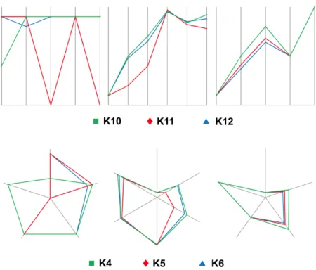
Bar vs. X2d 0.04678 0.01270 No
Bar vs. Star3k 0.00086 0.00851 Yes Bar vs. Star9kz 0.94928 0.05000 No X2d vs. Star3k 0.24238 0.01690 No X2d vs. Star9kz 0.27513 0.02500 No Star3k vs. Star9kz 0.00267 0.01020 Yes
Table 3.Post hoc testing results, stage 3 (N=59)
The post hoc test results show that despite the appearance of the graph there is no statistically significant difference between 2D parallel coordinates and a dense star plot.
4.2. Analysis of Accuracy
Fig. 5 (a) shows the relative accuracies of visualization techniques in stage 1 data with blue representing the percentage of correct answers. It is clearly visible that 2D parallel coordinates provided the best result by a significant margin, while 3D parallel coordinates did not display the effectiveness we expected, being no better than the control technique. As predicted, the scatter visualization technique is between the table and parallel coordi-nates in accuracy.
Fig. 5.Proportion of correct answers for techniques: (a) stage 1 (N=60), (b) stage 2 (N=43), (c) stage 3 (N=59)
only for 2D parallel coordinates, so based on this test we can suggest that 2D parallel coordinates are significantly more accurate than any other tested here. As for logistic regression coefficients, compared to the table, the confidence interval does not include 1 (doing so indicates insignificance) for the scatterplot and 2D parallel coordinates, with the 2D parallel coordinates showing the largest effect size. This can be interpreted to mean that the odds that the answer will be valid increase by 28.5 times (compared to the table) if the technique used is 2D parallel coordinates.
Visualization Proportion Log. reg. coeff.
From Value To From Value To
Table 27.604% 40.000% 52.396% N/A N/A N/A
Scatter 56.563% 68.333% 80.104% 1.529 3.237 6.853
X2d 89.485% 95.000% 100%+ 7.998 28.500 101.556
X3d 32.412% 45.000% 57.588% 0.594 1.227 2.534
Table 4.Proportion and coefficient confidence intervals, stage 1 (N=60)
Table??shows the results of a Holm-corrected McNemarχ2 test. The results that are marked significant are X2d compared to everything else, while scatter is only not significant compared to X3d. This corresponds nicely to the results in Table??.
Based on these results and according to the criterion outlined in 3.5, we can claim with statistical significance that two dimensional parallel coordinates are the most accurate technique.
Comparison Adjusted p value Significant
Table vs. Scatter 0.0062267 Yes Table vs. X2d 0.0000002 Yes Table vs. X3d 0.7277235 No Scatter vs. X2d 0.0031849 Yes Scatter vs. X3d 0.0605206 No
X2d vs. X3d 0.0000015 Yes
Table 5.Results of iterated McNemar test with Holm correction, stage 1 (N=60)
separate statistical tests, all of whom take as their null hypothesis that the proportions of accuracy are the same, and as their alternative hypothesis that they differ. In case of the iterated McNemar’s test the null hypothesis is expanded to a set where there are several H0being considered, each proposing that the proportions of accurate answers are equal between any two techniques studied. The alternative hypotheses are, therefore, that the proportions are not equal. The surprising result here is the success of the bar graph. The interpretation that seems obvious is that the bar graph is the most familiar visualization here and this seems dominant in this low-impact test case.
Table??shows the actual value of the proportions, their confidence intervals, and the corresponding coefficients in the logistic model comparing them to the control technique (here bar graph), and their confidence intervals. As can be seen, there are only the slightest indications of significance, chiefly with Star3k being noticeably worse than the others.
Visualization Proportion Log. reg. coeff.
From Value To From Value To
Bar 66.911% 79.070% 91.229% N/A N/A N/A
Star3k 38.580% 53.488% 68.397% 0.102 0.278 0.759
Star9kz 61.377% 74.419% 87.460% 0.268 0.757 2.136
X2d 72.687% 83.721% 94.755% 0.450 1.385 4.263
Table 6.Proportion and coefficient confidence intervals, stage 2 (N=43)
Table??shows the results of a Holm-corrected McNemar χ2test which is nowhere significant.
The result of the above according to the criterion outlined in section 3.5 is that we can-not claim that any technique is significantly more accurate than any other. The results of the low-impact test show, as was expected, that at this level of dimensionality familiarity outstrips nearly all other factors. It can be noted that, while we cannot claim a statisti-cally significant difference, 2D parallel coordinates did do the best in absolute terms and, crucially, did no worse than any other tested visualization.
Comparison Adjusted p value Significant
Bar vs. X2d 1.000 No
Bar vs. Star3k 0.185 No
Bar vs. Star9kz 1.000 No
X2d vs. Star3k 0.053 No
X2d vs. Star9kz 1.000 No
Star3k vs. Star9kz 0.381 No
Table 7.Results of iterated McNemar test with Holm correction, stage 2 (N=43)
accuracy are the same, and as their alternative hypothesis that they differ. In case of the iterated McNemar’s test the null hypothesis is expanded to a set where there are several H0being considered, each proposing that the proportions of accurate answers are equal between any two techniques studied. The alternative hypotheses are, therefore, that the proportions are not equal. Obviously, the star plots are working in a broadly similar fash-ion, and 2D parallel coordinates are clearly the best or nearly so, almost replicating their result from stage 1.
Table??shows the actual value of the proportions, their confidence intervals, and the corresponding coefficients in the logistic model comparing them to the control technique (here bar graph), and their confidence intervals. The only consistently non-overlapping interval is 2D parallel coordinates, and they also increase the odds of a correct answer the most.
Visualization Proportion Log. reg. coeff.
From Value To From Value To
Bar 36.396% 49.153% 61.909% N/A N/A N/A
Star3k 69.390% 79.661% 89.932% 2.571 7.621 22.588
Star9kz 71.418% 81.356% 91.294% 2.898 8.861 27.089
X2d 91.992% 96.610% 100%+ 13.958 97.723 684.165
Table 8.Proportion and coefficient confidence intervals, stage 3 (N=59)
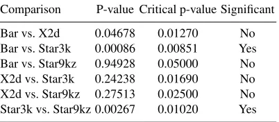
Table??shows the results of a Holm-corrected McNemarχ2test. Nearly all of the differences are significant, the only exception being the difference between the star plots which is to be expected. This fits perfectly with the results in Table??, and fig. 5 (c).
The result of the above according to the criterion outlined in 3.5 is that we can only claim that 2D parallel coordinates are consistently more accurate than all other techniques. Star plots are roughly the same and better than the bar graph in a statistically significant manner.
4.3. Expert Use-case Verification
Comparison Adjusted p value Significant
Bar vs. X2d 0.0000020 Yes
Bar vs. Star3k 0.0034246 Yes Bar vs. Star9kz 0.0026600 Yes X2d vs. Star3k 0.0132796 Yes X2d vs. Star9kz 0.0317227 Yes Star3k vs. Star9kz 1.0000000 No
Table 9.Results of iterated McNemar test with Holm correction, stage 3 (N=59)
from consideration crucial elements of how this sort of system would be used in practice. To rectify this, we created three real-world scenarios based on real data and modeled them in SICEP. Then we visualized them using 2D parallel coordinates (because they were the consistent winner in all our tests as shown by statistical analysis including but not limited to ANOVA) and presented them to a panel of three experts. These experts were actual stakeholders and users of PACS but, crucially, while they were domain experts, they had absolutely no experience in image compression in general or in the context of PACS in particular.
The panel consisted of a domain expert in healthcare, a domain expert in medical information systems, and a domain expert in finance. Once the panel used the visualiza-tions and the system to make their decision we interviewed them on their impressions and compared their decisions to the industry consensus.
All the scenarios are based on choosing between some subset of JPEG2000, SPIHT, lossy and lossless JPEG, and JPEG-LS, and differ on the requirements and the context. The scenarios observed are:
– A regional medical center PACS that supports both telemedicine and mobile medicine.
– A local medical institution PACS with limited capacities. It is a system that does not support lossless compression, telemedicine, or mobile medicine.
– A local medical institution PACS with extensive resources. This is a system that sup-ports lossless image compression in order to decrease image turnaround time and for more efficient image transmission [21]. Telemedicine and mobile medicine are not supported.
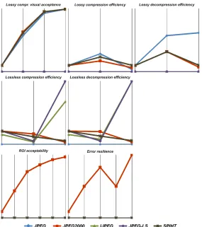
These scenarios were modeled in SICEP by forming seven requirement indicators (vi-sual acceptance of lossy image compression, lossy compression efficiency, lossy decom-pression efficiency, lossless comdecom-pression efficiency, lossless decomdecom-pression efficiency, ac-ceptability of region of interest coding, and error resilience of image compression) which variously combined a total of fourteen dimensions. We provided the ability to visualize this set either on the indicator level (which shows indicators) or the detail level (which shows details of a single indicator either against an arbitrary condition of acceptability or against other compressions being tested). This level also displays the explicit measured values.
for this task, is labeled with the name of its indicator and the number of vertical axes rep-resent the specific measurements which are a part of this indicator. To give an example, in the case of the visual acceptance of lossy image compression visible in the top left, it consists of four measurements (corresponding to the four axes), indicating the compres-sion ratio, peak signal-to-noise ratio, structured similarity index, and receiver operating characteristic. These are combined because they are all relevant to the decision to be made regarding this particular indicator. Intelligent grouping made using SICEP is what allows us to manage the number of dimensions used to display the data. This is done by group-ing those axes, whose interactions interest us most, into convenient indicators representgroup-ing specific questions in the decision-making process being supported by this visualization.
Fig. 6 (top row) displays a subset of the data because the use case was modeled dif-ferently in SICEP prioritizing certain factors and ignoring others. Since capabilities are limited in the PACS studied here, lossy compression is the subject of focus.
Similarly to the earlier case, Fig. 6 (middle row) only shows the subset of the data of interest according to the SICEP decision-supporting model. In the case of the local PACS with extensive capabilities, the trade-off favors increased quality over speed and space, and so only lossless factors are relevant.
The way the panel of experts used these visualizations was to be told, briefly, what scenario they were engaged in and what their priorities are. The experts were then allowed to interact with a visualization solution displaying the visualizations illustrated Fig. 6. Also available was a zoomed-in detail level, which focused on only one indicator rather than the overview of all indicators, as well as, if necessary, access to a table display of all values. They could also choose to compare the data to an acceptability threshold (Fig. 7), or simply view the visualization with an overlay containing the data values (Fig. 8).
During the test, the experts never asked for the table display, which the empirical tests indicated would happen, and mostly focused on the indicator display, sorting their options and identifying candidates to reject out of hand or to consider further. Only once was a detail unclear and one of the panel experts, the domain expert in medical information sys-tems, asked for a zoomed-in detail level in the case of lossless compression efficiency to confirm a suspicion. This corresponds to the criteria derived from the survey of literature and is precisely why 2D parallel coordinates were included in the empirical tests.
In all three cases, the panel reached the ’correct’ (industry consensus) choice, serving to strengthen the conclusion reached in the empirical and statistical testing phase. In the first scenario, the choice of JPEG2000 was instant which made sense given how over-constrained the problem was. In the other two, the selection took a while, but the correct response was always found and, afterwards, was held with considerable confidence.
Fig. 7.Comparison of an individual compression technique with a specified threshold of acceptability visualized using 2D parallel coordinates according to the tests performed, demonstrating the end result of the visualization evaluation process
5.
Conclusion
Based on our research we can claim with considerable confidence that:
– The use of visualization as a primary component in this sort of decision support sys-tem is justified.
– Out of the considered visualization techniques, the most accurate and the one that requires the least time to produce a result in the considered context of medical im-age compression is 2D parallel coordinates, followed by a dense star plot. No other visualization technique compares in the examined use-case.
– The choice of visualization techniques in the reviewed literature is nowhere close to optimal.
– Out of the considered visualization techniques, the best choice for the design of the VisSys module is 2D parallel coordinates.
A question that immediately comes to mind is how applicable is this research outside the relatively niche, if not unimportant, field of PACS design. It is our position that essen-tially all the results presented herein are entirely applicable to any field which faces a prob-lem of using multidimensional data sets to make choices between complexly-described alternatives. Complexly-described alternatives, in this context, mean any entity that
– is described by a large number of attributes, where large is defined by significantly exceeding the capacity of short-term memory [32],
– possesses some sort of structure including those attributes,
– has this structure, in aggregate, measure some sort of desirability of the entity pre-senting tradeoffs and varying requirements.
So describeddesiderataof complexly-described alternatives must be compared and a decision must be reached selecting one of the proposed alternatives based on the relative values of attributes and arbitrary minimum requirements over those attributes.
Described abstractly it may seem like an unlikely contingency, but, in fact, any pur-chasing decision one might agonize over is an example of using multidimensional data sets to make choices between complexly-described alternatives: the desirability of a house (corresponding to the quality of a compression technique) depends on a number of at-tributes (area, price, availability of schools, facilities, and many others a moment’s re-flection ought to furnish) which are both used to compare and to disqualify (such as a maximum price or minimum area). This problem is complex enough that it is studied through successive hierarchical decomposition [45]. The same could be said for the case of selecting one of several proposals for public works. This is by no means a problem limited to PACS design and we were cognizant of this fact when preparing the tests for the study.
Another area of research that presents itself is considering extremely large numbers of dimensions. Since we have determined star plots and 2D parallel coordinates as the best candidates, we should test how they behave in extreme-impact tests where the dimension-ality exceeds 100. In the same vein, a potentially fruitful area of research would be to re-run these tests or, perhaps, only stage 3 tests, using multiple sources of data in order to determine if the same results hold for different data sets or if some feature of the data, even if anonymized, influences the choice of suitable visualization technique.
Lastly, as the body of data gathered in these tests grows and this implementation of visualization testing is refined and validated, it can find a new use by being used ’back-ward’ as it were: this methodology of gauging visualization quality can, if the quality of the visualization is known, be used to evaluate perception. Thus, it would provide a way to quantify the impact of visual perception disorders and disabilities by running tests, much like the ones presented in this paper, using known-quantity visualization methods alongside simulated disabilities and disorders of perception.
Acknowledgments.The research reported in this paper is partially supported by the Ministry of Education, Science, and Technological Development of the Republic of Serbia, projects number TR32044 ”The Development of Software Tools for Business Process Analysis and Improvement” (2011-2018) and III44006 ”Development of New Information and Communication Technologies using Advanced Mathematical Methods with Applications in Medicine, Energy, e-Government, and Protection of National Heritage” (2011-2018).
References
1. Agresti, A., Kateri, M.: Categorical data analysis. Springer (2011)
2. Antonelli, J., Trippa, L., Haneuse, S., others: Mitigating Bias in Generalized Linear Mixed Models: The Case for Bayesian Nonparametrics. Statistical Science 31(1), 80–95 (2016) 3. Bates, D., Mchler, M., Bolker, B., Walker, S.: Fitting Linear Mixed-Effects Models Using lme4.
Journal of Statistical Software 67(1), 1–48 (2015)
4. Bellon, E., Feron, M., Deprez, T., Reynders, R., Van den Bosch, B.: Trends in PACS architec-ture. European Journal of Radiology 78(2), 199–204 (2011)
5. Bharti, P., Gupta, S., Bhatia, R.: Comparative analysis of image compression techniques: a case study on medical images. In: Advances in Recent Technologies in Communication and Computing, 2009. ARTCom’09. International Conference on. pp. 820–822. IEEE (2009) 6. Bruckner, L.A.: On Chernoff faces. Graphical Representation of Multivariate Data pp. 93–121
(1978)
7. Carpendale, M.: Considering visual variables as a basis for information visualisation. Computer Science TR# 2001-693 16 (2003)
8. Carpendale, S.: Evaluating information visualizations. In: Information Visualization, pp. 19– 45. Springer (2008)
9. Cawthon, N., Moere, A.V.: The effect of aesthetic on the usability of data visualization. In: Information Visualization, 2007. IV’07. 11th International Conference. pp. 637–648. IEEE (2007)
10. Chen, C.P., Zhang, C.Y.: Data-intensive applications, challenges, techniques and technologies: A survey on big data 275, 314–347 (2014)
12. Cooprider, N.D., Burton, R.P.: Extension of star coordinates into three dimensions. In: Elec-tronic Imaging 2007. pp. 64950Q–64950Q. International Society for Optics and Photonics (2007)
13. Dhouib, D., Nat-Ali, A., Olivier, C., Naceur, M.: Performance evaluation of wavelet based coders on brain MRI volumetric medical datasets for storage and wireless transmission. Inter-national Journal of Biological, Biomedical and Medical Sciences 3(3), 147–156 (2008) 14. Dragan, D., Iveti´c, D.: Quality evaluation of medical image compression: What to measure?
In: IEEE 8th International Symposium on Intelligent Systems and Informatics (2010) 15. Dragan, D., Iveti´c, D.: A comprehensive quality evaluation system for PACS. In:
Ubiq-uitous Computing and Communication Journal, Special Issue on ICIT 2009 Conference-Bioinformatics and Image. vol. 4, pp. 642–650 (2009)
16. Dragan, D., Iveti´c, D.: Request redirection paradigm in medical image archive implementation. Computer Methods and Programs in Biomedicine 107(2), 111–121 (2012)
17. Dragan, D., Iveti´c, D., Petrovi´c, V.B.: Introducing an acceptability metric for image compres-sion in PACS-A model. In: E-Health and Bioengineering Conference (EHB), 2013. pp. 1–4. IEEE (2013)
18. Dragan, D., Petrovi´c, V.B., Iveti´c, D.: Software Tool for 2D and 3D Visualization of Require-ment Indicators in Compression Evaluation for PACS. Proceedings of the 4th Inetrnational Scientific Conference on Geometry and Graphics, MoNGeometrija Vol. 1 p. 315 (2014) 19. Dreyer, K.J., Hirschorn, D.S., Thrall, J.H., Mehta, A.: PACS: A Guide to the Digital Revolution.
Springer Science and Business Media (2006)
20. Engelke, U., Vuong, J., Heinrich, J.: Visual Performance in Multidimensional Data Character-isation with Scatterplots and Parallel Coordinates. Electronic Imaging 2016(16), 1–6 (2016) 21. Eskicioglu, A.M.: Quality measurement for monochrome compressed images in the past 25
years. In: Acoustics, Speech, and Signal Processing, 2000. ICASSP’00. Proceedings. 2000 IEEE International Conference on. vol. 6, pp. 1907–1910. IEEE (2000)
22. Forsell, C., Johansson, J.: Task-based evaluation of multirelational 3D and standard 2D par-allel coordinates. In: Electronic Imaging 2007. pp. 64950C–64950C. International Society for Optics and Photonics (2007)
23. Forsell, C., Seipel, S., Lind, M.: Simple 3D glyphs for spatial multivariate data. In: IEEE Sym-posium on Information Visualization, 2005. INFOVIS 2005. pp. 119–124. IEEE (2005) 24. Freitas, C.M., Luzzardi, P.R., Cava, R.A., Winckler, M., Pimenta, M.S., Nedel, L.P.: On
eval-uating information visualization techniques. In: Proceedings of the Working Conference on Advanced Visual Interfaces. pp. 373–374. ACM (2002)
25. Garlandini, S., Fabrikant, S.I.: Evaluating the effectiveness and efficiency of visual variables for geographic information visualization. In: Spatial information theory, pp. 195–211. Springer (2009)
26. Gupta, M., Henry, J.K., Schwab, F., Klineberg, E., Smith, J., Gum, J., Polly, D.W., Liabaud, B., Diebo, B., Hamilton, D.K., others: Dedicated Spine Measurement Software Quantifies Key Spino-Pelvic Parameters More Reliably Than Traditional PACS. Global Spine Journal 6(S 01), GO082 (2016)
27. Inselberg, A.: Parallel coordinates: visualization, exploration and classification of high-dimensional data. In: Handbook of Data Visualization, pp. 643–680. Springer (2008)
28. Isenberg, T., Isenberg, P., Chen, J., Sedlmair, M., Mller, T.: A systematic review on the prac-tice of evaluating visualization. IEEE Transactions on Visualization and Computer Graphics 19(12), 2818–2827 (2013)
29. Iveti´c, D., Dragan, D.: Medical image on the go! Journal of Medical Systems 35(4), 499–516 (2011)
31. John, N.W., McCloy, R.F.: Navigating and visualizing three-dimensional data sets. The British Journal of Radiology 77(suppl 2), S108–S113 (Dec 2004), http://www.birpublications.org/doi/abs/10.1259/bjr/45222871
32. Jonides, J., Lewis, R.L., Nee, D.E., Lustig, C.A., Berman, M.G., Moore, K.S.: The mind and brain of short-term memory. Annual Review of Psychology 59, 193 (2008)
33. Kbben, B., Yaman, M.: Evaluating dynamic visual variables. In: Proceedings of the Seminar on Teaching Animated Cartography, Madrid, Spain. pp. 45–51 (1995)
34. Keim, D.A., Kriegel, H.P.: Visualization techniques for mining large databases: A comparison. IEEE Transactions on Knowledge & Data Engineering (6), 923–938 (1996)
35. Kosheleva, O.M., Cabrera, S.D.: Application of task-specific metrics in JPEG2000 ROI com-pression. In: Image Analysis and Interpretation, 2002. Proceedings. Fifth IEEE Southwest Symposium on. pp. 163–167. IEEE (2002)
36. Kumar, B., Singh, S.P., Mohan, A., Singh, H.V.: MOS prediction of SPIHT medical images using objective quality parameters. In: 2009 International Conference on Signal Processing Systems. pp. 219–223. IEEE (2009)
37. Lam, H., Bertini, E., Isenberg, P., Plaisant, C., Carpendale, S.: Empirical studies in information visualization: Seven scenarios. IEEE Transactions on Visualization and Computer Graphics 18(9), 1520–1536 (2012)
38. Leban, G., Bratko, I., Petrovic, U., Curk, T., Zupan, B.: Vizrank: finding informative data pro-jections in functional genomics by machine learning. Bioinformatics 21(3), 413–414 (2004) 39. Mair, P., Schoenbrodt, F., Wilcox, R.: WRS2: Wilcox robust estimation and testing (2015),
0.4-0
40. Man, H., Docef, A., Kossentini, F.: Performance analysis of the JPEG 2000 image coding standard. Multimedia Tools and Applications 26(1), 27–57 (2005)
41. McNeish, D.M.: Using Data-Dependent Priors to Mitigate Small Sample Bias in Latent Growth Models: A Discussion and Illustration Using M plus. Journal of Educational and Behavioral Statistics 41(1), 27–56 (2016)
42. Morris, C.J., Ebert, D.S., Rheingans, P.L.: Experimental analysis of the effectiveness of fea-tures in Chernoff faces. In: 28th AIPR Workshop: 3D Visualization for Data Exploration and Decision Making. pp. 12–17. International Society for Optics and Photonics (2000)
43. Penedo, M., Souto, M., Tahoces, P., Carreira, J., Villalon, J., Porto, G., Seoane, C., Vidal, J., Berbaum, K., Chakraborty, D., others: FROC evaluation of JPEG2000 and object-based SPIHT lossy compression on digitized mammograms. Radiology 237(2), 450–457 (2005)
44. Pillat, R.M., Valiati, E.R., Freitas, C.M.: Experimental study on evaluation of multidimensional information visualization techniques. In: Proceedings of the 2005 Latin American conference on Human-computer interaction. pp. 20–30. ACM (2005)
45. Saaty, T.L.: Decision-making with the AHP: Why is the principal eigenvector necessary. Euro-pean Journal of Operational Research 145(1), 85–91 (2003)
46. Santa-Cruz, D., Grosbois, R., Ebrahimi, T.: JPEG 2000 performance evaluation and assessment. Signal Processing: Image Communication 17(1), 113–130 (2002)
47. Speier, C.: The influence of information presentation formats on complex task decision-making performance. International Journal of Human-Computer Studies 64(11), 1115–1131 (2006) 48. Tufte, E.R., Graves-Morris, P.: The visual display of quantitative information, vol. 2. Graphics
Press Cheshire, CT (1983)
49. Union, I.T.: World Telecommunication/ICT Indicators Database 17th edition. Tech. rep. (2013) 50. Wang, J., Liu, X., Shen, H.W., Lin, G.: Multi-resolution climate ensemble parameter analy-sis with nested parallel coordinates plots. IEEE Transactions on Visualization and Computer Graphics 23(1), 81–90 (2017)
53. Zhao, X., Kaufman, A.: Structure revealing techniques based on parallel coordinates plot. The Visual Computer 28(6-8), 541–551 (2012)
54. Zheng, J.G.: Data visualization in business intelligence. In: Global Business Intelligence, pp. 67–81. Routledge (2017)
Dinu Dragan was born in 1979 in Zrenjanin. He is an Assistant Professor at the De-partment of Computing and Control Engineering of the Faculty of Technical Sciences, University of Novi Sad, Serbia. He received his Dipl. Ing. degree in Electrical Engineer-ing and ComputEngineer-ing in 2003, and the MSc and PhD in Computer Science from the Faculty Technical Sciences, University of Novi Sad, Serbia, in 2008 and 2013, respectively. His research interests include data compression, computer graphics, human computer interac-tion, data visualizainterac-tion, and computer vision.
Veljko B. Petrovi´cwas born in 1986 in ˇCaˇcak. He completed his studies at the Faculty of Technical Sciences in 2010 and holds BSc and MSc degrees in Computer and Elec-trical Engineering. He is currently in the final stages of defending his doctoral thesis at the same institution under the title ”Domain specific language for visualization evaluated by the statistical analysis of small data sets.” His research fields include visualization, humancomputer interaction, and large-scale high-performance computing.
Duˇsan B. Gaji´cis an Assistant Professor at the Department of Computing and Control Engineering of the Faculty of Technical Sciences, University of Novi Sad, Serbia. He re-ceived his MSc and PhD in Electrical Engineering and Computing from the Faculty of Electronic Engineering, University of Niˇs, Serbia, in 2009 and 2014, respectively. His research interests include parallel and distributed computing, blockchain, GPGPU, algo-rithm design, signal processing, and computer vision.
ˇ
Zarko ˇZivanovwas born in 1974 in Zrenjanin. He is an Associate Professor at the De-partment of Computing and Control Engineering of the Faculty of Technical Sciences, University of Novi Sad, Serbia. He received his Dipl. Ing. degree in Electrical Engineer-ing and ComputEngineer-ing in 2000, and the MSc and PhD in Computer Science from the Faculty Technical Sciences, University of Novi Sad, Serbia, in 2007 and 2012, respectively. His research interests include computer architecture, operating systems, parallel programming and data visualization.
Dragan Iveti´cwas born in Subotica and received the Dipl. Ing. degree in Electrical En-gineering in 1990, and the M.Sc. and Sc.D. degrees in computer science, in 1994 and 1999 respectively, from the Faculty of Technical Science, University of Novi Sad. Since 2000 he has been Professor of Computer Science at the Department for Computing and Automatics, Faculty of Technical Sciences, University of Novi Sad. His research inter-ests include HCI, multimedia, and computer graphics. Profesor Iveti´c received DAAD scholarship in 1997 and ACM scholarship in 1998.

![Fig. 2. Parallel coordinates: 2D (on the left) and 3D (on the right) in modified form as extendedClustered Multi-Relational Parallel Coordinates, image from [18]](https://thumb-us.123doks.com/thumbv2/123dok_us/1166007.1619034/5.612.195.428.305.401/parallel-coordinates-modied-extendedclustered-multi-relational-parallel-coordinates.webp)