Business Intelligence, Analytics And Data
Visualization: A Heat Map Project Tutorial
Pamela A. Dupin-Bryant, Utah State University, USA David H. Olsen, Utah State University, USA
ABSTRACT
Business intelligence and analytics (BI&A) initiatives are helping countless organizations harness and interpret the vast amount of information available in the world today. The explosion of BI&A in industry has fueled the high demand for knowledge workers with advanced analytical skills. The purpose of this paper is to introduce a data visualization project tutorial for Information Systems (IS) education. The applied BI&A tutorial was designed to help students learn how to create and analyze a heat map using SQL Server Data Tools (SSDT) and SQL Server Reporting Services (SSRS). Students learn how to make decisions based on large amounts of data by presenting it in visual form. This tutorial exposes students to the decision-making power derived from data visualization. Utilizing the 5E Instructional Model, the tutorial assists in the development of BI&A professionals who can quickly make sense of mass amounts of data, identify trends buried within data sets, and are skilled in making sound decisions that add value to organizations.
Keywords: Data Visualization; Business Intelligence and Analytics BI&A; Databases; Heat Maps; Decision Support Systems; 5E Instructional Model; SQL Server; Teaching/Learning Methods
INTRODUCTION
usiness intelligence and analytics (BI&A) describes the technologies, systems, practices, methodologies, and applications used to analyze large amounts of diverse business data to help organizations make sound and timely business decisions (Chaudhuri, Dayal, & Narasayya, 2011; Chen, Chiang, & Storey, 2010; Chen, Chiang, & Storey, 2012). A variety of BI&A tools exist to transform raw data into valuable information that can be used at all levels of organizations to help make business decisions. These Decision Support Systems (DSS) use computer power and analytical algorithms to convert immeasurable amounts of raw data into meaningful information to support enterprise-wide decision-making (Chaudhuri et al., 2011; Chen, et al., 2010; Williams, 2011). Visual Business Intelligence or simply ‘Data Visualization’ helps users quickly make sense of mass data by presenting it in visual form (Baltzan, 2014; Iliinsky & Steele, 2011; Rodeh, Helman, & Chambliss, 2013).
Data Visualization technologies help individuals ‘see’ data and transform large quantitative data sets into useful information with countless organizations depending heavily on these tools for decision support and business intelligence (Baltzan, 2014; Alazmi & Alazmi, 2012). Data visualization helps individuals “make sense of the ever-increasing stream of information with which we’re bombarded and provides a creative antidote to the analysis paralysis that can result from the burden of processing such a large volume of information” (Baltzan, 2014, p. 242). Heat maps are data visualization tools that use color to represent individual values in a data matrix (Iliinsky & Steele, 2011; Nandeshwar, 2013; Rodeh, et al., 2013; Wilkinson & Friendly, 2009). The representation of values as colors makes it easier for analysts to detect patterns in data (Nandeshwar, 2013). Color is used in heat maps to indicate areas of large changes, out-of-range values, or other interesting characteristics (Iliinsky & Steele, 2011; Wilkinson & Friendly, 2009). Data visualization tools such as heat maps help present data sets in visual form, test hypotheses, and emphasize trends that may otherwise be buried within data sets (Alazmi & Alazmi, 2012).
specialists abound these days” (Chen et al., 2012, p. 1182). Yet, the supply of talented workers in this area appears low. Studies suggest an imminent shortage of analytical talent (Manyika et al., 2011; Russom, 2011). Recent studies have highlighted the importance of training a new generation of students in BI&A skills (Chen et al., 2012; Chiang et al., 2012). “The landscape of BI in research and industry is vibrant today” (Chaudhuri et al., 2011, p. 98) and the enthusiasm to employ BI&A tools should be apparent in the education of business professionals. Business schools must alter what they teach in order to prepare qualified graduates in the area of business intelligence and analytics (Chiang et al., 2012; Connolly, 2012; Conway & Vasseur, 2009; Sircar, 2009; Wixom et al., 2011).
Faculty should seek to employ innovative ways to integrate rigorous and relevant BI&A learning objectives into university Information Systems (IS) courses. A key to success for learning BI&A is to integrate the concept of ‘learning by doing’ such as hands-on projects and trial-and-error experimentation (Chen et al., 2012). Wixom and colleagues (2011) recommend providing opportunities for students to solve meaningful problems framed in current business contexts and to “find ways to share teaching materials” (p. 308).
The purpose of this paper is to share a data visualization project tutorial for Information Systems education. The applied BI&A tutorial was designed to help students learn how to create a heat map using SQL Server Data Tools and SQL Server Reporting Services to analyze data. The project tutorial is grounded in current BI&A, database, data visualization, and business literature. Students learn how to make decisions based on large amounts of data by presenting it in visual form. This tutorial exposes students to the decision-making power derived from data visualization. Utilizing the 5E Instructional Model (a well-respected learning model), this tutorial assists in the development of BI&A professionals who can quickly make sense of mass amounts of data, identify trends buried within data sets, and are skilled in making sound decisions that add value to organizations.
Four objectives provide a structure for this paper: 1) highlight relevant literature pertaining to BI&A and data visualization in both business and educational environments, 2) outline the methods and educational model employed, 3) describe the steps involved in the BI&A data visualization project tutorial, and 4) provide concluding remarks and suggestions for future research and practice. This paper seeks to demonstrate the importance of integrating BI&A and data visualization learning objectives into university business curricula. The project tutorial identified in this paper should prove helpful to information systems educators who seek to provide a rigorous, practical, and relevant data visualization experience in their courses.
LITERATURE REVIEW
Business intelligence and analytics (BI&A) “is often referred to as the techniques, technologies, systems, practices, methodologies, and applications that analyze critical business data to help an enterprise better understand its business and market and make timely business decisions” (Chen et al., 2012, p. 1166). Business intelligence (BI) has been used as “an umbrella term to describe concepts and methods to improve business decision-making by using fact-based support systems” including underlying tools, architectures, applications, databases, and methodologies (Chen et al., 2010, p. 201). Analytics is a component of BI that provides techniques for data analysis used to deliver value from decision support data (Wixom et al., 2011). Consistent with current practice, the terms business analytics (BA) and business intelligence are often used interchangeably or as a unified term (Chen et al., 2012; Sircar, 2009; Wixom et al., 2011); BI being the preferred term used by information technology professionals and BA more often used by the broader business community (Sircar, 2009). This paper employs the overarching term business intelligence and analytics (BI&A), to describe objectives that provide business professionals the ability to easily access, interact with, manipulate, and transform large amounts of diverse data (Chen et al., 2010; Chen et al., 2012).
of databases in both size and complexity. Developed from the statistical, probabilistic and data representation fields to make sense of large quantitative data sets found in databases” (Alazmi & Alazmi, 2012, p. 297). Data Visualization technologies help individuals visualize data in order to transform information into a business perspective (Baltzan, 2014). Many organizations depend heavily on these tools for decision support and business intelligence (Alazmi & Alazmi, 2012).
Heat maps are data visualization tools that use color to represent individual values in a data matrix (Iliinsky & Steele, 2011; Nandeshwar, 2013; Rodeh et al., 2013; Wilkinson & Friendly, 2009). Heat maps are “two-dimensional area graphs that use color or brightness to indicate values (or changes in value) of large data sets” (Iliinsky & Steele, 2011, p. 56). Color is used in heat maps to indicate areas of large changes, out-of-range values, or other interesting characteristics (Iliinsky & Steele, 2011). Wilkinson and Friendly (2009) suggest “the heart of the heat map is a color-shaded matrix display” (p. 179). The representation of values as colors makes it easier for a reader to detect patterns in data (Nandeshwar, 2013). Data visualization tools such as heat maps help present data sets in visual form, test hypotheses, and emphasize trends that may otherwise be buried within data sets (Alazmi & Alazmi, 2012).
BI&A has shown massive growth in recent years and advancements in this area are projected to continue well into the future (Chaudhuri et al., 2011; Manyika et al., 2011; Russom, 2011). The vast amount of information available to companies needs to be harnessed and interpreted - “through BI initiatives, businesses are gaining insights from the growing volumes of transaction, product, inventory, customer, competitor, and industry data generated by enterprise-wide applications” (Chen et al., 2010, p. 201). The highly competitive nature of the business world has prompted countless organizations to employ BI&A. “The opportunities associated with data and data analysis in different organizations have helped generate significant interest in BI&A” (Chen et al., 2012, p. 1166). Organizations from a wide range of industries have reported improvement to business processes and decision-making by implementing BI&A technologies (Chaudhuri et al., 2011; Turban et al., 2011). Chen and colleagues (2012) note “business intelligence and analytics (BI&A) and the related field of big data analytics has become increasingly important in both the academic and the business communities over the past two decades” (p. 1165).
The explosion of BI&A in industry has fueled the high demand for knowledge workers with advanced analytical skills. “BI&A is data science in business. Job postings seeking data scientists and business analytics specialists abound these days” (Chen et al., 2012, p. 1182). Yet, the supply of talented workers in this area appears low. Studies suggest an imminent shortage of analytical talent (Manyika et al., 2011; Russom, 2011). Research by the McKinsey Global Institute forecasts a 50 to 60 percent gap between the supply and demand of people with deep expertise in data analysis, equaling 140,000 to 190,000 unfilled positions by 2018 (Manyika et al., 2011). Furthermore, in the United States alone a projected 1.5 million managers and analysts will lack the requisite skills to understand and make decisions based on the analysis of vast amounts of data (Manyika et al., 2011).
Incorporating BI&A into university business programs has not kept pace with growing market demands (Connolly, 2012; Sircar, 2009; Wixom et al., 2011). Connolly (2012) suggests “BI is about quickly making sense of the vast amounts of data collected about all dimensions of a business, and then making sound decisions that will generate value for the company. For business schools, it’s also a big opportunity, one that is, by and large, being missed” (para. 1). A recent BI Congress and companion surveys were conducted to evaluate the state of BI in academia (Wixom et al., 2011). Results suggest “business intelligence is in high demand in industry and that aspects of BI are being taught in many business schools…the results also show a mismatch at both the undergraduate and graduate levels between what our students learn and what our students need to know” (Wixom et al., 2011, p. 308).
who are BI&A employment ready (Wixom et al., 2011). “The landscape of BI in research and industry is vibrant today” (Chaudhuri et al., 2011, p. 98) and the enthusiasm to employ BI&A tools should be apparent in the education of business professionals. Business schools must alter what they teach in order to prepare qualified graduates in the area of business intelligence and analytics (Chiang et al., 2012; Connolly, 2012; Conway & Vasseur, 2009; Sircar, 2009; Wixom et al., 2011).
Given the ever increasing emphasis on BI&A in most organizations, successful IS graduates must be able to understand and apply BI&A principles. Sircar (2009) argues one reason BI has been overlooked in the business curriculum is the continuing trend of faculty to focus on rigor at the expense of practical relevance. Business faculty should seek to break this trend and find creative methods to integrate rigorous and relevant BI&A learning objectives into university business courses. A key to success for learning BI&A is to integrate the concept of ‘learning by doing’ such as hands-on projects and trial-and-error experimentation (Chen et al., 2012). Students would benefit more if teachers could demonstrate SQL material then allow students to practice by themselves (Piyayodilokchai et al., 2013). Wixom and colleagues (2011) recommend providing opportunities for students to solve meaningful problems framed in current business contexts and that instructors should find avenues for sharing their teaching materials.
METHODS
The BI&A project tutorial outlined in this paper was designed to expose students to the decision-making power derived from data visualization. This applied tutorial was designed as a stand-alone activity that can be employed in any university database course to help students apply the business intelligence and analytics tools offered in the Microsoft SQL Server Development Environment. Microsoft offers various products that enable business intelligence and data visualization solutions including creating, storing, processing, and querying business data, along with reporting and data visualization. This tutorial helps students learn how to create and analyze a heat map using SQL Server Data Tools and SQL Server Reporting Services. Students learn how to make decisions based on large amounts of data by presenting it in visual form. This tutorial exposes students to the decision-making power derived from data visualization.
The tutorial utilizes stock market trading data available on the web to allow students to determine whether or not a given stock should be bought or sold. Indeed, some students wrote Python scripts to “scrape” data from the web which automates the data gathering process. The project tutorial utilizes a 35-day moving average, but any moving average of reasonable length could be used. The exact data set used in this tutorial may not be readily available; however, any comparable data may be substituted into the framework provided to ensure students are introduced to fundamentals of data visualization and raw data analysis.
The data visualization project tutorial was designed to be taught over a two week period (i.e., two 75-minute class sessions) but could easily be adapted to shorter or longer time periods. Students will ideally have prior knowledge of conventional database principles and a strong SQL understanding. This project tutorial has been tested and successfully applied in various upper division university database courses. However, information systems educators should modify and apply this project tutorial based on the needs of their students, their individual teaching preferences, and the course learning objectives.
The 5E Instructional Model was employed as the framework for this BI&A project. The 5E Instructional Model is a highly respected, learning and teaching model based on the ideas of educational theorists Herbart, Dewey, and Piaget. The model is based on a constructivist approach to learning in which people ‘construct’ knowledge and meaning through experience; the 5E Instructional Model also incorporates aspects of behaviorist and cognitivist learning theories (Bybee et al., 2006; Bybee, 2009; Jobrack, 2011).
study, students significantly outperformed peers on understanding “key aspects and concepts in SQL, especially regarding basic knowledge of SQL and ability to apply SQL” (Piyayodilokchai et al., 2013, p. 156). Studies in a variety of scientific disciplines show positive trends for student mastery of subject matter and interest when employing the 5E model (Bybee et al., 2006).
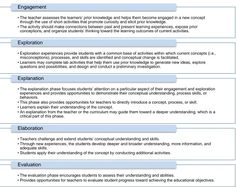
The phases of the 5E Instructional Model include: (E1) engagement, (E2) exploration, (E3) explanation, (E4) elaboration, and (E5) evaluation (Bybee et al., 2006; Bybee, 2009). Each of the distinct phases are supported by research and have been widely applied in diverse educational settings (Bybee et al., 2006; Bybee, 2009; Jabrock, 2011). Figure 1 summarizes each phase in the 5E Instructional Model (Bybee, 2009, p. 5).
Figure 1: Phases of the 5E Instructional Model
The 5E Instructional Model is “grounded in sound educational theory, has a growing base of research to support its effectiveness, and has had a significant impact on science education” (Bybee et al., 2006, p. 41). The instructional flow of this BI&A project tutorial follows the 5E Instructional Model. The alignment of the data visualization project tutorial with the 5E Instructional Model provides an educational environment in which students can thrive.
PROJECT TUTORIAL
Following the 5E Instructional Model, this BI&A project tutorial design includes sound educational methods and activities for each distinct phase (i.e., Engagement, Exploration, Explanation, Elaboration, and
• The teacher assesses the learners’ prior knowledge and helps them become engaged in a new concept through the use of short activities that promote curiosity and elicit prior knowledge.
• The activity should make connections between past and present learning experiences, expose prior conceptions, and organize students’ thinking toward the learning outcomes of current activities.
Engagement
• Exploration experiences provide students with a common base of activities within which current concepts (i.e., misconceptions), processes, and skills are identified and conceptual change is facilitated.
• Learners may complete lab activities that help them use prior knowledge to generate new ideas, explore questions and possibilities, and design and conduct a preliminary investigation.
Exploration
• The explanation phase focuses students’ attention on a particular aspect of their engagement and exploration experiences and provides opportunities to demonstrate their conceptual understanding, process skills, or behaviors.
• This phase also provides opportunities for teachers to directly introduce a concept, process, or skill. • Learners explain their understanding of the concept.
• An explanation from the teacher or the curriculum may guide them toward a deeper understanding, which is a critical part of this phase.
Explanation
• Teachers challenge and extend students’ conceptual understanding and skills.
• Through new experiences, the students develop deeper and broader understanding, more information, and adequate skills.
• Students apply their understanding of the concept by conducting additional activities.
Elaboration
• The evaluation phase encourages students to assess their understanding and abilities.
• Provides opportunities for teachers to evaluate student progress toward achieving the educational objectives.
Evaluation). All the components of this project tutorial are instructionally aligned with the learning objectives. The following section outlines each of the phases of instruction employed.
Engagement (E1)
At the beginning of the project tutorial, the instructor should present a variety of data visualization images (including heat maps) to introduce students to this unfamiliar material. Content for this activity can be created in SQL Server, found online, and/or in course textbooks. Current and interesting material related to the topic should be used (as per the instructor’s preference) to engage students.
The instructor should then ask the students to share any ideas for how they could use SQL Server to create a heat map. This discussion encourages student curiosity and helps them make connections with what they already know. Students should be encouraged to suggest a variety of queries and ideas for generating reports which highlight their previous knowledge. During this phase the instructor should also introduce the learning objectives. The learning objectives should be highlighted in an easy to read format (e.g., slide show) and also posted on the course Learning Management System (LMS) for easy retrieval and student access.
Students should be informed of the following objectives:
Integrate basic database component skills (such as designing queries and reports) with analytical tools to create graphical representations of data to provide meaningful analysis using color to help make decisions. Demonstrate effective use of the BI&A tools offered in the Microsoft SQL Server Development
Environment to create a heat map
Analyze and describe the value of heat maps to modern business decision-makers
Figure 2 provides an introduction to the project tutorial along with a description of project data selection and a color primer for data analysis.
Project Introduction and Objectives
This tutorial will guide you through the process of creating a heat map that highlights cells in a table according to their values. A heat map represents values as colors. The data for this project is taken from a historical stock market price listings. Upon completion of this tutorial you should be able to integrate basic database component skills (such as designing queries and reports) and effectively use an analytical tool to create a graphical representation of data to provide meaningful analysis using color to help make decisions.
Data Selection
The data for this project is taken from the StockData table. While stock market data is a useful tool for helping you learn to create the heat map, please note that you can practice integrating skills with a variety of data sets. This heat map will work better if the data values are relatively similar. Extreme values, such as a 0 when all other values are in the thousands or millions, may decrease usefulness of the heat map. Keep this in mind when you decide on your query for the heat map (or just use the sample query identified in the project tutorial).
Hex Colors and Color Formula
This tutorial uses hexadecimal (hex) colors, also known as web colors, to color the table cells. Hex colors range from #000000 (Black) to #FFFFFF (White). Adjusting each pair of characters changes the amount of red, green, or blue in the color. For example, #FF0000 is red. For more information about hex colors, see the following web pages.
http://www.w3schools.com/html/html_colors.asp http://en.wikipedia.org/wiki/Hex_colors
255 is the maximum color value. The formula we will use makes the value a fraction of 255, then subtracts from 255 to make the higher values darker:
Exploration (E2)
The second phase of project tutorial helps students gain experience creating heat maps. During this phase students explore data visualization tools by completing and practicing the following tutorial steps. Students should be given a copy of the steps and associated screen shots. Students should then be asked to perform each of the following steps: 1) create a new project, 2) select a data source, 3) design the query, 4) design the report type, 5) design the matrix, 6) customize the report, 7) customize the properties, and 8) preview the report. Figures 3-8 highlight each of these detailed steps. The steps can be completed all at once or in parts, as per the discretion of the instructor in accordance with the course time frame.
Create a Heat Map
1. Open SQL Server Data Tools (Search for it or select All Programs > Microsoft SQL Server 2012 > SQL Server Data Tools)
Create a New Project
1. Select New Project (or File > New > Project)
2. Select Report Server Project Wizard 3. Change the project name to Heatmap
and pick a file location 4. Click OK, to launch the Report
Wizard
Note: If there is a “Welcome to the Report Wizard screen” press Next
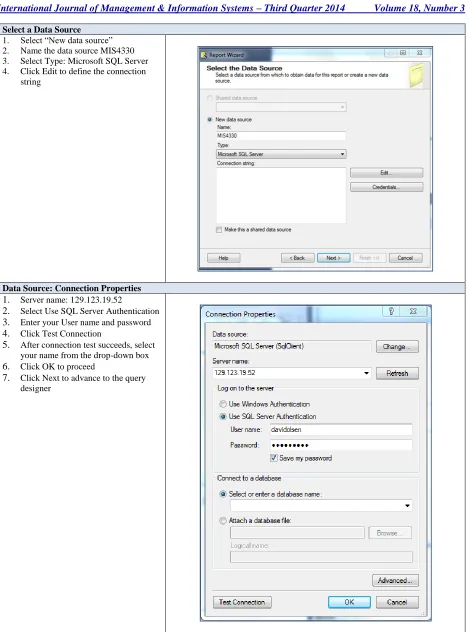
Select a Data Source 1. Select “New data source” 2. Name the data source MIS4330 3. Select Type: Microsoft SQL Server 4. Click Edit to define the connection
string
Data Source: Connection Properties 1. Server name: 129.123.19.52
2. Select Use SQL Server Authentication 3. Enter your User name and password 4. Click Test Connection
5. After connection test succeeds, select your name from the drop-down box 6. Click OK to proceed
7. Click Next to advance to the query designer
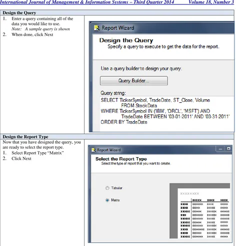
Design the Query
1. Enter a query containing all of the data you would like to use.
Note: A sample query is shown
2. When done, click Next
Design the Report Type
Now that you have designed the query, you are ready to select the report type.
1. Select Report Type “Matrix” 2. Click Next
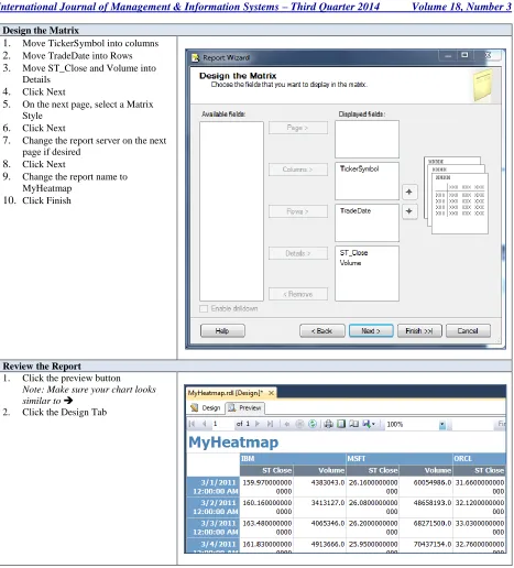
Design the Matrix
1. Move TickerSymbol into columns 2. Move TradeDate into Rows 3. Move ST_Close and Volume into
Details 4. Click Next
5. On the next page, select a Matrix Style
6. Click Next
7. Change the report server on the next page if desired
8. Click Next
9. Change the report name to MyHeatmap
10. Click Finish
Review the Report
1. Click the preview button
Note: Make sure your chart looks
similar to
2. Click the Design Tab
Customize the Report
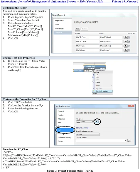
You will now create variables to hold the maximum and minimum values. 1. Click Report > Report Properties 2. Select “Variables” on the left 3. Enter the names/values:
MinST_Close/[Min(ST_Close)] MaxST_Close/[Max(ST_Close)] MaxVolume/[Max(Volume)] MinVolume/[Min(Volume)] 4. Click OK
Change Text Box Properties
1. Right-click on the ST_Close Value [Sum(ST_Close)]
2. Click Text Box Properties (as shown on the right)
Customize the Properties for ST_Close
1. Click “Fill” on the left
2. Click on the function button (Fx) 3. Enter the following function… 4. Click OK
Function for ST_Close ="#FF" +
IIF(Len(Cstr(HEX(Round(255-(Fields!ST_Close.Value-Variables!MinST_Close.Value)/(Variables!MaxST_Close.Value-Variables!MinST_Close.Value)*255,0)))) = 1,"0", "")
+ Cstr(HEX(Round(255-(Fields!ST_Close.Value-Variables!MinST_Close.Value)/(Variables!MaxST_Close.Value-Variables!MinST_Close.Value)*255,0)))
+ "FF"
Customize the Properties for Volume
1. Now select the Text Box Properties for Volume
Note: This is similar to what you did above for ST_Close
2. Select Fill
3. Click on the function button (Fx) 4. Enter the following function…
Notice the use of the formula from the introduction. The “if” statement makes sure that the total hex string will be a # followed by 6 characters. 5. Click OK
Function for Volume ="#FFFF" +
IIF(Len(Cstr(HEX(Round(255-(Fields!Volume.Value-Variables!MinVolume.Value)/(Variables!MaxVolume.Value-Variables!MinVolume.Value)*255,0)))) = 1, "0", "")
+ Cstr(HEX(Round(255-(Fields!Volume.Value-Variables!MinVolume.Value)/(Variables!MaxVolume.Value-Variables!MinVolume.Value)*255,0)))
Figure 7 cont.
Preview the Report
1. Click the Preview tab to see the results
2. Your table should look similar to the attached table
Notice that the higher values are highlighted more than the lower values. Volumes are highlighted a different color than closing prices. 3. Click File > Save All to save your
project
Figure 8: Project Tutorial Steps – Part F
Explanation (E3)
Table 1: Business Intelligence & Analytics Resources
Title Author(s) Year Publisher
Tableau Data Visualization Cookbook Nandeshwar 2013 Packt
Microsoft SQL Server 2012 Reporting Services Larson 2012 McGraw-Hill
Information Visualization Ware 2012 Morgan Kaufmann
The Microsoft Data Warehouse ToolKit Mundy, et al. 2011 Wiley & Sons Designing Data Visualizations Iliinsky & Steele 2011 O’Reilly Media
Students will look at the reports they generated in the exploration phase (see Figure 9) and learn to analyze the data.
During this phase the instructor should emphasize a fundamental point of BI&A, that data should be valuable to companies. In creating a heat map (and other data visualization tools) students are looking for ways to make sense of the data. Upon completion of this phase, students should now be able to explain that a heat map is a color-shaded matrix display that uses colors to represent values (or changes in values) and that heat maps make it easier for individuals to detect patterns in data. They are not simply writing queries or generating reports (albeit necessary component skills to BI&A), students are beginning to look at the data and see the story being told.
Elaboration (E4)
In the elaboration phase, students apply their understanding of data visualization tools and techniques with 2 different data sets. Piyayodilokchai et al., (2013) suggest students would benefit more if SQL teachers could demonstrate material then allow students to practice by themselves. In this elaboration phase, students do just that – they practice creating and analyzing heat maps (both on their own and in a small group setting). Instructors should organize students into small groups (2-3 individuals) to create and analyze a heat map based on a new data set. During this phase students are able to explore, discuss, and ask questions that arise as they explore the material as a group. Students are then asked to create and analyze a heat map on their own.
A recent article in MIS Quarterly, suggests that a key to success for learning BI&A is to integrate the concept of ‘learning by doing’ such as hands-on projects and trial-and-error experimentation (Chen et al., 2012). During this phase of the BI&A project tutorial, students actively participate in the learning process and develop a deeper understanding of data visualization tools and techniques through direct, experiential learning. Students get their hands on the ‘data’ and begin finding creative ways of turning it into valuable ‘information.’
Evaluation (E5)
In the last phase of the project, student understanding and skills should be assessed. While informal evaluation should occur in every phase of the BI&A project tutorial, a more formal assessment of student learning should be conducted during this phase. The 3 heat maps that were created in the project tutorial are evaluated by: (a) the instructor, (b) the student (self-assessment), and (c) a peer. A detailed rubric should be given to the students to help with the assessment process. This triangulated assessment procedure is designed to reinforce student knowledge. Given feedback, each student should be encouraged to make the necessary corrections and resubmit. This phase should help students make adjustments on their progress toward achieving the learning objectives.
CONCLUSION
The importance of big data analytical skills is axiomatic in the contemporary decision-making environment in most organizations. Data driven decision making requires technical as well as domain knowledge. We presented a tutorial here where we combined domain, analytical and presentation components to form a state of the art tutorial so that students can quickly leverage their skills and build their competencies.
AUTHOR INFORMATION
Technology from the University of Wyoming. Her research and scholarly writings have focused primarily on information systems pedagogy, distance education, and business ethics. Her primary teaching activities include web design/development, business applications programming, and principles of MIS. Throughout her career, she has employed a wide variety of delivery methods and educational strategies to facilitate student learning. Dr. Dupin-Bryant has received many awards for her teaching innovations, research, and service. E-mail: [email protected]
David Olsen is the Management Information Systems Department Head at Utah State University. He received his Ph.D. in Management Information Systems from The University of Arizona in 1993 and taught at The University of Akron accounting department in accounting information systems for five years. Dr. Olsen joined the MIS department at Utah State University in 1998 and teaches primarily in the database area as well as the MBA strategy and management course. His research interests include database concurrency control, accounting information systems, the integration of SQL, XML, and XBRL, and database modeling. His research has been published in journals such as Communications of the ACM, Issues in Accounting Education, and the Journal of Database Management. Dr. Olsen is happiest with regards to the teaching awards he has received. E-mail: [email protected] (Corresponding author)
REFERENCES
1. Alazmi, A. R. R., & Alazmi, A. A. R. (2012). Data mining and visualization of large databases. International Journal of Computer Science and Security, 6(5), 295-314.
2. Baltzan, P. (2014). Business driven information systems (4th ed.). New York, NY: McGraw-Hill. 3. Bybee, R. W. (2009). The BSCS 5E instructional model and 21st century skills. The National Academies
Board on Science Education. Retrieved from http://sites.nationalacademies.org/DBASSE/BOSE/ DBASSE_080127
4. Bybee, R., Taylor, J. A., Gardner, A., Van Scotter, P., Carlson, J., Westbrook, A., & Landes, N. (2006). The BSCS 5E instructional model: Origins and effectiveness. Colorado Springs, CO: BSCS.
5. Chaudhuri, S., Dayal, U., & Narasayya, V. (2011). An overview of business intelligence technology. Communications of the ACM, 54(8), 88-98.
6. Chen, H., Chiang, R. H. L., & Storey, V. C. (2010). Business intelligence research. MIS Quarterly, 34(1), 201-203.
7. Chen, H., Chiang, R. H. L., & Storey, V. C. (2012). Business intelligence and analytics: From big data to big impact. MIS Quarterly, 36(4), 1165-1188.
8. Chiang, R. H. L., Goes, P., & Stohr, E. A. (2012). Business intelligence and analytics education and program development: A unique opportunity for the information systems discipline. ACM Transactions on Management Information Systems, 3(3), 1-30.
9. Connolly, D. (2012). Why b-schools should teach business intelligence. Bloomberg Businessweek. Retrieved from http://www.businessweek.com/articles/2012-04-23/why-b-schools-should-teach-business-intelligence
10. Conway, M., & Vasseur, G. (2009). The new imperative for business schools. Business Intelligence Journal, 14(3), 13-17.
11. Goldston, M. J., Dantzler, J., Day, J., & Web, B. (2013). A psychometric approach to the development of a 5E lesson plan scoring instrument for inquiry-based teaching. Journal of Science Teacher Education, 24(3), 527-551.
12. Iliinsky, N., & Steele, J. (2011). Designing data visualizations. Sebastopol, CA: O’Reilly Media. 13. Jobrack, B. (2011). The 5E Instructional Model. Retrieved from https://www.mheonline.com/
secondaryscience/pdf/5e_lesson_cycle.pdf
14. Manyika, J., Chui, M., Brown, B., Bughin, J., Dobbs, R., Roxburgh, C., & Hung Byers, A. (2011). Big data: The next frontier for innovation, competition, and productivity. McKinsey Global Institute: McKinsey and Company. Retrieved from http://www.mckinsey.com/Insights/MGI/Research/Technology_and_ Innovation/Big_data_The_next_frontier_for_innovation
16. Piyayodilokchai, H., Panjaburee, P., Laosinchai, P., Ketpichainarong, W., & Ruenwongsa, P. (2013). A 5E learning cycle approach–based, multimedia-supplemented instructional unit for structured query Language. Educational Technology & Society, 16(4), 146-159.
17. Rodeh, O., Helman, H., & Chambliss, D. (2013). IBM research report: Visualizing block IO workloads. Retrieved from http://domino.watson.ibm.com/library/cyberdig.nsf/papers/9E29FDDED06E5DE785257C1 D005E7E9E/ $File/rj10514.pdf
18. Russom, P. (2011). Big data analytics. TDWI Best Practices Report, 4th Quarter. Retrieved http://tdwi.org/research/2011/09/best-practices-report-q4-big-data-analytics.aspx
19. Sircar, S. (2009). Business intelligence in the business curriculum. Communications of the Association for Information Systems, 24(17), 289-302.
20. Topi, H., Valacich, J., Wright, R., Kaiser, K., Nunamaker, J., Sipior, J., & de Vreede, G. (2010). IS 2010: Curriculum guidelines for undergraduate degree programs in information systems. Communications of the Association for Information Systems, 26(18), 359-428.
21. Turban, E., Sharda, R., & Denlen, D. (2011). Decision support and business intelligence systems (9th ed.). Upper Saddle River, NJ: Pearson Prentice Hall.
22. Wilkinson, L., & Friendly, M. (2009). The history of the cluster heat map. The American Statistician, 63(2), 179-178.
23. Williams, S. (2011). 5 barriers to BI success and how to overcome them. Strategic Finance, 93(1), 27-33. 24. Wixom, B., Ariyachandra, T., Goul, M., Gray, P., Kulkarni, U., & Phillips-Wren, G. (2011). The current
state of business intelligence in academia. Communications of the Association for Information System, 29(16), 299-312.