Wireless Web
Development,
Second Edition
Wireless Web Development, Second Edition Copyright ©2002 by Ray Rischpater
All rights reserved. No part of this work may be reproduced or transmitted in any form or by any means, electronic or mechanical, including photocopying, recording, or by any information storage or retrieval system, without the prior written permission of the copyright owner and the publisher.
ISBN (pbk): 1-59059-028-7
Printed and bound in the United States of America 12345678910
Trademarked names may appear in this book. Rather than use a trademark symbol with every occurrence of a trademarked name, we use the names only in an editorial fashion and to the benefit of the trademark owner, with no intention of infringement of the trademark. Technical Reviewer: Charles Stearns
Editorial Directors: Dan Appleman, Peter Blackburn, Gary Cornell, Jason Gilmore, Simon Hayes, Karen Watterson, John Zukowski
Managing Editor: Grace Wong Project Manager: Sofia Marchant Copy Editor: Kim Wimpsett
Compositor: Impressions Book and Journal Services Indexer: Rebecca Plunkett
Cover Designer: Kurt Krames
Manufacturing Manager: Tom Delboski Marketing Manager: Stephanie Rodriguez
Distributed to the book trade in the United States by Springer-Verlag New York, Inc., 175 Fifth Avenue, New York, NY, 10010 and outside the United States by Springer-Verlag GmbH & Co. KG, Tiergartenstr. 17, 69112 Heidelberg, Germany.
In the United States, phone 1-800-SPRINGER, email [email protected], or visit http://www.springer-ny.com.
Outside the United States, fax +49 6221 345229, email [email protected], or visit http://www.springer.de.
For information on translations, please contact Apress directly at 2560 9th Street, Suite 219, Berkeley, CA 94710. Phone 510-549-5930, fax: 510-549-5939, email [email protected], or visit http://www.apress.com.
The information in this book is distributed on an “as is” basis, without warranty. Although every precaution has been taken in the preparation of this work, neither the author nor Apress shall have any liability to any person or entity with respect to any loss or damage caused or alleged to be caused directly or indirectly by the information contained in this work.
The source code for this book is available to readers at http://www.apress.comin the Downloads section.
C H A P T E R 8
HyperText Markup
Language the Wireless
Way
AS DISCUSSED INCHAPTER4, “The Wireless World Wide Web,” the HyperText Markup Language (HTML) has significant advantages as a medium for wireless access terminals. However, you must approach its use with the constraints of handheld devices in mind. If you are used to developing in HTML for desktop browsers, you will have to start thinking a little differently, making sure you stick to HTML tags appropriate for the wireless world. In this chapter, I first review the different versions of HTML in light of their suitability for use with the wireless Web. I then walk through a tag-by-tag discussion of using HTML in your development of wireless content.
NOTE All of the examples in this chapter were generated using Microsoft Internet Explorer for Pocket PC and Handspring Blazer for the Palm Powered platform. You will see similar results using other Web browsers such as Opera, although there are marginal differences between their rep-resentation of HTML and those shown in this chapter (just as there are differences between browsers on the same computing platform). Of course, you should always test your content on target devices before you make assumptions about its appearance!
Picking a Version of HTML
Most important to consider when beginning to work with HTML for wireless browsers is which version of HTML you will use. When developing content for the World Wide Web, you will usually want to use the most up-to-date version, with all of its features. But if the market for your content is a handheld device,
you cannot be sure the platforms your customers use will support the latest versions of HTML. As a result, you will want to use earlier versions.
This is because of the way in which wireless Web browsing crept up on the marketplace. Many wireless browsers currently in use were written with core code that was years old. Others evolved from prototypes (created for academic research, to satisfy someone’s individual curiosity, or as corporate proof-of-con-cept demonstrations) that later evolved into software products as the demand for portable Web access grew. The humble origins of these browser applications make them incompatible with many of the latest features of HTML.
As long as hardware manufacturers are providing handheld devices with pre-installed browsers, this disparity between wireless browsers and wired ones is likely to continue. Hardware vendors tend to have a significant amount of soft-ware savvy, but few take the time and expense to track the rapid changes in Web standards hammered out by the World Wide Web Consortium (W3C) and indus-try giants. Because hardware sales success is measured by the number of units sold, not by the products’ compliance with W3C standards, there simply is no compelling business reason for them to do so. Smaller software vendors may pro-vide more up-to-date browser applications for these devices, but the reality is that most users will have access only to those installed during manufacturing.
So, what versions of HTML are recommended for wireless content develop-ment? Well, nearly all wireless Web browsers support HTML 2.0, and most support a subset of the features of HTML 3.2. Some support certain features of HTML 4.0, but virtually none meet all of the W3C’s requirements for implement-ing HTML 4.0 in all of its glory. Therefore, it is best to stick with the features you find in HTML 2.0 or, for some markets, HTML 3.2.
Determining exactly which version is appropriate requires knowledge of your user base. Keep in mind the adage Less is often more. If you know which wireless browsers will access your service, a quick look at the specifications provided by the browser vendor will often tell you which HTML version to use. If you are cre-ating a site for general public access, however, you will need to use the lowest common denominator of features between HTML 2.0 and 3.2.
Marking Up the Document Heading
In Chapter 4, “The Wireless World Wide Web,” you learned that HTML documents are divided into two sections, a heading and a body. The heading is an optional segment containing meta information about the document. If included, it is delineated by the tags <HEAD>and </HEAD>. The actual document to be displayed by the browser is then marked with the <BODY> tag.
Table 8-1 lists the HTML 4.0 heading tags of use in developing for wireless browsers; the following sections discuss each one in more detail.
Table 8-1. HTML Tags for Wireless Web Document Headings TAG INTRODUCED IN PURPOSE
TITLE HTML 2.0 Specifies the document’s title, which may appear in a document’s window bar, offline cache, or other location
META* HTML 2.0 Provides meta information not supported by HTML markup commands for the client
BASE* HTML 2.0 Specifies the base URL from which
relative URLs in the body should be derived
*These tags are empty tags and do not have a corresponding closing tag.
Specifying the Document Title
Probably the most common heading tag is <TITLE>,which, obviously enough, specifies the title of the document. Most wireless browsers honor this tag but not necessarily in the way you might expect. For example, browsers on the PalmOS platform show as much of the title as will fit at the top of the display; Microsoft Pocket Internet Explorer shows the title in the task bar rather than in the browser window.
Wireless browsers can use the <TITLE> tag to identify a document in a list of bookmarks, for example, because most browsers provide a default title when a new bookmark is created. The browser derives this title from the document’s <TITLE> tag.
Generally, your documents should include a title that briefly describes its content. Appropriate sample titles include the following:
• HTML 4.0 Specifications • Where to Go in Boulder Creek • Jarod Rischpater’s Home Page Some titles to avoid:
• Home (This is too short—home for what?)
• Sandy’s Stuff (Although this is cute, most readers will not remember Sandy or the stuff on the page, or know what is on the page from the title.) • Rachel and Ray’s Not So Totally Exhaustive Survey of Coffee
Providing Meta Information to a Client
The <META> tag is an empty tag that enables you to establish arbitrary
name/value pairs, called entities, for specific browsers. You can use these tags to specify browser-dependent behavior, such as how and when the client should reload a document, or to assert that a specific document is in fact formatted for a particular device. Table 8-2 outlines common <META>entities in wireless Web publishing and how they are used.
Table 8-2. HTML Meta Values for Wireless Web Document Headings
NAME VALUE PURPOSE
HTTP-EQUIV Varies Specifies HTTP header information (not to be confused with the HTML heading) to browsers in the HTML document, rather than the HTTP headers
PalmComputingPlatform true Indicates that the body of this document is appropriate for Palm Web Clipping applications
HandheldFriendly true Indicates that the body of this document is appropriate for the AvantGo browser
For wireless Web developers, the most important meta entities are those indicating that the document’s content is appropriate for small devices. Two common meta entities that serve this purpose are PalmComputingPlatformand HandheldFriendly. Meta PalmComputingPlatformindicates suitability for Palm’s Web Clipping application platform (see Chapter 9, “Palm-Powered Web Clipping Applications”); and HandheldFriendlyis for the AvantGo browser (see Chapter 14, “Content Delivery). You will find many general-purpose wireless Web pages have the following in their headers:
<META NAME=”HandheldFriendly” CONTENT=”true”> <META NAME=”PalmComputingPlatform” CONTENT=”true”>
Both of these tags let the appropriate browsers know that the document was designed for handheld use (because each browser is different, a different meta tag must be used). In the absence of the tags—or if these values were equal to false—these browsers will assume the content was targeted for desktop devices and might display radically different results. For example, the Palm VII browser discards the end of long pages lacking the PalmComputingPlatformmeta tag—
probably not what you would expect. And, when a browser encounters a meta entity it does not recognize, it ignores the entity entirely.
Another useful <META>entity is HTTP-EQUIV, which replaces a HyperText Transfer Protocol (HTTP) header with the value specified. Content authors use this meta entity when they want to express control over a document’s behavior in ways only specified by the HTTP protocol. For example, you can use HTTP-EQUIV to force the browser to refresh a page periodically or to expire a page in the cache. This ability can be handy for pages serving information that changes often, such as stock quotes or the weather; users generally will want this kind of information to be up to the minute. Not all browsers, however, support HTTP-EQUIV, and some that do only support some uses of it.
A tag such as this one:
<META HTTP-EQUIV=”expires”
CONTENT=”Sun, 31 Dec 2005 11:59:00 GMT”>
instructs the browser that this Web page should be discarded from the cache on New Year’s Eve, 2005.
The following line:
<META HTTP-EQUIV=”Refresh” CONTENT=”300”>
indicates that the Web page should be reloaded every five minutes (300 seconds). Be careful when using the HTTP-EQUIV=Refresh, however, as your content is dic-tating the behavior of your customer’s browser and may be incurring wireless fees subscribers are not aware of as the browser goes off and fetches pages peri-odically. (Incidentally, the content loaded as a result of the refresh must also have this tag, or the refresh will not happen again. This is because the page loaded by the browser is different—the browser does not retain memory of this directive across pages.)
The strength of a<META>tag in ordinary Web development is that it can be used with any name/value pair. But this fact can be a weakness in wireless Web development, as it means a<META>tag can consume a great deal of space. This kind of entity can take precious time to download and occupy space best left for more important material. If your desktop-oriented Web content uses meta tags this way, remove them before posting it for wireless use!
Specifying a Base URL
HTML headings use the <BASE>tag to specify the base Uniform Resource Locator (URL) from which other URLs in a particular document are derived. If your con-tent refers to other concon-tent on the same server, it should always specify a<BASE>
tag and use relative URLs to keep your document body smaller. Consider the dif-ference in the following two versions of the same page:
<HTML> <HEAD>
<BASE HREF=”http://www.colors.org/pCp/index.html”> <TITLE>People Color Picker</TITLE>
</HEAD> <BODY>
<H1 ALIGN=right>People Color Picker</H1>
<P>Choose a color below to learn about people who have that color as their favorite color:</P>
<MENU> <LI><A HREF=”chart.html”>Chartreuse</A></LI> <LI><A HREF=”magen.html”>Magenta</A></LI> <LI><A HREF=”cyan.html”>Cyan</A></LI> </MENU> </BODY> </HTML>
The previous HTML document, which specifies a base URL in the heading, uses 802 bytes. The following page, which does not, occupies 827 bytes:
<HTML> <HEAD>
<TITLE>People Color Picker</TITLE> </HEAD>
<BODY>
<H1 ALIGN=right>People Color Picker</H1>
<P>Choose a color below to learn about people who have that color as their favorite color:</P>
<MENU> <LI><A HREF=”http://www.colors.org/pCp/chart.html”>Chartreuse</A></LI> <LI><A HREF=”http://www.colors.org/pCp/magen.html”>Magenta</A></LI> <LI><A HREF=”http://www.colors.org/pCp/cyan.html”>Cyan</A></LI> </MENU> </BODY> </HTML>
Although this example does not provide a marked increase in performance (the savings is a mere 5 percent or so), savings become dramatic when a page has many links that point to long domain names. With 20 links, for example, the sav-ings will reach nearly 50 percent over all of the links in the document.
There is another reason to use the <BASE>tag, too. Keeping a document’s links as much in one place as possible makes moving Web pages around easier. When www.colors.orgdecides to move its People Color Picker site to a new server, it will only have to edit the <BASE>reference if they use the first example. If it uses the second, it will have to change each link in the entire document.
Avoiding Certain Tags
Although the empty tags <ISINDEX>, <STYLE>, and <LINK>are valid HTML, these tags are not generally supported by wireless browsers. Most wireless browsers should ignore these tags, but including them may cause problems and will always waste space. As virtually no Web browsers on handheld computers sup-port these three features, there is little point in including them in your content. A tag you should consider avoiding unless you know your target well is the <SCRIPT>tag because most devices do not support scripting. A few, notably Windows Powered handhelds, however, can correctly interpret simple JavaScript. Consequently, if your site uses the <SCRIPT>tag, you should plan on either devel-oping a separate version of your content that does not require scripts or checking your client’s headers to avoid sending JavaScript to less capable devices.
Marking Up the Document Body
Most HTML tags mark up the document itself. HTML is a structural markup lan-guage, meaning that its tags specify how a document is structured, not how it is to be rendered. An author specifies the various structural elements of a document (sections, paragraphs, lists, tables, and so on), and each browser uses this infor-mation to determine how best to render the content for its particular display.
Creating a Section Head
You may separate documents into sections and subsections, down to six levels, delineated with the section heading tags <H1>, <H2>, <H3>, <H4>, <H5>, and <H6>. You should always mark section heads with these tags rather than with specific typography (such as bold or italic, which can be created as described under “Specifying a Text Style,” later in this chapter). This leaves client applications free to present them in whatever format works best and even to construct navigation aids, such as a table of contents. (NetHopper, for the now-defunct Apple Newton platform, did this, for example.) Although the order and occurrence of headings is not constrained by the definition of HTML, you should avoid skipping levels
(for example, from <H1>to <H3>), as this can cause problems in some represen-tations.
Some wireless browsers may use the same formatting for several levels of section headings. This can be confusing, but often it is the only option, especially on platforms with a limited number of fonts. Figure 8-1 shows an example of using the same formatting for several heading levels, in Microsoft Internet Explorer/Pocket PC (MSIE/PPC) and in Handspring Blazer. Most can present at least the first level of section heading fairly clearly; many can also define a second level fairly well, at least using the bold face of the standard font. Subsequent lev-els (<H3>through <H6>) are generally not well distinguished from the body text in wireless browsers, however, as you can see in the figure.
Formatting Blocks of Text
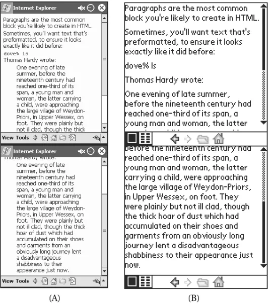
HTML provides three kinds of tags you can use when marking blocks of text. These tags enable you to indicate whether a block of text is a paragraph, prefor-matted text such as a computer listing, or a quotation from another source.
The tags for use with blocks of text are summarized in Table 8-3, and shown in Figure 8-2.
Figure 8-1. Section headings displayed in (A) MSIE/PPC and (B) Handspring Blazer
Table 8-3. HTML Tags for Wireless Web Text Blocks
TAG PURPOSE NOTES
<P> Marks a paragraph
<PRE> Preformatted text Generally set in fixed-width font if one is available
<BLOCKQUOTE> Long quotations May not be differentiated from body or other material text on all browsers
Figure 8-2. Blocks of text displayed in (A) MSIE/PPC and (B) Handspring Blazer
Paragraphs
Within a section, documents are composed of blocks of text. The most common block of text is a paragraph. Paragraphs in HTML correspond to the paragraphs you are reading in this book and are indicated with the <P>tag, like this:
<P>
Within a section, documents are composed of blocks of text. The most common block of text is a <EM>paragraph</EM>; paragraphs in HTML correspond to the paragraphs you are reading in this book.
</P>
Neither the opening nor closing tags need to be on their own line, but put-ting them on their own lines can help to make things more readable.
Prior to HTML 2.0, paragraphs were not marked as blocks with “start para-graph” and “end parapara-graph” tags, but separated with a single <P>tag. However, when the W3C enhanced HTML and developed the standard for HTML 2.0, it was necessary to maintain the begin/end paradigm for the <P>to adhere to the SGML specifications (of which HTML is a subset). Most browsers will support either style, but the start/end style is now seen more frequently, and you should use it for all new pages.
Preformatted Text
Another kind of text block, called a preformatted region, is set in a fixed-width font (like this). Blocks of preformatted text are demarcated with the <PRE>tag. You can use these tags to depict tab-delimited tables or other material in which character spacing is important, such as in the following code listing:
<PRE>
Hi Lo Kona 82 76 </PRE>
However, not all browsers on wireless devices support fixed-width fonts, and because many people find them hard to read, they are generally a poor choice for rendering most kinds of content.
Quotations
The block quote format is used for citing a large body of text. It most often appears when long runs of text are quoted from another source—such as one article quoting another. This format enables readers to differentiate between reg-ular text and quoted text (on desktop browsers, block quotes are often preceded and followed by blank lines, and slightly indented). The tag used to specify a block quote is <BLOCKQUOTE>.
Making a List
Lists make up a significant portion of the content on the wireless Web because they are often more concise than paragraphs. In fact, after summaries, they are your best tool for reducing fluff and getting to the substance of your content. Put as much of your material as you can into lists, as they best reflect how your users are likely to approach your content. Examples of material suitable for list format include the following:
• Directions for navigating
• Steps in any ordered task, such as preparing a recipe or using a software feature
• A series of items of equivalent or related priority, such as the various stocks in a portfolio
HTML offers several ways to create lists, most of which are well supported by the browsers on handheld devices. Each item within a list is marked with the <LI> tag (except definition lists), and the whole list is set off with one of several tags that indicate the type of list, such as bulleted or numbered.
You can nest lists as deeply as you choose, whether they are all of the same kind or of two or more different kinds. (An outline is an example of nested ordered lists.) You can use nested lists to create outlines or to make points in suc-cessively greater detail. The results of nesting lists vary considerably, however. Most desktop browsers set off lists from surrounding paragraphs with inden-tation and set off a list nested within a list by indenting further. Unfortunately, this scheme works poorly on the narrow screens of handheld devices, where repeated indentation quickly uses up valuable screen space, leaving little room for the list items themselves.
Figure 8-3 shows several types of lists rendered as a succession of screens in each browser. Note the readability problems, discussed previously, with both def-inition lists and nested lists.
Figure 8-3. Lists displayed in (A) MSIE/PPC and (B) Handspring Blazer
Table 8-4 summarizes the various list tags available in HTML. You will take a closer look at each one in the sections to follow.
Table 8-4. HTML Tags for Wireless Web Lists
TAG PURPOSE NOTES
<UL> Unordered list
<OL> Ordered list Elements are numbered or lettered in sequence.
<DIR> Directory list Not often used.
<MENU> Menu list Good for presenting a list of choices, where bullets are not necessary.
<DL> Definition list Used for glossaries or definitions of terms.
Unordered Lists
In many cases, the order of items is not important. This is often the case with bul-leted lists, where items are listed for clarity and all have equal weight. For
example, this is a list of colors in no particular order:
These wonderful aprons are available in the following colors: <UL>
<LI>Umber</LI> <LI>Ochre</LI> <LI>Sienna</LI> </UL>
You can use the <UL>tag to create unordered lists, which will be drawn with bullets, dashes, squares, or similar indicators at the beginning of each list item.
Ordered Lists
When the order of items in your list is crucial, use the ordered list tag, <OL>. The browser will generate a number or letter as the leading element for each list item, just as it generated bullets for the unordered list.
For example:
<P>
To make a lasagna: <OL>
<LI>Boil the noodles.</LI> <LI>Heat the sauce.</LI>
<LI>Apply the sauce to a single layer of noodles.</LI> <LI>Add sliced squash and cheese in generous amounts.</LI>
<LI>Repeat until you’ve filled the pan.</LI>
<LI>Bake until it looks cooked.</LI> </OL>
</P>
Menus
Another option is the menu list, which you create with the <MENU>tag. On screen, a menu list looks a lot like an unordered list without bullets. This means it can be a simple way to create separate lines without using the empty <BR>tag (described later in this chapter in “Raw Typographic Styles”).
The <MENU>tag has not traditionally been used much in HTML, but it is likely to get a new lease on life in the wireless Web world, where it can be a handy way to present a menu of choices that tie many short one-screen pages together. (Recall the People Color Picker example in the section “Specifying a Base URL.”) Menu lists are also appropriate for lists of headlines, subjects, topics, and, well, software menus.
Definitions
Definitions are specialized content often presented in a list. In a definition list,
each item begins with the text to be defined, which is followed by the definition. You can create this format, often used in glossaries or in dictionaries, using the <DL>tag. Unlike the other kinds of HTML lists, however, the definition list does not use the <LI>tag to separate items; rather, special tags denote the item being defined—<DT>—and the definition—<DD>—as shown here:
<DL>
<DT>Lasagna</DT>
<DT>Cannelloni</DT>
<DD>Pasta noodles stuffed with cheese</DD> </DL>
The default layout of a definition list—even in a desktop browser—is rather simplistic. There is usually little to connect the item being defined with its defi-nition; in fact, they often appear on separate lines. For that reason, many people prefer to present definitions by kludging together a similar format using para-graphs, line breaks, and bold tags, such as in the following example:
<P>
<B>Lasagna</B> A pasta casserole</BR>
<B>Cannelloni</B>Pasta noodles stuffed with cheese </P>
Of course, this kind of specificity nullifies both the purposes of HTML and the definition list. HTML tags are supposed to specify the structure, not the style, of a document, and the <DL>tag should allow flexibility in how the definition parts are displayed. Some browsers might choose to display definitions in a sepa-rate view or space, for example. But because in the real world, no browsers do take advantage of this flexibility, it is hard to argue against the method I outlined. It produces a result that not only looks better to most people, but also requires less scrolling and is considerably easier to read.
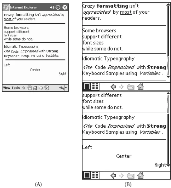
Specifying a Text Style
Many developers who are tempted to play with type styles in HTML are often dis-appointed to find out that its typesetting capabilities are reminiscent of the earliest word processors.
Typesetting for the wireless Web is even more restrictive; many mobile devices support only a few fonts, and often only a few styles of a particular font. Because of their limited memory and low performance levels, many of these devices use bitmapped fonts that look good only at specific sizes. Devices that use scalable fonts (fonts with a compact representation that scale well to various sizes) may provide a better appearance, but there is little standardization among the names and appearances of fonts and faces on handheld devices.
Idiomatic Text Styles
Most typographic decisions are best left to the browser, which is presumably tuned to make the appropriate typographic decisions on a particular platform based on structural tags such as section headings, text blocks, and so on. When additional differentiation is required, it is generally best to use HTML’s idiomatic text styles, which indicate the intent (again, the structure) of the formatting rather than specifying a particular representation. This enables the browser to pick the most appropriate presentation for a particular environment.
Table 8-5 lists idiomatic tags. As you can see, these tags cover most situations where you would choose varying type styles and typefaces in printed text. Using these idioms rather than typographic tags frees you to think about content rather than the specifics of representation.
Table 8-5. HTML Tags for Wireless Web Idiomatic Typography
TAG PURPOSE NOTES
<CITE> Rendering a May be underlined, italicized, bibliography citation or neither
<CODE> Computer print Fixed-width font if available
<EM> Emphasized text Traditionally rendered as italics
<KBD> Material to be entered Fixed-width font if available at a keyboard
<SAMP> A sequence of Fixed-width font if available literal characters
<STRONG> Important material Usually rendered as boldface
<VAR> A mathematical variable Usually italicized
Raw Typographic Styles
If you think you just have to have control over the particular appearance of a doc-ument, you can use typographic tags, shown in Table 8-6. However, you will quickly discover that not all the tags look the way you expect on most handheld clients. Differences in supported fonts, typefaces, and screen quality make work-ing with raw typography dicey unless your site is tailored to a specific device or unless you are creating content independently for each kind of device. Your best bet is to stick with the default font, using the bold tag sparingly to emphasize specific information to the reader.
Table 8-6. HTML Tags for Wireless Web Raw Typography
TAG PURPOSE NOTES
<B> Boldface Most likely supported on any device
<BR>* Line break Inserts a line break at the current position
<HR>* Horizontal line Inserts a horizontal rule at the current position
<I> Italic Occasionally supported
<U> Underlined Easily confused with hyperlinks
<TT> Teletype Fixed-width font if available
<FONT> Enables the selection Introduced informally after HTML of a specific font or 3.2; codified in HTML 4.0
modifies font size
* Denotes an empty tag.
The <B>tag surrounds text to be set in bold. Almost all mobile browsers sup-port bold type, and this can be a good way to differentiate content when raw typography is appropriate.
You indicate italic text using the <I>tag. Generally, you use italics for empha-sis weaker than what boldface implies. About half of the mobile browsers support italic text, although many of those that do have wretched italic fonts. These fac-tors make using italics a poor choice on almost all platforms.
You can underline text on some browsers using the <U>tag, but I strongly dis-courage doing this. Underlines mark hyperlinks on browsers; on grayscale screens, no colors will be available to tell the user the difference between an underlined title and a hyperlink. (In fact, I discourage using this tag in desktop content, too, for the same reason.)
If your content requires a fixed-width font, you can request it using the <TT> tag. (The TT is short for TeleType.) Unlike the <PRE>tag, the <TT>tag sets the text in fixed-width font, but treats all white space as single spaces, and it does not preserve other formatting. Because fixed-width fonts are hard to read, this tag should be used sparingly if at all.
One raw typographic tag you should definitely avoid is the <FONT>tag. Introduced between HTML 3.2 and 4.0, it is widely used by desktop browsers to select both the size and typeface of a font. Wireless Web browsers rarely support this tag, however. Even where it is supported, its output is not well defined, as dif-ferent platforms may have difdif-ferent fonts installed. In addition, the appearance
of scaled fonts cannot be predicted with the same kind of accuracy on a hand-held as on a desktop display.
Raw typographic tags also exist for separating text blocks. These are less problematic than those for specifying fonts and faces, and they can be useful in providing separations where headings may not be appropriate. The empty <BR>tag inserts a single line break without starting a new paragraph; the empty <HR>tag inserts a horizontal line.
Aligning Text
It is also possible to specify an alignment for text blocks in HTML using the ALIGN attribute with the paragraph tag. Table 8-7 summarizes the values for this attri-bute.
Table 8-7. HTML Attributes for Wireless Web Block Alignment ATTRIBUTE VALUES HTML VERSION PURPOSE
ALIGN LEFT HTML 3.2 and later Specifies left alignment of a block
ALIGN CENTER HTML 3.2 and later Specifies center alignment of a block
ALIGN RIGHT HTML 3.2 and later Specifies right alignment of a block
Although not widely supported, this attribute is worth using when you want to set off a section’s content. It can be used to align text at the left, right, or center, as shown in the following example:
<P ALIGN=left>Left</P> <P ALIGN=center>Center</P> <P ALIGN=right>Right</P>
Some browsers may not support the ALIGNattribute but do support the older <CENTER>tag:
<P>Left</P> <CENTER>
<P ALIGN=center>Center</P> </CENTER>
For centering text, whether to use ALIGNor <CENTER>depends on what is most important for your users. ALIGNwill create a smaller HTML file; for backward compatibility, the <CENTER>tag is more appropriate. It is worth trying both on the browsers your subscribers are likely to use to see which is handled better.
Figure 8-4 illustrates examples of both idiomatic and raw typography, along with text alignment.
Adding Hyperlinks and Images
Of course, tags are available for linking documents and adding images to content. In general, I recommend using only the most basic tags for linking documents
Figure 8-4. Raw typography and text alignment displayed in (A) MSIE/PPC and (B) Handspring Blazer
and for inserting images, shown in Table 8-8. The tags for more specialized fea-tures such as audio are inappropriate for most wireless browsers.
Table 8-8. HTML Tags for Wireless Web Hyperlinks and Multimedia
TAG ATTRIBUTE PURPOSE
<A> HREF Specifies a hyperlink
<A> NAME Specifies a name for other hyperlinks
<IMG> SRC Specifies the source of the image
<IMG> ALT Specifies an alternate title for the image
<IMG> WIDTH Specifies the width the image should occupy
<IMG> HEIGHT Specifies the height the image should occupy
The anchor tag (<A>) creates a link between two documents or between two parts of a single document. The client will render the argument of this tag in a way that indicates a hyperlink is available—usually as underlined text.
The anchor tag can have various attributes; in general, the only attributes appropriate for wireless development are the required HREFand NAME
attributes. You will use the NAMEattribute to name a link, which you can then reference using the anchor tag HREFattributes, as in the following example:
<HTML> <HEAD>
<TITLE>Anchors & Images</TITLE>
<META NAME=”PalmComputingPlatform” CONTENT=”true”></HEAD> <BODY>
<H1 ALIGN=right>
<A NAME=”Top”></A>Anchors and Images </H1>
<P><IMG SRC=”lost.GIF” ALT=”Signs”></P> <P><A HREF=”#top”>Back to the top</A></P> </BODY>
</HTML>
This example, which is shown in Figure 8-5, uses the HTML <A NAME=Top></A>to place a marker before the section heading at the top of the page. When a subscriber selects the Back to the Top link (HTML <A HREF=”#top”>Back to the top</A>), the browser will scroll back to the position of the mark at the top of the page.
This example also shows the simplest <IMG>tag, which is used to include an image for display. This tag also has a number of possible attributes that you will generally want to use to create robust content.
Other attributes used are the WIDTHand HEIGHTtags, which can specify the size of an image. Most wireless browsers that support the <IMG>tag also support the scaling of images using these attributes, although this feature is easily abused. Many content providers use these attributes to create
thumbnail images—smaller versions of a larger image—on pages that offer
a choice of images. This practice forces clients to download a large image, which is then subsequently scaled to the device’s display; users must thus expend the time and memory necessary to download all of the large images, rather than just those they choose to see. Needless to say, this is especially onerous given the limited bandwidth of most handheld devices. In fact, the very notion of a page of images is a bad idea on the wireless Web. If you find you must provide images— or scale images—consider doing it using server scripts instead.
If some degradation in image quality can be tolerated, however, the reverse— using these attributes to enlarge a smaller image—works well. In general, images will become grainy and distorted as they are scaled up, but, depending on your content, this approach can work well when both small and large versions of the same image are to be displayed.
On the other hand, the ISMAPattribute, which specifies an image map, is not appropriate for wireless devices. Few handheld devices support image maps, and those that do may not display downloaded images depending on preferences selected by the user. In general, it is inappropriate to use images for navigation;
Figure 8-5. Anchors, links, and the <IMG>tag displayed in (A) MSIE/PPC and (B) Handspring Blazer
text-based lists of navigation locations load more quickly, display more reliably, render on a wider selection of devices, and are easier for a mobile user to use.
Creating a Table
You can think of tables as blocks of text within the body of an HTML document. The use of tables in a wireless Web page, however, deserves some additional attention. Tables are an important part of wireless Web presentation because they often provide information more concisely than paragraphs or lists. Many, but not all, wireless Web browsers support the table tags introduced in HTML 3.2 (see Table 8-9).
Table 8-9. HTML Tags for Wireless Web Tables TAG INTRODUCED IN PURPOSE
<TABLE> HTML 3.2 Marks the beginning and end of a table
<CAPTION> HTML 3.2 Marks a caption for a table
<TR> HTML 3.2 Marks a table row, consisting of multiple table cells
<TH> HTML 3.2 Marks a table heading cell within a row
<TD> HTML 3.2 Marks a table cell within a row
Tables on wireless browsers can be problematic, however. The small screens provided by many devices—notably the Palm and Microsoft Palm-sized PC plat-forms—make tables with more than a few columns difficult to render. Some Web designers try to use tables as a means to control the layout of a page, which can defeat the optimal rendering of many handheld browsers. Other designers nest tables for particular effects, a practice that can consume inordinate amounts of memory on a handheld device where rendering sophisticated tables is often too difficult for the client. In these cases, the page could take too long to download and then be ugly or unreadable on the client, doubly disappointing your sub-scribers.
Tables consist of rows of cells, together with an optional caption. The <TABLE> tag delimits the start and end of a table. The <TD>tag surrounds each ordinary cell, and the <TH>tag indicates a table header cell; these basic table tags are illus-trated in the following example:
<TABLE BORDER=1>
<CAPTION>Times</CAPTION> <TR>
<TH><P>Stop</P></TH> </TR> <TR> <TD><P>5:52</P></TD> <TD><P>5:57</P></TD> </TR> <TR> <TD><P>6:23</P></TD> <TD><P>6:37</P></TD> </TR> </TABLE>
This HTML creates a three-row table with two columns. The table elements are to be drawn with a single-width border. The table’s caption, Times, should appear somewhere near the table. The first row—the first <TR> . . . </TR> seg-ment—labels the columns of the table, and all of the other table cells (between the <TD>and </TD>tags) simply contain times.
Browsers may make the column heads marked with <TH>stand out in a vari-ety of ways, such as with bold type or a larger font, if available. Many, however, do not clearly differentiate between header cells and normal cells, and this is proba-bly why many wireless Web developers do not bother to use the <TH>tag.
The <CAPTION>tag, not surprisingly, enables you to provide a caption for a table. This contextual tag, like the <TH>tag, enables browsers to make appropri-ate typographic decisions best suited to a specific device. Many developers, however, try to control the appearance of a table caption; all too often you will see something similar to the following:
Times<BR> <TABLE BORDER=1> <TR> <TH><P>Start</P></TH> <TH><P>Stop</P></TH> </TR> <TR> <TD><P>5:52</P></TD> <TD><P>5:57</P></TD> </TR> </TABLE>
This is bad form. I encourage you to use <CAPTION>instead because some browsers may use table captions for special purposes. For example, on a device with a very small screen, a table may be given its own page, and the caption may be used as a link between the containing document and the table.
In some circumstances, you may want a single cell in a table to occupy multi-ple rows or columns. The ROWSPANand COLSPANattributes of a cell enable it to stretch across multiple cells in a row (using ROWSPAN) or a column (with COLSPAN). For example, in the table outlined here the weekend rate occupies both the Friday and Saturday cells:
. . . <TR> <TD> <P>Friday</P> </TD> <TD ROWSPAN=2> <P>$99.95<BR>
<B>(note the weekend rate!)</B></P> </TD> </TR> <TR> <TD> <P>Saturday</P> </TD> </TR> . . .
The related NOWRAPattribute instructs the browser not to wrap the contents of a specific cell. Avoid using this tag, as it can cause inordinately long cells, making table layout unwieldy.
Table elements can use the ALIGNattribute (introduced earlier when dis-cussing the paragraph tag) to align the contents of a particular cell or heading. When the ALIGNattribute is used for a table, it instructs the browser to center the table, not the contents of the cells within the table.
The WIDTHand HEIGHTtags are used by table elements to indicate a desired size for the element. Not all browsers support this, and they are considered advi-sory at best—many browsers will work to fit the width of and height of a cell as best they can, but use these values as starting points only.
Other HTML 4.0 tags, including <THEAD>, <TBODY>, and <TFOOT>, are not avail-able on most wireless Web browsers and should consequently be avoided.
These examples and the material in this section should help bring home sev-eral points I have mentioned already:
• Keep tables simple. • Do not nest tables.
• Opt for long, skinny tables over wide, short ones.
• Do not use tables to override a browser’s page layout choices. Table 8-10 reviews the attributes you are likely to use when marking up your tables.
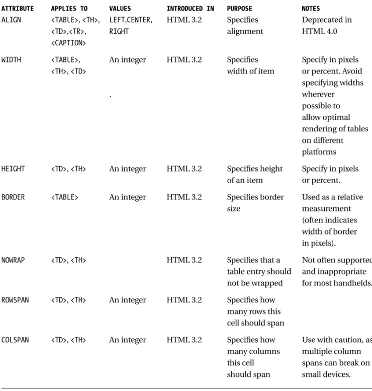
Table 8-10. HTML Attributes for Wireless Web Tables
ATTRIBUTE APPLIES TO VALUES INTRODUCED IN PURPOSE NOTES
ALIGN <TABLE>, <TH>, LEFT,CENTER, HTML 3.2 Specifies Deprecated in
<TD>,<TR>, RIGHT alignment HTML 4.0
<CAPTION>
WIDTH <TABLE>, An integer HTML 3.2 Specifies Specify in pixels
<TH>, <TD> width of item or percent. Avoid specifying widths . wherever possible to allow optimal rendering of tables on different platforms
HEIGHT <TD>, <TH> An integer HTML 3.2 Specifies height Specify in pixels of an item or percent.
BORDER <TABLE> An integer HTML 3.2 Specifies border Used as a relative size measurement
(often indicates width of border in pixels).
NOWRAP <TD>, <TH> HTML 3.2 Specifies that a Not often supported table entry should and inappropriate not be wrapped for most handhelds.
ROWSPAN <TD>, <TH> An integer HTML 3.2 Specifies how many rows this cell should span
COLSPAN <TD>, <TH> An integer HTML 3.2 Specifies how Use with caution, as many columns multiple column this cell spans can break on should span small devices.
Creating a Form
Supporting interactive queries is at the heart of mobile Web design. All other fac-tors being equal, user expectations tend toward greater customization and greater interactivity. The ability to target content—to provide a subscriber with only the content he or she desires—is often what differentiates one site from many other similar ones on the wireless Web.
Form tags (see Table 8-11) provide developers working in HTML with the means to provide simple input areas where users can enter information. You can use this information to customize the content for the particular user.
Table 8-11. HTML Tags for Wireless Web Forms
TAG ATTRIBUTE PURPOSE NOTES
<FORM> Marks the form region
ACTION Specifies the destination URL
METHOD Indicates the HTTP Must be either GET
method to use or POST.
<INPUT>* Specifies a form control
TYPE Specifies the type of the control See Table 8-12.
NAME Specifies the name of the field for use with the CGI
VALUE Value to be returned to the CGI
CHECKED Is item selected Include to select the given item.
SIZE Specifies the size of the input item
MAXLENGTH Specifies the maximum length of the input item
SRC Specifies a URL for an image Avoid using in on a button wireless pages.
ALIGN Used to specify the image Avoid using in alignment on buttons wireless pages.
<SELECT> Specifies a list
NAME Specifies the name of the field for use with the CGI
Table 8-11. HTML Tags for Wireless Web Forms (continued)
TAG ATTRIBUTE PURPOSE NOTES
SIZE Specifies the number of items to display in the list
MULTPLE If present, indicates how many When omitted, list items may be selected supports only one selection at a time. May not be set to a value.
<OPTION>* Specifies a list element within a<SELECT>region
SELECTED Is item selected by default If present, item is selected.
VALUE Value to be returned to the CGI
<TEXTAREA> Specifies the default entry for a text region
NAME Specifies the name of the field for use with the CGI
ROWS Specifies the number of rows in region
COLS Specifies number of characters per line in region
*Denotes an empty tag.
Defining the Form
You identify forms using the <FORM>tag. For each <FORM>tag, you must specify two attributes: an action and a method. The ACTIONattribute indicates the URL of the server and program where the form is to be sent, and the METHODindicates how the form should be sent—using an HTTP POSTor GETrequest method. The implementation of the Common Gateway Interface (CGI) scripts on the server determines what HTTP method should be used. As you develop CGI scripts, bear in mind that for wireless development it is generally more appropriate to use the newer POSTmethod than the older GETmethod.
Short forms can use the GETmethod, which has been supported since the early days of the Web; longer forms may call for the POSTmethod, which supports
longer form bodies. Form data is returned as a series of name/object pairs. The syntax of the response depends on which method was used: POSTreturns the pairs as a separate object body; GETreturns the pairs concatenated to the end of the destination URL. For example, a form using the GETmethod would return a single URL in this example:
GET http://www.lothlorien.com/cgi-bin/locate.php3?callsign=kf6gpe HTTP/1.0
and the corresponding URL requested by aPOSTmethod would look like this:
POST http://www.lothlorien.com/cgi-bin/locate.php3 HTTP/1.0 callsign=kf6gpe
Note that only the URL of the CGI script is passed in the request; everything else is the form data. In practice, you will never see this level of detail, although you may need to know which method is being used depending on how you imple-ment your CGI script. Most server-side scripting environimple-ments (see Chapter 6, “Server-Side Content-Management Scripting”) handle this detail for you.
Collecting User Input
User input to a form is supported by four kinds of tags. Most form objects are specified with the empty <INPUT>tag, which creates an input line (or button, depending on its attributes). <SELECT>and the empty <OPTION>tag are used to create a pop-up or menu list of items on a form; the actual appearance of the list is up to the client to determine.
Within the <SELECT>region, items are demarcated with <OPTION>tags. Note that this tag is in fact empty; there is not an </OPTION>tag. In addition, each option must use its VALUEattribute to specify a value to return to the Web server.
You can create multiline form elements that enable the user to enter sen-tences or paragraphs using the <TEXTAREA>tag. As I have mentioned before, you should avoid requiring lengthy text input from mobile users because their devices may not have keyboards. On such a device, entering even a small amount of text can quickly become frustrating.
All form objects should be given aNAMEattribute, which specifies the name of the input item for the CGI.
The <INPUT>element uses the TYPEattribute to select the kind of input item to create—an input line, check box or radio boxes, a password input line, or a button. (Table 8-12 lists the possible values of this attribute.) You can indi-cate a single line of text input using the value TEXTfor the TYPEattribute. For a similar short text input object, but one where you do not want the field to echo
characters as they are input, use the value PASSWORDfor the TYPEattribute instead.
Table 8-12. HTML Attributes for Wireless Web Input with <INPUT>
TYPE PURPOSE NOTES
TEXT Creates a single text input line
PASSWORD Creates a single text input line Input is not echoed to the user.
CHECKBOX Creates a check box element
RADIO Creates a single radio button Radio buttons can be grouped by using the same NAMEattribute value.
SUBMIT Creates a submit button Multiple SUBMITbuttons can be created with unique NAMEattributes.
RESET Creates a reset button The reset button resets the form’s values to its default.
HIDDEN Creates a hidden This is used by dynamic forms to name/value pair cache content between multiple
requests and responses.
FILE Requests the user to select a This is not appropriate for use with file to upload to the server wireless browsers.
IMAGE Creates a button with an image This is not appropriate for use with wireless browsers.
You can use the CHECKBOXvalue for TYPEto provide multiple possible selections and the RADIOvalue for TYPEto offer two or more mutually
exclusive selections. These elements should be used to select optional behav-iors, not items from an array of choices. Selecting a radio button or a check box indicates a characteristic of something (“the blue t-shirt,” for example), not an actual action (“buy a t-shirt”). Both support grouping using the NAMEattribute; a group of RADIObuttons with the same name will only enable one element within that group to be selected.
An <INPUT>tag can be used to handle form actions using the SUBMITand RESET TYPEvalues. Each provides a button labeled with the NAMEattribute indi-cated for the tag. When pressed, the SUBMITbutton packages the form’s contents and submits the results to the URL indicated in the form’s ACTIONvia the HTTP method indicated by the form’s METHODvalue. The RESETbutton, on the other hand, sets all the fields to supplied default values (or empties the fields if no defaults are provided) and displays the empty form to the user. Multiple in-puts with SUBMITvalues for the VALUEattribute, each with a distinct name, are
permissible, enabling a single form to be sent to the specified URL with the name of the button the user selects.
The following form, shown in Figure 8-6 on various browsers, illustrates the concepts behind the different form input tags and their appearance for a hypo-thetical page offering weather reports:
<HTML> <HEAD>
<TITLE>North American Weather</TITLE> </HEAD>
<BODY>
<H1 ALIGN=right>North American Weather</H1> <P>Enter the postal code and country:</P> <FORM
ACTION=”http://www.wirelesswx.com/cgi-bin/getwx.cgi” METHOD=”POST”> <P>Postal Code:
<INPUT TYPE=”text” NAME=”Code” VALUE=”” SIZE=10
MAXLENGTH=10><BR> Country:
<SELECT NAME=”Country”> <OPTION VALUE=”C”>Canada
<OPTION VALUE=”U”>United States of America <OPTION VALUE=”M”>Mexico
</SELECT><BR>
<INPUT TYPE=”checkbox” NAME=”cond” VALUE=”cond”> Current conditions<BR>
<INPUT TYPE=checkbox NAME=”fore” VALUE=”fore”> Forecast</P>
<P>Units:
<INPUT TYPE=”radio” NAME=”unit” VALUE=”m” CHECKED>Metric <INPUT TYPE=”radio” NAME=”unit” VALUE=”e”>English </P>
<P>
<INPUT TYPE=”submit” NAME=”Weather” VALUE=”Weather”> <INPUT TYPE=”reset” VALUE=”Clear”>
</P> </FORM> </BODY> </HTML>
Not all form elements need to be visible. The <INPUT> HIDDEN TYPEvalue enables additional name/value pairs (indicated with the NAMEand VALUE attri-butes) that do not appear on the form to be returned to the server. In a situation
where multiple forms are dynamically generated by back-end scripts, this capa-bility can be useful for carrying context between forms, such as order numbers or a user’s authentication. HIDDENelements are not completely secure, but they can be used to replace some of the functionality offered by cookies.
The FILEattribute, if used in conjunction with the POSTmethod, enables some clients to submit files in response to a form. This is not necessarily a good idea for content intended for wireless clients; not all wireless devices support file systems, and sending an entire file might be prohibitively expensive for the sub-scriber.
Although it is possible to create buttons with images on them using the IMAGE attribute, do not. Wireless clients may not support the display of images, or a subscriber may have turned off image downloads. In either case, the user is faced with a series of similar buttons that have no labels.
Ideally, most forms for mobile clients should be even simpler than the weather information form shown in Figure 8-6. Note the use of a<SELECT>list to enter a country (as opposed to free-input or check boxes), and of a check box to indicate actions to be taken by the server.
Using Other HTML Tags
The constraints of mobile devices eliminate a great deal of the glamour of Web content development. Frames, image maps, sounds, scripts, and other such gim-micks simply are not appropriate for a device the size of a calculator or notepad. Even if these handheld items evolve to the point where they do have the compu-tational horsepower, memory, and wireless bandwidth to support such features,
Figure 8-6. A form displayed in (A) MSIE/PPC and (B) Handspring Blazer
most users will not appreciate navigating through such junk in search of their content. Remember that wireless users are mobile for a reason—they are proba-bly in a hurry.
When developing wireless content, stick to the subset of HTML outlined in this chapter. I have already mentioned several pitfalls to avoid when using these elements, including nesting tables, using images, or, worse, using image maps for navigation (all links should be marked with text). Some whole categories of fea-tures, however, should be avoided altogether. Specifically, do not use the following:
Frames: Displaying frames properly on a screen can occupy many hun-dreds of pixels on one side—generally far more than are available on a mobile device. For kinds of information that is traditionally placed in frames, try creating multiple pages with a common navigation element. Sounds: Although some browsers do support audio, the bandwidth an audio file requires is excessive for many wireless users. And in any case, how many users really want their wireless Web devices to start talking to them in public?
Scripting: Although not formally a part of HTML, the scripting technolo-gies presently available—Java, JavaScript, and VBScript—are widely used in pages aimed at desktop Web viewers. Scripting is not even available on many mobile Web clients, however; and those clients that do provide sup-port for scripting may not adhere to accepted specifications for
functionality. Waiting until mobile-friendly scripting technologies such as Sun’s Java KVM are adopted is your best bet.
As time goes on, many of these features may become more widely and/or more readily supported within the capabilities of a handheld device. You may find that using them becomes more and more tempting. Remember, however, that subscribers will not upgrade wireless terminals in the same way they do soft-ware. Legacy browsers unable to handle these features well are likely to still be in common use several years after their manufacture.
Summary
HTML is a powerful tool for content development on both the World Wide Web and the wireless Web. Not all HTML commands are appropriate for wireless browsers, however. By using a carefully selected subset of HTML, you can create concise Web pages that use reasonable quantities of bandwidth and address the
special needs of wireless subscribers. Remember these general tips as you create your HTML content:
• Keep content simple.
• Allow the browser to select the best methods of presentation for a given combination of structural element and device.
• Keep tables as small as possible; if they must be large, make them long rather than wide.
• Avoid the use of frames, images, and bandwidth-intensive content. Be sure to declare a document heading with the document’s title and any meta tags your subscriber’s browsers will need. Often, you will want to be sure to include browser-specific meta tags such as PalmComputingPlatformand
HandheldFriendlyto ensure that these pages display correctly on specific browsers.
Use HTML’s idiomatic tags whenever possible. That means you will want to use the section head tags, block tags, and idiomatic tags such as <STRONG>to call out important content. Avoid raw typography such as <B>, <I>, and the <FONT> directive. The same guidelines apply to lists, too; HTML provides a rich set of tags for creating ordered and unordered lists, as well as definition lists for glossaries and lists of choices. Use images judiciously, always in conjunction with a text label using the <IMG>tag’s ALTattribute. Other kinds of multimedia—sounds or movies—are always inappropriate for wireless-oriented content.
Tables should be laid out simply using the table caption, table head, and cell tags. Preferably, these tables should be long and skinny, or better yet, short and skinny. The table tags new to HTML 4.0 are not widely supported, so be sure you use only the older HTML 3.2 tags discussed.
Form input enables you to target your content to your viewers. Be sure to do so, keeping in mind how they are likely to use the browser. Using the <SELECT> and <OPTION>tags is preferable to asking the user to enter text with the
<TEXTAREA>tag. When getting form input, you will find it easier to manage data submitted with the HTTP POSTrequest, which you can specify using the <FORM> tag’s METHODattribute.