Molly L O’Dwyer. What’s that building? The use of App Inventor to create an interactive mobile application campus tour. A Master’s Paper for the M.S. in IS degree. November, 2013. 46pages.Advisor: Dr. Brad Hemminger
Mobile applications can be created by many different methods but is nearly impossible without extensive knowledge of a programming language such as Java or Objective-C. New visual programming environments have been created to break down those
programming barriers. This project looks at the way applications can be built by a novice or non-programmer and evaluates App Inventor, a visual programming environment designed to create Android applications without knowing Java. This paper describes all phases of the project, from the selection process for choosing a program, to the testing and evaluation of the final mobile application.
Headings:
Computer programming -- Visual programming languages
WHAT’S THAT BUILDING?
THE USE OF APP INVENTOR TO CREATE
AN INTERACTIVE MOBILE APPLICATION CAMPUS TOUR
by
Molly L. O’Dwyer
A Master’s paper submitted to the faculty of the School of Information and Library Science of the University of North Carolina at Chapel Hill
in partial fulfillment of the requirements for the degree of Master of Science in
Information Science.
Chapel Hill, North Carolina November 2013
Approved by
Table of Contents
INTRODUCTION ... 2
BACKGROUND ... 4
APPLICATION SPECIFICATIONS ... 11
TECHNOLOGYREVIEW ... 16
IMPLEMENTATION ... 20
APPLICATIONDESIGNANDDEVELOPMENT ... 23
EVALUATION... 33
CONCLUSION ... 38
BIBLIOGRAPHY ... 41
NOTES ... 43
INTRODUCTION
The purpose of this project was to design a mobile application with specific
requirements with limited programming knowledge. The vision of the application would
be a historical tour of the University of North Carolina’s (UNC) campus that a user could
access on their smartphone while they walk around campus. Given the time constraints of
the project, the application needed to be either a modification of an existing application
or have some method in which it could be built with limited time and programming
knowledge.
The final product is a result of a combination of the above criteria. It started as a
modification of an existing campus tour application created by Ralph Morelli at Trinity
College. Snippets of code were taken from other applications and modified for this
project. All applications are open source and the code was freely available for use or
modification. The method in which the application was built was the code block method.
This is employed by App Inventor, a program managed by MIT, that lets application
builders create an application using a GUI and programming logic blocks instead of
writing out a programming language or having to worry about syntax. Since the program
was originally created by Google, programmers are only able to create applications for
Android smartphones or tablets.
This paper will describe the design, development and evaluation of this mobile
application. The main goal of this work was (1) to understand if this type of application
understand if App Inventor could be used to store historical data and guide the
application user on a tour of UNC’s campus; (3) test the GPS and database capabilities of
the program for feasibility and function; (4) evaluate the design and user interface of the
BACKGROUND
Early virtual tours began with museums offering images of their holdings on their
website. The user would click on text or an image and be able to view information about
an item that they could not see in person. These images served as digital surrogates for
the physical objects that could then be curated into an exhibit to be viewed on a website.
Museums small and large have done this. One example of a small museum’s efforts at
creating a virtual tour for visitors is the Orange County Historical Museum in
Hillsborough, North Carolina.1 Their tour presents the user with a map of the museum
with permanent exhibits marked on the map. The user clicks on an area such as Colonial
Cooking and is taken to images and text about the exhibit. They click on thumbnail
images that bring up a larger image and information about the image.
However, it’s not always feasible or even desirable for a large museum to create a
digital surrogate of their physical exhibits. For museums like the British Museum,
creating digital surrogates of their holdings that are not on display in the museum not
only reaches visitors that are not able to come in person but also extend the learning
experience of those visitors that physically visited the museum.2
Google has tried to advance this idea of a virtual tour online with their Cultural
Institute which provides web users with the opportunity to explore individual artifacts,
art, or take virtual tours of an institution through a web browser.3 Google’s virtual
museum tour is similar to using street view in Google maps, only the user rotates their
view of a room instead of a street or zooms in to a photo on the wall instead of a building.
Often there are buttons or icons that when clicked on provide more data about the object.
The user can virtually look up at the ceiling, down at the floor or walk down the hall with
the click of a button. While this is not a true virtual environment, it is a step towards
simulating a virtual environment.
Museums are not the only ones to create virtual tours of their holdings. Cultural
tourism has also tried to enhance a tourist’s visit to a city or historic location. The
Mountain Lakes in New York has created a historic online walking tour of the area.4 This
tour is a hybrid of an audio tour and map tour when used with smartphones, tablets or
some other portable music device. The mobile phone accesses a web page through the
mobile’s browser, the user selects a marker on a Google map and an audio narrative
begins to play. University of New Mexico also created a web-based mobile app using
ARIS that consisted of a map with markers that when clicked on brought up a new page
with information about that location.5
In his presentation on The Digital Humanities for Nonprofits, Kevin Dooley, VP
of Market Development at OnCell described the beginning of mobile phone tours.6 They
began around 2006 when users would have to dial a number on their phone, listen to
some audio then dial an extension to hear more audio narration. Usually the user was
guided by signs along the tour or a brochure map to tell them which number to select
from the audio prompt at each location. Some institutions still use a similar method but
4http://www.mtnlakes.org/History/Hiswalkingtour.htm 5
https://sites.google.com/site/unmgame/home
the use and technological advancements of mobile phones has opened up more
opportunities than just an audio tour.
The use of web tours within a mobile web browser was not as feasible to
accomplish until mobile phones had web browsers as a standard component. Mobile web
applications are often easier than a native application because of its universality across
multiple device platforms and simplicity using online user interfaces.
Using a mobile device to view a web tour started happening about three years
later in 2009. According to Dooley’s presentation over half of cell phone users have
smartphones. Twenty-five percent of cell phone users have Android devices.
Smartphones in particular had greater capability for enhanced multimedia and content
display.
Mobile web tours are often accessed through a QR code or NFC tag. A QR code,
or quick response code, is a two-dimensional barcode that a smart phone with a QR
reader can scan using the phone’s camera. The barcode is usually encoded with a URL
that provides more information. An NFC tag, or near field communication, is a sticker
with electronic information that is transmitted to another NFC enabled device.7 The user
simply holds or touches their NFC enabled smartphone to the sticker and the information
is automatically transferred. In the case of virtual tours, a QR code or NFC tag might be
placed next to a display in a museum to give the user “in-depth, contextual, multilingual
and multilevel content.”8
Since the user has to be physically near the QR code or NFC tag
and the code is usually near the item it is providing more information about, QR codes
and NFC tags as a way to access mobile web tours only enhances the in-person
7 Anokwa , et. al. A User Interaction Model for NFC Enabled Applications, pg. 1.
experience by providing additional information than what is in front of them. This is in
contrast to web only tours that the user might access from a PC or typing directly into
their mobile browser that do not require them to be at the physical location in order to
access the information (thus acting as a surrogate to the physical experience). While QR
codes and NFC tags are advancements in technology, it is a step away from the idea of a
virtual tour and a step towards the idea of augmented reality.
The problem with QR codes and NFC tags is the need for proximity to the code or
tag itself. While some tours are linear and the user is led from one location to the next
with easily identifiable information plaques, some tours are not designed with
information plaques.
A better alternative would be to use a form of augmented reality native
application. Native applications are mobile applications that are programmed for a
specific mobile platform, such as iOS or Android. These applications are not viewed in
the web browser but are downloaded to and stored on the phone itself.
Augmented reality uses components already found on a mobile phone to enhance
the real-world environment of the user.9 This might include camera, GPS sensor, digital
compass, accelerometer, and gyroscope.10 The GPS sensor will locate where the phone is
geospatially while the accelerometer, compass and gyroscope will provide information on
the phone’s orientation and general movements. Most mobile tour guides, whether
historical or tourist, use the GPS and orientation sensors. Some may use the camera to
identify locations by holding the camera to a building or object and matching the object
using image recognition. However this last method is still being improved on and may
not be feasible for smaller organizations with less access to highly skilled application
programmers.
Augmented reality has two types: markerless and marked.11 Marked uses QR
codes or NFC tags to provide location and other information. Markerless uses GPS or
image recognition to identify the phone’s location and provide information based on the
sensed data. Information can be pushed to the user’s phone based on their location or the
user can be presented with options and can then choose what information they want to
see in regards to their surroundings. This latter option is probably the most common
among native applications.
However, GPS does not work well, if at all, inside buildings.12 Some museums
have tried to address this challenge with other location-aware technologies such as
WIFI13 or ultrasound. Bihler, et. al., tried to test the strengths and limitations of
ultrasound. While the test was small, the results were positive and most of the
smartphones picked up the signal being sent by the signal emitters that were placed
within the museum. However, more study on the types of technologies that will work for
location-aware applications is needed before the technology will see a widespread
adoption.
Museums are not the only institutions dealing with augmented reality and
smartphones. Cultural tourism is grappling with the new technologies available and how
they can be put to use to market a city or tourist destination. Many cities have created
11 Pence, Smartphones, pg. 138.
12 Bihler, et. al., SmartGuide – A Smartphone Museum Guide with Ultrasound Control, pg. 587. 13
American Museum of Natural History uses WIFI to determine user location as a way to help the user navigate the 26 buildings and 46 halls of exhibits, including how where to find bathrooms and food:
native applications that utilize the GPS sensor in smartphones.14 Kokomo, Indiana has
advertised their application as being a virtual tour guide that tells visitors about the area
as if they were hearing it personally from the mayor or a local insider. Information is
stored in a database that is updated regularly with lodging, food and events information.15
The user can then get directions to their destination.
Spokane, Washington has taken the historical approach with a database of historic
locations in the area that includes a map to access images and text narrative about major
landmarks in the town.16
Perhaps one of the best examples of GPS use in a native application is
Streetmuseum, created by Museum of London. The GPS sensor identifies where the user
is and when they hold their phone up to a building or street scene, a historic image is
shown on the phone’s screen.17
HistoryPin has a similar function however the user has to
pick a location on a map before they see the images.18
Software has been developed to help programmers utilize these augmented reality
components. Wikitude,19 Junaio20 and ARIS21 allow programmers to build mobile
applications with augmented reality. However, Wikitude and possibly Junaio require the
programmer to write code. This makes it difficult for smaller organizations such as
museums or historical sites to create applications if they don’t have a resident
14 Snohomish County, Washington has created numerous applications related to the history of the area. Their applications use a paper brochure, a mobile app and includes a QR code located either on the brochure or on the building itself: http://www.heraldnet.com/article/20110625/LIVING/706259977. 15 Magan, Mike. Smartphone serves as your virtual Kokomo guide.
16 Project by Larry Cebula, professor of history at Eastern Washington University, and his students:
programmer on staff or the finances to outsource the job. ARIS provides a more graphical
interface for creating an application and is designed for games or tours using augmented
reality. However its limitations are such that for this project, another alternative was
chosen. App Inventor also uses a graphical interface to design and program an application
but has more basic and augmented reality components to work compared to ARIS. It does
require some understanding of programming logic but this is easier to overcome in most
organizations than the intricacies of code syntax.
Early discussion of App Inventor said augmented reality was not possible. While
App Inventor may not be able to do as complex things as using SDK would, according to
the components that made up augmented reality as mentioned earlier, App Inventor has
every possibility of creating a mobile application with augmented reality. This project
will test those capabilities and evaluate the effectiveness of the program to create a
mobile application with augmented reality. The program’s ability to incorporate
augmented reality without needing professional software development experience means
smaller organizations can engage their visitors in their collection, historic site or town
APPLICATION SPECIFICATIONS
1.1
Technical Specifications
In deciding how to design the application, the behavior of the users had to be
taken into consideration. Campus buildings are not linearly located with straight paths
that lead from one building to the next. Nor do the buildings have easily identifiable
information plaques. The most the building would have is the name, year it was built and
in a few cases, a small plaque somewhere on the building with minimal information. The
location of these pieces of information is different for each building. Visitors to campus
are likely to approach a building from different directions and would not easily find a QR
code or NFC tag to scan. The landscaping around the buildings would also prevent the
visitor from getting close enough to the building to scan the codes. The fact that visitors
would then have to find the codes, which would likely be in a different location each
time, might discourage their use, especially if the user has limited time.
Instead the application was designed with markerless augmented reality. It uses
GPS and orientation sensors and a modified map with markers on the map indicating a
location with information.
1.1.1
Data storage
Data include names, dates, text, images, geo-coordinate locations, and
links. Storage options included a key-value pair database or indexed lists. Indexed
lists ended up being the most workable for the purposes of this project. A single
entered in the list. To retrieve the data, the list was referenced using an index to
identify which item in the list was needed.
1.1.2 GPS
Geo-coordinates were used in the structure of the application and in the
location data. The GPS goal of the application was to show the user on the map
with a navigation arrow and have the arrow move on the map according to where
the user moves. Geo-coordinates had to be obtained for the boundaries of the
map, user location, and building locations. The boundary coordinates were stored
in the variables TLLat, TLLong, BRLat, BRLong. TL means Top Left and BR
means Bottom Left. Lat and Long are latitude and longitude, respectively. User
location was obtained from the Location Sensor element of App Inventor.
Location was sensed every minute and stored in the variables lat and long.
Building locations were stored as items in a list for the respective building.
Latitude and longitude each had their own index in the list. The map image was
placed in a canvas element. To determine the user’s location, a formula was used
to determine the X and Y coordinates on the canvas that equated to the
geo-coordinates of the current location.
The formula for calculating the x-coordinate is as follows:
Canvas width * (|TLLong – long| / |TLLong – BRLong|)
The y-coordinate formula is as follows:
1.1.3 Click functions
Since the user is on a mobile all traditional click functions on a computer
would be executed using a touch function. All buttons, sprites and canvases use
the Touch function. In App Inventor the buttons use the function .Click while
sprites use the function .Touch. Both functions are activated when the user
touches the element. A similar function is .BackPressed. The .BackPressed
function means the user has touched the back button on their phone instead of a
button within the application. Tabs in the application are buttons that allow for
button like click functions.
A variation of this click function is .Flung, which is an event specific to
sprites and canvases only. This means the user has swiped across the screen. For
this project this function is used only for swiping through the images.
1.2
User Interface Specifications
Since the interface will be on a small screen, it was important to keep the
application uncluttered and clean looking. A white background with blue
elements was chosen. The blue on white provides a clean contrast and makes the
buttons and images stand out. For simplicity the orientation was locked to portrait.
1.2.1 Buttons
The buttons were kept to a minimum so as not to be overwhelming to the
user. To make the button look modern, an image was created in Microsoft
PowerPoint and stylized using the built in functions. It was then cropped in GIMP
and saved as a jpeg. In App Inventor the button element image was set to the
newly created jpeg. More than one type of button was created. The tabs in the
second type of tab was created in a lighter blue color. When a tab was clicked on,
the image for that button would change to the lighter blue so it looked like it was
the selected tab.
Back buttons and exit application buttons were also created in PowerPoint
then cropped in GIMP and saved as a jpeg image. The respective button elements
were set to the jpeg image.
Button text was programmed in the App Inventor Viewer. The text color
was white against the blue buttons for greatest contrast and best readability.
1.2.2 Images
The image element in App inventor was never used, however images were
used with other elements. When viewing information about a particular location,
small thumbnails of associated images are visible. These are buttons that display
the images from the lists for each location. The images are stored in the
application.
1.2.3 Text
Text elements included labels and buttons. Text for a button was set in the
Viewer. Text for the labels were taken from the building lists and copied to the
label depending on which building was selected.
1.2.4 Navigation Controls
Navigating the application was accomplished with buttons and the canvas
element. Buttons allowed for backward movement to previous screens or to exit
allowed for swiping through the enlarged images. Buttons in the form of tabs let
TECHNOLOGY
REVIEW
2.1
Java vs. Visual Programming for Android
Java is the programming language used for Android applications. It
consists of textual syntax of the Java language written in an editor such as
Eclipse. The standard among most application programmers is to use Android
SDK to create their applications. This method requires extensive knowledge of
Java and programming in general.
Visual programming, on the other hand, uses visuals in the form of blocks,
boxes, lines or icons to convey programming logic instead of textual syntax. It is
often used to teach programming to children or adults learning to program for the
first time. It is used because the visual representations make it easier to follow and
quickly create an application while writing Java may take some time before
results can be seen.
While there are many visual programming languages or environments,
there are only a few that are designed for mobile development.22 Since mobile
phones and tablets are based on different programming languages the visual
environment is often specific to the mobile platform: Android or Apple. Android
uses Java and Apple uses Objective-C for all iPhones and iPads.23 There was
easier access to Android devices for this project so a method for building an
application for Android was chosen. Given the constraints of the project, five
programs were considered: Illumination, TouchDevelop, Hopscotch, Scratch and
App Inventor.
2.1.1 Application Building Programs
Illumination started as a visual programming environment for software
and added capabilities for Android development in version 2.0.24 Now it has
additional capabilities for iOS, Flash, Desktop, and HTML5.25 The program itself
is basic, using boxes of variables and functions with lines to connect the boxes. It
is open source which means anyone can download the program for free. However
the program is not very visually appealing for a non-programmer and does not
have the user/technical support of other programs.
TouchDevelop was created at Microsoft Research and is designed
specifically for smartphones and tablets. The program is browser based which
means programming can occur on any device with a standard browser. The
research team at Microsoft has created numerous video tutorials for developing
alone or to use in a classroom setting to teach programming. However, even
though any platform can be used to program, TouchDevelop is designed to build
Windows 8 applications.26 Using this program would limit the audience that could
access it since most visitors to the campus will likely have either an Android or
iPhone.
Hopscotch is also designed for iPhone or iPad and is geared towards
teaching children to program games.27 For this reason Hopscotch would not work
24
“Illumination Software Creator”. Wikipedia: The Free Encyclopedia. 25 Lunduke, Bryan. “Illumination Software Creator 6.0.”
26 “TouchDevelop: FAQ”. Microsoft Research.
for this project as some of the tasks this project is trying to accomplish are more
advanced than what Hopscotch is capable of.
Scratch was created at MIT and focused on programming projects using
animation and sound. Its target audience was K-12 school children and was not
designed to build mobile applications. However it does have a user-friendly
graphical interface with programming blocks. It is no wonder then that MIT chose
to take over the management of Google’s visual programming project, App
Inventor.
2.1.2 App Inventor
App Inventor (AI) allows users to create Android compatible applications
using a graphical interface much like Scratch, but with functionality closer to the
Android SDK—the standard method for building Android applications. The
blocks look similar to puzzle pieces that are clicked into place to create
programming logic. Projects are accessed through a browser where the user can
design the interface then open the blocks editor to create the logic. Emulators can
be used on the computer or wirelessly on an android phone to test the application
live. The application can then be downloaded to the phone directly or prepared for
upload to Google’s application store.
App Inventor is open source and projects and code are freely shared
among users. AI also provides tutorials, a forum and ways to report bugs since the
program is currently in beta (version 2.0 should be out by the end of the year).
This program application development from inception to publication on Google’s
sensing, buttons, labels, images, and swipe functions. The underlying code is
Android’s programming language, Java. AI had the best features and since it was
created by the company that manages Android apps, it was selected as the
IMPLEMENTATION
3.1
App Inventor
3.1.1 What it is
App Inventor was created by Google and designed to allow users to
program a mobile application without having to know extensive programming
languages. It uses a graphical interface with programming blocks that allow the
user to fit programming blocks together, much like two puzzle pieces fit together.
App Inventor was handed over to MIT to maintain and build on. App Inventor 2
will be released in 2013.
3.1.2 Why use App Inventor
App Inventor is designed to let non-programmers build mobile
applications. Given the time constraints of this project and the skill level of the
project facilitator, using a GUI to build a mobile application was the best choice.
Given the ease of learning App Inventor, it is reasonable to believe that others,
either in an academic setting or on their own, would be able to achieve a mobile
application similar in nature to this project using App Inventor instead of using
the Android SDK and Java language.
3.1.3 Capabilities
The project was designed with certain purposes that it was likely App
of the portion of campus where the tour would take place. Ideally the map would
be interactive, but the level of interaction would be determined by the program’s
abilities. Second, images would need to be associated with the locations so the
application needed a way to view those images. Lastly, the text about the location
needed to display in a user friendly way.
App Inventor has database abilities with its TinyDB and TinyWebDB
elements and it was anticipated that storing data in one of those databases and
recalling that information within the application would be possible. AI could start
other applications, such as Google maps, but in the beginning it was uncertain
what level of interaction was possible with the mapping programs.
3.1.4 Known Limitations
While App Inventor is capable of doing many things, it does have
limitations. Some of the limitations are the functionality of the program itself and
others are limitations in that advanced programming knowledge is necessary in
order to achieve the desired result. Both limitations were encountered in building
the application.
First, the interaction with the ActivityStarter element for the purposes of
using the Google maps application was limited. Geo-coordinates could be sent
from AI to the map application or a map URL could be specified that included
markers for all the buildings on the tour but ultimately that limited the interaction
with the metadata. A user could touch on a marker on the map but the information
Second, the limitation of the programmer for this project affected the
creation of the application. The list elements were used in place of TinyDB or
TinyWebDB as it was more feasible for the programmer to work with. It is
possible the use of lists lessened the overall functionality of the application even
APPLICATION
DESIGN
AND
DEVELOPMENT
App Inventor allows for multiple screens but for simplicity the app was built
using one screen and hiding or showing elements as the user interacts with the program.
Switching screens in an emulator was not possible which meant the application would
have to be downloaded each time testing was required. Keeping the design to one screen
allowed for use of the emulator on the phone and the ability to see live updates to the
application.
4.1
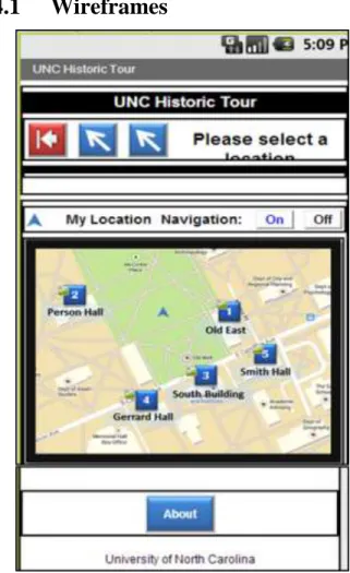
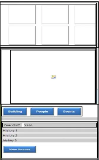
Wireframes
4.2
Working Prototype
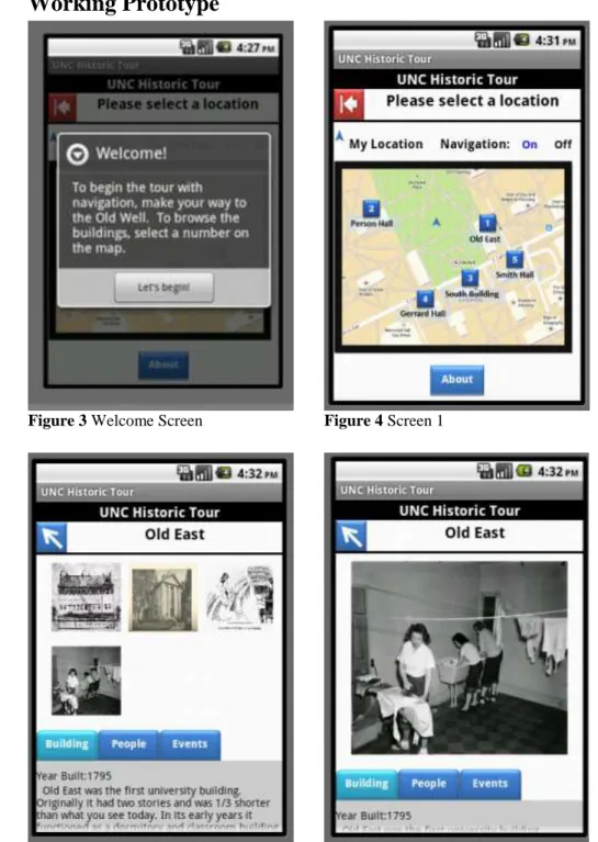
Figure 3 Welcome Screen Figure 4 Screen 1
4.3
Code Blocks
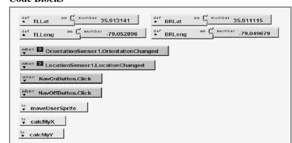
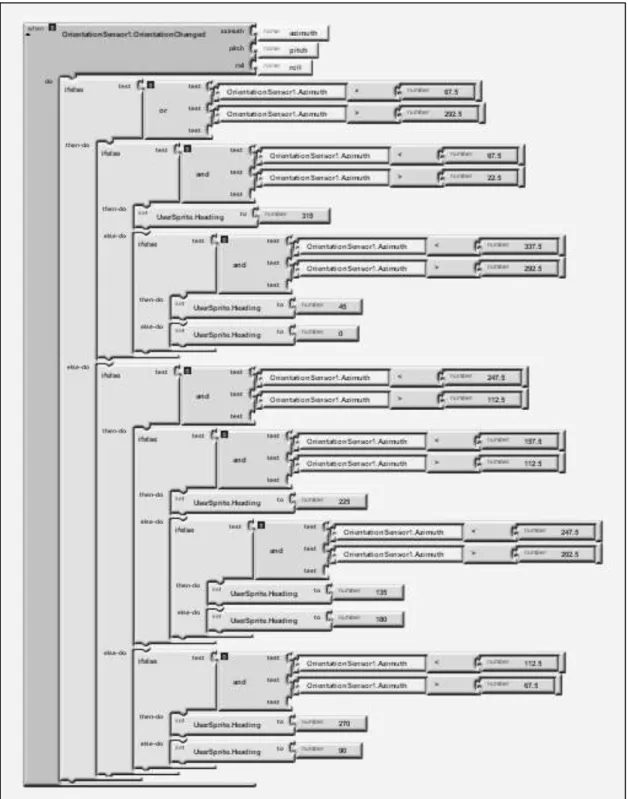
Figure 9 LocationSensor checks every 100 milliseconds if location has changed. If it has (i.e., the user has moved), it records the new latitude and longitude and when accuracy is less than 20 meters the procedure moveUserSprite is called. MoveUserSprite places the navigation arrow on the map using (x, y) coordinates calculated from the calcMyX and calcMyY procedures (below).
Figure 10 Formulas convert latitude and longitude values into (x,y) values to locate the navigation arrow on the map.
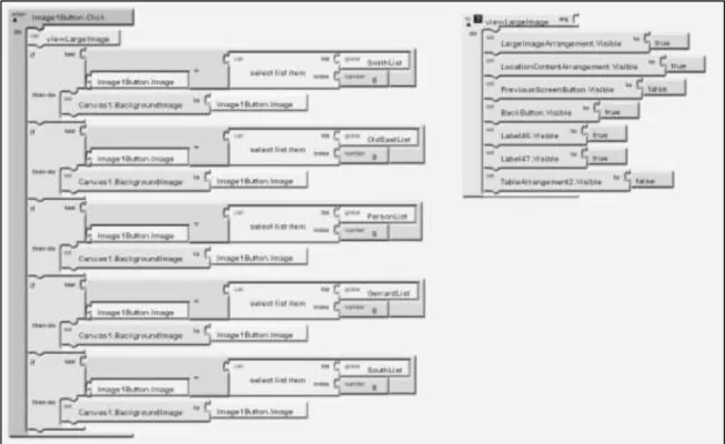
Figure 14 When a button image is touched, the image populates in the canvas. The viewLargeImage procedure hides the thumbnails and makes the canvas visible.
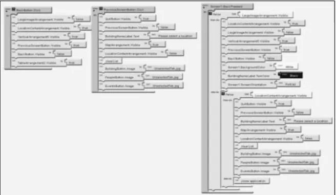
Figure 16 Back buttons for navigation within the app. One button will hide the large canvas image and show the thumbnails while the other will hide screen two and show screen one with the map. There is also a function if the user presses the back button on the phone itself instead of using the programmed back buttons.
EVALUATION
Evaluation of the application consisted of participants using a fully-packaged
version of the application on an Android device. The facilitator had the participants
perform tasks and answer questions about the application and their experience using it.
4.1
Testers
Five students and four non-students were selected to test the application
based on their response to an email sent to multiple listservs. The only
requirement to participate was the testers needed to be familiar with smart phones.
Only one tester was male. The students’ education level ranged from
undergraduate to PhD. The non-students were college graduates. Some testers
used Android for their personal phones and others used iPhone.
4.2
Devices
The Android platform is run on multiple devices and testing all of them is
beyond the scope of this project. A single device, an HTC Evo Shift was selected
for testing purposes. The application was loaded onto the phone and then given to
participants to use.
4.3
Procedures
Participants were assigned a time to meet with the facilitator. After signing
a consent form they were told about the study and shown the phone they would be
used the Old Well as a central starting point. The participant was then asked to
complete a series of tasks that involved navigating to a location and viewing
information about the building including text and pictures. They were advised to
use the map to help them navigate to the next location.
The facilitator recorded the participant’s responses to the tasks and asked
questions to follow-up their responses. At the end of the test the participant was
asked to rate the experience, particularly the functionality, usability, and subject
interest of the application.
4.4
Results
This particular study brought out interesting personal preferences of the
individual tester in regards to how they interact with mobile applications. While
one tester may have liked the textual content, another would think it was too long.
This was the case for many elements. However there was one positive and one
negative aspect of the application that was consistent across testers. All testers
liked the images that were used and found the navigation arrow to be inaccurate.
In regards to the usability of the application, the testers rated the app as
very easy to use. Testers said it was logical, intuitive, did not have error messages,
and had good color contrast. There were no foreign components which meant the
application was easy to use. They also said the tabs were easy to use, interaction
with images worked as expected, buttons were clearly defined and testers were
able to “zoom in” on the images (aka view a larger version of the image; regular
zoom was not a feature in this app). Testers did not like the navigation arrow and
the map. Many said the distance between buildings seemed farther because of the
map and where the navigation arrow was located. Some testers also said there was
no indication of which side of the building they should stand on. This eventually
lessened the enjoyment of the experience when they were looking at the images
and their view was not the same as the images.
In terms of layout, formatting and color use, testers liked the button colors
and photos. They felt it was a nice layout, the colors were applicable to the school
and the back arrow was very clear. One tester said they didn’t notice the layout
much because it didn’t detract from using the application. Another tester wanted
to see a large image indicating they could swipe to more images when they first
see the second screen instead of the thumbnail images. Other testers expressed
interest in seeing a modern image of the building to make sure they were at the
correct one. The navigation arrow was sometimes hard to see when it was located
over the blue markers and a few testers suggested changing the color of the
navigation arrow. The markers were not in numerical order and one tester thought
it would be better to have them in order, thus creating a loop, instead of having
the user backtrack to a building they had passed. Along those lines, another tester
felt they had to go in order because of the numbered markers instead of viewing
the buildings in the order they wanted.
Testers really liked the functionality of the application. One felt the
interactive map was a step beyond traditional GPS. Most commented on the swipe
function and liked that but one wanted to be able to touch the image to see the
touching the elements was easy. The main complaint about function was the
navigation arrow. It would often spin in many directions before stopping in the
right direction. It was also inaccurate, sometimes placing the tester inside a
building when they were standing outside. One tester noted that the links to URLs
were long and were not actually linked. Shortening the URLs to bit.ly format was
suggested.
Testers said the text and images were engaging. The most positive
response was to the images. Some liked that they were old, others found them
interesting, and yet others liked that you could view a larger version of the image.
However, the personal styles of application use as mentioned earlier were most
apparent with the text and images. Some testers said they didn’t like reading a lot
of text in general and mostly skimmed the text and focused on the images. Others
loved to read text and read all the text for each building. Those that skimmed the
text often asked questions about what was going on in the images while those that
read the text did not and indicated that they understood why the images were
chosen. One tester that skimmed the text said captions would have been nice.
Other complaints included the text being too small or too much. A few testers
found some of the text confusing and were not sure how it related to the building
and yet others found the information interesting and were surprised at the kind of
information that was included. A few testers wanted to know what the building
was used for currently and some would have liked the images to be incorporated
Recommendations for future applications
Give users opportunity to be spontaneous. Users on a campus tour will likely want to wander on their own and look at buildings at their leisure. Using blank markers on the map instead of numbers gives the user freedom to interact with the map in the way they prefer.
Let users know they have arrived. A current image of the building/location helps the user know they have reached their destination.
Incorporate user feedback into the design. User feedback is invaluable so build in testing time and incorporate user feedback into the development of the application.
Use images tell users what they are seeing. Users enjoy swiping through images. Make sure they understand thumbnails can be clicked on or large images can be swiped to reveal more images. Many users prefer to look at images and read captions to paragraphs of text so captions for the images are important.
Don’t use GPS just for the sake of using it. While it is a common feature in applications, tall buildings may block GPS signals and provide for poor location sensing and result in frustration for users. Be aware of the tour environment and adjust the design and function of the application accordingly.
Be consistent in design. Consistent colors and designs provide a cohesive look to the application. The brand of the application should be consistent with the brand of the organization building the application.
Let users decide how much text they want to see. Organize text so only headings are visible and give users the option to expand the text that interests them or hide the ones that don’t.
Overall, the testers had a good impression of the application. They found it
was clear and easy to use and liked the fun facts and images that were used. The
navigation arrow was a drawback in terms of functionality and one tester thought
the map had an “old school” GPS look. That same tester felt the application had a
dated look but no other testers mentioned whether or not they felt the application
was modern looking or not. One tester said they expected more UNC branding in
CONCLUSION
This study was designed to create a historical tour application with App Inventor
and understand whether or not App Inventor was capable of storing historical data and
guide the user on a tour of UNC’s campus. We also wanted to look at the feasibility of
the GPS sensor and database storage in AI and evaluate the user interface and design of
the application.
Historical data was in fact stored in lists in App Inventor and accessed by the
users. The data consisted of text and images and were accurately displayed to the user for
the location that was selected.
The GPS sensor worked well in AI but for the purposes of this project and the
modifications made, there were some significant limitations. In most AI projects using
GPS, only the geo-coordinate is recorded and either displayed to the user or used to give
directions using a map application on the phone. Since our application tried to display a
map within the application and not in a separate map application, other factors affected
the accuracy of the navigation arrow. The geo-coordinates had to be converted to pixel
coordinates in order to place the navigation arrow on the map. With the tall buildings in
the area, the GPS accuracy rarely reached below 10 meters. The program was designed to
only move the location of the arrow when accuracy was below 20 meters which means
the placement of the arrow on the map could be as much as 20 meters off. When accuracy
confusion for the user. Knowing the arrow was moving in the right direction most of the
time seemed to be the better option to it not moving at all.
The database features were not used, although it is possible it could be used for
such an application. The basic code to access the data was similar to the lists but the lists
were easier to work with overall and produced less confusing code logic.
The user interface design was not the easiest to work this but a good tour
application could be made with it. Placement of objects required significant forethought
for how to achieve the correct alignment of elements or text. The design of the user
interface is more time consuming than is it difficult to understand. The basic colors built
in to the program are not desirable to use at all and creating custom colors is far more
involved than simply picking a color from a list. The RGB codes are needed and have to
be programmed in the blocks editor instead of the interface design window.
Zooming in on the map or images was one thing numerous testers mentioned as
something they would like to do but could not. Zoom functions are important to users and
common in applications created by professional software developers. Being able to zoom
in to the map or an image would be useful for users with smaller screens. This is a
possibility with AI but requires extensive programming since there is not a native
function built into the AI software that allows for zooming.
While it seems a bit cumbersome with all the customizations, App Inventor is a
viable platform in which to build mobile applications. A tour, either for a campus or other
location, is quite possible as evidenced by this project and the Trinity College campus
tour app.28 The greater understanding of programming logic an individual has, the easier
it will be to build an application in AI, but no knowledge of a specific programming
language is necessary. With the help of tutorials, one can build a simple application
within an hour. However more complex applications such as this campus tour would
BIBLIOGRAPHY
Anokwa, Yaw, et al. "A user interaction model for NFC enabled applications."Pervasive Computing and Communications Workshops, 2007. PerCom Workshops' 07. Fifth Annual IEEE International Conference on. IEEE, 2007.
Bihler, Pascal, Paul Imhoff, and Armin B. Cremers. "SmartGuide–A Smartphone
Museum Guide with Ultrasound Control." Procedia Computer Science 5 (2011): 586-592.
Ceipidor, U. Biader, et al. "NFC technology applied to touristic-cultural field: a case study on an Italian museum." Near Field Communication (NFC), 2013 5th
International Workshop on. IEEE, 2013.
Dooley, Kevin. “Self-guided Mobile Tours.” The Digital Humanities for Nonprofits. South Jersey Center for Digital Humanities. 3 May 2013. Lecture.
<http://njch.org/wp-content/uploads/2013/05/Kevin-Dooley_OnCell.pdf>
Goffredo, Theresa. “Smartphone tour guides now available for four historical sites in county,” HeraldNet.com, 25 Jun. 2011. Web. 13 Nov. 2013. <
http://www.heraldnet.com/article/20110625/LIVING/706259977>
Grobart, Sam. “Multimedia tour guides on your smartphone,” The New York Times, 16 Mar. 2011. Web. 13 Nov. 2013. <
http://www.nytimes.com/2011/03/17/arts/design/apps-give-museum-visitors-multimedia-access.html?_r=1&>
Handy, Grace. “What Language Should you Build your app with?” Mashable.com, 11 Jul. 2012. Web. 4 Nov. 2013. <http://mashable.com/2012/07/11/language-app/>
“Illumination Software Creator”. Wikipedia: The Free Encyclopedia. Wikimedia Foundation, Inc., 12 Aug. 2013. Web. 4 Nov. 2013.
<http://en.wikipedia.org/wiki/Illumination_Software_Creator>
Klosowski, Thorin. “Hopscotch HD Introduces Kids to Programming,” Lifehacker.com, 19 Apr. 2013. Web. 4 Nov. 2013. <http://lifehacker.com/hopscotch-hd-introduces-kids-to-programming-476419325>
Magan, Mike. Smartphone serves as your virtual Kokomo guide. Indiana Insider Blog, 7 Feb. 2013.
Menzel, J., Michael Königs, and Leif Kobbelt. "A framework for vision-based mobile AR applications." Proceedings of the Workshop on Mobile Vision and HCI
(MobiVis). Held in Conjunction with Mobile HCI. 2012.
Pence, Harry E. "Smartphones, smart objects, and augmented reality." The Reference
Librarian 52.1-2 (2010): 136-145.
“TouchDevelop: FAQ,” Microsoft Research. Web. 4 Nov. 2013. <https://www.touchdevelop.com/docs/faq>
“Visual programming language,” Wikipedia: The Free Encyclopedia. Wikimedia Foundation, Inc., 6 Nov. 2013. Web. 4 Nov. 2013.
NOTES
1. A list of visual programming languages can be found at
APPENDIX
Examples of tours:
Original tutorial for the campus tour, basis of this project: http://turing.cs.trincoll.edu/~ram/cpsc110/tutorials/mylocation2/
Campus tour without images: https://sites.google.com/site/donnyhuntsportfolio/creative-projects/creative-project-3
Trinity campus tour without images, basic:
http://notes.hfoss.org/index.php/AppInventor:Trinity_Tour_App
Tutorials Consulted/Code used or modified:
Swipe images function: http://puravidaapps.com/snippets.php#flung
How to add and remove list items:
https://lh6.googleusercontent.com/-ex5le03D7xU/UTIQvjWV_2I/AAAAAAAAG3E/MTqSNsLmUn4/s1600/Capture.PNG
Original campus tour code, modified for project:
http://turing.cs.trincoll.edu/~ram/cpsc110/tutorials/mylocation2/