Relationship between Marketplace Plan Take-up rate and Monthly Premium from 2014 to 2016.
by
Yifan Wei
A master’s paper submitted to the faculty of The University of North Carolina at Chapel Hill in partial fulfillment of the requirements for the degree of Master of Sciences in Public
Health in the Department of Health Policy and Management, Gillings School of Global Public Health
Chapel Hill 04/28/2017
Approved by:
Abstract: This study estimates the causal relationship between state-level Federally Facilitated Marketplace monthly premiums and take-up rates from 2014 to 2016. A model using fixed
effects was shown to be the right approach. This study found \ small though statistically
significant effects of monthly premiums on the Marketplace plan take-up rate. The results may
suffer from limitations of the model itself and also of accuracy issues in the input data, but if this
finding holds in the upcoming years, the Marketplace may have the chance to stabilize on its
Introduction
Began in October 1st, 2013, the Health Insurance Marketplace (referred to hereafter as
‘the Marketplace’) is one of the central and most visible components of the Affordable Care Act
(ACA). The Marketplace provides consumers a method to enroll in non-group health insurance
and is the only enrollment method where qualifying individuals can get premium- and
cost-sharing subsidies.1 To date, four Open Enrollment periods have been completed. As of the end of
the third open enrollment under the ACA, 12.7 million people had signed up for coverage in the
Health Insurance Marketplace.3
Though providing health insurance coverage to millions of Americans, the Marketplace
has limitations. With the announcement of sizable premium rises and fewer plan choices in 2017,
critics have said that the Marketplace is in a “death spiral”, indicating that the two-way
relationship between the increase in premiums and decreases in enrollment number, called
“adverse selection” by economists, will leave the Marketplace with ever-increasing premiums an
increasingly sicke (and high cost) population, eventually lead to its collapse. However, many
state regulators who permitted large premium increases for 2017 did so primarily to enable
premiums to catch up to the risk profile of the populations enrolling in Marketplace plans, which
is sicker than typical insurance pools. The regulators’ hope is that those increases, coupled with
stable or modestly increasing enrollment, would solidify the Marketplace and return premium
increases to much more moderate levels moving forward.4 How well this will work out depends
on how responsive people are to the rise in premium; if people turn out to be more responsive
than the state regulators expected, a “death spiral” may happen before the Marketplace
This paper looks at the relationship between Marketplace plan take-up rates and
premiums at the state-level. Previous literature looked into this question using
employment-based health insurance and has concluded that employees follow the law of demand and are less
likely to choose health plans with higher monthly out-of-pocket premiums.5,6,7 However, the
Marketplace offers non-group (i.e. individual) plans, rather than group plans, which may affect
response. Marquis and Long measured worker’s demand for health insurance in the non-group
market in their paper and found a price elasticity of -0.3 to -0.4, indicating an inelastic but
nonzero response.8
Though this paper does not try to examine the individual-level relationship of demand for
health insurance’s and premium, instead measuring on an aggregate level, this literatures provide
some insight. My hypothesis for this paper is that increases in premiums should cause a decrease
in the plan take-up rate. If this hypothesis holds, we might also need to know how big the
coefficient is to tell if it is going to lead to the so called “death spiral”. If this hypothesis does not
hold, then maybe after this initial rise in premium to correctly reflect the higher than usual risk
profile of Marketplace population, the number of enrollment will not decrease sharply but may
even increase modestly due to people’s increasing knowledge of the Marketplace; this way, the
Marketplace may normalize after a few years.
Specific Aims
The first specific aim of this study is to estimate the Health Insurance Marketplace plan
take-up rate from Open Enrollment period one to Open Enrollment period three. The second
at the county-level and state average premiums. My hypothesis for this is that an increase in the
premium will be associated with a decrease in the plan take-up rate.
Data
The data I used in this study are longitudinal (three years) at the county-level. The 580
counties included in this dataset are from 35 states that use Healthcare.gov website to enroll in
their Marketplace plans (that is, federally facilitated marketplaces). The dependent variable is the
estimated Marketplace plan take-up rate (in percentage points) for 2014 – 2016; the explanatory
variable is the average monthly premium for the Marketplace plans before tax credit for 2014 –
2016. Due to data limitations, the most granular premium data available are state-level premium
data; this will be addressed in the Limitation section. The plan take-up rate is estimated using the
small area estimation method, with plan selection data from Office of The Assistant Secretary for
Planning and Evaluation (ASPE) and state demographic variables from the American
Community Survey (ACS). The primary explanatory variable is derived from ASPE’s annual
report on premium affordability, competition, and choice in the Health Insurance Marketplace
from 2014 – 2016.9,10,11 Marketplace plans are categorized into four metal levels: bronze, silver,
gold and platinum; as the metal level increases, plans are with higher premium and better
coverage. Nearly 90% of people enrolled into Marketplace plans choose bronze or silver plans,
which are the two lowest costs plans; the average monthly premium for the Marketplace plans
before the tax credit, the explanatory variable in this model, should be a proxy for the price most
people faced when signing up for Marketplace plans. Because pre-subsidy and after-subsidy
premiums are positively correlated, so the pre-subsidy is a rough proxy for the after-subsidy
avoid the two-way causal relationship problem. The tax credit rate is set by federal government
and is the same for every state; it is related to income, so the model will include the percentage
of people in different poverty categories as control variables to control for its effect.
Control variables included in this model are: county-level demographic variables (log
county population, county percentage male, county median age, county percentage of population
in racial/ethnicity groups, county percentage of population in different poverty categories) from
the ACS; number of plans available on county Marketplace from CMS Health Insurance
Marketplace Public Use Files, to control for competition’s impact on premium level; state’s
Medicaid Expansion status, because study has shown that that Medicaid Expansion is associated
with lower Marketplace premiums12; navigator grant amount (per capita) and number of
navigator grantees for each state from CMS website, to control for outreach and enrollment
effort’s effect on take-up rate; year indicator variables, to control for the fact that people’s
knowledge on Marketplace increases over time, and knowledge on Marketplace has positive
impact on take-up rate. All the county demographic variables are from 2013 – 2015; because the
enrollment for a specific year’s Marketplace plan starts in previous year’s November and ends in
January that year, so it makes sense to use demographic variables of the enrolling time in the
model (for example, the state demographic variables used with 2014 take-up rate and premium
are from 2013).
After merging county-level demographics variables from ACS with other variables, there
are 580 counties included in the study sample. The data may suffer from autocorrelation because
it is a county-level study. I will test and address with Huber clustered ex-post standard errors. I
do not suspect heteroscedasticity will be an issue because my outcome variable is a rate; but I
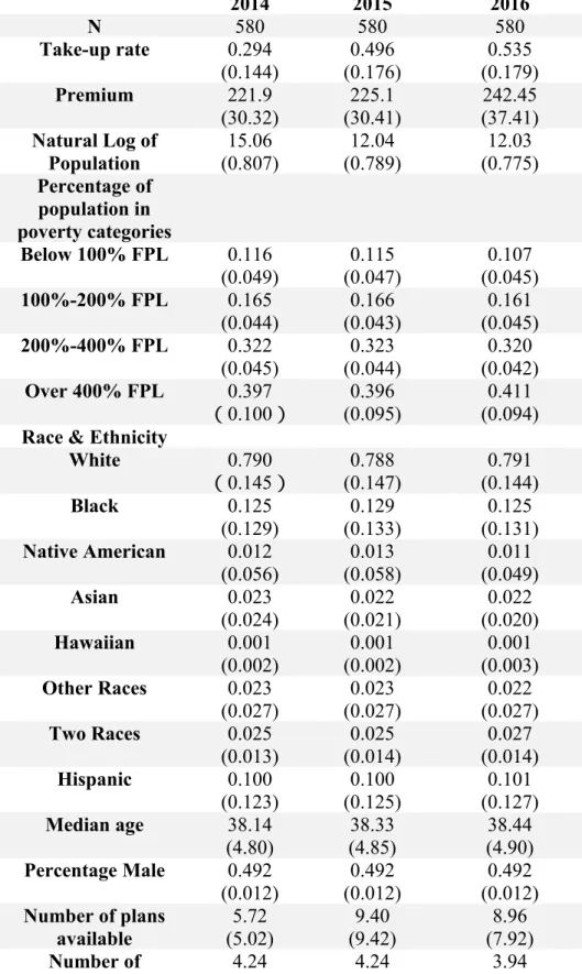
Below in Table 1 are summary statistics for outcome, explanatory and control variables included
in the model.
Method
First Part (take up rate)1 I build on earlier work and use the method outlined here: (excerpted from Dr. Holmes’s research brief)
ASPE provided the number of plan selections by ZIP code during three Open Enrollment
periods. Plan selections for the ZIP code were based on the home address provided for
that individual applicant, or if home address was unavailable, the applicant’s residential
address. The number of plan selections was suppressed for ZIP codes with 50 or fewer
plan selections for privacy reasons. Note that this variable contains the number of
selections, not the number of plans purchased; that is, ASPE did not know whether the
applicant ultimately enrolled in the plan. This variable serves as the numerator. We
calculated the denominator(s) using a three step approach similar to the method used in
other approaches to small-area estimation. The approach is summarized briefly here.
Step 1: Modeling individual probabilities. First, we used the 2012 Public Use Microdata
Sample (PUMS) of the American Community Survey (ACS) to model factors associated
with an individual’s probability of being eligible for the marketplace. An individual was
identified as being “eligible” if they were age 0-64, uninsured or insured through
non-group only, and a citizen of the United States. Children living in households with income
deeming them eligible for Medicaid or CHIP5 were classified as ineligible. Note that this
with access to employer sponsored insurance, but is likely a reasonable estimate based on
data available in the ACS. We developed two estimates: one for those with income 100%
FPG and above and one for those 138% FPG or above.
Using a separate linear probability model for each state, we estimated the probability an
individual was eligible for the marketplace as a function of eight age categories (0-6,
7-11, 12-17, 18-24, 25-34, 35-44, 45-54, 55-64), gender, three race/ethnicity categories
(Hispanic-any race, white only-not Hispanic, at least one race other than white-not
Hispanic), six income categories (0-100% FPG, 100-150% FPG, 150-200% FPG,
200-300% FPG, 300-400% FPG, 400+% FPG), industry/unemployed (for adults), whether the
individual was born in the United States, and indicators for the Public Use Microdata
Area (PUMA). Sampling weights were used to ensure the sample was representative of
the state population. The parameter estimates for each regression were set aside.
Step 2: Developing Small Area Estimates. With the individual parameter estimates in
hand, we then collected ZCTA- level data on corresponding characteristics from the ACS
summary data. For example, table S2407 was used to characterize the proportion of the
ZCTA that worked in each industry, B17024 was used to characterize the age/income
profile of the county, and B05003 was used to characterize the age/sex/nativity of the
community. These data were then used with the parameter estimates from Step 1 to
develop the average probability in the ZCTA of being eligible for the marketplace. This
probability, multiplied by the number of non-elderly in the ZCTA, served as the initial
estimate for the ZCTA-level denominator. Using the MABLE data engine provided by
that the ZCTA-specific estimates could be allocated to PUMAs (ZCTAs spanning
multiple PUMAs were allocated proportionally by population).
Step 3: Raking Estimates. The first two steps of this process do not require the sum of the
ZCTA-specific estimates to equal the estimated number of eligibles from the ACS
PUMA. Therefore, the ZCTA-specific estimates were ”raked” to ensure that the sum of
the ZCTA-estimates in a PUMA equals the estimated number in the PUMA.7 For
example, if the summed number of eligibles in the ZCTAs was 100 but the PUMA
estimate was 110, each ZCTA-specific estimate was increased by 10%. Similarly, the
models do not impose that the number of eligibles with incomes above 138% FPG is less
than the number of eligibles with incomes above 100% FPG; the model is iteratively
raked to ensure that the data are internally consistent in this respect. The final
denominator was the number of estimated eligibles in the ZCTA with incomes above
100% FPG for Medicaid non-expansion states and above 138% FPG for Medicaid
expansion states.
Because ZCTAs can be small, and thus impose considerable sampling variation, we
calculated (weighted) local uptake rates. Briefly, we calculated weighted sums of
enrollees and eligible individuals for a latitude/longitude grid. We identified all ZCTAs
with centroids within 50 miles of the grid point and calculated weights based on the
distance from the ZCTA to the grid; the function exp(-0.1 * miles) means a ZCTA 30
miles away receives 5% of the weight of a ZCTA with centroid equal to the grid point.
With the takeup estimates in hand, I then turn to estimating takeup rates as a a function of
premiums and other factors. I used the OLS/FE/RE method for this paper. The equation is:
TAKEUP = 0 + 1*PREMIUM + 2*X + ,
with TAKEUP being my outcome variable, PREMIUM being my explanatory variable and X
being all the control variables as mentioned above in the Data section; 1 is the parameter that will test my hypothesis.
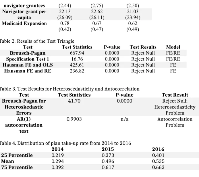
To test which method to use, I performed the Test Triangle. First, I conducted the
Breusch-Pagan test to see whether error terms are independent within the unit to choose between
OLS and RE; then, I conducted a specification test if the coefficient for the individual indicator
is zero to choose between OLS and FE; finally, I conducted Hausman tests between FE and OLS,
FE and RE to test if the consistent estimator (FE) and the efficient estimator (OLS or RE) are
different from each other to choose between these three methods. The results of the Test Triangle
are shown in Table 2. Breusch-Pagan tests whether error terms are independent within the unit to
choose between RE/FE and OLS, and the null hypothesis is σu2 = 0. The result for
Breusch-Pagan shows that it rejected null and should choose RE/FE over OLS. Specification Test 1 tests
whether the coefficient for the individual indicators is zero to choose between FE/RE and OLS,
and the null hypothesis is they are zero. The result for Specification Test 1 shows that it rejected
null and should choose FE/RE over OLS. The Hausman tests if the consistent estimator (FE) and
the efficient estimator (RE/OLS) are different from each other, and the null is they are not
different. The result for both the Hausman tests rejected the null and should choose the consistent
one over the efficient ones. Based on results from the Test Triangle, FE is the best method to use
I would also like to test for heteroscedasticity and autocorrelation. To test for
heteroscedasticity, I used the Breusch-Pagan test for heteroskedastic errors; to test for
autocorrelation, I used the AR (1) serial correlation model. To test for heteroscedasticity
problem, I used Breusch-Pagan Test. After running FE regression, predict and store the residual;
then run auxiliary regression of squared residual on all explanatory variable and control
variables. The F-statistics of this auxiliary regression is shown in Table 3. The F-statistics is
41.70 and the corresponding p-value is 0. We can reject the null hypothesis and from this result,
we could see that there is heteroscedasticity problem with the model. To test for autocorrelation
problem, I used AR(1) autocorrelation test. I predict the residual of FE regression and lag 1 FE
regression, and the correlation coefficient between these two residuals is shown in Table 3. The
correlation coefficient is 0.9903, there is autocorrelation problem with this model. So in the final
model, I use robust standard error and cluster on county level.
Results
Estimation of Plan take-up rate
Table 4 shows summary of plan take-up rate estimation from 2014 to 2016. Graph 1, 2 and 3 are
histograms showing the distribution of plan take-up rate estimation from 2014 to 2016. We could
see from the graph that in 2014, more counties had a lower than average take-up rate; while in
2015 and 2016, this distribution tends to be more normal.
Regression results
The regression results using fixed effects model are shown in Table 5. As shown in Table 5, the
effect of premium on plan take-up rate is
for poverty categories, this effect is 0.02; one dollar increase in premium will increase
percentage plan take-up by 0.02 percentage point. Considering the mean value for take-up and
premium over three years shown in Table 1, this effect is very small.
Other variables that have a statistically significant effect are: natural log of population,
navigator grant per capita, number of plans available on Marketplace and the year indicator
variables.
Limitations
The first limitation of this paper is that the plan selection value used to estimate plan
take-up rate is not actual enrollment number, the actual enrollment should be smaller. There
should be people that select the plan but do not pay the premium, so they are not actually
enrolled into the plan, but they are included in this paper’s plan take-up rate. This affects how
accurate this paper could estimate the relationship between premium and plan take-up. If most
people only start taking premium into consideration on whether or not to enroll after they select
the plan, then this paper’s model might have larger limitatons. But the ASPE plan selection data
is the best available data on Marketplace enrollment number.
A second limitation is that because plan take-up rate is a possibility between 0 and 1, a
maximum likelihood model is a better choice than a linear model in this case. In this case,
however, the range of takeup estimates is largely within the 0-1 range and does not tend to have
a large number of counties with “corner values” at 0 or 1.
A third limitation is that the premium value in this paper is on the state-level because
county-level data is not available. Also, this paper chooses to use the second lowest silver plan
on a range of other characteristics (like smoking or not, family member, age, etc.), the premium
facing everyone is different. A better approach might be to include a premium number with more
variation in the model to better represent the real price that people are facing when deciding
whether or not to enroll into a Marketplace plan. In any event, the premium used here is likely a
fair representation of the overall state-level rates; in other words, states with higher values for the
the measure used here likely have higher after-subsidy premiums.
Another limitation of this paper is that there is potentially a simultaneity issue. The
premium has effect on plan take-up rate, but in turn, the take-up rate or enrollment number in
one area will also affect premium when the insurance issuers and state regulators decide next
year’s premium. So the the two values are determined simultaneously and this is not addressed
by this paper’s model.
Discussion
This study found the effect of premium on plan take-up rate in the Marketplace is very
small, though significant, on the county-level, using 2014-2016 data. If this finding holds true
during the coming years for the Marketplace, ‘death spiral’ might not happen. Even if the finding
itself is reliable, which may not be true due to limitations stated above, the relationship between
premium and take-up rate during 2014 to 2016 may be different with this relationship for
following years. During 2014 to 2016, the Marketplace has just been established, reduction in
take-up rate due to increasing premium may be balanced by increases in the take-up rate due to
more people learning about their eligibility for Marketplace plans and enrolling in. This is
supported by the very large and statistically significant coefficients on both year indicator
variables included. During the first introduction of Marketplace, maybe most of the between-year
variation in plan take-up rate can be explained by difference in year, thus how well people
learnted about the Marketplace. Though this model tries to separate the effect of people’s
knowledge of the Marketplace by including year indicators, it might still be problematic.
Existing studies on relationship between out-of-pocket premium and plan take-up rate on other
kinds of health insurance market show at least a modest negative relationship. For the
Marketplace to stabilize, it may need to finish its premium adjustment for riskier populations in
the initial three to five years, when more people are learning about Marketplace and enrolling in.
After this period, if the fast-increasing premium continues, more people will drop out
Marketplace plan than the number of new enrollees, and that will lead to the collapse of the
References
1. Holmes, Mark, et al. "Geographic variation in plan uptake in the federally facilitated marketplace." NC Rural Health Research Program. September (2014). Available at: http://www.shepscenter.unc.edu/wp-content/uploads/2014/09/EnrollmentFFMSeptember_rvOct2014.pdf
2. State Health Insurance Marketplace Types, 2016. The Kaiser Family Foundation, 2016. Available at:http:// kff.org/health-reform/state-indicator/state-health-insurance-marketplace-types/?
currentTimeframe=0&sortModel=%7B%22colId%22:%22Location%22,%22sort%22:%22asc%22%7D
3. Levitt L, Claxton G, Damico A. and Cox C. Assessing ACA Marketplace Enrollment.The Kaiser Family Foundation. March (2016). Available at:
http://files.kff.org/attachment/issue-brief-assessing-aca-marketplace-enrollment
4. Altman D. Why the Key Indicators to Watch on Health-Care Marketplace Come in 2017. The Kaiser
Family Foundation. October (2016). Available at: http://kff.org/health-reform/perspective/why-the-key-indicators-to-watch-on-health-care-marketplaces-come-in-2017/
5. Feldman, Roger, et al. "The demand for employment-based health insurance plans." Journal of Human Resources (1989): 115-142.
6. Chernew, Michael, Kevin Frick, and Catherine G. McLaughlin. "The demand for health insurance coverage by low-income workers: Can reduced premiums achieve full coverage?." Health Services Research 32.4 (1997): 453.
7. Cooper, Philip F., and Jessica Vistnes. "Workers’ decisions to take-up offered health insurance coverage: assessing the importance of out-of-pocket premium costs." Medical Care 41.7 (2003): III-35.
8. Marquis, M. Susan, and Stephen H. Long. "Worker demand for health insurance in the non-group market." Journal of health economics 14.1 (1995): 47-63.
9. Burke Amy, Misra Arpit, and Sheingold Steven. "Premium Affordability, Competition, and Choice in the Health Insurance Marketplace, 2014." ASPE Research Brief (2014).
10. Misra Arpit and Tsai Thomas. “Health Insurance Marketplace 2015: Average Premiums after Advance
Premium Tax Credits through January 30 in 37 States Using the Healthcare.gov Platform.” ASPE Issue
11. ASPE. “Health Insurance Marketplace Premiums after Shopping, Switching, and Premium Tax Credits,
2015-2016.” ASPE Issue Brief (2016).
12. Sen Aditi and DeLeire Thomas. “The Effect of Medicaid Expansion on Marketplace Premiums.” ASPE
Issue Brief (2016).
13. Wooldridge J. “Introductory Econometrics – A Modern Approach” 5th Edition, Chapter 3 & 4. (2013)
14. Aizer, Anna. "Low Take-Up in Medicaid: Does Outreach Matter and for Whom?." The American Economic Review 93.2 (2003): 238-241.
15. Enroll America. “State of Enrollment: Helping North Carolina Get Covered and Stay Covered,
2014-2015.” Enroll America (2015).
16. Jane B. Wishner, Anna C. Spencer, and Erik Wengle. (November 2014). Analyzing Different Enrollment
Outcomes in Select States That Used the Federally Facilitated Marketplace in 2014. The Urban Institute.
Tables and Graphs
Table 1. Summary Statistics
2014 2015 2016
N 580 580 580
Take-up rate 0.294
(0.144) 0.496 (0.176) 0.535 (0.179) Premium 221.9
(30.32) (30.41)225.1 (37.41)242.45
Natural Log of Population 15.06 (0.807) 12.04 (0.789) 12.03 (0.775) Percentage of population in poverty categories
Below 100% FPL 0.116
(0.049) (0.047)0.115 (0.045)0.107
100%-200% FPL 0.165
(0.044)
0.166 (0.043)
0.161 (0.045)
200%-400% FPL 0.322
(0.045)
0.323 (0.044)
0.320 (0.042)
Over 400% FPL 0.397
(0.100) (0.095)0.396 (0.094)0.411
Race & Ethnicity
White 0.790
(0.145)
0.788 (0.147) 0.791 (0.144) Black 0.125 (0.129) 0.129 (0.133) 0.125 (0.131)
Native American 0.012 (0.056) 0.013 (0.058) 0.011 (0.049) Asian 0.023 (0.024) 0.022 (0.021) 0.022 (0.020) Hawaiian 0.001 (0.002) 0.001 (0.002) 0.001 (0.003)
Other Races 0.023
(0.027) (0.027)0.023 (0.027)0.022
Two Races 0.025
(0.013) 0.025 (0.014) 0.027 (0.014) Hispanic 0.100 (0.123) 0.100 (0.125) 0.101 (0.127)
Median age 38.14
(4.80)
38.33 (4.85)
38.44 (4.90)
Percentage Male 0.492 (0.012)
0.492 (0.012)
0.492 (0.012)
Number of plans
available (5.02)5.72 (9.42)9.40 (7.92)8.96
navigator grantees (2.44) (2.75) (2.50)
Navigator grant per capita 22.13 (26.09) 22.62 (26.11) 21.03 (23.94)
Medicaid Expansion 0.78 (0.42)
0.67 (0.47)
0.62 (0.49)
Table 2. Results of the Test Triangle
Test Test Statistics P-value Test Results Model
Breusch-Pagan 667.94 0.0000 Reject Null FE/RE
Specification Test 1 16.76 0.0000 Reject Null FE/RE
Hausman FE and OLS 425.61 0.0000 Reject Null FE
Hausman FE and RE 236.82 0.0000 Reject Null FE
Table 3. Test Results for Heteroscedasticity and Autocorrelation
Test Test Statistics P-value Test Result Breusch-Pagan for
Heteroskedastic Errors
41.70 0.0000 Reject Null; Heteroscedasticity
Problem AR(1)
autocorrelation test
0.9903 n/a Autocorrelation Problem
Table 4. Distribution of plan take-up rate from 2014 to 2016
2014 2015 2016
25 Percentile 0.219 0.373 0.401
Mean 0.294 0.496 0.535
75 Percentile 0.392 0.617 0.663
Table 5. Fixed Effects Regression Results after Adjusting for Heteroscedasticity and Autocorrelation
Variable Coefficient
Premium** 0.225
(0.083) Interaction terms: premium and
percentage of population in poverty categories
Premium*under 100 FPL -0.328
(0.204) Premium*between 100 and 200 FPL -0.332
(0.232) Premium*between 200 and 400 FPL -0.331
(0.217) Natural log of population*** 124.1
(42.4)
Median age 0.448
(0.373)
Percentage White 16.48
(42.10)
Percentage Black 60.19
(37.65)
Percentage Native American -72.59
(62.20)
Percentage Asian 10.85
(54.81)
Percentage Hawaiian 110.61
(110.48)
Percentage Other Race 10.92
(42.51)
Hispanic -60.01
(102.20)
Percentage under 100 FPL 57.48
(48.36) Percentage between 100 and 200 FPL 67.12
(52.05) Percentage between 200 and 400 FPL 65.45
(49.42) Navigator grant per capita*** 0.452
(0.056) Number of navigator grantees -0.223
(0.181) Number of plan available on
Marketplace*** (0.001)0.191
Medicaid Expansion -0.429
(1.162)
Year 2014 indicator*** -23.21
(0.822)
Year 2015 indicator*** -4.422
(0.508)
Constant*** -1554.5
(275.5)