Jiaoling Chen. A Study to Explore How Differences in the Amount of Details in Visualization Impact Decision-making. A Master’s Paper for the M.S. in I.S degree. April, 2016. 41 pages. Advisor: David Gotz
This study explores how differences in the amount of details in visualization impact the decision-making process. Everyday decisions like buying a used car are the focus of the study. A visualization tool that is able to show different number of attributes was
designed and developed using JavaScript library d3. Twenty users participated in the user study and were asked to make car-buying decisions based on the observation of different levels of details of car information presented in the developed visualization tool.
Two patterns of the decision-making process were summarized. The increasing number of details in information visualization does not always influence participants’ decision-making, while the value range and the level of importance of the newly added attributes turned out to be more influential on participants’ decision-making processes. A weak correlation between level of confidence and the number of details in information visualization is found.
Headings:
A STUDY TO EXPLORE HOW DIFFERENCES IN THE AMOUNT OF DETAILS IN VISUALIZATION IMPACT DECISION-MAKING
by Jiaoling Chen
A Master’s paper submitted to the faculty of the School of Information and Library Science of the University of North Carolina at Chapel Hill
in partial fulfillment of the requirements for the degree of Master of Science in
Information Science.
Chapel Hill, North Carolina
April 2016
Approved by
1.
I
NTRODUCTIONThe rapidly growing flood of data, which increases the difficulty making effective
decisions, overwhelms decision-makers. Visualization, an intermediate step in converting
data into insight (Green 1998), is regarded as a helpful tool to enlarge problem-solving
capabilities by enabling the processing of more data without overloading the
decision-maker (Tegarden 1999). However, over-complexity of visualization can cause cognitive
problems and hinder effective decision-making when elements in visualization are
depicted in a more complex manner than necessary (Tversky 2005, Kosslyn 2006).
This paper aims to study how differences in the number of details in visualization
impact a user’s ability to make an informed decision. Everyday decisions like buying a
used car are the focus of the study. During this kind of decision-making process,
evidence-based strategy is a common way for people to reach a final decision. The users
in this study are asked to buy a used car according to their observations on the car
information presented by a visualization tool. Different patterns of users’
decision-making process as the number of details of information increases are summarized and
analyzed. The user study also investigates how different number of details of visual data
influence users’ confidence level, which is an important psychological aspect during the
decision-making process. An interactive visualization tool capable of showing different
2.
M
OTIVATIONThis paper is going to investigate how differences in the number of details in
visualization impact a consumer’s ability to make an informed decision. The study aims
to answer the following questions:
1. What are the patterns of the decision-making process as the number of details of
information in visualization increases?
2. Will visualization with low level of details of data cause under-confidence during
decision-making?
3. Will visualization with high level of details of data cause over-confidence during
decision-making?
In this paper, the level of details of data in visualization will be presented as the
different number of features in car information shown in visualization. It is assumed that
an informed decision is based on an evidence-based decision-making process. The level
of confidence during decision-making is a self-evaluation from participants using a 0-10
3.
R
ELATEDW
ORK3.1 Data details in visualization & decision-making
Few researchers in the past have directly demonstrated the impact of the amount of
data details in a visual presentation on reaching an informative decision-making. Though
accuracy is often used to evaluate whether a decision-making is effective, few studies
implied that such effectiveness is directly related to certain amount of data details in a
visual presentation. But many researchers do agree on the idea that the amount of details
in visualization is likely to affect how information is evaluated and understood during a
decision-making process. Early in 1990, Hauser and Wernerfelt discussed that
visualization tools that locate more data in a given visual field lower the cognitive costs
of adding alternatives to a consideration set (Hauser & Wernerfelt 1990). Similarly, Lurie
and Mason agree that “the depth of field” may change the number of alternatives
considered and the perceived differences among choice alternatives. Lurie and Mason
bring up with the concept of “depth of field” as one aspect of visual perspectives to refer
to whether a visualization tool provides context by displaying an overview of large
numbers of data points and/or more focused detail information on particular data points
of interest (Lurie & Mason 2007). At the same time, visualization tools that provide more
context rather than more details and tools that enable more alternatives to be displayed in
a given visual field may lead to relatively less compensatory (more selective) decision
Many visualization tools capable of showing different amount of data details are
also identified in the previous work as effective tools in facilitating people making
decisions. By converting a data point into a pencil-thin bar line, the visualization tool
TableLens is able to display more details in a given space than traditional spreadsheets
(Ganapathy, Ranganathan & Sankaranarayanan 2004). This function can help a manager
assessing product sales across different retail stores to establish a better understanding of
the range of values of the visualized attributes (Lurie & Mason 2007). Spotfire is another
visualization tool previously mentioned that allows decision makers to focus on specific
data points. Spotfire’s zooming scrollbars can facilitate marketers to change level of
detail to see characteristics of a specific item sold in a specific store on a specific day or
to see sales of a product and those of its competitors in multiple retailers over time (Lurie
& Mason 2007). For these visualization tools, more detailed views with more information
on each alternative tend to limit the number of alternatives considered, leading to more
alternative-based (compensatory) processing (Payne 1976).
In order to develop a visualization tool that can show different amounts of data
details in support of decision-making, it is important to study related visualization
techniques. The Treemap visualization technique is a well-known technique because it is
able to show large amounts of hierarchically organized and detailed data. It was first
introduced by Johnson and Shneiderman in the early nineties, and have gained increasing
popularity (Vliegen, Wijk & Linden 2006). It has been used successfully for visualizing
various kinds of data, such as the content of file systems (Johnson & Shneiderman 1991,
Wattenberg 1998), market data, process control data (Mitchell, Shook & Shah 2004), and
Vliegen & Van Wijk 2005). Treemap is also considered to be supportive for
decision-making. In the field of E-commerce, a marketing survey showed that 92% of Peet’s
Coffee and Tea customers who used the more detailed visual treemap interface thought
their buying decision process was easy, opposed to only 12% of those who used the
textual lists(Plaisant 2004). Besides, Treemap is considered as being efficient for tasks
like identification of cause-effect relationships within hierarchies. AHP (Analytic
Hierarchy Process), given its decision tree hierarchy and inherent need for large scale
data visualization and user manipulation, is an appropriate choice for tree map
visualization(Asahi, Turo & Shneiderman 1995). Despite advantages mentioned above,
one drawback of Treemap is that such visualization is difficult to use for less experienced
users (Bederson & Shneiderman 2003). They are also considered as less effective for
presenting aggregate information in business information visualization (Vliegen, Wijk &
Linden 2006). The visualization technique adopted to develop the visualization tool in
this study is initially Treemap. A pilot study was conducted after the visualization tool
was designed using Treemap to test whether the tool is straightforward and effective
enough for the users to explore information within the study context. Unfortunately, the
results showed that the Treemap visualization is too difficult for users to comprehend the
meaning of each dimension, and can hardly facilitate our study. Hence, the study adopts
bar and plot charts to keep the visualization tool more approachable and easy to
understand.
3.2 Data details in visualization & confidence level in decision making
over-confidence or under-over-confidence during the decision-making process has been discussed
in previous literature.
Within cognitive psychology, the “confidence paradigm” has extensively tested
participants’ reactions to a range of cognitive tasks and their confidence in their answers
(also referred to as “meta cognition” or “knowing about knowing”) (Westbrook, Gosling
& Coiera 2005). According to Griffin and Varey, over-confidence can be categorized into
two types: optimistic over-confidence and over-estimation of one’s own knowledge.
Optimistic over-confidence refers to the tendency to over-estimate the likelihood that
one’s favored outcome will occur, and over-estimation of one’s own knowledge refers to
over-confidence in the validity of the judgment even when there is no personally favored
hypothesis or outcome (Griffin & Varey 1996).
Some researches believe the level of confidence is related to the amount of
important information. Koriat et al. (1980) posit that confidence is determined by the
amount and strength (or quality) of information supporting the decision. The increased
amount of information allows people to generate more reasons to justify their decisions
and increases their confidence (Schwenk 1986). Similarly, Oskamp showed that
confidence increases as the amount of relevant information increases (Oskamp 1982). In
the study, Oskamp had 32 subjects (8 psychologists, 18 graduate students and 6
undergraduates) evaluate a scenario of an individual seeking counseling. As more
information became available, the participants became significantly more confident (p
.001) across all expert levels (Oskamp 1982). However, accuracy in determining the
correct prognosis did not significantly, nor consistently, improve with more information
bring more information to users through the activation of both verbal and nonverbal
processing systems. The increased amount of information allows people to generate more
reasons to justify their decisions and increases their confidence (Schwenk 1986).
Other researches also discussed the relationship between level of confidence and
the amount of details in visual presentation. According to Griffin and Tversky, the visual
presentations that provide greater details may lead to over-confidence as users make
assessments on the basis of fewer observations, whereas visualizations that provide
greater context may lead to under-confidence as users fail to adjust for the larger sample
size (Griffin & Tversky 1992). In another research conducted by Zacharakis and
Shepherd, over-confidence varies with the amount, form, and vividness of the
information used in their decision. Specifically, Venture Capitalists’ over-confidence
increases with more information, unfamiliar framing of information, and also with
moderate performance predictions relative to all other more extreme (more vivid)
predictions, and with failure predictions relative to extreme success predictions
4.
S
TUDY4.1 Overview
For the purpose of exploring whether the inclusion of more or less details of
information in visualization impacts the decision-making process and decision-makers’
level of confidence, a user study comprised of user tests, semi-interviews, and qualitative
and quantitative analysis was conducted. User tests were used to record different
decision-making processes based on different amount of details in information
visualization and semi-interviews facilitated to better reason decision-makers’ choices
and psychological perspectives. A visualization tool was developed to provide a visual
presentation of information for this study.
4.2 Visualization Tool Development
In the first phase of this study, a visualization tool that is able to present different
levels of details of used car information was designed and developed. After the
development, two students from the School of Information and Library Science at the
University of North Carolina at Chapel Hill (convenience sample) pre-tested the tool for
tool validation and improvement.
4.2.1 Technology
developed using web technologies: HTML5, CSS3 and JavaScript (jQuery) for front-end
development, PHP and MySQL for web database development, and JavaScript library d3
for data visualization. The tool can be accessed online via the Perl server and the database
is connected to the Ruby server. Text Wrangler Editor and Terminal Console are the
major development environments.
4.2.2 Data Collection
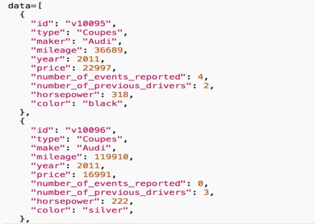
Data of 602 used cars was retrieved from Edmunds.com’s website and Edmunds
API Console, an interactive tool allowing for interaction with automotive data. The data
was formatted in Excel (Figure 4.1). Each row represents information about an individual
used car with 10 fields: car id, type, make, used mileage, year of production, price,
number of events reported, number of previous drivers, horsepower and color. Table 4.1
gives a summary of the 602 pieces of data used in the visualization tool. Field “id” is a
five-digit number, representing a unique car. Field “type” represents the type of the car
and only three types are involved in this study: coupes, SUV and truck. Field “make”
represents the brand of the car, field “price” represents the suggested purchasing price of
the used car, field “mileage” represents the total used mileage of the car, field “year”
represents the production year of the car, field “number_of_reported_events” represents
the number of big/minor accidents in the car history, field “number_of_previous_drivers”
represents the number of previous car owners, field “horsepower” represents the
horsepower of the car, and field “color” represents the color of the car. The formatted
data was converted into a JSON file for further data visualization. Figure 4.2 shows the
dictionary with sets of key-value.
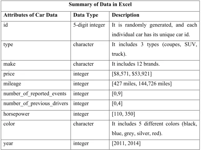
Summary of Data in Excel
Attributes of Car Data Data Type Description
id 5-digit integer It is randomly generated, and each individual car has its unique car id. type character It includes 3 types (coupes, SUV,
truck).
make character It includes 12 brands.
price integer [$8,571, $53,921]
mileage integer [427 miles, 144,726 miles]
number_of_reported_events integer [0,9] number_of_previous_drivers integer [0,4]
horsepower integer [110, 350]
color character It includes 5 different colors (black, blue, grey, silver, red).
year integer [2011, 2014]
Table 4.1. Summary of data fields
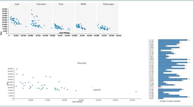
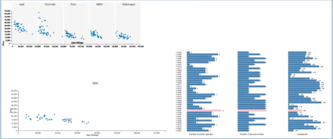
4.2.3 Visualization
The visual perspective of the tool is developed based on the concept “depth of
field”, which refers to whether a visualization tool provides context by displaying an
overview of large numbers of data points and/or more focused detail information on
particular data points of interest (Lurie & Mason 2007). This tool displays increasing
focused detail information on particular data points of interest. There are six different
views presenting increasing number of car attributes on every car data point. Figure 4.3 -
Figure 4.8 present examples of views with different number of car attributes in the
visualization tool.
Figure 4.3. View 1 in the visualization tool shows three attributes of car information. Attributes include car make, price, and used mileage. The participant is able to click the dots to see car ids. The participant was asked to make a car-buying decision based on the information shown.
Figure 4.5. View 3 in the visualization tool shows five attributes of car information. Attributes include car make, price, used mileage, number of events reported, and number of previous drivers.
4.2.4 Function
The function of the visualization tool includes: (1) showing different number of
features of car information; (2) the participants are able to interact with a view by Figure 4.7. View 5 in the visualization tool shows seven attributes of car information. Attributes include car make, price, used mileage and the number of events reported, number of previous drivers, horsepower and color.
zooming in and out; (3) the participants are able to enter answers according to specific
tasks; (4) user input can be collected and stored in the back-end database for further data
analysis.
4.3 User Study
The second phase of this study is to conduct a user study. Recruited participants
were asked to view different number of details of car information in the developed
visualization tool, and correspondently make individual car-buying decisions. Choices of
cars were recorded in the tool. Each participant had an individual session to learn the tool
and conduct the user test, with the company of the investigator. The investigator made
observations on the participants, recorded the time during each session and conducted a
semi-interview after each user test. The participants were asked to describe and reason
their process of making the car-buying decision after each decision and to evaluate the
confidence level of their decision-making based on a 0-10 scale. User input data gathered
from the visualization tool and the interview contents were combined and modified for
analysis.
4.3.1 Participants
A total number of 20 participants (13 females and 7 males) took part in this
experiment. Considering that the decision-making event is a casual type, no professional
background of participants is required and convenience sampling is adopted. Participants
are students from the University of North Carolina at Chapel Hill. Ages of the
vision and are not be informed about the purpose of the study at the beginning of the
session.
4.3.2 Tasks
The study consists of three rounds, with six individual decisions to be made each
round. For each round, the participant is presented with six different views (view n+1
always adds one more attribute to the attributes presented in the view n) and is asked to
make a correspondent car-buying choice based on the information shown. From view 1 to
view 6, the number of attributes of car information is increasing from three (car make,
price, and used mileage) to eight (make, price, used mileage, number of events reported,
number of previous drivers, horsepower, color and year). Information including user id
(randomly assigned and anonymous), car id of the chosen car and the top three criteria
that influence the decision-making at the current view was typed by participants and
stored in the database.
At the start of the user test, explorative questions were asked to get a general
picture of the knowledge level and buying criteria of the user group on buying used cars
and on buying specific types of used cars. Questions include: 1) “How familiar are you
with purchasing a used car, please score it with a 0 - 10 scale, with 0 not familiar at all
and 10 very familiar?”, 2) “How familiar are you with purchasing coupes, please score it
with a 0 - 10 scale, with 0 not familiar at all and 10 very familiar?”, 3) “How familiar are
you with purchasing trucks, please score it with a 0 - 10 scale, with 0 not familiar at all
and 10 very familiar?”, 4) “How familiar are you with purchasing SUVs, please score it
top criteria for you to choose a used car?”.
During each decision-making process, the investigator observed the mouse click
behaviors of the participant and recorded the time of the decision-making process. After
each decision, the investigator asked the participant questions related to his/her
decision-making process. Questions include: 1) “Can you describe the process of your choice and
why you did that?”, 2) “What were the top criteria for choosing this car?”, 3) “Did the
attribute “A” compromise your other attributes?”, 4) “How did you view numerical
information, with absolute values or relative values?”, 5) “What bothered you during the
interaction with the tool?”, and 6) “How confident are you with your choice, please score
it with a 0 - 10 scale, with 0 not confident at all and 10 very confident?”.
4.3.3 Data Collection and Analysis
User input was stored in a MySQL database. It got retrieved using MySQL
Workbench tool and exported into Excel for data cleansing and validation. Note-taking
information including time of the decision-making process and level of confidence was
added manually into the same table. Table 4.2 summarizes all data gathered from the
study including user input and note-taking information. There are in total 360 rows of
individual decision-making records that were gathered from 20 participants. Each record
includes 9 attributes that include the user id, the number of attributes presented in this
decision-making process, the type of the chosen car, the car id of the chosen car in the
database, the top three criteria the participant was based on during the decision-making,
the time of completion of this decision-making, and the level of confidence about this
statistics analysis. Tableau was chosen to facilitate the summarization of different
decision-making patterns, which were analyzed based on user input, note-taking
information from the semi-interviews and the investigator’s observations on the user
tests. JMP was used to analyze the correlation between level of confidence in
decision-making and the increasing number of attributes of data information. REML (restricted
maximum likelihood) was the major estimation method for calculating correlation.
Spearman's rank correlation coefficient (Spearman's rho) was also used in JMP.
Summary of Data gathered from the study
Attributes of Car Data Data Type Description
user id 5-digit integer The id is randomly generated to the participants in order to keep them anonymous.
number of attributes integer It records the number of attributes of car information presented in the tool. type character It records the type of the used car the
participant is considering to buy.
car id 5-digit integer The car id refers to a certain car in the database that the participant decides to purchase.
priority 1 text The top criterion of this decision
priority 2 text The second top criterion of this decision (optional)
priority 3 text The third top criterion of this decision (optional)
Summary of Data gathered from the study (Continue)
Attributes of Car Data Data Type Description
confidence float It is a self-evaluated score from the participants. The scale is from 0-10, with 0 not confident at all and 10 very confident.
5.
R
ESULTSAs the amount of details in information visualization increased in this study,
participants’ information seeking behaviors and decision-making criteria correspondently
changed and compromised. The decision-making processes are summarized and
categorized into two general patterns, which are shown in Figure 5.1 and Figure 5.2. Both
patterns indicate that factors that influence a decision-maker’s decision-making process
as more details of information are presented are dependent of the value range of the
existing dataset and the amount of information considered as important criteria for the
decision-maker. In this study, the increasing number of attributes in information
visualization does not always influence participants’ decision-making, while the value
range and the level of importance of the newly added attributes are considered more
influential on participants’ decision-making processes.
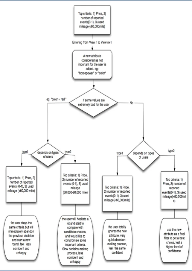
5.1 Summarization of Pattern 1
Pattern 1 (Figure 5.1) happens when an important attribute is added to the previous
information visualization. “An important attribute” is defined as whether this attribute is
considered as a key criterion for the decision maker. Under this situation, a participant’s
information seeking behavior changed depending on whether the new values of the new
attribute were all under a desirable range that matched the participant’s certain criteria. If
his/her previous decision-making criteria and information-seeking approach, with an
increase in satisfaction and confidence about the decision he/she had made. For example,
the attribute “year of production” was considered by many participants in this study as an
important criterion for purchasing a used car, and the average ideal value range of this
attribute was after 2010. When the new attribute “year of production” was added into the
information visualization and all the values were between 2011 - 2014, these participants
didn’t consider “year of production” as an important factor deciding the current
decision-making and preferred to keep their previous criteria. The reason was that they were
satisfied with all of these year values.
On the other hand, if some values of the newly added attribute happened to be
under the cut-off line of the participant’s criteria, participants in this study responded
with two types of strategies. One type of strategy is that the participants chose to
compromise some criteria that were considered less important than the new attribute.
Participants were even willing to compromise criteria that were once considered very
important yet less superior than the new attribute. The second strategy is that some
participants directly changed their information-seeking behavior in order to avoid
compromising other criteria. Commonly, these participants started to evaluate two
important attributes together by calculating the related ratio and comparing values by
5.2 Summarization of Pattern 2
Pattern 2 (Figure 5.2) happens when an unimportant attribute is added into the
view. Generally, participants reacted in two sub-patterns. The first sub-pattern shows a
disregard towards the newly added attribute. For example, some participants didn’t
consider the criterion “horsepower” into their evaluation process and simply ignored
viewing values of this attribute. The other sub-pattern, which was a more common way,
is that participants used that newly added attribute as a final filter to improve their choice
among candidates. One interesting phenomenon is that although some newly added
attributes themselves were considered as unimportant, the participant abandoned his/her
previous choice after he/she found out that this choice contained unacceptable values in
these attributes. This happened even when all the other attributes of that choice perfectly
matched his/her top decision criteria. In the study, this happened especially when the
attribute “color of the car” was newly added into information visualization. Many
participants accepted all colors but red. As soon as they were informed that the color of
the previously chosen car is red, they abandoned that choice immediately. Accordingly,
their happiness and confidence decreased. Some other participants under this situation
were hesitated about their previous decisions and started to look for alternatives. They
5.3 Strategies coping with lack of details of information in information visualization
It is observed that the definition of lack of details of information from the
participants’ perspective is the lack of attributes that decision-makers consider as decisive
criteria. For attributes unimportant for the decision-makers, even though their amount of
details is large in information visualization, the decision-maker may still consider
himself/herself having a lack of information to support a wise decision-making. This was
strongly reflected from the sampling group, and interestingly the participants had
different ways to cope with such lack of information.
When the lack of information was felt, participants with relatively more
background knowledge took their personal knowledge and daily preferences as top
priority when making decisions. For example, some participants only looked at certain
car brands when there was little important information presented, and once more
important attributes of car information were shown, the participants were willing to
compromise their personal preferences if they saw a better choice based on information
presented in the visualization tool.
Another group of participants, when facing lack of information, were inclined to
choose average values according to the overall distribution of the given information
visualization. Many participants with little background knowledge about car-purchasing
fell into this user group. Since they had vague or no idea about the cut-off line between a
good and bad choice, viewing visual distributions and value trends were immediate
strategies to support a conservative decision-making, with relatively high confidence.
Interestingly, most participants in this study tended to be skeptical about choosing cars
A third strategy to cope with lack of information in this study is that the participant
tended to make assumptions about the relationship between existing information and the
missing information that he/she wanted to know. For example, one participant took the
attribute “year of production” as his most important criterion when purchasing a used car
in the daily life. When this attribute was missing during his first few rounds of
decision-making, the participant made observations over car information visualization based on
the assumption that less used mileage and less number of previous drivers are strong
indicators for a car with younger year of production. In this study, this kind of
interpretations often occurred when the participants felt the lack of information and they
made different assumptions over identical information visualization. For example, when
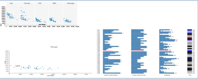
participants were viewing several plot charts depicting a relationship between price and
used mileage under each car brand, different participants had different interpretations.
For some participants, the stability of price range of a brand was interpreted from a more
scattered distribution, while some other participants regarded a scattered distribution as
variations of price values.
5.4 Weak correlation between level of confidence and different number of details in
information visualization
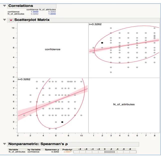
Figure 5.3 presents the correlation between level of confidence and the number of
attributes in information visualization using REML (restricted maximum likelihood) and
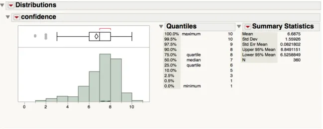
Spearman's rank correlation coefficient (Spearman's rho). Figure 5.4 presents descriptive
statistics of the confidence data. Figure 5.5 presents the distributions of level of
A statistics analysis was conducted using JMP. Correlation between level of
confidence and the number of attributes of information visualization turned out to be
0.3262 by using REML (restricted maximum likelihood) and 0.3262 by using
Spearman’s rho. Both indicated that the correlation between level of confidence and the
number of details in information visualization is relatively weak (Figure 5.3).
Descriptive statistics of overall level of confidence and distributions of level of
confidence at different number of attributes of car information were computed and
analyzed in the JMP tool (Figure 5.4 and Figure 5.5). According to Figure 5.5, more
participants raised their level of confidence in decision-making from a score of 5 out of
10 to a score of 8 out of 10 as the number of details in information visualization
increased, but with the overall level of confidence dropping suddenly at eight number of
attributes presented.
After carefully examining the confidence (for buying different types of cars) trends
along with the increase of number of attributes for each participant (Figure 5.6 - Figure
5.9), there are no common patterns that indicate an obvious correlation between level of
confidence and the increase of number of details. In Figure 5.6, the individual level of
familiarity with purchasing used cars, used coupes, used SUVs and used trucks are
depicted in bar charts using Tableau. Among all the participants, the highest level of
familiarity reaches 9 out of 10 and the lowest reaches 0 out of 10. Most participants have
a medium level of familiarity with purchasing used cars. Figure 5.7 showcases the trends
of confidence of each participant on buying a used coupe-typed car as the increase of
number of details of information visualization in Tableau. Figure 5.8 showcases the
trends of confidence of each participant on buying a used SUV-typed car as the increase
of number of details of information visualization in Tableau. Figure 5.9 showcases the
trends of confidence of each participant on buying a used truck-typed car as the increase
of number of details of information visualization in Tableau. It can be observed that 9 out
of 20 participants felt increasingly confident
when choosing SUV-typed cars, and 8 out of 20 participants felt increasingly confident
about their decision-making as the number of attributes in car information increased
when choosing truck-typed cars. But for each participant, the consistency of his/her
confidence trends across different car-buying decisions is weak. Only 6 out of 20
participants had relatively consistent confidence trends across buying different types of
cars, and only 2 participants of these 6 participants shared a similarly increasing
confidence trend. What’s more, participants with the same level of familiarity with
purchasing cars in general didn’t experience similar confidence trends (For example:
participant with id 10098 and participant with id 10100). Overall, the confidence trends
(Figure 5.7, Figure 5.8, and Figure 5.9) along with the increase in details in information
are irregular and cannot indicate obvious correlation between level of confidence and the
level of details in information.
Hence, it can be concluded that visualization with low level of details of data
doesn’t always cause under-confidence during decision-making, and visualization with
high level of details of data also doesn’t always cause over-confidence during
decision-making. In this study, one participant with low level of background knowledge of buying
used cars showed extremely high level of confidence after making decisions based on the
least number of details of information visualization. When the number of details of
information increased, the confidence gradually decreased. This participant was more and
more confused and overwhelmed by all the new yet unfamiliar information. At the same
time, several participants with relatively high level of background knowledge of
purchasing used cars also showed a high level of confidence when viewing low details of
details of data. This happened because these participants became more skeptical about
their decision-making as more information was presented.
Also, it is common to see that the level of confidence in decision-making dropped
when the participants were not satisfied with the available choices. This often happened
when more information was presented in the visualization tool. The participant found out
the previous decision was poor based on the new attribute, and were more likely to feel
less confident in his/her decision-making.
Figure 5.6. For each participant, level of familiarity with purchasing used cars, level of familiarity with purchasing used coupes, level of familiarity with purchasing used SUVs and level of familiarity with purchasing used trucks are visualized from left to right into the above bar charts using Tableau. The highest level of familiarity reaches 9 out of 10 and the lowest reaches 0 out of 10. Most participants have a medium level of familiarity with purchasing used cars.
Figure 5.8. For each participant, the trends of level of confidence on buying a used SUV-typed car as the increase of number of details of information visualization are visualized in Tableau. Nine out of twenty participants felt increasingly confident about their decision-making as the number of attributes in car information increased.
6.
D
ISCUSSION6.1 Interaction perspective is critical in shaping effective decision-making strategy
When more details of information were presented, many participants were inclined
to combine information together to filter choices. Functions that help decision-makers to
sort and compare attributes in order to find the best combination can be a good user
interaction design for supporting decision-making tasks in a visualization tool.
When being presented with large amount of details of car information and many of
them were considered as unimportant, the participants usually ignored checking those and
just focused on the important information. When the amount of redundant information
was not too many, the participant was inclined to use these as a final filter to choose one
of the candidates that matched his/her top criteria to optimize the decision-making.
Hence, flexibility of allowing decision-makers to actively view and choose certain
attributes of information, those that are considered as important factors for
decision-making, is a crucial perspective for a visualization tool to better support different
decision-making tasks.
According to the participants’ information seeking behaviors in this study,
information visualization like bar charts and plot charts are effective decision-making
facilitators. They are especially effective and useful for information/attributes that hold
complex values. By viewing the overall distributions presented by the visualization tool,
average. In this study, some participants were not familiar with criteria like horsepower,
so they weighted whether a horsepower value was high by comparing it with other
values, and the visualization of distribution helped to fasten the whole viewing process.
While for attributes with small and straightforward values like number of reported
accidents in this study (the value range is from zero to nine), the bar chart visualization
didn’t help. Most participants were more inclined to view the absolute values of this type
of attributes.
The visualization tool in this study shows all the car information in a way that lacks
user interactions. The tool presents all cars into different car make categories and
visualizes the relationship between price and used mileage in a plot chart for each
category. Some participants who didn’t consider car make as an important factor
preferred to see all car information in a single chart rather than in categories of car
makes. Also, in this visualization tool, participants could only check all the other
information of a certain car by first clicking that data dot in the price-used mileage plot
charts; thus, they felt it quite difficult to find the desirable car when they wanted to
examine cars with 0 accidents first. Hence, it is suggested that user interactions in
visualization tools should be designed in a way that helps decision-makers to quickly find
their choice by checking their priorities and filtering bad choices. This type of
interactions becomes more important as the amount of details increases. When the
interaction in the visualization tool is poor, the user is more inclined to take the first
desirable option as his/her final decision instead of checking more candidates and make
6.2 Limitations
Naturally, the scope of this user study is limited. First, the visualization
presentation for information in this study is limited to plot charts and bar charts. This may
not be general enough to draw the same conclusion for using alternative visualization
techniques since different visualization presentations impact human memory systems and
cognitive processes differently. Correspondently, the users may react and feel differently
during the decision-making process. Secondly, the small size of the studied group may
not be sufficient to generalize the whole population. The population studied here are
university students, which lack diversity. Users with different professional backgrounds
at different age ranges should be recruited for further study. Thirdly, this study only
focused on daily life decision-making, and may not apply to decision-making in other
fields. For different types of decision-making tasks, people experience different levels of
difficulty in processing information and set different perspectives of criteria, which
7.
C
ONCLUSIONBy summarizing two different patterns of the decision-making processes as the
amount of details in visualization increases, it can be concluded from this study that the
increasing number of details in information visualization does not always influence
participants’ decision-making. Instead, the value range and the level of importance of the
information are more influential factors that impact the decision-making process. These
two aspects should be taken into considerations when designing visualization tools to
support decision-making processes. Flexible user interactions that help users to narrow
down their ideal value ranges and prioritize important aspects of information are
encouraged to support effective decision-making.
A weak correlation between level of confidence and the number of details in
information visualization is found. Further studies should be conducted to explore the
factors that impact decision-makers’ level of confidence in order to better understand
B
IBLIOGRAPHYAsahi, T., Turo, D., & Shneiderman, B. (1995). Using treemaps to visualize the analytic hierarchy process. Information Systems Research, 6(4), 357-375.
Aley, E. B. (2007). Metaphorical Visualization: Using Multidimensional Metaphors to Visualize Data. VDM Publishing.
Bederson, B. B., & Shneiderman, B. (2003). The craft of information visualization: readings and reflections. Morgan Kaufmann.
Ganapathy, S., Ranganathan, C., & Sankaranarayanan, B. (2004). Visualization strategies and tools for enhancing customer relationship management. Communications of the ACM, 47(11), 92-99.
Green, M. (1998). Toward a perceptual science of multidimensional data visualization: Bertin and beyond. ERGO/GERO Human Factors Science, 8.
Griffin, D., & Tversky, A. (1992). The weighing of evidence and the determinants of confidence. Cognitive psychology, 24(3), 411-435.
Griffin, D. W., & Varey, C. A. (1996). Towards a consensus on overconfidence.
Organizational Behavior and Human Decision Processes, 65(3), 227-231.
Hauser, J. R., & Wernerfelt, B. (1990). An evaluation cost model of consideration sets.
Journal of consumer research, 393-408.
Holten, D., Vliegen, R., & Van Wijk, J. J. (2005, September). Visual realism for the visualization of software metrics. In 3rd IEEE International Workshop on Visualizing Software for Understanding and Analysis (p. 12). IEEE.
Holyoak, K. J., & Morrison, R. G. (2005). The Cambridge handbook of thinking and reasoning. Cambridge University Press: 209-249.
Johnson, B., & Shneiderman, B. (1991, October). Tree-maps: A space-filling approach to the visualization of hierarchical information structures. In Visualization, 1991. Visualization'91, Proceedings., IEEE Conference on (pp. 284-291). IEEE.
Kosslyn, S. M. (2006). Graph design for the eye and mind. OUP USA.
navigator: An interactive toolset for source code investigation. In Information Visualization, 2005. INFOVIS 2005. IEEE Symposium on (pp. 24-31). IEEE.
Lurie, N. H., & Mason, C. H. (2007). Visual representation: Implications for decision making. Journal of Marketing, 71(1), 160-177.
Mitchell, W., Shook, D., & Shah, S. L. (2004). A picture worth a thousand control loops: an innovative way of visualizing controller performance data. Invited Plenary Presentation, Control Systems.
Oskamp, S. (1982). Overconfidence in Case-study Judgments. W: D. Kahneman, P. Slovic, A. Tversky (red.), Judgment under Uncertainty: Heuristics and Biases (s. 287-293).
Payne, J. W. (1976). Task complexity and contingent processing in decision making: An information search and protocol analysis. Organizational behavior and human performance, 16(2), 366-387.
Plaisant, C. (2004, May). The challenge of information visualization evaluation. In
Proceedings of the working conference on Advanced visual interfaces (pp. 109-116). ACM.
Schwenk, C. H. (1986). Information, cognitive biases, and commitment to a course of action. Academy of Management Review, 11(2), 298-310.
Tang, F., Hess, T. J., Valacich, J. S., & Sweeney, J. T. (2013). The effects of visualization and interactivity on calibration in financial decision-making.
Behavioral Research in Accounting, 26(1), 25-58.
Tegarden, D. P. (1999). Business information visualization. Communications of the AIS,
1(1es), 4.
Vessey, I., & Galletta, D. (1991). Cognitive fit: An empirical study of information acquisition. Information systems research, 2(1), 63-84.
Vliegen, R., van Wijk, J. J., & Van der Linden, E. J. (2006). Visualizing business data with generalized treemaps. Visualization and Computer Graphics, IEEE Transactions on, 12(5), 789-796.
Wattenberg, M. (1998). Map of the Market. SmartMoney. com.
Westbrook, J. I., Gosling, A. S., & Coiera, E. W. (2005). The impact of an online evidence system on confidence in decision making in a controlled setting. Medical Decision Making, 25(2), 178-185.