Yufei Zhang. Increasing the Transparency of Survey Re-Weighting Using Visualization. A Master’s Paper for the M.S. in I.S degree. April, 2018. 43 pages. Advisor: David Gotz
Surveys are widely used for a long time by collecting data from a sample and further making reasonable target population. However, generally, sample cannot fully represent target population. Thus, predictions made from surveys contain biases. To eliminating biases, subgroups inside sample can be re-weighted to match target population. This paper introduces an interactive tool to visualize the re-weighting process in surveys, especially in presidential polls. A detailed description of system’s web-based user interface and algorithm are provided. In addition, results of user studies that evaluating the system with twenty users are presented and discussed.
Headings:
INCREASING THE TRANSPARENCY OF SURVEY REWEIGHTING USING VISUALIZATION
by Yufei Zhang
A Master’s paper submitted to the faculty of the School of Information and Library Science of the University of North Carolina at Chapel Hill
in partial fulfillment of the requirements for the degree of Master of Science in
Information Science.
Chapel Hill, North Carolina April 2018
Approved by
Table of Contents
Increasing the transparency of survey reweighting using visualization ... 2
1. Introduction ... 2
2. LiteratureReview ... 6
2.1 Data Visualization in Statistical Analysis ... 6
2.2 Interactive Visualization ... 7
2.3 Survey Methods ... 7
2.4 Survey Sampling Bias and Re-Weighting ... 8
2.5 Survey Result Visualization ... 9
3. Research Design ... 10
3.1 Dataset ... 10
3.2 Data Processing ... 11
3.2.1 Poll Data Processing ... 11
3.2.2 Baseline Data Processing ... 12
3.3 User Interface and Functionality ... 13
3.4 Balancing Algorithm ... 14
4. Evaluation ... 16
4.1 Population ... 16
4.2 Data and Task ... 17
4.3 Measurements ... 18
4.3.1 Close-ended Questions ... 18
4.3.2 Open-ended Questions ... 19
4.3.3 Task Accuracy ... 20
4.4 Procedure ... 20
5. Results and Discussion ... 23
5.1 Results ... 23
5.1.1 Improve on Understanding of Re-Weighting ... 23
5.1.2 Preference Between Stages ... 24
5.1.3 Usability ... 25
5.2 Discussion ... 26
6. Conclusion and Future Work ... 29
Bibliography ... 31
APPENDICES ... 36
APPENDIX A: Practice Tasks Used in User Study ... 36
APPENDIX B: Experimental Tasks Used in User Study ... 37
APPENDIX C: Pre-Test Questionnaire ... 38
APPENDIX D: Mid-Test Questionnaire ... 39
1. Introduction
Easy access to individuals and advanced analyzing technique enable mainstream media to collect public opinion and make reasonable predictions of the presidential campaign before the final vote. Predictions made by mainstream media can somehow influence public attitudes towards election candidates (Lazarsfeld, F., Berelson, & Gaudet, 1948). Nationwide telephone poll is widely used in collecting public opinion on presidential election. Polls are usually conducted by monthly collecting demographic information, opinions towards president candidates and their political opinions from a sample of nationwide population. Poll population will be used in the rest of this article to describe the sample population. Polls usually trace the same group of people in order to control unexpected variables.
different extent of emphasis on demographic features, or different target population to represent. For example, some algorithms try to fully match education level distribution in poll population with a baseline population while other algorithms want to partly match education level distribution and fully match gender distribution. Moreover, some poll websites might choose their baseline population as all voters in last year while some other poll websites might use all adults as their target population. The algorithms, which are not open to public and get rid of professional test, sometimes make mistakes and derived unreasonable prediction. An article in New York Times reveals an unbelievable fact in 2016 presidential election that one 19-year-old African American man, who is a Trump supporter and a panelist on the U.S.C./LAT poll, distort national poll averages (Cohn, 2016). He has even played a modest role in shifting entire poll aggregates toward Mr. Trump. How did he make this? It is because U.S.C./LAT poll weights for very tiny groups which generally requires more weighting. In above instance, the 19-year-old African American man is a rare representative of his group. To made it up to the baseline population, he would be assigned by large weight. As a result, his votes are weighted as much as 30 times more than the average respondent, and as much as 300 times more than the least-weighted respondent in some polls. He can improve Mr. Trump’s margin by 1 point in the survey and Mrs. Clinton surged once he was out of the sample.
chart will display in the main view showing the how many weighted votes that each candidates gained. The number will be showed by percentage. A slider will be provided for users to decide how much they want to match the poll data, from 0 (do not perform any re-weighting) to 100 (fully match baseline population). Users can find how demographic matching will influence the prediction result by choosing different combinations of demographic dimensions and balancing the dimensions to different extent. Without any specific training, people who are interested in presidential election can use Balance to make presidential campaign predictions by matching demographic dimensions that they think are vital to prediction to their desired baseline population. For example, Jane might choose to match gender, age, race and education level distribution in poll population to the distribution in all adults in U.S. by 50%. Users can also use
Balance to explore which demographic dimension is most sensitive to result. For example, if balancing by gender makes great change to the prediction result while balancing by age makes little change, users might find that gender is a more sensitive metric. Furthermore, Balance can be applied to general survey analyzing. By providing a sample population distribution and target population of interest distribution, Balance can analyze survey data by applying different weight for subgroups in survey population for users. Aims of this study includes:
• Designing and developing a visualization prototype that can educate people about
• Evaluating if people can get educated of the impact of re-weighing by using the
2. Literature
Review
2.1 Data Visualization in Statistical Analysis
Analyzing collected data using visualization is not a new technology (Fayyad, Wierse, & Grinstein, 2002). History of data visualization can be traced as early as 16th century (Friendly & Denis, 2001). Development of precise measurement of physical quantities and birth of statistical thinking (Fayyad, Wierse, & Grinstein, 2002) contribute to the rise of visual thinking. Visualization, as a tool, helps people to understand
enormous quantities of data and discover insights from data by representing data structure, features, patterns, anomalies and relationships (Cleveland, 1993; Fayyad, Wierse, & Grinstein, 2002; Gray, Chambers, & Bounegru, 2012) Visual data exploration popular for its intuitive and having no requirement in complex statistical knowledge and
programming basis (Vaishnavi, Kannan, Cline, & Etemadpour, 2016).
Visualization is used to guide and interpret statistical analysis (Tukey, 1977) in many fields, from systems biology to human health; from evaluations of product
2.2 Interactive Visualization
Effective interaction between our prototype and users is important for this study as the target user is ordinary people without specific training. Thanks to the development of technology and the increasing concern of user experience, human computer interactive has been an important topic among various field, especially computer science area (Dix, 2009). Researchers apply different design methods and principles to software engineering field (Hollan, Hutchins, & Kirsh, 2000). A book by Rosson and Carroll (2002) comprehensively illustrate the steps of using scenario based design in software development, from requirements analysis, activity design, information design to interaction design.
Particularly, the interaction between human and visualization applications is widely studied by researchers. Through effective visualizations, users should be able to gain knowledge about the underlying data and apply the analysis result to decision making. Screen space, object space, data space, attribute space and animating transforming all contribute to the effective of interaction visualization (Ward, Grinstein, & Keim, 2010).
2.3 Survey Methods
Survey results are used increasingly in social science (Weisber, Krosnick &
is commonly used, is to do a random sampling. Problem of deciding an appropriate sample size is actually a problem of striking a balance of precision and cost (Bennett, 1991). Increasing the sample size may narrow the confidence interval of survey results. However, at the same time, increasing the budget.
2.4 Survey Sampling Bias and Re-Weighting
Survey sampling bias, also known as sample selection bias is a systematic error which is caused by non-random sample of a population. It is a general issue widely studied in various research fields (Berk, 1983; Bethlehem, 2010; K. D. Miller, Rahman, & Sledge Jr., 2001; Phillips et al., 2009) that potentially threatens both the internal and external validity of the studies (Berk, 1983; R. B. Miller & Wright, 1995). A book by Huff (2010) illustrated volume outlining errors when it comes to the interpretation of statistics, and how these errors may create incorrect conclusions. Best Joel divided the misleading statistical numbers into 6 categories and analyze how numbers confuse people in public issues (Best, 2004).
system focused on the bias mainly caused by demographic difference between poll population and real voters.
One common approach to correct for the sampling bias with respect to the target population of interest, assuming that the subgroup distribution in population is known or can be estimated, is giving different weight to subgroups in the sample such that subgroups that are under-represented in the sample obtain a higher weight, whereas subgroups that are over-represented are down-weighted (Gelman, 2007; Huang, Smola, Gretton, Borgwardt, & Scholkopf, 2006; Little, 1993; Pfeffermann, 1993).
2.5 Survey Result Visualization
3. Research Design
A web-based application was developed to display the bias introduced in two political polls and the process of eliminating bias. A user study with 20 participants was conducted to evaluate the usability and the education ability of the software.
3.1 Dataset
This study was based on two kinds of dataset. One was poll dataset and the other was baseline dataset.
Poll dataset included information of each respondent in that poll. Respondent information consisted of demographic data and voting preference. Demographic data was used to define subgroups and calculate size of subgroups. Sum of voting preference was treated as result of poll.
Two poll datasets used in this study were two national polls published by Monmouth University Poll Institute, one in 2012 and the other in 2016. Data was retrieved from UNC Dataverse which was hosted by Odum Institute. There were 1874 respondents in 2012 poll and 802 respondents in 2016 poll. Both polls were conducted using a national sample and addressed presidential election of its year.
Two baseline datasets used in this study were statistical demographic information of all adults and all voters of 2012 in United States. Data was retrieved from U.S. Census Bureau and Wikipedia.
3.2 Data Processing
3.2.1 Poll Data Processing
Only interested in winning possibility of top two candidates, we keep information of respondents who have clear choice between two most popular candidates (Barack Obama and Mitt Romney in 2012, Donald Trump and Hillary Clinton in 2016).
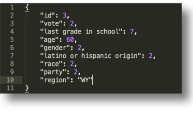
Questions and answers about willing of voting and opinion on some particular policies were excluded in first round data cleaning. Only demographic information and vote choice were remained. Figure 1(a) was an example of one records in 2016 poll dataset after cleaning. Information were coded according to the convention of the poll publisher. For example, “last grade in school: 7” means the last degree that the participant completed is a 4-year college degree.
Figure 1a. First round coding example. This is a participant with id as 3. She wants to vote for Clinton. Her last grade
in school is 4-year college. She is at her 60. She recognizes herself as a female. She is not Latino or Hispanic origin.
After first round of data cleaning and coding, a second round of coding was performed. In order to match categorization method in baseline data and avoid weighting on small groups, eight categories of “last grade in school” were combined to five. Age data was transformed from continues data to ordinal data. Address data which was coded by states was changed to code by regions. Figure 1(b) showed information of participants of id as 3 after second round of coding.
Figure 1(b). Second round coding example. Education level was coded from 7 to 4 to represent "Postgraduate education". Age was coded from 60 to 4 referring to "50 ~ 65". Region was coded from “WY” to “NE” that refers to northeast US.
3.2.2 Baseline Data Processing
3.3 User Interface and Functionality
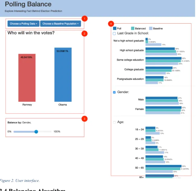
An interactive interface was designed to visualize the reweighting process. Figure 2 shows four panels of the interface.
Panel 1 is used to choose poll data and baseline data from available datasets. A drop-down list will appear after clicking on the two buttons. Once choosing a dataset, a visualization of the dataset will appear in panel 2 and 4.
Panel 2 is display section showing the prediction of winning possibility for each candidate. At the beginning, predictions are raw results from the poll, without any re-weighting. Predictions may change according to different weighting methods.
Panel 3 is a balance list showing current balancing dimensions and a slider indicating balancing extent. Number of the slider value will appear during dragging. From left to right, the extent of balancing changes from 0% to 100%.
Figure 2. User interface.
3.4 Balancing Algorithm
may balance by 50% because he wants to somehow keep the features in the poll data. Once T and E are decided, a balancing algorithm will be applied to the dataset to generate weights for each subgroup. Subgroups are defined by combination of values in T. For example, suppose Jane specifies Race and Gender in T. Six subgroups would be created: people with (1) Male White, (2) Male Black, (3) Male Asian, (4) Female White, (5) Female Black, and (6) Female Asian. If any subgroup has zero members, it will be omitted from the algorithm because it is impossible to balance.
A weight (𝑤") will then be computed for each of the n subgroups as follow
formula:
𝒘𝒊 =𝒑𝒊+ 𝒆(𝒃𝒊− 𝒑𝒊) 𝒑𝒊
𝑝" is the proportion of the subgroup 𝑖 in the poll data; 𝑏" is proportion of the subgroup 𝑖 in
the baseline dataset; 𝑒 refers to balance extent. For example, if the users want to balance gender and race by 50%. Assuming proportion of Male White in poll population is 20%, whereas proportion of Male White in baseline population is 40%. The weight for Male White will be computed as:
𝑤12 = 20% + 40% − 20% ×50%
20% = 1.5
4. Evaluation
A user study was performed to evaluate if Balance can help users to understand the impact of weighting in survey analyzing. A usability testing inserted in the user study helped examine the usability of Balance system.
4.1 Population
Totally 20 users recruited by email participated in this user study. Users are graduate students from UNC. None of the participants had prior experience with the system. All users have graduated from a 4-year college and seven of them have graduated from a graduate school, showing they already mastered basic statistical knowledge that is required in this study. Users reported various level of interest in politics (Table 1).
A moderator was present, responsible for giving introduce of background, running the test, recording the user’s task performance, making observations, and taking notes.
Table 1. Users self-reported level of interest in politics. Most people are somewhat interested in politics and few people give extreme choices.
2
4
11
2
1 0
2 4 6 8 10 12
Not at all
4.2 Data and Task
Datasets employed in this user study were “September 2012 Poll” and “All Adults”. Though the system adopts political poll dataset, the function to be test was to solve a common statistical problem happening in polls and can be generalized to most survey study. Thus, no specific domain knowledge is required in this study.
Users are required to complete 8 tasks by performing operations on above two datasets. Four tasks (Task 1, 2,3,6) focused on basic interaction with the system. Three tasks (Task 4,5,7) addressed on interpretation of visualization in Balance including demographic distribution visualization and prediction visualization. The last task (Task 8) focused on understanding of re-weighting. Appendix A and B gives detailed practice tasks and experimental tasks during this study. Goals of tasks were as follows:
T1. Learn to choose a poll data and a baseline data, and understand charts that visualized chosen datasets.
T2. Learn to add dimension of interest into balance list.
T3. Learn to balance by different extent, and observe changes in charts. T4. Use observations in previous tasks to identify winning trends.
T5. Identify the percentage of a specific group if fully match baseline population. T6. Adjust balance extent to verify answers in previous two tasks.
T7. Learn to identify winning possibility during adjusting balance extent.
4.3 Measurements
Close-ended questions, open-ended questions and task accuracy were used as measurements in this study.
4.3.1 Close-ended Questions
Close-ended questions asked in this study were 1 preference question and 14 Likert-scale questions.
4.3.1.1 Preference Questions
A preference question was provided in post-test questionnaire. The question asked user to choose which stage they prefer, inactive stage or static stage. The goal was to examine if Balance was able to assist users on better understanding of re-weighting. Q7 in Appendix E was preference question asked in this study.
4.3.1.2 Likert-scale Questions
Answers to Likert-scale questions were collected from both mid-test questionnaire and post-test questionnaire, 4 from the former and 10 from the latter. Questions addressed on users’ understanding of re-weighting in surveys and users’ feelings of the software’s usability.
Q1. Understanding of whole re-weighting process in presidential prediction. Q2. Understanding of sensitivity of different bias to prediction result. Q3. Understanding of impact of weighting extent in prediction. Q4. Understanding of impact of weighting overall.
The other 6 questions asked in post-test questionnaire were usability questions. Each question asked users if it is easy to perform a particular operation. A 5-point Likert scale was used for each question, where 1 representing for “Strongly Disagree” and 5 representing for “Strongly Agree”. Q1 to Q6 in Appendix E were usability questions asked in this study. Goal of questions were as follows:
Q1. If it is easy or hard to use the system overall. Q2. If it is easy or hard to choose datasets.
Q3. If it is easy or hard to interpret demographic charts. Q4. If it is easy or hard to adjust the extent of weighting.
Q5. If it is easy or hard to add and remove variables of interest to the balance list. Q6. If it is easy or hard to discover how possibility of each candidate winning the
vote changed in response.
4.3.2 Open-ended Questions
Two open-ended questions were provided in post-test questionnaire. Open-ended questions addressed on users’ opinion on Balance overall. Last two questions in Appendix E were example questions asked in this study. Goal of two questions were as follows:
4.3.3 Task Accuracy
Moderator recorded if users were able to provide correct answer or operation for each task after users finish that task. Finish of a task was defined as either the user answered the question or the users stopped interaction for the current task.
4.4 Procedure
Each testing session lasted approximately 30 minutes, including 3 questionnaires and two task stages. The studies were carried out on a laptop with no lab environment required.
The first step was a pre-test paper and pencil questionnaire which collects participants demographic like age, gender, their highest education and self-reported level of interest in politics. This pre-test questionnaire ensured all users had required statistical knowledge and helped researcher to understand users.
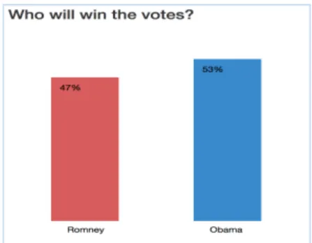
Next, in the first stage (stage A), a brief introduce about the process of political national tracking poll and a static chart of poll result (Figure 3) was provided to users. Detailed description of re-weighting process was not provided at this stage. The static chart showed percentages of people in this poll that vote for Romney and Obama. By looking at this static chart, users proceeded to mid-test questionnaire.
After stage A, users would need to fill out a mid-test paper and pencil questionnaire. The questionnaire contained of four Likert-scale questions which ask users about their understanding of generating winner prediction using data in the static chart they saw before. Aim of Sage A and this mid-test questionnaire is to understand users’ knowledge of survey re-weighting before using Balance.
Then, in the second task stage (stage B), users could interact with Balance system. Using this tool, users were asked to explore demographic differences and adjust survey re-weighing parameters. At the beginning of stage B, a short tutorial was provided by moderator to help users understand the concepts of “bias” and “balance”, both of which the users would encountered in the study tasks, as well as to get familiar with the dataset and the user interface. Then the users, aided by the moderator, went through seven sample tasks to further practice on the system operations. Users can ask questions about functionality of the software throughout the whole practice part. After users got familiar with the system interface and operations, eight experimental tasks were provided. Experimental tasks were similar to practice tasks, but choosing a different bias dimension of interest. Unlike practice session, users perform operations on system to complete tasks without aid from moderator. Aims of experimental process were:
1. Usability test
5. Results and Discussion
5.1 Results
5.1.1 Improve on Understanding of Re-Weighting
Table 2 provides mean of answers to four Likert-scale questions asked in both mid-test and post- test questionnaire. Each question focus on a specific aspect of survey re-weighting. Users self-report their level of understanding to each aspect in both questionnaires, 1 referring to “Not at All” and 5 referring to “Very Well”.
Question numbers out of parentheses are questions in mid-test questionnaire. Question numbers in parentheses are corresponding questions in post-test questionnaire.
Table 2. Mid-test and post-test questionnaire responses for the four understanding of weighting questions. The chart shows mean of answers.
Four independent-samples t-test were conducted to compare answers corresponding questions. Results are described as below.
2.75
2.25 2.25 2.15
4.2 4.3 4.25 4.35
0 1 2 3 4 5
Q1(Q8) Q2(Q9) Q3(Q10) Q4(Q11)
Q1 and Q8 asked users how much do they understand how polls generate prediction result. There was a significant difference in the scores for answers to Q1 (M= 2.75, SD= 0.91) and answers to Q8 (M= 4.2, SD= 0.69) conditions; t (38) =5.6588, p < 0.0001. T-test result showed that users did improve their understanding on how polls generate prediction result.
Q2 and Q9 asked users how much do they understand the sensitivity of demographic dimensions to prediction result. There was a significant difference in the scores for answers to Q2 (M= 2.25, SD= 0.79) and answers to Q9 (M= 4.3, SD= 0.57) conditions; t (38) =9.4322, p < 0.0001. T-test result showed that users did improve their understanding about sensitivity in re-weighting.
Q3 and Q10 asked users how much do they understand the impact of weighting extent to prediction result. There was a significant difference in the scores for answers to Q3 (M= 2.25, SD=1.02) and answers to Q10 (M= 4.25, SD= 0.79) conditions; t (38) =6.9465, p < 0.0001. T-test result showed that users did improve their understanding on about balancing extent in re-weighting.
Q4 and Q11 asked users how much to they understand the impact of weighting in poll. There was a significant difference in the scores for answers to Q4 (M= 2.15, SD= 0.88) and answers to Q11 (M= 4.35, SD= 0.67) conditions; t (38) =8.9230, p < 0.0001. T-test result showed that users did improve their understanding on weighting in polls.
5.1.2 Preference Between Stages
Table 3 Result of preference question.
5.1.3 Usability
Results of six 5-point Likert-scale questions post-test questionnaire are shown in Table 4. Questions can be found in section 4.3.1.2. All questions achieve high score from users, indicating the high usability of the software. First five questions get the highest score as 5. Q6 is relatively low, scored as 4. Q6 asks users if it easy to discover how result change in response to balancing. A reasonable guess is when balancing by dimensions that have little bias, small changes in result were hard for users to discover. Detailed discussion about Q6 will be present in section 5.2.
Table 4 Post-test questionnaire responses for the six easy-to-use questions answered by users on a 5-point scale. This chart shows median, outlier, lower whisker,1st quartile and 3rd quartile.
0
20
0 5 10 15 20 25
5.2 Discussion
Theme 1: Difficulty of figuring out small changes. An incorrect answer in tasks, observation from the moderator, opinions collected and relatively low score of Q6 indicating the problem of hard to identifying slight changes in result chart.
One incorrect answer was from Task 4, which requires users to give winning trends of two candidates when increasing balance extent from 50% to 100% without performing any operations on the system. The user understood that the winning trends should be same with that when increasing balance extent from 0% to 50%. However, due to the small change observed when sliding from 0% to 50%, the user failed to figure out correct changing trends and gave wrong answer.
Many users were observed spend more time on this task than other tasks. 6 users wrote down the result numbers of balancing by 0% and 50% in order to compare numbers and got changing trends. Others choose to move between 0% and 50% one or more times to compare numbers.
Totally 4 opinions collecting from post-test questionnaire pointed out the difficulty of figuring out difference when changing is small. One example as follow:
“Numbers are very close sometimes making it hard to differentiate after balancing”
“… It would be better if I could see history data? Like what prediction result I got when I balanced the data by 50% before I balanced it by 100%, so that I can compare the two numbers…”
The difficulty that users experienced in the study gave reason for the relative low score of Q6, which asked users if it was easy to figure out changes in winning possibility in response to balancing.
Theme 2: Problem of self-report. One key observation in mid-test questionnaire was a user self-reporting “very well” to all questions. However, when asked to explain a specific question, the user was not able to give an answer. Finally, the user changed his answers to “Not at All” and “Slightly”. Other users in the study were not asked to show expertise that match their self-reported levels. However, same problem might still exist.
Theme 3: Improvement on understanding of re-weighting. Compareto result of mid-test questionnaire, the result of post-test questionnaire showed a significant improvement, indicating users gained more sense about weighting after using the software. T-test results showed difference between answers to each pair of questions are extremely statistically significant. In another word, it suggested using Balance really did have a positive effect to individuals on understanding of survey re-weighting.
Theme 4: Preference for interaction. All users in the study reported preference of the interactive stage. A positive opinion collecting from the post-test questionnaire explained the reason of choosing stage B:
“I like the interactive feeling of the visualization (seeing how polling results shift in response to changing the balance)”
6. Conclusion and Future Work
This paper reported a visualization tool designed to visualize the bias introducing by survey sampling and the re-weighting process of eliminating bias. An introduce to interface and functionalities, the key algorithm, along with the results and discussion of user study that evaluating this software were provided. Task accuracies as well as opinions collecting from the user study indicated the software is easy to use. T-test results proved that the software was able to improve users’ understanding of survey re-weighting.
Data collected from user study provided key guidelines for future work.
Firstly, a quiz in mid-test questionnaire is required to evaluating users’ knowledge. By answering same questions, different users can be evaluated under the same standard. Quiz solves the problem of self-reporting that different people have different definitions to the same level. Moreover, some users were not able to accurately assess themselves, like the example discussed in Usability section.
Thirdly, increasing transparency on balancing calculation will better assist users to understand the weighting process. A suggestion from post-test questionnaire is:
“I wish I could see the calculations being made – I understand how weighting affects the results, but I still am not understanding completely how this is computed to get from raw data to a final and more accurate result. (i.e. free from biases and perfectly balanced)”
Bibliography
Berk, R. A. (1983). An Introduction to Sample Selection Bias in Sociological Data.
American Sociological Review, 48(3), 386–398. https://doi.org/10.2307/2095230 Best, J. (2001). Damned Lies and Statistics: Untangling Numbers from the Media,
Politicians, and Activists. University of California Press.
Bethlehem, J. (2010). Selection Bias in Web Surveys. International Statistical Review,
78(2), 161–188. https://doi.org/10.1111/j.1751-5823.2010.00112.x Cleveland, W. S. (1993). Visualizing Data. Hobart Press.
Cohn, N. (2016, October 12). How One 19-Year-Old Illinois Man Is Distorting National Poll Averages. The New York Times. Retrieved from https://www.nytimes.com/2016/10/13/upshot/how-one-19-year-old-illinois-man-is-distorting-national-poll-averages.htmlq
Detecting and Correcting Attrition Bias in Longitudinal Family Research on JSTOR.
(n.d.). Retrieved November 16, 2017, from
http://www.jstor.org/stable/353412?seq=1#page_scan_tab_contents
Dix, A. (2009). Human-Computer Interaction. In L. LIU & M. T. ÖZSU (Eds.),
Encyclopedia of Database Systems (pp. 1327–1331). Springer US. https://doi.org/10.1007/978-0-387-39940-9_192
Friendly, M., & Denis, D. J. (2001). Milestones in the history of thematic cartography, statistical graphics, and data visualization. URL Http://Www. Datavis. Ca/Milestones,
32.
Gelman, A. (2007). Struggles with Survey Weighting and Regression Modeling.
Statistical Science, 22(2), 153–164.
Gray, J., Chambers, L., & Bounegru, L. (2012). The Data Journalism Handbook: How Journalists Can Use Data to Improve the News. O’Reilly Media, Inc.
Hollan, J., Hutchins, E., & Kirsh, D. (2000). Distributed Cognition: Toward a New Foundation for Human-computer Interaction Research. ACM Trans. Comput.-Hum. Interact., 7(2), 174–196. https://doi.org/10.1145/353485.353487
Huang, J., Gretton, A., Borgwardt, K. M., Schölkopf, B., & Smola, A. J. (2007). Correcting sample selection bias by unlabeled data. In Advances in neural information processing systems (pp. 601–608).
Huff, D. (2010). How to lie with statistics. WW Norton & Company.
Keeter, S. (2006). The Impact of Cell Phone Noncoverage Bias on Poll in the 2004 Presidential Election. Public Opinion Quarterly, 70(1), 88–98. https://doi.org/10.1093/poq/nfj008
Keim, D. A. (2002). Information visualization and visual data mining. IEEE Transactions on Visualization and Computer Graphics, 8(1), 1–8. https://doi.org/10.1109/2945.981847
Magalhães, P. C. (2005). Pre-Election Polls in Portugal: Accuracy, Bias, and Sources of Error, 1991–2004. International Journal of Public Opinion Research, 17(4), 399– 421. https://doi.org/10.1093/ijpor/edh078
Miller, K. D., Rahman, Z. U., Jr, S., & W, G. (2001). Selection Bias in Clinical Trials.
Breast Disease, 14(1), 31–40. https://doi.org/10.3233/BD-2001-14105
More Damned Lies and Statistics: How Numbers Confuse Public Issues - Joel Best - Google Books. (n.d.). Retrieved November 16, 2017, from https://books.google.com/books?hl=en&lr=&id=SWBr7D6VavoC&oi=fnd&pg=PP 1&dq=Best,+J.+(2004).+More+damned+lies+and+statistics:+How+numbers+confu se+public+issues.+Univ+of+California+Press.&ots=WqwcxAKq2Y&sig=_cUq5Yj XKCWckQZKyrCABRzrjTA#v=onepage&q=Best%2C%20J.%20(2004).%20More %20damned%20lies%20and%20statistics%3A%20How%20numbers%20confuse% 20public%20issues.%20Univ%20of%20California%20Press.&f=false
Pfeffermann, D. (1993). The Role of Sampling Weights When Modeling Survey Data.
International Statistical Review / Revue Internationale de Statistique, 61(2), 317– 337. https://doi.org/10.2307/1403631
Phillips, S. J., Dudík, M., Elith, J., Graham, C. H., Lehmann, A., Leathwick, J., & Ferrier, S. (2009). Sample selection bias and presence-only distribution models: implications for background and pseudo-absence data. Ecological Applications, 19(1), 181–197. https://doi.org/10.1890/07-2153.1
framework. International Journal of Human-Computer Studies, 41(4), 553–583. https://doi.org/10.1006/ijhc.1994.1073
Rosson, M. B., & Carroll, J. M. (2002). Usability Engineering: Scenario-based Development of Human-computer Interaction. Morgan Kaufmann.
Thomas, J. J., & Cook, K. A. (2006). A visual analytics agenda. IEEE Computer Graphics and Applications, 26(1), 10–13. https://doi.org/10.1109/MCG.2006.5 Tukey, J. W. (1977). Exploratory data analysis.
Vaishnavi, K., Kannan, A., Cline, D., & Etemadpour, R. (2016). A Visualization Tool for Learning Statistical Analysis in Multi Tabular Datasets. In 2016 IEEE 16th International Conference on Advanced Learning Technologies (ICALT) (pp. 222– 226). https://doi.org/10.1109/ICALT.2016.13
Ward, M. O., Grinstein, G., & Keim, D. (2010). Interactive Data Visualization: Foundations, Techniques, and Applications. CRC Press.
Welch, R. L. (2002). Polls, Polls, and More Polls: An Evaluation of How Public Opinion Polls Are Reported in Newspapers. Harvard International Journal of Press/Politics, 7(1), 102–114. https://doi.org/10.1177/1081180X0200700107
Weisberg, H., Krosnick, J. A., & Bowen, B. D. (1996). An introduction to survey research, polling, and data analysis. Sage.
Kalton, G. (1983). Introduction to survey sampling (Vol. 35). Sage.
Bennett, S., Woods, T., Liyanage, W. M., & Smith, D. L. (1991). A simplified general method for cluster-sample surveys of health in developing countries.
Millikin, L. (2016). SurveyGizmo Resources. Retrieved March 29, 2018, from https://www.surveygizmo.com/resources/blog/data-visualization-best-practices-reporting/
APPENDICES
APPENDIX A: Practice Tasks Used in User Study
1. Choose poll data as “September 2012” and choose baseline data as “All Adults”. 2. Add Gender into balance list.
3. Balance by 0%, then by 50%.
4. What should we expect about the possibility that Obama will win when the gender distribution of poll population is more similar to the baseline population, increase or decrease? What about Romney?
5. What should we expect about the value of balanced percentage (green bar) of “Male” will be if we balance by 100%?
6. Balance by 100%
APPENDIX B: Experimental Tasks Used in User Study
1. Choose poll data as “September 2012” and choose baseline data as “All Adults”. 2. Add Region into balance list.
3. Balance by 0%, then by 50%.
4. What should we expect about the possibility that Obama will win when the gender distribution of poll population is more similar to the baseline population, increase or decrease? What about Romney?
5. What should we expect about the value of balanced percentage (green bar) of “Male” will be if we balance by 100%?
6. Balance by 100%
7. What is the possibility that Obama will win when we fully match demographic of “All Adults” by gender? What about Romney?
APPENDIX C: Pre-Test Questionnaire
1. Please choose your gender: Male
Female
2. What was your age on your last birthday? ___ 3. What was the last grade in school you completed?
High School Some college
4-year college graduate (Bachelor’s degree)
Graduate School (Masters, Law/Medical School, etc.) 4. How interested are you in politics?
1 2 3 4 5
Not at all interested
Slightly interested
Somewhat interested
APPENDIX D: Mid-Test Questionnaire
1. How much do you understand how polls generate prediction result?
1 2 3 4 5
Not at all Slightly Somewhat Fairly Well Very Well
2. How much to you understand the sensitivity of demographic dimensions to prediction result? i.e. which dimension has large influence on the result when balancing and which has small influence
1 2 3 4 5
Not at all Slightly Somewhat Fairly Well Very Well
3. How much do you understand the impact of weighting extent to prediction result?
1 2 3 4 5
Not at all Slightly Somewhat Fairly Well Very Well
4. How much to you understand the impact of weighting in poll?
1 2 3 4 5
APPENDIX E: Post-Test Questionnaire
1. It was easy for me to use the system overall.
1 2 3 4 5
Strongly Disagree
Disagree Neither agree nor disagree
Agree Strongly Agree
2. It was easy to choose a poll data and a baseline data.
1 2 3 4 5
Strongly Disagree
Disagree Neither agree nor disagree
Agree Strongly Agree
3. It was easy to interpret the bar charts that describing demographic information.
1 2 3 4 5
Strongly Disagree
Disagree Neither agree nor disagree
Agree Strongly Agree
4. It was easy to adjust the extent of weighting.
1 2 3 4 5
Strongly Disagree
Disagree Neither agree nor disagree
Agree Strongly Agree
5. It was easy to add and remove variables of interest to the balance list and balance them according to the target population of interest.
1 2 3 4 5
Strongly Disagree
Disagree Neither agree nor disagree
Agree Strongly Agree
1 2 3 4 5 Strongly
Disagree Disagree Neither agree nor disagree Agree Strongly Agree
7. In two stages of exploring the poll data, which do you prefer, static result chart in stage A or interactive exploring in stage B?
Stage A Stage B
8. How much do you understand how polls generate prediction result?
1 2 3 4 5
Not at all Slightly Somewhat Fairly Well Very Well
9. How much do you understand the sensitivity of demographic dimensions to
prediction result? i.e. which dimension has large influence on the result most when balancing and which has small influence
1 2 3 4 5
Not at all Slightly Somewhat Fairly Well Very Well
10. How much do you understand the impact of weighting extent to prediction result?
1 2 3 4 5
Not at all Slightly Somewhat Fairly Well Very Well
11. How much to you understand the impact of weighting in poll?
1 2 3 4 5
Not at all Slightly Somewhat Fairly Well Very Well
12. What do you like most about the system?