The news is full of references To “big daTa.” What does that mean, and what does it have to do with statistics? In business, big data usually refers to information that is captured by computer systems that monitor various transactions. For instance, cellular telephone companies carefully watch which
customers stay with their network and which leave when their contracts expire. Systems that monitor customers are essential for billing, but this information can also help managers understand customer churn and devise plans to keep profitable customers. Traditional bricks-and-mortar retail stores also generate wide streams of data. Modern checkout software tracks every item a shopper buys. These systems were originally devised to monitor inventory, but are now used to discover which items shoppers buy. That information can help marketers design coupons that entice shoppers to buy more on their next visit.1
Big data can be overwhelming. Imagine opening a data table with millions of rows and thousands of columns. That’s a lot of numbers, and not all of that information is typically useful. Where do you begin? Transactional data often aren’t relevant for building a statistical model. Figuring out what to use and what to ignore is a challenge, and we can only expect to succeed by first understanding the business. Unless we have a clear sense of the problem and the context, we’re not going to be able to sort through thousands of columns of numbers to find those that help us. Automated modeling tools offer help (see Statistics in Action: Automated Modeling), but we can do better if we understand the problem.
T
hischapTer presenTsasysTemaTicwayofbuildingregressionmodelswhendealing wiThbigdaTa
.
Big data isn’t just big. It also may come with problems, such ascatego-ries pretending to be numerical and missing data. To overcome these problems and exploit all of that data, you need to turn business insights into a statistical model. That’s the task for this chapter: combining business knowledge and regression analysis into a powerful approach for successful modeling.
Regression with
Big Data
1 Modeling Process 2 building The Model 3 ValidaTing The Model chaPTer suMMary
1
❘
Modeling Process
This chapter describes how to build a regression from a large data table. We begin with an overview of the steps, organized within the framework of a 4M exercise. Most steps involve familiar methods, such as using plots to check for outliers. Other steps introduce new concepts, such as overfitting and validation, that become relevant when modeling large amounts of data. After introducing the modeling process, we illustrate the process by building a model designed to help a finance company identify profitable customers. Its clients are small busi- nesses that purchase financial services. These services include accounting, bank-ing, payroll, and taxes. Its clients know their market niche, but not how much to withhold in payroll taxes or the best way to negotiate the terms of a loan. The finance company also occasionally provides short-term loans to clients. The goal of the regression model is to estimate the value of fees generated by potential clients. Clients sign an annual contract, and the finance company would like to be able to predict the total fees that will accumulate over the coming year. It currently relies on search firms, called originators, that recruit clients. The finance company would like to identify clients that will generate greater fees so that it can encourage originators to target them. The data available for building this model describe 3,272 clients that bought services from this financial provider for the first time last year. The data include 53 variables. This is a relatively small data set compared to those at WalMart, but substantially larger and more complex than others we have used. Modeling steps To build a model from a large data set, you need to be knowledgeable about the business and have a plan for how to proceed. The approach described in this chapter expands the 4M strategy used in other chapters, emphasizing issues that arise with big data. You don’t have to follow this script, but expe-rience has taught us that these steps—such as looking at histograms of data— lead to insights that save time later. Motivation▪ Understand the context. Every 4M analysis begins with Motivation, and this emphasis on business knowledge becomes more essential when you are dealing with big data. From the start, make sure you know what you’re try-ing to do. You should not have to browse the data table to figure out which variable is the response. In this example, we know that we need to build a model that predicts the fees generated by clients. You also will find it helpful to set some goals for your model, such as how precisely the model should predict the response. Method
▪ Anticipate features of the model. Which variables do you expect to play an important role in your regression? It is often smart to answer this question before looking through a list of the available variables. Once you see this list, you may not realize an important characteristic is missing. Anticipat-ing the relevant explanatory variables also forces you to learn about the business problem that provides the context for the statistical model. In this case, that implies learning more about how a financial advisor operates. ▪ Evaluate the data. It is always better to question the quality of your data
before the analysis begins than when you are preparing a summary. There’s no sense spending hours building a regression only to realize that the data do not represent the appropriate population or that the variables do not measure what you thought they did. For this example, we need to be sure
future customers it hopes to predict. The concepts of sampling introduced in Chapter 13 are relevant here.
Mechanics
▪ Scan marginal distributions. Before fitting models, browse histograms and bar charts of the available variables. By looking at the distribution of each variable, you become familiar with the data, noticing features such as mea-surement scales, skewness, and outliers or other rare events. If data are time series, then plots over time should be done before considering histograms. ▪ Fit an initial model. The choice of explanatory variables to include in an
initial regression comes from a mix of substantive insight and data analy-sis. Substantive insights require knowledge of the business context along with your intuition for which features affect the response. Start with the model suggested by your understanding of the problem; then revise it as needed. Notice that we describe this model as the “initial regression.” Building a regression in practice is usually an iterative process, and few stop with the first attempt.
▪ Evaluate and improve the model. Statistical tests dominate this stage of the process, and the questions are familiar: • Does the model explain statistically significant variation in the response, as judged by the overall F-statistic? • Do individual variables explain statistically significant variation in the response? • Can you interpret the estimated coefficients? Would a transformation (usually, the log of a variable) make the interpretation more sensible? • Does collinearity or confounding obscure the role of any explanatory variables? • Do diagnostic plots indicate a problem with outliers or nonlinear effects? • Does your model omit important explanatory variables?
It is much easier to judge whether a variable in the model is statistically significant (just use the t-statistic) than to recognize that a variable has been left out of the model. With-out understanding the substantive context, you’ll never realize an essential variable is missing from the data set you’re analyzing. And even if it’s there, identifying an omitted variable can resemble the proverbial search for the needle in a haystack. Fortunately, statistics has tools that help you find addi-tional variables that improve the fit of your model. If you decide to remove explanatory variables from a regression (usually variables that are not statistically significant), be careful about collinearity. An explanatory variable may be insignificant because it is unrelated to the re-sponse or because it is redundant (collinear) with other explanatory variables. If removing variables, do it one at a time. If you remove several variables at once, collinearity among them may conceal an important effect. Variance inflation factors (Chapter 24) warn about possible collinearity. Message
▪ Summarize the results. Save time for this step. You might have spent days building a model, but no one is going to pay attention if you can’t commu-nicate what you found using the language of the business. Illustrations that show how the model is used to predict typical cases may be helpful. Not everyone is going to be familiar with the details of your model, so take your time. For example, if your model includes logs, then explain them using percentages rather than leaving them a mystery. Point out if your analysis supports or contradicts common beliefs. Finally, no model is perfect. If there is other data that you think could make the model better, now’s the time to point that out as well as your thoughts on how to improve any weaknesses.
tip
what do you Think?
These questions are intended to remind you of several aspects of regression analysis that you may have forgotten. We will need these soon, so it’s time to scrape off the rust.a. A regression of Sales (in thousands of dollars) on spending for advertise-ments (also in thousands of dollars) produced the fitted equation
Estimated Sales = 47 + 25 loge Advertising.
Interpret the estimated slope. (Feel free to refer back to Chapter 20.) Describe how the gain in estimated sales produced by spending another $1,000 on advertising depends on the level of advertising?a b. What plot would you recommend for checking whether an outlier has influenced a multiple regression?b c. If a categorical variable has 20 levels, what problems will you encounter using it as an explanatory variable in a multiple regression?c d. In a regression of productivity in retail stores, what problem will you en-counter if two explanatory variables in the model are the percentage male and percentage female in the workforce?d
Model Validation and overfitting
Model validation is the process of verifying the advertised properties of a statistical model, such as the precision of its predictions or its choice of explanatory variables. In previous chapters, examples of regression name the response and explanatory variables. If you know the equation of a model, then model validation means checking the conditions, such as the similar vari- ances condition. When we use the data to pick the relevant variables, valida-tion requires more. The iterative process of building a regression model requires a bit of “try this, try that, and see what works.” This sort of “data snooping” typically leads to a higher R2, but the resulting model may be deceptive. The problem arises because we let the data pick the explanatory variables. A search for explana-tory variables might cause us to look at tens or even hundreds of t-statistics before finding something that appears statistically significant. The deception is that there’s a good chance that a variable appears statistically significant because of data snooping rather than its association with the response. This problem is known as overfitting. Overfitting implies that a statistical model confuses random variation for a characteristic of the population. A model that has been overfit to a sample won’t predict new observations as well as it fits the observed sample. Suppose a regression has residuals with standard deviation se = +50, for example. The approximate 95% prediction intervals suggest that this model ought to pre-dict new cases (that are not extrapolations) to within about $100 with 95% probability. If the regression has been overfit to the sample, however, the pre- diction errors will be much larger. Prediction intervals that claim 95% cov-erage might include only half of the predicted values. Overfitting also leads
model validation confirming that the claims of a model hold in the population.
overfitting confusing random variation for systematic proper-ties of the population.
a Each 1% increase in advertising adds about 0.011252= +0.25 thousand ($250) to estimated sales. The estimated gain decreases with the level of advertising because a $1,000 increase comprises a smaller and smaller percentage change. b A plot of the residuals on fitted values. (We will see a better choice later in the chapter.) c Many dummy variable coefficients (19 of them) will complicate the model, and some may have large standard errors if the category has few cases.
tip
to spurious claims of statistical significance for individual explanatory vari-ables. If overfit, an explanatory variable with t-statistic 2.5 might nonetheless have slope b = 0 in the population. We would come away with the impres-sion that differences in this explanatory variable are associated with changes in the average response when they are not.There’s a simple explanation for why overfitting occurs. Statistics rewards persistence! If you keep trying different explanatory variables, eventually one of them will produce a t-statistic with p-value less than 0.05. This happens not because you’ve found an attribute of the population, but simply because you’ve tried many things. We’ve run into this problem before. The causes of overfitting affect control charts (Chapter 14) and the analysis of variance (Chapter 26). Both procedures require many test statistics. Control charts test the stability of a process repeatedly. The analysis of variance tests for differences between the means of several groups. Comparing the means of, say, eight groups implies 182172>2 = 28 pairwise comparisons. Because testing H0 with a = 0.05 pro-duces a Type I error with probability 0.05, continued testing inevitably leads to incorrectly rejecting a null hypothesis. Incorrectly rejecting H0: bj = 0 in regression means thinking that the slope of Xj is nonzero when in fact Xj is unrelated to the response in the population. The approaches taken to control overfitting in control charts or ANOVA work in regression, but these are unpopular. It’s easy to see why. Both avoid the risk of too many false rejections of H0 by decreasing the alpha level below 0.05. In control charts, for example, the default is a = 0.0027 so that a test rejects the null hypothesis that claims the process is under control only when Z 7 3. In regression, this approach would mean rejecting H0: bj = 0 only if the p-value of the t-statistic were less than 0.0027, or roughly if t 7 3. This approach is unpopular in regression because it makes it harder to find statis-tically significant explanatory variables that increase R2. Similar objections apply to the Bonferroni method in Chapter 26. So how should you guard against overfitting? Suppose you have hired consultants to build a regression model to help you understand a key business process, such as identifying profitable custom-ers. How would you decide whether to believe the regression model they have developed? Maybe the consultants snooped around until they found charac-teristics that inflated R2 to an “impressive level” to convince you to pay them a large fee for the model. Before you pay them and incorporate their model into your business, what would you do to test it? A popular, commonsense approach is to reserve a so-called holdback or test sample that the consultants do not see. The data used for fitting the model is called the training sample. The idea is to save data that can be used to test the model by comparing its fit to the test sample to its fit to the training sam-ple. We can compare the fit of the model in the two samples in several ways. The most common uses the estimated model built from the training sample to predict the response in the test sample. The estimated model should be able to predict cases in the test sample as accurately as it predicts those in the training sample. A further comparison contrasts the estimated coefficients of the explanatory variables when the model is fit in the two samples. The coef-ficients ought to be similar in the two samples. The idea of reserving a test sample is straightforward, but deciding how much to hold back is not obvious. Ideally, both samples should be “large.” The training sample needs to be large enough to identify a good model, and the test sample needs to be large enough to validate its fit to new data. A test sample with only 50 observations lacks enough information for serious model validation unless the model is very simple. With more than 3,000 cases from the financial provider, we have more than enough for validation. We’ll reserve about one-third for validation and use the rest to build the model.
test sample Data reserved for testing a model.
training sample Data used to build a model.
what do you Think?
a. Imagine fitting a multiple regression with a normally distributed response and ten explanatory variables that are independently randomly generated (“random noise”). What is the probability that at least one random predic-tor appears statistically significant?a b. One test of overfitting compares how many predicted observations in the test sample lie within the 95% prediction intervals of a model. If the test sample has 100 cases, would it indicate overfitting if 80 or fewer fell inside the 95% prediction limits? Explain.b c. What if the validation sample has ten cases? That is, would finding eight or fewer inside the 95% bounds suggest overfitting?c d. The answers to (b) and (c) are very different. Explain the relevance for model validation.d2
❘
building The Model
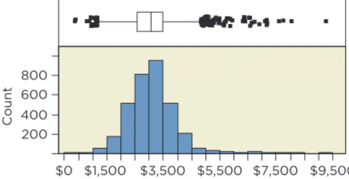
This section presents a long 4M example that follows the modeling process just described to build a regression model. We already introduced the context, and the following discussion of the variables in the data adds to that introduc-tion. Marginal notes call out key components of the steps. setting goals Two goals for the model are to predict fees produced by new clients and to iden-tify characteristics associated with higher fees. The model should fit well—attain a reasonable R2—and have an equation we can interpret. These goals conflict if the model requires collinear explanatory variables to produce precise predic-tions. Collinearity among many explanatory variables makes it hard to interpret individual partial coefficients. It is difficult to explain what it means for one variable to change “holding the others fixed” if that never happens in the data. What does it mean to have a “reasonable R2”? To find an answer, look at the variation in the response. The histogram of annual fees in Figure 1 shows that clients paid amounts from around $500 to more than $9,000, with mean $3,100 and standard deviation $800. The bell-shaped distribution implies that we can predict the fees for a new client to within about $1,600 with 95% prob-ability without regression—just use the mean plus or minus two standard deviations. It’s easy to think that regression should do much better, but it is harder than it seems. For a regression to obtain a margin of error of $500 (predict within {+500 with 95% probability), for example, requires that R2 approach 90%. Such a good fit rarely happens and may be unattainable. If R2 60%, then the margin of error is about $1,000. If that’s not good enough, we are left to hope that the data contain a very good predictor. aTreating these as independent, the probability of no Type I error is 1-0.9510 0.40. bYes, this would be very rare if the model were correct. 80 lies 180-952>2110010.95210.05226.9 SDs below the mean, a very extreme deviation. (Note: The variance of a binomial is n p 11-p2.) Use a histogram to see the
variation in the response and set goals for model precision.
200 400 600 800 $0 $1,500 $3,500 $5,500 $7,500 $9,500 Count
figure 1 Histogram and boxplot of the annual fees paid by clients.
anticipate features of the Model Before we look at the list of possible explanatory variables, what would you expect to find in a regression model that predicts the value of fees? We don’t work in that industry, so we do not know the ins and outs of the business. Even so, we ought to be able to list a few possible variables. For example, the size of the business seems like a good guess: clients with little revenue can’t afford to pay much either, nor do they need much financial advice. The type of business that the client is in might be important, too. Those with many em-ployees might need help with payroll. As it turns out, the data set identifies the type of the business, but does not reveal much about the size of the business outside its use of credit. Table 1 lists the available variables and gives a short description of each. The table also shows the number of levels in categorical variables.
Table 1 Variables measur-ing the characteristics of past clients.
Variable Name Levels Description
Annual fees The response, in dollars Originator 3 Three originators recruit clients Years in Business Length of time the client has operated Credit Score Credit score of the listed owner of the business SIC Code 270 Standard Industry Classification code Industry Category 32 Textual description of the business Industry Subcategory 268 More specific description of the business Property Ownership 3 Whether the business property is owned, leased, or under mortgage Num Inquiries Number of times in last six months the business has sought more credit Active Credit Lines Number of active credit lines, such as credit cards Active Credit Available Total over all lines, in dollars Active Credit Balance Total over all lines, in dollars Past Due Total Balance Total over all lines, in dollars Avg Monthly Payment Total over all lines, in dollars Active #30 Days Number of times payment on a credit line was 30 days past due Active #60 Days Number of times payment was 60 days past due Active #90 Days Number of times payment was 90 days past due Number Charged Off Number of credit lines entering collection, total Credit Bal of Charge-Offs Total balance over all lines at time of collection, in dollars Past Due of Charge-Offs Total over all lines, in dollars Percent Active Current Percentage of active credit lines that have current payments Active Percent Revolving Percentage of credit lines that are revolving (for example, credit cards) Num of Bankruptcies Number of times the company has entered bankruptcy Num of Child Supports Number of times owner has been sued for child support Num of Closed Judgments Number of times a closed judgment has been entered against owner Num of Closed Tax Liens Number of times a tax lien has been entered against the owner
A quick scan of Table 1 reveals that many of these variables describe the credit-worthiness of clients. There are two explanations for this. First, data that describe how a business uses credit are readily available from credit bureaus. For a fee, the financial provider can purchase credit scores, balance infor-mation, and other financial details from one of the three big credit bureaus (Experian, Equifax, and TransUnion). The second explanation for the prevalence of these variables is more reveal-ing: this provider often deals with businesses that have a troubled history. The variables provide detail on past problems, including a history of credit default and bankruptcy. A history of problems does not imply that a client was out to defraud others, but such a past suggests that the client has a volatile busi-ness, one with large swings from profitability to losses. As it turns out, volatile businesses are often the most profitable targets for financial service providers. These businesses have problems managing money and hence often seek—and pay for—advice. Without insight into how such companies operate, it is hard to build a model from so many explanatory variables. Rather than rely on an automatic search (such as the stepwise algorithm described in SIA 8), let’s imagine that we have a conversation with managers of the financial provider that provides us with insights as to which factors predict the fees generated by a client. (Exercise 50 exploits further comments along these lines.)
Variable Name Levels Description
Population of ZIP Code Refer to the ZIP Code of the business Households in ZIP Code White Population Black Population Hispanic Population Asian Population Hawaiian Population Indian Population Male Population Female Population Persons per Household Median Age Median Age Male Median Age Female Employment First-Quarter Payroll Annual Payroll State 51 Time Zone 6 Number of time zone, relative to Greenwich Metro. Stat. Area 231 Name of the metropolitan area in which business is located Region 4 Name of the region of the country Division 9 Census division Table 1 continued
Skim the list of potential vari-ables. Does it contain what you expected? Do you know what the variables measure?
1. Clients that have a wider range of opportunities for borrowing—namely, those with more lines of credit—generate higher fees. 2. Clients that have nearly exhausted their available credit also generate higher fees. 3. Clients owned by individuals with high credit scores often have novel financial situations that produce large fees. Credit scores run from about 200 to 800, mimicking the range used in SATs. Individuals with high scores tend to be wealthy with high-paying jobs and a clean credit record. 4. Three originators recruit clients for the financial company. Managers suspect that some of the originators produce better (more profitable) clients. 5. Retail businesses in low-margin activities (groceries, department stores) operate a very lean financial structure and generate few fees. Businesses that provide services to other businesses often have complex financing arrangements that generate larger fees. 6. The financial provider handles clients with a history of bankruptcy differently. It structures the fees charged to firms with a prior bankruptcy differently from those charged to other firms. Now that we have a sense of possible explanatory variables, we can guess the direction of their effects on the response. Finding that the coefficient of an explanatory variable has the “wrong” sign may indicate that the model omits an important confounding variable. For instance, the third comment suggests that higher credit scores should come with higher fees—positive association. Finding a negative coefficient for this variable would indicate the presence of a confounding effect; for example, businesses whose owners have high credit scores might also be older (and perhaps older firms generate less fees). Once we have the direction, we can anticipate whether the association is linear or nonlinear. Nonlinear patterns should be expected, for instance, in situations in which percentage effects seem more natural. For instance, we often expect the effects of an explanatory variable on the response to dimin-ish as the explanatory variable grows. Do you expect the same increase in fees when comparing clients with 1 or 2 lines of credit as when comparing those with 20 or 21 lines of credit? You might, but it seems plausible that a log transformation might be helpful. The jump from 1 to 2 doubles the num-ber of lines of credit, whereas a change from 20 to 21 is only a 5% increase. Both add one more line of credit, but the second difference (from 20 to 21) seems less important. (Refer to Chapter 20 for a detailed treatment of non-linear association.)
evaluate the data
It is a given that our data must be a representative sample from the popu-lation of interest. Here we give two less obvious reasons for why data may not be representative. One is generic in business applications of statistics, and another comes from a comment from the discussion with managers. The sixth comment listed previously points out that the finance company has a very different fee structure for clients with a history of bankruptcy. A quick peek at the data reveals a mixture of firms with and without a prior bankruptcy. Of the 3,272 cases, 378 clients (11.6%) have a bankruptcy and 2,894 do not. Taken together, these observations are a sample of the population of clients, but according to managers, the two types of clients produce very different fees. Use the context to
antici-pate direction of effects and nonlinearity.
tip
We have two ways to deal with this heterogeneity. One approach keeps the data together. This approach requires a regression with numerous interactions that allow different slopes for modeling the effect on fees for firms with and without a bankruptcy. With so many possible variables, the use of interactions seems daunting; so we will take a different path. Because of the heterogeneity produced by bankruptcy, we will set aside the bankrupt clients and use only those without a bankruptcy. We can think of this subset as a sample from the population of clients that do not have a history of bankruptcy. (Exercise 52 models clients with a history of bankruptcy.) This sort of segmentation, dividing data into homogeneous subsets, is common when modeling big data. Part of the rationale for modeling these subsets separately is that we suspect that variables that are relevant for bank-rupt businesses are not relevant for others. For instance, it might be important to know how long ago the bankruptcy occurred and use this in a model. That variable is not defined for firms without bankruptcy. (Credit bureaus routinely partition individuals into six or more segments when assigning credit scores; those with bankruptcies or little history are handled separately from others.) After segmentation, there is another reason that data may not be repre-sentative: the passage of time. Think about how long it takes to assemble a data set such as this one. The response is the level of fees produced over a year. Hence, it takes at least a year just to observe the response, in addition to time to accumulate the observations. Let’s assume that it took the company 18 months to build this data table. Now the company must build a model, in-struct its staff in the use of the model, and then use that model to predict fees. How long will that take? You can see that it might easily be two years after data collection begins before the model is routinely used, and then it will take another year to see how well its predictions turn out. Three years is a long time in the business world, and much can change. A regression model that describes the association between customer characteristics and fees is likely to be sensitive to the overall economy. The nature of customers might, for instance, change if the economy were to sud-denly head down or boom. We need to confirm that our data in this example comes from a period in which the economy is similar to the economy when the model is used. The use of a test sample to evaluate the model only partly addresses this problem. The cases in the test sample come from the same col-lection as those used to fit the model, not from cases several years down the road. Performance in a test sample does not guarantee that a model will work well in the field if the economic environment changes.scan Marginal distributions
To illustrate the benefits of skimming marginal distributions, consider the his-tograms of two numerical and two categorical variables from the financial data in Figure 2. From this point on, we will use the data for the 2,894 clients without a bankruptcy.
The variable Active Credit Lines is right-skewed, and this type of skewness often anticipates the use of a log transformation to capture diminishing fees per additional line of credit. A log scale for this variable would produce a more symmetric distribution as well. The histogram of Credit Score reveals another common anomaly: missing data that are not identified as missing. The boxplot highlights a clump of three outliers with credit score 0; most likely, these are missing data that was entered as 0 because nothing was known. Actual credit scores do not extend below 200. We exclude these from further analysis.
Are the data a sample from one population? Segmentation may be needed.
segmentation Separating data into homogeneous sub-sets that share a collection of explanatory variables.
Use histograms and bar charts to find outliers, skewness, data entry errors, and other anomalies.
tip
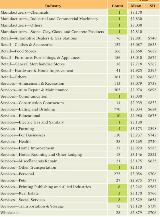
The bar charts of Originator and Property Ownership in Figure 2 illustrate good and bad properties of categorical variables. The bar chart of Originator spreads numerous observations over each of the three categories. This vari-able has enough information to distinguish the three groups. On the other hand, the bar chart of Property Ownership has few cases in two categories. We know very little about businesses that have mortgages or own their property. When fitting models, we may not have enough data to find statistically signifi-cant differences. This problem—not enough data in some categories—gets worse as the number of categories increases. The fifth comment on page 9 suggests that the industry category affects fees. Table 2 shows the frequency distribution over the 29 categories of this variable (after removing bankruptcies and the three observations with missing credit scores). It’s a good thing we checked this distribution: seven of the categories have only one observation. Estimat- ing the effect on fees of belonging to one of these groups would mean rely-ing on just one observation. We either must exclude these rare categories or lump them together into a category called “Other.” Before combining rare groups, make sure the responses in these groups are similar (such as by using comparison side-by-side boxplots and the ideas from Chapter 26). If, for example, fees in a rare category average several times fees elsewhere, we would not want to mix that category with cases from typical categories. The means and stan-dard deviations in Table 2 don’t show any anomalous categories (which can be confirmed with plots). For this analysis, we will merge the categories with 10 or fewer cases (shaded in Table 2) into a group called “Other.” The resulting categorical variable Merged Industry has 21 levels, all with at least 14 cases. We would probably merge more categories, but the fifth comment singles out retailers as different; so we will keep the remaining categories distinct.
figure 2 Marginal distributions of four variables show skewness, outliers, and proportions.
100 200 300 400 500 Count 0 5 10 15 20 25 30 35 40 45 200 400 600 Count 0 100 200 300 400 500 600 700 800 0 250 500 750 1000 1250 A B C Originator 0 500 1000 1500 2000 2500
Lease Mortgage Own Property Ownership Active Credit Lines Credit Score
combine nearly empty c ategories unless they have very different responses.
Table 2 Frequency distribu-tion for the variable Industry category, with mean and standard deviation of fees in that group. Industry Count Fees Mean SD Manufacturers—Chemicals 1 $3,170 Manufacturers—Industrial and Commercial Machinery 1 $2,830 Manufacturers—Others 1 $3,030 Manufacturers—Stone, Clay, Glass, and Concrete Products 1 $2,810 Retail—Automotive Dealers & Gas Stations 76 $2,801 $740 Retail—Clothes & Accessories 157 $3,087 $625 Retail—Food Stores 166 $2,668 $687 Retail—Furniture, Furnishings, & Appliances 186 $3,010 $674 Retail—General Merchandise Stores 18 $2,718 $562 Retail—Hardware & Home Improvement 41 $2,925 $595 Retail—Others 361 $3,024 $683 Services—Amusement & Recreation 113 $3,079 $738 Services—Auto Repair & Maintenance 305 $2,974 $698 Services—Communication 1 $3,030 Services—Construction Contractors 14 $2,939 $832 Services—Eating and Drinking 770 $3,034 $684 Services—Educational 10 $2,980 $675 Services—Electric Gas and Sanitary 1 $3,130 Services—Farming 4 $3,173 $598 Services—For Businesses 110 $3,237 $742 Services—Health 58 $3,265 $720 Services—Home Improvement 37 $2,929 $585 Services—Hotels Rooming and Other Lodging 18 $3,146 $852 Services—Miscellaneous Repair 21 $3,175 $625 Services—Other Transportation 1 $2,110 Services—Personal 275 $3,056 $706 Services—Pets 27 $2,975 $717 Services—Printing Publishing and Allied Industries 6 $3,242 $567 Services—Real Estate 3 $3,170 $766 Services—Social Services 8 $2,529 $654 Services—Transportation & Storage 72 $3,128 $739 Wholesale 28 $2,879 $706
Prepare for Validation
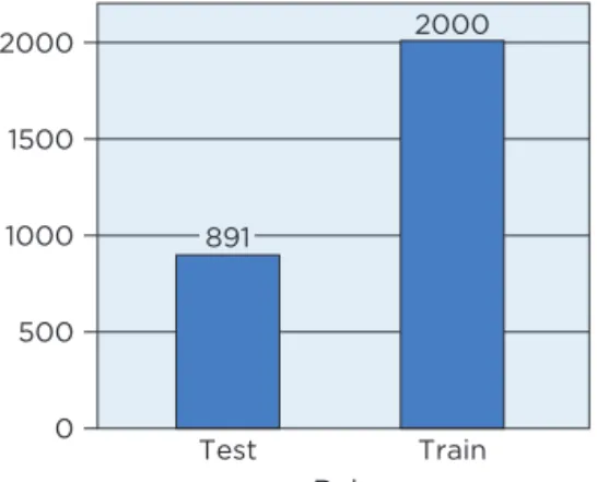
For the test sample to be useful for model validation, we must set these cases aside before fitting regression equations. The data table includes the col-umn Role with values “Train” and “Test” for this purpose. We decided to use 2,000 randomly chosen observations for fitting models (about two-thirds of the data) and to reserve the remaining 891 for testing the fit (Figure 3). It is common to use more data for estimation than for testing, and one often sees 80 or 90% of the data used for fitting the model. The larger the training
sample used for estimation, the more precise the parameter estimates become because standard errors decrease with increasing sample size. For this example, we keep a large testing sample to obtain precise estimates of how well the model performs.
exclude the test sample before fitting models.
figure 3 Sizes of the training and test samples.
0 500 1000 1500 2000 2000 Test Train Role 891
fit an initial Model
Our initial model reflects what we know about context of the problem gleaned from the previous substantive comments listed on page 9. The first comment regarding the number of credit lines seems clear: businesses with more credit lines generate higher fees. So we will use Active Credit Lines in our model. The second comment requires that we build a variable to capture the notion that firms that have used up more of their available credit generate higher fees. To capture this effect, we define the variable Utilization, which is the ratio of the active credit available divided by the sum of credit available plus the balance (times 100 to give a percentage). Even though this data table has numer-ous columns, we often must construct yet more variables to incorporate the desired features into a regression. The third comment suggests that the model should include Credit Score as another explanatory variable.
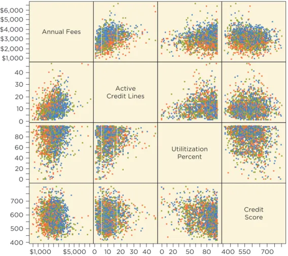
Figure 4 shows the scatterplot matrix for the response and these explana- tory variables, color-coded to identify the originator noted in the fourth com-ment on page 9. Red denotes businesses found by Originator A, green denotes B, and blue denotes C. Color-coding works well for Originator because it has only three categories. Color-coding is helpful for categorical variables with few levels but confusing for variables with many levels, such as the industry of these companies.
None of these variables has a very high correlation with the response,
Annual Fees. The largest correlation is with Active Credit Lines 1r = 0.332. There is little correlation with Utilization 1r = 0.152 and a surprising small negative correlation with Credit Score 1r = -0.102. Little collinearity con-nects these three explanatory variables; the largest correlation among them is the negative correlation between Utilization and Credit Score (r = -0.22, which could be expected since one’s credit score goes down as more of the available credit is used). Don’t be disappointed by the small correlations of these explanatory variables with the response. We’re just starting and need to combine them with the other effects in a multiple regression. Although the numerical variables have small correlations with the response, this plot shows a large effect for Originator. The elevated positions of blue points in the top row of the scatterplot matrix indicate higher fees coming from busi-nesses found by Originator C.
tip
tip
Use a scatterplot matrix to see the relationships among the response and explanatory variables.We fit a multiple regression with these variables, along with the response,
Merged Industry. The output in Table 3 summarizes the results. Overall, the model is highly statistically significant. Although it is premature to believe that the Multiple Regression Model holds for this equation (we have not added all of the relevant explanatory variables so that nonrandom structure remains in the residuals), the overall F-statistic 1F = 26, p 6 0.00012 shows that one is unlikely to obtain R2 = 0.25 with n = 2,000 and k = 25 explanatory vari-ables by chance alone. Some of these explanatory variables are related to the response. Light shading in the table of estimates highlights coefficients that are statistically significant 1p 6 0.052.
figure 4 Scatterplot matrix of the response and several potential explanatory variables, color-coded by the originator for each client.
$1,000 $2,000 $3,000 $4,000 $5,000 $6,000 0 10 20 30 40 0 20 40 60 80 400 500 600 700 Annual Fees $1,000 $5,000 Active Credit Lines 0 10 20 30 40 Utilitization Percent 0 20 50 80 Credit Score 400 550 700 R2 0.2476 se 610.9011 n 2000 Analysis of Variance
Source DF Sum of Squares Mean Square F Ratio
Model 25 242423024 9696921 25.9832 Error 1974 736697079 373200 Prob + F C. Total 1999 979120104 <0.0001*
Table 3 Initial multiple regression for client fees.
choose an initial model based on substantive insights.
Parameter Estimates
Term Estimate Std Error t-statistic p-value
Intercept 2935.16 210.57 13.94 60.0001 Active Credit Lines 36.92 2.17 17.01 60.0001 Utilization Percent 3.86 0.72 5.40 60.0001 Credit Score -1.05 0.20 -5.36 60.0001 Originator [A] -541.05 35.47 -15.25 60.0001 Originator [B] -259.24 32.80 -7.90 60.0001 Merged Industry [Other] 9.70 202.95 0.05 0.9619 Merged Industry [Retail—Automotive Dealers & Gas Stations] 3.83 175.36 0.02 0.9826 Merged Industry [Retail—Clothes & Accessories] 335.94 164.12 2.05 0.0408 Merged Industry [Retail—Food Stores] -77.23 163.37 -0.47 0.6365 Merged Industry [Retail—Furniture, Furnishings, & Appliances] 256.09 161.82 1.58 0.1137 Merged Industry [Retail—General Merchandise Stores] -108.86 246.59 -0.44 0.6589 Merged Industry [Retail—Hardware & Home Improvement] 88.70 191.98 0.46 0.6441 Merged Industry [Retail—Others] 199.04 158.16 1.26 0.2084 Merged Industry [Services—Amusement & Recreation] 184.38 168.40 1.09 0.2737 Merged Industry [Services—Auto Repair & Maintenance] 223.36 159.22 1.40 0.1608 Merged Industry [Services—Construction Contractors] 36.74 255.22 0.14 0.8856 Merged Industry [Services—Eating and Drinking] 244.06 155.79 1.57 0.1174 Merged Industry [Services—For Businesses] 384.72 167.76 2.29 0.0219 Merged Industry [Services—Health] 341.63 179.85 1.90 0.0576 Merged Industry [Services—Home Improvement] 36.62 203.53 0.18 0.8572 Merged Industry [Services—Hotels Rooming and Lodging] 61.78 246.91 0.25 0.8024 Merged Industry [Services—Miscellaneous Repair] 382.62 224.02 1.71 0.0878 Merged Industry [Services—Personal] 221.21 159.33 1.39 0.1652 Merged Industry [Services—Pets] -26.88 213.38 -0.13 0.8998 Merged Industry [Services—Transportation & Storage] 247.09 179.44 1.38 0.1687
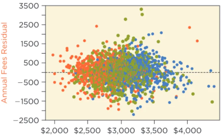
Most of the estimated coefficients that are statistically significant in Table 3 have the expected sign. Adding more credit lines adds to fees (about $37 per additional line), as does having a higher utilization (although only $4 per additional 1% increase). Credit Score, however, is statistically significantly negative. This unexpected sign suggests confounding due to an omitted vari-able; otherwise, the managers who made suggestions on page 9 were wrong. The diagnostic plot of the residuals on fitted values in Figure 5 looks okay, although the coloring might be confusing. This plot is colored as in Figure 4 by the three originators. Notice that the red points (Originator A) tend to lie to the left side of the plot, with the blue points (C) dominating the right side and the green points (B) in the middle. This pattern does not indicate a problem and instead confirms the effect of Originator. Red points fall on the left-hand side of the plot because clients obtained by this originator produce systemati-cally lower estimated fees than those from the other two. How much lower? The estimated coefficient for the dummy variable Originator[A] in Table 3 shows that if comparing fees from otherwise comparable clients, fees for busi- ness identified by Originator A average about $540 less than those from Origi-nator C. Similarly, the green points for Originator B lie in the middle of the check signs of coefficients,
being mindful of collinearity and confounding due to omitted variables.
plot because fees from its clients average about $260 less than those from Originator C.
figure 5 Scatterplot of residuals on fitted values for the initial multiple regression model, colored by the three originators. 22500 21500 2500 500 1500 2500 3500
Annual Fees Residual
$2,000 $2,500 $3,000 $3,500 $4,000
Annual Fees Predicted
tip
evaluate the Model
We need to be careful when thinking about the importance of Merged Indus-try in this model. First, recall that the coefficients of dummy variables that represent the levels of a categorical variable compare the average response in the category shown to the average response in a baseline category, the cate-gory not represented by a dummy variable. (If necessary, review these ideas in Chapter 25.) Which industry defines the baseline? Our software automatically generates dummy variables and by default leaves out the last one alphabeti-cally, which happens to represent wholesalers. Hence, all of the coefficients in Table 3 for Merged Industry are comparisons to wholesalers. If you change the baseline, then all of these estimates change. Also, if the baseline category has but a few cases, then many of the estimated comparisons to the baseline will not be statisti-cally significant because of the small sample size in the baseline category. Here 16 of the 2,000 businesses in the training sample are wholesalers. Consequently, it is often a good idea to use a category with many cases to define the baseline. For example, 523 businesses in the training sample are restaurants (with the label “Services—Eating and Drinking”). Using this category to define the base-line produces the fitted estimates shown in Table 4. R2 0.2476 se 610.9011 n 2000 Analysis of Variance
Source DF Sum of Squares Mean Square F Ratio
Model 25 242423024 9696921 25.9832 Error 1974 736697079 373200 Prob + F
C. Total 1999 979120104 60.0001* Table 4 estimated initial
multiple regression for client fees with the baseline industry category changed to be restaurants rather than wholesalers.
Parameter Estimates
Term Estimate Std Error t-statistic p-value
Intercept 3179.23 143.38 22.17 60.0001* Active Credit Lines 36.92 2.17 17.01 60.0001 Utilization Percent 3.86 0.72 5.40 60.0001 Credit Score -1.05 0.20 -5.36 60.0001 Originator [A] -541.05 35.47 -15.25 60.0001 Originator [B] -259.24 32.80 -7.90 60.0001 Merged Industry [Other] -234.36 136.35 -1.72 0.0858 Merged Industry [Retail—Automotive Dealers & Gas Stations] -240.23 89.03 -2.70 0.0070* Merged Industry [Retail—Clothes & Accessories] 91.88 63.25 1.45 0.1465 Merged Industry [Retail—Food Stores] -321.29 62.30 -5.16 60.0001* Merged Industry [Retail—Furniture, Furnishings, & Appliances] 12.03 58.25 0.21 0.8364 Merged Industry [Retail—General Merchandise Stores] -352.92 195.14 -1.81 0.0707 Merged Industry [Retail—Hardware & Home Improvement] -155.37 118.63 -1.31 0.1905 Merged Industry [Retail—Others] -45.03 46.55 -0.97 0.3335 Merged Industry [Services—Amusement & Recreation] -59.68 74.15 -0.80 0.4210 Merged Industry [Services—Auto Repair & Maintenance] -20.70 49.88 -0.42 0.6782 Merged Industry [Services—Construction Contractors] -207.32 205.62 -1.01 0.3134 Merged Industry [Services—For Businesses] 140.66 73.59 1.91 0.0561 Merged Industry [Services—Health] 97.57 98.30 0.99 0.3210 Merged Industry [Services—Home Improvement] -207.44 136.01 -1.53 0.1274 Merged Industry [Services—Hotels Rooming and Lodging] -182.28 195.28 -0.93 0.3507 Merged Industry [Services—Miscellaneous Repair] 138.56 165.54 0.84 0.4027 Merged Industry [Services—Personal] -22.85 51.43 -0.44 0.6569 Merged Industry [Services—Pets] -270.95 150.75 -1.80 0.0724 Merged Industry [Services—Transportation & Storage] 3.03 97.07 0.03 0.9751 Merged Industry [Wholesale] -244.06 155.79 -1.57 0.1174 Changing the baseline category only affects the intercept and the coefficients associated with the categorical variable. The intercept now refers to restau- rants rather than wholesalers, and the coefficients of the other dummy vari-ables for Merged Industry make comparisons to restaurants. As a result, these estimates decrease by 244.06, the coefficient of the wholesale dummy vari-able in Table 4. That shi ft pushes some estimates closer to zero and others farther away. Also, with a larger baseline category (523 restaurants versus 16 wholesalers), the estimates have smaller standard errors. For example, the standard error of the coefficient of the dummy variable identifying retail food stores is 163 in the initial regression with wholesalers as the baseline but 62 in this fit. The estimated coefficient is also more negative, implying that fees for retail food stores are statistically significantly less than for restaurants (given the other variables in the model). The overall summary of the model (R2 = 0.2476 with F = 25.98) and the coefficients for the other explanatory variables remain the same. For example, the slope for the number of active credit lines remains 36.92 and that for utilization remains 3.86.
When a categorical variable has just a few levels, such as Originator, it is not too hard to sort out the consequences of picking a baseline category. The presence of many categories, however, becomes confusing. It is easy to inad- vertently choose a nearly empty baseline category that produces no statisti-cally significant coefficients even though there are large differences among the categories. To avoid that problem and obtain a better test of the importance of a categorical variable, use the partial F-statistic. A partial F-statistic tests whether a subset of coefficients in a regression model simultaneously have coefficient zero. You can think of this statistic as testing the improvement in R2 obtained when adding several variables as a group to a regression, as happens when we add a categorical variable with several levels. This statistic compares the fit obtained by two regressions, a regression that includes the full set of explanatory variables, and a partial re-gression that removes one or more explanatory variables (thereby setting their coefficients to zero). The test answers the question: Does the full regression explain statistically significantly more variation in the response than the par-tial regression? The formula for the partial F-statistic is: F = 1R 2
full-R2partial2>1kfull-kpartial2
11 - R2
full2>1n - kfull - 12
1Change in R22>1Number of Added Terms2
1Remaining Variation2>1Residual d.f.2 = R 2 full - R2partial 1 - R2 full * n - kfull - 1 kfull - kpartial
The partial F-statistic compares the change in R2 per added variable to the amount of unexplained variation per residual degree of freedom. In this for-mula, the subscript “full” identifies properties of the regression model using all of the variables, and the subscript “partial” identifies the regression that sets a subset of the coefficients to 0. The constant k refers to the number of estimated coefficients (not including the intercept). The second way of writing the formula stresses the importance of the sample size n in determining the size of the F-statistic. As an example of the partial F -statistic, we test the null hypothesis that add-ing the collection of 20 dummy variables that represent Merged Industry does not improve the fit.
H0: all b coefficients associated with Merged Industry are zero.
We have already fit the full regression and found (keep extra digits for R2 to avoid too much round-off error)
R2
full = 0.2476, kfull = 25, n = 2000.
If the model omits the dummy variables representing Merged Industry, the summary statistics are R2 partial = 0.2237, kpartial = 5. Plugging these into the formula for the partial F-statistic, we obtain F = 0.2476 - 0.2237 1 - 0.2476 * 2000 - 25 - 1 25 - 5 0.03177 * 98.7 3.14. The change in R2 is relatively small until you multiply it by the ratio of residual degrees of freedom to the number of added variables, which is almost 100 to 1.
partial F-statistic Used to test H0 that a subset of
coef-ficients in a regression all have coefficient 0.
Use the partial F-statistic to judge the contribution of com-plex categorical explanatory variables.
tip
To determine whether the observed F -statistic is statistically signifi-cant at the chosen a level, compare it with the 10011 - a2 percentile of the F distribution with kfull - kpartial and n - kfull - 1 degrees of freedom (these are the integers in the preceding formula). The 5% critical value with kfull - kpartial = 20 added variables and n - kfull - 1 = 1,974 residual degrees of freedom in the full model is F0.05, 20, 1974 = 1.576. We reject H0 because the observed F = 3.14 exceeds this threshold. (The p-value of the test is less than 0.0001, and the test rejects H0 at any reasonable a level.) The test implies that adding this collection of 20 dummy variables (representing the 21 industries defined by Merged Industry) produces a statistically significant improvement in the fit of the model. Even though the coefficients of most of these dummy variables are not statistically significant, the addition of this collection of vari-ables produces a statistically significantly better fit.
what do you Think
We used a partial F-statistic to test the benefit of adding the collection of 20 dummy variables representing Merged Industry to this model. Why didn’t we use the same procedure to test the addition of Originator? The answer is that we should, even though both coefficients for Originator are highly statistically significant. The R2 without Originator in the model is 0.1589.a. State the specific null hypothesis that is tested if we use the partial F-statistic to test the effect of adding Originator to the model.a
b. What is the appropriate value to use for kpartial?b c. What is the value of the partial F-statistic?c
d. Does the addition of Originator produce a statistically significant increase in the R2 of the reduced model? Explain.d
Partial regression Plots
In addition to a rich set of categorical variables, complex regression models likely have several numerical explanatory variables as well. The more vari-ables in the model, the harder it becomes to rely on scatterplots of Y on in-dividual explanatory variables to check whether outliers and leverage points influence the estimated coefficients. Collinearity among the explanatory vari-ables can produce surprising leverage points that influence the regression in ways that would not be expected from the usual scatterplots. Partial regression plots remedy this weakness of scatterplots. A partial regression plot provides a “simple regression view” of the partial slope for each numerical explanatory variable. Fitting a line in the scatterplot of Y on X reveals the marginal slope of the simple regression of Y on X. This plot makes simple regression “simple.” Once you see the scatterplot of Y on X, you can see where the line goes and estimate the slope. You can’t do that for multiple regression because the model has several explanatory variables. That’s where partial regression plots become handy. Partial regression plots do for multiple regression what the scatterplot does for simple regression. Fitting a line in the partial regression plot of Y on X produces the partial slope of the explanatory variable.
aH 0: bA= bB= 0; the coefficients of the dummy variables for these categories are both zero. bk partial= 25-2= 23 counts the number of coefficients in the reduced model after removing Originator. cF= 10.2476-0.15892>11 -0.24762*12000-25-12>125-232 116.4. dYes. The 5% critical point in the F 2,1974 distribution is 3.000. The observed F is much larger.
partial regression plot Scatterplot that shows how data determine the partial slope of an X in multiple regression.